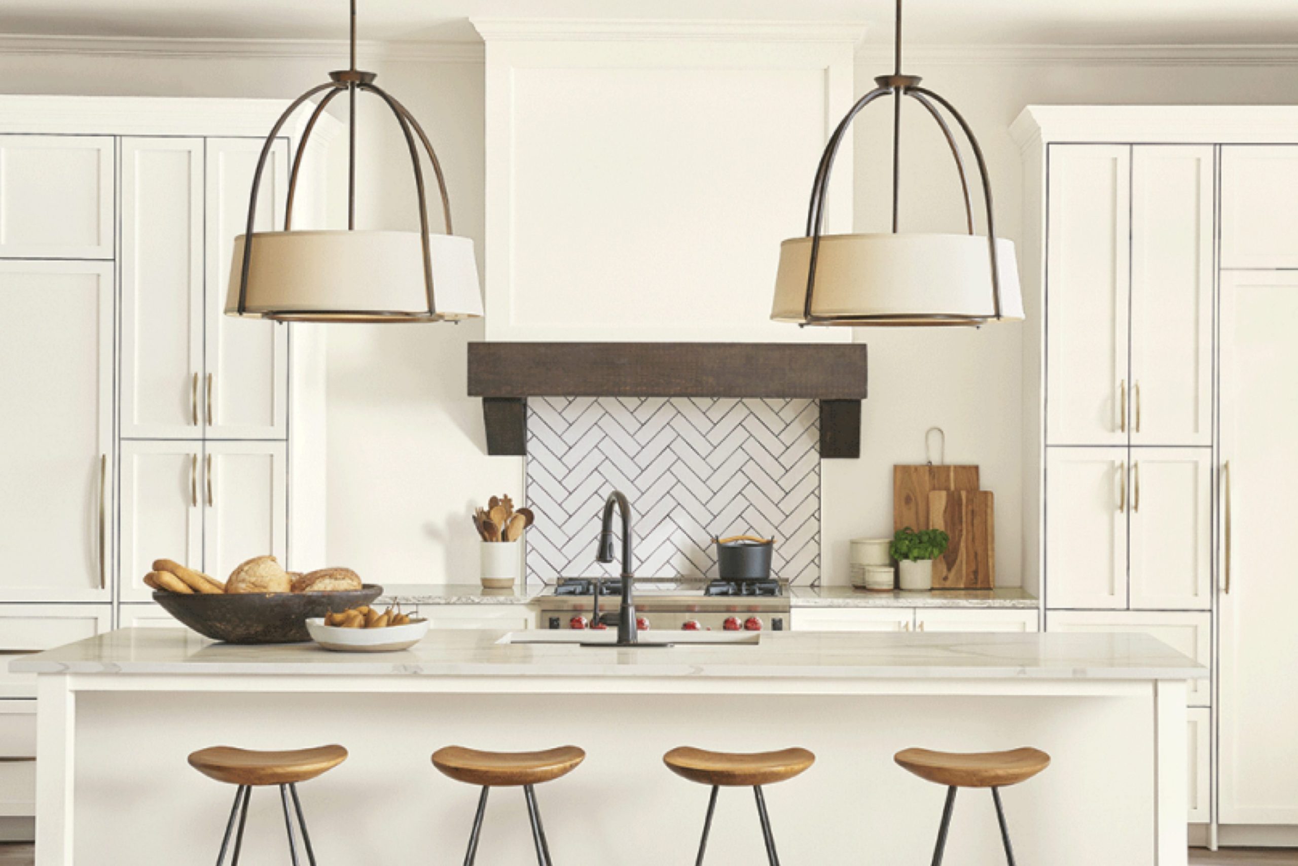
If you’re considering refreshing your room with a new coat of paint, you might want to look at SW 7102 White Flour by Sherwin Williams. As someone who has used this shade in several projects, I can share a few insights to help you make an informed decision.
First off, White Flour is not just a simple white. It has a warm undertone that brings a soft and welcoming feel to any room. It’s particularly effective in areas that get a lot of natural light, where it casts a gentle, sunny glow that makes the room feel more spacious and airy.
Before you commit to buying gallons of it, I advise testing it out in your room. Light plays a significant role in how paint colors appear, and White Flour can look different depending on the amount and type of light in a room. Try painting a large swatch on the wall and observe it at different times of the day to see how it changes with the shifting light.
Also, consider the paint finish. For high traffic areas, a satin or semi-gloss might be more practical, while a flat or matte finish could be perfect for less busy areas. Each finish affects the final look of the color, influencing not just the color’s durability but its perception too.
Keeping these tips in mind, you’ll be better equipped to decide if SW 7102 White Flour is the right choice for your decorating project.
Is White Flour SW 7102 Right for My Home?
White Flour by Sherwin Williams is a color I find incredibly flexible and classic. It has a soft, warm tone that isn’t stark or cold, which makes it a comforting choice for any room. This shade of white acts as a subtle backdrop that allows other design elements to stand out, yet it still offers enough warmth to make areas feel inviting on its own.
I’ve noticed that White Flour works exceptionally well in a variety of interior styles. In minimalist or modern settings, it creates a clean, uncluttered look. It’s also perfect for farmhouse or shabby chic decor because it enhances the rustic elements without feeling too strong. For a traditional style, it adds a fresh, updated feel without losing any of the classic elegance.
When it comes to pairing materials and textures with White Flour, the possibilities seem endless. It looks beautiful next to natural wood, whether it’s a dark walnut or a lighter pine. This color also pairs well with metallic finishes like brass or copper, adding a touch of warmth and shine to the calm palette.
Textures like linen or cotton in soft beige or gray tones complement the subtlety of White Flour, contributing to a cozy and harmonious interior.
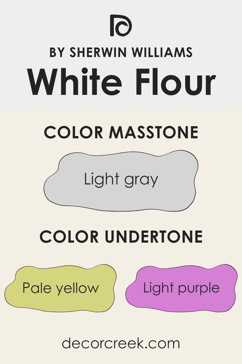
What are the right undertones of White Flour SW 7102 ?
White Flour by Sherwin Williams is a popular paint color known for its flexibility and subtle beauty. The color primarily appears as a soft white, but its perception can significantly change depending on its undertones. These undertones include pale yellow, light purple, light blue, pale pink, mint, lilac, and grey. Each undertone brings a unique feel to the color which can affect how it looks in different settings and lighting conditions.
For instance, the pale yellow undertone adds a warm glow, making the room feel cozy, especially in natural light. Light purple and lilac undertones can give the walls a slightly cooler feel, which might be used to create a more relaxed mood in a room.
Light blue and mint undertones are refreshing, giving a clean and airy quality, ideal for bathrooms or kitchens. The pale pink undertone adds a hint of softness, perfect for creating a gentle and inviting environment, while grey tones down the color, making it more neutral and suitable for various decor styles.
On interior walls, the underlying tones of White Flour affect how the color interacts with other elements in the room, like furniture and fabrics. The room’s lighting, both natural and artificial, will play a significant role in highlighting these undertones, thus influencing the overall ambiance. By understanding these nuances, decorators can make informed decisions to achieve the desired effect in a room, making White Flour a highly adaptable choice.
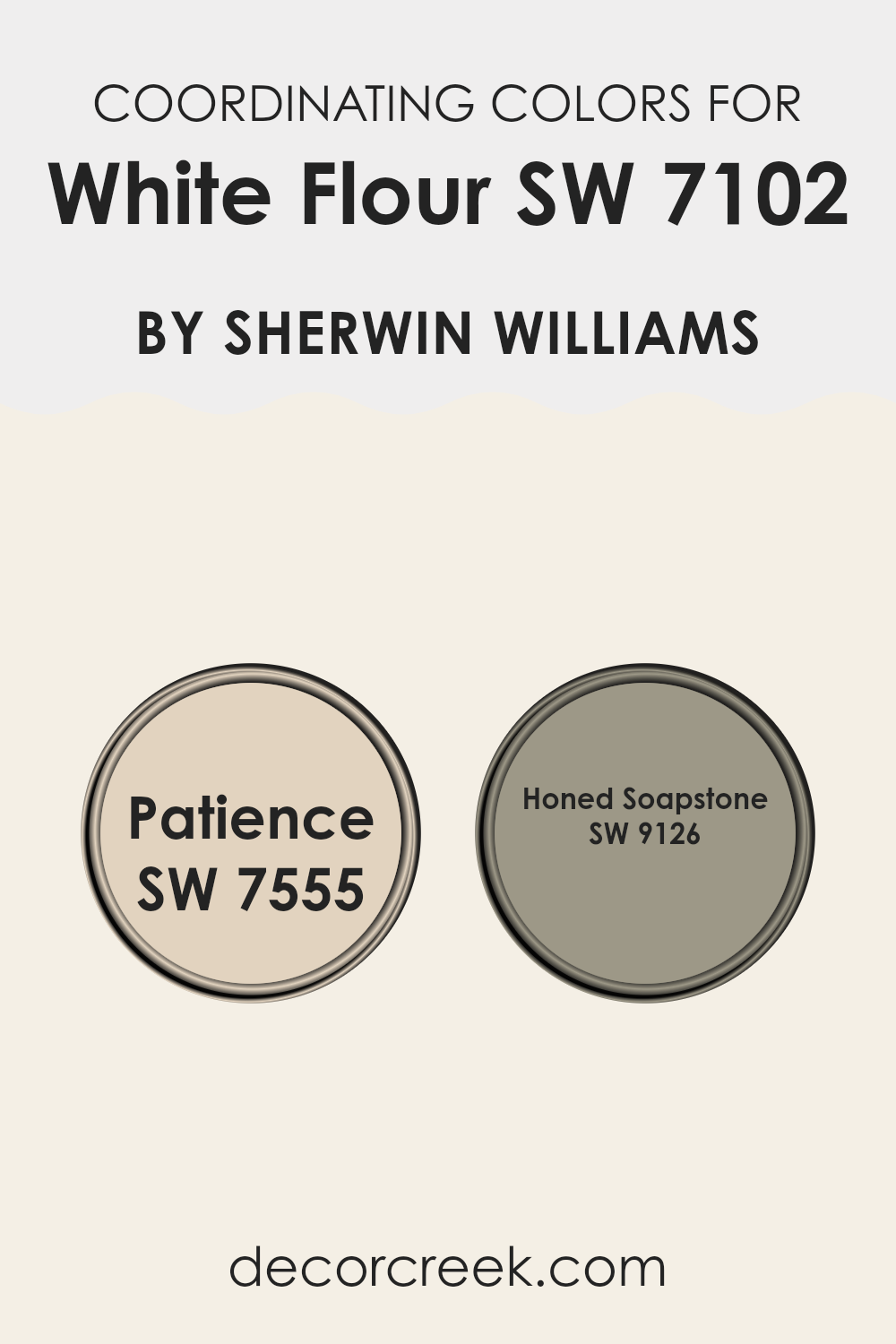
Best Coordinating Colors to use with White Flour SW 7102 by Sherwin Williams this year.
Coordinating colors are hues selected to harmonize and complement each other when used together in a room. These colors can be contrasted or from similar palettes, depending on the desired effect.
For instance, when decorating with a base of a neutral shade like White Flour by Sherwin Williams, choosing coordinating colors can improve the overall look without feeling too strong against the primary color. Coordinating colors work by balancing visual interest and continuity in design, creating a cohesive atmosphere throughout the room.
SW 7555 – Patience is a subtle beige that offers a warm and soothing effect, making it an excellent companion to the clean and crisp tone of White Flour. It’s a perfect choice for creating a soft backdrop or for adding depth while maintaining a subdued and welcoming feel in a room.
On the other hand, SW 9126 – Honed Soapstone presents a deeper gray that brings a strong yet balanced contrast to lighter shades like White Flour. This color adds a touch of grounding and definition to areas, ideal for accent walls or cabinetry for those looking to introduce some intensity without feeling too much in the room’s look. Together, these colors work smoothly with White Flour to create a harmonious palette.
You can see recommended paint colors below:
- SW 7555 Patience
- SW 9126 Honed Soapstone
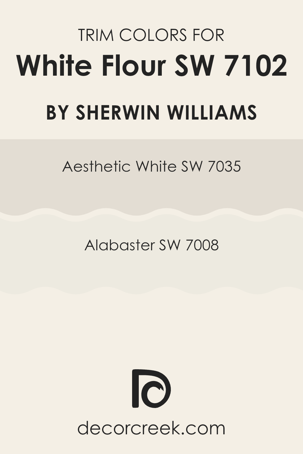
Trendy Trim Colors of White Flour SW 7102 by Sherwin Williams to use this year.
Trim colors are used to accentuate the architectural features of a room like door frames, window casings, and baseboards, contrasting with the main wall color to create a defined and finished look.
For White Flour by Sherwin Williams, incorporating trim colors such as Aesthetic White SW 7035 and Alabaster SW 7008 can improve the overall look by adding a subtle contrast that highlights the clean, fresh appeal of the main wall color. Such selections not only define boundaries clearly but also contribute to a harmonious palette that complements the light and airy feel of the primary paint shade.
Aesthetic White SW 7035 is a soft, muted white with subtle beige undertones that give it a warm and inviting feel. This color works beautifully as a trim, offering a gentle contrast against the brighter White Flour, creating a layered and welcoming feel in any room. On the other hand, Alabaster SW 7008 is a slightly warmer shade with creamy undertones, providing a richer depth when used as a trim. Its use alongside White Flour improves rooms, making them feel cozy yet fresh, and perfectly framing the walls with a soothing outline.
You can see recommended paint colors below:
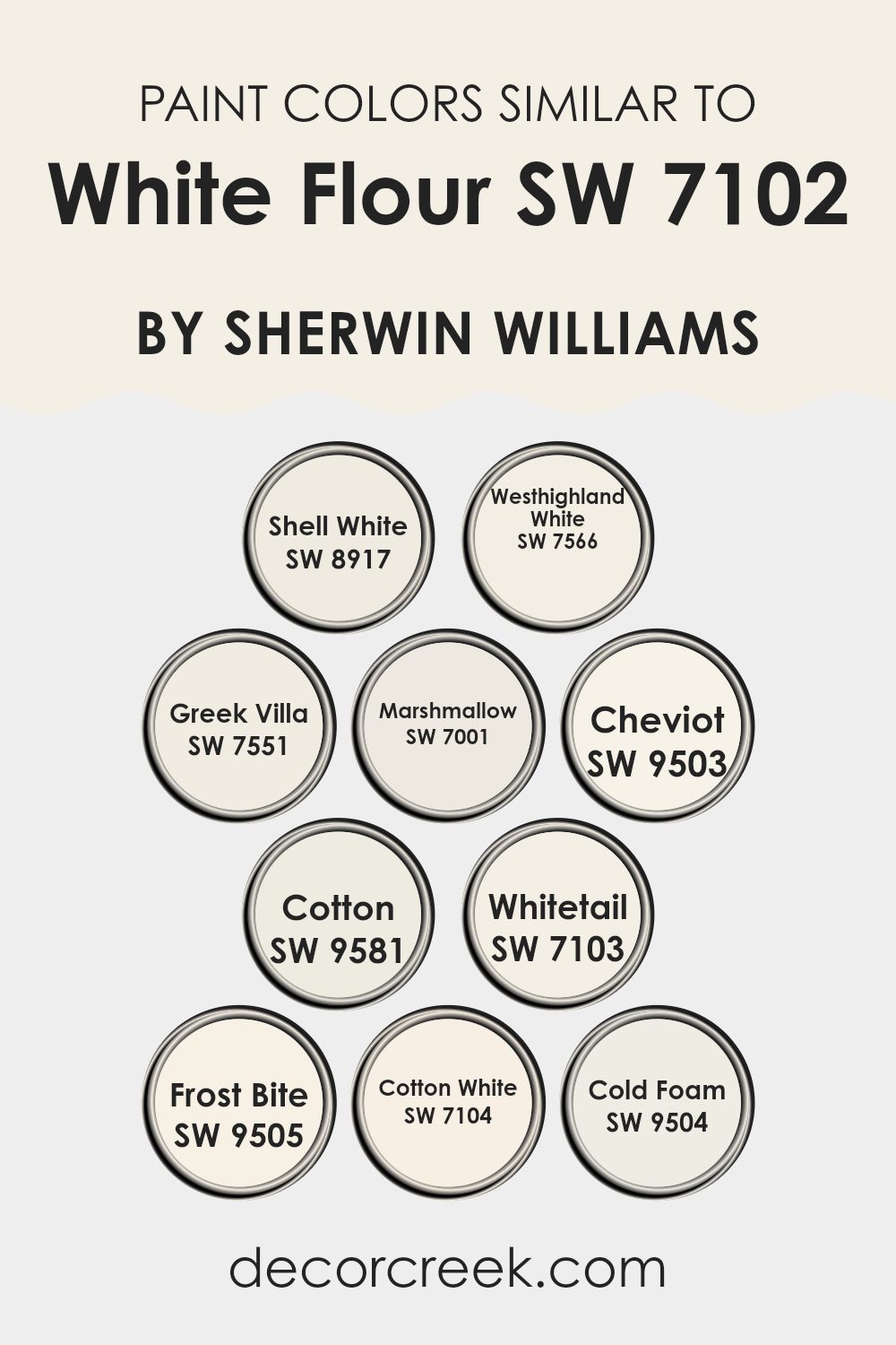
Evergreen Colors Similar to White Flour SW 7102 by Sherwin Williams
Similar colors play a crucial role in interior design by creating a harmonious and seamless look that improves the aesthetic appeal of a room. When dealing with shades close to White Flour by Sherwin Williams, such as Shell White, Westhighland White, and Greek Villa, the subtle variations in tone help in achieving a layered yet cohesive style.
These slight differences can accentuate architectural details, create depth, or provide a gentle contrast that adds interest without feeling too strong for the senses. For instance, using Marshmallow and Cheviot in the same room can finely highlight different elements like trim or furniture, drawing attention in a soft and gentle way.
Colors like Cotton, Whitetail, and Frost Bite are useful when you want to maintain a light and airy feel but introduce slight contrasts. Cotton offers a clean and refreshing look while Whitetail brings a slightly warmer hue that can make a room feel more inviting.
Frost Bite has a cool undertone that works well in achieving a crisp, modern look. Similarly, Cotton White and Cold Foam provide options for those looking to keep a neutral palette but with a hint of distinction, ensuring the room remains visually interesting. Each of these colors complements White Flour by providing options that stay true to a light palette while offering a chance to fine-tune the decor to fit personal tastes or specific design needs.
You can see recommended paint colors below:
- SW 8917 Shell White
- SW 7566 Westhighland White
- SW 7551 Greek Villa
- SW 7001 Marshmallow
- SW 9503 Cheviot
- SW 9581 Cotton
- SW 7103 Whitetail
- SW 9505 Frost Bite
- SW 7104 Cotton White
- SW 9504 Cold Foam
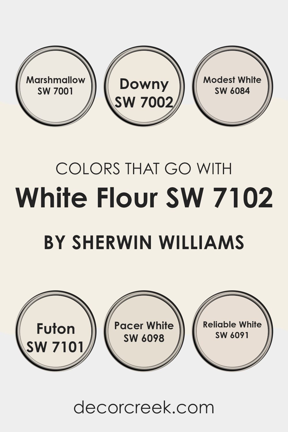
Colors that Go With White Flour SW 7102 by Sherwin Williams
Choosing the right colors to complement White Flour SW 7102 by Sherwin-Williams is crucial as it improves the look and mood of a room. White Flour SW 7102 is a flexible shade, and when paired with appropriate colors, it creates a smooth and harmonious look. For instance, SW 7001 – Marshmallow is another soft white that when used with White Flour, offers a subtle contrast, perfect for a clean and cohesive environment. Similarly, SW 7002 – Downy, which is a slightly warmer white, blends beautifully with White Flour for a cozy feel.
SW 6084 – Modest White carries a hint of grey, adding depth and interest to the combination with White Flour, making it ideal for areas that want to maintain a neutral yet enriched palette. SW 7101 – Futon, also a calm and muted color, complements White Flour in creating a peaceful and comfy atmosphere, good for relaxed settings.
SW 6098 – Pacer White, which leans towards a beige tone, provides a soft warmth to the cooler tone of White Flour, perfect for inviting living areas. Lastly, SW 6091 – Reliable White has a crisp clarity that pairs well with White Flour, ensuring that the room remains bright and airy, especially suited for well-lit or smaller areas to give an impression of openness. Together, these colors work in harmony to craft visually pleasing and balanced rooms.
You can see recommended paint colors below:
- SW 7001 Marshmallow
- SW 7002 Downy
- SW 6084 Modest White
- SW 7101 Futon
- SW 6098 Pacer White
- SW 6091 Reliable White
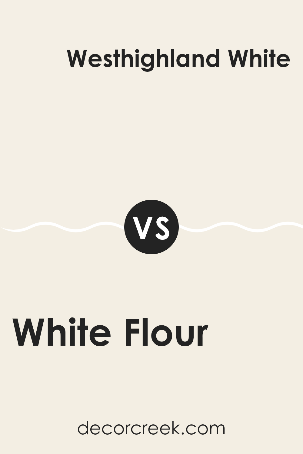
White Flour SW 7102 by Sherwin Williams vs Westhighland White SW 7566 by Sherwin Williams
White Flour and Westhighland White by Sherwin Williams are two popular shades, but they have some subtle differences. White Flour is a bright, pure white with a refreshing and clean look.
It’s great for making areas appear more open and airy. On the other hand, Westhighland White is a slightly warmer white with a touch of creaminess, which gives it a cozy and inviting quality.
This makes it ideal for settings where a softer, more gentle white is preferred, like living rooms or bedrooms. While both colors can be used to give walls a clean, fresh appearance, the choice between them depends on the specific atmosphere you want to create in your room.
You can see recommended paint color below:
White Flour SW 7102 by Sherwin Williams vs Cotton SW 9581 by Sherwin Williams
White Flour and Cotton by Sherwin Williams are two subtly distinct shades of white, each offering a unique ambiance for interior areas. White Flour is a soft, warm white with a gentle creamy hint, making it ideal for creating a cozy and inviting atmosphere.
This shade pairs beautifully with soft pastels and earth tones, improving rooms with a subtle richness. In contrast, Cotton is a cooler shade of white that carries a crisp and clean feel. Its slightly bluish undertone makes it perfect for achieving a fresh and clean look, particularly effective in modern and minimalist decor settings.
Both colors reflect light well, making rooms appear brighter and more spacious. However, the choice between them depends on the desired mood and the specific style of the room, with White Flour offering warmth and Cotton providing a sharp, contemporary vibe. Each serves as a flexible backdrop for various decor styles and color palettes.
You can see recommended paint color below:
White Flour SW 7102 by Sherwin Williams vs Whitetail SW 7103 by Sherwin Williams
White Flour and Whitetail by Sherwin Williams are both shades of white, but they have subtle differences. White Flour is a clean, pure white with no obvious undertones, making it a great choice if you want a bright and fresh look. It reflects more light, which can help make a small room appear bigger and more open.
On the other hand, Whitetail is slightly warmer. This color also has minimal undertones, but compared to White Flour, it offers a softer and more inviting warmth, making it ideal for creating a cozy atmosphere in a room. It’s especially fitting for living areas or bedrooms where a gentle, calming feel is desired.
Both colors are flexible and can be used in various settings, from modern to traditional, depending on the furnishings and decor. Choosing between them depends on the mood you want to set and how much natural light your room receives.
You can see recommended paint color below:
White Flour SW 7102 by Sherwin Williams vs Greek Villa SW 7551 by Sherwin Williams
White Flour and Greek Villa, both by Sherwin Williams, are two elegant but subtly different shades of white. White Flour is a cleaner and brighter white, giving a sharp, fresh look that works well in modern areas. It has a slight crispness to it, which makes it excellent for a base color, reflecting natural light beautifully and making rooms appear larger.
On the other hand, Greek Villa has a warmer undertone. It’s not just plain white but has a creamy touch, which adds a cozy and welcoming feel. This makes Greek Villa a great choice for living areas and bedrooms where a softer ambiance is desired. It pairs well with softer hues and natural materials like wood.
Both colors are flexible and can improve other colors well. The choice between them depends on the mood you want to create – sharper and more vibrant with White Flour, or warmer and soothing with Greek Villa.
You can see recommended paint color below:
White Flour SW 7102 by Sherwin Williams vs Marshmallow SW 7001 by Sherwin Williams
White Flour and Marshmallow by Sherwin Williams are two popular white shades with subtle differences. White Flour is a crisp, bright white with a slightly warm undertone, making it great for areas where you want a fresh and clean look. It reflects light beautifully and can help make small areas appear larger and more open.
On the other hand, Marshmallow has a softer, slightly creamier tone than White Flour. It’s an ideal choice for creating a cozy, welcoming atmosphere in a room. This color can be especially good in areas with less natural light, as it won’t appear as stark as a purer white might.
When choosing between these two, consider the mood you want to set and the existing lighting in your room. White Flour is better for a sharp, modern look, while Marshmallow suits a gentler, more relaxed vibe. Both colors are flexible and can work well in various settings, from kitchens to bedrooms.
You can see recommended paint color below:
White Flour SW 7102 by Sherwin Williams vs Frost Bite SW 9505 by Sherwin Williams
White Flour and Frost Bite by Sherwin Williams are two distinct shades that can set different moods in a room. White Flour is a pure, clean white that helps to create a bright and open feel in any room. It’s great for making small areas appear larger and for boosting natural light, making it a solid choice for kitchens and bathrooms.
On the other hand, Frost Bite is a cooler tone with a subtle blue undertone, giving it a fresher and slightly more energetic vibe compared to the neutral base of White Flour. This color works well in areas where a calm but slightly more colorful atmosphere is desired, such as bedrooms or home offices.
Both colors offer a clean backdrop, but Frost Bite adds a hint of personality without feeling too strong in a room, while White Flour provides a classic simplicity that is flexible in any setting.
You can see recommended paint color below:
White Flour SW 7102 by Sherwin Williams vs Cheviot SW 9503 by Sherwin Williams
White Flour SW 7102 and Cheviot SW 9503, both by Sherwin Williams, are two light shades that have subtle yet distinct differences. White Flour is a clean, pure white that provides a sense of brightness and spaciousness to any room. It reflects light well, making it a great choice for areas you want to appear larger and more open.
On the other hand, Cheviot is slightly warmer and has undertones that can be described as soft and creamy. This color isn’t pure white but leans towards a very light beige, giving it a cozy warmth which makes it ideal for creating a welcoming and comfortable atmosphere, especially in living areas or bedrooms.
Both colors work well in various lighting conditions, but White Flour is typically best for achieving a crisp, fresh look, whereas Cheviot’s subtle warmth offers a gentle, soothing feel. Depending on the mood and function of the room, each color has its strengths, with White Flour being more flexible for various styles and Cheviot ideal for a softer, more intimate setting.
You can see recommended paint color below:
White Flour SW 7102 by Sherwin Williams vs Cotton White SW 7104 by Sherwin Williams
White Flour and Cotton White by Sherwin Williams are both shades of white paint that offer subtle differences suitable for various areas. White Flour is a clean and fresh white with a slight hint of warmth, making it inviting and flexible for different room styles, from modern to traditional. This shade works well in areas where you want to create a soft and welcoming atmosphere.
On the other hand, Cotton White steps slightly towards the cooler side of the white spectrum. It has an almost imperceptible touch of gray, which can help in reducing the starkness sometimes associated with pure whites. This color is ideal for areas that get a lot of natural light, as it helps in maintaining a crisp and calm environment.
Both colors are excellent choices for creating bright and airy areas. The selection between White Flour and Cotton White largely depends on the lighting and the mood you aim to achieve in your room.
You can see recommended paint color below:
White Flour SW 7102 by Sherwin Williams vs Cold Foam SW 9504 by Sherwin Williams
White Flour and Cold Foam, both by Sherwin Williams, are subtle yet distinct shades that can brighten up a room. White Flour is a clean and crisp white that leans towards a pure, unblemished look. It brings a feeling of freshness and simplicity to any room, making it a great choice for creating a bright and airy atmosphere.
On the other hand, Cold Foam is also a light shade but it has a grey undertone that gives it slightly more depth compared to White Flour. This color can add a modern touch to interiors, offering a bit more character while still keeping the room light and open.
Whether you choose White Flour for its straightforward purity or Cold Foam for its hint of contemporary grey, both colors are flexible. They work excellently in areas that aim for a minimalist or modern look, providing a neutral backdrop that can support various decor styles and color accents.
You can see recommended paint color below:
White Flour SW 7102 by Sherwin Williams vs Shell White SW 8917 by Sherwin Williams
White Flour and Shell White are both shades produced by Sherwin Williams, but they have subtle differences that set them apart. White Flour is a crisp, clean white with a neutral base that makes it incredibly flexible for use in any room. It reflects light beautifully, making rooms appear larger and more open.
On the other hand, Shell White has a slightly warmer undertone, giving it a cozy and soft appearance. This warmth makes it ideal for areas where a more inviting, less stark atmosphere is desired. While still light and airy, Shell White offers a hint of creaminess that improves the feeling of warmth in a room.
Overall, although both colors are white, the choice between them depends on the mood you want to create. White Flour is great for a sharp, fresh look, whereas Shell White works well for a gentler, warmer vibe.
You can see recommended paint color below:
After reading about Sherwin Williams SW 7102 White Flour, I’ve learned quite a lot about this paint color. It’s clear to me that White Flour is a wonderful choice if you want a room to feel bright and fresh. This color is like a soft, bright white but with a touch of warmth which makes it perfect for any room, whether it’s a busy kitchen or a quiet place to read.
I found out that it works very well in rooms that don’t have a lot of natural light. Instead of making the room feel dull, it actually helps brighten things up which is pretty neat. If you have a small room or a room that feels a bit dark, painting it with White Flour can make the room seem bigger and more inviting.
Additionally, the review said that White Flour is easy to match with other colors. Whether you have furniture in bold colors or softer tones, this paint can go along with anything which makes decorating a lot easier. No need to worry too much about whether things will match!
In summary, if you’re looking for a paint color that is easy on the eyes, makes rooms look more spacious and bright, and easy to match with any decor, then SW 7102 White Flour by Sherwin Williams is an excellent choice.
Ever wished paint sampling was as easy as sticking a sticker? Guess what? Now it is! Discover Samplize's unique Peel & Stick samples.
Get paint samples

