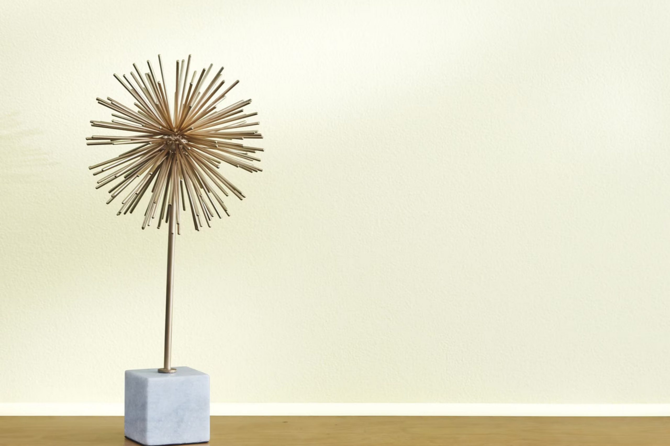
Are you looking for the perfect white paint that isn’t too stark or too creamy? Let me introduce you to OC-124 Alpine White by Benjamin Moore, a color that might just be the solution you’re searching for. As someone constantly looking to freshen up my living rooms without overpowering them, I found Alpine White strikes an excellent balance. This shade of white provides a subtle warmth that makes any room feel welcoming without altering the mood or tone you’ve already established with your décor and furniture.
It’s soft enough to soothe and crisp enough to make your trims, walls, and ceilings pop. Whether you’re painting a sunny kitchen or a cozy bedroom, Alpine White adjusts beautifully to different lighting conditions, maintaining its integrity without turning dull or too bright.
For those of you considering a new painting project, Alpine White offers flexibility that works wonderfully across various rooms and styles. Its adaptability to both modern and traditional aesthetics makes it a reliable choice for your home renovation or a quick refresh.
In my experience, using this paint has consistently delivered results that both I and my guests love, and I’m excited to share more about how it performs in various rooms around the house.
What Color Is Alpine White OC-124 by Benjamin Moore?
Alpine White OC-124 by Benjamin Moore is a pristine and adaptable shade of white that brings freshness and clarity to any room. With a subtle cool undertone, this color creates a clean and open feel, making rooms appear more roomy and bright. Its flexibility allows it to blend seamlessly with various interior styles, ranging from minimalist and modern to traditional and coastal.
Ideal for living rooms, kitchens, and bedrooms, Alpine White works splendidly as a base color, providing a neutral backdrop that highlights other design elements. It complements bold and vibrant accents, such as colorful artwork and textured fabrics, allowing them to stand out without overpowering the room.
When pairing with materials, Alpine White connects beautifully with natural wood, adding warmth to the coolness of the shade. It also matches well with metallic finishes like brass or chrome, creating a sleek, clean look. Textures such as linen, wool, and cotton look particularly striking against this backdrop, offering a contrast that is both visually appealing and comfortable.
Altogether, Alpine White OC-124 is an excellent choice for those looking to refresh their home with a bright and welcoming atmosphere.
Is Alpine White OC-124 by Benjamin Moore Warm or Cool color?
Alpine White is a popular paint color from Benjamin Moore that homeowners often choose for its crisp, clean look. This color is a soft white, which means it doesn’t have the starkness of a pure white. This makes it easier on the eyes and very adaptable, suitable for almost any room in a house.
Because of its neutral tone, Alpine White is great for walls, creating a fresh backdrop that allows furniture and decor to really stand out. It also reflects light well, making smaller rooms appear larger and more open. For those looking to update their home without going too bold, Alpine White is a go-to option.
It’s especially useful in rooms that don’t get much natural light, as it helps brighten them. Additionally, it pairs nicely with other colors, so adding colorful accents or decorations can really bring a room to life. Whether updating a kitchen, bathroom, living room or bedroom, this color provides a clean, fresh look that’s beautiful and enduring.
Undertones of Alpine White OC-124 by Benjamin Moore
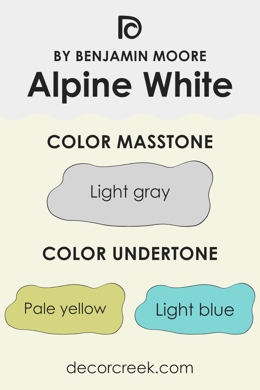
Alpine White is a popular shade that might look simply white at first glance, but it actually carries a mix of subtle undertones that can significantly influence the feeling of a room. These undertones include pale yellow, light blue, light purple, mint, pale pink, lilac, and grey. These are not bold colors, but their slight hints can shift the white toward warmer or cooler tones depending on the lighting and surrounding colors.
In interior settings, undertones affect how we perceive color. For example, a white with yellow undertones can make a room feel warmer and cozier, while blue undertones might give a crisper, cleaner look. The mix of undertones in Alpine White makes it a flexible choice, adjusting slightly under different lighting conditions. In natural light, you might notice a soft glow, enhancing a welcoming vibe.
On interior walls, the variety of undertones in this particular white means it can complement a wide range of décor styles and color schemes. The grey undertone helps to anchor the color, preventing it from feeling too floaty or overly bright, which can be beneficial in rooms with lots of natural light.
Meanwhile, the hints of mint or lilac can subtly interact with furnishings in similar or contrasting hues, allowing for a harmonious yet dynamic interior. This dynamic nature means Alpine White can be a solid choice for anyone looking to refresh their room without committing to a strong color statement.
decorcreek.com
What is the Masstone of the Alpine White OC-124 by Benjamin Moore?
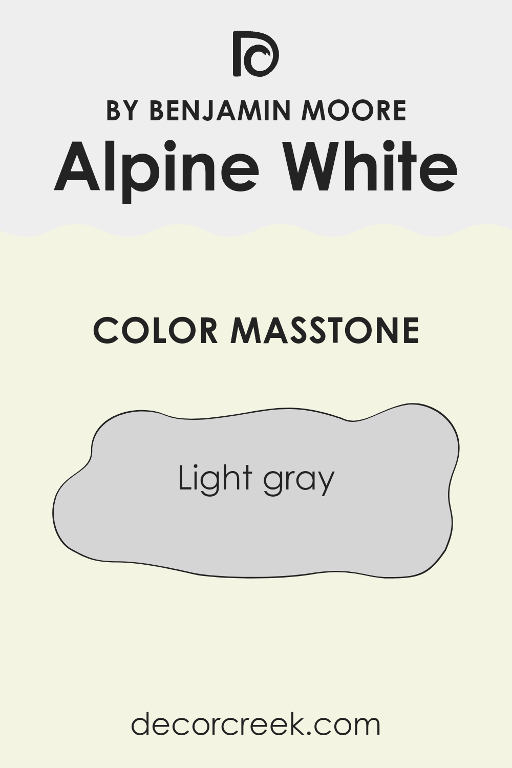
Alpine White OC-124 by Benjamin Moore has a masstone of light gray, color code #D5D5D5. This base tone gives the paint a clean and gentle appearance, making it easy to fit into most home environments.
Its light gray hue reflects natural light beautifully, brightening up rooms that may lack direct sunlight, thus making them appear larger and more open. This flexibility means that Alpine White can be used across a range of styles and decor, from modern to rustic. It works particularly well in living areas, bedrooms, and kitchens where a fresh, calm atmosphere is often desired.
Furthermore, being a neutral color, it pairs effortlessly with various other colors and textures, allowing homeowners to add personal touches through furniture and accessories without the walls overpowering the room. This color is an excellent choice for creating a welcoming and clean setting in any home.
How Does Lighting Affect Alpine White OC-124 by Benjamin Moore?
Lighting plays a crucial role in how we perceive colors. Different light sources can make a paint color look completely different in appearance. A color like the Alpine White by Benjamin Moore can show varying shades depending on whether it’s under natural or artificial light.
Under artificial lighting, such as LED or fluorescent light, the Alpine White may appear slightly cooler or even take on a bluish tint. This is because artificial lights often lack the full spectrum of sunlight, influencing the way colors look. In contrast, in natural sunlight, the Alpine White will look truer to its color swatch, showing its pure, crisp shade as it reflects the broad spectrum of natural light.
The direction a room faces affects how the color is perceived because of the quality and amount of natural light entering the room. In north-facing rooms, light tends to be cooler and more subdued. Here, Alpine White might appear slightly more muted and less warm, maintaining a clean and neutral look without becoming too stark.
In south-facing rooms, there’s an abundance of bright, warm light throughout the day. This will make the Alpine White look brighter and can bring out its underlying warm tones, making the room feel airy and light.
East-facing rooms get plenty of light in the morning, which is generally warm; then, the light becomes cooler as the day progresses. Alpine White will appear livelier and warmer in the morning but will neutralize as the day moves on.
West-facing rooms receive intense evening light that is warm and golden. This will cause the Alpine White to look warmer in the afternoons and evenings, often glowing somewhat during sunset.
This varied interaction between the color and the room’s directional lighting demonstrates the important relationship between light and color. Making smart choices regarding color placement depending on room orientation and light source can truly optimize the way colors enhance a room.
decorcreek.com
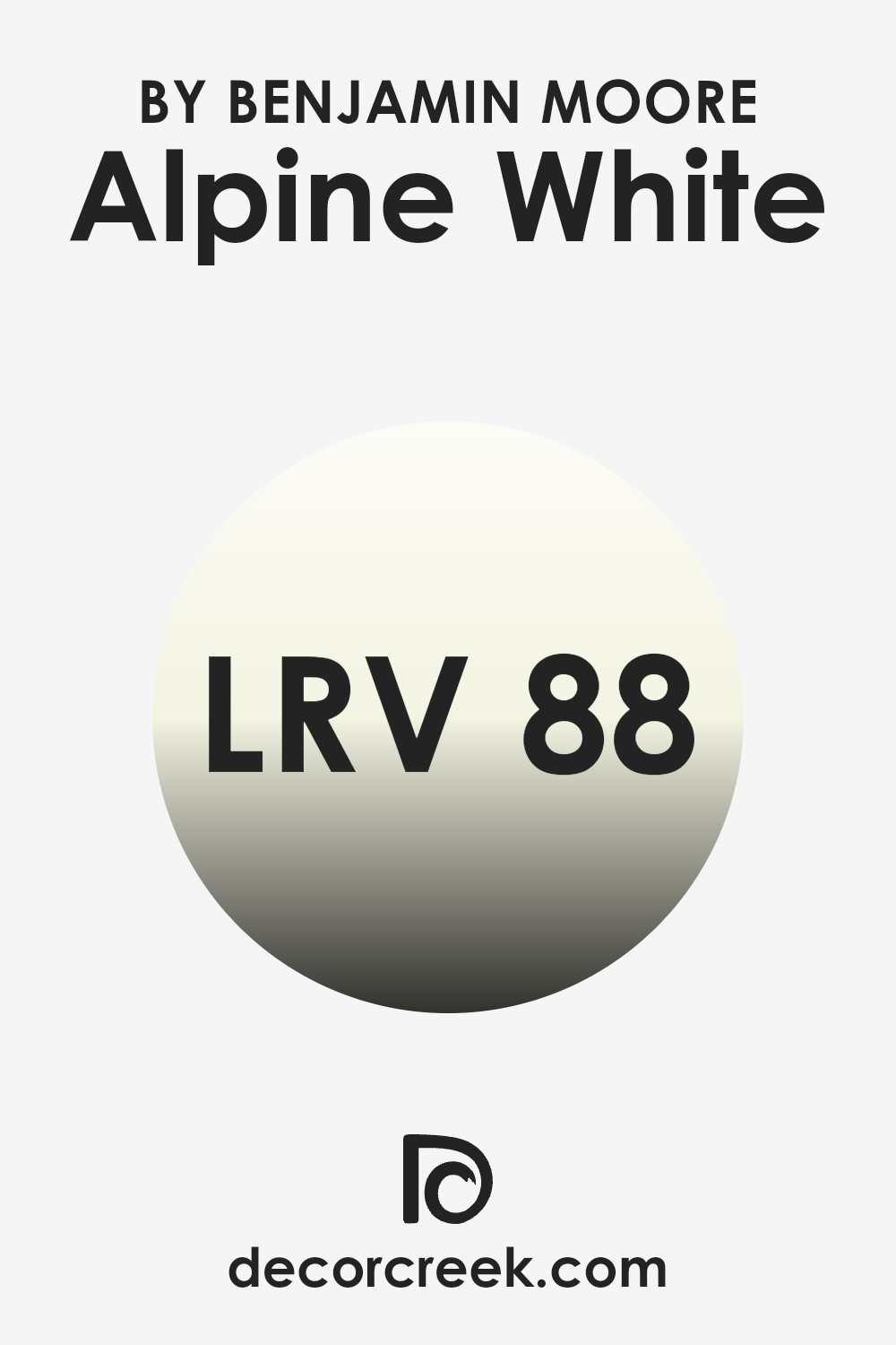
What is the LRV of Alpine White OC-124 by Benjamin Moore?
LRV, or Light Reflectance Value, is a measure used to determine how much light a paint color will reflect or absorb when applied to a surface. It’s measured on a scale where the higher the number, the more light the color reflects. This value is particularly useful when deciding on a paint color for a room, as it affects how bright or dark the room will appear.
Colors with a high LRV are great for making rooms appear larger and more open, since they reflect more light around the room. With an LRV of 87.62, Alpine White is a color that reflects a lot of light, making it an excellent choice for rooms that you want to appear bright and airy.
When used on walls, this high LRV means that Alpine White will help to bounce natural light around the room, reducing the need for artificial lighting and making the room feel more welcoming. This is especially beneficial in smaller or darker rooms where maximizing light is essential. The reflective quality of a color with such a high LRV can also enhance the overall ambience, making it feel fresh and clean.
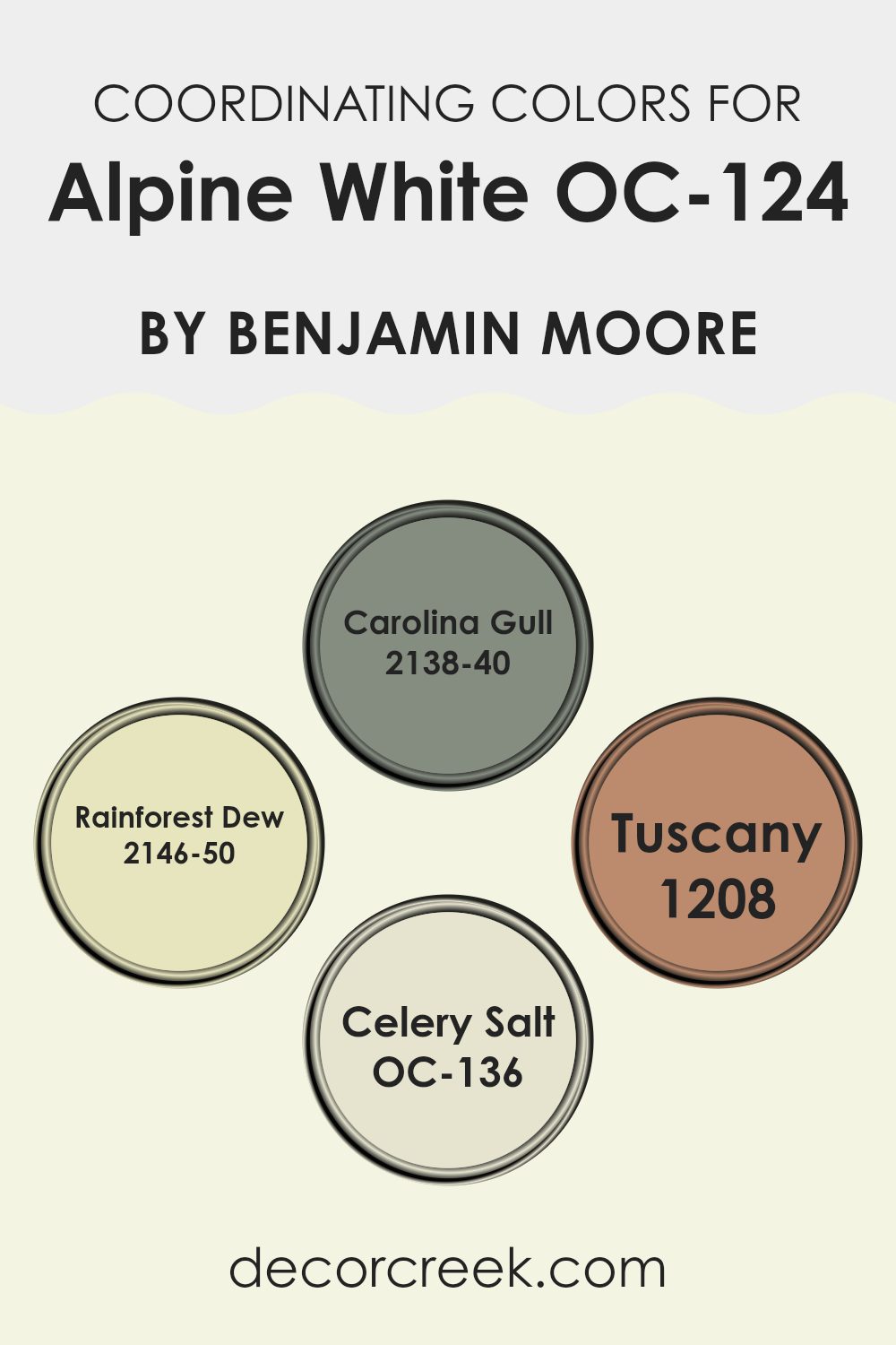
Coordinating Colors of Alpine White OC-124 by Benjamin Moore
Coordinating colors are shades that complement or enhance the main color in a design scheme, creating a balanced and aesthetically pleasing look. When working with a neutral base such as Alpine White, selecting coordinating colors can add depth and interest to your room without overpowering the senses. Each coordinating color can bring its own unique vibe while still maintaining harmony with the main shade.
Carolina Gull is a deep gray with green undertones, perfect for adding some gravity to a room dominated by a lighter shade like Alpine White. It works well in areas where you want to establish a sense of calmness without resorting to pure black or navy. Rainforest Dew, on the other hand, is a soft, gentle green that brings a touch of freshness and nature into a room.
It reflects light in a subtle manner, promoting a light and airy feel when paired with a crisp white. Moving on to Tuscany, this is a warm, earthy hue reminiscent of terracotta. It adds a cozy, inviting feel to any room, complementing the coolness of Alpine White with its rich, sunbaked tone. Lastly, Celery Salt is a muted green with a hint of gray, offering a soft contrast that’s easy on the eyes. It’s ideal for those looking to incorporate a natural element into their interiors while maintaining a clean and coordinated look.
You can see recommended paint colors below:
- 2138-40 Carolina Gull
- 2146-50 Rainforest Dew
- 1208 Tuscany
- OC-136 Celery Salt
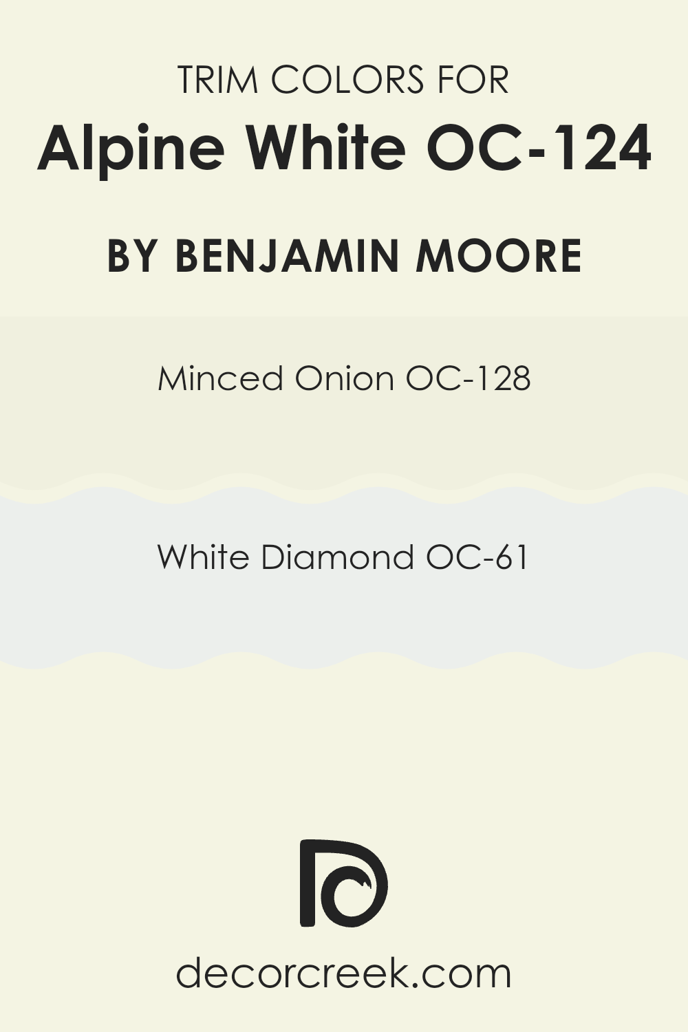
What are the Trim colors of Alpine White OC-124 by Benjamin Moore?
Trim colors are essentially accents used in decorating rooms, specifically applied to areas like door frames, baseboards, window frames, and moldings to enhance the overall aesthetic of a room. When used with a base wall color, such as Alpine White by Benjamin Moore, trim colors can add depth and dimension, making the room feel more defined and cohesive.
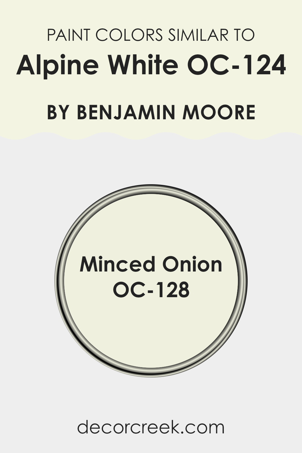
Selecting the right trim colors is crucial because they act as a subtle frame that gives a finished look to the walls, bringing out the best features of the main color. Minced Onion OC-128 is a muted, almost understated off-white that adds a gentle contrast when used as a trim color with brighter whites like Alpine White.
This subtle distinction helps in breaking the monotony without overpowering the primary color. On the other hand, White Diamond OC-61 offers a slightly brighter and cleaner look, creating a crisper edge to the rooms and highlighting the clean, fresh feel of Alpine White. Both these colors are gentle and effective in enhancing the beauty of the main wall while keeping the overall look coherent and polished.
You can see recommended paint colors below:
- OC-128 Minced Onion
- OC-61 White Diamond
Colors Similar to Alpine White OC-124 by Benjamin Moore
Choosing colors that are similar to a particular shade, such as Alpine White OC-124 by Benjamin Moore, is essential for maintaining a cohesive and harmonious look in your room. When colors closely align in their tones and undertones, they easily blend together, creating a smooth visual flow that enhances the overall aesthetics of a room without causing abrupt transitions. Such harmonization is particularly useful in open-plan areas where living rooms merge and you want each zone to feel connected yet subtly differentiated.
One similar color to Alpine White is Minced Onion OC-128, also by Benjamin Moore. Minced Onion OC-128 is a slightly deeper, creamy off-white that brings warmth to rooms while maintaining a clean and airy feel. This color works well in rooms where you need a touch of coziness without overpowering the senses with stronger color hues.
It pairs beautifully with the crispness of Alpine White, providing just enough contrast to define rooms while remaining in harmony with the brighter white. This approach to using similar colors can effectively enhance the elegance of your home with minimal effort, ensuring a polished look that ties different design elements together seamlessly.
You can see recommended paint color below:
- OC-128 Minced Onion
How to Use Alpine White OC-124 by Benjamin Moore In Your Home?
Alpine White OC-124 by Benjamin Moore is a fresh and adaptable paint color that can brighten up any room in your house. This shade of white is light and has a subtle warmth to it, making it perfect for creating a welcoming atmosphere. Whether you’re thinking about repainting your living room, bedroom, or even your kitchen, Alpine White can work wonders.
In the living room, it can create a clean and open feel, letting your furniture and decor pieces stand out. Using Alpine White in your bedroom can make the room appear bigger and airier, offering a calm environment that’s ideal for relaxation.
In the kitchen, this color can help reflect light, which makes the room look cleaner and more inviting. Moreover, Alpine White goes well with various other colors, so you can pair it with bold colors, like navy or dark green, for a striking contrast, or keep things gentle by pairing it with pastels for a soft look. This flexibility allows you to personalize your room while keeping a neat and tidy vibe.
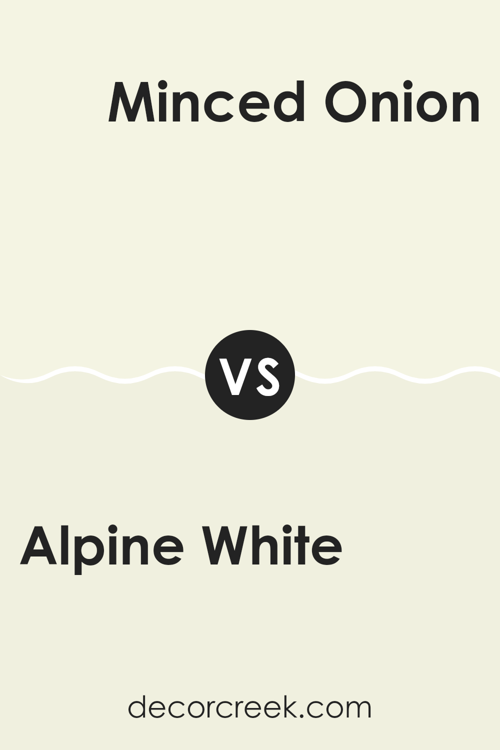
Alpine White OC-124 by Benjamin Moore vs Minced Onion OC-128 by Benjamin Moore
Alpine White and Minced Onion by Benjamin Moore are two subtle shades that can make any room feel fresh and clean. Alpine White has a bright and slightly cool tone, making it a great choice for a crisp, clean look in your room. It reflects light well, which can make smaller rooms appear larger and more open.
On the other hand, Minced Onion has a warmer undertone. It’s still very light, but with a hint of beige, giving it a cozy and welcoming feel. This makes it perfect for rooms where you want a touch of warmth without darkening the room too much.
Both colors are neutral enough to work with a wide range of decor styles and can act as a backdrop for more vibrant colors or stand alone for a minimalist look. Choosing between them comes down to whether you prefer a cooler or warmer atmosphere in your room.
You can see recommended paint color below:
- OC-128 Minced Onion
After reading about OC-124 Alpine White by Benjamin Moore, I’ve learned that this paint color is really special. It’s not just plain white; it has this soft and comfy feel that makes any room seem cozy and welcoming. Whether you’re painting a small room or a big one, Alpine White can make the walls look fresh and clean.
One of the best things about using Alpine White in a room is how well it gets along with other colors. Whether you have bright cushions, colorful curtains, or dark furniture, this shade of white matches perfectly with everything. It’s like the friendly kid in class who everyone likes!
Using this paint is a good idea if you’re thinking of changing your room a bit without making everything look very different. It lightens up dark corners and makes small rooms look bigger. Also, because it’s by Benjamin Moore, you can trust that the quality is top-notch, so the color will stay looking great for a long time.
To sum it up, OC-124 Alpine White by Benjamin Moore is a fantastic choice if you want a paint color that is soft, makes other colors pop more, and can brighten any room. If you’re thinking about giving your room a new look, this paint could be the perfect start.
Ever wished paint sampling was as easy as sticking a sticker? Guess what? Now it is! Discover Samplize's unique Peel & Stick samples.
Get paint samples

