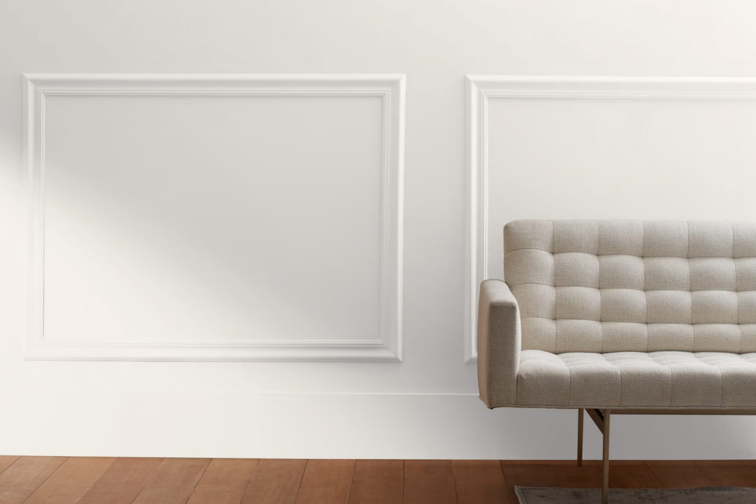
Imagine standing in a bright, open area, where everything feels calm and inviting. That’s the magic of OC-145 Atrium White by Benjamin Moore. Whenever I look at this color, it reminds me of a gentle, warm hug. It’s not just white; it carries a soft touch that feels like morning sunlight gently pouring into a room. This shade isn’t stark or intense; it’s like a whisper that suggests coziness and peace.
Atrium White has a way of blending seamlessly into any room, making it feel more open and airy. Whether you’re thinking of painting a bedroom, living room, or even just some accent walls, it works wonders. It complements various styles, from modern to traditional, offering a subtle backdrop that enhances the other elements in a room.
It’s also flexible enough to play well with other colors. Pair it with bold, vibrant hues for a striking contrast, or with soft pastels and neutrals for a soothing palette. For anyone considering a refresh or simply wanting to create a peaceful environment, OC-145 Atrium White is a wonderful choice.
It brings lightness and softness, inviting you to relax and enjoy the room around you.
What Color Is Atrium White OC-145 by Benjamin Moore?
Atrium White by Benjamin Moore is a soft, warm white with subtle peachy undertones. It is often appreciated for its ability to brighten up areas without feeling sterile or cold. This makes it a flexible choice for various interior styles, including traditional, farmhouse, and transitional designs. Its gentle warmth can complement both classic and modern elements, making it a great choice for creating a cozy and inviting atmosphere.
In a traditional setting, Atrium White can pair beautifully with rich, dark woods, such as mahogany or walnut, highlighting their depth and elegance. In a farmhouse-style home, it looks lovely alongside distressed woods, burlap, and cotton, adding brightness while maintaining a rustic charm.
In more contemporary rooms, this color works well with sleek metals, like brushed nickel or chrome, and plush fabrics, such as velvet or soft wools, providing a pleasing contrast to cooler tones. When it comes to textures, Atrium White enhances the natural beauty of stone surfaces like marble and granite, giving them a clean canvas to stand out.
It also complements natural fiber rugs, woven baskets, and soft linens, contributing to an overall sense of comfort and warmth in a room.
Is Atrium White OC-145 by Benjamin Moore Warm or Cool color?
Atrium White OC-145 by Benjamin Moore is a popular choice for homeowners looking for a flexible and subtle wall color. It’s a soft white with slight pink undertones, which sets it apart from other whites. This unique feature helps bring warmth and comfort into a room, making rooms feel inviting and cozy.
Contrary to stark, cold whites, Atrium White adds a gentle glow to any room, influenced by its surroundings and lighting. This color works well in various rooms, from living areas to bedrooms, providing a neutral backdrop that won’t clash with other colors or decor.
It pairs beautifully with both traditional and modern furnishings, allowing homeowners flexibility in styling. Atrium White complements natural light with a soft, welcoming appearance and can make smaller areas appear more open and airy. It’s particularly effective in achieving a harmonious balance, ensuring the room does not feel too bright or intense.
Undertones of Atrium White OC-145 by Benjamin Moore
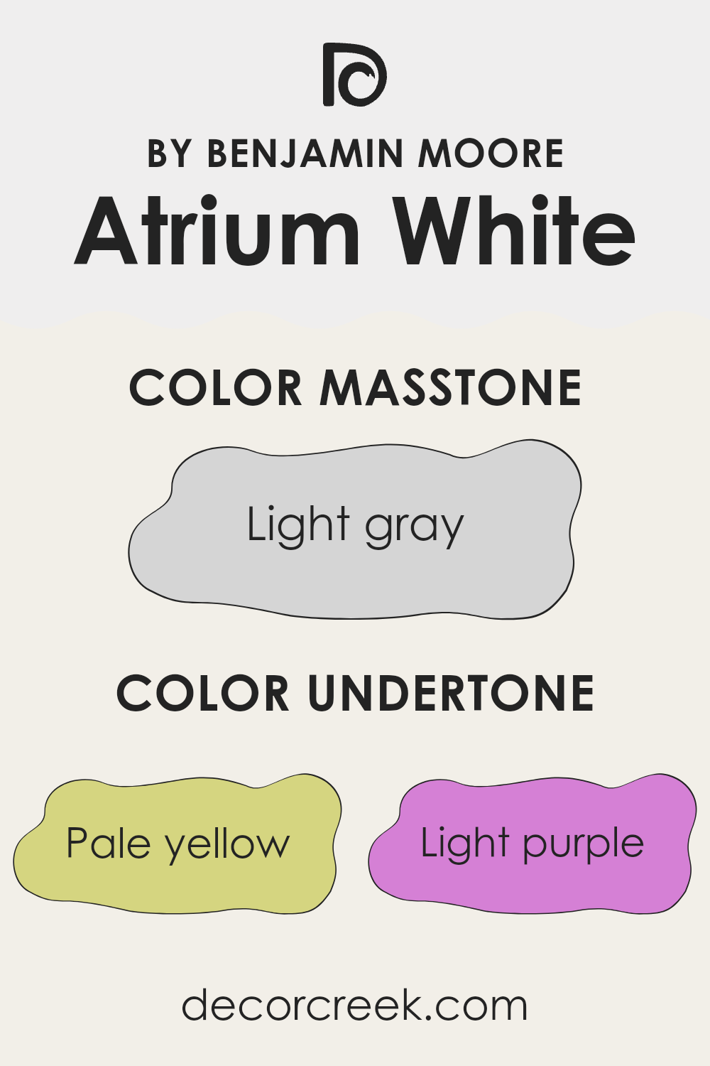
Atrium White by Benjamin Moore is a subtle and flexible white paint that possesses several undertones, subtly influencing its appearance. These undertones include pale yellow, light purple, light blue, pale pink, mint, lilac, and grey. Undertones are the hidden hues beneath the primary color, affecting the way it interacts with surrounding elements and lighting.
In natural light, Atrium White may appear warmer because of its pale yellow and pale pink undertones, giving rooms a cozy and inviting feel. In areas with cool light or shadows, undertones like light blue, mint, and lilac can become noticeable, casting a slightly cooler, soft tint. This can make rooms feel more calm or airy.
The light grey undertone gives the paint a neutral base, helping it adapt to various styles and schemes. These qualities make it a suitable choice for living rooms, bedrooms, or kitchens, where it complements different fixtures and furnishings.
The color’s ability to subtly change with light and surrounding shades makes it adaptable and ensures it doesn’t look stark or overly plain. Whether paired with bold accents or neutral tones, Atrium White creates a harmonious backdrop that can fit many design preferences.
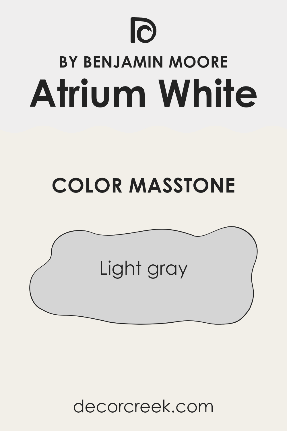
What is the Masstone of the Atrium White OC-145 by Benjamin Moore?
Atrium White OC-145 by Benjamin Moore is a light gray color, with a hex code of #D5D5D5. This shade is flexible and often used in homes for its ability to create a neutral and calming environment. The light gray hue is gentle on the eyes, providing a soft backdrop that doesn’t overpower a room.
It works well in various lighting conditions, maintaining its elegance both in natural sunlight and artificial light. This color can make areas feel more open and airy, which is especially beneficial in smaller rooms or areas lacking natural light.
Atrium White complements a wide variety of other colors and textures, easily blending with both modern and traditional decor. It can be paired with bolder colors for a pop of contrast or with other neutrals for a more cohesive look. It’s a popular choice for those seeking a crisp, clean appearance without being stark or too clinical.
How Does Lighting Affect Atrium White OC-145 by Benjamin Moore?
Lighting plays a significant role in how colors appear in a room. The color Atrium White OC-145 by Benjamin Moore is a soft white with warm undertones, and its appearance can change based on the type and direction of lighting.
In artificial light, such as incandescent bulbs, Atrium White can appear warmer, sometimes bringing out hints of pink or beige. This is due to the warm nature of incandescent bulbs, which tend to enhance warmer tones. Under LED lighting, which can vary in warmth, Atrium White can maintain a more neutral look, depending on the specific bulb used.
In natural light, Atrium White varies based on the room’s orientation. In north-facing rooms, which generally have cooler and softer light, Atrium White can take on a slightly cooler appearance. However, because north light is constant throughout the day, the color maintains its subtle warmth without looking too stark.
In south-facing rooms, where natural light is warm and abundant, Atrium White tends to appear brighter and more luminous, bringing out its subtle warm undertones. This makes the color particularly inviting and cozy in these rooms.
In east-facing rooms, the morning light is warmer and softer, enhancing the warm undertones of Atrium White. As the sun moves away, the light becomes cooler and more neutral, but Atrium White remains pleasant and balanced, adapting well to the changing light throughout the day.
In west-facing rooms, the light is cooler in the morning and becomes warmer as the day progresses, especially in the late afternoon and evening. Atrium White will look more neutral and calm in the morning, while in the afternoon, as the light becomes more golden, it brings out a warmer and cozier feel in the room.
Overall, Atrium White OC-145 adapts well to different types and directions of light, making it a flexible choice for various rooms and lighting conditions.
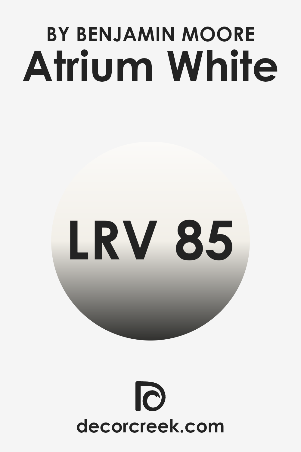
What is the LRV of Atrium White OC-145 by Benjamin Moore?
Light Reflectance Value, or LRV, is a measurement that indicates how much light a color reflects. It is measured on a scale from 0 to 100, where 0 means the color absorbs all light and reflects none (pure black), and 100 indicates it reflects all light (pure white). A higher LRV means the color is lighter and reflects more light, making it appear brighter. When you choose paint for your walls, the LRV can affect how light or dark the room feels.
For example, paint with a high LRV can help make a room feel more open and bright, especially if the room has limited natural light. On the other hand, paint with a low LRV can make a room feel cozier but might also cause it to look smaller or darker.
The color Atrium White has an LRV of 85.08, which means it is quite reflective and will make areas appear lighter and more airy. Since the LRV is fairly high, painting walls with this color can help maximize the light in a room, making it a good choice for spots you want to feel more open or for rooms that don’t get much sunlight. This makes it an ideal shade for smaller areas or places where you want a light and fresh look.
The high LRV also helps enhance the effect of both natural and artificial lighting, ensuring the room stays bright throughout the day.
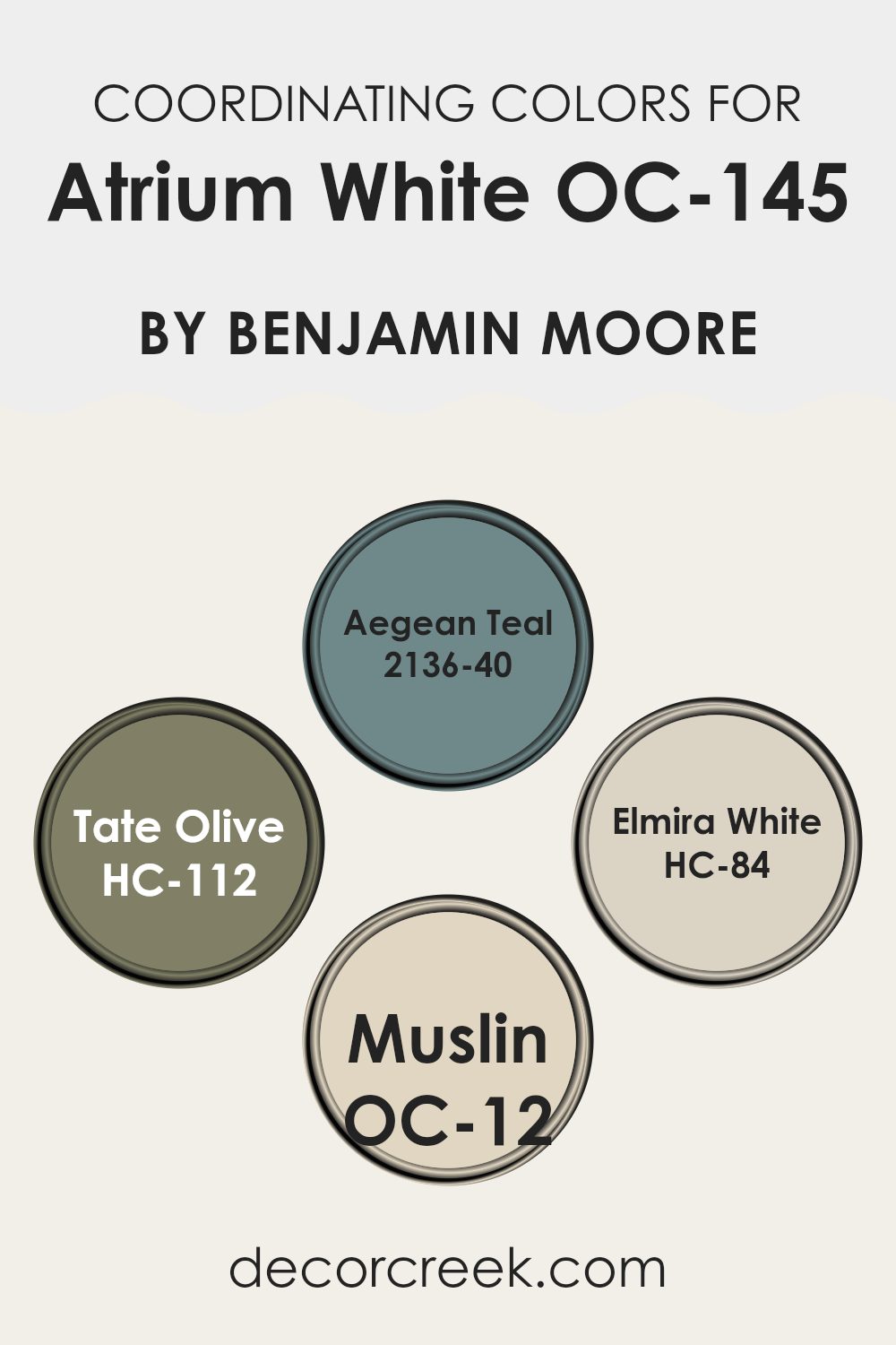
Coordinating Colors of Atrium White OC-145 by Benjamin Moore
Coordinating colors are shades that complement a main color, creating harmony and balance in a room. When using Atrium White by Benjamin Moore as the main color, certain shades can be paired with it to enhance and complete the look of a room. One such color is Aegean Teal, which brings a rich, calming depth with its mix of blue and green tones. This shade can add a gentle refinement to any area, making it feel inviting and cozy.
Another great coordinating color is Tate Olive, an earthy green that adds warmth and an organic touch. It’s a flexible hue that can balance the lightness of Atrium White with its natural richness.
Elmira White is another excellent choice, offering a soft, creamy beige that provides a subtle contrast while maintaining a light and airy feel. Finally, Muslin contributes a gentle, neutral touch with its warm, pale beige color, perfect for tying all the elements of a room together. Together, these coordinating colors help create a cohesive and inviting ambiance without being too intense or overly bold.
You can see recommended paint colors below:
- 2136-40 Aegean Teal
- HC-112 Tate Olive
- HC-84 Elmira White
- OC-12 Muslin
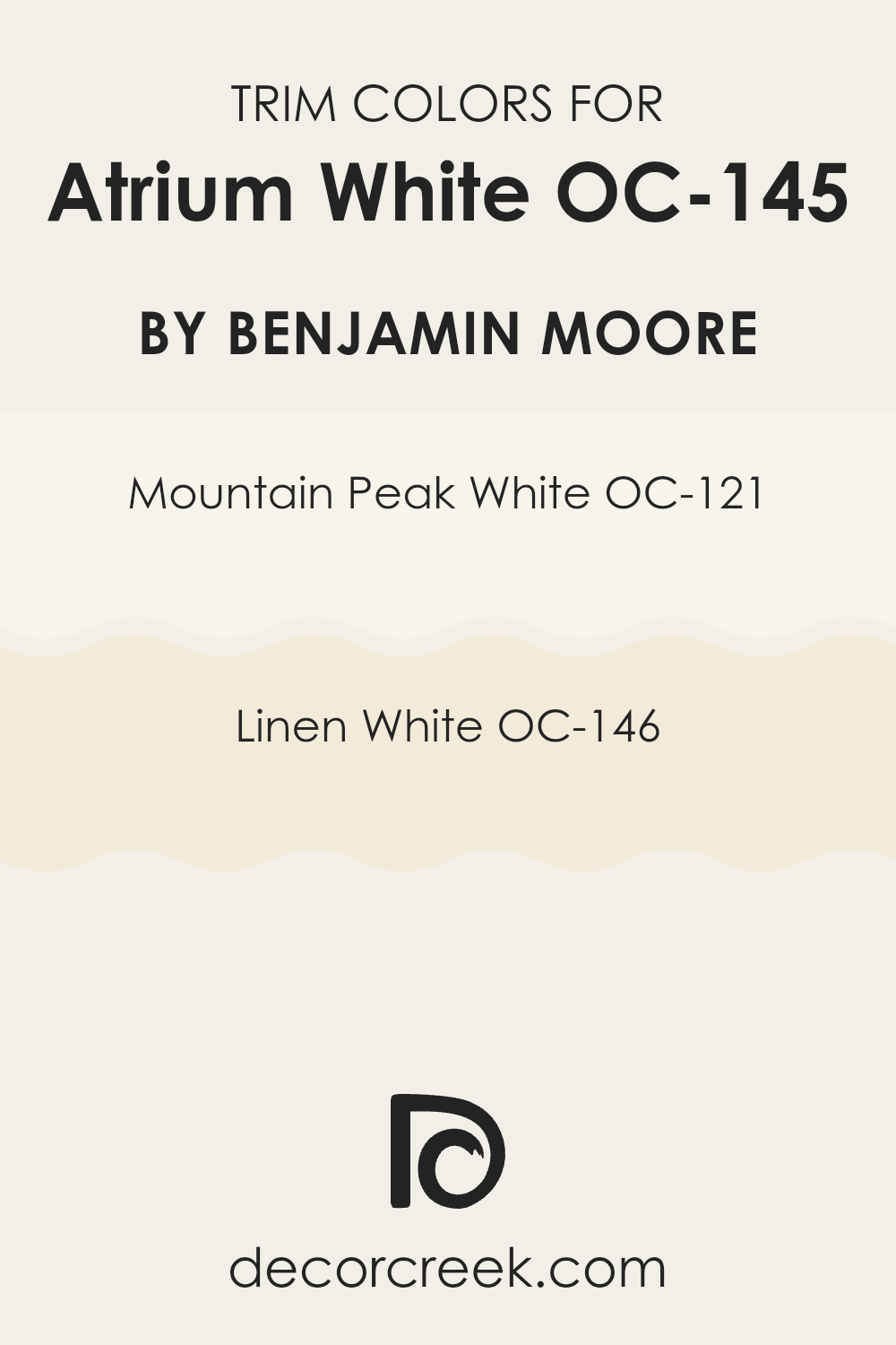
What are the Trim colors of Atrium White OC-145 by Benjamin Moore?
Trim colors are the paint colors typically used for the moldings, doors, window frames, and other detailing features of a room. They play a significant role in complementing or contrasting with the main color of your walls, adding depth and visual interest. Atrium White by Benjamin Moore is a soft, warm white that can benefit greatly from the right trim colors.
Choosing trim colors like Mountain Peak White and Linen White can highlight Atrium White’s subtle warmth, enhancing its elegance and ensuring the room feels balanced and cohesive. Mountain Peak White is a beautifully flexible white with subtle undertones that offer a crisp, clean look.
It can brighten up the room and balance beautifully with Atrium White, accentuating its smoothness. On the other hand, Linen White has a slightly warmer note, adding a cozy touch to the room. Paired with Atrium White, Linen White can bring out warmth and comfort, making the room feel inviting while still maintaining a fresh, classic feel. The combination of these colors creates a harmonious environment that is both charming and welcoming.
You can see recommended paint colors below:
- OC-121 Mountain Peak White
- OC-146 Linen White
Colors Similar to Atrium White OC-145 by Benjamin Moore
When choosing paint colors for a room, similar colors play a crucial role in creating a sense of harmony and cohesion. Atrium White by Benjamin Moore is a flexible and soft white, which serves as an excellent base for a variety of palettes. One effective way to complement it is by using similar shades that maintain balance and subtly enhance the overall design.
Slight variations in color can add depth and interest without being too intense, making them perfect for living areas that aim for a calm and comfortable ambiance. These colors work well together, creating a unified look that feels natural and pleasing to the eye.
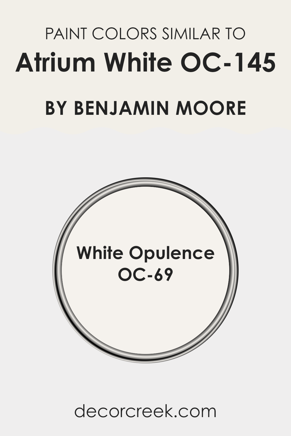
For instance, White Opulence, also by Benjamin Moore, is one such similar color that works beautifully with Atrium White. White Opulence is a gentle, warm white with a hint of pink undertone, adding a touch of warmth and grace to the overall palette.
This color can help soften the appearance of a room, making it feel cozier and more inviting. When paired with Atrium White, it creates a seamless transition that enhances the subtleties of both colors. Together, they provide a refined yet simple backdrop that allows other elements of a room, such as furniture and decor, to stand out, achieving a balanced and welcoming environment.
You can see recommended paint color below:
- OC-69 White Opulence
How to Use Atrium White OC-145 by Benjamin Moore In Your Home?
Atrium White OC-145 by Benjamin Moore is a flexible paint color that brings a soft, warm look to any home. This shade is perfect for those who want a neutral tone without harshness. Its subtle warmth makes it an ideal choice for most rooms.
In living rooms, it can create a cozy atmosphere, making the room feel inviting and comfortable. Used in kitchens, it provides a clean and fresh look while still adding some softness. For bedrooms, Atrium White helps to create a relaxing and calming environment, perfect for unwinding after a long day.
It also works well in hallways, adding brightness without being too intense. This paint color pairs beautifully with both light and dark wood furniture and can complement various decor styles, from modern to traditional. Whether used on walls, ceilings, or even trim, Atrium White OC-145 is a reliable choice for anyone looking to update their home’s appearance.
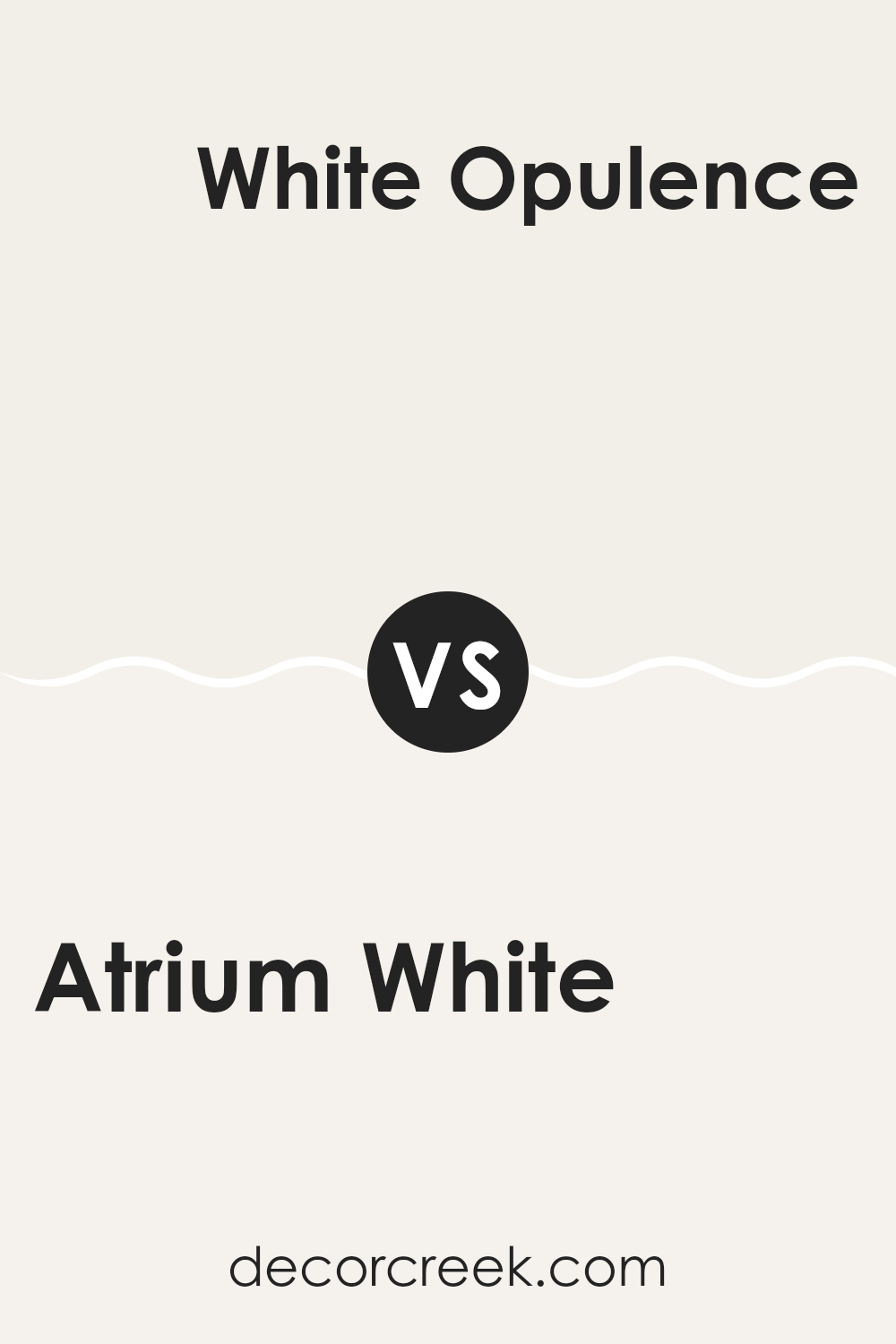
Atrium White OC-145 by Benjamin Moore vs White Opulence OC-69 by Benjamin Moore
Atrium White OC-145 and White Opulence OC-69 are two gentle and refined whites from Benjamin Moore. Atrium White has a slightly warm undertone, giving it a subtle glow that suits rooms needing a welcoming feel. It’s flexible, adapting well to various lighting conditions, perfect for both traditional and modern settings.
White Opulence OC-69, on the other hand, is a bit softer with a hint of pink or rose in its undertone. This gives it a warm, light feel, making it suitable for intimate areas or those aiming for a cozy vibe. It’s great for bedrooms or living rooms where a gentle touch is desired.
While both colors are white, Atrium White leans more towards a pure and clean white, while White Opulence offers a touch of warmth with its distinctive undertone. Choosing between them depends on the mood you want to create in your room.
You can see recommended paint color below:
- OC-69 White Opulence
After going through the information on OC-145 Atrium White by Benjamin Moore, I’ve learned something interesting about this paint color. It’s a simple and clean white that people really seem to like. It’s not too yellow or too blue, which makes it feel kind of perfect for many uses. Lots of people pick this color when they want a nice, fresh look in their homes.
I think if someone wants their room to look brighter and bigger, OC-145 Atrium White is a great choice. It helps other colors in the room really stand out because it doesn’t grab too much attention. Also, it matches easily with many other colors. Whether someone has a lot of bright, fun colors or more soft and calm ones, this white can go with both.
This paint color can also help a room look more modern or fresh without being too fancy. It’s like having a plain piece of paper that you can add anything you want to. I feel like it’s a good choice for anyone who wants a nice, clean start in their room. It’s like a blank canvas but in paint form.
Overall, learning about OC-145 Atrium White by Benjamin Moore has shown me how just one simple color can do so much.
Ever wished paint sampling was as easy as sticking a sticker? Guess what? Now it is! Discover Samplize's unique Peel & Stick samples.
Get paint samples

