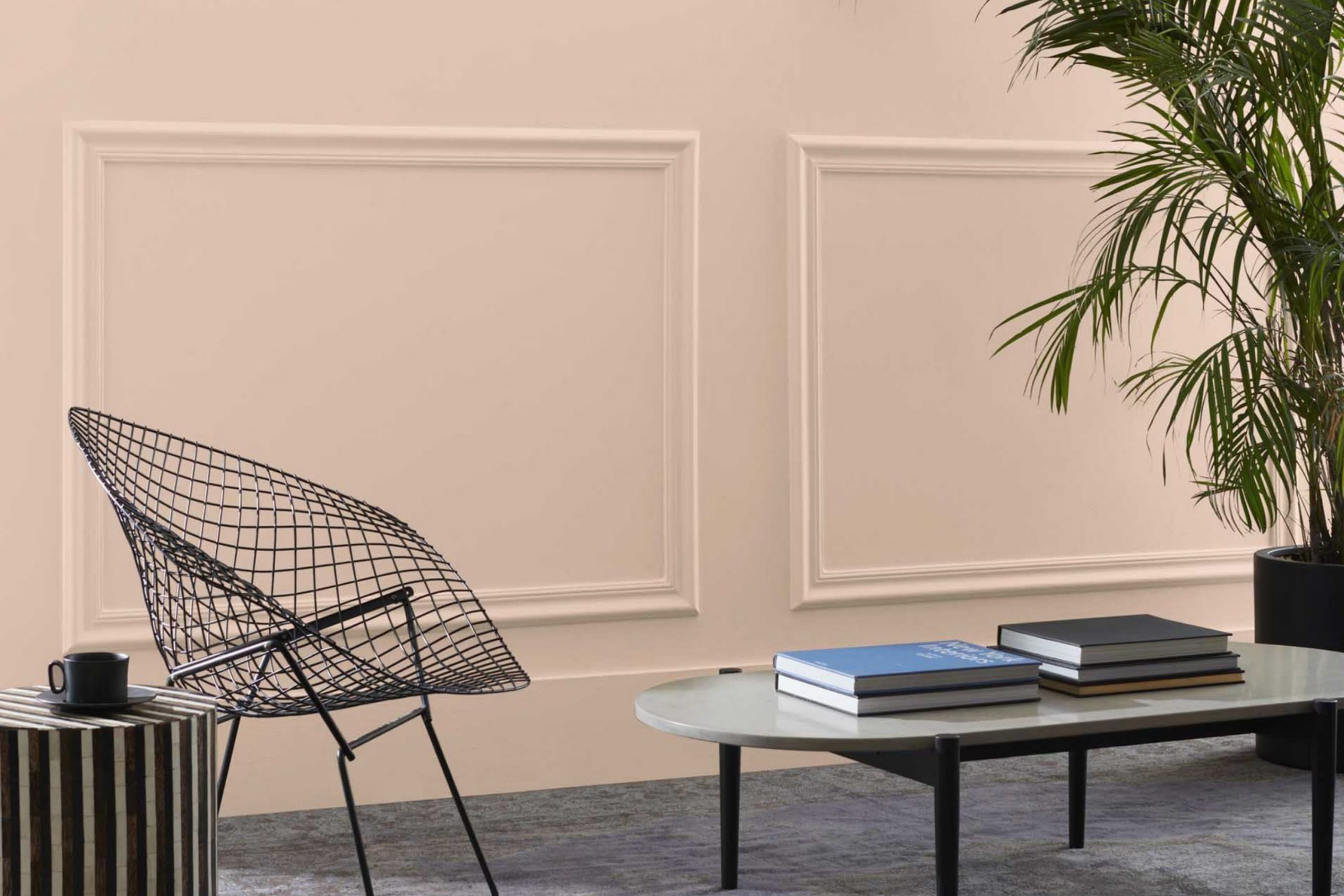
Have you ever come across a color that subtly complements almost every room it graces? That’s exactly my experience with 1158 Basking Ridge Beige by Benjamin Moore. This particular shade of beige is not just another neutral; it holds a unique softness that brings a warm, inviting atmosphere to any room.
Whether you’re looking to refresh your living room or add a touch of calm to your bedroom, Basking Ridge Beige has the potential to enhance your environment without overpowering it. The beauty of this color lies in its flexibility.
It pairs beautifully with a wide array of décor styles—from modern minimalist to rustic country. It acts as a calm backdrop that lets your furniture and decorative pieces stand out. If you’re aiming for a cozy, understated elegance in your home, this might just be the color you’ve been looking for.
Applying it on the walls can unify the elements of your room with a soft, cohesive glow.
What Color Is Basking Ridge Beige 1158 by Benjamin Moore?
Basking Ridge Beige by Benjamin Moore is a warm and inviting shade of beige that offers a gentle, neutral backdrop for any room. This shade is flexible and classic, making it a perfect choice for those looking to add a touch of coziness without overpowering the room.
The color has a subtle richness that can enhance natural light in a room, creating a welcoming atmosphere. Basking Ridge Beige works exceptionally well in interior styles such as traditional, modern farmhouse, and Scandinavian due to its soft warmth and adaptability.
It serves as an excellent base color that can be beautifully layered with various textures and materials. In a traditional setting, pairing it with rich woods, like mahogany or walnut, brings out the earthy tones in the wood. For a modern farmhouse look, combining it with distressed wood, natural linens, and chunky knits creates a rustic yet refined feel.
In terms of textures, Basking Ridge Beige complements smooth, matte finishes as well as more textured surfaces like coarse fabrics or woven baskets. It also pairs well with both metallic accents — such as brass or copper — and natural elements like stone or clay, making it incredibly flexible for different design approaches and material combinations. Overall, Basking Ridge Beige is a go-to color for creating a cozy, welcoming environment in your home.
Is Basking Ridge Beige 1158 by Benjamin Moore Warm or Cool color?
Basking Ridge Beige by Benjamin Moore is a warm and inviting shade of beige that brings a cozy and comfortable feeling to any room in a home. This particular beige has a subtle richness that makes it more than just a basic neutral. It pairs well with almost any color scheme, making it incredibly flexible for decorating.
Whether you’re using it as a main color for walls in a living room or as a background for bolder decor elements, it manages to blend seamlessly. The color has enough depth to avoid looking flat but is still light enough to keep areas feeling open and airy. In well-lit areas, it can add a sunny, cheerful vibe, while in rooms with less natural light, its warmth helps to soften and warm the room.
This makes it perfect for creating a welcoming atmosphere in common areas like living rooms and kitchens, as well as in more private areas like bedrooms. Basking Ridge Beige is ideal for those looking to create a homely feel without making a room feel smaller or darker.
Undertones of Basking Ridge Beige 1158 by Benjamin Moore
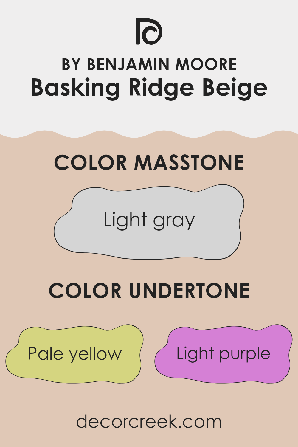
Basking Ridge Beige is a flexible color choice for interior walls, often celebrated for its warm and inviting qualities. The color has a complex composition, which includes undertones of pale yellow, light purple, pale pink, light blue, mint, lilac, and grey. These undertones play a crucial role in how the color appears under different lighting conditions and can subtly influence the atmosphere of a room.
Pale yellow undertones add a soft, sunny vibe, making the room feel more cheerful. Light purple and pale pink bring a touch of warmth, which can make the room feel cozy and welcoming. The light blue and mint undertones inject a fresh, airy feel, ideal for creating a calm environment. Lilac undertones add a hint of sophistication, while the grey helps to ground the other hues, adding a sense of stability and neutrality.
When applied to interior walls, these undertones interact with both natural and artificial light, shifting the perceived color at different times of the day. This means Basking Ridge Beige can look slightly different in the morning light compared to the evening. The choice of furnishings and decor also affects how these undertones play out; for instance, a room with lots of natural light will enhance the yellow and mint undertones, making the room feel vibrant and lively.
Overall, the blend of these subtle hues in Basking Ridge Beige provides a flexible backdrop that adapts to various styles and preferences, allowing for easy decoration. Choosing this color for walls is a way to ensure the room will maintain a fresh and accommodating atmosphere, regardless of its function or the decorations around it.
What is the Masstone of the Basking Ridge Beige 1158 by Benjamin Moore?
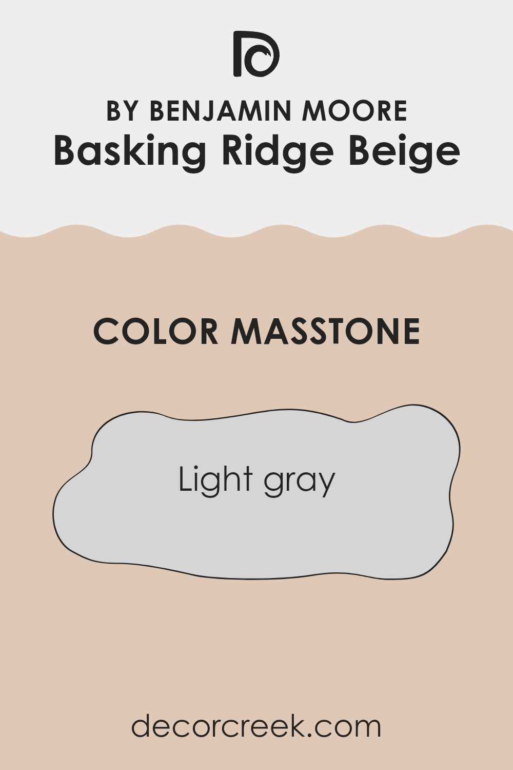
Basking Ridge Beige 1158 by Benjamin Moore has a masstone of light gray, a subtle and flexible shade that can work beautifully in various home settings. This particular hue is neutral and soft, making it an excellent choice for creating a calm and welcoming room without dominating the area with color.
Because it’s neither too dark nor too light, it effectively hides small imperfections on walls and reflects just enough light to make rooms feel airy but cozy.
This gentle gray can blend seamlessly with other colors, from bright and bold to soft and subtle, making it perfect for common areas like living rooms or bedrooms where you might want to mix and match different furniture and decor items. Overall, its adaptability and soothing nature can help create a lovely backdrop that enhances the overall aesthetic of your home while keeping things simple and fresh.
How Does Lighting Affect Basking Ridge Beige 1158 by Benjamin Moore?
Lighting plays a crucial role in the way we perceive colors in our environment. Different light sources can dramatically alter the appearance of a color. Natural light brings out the truest version of colors, while artificial lights can add different hues and intensities. The color Basking Ridge Beige by Benjamin Moore is a flexible shade that reacts distinctively under varying lighting conditions.
Under artificial light, such as incandescent bulbs, this beige tends to look warmer, highlighting its yellow and red undertones. This warm effect makes rooms feel cozy and inviting. In contrast, fluorescent lighting can bring out the cooler tones in the paint, leading to a more muted beige with a slightly greenish cast.
In natural light, Basking Ridge Beige changes throughout the day with the changing position of the sun. In rooms that face north, natural light is cooler and more diffuse, making this beige appear more subdued and neutral, without emphasizing any particular undertone. North-facing rooms may benefit from this even tone, offering a calm and consistent backdrop throughout the day.
South-facing rooms receive more intense, direct sunlight, which can make the beige look brighter and more vibrant. The natural warmth of the sunlight enhances the paint’s underlying warm tones, making south-facing rooms feel sunnier and more welcoming.
For rooms facing east, the morning light can make Basking Ridge Beige look particularly soft and warm, ideal for bedrooms and breakfast nooks where a gentle, welcoming atmosphere is often desired. As the sun shifts, the color will maintain a balance of warmth with a hint of brightness throughout the day.
West-facing rooms experience the strongest effect of sunlight in the afternoons to evenings. During these times, the paint can appear much warmer and richer. This enhancement is perfect for living areas used mostly in the afternoon and evening, creating a cozy, inviting glow that complements the settling sun.
Understanding how Basking Ridge Beige interacts with light helps in making informed decisions about where to apply this color and how to use lighting to its best advantage.
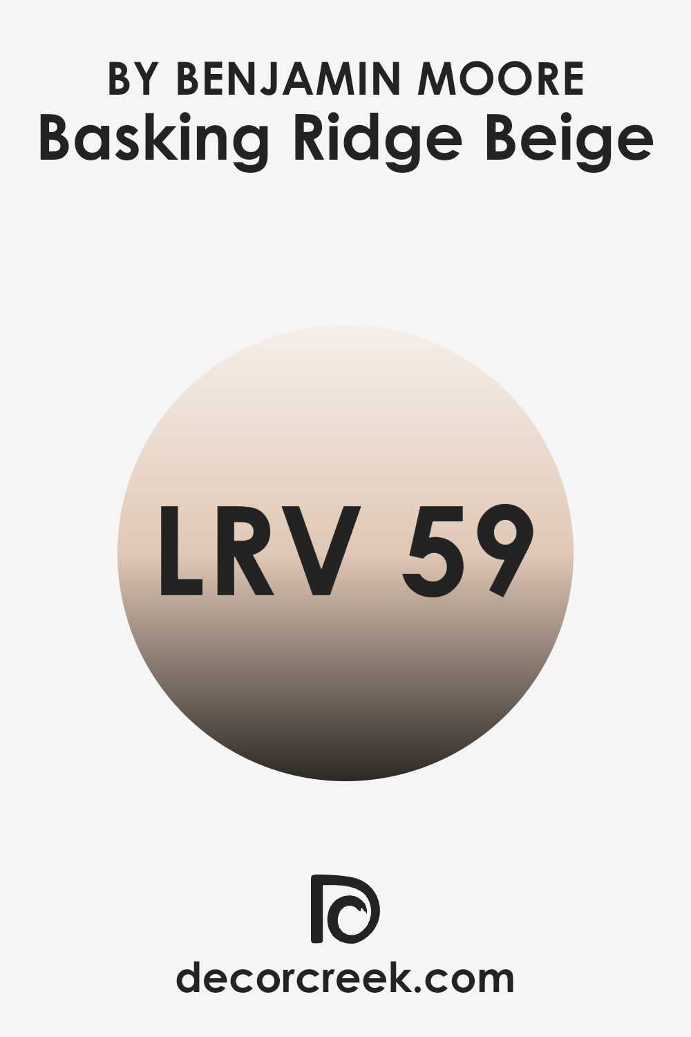
What is the LRV of Basking Ridge Beige 1158 by Benjamin Moore?
LRV stands for Light Reflectance Value, and it is a key measure used to understand how light or dark a paint color will look once it is applied on a wall. This value ranges from a low number indicating a darker color that reflects less light, to a higher number reflecting more light due to being a lighter shade.
Essentially, LRV helps in determining how much visible light a color will reflect when lit. When selecting a paint color, understanding its LRV can help you predict how it will influence the atmosphere and brightness of a room. For the color Basking Ridge Beige by Benjamin Moore with an LRV of 59.18, this indicates that it is a mid-range color, balancing between lighter and darker shades.
This particular value suggests that the color will reflect a moderate amount of light, making it a flexible choice for areas that require neither too bright nor too subdued an ambiance. Such an LRV is useful in rooms that need a neutral backdrop that is welcoming yet not stark, providing a gentle lift to the room without overpowering it with brightness.
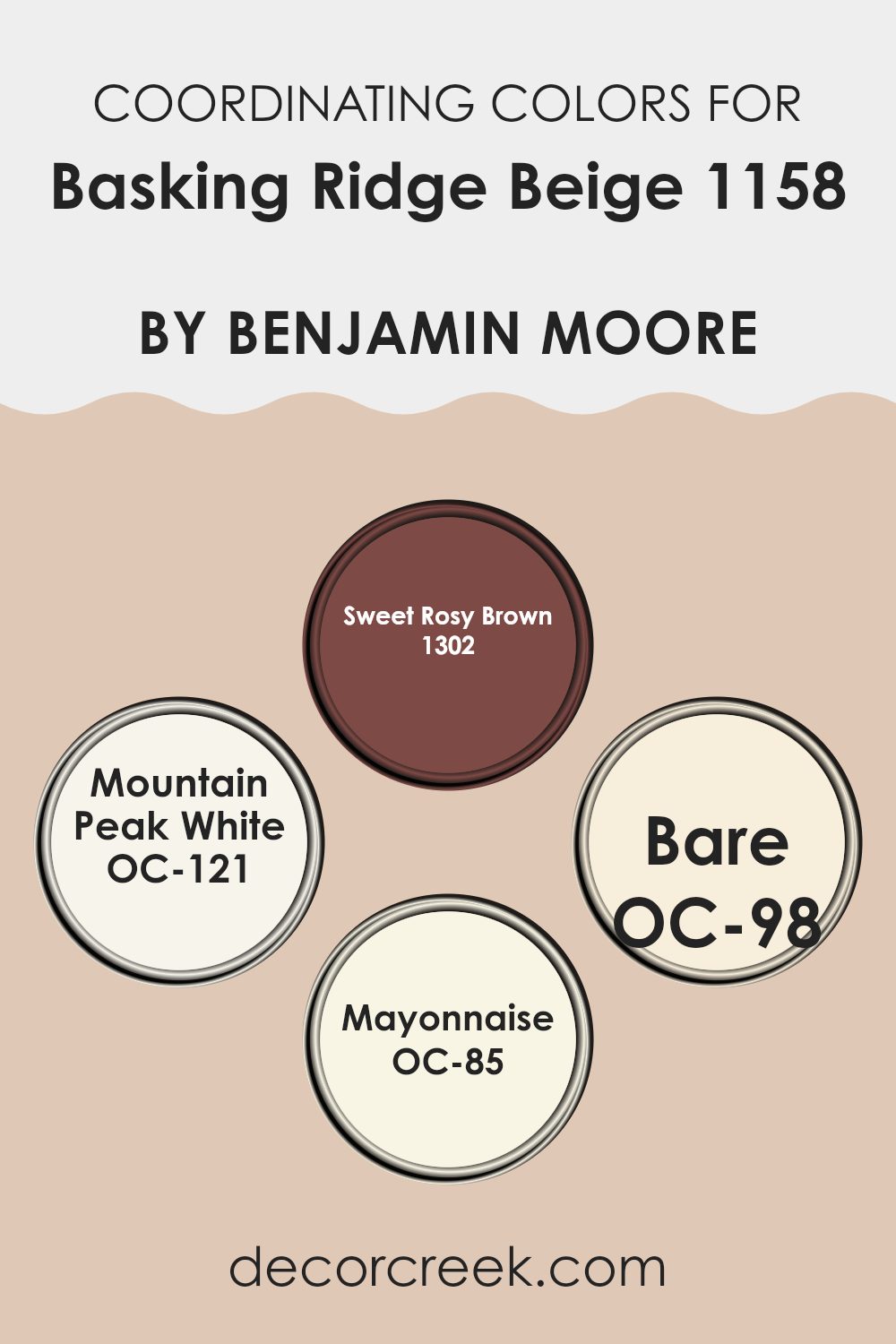
Coordinating Colors of Basking Ridge Beige 1158 by Benjamin Moore
Coordinating colors are selected shades that harmonize with a primary color, in this case, Basking Ridge Beige. The chosen shades enhance the base color while creating a pleasing visual palette that flows smoothly through a room. Selecting coordinating colors involves understanding the tones and subtleties of the base color and pairing it with colors that either contrast or complement those qualities.
This approach helps in achieving a balanced and aesthetically pleasing decor. The colors 1302 – Sweet Rosy Brown, OC-121 – Mountain Peak White, OC-98 – Bare, OC-85 – Mayonnaise are all examples of hues that pair well with Basking Ridge Beige.
Sweet Rosy Brown offers a gently rich hue, providing a touch of warmth and depth that pairs nicely with the neutrality of Basking Ridge Beige. This color can add a subtle vibrancy to areas that need a hint of robustness without overpowering the senses. Mountain Peak White serves as a clean and crisp background that lets Basking Ridge Beige stand out.
Its clarity and brightness offer a refreshing contrast, making any room feel more open. Bare is an understated color that complements Basking Ridge Beige by maintaining a soft continuity in decor, ensuring that rooms feel well-connected and harmonious.
Lastly, Mayonnaise is a creamy white that brings a light and airy feel to the ensemble, allowing for a gentle flow from one area to another without sharp transitions. Together, these colors create a cohesive look that enhances the original beauty of Basking Ridge Beige.
You can see recommended paint colors below:
- 1302 Sweet Rosy Brown
- OC-121 Mountain Peak White
- OC-98 Bare
- OC-85 Mayonnaise
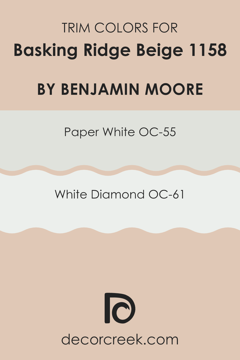
What are the Trim colors of Basking Ridge Beige 1158 by Benjamin Moore?
Trim colors are those used on the architectural elements of a room or a house’s exterior to highlight details and frame the main colors of walls or facades. In the case of Basking Ridge Beige by Benjamin Moore, selecting the right trim colors is critical to complement its warm and inviting tone.
A trim color like OC-55 – Paper White or OC-61 – White Diamond by Benjamin Moore works beautifully to subtly delineate rooms and bring out the richness of the main beige hue, without overpowering it, making each room feel distinct and neatly finished.
OC-55 – Paper White is a clean and bright white that offers a crisp contrast to Basking Ridge Beige, creating a fresh look that can breathe life into any room. This makes the room appear more defined and spacious.
On the other hand, OC-61 – White Diamond has a slightly warmer undertone that aligns closely with the natural warmth of beige, providing a seamless transition between the wall and trim which enhances the overall harmony of the room. Both colors support the main hue in a way that’s noticeable yet discreet, ensuring the atmosphere remains light and welcoming.
You can see recommended paint colors below:
- OC-55 Paper White
- OC-61 White Diamond
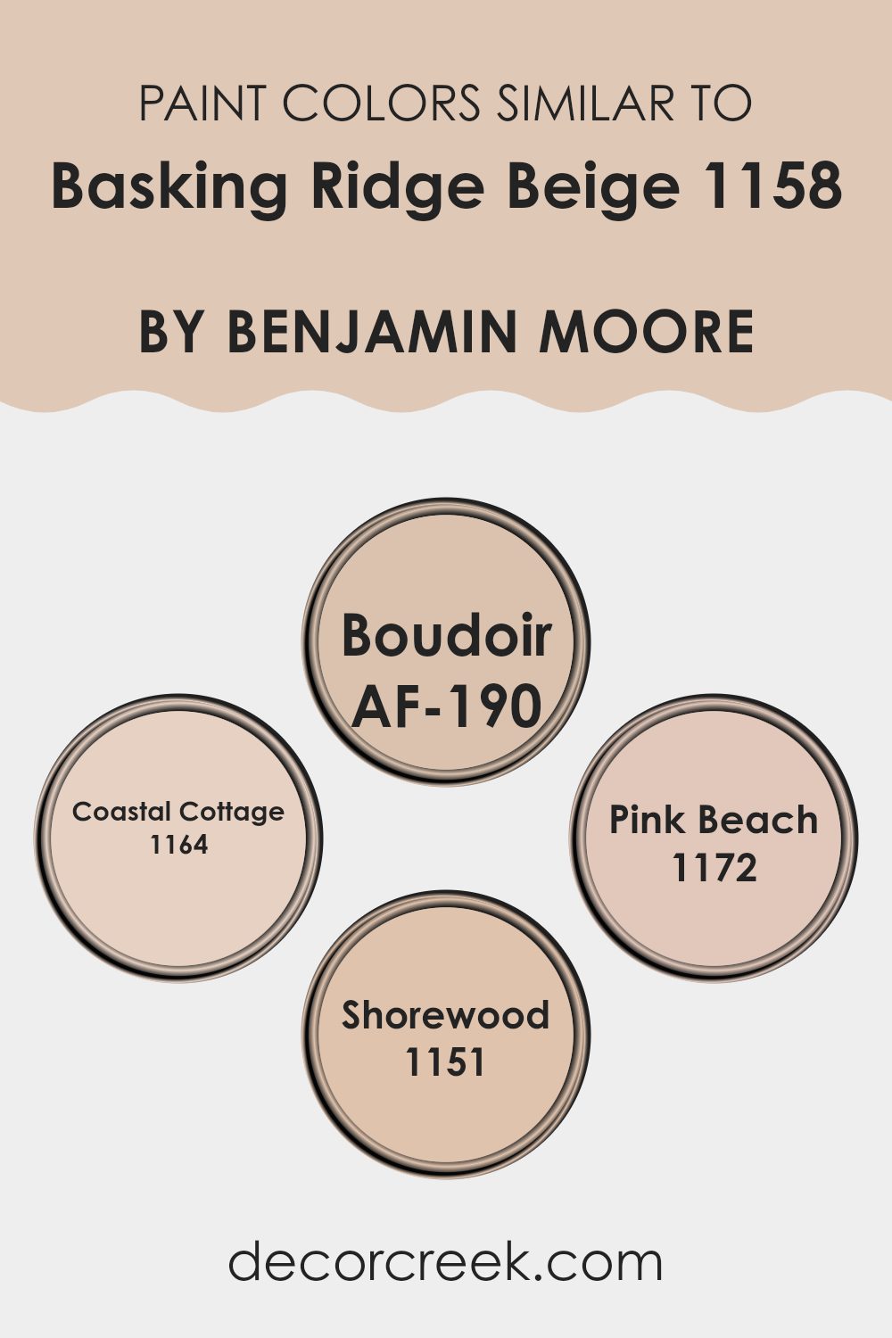
Colors Similar to Basking Ridge Beige 1158 by Benjamin Moore
In interior design, using similar colors can create a cohesive and harmonious atmosphere that allows for a subtle yet impactful aesthetic appeal. Colors similar to Basking Ridge Beige by Benjamin Moore such as AF-190 – Boudoir, 1164 – Coastal Cottage, 1172 – Pink Beach, and 1151 – Shorewood, share complementary undertones that blend effortlessly into any room, enhancing natural light and making rooms appear more spacious.
These colors have the advantage of creating a relaxed atmosphere, where each hue complements the others, forging a seamless transition from one to another which is pleasing to the eye and adds a polished finish to a room. This ensures that the décor enhances rather than distracts, providing a backdrop that supports a variety of design styles and personal tastes.
For instance, AF-190 – Boudoir is a muted mauve that offers a gentle nod to warmth, making it ideal for areas meant to feel cozy and inviting. Coastal Cottage, with its subtle sandy tone, captures the essence of a beachside retreat, perfect for a light and airy feeling in a home. Pink Beach offers a soft blush tint infusing a room with a hint of cheerfulness without overpowering the senses.
Meanwhile, Shorewood is a slightly deeper beige that carries an earthy base, providing a sturdy foundation for design elements to stand out. These colors, closely aligned with Basking Ridge Beige, ensure that every room maintains a fluid visual continuity, increasing the aesthetic value and overall comfort of your home.
You can see recommended paint colors below:
- AF-190 Boudoir
- 1164 Coastal Cottage
- 1172 Pink Beach
- 1151 Shorewood
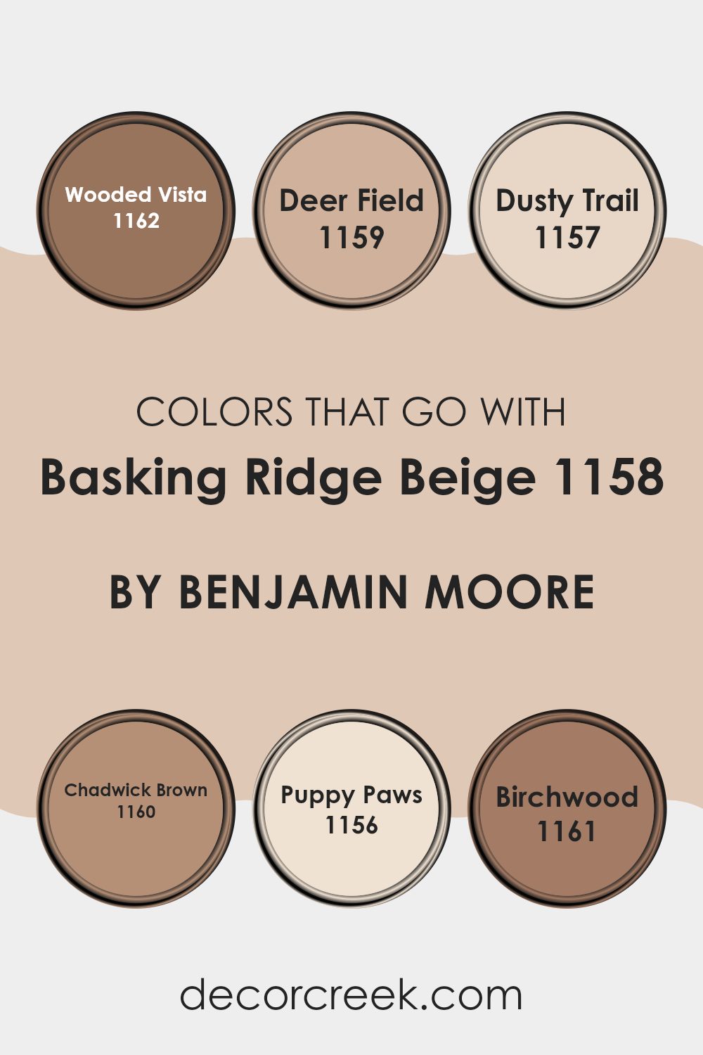
Colors that Go With Basking Ridge Beige 1158 by Benjamin Moore
Choosing the right colors to complement Basking Ridge Beige 1158 by Benjamin Moore is crucial for creating a harmonious and visually appealing room. Basking Ridge Beige is a flexible neutral that provides a warm backdrop, making it perfect for pairing with a variety of shades. Colors such as Wooded Vista, Deer Field, Dusty Trail, Chadwick Brown, Puppy Paws, and Birchwood each bring their own unique attributes while maintaining a cohesive look with the beige.
Wooded Vista is a deep, earthy green that mimics the lushness of a dense forest, providing a rich contrast to the light, sandy tone of Basking Ridge Beige. It works well in areas that aim for a natural feel. Deer Field is a soft, muted brown with hints of gray, reminiscent of a calm deer habitat in the early morning; it adds a subtle depth to rooms without overpowering the senses.
Dusty Trail offers a lighter brown tone that echoes the dusty paths of a countryside hike, blending effortlessly with the beige for a gentle, understated ambiance. Chadwick Brown is a stronger, dark chocolate color that anchors lighter tones and adds sophistication without needing complex vocabulary.
Puppy Paws is a playful, light caramel shade that introduces a touch of softness and whimsy, perfect for creating a friendly and inviting room. Lastly, Birchwood is a pale, creamy white, offering a crisp, clean look that reflects light, enhancing the overall brightness of a room. Together, these colors create a palette that enriches the base tone of Basking Ridge Beige, allowing for a range of design options from calming and cozy to vibrant and dynamic.
You can see recommended paint colors below:
- 1162 Wooded Vista
- 1159 Deer Field
- 1157 Dusty Trail
- 1160 Chadwick Brown
- 1156 Puppy Paws
- 1161 Birchwood
How to Use Basking Ridge Beige 1158 by Benjamin Moore In Your Home?
Basking Ridge Beige 1158 by Benjamin Moore is a flexible paint color that can breathe new life into any room of your home. This warm beige shade has a cozy feel, making it perfect for living rooms and bedrooms where you want a calm and inviting atmosphere.
Because of its neutral tone, Basking Ridge Beige pairs beautifully with a wide range of colors, from soft pastels to bold hues, allowing you to mix and match your decor effortlessly. For those looking to update their kitchen or bathroom, this color works well too. It provides a clean and fresh background that complements wood cabinets and stone countertops.
In larger rooms, such as an open-plan living area, Basking Ridge Beige can help to unify the room without making it feel too enclosed. Applying this color on walls, it not only adds warmth but also helps in brightening dim corridors and smaller rooms. Finish off your look by adding white trims or molding for a crisp, polished appearance.
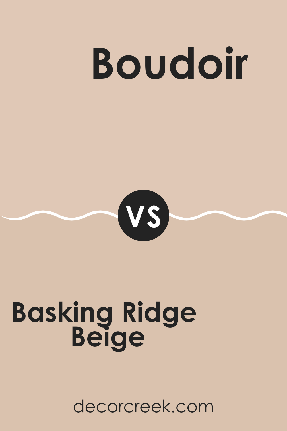
Basking Ridge Beige 1158 by Benjamin Moore vs Boudoir AF-190 by Benjamin Moore
Basking Ridge Beige is a warm, inviting shade that lends a cozy, comfortable vibe to any room. It’s a perfect foundation color for living rooms or bedrooms, creating a friendly and welcoming feeling. On the other hand, Boudoir is a deeper, more intense color.
It adds a bold touch and can make a strong statement in a room. While Basking Ridge Beige brings a light and airy feel, Boudoir, with its richer tone, provides more drama and warmth.
Both colors offer unique advantages depending on the atmosphere you want to achieve in your room. Basking Ridge Beige is ideal for a laid-back, subtle look, whereas Boudoir is great for creating a more vibrant, cozy room.
You can see recommended paint color below:
- AF-190 Boudoir
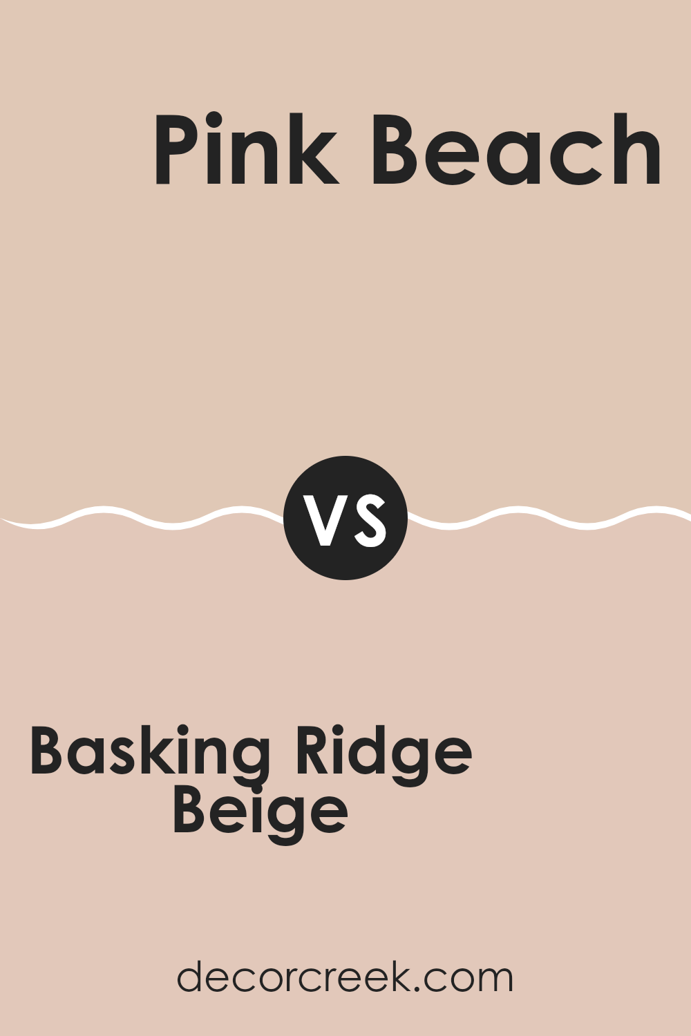
Basking Ridge Beige 1158 by Benjamin Moore vs Pink Beach 1172 by Benjamin Moore
Basking Ridge Beige is a warm, inviting shade with a subtle yellow undertone that gives it a cozy feel. It’s perfect for creating a comfortable and welcoming atmosphere in any room. This color is flexible and works well in living areas, bedrooms, or kitchens, making areas feel more homey and relaxed.
Pink Beach, on the other hand, is a softer hue with a gentle pink tone. It brings a light, airy quality to areas, perfect for adding a touch of sweetness and charm. This color is ideal for areas where you want to create a soft, pleasant vibe, like nurseries or bathrooms.
While both colors offer warmth, Basking Ridge Beige leans more towards a classic, neutral look, and Pink Beach introduces a subtle, cheerful pop of color. They could complement each other in a room that aims for a balance of warmth and cheerfulness.
You can see recommended paint color below:
- 1172 Pink Beach
Basking Ridge Beige 1158 by Benjamin Moore vs Coastal Cottage 1164 by Benjamin Moore
Basking Ridge Beige and Coastal Cottage are two subtle yet distinct shades from Benjamin Moore. Basking Ridge Beige has a warm, welcoming tone, leaning towards a soft tan that feels cozy and comforting. It’s perfect for creating a homey ambiance in living areas and bedrooms.
On the other hand, Coastal Cottage offers a lighter feel, reminiscent of sandy beaches and has a slightly cooler undertone compared to Basking Ridge Beige. This color is ideal for areas where you want a fresh and airy look, like bathrooms or small kitchens.
The colder nuance of Coastal Cottage makes it great for pairing with blues and greens, whereas the earthier Basking Ridge Beige works well with rich browns and reds. Together, these colors offer flexible options for different moods and themes in home décor.
You can see recommended paint color below:
- 1164 Coastal Cottage
Basking Ridge Beige 1158 by Benjamin Moore vs Shorewood 1151 by Benjamin Moore
Basking Ridge Beige is a warm and cozy shade that creates a soft, inviting atmosphere in a room. It has a subtle richness that pairs well with various decor styles, offering a flexible backdrop for both contemporary and traditional areas. This color is excellent for areas where you want to enhance comfort, like living rooms or bedrooms.
Shorewood, on the other hand, leans towards a cooler, lighter beige tone. It has a fresh feel that can brighten up areas and make them appear more spacious. This color is particularly effective in smaller rooms or areas with less natural light, as it helps to reflect light around the room.
While both colors share a beige base, Basking Ridge Beige is deeper and warmer, making it ideal for a cozy, welcoming vibe. Shorewood offers a lighter, refreshing look, suitable for creating the illusion of more area and light in a room. Both are flexible, but your choice might depend on the specific mood or optical effect you want to achieve in your room.
You can see recommended paint color below:
- 1151 Shorewood
In writing this, I’ve learned that 1158 Basking Ridge Beige by Benjamin Moore is not just any ordinary color. It’s a warm, inviting shade that makes any room feel cozier, like wrapping up in a soft blanket. It works well everywhere, be it in the living room, bedroom, or even the kitchen, adding a gentle touch without being too bold or out of place.
This color can easily pair with many other colors, which makes it super handy if you love to change your decorations often. After looking at how other people use Basking Ridge Beige in their homes, I saw how it helps make everything look pulled together, like all parts of the room are friends.
For anyone thinking about a new paint color, this beige is a smart pick because it’s simple, attractive, and makes rooms feel warm and welcoming. So, next time you want to give your room a new look, think about this cozy beige.
It might just be the perfect color you’re hoping to find.
Ever wished paint sampling was as easy as sticking a sticker? Guess what? Now it is! Discover Samplize's unique Peel & Stick samples.
Get paint samples

