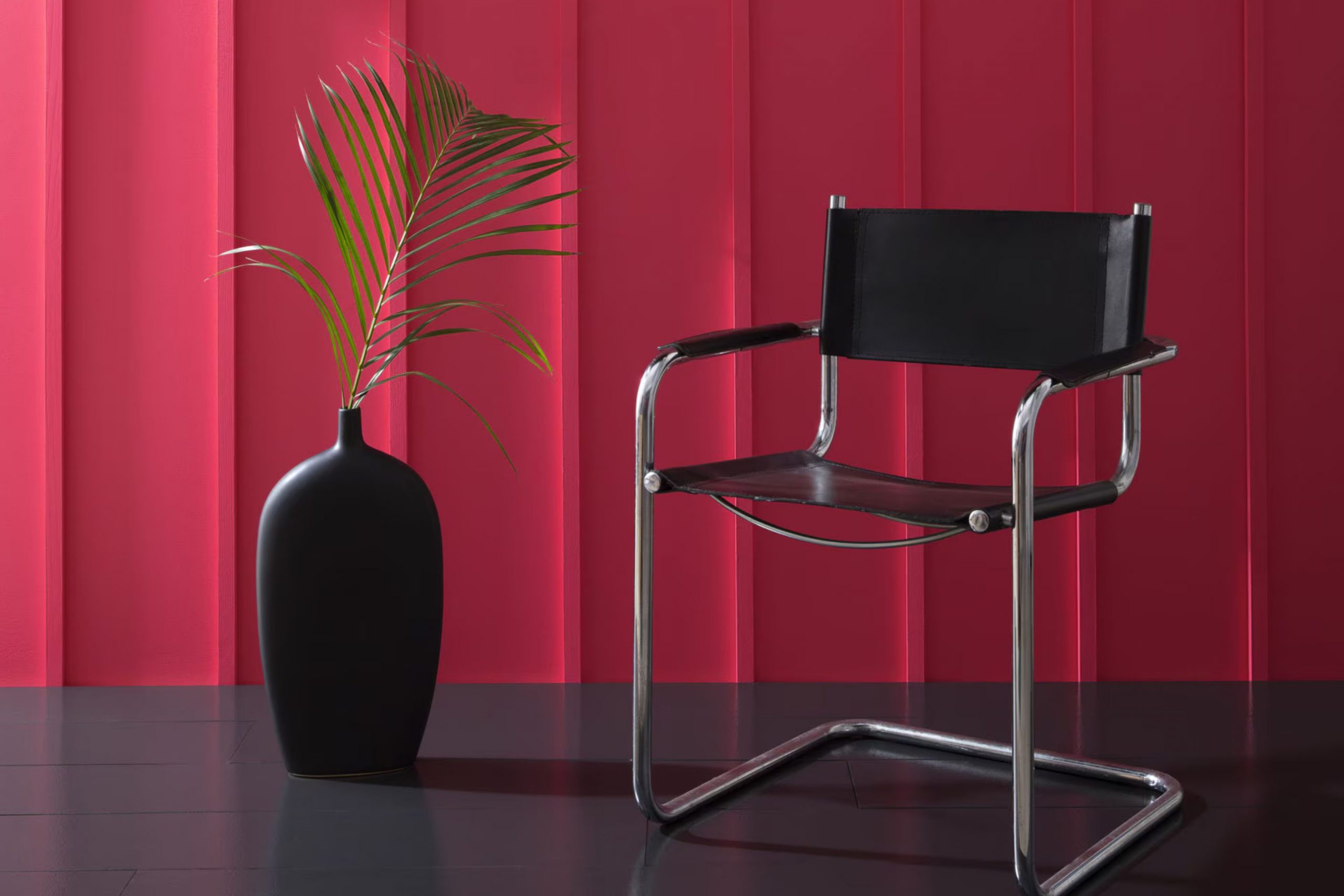
I stumbled upon CSP-1200 Cherry Burst by Benjamin Moore while looking for the perfect paint to brighten up my living room. Initially, I was just browsing through different shades, but the rich, vibrant hue of Cherry Burst immediately caught my attention. It’s a bold color that promises to make any room feel warm and welcoming.
Using Cherry Burst, I envisioned creating a lively interior that could stimulate conversations or be the cozy corner for my evening reads. The color has this unique way of making a statement without feeling overpowering.
It strikes just the right balance between being lively and soothing, which is exactly what I was searching for. Whether you’re planning to refresh a single wall as a focal point or paint an entire room, Cherry Burst might just be the shade you’re looking for to add that pop of color.
It’s amazing how a single can of paint can offer so much potential and change an interior!
What Color Is Cherry Burst CSP-1200 by Benjamin Moore?
Cherry Burst CSP-1200 by Benjamin Moore is a vibrant and lively shade of red that instantly adds warmth and energy to any interior. The color is rich and deeply saturated, making it a standout choice for interior designs that aim to make a statement. It’s a flexible hue that can be used in various styles, from modern to traditional, adding a touch of boldness wherever it’s used.
In terms of interior styles, Cherry Burst works best in contemporary settings where bold colors are celebrated, or in eclectic interiors that mix various styles and periods. It also fits beautifully in rustic designs, pairing well with natural materials like wood and leather, which help to ground its vivacity and link it to more earthy elements.
The color pairs exceptionally well with neutral tones such as grays, whites, and beiges, which provide a balance and allow Cherry Burst to shine without feeling overpowering. Textures like velvet or silk give a luxurious feel when used with this shade, while rough textures like burlap or linen can offer a striking contrast, highlighting its richness even more.
Using Cherry Burst in your home can create a cozy, inviting atmosphere, ideal for areas like living rooms or dining areas where warmth is appreciated. It’s a color that brings interiors to life and works well when used for accent walls, decor pieces, or even furniture.
decorcreek.com
Is Cherry Burst CSP-1200 by Benjamin Moore Warm or Cool color?
Cherry Burst CSP-1200 by Benjamin Moore is a lively and bright paint color that brings a vibrant pop to any room in the house. This shade has a rich, deep hue that can create a cheerful and inviting atmosphere, making it ideal for areas where people gather, like living rooms or dining areas.
The color is energetic without feeling overpowering, which means it pairs nicely with neutral tones such as whites, grays, and beiges. This flexible nature allows homeowners to use it as a focal point or just an accent wall, depending on the desired effect.
Cherry Burst can also make small areas feel more open and fun, particularly in entryways or half-bathrooms. It is particularly effective for adding personality to a home and making interiors more enjoyable and lively. This color is well-suited for those looking to add a touch of joy and energy to their living environments.
Undertones of Cherry Burst CSP-1200 by Benjamin Moore
Cherry Burst, a vibrant and energetic paint color, offers a rich blend of undertones that can subtly influence the ambiance and appearance of any room. Undertones are like hidden colors within the main hue, affecting how we perceive the primary color under different lighting conditions and surroundings.
For instance, Cherry Burst contains undertones of red, purple, pink, olive, orange, dark grey, grey, pale pink, navy, dark green, and dark turquoise. When lighting hits the walls painted in Cherry Burst, these undertones can make the color appear warmer or cooler.
In natural daylight, the red and orange undertones might make the walls look lively and inviting, perfect for a living room or dining area. Meanwhile, the cooler undertones like navy and dark grey might become more noticeable in artificial light, lending a more grounded feel suitable for an office or den.
On interior walls, these diverse undertones allow Cherry Burst to interact beautifully with different decor styles and color schemes. For example, if the room has lots of natural light, the warm tones can make the interior feel cheerful and cozy. In contrast, in areas with less natural light, the cooler undertones might dominate, creating a more subdued yet still dynamic look.
Thus, understanding and considering the play of undertones is crucial when choosing a color like Cherry Burst for any interior. It helps in achieving the desired mood and effect in a room, ensuring that the paint complements the overall design and function of the interior.
decorcreek.com
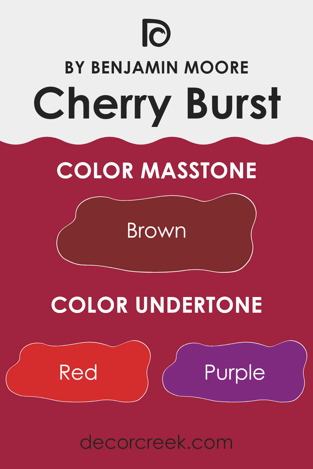
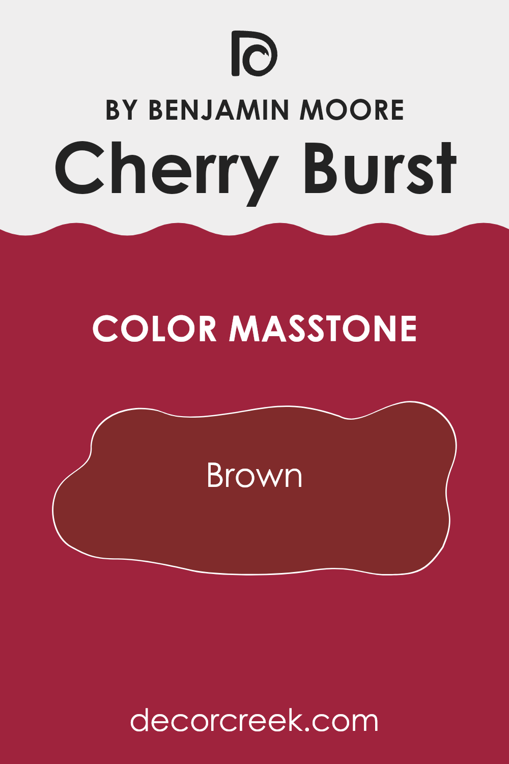
What is the Masstone of the Cherry Burst CSP-1200 by Benjamin Moore?
Cherry Burst CSP-1200 by Benjamin Moore, with a masstone of Brown (#802B2B), is a unique shade that can significantly influence the ambiance of a home. This specific brown tone integrates warmth and a subtle hint of depth that can make interiors feel welcoming and comfortable.
Its earthy base helps it pair well with a variety of other colors and décor styles, from rustic to modern. In living rooms or bedrooms, this color can create a cozy backdrop that promotes relaxation and comfort.
It’s also flexible enough to work well in kitchens and dining areas, adding a touch of warmth that enhances the area’s conviviality. This color’s richness also makes it an excellent choice for accent walls, where it can provide a striking contrast to lighter shades, helping to break up monotonous color schemes and add an interesting visual element to the room. Overall, the use of Cherry Burst CSP-1200 in a home can offer a welcoming and grounded atmosphere.
decorcreek.com
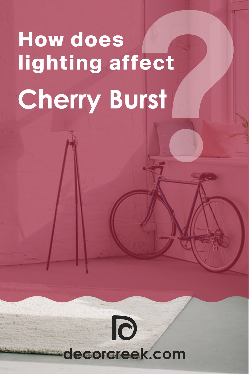
How Does Lighting Affect Cherry Burst CSP-1200 by Benjamin Moore?
Lighting plays an essential role in how we perceive the color of an object or a wall. Depending on the type of light—natural or artificial—colors can appear differently. This is important to consider when choosing a paint color for your interior, such as Cherry Burst by Benjamin Moore.
In artificial light, Cherry Burst might look warmer and more vibrant. This is because artificial lights, especially those with a yellow or warm tone, can intensify red and orange hues. If the room uses cooler LED or fluorescent lights, the color may appear slightly muted, as these lights tend to soften warmer colors.
In natural light, the appearance of Cherry Burst will vary throughout the day. Morning light, which is typically softer and more golden, will enhance the warm tones of the paint, making it glow warmly. As the day progresses and the light becomes whiter and brighter at noon, the color will look truer to its original shade. In the evening, as the light softens again, the color will again take on a warm, inviting glow.
The direction your room faces also affects how Cherry Burst will look:
- North-faced rooms get less direct sunlight, which can make colors appear cooler. Here, Cherry Burst might look more subdued and less vibrant.
- South-faced rooms receive more direct sunlight, bringing out the brightness and warmth of the color, making it appear more vivid and dynamic.
- East-faced rooms get bright morning light, which can make Cherry Burst look very warm and welcoming in the morning, but cooler in the afternoon.
- West-faced rooms are brighter in the afternoons and evenings. Here, the paint will show its warm, rich tones later in the day, offering a cozy atmosphere by sunset.
Choosing colors like Cherry Burst by Benjamin Moore for your walls therefore requires considering both the light sources in the room and its orientation to ensure that the color behaves as desired throughout the day.
decorcreek.com
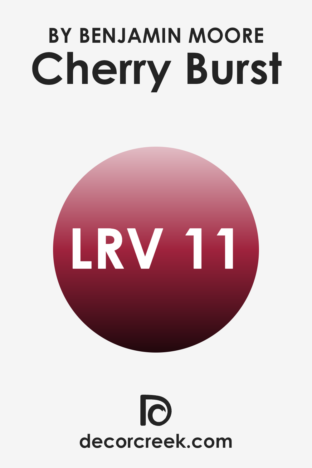
What is the LRV of Cherry Burst CSP-1200 by Benjamin Moore?
LRV stands for Light Reflectance Value and is a measure used to indicate how much light a color reflects or absorbs when it’s painted on a wall. In simpler terms, it determines how bright or dark a color will appear under natural or artificial lighting.
A higher LRV value means the color reflects more light, appearing brighter, and making interiors feel larger and more open. Conversely, a lower LRV means the color absorbs more light, appearing darker and can make a room feel cozier and smaller because less light is bouncing around.
In the case of Cherry Burst with an LRV of 10.79, this is considered a lower value, suggesting that it’s a darker color. When used on walls, this hue will absorb more light than it reflects, which could enhance the atmosphere in an interior by giving it a more intimate and warm feel. This characteristic makes it a suitable choice for larger rooms or well-lit areas where a bit of warmth is desired. However, if used in a smaller or poorly lit room, it might make the interior feel even smaller or dimmer due to its lower light reflectance.
decorcreek.com
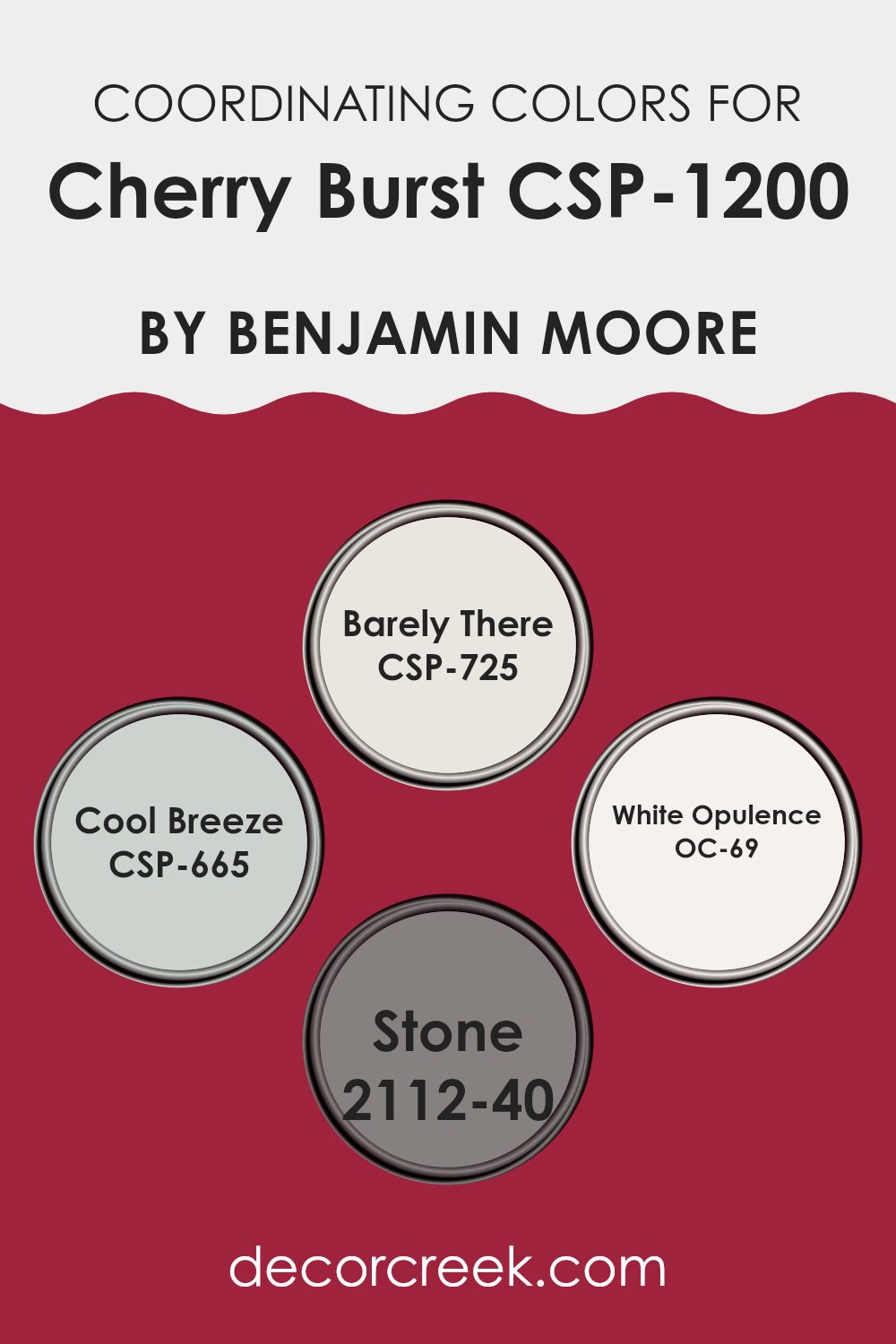
Coordinating Colors of Cherry Burst CSP-1200 by Benjamin Moore
Coordinating colors are hues that complement each other when used together in a design or color scheme. These colors can enhance the overall aesthetics of an interior, ensuring that the colors balance well without feeling overpowering. For example, the vibrant Cherry Burst can be beautifully complemented by a selection of other colors chosen for their harmonizing qualities.
Barely There CSP-725 provides a subtle and neutral backdrop that allows bolder colors like Cherry Burst to stand out without clashing. It’s a soft beige that helps to create a calm and light atmosphere. Cool Breeze CSP-665 is a gentle blue with a refreshing feel, perfect for adding a touch of cool contrast to warmer tones while maintaining a harmonious look.
White Opulence OC-69 is a crisp white, offering a clean and fresh look that can make the Cherry Burst pop, and prevent darker or richer colors from making the interior feel too confined. Lastly, Stone 2112-40 is a deep gray that pairs nicely with both neutral and vivid colors, grounding the brighter shades and bringing an element of modernity to any decor. These colors together provide flexible options for decorating with balance and harmony, making any room feel cohesive and thoughtfully designed.
You can see recommended paint colors below:
- CSP-725 Barely There
- CSP-665 Cool Breeze
- OC-69 White Opulence
- 2112-40 Stone
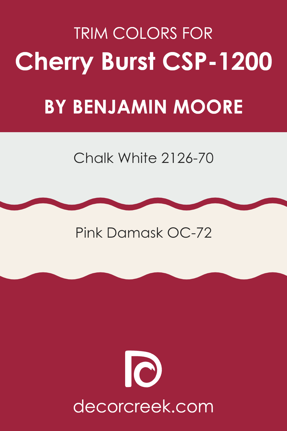
What are the Trim colors of Cherry Burst CSP-1200 by Benjamin Moore?
Trim colors are essential elements in painting and decorating because they help to define and highlight the architectural features of a room, such as doors, windows, and skirting boards. By using colors like 2126-70 – Chalk White and OC-72 – Pink Damask as trim colors for a rich hue such as Cherry Burst, you create a striking contrast that can enhance the overall appearance of an interior.
This contrast not only frames the primary wall color but also adds a layer of visual interest, helping to outline different zones or features within a room effectively. Chalk White 2126-70 is a clean and bright white that offers a crisp contrast to richer, darker colors. It’s particularly effective at making other colors stand out and adds a fresh, neat appearance to any room.
On the other hand, Pink Damask OC-72 is a soft pink that provides a gentle and warm contrast. Using Pink Damask as a trim color introduces a subtle hint of color that is not too intense but adds a pleasant softness to the overall look, working particularly well in areas aiming for a light and inviting feel.
You can see recommended paint colors below:
- 2126-70 Chalk White
- OC-72 Pink Damask
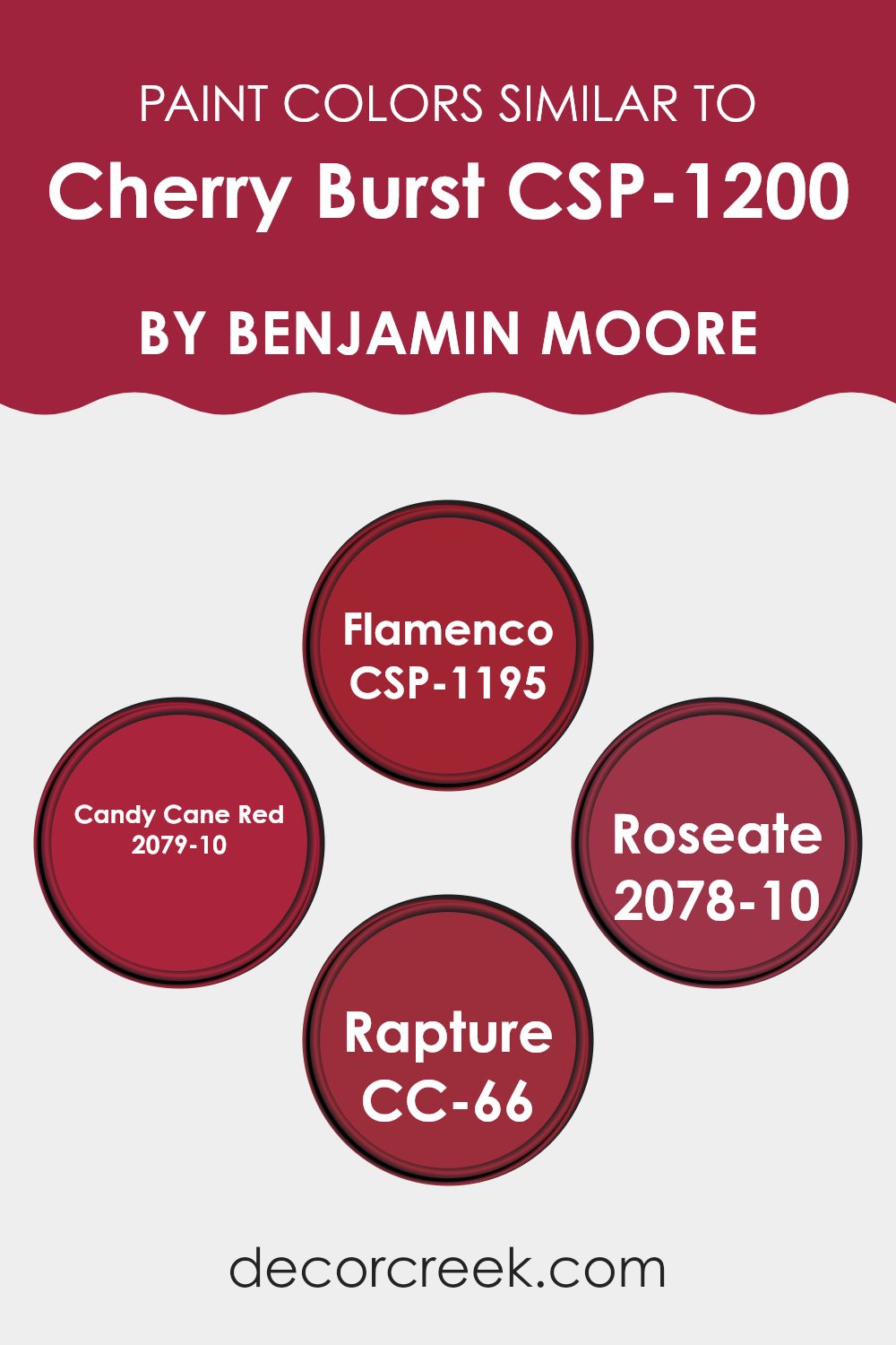
Colors Similar to Cherry Burst CSP-1200 by Benjamin Moore
Choosing colors that are similar or complementary is crucial when designing an interior, whether for creating a harmonious atmosphere or for emphasizing a certain aesthetic. Similar colors like those comparable to Cherry Burst by Benjamin Moore, such as Flamenco, Candy Cane Red, Roseate, and Rapture, can provide a cohesive look while still allowing for distinct accents and variation within a design scheme.
These shades build off of each other because they share a base hue, yet each offers its own unique feel and intensity. This method of selecting colors helps maintain a visual flow throughout an interior, contributing to a well-rounded and pleasing environment.
For instance, Flamenco is a warm, vibrant red that brings a lively and energetic touch to interiors, making it perfect for areas that benefit from a splash of enthusiasm. On the other hand, Candy Cane Red, resembling the cheerful red of the holiday treat, offers a slightly playful and bright option, ideal for areas meant to evoke joy and liveliness.
Roseate has a softer tone, akin to the gentle hue of a rose, suitable for creating a softer, more subdued atmosphere while still retaining warmth. Rapture strikes a balance with a deep red that hints at maroon, providing a richer, more muted option when compared to the brighter reds. These similar colors work together seamlessly, allowing you to mix and match while maintaining a harmonious palette that enhances the overall design.
You can see recommended paint colors below:
- CSP-1195 Flamenco
- 2079-10 Candy Cane Red
- 2078-10 Roseate
- CC-66 Rapture
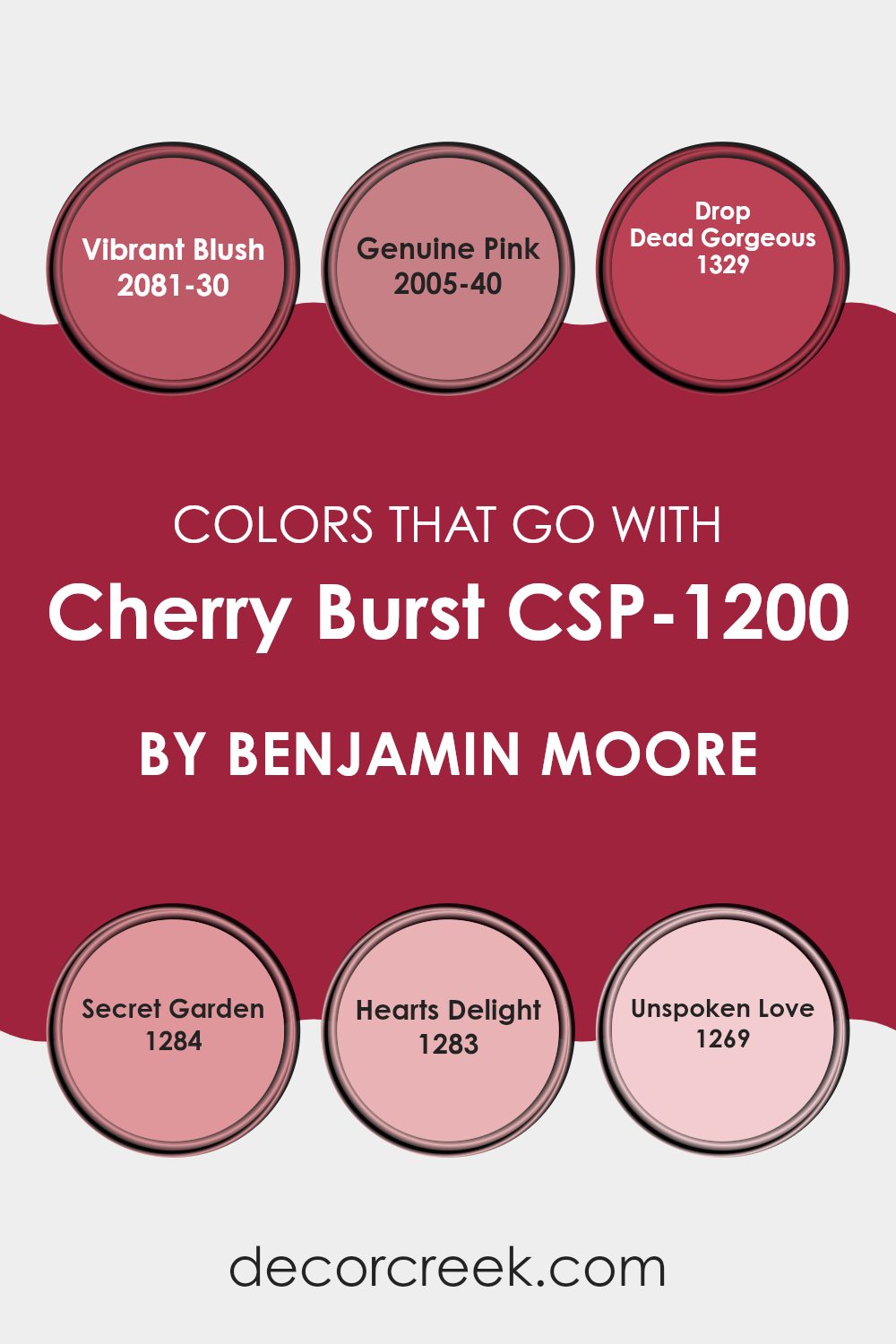
Colors that Go With Cherry Burst CSP-1200 by Benjamin Moore
Colors that complement Cherry Burst CSP-1200 by Benjamin Moore are crucial for setting the right mood and enhancing visual harmony in your interior. For instance, 2081-30 – Vibrant Blush is a bold and energizing pink that adds a lively pop of color, making it perfect for accent walls or decorative accessories that need to stand out against the deeper tones of Cherry Burst. Meanwhile, 2005-40 – Genuine Pink offers a softer, more delicate pink, giving a gentle contrast that’s ideal for creating a nuanced and appealing look.
Pairing Cherry Burst with 1329 – Drop Dead Gorgeous, a deep, luxurious berry shade, adds a layer of depth and richness that enhances the robust character of Cherry Burst, perfect for a cozy corner or an elegant dining area. Using 1284 – Secret Garden provides a muted teal that can cool down the warmth of Cherry Burst, lending a refreshing touch to the interior.
Similarly, 1283 – Hearts Delight is a playful coral shade that brings a cheerful energy, brightening areas with a youthful glow. Lastly, 1269 – Unspoken Love is a subtle mauve that offers a touch of understated elegance, working beautifully in areas that aim for a soft, romantic feel. Each of these colors supports Cherry Burst in its own unique way, ensuring that whatever the pairing, the environment remains inviting and stylish.
You can see recommended paint colors below:
- 2081-30 Vibrant Blush
- 2005-40 Genuine Pink
- 1329 Drop Dead Gorgeous
- 1284 Secret Garden
- 1283 Hearts Delight
- 1269 Unspoken Love
How to Use Cherry Burst CSP-1200 by Benjamin Moore In Your Home?
The Cherry Burst CSP-1200 by Benjamin Moore is a vibrant and lively paint color that can add a fresh and cheerful vibe to any room in your home.
If you want to brighten up your interior, this shade of red can do wonders. It works great in a kitchen or dining area, making the interior feel warm and inviting. You can also use it in a living room or entryway to create a strong, welcoming impression.
When using such a bold color, consider painting one accent wall to add a pop of color without feeling overpowering. Pair Cherry Burst with neutral colors such as white, grey, or beige to balance out its intensity. It’s also a great option for adding color to smaller pieces, like a bookshelf or a single piece of furniture, to inject personality into your interior without a major overhaul. With Cherry Burst, you can easily liven up your home.
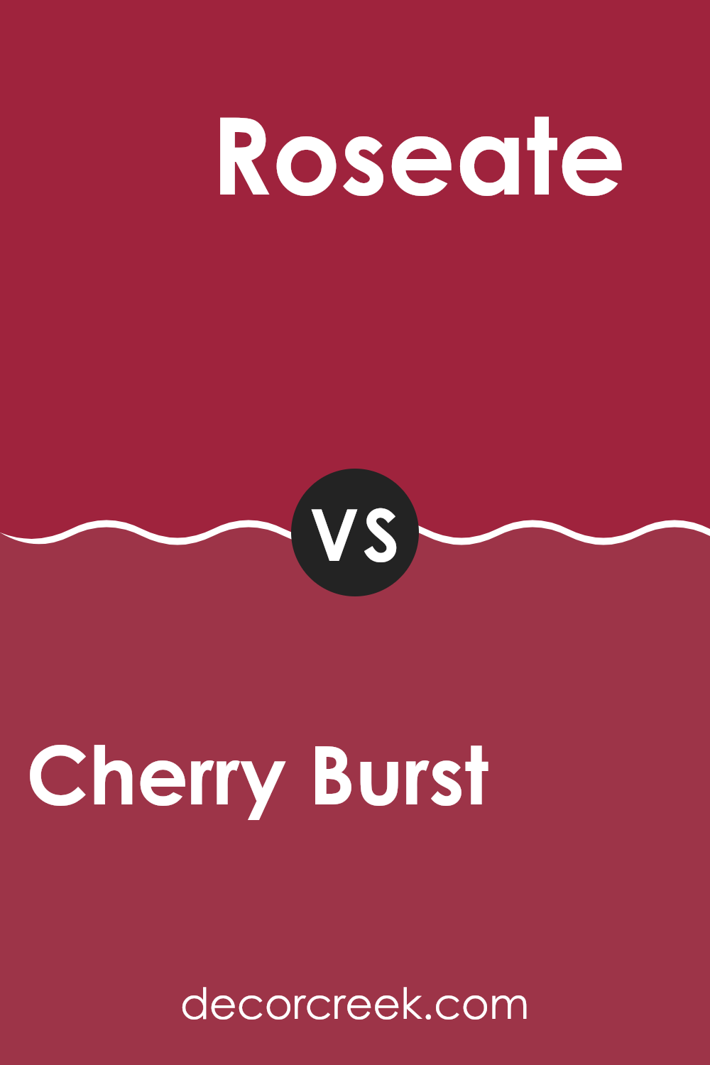
Cherry Burst CSP-1200 by Benjamin Moore vs Roseate 2078-10 by Benjamin Moore
Cherry Burst CSP-1200 and Roseate 2078-10 by Benjamin Moore are both warm, vibrant colors but they have distinct differences. Cherry Burst has a rich, deep red hue that resembles the dark tones found in ripe cherries.
This color is bold and can add a strong statement to any interior, making it lively and energetic. In contrast, Roseate leans more towards a bright pink, catching the eye with its luminous intensity. It’s a cheerful color that can add a playful yet bold touch to decor.
While Cherry Burst brings depth and warmth, Roseate offers a lighter, more vibrant energy. Both colors can liven up an interior, but your choice will depend on whether you want the mature richness of a dark red or the bright burst of a vivid pink.
You can see recommended paint color below:
- 2078-10 Roseate
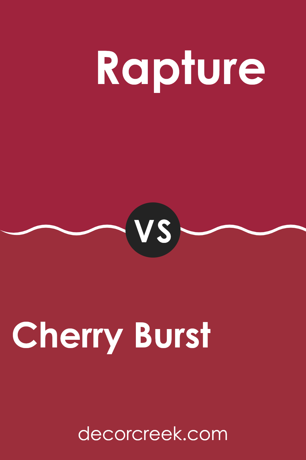
Cherry Burst CSP-1200 by Benjamin Moore vs Rapture CC-66 by Benjamin Moore
Cherry Burst is a vibrant, deep red color that really pops, making it a great choice for adding some energy to a room. It has a boldness that can make rooms feel warm and inviting. This shade is quite dynamic and can pair well with neutrals to stand out as a focal color in a living room or dining area.
On the other hand, Rapture is a soft, muted gray with cool undertones. It’s a more understated color that works well in rooms where you want a calm and quiet atmosphere. This color is flexible, making it easy to match with various decor styles and colors, providing a soothing backdrop that can make
In comparison, Cherry Burst brings warmth and vibrancy, ideal for energetic rooms, while Rapture offers a peaceful and subtle vibe, perfect for relaxed environments. Both colors have their unique appeal depending on the mood you want to create.
You can see recommended paint color below:
- CC-66 Rapture
Cherry Burst CSP-1200 by Benjamin Moore vs Flamenco CSP-1195 by Benjamin Moore
The main color, Cherry Burst, is a rich, deep red hue reminiscent of ripe cherries. It gives off a strong, vibrant feel, ideal for creating a warm and inviting interior. This color can be perfect for accent walls or areas where you want to add a dash of boldness.
In contrast, Flamenco is a bit lighter and leans towards a rusty red shade. It carries an earthy tone, which makes it less intense than Cherry Burst. Flamenco can work well in living areas or bedrooms where a softer yet warm atmosphere is desired.
Together, these two colors from Benjamin Moore can complement each other beautifully. Cherry Burst’s vividness paired with the softer, mellower tone of Flamenco allows for a balanced and harmonious color scheme in any room. Whether used in the same interior to highlight different architectural features or in separate rooms to maintain a fluid color theme throughout the home, these colors offer flexibility and warmth.
You can see recommended paint color below:
- CSP-1195 Flamenco
Cherry Burst CSP-1200 by Benjamin Moore vs Candy Cane Red 2079-10 by Benjamin Moore
Cherry Burst and Candy Cane Red, both by Benjamin Moore, have their unique shades of red, each giving a distinct vibe. Cherry Burst is a deep, rich red with a slight hint of burgundy that makes it feel warm and cozy.
It’s perfect for creating a welcoming atmosphere in an interior like a living room or dining area. On the other hand, Candy Cane Red is a brighter, more vibrant red. It closely resembles the classic red of a candy cane and feels more energetic and lively.
This color would be great for an accent wall or a room where you want to make a bold statement and liven things up. So, while Cherry Burst leans towards a more subdued and warm experience, Candy Cane Red offers a pop of boldness and energy, making each suitable for different moods and settings.
You can see recommended paint color below:
- 2079-10 Candy Cane Red
After reading about CSP-1200 Cherry Burst by Benjamin Moore, I really like how this paint color can make a room feel warm and cozy. It’s like the warm glow you see during a sunset. The color is a mix of red and pink, which reminds me of cherries, just like its name. This color isn’t just pretty; it also makes the room look happy and welcoming.
I learned that you can use Cherry Burst in many different rooms. It looks good in living rooms, dining rooms, and even bedrooms. It’s good because it works well with other colors. For example, you can pair it with soft whites or even dark greens, and it will still look nice.
Overall, I think CSP-1200 Cherry Burst is a fantastic choice if you want to make your room look and feel warm and friendly. It’s like bringing a little bit of a cherry orchard indoors, which sounds really fun.
Whether you’re painting a new room or changing an old one, this color could be a great choice to make any room look better.
decorcreek.com
Ever wished paint sampling was as easy as sticking a sticker? Guess what? Now it is! Discover Samplize's unique Peel & Stick samples.
Get paint samples

