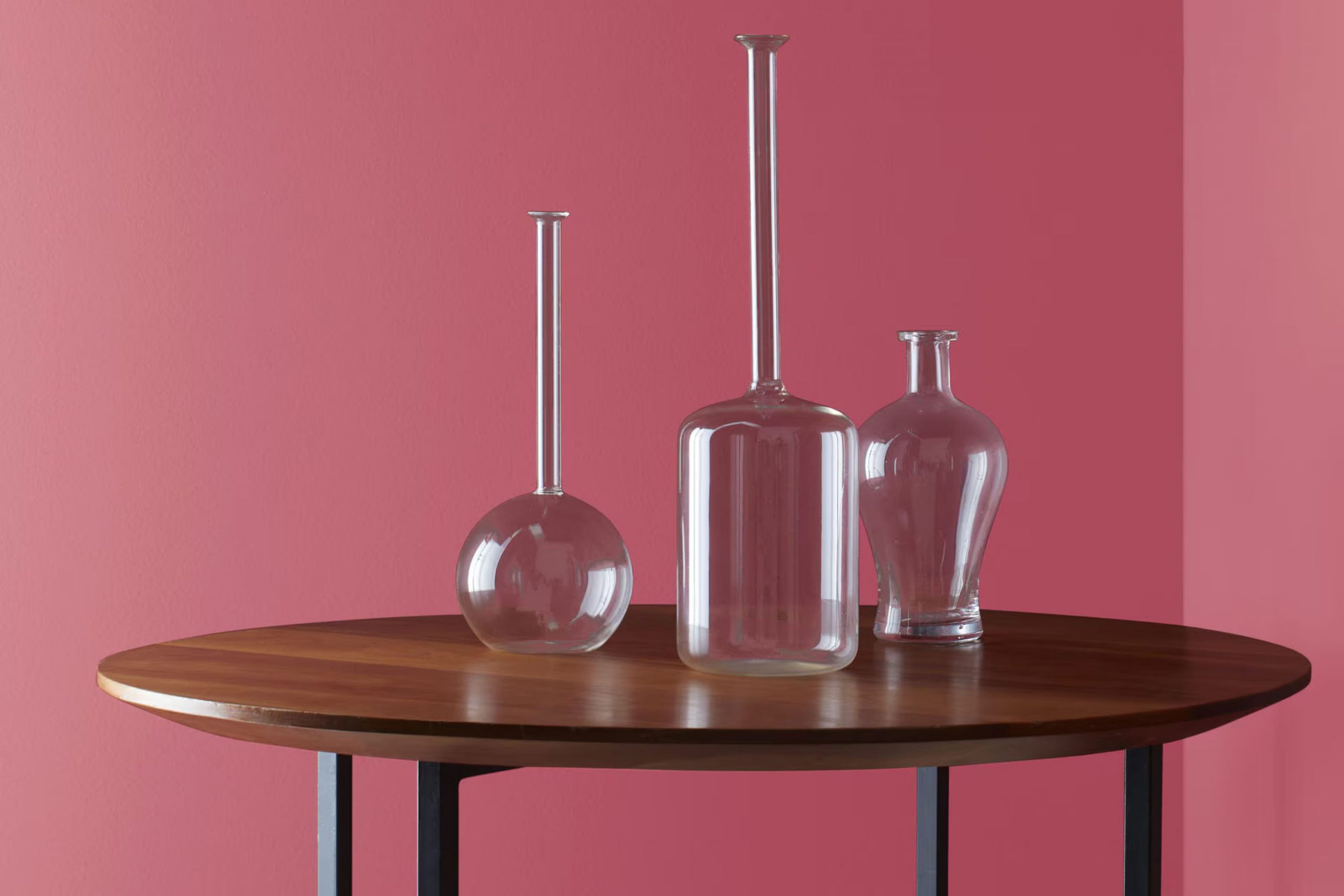
I recently considered repainting my living room to create a fresh, inviting interior, and I stumbled upon a unique shade: 2080-30 Cherry Wine by Benjamin Moore. This rich, deep red offers a sense of warmth that many other colors lack, making it an excellent choice for anyone looking to add a cozy and refined touch to their room.
As I tried out a sample, I noticed how Cherry Wine manages to balance boldness and elegance, giving off a vibe that’s both welcoming and stylish. It’s not just another red; its nuanced hues give it a special character that can enhance a simple room into a refined retreat.
Whether you’re aiming to style a focal wall or envelop the whole room in this distinctive color, Cherry Wine provides a memorable backdrop that can enhance your décor and reflect your personal style. This shade pairs beautifully with soft lighting and rich textures, making the interior not only visually appealing but also comfortably chic.
If you’re considering a vibrant yet tasteful change for any room in your home, Cherry Wine might be the perfect paint to consider.
What Color Is Cherry Wine 2080-30 by Benjamin Moore?
Cherry Wine by Benjamin Moore is a rich, deep red hue that brings warmth and personality to any interior. This color has a luxurious feel that works exceptionally well in both traditional and contemporary settings, adding depth and drama effortlessly.
In traditional interiors, Cherry Wine creates a sense of old-world charm when paired with dark woods and classical furniture. It especially shines in dining rooms or living areas where its intensity helps foster a cozy, inviting atmosphere. For a more modern approach, this color can be the striking backdrop for minimalist decor, contrasting beautifully against sleek metals and glass.
When considering materials, Cherry Wine pairs wonderfully with natural textures. Think leather couches, velvet cushions, and satin drapes to enhance its plush nature. These materials not only complement the depth of the color but also add to the overall warm feel of the room. For those looking to add a bit of brightness and balance, incorporating hints of creamy whites or soft grays can lighten the interior without taking away from the color’s boldness.
Overall, Cherry Wine is a flexible shade that can create a statement in any home, enriching the interior with its deep red tones and adaptable nature. Whether you’re aiming for cozy traditionalism or sleek modernity, this color can help you achieve the look you desire.

decorcreek.com
Is Cherry Wine 2080-30 by Benjamin Moore Warm or Cool color?
Cherry Wine 2080-30 by Benjamin Moore is a deep, rich red color that adds a warm and inviting vibe to any room. It’s perfect for creating a cozy and comfortable atmosphere that makes a home feel welcoming. This shade can be used in living rooms or dining areas to create a sense of comfort and togetherness, where family members can gather and feel relaxed.
In smaller areas, such as a bedroom or bathroom, Cherry Wine can be applied on one wall as an accent, giving a touch of warmth without feeling overpowering. It pairs well with neutral furnishings, allowing the color to stand out and draw attention without clashing.
Furthermore, this color works great for adding character and charm to older homes, highlighting traditional features like wood trim or decorative moldings. In modern settings, it brings a touch of vintage flair that can complement minimalist decors and balance out stark, contemporary lines. Overall, Cherry Wine is a flexible color that can enhance the aesthetic of any home.
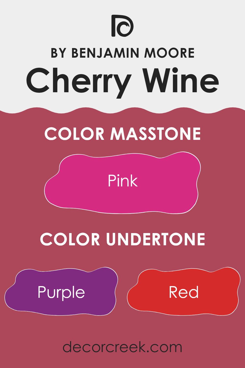
Undertones of Cherry Wine 2080-30 by Benjamin Moore
Cherry Wine is a rich and vibrant color that can dramatically influence the ambiance of a room. Understanding the undertones of this shade is essential to maximizing its impact in an interior. With undertones spanning from purple and red to brown, and lighter hints like pale pink, the complex nature of Cherry Wine makes it flexible yet bold.
Undertones are subtle colors that influence the main hue but may not be immediately noticeable. They play a crucial role in how we perceive the dominant color. For example, the purple and violet undertones in Cherry Wine add a cooler, more mystical depth, making the walls where it is applied seem more lush and inviting. Red and fuchsia undertones add a sense of warmth and energy, making the room feel more dynamic.
On the other hand, brown and grey undertones can ground the color, providing a sense of stability and tempering the brightness with a soothing effect. This makes Cherry Wine an ideal choice for areas where a balance between vibrancy and subtlety is desired.
When used on interior walls, Cherry Wine creates a striking backdrop that can either be the focal point or serve as a refined complement to your decor. It is particularly effective in areas that benefit from a touch of drama, such as dining rooms or cozy reading nooks.
The various undertones can also help tie together different elements and colors within the room, from furniture to art and textiles, enhancing overall cohesion and atmosphere.
decorcreek.com
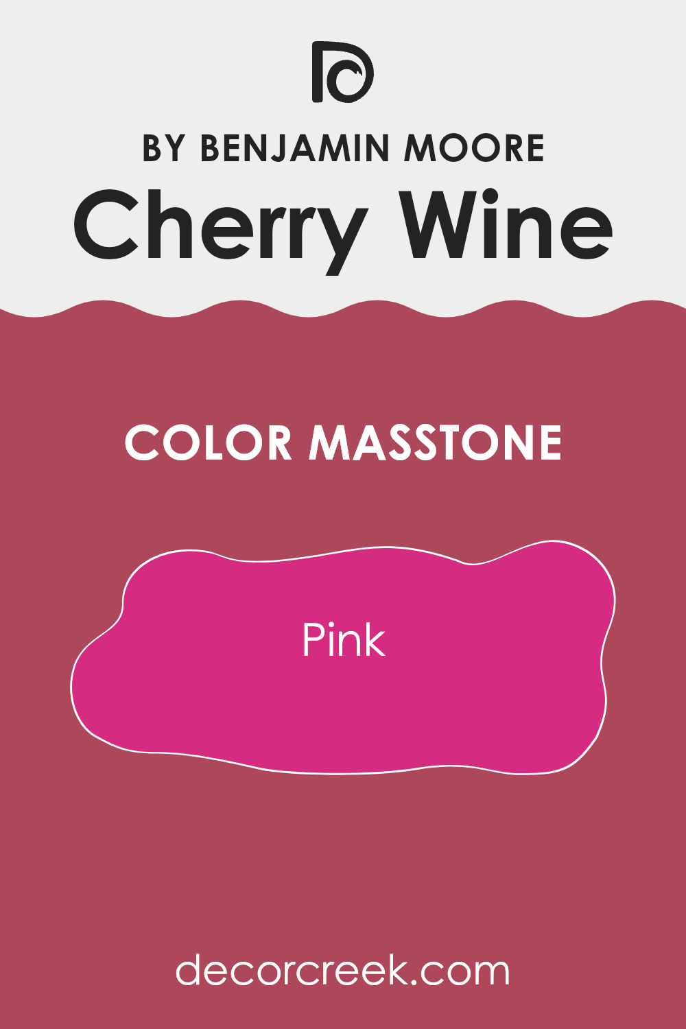
What is the Masstone of the Cherry Wine 2080-30 by Benjamin Moore?
Cherry Wine 2080-30 by Benjamin Moore, with its masstone of Pink (#D52B80), brings a vibrant and lively touch to any room. This shade of pink is bold and bright, serving as a statement color that can add a lot of personality to an interior.
When used on walls, it provides a strong backdrop that can either dominate the room or be balanced out with more neutral tones in furniture and accessories. This makes it flexible for different decorating styles, from modern to traditional.
Because of its intensity, it’s perfect for an accent wall or for use in smaller areas to avoid feeling overpowering. In larger rooms, pairing it with lighter colors can help maintain a fresh and open feel. It works well in living rooms and bedrooms where a splash of color can energize or dress up the environment. However, using it in areas focused on relaxation might require careful balancing as its vibrancy can sometimes be too stimulating.
decorcreek.com
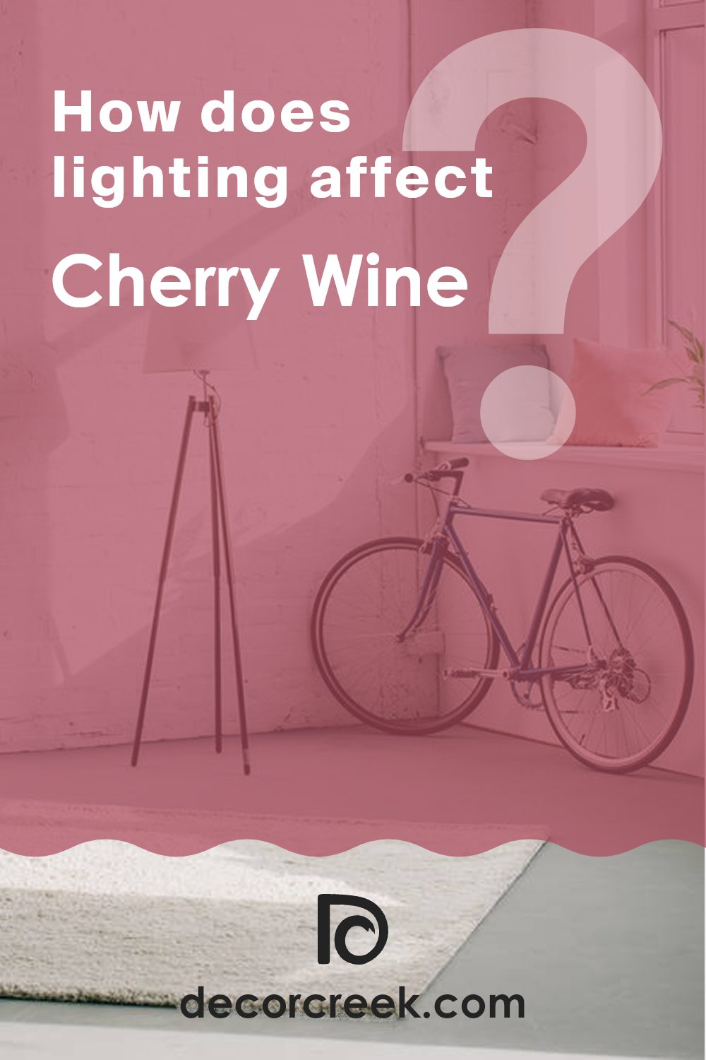
How Does Lighting Affect Cherry Wine 2080-30 by Benjamin Moore?
Lighting plays a crucial role in how colors appear in an interior. The type of light—whether natural or artificial—can significantly impact the way a color is perceived. The color “Cherry Wine” by Benjamin Moore is a rich, deep red that can look different depending on the light it’s exposed to.
In natural light, “Cherry Wine” tends to show its true color. Natural light, especially from the sun, is balanced and helps colors appear vibrant and lively. In a room with plenty of natural light, such as from south-facing windows, “Cherry Wine” will look bright and vivid, enhancing its warm tones. South-facing rooms get a lot of light throughout the day, which means this color will consistently show its richness.
In north-faced rooms, where light is cooler and somewhat bluish, “Cherry Wine” might appear slightly darker and more subdued. North-facing rooms generally receive less direct sunlight, so this color could seem a bit shadowy and less intense.
When it comes to artificial lighting, the type of bulbs used can affect how “Cherry Wine” looks. Warm lights, like those with a yellowish hue, can make this color appear warmer and more inviting, ideal for living areas or a cozy study. Cool lights, on the other hand, may bring out the deeper, more mysterious aspects of the color, perhaps making it less vibrant.
East and west-facing rooms experience changes throughout the day. “Cherry Wine” in east-facing rooms will look warm and bright in the morning due to the gentle morning light but could lose some vibrancy in the afternoon and evening. In west-facing rooms, this color might appear dull in the morning but gain warmth and depth in the afternoon and evening when the sunlight is at its richest.
Understanding how different lights affect “Cherry Wine” can help in deciding if it’s the right color for a particular room, based on the lighting conditions of the interior.
decorcreek.com
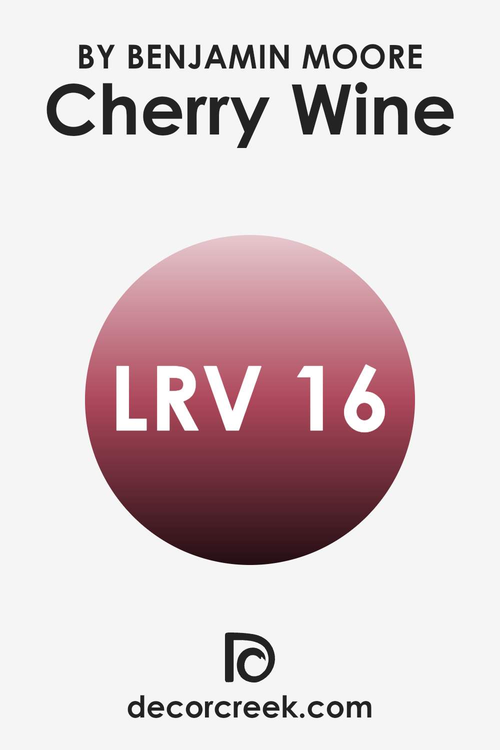
What is the LRV of Cherry Wine 2080-30 by Benjamin Moore?
LRV stands for Light Reflectance Value, which is a measure of how much light a paint color reflects back into a room compared to how much it absorbs. This value is expressed on a scale from 1 to 99, with lower numbers indicating that the color absorbs more light and thus appears darker.
LRV is an important factor when choosing paint colors because it helps you understand how light or dark a color will look on your walls once it’s applied. A color with a low LRV can make a room feel cozier and smaller, while a high LRV can make an interior feel airier and larger.
The LRV for the color Cherry Wine (Benjamin Moore 2080-30) is 15.7, which is fairly low. This means that it is a darker shade that will absorb more light than it reflects. As a result, using this color in a room might make the interior appear smaller and more intimate, which can be ideal for creating a warm and cozy atmosphere.
However, it’s also crucial to consider the room’s natural lighting before deciding on this color, as it could make a dimly lit room feel even darker. If you do choose to use this paint in a poorly lit area, incorporating various light sources to offset the darkness can maintain a balance between cozy and excessively dark.
decorcreek.com
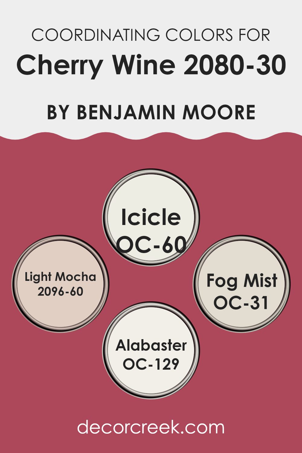
Coordinating Colors of Cherry Wine 2080-30 by Benjamin Moore
Coordinating colors are hues that complement each other and create a pleasing visual experience when used together in décor. For example, when decorating with a rich shade like Cherry Wine by Benjamin Moore, selecting complementary coordinating shades can enhance the overall appearance. These hues work together by balancing color intensity and tones, providing a harmonious look that connects different design elements in an interior.
OC-60 Icicle by Benjamin Moore is a very light, almost white color with subtle blue undertones. This color works well to lighten up interiors and offers a cool contrast to warmer tones like Cherry Wine. 2096-60 Light Mocha is a gentle, light brown that adds a sense of warmth and soft neutrality, making it a flexible companion to more vivid colors.
OC-31 Fog Mist, another color by Benjamin Moore, is a soft grey with a hint of blue, providing a muted, airy quality that pairs nicely with darker, more intense colors. Lastly, OC-129 Alabaster is a clean, pure off-white that acts as a perfect backdrop, allowing more dramatic colors like Cherry Wine to stand out while ensuring the interior feels balanced and not overwhelmed.
You can see recommended paint colors below:
- OC-60 Icicle
- 2096-60 Light Mocha
- OC-31 Fog Mist
- OC-129 Alabaster
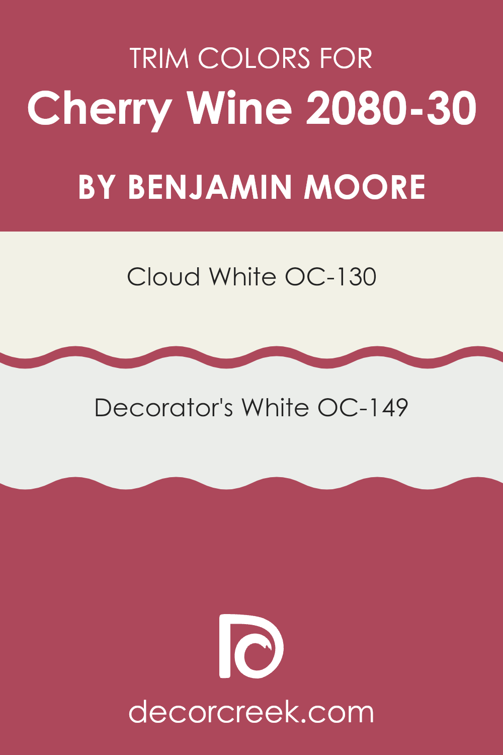
What are the Trim colors of Cherry Wine 2080-30 by Benjamin Moore?
Trim colors are specific shades used to highlight or accentuate the architectural details and edges of a room, such as door frames, window frames, and skirting boards. Choosing the right trim color can significantly affect the overall look and feel of an interior, providing a visual framework that complements the primary wall color.
For a rich and vibrant hue like Cherry Wine by Benjamin Moore, selecting an appropriate trim color is crucial to ensure a harmonious balance that enhances both the boldness of the wall color and the room’s aesthetic appeal.
Cloud White OC-130 and Decorator’s White OC-149 are both excellent choices for trim when paired with a robust color like Cherry Wine. Cloud White offers a warm and soft off-white tone that brings a gentle contrast, not feeling overpowering against the deep red of Cherry Wine but gently framing it, adding a touch of freshness to the interior without competing for attention.
On the other hand, Decorator’s White provides a slightly cooler, crisp white finish, giving a clean and defined boundary to the rich Cherry Wine, ensuring the walls pop and the room feels neatly organized. Both trim colors help in defining the interior clearly, making the Cherry Wine hue look even more appealing.
You can see recommended paint colors below:
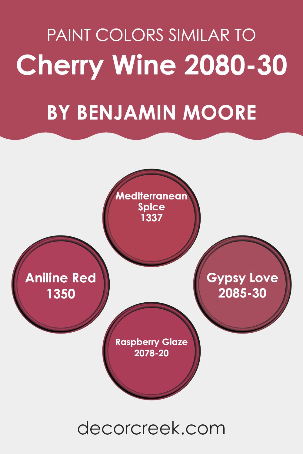
Colors Similar to Cherry Wine 2080-30 by Benjamin Moore
Choosing similar colors in a design is crucial for creating a harmonious and visually appealing interior. Colors that share a similar tone or shade can easily blend together, enhancing the overall aesthetic without creating a jarring contrast.
This coordination helps in achieving a cohesive look in any room. For instance, if you’re considering painting your walls with a rich hue like Cherry Wine, opting for colors close in spectrum can enrich the environment and add depth to your decor.
One such color is Mediterranean Spice, a warm and inviting shade that resembles a sunset glow, perfect for areas that aim for a cozy atmosphere. Then there’s Aniline Red, slightly brighter with a vibrant energy that can add a lively spirit into any area.
Gypsy Love, on the other hand, has a deep, passionate feel, similar to the primary hue but with a hint of mystery that can make any corner intriguing. Lastly, Raspberry Glaze offers a luscious, berry-like tone that provides a sweet and refined backdrop, ideal for adding a touch of elegance to rooms. These colors, when used together with Cherry Wine, ensure a stylish yet unified look that can enliven any interior without feeling overpowering.
You can see recommended paint colors below:
- 1337 Mediterranean Spice
- 1350 Aniline Red
- 2085-30 Gypsy Love
- 2078-20 Raspberry Glaze
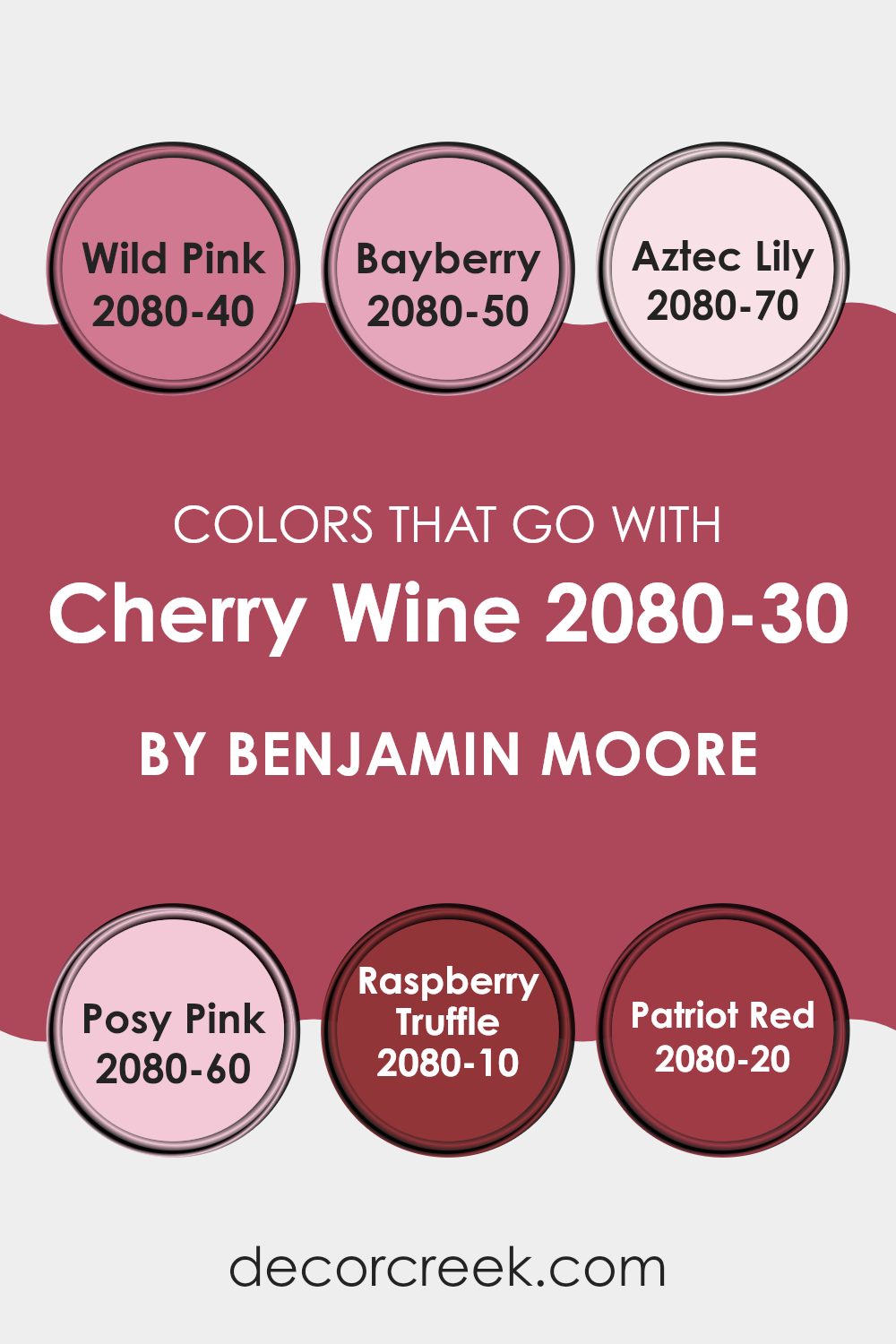
Colors that Go With Cherry Wine 2080-30 by Benjamin Moore
Choosing the right colors to complement Cherry Wine 2080-30 by Benjamin Moore is crucial for creating a harmonious and appealing visual environment. Cherry Wine itself is a deep, rich red that brings warmth and a sense of welcoming coziness. When paired with compatible colors, it helps in achieving a balanced and aesthetically pleasing interior.
Wild Pink 2080-40 is a vibrant pink with a playful feel that brings a pop of brightness when used alongside Cherry Wine, contrasting nicely without feeling overpowering. Bayberry 2080-50 offers a cooler, muted green tone that acts as a calm counterpoint to the intensity of Cherry Wine, providing a natural, soothing presence.
Aztec Lily 2080-70 is a light and airy pink, almost pastel, which softens the strong character of Cherry Wine, making the interior feel lighter. Posy Pink 2080-60 is another gentle pink, a tad deeper than Aztec Lily, which mixes well to add a touch of gentleness. Raspberry Truffle 2080-10 introduces a dark, chocolatey red that complements Cherry Wine by staying within the red family while adding depth and richness.
Lastly, Patriot Red 2080-20 is a bold, true red that matches the energy of Cherry Wine, making any room vibrant and dynamic. Together, these colors create various options for designing interiors that are warm, welcoming, and visually cohesive, enhancing the overall aesthetic of any environment where Cherry Wine is a base tone.
You can see recommended paint colors below:
- 2080-40 Wild Pink
- 2080-50 Bayberry
- 2080-70 Aztec Lily
- 2080-60 Posy Pink
- 2080-10 Raspberry Truffle
- 2080-20 Patriot Red
How to Use Cherry Wine 2080-30 by Benjamin Moore In Your Home?
Cherry Wine 2080-30 by Benjamin Moore is a rich, deep red color that can add warmth and character to any interior in your home. This shade is perfect for creating a cozy, inviting atmosphere in living areas or dining rooms. It works well on accent walls to provide a focal point and adds richness when used on furniture or cabinets.
For a dramatic effect, you can paint all the walls in a small room, like a bathroom or study, to create a bold, intimate vibe. Cherry Wine also pairs beautifully with neutral colors and wood finishes, helping to balance its intensity while maintaining a homey feel. If you prefer subtle touches, consider using it for throw pillows, a feature wall, or even inside shelving units for a surprise pop of color.
Overall, this paint color is a great choice for anyone looking to add warmth and personality to their living interior without feeling overpowering with brightness.
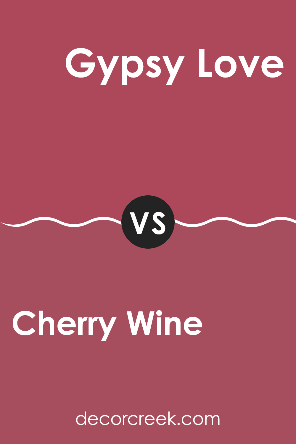
Cherry Wine 2080-30 by Benjamin Moore vs Gypsy Love 2085-30 by Benjamin Moore
Cherry Wine and Gypsy Love, both by Benjamin Moore, are two colors that present interesting yet notably distinct tones. Cherry Wine is a deep, rich red that suggests warmth and comfort, evoking the feel of a cozy evening. It carries a classical sense of elegance and is ideal for creating a standout accent wall or for areas intended to feel more intimate and inviting.
On the other hand, Gypsy Love has a bolder, pinker hue than Cherry Wine. It’s a lively color that brings a touch of playfulness and brightness to a room. This shade has the potential to energize interiors and is perfect for anyone looking to add a spirited and cheerful vibe to their decor.
Both colors have their unique appeal, where Cherry Wine leans towards a traditional and cozy atmosphere, Gypsy Love offers an energetic and vibrant flair. These differences make them suitable for different areas or themes within a home depending on the mood one wishes to achieve.
You can see recommended paint color below:
- 2085-30 Gypsy Love
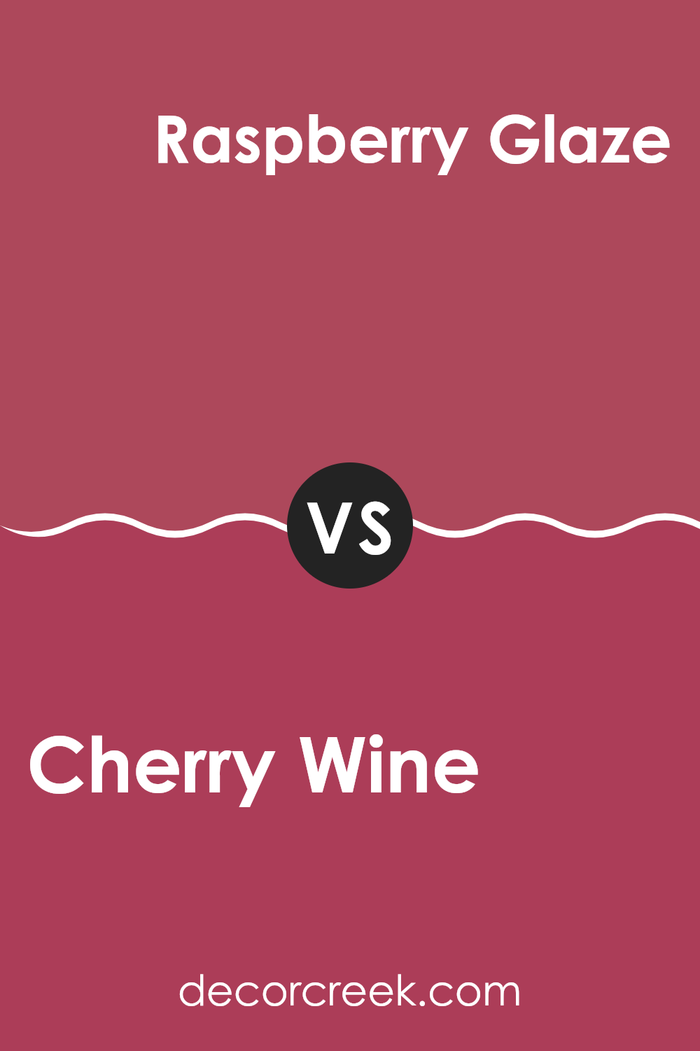
Cherry Wine 2080-30 by Benjamin Moore vs Raspberry Glaze 2078-20 by Benjamin Moore
Cherry Wine 2080-30 and Raspberry Glaze 2078-20 by Benjamin Moore are two vibrant, eye-catching colors. Cherry Wine has a deeper, richer red tone that resembles the color of a dark red wine. This color offers a bold look that can make a striking statement in an interior, making it ideal for areas where you want to add a touch of drama or warmth.
On the other hand, Raspberry Glaze is a brighter red with hints of pink, slightly lighter than Cherry Wine. It brings a lively, cheerful vibe to rooms, perfect for areas meant to be energetic and inviting.
While both colors share a red base, Raspberry Glaze has a more playful, less intense feel than the more grounded Cherry Wine. These colors go well in different settings depending on the mood you want to set—Cherry Wine for a more intimate, cozy atmosphere and Raspberry Glaze for a fun, welcoming area.
You can see recommended paint color below:
- 2078-20 Raspberry Glaze
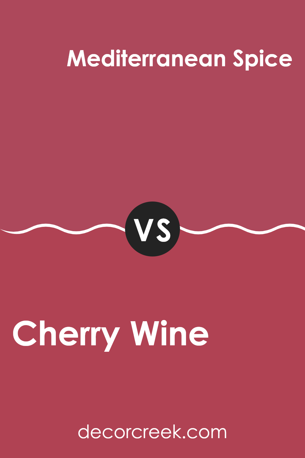
Cherry Wine 2080-30 by Benjamin Moore vs Mediterranean Spice 1337 by Benjamin Moore
Cherry Wine and Mediterranean Spice are two distinct shades by Benjamin Moore. Cherry Wine is a deep, rich red that has a warm undertone, making it feel cozy and inviting. It’s perfect for areas where you want to add a touch of drama or create a cozy, intimate atmosphere.
On the other hand, Mediterranean Spice is a vibrant orange with a touch of red, which gives it a spicy and energetic feel. This color brightens an interior with its cheerful hue, ideal for areas where you want to add excitement or encourage lively conversations.
When you compare these two, Cherry Wine tends to offer a more traditional vibe, often associated with elegance and warmth. Mediterranean Spice, however, leans towards a more dynamic and fun character, bringing brightness and a sense of adventure to interiors. Both colors are bold in their own ways and can make a strong statement depending on what mood you want to set in your interior.
You can see recommended paint color below:
- 1337 Mediterranean Spice
Cherry Wine 2080-30 by Benjamin Moore vs Aniline Red 1350 by Benjamin Moore
Cherry Wine by Benjamin Moore is a rich and deep red color that brings warmth and a cozy feel to any interior. It’s perfect if you want to create a welcoming and inviting atmosphere. This hue resembles a robust red wine, giving any room a classy look without being too overpowering.
On the other hand, Aniline Red by Benjamin Moore leans more towards a vibrant, intense red. This shade is brighter and more pronounced, making it great for adding a pop of color. It’s ideal for someone looking to make a bold statement in their interior, whether it’s a feature wall or an accent piece.
Both Cherry Wine and Aniline Red offer unique qualities that can enhance a room depending on what mood you’re aiming for—coziness with Cherry Wine or striking vibrancy with Aniline Red. Despite their differences, both are beautiful shades of red that can liven up an interior effectively.
You can see recommended paint color below:
- 1350 Aniline Red
After reading about the 2080-30 Cherry Wine paint by Benjamin Moore, I’ve learned a lot about what makes this color unique and how it can change the look of a room. “Cherry Wine” is a deep, rich red that can make any room feel warm and welcoming. It seems perfect for places where families gather like living rooms or dining areas. This color has a cozy vibe, which means it can make large rooms feel more inviting and small areas appear more interesting.
In my opinion, Benjamin Moore did a great job with this paint color by making it bold but still pleasant to look at. It can go well with different kinds of furniture and decorations, from modern to traditional. Whether someone wants to paint an entire room or just one wall as a focal point, Cherry Wine seems like a great choice because it adds personality and warmth.
Overall, using 2080-30 Cherry Wine in a home decorating project sounds like a fun way to make an interior more lively and cozy. It’s a color that can probably make anyone feel happier and more relaxed when they walk into the room.
This paint color has definitely caught my attention, and I think it would be exciting to see how it changes the atmosphere of a room after it is applied to the walls.

decorcreek.com
Ever wished paint sampling was as easy as sticking a sticker? Guess what? Now it is! Discover Samplize's unique Peel & Stick samples.
Get paint samples

