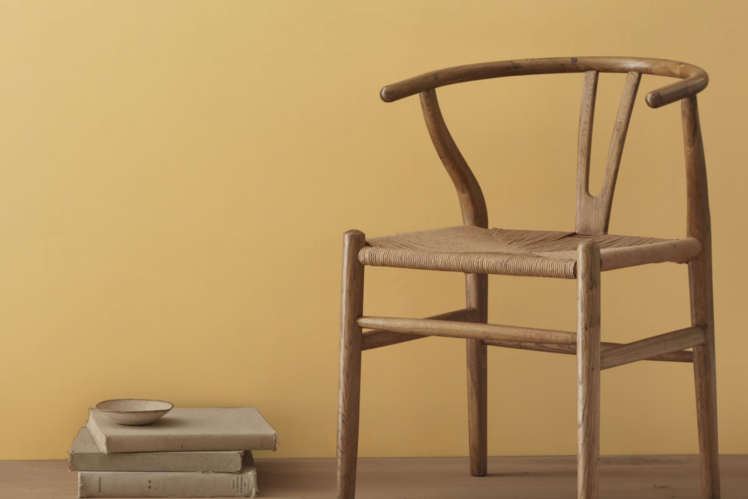
If you’re thinking about giving your room a fresh, cozy update, let me suggest HC-9 Chestertown Buff by Benjamin Moore. From my experience, this color has a rich, warm tone that instantly makes any area feel more inviting. It’s a flexible hue that pairs wonderfully with a variety of decors, whether you want to spruce up your living room or add a touch of warmth to your bedroom.
One of the best things about Chestertown Buff is its ability to blend seamlessly with natural elements like wooden furniture or wicker baskets, enhancing the overall texture of a room. It also works well under different lighting conditions, maintaining its beauty and depth whether bathed in sunlight or illuminated by soft, indoor lights.
Choosing the right paint color can sometimes feel like too much, but Chestertown Buff strikes an ideal balance — it’s neither too bold nor too subtle.
So, if you’re looking to update your walls with a color that provides a comforting presence and complements various styles, HC-9 Chestertown Buff might just be the perfect choice for you.
What Color Is Chestertown Buff HC-9 by Benjamin Moore?
Chestertown Buff HC-9 by Benjamin Moore is a warm, inviting beige color that adds a cozy feel to any room. It’s a flexible shade that blends beautifully with various decor styles and settings. Its subtle yellow undertones provide a hint of sunshine, making rooms feel more welcoming and lived-in.
This color is ideal for traditional and rustic interior designs. In traditional settings, it complements rich wood tones found in furniture and flooring. It pairs well with classic white trim and molding, enhancing the classic feel of the area. In rustic interiors, Chestertown Buff beautifully harmonizes with natural materials such as stone and unfinished wood, lending an earthy, grounded touch to the decor.
Chestertown Buff also works well in farmhouse-style homes where its soft hue coordinates splendidly with textured fabrics like linen and burlap and rustic elements like galvanized metal and distressed wood. Its neutrality allows for great flexibility in accessorizing; bold or muted colors in decorations and furnishings stand out against it without clashing.
When it comes to materials, Chestertown Buff pairs exceptionally well with soft textures and natural fabrics, adding depth and warmth. Leather, wool, and cotton look particularly appealing against this subtle backdrop, creating a comfortable, inviting environment. Whether in a living room, bedroom, or hall, Chestertown Buff creates a cozy, stylish atmosphere.
Is Chestertown Buff HC-9 by Benjamin Moore Warm or Cool color?
Chestertown Buff HC-9 is a warm, inviting paint color from Benjamin Moore. It offers a cozy hue that creates a welcoming atmosphere in any room of the house. This smooth, creamy shade has a touch of yellow, making it perfect for those who want to add a subtle richness to their living area without making it feel too bold.
The flexibility of Chestertown Buff HC-9 allows it to be used in various settings, from kitchens and living rooms to bedrooms and bathrooms. Its lightness helps to brighten up rooms and also makes them look bigger. It pairs well with many colors, allowing for different decorating styles.
Whether combined with deep blues for a calm feel, vivid reds for a touch of energy, or neutral whites for a clean look, this color can handle it all. Its simplicity and warmth make it a great choice for anyone wanting to refresh their home with a new coat of paint that feels both cozy and stylish.
Undertones of Chestertown Buff HC-9 by Benjamin Moore
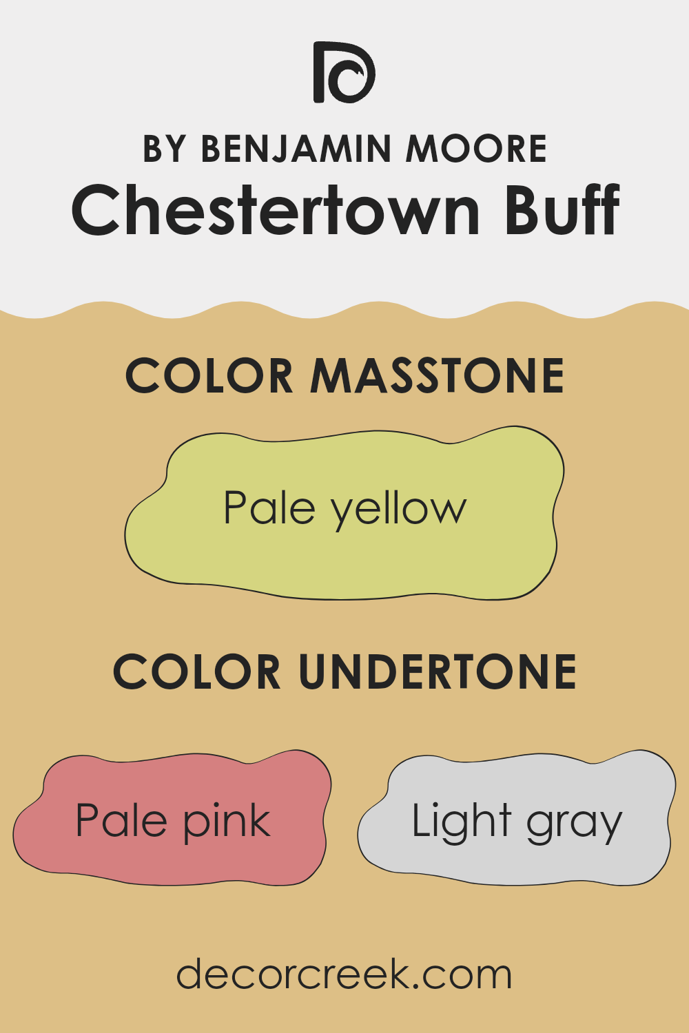
Chestertown Buff is a popular paint color known for its warm, inviting tone. What makes this color so flexible and adaptable is its rich blend of undertones. Undertones are subtle colors that lie beneath the surface of the main hue. They can significantly influence how a color appears in different lighting conditions and can change the mood of a room.
Chestertown Buff has a unique combination of undertones including pale pink, light gray, yellow, mint, light purple, orange, grey, light blue, light green, lilac, and olive. These undertones add depth and complexity, making it more than just a simple beige or buff color.
For example, the yellow undertone brings a sunny warmth, which makes a room feel cozy and welcoming. The light gray and olive help balance that warmth, ensuring the color doesn’t feel too strong but instead offers a subtle, natural feel. Meanwhile, hints of pale pink and light purple add a soft, almost imperceptible flush of color that enhances the overall richness.
When used on interior walls, Chestertown Buff adapts to the lighting conditions, shifting subtly throughout the day. In natural light, the warmer yellow and orange undertones might become more pronounced, creating a cheerful atmosphere. In artificial lighting, the grays and blues can become more evident, providing a calm, grounded feel.
Understanding the undertones of Chestertown Buff can help in choosing decor and furnishings that complement the walls, making decorating a room an easier and more enjoyable task. Whether you desire an area that feels airy and light or warm and cozy, paying attention to these undertones will help achieve the desired effect.
What is the Masstone of the Chestertown Buff HC-9 by Benjamin Moore?
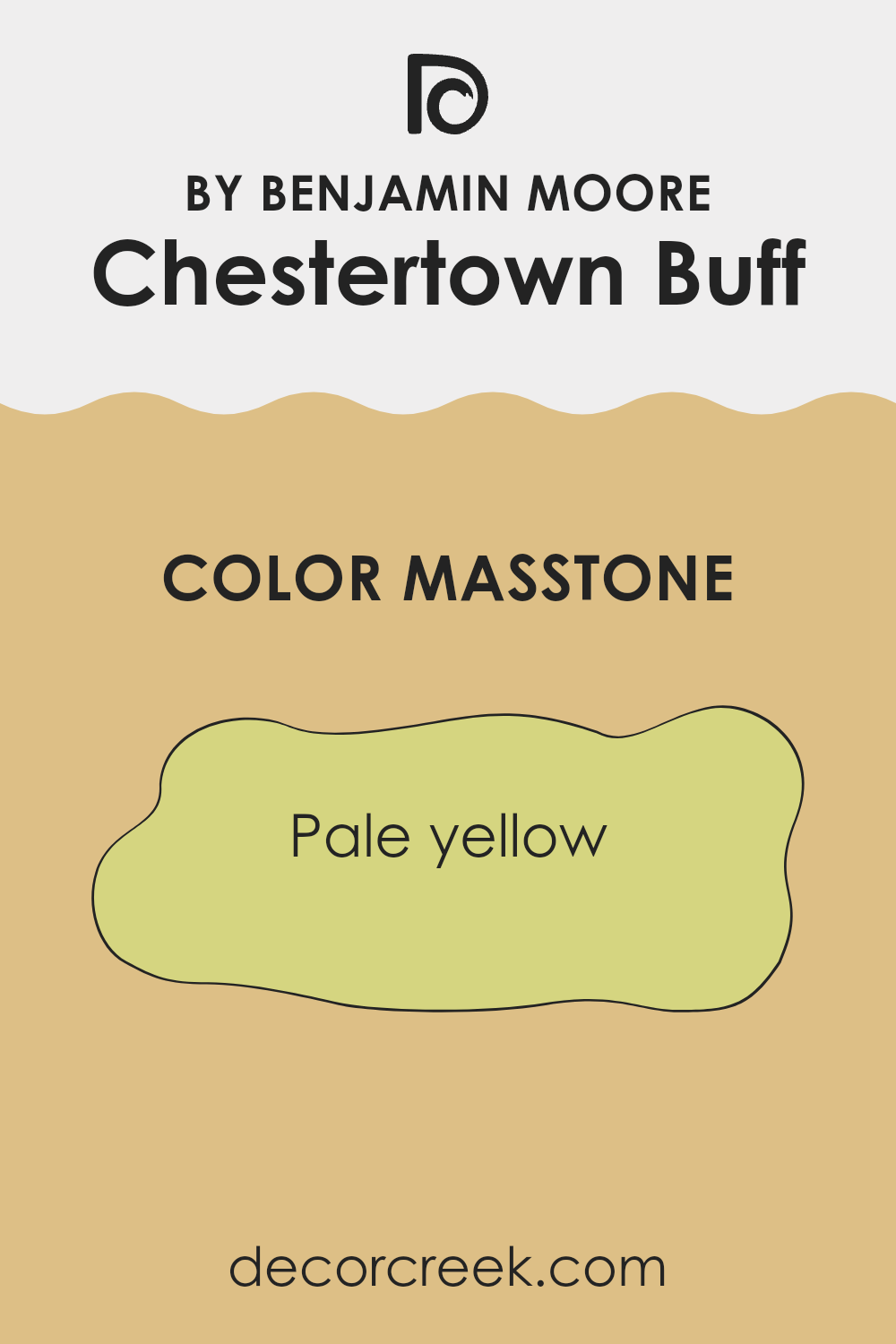
Chestertown Buff HC-9 by Benjamin Moore has a masstone that is a pale yellow, shown by its color code #D5D580. This shade offers a gentle, comforting feel when used in homes. Because its tone is soft and not too bright or harsh, it makes rooms feel cozy and inviting.
The color is great for living rooms and bedrooms where a calm atmosphere is desired. Additionally, since it’s a neutral tone, it pairs well with many other colors, allowing for flexible design options.
Furniture and decor in both dark and light shades can match beautifully with this pale yellow, making it a practical choice for those who like to change their interior style often. It’s also excellent for smaller rooms or areas with less natural light, as it can make them appear bigger and brighter, enhancing the overall feel of the home.
How Does Lighting Affect Chestertown Buff HC-9 by Benjamin Moore?
Lighting plays a crucial role in influencing the appearance of colors on walls and surfaces. Sunlight or artificial light can make the same paint look very different depending on the type of light and the direction of the room in relation to the sun. Let’s look at the color Chestertown Buff by Benjamin Moore. This warm, creamy yellow has a cozy vibe that can enhance the feel of any room.
Under artificial light, such as LED or incandescent bulbs, this color tends to look warmer and richer, making the room feel inviting at night. Since artificial lighting can vary, LEDs might render it more true to its hue in daylight, whereas incandescent bulbs bring out the warmth in the color, emphasizing its creamy quality.
In natural sunlight, the time of day and the room’s orientation significantly affect how Chestertown Buff looks. In north-facing rooms, light tends to be cooler and more consistent throughout the day. Here, Chestertown Buff might appear slightly muted and cooler, losing some of its warmth. It still works nicely, though, acting as a subtle, soft backdrop.
In south-facing rooms, expect Chestertown Buff to shine. The ample sunlight throughout the day hits warmer tones, bringing out the richness and depth of the color. It’s perfect for these rooms as it enhances the natural brightness and warmth, making the area feel sunny and cheerful.
East-facing rooms get direct sunlight in the morning, which can make Chestertown Buff look bright and vibrant in the early hours, gradually softening as the day progresses. In contrast, west-facing rooms see the reverse; the color would appear softer in the morning and gain intensity with the warm afternoon light.
In conclusion, lighting considerations are essential when choosing wall colors. Chestertown Buff by Benjamin Moore is flexible and can work beautifully across different settings, depending on how light interacts with the room throughout the day.
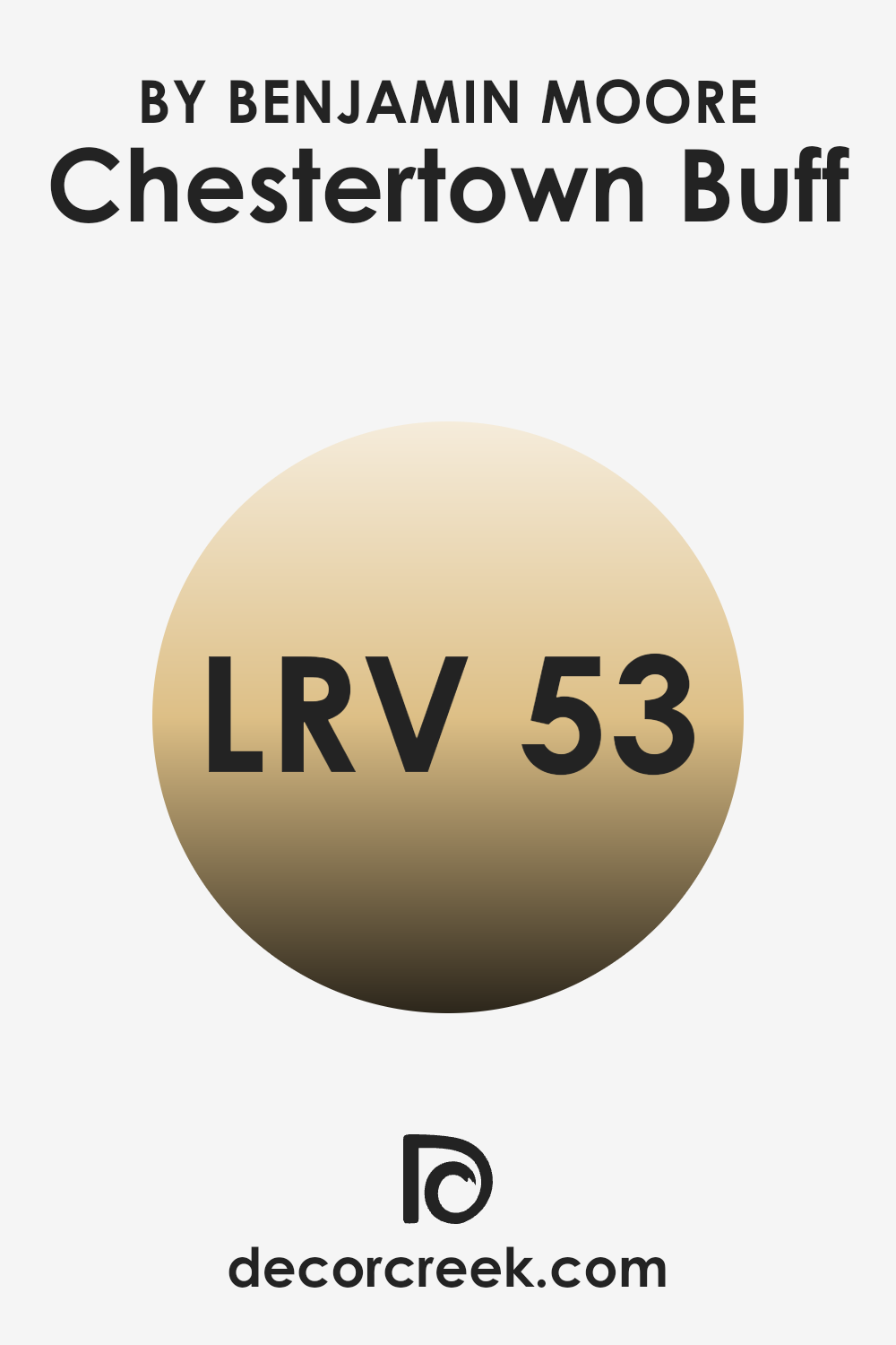
What is the LRV of Chestertown Buff HC-9 by Benjamin Moore?
LRV stands for Light Reflectance Value, a measure used to reflect how much light a color reflects or absorbs when painted on a surface. This value is expressed in percentages where higher values mean the color reflects more light and appears lighter, while lower values mean it absorbs more light and looks darker.
The scale used runs from 0 (reflects no light, pure black) to the highest value (reflects all light, pure white). Understanding LRV is helpful when choosing paint colors for a room because it impacts the overall brightness and mood. Brighter rooms typically feel more open and airy, whereas rooms with darker colors feel cozier and more enclosed.
The LRV for the color Chestertown Buff is 52.88, placing it in the middle range of light reflectance. This means that it neither overly bright nor too dark, making it a versatile color for various spaces. In well-lit rooms, this particular shade will appear lighter and more vibrant due to its ability to reflect a moderate amount of light. However, in less lit areas, it might give off a more subdued and calmer look due to lesser light reflection. The mid-range LRV makes Chestertown Buff a good choice for someone looking for a balanced color tone that isn’t too stark or dull.
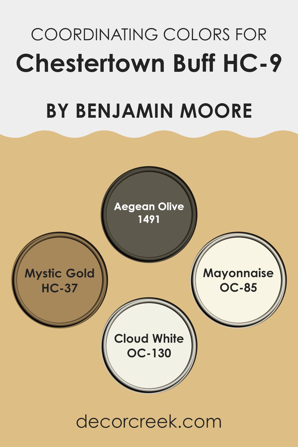
Coordinating Colors of Chestertown Buff HC-9 by Benjamin Moore
Coordinating colors are those that complement or enhance the main color in a room, working together to create a harmonious palette. For example, when used with a warm, muted yellow like Chestertown Buff by Benjamin Moore, certain colors can add depth and balance to the overall design. Selecting the right coordinating colors is key to achieving a cohesive look, whether in a home or an office area.
Aegean Olive, numbered 1491, is a deep, rich olive green that brings a grounding, earthy element when paired with Chestertown Buff. It’s perfect for accents like cushions or for an accent wall that needs a touch of nature-inspired strength.
Mystic Gold, HC-37, much like Chestertown Buff itself, offers a golden hue but with a deeper, more amber-like tone, ideal for creating a warm, inviting feel in areas like the living room or dining room. On the lighter end, Mayonnaise (OC-85) is a soft, subtle cream that can be used on trims and ceilings to provide a gentle contrast, ensuring the room feels airy and light.
Similarly, Cloud White (OC-130) is a pure, clean white that offers freshness and a sense of openness, great for larger surfaces to help brighten the area alongside Chestertown Buff. Together, these colors support and enhance one another, creating an environment that feels balanced and thoughtfully designed.
You can see recommended paint colors below:
- 1491 Aegean Olive
- HC-37 Mystic Gold
- OC-85 Mayonnaise
- OC-130 Cloud White
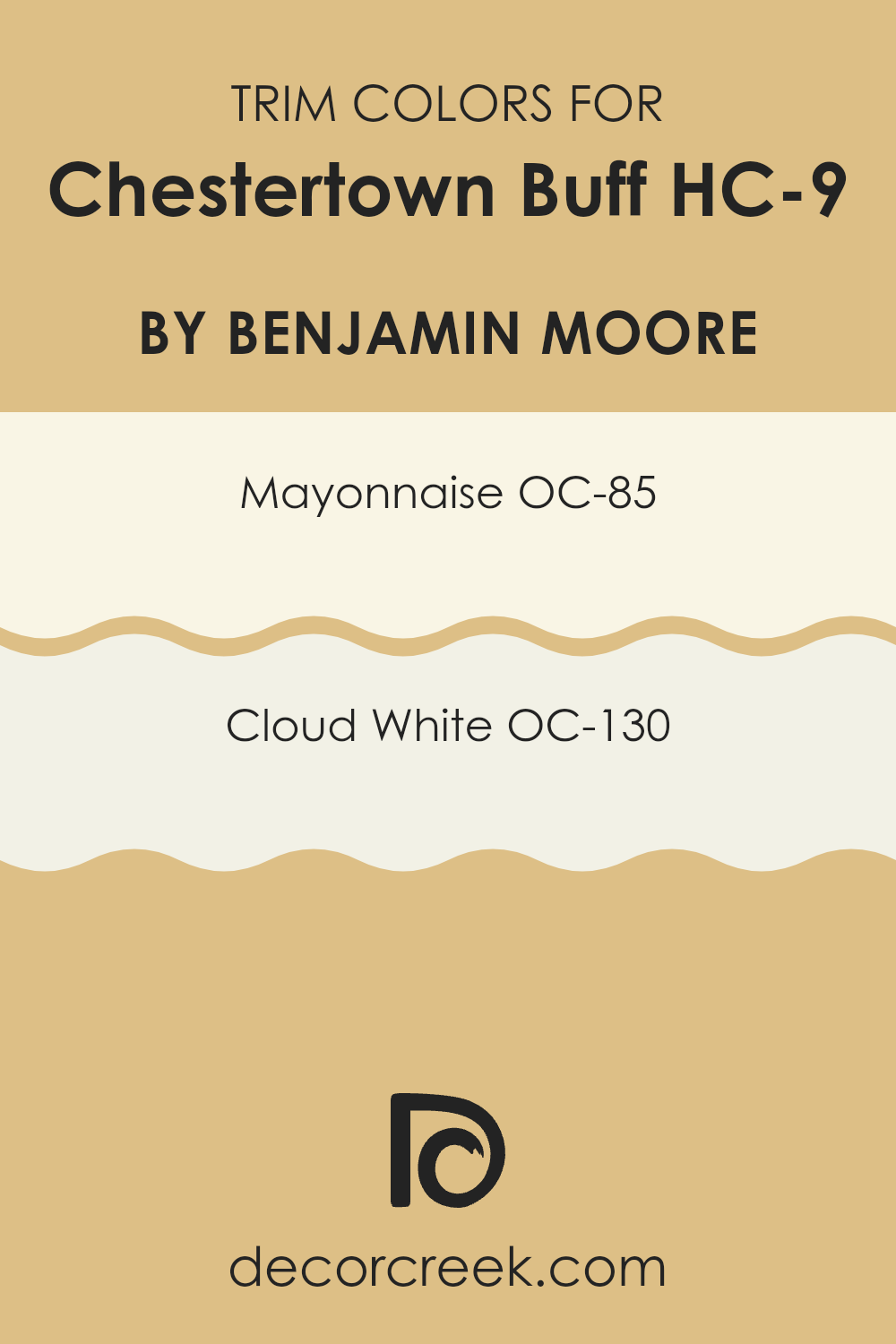
What are the Trim colors of Chestertown Buff HC-9 by Benjamin Moore?
Trim colors are used to highlight the architectural details and framing elements of rooms, such as window frames, skirting boards, and doors. For a warm, neutral shade like Chestertown Buff by Benjamin Moore, choosing the right trim color can greatly enhance the overall aesthetic of the area.
Options like Mayonnaise OC-85 or Cloud White OC-130 serve as excellent choices to complement this particular hue. These lighter trim colors help to define and subtly highlight the boundaries and features of a room, making the wall color stand out with a clean and refined look.
Mayonnaise OC-85 is a warm, off-white color that provides a gentle contrast against Chestertown Buff, softly outlining architectural features without creating too sharp of a difference. Its creamy tone helps to soften the edges and can make a room feel cozier.
On the other hand, Cloud White OC-130 is a slightly cooler white that offers a clearer boundary against the warmer tones of Chestertown Buff. It is ideal for those wanting a more distinct separation in their room, giving it a bright and clean appearance. Both colors support a balanced color scheme that highlights the richness of Chestertown Buff without taking attention away from it.
You can see recommended paint colors below:
- OC-85 Mayonnaise
- OC-130 Cloud White
Colors Similar to Chestertown Buff HC-9 by Benjamin Moore
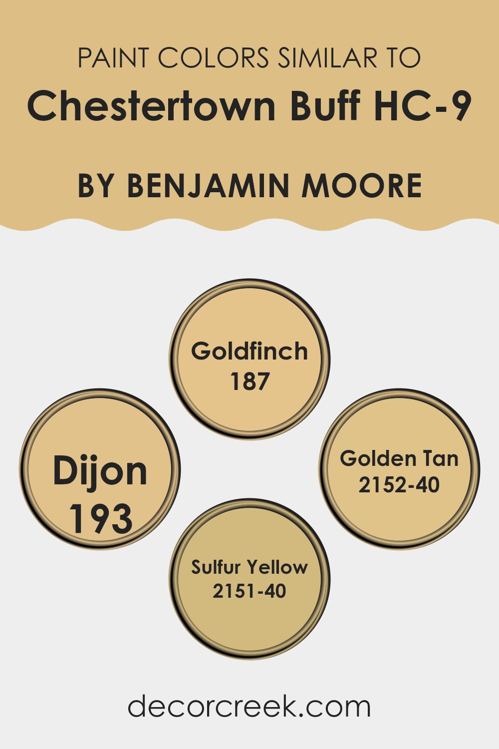
Similar colors play an important role in creating a balanced and cohesive look in interior design, as they allow for a smooth blend and transition between shades. Choosing similar colors like those related to Chestertown Buff helps to enhance the visual harmony of a room, making it feel thoughtfully designed and unified. These shades, each offering a gentle variation within the same spectrum, contribute to an environment that feels visually comforting and appealing.
Colors like 187 – Goldfinch present a sunny, warm hue that evokes the brightness of a clear summer day. It works beautifully to add a cheerful splash to rooms that benefit from a light and open feel. Meanwhile, 193 – Dijon delivers a deeper, mustard-like tone that suggests richness and warmth, ideal for areas aiming for a more grounded and cozy atmosphere.
The color 2152-40 – Golden Tan resembles the soft touch of late afternoon sunlight, offering a mellow and welcoming warmth that suits spaces meant for rest and comfort. Lastly, 2151-40 – Sulfur Yellow, with its lively, almost electric energy, adds a spirited touch that can energize any room, making it feel fresh and vibrant. All these colors, while similar, bring their own mood and depth, allowing for subtle variation while keeping the design consistent and inviting.
You can see recommended paint colors below:
- 187 Goldfinch
- 193 Dijon
- 2152-40 Golden Tan
- 2151-40 Sulfur Yellow
Colors that Go With Chestertown Buff HC-9 by Benjamin Moore
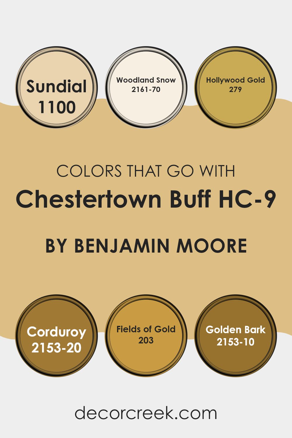
The colors that complement Chestertown Buff HC-9 by Benjamin Moore play a crucial role in creating a harmonious and visually appealing color scheme. These colors help bring balance and variety to an area, making it feel more inviting and comfortable.
For instance, 1100 – Sundial offers a soft hint of sandy yellow, which adds a subtle warmth that pairs perfectly with the subdued tone of Chestertown Buff HC-9. Meanwhile, 2161-70 – Woodland Snow provides a crisp, clean contrast that can help to make the room feel more open and airy, as its light and almost white tone offsets the depth of Chestertown Buff HC-9.
Adding a touch of elegance to the palette, 279 – Hollywood Gold brings a glamorous golden hue that enriches the environment without making it feel too strong, giving a room a touch of luxury and warmth. For those looking for a more earthy contrast, 2153-20 – Corduroy is an excellent choice with its deep, rich brown that grounds the lighter tones in the palette. In a similar vein, 203 – Fields of Gold presents another layer of subtle warmth, reminiscent of wheat fields, that’s perfect for creating a cozy atmosphere.
Finally, 2153-10 – Golden Bark adds a darker, more intense element with its deep mustard tone, ideal for adding depth and interest to the areas it enhances. Together, these colors provide a well-rounded and cohesive palette that can enrich the ambiance of any room when paired with Chestertown Buff HC-9.
You can see recommended paint colors below:
- 1100 Sundial
- 2161-70 Woodland Snow
- 279 Hollywood Gold
- 2153-20 Corduroy
- 203 Fields of Gold
- 2153-10 Golden Bark
How to Use Chestertown Buff HC-9 by Benjamin Moore In Your Home?
Chestertown Buff HC-9 by Benjamin Moore is a warm, inviting paint color that works beautifully in many areas of a home. Its rich, creamy hue adds a cozy feeling to living rooms and bedrooms, creating a pleasant atmosphere where you can relax.
This color pairs well with whites and other neutrals, making it an excellent choice for a balanced look. In a kitchen, Chestertown Buff can give cabinets or walls an updated feel without being too bold. It’s also flexible enough to be used in a small room like a bathroom, where it can make the area seem larger and more welcoming.
If you’re tired of plain walls and want a gentle, yet noticeable change, Chestertown Buff is a solid choice. It reflects light well, turning even dimly lit rooms into warm, inviting areas. Plus, it goes well with various decor styles, from traditional to modern.
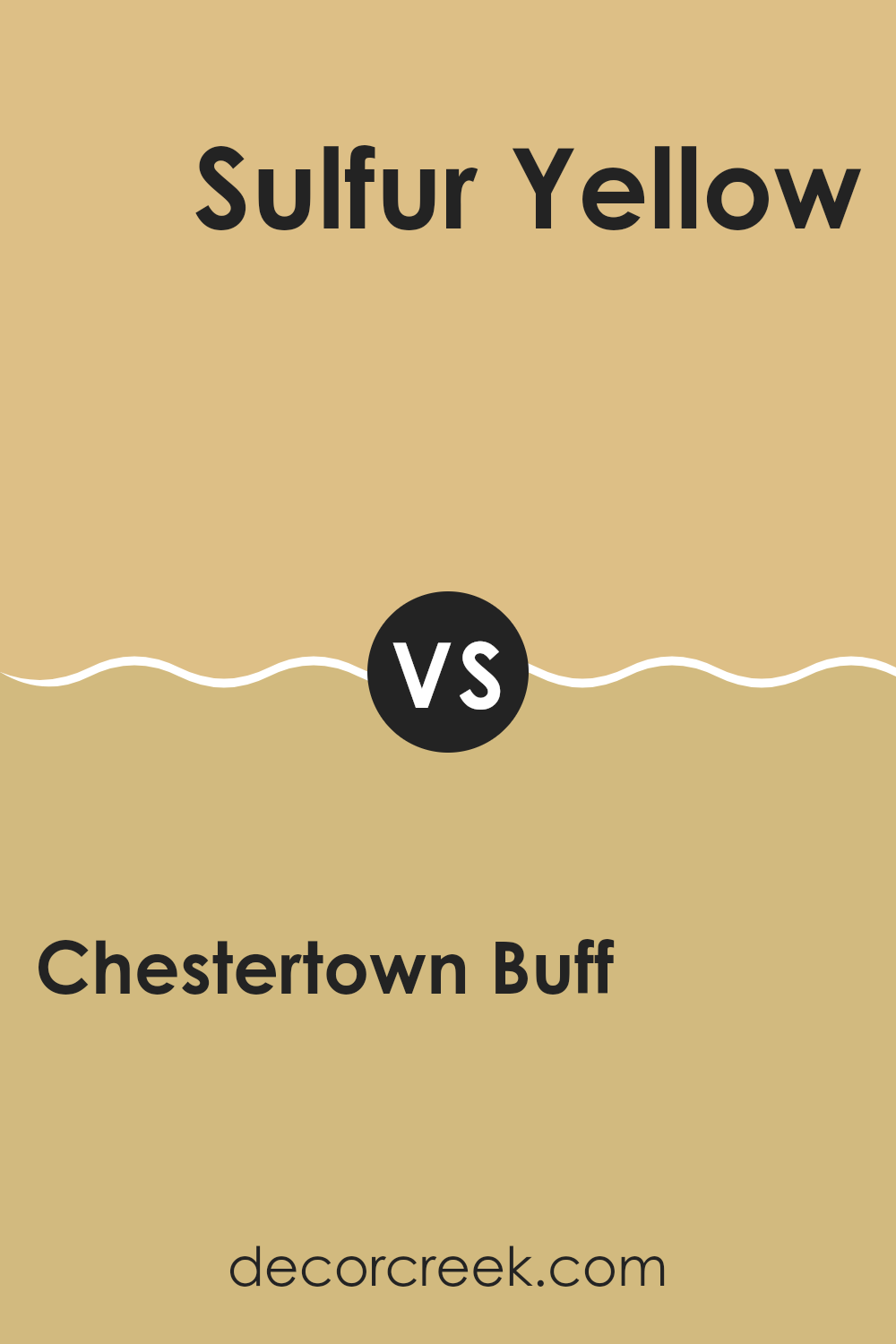
Chestertown Buff HC-9 by Benjamin Moore vs Sulfur Yellow 2151-40 by Benjamin Moore
The main color, Chestertown Buff, is a warm, welcoming shade of beige with subtle yellow undertones. It’s a flexible color that creates a cozy and inviting atmosphere in any room, making it a popular choice for living areas and bedrooms. Its softness allows it to blend easily with various decor styles and colors, providing a calming backdrop.
On the other hand, Sulfur Yellow is a bright and bold yellow. It stands out and brings a lively burst of energy to any area. This color is ideal for adding a pop of vibrancy, often used in rooms that benefit from a cheerful and stimulating vibe like kitchens or playrooms.
While Chestertown Buff is more subdued and easily pairs with other hues, Sulfur Yellow draws attention and is typically used as an accent. Both colors reflect different moods and can greatly influence the feel of a room based on how they are applied.
You can see recommended paint color below:
- 2151-40 Sulfur Yellow
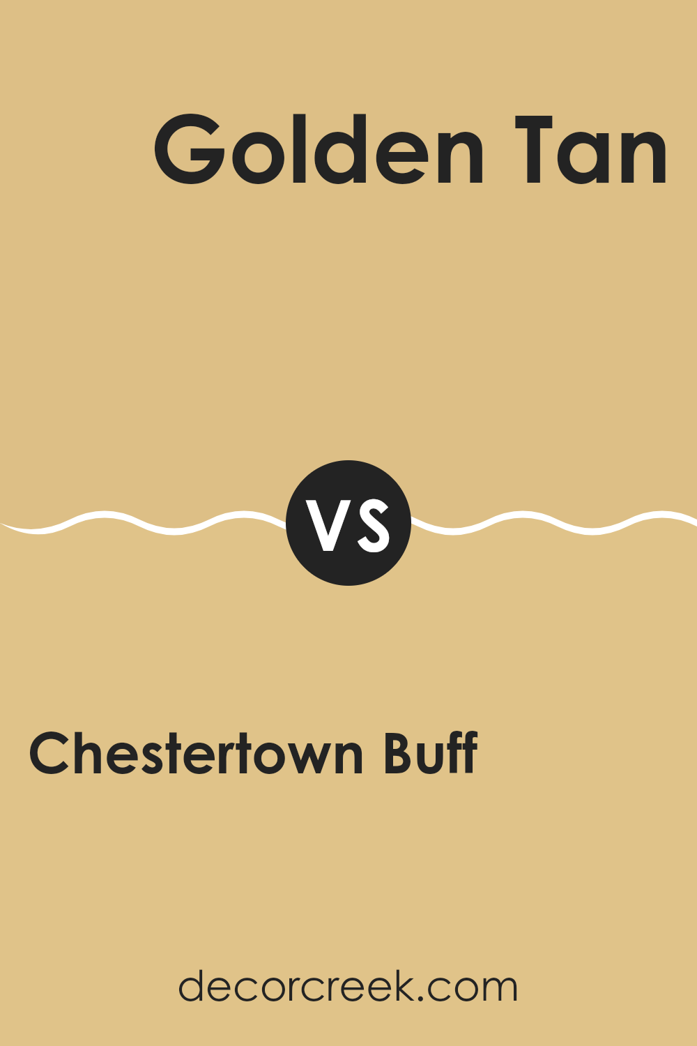
Chestertown Buff HC-9 by Benjamin Moore vs Golden Tan 2152-40 by Benjamin Moore
Chestertown Buff is a warm, inviting shade, with a subtle golden undertone that makes any area feel cozy and welcoming. It’s an excellent choice if you’re looking to create a soothing, comfortable atmosphere without making the room feel too bold. This paint is great for those who prefer a more muted, neutral palette but still want a hint of warmth.
On the other hand, Golden Tan is a more vibrant color. It stands out more due to its brighter and deeper golden hue. This color is perfect for adding a pop of cheerfulness to an area. It works well in rooms that receive a lot of natural light, as the light accentuates the depth of the color, making the area feel lively and energetic.
Both colors share a warmth that can make a home feel inviting, but the use of Chestertown Buff or Golden Tan depends on how subtle or bold you want the room’s mood to be.
You can see recommended paint color below:
- 2152-40 Golden Tan
Chestertown Buff HC-9 by Benjamin Moore vs Dijon 193 by Benjamin Moore
The Chestertown Buff is a warm, inviting beige that adds a cozy and light feel to any room. It’s perfect for areas where you want a soft, neutral backdrop that still offers a touch of warmth. On the other hand, Dijon 193 is a bolder choice.
This color resembles the spicy mustard it’s named after, providing a deep, golden-yellow hue. It’s a good option for rooms where you want to add a bit more energy and vibrancy, as it stands out more than Chestertown Buff.
While both colors come from the same family of earth tones, Dijon 193 is noticeably darker and can make a stronger statement. Chestertown Buff works well in a variety of settings thanks to its subtle nature, whereas Dijon 193 is better suited for specific areas that benefit from a pop of color.
You can see recommended paint color below:
- 193 Dijon
Chestertown Buff HC-9 by Benjamin Moore vs Goldfinch 187 by Benjamin Moore
Chestertown Buff is a warm, creamy yellow. It offers a subtle, calming vibe that works well in areas meant for relaxation like living rooms or bedrooms. Its gentle tone blends with many color schemes and adds a cozy feel without being too bold or strong.
On the other hand, Goldfinch is a vivid, brighter yellow. It brings a lot of energy and brightness to a room, making it a great choice for areas where you want to add a cheerful pop of color, such as kitchens or playrooms. Goldfinch is livelier and can really make an area feel more dynamic and joyful.
When compared, Chestertown Buff is more muted and gentle, while Goldfinch stands out with its vibrant tone. Depending on the mood you want to create, Chestertown Buff is better for a subtle backdrop, and Goldfinch is ideal for a bold, cheerful statement.
You can see recommended paint color below:
- 187 Goldfinch
In my search to find the perfect paint color for my room, I found HC-9 Chestertown Buff by Benjamin Moore, and I’m really glad I did! Let me tell you about this color. It’s a very warm and inviting shade of yellowish-brown, almost like a nice, sunny day or a yummy slice of toasted bread. When I used this color in my living room, it made the room feel cozy and welcoming, just like a big, soft hug.
I noticed that Chestertown Buff goes well with many other colors. Whether I paired it with dark greens, blues, or even some reds, it always looked great. This is really helpful because it means I don’t have to worry too much about choosing accessories or other paint colors; most things just naturally look good with it.
The paint was also very good quality. It went on the wall smoothly and covered up the old colors well, so I didn’t have to use many coats. This made my painting job much quicker and easier.
All in all, HC-9 Chestertown Buff by Benjamin Moore is a great choice if you want a paint color that makes your room feel warm, matches well with other colors, and is easy to apply. I’m really happy with how my room turned out, and I think this color helped a lot. It’s definitely one of my favorites!
Ever wished paint sampling was as easy as sticking a sticker? Guess what? Now it is! Discover Samplize's unique Peel & Stick samples.
Get paint samples

