When you think of a color that seamlessly combines elegance with a touch of warmth, 1008 Devonwood Taupe by Benjamin Moore might just catch your attention. This refined hue offers a balance of gray and beige tones, making it adaptable for various rooms in your home. It creates a neutral backdrop that complements different styles, whether you’re a fan of modern minimalism or classic designs.
I find that Devonwood Taupe brings a sense of calm sophistication to a room, without overpowering the room. It’s perfect for creating a cozy atmosphere in living rooms or bedrooms, and it pairs beautifully with both light and dark furnishings. The color’s subtle warmth can make a room feel inviting, while its neutral quality allows for a wide range of accent colors.
This shade holds its own in different lighting conditions, maintaining its charm whether bathed in natural daylight or under the glow of indoor lighting. Personally, I appreciate how Devonwood Taupe adapts to various settings, and its enduring appeal means it can easily evolve with your decorating tastes over the years.
If you’re considering a change, this color might be the perfect choice to add a touch of understated elegance to your home.
What Color Is Devonwood Taupe 1008 by Benjamin Moore?
Devonwood Taupe by Benjamin Moore is an adaptable shade that combines the warmth of brown with the subtlety of gray. This color is a soft, muted taupe, offering a neutral base that’s neither too light nor too dark. It provides a calming and inviting atmosphere, making it suitable for various rooms in a home.
This color works particularly well in interior styles like traditional, modern farmhouse, and transitional. It adds a grounded feel that complements both classic and contemporary elements. The softness of Devonwood Taupe makes it a fitting backdrop for areas where you want to create a cozy and welcoming environment.
When it comes to materials and textures, Devonwood Taupe pairs beautifully with natural wood tones, adding depth and richness. It also works well with linen and cotton fabrics, enhancing a room’s comfort. Metal accents, such as brushed nickel or wrought iron, provide a touch of contrast, while stone elements like marble or slate can highlight the color’s neutral undertone.
Additionally, adding greenery or natural fibers like jute can further enhance the harmonious feel of the room. Overall, Devonwood Taupe is a color that harmonizes with a wide array of materials and textures, providing an adaptable and enduring look.
Is Devonwood Taupe 1008 by Benjamin Moore Warm or Cool color?
Devonwood Taupe by Benjamin Moore is an adaptable paint color that brings warmth and comfort to any room. This shade is a soft, neutral taupe that falls between beige and gray, making it a popular choice for various rooms in a home. Its balanced tone helps create a cozy and inviting atmosphere without overpowering the senses. Living rooms and bedrooms benefit from this color as it complements many styles, from traditional to modern.
In kitchens, Devonwood Taupe pairs well with natural wood finishes and stainless steel appliances, creating a harmonious and balanced look. It can also be used in hallways and entryways to warm up these transitional rooms without making them feel too dark or narrow.
The color’s understated nature allows it to play well with other colors, offering flexibility in decorating choices. Whether used as a main wall color or an accent, Devonwood Taupe remains an enduring choice that enhances the overall feel of a home.
Undertones of Devonwood Taupe 1008 by Benjamin Moore
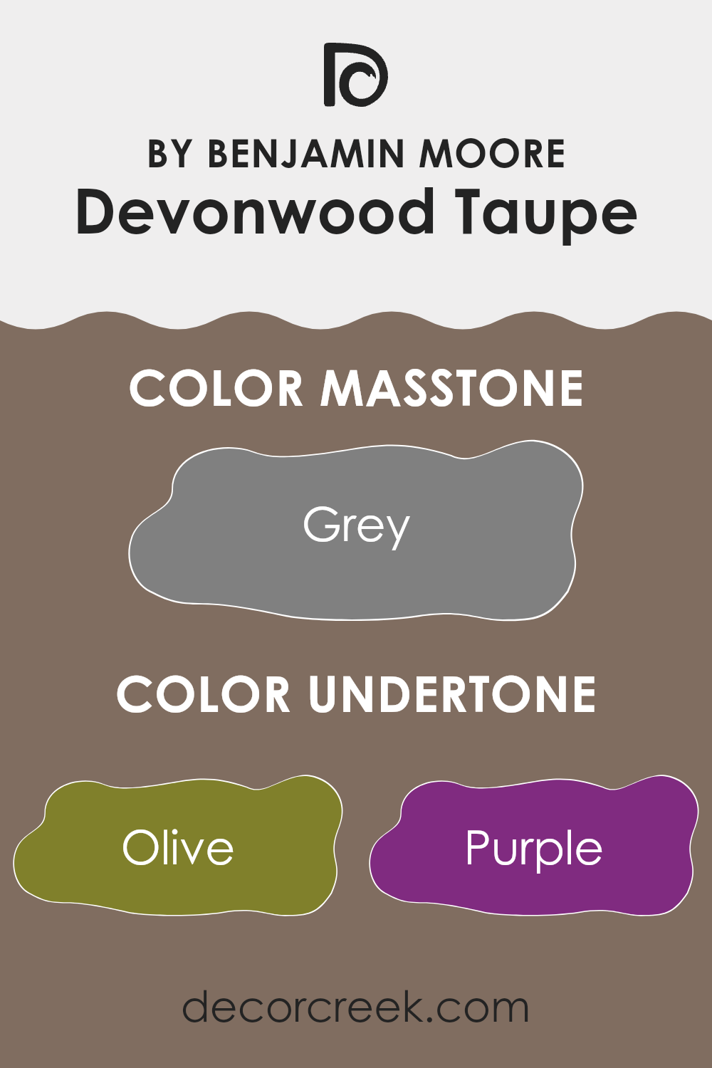
Devonwood Taupe by Benjamin Moore is a warm, earthy color that has a lot going on beneath its surface. Its undertones influence how we perceive it on walls in a room. This taupe carries subtle hints from a range of colors, including olive, purple, brown, and even colors like pale pink and fuchsia, which all contribute to its complexity.
When applied to interior walls, the olive and brown undertones can give Devonwood Taupe a grounded, natural feel. These greenish, earthy notes help it pair well with natural materials like wood and stone, fitting seamlessly into a rustic or organic setting. Meanwhile, purple and pink undertones add a touch of warmth and playfulness, making the color feel less heavy.
The influence of dark shades like navy and dark grey makes Devonwood Taupe feel rich and slightly muted, which can create a cozy, intimate area. Additionally, hints from light shades like pale yellow and mint lend a sense of brightness, subtly lifting the overall feel of a room.
Overall, Devonwood Taupe’s complex undertones make it adaptable. It can vary depending on the lighting and surrounding decor, sometimes emphasizing its warm aspect, while at other times showcasing its cooler, more subdued tones. This adaptability is key in how it adapts to different interior design styles and settings.
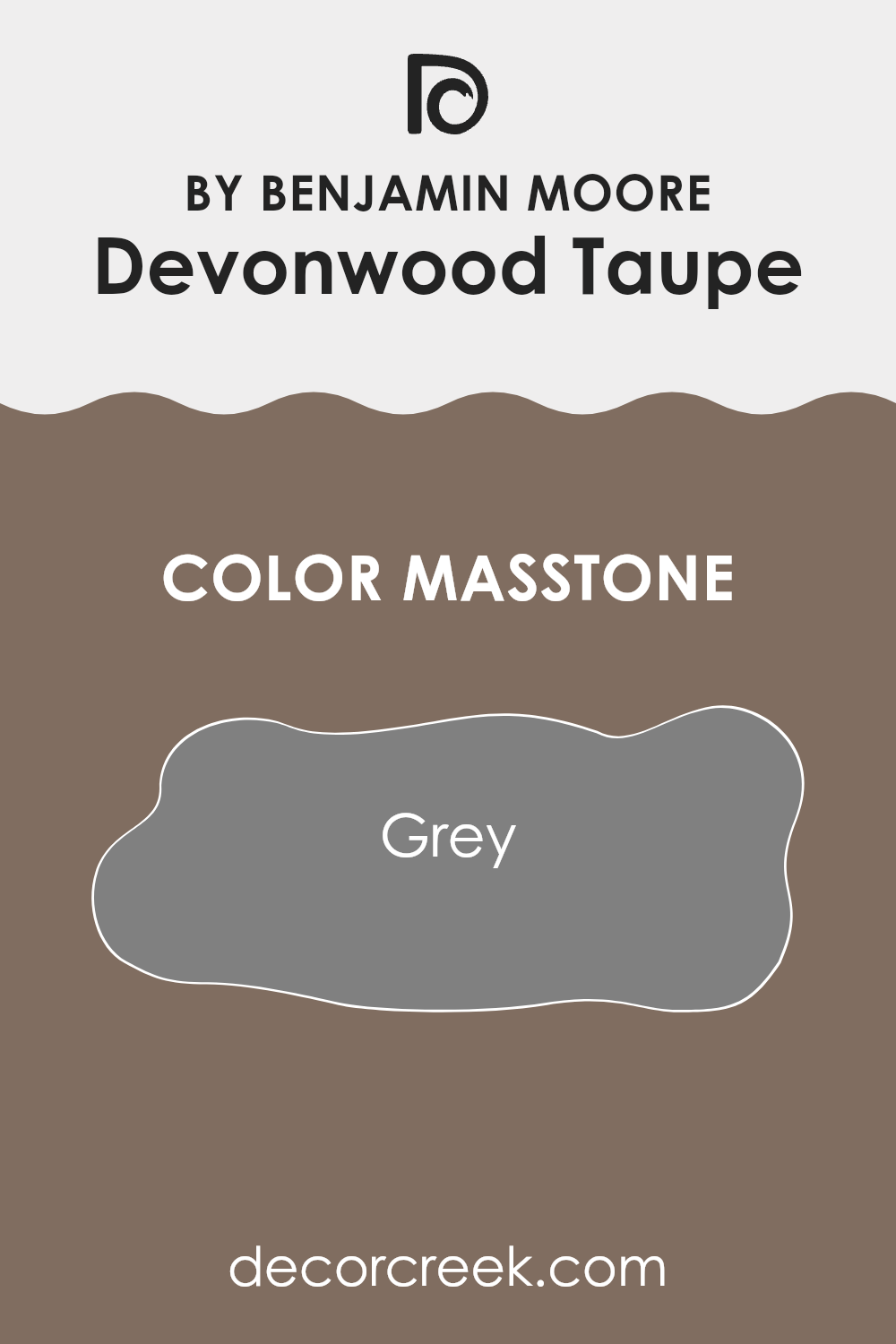
What is the Masstone of the Devonwood Taupe 1008 by Benjamin Moore?
Devonwood Taupe by Benjamin Moore is an adaptable color that brings a cozy warmth to homes. Its masstone is a medium grey, which means it has a neutral foundation. This quality makes it a great backdrop in various room settings. The grey undertone softens the taupe, giving it a balanced look that works well with different styles and furnishings.
In living rooms, this color adds a comforting vibe without dominating the room. It can complement both modern and traditional interiors, allowing other decor elements to shine. When used in bedrooms, Devonwood Taupe creates a restful atmosphere, ideal for relaxation.
The grey base ensures the color pairs beautifully with a wide range of accent hues, from soft blues and greens to vibrant reds and yellows. Additionally, it adapts to different lighting conditions, subtly shifting in appearance throughout the day, keeping your room looking interesting without overpowering it.
How Does Lighting Affect Devonwood Taupe 1008 by Benjamin Moore?
Lighting can greatly affect how we see colors in a room. The color you choose for your walls may look different under various lighting conditions. Let’s use Devonwood Taupe by Benjamin Moore as an example. This color is a warm, neutral taupe.
In natural light, colors can appear more true to their actual shade, but even then, different angles of sunlight can change their look. In rooms with artificial light, the type of bulb (LED, incandescent, or fluorescent) can alter the appearance of color.
Incandescent bulbs tend to make colors look warmer and slightly enhance yellow undertones. Fluorescent lighting might cast a cooler tone, while LED lighting can vary depending on the specific bulb.
In a north-facing room, natural light tends to be cooler and softer. Devonwood Taupe might appear a bit grayer in this setting, as the cooler light can enhance its cooler tones. In contrast, a south-facing room usually receives warm, bright light throughout the day. Here, Devonwood Taupe can look warmer and more inviting, as the direct sunlight really brings out its warm undertones.
In an east-facing room, morning light is soft and warm, while afternoon light is cooler. In the morning, Devonwood Taupe may have a warm, cozy feel, but by afternoon, it could look a bit more subdued. In a west-facing room, the light is cooler in the morning and becomes warmer in the afternoon and evening. This means Devonwood Taupe could look cooler during the early part of the day and warmer as the day goes on.
Overall, understanding how lighting affects colors can help you choose the right paint for your room. Devonwood Taupe is flexible and tends to adapt well, but always remember to test colors in each room before making a final decision.
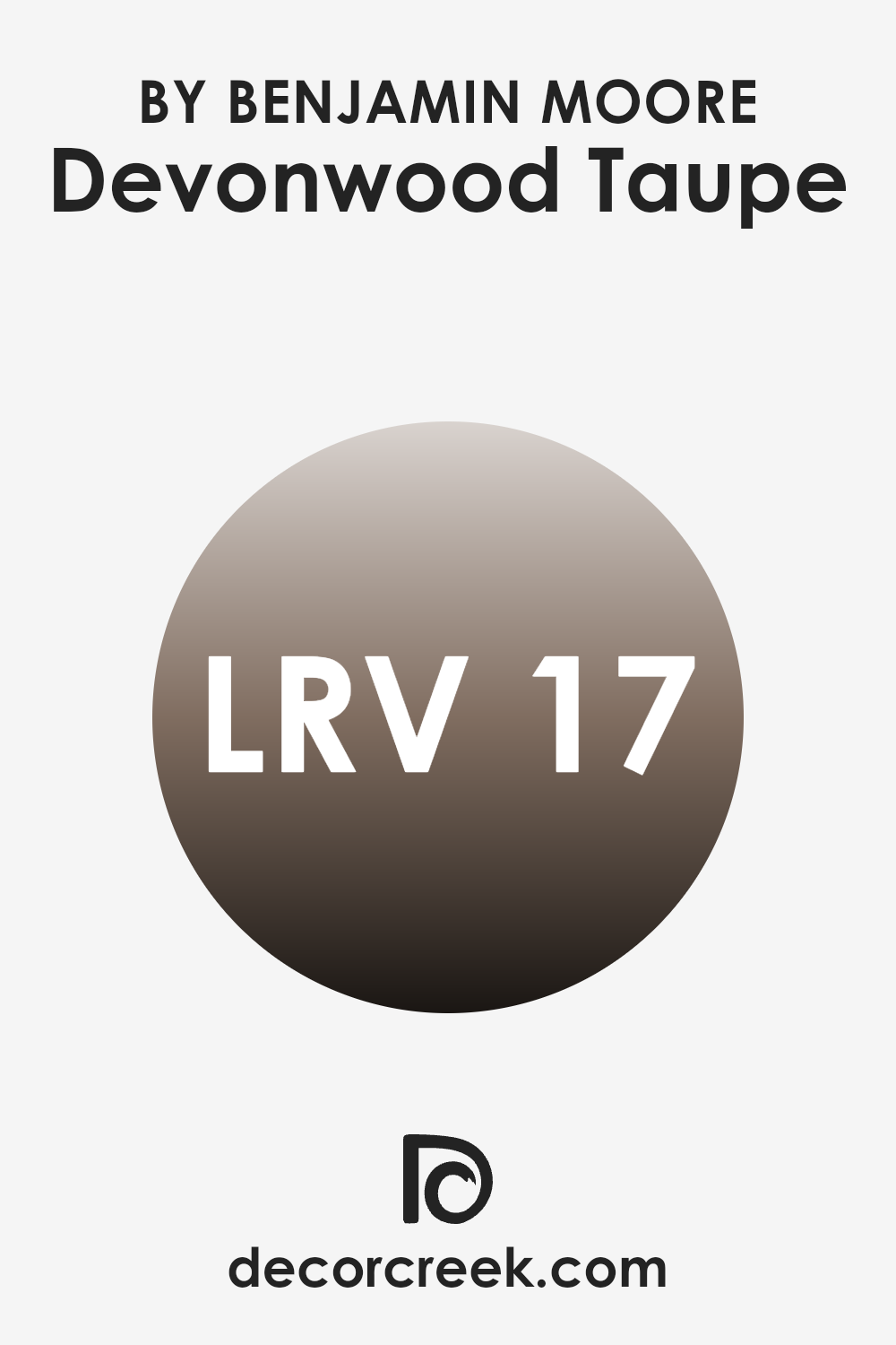
What is the LRV of Devonwood Taupe 1008 by Benjamin Moore?
LRV stands for Light Reflectance Value. It’s a measure of how much light a color reflects or absorbs. The scale goes from 0 to 100, where 0 means the color absorbs all light, making it very dark, and 100 means it reflects all light, making it very bright.
When you paint a room, the LRV can help you understand how the color will interact with the light in the room. Colors with low LRV values absorb more light, making them appear darker and more intense, while colors with high LRV values reflect more light, making them seem brighter and lighter.
For Devonwood Taupe, which has an LRV of 17.45, it demonstrates that this color will appear quite dark on the walls. Since it reflects only a small portion of light, Devonwood Taupe will give a room a cozy and intimate feel, as it absorbs more light than it reflects.
In areas with limited lighting, particularly, this color might look even darker. Therefore, it’s important to consider the amount of natural and artificial light in the room when choosing this color, as it can significantly impact the overall ambiance and perceived size of the room.
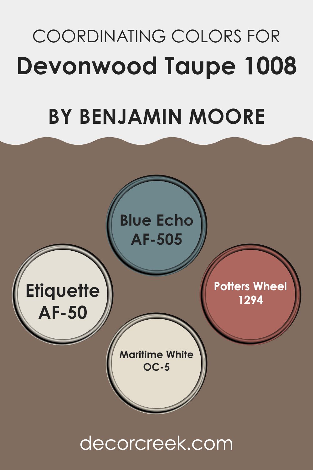
Coordinating Colors of Devonwood Taupe 1008 by Benjamin Moore
Coordinating colors are shades that complement each other when used in a room, creating a harmonious and balanced look. They work by either matching or contrasting in a way that makes each stand out while still contributing to a unified appearance. When used with Devonwood Taupe by Benjamin Moore, coordinating colors like Blue Echo, Etiquette, Potter’s Wheel, and Maritime White can bring out the best in the taupe shade.
Blue Echo is a gentle, muted blue that instills calmness and works well with taupe to create a soothing environment. Etiquette is a soft, light peach with a subtle warmth that adds a touch of elegance and coziness, enhancing the neutrals around it.
Potter’s Wheel introduces a rich, earthy terracotta tone, offering depth and a hint of rustic charm to the palette. Maritime White is a creamy white hue that provides a clean and airy feel, making rooms appear bright and open. Together, these colors with Devonwood Taupe create a balanced palette that is visually pleasing without being overpowering. Each color contributes its unique character, ensuring your room feels well harmonized and inviting.
You can see recommended paint colors below:
- AF-505 Blue Echo
- AF-50 Etiquette
- 1294 Potters Wheel
- OC-5 Maritime White
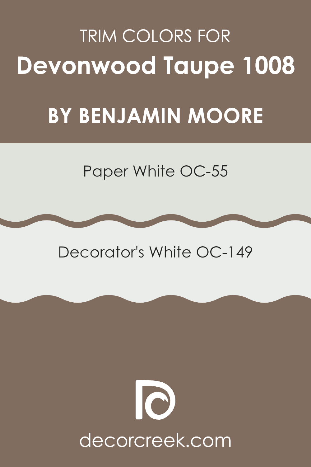
What are the Trim colors of Devonwood Taupe 1008 by Benjamin Moore?
Trim colors are the shades chosen to paint the edges around windows, doors, baseboards, and moldings. They play a crucial role in interior design by highlighting the room’s features and providing a visual boundary that can either contrast with or complement the main wall color. Choosing the right trim color is important especially when paired with Devonwood Taupe by Benjamin Moore, a warm and earthy taupe shade that brings a cozy and inviting feel to any room.
Trim colors help define the room’s architecture and can either help the walls to pop or blend seamlessly, depending on the effect you desire. By carefully selecting trim colors like OC-55 Paper White and OC-149 Decorator’s White, you can enhance the taupe’s natural warmth and richness.
OC-55 Paper White is a soft and subtle off-white that adds a gentle brightness without overpowering a room. It’s perfect for achieving a modern and clean look while still offering a bit of warmth alongside Devonwood Taupe. On the other hand, OC-149 Decorator’s White is a crisp and classic white that provides a bright, fresh contrast against taupe walls, offering an enduring appeal.
Both colors can beautifully highlight and differentiate architectural details, helping to frame Devonwood Taupe in a manner that enhances the areas aesthetic appeal. The right trim color is like the finishing touch that completes the room, making the main wall color stand out even more.
You can see recommended paint colors below:
- OC-55 Paper White
- OC-149 Decorator’s White
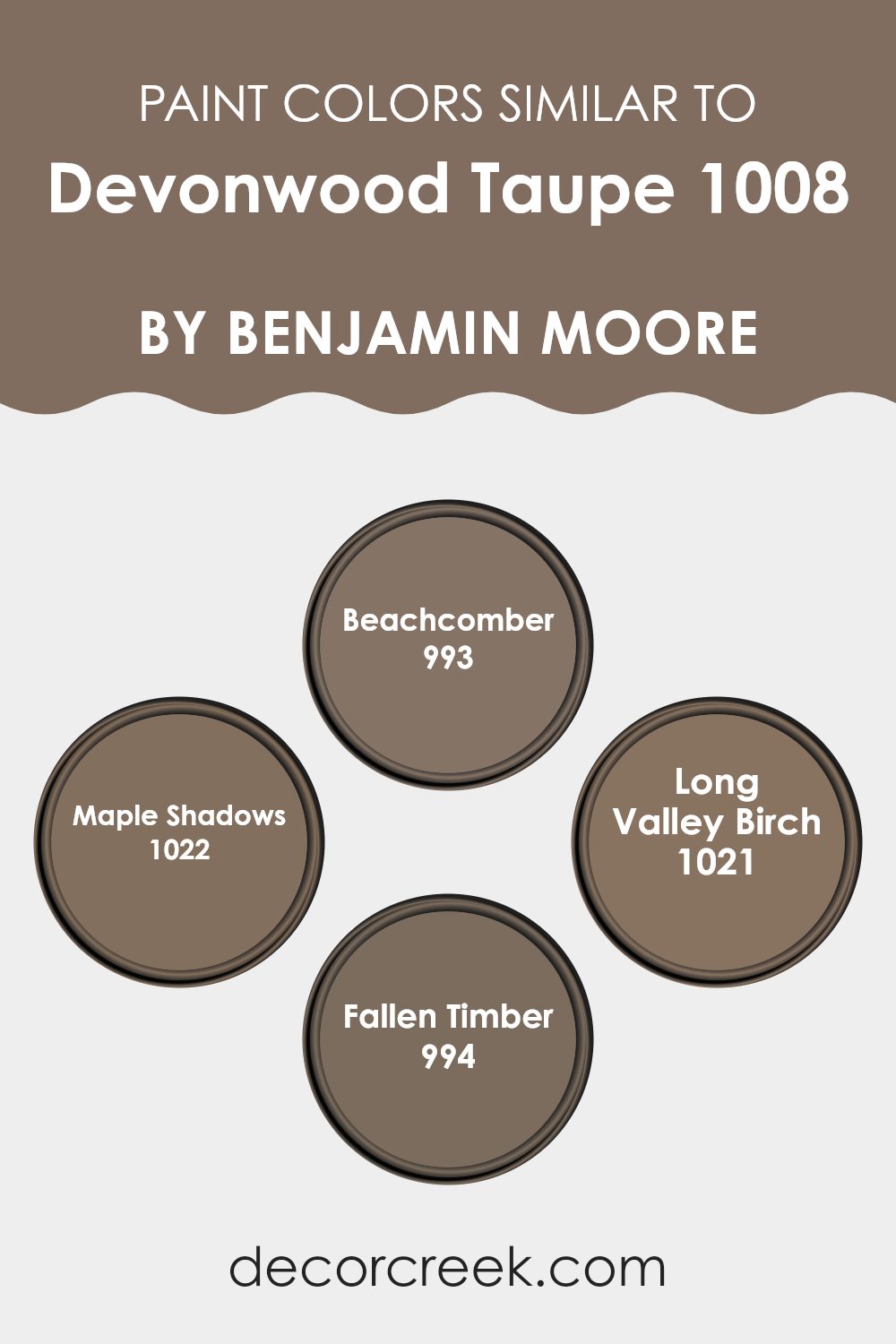
Colors Similar to Devonwood Taupe 1008 by Benjamin Moore
Similar colors play a crucial role in home design as they bring harmony and cohesion to a room. Devonwood Taupe by Benjamin Moore is a warm, inviting shade that can be beautifully complemented by shades such as Beachcomber, Maple Shadows, Long Valley Birch, and Fallen Timber.
These colors enhance the overall look and feel of a room, providing subtle variety while maintaining a consistent palette. When used together, they create a natural flow from one area to another, making the room feel united and pleasing to the eye. Similar colors are especially effective in open-plan homes where distinguishing differen tareas without harsh contrasts is key.
Beachcomber is a light and airy color, reminiscent of sand and sunshine, perfect for creating a soothing environment. Maple Shadows offers a deeper, earthy tone, bringing warmth and coziness to a room. Long Valley Birch is a muted, soft shade that evokes a sense of calm, ideal for bedrooms or quiet corners.
Fallen Timber is rich and grounding, adding depth and sophistication to any room. By incorporating these colors, you can craft a welcoming and balanced atmosphere in your home, ensuring that each element seamlessly flows into the next, while still allowing individual touches to shine through.
You can see recommended paint colors below:
- 993 Beachcomber
- 1022 Maple Shadows
- 1021 Long Valley Birch
- 994 Fallen Timber
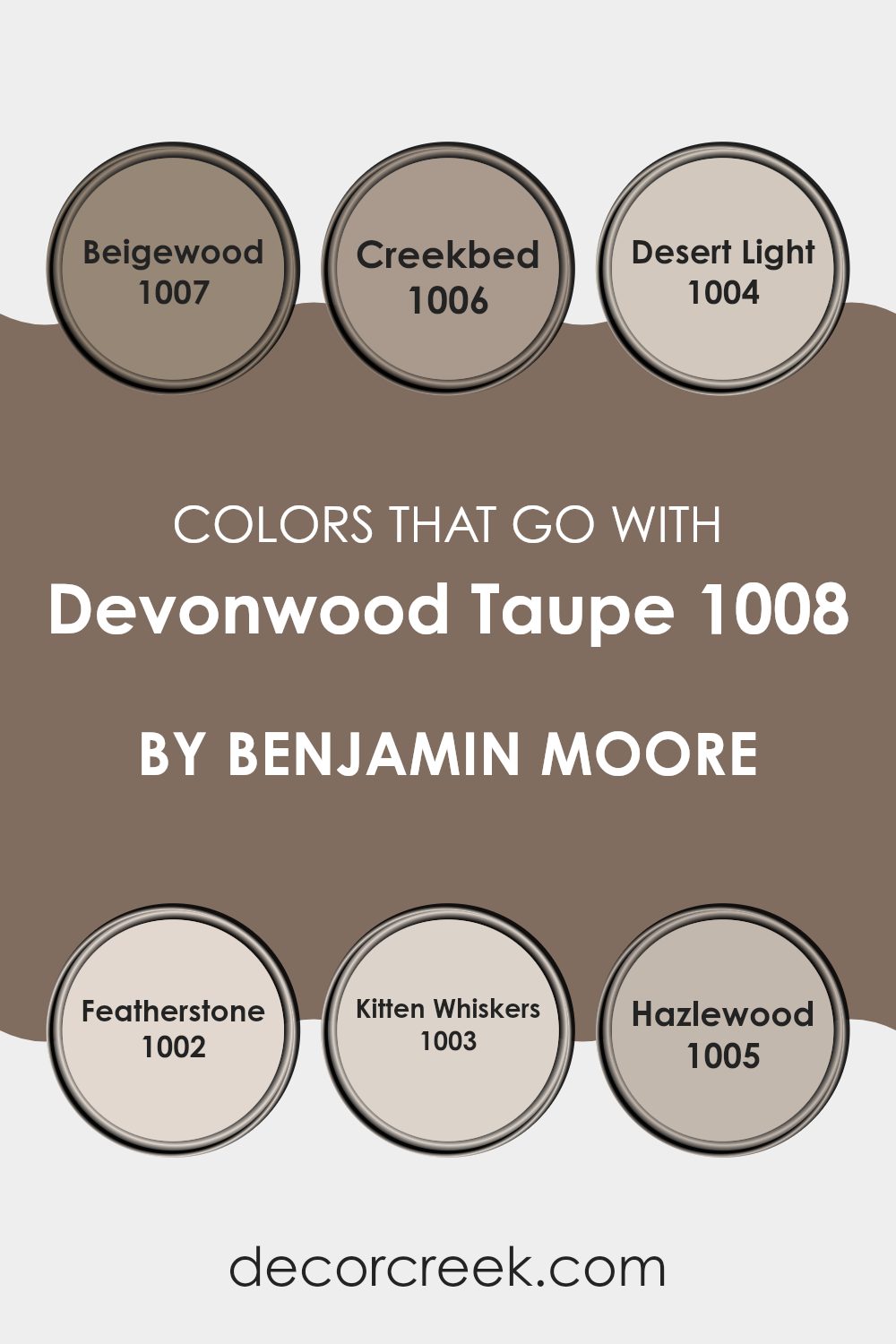
Colors that Go With Devonwood Taupe 1008 by Benjamin Moore
Choosing colors that complement Devonwood Taupe 1008 by Benjamin Moore can create a balanced and welcoming atmosphere in any room. This neutral hue serves as an adaptable backdrop, allowing accent colors to shine while maintaining harmony. For example, Beigewood 1007 works beautifully alongside Devonwood Taupe, adding a warmer undertone with its soft beige quality.
Creekbed 1006, with its earthy and grounded feel, adds richness and depth, complementing the subtle taupe undertones. Desert Light 1004 brings a touch of sunlit warmth, brightening up the room while maintaining cohesion with the neutral base.
Featherstone 1002, with its gentle gray tones, offers a cooler contrast to Devonwood Taupe, creating a calm and balanced effect. Kitten Whiskers 1003 introduces a hint of softness with its light mauve-tinted gray, adding a delicate touch that’s perfect for cozy rooms.
Lastly, Hazlewood 1005 blends seamlessly with Devonwood Taupe, bringing in an organic feel with its natural wood-like quality. Together, these colors complement Devonwood Taupe by providing variation and personality, allowing for a cohesive and inviting design. Each shade enhances the taupe backdrop in its unique way, making the overall look both harmonious and dynamic.
You can see recommended paint colors below:
- 1007 Beigewood
- 1006 Creekbed
- 1004 Desert Light
- 1002 Featherstone
- 1003 Kitten Whiskers
- 1005 Hazlewood
How to Use Devonwood Taupe 1008 by Benjamin Moore In Your Home?
Devonwood Taupe 1008 by Benjamin Moore is a warm, neutral paint color that’s adaptable and welcoming. It’s a soft taupe with hints of gray and brown, making it a great choice for almost any room in your home. If you’re looking to create a cozy and inviting living room, Devonwood Taupe can be an excellent backdrop for both modern and traditional furniture.
Pair it with off-white trim for a clean and classic look. In the bedroom, this shade can create a restful atmosphere, perfect for relaxation. It works well with natural materials like wood and stone, bringing a touch of nature indoors.
You can also use this color in a hallway to tie different rooms together, giving your home a cohesive feel. Light fixtures in various metals can highlight Devonwood Taupe’s tones, making your room feel complete and balanced. Overall, it’s a flexible choice that suits multiple styles and tastes.
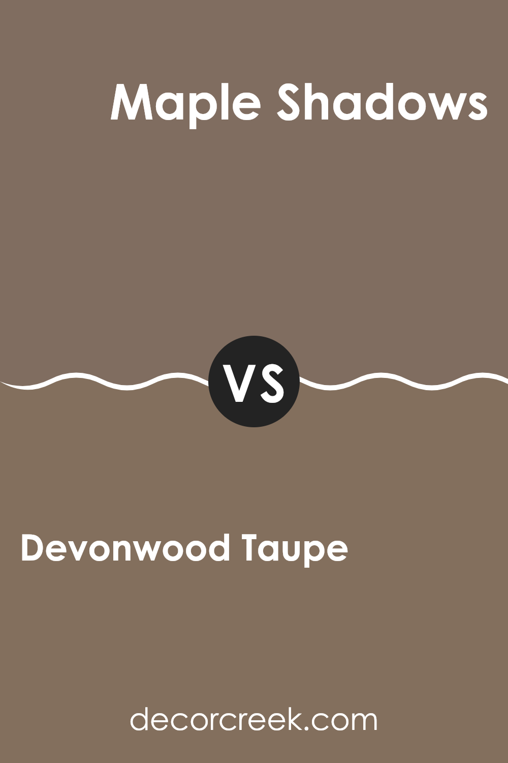
Devonwood Taupe 1008 by Benjamin Moore vs Maple Shadows 1022 by Benjamin Moore
Devonwood Taupe 1008 by Benjamin Moore is a warm, soft taupe that offers a cozy and inviting feel to any room. It has a neutral tone that can adapt to various decor styles, making it perfect for living rooms or bedrooms where relaxation is key. This color creates a gentle backdrop without being overpowering.
On the other hand, Maple Shadows 1022 has a richer and deeper hue. It’s darker than Devonwood Taupe and adds a sense of depth and sophistication to a room. Maple Shadows can make a bold statement in a room, providing a dramatic and luxurious atmosphere. It works well in areas where you want to create a distinct mood, such as dining rooms or study areas.
While both colors are adaptable, Devonwood Taupe is more subdued and comforting, while Maple Shadows offers a darker, more intense option. Together, they can be used to create contrasts or emphasize certain aspects of interior design.
You can see recommended paint color below:
- 1022 Maple Shadows
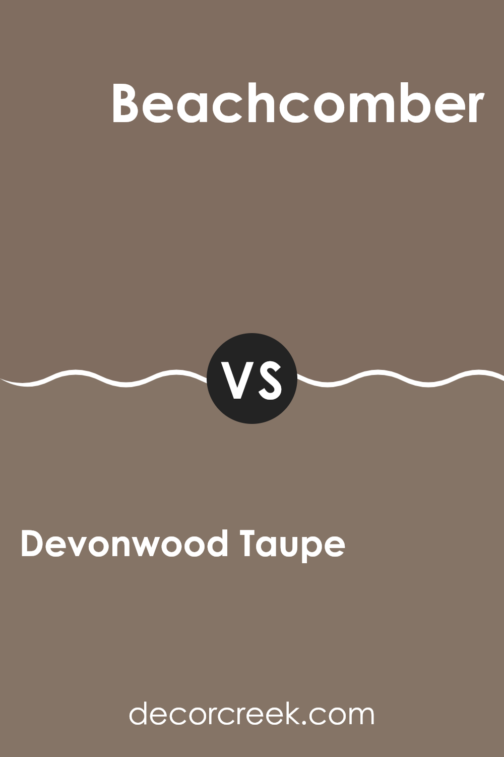
Devonwood Taupe 1008 by Benjamin Moore vs Beachcomber 993 by Benjamin Moore
Devonwood Taupe 1008 by Benjamin Moore is a warm, medium-toned taupe that offers a cozy and inviting atmosphere. It has earthy undertones, making it an adaptable choice for various rooms. This shade can lend a sense of warmth to a room without being too bold, balancing nicely between gray and brown.
Beachcomber 993, on the other hand, is a lighter and more subdued color. It has subtle hints of beige with a cooler undertone than Devonwood Taupe. This makes Beachcomber an excellent option for areas where a light and airy feel is desired, providing a soothing backdrop that doesn’t overpower other elements in a room.
While Devonwood Taupe feels warm and grounded, Beachcomber gives off a more relaxed and airy vibe. Both are flexible neutrals, yet each brings a unique feel to a room — one hugging warmth, and the other offering gentle brightness.
You can see recommended paint color below:
- 993 Beachcomber
Devonwood Taupe 1008 by Benjamin Moore vs Long Valley Birch 1021 by Benjamin Moore
Devonwood Taupe 1008 and Long Valley Birch 1021 by Benjamin Moore are two subtle, earthy tones that can complement a variety of interior styles. Devonwood Taupe, a warm taupe shade, offers a grounded and cozy feel, with its medium intensity making it suitable for living rooms or bedrooms where you want a comforting atmosphere.
It’s adaptable enough to act as a neutral backdrop while still having its unique presence. On the other hand, Long Valley Birch leans towards a lighter, softer hue. This color might remind you of birch wood bark, offering a gentle and airy feel.
Its lightness makes it a great choice for rooms where you want to reflect more natural light, like smaller areas or corridors. When paired together, Long Valley Birch can brighten a room while Devonwood Taupe adds depth and warmth, creating a balanced and relaxed environment. Both colors allow for adaptable decor options, enhancing natural materials like wood and stone.
You can see recommended paint color below:
- 1021 Long Valley Birch
Devonwood Taupe 1008 by Benjamin Moore vs Fallen Timber 994 by Benjamin Moore
Devonwood Taupe 1008 and Fallen Timber 994 by Benjamin Moore are both warm and earthy paint colors, but they offer different vibes. Devonwood Taupe 1008 is a medium taupe color with a balance of gray and brown undertones. It feels adaptable and neutral, making it suitable for various rooms.
Its calm and muted appearance creates a cozy and inviting atmosphere, which works well in living rooms or bedrooms. On the other hand, Fallen Timber 994 is a deeper, richer shade that brings more intensity to a room.
It leans more towards a dark brown with a subtle green undertone, giving it a grounded feel. This color is ideal for accent walls or areas where you want to create a more dramatic effect. When used with lighter colors, Fallen Timber 994 can provide a striking contrast and add depth to the room. Both colors complement natural materials like wood and stone, enhancing their earthy qualities.
You can see recommended paint color below:
- 994 Fallen Timber
I think 1008 Devonwood Taupe by Benjamin Moore is an amazing paint color. When I look at it, I see a warm and gentle tone that makes any room feel cozy and inviting. It’s like a hug for your walls! This color isn’t too dark or too light—it’s just right. Whether you want to paint your bedroom, living room, or even a hallway, this taupe can make the area feel more comfortable and welcoming.
One of the things I love about Devonwood Taupe is how well it matches with other colors. You can add bright colors like red or green for a fun look or stick with other soft colors for a more calm feeling. It can work with lots of different styles and decorations, which makes it a great choice for any home.
I also noticed how this color changes a little depending on the light. In the morning, it might look a bit brighter, while in the evening, it could seem a bit warmer. This change makes it interesting and keeps it from looking boring over time.
Overall, 1008 Devonwood Taupe by Benjamin Moore is a great color that can make any room feel nice and cozy. If you want a color that can make your home feel friendly and inviting, this is a wonderful choice.
Ever wished paint sampling was as easy as sticking a sticker? Guess what? Now it is! Discover Samplize's unique Peel & Stick samples.
Get paint samples

