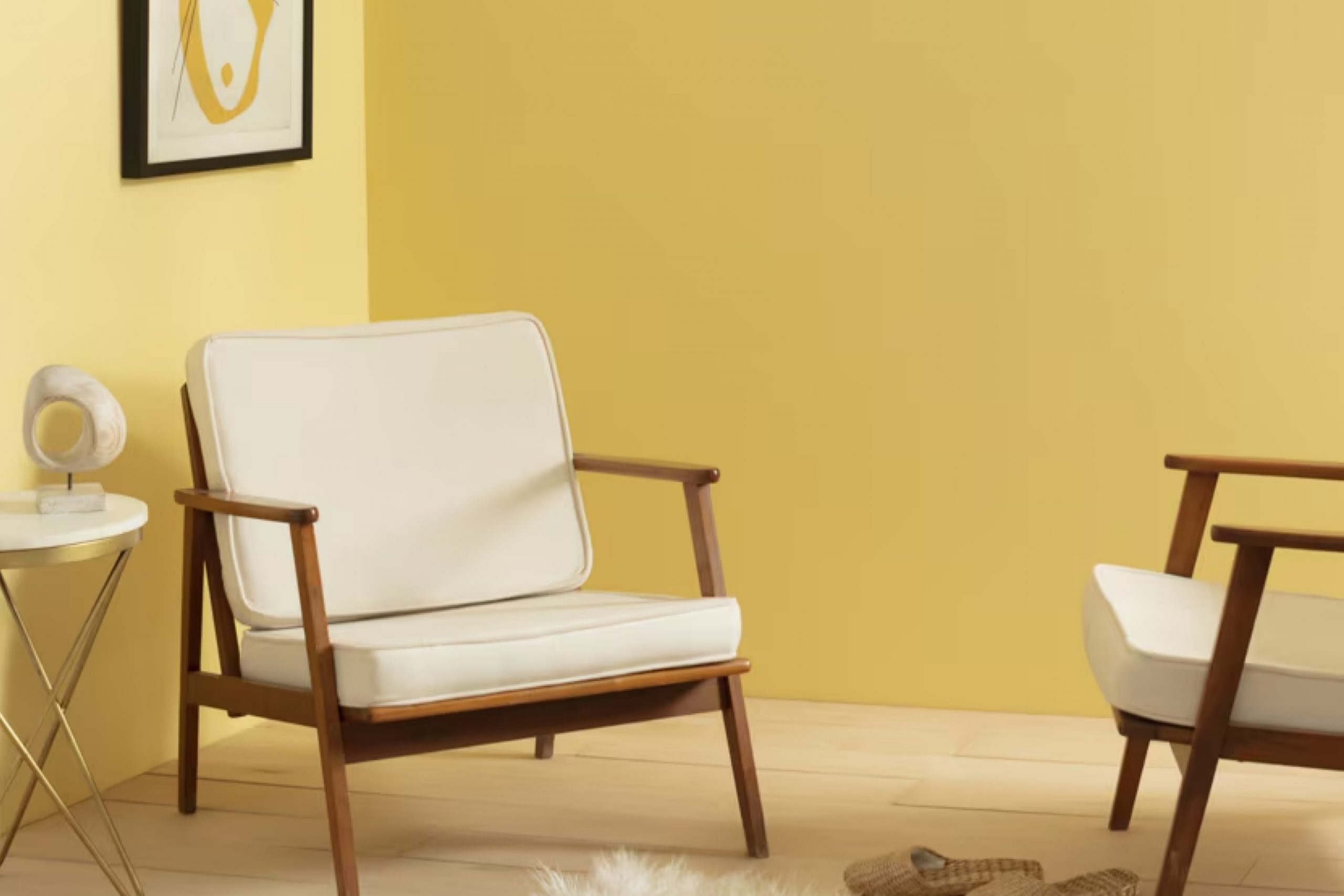
I recently stumbled upon HC-4 Hawthorne Yellow by Benjamin Moore, a paint selection that could change the feel of your room. If you’re considering giving your space a fresh look, this shade might be worth your attention.
Hawthorne Yellow is part of Benjamin Moore’s Historical Collection, which is inspired by America’s historic landmarks.
Yellow often brings a sense of cheer and energy to a room, and Hawthorne Yellow does just that, but in a subtle way. It isn’t overpoweringly bright, but rather soft and mellow, leaning towards a warm, creamy hue.
This makes it versatile enough to use in many areas of your home, like the living room or kitchen, where you want to add a touch of coziness.
When I used it, what impressed me was how it shifted with the natural light, offering different shades throughout the day, from a pale buttery color in bright morning light to a richer, golden tone by evening. This dynamic quality can really enhance your living space, making it feel more alive.
It pairs beautifully with white trims, enhancing doors and windows without overwhelming them. For anyone looking to refresh their interiors without going too bold, this could be a perfect choice.
Think about using HC-4 Hawthorne Yellow for your next decorating project; it might just surprise you with its gentle charm and versatility.
What Color Is Hawthorne Yellow HC-4 by Benjamin Moore?
Hawthorne Yellow HC-4 by Benjamin Moore is a warm, inviting shade of yellow that brightens up any room with a soft radiance. This color has a gentle depth that stands out in spaces that need a touch of cheer without overwhelming the senses. It’s perfect for creating a welcoming atmosphere and brings a sunny disposition to interiors even on cloudy days.
The versatility of Hawthorne Yellow works exceptionally well in various interior styles, particularly in country, coastal, and traditional settings. This yellow hue pairs nicely with natural materials such as wood, enhancing rustic wooden furniture and hardwood floors with a cozy, lived-in feel.
Its natural vibrancy also harmonizes with textures like linens and soft cotton, adding a light, airy quality to drapery or sofa covers.
For accents, Hawthorne Yellow complements greens, blues, and earthy tones like taupe and gray, making it easy to integrate into a color scheme that seeks a balance between warmth and subdued elegance.
It’s especially effective in living rooms, kitchens, or dining areas where its sunny character promotes a welcoming, friendly vibe.
Overall, Hawthorne Yellow HC-4 is a wonderful choice for anyone looking to brighten their home with a color that is cheerful yet not too bold, creating a pleasant and cozy environment.
Is Hawthorne Yellow HC-4 by Benjamin Moore Warm or Cool color?
Hawthorne Yellow HC-4 is a warm and inviting paint color from Benjamin Moore that can add a cheerful touch to any home. This shade of yellow has a soft brightness that makes it perfect for creating a cozy, welcoming atmosphere. Often used in kitchens and living rooms, it pairs well with both traditional and modern decor.
Hawthorne Yellow has the ability to make small rooms appear bigger and brighter. It’s especially effective in spaces that don’t get a lot of natural light, giving them a sunnier, lifted feel. This color goes well with a wide range of other colors, from neutral shades like whites and grays to bolder colors like blues and greens.
It can be used on walls, but also looks great on cabinets or paired with wood finishes for a harmonious look.
Overall, Hawthorne Yellow is an excellent choice for anyone looking to add warmth and light to their space without overwhelming it with too strong a color.
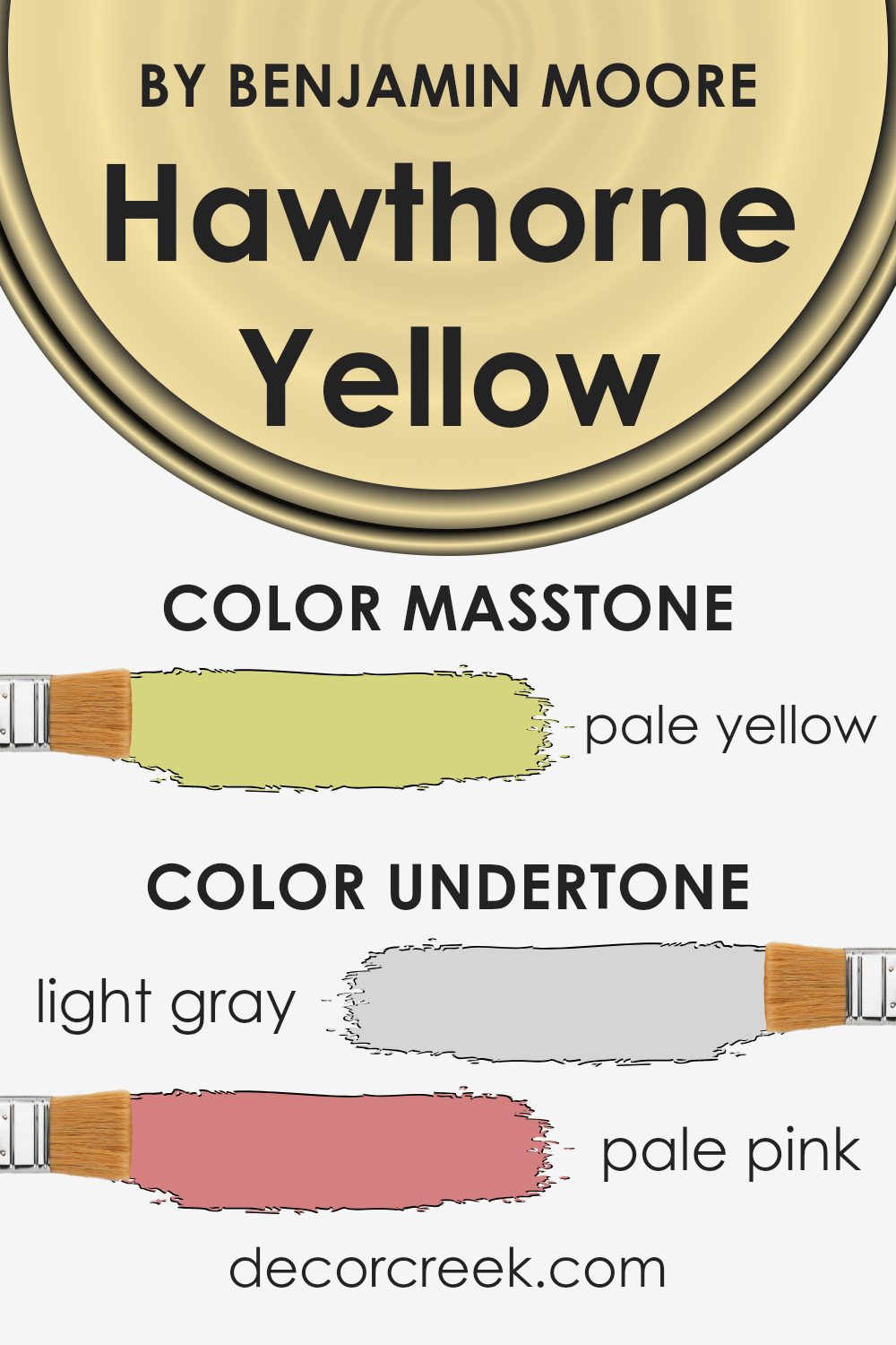
Undertones of Hawthorne Yellow HC-4 by Benjamin Moore
The color Hawthorne Yellow, which has a cheerful and warm base, can look different depending on its undertones. Undertones are subtle colors that lie beneath the main color, influencing how it appears under various lighting conditions.
For this particular shade of yellow, the undertones include a spectrum of hues like light gray, pale pink, light purple, mint, bright yellow, light blue, gray, orange, lilac, light green, and olive. Each of these undertones contributes to the overall perception of the color.
For instance, when light gray or olive undertones are dominant, Hawthorne Yellow might appear more muted and subtle, making it suitable for a calming environment. On the other hand, undertones like pale pink or light purple can give it a slightly softer, more delicate vibe, which might enhance small spaces or rooms needing a gentle touch of warmth.
In the context of interior walls, these undertones play a crucial role in determining the final look of the room. The color might shift throughout the day as natural light changes.
Early morning light might highlight the mint or light blue, creating a fresh and airy feel, while in the evening, the warmer undertones like orange or bright yellow might make the room feel cozier and more welcoming.
Choosing the right undertones can help ensure that the color works well in your space, complementing furnishings and reflecting your style. So, when using Hawthorne Yellow on walls, considering these undertones will help achieve the desired effect, making the space feel just right.
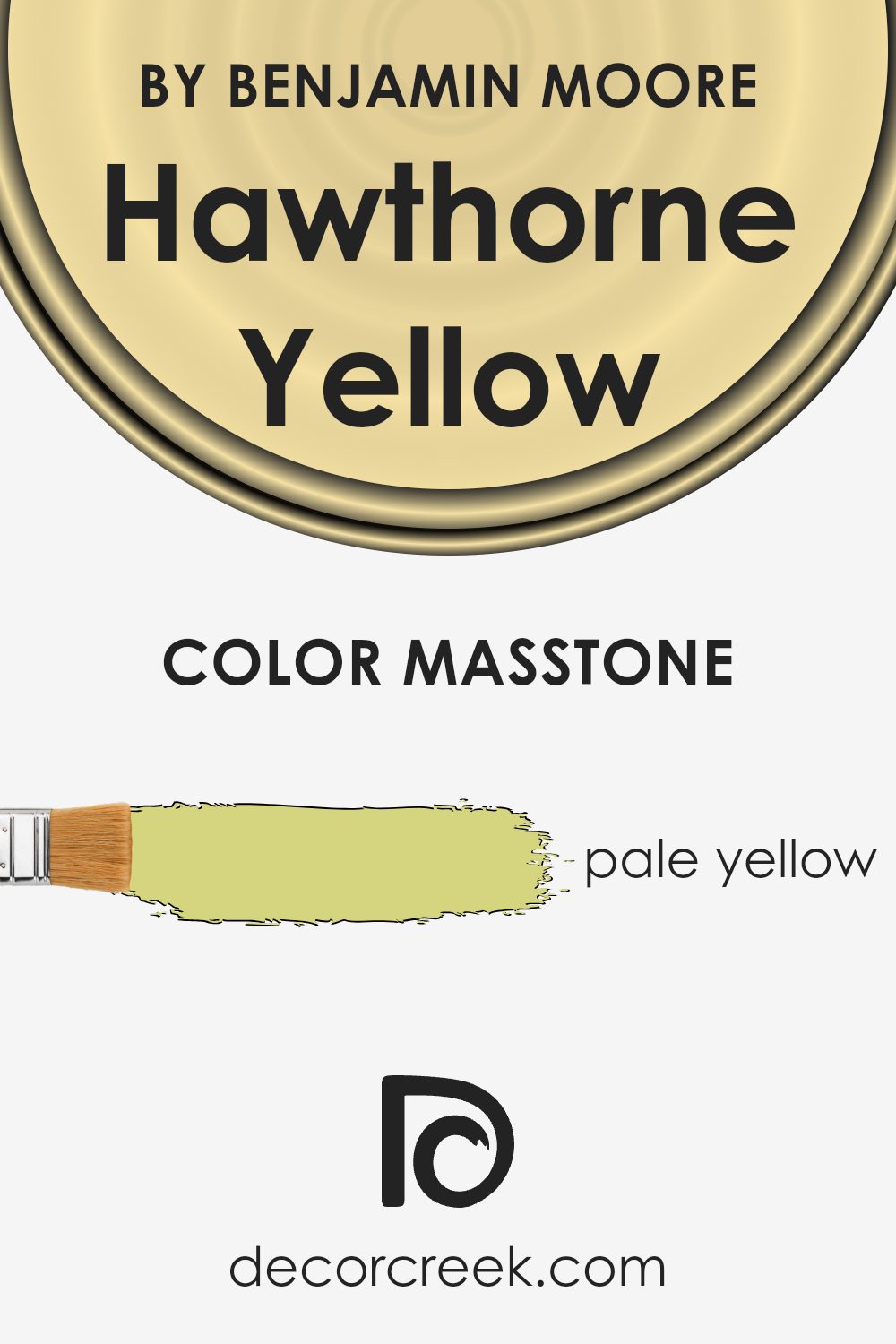
What is the Masstone of the Hawthorne Yellow HC-4 by Benjamin Moore?
Hawthorne Yellow HC-4, a Benjamin Moore paint color, has a masstone of pale yellow (#D5D580). This quiet and gentle yellow shade brings a subtle brightness to rooms without overwhelming the space.
Being a lighter yellow, it reflects light beautifully, making it a great choice for spaces that might not get a lot of natural sunlight, like north-facing rooms. Its softness allows it to blend well with other colors, serving either as a soothing background or a gentle accent in your home decor.
Hawthorne Yellow is especially good in living areas or kitchens where a welcoming, warm atmosphere is desired. It’s also mild enough to be used in bedrooms, helping to create a light and airy feel. This color works nicely with whites and grays to keep things looking fresh, yet can also pair well with bolder colors like blues or greens for a cheerful contrast.
How Does Lighting Affect Hawthorne Yellow HC-4 by Benjamin Moore?
Lighting plays a crucial role in how we perceive colors. Different types of light can make colors look different, which is important to consider when choosing paint colors for your home.
Hawthorne Yellow by Benjamin Moore is a warm, sunny shade of yellow. How this color appears can vary greatly depending on the light source. In natural light, Hawthorne Yellow looks bright and vibrant, bringing a cheerful ambiance to any room.
Under artificial light, such as LED or fluorescent lighting, the color might appear slightly muted, losing a bit of its brightness but maintaining its warm tone.
The direction your room faces can also affect how Hawthorne Yellow looks:
- North-facing rooms – These rooms often get less direct sunlight, which can make colors appear cooler. In north-facing rooms, Hawthorne Yellow may seem more subdued and less bright, taking on a softer, gentler yellow.
- South-facing rooms – These rooms benefit from abundant natural light most of the day, which can make Hawthorne Yellow look very bright and vivid. The warm sunlight enhances the yellow, making the room feel more inviting and energetic.
- East-facing rooms – These rooms get plenty of light in the morning. Hawthorne Yellow will look very cheerful and lively in the morning but might lose some of its vibrancy in the afternoon and evening as the natural light fades.
- West-facing rooms – These rooms receive more sunlight in the afternoons and evenings. Hawthorne Yellow will appear softer during the morning and become warmly lit and vivid as the sun sets.
Thus, Hawthorne Yellow is versatile and can work well in many settings, but the amount and type of light should be considered to ensure the color works as intended in your space.
By understanding these influences, you can choose the best room or adjust your lighting to make the most out of this beautiful color.
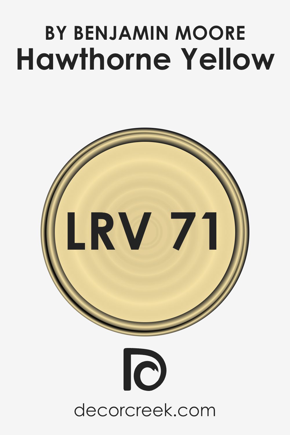
What is the LRV of Hawthorne Yellow HC-4 by Benjamin Moore?
LRV stands for Light Reflectance Value, which is a measurement used to determine how much light a paint color reflects as opposed to absorbing. This scale is used when choosing paints, helping to predict how light or dark a color will look once it’s on your wall.
A higher LRV means the color reflects more light, making the space feel brighter and more open. Conversely, a lower LRV means the color absorbs more light, which can make a room feel smaller or cozier.
In the case of Hawthorne Yellow with an LRV of 71.33, this indicates that it is a fairly light shade, reflecting a good amount of light. This makes it an excellent choice for spaces you want to appear more airy and vibrant.
When used on walls, this particular shade of yellow will make the room feel lively and bright, particularly beneficial in spaces that don’t receive a lot of natural sunlight. Colors with this level of LRV can also make small rooms look bigger and more welcoming.
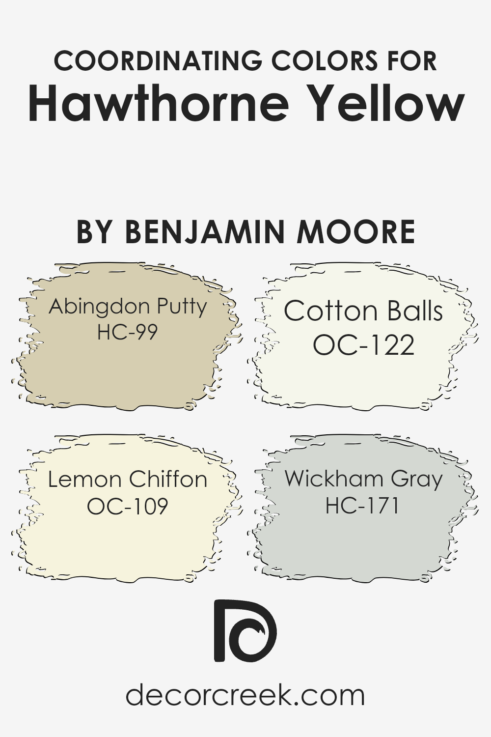
Coordinating Colors of Hawthorne Yellow HC-4 by Benjamin Moore
Coordinating colors are chosen to complement a primary color, in this case, Hawthorne Yellow HC-4 by Benjamin Moore. These colors harmonize well together, creating a balanced and aesthetically pleasing palette in any living space.
The use of coordinating colors helps to create a cohesive look that enhances the primary color’s beauty without overshadowing it. They can be applied in various elements such as walls, trims, accents, and furnishings to enrich the overall atmosphere of a room.
Among the coordinating colors, HC-99 Abingdon Putty is a subtle tan that offers a warm neutral base, making it a versatile background for rooms using Hawthorne Yellow as an accent. OC-109 Lemon Chiffon is a soft, pale yellow that brightens spaces with a gentle, airy feel; it’s lighter than Hawthorne Yellow but maintains a cheerful tone. OC-122 Cotton Balls presents a clean, crisp white that refreshes the environment and provides a sharp contrast that highlights other colors.
Lastly, HC-171 Wickham Gray offers a cool gray shade that provides a modern, neutral backdrop that complements the warmth of Hawthorne Yellow, allowing for a sophisticated balance in the color scheme. Together, these colors ensure a polished and appealing visual flow throughout the space.
You can see recommended paint colors below:
- HC-99 Abingdon Putty (CHECK A SAMPLE)
- OC-109 Lemon Chiffon
- OC-122 Cotton Balls
- HC-171 Wickham Gray
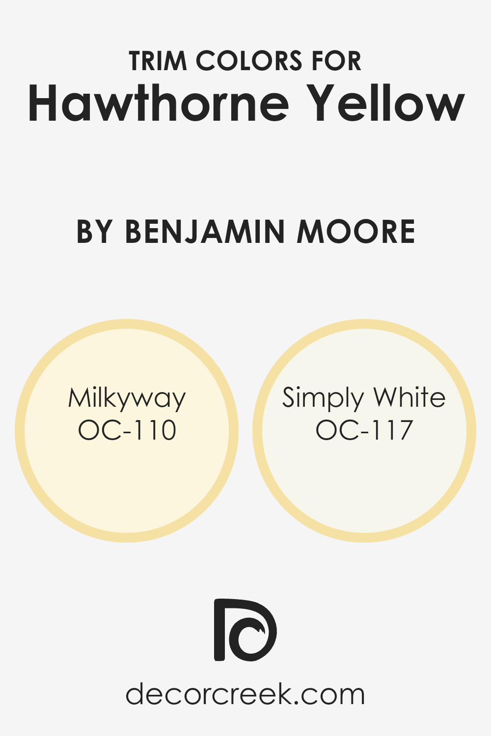
What are the Trim colors of Hawthorne Yellow HC-4 by Benjamin Moore?
Trim colors are essentially accent colors that highlight the architectural features of a room, like door frames, window frames, baseboards, and crown moldings. When paired thoughtfully, they can augment the main wall color, creating a cohesive and appealing aesthetic.
For instance, when using a rich and warm shade like Hawthorne Yellow HC-4 by Benjamin Moore, selecting the right trim colors is crucial to enhancing the liveliness and brightness of the walls.
Trim colors like OC-110 – Milkyway and OC-117 – Simply White by Benjamin Moore are excellent choices as they provide a subtle contrast that emphasizes the sunny charm of Hawthorne Yellow without overpowering it.
Milkyway OC-110 is a gentle off-white with a touch of creaminess that adds a soft, subtle contrast against bolder hues, making it a perfect trim companion for the vibrant Hawthorne Yellow.
It lends a slight warmth to the trim, which harmoniously bridges the gap between stark whites and vivid yellows. On the other hand, Simply White OC-117 is a clean and crisp white, which offers a more striking contrast to Hawthorne Yellow, pulling the look together with a fresh, clean finish that can make the yellow really stand out and ensure that spaces feel airy and light.
You can see recommended paint colors below:
- OC-110 Milkyway
- OC-117 Simply White
Colors Similar to Hawthorne Yellow HC-4 by Benjamin Moore
Selecting similar colors, such as variations of yellow, plays a crucial role in achieving a cohesive and harmonious look in any space. When colors like Hawthorne Yellow HC-4 by Benjamin Moore are used as a base, finding complementary shades enhances the overall aesthetics without causing a harsh contrast.
This method allows for a gradual and subtle transition between shades, which can make a room feel more balanced and visually appealing. It provides an opportunity to add depth and richness while maintaining a unified color theme.
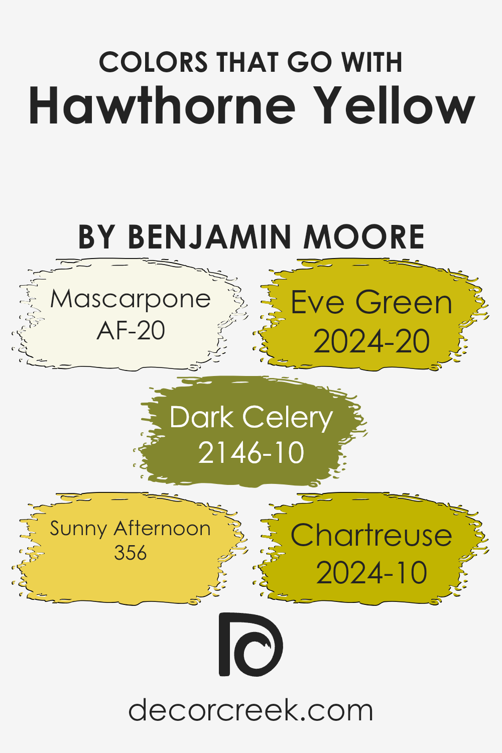
For example, 311 – Squish-Squash is a playful and vibrant yellow that brings a sense of freshness and energy into any space, making it ideal for areas where positivity is encouraged. On the other hand, 290 – Fresh Butter offers a softer, more muted yellow, perfect for creating a cozy and inviting atmosphere.
The color 170 – Traditional Yellow strikes a balance between bright and soft, giving a classic and cheerful look that’s suitable for spaces that aim to be both lively and relaxed. Lastly, 297 – Golden Honey has a deeper, warmer tone that resembles the natural color of honey, providing a rich backdrop that works well in creating a welcoming and comforting environment.
Together, these shades coordinate beautifully with Hawthorne Yellow HC-4, enhancing its versatility and appeal in various design scenarios.
You can see recommended paint colors below:
- 311 Squish-Squash (CHECK A SAMPLE)
- 290 Fresh Butter (CHECK A SAMPLE)
- 170 Traditional Yellow (CHECK A SAMPLE)
- 297 Golden Honey (CHECK A SAMPLE)
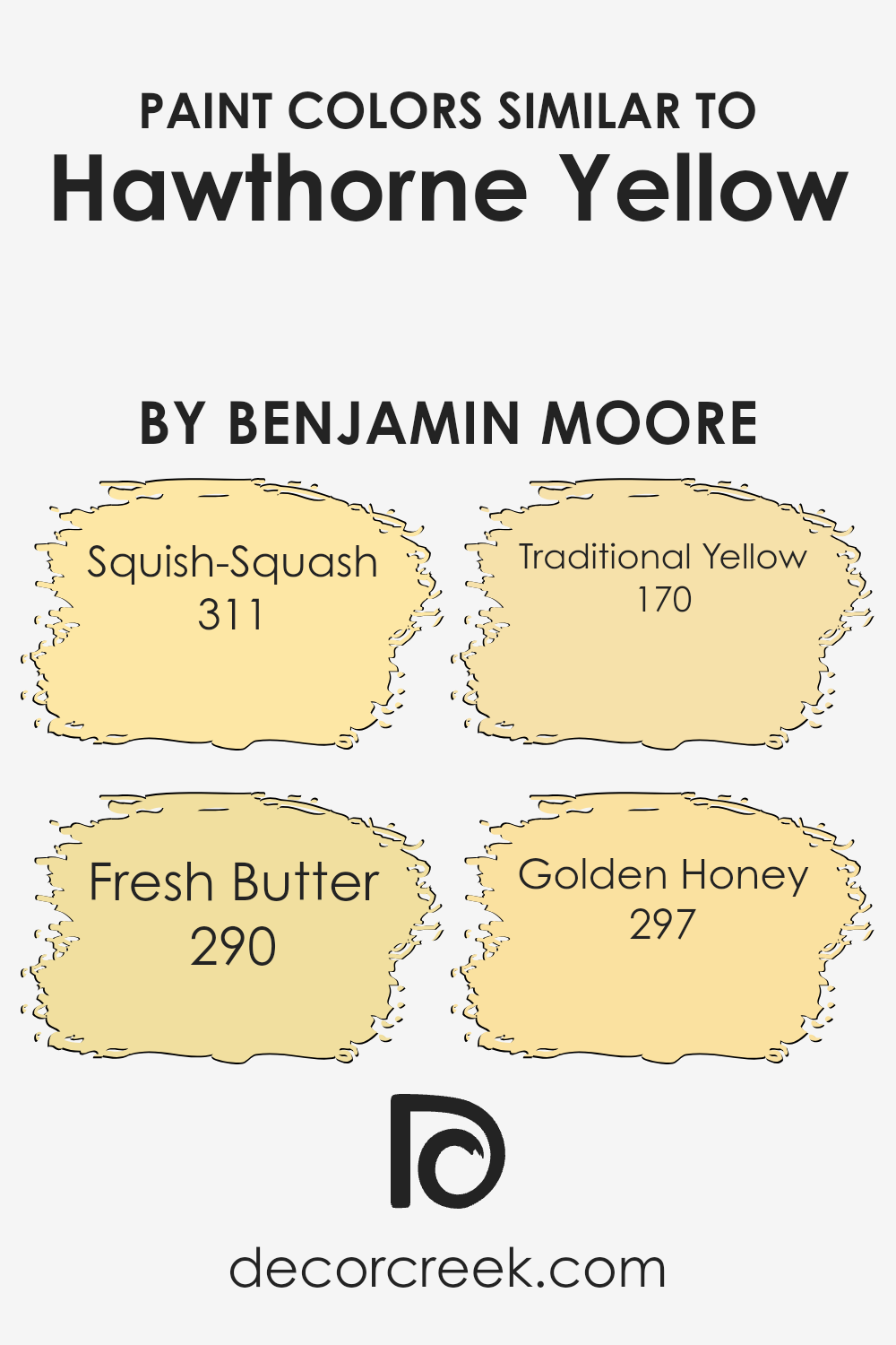
Colors that Go With Hawthorne Yellow HC-4 by Benjamin Moore
Choosing the right colors to pair with Hawthorne Yellow HC-4 by Benjamin Moore is vital as it ensures that the space feels coordinated and visually pleasing. Hawthorne Yellow is a warm, inviting shade that can brighten up any room, but picking complementary colors like AF-20 – Mascarpone, a creamy, almost white color, helps to create a soft and balanced look.
Additionally, pairing it with 2146-10 – Dark Celery, a deep, leafy green, introduces a natural element that contrasts beautifully without overwhelming the yellow.
To inject a bit more vibrancy, 356 – Sunny Afternoon, another cheerful yellow, mirrors the base tone of Hawthorne Yellow but with a slightly different hue for a monochromatic scheme that is rich yet unified.
Alternatively, 2024-20 – Eve Green, which is a lush, vibrant green, adds a punch of color that enlivens the environment, making it perfect for accents and focal points.
Lastly, 2024-10 – Chartreuse, a bold, lively green-yellow, brings an energetic burst that guarantees to make any space more lively and appealing.
These colors work together to create environments that are welcoming and bright, perfect for spaces you want to feel energetic and joyful.
You can see recommended paint colors below:
- AF-20 Mascarpone (CHECK A SAMPLE)
- 2146-10 Dark Celery (CHECK A SAMPLE)
- 356 Sunny Afternoon (CHECK A SAMPLE)
- 2024-20 Eve Green (CHECK A SAMPLE)
- 2024-10 Chartreuse (CHECK A SAMPLE)
How to Use Hawthorne Yellow HC-4 by Benjamin Moore In Your Home?
Hawthorne Yellow HC-4 by Benjamin Moore is a warm, cheerful yellow paint that can brighten up any space in your home. This shade is perfect for creating a welcoming atmosphere in living rooms or kitchens where families gather.
Its inviting tone helps make rooms feel cozy and full of life. You can use it as a main wall color or for accent walls if you prefer a subtle touch of warmth. Additionally, Hawthorne Yellow works well in hallways or small spaces, as the light color can make these areas appear larger and more open.
Pair it with white trim or soft blues and greens for a fresh, airy look. Whether you want a splash of sunshine in a bathroom or a pleasant, sunny spot for reading in a bedroom, Hawthorne Yellow is a versatile choice that adds a positive vibe to your home without being too bold.
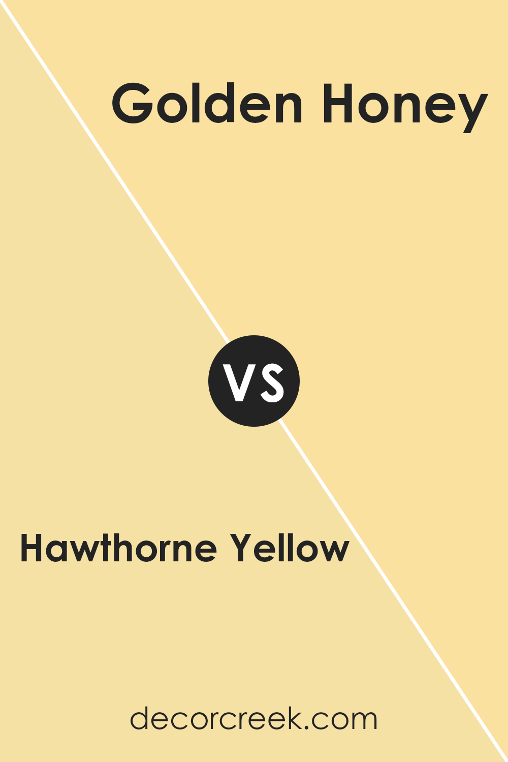
Hawthorne Yellow HC-4 by Benjamin Moore vs Golden Honey 297 by Benjamin Moore
Hawthorne Yellow and Golden Honey are both warm, inviting shades by Benjamin Moore, but they bring different vibes to a space. Hawthorne Yellow is a soft, muted yellow with a touch of creaminess, making it perfect for creating a cozy, welcoming atmosphere.
It doesn’t overwhelm the space but rather adds a subtle brightness. On the other hand, Golden Honey is a bolder, more vivid shade of yellow. It’s brighter and can make a real statement in a room, ideal for those who want to add a splash of energy and cheeriness.
While Hawthorne Yellow works well in a more laid-back, subtle décor style, Golden Honey is great for spaces that benefit from a pop of color. Both colors can warm up a room, but the choice between them depends on how subtle or striking you want the yellow in your room to be.
You can see recommended paint color below:
- 297 Golden Honey (CHECK A SAMPLE)
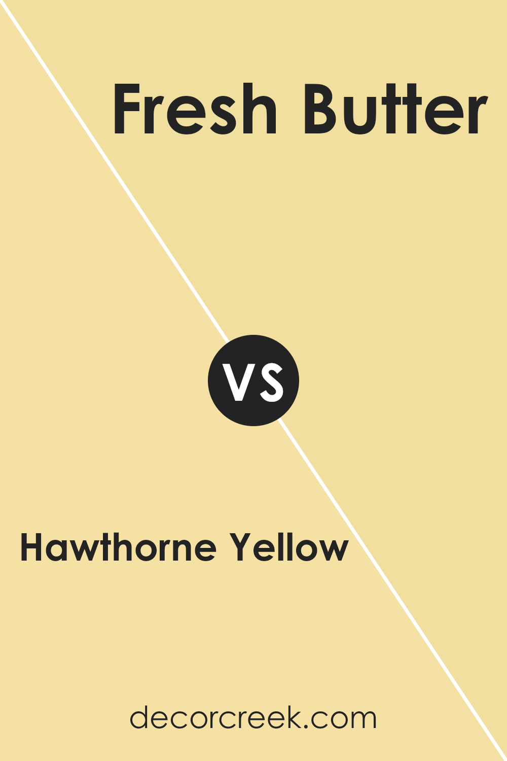
Hawthorne Yellow HC-4 by Benjamin Moore vs Fresh Butter 290 by Benjamin Moore
Hawthorne Yellow and Fresh Butter by Benjamin Moore are both warm and inviting shades of yellow that add cheer to any space. Hawthorne Yellow is a soft, muted yellow with a hint of green undertones, making it feel calm and subtle.
It works well in spaces that need a touch of brightness without overpowering the room. On the other hand, Fresh Butter is a more intense and vivid yellow. It’s brighter and has a sunny, energetic feel that can make a space feel more lively and vibrant.
While Hawthorne Yellow might be better suited for a relaxed and understated look, Fresh Butter is a great choice if you want to make a bolder statement with your color choice. Both colors can warm up a room, but the impact and mood they set are quite different due to their varying intensities and undertones.
You can see recommended paint color below:
- 290 Fresh Butter (CHECK A SAMPLE)
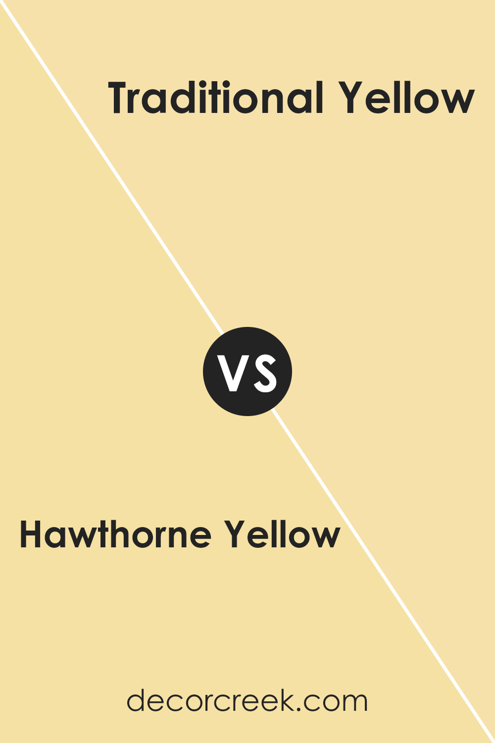
Hawthorne Yellow HC-4 by Benjamin Moore vs Traditional Yellow 170 by Benjamin Moore
Hawthorne Yellow and Traditional Yellow by Benjamin Moore are both charming shades, but they have distinct vibes. Hawthorne Yellow has a soft, muted quality, like the gentle warmth of sunlight in early morning. This makes it perfect for creating a cozy, welcoming atmosphere in any room. It’s especially suited for spaces where you want a calming, yet cheerful ambiance.
On the other hand, Traditional Yellow is brighter and more straightforward. It’s the kind of yellow that stands out more, bringing a lively and energetic feel to a space. This shade is great for areas where you want to inject vitality and a sense of joy.
In short, if you’re looking for a subtle and gentle yellow, Hawthorne is your go-to. But if you prefer something that’s more vivid and stands out, Traditional Yellow will do the trick. Each color offers its own unique mood and can be used effectively depending on the feeling you want to achieve in your space.
You can see recommended paint color below:
- 170 Traditional Yellow (CHECK A SAMPLE)
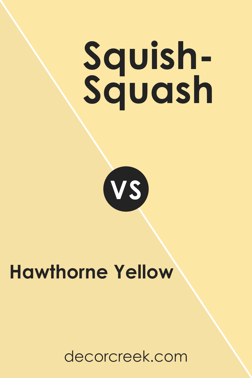
Hawthorne Yellow HC-4 by Benjamin Moore vs Squish-Squash 311 by Benjamin Moore
Hawthorne Yellow and Squish-Squash are two distinct colors from Benjamin Moore, each bringing its own unique vibe to a space. Hawthorne Yellow is a soft, muted yellow that breathes a sense of calm and subtleness into any room.
It’s not overly bright, making it a wonderful choice for creating a cozy, welcoming environment. This color works perfectly in spaces that aim for a relaxed yet cheerful atmosphere, such as living rooms or kitchens.
On the other hand, Squish-Squash is a much more intense and lively shade of yellow. It’s a bold color that can instantly brighten up a space and add a playful, energetic feel. Because of its vibrancy, it’s an excellent pick for areas that need a pop of color or for decorative accents that stand out.
In choosing between these two, consider the mood and function of your room. Hawthorne Yellow offers a gentle warmth, while Squish-Squash provides a vibrant, cheerful burst.
You can see recommended paint color below:
- 311 Squish-Squash (CHECK A SAMPLE)
Conclusion
Concluding my thoughts on HC-4 Hawthorne Yellow by Benjamin Moore, I would say that this shade stands out as a refreshing and cheerful choice within their Historical Collection. As someone who loves to create warm, inviting spaces, I found Hawthorne Yellow to be the perfect pick for bringing sunlight into any room without overwhelming it with brightness. Its historical significance adds a layer of depth, making it not just a color choice but a nod to American heritage.
This shade pairs beautifully with a wide range of colors, from neutrals to bold tones, allowing for flexibility in design schemes. Whether it’s for a kitchen, a living room, or even an exterior, Hawthorne Yellow maintains its charm and vibrancy, ensuring that spaces look alive and welcoming at any time of the day.
What I appreciate most about Hawthorne Yellow is its ability to uplift a space. In my use of this color, it consistently offers a positive vibe to the room, making it feel cozier and more comfortable. This quality is especially important in home environments where warmth and comfort are paramount.
Overall, my experience with HC-4 Hawthorne Yellow has been overwhelmingly positive. It’s a reliable and delightful choice for anyone looking to refresh their space with a touch of historical elegance and a burst of joy.
Ever wished paint sampling was as easy as sticking a sticker? Guess what? Now it is! Discover Samplize's unique Peel & Stick samples.
Get paint samples


