The CC-600 Mossy Oak by Benjamin Moore paint is a fantastic choice for those looking to refresh the look of their home or space with a new color. As with all Benjamin Moore paints, this shade offers exceptional quality, ensuring long-lasting beauty and durability. Mossy Oak belongs to a palette that resonates with nature, bringing an essence of the outdoors into any room. Its unique hue is versatile, making it suitable for various spaces, whether you’re aiming to create a serene bedroom, a lively living area, or even an inviting kitchen.
Choosing the right paint color can significantly influence the ambiance of a room. Mossy Oak stands out with its ability to blend with both contemporary and traditional decor, providing a backdrop that complements furnishings of all types. This color isn’t just about aesthetics; it’s also about creating an atmosphere that feels comfortable and welcoming.
For those considering a new project or updating their space, the CC-600 Mossy Oak by Benjamin Moore is worth considering. Its reliability and stunning appearance make it a popular choice among homeowners and interior designers alike. Whether you’re looking to make a bold statement or simply want to add a touch of nature to your environment, Mossy Oak offers that perfect balance, ensuring your space looks great for years to come.
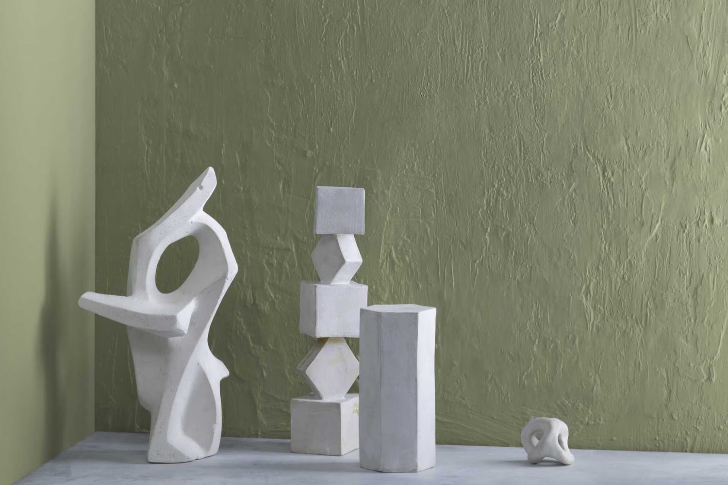
What Color Is Mossy Oak CC-600 by Benjamin Moore?
The color Mossy Oak CC-600 by Benjamin Moore has a calm and earthy essence, effortlessly bringing the tranquility of nature into any space. It’s a rich, deep green that mimics the cool, forest floor – not too dark but with enough depth to make a statement. This shade works wonderfully in several interior styles, especially in rustic, farmhouse, and even modern settings. It invokes a sense of grounding and warmth, making it an excellent choice for living rooms, bedrooms, or studies.
When considering what materials and textures pair well with Mossy Oak, think natural and rustic. Materials like raw wood, leather, and linen can complement its earthy vibe beautifully. These elements help create a cozy, inviting space. For textures, consider adding woven rugs or chunky knit throws to enhance the room’s comfort level. Metals such as brass and copper also work well with Mossy Oak, adding a touch of sophistication without detracting from the color’s natural appeal.
In summary, Mossy Oak by Benjamin Moore is a versatile, deep green color that suits various interior styles and pairs wonderfully with natural materials and textures. It’s perfect for anyone looking to add a serene, nature-inspired touch to their space.
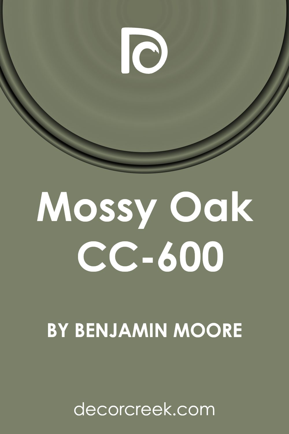
Is Mossy Oak CC-600 by Benjamin Moore Warm or Cool color?
The Mossy Oak CC-600 paint color by Benjamin Moore offers a unique and soothing mood for any room in a house. This particular shade is a soft, earthy green, kind of like the cool shades you would find in a lush forest. It’s great because it brings a touch of nature indoors, making your spaces feel more peaceful and grounded.
What’s cool about this color is how versatile it is. It fits well in many areas of a home. Whether you’re looking to add a calming backdrop to your bedroom or want to freshen up your living space with a hint of outdoor vibes, Mossy Oak has got you covered. This color works well with natural light, turning spaces into serene spots for relaxation or focus. When combined with both light and dark furniture, it creates a balanced look, making small rooms appear bigger and giving larger rooms a cozy feel.
In essence, using Mossy Oak in your home can transform plain spaces into soothing sanctuaries. It’s all about creating a relaxing environment where you can unwind, making it a perfect choice for anyone looking to refresh their home’s look with a warm, inviting atmosphere.
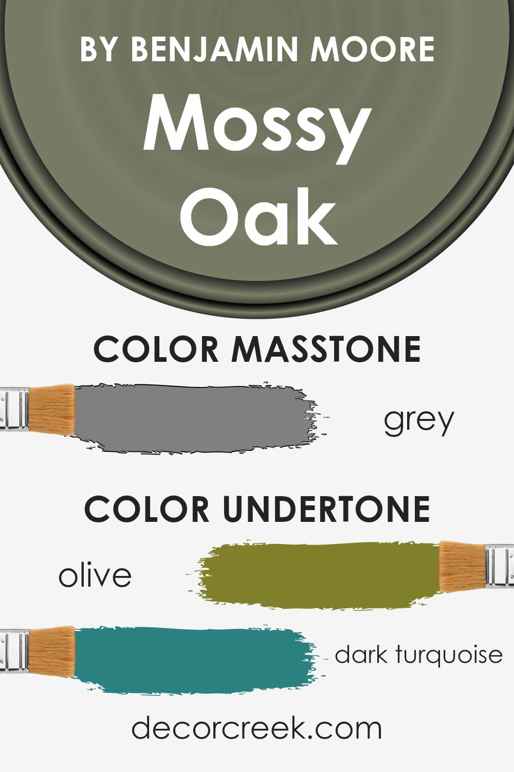
Undertones of Mossy Oak CC-600 by Benjamin Moore
Mossy Oak by Benjamin Moore is a versatile color that brings a sense of nature and tranquility into any space. This shade carries a rich blend of undertones, which play a crucial role in how it’s perceived and how it influences the ambiance of a room. Undertones are the colors lurking beneath the surface of the paint, affecting its overall hue and warmth. They can make a color appear cooler or warmer, depending on the lighting and surrounding colors.
Mossy Oak has a palette of undertones that range from subtle olive greens to deeper shades like dark turquoise, mint, and even hints of purple and pale pink. These undertones contribute to the complexity and depth of the color, allowing it to adapt to different settings and styles. For instance, olive and dark green undertones enhance the feeling of earthiness, making the room feel grounded and serene. On the other hand, splashes of mint, lilac, and pale yellow add a touch of freshness and vitality, brightening up the space.
When applied to interior walls, the undertones in Mossy Oak interact with natural and artificial light, shifting in appearance throughout the day. The color can bring warmth and coziness to a dimly lit room or a cool, calming effect to a brightly lit space. Additionally, its versatility allows it to complement a wide range of décor items and furniture, from modern and minimalist to rustic and vintage.
In essence, the undertones of Mossy Oak make it a dynamic and adaptable paint color, capable of transforming the mood and style of any room. It’s not just about the color on the wall; it’s about bringing an enriching and harmonious atmosphere to your living space.
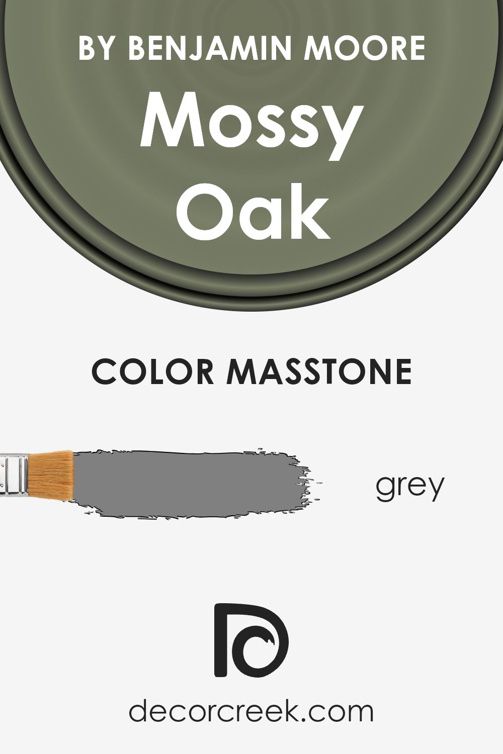
What is the Masstone of the Mossy Oak CC-600 by Benjamin Moore?
The Mossy Oak CC-600 by Benjamin Moore has a masstone of Grey, a color with the hex code #808080. This neutral tone has a unique ability to fit into almost any home decor scheme. Because the base color is grey, it offers a versatile backdrop that can complement a wide range of other colors, from bright and bold to soft and subtle. In homes, this means it can easily adapt to different styles and preferences, making rooms feel more cohesive and thoughtfully put together.
Grey is known for its calming effect, making it ideal for spaces where relaxation is key, like bedrooms and living rooms. The neutrality of grey also means it’s great at balancing out more vibrant colors, preventing spaces from feeling overwhelming. Whether you’re going for a modern, minimal look or something more traditional and cozy, this shade of grey can help tie your space together, providing a sophisticated foundation that enhances the overall aesthetic of your home.
How Does Lighting Affect Mossy Oak CC-600 by Benjamin Moore?
Lighting plays a crucial role in how colors are perceived, dramatically changing their appearance and the ambiance they create. The interplay between light and color can make the same shade look different at various times of the day or in different settings. Understanding this can help you choose the right paint or décor to achieve your desired effect in any space.
Take, for example, a color like Benjamin Moore’s Mossy Oak. This hue can appear differently under artificial light compared to natural sunlight. Under artificial lighting, such as LED or fluorescent lights, this color may seem warmer and more enveloping, creating a cozy atmosphere in rooms. This coziness is because artificial lighting typically has a fixed color temperature, influencing the color’s appearance on your walls.
- In natural light, the color can shift dramatically throughout the day. Morning light, which is cooler, might make Mossy Oak look more muted and subdued, while the golden hues of late afternoon could enrich the color, giving it a more vibrant and earthy feel.
- The direction a room faces also significantly impacts how Mossy Oak comes to life. In north-facing rooms, which tend to receive cooler, indirect light, this color might appear more somber and reserved, making the space feel calm and serene. South-facing rooms, basked in warm, direct sunlight for most of the day, can make Mossy Oak feel lively and dynamic, enhancing its depth.
- East-faced rooms see the early morning sun, making Mossy Oak look soft and inviting in the morning, gradually shifting to a cooler tone as the day progresses. Conversely, in west-facing rooms, the color may look somewhat flat and subdued during the morning but becomes warm and welcoming in the evening as it catches the late afternoon sun.
Understanding these nuances of light and its effect on color can help you choose where and how to use certain shades in your home, ensuring you get the desired mood and atmosphere in each room.
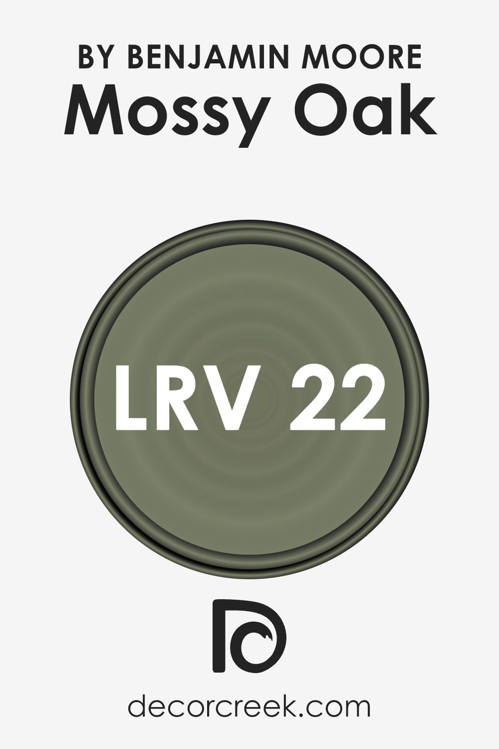
What is the LRV of Mossy Oak CC-600 by Benjamin Moore?
LRV stands for Light Reflectance Value, a measure used to determine how much light a color reflects or absorbs. This value ranges from 0 to 100, with 0 being pure black, absorbing all light, and 100 being pure white, reflecting all light back. Paint colors with a higher LRV make rooms feel more spacious and brighter as they reflect more light. Conversely, colors with a lower LRV can make spaces feel cozier or smaller because they absorb more light.
Given LRV of 21.5 for the color in question, it falls on the lower end of the scale, meaning it absorbs more light than it reflects. This characteristic will impact how the color looks on your walls, creating a rich and deeper tone that provides a sense of warmth and sophistication. In adequately lit rooms, this color can add depth and character to the space. However, in rooms with limited natural light, it might make the space appear darker, so lighting considerations are crucial to ensure the room doesn’t feel too enclosed.
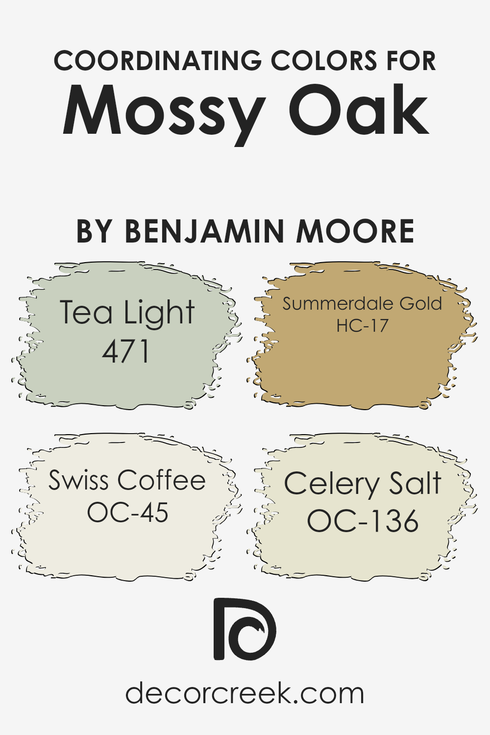
Coordinating Colors of Mossy Oak CC-600 by Benjamin Moore
Coordinating colors are shades that complement each other and work in harmony to enhance the overall appearance of a space. They can either contrast or blend with the primary color, in this case, Mossy Oak by Benjamin Moore, to create a cohesive and appealing design. These coordinating colors help balance the atmosphere of a room, making it more visually pleasing. By selecting colors that complement Mossy Oak, designers and homeowners can ensure that the space feels balanced and thoughtfully put together.
The color Tea Light is a muted shade that offers a soft, almost ethereal glow to any space, reminiscent of the gentle light of a tea candle. It brings a sense of calm and serenity, making it an ideal choice for creating a relaxed atmosphere. Swiss Coffee, on the other hand, is a warm, inviting shade of off-white that adds a smooth, creamy texture to the visual palette. It’s perfect for walls or trim, providing a subtle contrast without overwhelming the senses.
Summerdale Gold is a sunny, cheerful hue that injects energy and brightness into a room, capturing the essence of a sunny summer day. It’s excellent for adding a pop of color without dominating the space. Lastly, Celery Salt is a light, airy green with a hint of freshness, offering a natural and rejuvenating feel that complements the earthy tones of Mossy Oak beautifully. Combined, these colors work together to create a harmonious and inviting space.
You can see recommended paint colors below:
- 471 Tea Light (CHECK A SAMPLE)
- OC-45 Swiss Coffee (CHECK A SAMPLE)
- HC-17 Summerdale Gold (CHECK A SAMPLE)
- OC-136 Celery Salt
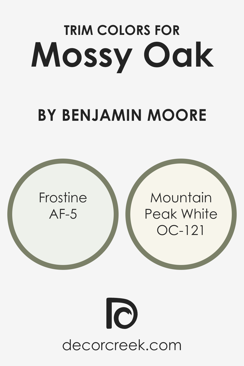
What are the Trim colors of Mossy Oak CC-600 by Benjamin Moore?
Trim colors are the shades applied to the edges, borders, or detailing of a room, like door frames, skirting boards, and window sills. These colors play a crucial role in interior design because they frame the space, highlighting the architecture and setting the tone for the overall ambiance. For a color like Mossy Oak CC-600 by Benjamin Moore, selecting the right trim colors can enhance its natural, outdoorsy vibe, making the room feel cohesive and thoughtfully designed. Trim colors are not just an afterthought; they’re an essential element that can accentuate the primary color, adding depth and character to the space.
AF-5 Frostine, a subtly cool white with just a hint of gray, brings a light and airy feel to the trim, offering a gentle contrast that can make the walls appear more vivid and dynamic without overpowering them. OC-121 Mountain Peak White, on the other hand, provides a warmer, creamier approach, giving a soft, welcoming glow that complements the earthy tones of Mossy Oak. This warmer shade can subtly enhance the cozy feel of a room, pairing beautifully with Mossy Oak to create a harmonious and inviting space. Both colors, in their own right, offer a unique way to frame Mossy Oak, highlighting its beauty and ensuring the room feels balanced and well-considered.
You can see recommended paint colors below:
- AF-5 Frostine (CHECK A SAMPLE)
- OC-121 Mountain Peak White
Colors Similar to Mossy Oak CC-600 by Benjamin Moore
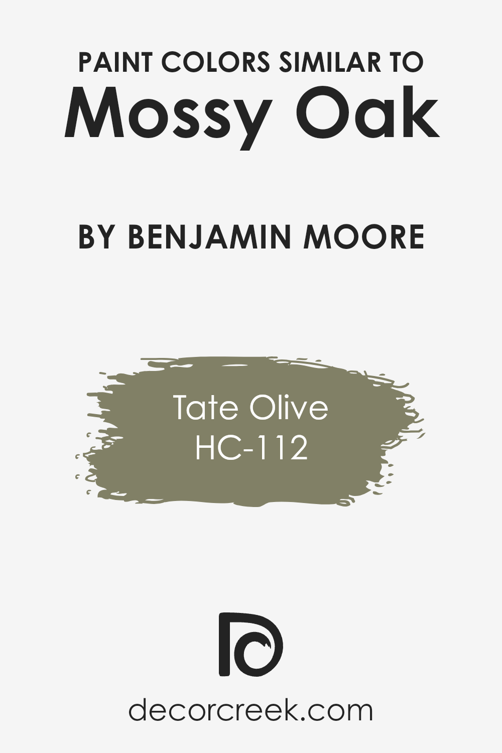
When it comes to creating a harmonious and visually appealing space, choosing the right colors is key. Similar colors, like those in the same family as Benjamin Moore’s Mossy Oak (CC-600), play a crucial role in achieving a balanced and cohesive look. By selecting shades that closely resemble each other, you can create a subtle contrast that adds depth and complexity to your decor without overwhelming the senses. Colors that are similar to Mossy Oak, such as HC-112 – Tate Olive by Benjamin Moore, work well together because they share common undertones. This similarity allows them to blend seamlessly, giving a room a uniform appearance that is soothing to the eye.
Mossy Oak is a rich, earthy color that evokes the lush, dense foliage of a forest. Its deep green hue provides a strong foundation for a nature-inspired color scheme, offering a sense of tranquility and rejuvenation. On the other hand, Tate Olive (HC-112) is a slightly lighter, more muted green. It carries the same natural vibe as Mossy Oak but adds a touch of softness that can lighten a room’s atmosphere, making it feel more open and airy.
Together, these colors create an environment that is both grounding and invigorating, perfect for spaces where you want to relax and recharge. By carefully selecting similar hues like these, you can craft a space that beautifully mirrors the subtle variations found in nature.
You can see recommended paint color below:
- HC-112 Tate Olive (CHECK A SAMPLE)
How to Use Mossy Oak CC-600 by Benjamin Moore In Your Home?
Mossy Oak CC-600 by Benjamin Moore is a unique and versatile paint color that can significantly impact your home’s aesthetic. This shade, part of Benjamin Moore’s collection, offers a rich and earthy tone that mimics the lushness of forest moss. Its deep, yet understated, green hue works wonderfully in various settings, providing a calm and grounding effect wherever it’s applied.
Whether you’re aiming to rejuvenate your living room, bedroom, or even your kitchen, Mossy Oak CC-600 can serve as an excellent backdrop or accent wall, enhancing the coziness and inviting nature of your spaces. For those looking to add a touch of nature indoors, pairing this color with natural wood elements and plant life can create a serene and organic atmosphere.
It’s not just about aesthetics; the right paint color can influence your mood and the overall feel of your home. Mossy Oak CC-600 brings a sense of tranquility and connection to nature, making it ideal for anyone looking to create a peaceful and relaxing environment. So, when you plan your next home makeover, consider how this beautiful shade can transform your space.
Mossy Oak CC-600 by Benjamin Moore vs Tate Olive HC-112 by Benjamin Moore
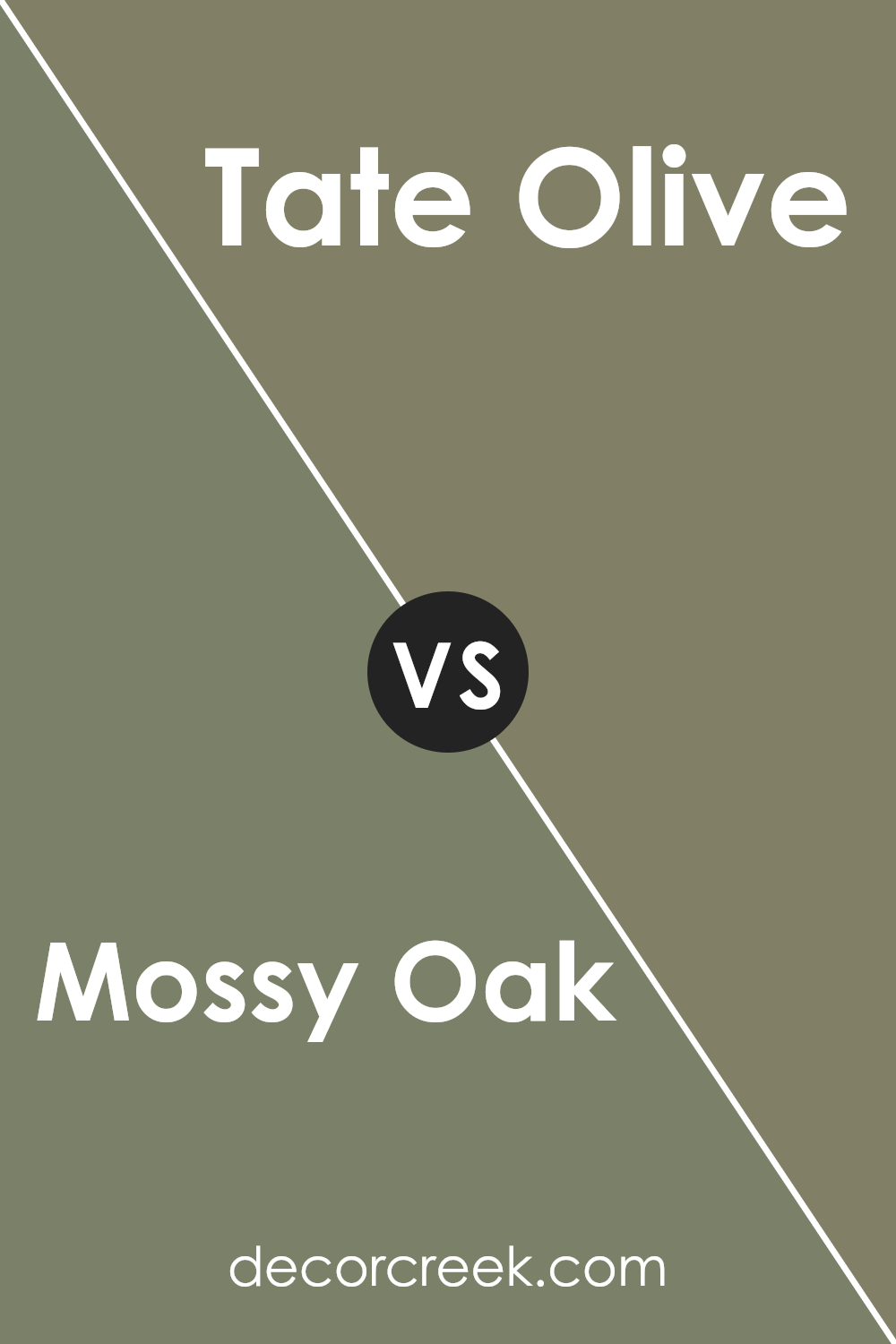
Mossy Oak CC-600 and Tate Olive HC-112, both by Benjamin Moore, offer unique takes on the beauty of nature-infused colors. Mossy Oak presents a deeper, more enriched green, reminiscent of a lush, dense forest. It has a certain richness that makes it perfect for creating a cozy, embraced atmosphere in a room. It’s the kind of color that brings the essence of the outdoors inside, giving a sense of calm and tranquility.
On the other hand, Tate Olive HC-112 leans towards a milder, more muted green. It has a softness to it that is both soothing and refreshing. This color can illuminate a space with a gentle touch of nature’s palette, making it ideal for those looking to add a subtle natural vibe without overwhelming a room.
Both colors provide a touch of the natural world but in distinctly different ways. Mossy Oak is all about depth and richness, ideal for a bold statement, while Tate Olive offers a lighter, softer approach, perfect for creating a serene and calming environment.
You can see recommended paint color below:
- HC-112 Tate Olive (CHECK A SAMPLE)
Conclusion
The Benjamin Moore Mossy Oak CC-600 paint color is a versatile and appealing choice for those looking to bring a natural and soothing ambiance into their space. Its unique shade, inspired by the serene and grounded essence of a moss-covered oak forest, offers a subtle and earthy hue that effortlessly complements a wide range of decor styles. This makes it an excellent option for anyone seeking to create a cozy yet sophisticated atmosphere in their home or office. The paint’s adaptability and the calming effect it brings make it a standout choice for creating tranquil and inviting environments.
Choosing Mossy Oak CC-600 by Benjamin Moore can significantly enhance the aesthetic appeal of a room without overwhelming it with color. Its harmonious balance between being understated and impactful allows for creative freedom in interior design, making it possible to pair with both bold and neutral accessories. Whether applied in a living room, bedroom, or workspace, this color has the capability of transforming mundane spaces into refreshing and stylish areas. Its popularity stems not only from its aesthetic versatility but also from the quality assurance that comes with the Benjamin Moore brand, known for its durable and premium paints.
Ever wished paint sampling was as easy as sticking a sticker? Guess what? Now it is! Discover Samplize's unique Peel & Stick samples.
Get paint samples


