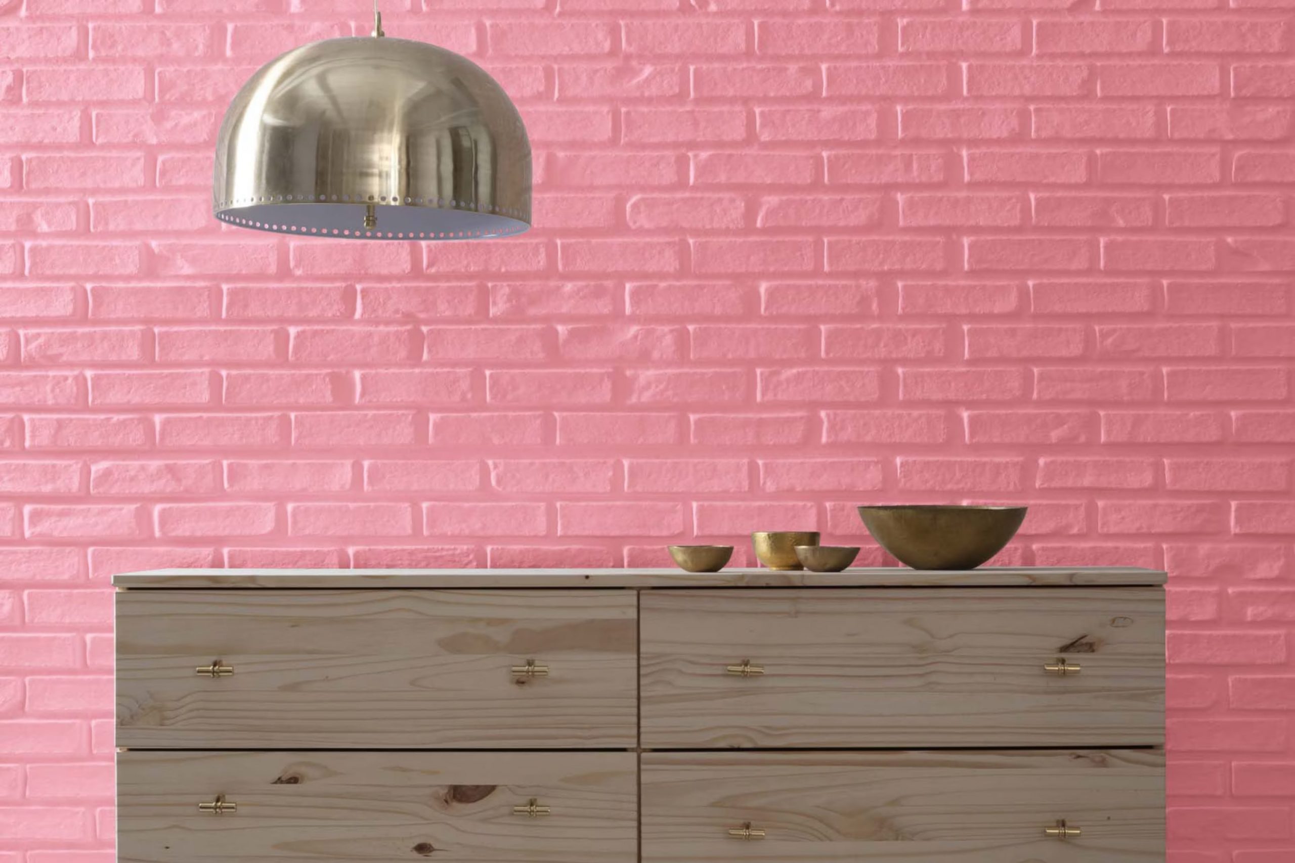
I recently came across Benjamin Moore’s 1312 Potpourri and must say, it’s a unique color choice that caught my attention. Initially, when you hear “Potpourri,” you might think of mixed floral scents and varied colors bundled together, but this paint shade tells a different story. It has a subtle, understated elegance that offers a refreshing contrast to the name that implies complexity. What I like about it is how it presents a blend that isn’t overpowering but rather calming and flexible.
Benjamin Moore’s choice with 1312 Potpourri is perfect if you’re looking for something’s that can adjust to different rooms and lighting conditions without losing its charm. It works beautifully in areas that need a touch of softness, and yet it holds its own in rooms filled with natural light, reflecting different undertones throughout the day.
Whether you’re thinking about repainting your living room or just sprucing up a cozy corner, this shade provides a gentle backdrop for your daily activities.
It has this way of making the décor items around it stand out, which is excellent if you like to switch things up now and then.
What Color Is Potpourri 1312 by Benjamin Moore?
Potpourri, color 1312 by Benjamin Moore, is a soft, warm beige with a subtle hint of peach, creating an inviting atmosphere in any room. This flexible hue acts as a neutral backdrop that can easily blend with various decor styles and color palettes. Potpourri is particularly well-suited for traditional and contemporary interiors where its calming tone helps to create a cozy, welcoming ambiance.
In terms of interior styles, this color shines in settings that favor a classic approach with a touch of warmth. It is ideal for living rooms, bedrooms, and kitchens where it complements natural light and enhances the room’s overall aesthetic.
Potpourri pairs beautifully with rich textures like plush wool, smooth leather, and rustic wood, which all contribute to a layered and comfortable interior. The softness of Potpourri allows it to integrate seamlessly with materials like linens and cotton, making it a fantastic choice for window treatments and upholstered furniture.
For those looking to create a balanced and inviting home, Potpourri works excellently with other earthy tones like soft greens, muted blues, and gentle browns. Its adaptability and warm undertones make it an excellent base that supports a variety of design choices, ensuring a harmonious look throughout your home.
Is Potpourri 1312 by Benjamin Moore Warm or Cool color?
Potpourri1312 by Benjamin Moore is a distinctive paint color that brings a cozy and inviting atmosphere to any room in a house. This color is a soft blend that looks like a mix between gray and lavender, which makes it very adaptable for decorating. It can work well in various rooms like living rooms, bedrooms, or even bathrooms.
The subtle tone of Potpourri1312 is great for people who want a hint of color on their walls without it feeling too intense or overpowering. It pairs nicely with different types of furniture, whether you have modern pieces or more traditional styles. This color also complements other shades, so you can mix it with warm colors like creams or cool tones like blues without any clash.
Using Potpourri1312 can help to create a welcoming vibe in a home. It’s a good choice for those looking to add a touch of softness and warmth to their interiors without making too bold of a statement with their wall color. This makes it especially suited for anyone looking to refresh their home in a subtle yet effective way.
Undertones of Potpourri 1312 by Benjamin Moore
Potpourri1312 by Benjamin Moore is a unique color that, because of its range of undertones, can appear different depending on the lighting and surrounding colors. The undertones in paint colors are subtle hues that can influence the main color. In the case of Potpourri1312, the undertones span a broad spectrum including light purple, pale yellow, pink, orange, grey, light gray, fuchsia, lilac, yellow, mint, red, purple, olive, light blue, violet, light green, and brown.
These undertones affect how we perceive the color when it’s on the walls. Since Potpourri1312 includes both cool and warm undertones like lilac and orange or mint and red, it can blend or contrast harmoniously with a wide range of decor and furniture. It also means the color can shift its appearance under different lighting conditions. Natural light might highlight its yellow or pale yellow undertones, making the room feel warmer, while artificial lighting might bring out the cooler tones like grey or lilac, giving the room a more muted ambiance.
When used on interior walls, Potpourri1312 can shape the mood and style of a room. In a room with plenty of sunlight, the warmer undertones might make the area feel cozy and inviting. In rooms with less natural light, the cooler undertones could dominate, making the room feel calm and reserved. This flexibility makes Potpourri1312 a flexible choice for different rooms and settings, subtly adjusting to complement the interior design elements.

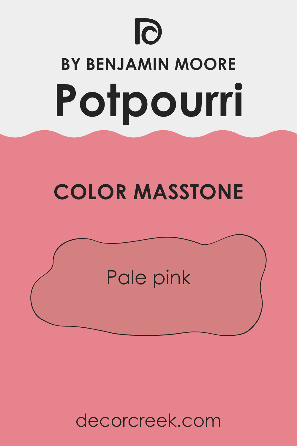
What is the Masstone of the Potpourri 1312 by Benjamin Moore?
Potpourri1312 by Benjamin Moore, sporting a masstone of pale pink (#D58080), offers a gentle and welcoming hue that can subtly enhance any room in the home. This pale pink shade brings a soft, warm feel that is perfect for creating a cozy atmosphere. When used in rooms like living areas or bedrooms, it adds a touch of softness without feeling too intense.
The color works well with natural light, radiating a subtle brightness that can make small rooms appear larger and more open. It’s adaptable, too, pairing nicely with a range of other colors—from crisp whites to deep grays—to foster an inviting environment.
In nurseries, this pale pink nurtures a calm and loving vibe, while in bathrooms, it introduces a fresh and clean aesthetic. Overall, Potpourri1312 is a great choice for anyone looking to add a hint of warmth and color to their home without making a bold statement.
How Does Lighting Affect Potpourri 1312 by Benjamin Moore?
Lighting plays a crucial role in how colors appear in any given room. Depending on whether a room uses natural light, artificial light, or a combination of both, the same color can look different.
For instance, Potpourri1312 by Benjamin Moore, a nuanced shade, varies noticeably under different lighting conditions. In natural light, colors generally show their truest form. However, the quality and angle of natural light can change a color’s appearance throughout the day. With artificial light, which includes various bulb types like LED or incandescent, colors can appear warmer or cooler depending on the bulbs’ temperature.
In north-facing rooms, light is typically cooler and bluer, which can make Potpourri1312 appear more muted and subdued. These rooms receive less direct sunlight, so the color may look slightly darker and richer than in other areas.
South-facing rooms enjoy abundant light for most of the day, which tends to be warm and bright. In these rooms, Potpourri1312 will appear lighter and softer, almost glowing at times as the intense light can wash out subtle color differences.
East-facing rooms receive the most light in the morning. The morning light is warm and yellow, giving Potpourri1312 a cheerful and warm presence early in the day, which may shift to a more neutral tone as the day progresses and the light fades.
West-facing rooms get most of their light in the late afternoon to evening when the light is warmer. In these rooms, the color will have a cozy and warm tone during the evening, becoming calmer and more shadowy as the natural light diminishes.
Overall, the appearance of Potpourri1312 depends heavily on the direction the room faces and the type of light it receives. It’s a flexible color that shows different qualities based on lighting conditions, making it a great option for a variety of rooms.

What is the LRV of Potpourri 1312 by Benjamin Moore?
LRV stands for Light Reflectance Value, which measures the percentage of light a paint color reflects back into a room compared to how much it absorbs. LRV is an important factor to consider when choosing paint because it can significantly influence the brightness and atmosphere of a room.
For instance, colors with higher LRVs are lighter and make a room feel more open and airy, whereas colors with lower LRVs are darker and can make a room feel cozier and smaller. This value helps in deciding which paint to use based on how much natural light a room receives or the mood you’re trying to create.
In the case of the paint color with an LRV around 34, such as the Benjamin Moore Potpourri, the LRV signifies that it is a mid-tone color. It will reflect some light but absorb more, giving it a richer appearance than lighter colors. This means it is adaptable enough to add some depth and interest to a room without overpowering it, especially in rooms that may not receive excessive sunlight. As a result, this paint can help create a warm and inviting room, and its balance between light and dark makes it suitable for a wide range of settings and themes.

decorcreek.com
Coordinating Colors of Potpourri 1312 by Benjamin Moore
Coordinating colors are selected to complement each other and work together harmoniously within a design area. The concept is based on color theory, which outlines relationships between colors on the color wheel. Colors that coordinate often balance each other, creating a visually appealing and unified look. This is particularly effective in interior design, where the harmony of color can enhance the mood and aesthetic of a room.
For example, HC-179 – Platinum Gray is a deep, rich gray that offers a strong base color, perfect for creating a grounded, calm atmosphere. It pairs well with lighter or more vibrant colors, bringing balance to brighter tones. Next, 507 – Grecian Green provides a touch of nature’s palette with its leafy tone. It’s a refreshing color that complements grays and whites by adding a lively yet soothing vibe to rooms.
OC-130 – Cloud White is a soft white with a hint of warmth, making it ideal for creating a sense of openness and light in any room. It helps other colors stand out while providing a clean backdrop. Finally, OC-149 – Decorator’s White is crisper and cooler compared to Cloud White, making it suitable for achieving a more defined look. This white works well in rooms that require a clear, crisp finish to support bolder colors or intricate design elements.
You can see recommended paint colors below:
- HC-179 Platinum Gray
- 507 Grecian Green
- OC-130 Cloud White
- OC-149 Decorator’s White

What are the Trim colors of Potpourri 1312 by Benjamin Moore?
Trim colors are specific shades used to accentuate and complement the main colors on walls or exterior surfaces of a home or building. When selected carefully, trim colors can enhance architectural details, create a clean and finished look, and define the character of a room.
Using colors like OC-146 – Linen White and OC-61 – White Diamond from Benjamin Moore for trim can subtly highlight and support the main color palette, ensuring that the overall aesthetic is cohesive and thoughtfully designed.
OC-146 – Linen White is a soft, creamy white that offers a gentle contrast against bolder colors. This color is ideal for creating a warm and inviting feel, as it pairs well with a wide range of hues without overpowering them. On the other hand, OC-61 – White Diamond is a clearer, brighter white with a crisp appearance. It works well in rooms that aim for a fresh and clean look, making it great for more modern settings where a stark, yet inviting contrast is desired.
You can see recommended paint colors below:
- OC-146 Linen White
- OC-61 White Diamond

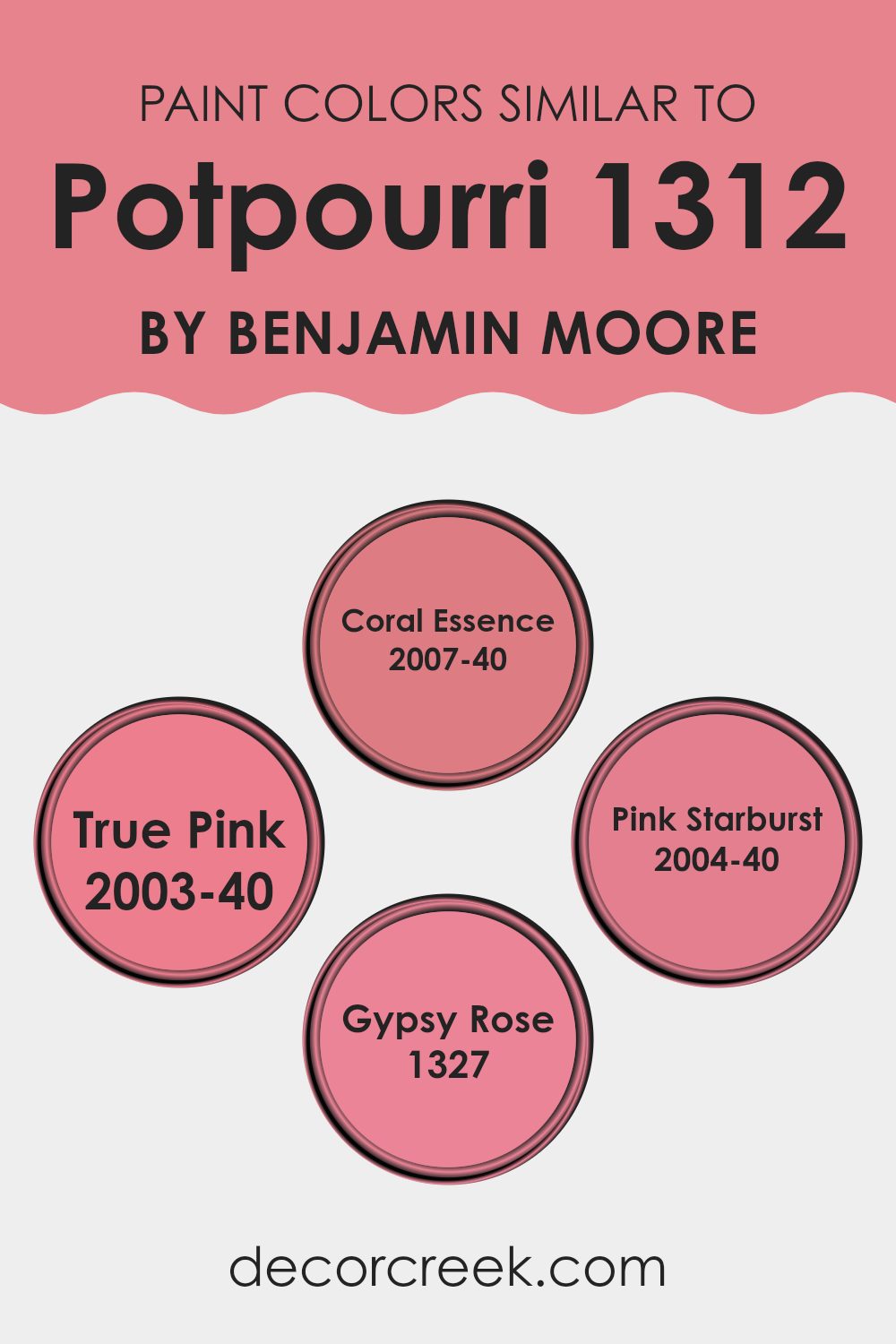
Colors Similar to Potpourri 1312 by Benjamin Moore
Similar colors create a harmonious and cohesive look when decorating a room. When colors like Coral Essence, True Pink, Pink Starburst, and Gypsy Rose from Benjamin Moore are used together, they provide a seamless visual experience that enhances the mood of an interior without feeling too intense. These related hues can easily flow from one room to another, maintaining a consistent theme throughout a home. By sticking to one color family, you achieve a unified and inviting atmosphere that is pleasing to the eye.
Coral Essence has a vibrant yet warm tone that offers a refreshing splash of color, perfect for adding a lively touch to any interior. True Pink is a cheerful and bright shade that brings a sense of playfulness and warmth, making it a great choice for areas meant to inspire positivity.
Pink Starburst offers a softer approach with its gentle and subtle pink hue, making it ideal for creating a light and easygoing feel. Gypsy Rose is deeper and richer, giving a bolder statement that can anchor lighter shades and add depth to the color scheme. Together, these colors allow for a varied yet cohesive palette, giving decorators the flexibility to create both vibrant and subtle environments as needed.
You can see recommended paint colors below:
- 2007-40 Coral Essence
- 2003-40 True Pink
- 2004-40 Pink Starburst
- 1327 Gypsy Rose
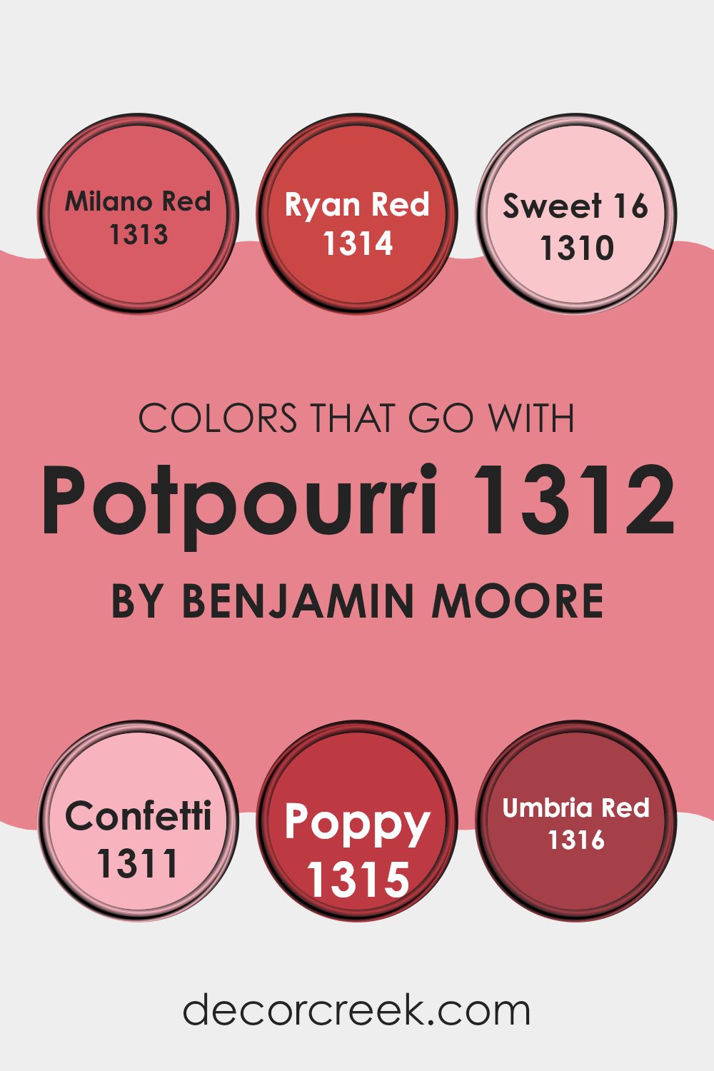
Colors that Go With Potpourri 1312 by Benjamin Moore
Choosing the right colors to complement Potpourri 1312 by Benjamin Moore is crucial because it helps create a cohesive and appealing look in your room. Colors that pair well can enhance the overall aesthetic and make the environment more enjoyable. Potpourri 1312 is a unique hue, and selecting the right combinations can really highlight its qualities and bring balance to an interior.
Milano Red 1313 and Ryan Red 1314 are vibrant choices that add energy and warmth to rooms when used alongside Potpourri 1312. Milano Red is a bold, attention-grabbing color that can make a statement in any room. In contrast, Ryan Red is slightly deeper and brings a hint of traditional charm.
Moving toward the softer spectrum, Sweet 16 – 1310 has a gentler, more understated appeal, making it perfect for creating a relaxed vibe. Confetti 1311, similar to Sweet 16, offers a playful splash of color that works well in more dynamic and creative interiors. Poppy 1315 is another lively color that can inject some fun into the mix, while Umbria Red 1316 offers a rich tone that works beautifully in more elegant or refined rooms. By choosing these complementary colors, you ensure that each room not only looks visually pleasing but also feels inviting and comfortable.
You can see recommended paint colors below:
- 1313 Milano Red
- 1314 Ryan Red
- 1310 Sweet 16
- 1311 Confetti
- 1315 Poppy
- 1316 Umbria Red
How to Use Potpourri 1312 by Benjamin Moore In Your Home?
Potpourri 1312 by Benjamin Moore is a unique paint color that brings warmth and a calming touch to any home. This shade is a soft, dusky pink that can make rooms feel cozy and inviting.
It’s an excellent choice for living rooms and bedrooms where you want to create a calm and welcoming atmosphere. Because of its gentle tone, Potpourri 1312 pairs beautifully with light, neutral furniture and decor, allowing it to stand out as a subtle yet effective backdrop.
Using Potpourri 1312 in small rooms like bathrooms or as an accent wall can also add a hint of color without feeling too intense. If you like a bit of variety, consider using it in creative ways, such as for painting the insides of bookshelves or a standout piece of furniture. This color can also work well in children’s rooms, giving off a soft and playful vibe. Overall, Potpourri 1312 offers a flexible option for anyone looking to bring a fresh look to their home.
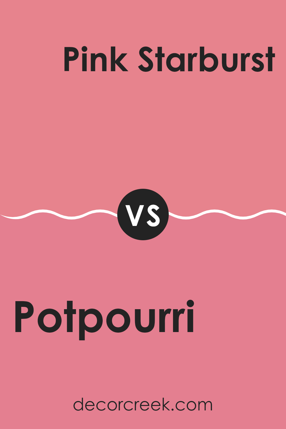
Potpourri 1312 by Benjamin Moore vs Pink Starburst 2004-40 by Benjamin Moore
Potpourri and Pink Starburst are two distinctive shades offered by Benjamin Moore. Potpourri is a muted, creamy peach color that gives a gentle, calming vibe to any room. It is soft and subtle, making it a great choice for creating a warm and inviting atmosphere.
On the other hand, Pink Starburst is a vibrant, lively pink. It’s much brighter and is sure to make a bold statement wherever it’s used. This color tends to add a burst of energy and cheerful brightness, perfect for rooms intended to be fun and lively.
In comparison, while Potpourri leans toward a quiet, understated elegance, Pink Starburst is all about vibrancy and fun, making it more suited for playful or dynamic areas. Each color serves different moods and setting preferences, from calm and laid-back to exciting and spirited.
You can see recommended paint color below:
- 2004-40 Pink Starburst
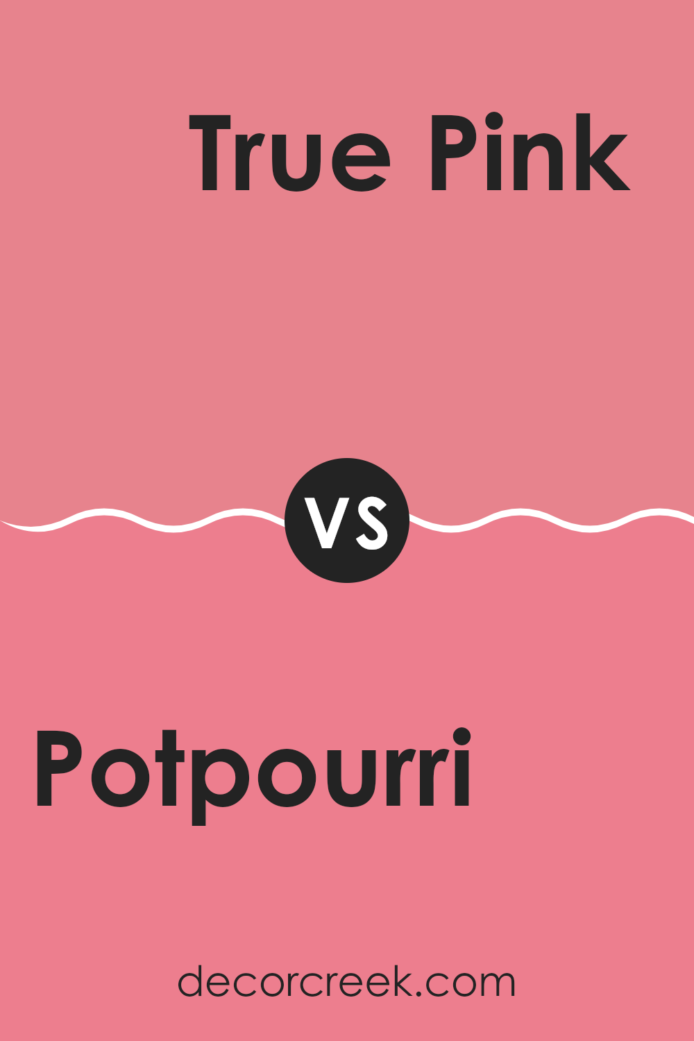
Potpourri 1312 by Benjamin Moore vs True Pink 2003-40 by Benjamin Moore
Potpourri by Benjamin Moore is a warm, soft peach hue that brings a cozy, welcoming feel to any room. It’s gentle and light, with a subtle warmth that can make interiors feel inviting and homely. This shade works well in living rooms or bedrooms where you want a calm, soothing atmosphere without going too bold.
On the other hand, True Pink by Benjamin Moore is a vibrant and cheerful pink. It’s a lot bolder and can add a playful splash of color to a room. This shade is great for areas where you want to inject some energy and fun, like a children’s room or a creative area.
The brightness of True Pink stands out more compared to the muted tones of Potpourri, making it a good choice for anyone looking to make a statement. Both colors offer their own charm, with Potpourri leaning toward a subdued, warm feel, and True Pink delivering a burst of lively personality.
You can see recommended paint color below:
- 2003-40 True Pink
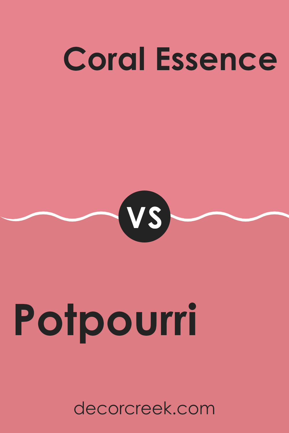
Potpourri 1312 by Benjamin Moore vs Coral Essence 2007-40 by Benjamin Moore
The colors Potpourri and Coral Essence by Benjamin Moore are visually distinct yet both provide a warm ambiance to any room. Potpourri is a gentle pink with a soft, muted tone that offers a subtle hint of color. It’s understated and gentle, making it an excellent choice for creating a cozy, inviting atmosphere. This color is adaptable enough for bedrooms or living areas where a touch of softness is desired.
On the other hand, Coral Essence is a vibrant coral shade that has a more lively and energetic feel. It’s a standout color that can brighten up a room and is especially suitable for rooms where you want to add a burst of energy or cheer. This color can work well in a kitchen, dining area, or even a bathroom where a splash of brightness is needed.
Both colors bring their own unique vibes to a room – Potpourri with its calm, muted presence, and Coral Essence with its cheerful, vivid essence.
You can see recommended paint color below:
- 2007-40 Coral Essence
Potpourri 1312 by Benjamin Moore vs Gypsy Rose 1327 by Benjamin Moore
Potpourri by Benjamin Moore is a gentle, pale pink hue with a soft and inviting vibe. It’s ideal for creating a calm and cozy atmosphere in any room. This light-colored shade brings a sense of airiness and can easily match different decor styles, adding a touch of understated charm.
On the other hand, Gypsy Rose by Benjamin Moore is a deeper, more vibrant pink with a rich intensity that makes it stand out. It’s more spirited and energetic compared to Potpourri, making it great for rooms where you want to add some drama or a splash of boldness. This color can be used to make a strong statement whether on an accent wall or throughout a room.
Overall, while both hues are pink, Potpourri offers a softer appeal, perfect for a relaxed feel, whereas Gypsy Rose provides a punchier presence suitable for more dynamic or lively settings.
You can see recommended paint color below:
- 1327 Gypsy Rose
In conclusion, after reading the article about 1312 Potpourri by Benjamin Moore, I learned a lot about this unique paint color. This isn’t just any shade; it feels like a special detail that can make any room in your home look warm and welcoming. Benjamin Moore created Potpourri to give walls a soft, delicate look that feels both friendly and comfortable. The article explained how this color can work well in many different rooms, from kitchens to bedrooms, making it very practical.
What’s great about Potpourri is that it isn’t too bright or too dark, so it creates a perfect background for favorite items like pictures, books, or toys. It’s almost like giving your walls a gentle hug. The article also shared ideas about which colors pair well with Potpourri, which makes decorating feel much easier. Whether you enjoy cool blues or bright yellows, Potpourri complements them nicely, helping everything look well balanced.
Reading about all these possibilities makes me excited to maybe use this color in my own room. It seems like a wonderful choice for anyone who wants to make their home feel cozy and warm without much effort.
Benjamin Moore really did a great job with 1312 Potpourri, and I’m glad I got to learn more about it.
Ever wished paint sampling was as easy as sticking a sticker? Guess what? Now it is! Discover Samplize's unique Peel & Stick samples.
Get paint samples

