If you’re thinking about giving your space a fresh look with a serene and soft vibe, you might want to consider the color OC-19 Seapearl by Benjamin Moore. This shade is a gentle off-white that brings a calm and light atmosphere to any room. It’s perfect if you enjoy a clean and understated style but still want a hint of warmth and coziness around you.
Seapearl has a natural versatility that works beautifully in different areas of your home, whether it’s your living room, bedroom, or kitchen. It pairs well with various decor styles and colors, allowing you to mix and match according to your taste and existing furniture.
I’ve seen how this color can transform a space into a relaxing haven. It’s ideal for those who appreciate a subtle elegance and want to maintain a bright and airy feel in their environment. If you’re considering a color update or starting a new decorating project, Seapearl could be a fantastic choice to keep your space feeling fresh and inviting.
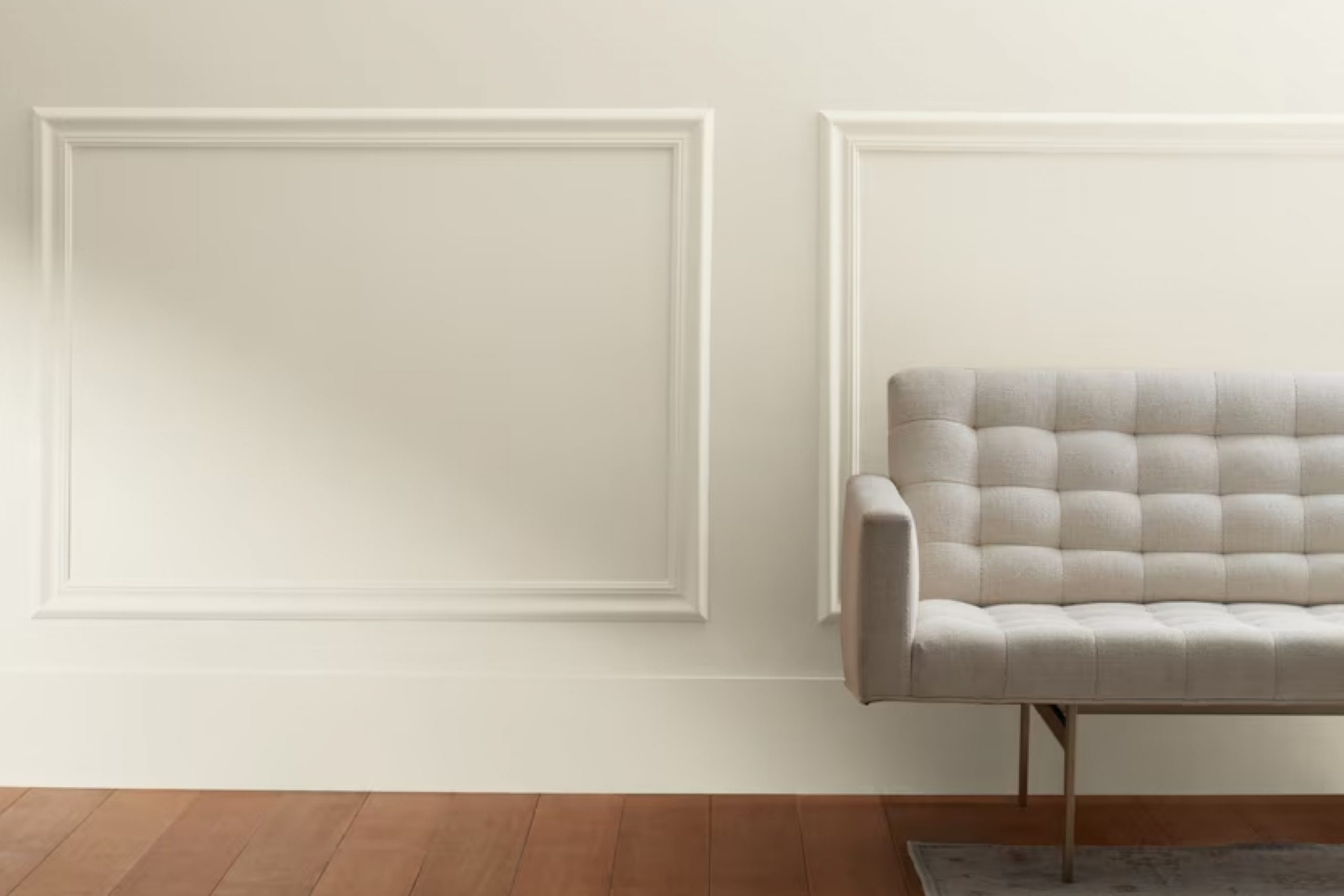
What Color Is Seapearl OC-19 by Benjamin Moore?
Seapearl OC-19, offered by Benjamin Moore, is a versatile shade that falls between white and light gray. It has a soft, subtle undertone that makes it an ideal choice for creating a calm and inviting atmosphere in any room. This neutral color is extremely adaptive and works well across various interior design styles, including modern, coastal, and traditional decor.
In a modern setting, Seapearl pairs beautifully with sleek, clean lines and minimalistic decor, helping to create a crisp and fresh look. For a coastal vibe, it complements blues and sandy tones, evoking the feeling of a beach house, while in traditional homes, it can balance more ornate elements and rich textures without overwhelming the senses.
When thinking about materials, Seapearl coordinates well with natural wood, which can warm up the space while maintaining an airy feel. It’s equally appealing with metallic accents like brushed nickel or chrome, adding a light sheen that reflects the color’s gentle nuance.
As for textures, linen, and cotton fabrics blend seamlessly with this hue, offering a soft touch to draperies and upholstery that stands out in the subtle elegance of this color.
Overall, Seapearl OC-19 supports a range of design preferences and can bridge the gap between various elements in a room, making it a popular choice for those looking to refresh their interiors with a timeless appeal.
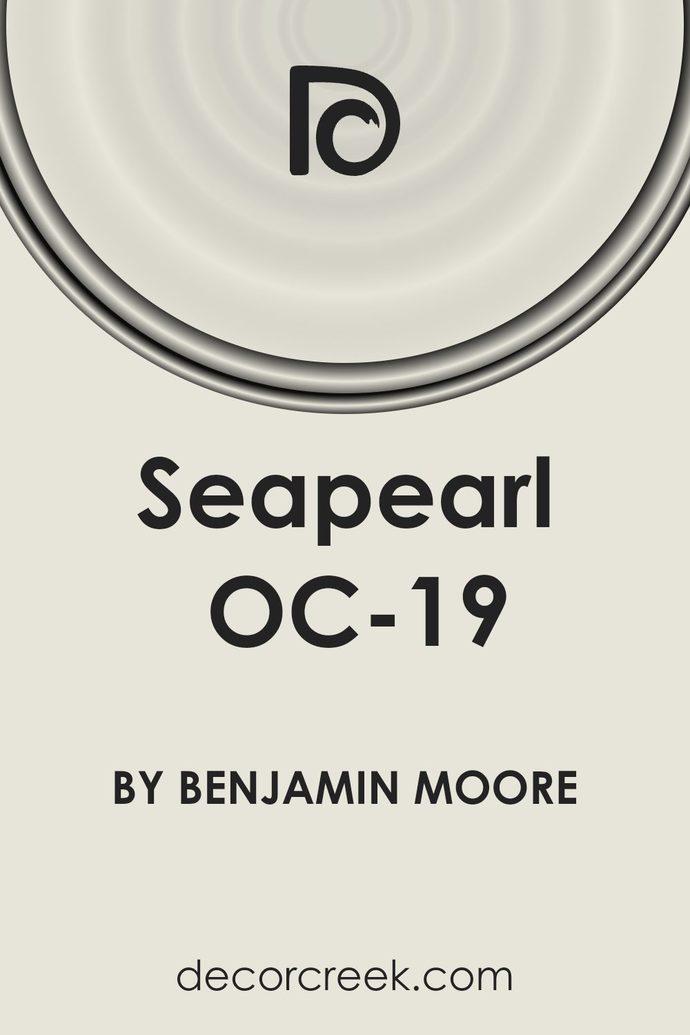
Is Seapearl OC-19 by Benjamin Moore Warm or Cool color?
Seapearl OC-19 by Benjamin Moore is a versatile paint color ideal for creating a warm and welcoming atmosphere in any home. This shade is a soft white with a hint of gray, making it a perfect neutral backdrop for any room. It’s subtle enough to work in small spaces, making rooms appear larger and brighter, while also providing a clean canvas for any decorating style.
Homeowners will appreciate how Seapearl OC-19 seamlessly blends with other colors, whether you’re looking to pair it with bold hues or softer tones. It’s particularly effective in living areas and bedrooms, where the need for a calming environment is key.
Additionally, this color is great for kitchens and bathrooms as it reflects light beautifully, adding a fresh and clean look to these key areas.
The durability and quality of Benjamin Moore paints ensure that Seapearl OC-19 not only looks good but also withstands the test of time, maintaining its beauty through daily wear and tear.
Undertones of Seapearl OC-19 by Benjamin Moore
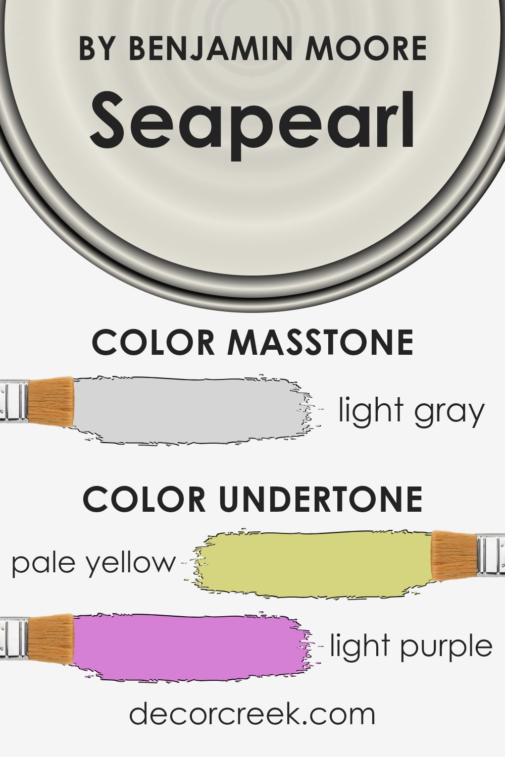
Seapearl is a paint color loved for its versatility and softness. It appears mainly as a gentle white but includes various subtle undertones that can influence the mood and appearance of a room. These undertones are pale yellow, light purple, light blue, pale pink, mint, lilac, and grey.
Undertones are important because they can change how we perceive colors. For example, a white paint might look just white in one light, but in another lighting, the undertones can make it appear warmer or cooler. These nuances can affect decorating choices, like choosing fabrics or furniture colors.
In the case of Seapearl and its undertones, the effect on interior walls is quite unique. The pale yellow undertone can make a room feel more welcoming and warm, especially in natural light. The light blue and mint undertones give a fresh, clean look, making it ideal for bathrooms or kitchens. In contrast, the light purple and lilac can add a subtle hint of vibrancy when used in spaces with ample light.
The grey and pale pink undertones help in achieving a balance, keeping the color from leaning too cold or too warm. This balance makes Seapearl a great option for living rooms and bedrooms, where a neutral backdrop is often desirable.
Overall, the mixed undertones in Seapearl make it a flexible choice for any room, adapting subtly to different lighting conditions and complementing various decor styles.
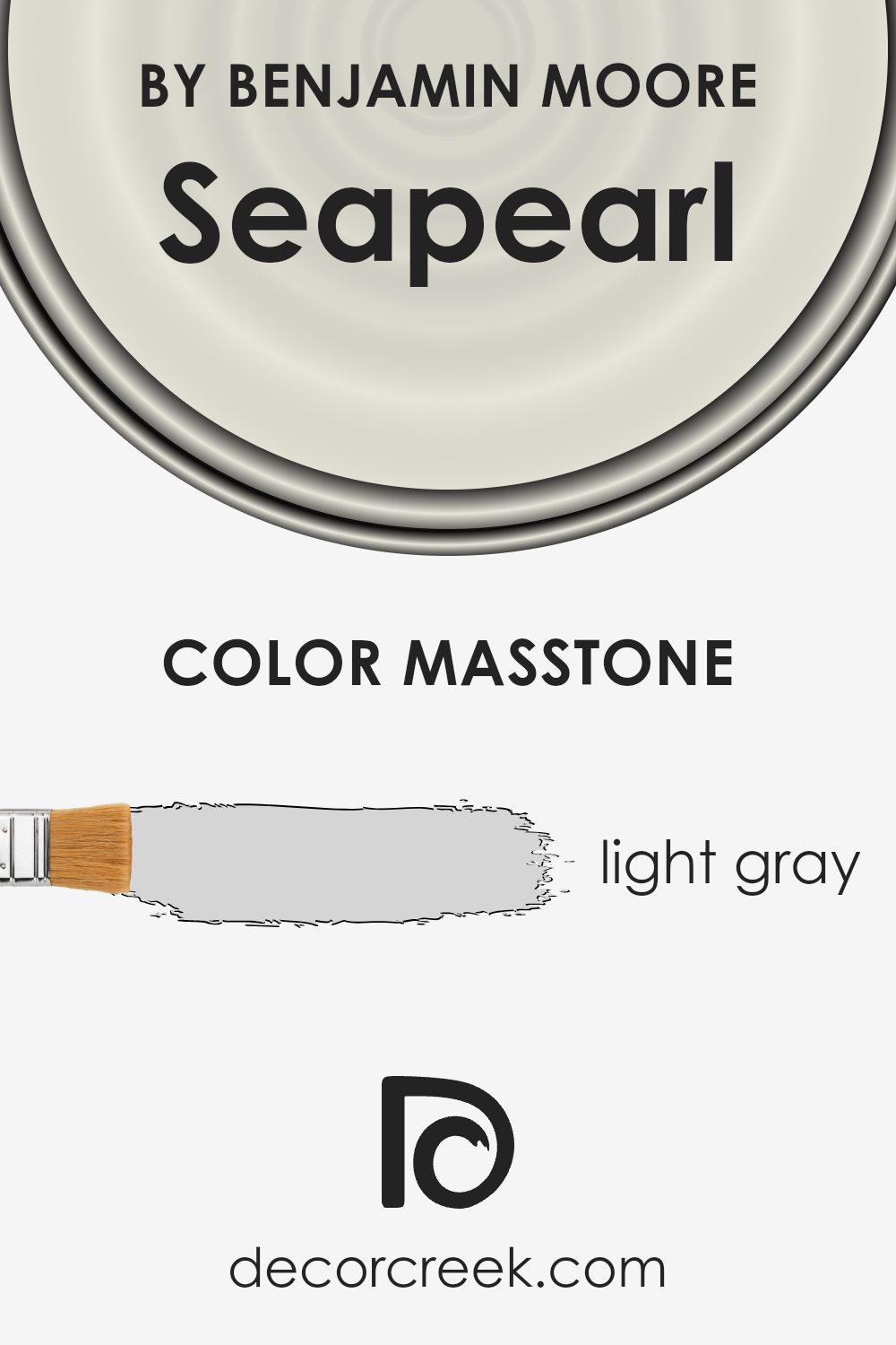
What is the Masstone of the Seapearl OC-19 by Benjamin Moore?
The Seapearl OC-19 color by Benjamin Moore is a light gray shade, appearing like a soft, cloudy day. This color is quite versatile, making it easy to pair with other colors in a home. The light gray (#D5D5D5) can act as a neutral backdrop, allowing furniture and decor items to stand out. It’s particularly useful in rooms that don’t get a lot of natural light, as it can help make these spaces appear brighter and more open.
Using this light gray in smaller rooms can make them feel larger, as the color doesn’t overwhelm the senses. It’s also gentle enough to use in bedrooms, where it can create a calm and restful atmosphere without being too dark or moody.
In living areas, it complements both modern and traditional styles, making it a good choice for people who like to change their decor without repainting walls. Overall, Seapearl OC-19 brings a clean and fresh look to homes, providing a simple yet effective way to refresh any space.
How Does Lighting Affect Seapearl OC-19 by Benjamin Moore?
Lighting has a significant impact on how we perceive colors. The type of light and its intensity can change the way a color looks. Whether illuminated by natural sunlight or artificial lighting, the appearance of colors can shift dramatically.
Taking the color “Seapearl” as an example, we see different effects in various lighting conditions. This is a subtle, light gray shade that can look different depending on the light source. Under artificial light, such as LED or fluorescent bulbs, the color may appear slightly cooler or bluer.
This is because many artificial lights have a blue tone, which can influence how the color is displayed.
In natural light, “Seapearl” often shows its true color. Natural sunlight provides a broader spectrum of light, allowing all the pigments in the paint to be more visible and true to their intended hue. During the day, as the kind and angle of sunlight change, so does the perception of color.
Room orientation also plays a crucial role in how this color appears:
- North-faced rooms tend to get less direct sunlight, making them cooler in tone. In these rooms, “Seapearl” might appear slightly darker and lean towards a cooler, more shadowy gray.
- South-faced rooms receive more intense sunlight, which can make the paint look lighter and brighter. In these rooms, “Seapearl” can reflect this light, appearing almost white or a very light gray.
- East-faced rooms receive strong morning light. This warm, yellowish morning light can make “Seapearl” look warmer and softer in the mornings, returning to a true light gray as the light fades.
- West-faced rooms are influenced by the afternoon and evening light, which can bring out a bit of warmth in the color, possibly making “Seapearl” appear more inviting and slightly warmer in the late hours of the day.
Understanding these impacts can help in choosing the right paint for a specific room, ensuring the color meets your expectations throughout the day.
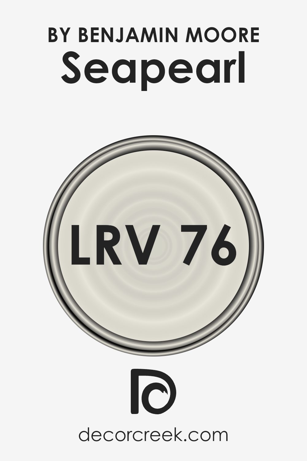
What is the LRV of Seapearl OC-19 by Benjamin Moore?
LRV stands for Light Reflectance Value and is a measure of how much light a paint color reflects back into a room, compared to how much it absorbs. In practical terms, this means that a higher LRV can make a room feel brighter because more light is bouncing around the space.
Paint colors with high LRV are often used in smaller, darker rooms to make them appear larger and more open. On the other hand, paint with a low LRV might be used to create a cozier or more enclosed feeling because it absorbs more light.
Regarding the LRV of 76.43 for the Seapearl OC-19 by Benjamin Moore, this means the color is quite reflective and will help to brighten up a space. It’s a good choice for spaces that might not get a lot of natural sunlight or for rooms that you want to feel airy and light.
This higher LRV will help in maximizing the perceived size of the area and enhancing the overall luminosity, making it an excellent selection for living spaces, kitchens, or bathrooms where a light and inviting atmosphere is desirable.
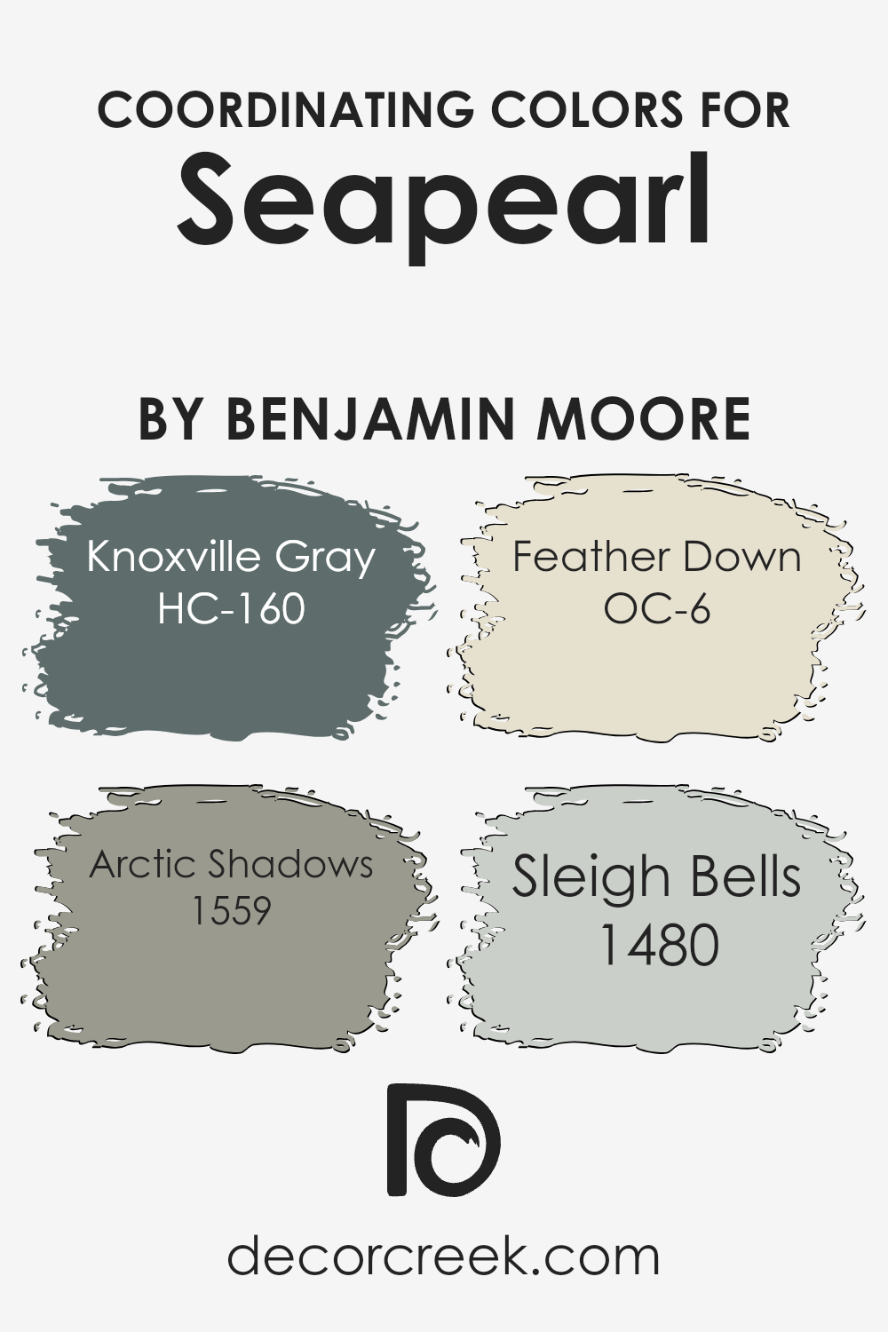
Coordinating Colors of Seapearl OC-19 by Benjamin Moore
Coordinating colors are essentially hues that complement each other when used together within a design scheme, enhancing the overall aesthetic of a space. When used effectively, these colors can harmonize an area, making it more visually pleasing.
For example, when paired with Seapearl OC-19 by Benjamin Moore, colors like HC-160 Knoxville Gray, 1559 Arctic Shadows, OC-6 Feather Down, and 1480 Sleigh Bells each bring out the best in the neutral backdrop that Seapearl provides.
Knoxville Gray HC-160 is a deep, moody gray with green undertones that delivers a striking contrast to the lighter, creamy tones of Seapearl, perfect for creating a focal point in a room. Meanwhile, Arctic Shadows 1559 is a darker, almost mystical shade that adds a sense of depth and mystery to the palette.
On the lighter side, Feather Down OC-6 offers a soft, warm beige that pairs seamlessly with Seapearl, ensuring a smooth and harmonious flow through the space. Lastly, Sleigh Bells 1480, with its gentle gray hue, provides a subtle, soothing presence that doesn’t compete but instead complements the base color, enhancing the overall calming feel of the environment.
These colors work together to create a dynamic yet cohesive space that feels both welcoming and stylish.
You can see recommended paint colors below:
- HC-160 Knoxville Gray (CHECK A SAMPLE)
- 1559 Arctic Shadows (CHECK A SAMPLE)
- OC-6 Feather Down
- 1480 Sleigh Bells (CHECK A SAMPLE)
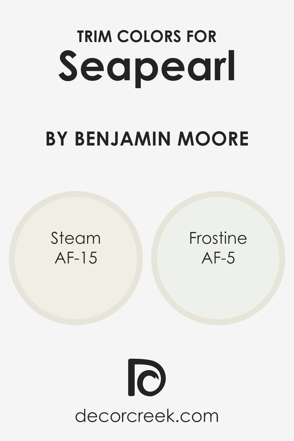
What are the Trim colors of Seapearl OC-19 by Benjamin Moore?
Trim colors are specific shades used for painting the architectural elements like door frames, baseboards, crown moldings, and window trims that highlight or complement the main color of a wall.
In the case of a soft and versatile wall color like Seapearl OC-19 by Benjamin Moore, choosing the right trim color can significantly enhance the overall look of a room, providing a clean, finished appearance.
The trim acts as a frame for different areas, helping to define the spaces distinctly and adding to the visual appeal, which is crucial in interior design to create a well-rounded and appealing aesthetic.
For a color like Seapearl by Benjamin Moore, trim colors such as AF-15 – Steam and AF-5 – Frostine are excellent choices. Steam AF-15 is a very light, almost neutral color that has just enough warmth to subtly contrast with the cool tones of Seapearl, bringing a gentle definition to the space without overpowering it.
Frostine AF-5, on the other hand, is a crisp, clean white that offers a sharper contrast, making it ideal for areas where a more pronounced delineation between the wall and trim is desired. Both colors support a harmonious design and can refresh the look of a room without overshadowing the primary wall color.
You can see recommended paint colors below:
- AF-15 Steam (CHECK A SAMPLE)
- AF-5 Frostine (CHECK A SAMPLE)
Colors Similar to Seapearl OC-19 by Benjamin Moore
Similar colors play a crucial role in creating a harmonious and appealing aesthetic in interior design, especially when using shades that are close in hue. For instance, let’s consider the role of similar colors when decorating with a base color like an off-white.
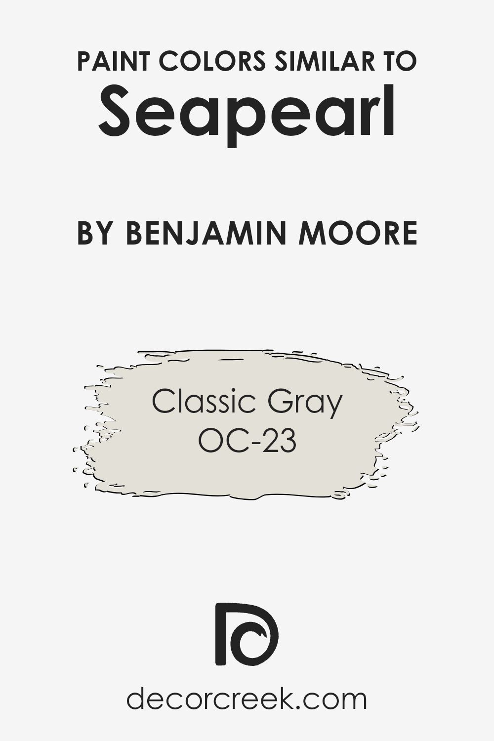
Using shades that are closely aligned in the color spectrum, such as OC-23 Classic Gray, maintains a subtle yet visually interesting environment. This creates a cohesive look that allows other elements of the room, like furniture and art, to stand out without overwhelming the senses.
OC-23 Classic Gray by Benjamin Moore is a soft, warm gray that exudes a quiet charm. It works seamlessly with lighter shades like off-white because it shares a similar undertone, providing a gentle contrast that’s easy on the eyes.
Classic Gray is understated yet inviting, making it a perfect complement to a neutral palette in spaces that aim for a calm and peaceful atmosphere. When used alongside a light base color, it enhances the space without dominating it, allowing for a fluid and relaxed interior that feels both cozy and modern.
You can see recommended paint color below:
How to Use Seapearl OC-19 by Benjamin Moore In Your Home?
Seapearl OC-19 by Benjamin Moore is a popular paint color known for its soft, warm white hue that offers a clean and inviting atmosphere. This versatile shade works well in almost any room, bringing a fresh and cozy feeling. It’s especially great for living rooms and bedrooms where you want a relaxed environment. The light tone of Seapearl also makes spaces appear larger and more open, which is perfect for small rooms or apartments.
When used in the kitchen, Seapearl can help brighten the space and make it appear cleaner. In bathrooms, this color pairs beautifully with marble or other natural materials for a gentle, soothing look. For those who like DIY projects, consider using Seapearl for cabinets or furniture to give old pieces a modern update without overpowering the room.
Overall, Seapearl OC-19 is a fantastic choice if you’re looking for a white that’s not too stark but still adds a lot of light to your space. It works with many decor styles, making it a handy color to keep in mind when decorating.
Seapearl OC-19 by Benjamin Moore vs Classic Gray OC-23 by Benjamin Moore
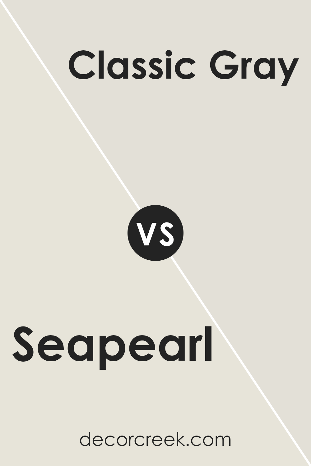
Seapearl and Classic Gray are both popular paint colors by Benjamin Moore, often used for their neutral and versatile qualities. Seapearl is a light, slightly warm gray that has a subtle hint of beige. This soft tone makes it great for creating a cozy and inviting atmosphere in a home. It’s particularly effective in spaces that need a light color that still brings a sense of warmth.
On the other hand, Classic Gray is a more straightforward light gray with a clean and clear appearance. It lacks the beige undertones of Seapearl, giving it a crisper, more neutral look. This makes Classic Gray a good choice for a modern look and feel, providing a more neutral backdrop that pairs easily with almost any decor style.
Both colors are understated yet distinct in their ways, making them suitable for various rooms and complementing different styles and finishes. Whether choosing Seapearl for a hint of warmth or Classic Gray for a pure gray tone, both colors offer a clean and airy feel to interiors.
You can see recommended paint color below:
Conclusion
When I started using Seapearl in different rooms, I noticed how perfect it is for creating a calm and warm feeling. This paint color looks soft and creamy, almost like a gentle, off-white sandy beach. Because of its softness, Seapearl goes well in any room, no matter if it’s the kitchen, bedroom, or living room.
I also found out that OC-19 Seapearl is super versatile. It pairs nicely with lots of other colors. Whether I mix it with dark blues, greens, or even bolder shades like oranges, it always looks good. Additionally, it does a great job at reflecting light, which makes my rooms look brighter and more inviting.
Overall, if you’re thinking about giving your room a new look and want a color that is easy to work with, Seapearl by Benjamin Moore is a great choice. It has definitely made my home feel more cozy and welcoming. It’s really a reliable and effective way for anyone to refresh their space without making it too flashy.
So, choosing OC-19 Seapearl is something I would recommend if you want a beautiful and lasting change in your home.

Ever wished paint sampling was as easy as sticking a sticker? Guess what? Now it is! Discover Samplize's unique Peel & Stick samples.
Get paint samples


