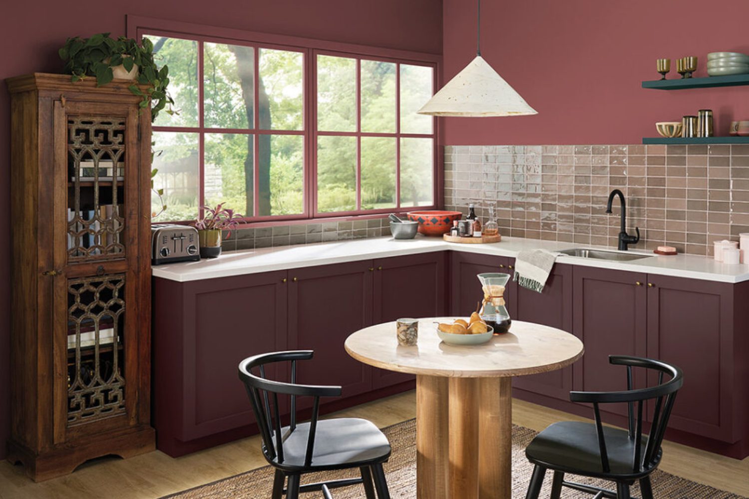
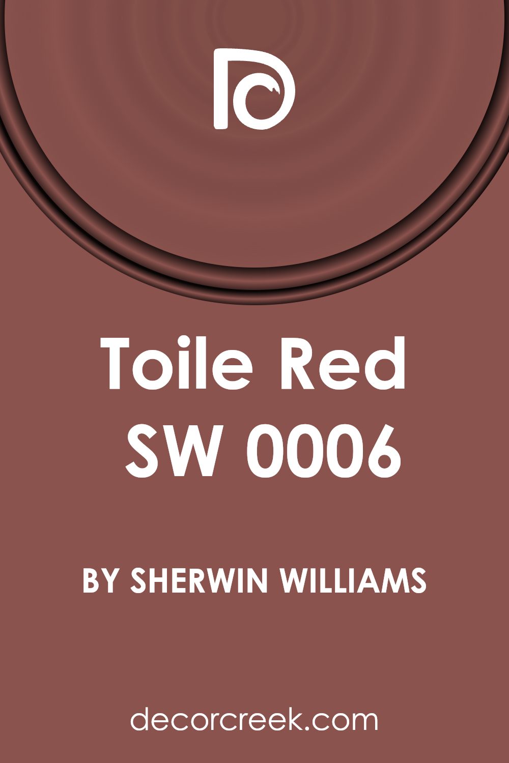
Introducing SW 0006 Toile Red by Sherwin Williams, a color that instantly adds warmth and charm to any room. This particular shade is not just a color; it’s a statement. With its rich, vibrant tone, Toile Red transforms spaces into cozy, inviting environments. It’s perfect for anyone looking to add a touch of elegance and personality to their home.
Whether you’re painting a full room, creating a feature wall, or simply adding accents, Toile Red has the versatility to fit any design style. From traditional to modern, it brings a unique energy that complements a wide range of decor. This shade is more than just visually appealing. It sets a mood, creating a comfortable, lively setting for gatherings or a peaceful retreat for relaxation.
In this article, we’re going to explore the best ways to incorporate Toile Red into your interiors. We’ll look at color combinations that work, tips for achieving the perfect finish, and inspiration for making this color work in any space. Sherwin Williams offers a high-quality paint that ensures durability and a clean, vibrant look for years to come. Get ready to transform your home with the warmth and beauty of Toile Red.
What Color Is Toile Red SW 0006 by Sherwin Williams?
Toile Red by Sherwin Williams is a warm, rich shade that brings a cozy and welcoming vibe to any space. This color is a deep red with hints of earthy undertones, making it a versatile choice for various interior styles. It works particularly well in traditional, rustic, and even contemporary settings, offering a timeless appeal that can enhance the character of a room.
In traditional spaces, Toile Red can add a sense of elegance and sophistication, especially when paired with luxurious textures like velvet or silk. For a rustic look, combining this color with natural materials such as wood, leather, or woven textures can create a comfortably inviting atmosphere. In contemporary settings, Toile Red can serve as a bold accent, especially when matched with sleek furniture and metallic finishes like brass or gold, adding a touch of warmth to a modern aesthetic.
Toile Red is incredibly adaptable, complementing a wide range of materials and textures. It looks stunning against dark woods, bringing out their rich tones, while contrasting beautifully with lighter, neutral fabrics to add depth and interest to the space. Whether used on walls, as an accent, or through decorative elements, this color can help create a charming and inviting interior.
Is Toile Red SW 0006 by Sherwin Williams Warm or Cool color?
The Toile Red SW 0006 by Sherwin Williams is a color that adds warmth and personality to any room it graces. This particular shade of red has a cozy, inviting quality to it, making spaces feel more welcoming and lively. When used in homes, it can transform a dull room into an area full of energy and charm. However, because it’s a strong color, it works best when balanced with neutral shades like whites, beiges, or soft grays. This combination prevents the red from overwhelming the space while allowing its vibrant character to shine.
In larger rooms, applying Toile Red on one accent wall can create a stunning focal point without making the space feel closed in. In smaller spaces, such as a powder room or an entryway, using this color can add a sense of drama and sophistication. Accessories and decor in Toile Red also work well, offering pops of color that can brighten up and add interest to a more neutrally decorated room. It’s a versatile color that, when used thoughtfully, can make a home feel more alive and inviting.
Undertones of Toile Red SW 0006 by Sherwin Williams
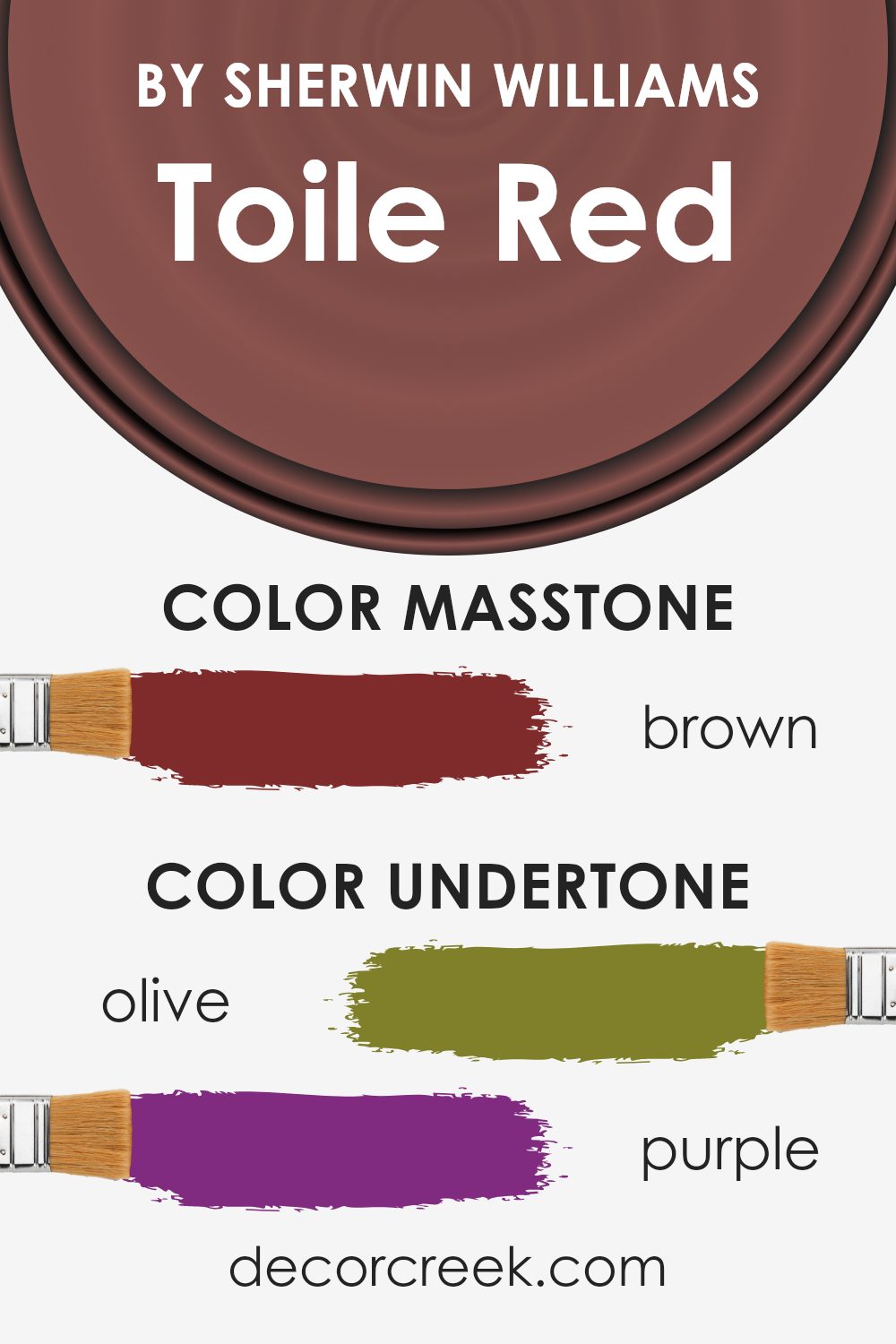
Toile Red by Sherwin Williams is a color with a complex personality because of its many undertones. Imagine undertones like secret ingredients in your favorite dish; they can change how it tastes without you seeing them directly. In colors, undertones subtly influence how we perceive the main color, especially under different lighting conditions.
The undertones of Toile Red include a wide range from olive, purple, and grey to red, orange, and various shades of pink, along with dark grey, dark green, navy, and dark turquoise. This variety allows Toile Red to adapt and shift its appearance depending on the surrounding elements and lighting. For example, in a room with lots of natural light, the orange or pale pink undertones might make the color appear warmer and more inviting. Under cooler, artificial light, the grey or navy undertones could make it seem more subdued and sophisticated.
When used on interior walls, Toile Red’s undertones can significantly impact the room’s overall feel. Olive and dark green undertones can bring a touch of nature indoors, creating a calming, grounded atmosphere. The purple and navy undertones might add a hint of luxury and depth, making the space feel more intimate and cozy. Meanwhile, the presence of red and orange undertones can energize a room, making it feel lively and welcoming.
Each of these undertones can affect the way decorations and furniture in similar or contrasting colors interact with the wall color. Thus, understanding and considering Toile Red’s undertones can help you create the exact mood you’re aiming for in your space.
What is the Masstone of the Toile Red SW 0006 by Sherwin Williams?
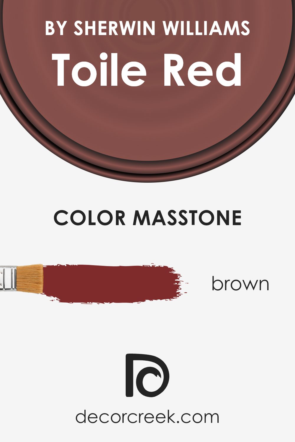
The masstone of Toile Red SW 0006 by Sherwin Williams is brown (#802B2B). This foundational shade plays a significant role in how the color operates within home spaces. Being a brown-toned red, it offers a warm and inviting feel, different from brighter reds that can be too intense or overpowering. This unique hue makes it versatile and easy to integrate into various decor styles, from rustic to modern.
In homes, its brown undertone ensures that it pairs well with natural elements like wood and leather, enhancing a sense of coziness and comfort. It’s not just a pop of color; it’s a sophisticated choice that adds depth and character to walls, accent pieces, or even furniture. This means it can serve as a striking focal point or as a complement to a broader color palette, blending seamlessly with neutrals or standing out against lighter shades. Its effect is warm, welcoming, and effortlessly elegant, making any room feel more like home.
How Does Lighting Affect Toile Red SW 0006 by Sherwin Williams?
Lighting significantly impacts how we see colors. Depending on the light, the same color can look different. When we talk about a specific color, like a deep, warm red, its appearance can change based on the kind of light shining on it, whether it’s natural or artificial.
In natural light, colors can look very vibrant. For our warm red, under the soft light of an overcast day, it can appear quite rich and deep. But, when the sun is shining bright, this red might seem even more vivid and slightly lighter.
In rooms with artificial light, the type of bulb matters. LED or fluorescent lights can make the red look different. Cool white bulbs can make it seem a bit sharper and more vivid, while warm white bulbs can enhance its warmth, making it feel cozy and inviting.
The direction your room faces also plays a big role. In north-facing rooms, which get cooler, less direct light, the warm red can appear more subdued and elegant, keeping its richness without becoming too overpowering. In south-facing rooms, with abundant and warmer light throughout the day, this red can feel lively and dynamic, really standing out and filling the room with energy.
East-facing rooms get the morning sun, which is warm and golden. Here, our warm red will look bright and welcoming in the morning, then softer as the day goes on. On the other hand, west-facing rooms receive the intense afternoon sun, which can make the red look very bold and dramatic in the evening while being more muted during the day.
So, the same color can take on different personalities depending on the lighting and the direction of the room. It shows just how much environment matters when choosing colors for a space.

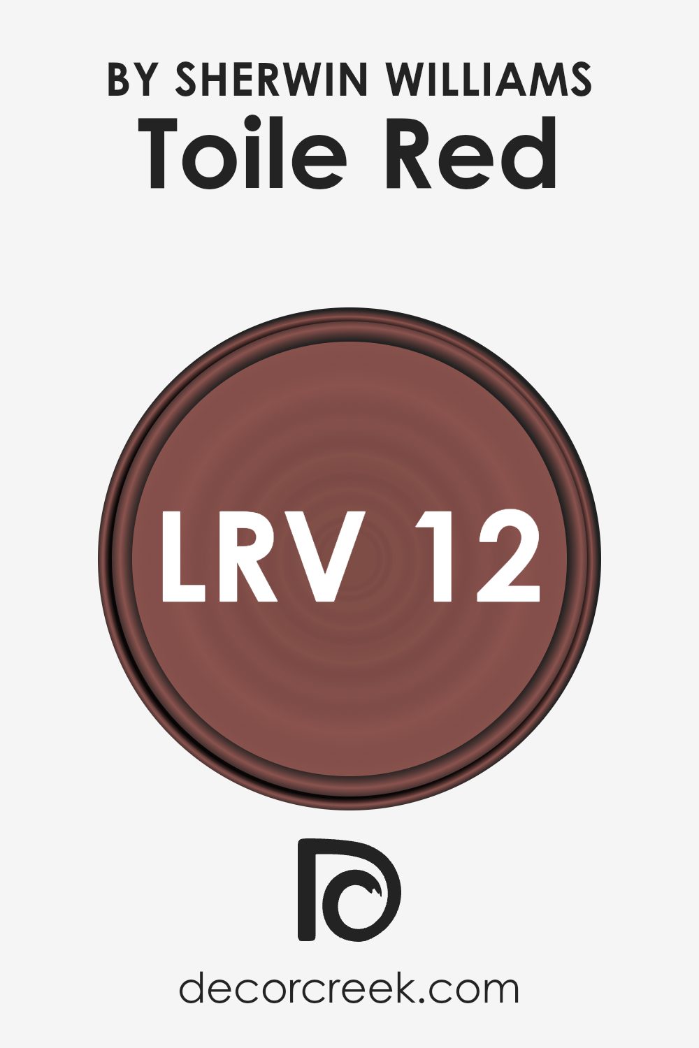
What is the LRV of Toile Red SW 0006 by Sherwin Williams?
LRV stands for Light Reflectance Value, which is a measurement used to indicate how much light a paint color reflects or absorbs when it’s applied on a surface. It’s a scale that goes from 0 to 100, where 0 means the color absorbs all light (think of a pitch-black room) and 100 reflects all light (imagine a bright, white wall). This number is super important because it helps you get an idea of how a paint color will look once it’s up on your walls. The higher the LRV, the lighter and brighter the color will appear. On the other hand, colors with lower LRVs will look deeper and can make spaces feel smaller or more intimate.
In the case of a color with an LRV of 12.277, like the mentioned deep red, it means the color absorbs a lot of light and reflects very little. This can have a significant impact on the feel of a room. Such a low LRV color can make a room feel cozy, rich, and warm, but it might also make a small room feel even smaller or darker if not balanced properly with good lighting or lighter colors. When using a color with this LRV, it’s critical to consider where and how you’re using it. In well-lit or large spaces, it can add a dramatic and sophisticated vibe, but in smaller or poorly lit rooms, you might need to add extra light sources or use the color on just one wall to prevent the space from feeling too closed in.
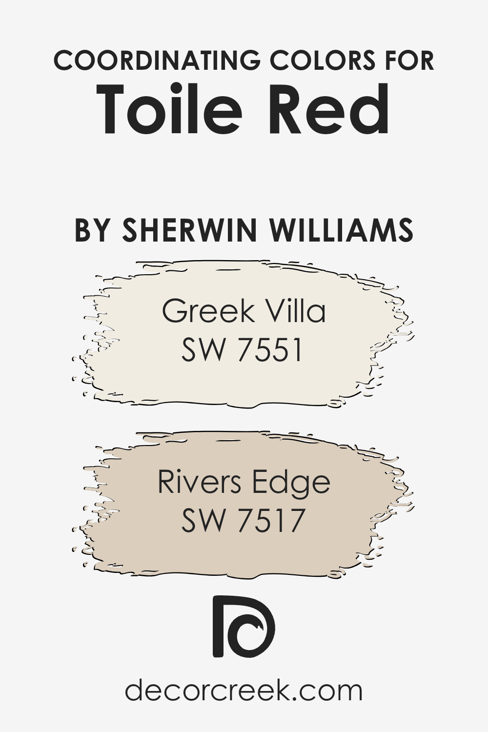
Coordinating Colors of Toile Red SW 0006 by Sherwin Williams
Coordinating colors are shades that work in harmony with a primary color to enhance the aesthetic appeal of a space, making it more visually pleasing. Essentially, they are the color palette’s supporting members, helping to balance, complement, or subtly contrast the main hue without overwhelming it. The idea is to create a cohesive look where every color has its place and purpose, contributing to the overall ambiance of a room or design. These coordinating colors can be found across color wheels, often sitting near or opposite the primary choice, ensuring they work well together in any setting.
For Toile Red by Sherwin Williams, a vibrant and warm hue, two wonderful coordinating colors are Greek Villa (SW 7551) and River’s Edge (SW 7517). Greek Villa is not just plain white; it has a slight warmth to it, making spaces feel open and airy yet cozy and inviting at the same time. It’s perfect for giving a light and uplifting ambiance to a room without making it feel cold or stark, acting as an excellent counterbalance to the more assertive Toile Red.
On the other hand, River’s Edge offers a soothing escape with its earthy green tone. This color brings a sense of calmness and grounding, creating a natural and serene backdrop that complements the vivacity of Toile Red. Its ability to connect with nature makes it incredibly versatile, fitting beautifully within any space that aims to strike a balance between energy and tranquility.
You can see recommended paint colors below:
- SW 7551 Greek Villa
- SW 7517 Rivers Edge
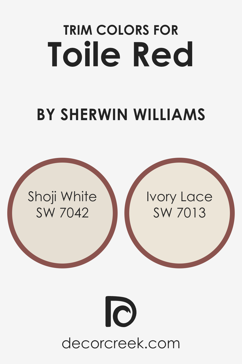
What are the Trim colors of Toile Red SW 0006 by Sherwin Williams?
Trim colors play a crucial role in interior and exterior design, especially when working with vibrant hues like Toile Red by Sherwin Williams. They act as a frame for your walls, highlighting the rich color and ensuring that the space feels cohesive and thoughtfully designed. Choosing the right trim color can greatly influence the overall look and feel of a room, creating contrast or harmony with the main color palette. Trim elements include baseboards, moldings, doors, and window casings, and their color can either make a bold statement or subtly tie a room together.
Shoji White SW 7042 is a soft, warm white with a touch of gray. It’s ideal for creating a gentle contrast with Toile Red, giving a room a refined and inviting look. This color is particularly effective in spaces where you want the trim to blend smoothly with the rest of the decor, providing just enough differentiation without overwhelming the senses.
Ivory Lace SW 7013, on the other hand, offers a slightly warmer tone, with creamy undertones that complement the vibrancy of Toile Red. It creates a smooth and elegant transition between the wall color and trim, adding depth and character to the overall design. Both colors support the boldness of Toile Red by offering a soft background that allows the rich color to stand out beautifully.
You can see recommended paint colors below:
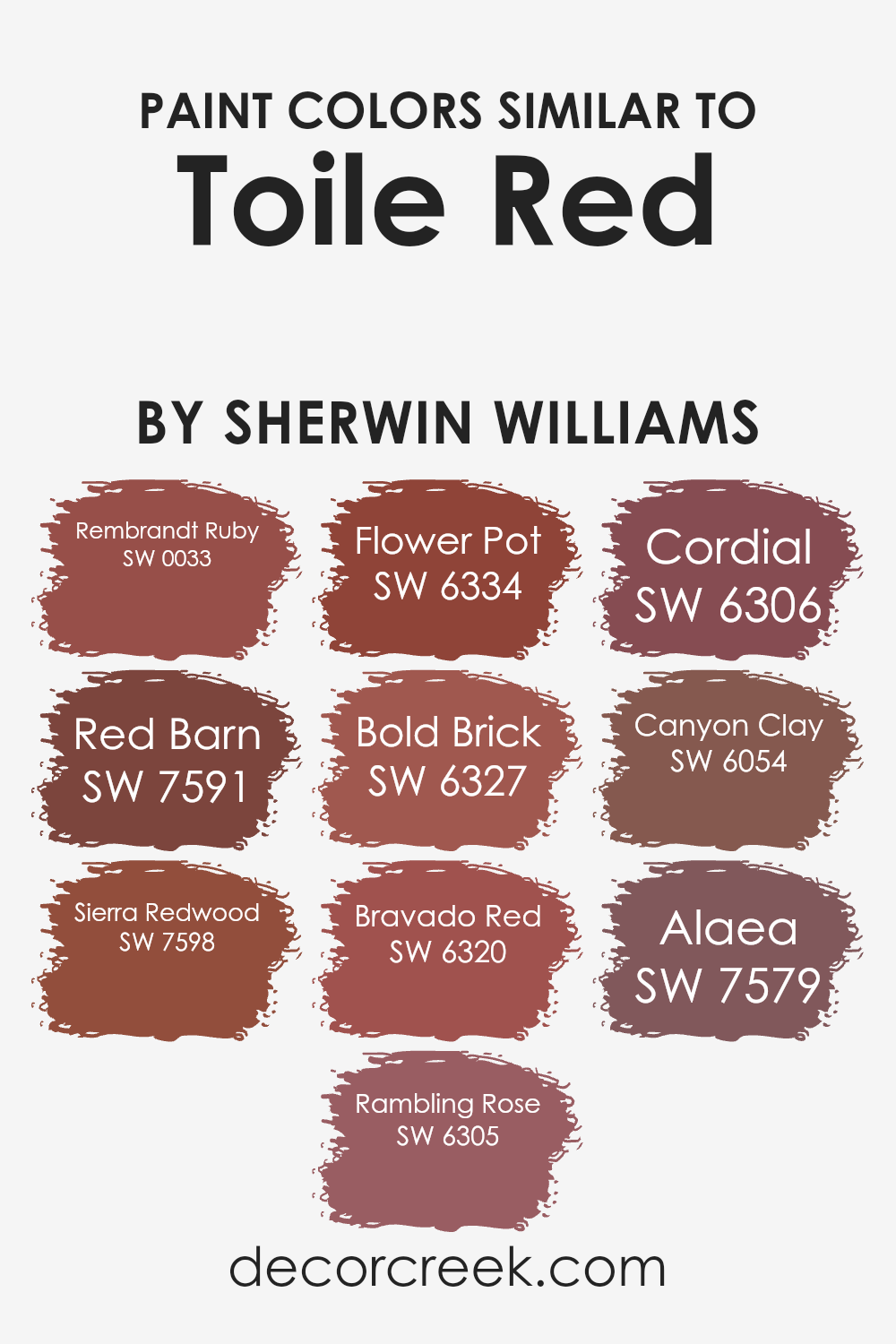
Colors Similar to Toile Red SW 0006 by Sherwin Williams
When decorating or designing a space, using similar colors can create a cohesive and harmonious look. Colors like Toile Red and its similar variants mix well to add depth and warmth to any room. These shades belong to a palette that draws from the natural world, ranging from the deep hues of autumn leaves to the vibrant tones of flowers. By combining these colors, you can achieve a lively yet balanced atmosphere.
- Rembrandt Ruby is a rich, jeweled tone that adds elegance, while Red Barn calls to mind the rustic charm of a countryside barn.
- Sierra Redwood carries the warmth and majesty of towering forests, and Rambling Rose offers a gentle, romantic blush to spaces.
- Flower Pot is reminiscent of sun-touched terracotta, evoking a welcoming, earthy feel. Bold Brick provides a strong, foundational color that recalls historic and industrial chic looks.
- Bravado Red is vibrant and full of energy, making it a striking choice.
- Cordial is lighter and more subdued, offering a soft, approachable warmth. Canyon Clay draws inspiration from natural earth, grounding a space with its rich, nurturing hue.
- Lastly, Alaea, like the rare Hawaiian salt, possesses a unique blend of natural red tones, perfect for adding a touch of exotic warmth.
Together, these colors work harmoniously to create spaces that are inviting and full of life.
You can see recommended paint colors below:
- SW 0033 Rembrandt Ruby
- SW 7591 Red Barn
- SW 7598 Sierra Redwood
- SW 6305 Rambling Rose
- SW 6334 Flower Pot
- SW 6327 Bold Brick
- SW 6320 Bravado Red
- SW 6306 Cordial
- SW 6054 Canyon Clay
- SW 7579 Alaea
How to Use Toile Red SW 0006 by Sherwin Williams In Your Home?
Toile Red by Sherwin Williams is a warm and inviting shade of red that can add a cozy touch to any space in your home. Perfect for creating a welcoming atmosphere, this color is great for living rooms where families gather or dining areas for a touch of elegance. When you want to add some energy and warmth without going too bold, Toile Red is an excellent choice. It pairs well with neutral tones like whites and beiges, allowing it to stand out without overwhelming the space.
Additionally, this hue can work beautifully in bedrooms when used for accent walls, bringing a soothing yet sophisticated look. For those who enjoy a bit of creativity, combining Toile Red with soft greens or blues can produce a unique and harmonious palette. Easy to incorporate through paint, accessories, or fabrics, this versatile color can truly make your house feel more like a home, fitting seamlessly into various decorating styles from traditional to contemporary.
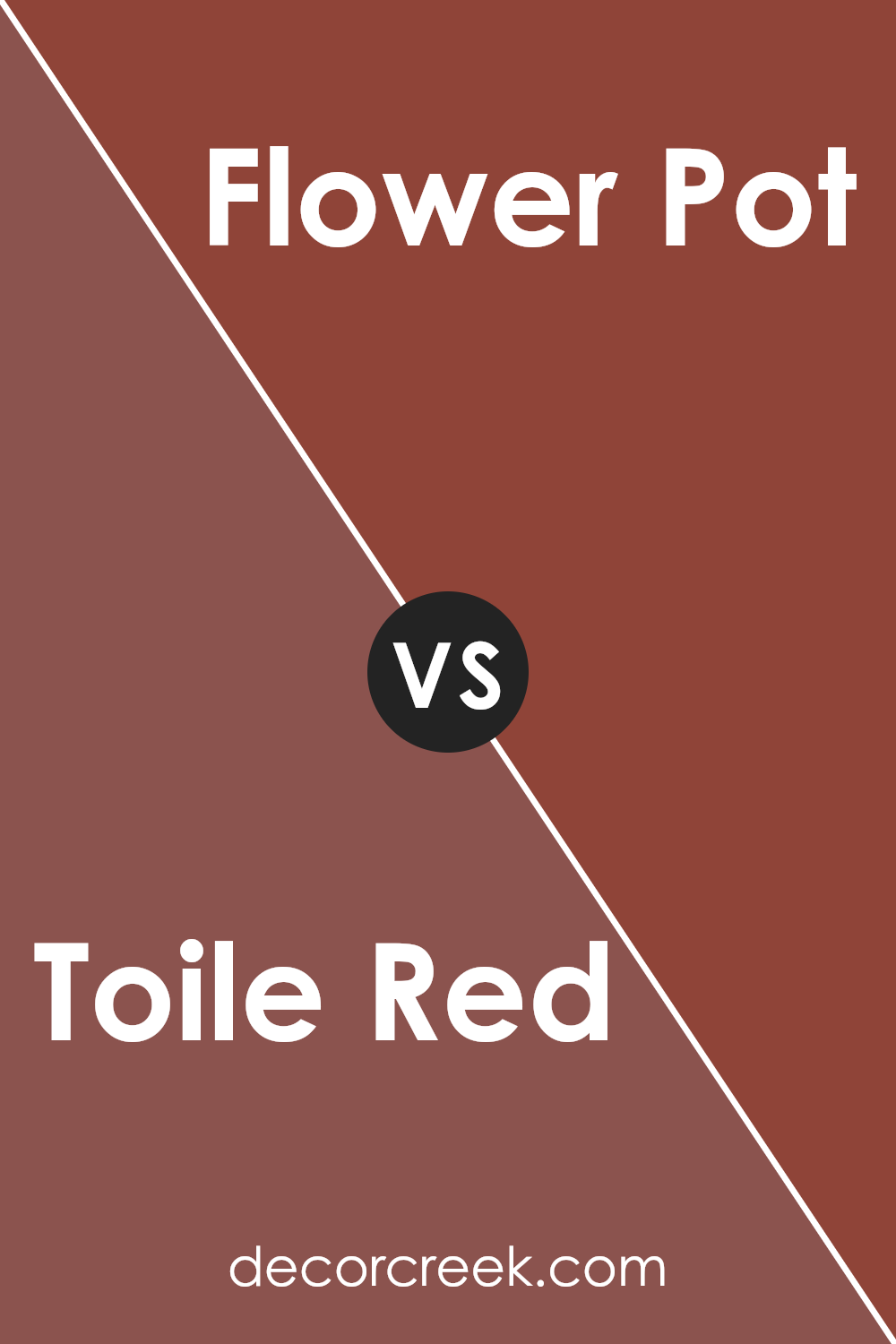
Toile Red SW 0006 by Sherwin Williams vs Flower Pot SW 6334 by Sherwin Williams
Toile Red and Flower Pot are two interesting shades offered by Sherwin Williams. Toile Red is a classic, deep hue that leans towards a mature, vintage feel. It’s a color that speaks of elegance and has a timeless vibe, making it perfect for spaces that aim for a sophisticated look. On the other hand, Flower Pot is a warmer, more vibrant shade. It carries a cozy, welcoming energy, making it excellent for creating inviting spaces. While Toile Red has a more refined and subtle appeal, Flower Pot stands out with its cheerful and lively presence. Both colors can dramatically transform a room, but while Toile Red adds depth and a sense of tradition, Flower Pot adds brightness and a touch of modernity. In summary, Toile Red offers a classic elegance, whereas Flower Pot brings warmth and energy to a space.
You can see recommended paint color below:
- SW 6334 Flower Pot
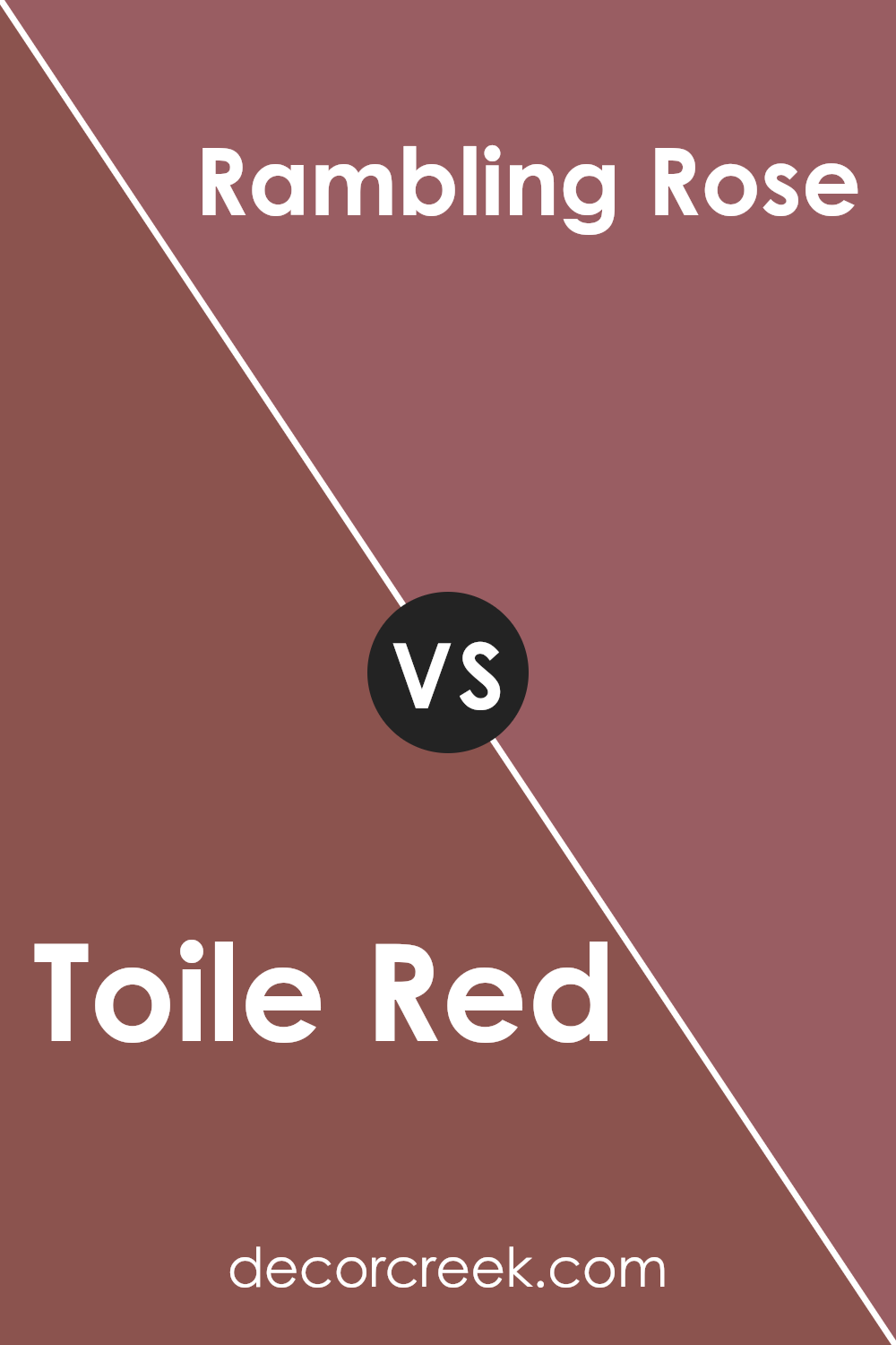
Toile Red SW 0006 by Sherwin Williams vs Rambling Rose SW 6305 by Sherwin Williams
Toile Red and Rambling Rose by Sherwin Williams are two distinct colors, each with its unique charm. Toile Red presents a deep, sophisticated hue, somewhat like the classic color of vintage brick or a fine, aged wine. This color can add a touch of elegance and a traditional vibe to any space, making it cozy and inviting. On the other hand, Rambling Rose is a softer, more subtle shade. It leans towards a muted, rosy warmth, suggesting the delicate petals of a garden rose in full bloom.
This color brings a gentle, comforting atmosphere to rooms, perfect for creating a soothing and peaceful space. While Toile Red offers depth and intensity, Rambling Rose provides softness and tranquility. Both colors have their special place, depending on the mood you wish to create. Whether you’re looking for the richness of a well-worn leather book or the gentle embrace of a morning garden, these colors provide beautiful options.
You can see recommended paint color below:
- SW 6305 Rambling Rose
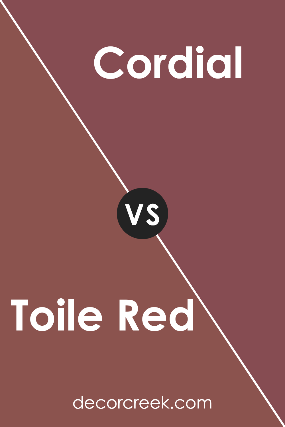
Toile Red SW 0006 by Sherwin Williams vs Cordial SW 6306 by Sherwin Williams
The main color, Toile Red, is a soft, warm, and somewhat muted red. It has an inviting feel, making it perfect for spaces where you want to add warmth without overwhelming the room. On the other hand, Cordial is a richer, more saturated hue with deeper red tones that give it a more pronounced presence. While Toile Red leans towards a subtle elegance that can blend easily into various decor styles, Cordial stands out more, making a bold statement.
Toile Red is great for creating a cozy atmosphere, possibly for a living room or bedroom. Cordial, with its deeper red, suits areas where a strong, vibrant look is desired, such as dining rooms or accent walls that need a touch of drama. Although both share a red base, their individual tones and depths set them apart, giving each a unique character suited to different tastes and spaces.
You can see recommended paint color below:
- SW 6306 Cordial
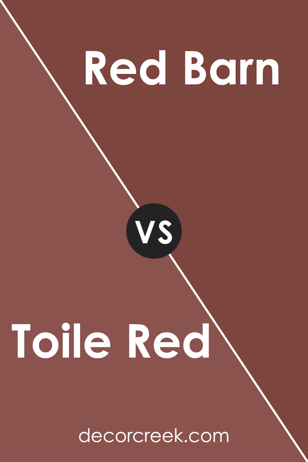
Toile Red SW 0006 by Sherwin Williams vs Red Barn SW 7591 by Sherwin Williams
The main color, Toile Red, is a unique shade that carries a soft, muted elegance. It’s not too loud but has enough depth to create a warm, inviting space. Think of it as a color that wraps the room in a gentle hug without overwhelming the senses.
On the other side, Red Barn stands out with a robust and earthy tone. This color is more grounded, reminiscent of rustic settings and natural landscapes. It brings a strong sense of tradition and comfort, making it perfect for those looking to add a touch of country charm to their spaces.
Comparing the two, Toile Red offers a subtle sophistication, making it ideal for creating serene, refined spaces. Red Barn, however, is the go-to for a bolder, more nostalgic vibe. Each color has its unique beauty, with Toile Red leaning towards quiet elegance and Red Barn celebrating the beauty of rural simplicity.
You can see recommended paint color below:
- SW 7591 Red Barn
Toile Red SW 0006 by Sherwin Williams vs Rembrandt Ruby SW 0033 by Sherwin Williams
Toile Red and Rembrandt Ruby are both colors made by Sherwin Williams. Toile Red is a slightly brighter shade of red, reminding you of classic red tones you’d often see in traditional designs. It has a soft and welcoming vibe, making it perfect for cozy living spaces or bedrooms.
On the other hand, Rembrandt Ruby takes a richer, deeper approach. This color leans more towards a luxurious look, with its deeper red resembling precious rubies. It’s the kind of color that feels right at home in elegant and sophisticated settings, adding a touch of drama and intensity.
While both colors share a red base, Toile Red offers a lighter and more airy feel, ideal for more relaxed and inviting spaces. Rembrandt Ruby, though, provides depth and luxury, great for making bold statements. Choosing between them depends on the mood and style you want to achieve in your space.
You can see recommended paint color below:
- SW 0033 Rembrandt Ruby

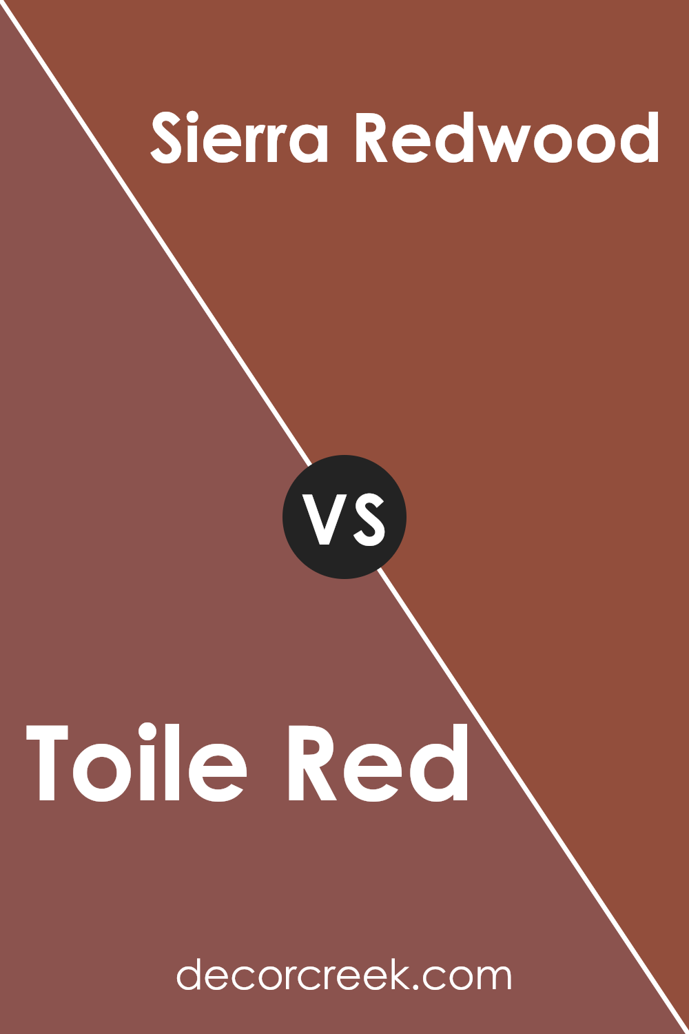
Toile Red SW 0006 by Sherwin Williams vs Sierra Redwood SW 7598 by Sherwin Williams
Toile Red and Sierra Redwood are both red hues made by Sherwin Williams, but they have distinct differences. Toile Red is a softer, more subdued shade that can add a gentle warmth to any space without overwhelming it. It has a classic feel, perfect for creating a cozy and inviting atmosphere in living areas or bedrooms. On the other hand, Sierra Redwood stands out with its bolder and deeper tone. It’s much richer, bringing a strong statement to any room it’s used in.
This color can add a sense of elegance and drama, ideal for accent walls or spaces where you want to make an impact. While both colors share a red base, Toile Red leans towards a lighter, more muted rendition, whereas Sierra Redwood offers a vivid and robust character. Choosing between them depends on the mood you want to create – a gentle warmth with Toile Red or a striking presence with Sierra Redwood.
You can see recommended paint color below:
- SW 7598 Sierra Redwood
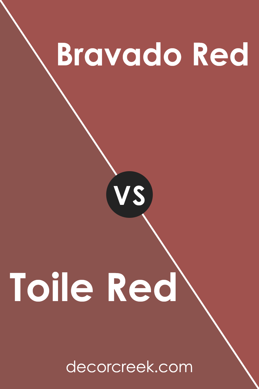
Toile Red SW 0006 by Sherwin Williams vs Bravado Red SW 6320 by Sherwin Williams
Toile Red and Bravado Red by Sherwin Williams are two distinct red shades, each with its unique character. Toile Red is a softer, more subdued shade. It’s like a gentle whisper in a quiet room, providing a subtle hint of color without overwhelming the senses. Its softer tone makes it versatile, perfect for creating a cozy, inviting atmosphere in any space.
Bravado Red, on the other hand, is a bold and vibrant color. It’s like the loud laughter in a conversation, instantly grabbing attention and making a strong statement. This color is loaded with energy and is sure to make any wall or space stand out. It’s ideal for areas where you want to add excitement and a focal point.
While both colors share the warmth that red hues typically bring, Toile Red offers a more muted elegance, and Bravado Red delivers a powerful punch of vibrancy. Depending on the mood you want to set or the space you’re decorating, each color serves its purpose beautifully but in very different ways.
You can see recommended paint color below:
- SW 6320 Bravado Red
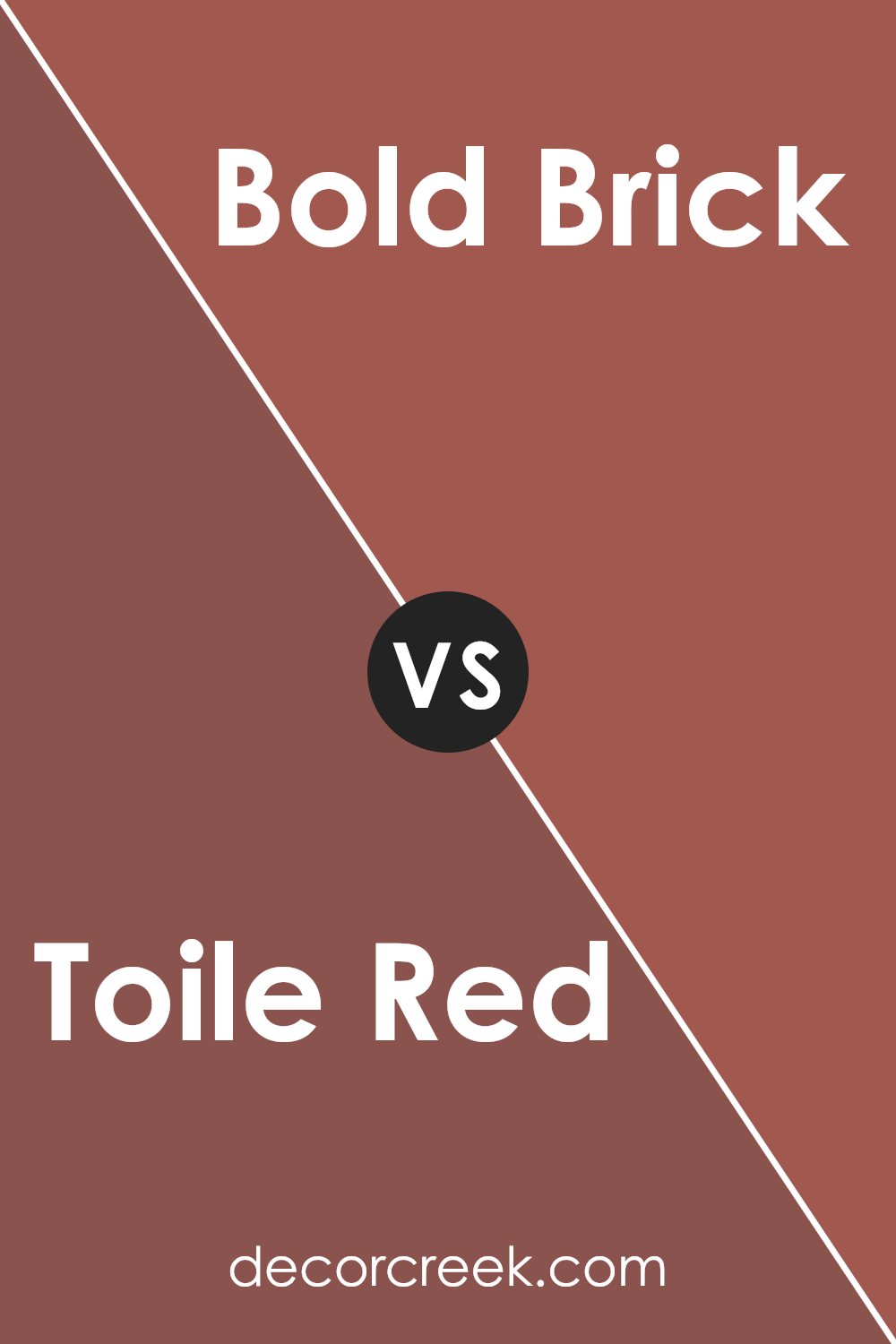
Toile Red SW 0006 by Sherwin Williams vs Bold Brick SW 6327 by Sherwin Williams
The main color, Toile Red, and Bold Brick are both rich, warm reds from Sherwin Williams, but they have distinct vibes. Toile Red is a softer, more muted red. It’s like the color of vintage fabric or the blush on an old brick wall, offering a gentle touch of elegance without overwhelming a space. It feels more refined and subdued, perfect for creating a cozy atmosphere in any room.
On the other hand, Bold Brick is, as the name suggests, a stronger, more vibrant red. Imagine the color of a freshly painted barn or a bright red brick road; this color packs a punch and is sure to make a statement. It’s the kind of red that can add energy and liveliness to a space, making everything around it pop with excitement.
While both colors share a red base, Toile Red leans towards a softer, more traditional aesthetic, and Bold Brick goes all in with its vivid, dynamic presence. Choosing between them depends on the mood and impact you want to bring into your space.
You can see recommended paint color below:
- SW 6327 Bold Brick
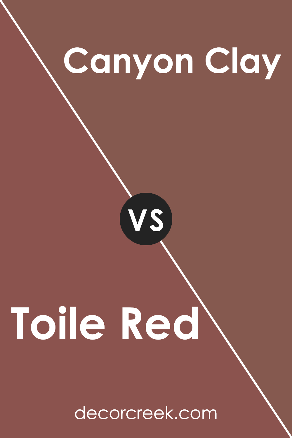
Toile Red SW 0006 by Sherwin Williams vs Canyon Clay SW 6054 by Sherwin Williams
Toile Red and Canyon Clay are like two sides of the same coin when it comes to warm, welcoming shades from Sherwin Williams. Imagine Toile Red as a vibrant, bold hue. It’s the kind of color that grabs your attention in a room, making everything look more lively and dynamic. On the other hand, Canyon Clay offers a softer, more grounded vibe. It’s not as in-your-face as Toile Red; instead, it brings a cozy, subtle warmth that’s very much like the earthy tones of a clay pot.
When you put these two colors side by side, Toile Red stands out because it’s brighter and more saturated. Canyon Clay, though, has this understated elegance that complements spaces looking for a touch of nature and tranquility. Whether you’re painting a whole room or just an accent wall, choosing between these two depends on what mood you’re going for: energizing and bold with Toile Red, or calm and earthy with Canyon Clay.
You can see recommended paint color below:
- SW 6054 Canyon Clay
Toile Red SW 0006 by Sherwin Williams vs Alaea SW 7579 by Sherwin Williams
Toile Red and Alaea, both by Sherwin Williams, are distinct in their vibe and appeal. Toile Red is a rich, slightly muted red, giving it a vintage, classic feel. It’s the kind of color that brings warmth and sophistication to a space, making it feel cozy yet refined. On the other hand, Alaea has a lighter touch. It leans more towards a soft terra-cotta, blending reddish tones with a hint of earthy brown. This color feels more laid-back and natural, perfect for creating a relaxed, welcoming atmosphere.
While Toile Red seems like it would command attention in a room, making a bold statement, Alaea offers a subtler charm. It’s more about creating a backdrop that feels warm and inviting without overwhelming the senses. In essence, if you’re looking for a color with depth and a traditional edge, Toile Red is your go-to. But if your preference tilts towards something more understated that still retains warmth, Alaea would be the ideal choice.
You can see recommended paint color below:
- SW 7579 Alaea
Conclusion
Toile Red by Sherwin Williams stands out as a vibrant and rich color that can add a warm and inviting ambiance to any space. This particular shade of red has the power to transform rooms by adding a bold statement that is both elegant and timeless. It’s an ideal choice for those looking to infuse their surroundings with a sense of energy and passion, creating an atmosphere that is both welcoming and visually stimulating.
Moreover, Toile Red’s versatility allows it to be paired with a wide range of colors and decor styles. Whether it’s used as an accent wall to bring a pop of color to a neutral room or incorporated into accessories and fabrics, it enhances the overall aesthetic of a space. This shade of red works particularly well in living areas and dining rooms, where it encourages warmth and conversation, making it a smart choice for anyone wanting to uplift their home’s interior with a touch of sophistication and flair.

Ever wished paint sampling was as easy as sticking a sticker? Guess what? Now it is! Discover Samplize's unique Peel & Stick samples.
Get paint samples

