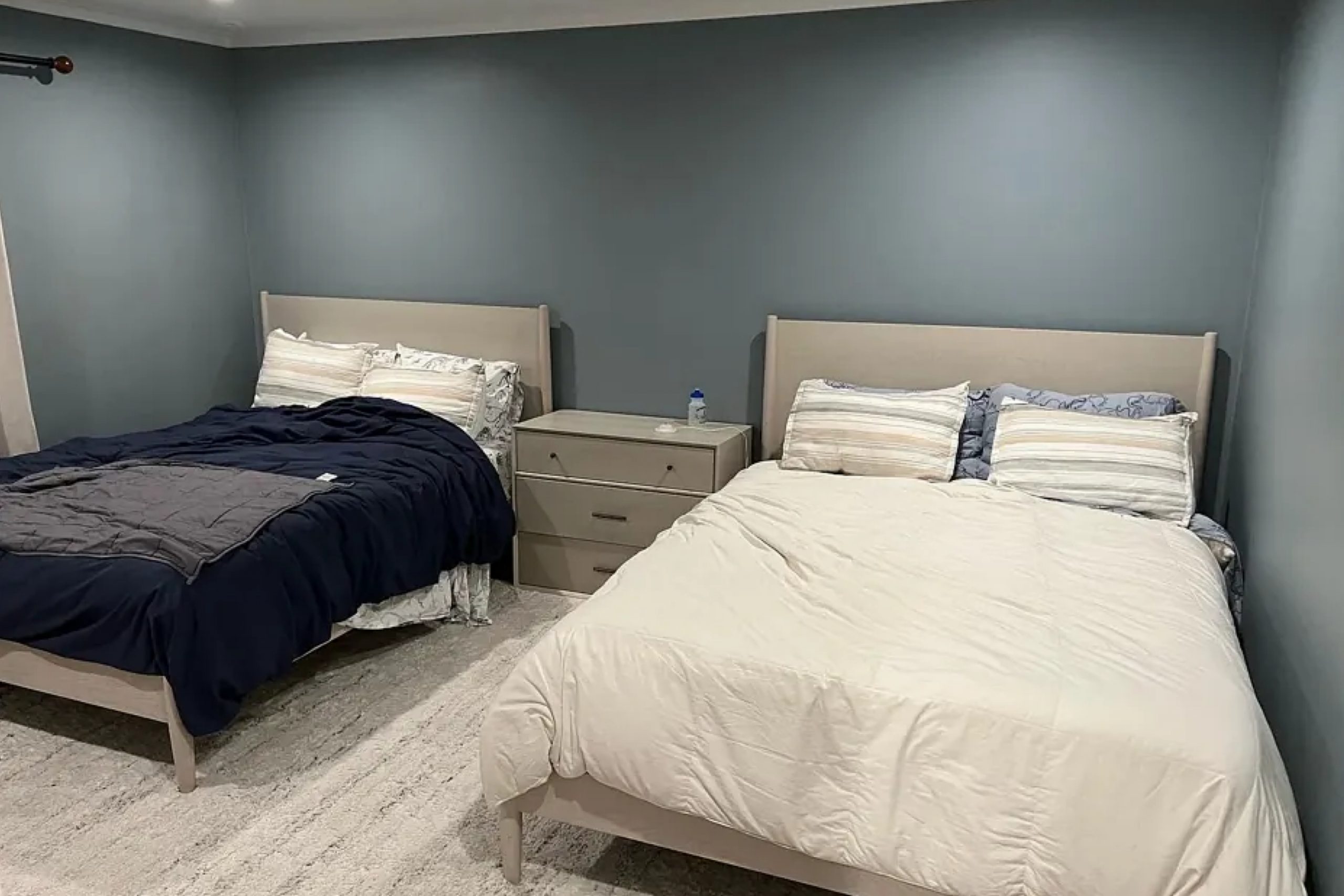
The first time I saw HC-145 Van Courtland Blue by Benjamin Moore, its unique shade immediately caught my eye. This soft, muted blue brings a sense of calm and elegance to any space. It has a timeless appeal, seamlessly complementing both modern and traditional interiors.
What truly impressed me was the way this color seems to adapt to different lighting throughout the day. In the morning, it feels fresh and airy, while in the evening it takes on a cozy, welcoming warmth.
I began to experiment with this paint in different areas of my home and noticed how it paired beautifully with various textures and accents. Whether it was the sleek lines of modern furniture or the rustic charm of wooden pieces, Van Courtland Blue provided a subtle yet sophisticated backdrop that enhanced everything around it.
This shade doesn’t shout for attention but instead offers a gentle invitation to relax and enjoy the space you’re in.
After trying it out, I understood why this color has become a favorite for those looking to create a serene and inviting atmosphere.
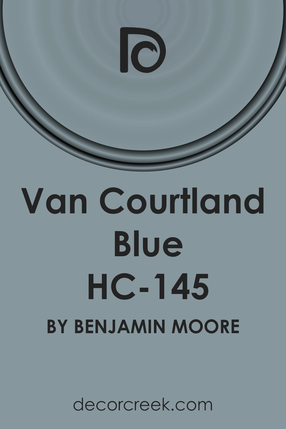
What Color Is Van Courtland Blue HC-145 by Benjamin Moore?
Van Courtland Blue by Benjamin Moore is a versatile and charming shade of blue with a hint of gray, giving it a muted and soft appearance. This color works well in a variety of interior styles due to its calming and timeless quality.
It is a great choice for traditional spaces, as it complements classic furnishings and architectural details, adding a gentle touch of color without overpowering the room.
In modern and transitional designs, it offers a subtle contrast to clean lines and minimalist décor, providing a hint of personality without being flashy.
This shade pairs beautifully with natural materials such as light or dark wood, bringing out their warmth and richness. It also works well with crisp white trim or cabinetry, offering a fresh and airy feel to the space.
Textured fabrics like linen, cotton, or wool complement this blue, adding depth and interest to the room.
Metallic accents, particularly in brass or gold, create a lovely balance, enhancing its elegance. Whether used on walls, cabinetry, or furniture, Van Courtland Blue offers a versatile and soothing palette, adaptable enough to create a cozy nook or an expansive, calm retreat.
Its gentle hue harmonizes effortlessly with various textures and materials, making it a beloved choice for many.
Is Van Courtland Blue HC-145 by Benjamin Moore Warm or Cool color?
Van Courtland Blue by Benjamin Moore, labeled as HC-145, is a soft blue paint color with a touch of gray. This color brings a calm and soothing atmosphere to any space, making it a popular choice for homeowners. It is perfect for creating a peaceful environment in bedrooms or bathrooms, helping people relax and unwind.
In living areas, Van Courtland Blue works well with both traditional and modern decor due to its muted tone. It pairs nicely with whites and creams, adding a gentle contrast without overwhelming the space.
Accents in natural wood or metallic finishes can add warmth and depth alongside this blue.
The versatility of Van Courtland Blue allows it to complement various styles and color palettes. Its subtle hue can make smaller rooms feel more open, while still providing enough personality to stand out.
Whether used on walls, cabinets, or trim, this shade offers a timeless elegance that enhances any home setting.
Undertones of Van Courtland Blue HC-145 by Benjamin Moore
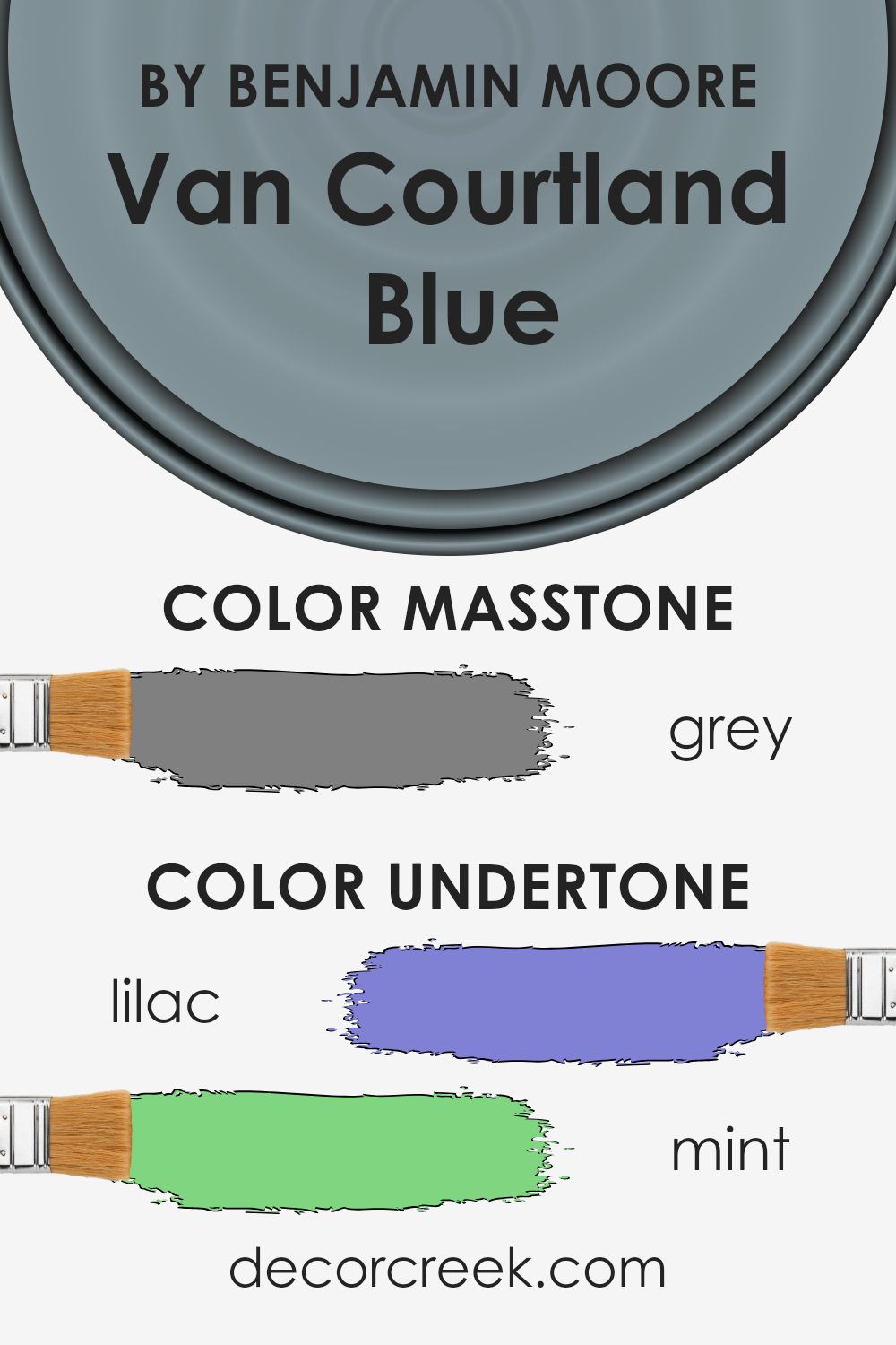
Van Courtland Blue is an intriguing color with unique undertones that subtly impact how we perceive it. This shade of blue, introduced by Benjamin Moore, contains a variety of undertones like lilac, mint, light blue, pale pink, and others. These undertones are like hidden layers that change how the main color appears based on lighting and surroundings.
The lilac and light purple undertones can add a hint of warmth, making the blue feel slightly softer. The presence of mint and light turquoise undertones introduces a refreshing quality, bringing a sense of liveliness.
Light gray helps to neutralize the color, providing balance and preventing it from feeling too vibrant.
Meanwhile, the hints of dark turquoise and dark blue give it depth, potentially making the blue feel more grounded.
When used on interior walls, these undertones alter the mood of a room. During the day, natural light might enhance the mint and light blue undertones, creating a fresh atmosphere. As evening falls, artificial light might highlight the lilac and pale pink, resulting in a cozy ambiance. The diverse mix of undertones in Van Courtland Blue allows it to adapt to different settings, ensuring it complements various decor styles and furnishings effortlessly.
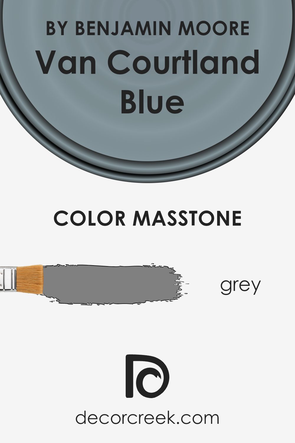
What is the Masstone of the Van Courtland Blue HC-145 by Benjamin Moore?
Van Courtland Blue (HC-145) by Benjamin Moore is a gentle blue shade that includes a touch of gray, giving it a soft and balanced look. The masstone here is a neutral gray (#808080), which tones down the vibrancy of the blue, making it versatile and suitable for various spaces in the home.
Because of this gray influence, Van Courtland Blue can appear differently depending on the lighting and surrounding colors. It tends to provide a calming backdrop without overpowering a room, making it a great choice for bedrooms, living rooms, or even kitchens.
The gray masstone allows Van Courtland Blue to work well with both light and dark finishes. It can complement white trims beautifully, offering a crisp and clean look, or pair nicely with darker wood tones for a cozy feel. This color’s understated elegance makes it easy to match with different decor styles, ensuring a harmonious fit in any home setting.
How Does Lighting Affect Van Courtland Blue HC-145 by Benjamin Moore?
Lighting plays a crucial role in the way we perceive colors. Changes in lighting can alter the appearance of a color, sometimes quite dramatically. Van Courtland Blue by Benjamin Moore is a soft, muted blue with a hint of gray, and its appearance can vary significantly depending on the type of lighting it receives.
In natural light, Van Courtland Blue has a cooler, more subtle appearance. In artificial light, especially if the bulbs emit a warm glow, the color can take on a slightly warmer tone, sometimes appearing more greenish or grayish depending on the specific type of artificial lighting.
North-facing rooms have a consistent, cool light, often described as a bluish light. In these rooms, Van Courtland Blue will tend to look cooler and more muted, emphasizing the gray undertones. In some cases, it might even appear a bit more muted or shadowed because of the lack of direct sunlight.
South-facing rooms receive more direct sunlight throughout the day, resulting in a warmer, brighter light. In these spaces, Van Courtland Blue can appear lighter, brighter, and even a bit warmer, bringing out more of its blue character. The color can look more vibrant without losing its soft quality.
East-facing rooms benefit from morning sunlight, which is warm and bright. During the morning hours, Van Courtland Blue can appear brighter and more cheerful. However, as the day progresses and the light becomes less direct, the color will revert to its cooler undertones.
West-facing rooms get the best natural light in the afternoon and evening.
In the afternoons, Van Courtland Blue can look rich and warm. As evening approaches, the color might appear even more inviting and somewhat deeper, picking up on warm tones if artificial lighting is used to complement natural sunset hues.
In summary, the perception of Van Courtland Blue changes with different lighting conditions, making it a versatile choice adaptable to various settings.
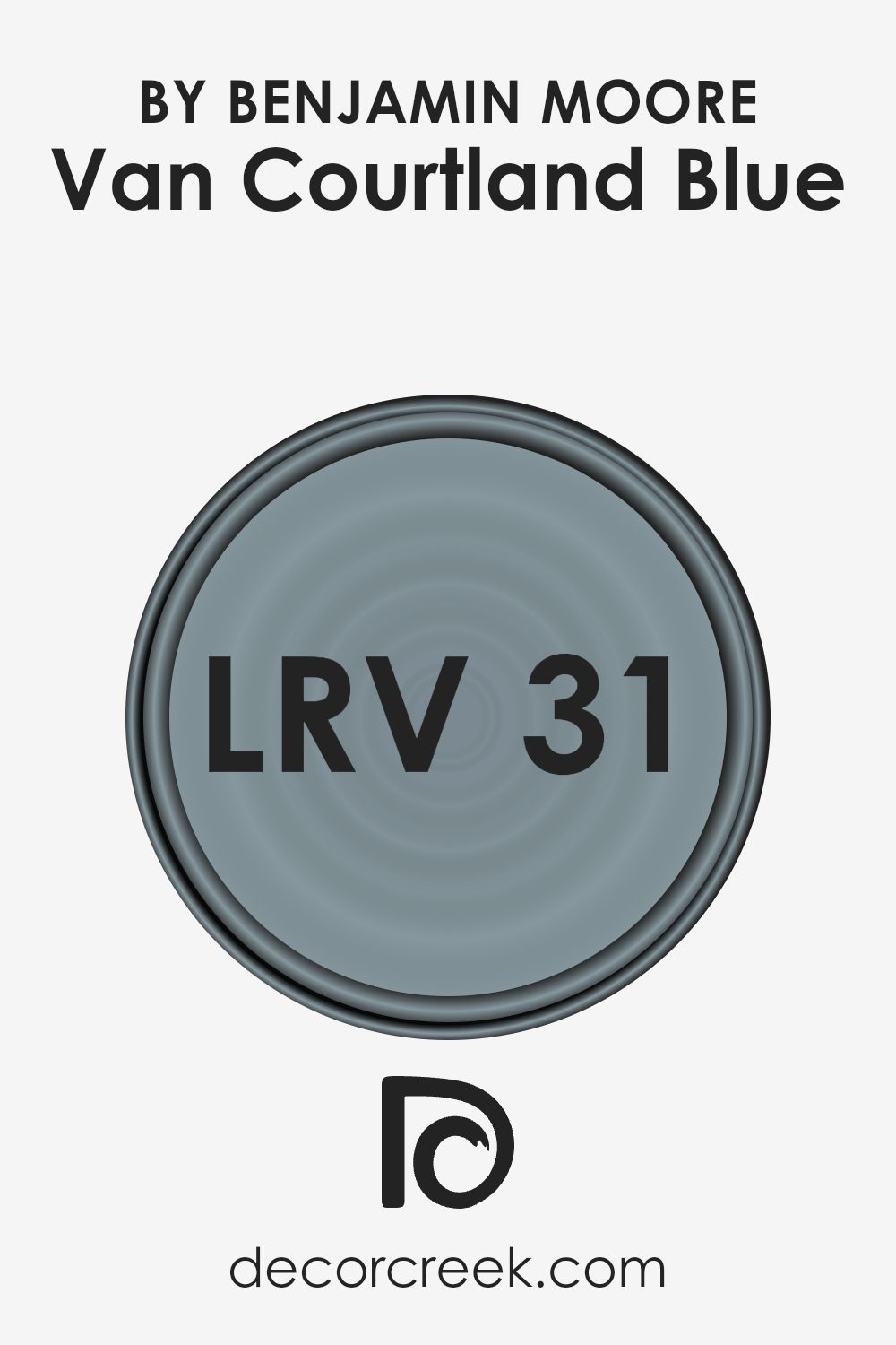
What is the LRV of Van Courtland Blue HC-145 by Benjamin Moore?
Light Reflectance Value (LRV) measures the amount of visible and usable light reflected by a surface, and it is expressed on a scale from 0 to 100, where 0 is absolute black, no reflection, and 100 is pure white, full reflection. This value helps people understand how light or dark a color will appear when painted on walls.
A lower LRV indicates a darker color that absorbs more light, while a higher LRV suggests a lighter color that reflects more light. LRV is important in choosing paint colors, as it affects how colors look in different lighting conditions and how they influence the perception of space.
Van Courtland Blue, with an LRV of 31.47, is a medium-dark shade that leans towards the darker side yet retains some ability to reflect light. In a space without a lot of natural light, this color may appear more intense and deeper, potentially making rooms feel smaller and cozier.
However, in a well-lit area, it will have a pleasing effect without overwhelming the space. It provides a balanced backdrop that pairs well with both light and dark furnishings, offering a classic look without being too dark or too bright.
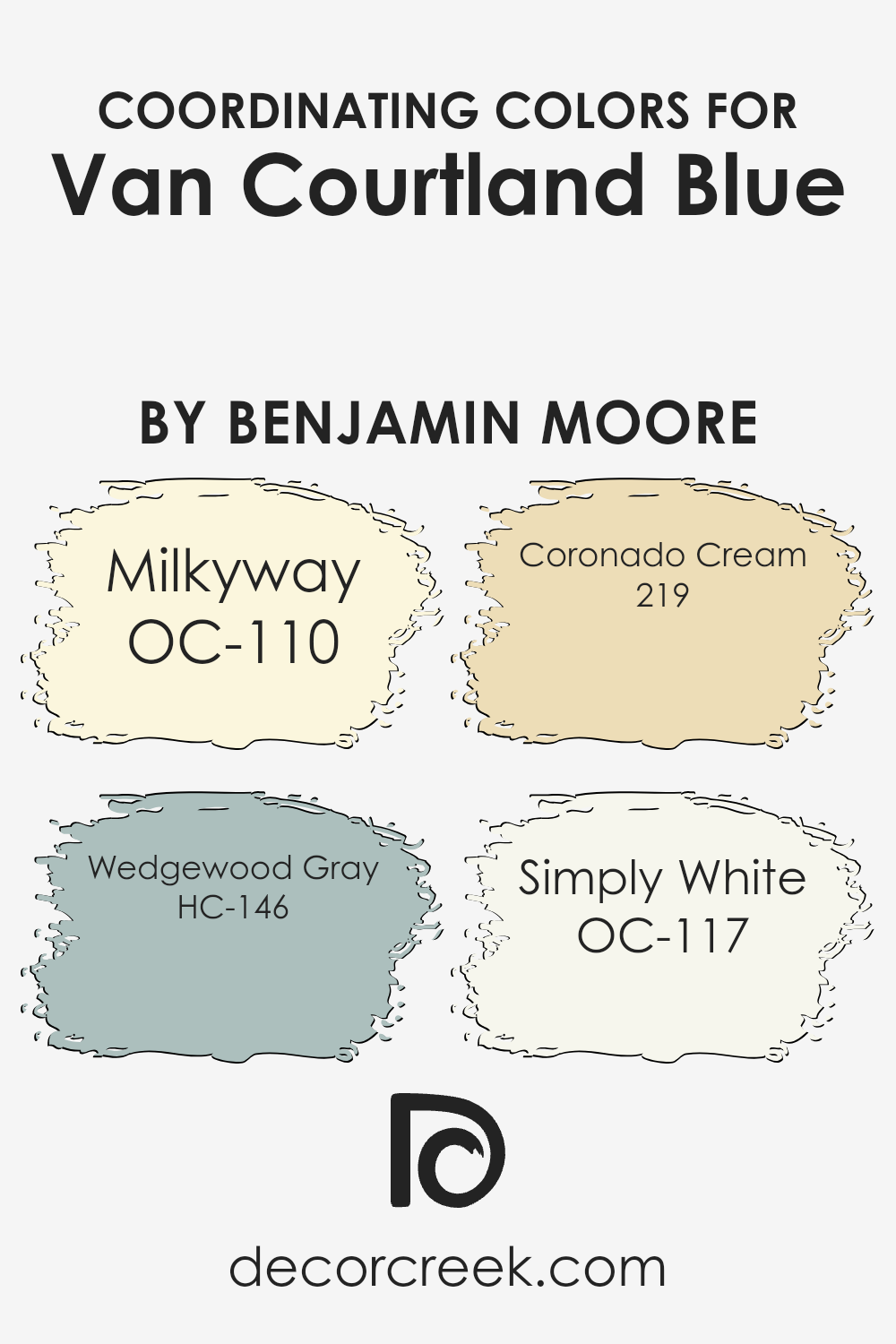
Coordinating Colors of Van Courtland Blue HC-145 by Benjamin Moore
Coordinating colors are hues that work well together, creating a harmonious and balanced look in a space. They complement each other by sharing similar undertones or contrasting in a pleasing way. Van Courtland Blue, a timeless shade by Benjamin Moore, pairs wonderfully with a selection of colors that enhance its depth and character.
One such color, Milkyway (OC-110), is a soft, creamy tone that provides a gentle, warm backdrop, bringing out the subtle elegance of Van Courtland Blue.
Wedgewood Gray (HC-146) is another coordinating color that offers a cool and soothing touch, enhancing the calming effect of the blue without overpowering it. The muted gray adds a layer of sophistication to any room.
Coronado Cream (219) introduces a cheerful, sunny note to the palette. Its warm, buttery appearance contrasts beautifully with the blue, bringing light and vibrancy to the combination. Simply White (OC-117) is a fresh, classic shade that works across various elements in the room, from trims to ceilings, ensuring a clean and crisp finish.
When combined with Van Courtland Blue, these coordinating colors create a unified and inviting space, perfect for various settings and personal styles. They not only balance each other but also enhance the overall ambiance of any area.
You can see recommended paint colors below:
- OC-110 Milkyway
- HC-146 Wedgewood Gray
- 219 Coronado Cream
- OC-117 Simply White
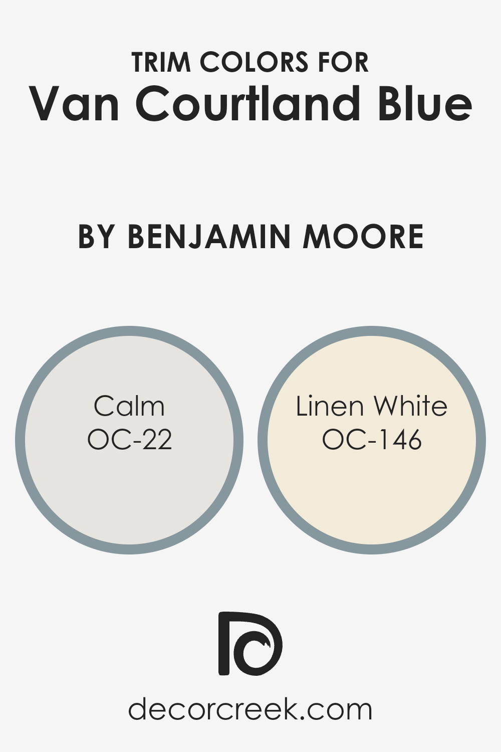
What are the Trim colors of Van Courtland Blue HC-145 by Benjamin Moore?
Trim colors are the paints used on the edges and borders within a room, such as on baseboards, window and door frames, and moldings. These colors play a crucial role in highlighting and defining a space. They help create contrast or harmony with the wall color, adding depth and visual interest to the room.
When using a color like Van Courtland Blue, which is a soft, sophisticated blue-gray, the right trim color can enhance its beauty by either complementing it or providing an attractive contrast.
Choosing the right trim color ensures that the room feels complete and that the colors work well together to create a cohesive look.
Calm, labeled as OC-22, is a gentle, soft gray with a hint of warmth. It is a versatile neutral that pairs well with various colors, contributing to a relaxed atmosphere. On the other hand, Linen White, labeled OC-146, is a warm, creamy white, offering a touch of elegance and comfort.
It provides a subtle, clean contrast when used as a trim color against Van Courtland Blue, making the room feel inviting and cozy. Both these trim colors enhance the beauty of Van Courtland Blue by bringing out its undertones and highlighting its charm.
You can see recommended paint colors below:
- OC-22 Calm
- OC-146 Linen White
Colors Similar to Van Courtland Blue HC-145 by Benjamin Moore
Similar colors play an important role in design because they help create a harmonious and cohesive look. By using colors that are close to each other on the color wheel, you can create a subtle and pleasing visual effect. These colors can make spaces feel more unified and balanced.
In the context of Van Courtland Blue by Benjamin Moore, which is a soft, muted blue with gray undertones, similar colors can enhance its soothing and classic appeal.
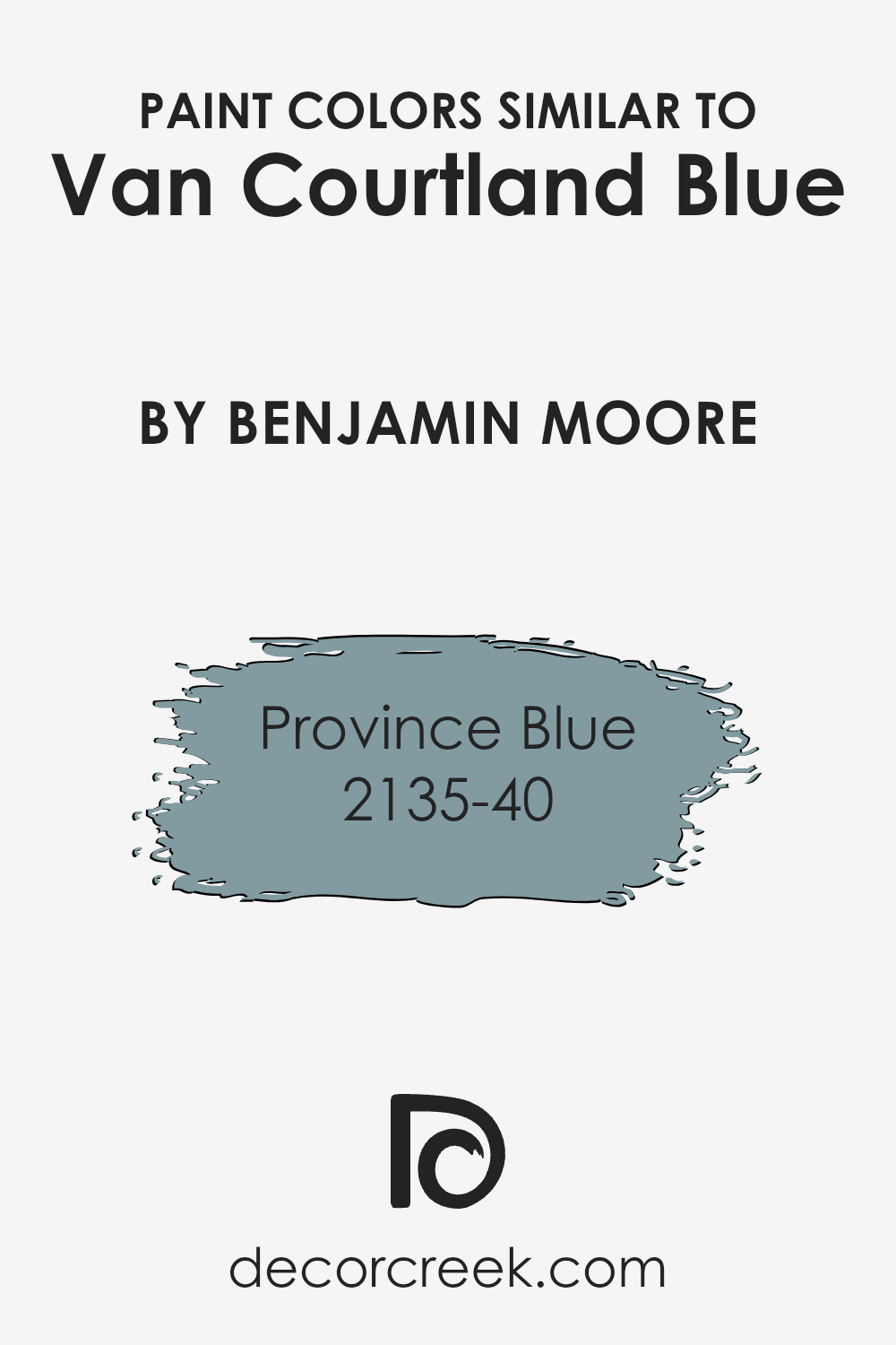
One similar shade is Province Blue 2135-40, which is slightly deeper and has a rich, historic feel. While Van Courtland Blue brings an airy elegance, Province Blue adds depth and warmth, making it perfect for spaces like libraries or dining rooms where you want a cozy atmosphere.
By choosing colors like these that complement each other, you can achieve a seamless look that flows beautifully throughout a space. They work well together in creating layers of color that don’t clash but instead support each other, enhancing the design’s overall appeal.
Each color brings its own nuance while respecting the main theme, allowing for a sophisticated yet relaxed setting without being overwhelming or busy.
You can see recommended paint color below:
- 2135-40 Province Blue
How to Use Van Courtland Blue HC-145 by Benjamin Moore In Your Home?
Van Courtland Blue HC-145 by Benjamin Moore is a soft and inviting blue that can add a refreshing touch to any room in your home. Its gentle tone makes it a versatile choice for a range of spaces. In the living room, it can create a calming atmosphere, making it a great backdrop for relaxation and family gatherings.
You can pair it with white or neutral-colored furniture and decor to highlight its subtle hue.
In the bedroom, Van Courtland Blue can contribute to a peaceful environment, promoting restful sleep. Combine it with cozy textiles and warm lighting for a soothing effect. This color also works well in bathrooms, offering a clean and airy feel that pairs nicely with white fixtures.
For a creative touch, consider using Van Courtland Blue on kitchen cabinets or as an accent wall to add depth without overpowering the space. This color effortlessly blends with various styles, from traditional to contemporary.
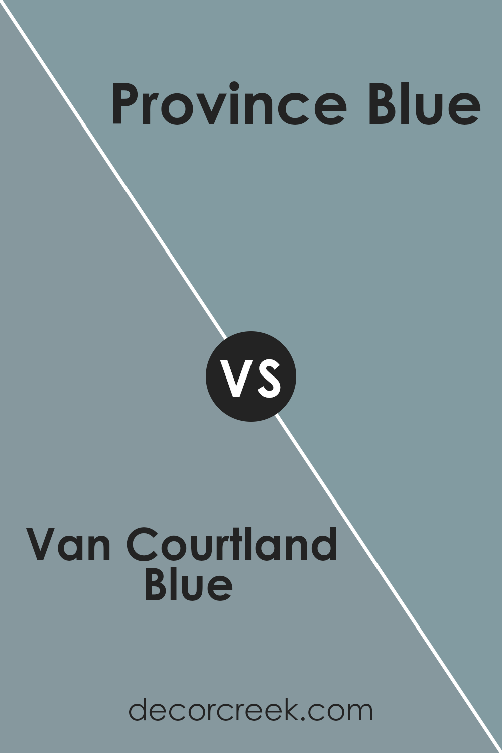
Van Courtland Blue HC-145 by Benjamin Moore vs Province Blue 2135-40 by Benjamin Moore
Van Courtland Blue HC-145 and Province Blue 2135-40, both by Benjamin Moore, offer two distinct shades of blue with unique characteristics. Van Courtland Blue is a soft, muted blue with a hint of gray. It provides a gentle and relaxing atmosphere, making it ideal for spaces where a calming effect is desired, such as bedrooms or living rooms.
On the other hand, Province Blue is deeper and richer, with a slightly more pronounced green undertone. This gives it a bolder presence, suitable for accent walls or areas where a stronger statement is needed.
While both colors belong to the blue family, Van Courtland Blue leans towards a vintage, classic feel, while Province Blue lends a more modern and vibrant vibe. Each color brings its own charm, suiting different tastes and purposes in home decor.
You can see recommended paint color below:
- 2135-40 Province Blue
Conclusion
It’s a nice, soft blue that reminds me of the sky when it’s clear and sunny. This shade is gentle and makes rooms feel calm and happy.
When you paint your walls with Van Courtland Blue, it feels like bringing a piece of the outside indoors.
This color fits nicely in many different places in a home. Whether it’s the living room, bedroom, or even the kitchen, Van Courtland Blue makes everything look fresh and pleasant. It goes well with other colors, too, especially white and light gray, which makes it really useful when decorating your house.
I think one of the best things about Van Courtland Blue is how it makes everything feel balanced. It’s not too bright or too dark, so it makes rooms feel just right. Kids and adults alike will enjoy this color because it is soothing and friendly.
In the end, choosing HC-145 Van Courtland Blue can be a great way to make a room look nice and feel welcoming. It’s a beautiful color that can make anyone smile and enjoy their home a little more each day.
Ever wished paint sampling was as easy as sticking a sticker? Guess what? Now it is! Discover Samplize's unique Peel & Stick samples.
Get paint samples

