Black
Black Blue
Blue Brown
Brown Gray
Gray Green
Green Neutral
 Orange
 White
White Yellow
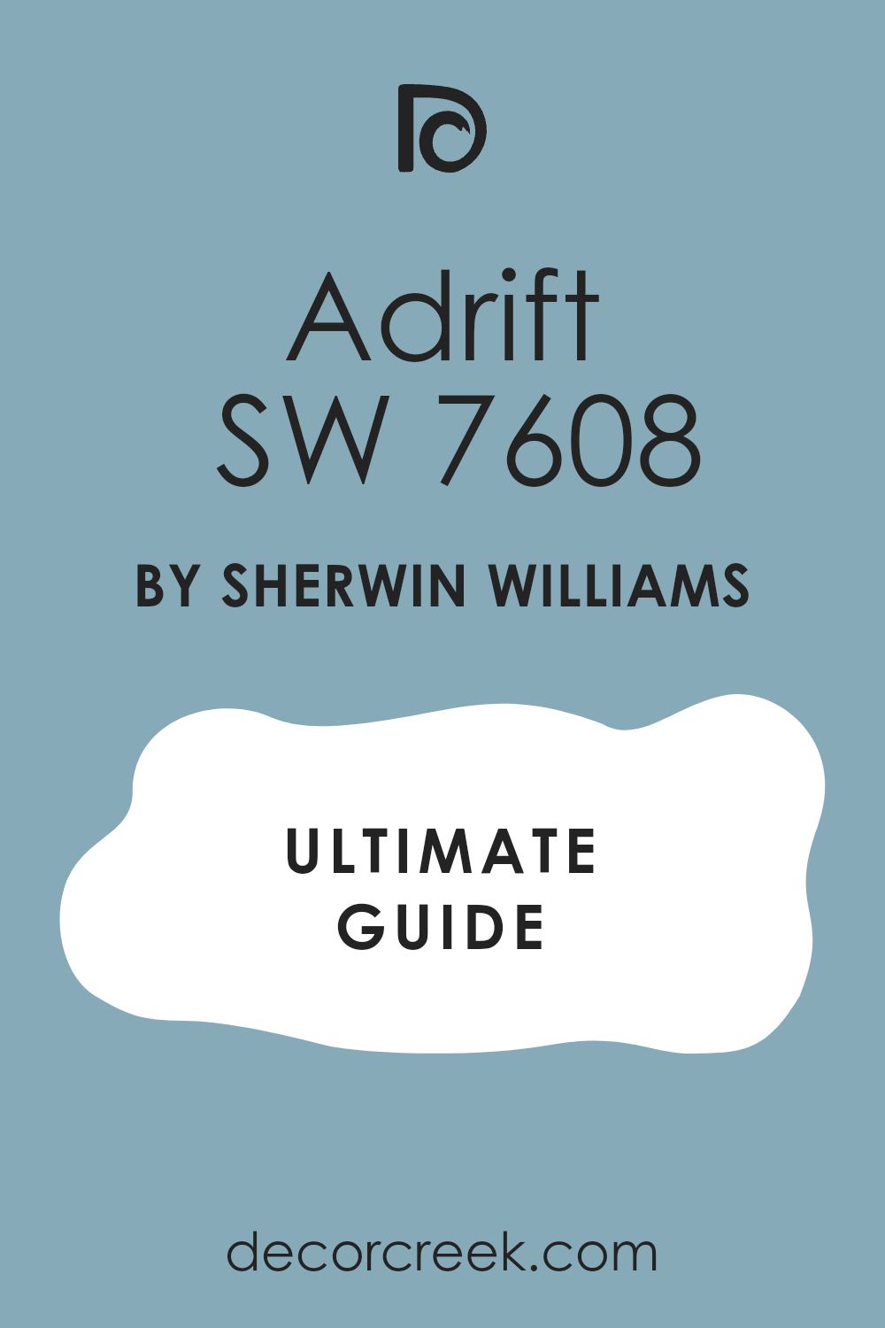
Imagine sitting by the shore, the ocean gently lapping at the sand, and there it is—SW 7608 Adrift by Sherwin Williams, a color that captures that peaceful moment between sea and sky. As I look around my room, freshly painted in this soothing shade, I feel a sense of calm wash over me. This color truly brings a slice of seaside peace to my own room, and it could do the same for yours.
SW 7608 Adrift is a unique hue, not just your typical blue or gray. It has this magical way of shifting under different lighting. In the morning light, it’s a pale, almost misty gray, but by evening, it deepens, reflecting more profound blue tones, almost like the ocean at dusk. This quality makes it an adaptable choice for anyone looking to refresh their walls with something that isn’t just a flat, static color.
Whether you’re redoing your bedroom, bathroom, or a quiet nook, Adrift offers a subtle backdrop that enhances everything around it. It pairs beautifully with soft whites or vibrant colors, making your decor pop just the right amount.
If you’re considering a change, think about what a calming influence this color can be in your daily life. It might just be the refreshing touch you need.
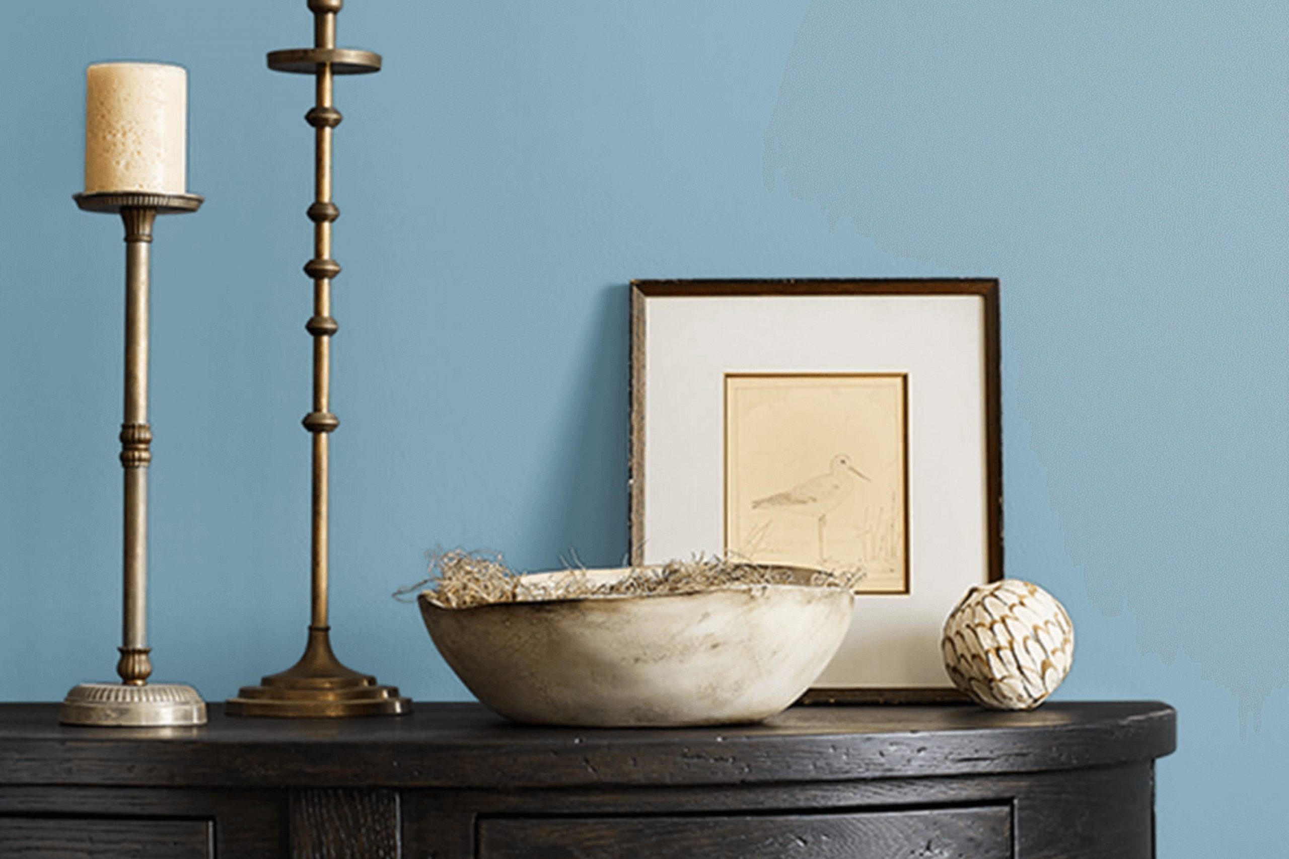
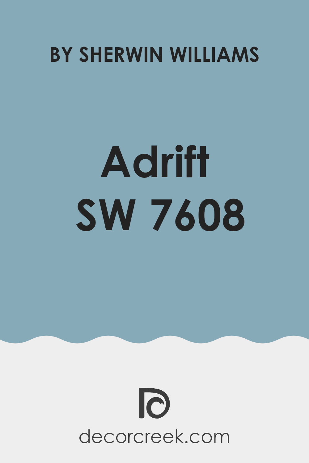
What Color Is Adrift SW 7608 by Sherwin Williams?
The color Adrift by Sherwin Williams is a deep, rich gray with a subtle hint of blue. This soothing shade is adaptable and practical, lending a sense of calm and steadiness to any room. It’s perfect for creating a cozy, inviting ambiance in rooms where you want to relax and unwind.
Adrift works exceptionally well in modern and contemporary interiors because of its clean and minimalistic look. Additionally, it fits beautifully into nautical and coastal themes, complementing the natural elements associated with these styles. This color can also be a great choice for industrial themes, as its depth can balance the raw, edgy elements of metal and wood typically used in this style.
When it comes to materials, Adrift pairs harmoniously with natural wood, adding warmth to the cool tones of the paint. It also looks stunning when contrasted with metals like silver, chrome, or brushed nickel, enhancing modern fittings and fixtures. For textures, consider soft, plush fabrics like velvet or wool in lighter shades to create a lovely contrast with the walls. This creates an inviting room that feels both comfortable and stylish.
Adrift is a color that offers both flexibility and charm, making it ideal for those looking to create a stylish yet soothing environment.
decorcreek.com
Is Adrift SW 7608 by Sherwin Williams Warm or Cool color?
Adrift by Sherwin Williams is a soothing shade of gray-blue that brings a calm and peaceful feel to any room. This color is adaptable, working well in various rooms such as bedrooms, bathrooms, and even living rooms. Its cool tone creates a relaxed atmosphere, making it perfect for areas where comfort is key, like where you unwind after a long day.
Adrift pairs nicely with both light and dark furniture, allowing for flexibility in decorating styles. You can match it with soft beige and warm woods for a cozy look or contrast it with bright whites for a crisp, fresh vibe. This shade is also great for smaller rooms, as it’s light enough to make rooms appear bigger and more open.
Overall, Adrift adds a gentle, refreshing touch to homes, making rooms more inviting without dominating them with color. It’s a popular choice for those looking to add a hint of color while maintaining a neutral backdrop.
Undertones of Adrift SW 7608 by Sherwin Williams
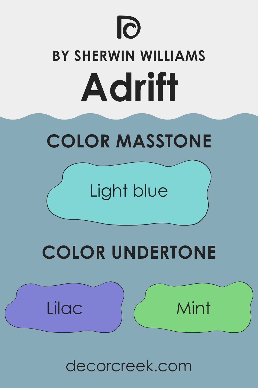
AdriftSW 7608 is an intriguing paint color that brings a unique depth and adaptability to interior rooms with its blend of subtle undertones. This color combines hints of lilac, mint, and various shades of gray and blue, which contribute to its complex appearance.
The inclusion of lilac gives it a soft hint of purple, making it warm and welcoming. Mint adds a refreshing touch, balancing the color’s warmth with a bit of coolness. This coolness is further enhanced by different shades of gray and blue, which provide a neutral base, making the color easily suited to different lighting conditions and decor styles.
The presence of light purple and turquoise introduces a playful yet muted vibrancy, enriching the color’s palette. Meanwhile, understated tones of pale pink and pale yellow add a faint touch of brightness and warmth, making the walls feel more lively and engaging. The dark and light shades of turquoise offer a hint of aquatic freshness, perfect for creating a soothing atmosphere.
On interior walls, these undertones affect how the color looks under different lighting conditions. Natural light can bring out the cooler mint and blue undertones, while artificial light might highlight the warmer lilac and pale pink shades, making the room feel cozy.
This adaptability makes it an excellent choice for rooms that are used at different times of the day. Whether used in a bedroom, living room, or study, the varied undertones of this color ensure that the walls remain dynamic and engaging, always appearing slightly different as the light changes. This keeps the room interesting and inviting, showcasing a beautiful interplay of colors that respond to their environment.
decorcreek.com
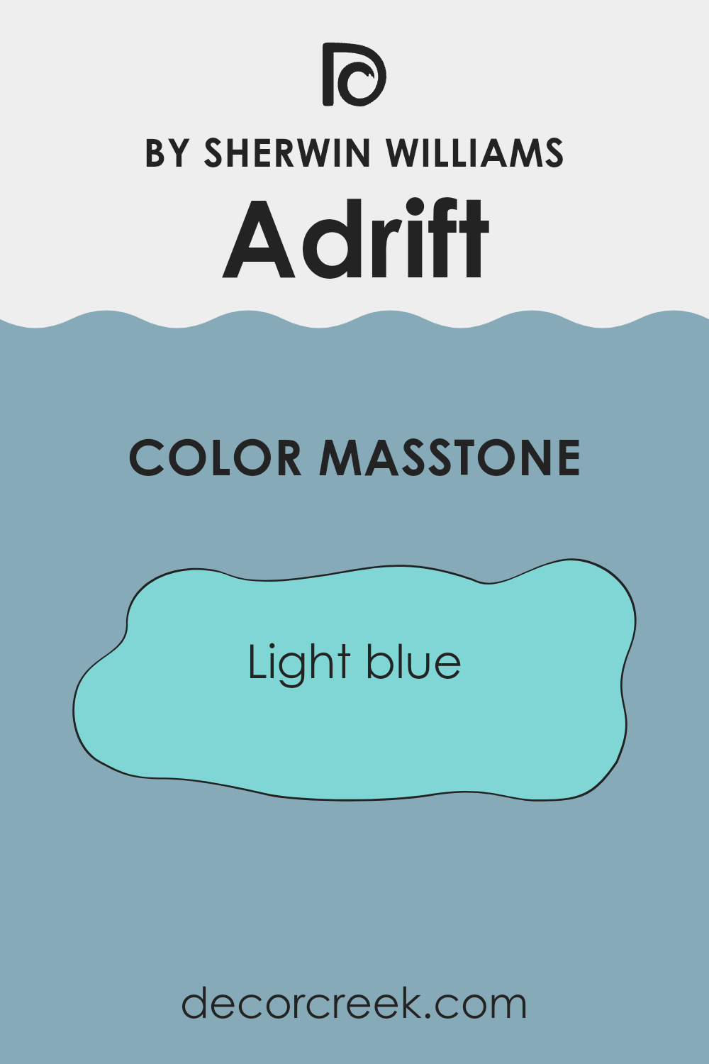
What is the Masstone of the Adrift SW 7608 by Sherwin Williams?
The light blue masstone of Adrift (technical color code #80D5D5), offers a fresh and airy feel, making it a popular choice for home interiors. This shade of blue closely resembles the hue of clear skies on a sunny day, which naturally brings a sense of openness and light into a room.
When used in homes, this color is great for creating a relaxed atmosphere. It works exceptionally well in bathrooms and bedrooms where calmness is often desired.
Additionally, its light-reflective properties can make smaller rooms appear more spacious and brighter, which is especially useful in areas that do not receive a lot of natural sunlight. This particular shade pairs beautifully with crisp whites and soft greys, providing a clean and modern look while maintaining a welcoming vibe. Overall, this welcoming and broadening effect makes it an adaptable choice for many different types of living rooms.
decorcreek.com
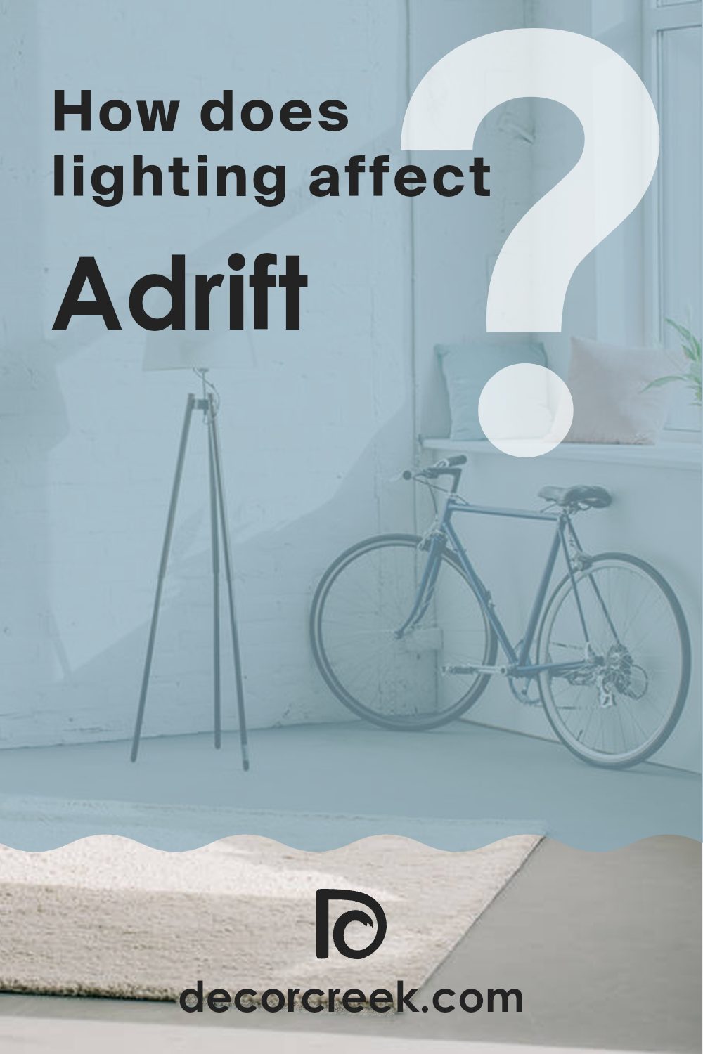
How Does Lighting Affect Adrift SW 7608 by Sherwin Williams?
Lighting plays a crucial role in how we perceive colors. The appearance of a color can change dramatically under different lighting conditions because each light type has its own color temperature and intensity that influences how a color looks.
Let’s consider Adrift by Sherwin Williams, an adaptable shade of blue-gray. In artificial light, such as LED or incandescent light, this shade can appear slightly different. Under the warm glow of incandescent bulbs, Adrift might look softer and more muted, with the cozy qualities in the color emphasized, making it a comfortable choice for living rooms or bedrooms. LED lights, which often have a cooler tone, can enhance the blue in this paint, giving it a crisper, more vibrant look.
In natural light, Adrift’s true color is more noticeable, but the orientation of the room can affect this perception. In a north-facing room, which receives less direct sunlight and generally has cooler, more diffused light throughout the day, Adrift might appear more reserved and subtle, leaning towards its gray undertones. This can give a calming, gentle feel to the room.
In a south-facing room, where sunlight is abundant most of the day, this color can come alive, showing its full range of blue-gray hues and creating a lively yet balanced atmosphere. The ample sunshine can make Adrift look brighter and more dynamic.
For east-facing rooms, morning light can make Adrift look very lively and welcoming, but as the day progresses and the sunlight fades, the color might look cooler and more subdued. Conversely, in west-facing rooms, the color may appear more muted in the morning but gain vibrancy during the sunset hours when the light warms up and intensifies, highlighting the warmer tones in the paint.
Each of these changes in appearance illustrates how lighting conditions can affect not only the look of a color but the mood and feel of a room.
decorcreek.com
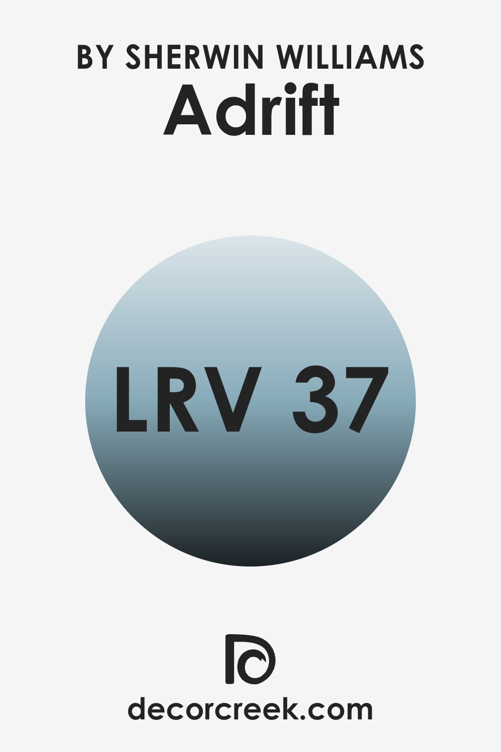
What is the LRV of Adrift SW 7608 by Sherwin Williams?
LRV, or Light Reflectance Value, is a measurement used to determine how much light a paint color reflects or absorbs. This value is expressed on a scale, where lower numbers represent colors that absorb more light and appear darker, while higher numbers reflect more light and appear lighter.
Understanding LRV is important when selecting paint colors, as it influences how bright or dark a room can feel once the walls are painted. This number helps predict how much light will bounce around in a room, which can significantly affect the overall mood and visual size of the room.
The LRV for the color Adrift SW 7608 by Sherwin Williams is 37.274, placing it in the mid-range category of light reflection. This means it does not reflect a lot of light, nor does it absorb light excessively. As a result, this color appears as a more solid mid-tone on walls. It can make a room feel cozy and contained without making it feel cramped. This particular LRV level is adaptable for various lighting conditions, though in a dimly lit room, it may appear slightly darker, while in a well-lit area, the true color will show more vibrantly. Such an LRV makes this color suitable for rooms where a balanced, moderate ambiance is desired.
decorcreek.com
Coordinating Colors of Adrift SW 7608 by Sherwin Williams
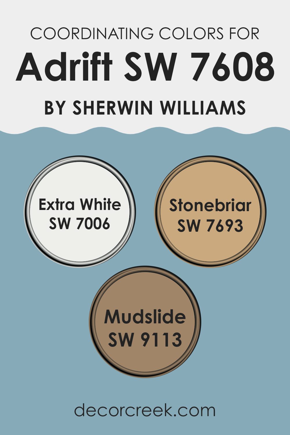
Coordinating colors are hues that complement each other and are often used together to create a harmonious and balanced look in interior design or fashion. When we talk about coordinating colors for a paint shade like Adrift SW 7608 by Sherwin Williams, it means selecting colors that will look good when used alongside it, either as primary or accent shades. These coordinating colors generally share certain undertones or contrast perfectly to bring out the best in each other.
For example, Extra White SW 7006 is a clean, crisp white that works well to balance darker or more saturated colors. It’s perfect for trim, ceilings, or even as a contrasting wall color, providing a fresh backdrop that allows other colors to stand out.
Stonebriar SW 7693 is another great coordinating color; it’s a soft, earthy hue that offers a warmth which pairs nicely with cooler tones, giving a room a cozy and inviting feel. Lastly, Mudslide SW 9113 is a deeper, warmer brown. It complements well with both light and dark colors, adding depth and richness to the color scheme. Using these shades in combination with each other can help achieve a pleasing aesthetic that ties different elements of a room together.
You can see recommended paint colors below:
- SW 7006 Extra White
- SW 7693 Stonebriar
- SW 9113 Mudslide
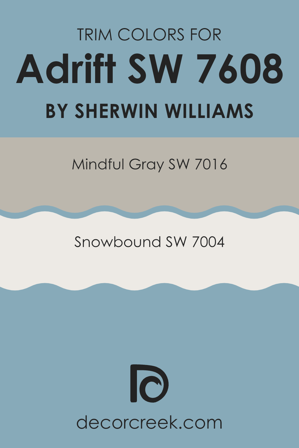
What are the Trim colors of Adrift SW 7608 by Sherwin Williams?
Trim colors play a significant role in interior and exterior design by defining and accentuating the architectural features of rooms. When considering a unique shade like Adrift SW 7608 by Sherwin-Williams, selecting the right trim colors can greatly enhance the overall appeal of the room or the exterior of a home.
Opting for trim colors such as Mindful Gray SW 7016 or Snowbound SW 7004 allows for a harmonious yet distinct complement to Adrift, which is a deep, subtle shade of blue-gray. The choice of trim colors helps in creating a balanced color scheme that distinguishes details and features, making rooms more visually interesting and coherent.
Mindful Gray SW 7016 is a warm, gentle gray that carries a soft adaptability, perfect for complementing the stronger tones of Adrift. It’s light enough to highlight baseboards, molding, and trim, providing a subdued contrast that enhances the main color. On the other hand, Snowbound SW 7004 is a clean, bright white with subtle undertones that prevent it from feeling too stark. This color is excellent for making architectural elements stand out crisply against darker or richer wall colors, ensuring that features like door frames and window trims pop beautifully, adding depth and dimension to the overall design.
You can see recommended paint colors below:
- SW 7016 Mindful Gray
- SW 7004 Snowbound
Colors Similar to Adrift SW 7608 by Sherwin Williams
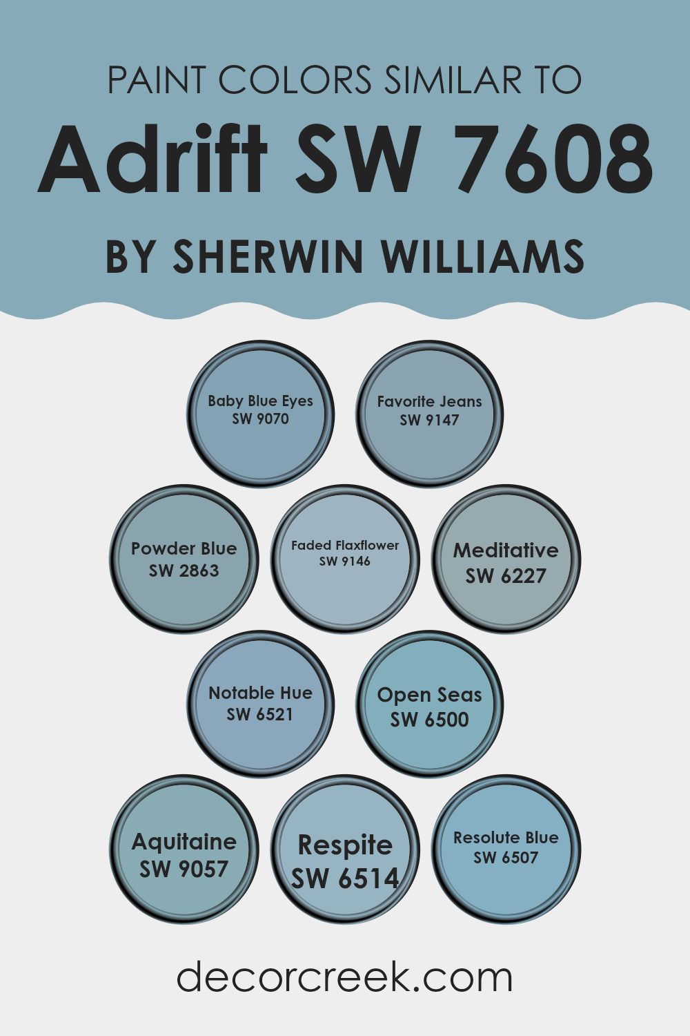
Using similar colors when designing a room can create a harmonious and cohesive look. Choosing similar shades like those of Adrift by Sherwin Williams helps to ensure that the colors blend well together, promoting a subtle and pleasing visual flow. This approach allows for a varied yet unified aesthetic that can make any room feel well-coordinated and comfortable. Close color relatives lend themselves to a layered look, offering depth without the stark contrasts that come with more divergent palettes.
Adrift pairs nicely with soft, muted tones such as Baby Blue Eyes, which brings to mind the gentle hues of a clear sky. Favorite Jeans has a deeper, comforting quality, reminiscent of well-loved denim. Powder Blue is light and airy, offering a fresh, clean feel that enhances rooms with a gentle touch of color.
Faded Flaxflower introduces a hint of understated green, adding a muted natural element to the scheme. Meditative is deeper and more introspective, giving a sense of calm. Notable Hue, true to its name, stands out with a stronger blue tone that catches the eye without being too bold. Open Seas invites thoughts of the deep, expansive ocean, enriching any palette with its vibrant depth.
Aquitaine adds a slightly greenish-blue intensity, lending vibrancy and a sense of freshness. Respite provides a soft, restful blue that pairs easily with other shades for a relaxed feel. Finally, Resolute Blue offers a more assertive presence, grounding lighter blues and providing a strong base in the color scheme. These hues, each unique yet related, work together to create a fluid and attractive room.
You can see recommended paint colors below:
- SW 9070 Baby Blue Eyes
- SW 9147 Favorite Jeans
- SW 2863 Powder Blue
- SW 9146 Faded Flaxflower
- SW 6227 Meditative
- SW 6521 Notable Hue
- SW 6500 Open Seas
- SW 9057 Aquitaine
- SW 6514 Respite
- SW 6507 Resolute Blue
Colors that Go With Adrift SW 7608 by Sherwin Williams
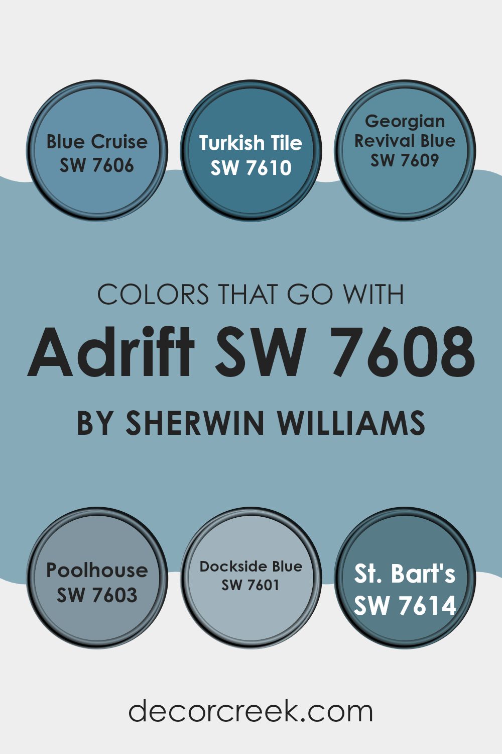
Choosing the right colors that complement Adrift SW 7608 by Sherwin Williams is crucial because it ensures that the room feels harmonious and well-thought-out. Colors like SW 7606 – Blue Cruise, SW 7610 – Turkish Tile, and others are picked to either contrast or blend smoothly with Adrift, creating an aesthetically pleasing environment.
These accompanying colors can affect the mood and perception of the room, enhancing architectural features or making the rooms appear more spacious. They can also help in balancing the visual weight of the room, making darker or lighter areas feel more integrated.
SW 7606 – Blue Cruise is a deep blue that echoes the depth of the ocean, bringing a strong presence into the room. SW 7610 – Turkish Tile offers a vibrant blue that adds a lively touch to the surroundings. SW 7609 – Georgian Revival Blue, a softer mid-tone blue, provides a classic touch and a sense of calm.
SW 7603 – Poolhouse has a lighter, refreshing blue tone that reminds you of a clear sky on a sunny day, making any room feel breezy and light. SW 7601 – Dockside Blue features a grayish-blue hue that works well in a more muted color scheme or in industrial-inspired decor. SW 7614 – St. Bart’s has a lush, tropical vibe, reminiscent of Caribbean waters, perfect for adding a splash of excitement. These colors, when used alongside Adrift, ensure that each room delivers a visual impact, either by creating a soothing backdrop or a striking focal point.
You can see recommended paint colors below:
- SW 7606 Blue Cruise
- SW 7610 Turkish Tile
- SW 7609 Georgian Revival Blue
- SW 7603 Poolhouse
- SW 7601 Dockside Blue
- SW 7614 St. Bart’s
How to Use Adrift SW 7608 by Sherwin Williams In Your Home?
Adrift SW 7608 by Sherwin Williams is a soothing shade of blue that can bring a refreshing touch to any room in your house. This color works well in rooms that need a calming atmosphere, such as bedrooms and bathrooms.
You can paint all the walls this gentle blue to create a peaceful backdrop, or use it for just one accent wall to give a room a subtle pop of color.
Adrift also pairs beautifully with white trim for a clean and fresh look. If you have wooden furniture, this shade complements the natural tones well, adding a warm and inviting feel. For those who like a bit of contrast, use Adrift alongside soft grays or even brighter colors like yellows for throw pillows or decorations. It’s a flexible color that can help make your room feel more comfortable and welcoming without being too bold or dominant.
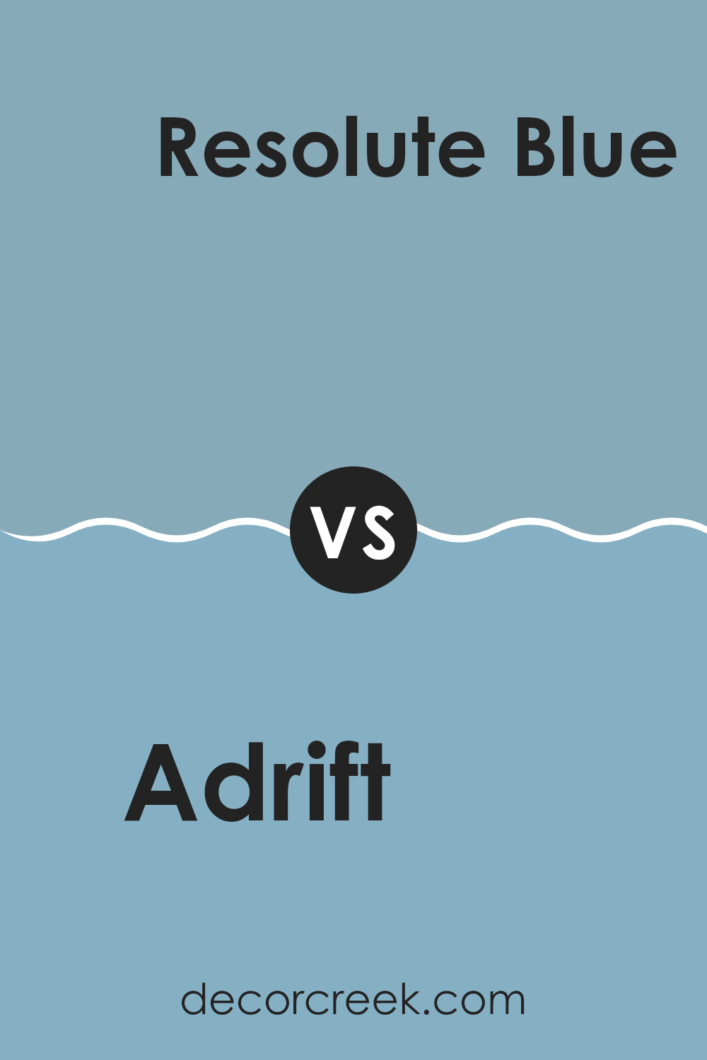
Adrift SW 7608 by Sherwin Williams vs Resolute Blue SW 6507 by Sherwin Williams
Adrift and Resolute Blue, both from Sherwin Williams, are distinct shades of blue that each bring their own unique vibe to a room. Adrift is a soft, muted blue with hints of gray, making it a subtle and understated color. It works well in rooms where you want to create a calm, soothing atmosphere without being too bold.
On the other hand, Resolute Blue is a deeper, more vibrant shade. It has a stronger presence and offers more drama and intensity. This color is great for making a statement, whether on an accent wall or throughout a room, adding depth and energy.
While Adrift is more low-key and can blend easily with various decor styles, Resolute Blue is bolder and calls for thoughtful coordination with other colors and elements in a room. Both colors have their own appeal and can significantly impact the mood and style of any room.
You can see recommended paint color below:
- SW 6507 Resolute Blue
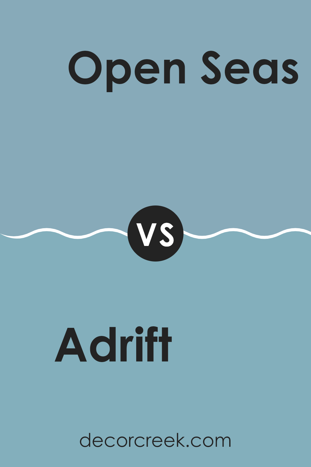
Adrift SW 7608 by Sherwin Williams vs Aquitaine SW 9057 by Sherwin Williams
Adrift SW 7608 by Sherwin Williams is a deep, grayish-blue color that gives off a calm and soothing vibe. It’s like a cloudy, overcast day at sea, providing a subtle and toned-down feel to any room. This color works well in rooms for relaxation like bedrooms or bathrooms.
On the other hand, Aquitaine SW 9057 by Sherwin Williams is a lighter, more vivid blue with hints of green. It reminds one of clear, bright waters in a tropical location, adding a fresh and clean look to any area. It’s an excellent choice for adding a touch of brightness to kitchens or living rooms.
Both colors can help make a room feel cooler, but while Adrift offers a more muted, soothing backdrop, Aquitaine suggests a cheerful and lively atmosphere. Depending on the mood you’re aiming for, either could be a great choice.
You can see recommended paint color below:
- SW 9057 Aquitaine
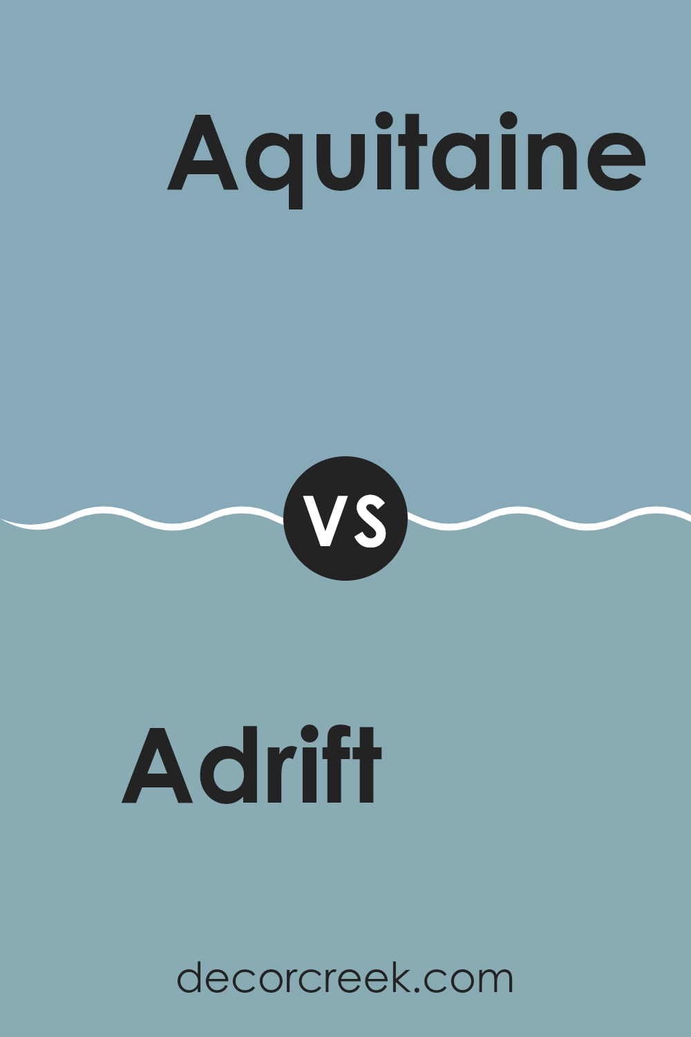
Adrift SW 7608 by Sherwin Williams vs Notable Hue SW 6521 by Sherwin Williams
Adrift and Notable Hue by Sherwin Williams are two distinct colors that offer unique vibes for any room. Adrift is a deep, almost charcoal gray that brings a strong and grounded feel to a room. It works well in rooms where you want a touch of elegance without going too dark.
On the other hand, Notable Hue is a vibrant teal that adds a lively splash of color. This shade is perfect for brightening up any area, making it more cheerful and inviting. While Adrift leans more towards a neutral, calming backdrop, Notable Hue stands out and can be a focal point in the decor.
These colors could also complement each other well in a room, with Adrift providing a subtle base and Notable Hue adding pops of energy. Whether used together or separately, they can definitely improve the aesthetic of a home.
You can see recommended paint color below:
- SW 6521 Notable Hue
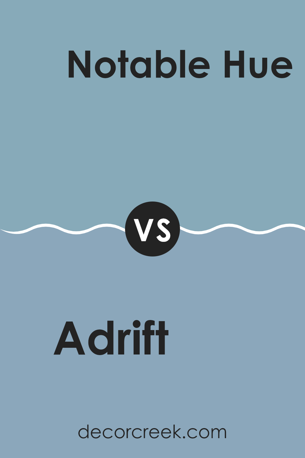
Adrift SW 7608 by Sherwin Williams vs Powder Blue SW 2863 by Sherwin Williams
Adrift and Powder Blue are two distinct paint colors from Sherwin Williams. Adrift is a deep, grayish-blue shade that gives off a calm, subtle vibe. It’s perfect for creating a cozy, subdued atmosphere in a room.
On the other hand, Powder Blue is much lighter, featuring a soft, gentle blue that feels airy and spacious. This color is great for making a small room appear larger and more open.
When comparing the two, Adrift presents as more grounded and reserved, ideal for a refined setting without appearing too bold. Powder Blue, however, exudes a fresher, more inviting feel, which can add a bright and cheerful touch to any area. Both colors work well in different settings depending on the mood and effect you want to achieve.
You can see recommended paint color below:
- SW 2863 Powder Blue
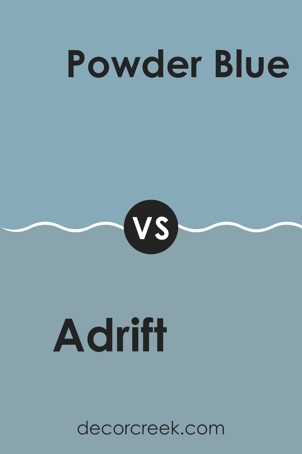
Adrift SW 7608 by Sherwin Williams vs Open Seas SW 6500 by Sherwin Williams
Adrift SW 7608 and Open Seas SW 6500, both from Sherwin Williams, differ subtly in their shades of blue. Adrift is a deeper, somewhat muted blue that resembles the twilight sky, giving a calm and grounded feel.
It works well in rooms where you want a sense of stability and a touch of depth without making the area feel too bold. On the other hand, Open Seas has a lighter, more vibrant tone that mirrors the lively aspect of tropical waters.
This color brings a fun and fresh look to any room, making it ideal for creating an upbeat and friendly atmosphere. Both colors can add charm to a room, but the choice between them depends on whether you prefer a cozy, secure ambiance (Adrift) or a more dynamic, energizing environment (Open Seas).
You can see recommended paint color below:
- SW 6500 Open Seas
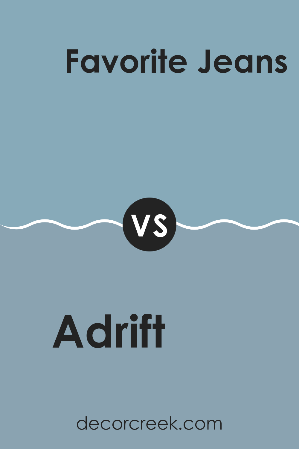
Adrift SW 7608 by Sherwin Williams vs Favorite Jeans SW 9147 by Sherwin Williams
Adrift and Favorite Jeans by Sherwin Williams are two distinct blue hues that can give different vibes to a room. Adrift is a muted, grayish blue that carries a calm and understated feel, making it ideal for creating a relaxed atmosphere in rooms like bedrooms or bathrooms. It also pairs well with soft neutrals for a gentle, soothing palette.
On the other hand, Favorite Jeans is a deeper, more vibrant blue. This color resembles the classic blue of denim and has a more lively and cheerful energy. It can add a pop of color in rooms that benefit from some brightness, such as kitchens or playrooms. This hue works nicely with crisp whites or even some bolder colors like yellows or reds.
Both colors offer unique options depending on what feel you’re aiming for in a room. Whether you want a soft backdrop or a cheerful statement, these colors provide adaptable choices.
You can see recommended paint color below:
- SW 9147 Favorite Jeans
Adrift SW 7608 by Sherwin Williams vs Faded Flaxflower SW 9146 by Sherwin Williams
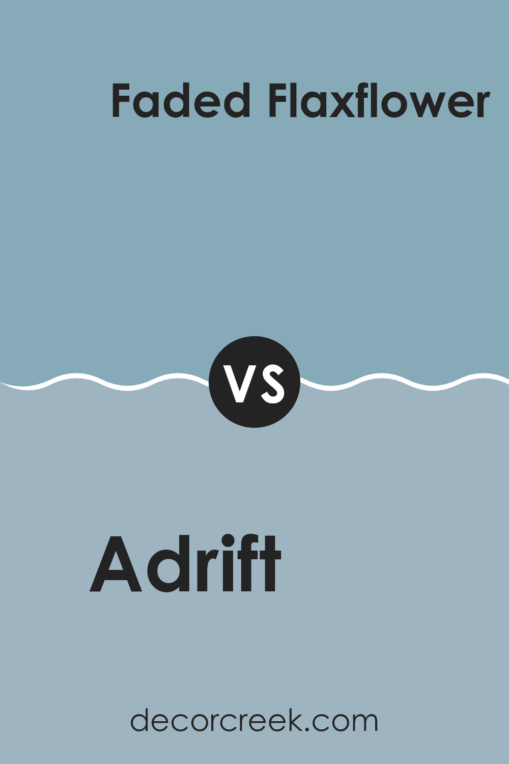
Adrift SW 7608 and Faded Flaxflower SW 9146, both by Sherwin Williams, present unique color tones. Adrift is a deep, greyish-blue shade, resembling the color of a stormy sea at dusk. It brings a strong, calm feeling to rooms, making it an excellent choice for creating a peaceful yet robust atmosphere.
On the other hand, Faded Flaxflower is lighter, featuring a soft, muted blue with hints of grey. This color is adaptable and gentle, providing a calming effect but with a more subdued presence compared to Adrift. It suits well for brightening up a room without being too bold with color intensity.
When comparing the two, Adrift stands out as a bolder choice, ideal for focal points or accent walls, while Faded Flaxflower works beautifully as a background color, complementing furniture and decor with its lighter, soothing tones. Both colors support design styles that favor calmness and gentleness, but their intensity levels differ significantly.
You can see recommended paint color below:
- SW 9146 Faded Flaxflower
Adrift SW 7608 by Sherwin Williams vs Meditative SW 6227 by Sherwin Williams
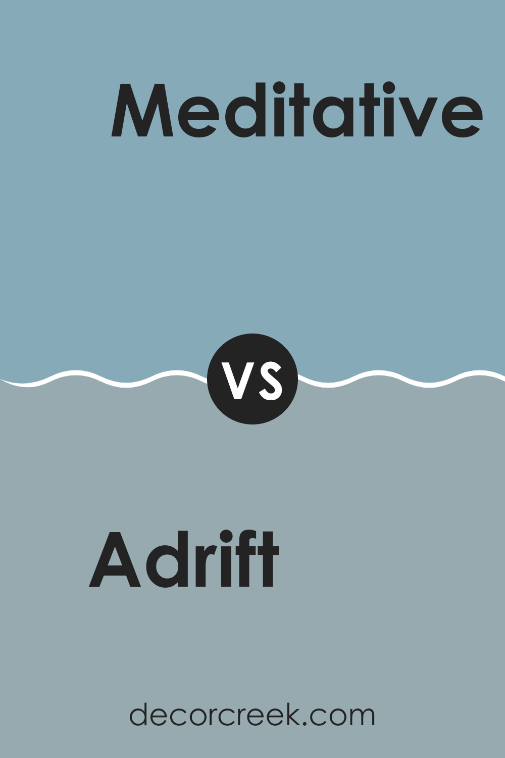
Adrift SW 7608 and Meditative SW 6227, both by Sherwin Williams, offer unique shades of blue that can change the feel of any room. Adrift is a darker, richer blue that seems almost like a stormy sea. It’s a strong color that can make a bold statement in a room, especially when used on a feature wall or in a cozy room like a study or bedroom.
On the other hand, Meditative is a lighter, softer blue. It has a calming presence which makes it ideal for places where you want to relax, such as bathrooms or bedrooms. It’s less intense than Adrift, providing a gentle backdrop that easily pairs with many decor styles and colors.
Both colors work well in different settings depending on the mood you want to create. Adrift commands attention with its depth while Meditative offers a gentle touch, perfect for a peaceful environment.
You can see recommended paint color below:
- SW 6227 Meditative
Adrift SW 7608 by Sherwin Williams vs Respite SW 6514 by Sherwin Williams
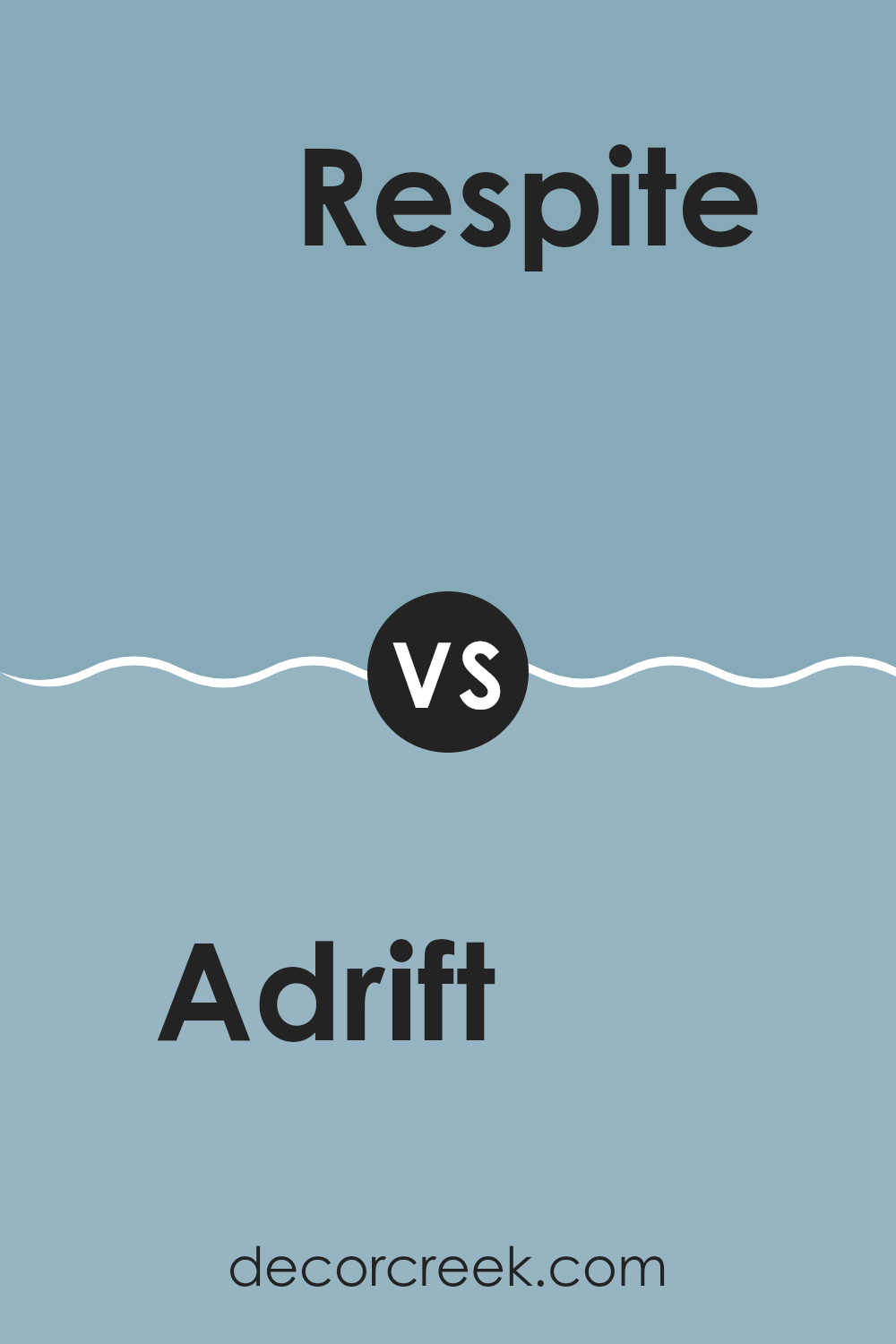
Adrift SW 7608 and Respite SW 6514, both by Sherwin Williams, present soothing tones but differ in their shades and mood-setting capabilities. Adrift registers as a deep, smoky blue with grey undertones, providing a solid, calming effect ideal for creating a grounded and stable feel in a room. This color works well in rooms meant for relaxation or focused work.
In contrast, Respite is a lighter, airy blue with a refreshing vibe, invoking feelings of a gentle, clear sky on a sunny day. It is softer and tends to open up a room, making it feel more expansive and inviting. This color is perfect for bedrooms, bathrooms, or areas where a light, refreshing feel is desired.
Together, these colors could complement each other well in a color scheme, with Adrift offering depth and grounding, and Respite providing a lift and lightness to the overall palette.
You can see recommended paint color below:
- SW 6514 Respite
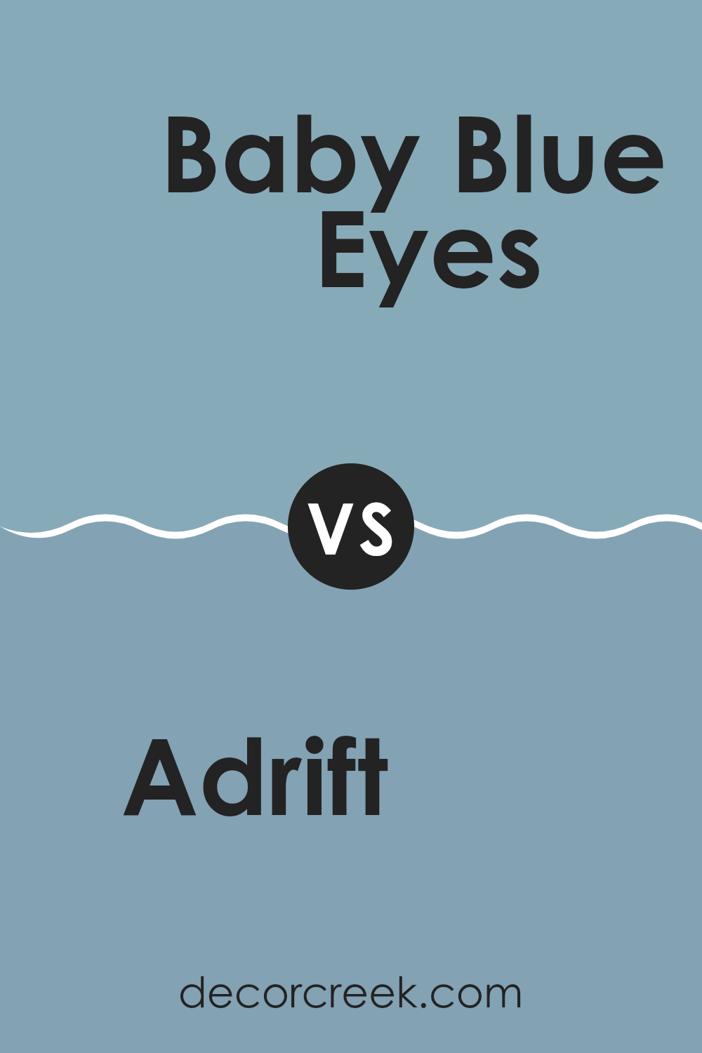
Adrift SW 7608 by Sherwin Williams vs Baby Blue Eyes SW 9070 by Sherwin Williams
Adrift and Baby Blue Eyes, both by Sherwin Williams, offer distinctly different vibes for any room. Adrift is a deep, grayish blue, which brings a stable and calm feeling to a room, almost like a quiet evening sky. It’s a mature color that works well in a study or bedroom, providing a backdrop that’s both grounding and subtle.
On the other hand, Baby Blue Eyes is a much lighter and softer shade of blue. It has a gentle and welcoming feel, perfect for creating a cheerful and airy atmosphere. This color is ideal for rooms like nurseries or light-filled sunrooms, where you want to foster a sense of freshness and uplift.
Comparing the two, Adrift serves as a more reserved and muted option, while Baby Blue Eyes offers a brighter and more playful approach. Either choice depends on the mood and function you wish to achieve in your room.
You can see recommended paint color below:
- SW 9070 Baby Blue Eyes
After reading about SW 7608 Adrift by Sherwin Williams, I learned that this paint color is a beautiful gray-blue that can make any room feel calm and inviting. It’s like looking at the ocean or the sky during a cool, early morning.
This color can work well in a bedroom where you want to relax, or even in a living room to make it look more inviting. What’s great about Adrift is that it doesn’t scream for attention but gently adds a touch of style to the walls. It also matches well with a lot of other colors, which means it’s pretty easy to find things like curtains, pillows, and rugs that look perfect with it.
From everything I read, Adrift seems like a wonderful choice if you want to freshen up a room without making things too bright or too dark. It’s a color that makes a room feel just right. So, if someone asked me whether they should use SW 7608 Adrift for their next painting project, I’d say go for it, it seems like a sure shot way to make your room look good!
decorcreek.com
Ever wished paint sampling was as easy as sticking a sticker? Guess what? Now it is! Discover Samplize's unique Peel & Stick samples.
Get paint samples