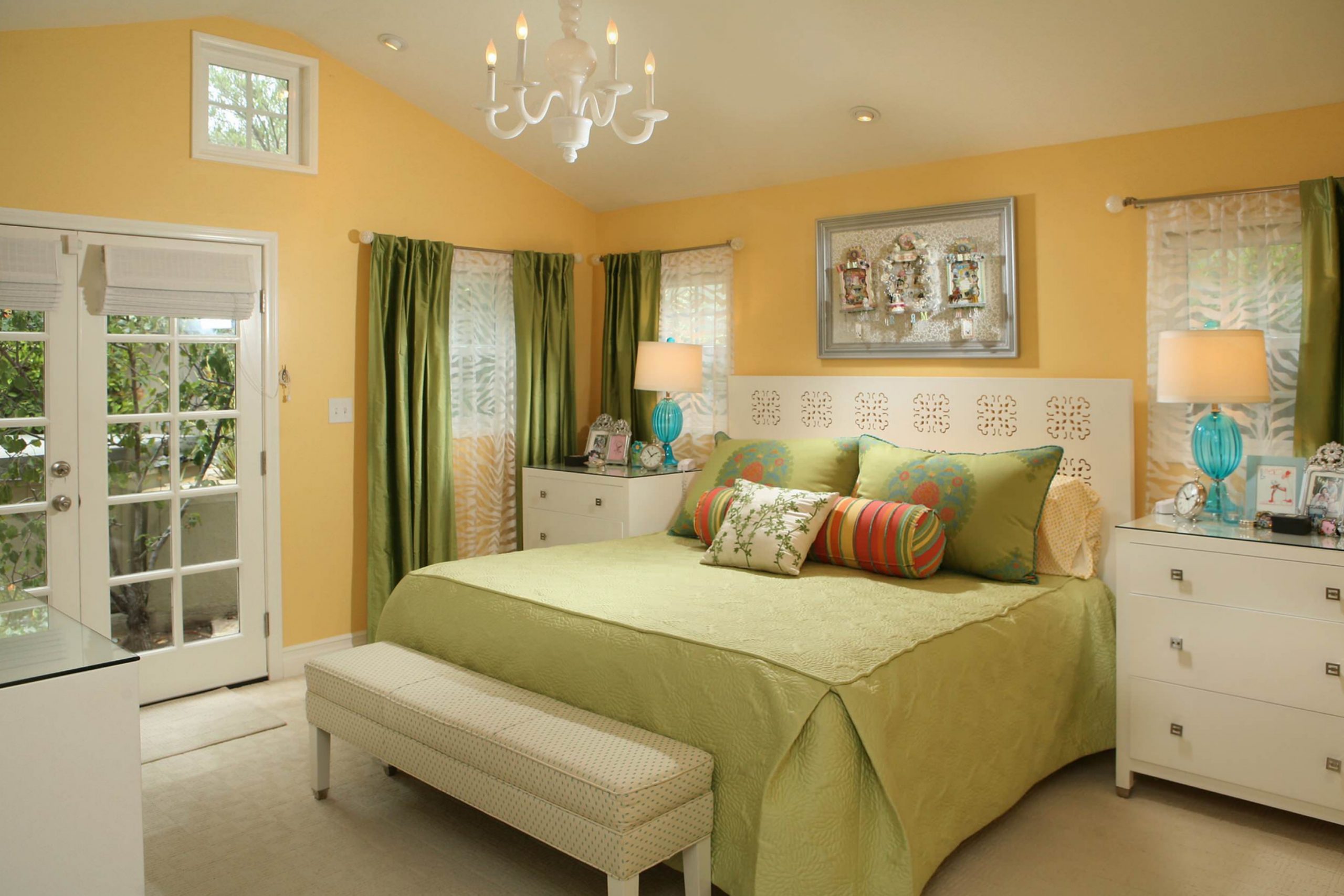
There’s something magical about finding the right color for a room. When choosing a paint color, I stumbled upon SW 6667 Afterglow by Sherwin Williams. This warm and inviting shade immediately caught my attention. Warm honey tones with a gentle golden undertone invite you into its comforting embrace, perfect for creating a cozy and welcoming space.
SW 6667 Afterglow isn’t just a color; it is like the soft, golden light of a sunset filling your room with warmth and peace. It brings to life any space it touches, making it an ideal choice for living rooms, bedrooms, or even a welcoming hallway.
The color exudes a sense of calmness and comfort, turning your space into a haven where you can unwind after a long day.
What stood out is the remarkable versatility of this hue. Afterglow pairs seamlessly with a variety of decor styles, from traditional to modern.
It complements natural materials like wood and stone beautifully or provides a gentle contrast to cool-toned furnishings. With SW 6667 Afterglow, your room feels lively, yet grounded, turning any space into a soothing retreat.
What Color Is Afterglow SW 6667 by Sherwin Williams?
Afterglow by Sherwin Williams is a warm, golden color that brings a sunny and inviting feel to any room. This rich hue resembles a gentle, sunlit glow, like the calming late afternoon light that bathes a room in warmth. It can brighten up spaces without being overpowering, making it a versatile choice for different areas in the home.
This color works well in cozy, rustic interiors where natural elements are prominent. It enhances farmhouse styles by complementing wood accents and earthy tones, creating a harmonious and welcoming atmosphere.
Afterglow also fits in well with bohemian designs, where its warmth pairs nicely with woven textures and layered textiles.
For materials and textures, Afterglow looks stunning against natural wood, especially medium to dark-toned finishes. It also works beautifully with rattan and wicker, adding a touch of warmth and comfort.
Terracotta tiles or accents can further highlight its golden undertones. Incorporating soft fabrics like cotton, linen, or wool in neutral shades can create a balanced look.
In modern settings, Afterglow adds a pop of color that isn’t too bold, but still enough to bring life to minimalist spaces. It pairs well with metals like brass and copper, adding a bit of shine and sophistication without being overwhelming.
Is Afterglow SW 6667 by Sherwin Williams Warm or Cool color?
Afterglow (SW 6667) by Sherwin Williams is a warm and inviting color that brings a cozy atmosphere to any home. This soft orange hue combines a gentle brightness with a subtle earthiness, making it versatile for many spaces. Its warm tones can make a living room feel more welcoming and comfortable, or add a cheerful touch to a kitchen.
In bedrooms, Afterglow creates a peaceful and cozy environment, perfect for relaxation.
The color pairs well with both neutral shades and bolder colors. You can match it with cream or beige for a soft, harmonious look, or couple it with navy or teal for a more striking contrast. Light can influence how Afterglow appears; in natural light, it may seem brighter and more vibrant, while in dimmer settings, the color might come across as softer and more subdued.
Overall, Afterglow is a versatile choice that adds warmth and personality to home interiors.
Undertones of Afterglow SW 6667 by Sherwin Williams
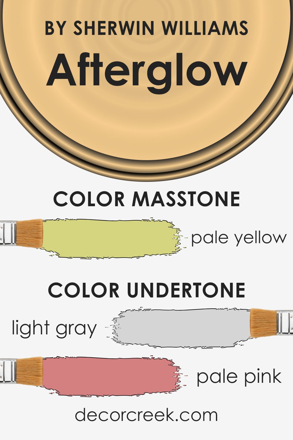
Afterglow, by Sherwin Williams, is a paint color with a mix of intriguing undertones that influence its appearance. This shade combines hints of light gray, pale pink, yellow, purple, mint, orange, blue, gray, light green, lilac, and olive. These undertones affect how Afterglow looks in various settings, as different lighting can bring out specific tones.
When viewed in natural light, Afterglow might appear warmer because of its yellow and orange undertones, creating a cozy and inviting feeling. In artificial light, the purple, mint, and lilac tones might stand out, giving the space a more relaxed and gentle appearance.
On interior walls, these undertones help Afterglow harmonize with a wide range of furnishings and decor. The light gray and pale pink create a soft background that can match well with both modern and traditional styles. Meanwhile, the subtle mint and light blue offer a refreshing vibe that may make small spaces feel larger and more open.
The presence of these undertones means Afterglow can complement both bold and soft color accents, making it a versatile choice for any room in the house.
Homeowners have the flexibility to decorate with various colors and textures, knowing that Afterglow will blend seamlessly with different design elements.
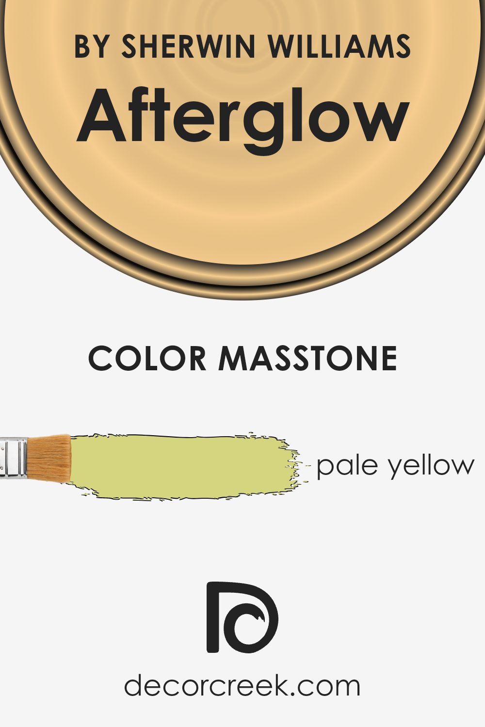
What is the Masstone of the Afterglow SW 6667 by Sherwin Williams?
Afterglow SW 6667 by Sherwin Williams is a pale yellow (#D5D580) that brings a cheerful and warm feeling to any home. Its soft tone is gentle and inviting, making spaces feel bright and airy without being too overpowering.
This color works well in areas where you want to create an upbeat and lively atmosphere, such as kitchens or living rooms, where natural light can enhance its warm undertones.
Because it is a subtle shade of yellow, it can also create a cozy and comfortable environment, perfect for rooms where you want to relax, like bedrooms.
It complements both light and dark furniture, adding a touch of warmth that can balance cooler tones in your decor.
Additionally, it pairs nicely with white trim, offering a clean and crisp contrast. Whether used on one accent wall or throughout a room, this pale yellow can lighten a room’s mood and create a welcoming space.
How Does Lighting Affect Afterglow SW 6667 by Sherwin Williams?
Lighting plays a significant role in how colors appear in a space. Different types of lighting can change the way we perceive a color, sometimes making it look lighter, darker, or even a different hue than it really is.
Consider the color Afterglow (SW 6667) by Sherwin Williams. This is a warm, peachy color with a hint of orange. In natural light, especially under the bright midday sun, Afterglow appears vivid and true to its warm tone. However, in artificial lighting, its appearance can change.
Under incandescent lights, which are warmer, the color may look more intense, highlighting its orange and red undertones. In contrast, under fluorescent lighting, which tends to be cooler, Afterglow might appear a bit more muted and less vibrant.
The orientation of a room also affects how Afterglow looks. In north-facing rooms, which typically have cooler and less intense light, Afterglow may seem a little duller, picking up more of its earthy tones.
It can provide a cozy feeling but might lack the bright warmth that it displays in brighter light.
South-facing rooms have strong, warm light throughout the day. Here, Afterglow can look its brightest and most dynamic. The color’s warm undertones are highlighted, making the room feel lively and inviting.
In east-facing rooms, the morning light is soft and warm. Afterglow will appear brighter and more energetic in the morning but can become softer and muted as the day progresses and natural light decreases.
West-facing rooms receive warm light in the afternoon and evening. During these times, Afterglow will again appear vibrant and lively, enhancing its warm tones. Earlier in the day, when sunlight is less direct, the color might seem more subdued.
In summary, Afterglow’s appearance shifts with lighting conditions and room orientation, demonstrating the importance of lighting in color perception.

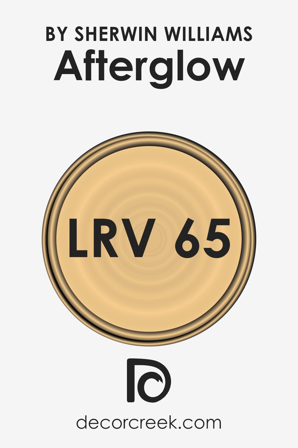
What is the LRV of Afterglow SW 6667 by Sherwin Williams?
LRV stands for Light Reflectance Value, and it measures the percentage of light a paint color reflects. The scale goes from 0 to 100, with 0 being absolute black (no light reflected) and 100 being pure white (all light reflected).
When you pick a paint color, knowing its LRV helps you understand how it might look in your space.
A higher LRV means the color will reflect more light, making the room feel brighter and perhaps even larger. Conversely, a lower LRV means the color absorbs more light, which can make a space feel smaller or more cozy.
For Afterglow by Sherwin Williams, with an LRV of 65.166, it sits towards the brighter side of the spectrum.
This means Afterglow reflects a fair amount of light. In a room with natural light, this color can help make the space feel open and airy, enhancing lightness and warmth. It’s neither too dark nor too light, striking a balance that works well in various settings. If your room doesn’t get much natural sunlight, this LRV value suggests the color can still brighten the area, improving light without overpowering with brightness.
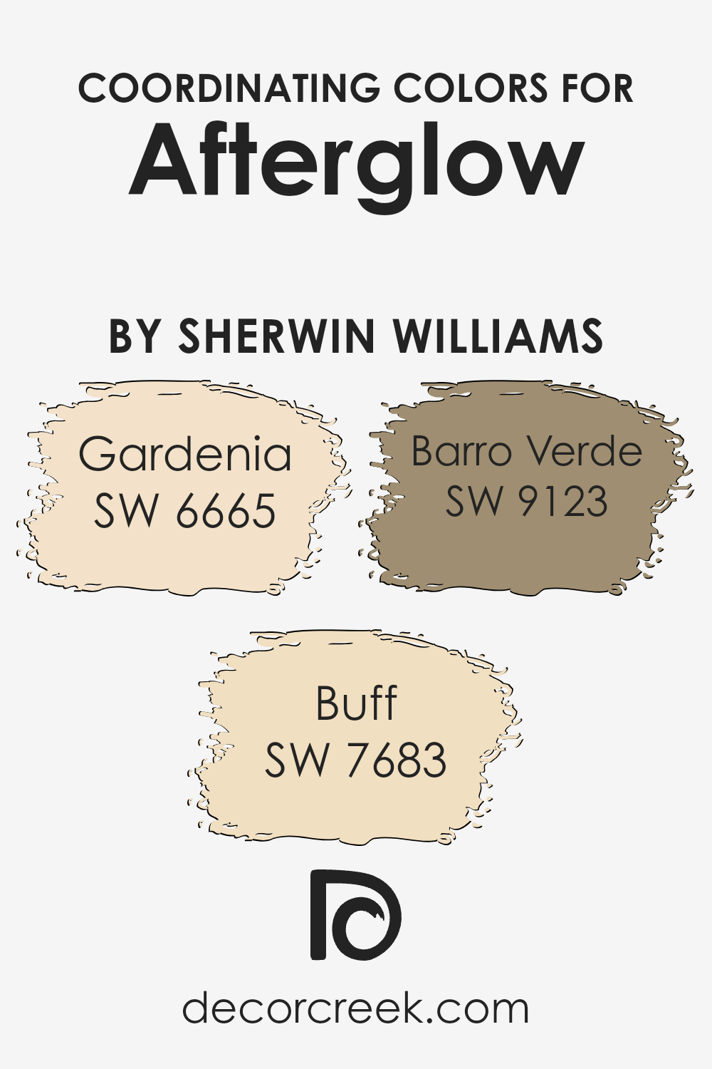
Coordinating Colors of Afterglow SW 6667 by Sherwin Williams
Coordinating colors are hues selected to complement a primary color in a space, creating a balanced and cohesive look. These colors work in harmony, enhancing the overall design while maintaining visual interest. For example, the warm and inviting Afterglow by Sherwin Williams can be paired with soft and subtle tones to bring out its rich character without overwhelming a room.
Gardenia, a creamy and neutral tone, pairs effortlessly with Afterglow. It adds an element of brightness and warmth, making spaces feel open and welcoming. Buff is an earthy and muted tan that complements the depth of Afterglow, offering an understated elegance to interiors.
This color can add a sense of grounding and comfort. Barro Verde brings a soft touch of nature with its gentle green hue. It infuses a space with a hint of freshness, perfectly rounding out the palette.
These coordinating colors make it easy to create a versatile and harmonious setting that enhances any design style.
You can see recommended paint colors below:
- SW 6665 Gardenia
- SW 7683 Buff
- SW 9123 Barro Verde
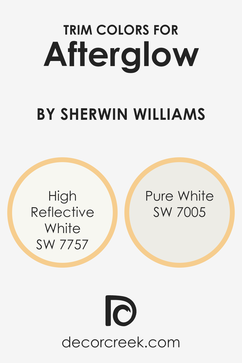
What are the Trim colors of Afterglow SW 6667 by Sherwin Williams?
Trim colors are the paint colors used on the edges and borders of walls, ceilings, and other architectural features, providing a frame for the main wall color. When using Afterglow SW 6667 by Sherwin Williams, choosing the right trim color is essential to create a balanced and appealing look.
Trim colors can either contrast with or complement the main wall color, and they play an important role in setting the overall tone of a space. In the case of Afterglow, which is a warm, gentle hue, selecting your trim colors thoughtfully can enhance the dimensions of the room and define spaces more clearly.
High Reflective White and Pure White are both great options to pair with Afterglow, offering clean and crisp borders that highlight the warm tones of the walls.
High Reflective White, as the name suggests, is a bright, pure white that reflects a lot of light, making spaces feel open and airy.
It gives a modern and fresh look that pairs well with warmer colors like Afterglow by creating a balanced contrast. On the other hand, Pure White is softer and slightly warmer in tone, adding a subtle coziness while still remaining clean.
This choice can provide a gentle and seamless transition between the wall and trim, perfect for those looking for a less stark contrast.
Both trim colors contribute to framing the room beautifully and bringing out the best in the Afterglow hue through their crisp and neat finish.
You can see recommended paint colors below:
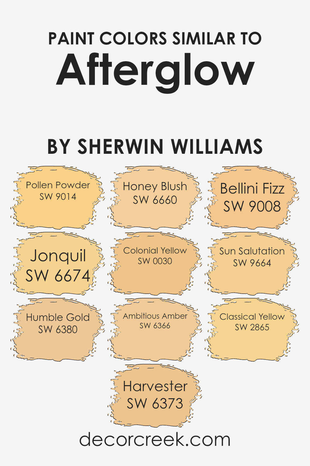
Colors Similar to Afterglow SW 6667 by Sherwin Williams
Using similar colors is important because they create a harmonious and cohesive look in any space. These colors naturally complement each other, making the overall design feel more balanced and pleasing to the eye.
For instance, when we think of Afterglow by Sherwin Williams, a warm and inviting hue, similar shades like Pollen Powder and Jonquil come to mind. Pollen Powder offers a soft, gentle yellow that feels refreshing and light. Jonquil adds a slightly brighter touch, bringing a cheerful and uplifting vibe to the room.
Humble Gold brings warmth and depth, resembling the richness of a golden sunset. Harvester offers a more muted yellow, reminiscent of ripe harvest fields. Honey Blush has a cozy and comforting quality with its subtle honey undertone. Colonial Yellow is a classic, timeless shade that adds a hint of nostalgia.
Ambitious Amber provides a deep, radiant amber tone that catches the eye.
Bellini Fizz and Sun Salutation both add a lively, sunny sparkle to the palette, while Classical Yellow offers a traditional feel, grounding the brighter hues. Together, these colors highlight the beauty of Afterglow, showing how similar tones can enhance one another and create a vibrant, inviting atmosphere.
You can see recommended paint colors below:
- SW 9014 Pollen Powder
- SW 6674 Jonquil
- SW 6380 Humble Gold
- SW 6373 Harvester
- SW 6660 Honey Blush
- SW 0030 Colonial Yellow
- SW 6366 Ambitious Amber
- SW 9008 Bellini Fizz
- SW 9664 Sun Salutation
- SW 2865 Classical Yellow
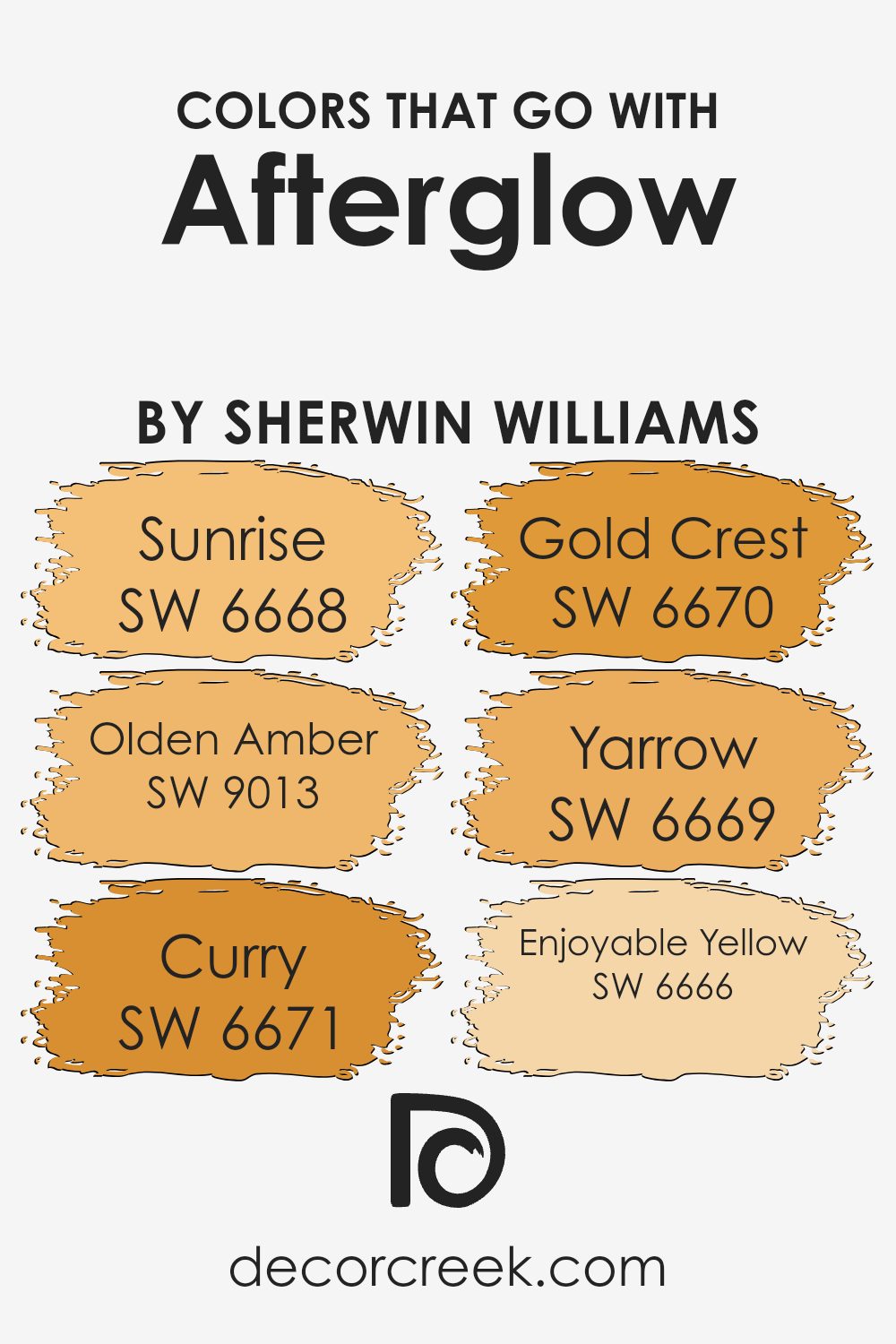
Colors that Go With Afterglow SW 6667 by Sherwin Williams
When decorating a room with Afterglow SW 6667 by Sherwin Williams, it’s essential to choose colors that harmonize beautifully to create a pleasing atmosphere. Colors like SW 6668 – Sunrise and SW 9013 – Olden Amber complement Afterglow well.
Sunrise offers a warm, peachy tone that enhances the soft glow of Afterglow, while Olden Amber adds a slightly deeper golden hue that brings a touch of earthy richness to the palette. These colors together create an inviting and cozy environment that feels both lively and comfortable.
Moving on to SW 6671 – Curry and SW 6670 – Gold Crest, these shades introduce vibrant yellow tones that can boost the energy of a room. Curry adds a spicy, mustard-like shade that can make any space feel bright and cheerful, while Gold Crest provides a slightly muted yellow, balancing the palette with subtle warmth.
SW 6669 – Yarrow and SW 6666 – Enjoyable Yellow round out the color scheme with joyful tones.
Yarrow is a bold, sunny yellow that can add an energetic punch, which is perfect for areas needing a lively touch. Meanwhile, Enjoyable Yellow brings a softer, pleasant yellow that blends well with Afterglow, creating a harmonious and cheerful setting that’s easy to enjoy.
You can see recommended paint colors below:
- SW 6668 Sunrise
- SW 9013 Olden Amber
- SW 6671 Curry
- SW 6670 Gold Crest
- SW 6669 Yarrow
- SW 6666 Enjoyable Yellow
How to Use Afterglow SW 6667 by Sherwin Williams In Your Home?
Afterglow SW 6667 by Sherwin Williams is a warm, sunny shade of yellow that can brighten any space in your home. This cheerful color works well in areas where you want to create an inviting and energetic atmosphere.
For instance, painting the walls of a kitchen or dining room in Afterglow can make the space feel lively and welcoming, perfect for family gatherings or casual meals. In a living room, it can create a vibrant backdrop that complements both modern and classic furnishings.
For those who enjoy a bit of creativity, Afterglow can be paired with neutral colors like white or beige for a balanced look. It also pairs nicely with natural wood tones, adding a fresh and contemporary touch. In a child’s bedroom, this lively color can stimulate playfulness and creativity. Adding Afterglow accents through accessories or furniture is an easy way to bring a touch of sunshine indoors.
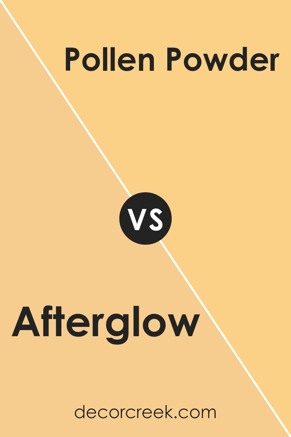
Afterglow SW 6667 by Sherwin Williams vs Pollen Powder SW 9014 by Sherwin Williams
Afterglow SW 6667 by Sherwin Williams is a warm and inviting orange hue. It exudes a sense of comfort and energy, making it a great choice for creating a lively atmosphere in a room. This color can brighten up any space and works well in areas meant for socializing or entertainment.
On the other hand, Pollen Powder SW 9014 by Sherwin Williams is a soft, muted yellow. It is gentle on the eyes and brings a subtle cheerfulness to a room. This color is perfect for spaces where you want a light and airy feeling without overwhelming brightness.
When comparing these two colors, Afterglow has a more vibrant and bold presence, while Pollen Powder offers a calm and mellow vibe. Both colors can bring warmth to a room, but the choice between them depends on whether you prefer the boldness of orange or the softness of yellow.
You can see recommended paint color below:
- SW 9014 Pollen Powder
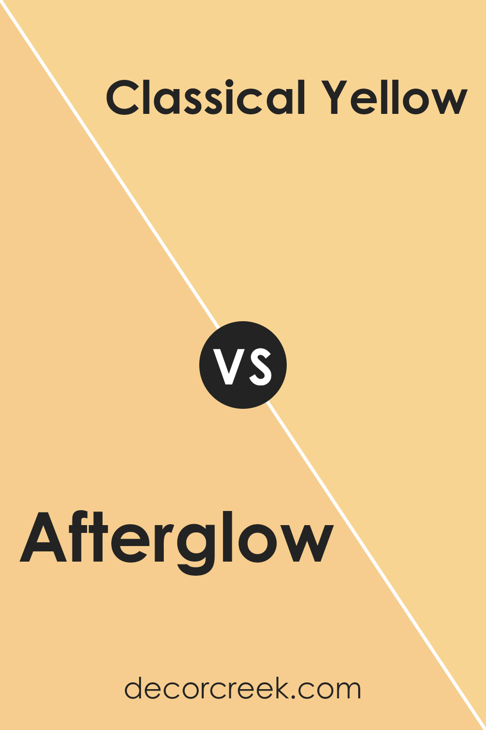
Afterglow SW 6667 by Sherwin Williams vs Classical Yellow SW 2865 by Sherwin Williams
Afterglow (SW 6667) and Classical Yellow (SW 2865) are both cheerful and warm colors by Sherwin Williams that can brighten up a space. Afterglow is a soft, muted shade of orange with a hint of pink, giving it a cozy, sunset vibe. It feels warm and inviting, perfect for spaces where you want to create a relaxed and welcoming atmosphere.
On the other hand, Classical Yellow is a more traditional and straightforward yellow, reminiscent of sunflowers or early morning sunshine.
It’s vibrant and cheerful, making it ideal for spaces where you want to add a burst of energy or happiness. While both colors are bright and warm, Afterglow leans towards a subtler, softer tone, whereas Classical Yellow is more vivid and attention-grabbing. These colors can stand alone or complement each other, depending on the desired mood and effect in a room.
You can see recommended paint color below:
- SW 2865 Classical Yellow
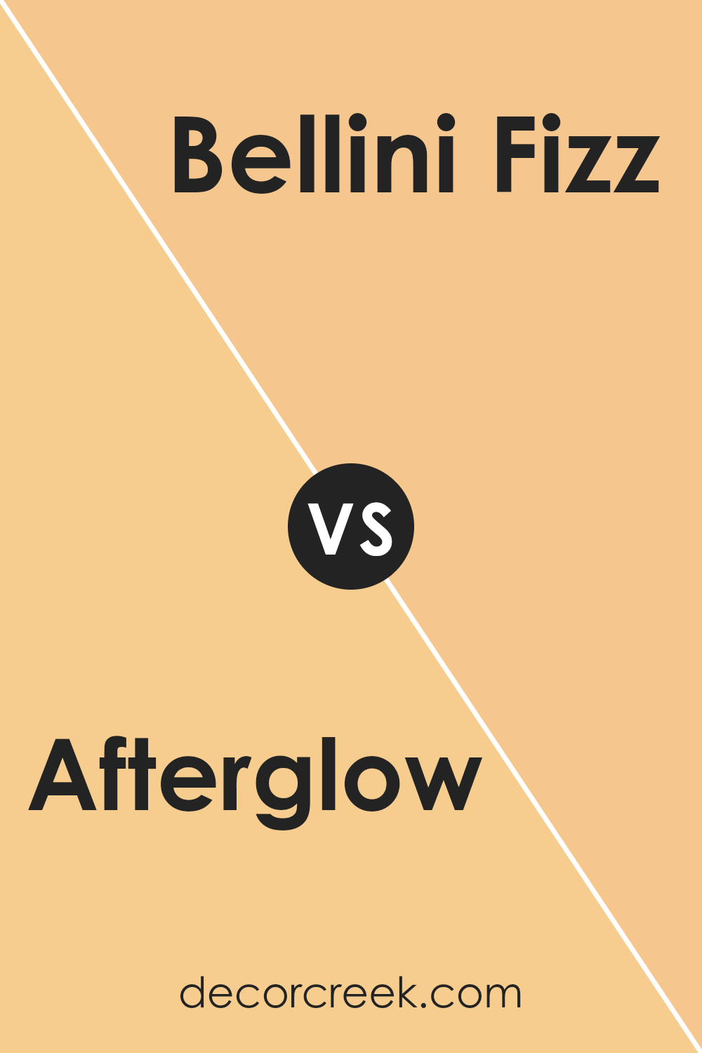
Afterglow SW 6667 by Sherwin Williams vs Bellini Fizz SW 9008 by Sherwin Williams
Afterglow SW 6667 and Bellini Fizz SW 9008, both by Sherwin Williams, are warm, inviting colors that can add a cozy feel to any space. Afterglow is a rich, golden hue with a hint of orange, often associated with sunsets. It brings warmth and vibrancy, making it suitable for living rooms or dining areas where a lively atmosphere is desired.
On the other hand, Bellini Fizz is a softer, peachy tone that exudes a gentle warmth. It’s perfect for spaces where you want a light and fresh feel, like a bedroom or a bathroom.
While both colors share a warm undertone, Afterglow is bolder and more intense, while Bellini Fizz creates a more subtle and relaxed ambiance.
Together, they can complement each other well if you want to create a balanced yet warm look in your home.
You can see recommended paint color below:
- SW 9008 Bellini Fizz
Afterglow SW 6667 by Sherwin Williams vs Honey Blush SW 6660 by Sherwin Williams
Afterglow SW 6667 and Honey Blush SW 6660 are two warm and inviting colors from Sherwin Williams. Afterglow is a vibrant, cheerful orange with hints of yellow, making it feel warm and sunny. It’s bright and energetic, perfect for adding a lively touch to a room.
On the other hand, Honey Blush is a softer, more subdued orange with undertones of beige. This makes it feel cozy and comforting, lending a soothing atmosphere to any space.
If you’re looking to create an energizing and cheerful environment, Afterglow is an excellent choice. It brings a lively vibe that can brighten a space. Meanwhile, Honey Blush is ideal for those who prefer a more subtle and warm ambiance. It offers a gentle, calming effect without overwhelming a room.
Both colors can enhance a space but offer different moods—lively energy versus gentle warmth.
You can see recommended paint color below:
- SW 6660 Honey Blush
Afterglow SW 6667 by Sherwin Williams vs Ambitious Amber SW 6366 by Sherwin Williams
Afterglow SW 6667 and Ambitious Amber SW 6366 are two warm, inviting colors from Sherwin Williams that bring different vibes to a space. Afterglow is a soft, golden hue with a hint of orange, reminiscent of a peaceful sunset or the gentle glow of candlelight.
It’s warm and comforting, making it perfect for creating a cozy atmosphere in living rooms or bedrooms. On the other hand, Ambitious Amber is a bolder, more vibrant yellow-orange shade.
It is energetic and bright, making it an excellent choice for spaces that need a cheerful and lively touch, such as kitchens or playrooms. While both colors reflect warmth, Afterglow offers subtlety and relaxation, whereas Ambitious Amber injects a burst of sunny enthusiasm.
When choosing between the two, consider the mood and energy you want to bring into your space. Both shades effectively add warmth but in distinct ways.
You can see recommended paint color below:
- SW 6366 Ambitious Amber
Afterglow SW 6667 by Sherwin Williams vs Colonial Yellow SW 0030 by Sherwin Williams
Afterglow SW 6667 by Sherwin Williams is a warm, peachy color with hints of orange and pink. It’s a soft, inviting hue that adds a cozy feel to any space. It works well in living rooms, dining areas, or bedrooms, where you want a touch of warmth and comfort.
Colonial Yellow SW 0030, on the other hand, is a more traditional shade of yellow. It’s lively, cheerful, and slightly muted, making it perfect for kitchens or playrooms. This yellow brings a sense of brightness and energy without being too bold or overwhelming.
When compared, Afterglow leans towards a more subdued and calming vibe, whereas Colonial Yellow is more vibrant and uplifting. Both colors can enhance a room’s atmosphere, but the choice depends on whether you prefer the gentle warmth of Afterglow or the sunny brightness of Colonial Yellow. Each color offers its own charm and can be paired with neutral tones for a balanced look.
You can see recommended paint color below:
- SW 0030 Colonial Yellow
Afterglow SW 6667 by Sherwin Williams vs Jonquil SW 6674 by Sherwin Williams
Afterglow SW 6667 and Jonquil SW 6674 are both colors offered by Sherwin Williams, but they offer distinct vibes for a space. Afterglow is a warm and cozy color, resembling a rich, golden yellow. It brings to mind the warm light during sunset, creating an inviting and comfortable atmosphere.
On the other hand, Jonquil is a lighter, brighter shade of yellow. It has a sunnier feel, reminiscent of a fresh spring morning. This color can make a room feel cheerful and lively, promoting a sense of joy and freshness.
When comparing the two, Afterglow might be chosen for spaces where a more calming, soothing environment is desired, while Jonquil could be perfect for areas where energy and brightness are needed. Both colors have their unique charm, with Afterglow providing warmth and coziness, and Jonquil offering lightness and happiness.
You can see recommended paint color below:
- SW 6674 Jonquil
Afterglow SW 6667 by Sherwin Williams vs Sun Salutation SW 9664 by Sherwin Williams
Afterglow SW 6667 and Sun Salutation SW 9664 are both warm, inviting colors by Sherwin Williams, but they have distinct personalities. Afterglow is a soft, muted shade of orange with hints of peach, creating a cozy and welcoming atmosphere. It’s like the gentle light of a setting sun, making any space feel warm and comforting.
On the other hand, Sun Salutation is a brighter, more energizing yellow-orange. This color is full of life and vibrancy, bringing a sunny and cheerful feel to a room. It’s perfect for spaces where you want to add a touch of brightness and optimism.
While Afterglow leans towards a subtle and calm ambiance, Sun Salutation is more bold and uplifting. Both colors can make a room feel alive and warm, but with different intensities and effects, depending on the mood you want to create.
You can see recommended paint color below:
- SW 9664 Sun Salutation
Afterglow SW 6667 by Sherwin Williams vs Humble Gold SW 6380 by Sherwin Williams
Afterglow SW 6667 and Humble Gold SW 6380 by Sherwin Williams are two warm and inviting colors with distinct characteristics. Afterglow is a rich, warm orange with a hint of coral, giving it an energetic and lively vibe. It’s often associated with warmth and can create a cheerful and vibrant atmosphere in any room.
On the other hand, Humble Gold is a soft golden yellow that brings a sense of coziness and comfort. It has a more muted tone compared to Afterglow, making it ideal for spaces where you want a warm but subtle backdrop. Humble Gold’s gentle color can create a soothing atmosphere.
When comparing the two, Afterglow is bolder and more dynamic, perfect for accent walls or areas where you want to make a statement. Humble Gold is softer and more relaxed, making it suitable for creating a warm, inviting feel without being overpowering. Both colors have their unique charm and can enhance different interior styles.
You can see recommended paint color below:
- SW 6380 Humble Gold
Afterglow SW 6667 by Sherwin Williams vs Harvester SW 6373 by Sherwin Williams
Afterglow SW 6667 by Sherwin Williams is a warm, vibrant yellow with subtle orange undertones, making it lively and inviting. It’s a color that can add energy and warmth to a room, perfect for brightening up spaces or creating a cheery atmosphere.
On the other hand, Harvester SW 6373 is also a warm shade but leans more towards a soft, sunny yellow. Harvester is slightly lighter and less intense than Afterglow, offering a more understated, gentle glow.
This makes Harvester ideal for spaces where you want to introduce warmth without it being too overpowering.
While both colors are sunny and uplifting, Afterglow makes a bold statement with its orangey hints, whereas Harvester provides a more subtle, mellow effect.
Depending on the desired mood and intensity, you can choose Afterglow for a punchier, energetic feel or Harvester for a softer, laid-back vibe.
You can see recommended paint color below:
- SW 6373 Harvester
Conclusion
It’s a bright and warm shade of yellow that reminds me of a sunny day or the first rays of sunshine in the morning.
This color can make a room feel cheerful and welcoming. I can imagine using it in a living room or a kitchen where I want the space to feel lively and full of energy.
Not only does it look good on walls, but it can also be fun to use on cabinets or even furniture. It’s a color that can make other decorations stand out because it pairs nicely with many different shades, like whites, browns, or even blues.
By bringing this color into my home, I can create a happy and positive atmosphere.
It’s like having a piece of the sun indoors, making everyday moments feel a little brighter. I think SW 6667 Afterglow is a great choice when I want to bring a touch of warmth and happiness to my surroundings. It’s amazing how just a splash of a new color can change things and put a smile on my face!
Ever wished paint sampling was as easy as sticking a sticker? Guess what? Now it is! Discover Samplize's unique Peel & Stick samples.
Get paint samples

