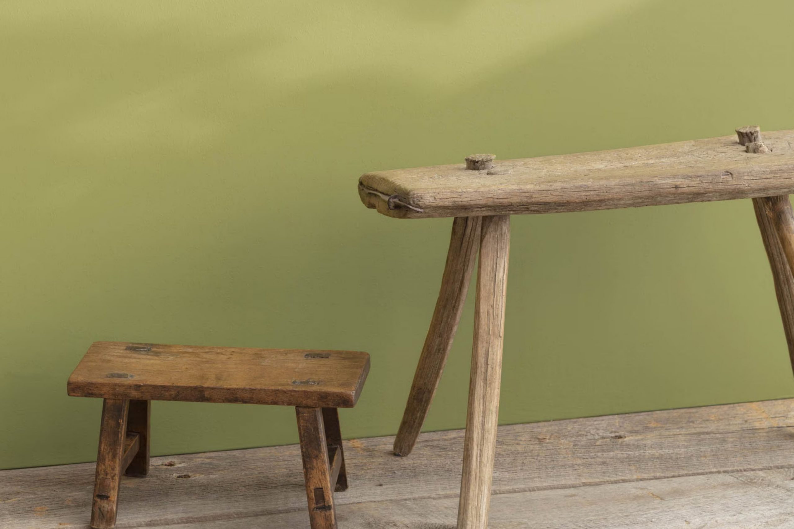
When you first glance at AF-420 Agave from Benjamin Moore, it strikes you as more than just a color; it’s a gentle whisper of calm and freshness for your walls. Imagine changing your room into a peaceful escape, where the soothing essence of this unique shade brings a soft, natural elegance to your living area.
Choosing the right color can often feel daunting, but Agave offers a flexible palette that works beautifully with both modern and traditional decor. Its subtle green tones can create a sense of harmony and freshness, making it an excellent choice for your kitchen, bathroom, or anywhere you want to introduce a touch of nature’s calmness.
Whether you aim to repaint a single room or are planning a larger renovation, Agave provides a classic backdrop that enhances the aesthetics of your furniture and decorations without overpowering them.
It’s a color that agrees with light and shifts gently across different times of the day, giving your room a dynamic yet consistent charm. In your journey to personalize your home, Agave stands out as a thoughtful and refined choice that could fulfill your desire for design that feels both refreshing and comforting.
What Color Is Agave AF-420 by Benjamin Moore?
Agave AF-420 by Benjamin Moore is a unique green hue with a hint of blue, making it fresh and vibrant. It’s a medium-toned color that brings a calm yet cheerful vibe to any room. This shade resembles the natural tones of the agave plant, offering a touch of nature’s beauty indoors.
This color works wonderfully in a variety of interior styles, particularly modern, coastal, and boho designs. In modern settings, Agave AF-420 introduces a pop of color that is neither too strong nor too subtle. It fits beautifully in coastal themes, complementing light blues and sandy neutrals to create a relaxed, beachy feel. For boho-styled rooms, it pairs well with warm earth tones and rich textures, adding depth and a sense of fun.
When it comes to materials, Agave AF-420 goes well with natural wood, bringing out its warm undertones. It also looks stunning when contrasted with metals like brass or copper, adding a touch of warmth. Textures such as linen, wool, and jute also complement this color, enhancing its organic feel. Light-colored fabrics and ceramics can balance its richness, making any room feel inviting and refreshing.
Is Agave AF-420 by Benjamin Moore Warm or Cool color?
Agave AF-420, developed by Benjamin Moore, is a popular paint color known for its rich, deep green hue. This color adds a refreshing and earthy feel to any room, making it ideal for those who prefer a natural and cozy atmosphere in their home. Its flexibility allows it to be used in various rooms, from kitchens and bathrooms to living rooms and bedrooms.
The subtle strength of Agave AF-420 works well with both light and dark accents, which can help in creating a balanced visual appeal. This makes it a great choice for people looking to refresh their interior without making it overly bold. It pairs nicely with wooden furniture and natural elements like plants, enhancing the feeling of being connected to nature.
Due to its calming green shade, it also has a relaxing effect, making it suitable for bedrooms or study areas where comfort and calm are paramount. Overall, Agave AF-420 by Benjamin Moore provides a simple yet effective way to bring the beauty of nature into your home, creating inviting rooms where families can relax and gather.
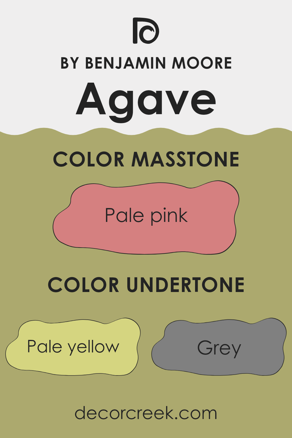
Undertones of Agave AF-420 by Benjamin Moore
Agave AF-420, a paint color by Benjamin Moore, presents a complex profile with numerous undertones that subtly influence its appearance and how it’s perceived in different settings. Undertones are the underlying hues that can gently shift the main color. While Agave AF-420 might initially appear as a straightforward shade, its undertones such as pale yellow, grey, mint, and others play a significant role.
When applying Agave AF-420 on interior walls, these undertones become quite important. Pale yellow and mint can bring a touch of freshness and light, making a room feel more open and airy. Grey and light gray can add a sense of calm and neutrality, helping the color blend well with different decor styles and furniture. Orange and yellow undertones can introduce warmth, making an interior feel more welcoming.
Colors like olive, light green, and lilac add a subtle depth that enriches the main hue, preventing it from appearing flat. This effect is crucial, especially in rooms with varying natural light throughout the day. During sunny periods, the brighter undertones might become more noticeable, enhancing the vibrancy of the room.
Conversely, in dimmer lighting, deeper undertones such as grey and olive provide a soothing effect. This flexibility means that Agave AF-420 can adjust gently to both bright and subdued conditions, catering to varied aesthetic preferences and functional needs of a room. The presence of these undertones makes the paint not just a background shade but an integral part of the room’s overall ambiance.
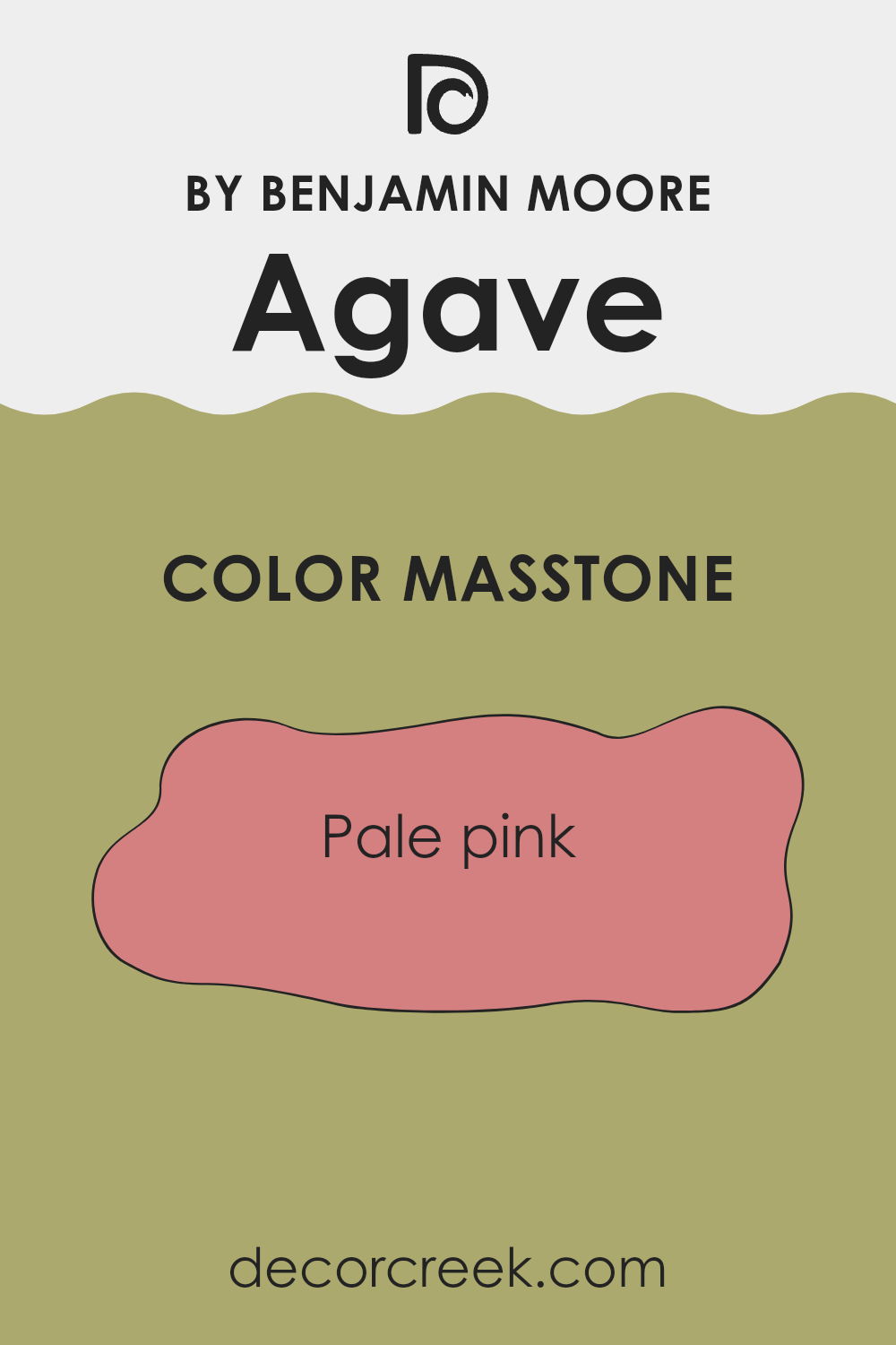
What is the Masstone of the Agave AF-420 by Benjamin Moore?
The Agave AF-420 by Benjamin Moore has a masstone or the main underlying tone, Pale Pink (#D58080), which brings a soft and gentle aesthetic into any room. This pale pink shade is adaptable and works well in various home interiors such as bedrooms, living rooms, or bathrooms.
It creates a comforting and welcoming atmosphere, making it easy for homeowners to relax and feel at ease. Pale pink as a color can be incredibly flexible, matching well with a range of other colors including whites, grays, and darker shades of blue or green.
This makes it easy for homeowners to incorporate it into their existing decor or use it as a base for a new decorating scheme. Additionally, the softness of pale pink helps to gently lighten darker rooms or add a touch of warmth to more minimalist, modern designs. Overall, this masstone allows for personalization while keeping the interior cozy and pleasant.
How Does Lighting Affect Agave AF-420 by Benjamin Moore?
Lighting plays a crucial role in how we perceive colors. When light hits an object, it reflects back certain wavelengths that our eyes see as color. Different types of light, such as natural sunlight or artificial bulbs, can greatly influence how a color appears. For instance, artificial light varies depending on the bulb used, from warm yellow tones to cooler blue-white hues, thus changing how a paint color might look on your walls.
Consider the paint color Benjamin Moore’s AF-420, commonly named Agave. In rooms with natural light, Agave tends to show its true color. Sunlight provides a balanced spectrum of light, allowing the refined depth of Agave to come through beautifully. But the appearance of Agave changes with the direction a room faces and the source of light it receives.
In north-facing rooms, which don’t get direct sunlight and hence are cooler, this color might look slightly more muted and shadowed, with subtle grayish undertones becoming noticeable. On the other hand, in south-facing rooms where warm, bright sunlight flows in most of the day, Agave will look vivid and lively, with its greenish-blue tones enhanced, making the room feel vibrant and fresh.
For east-facing rooms, where the light is bright in the morning and softer as the day progresses, Agave will appear brighter and more cheerful in the morning, slowly transitioning to a more subtle and soothing color by the afternoon. Conversely, in west-facing rooms, Agave will display a softer tone during the morning and become dynamically brighter and richer towards the evening as sunlight becomes more intense.
In artificial lighting, the type of bulbs used affects Agave’s appearance. Warmer bulbs may pull out the cozy, earthy undertones, making the interior feel warmer, while cooler LED bulbs might make the walls look more pronounced in their blue-green hues. In both scenarios, the color adapts gently to the lighting conditions, showing how flexible and dynamic Agave can be.
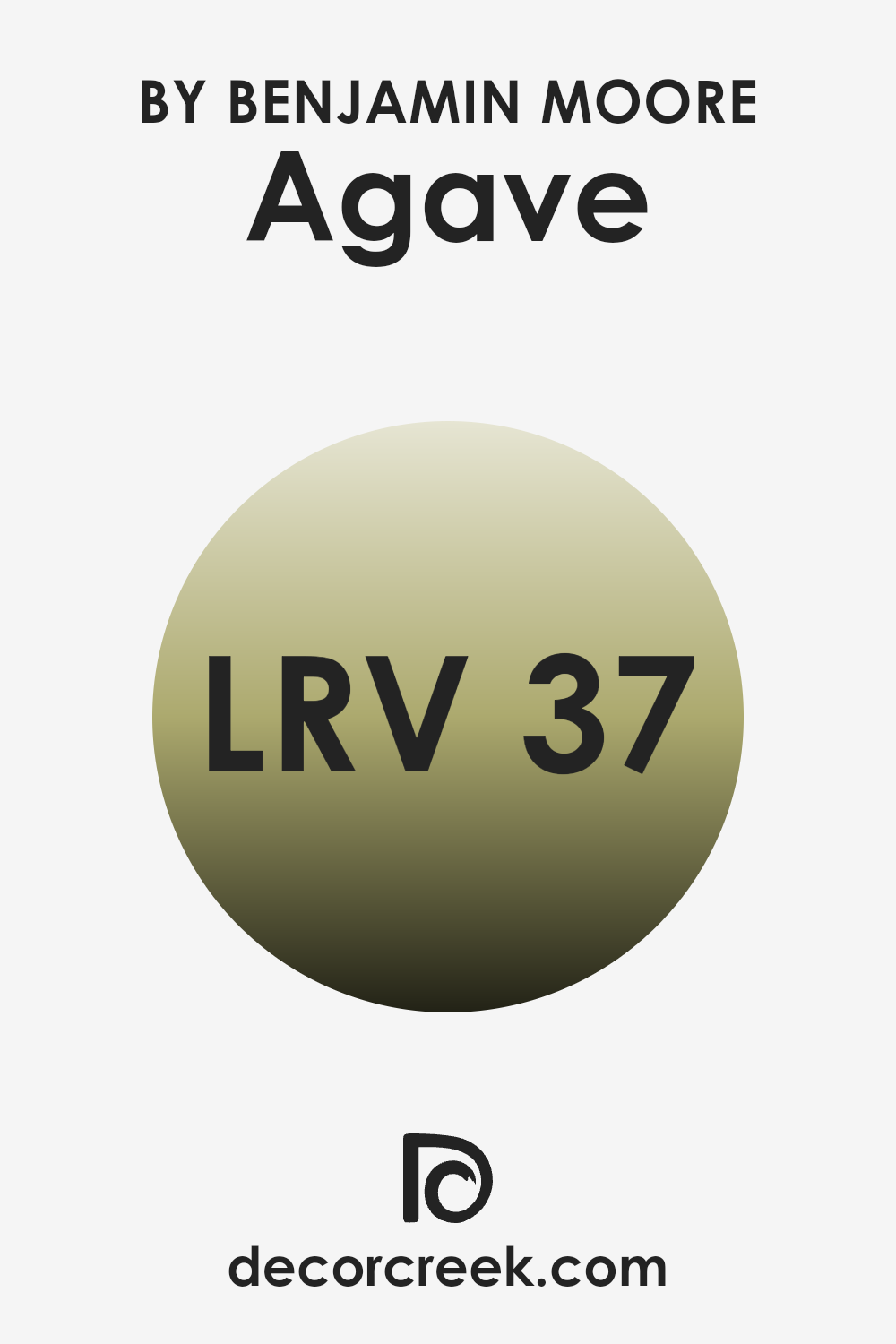
What is the LRV of Agave AF-420 by Benjamin Moore?
LRV stands for Light Reflectance Value, a measure that indicates how much light a paint color reflects or absorbs when it’s applied to a surface. It’s a scale typically going from one extreme of total absorption, which shows no light reflected, to another of total reflection, showing all light is reflected.
This value helps in choosing paint colors based on how bright or dark you want a room to appear. A higher LRV means the color will look lighter and make a room feel more open and airy, while a lower LRV means the color will look darker and can make a room feel smaller or more enclosed.
For the color Agave AF-420 by Benjamin Moore, which has an LRV of 37.42, it reflects some light but also absorbs a fair amount. This makes it neither too bright nor too dark, placing it in the medium range of light reflection.
In application, this means Agave will bring a moderate level of brightness to a room, not overly amplifying natural light but also not making the interior feel too dark. It’s a good balance for areas where you want some warmth and color without making it too strong. This color might be particularly effective in rooms that need a comforting presence but without the starkness that a lighter shade might bring.
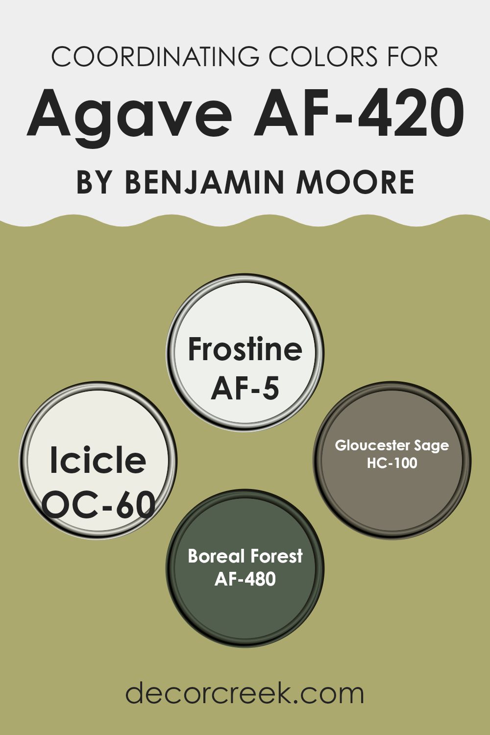
Coordinating Colors of Agave AF-420 by Benjamin Moore
Coordinating colors are shades that work well together to enhance and complement a primary color, which in this example is based around a reference color by Benjamin Moore. When selecting coordinating colors, the aim is to choose tones that create balance and harmony within a room, allowing each shade to shine without making the interior feel too strong. These colors can bring different nuances by either contrasting strikingly or blending seamlessly with the main hue.
For instance, Frostine AF-5 is a very light, almost ethereal gray that would lighten and open up a room with its subtle brightness while pairing well with a strong color like Agave. Icicle OC-60, another pale tone, leans slightly more towards blue, offering a crisp, clean look that complements cooler hues, making it a fantastic backdrop for more saturated shades.
On the more vibrant side, Gloucester Sage HC-100 provides a soft, earthy green that can add a touch of natural calmness to a room, harmonizing with warmer and deeper tones to create a grounded feel. Boreal Forest AF-480 is a deep, rich green that works as an accent, pulling in depth and intensity to balance lighter and neutral surroundings, adding visual interest and a sense of the outdoors. Together, these shades can create a cohesive palette that enhances the overall aesthetic of an interior.
You can see recommended paint colors below:
- AF-5 Frostine
- OC-60 Icicle
- HC-100 Gloucester Sage
- AF-480 Boreal Forest
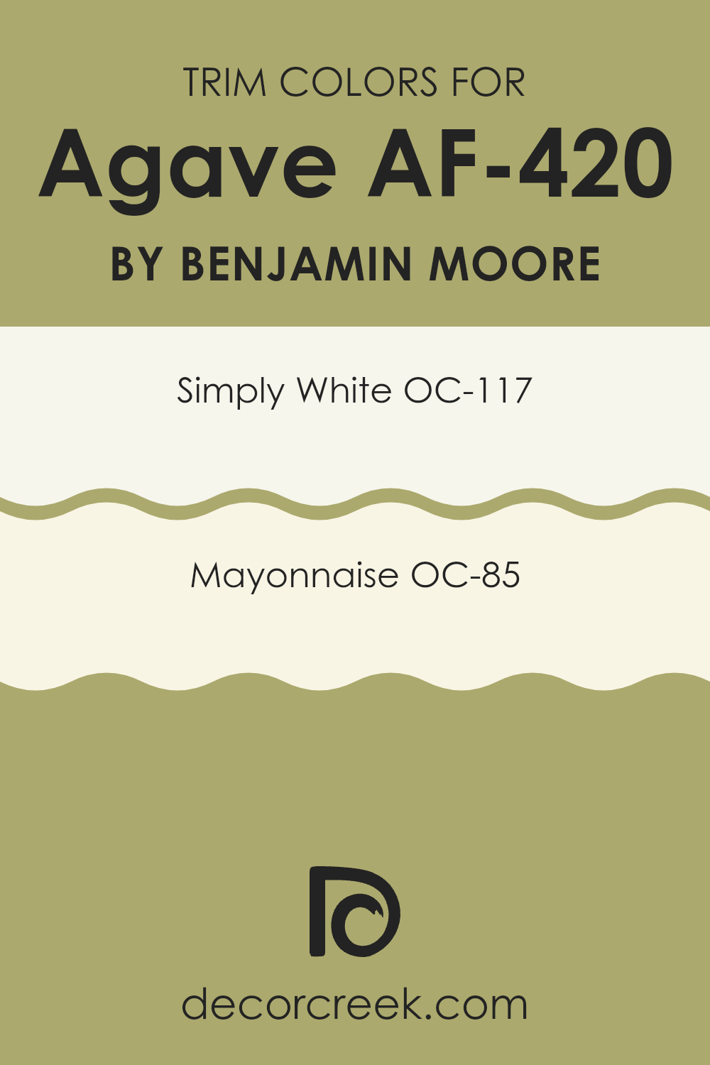
What are the Trim colors of Agave AF-420 by Benjamin Moore?
Trim colors are used to accentuate and define the details and borders of a room such as door frames, moldings, and window sills. Selecting the right trim color can significantly enhance the overall appearance of an interior.
For instance, when paired with Agave AF-420, a deep and vibrant hue, the right choice of trim colors like OC-117 – Simply White and OC-85 – Mayonnaise can create a crisp, appealing contrast that frames and complements the wall color. These trim shades help in breaking the monotony and bringing a fresh look that highlights the architectural features of a room.
Simply White (OC-117) is a clean and bright white that offers an airy feel to any room. It’s particularly effective in enhancing natural light, making interiors appear larger and more open. Mayonnaise (OC-85), on the other hand, has a slightly warmer tone, providing a soft, creamy backdrop that adds a gentle warmth to the room. Both colors, when used as trims with a bold shade like Agave AF-420, provide a beautiful contrast that can define details neatly and make the wall color stand out.
You can see recommended paint colors below:
- OC-117 Simply White
- OC-85 Mayonnaise
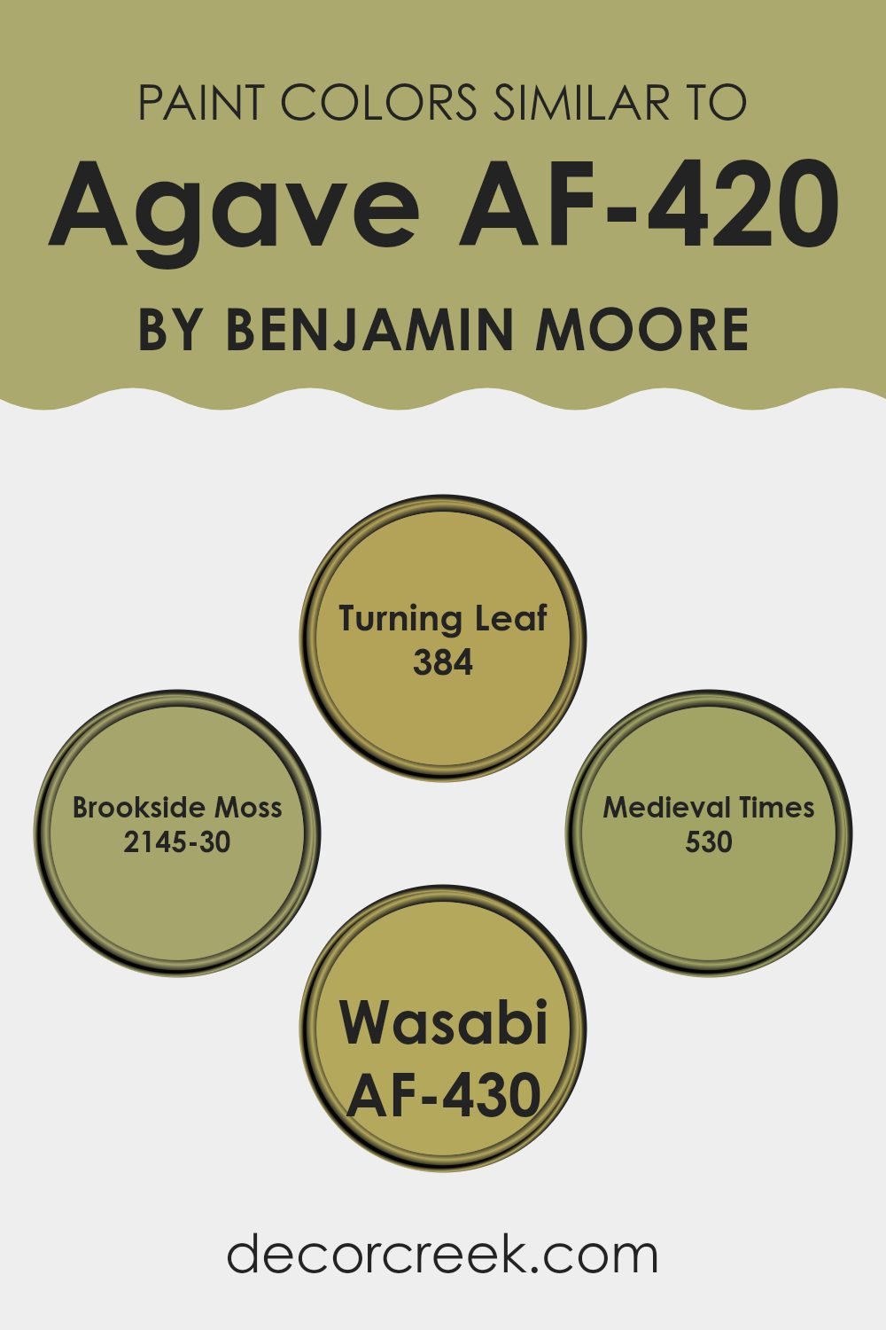
Colors Similar to Agave AF-420 by Benjamin Moore
Choosing similar colors when planning a room’s color scheme can be instrumental in creating a harmonious and pleasing aesthetic. Similar shades, like those akin to Agave AF-420 by Benjamin Moore, provide a sense of continuity and flow which makes a room feel more cohesive.
For instance, colors like Turning Leaf and Brookside Moss are earthy hues that closely match the greenish tone of Agave, ensuring that no element feels out of place. On the other hand, Medieval Times and Wasabi, while still maintaining a relationship with Agave, introduce slightly different undertones that add depth and interest to the overall look without clashing.
Turning Leaf is a comforting green that mirrors the softness of early autumn leaves, providing a subtle and warm background that is easy on the eyes. Brookside Moss is deeper, reminiscent of dense forest moss, offering a richer, more enveloping feel. Medieval Times moves away slightly by infusing a touch of gray, creating a muted, classic green that works well in rooms aiming for a grounded, historical feel.
Wasabi, meanwhile, injects a more vibrant, zesty green into the mix, hinting at freshness and energy, perfect for adding a dash of liveliness to any room. Together, these colors support each other, creating layers of visual interest while maintaining a cohesive palette.
You can see recommended paint colors below:
- 384 Turning Leaf
- 2145-30 Brookside Moss
- 530 Medieval Times
- AF-430 Wasabi
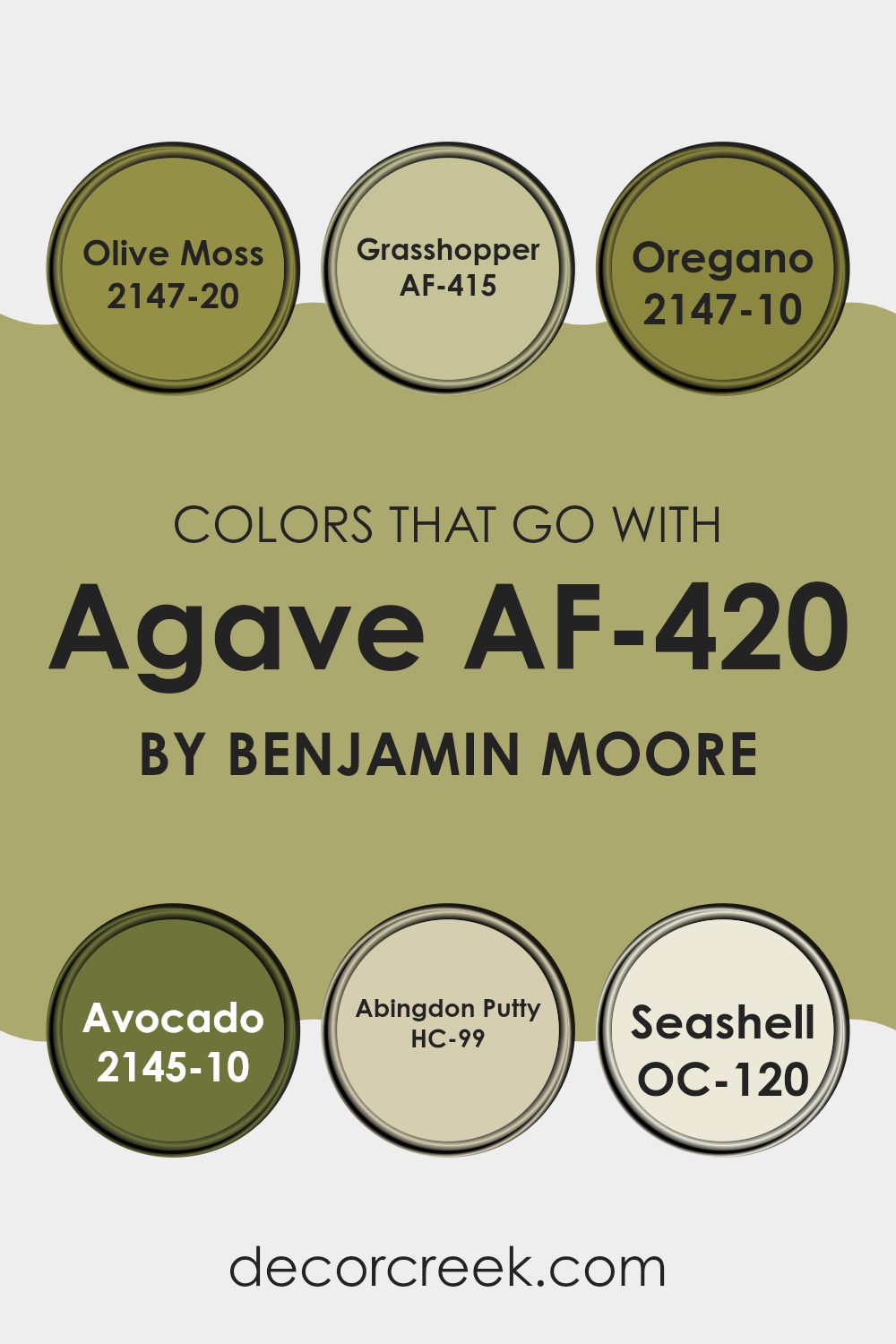
Colors that Go With Agave AF-420 by Benjamin Moore
The colors that complement Agave AF-420 by Benjamin Moore hold a crucial role in creating a balanced and appealing color scheme in any interior. One such color, Olive Moss 2147-20, introduces a deep, natural green that evokes a sense of freshness and vitality, working well in rooms that seek a connection to nature. Another harmonious pick, Grasshopper AF-415, offers a slightly lighter, brighter green, injecting energy and a touch of cheerfulness.
Oregano 2147-10 provides a darker, more subdued shade of green, suitable for creating cozy corners or highlighting areas that benefit from a less vibrant, more muted hue. In contrast, Avocado 2145-10 has an even richer and earthy green, perfect for adding depth and warmth.
For softer backgrounds or larger wall areas, Abingdon Putty HC-99 offers a neutral, gentle beige that supports the more vibrant greens without overpowering them, ensuring a pleasant visual flow. Finally, Seashell OC-120 offers a light, airy cream that brightens interiors and pairs beautifully with Agave AF-420, ensuring that the room feels open and light-filled. Combining these shades allows for an adaptable and welcoming atmosphere, ideal for any room aiming for a connection with nature and a fresh, lively vibe.
You can see recommended paint colors below:
- 2147-20 Olive Moss
- AF-415 Grasshopper
- 2147-10 Oregano
- 2145-10 Avocado
- HC-99 Abingdon Putty
- OC-120 Seashell
How to Use Agave AF-420 by Benjamin Moore In Your Home?
Agave AF-420, a color by Benjamin Moore, is a rich, deep teal that adds a welcoming touch to any room. This inviting shade works well in living rooms, bedrooms, or bathrooms, providing a cozy backdrop that pairs nicely with both light and dark furniture and accents.
When used in a living room, Agave can complement neutral tones like whites or grays, making the interior feel warm and inviting. In a bedroom, it creates a calming atmosphere, perfect for relaxing at the end of the day. For bathrooms, this color pairs beautifully with white tiles or fixtures, giving a fresh and clean look.
Moreover, adding Agave to kitchen cabinets or an accent wall can create an eye-catching focal point in your home. It’s adaptable, so whether you paint a whole room or just one wall, Agave provides a stylish touch that makes your interior more attractive and enjoyable to live in. Experiment with decor and see how this beautiful teal can enhance the style of your home.
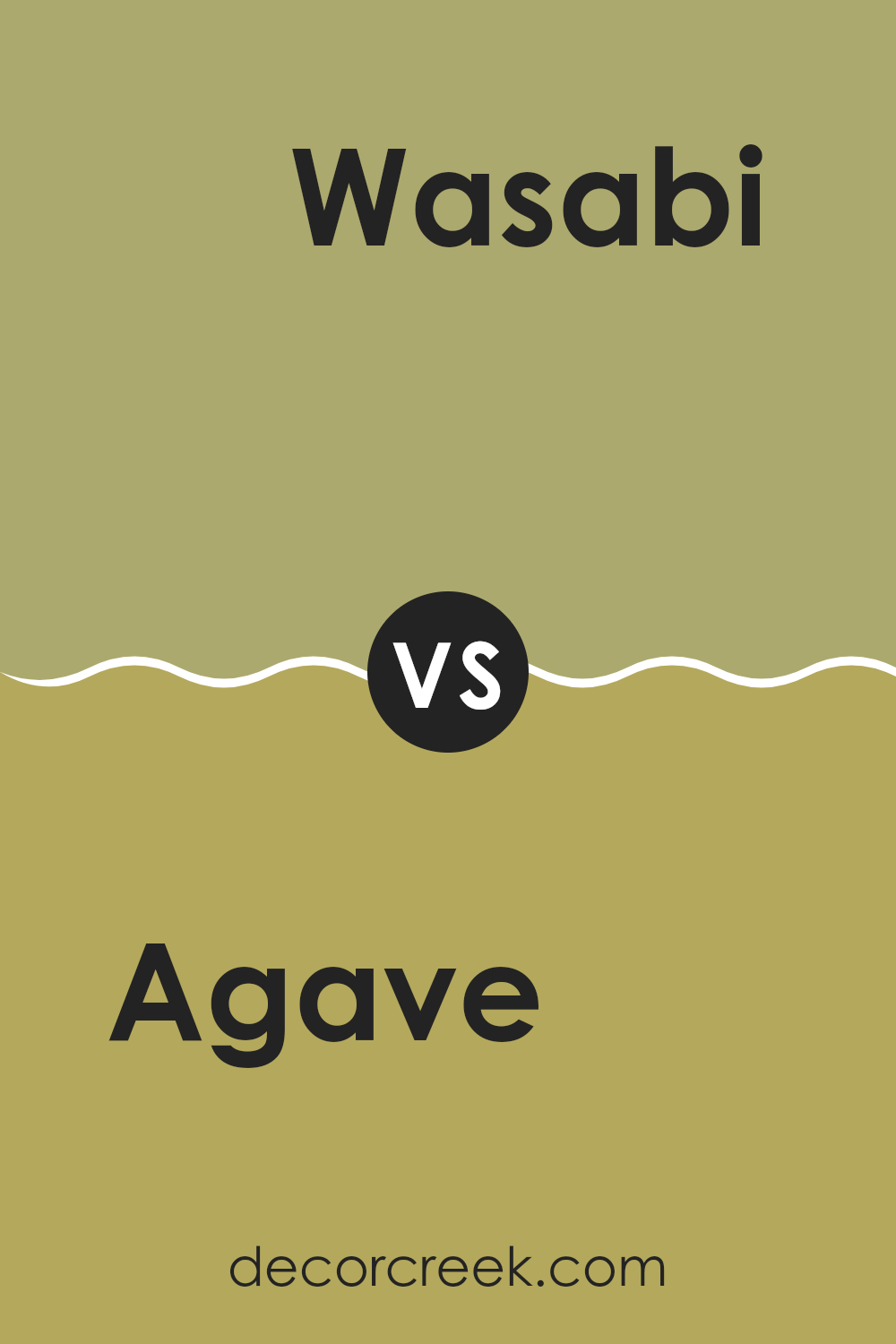
Agave AF-420 by Benjamin Moore vs Wasabi AF-430 by Benjamin Moore
The main color, Agave, is a soothing green with blue undertones that gives it a fresh and cool feel. It’s subtle and light, making it a perfect choice for creating a calming atmosphere in a room. This shade works well in areas where you want to promote relaxation and calmness, such as bedrooms or bathrooms.
On the other hand, Wasabi is a bolder green that leans towards yellow, making it vibrant and more energized. Its brightness brings life to an interior and can make rooms feel more lively and active. Wasabi would be a great choice for rooms where you want to inject some cheerfulness and vigor, like kitchens or playrooms.
Both colors, despite being greens, serve very different moods and settings due to their varying undertones and intensity. Agave’s cooler, lighter tone offers a gentle backdrop, while Wasabi’s lively hue is perfect for adding a punch of color to any room.
You can see recommended paint color below:
- AF-430 Wasabi
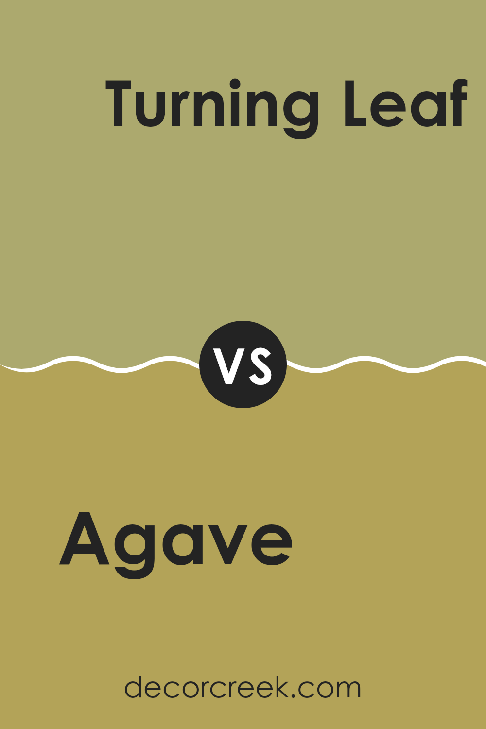
Agave AF-420 by Benjamin Moore vs Turning Leaf 384 by Benjamin Moore
The main color, Agave, is a gentle green with a touch of blue, giving it a soothing, refreshing vibe. It recalls natural elements, like the calm of a forest or a peaceful sea. This shade is perfect for creating a relaxing atmosphere in rooms like bedrooms or bathrooms.
Turning Leaf, on the other hand, is a warmer, golden-yellow shade. It brings brightness and cheerful energy to any interior. It feels like autumn, with its golden leaves and sunny days. This hue works well in areas where you want to add warmth and a welcoming feel, such as living rooms or kitchens.
Both colors offer their unique charm: Agave providing a cool retreat and Turning Leaf offering sunny radiance. When choosing between them, think about the mood you want to set. Agave is ideal for calming areas, while Turning Leaf is great for vibrant, lively rooms.
You can see recommended paint color below:
- 384 Turning Leaf
Agave AF-420 by Benjamin Moore vs Medieval Times 530 by Benjamin Moore
The main color, Agave AF-420, is a muted green with a touch of blue, offering a calm and subdued look. It brings a fresh, natural feel to any room, reminiscent of garden foliage. In contrast, Medieval Times 530 is a deeper, bolder shade of blue.
This color has a strong presence and can add a dramatic flair to an interior, creating a standout feature whether it’s on a wall or an accent piece. While Agave gives a breath of freshness with its lighter and earthy tones, Medieval Times commands attention with its rich depth.
Together, these colors could complement each other in a room that balances softness with boldness, or they could be used separately to set very different moods in a home. They cater to different tastes and purposes, with Agave leaning towards a gentle aesthetic and Medieval Times suiting a more dramatic or striking design.
You can see recommended paint color below:
- 530 Medieval Times
Agave AF-420 by Benjamin Moore vs Brookside Moss 2145-30 by Benjamin Moore
Agave AF-420 and Brookside Moss 2145-30 by Benjamin Moore are both green hues but have distinct qualities. Agave AF-420 is a soft, muted green with a hint of gray, giving it a subtle and soothing appearance.
It’s an adaptable color that works well in rooms where a calm and quiet atmosphere is desired. On the other hand, Brookside Moss 2145-30 is a deeper, more vibrant green. This shade has a more energetic feel and stands out more boldly on walls.
It can bring a lively and fresh vibe to an interior, making it ideal for areas where you want more vibrancy. Comparing the two, Agave is better for a gentle, understated look, while Brookside Moss makes a statement and adds a punch of color.
You can see recommended paint color below:
- 2145-30 Brookside Moss
After reading all about the AF-420 Agave paint by Benjamin Moore, I learned quite a bit. This specific green color really brings a bit of nature and calmness into a room, almost like you’re surrounded by grass or trees. It’s not too bright or too dark; it’s just right for making any place feel fresh and relaxed, like a beautiful day outside.
I think Benjamin Moore made AF-420 Agave paint a great choice for anyone wanting to refresh their room or even their whole house. Whether it’s in a bedroom to help you feel calm and get a good night’s sleep, or in a living room to make guests feel welcome, this color seems to work really well.
Choosing the right paint color can make a big difference in your home, and AF-420 Agave seems like a perfect pick if you love green and want to feel cozy and connected to nature. I can imagine rooms painted with this shade looking very pretty and being very comfy to spend time in. It’s like having a small piece of the outdoor world right inside your home.
This color has made me think that a simple change like a new paint can really make your home feel different and new.
Ever wished paint sampling was as easy as sticking a sticker? Guess what? Now it is! Discover Samplize's unique Peel & Stick samples.
Get paint samples

