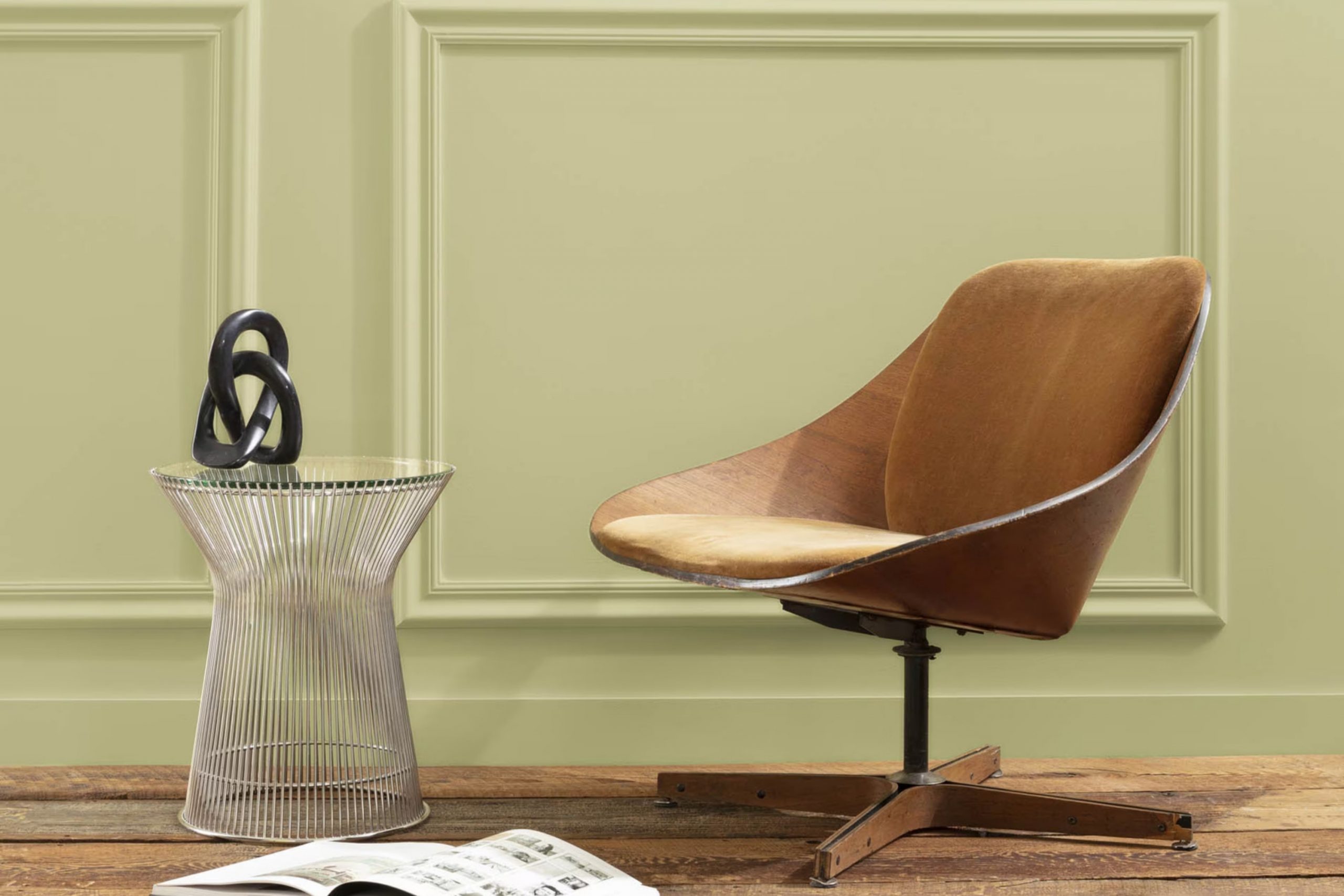
Imagine walking into a room bathed in the calm and soothing shade of AF-415 Grasshopper by Benjamin Moore. As a painter and decorator, I’ve brushed countless colors onto walls, but there’s something uniquely refreshing about Grasshopper. It’s not just any green; it’s like early spring grass under morning dew, gentle yet vibrant.
Each stroke of this color brings nature indoors, providing a backdrop that’s both calming and alive. Recently, I completed a project in a sunlit study, where the main goal was to create an area that felt both invigorating and peaceful. Choosing AF-415 Grasshopper achieved just that.
It turned the room into a haven for creativity and relaxation, proving its worth as more than just paint; it’s a mood enhancer. Whether you’re looking to freshen up a living area or create a calm nook, Grasshopper offers that perfect blend of peace and freshness.
If you’re considering a new vibe for your home, this color might just be the perfect starting point for your next project.
What Color Is Grasshopper AF-415 by Benjamin Moore?
Grasshopper AF-415 by Benjamin Moore is a vibrant green shade that brings the freshness of spring indoors. This lively color is reminiscent of young, tender leaves and has a bright, upbeat energy that can liven up any room. Its vivid nature makes it ideal for adding a playful splash of color to an area.
Grasshopper works especially well in modern and contemporary interior designs where bold colors can turn a simple room into a striking statement. It pairs beautifully with sleek materials such as glass and polished metal, enhancing their clean lines. In areas with lots of natural wood, Grasshopper highlights the warmth of the wood, creating a balanced yet dynamic aesthetic.
For a cohesive design, consider matching it with soft textures like cotton or linen in neutral shades to keep the focus on the green. Bold geometric patterns or minimalist designs in complementary colors such as soft yellows or deep blues can also look fantastic. Grasshopper is excellent for accent walls, furniture pieces, or even small decor elements that breathe life into a room without making it too intense. Its lively hue works particularly well in areas where you want to inspire creativity and vitality, such as kitchens, playrooms, or creative home offices.
decorcreek.com
Is Grasshopper AF-415 by Benjamin Moore Warm or Cool color?
The color Grasshopper AF-415 from Benjamin Moore is an adaptable shade that works wonderfully in many home areas. Its unique green tone provides a fresh and lively feel without being too bold or too strong. This makes it great for living rooms and kitchens where a touch of nature’s vibes can create a welcoming environment.
The color is light enough to make small rooms appear larger and brighter, yet has enough depth to add character to larger areas as well. Grasshopper AF-415 pairs nicely with a variety of decor styles, whether you are looking for a modern look or a more traditional aesthetic.
It complements wooden furniture and natural elements like stone or metal, enhancing the overall warmth of a room. Additionally, its calming nature makes it a good choice for bedrooms, helping to establish a relaxing atmosphere. For anyone looking to refresh their home with a natural, lively green, Grasshopper AF-415 is a solid choice.
Undertones of Grasshopper AF-415 by Benjamin Moore
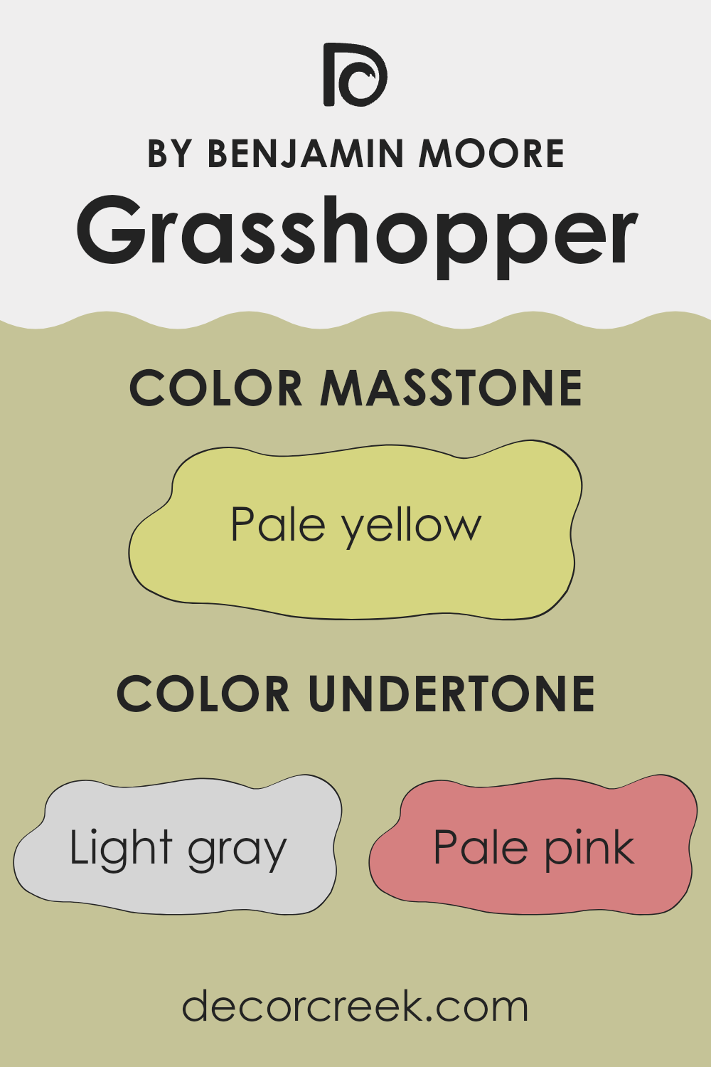
Grasshopper by Benjamin Moore is a unique paint color that carries a blend of subtle undertones, which greatly influence how it appears in different lighting and settings. Undertones are the underlying shades that are mixed into the main color, and they can significantly change the color’s appearance on walls.
Grasshopper has a variety of undertones including light gray, pale pink, mint, light purple, light blue, gray, yellow, lilac, orange, light green, and olive. These undertones add depth and complexity, making the color adaptable and fitting for various interior styles.
For example, in a room with abundant natural light, the yellow and light green undertones might make the color appear brighter and more vibrant. In contrast, in an area with less light, the gray and pale pink undertones could make it look softer and more subdued.
On interior walls, the undertones of this color can affect the mood and atmosphere. The presence of cool undertones like mint and light blue can give a fresh and calming effect, while the warmer tones like orange and yellow can make an area feel more welcoming and cozy.
Choosing furnishings and decorations that complement these undertones can help in creating a harmonious and aesthetically pleasing room. It’s important to consider these undertones when selecting this paint color, as they can interact with both artificial and natural light, altering the color’s appearance throughout the day.
What is the Masstone of the Grasshopper AF-415 by Benjamin Moore?
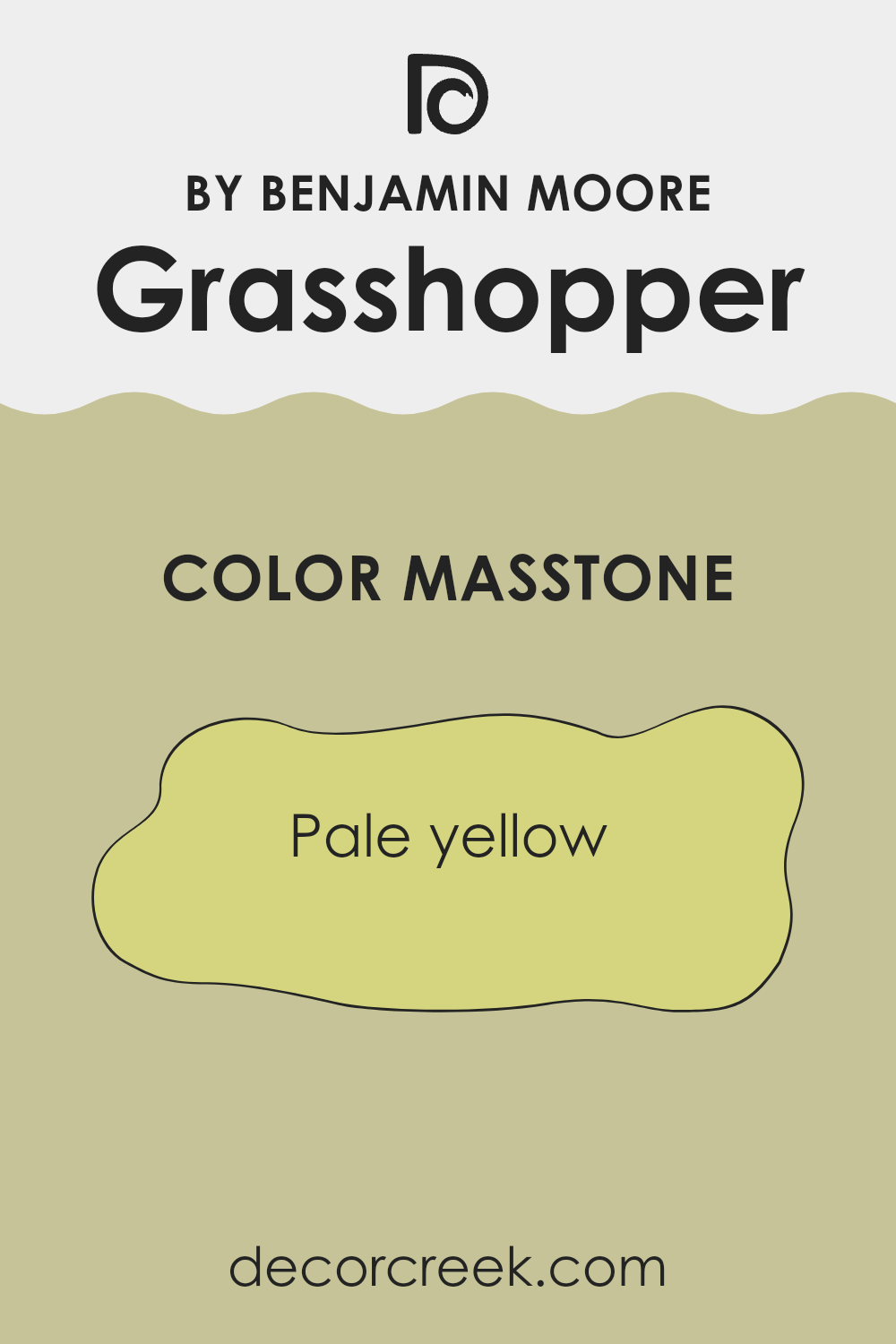
Grasshopper AF-415 by Benjamin Moore has a masstone of pale yellow, a color that presents itself as cheerful and light. This shade can make rooms appear more airy and open, which is particularly useful for smaller or darker areas.
Using pale yellow on walls can also bring a touch of brightness without being too strong, making it a fine choice for living rooms or kitchens where a welcoming and friendly atmosphere is often desired. Additionally, it can act as a neutral backdrop, making it easy to match with a wide range of furniture colors and styles, from traditional wood pieces to more modern or colorful accents.
The softness of this pale yellow does not clash with bolder colors, allowing for adaptable decorating options. It adds a subtle warmth to any room, enhancing natural light and creating a cozy, inviting area. Such qualities make it a practical yet effective choice for those looking to refresh their home’s look.
How Does Lighting Affect Grasshopper AF-415 by Benjamin Moore?
Lighting plays a crucial role in how we perceive colors. When exposed to different types of light, a single paint color can appear vastly different. For example, let’s consider the color Grasshopper AF-415 from Benjamin Moore.
Artificial Light: Under artificial lighting, such as LED or incandescent bulbs, Grasshopper AF-415 will generally appear slightly different than in natural light. Incandescent bulbs, which emit a warm glow, can make this green shade look richer and slightly darker, enhancing its cozy feel. On the other hand, fluorescent lighting, which is cooler, might make it look a bit sharper and more vibrant.
Natural Light: In natural sunlight, this color can show off its truest form. Depending on the time of day and weather conditions, natural light can make Grasshopper AF-415 look lively and dynamic. On a sunny day, it might appear bright and cheerful, while on a cloudy day, it could look more subdued.
Room Orientation and Lighting Effect:
- North-Faced Rooms: In rooms that face north, light is generally cooler and less direct. Here, Grasshopper AF-415 may appear slightly muted and softer. This can be ideal for creating a calm and gentle ambiance in an area where bright, intense colors might feel too strong.
- South-Faced Rooms: South-facing rooms enjoy ample sunlight most of the day, which means Grasshopper AF-415 will look vibrant and alive in such areas. The color will pick up the sunlight, making the room feel warm and inviting.
- East-Faced Rooms: Morning light is warm and bright in east-facing rooms. Here, Grasshopper AF-415 can look quite cheerful and energetic in the morning, fading to a cooler tone as the day progresses.
- West-Faced Rooms: In west-facing rooms, the evening light brings warmth. This lighting will enhance the depth of Grasshopper AF-415, making it feel more intense and warm in the afternoons and evenings.
Understanding these variations can help in choosing the right paint color for an area based on its orientation and the type of lighting it most often receives. Grasshopper AF-415, with its adaptable green hue, can work beautifully across different rooms when these factors are considered.
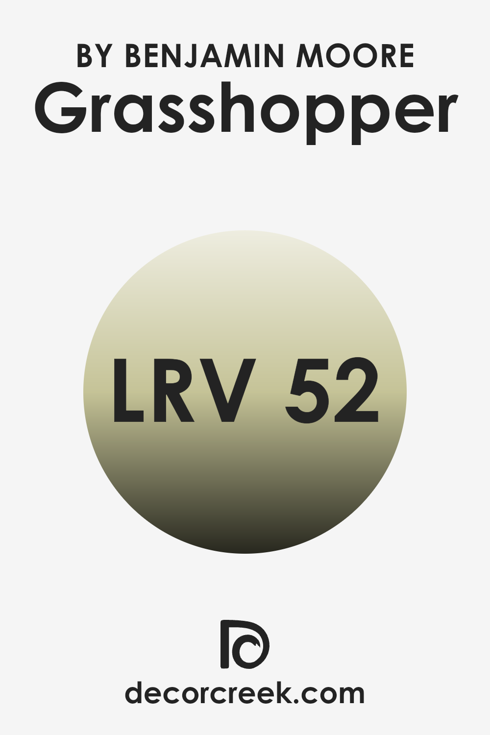
What is the LRV of Grasshopper AF-415 by Benjamin Moore?
LRV stands for Light Reflectance Value, which measures the percentage of light a paint color reflects back into a room as opposed to absorbing it. Essentially, it’s a gauge of how light or dark a color will appear once it’s on your walls.
A higher LRV means the color reflects more light, making a room feel brighter and possibly more open. Conversely, a lower LRV indicates that a color absorbs more light, which can make an area appear cozier but smaller or dimmer. For a color with an LRV of 52.14, such as this particular green hue, it falls midway on the scale, reflecting a moderate amount of light.
This kind of LRV is adaptable as it doesn’t make a room feel overly bright nor too enclosed. It strikes a balance, offering a soothing but lively backdrop suitable for many areas. The actual impact can slightly vary depending on the room’s natural lighting, size, and complementary colors used within the decor. In rooms with ample sunlight, this shade will appear more vibrant while in dimly lit areas, it might look more subdued.
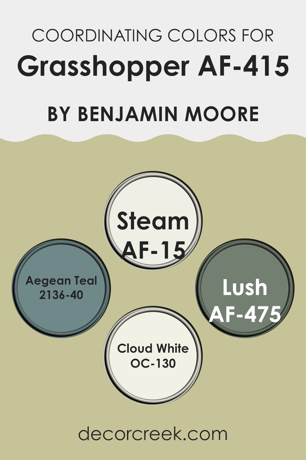
Coordinating Colors of Grasshopper AF-415 by Benjamin Moore
Coordinating colors are selected shades that harmonize well with a primary color to create a pleasing aesthetic in any area. When working with a unique color like Grasshopper AF-415 by Benjamin Moore, it’s vital to choose coordinating colors that not only complement but also enhance the main hue. By doing so, you create a balanced and harmonious look.
For Grasshopper AF-415, a vibrant green, its coordinating colors include Steam AF-15, a gentle, airy gray that provides a subtle contrast, softening the boldness of the green while maintaining a clean, fresh look. Aegean Teal 2136-40 adds depth with its teal undertones, offering a beautiful, rich counterpoint that is both earthy and refreshing.
Lush AF-475 is a deeper shade of green that seamlessly aligns with Grasshopper, intensifying the natural feel without making the room too strong. Finally, Cloud White OC-130 offers a crisp finish that acts as a light enhancer, giving a lift to the overall palette and ensuring the area feels open and bright. Each of these colors works together to support the lively character of Grasshopper while ensuring the room remains cohesive and inviting.
You can see recommended paint colors below:
- AF-15 Steam
- 2136-40 Aegean Teal
- AF-475 Lush
- OC-130 Cloud White
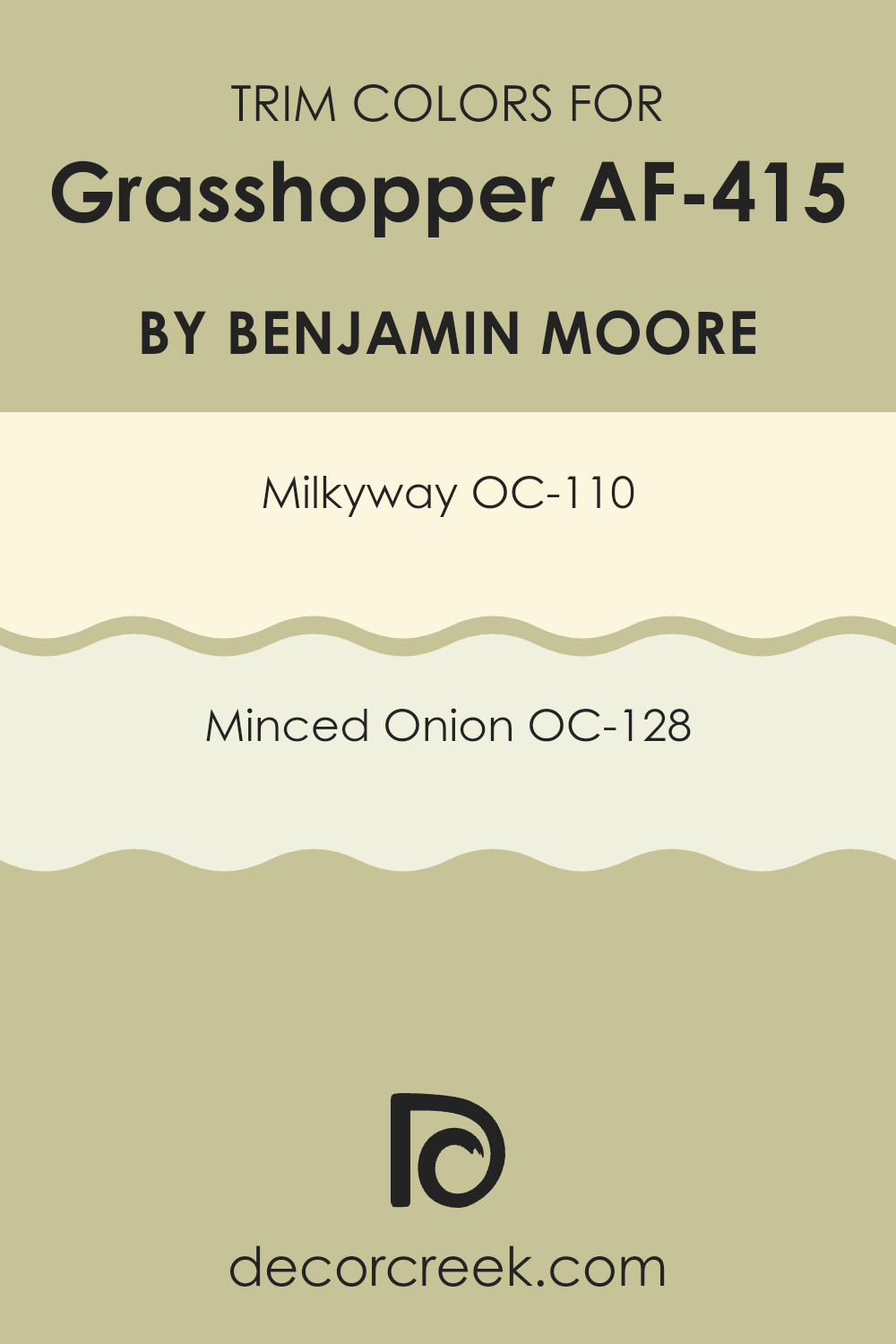
What are the Trim colors of Grasshopper AF-415 by Benjamin Moore?
Trim colors play a significant role in interior design, accentuating the borders and edges of an area and highlighting architectural details, making elements like windows, doors, and panels stand out. When considering a vibrant shade like Grasshopper AF-415 by Benjamin Moore for the primary color in a room, choosing the right trim color is essential to balance the atmosphere and ensure that the room feels well-composed rather than too strong.
Trim colors like OC-110 – Milkyway and OC-128 – Minced Onion are excellent choices that can pull the look together and add a clean, tailored finish to the area. The color OC-110 – Milkyway by Benjamin Moore is a delicate off-white that offers a smooth, creamy texture to any interior it accompanies.
Its light and airy feel contrasts subtly with more vivid colors like Grasshopper AF-415, providing a soft, understated boundary that gently frames the bolder hues. On the other hand, OC-128 – Minced Onion is a light, soft gray that delivers a hint of contrast against deeper and more intense colors, enriching the overall palette of the area without taking focus from the main color. This shade ensures the perfect backdrop that complements rather than competes, carrying the design with elegance and harmony.
You can see recommended paint colors below:
- OC-110 Milkyway
- OC-128 Minced Onion
Colors Similar to Grasshopper AF-415 by Benjamin Moore
Choosing similar colors for a design project can maintain a cohesive and harmonious look throughout an area. By using shades that share the same base color, like variants of green inspired by Grasshopper AF-415 by Benjamin Moore, the resulting aesthetic feels balanced and unified.
Similar colors work well together because they naturally blend without creating a sharp contrast, allowing for a smoother transition from one part of an area to another. This method of color coordination is especially useful in open floor plans or rooms that connect seamlessly, as it keeps the visual flow continuous and pleasant.
The similar colors such as Lewiville Green, Fernwood Green, Light Khaki, and Dried Parsley each have their unique traits yet contribute to an overall sense of unity. Lewiville Green appears as a fresh, lively green that can brighten areas while staying connected to nature. Fernwood Green brings a deeper, lush tone that evokes the richness of dense foliage, perfect for adding depth to a room.
Light Khaki offers a softer take on green, adding warmth and lightness—ideal for relaxed or subtle settings. Lastly, Dried Parsley introduces a grounded, herbal hue that adds a sense of stability, great for accent walls or furniture. Together, these shades create a flexible palette that can adapt to various design goals while keeping the overall theme consistent.
You can see recommended paint colors below:
- 494 Lewiville Green
- 2145-40 Fernwood Green
- 2148-40 Light Khaki
- 522 Dried Parsley

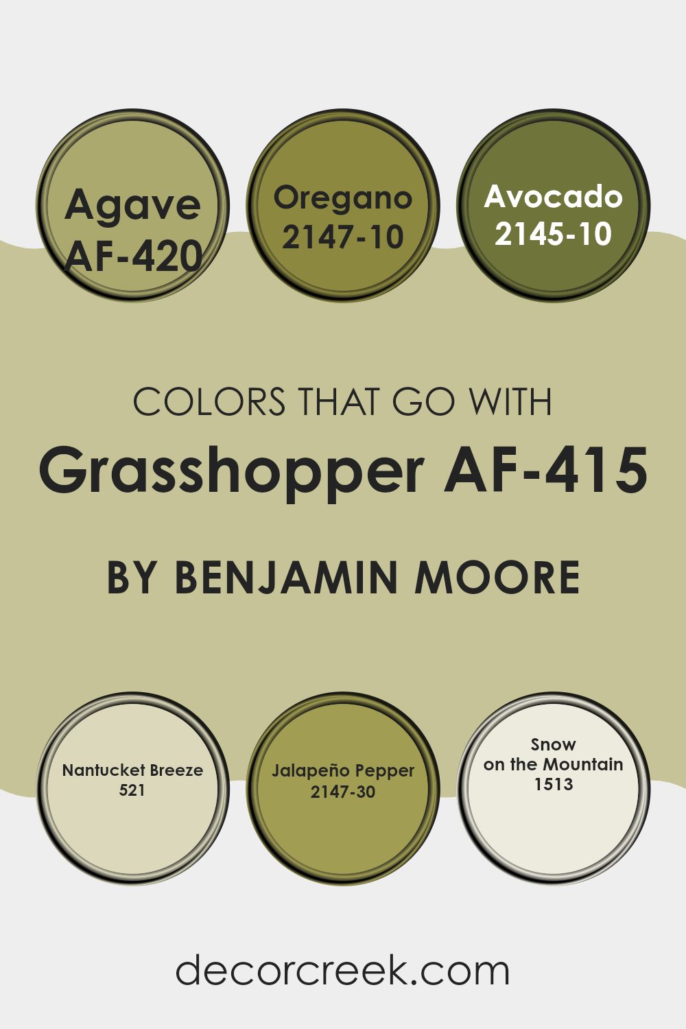
Colors that Go With Grasshopper AF-415 by Benjamin Moore
Choosing the right colors to complement Grasshopper AF-415 by Benjamin Moore is essential because it helps create a harmonious and visually appealing area. Grasshopper AF-415 is a vibrant, lively green that can energize a room, but when paired with the right accents, it also brings a sense of balance and cohesiveness.
For instance, AF-420 – Agave adds a dustier, subdued green that contrasts slightly with Grasshopper, softening the overall impact without losing the freshness of green. Similarly, 2147-10 – Oregano offers a deep, earthy green that grounds the brighter tones of Grasshopper, adding depth and warmth to the environment.
On a lighter note, 521 – Nantucket Breeze provides a cool, breezy touch with its muted blue-green, offering a refreshing lift that complements the more intense Grasshopper. Meanwhile, 2145-10 – Avocado is a richer, deeper green that enhances the lushness of the area, making it feel full and vibrant. For a little spice, 2147-30 – Jalapeño Pepper introduces a vibrant green with a yellow undertone, injecting a playful and energetic vibe into the mix.
Lastly, 1513 – Snow on the Mountain is almost neutral, with just enough green to tie back to Grasshopper, ensuring that the area remains cohesive while providing a light, airy quality. By using these colors together, you can create a variety of moods and styles, all the while keeping a sense of unity in your color scheme.
You can see recommended paint colors below:
- AF-420 Agave
- 2147-10 Oregano
- 2145-10 Avocado
- 521 Nantucket Breeze
- 2147-30 Jalapeño Pepper
- 1513 Snow on the Mountain
How to Use Grasshopper AF-415 by Benjamin Moore In Your Home?
Grasshopper AF-415 by Benjamin Moore is a vibrant green paint color that brings a fresh and lively vibe to any room. Ideal for adding a splash of energy, this shade can be used in many ways around your home. If you’re looking to freshen up your living area, consider painting an accent wall with Grasshopper AF-415. This can make the room feel more dynamic and fun.
This color also works well in a kitchen, where it can complement wooden cabinets or contrast nicely with white or metallic finishes. In a bedroom, using it on a single wall or as a backdrop for artwork can create a focal point and add a natural, calming feel.
For those who enjoy DIY projects, painting old furniture with this green hue can give your pieces a new life and brighten up any room. Whether you use it in small doses or go big with a full room paint job, Grasshopper AF-415 is an adaptable choice that adds personality and a touch of nature to your home.
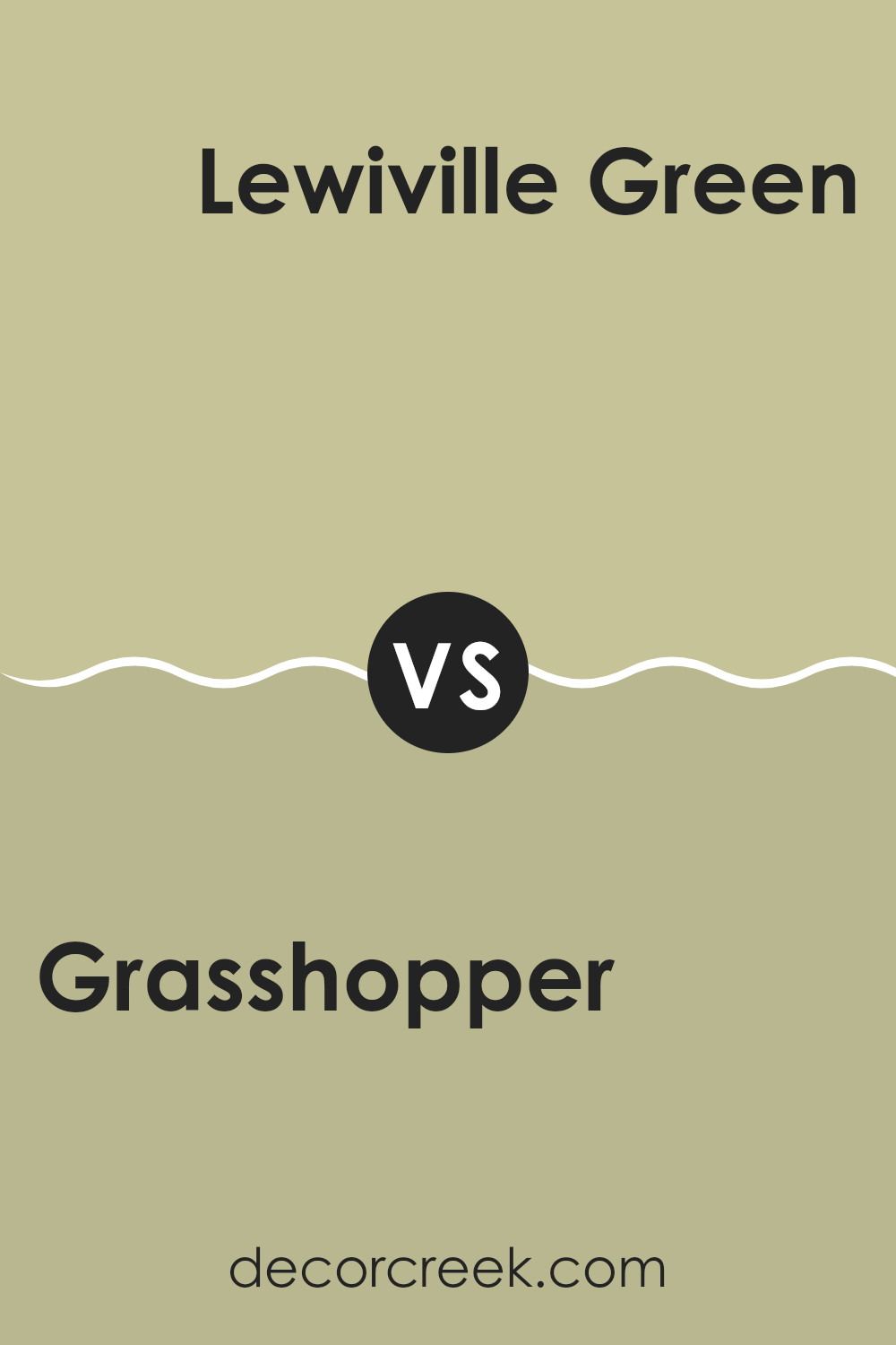
Grasshopper AF-415 by Benjamin Moore vs Lewiville Green 494 by Benjamin Moore
Grasshopper AF-415 and Lewisville Green 494, both by Benjamin Moore, offer unique green hues, ideal for different decorating tastes and areas. Grasshopper leans towards a soft, muted sage green, providing a subtle and gentle atmosphere.
It’s an adaptable shade that works well in rooms that aim for a calm and soothing vibe without being too bright. On the other hand, Lewisville Green has a deeper, richer green tone that mirrors lush foliage, making it perfect for areas where a stronger, more nature-inspired aesthetic is desired.
This color can add depth and character to rooms, especially when used in well-lit areas or as an accent wall. Whereas Grasshopper offers a lighter touch, Lewisville brings intensity and presence, making each suitable for different purposes and styles within home decor.
You can see recommended paint color below:
- 494 Lewiville Green
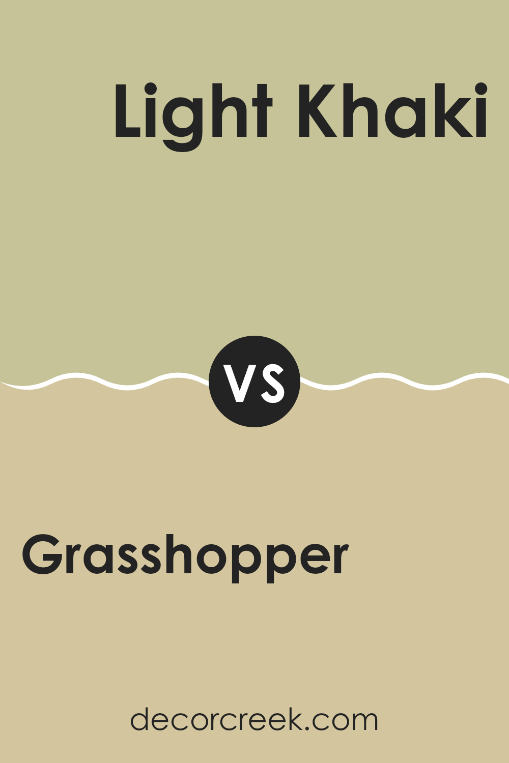
Grasshopper AF-415 by Benjamin Moore vs Light Khaki 2148-40 by Benjamin Moore
Grasshopper AF-415 and Light Khaki 2148-40 are two paint colors from Benjamin Moore. Grasshopper AF-415 is a soft green color that brings to mind the fresh, bright tones of spring leaves. It’s a light and airy color that can make small areas appear larger and more open.
On the other hand, Light Khaki 2148-40 has a more neutral tone. It’s a gentle beige that echoes the colors of sand and clay, providing a calm and subtle background that can fit into any area without taking too much attention.
Both colors are adaptable and can be used in many settings, from bedrooms to kitchens. Grasshopper adds a touch of nature’s freshness, while Light Khaki offers a quiet backdrop, making them suitable for balancing out busier elements in a room.
You can see recommended paint color below:
- 2148-40 Light Khaki
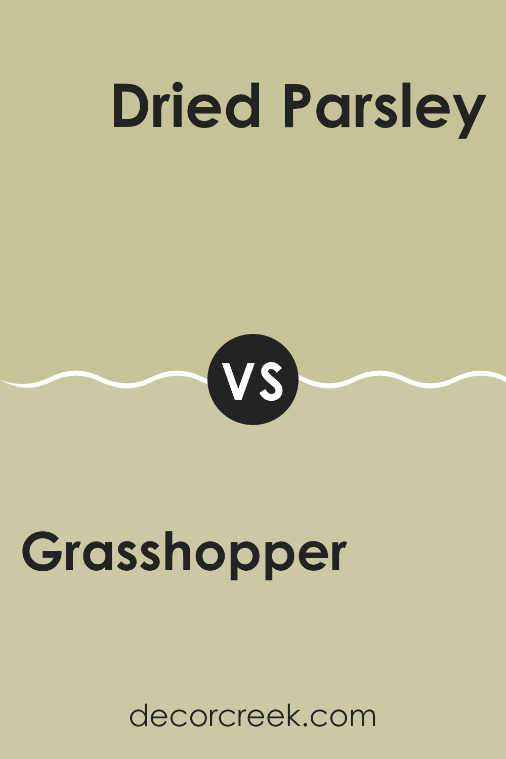
Grasshopper AF-415 by Benjamin Moore vs Dried Parsley 522 by Benjamin Moore
The colors Grasshopper and Dried Parsley by Benjamin Moore both belong to the natural green family but each brings its own unique vibe to an area. Grasshopper is a lighter, fresher green with a visible brightness, resembling the lively color of young grass in spring.
This makes it perfect for creating a cheerful and inviting atmosphere in a room. On the other hand, Dried Parsley has a deeper, more muted tone that leans toward an earthy olive. It’s more reserved and subtle compared to Grasshopper, which makes it great for adding a touch of calmness and grounded feeling to an area.
When it comes to decorating, Grasshopper could light up a smaller or darker room, while Dried Parsley might be ideal in an area that gets plenty of natural light or for creating a cozy, intimate vibe. Both colors work well with natural materials and can complement an environment striving for a natural, green-based aesthetic.
You can see recommended paint color below:
- 522 Dried Parsley
Grasshopper AF-415 by Benjamin Moore vs Fernwood Green 2145-40 by Benjamin Moore
Grasshopper AF-415 and Fernwood Green 2145-40, both by Benjamin Moore, are two distinct shades of green, each offering a unique atmosphere and vibe. Grasshopper AF-415 is a darker, more subdued green. It brings a sense of calm and grounding, similar to the dense foliage of a forest, making it a great choice for areas where a cozy, inviting feel is desired.
On the other hand, Fernwood Green 2145-40 has a lighter, brighter quality. It reflects more light, which can make an area feel more open and airy. This color resembles the fresh, new leaves of spring, providing a refreshing and uplifting mood in any room.
Choosing between them depends on the effect you want to create. Grasshopper adds depth and warmth, making it ideal for larger areas or rooms that need a touch of coziness. Fernwood Green, being lighter, works well in smaller or less naturally lit areas to give them a cheerful, expansive feel. Both colors offer a natural and refreshing vibe but in notably different ways.
You can see recommended paint color below:
- 2145-40 Fernwood Green
After reading the article about the AF-415 Grasshopper color by Benjamin Moore, I learned a lot about this unique shade of green. It’s not just any green; it’s a special one that can make rooms look more lively and fresh. This color is a great choice if someone wants to add a bit of nature’s feel to their home. It reminds me of grass in the spring, which can make any room feel welcoming.
The article explained how Grasshopper green works well in many different areas like living rooms, kitchens, and even outdoor settings. It can also pair nicely with many other colors. If you have a room that seems a bit dull, painting it with Grasshopper green might be a good idea to brighten it up.
Overall, reading about AF-415 Grasshopper has given me lots of ideas about how colors can affect the look and feel of a room. It’s interesting to see how a simple thing like the color of the walls can change the atmosphere of a place.
If I ever get a chance to repaint a room in my house, I might consider using this lively and fresh green to make the area feel new and exciting.
Ever wished paint sampling was as easy as sticking a sticker? Guess what? Now it is! Discover Samplize's unique Peel & Stick samples.
Get paint samples

