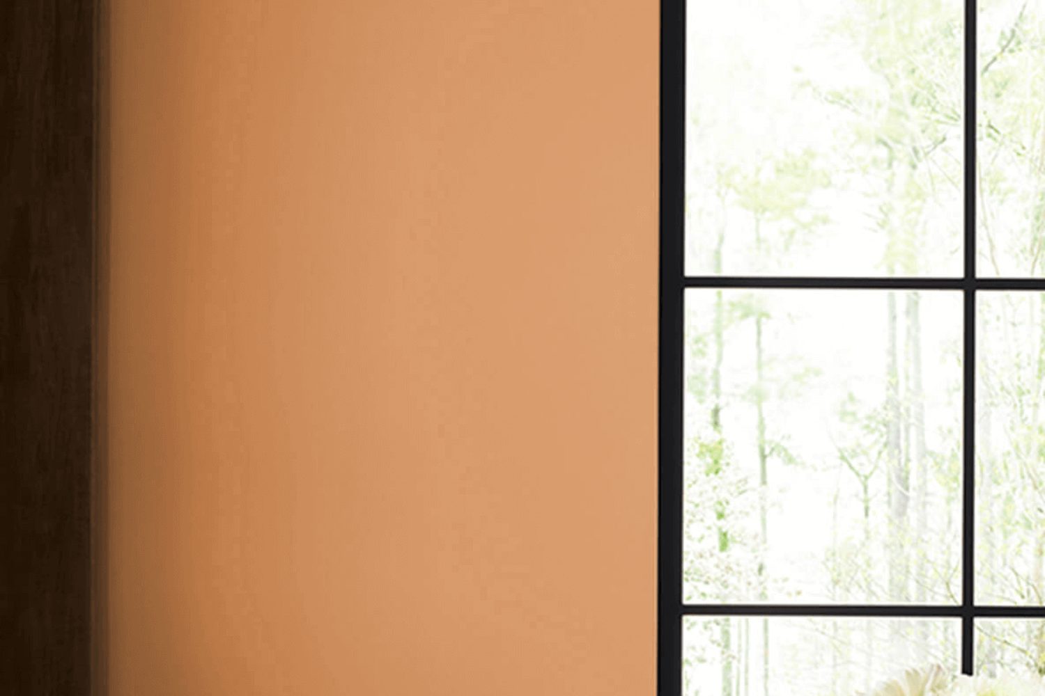
Are you looking for the perfect paint color to give your space a warm, cozy feel that makes every moment feel like the essence of fall? Look no further than SW 6361, Autumnal by Sherwin Williams. This paint color is a beautiful reflection of the fall season, designed to bring the comforting hues of autumn into your home or workspace. With its rich, inviting tones, it transforms any room into a welcoming space that reminds you of the beauty of the changing seasons.
Autumnal is not just any shade of orange or red; it’s a carefully crafted color that balances warmth and depth, creating a unique ambiance that encourages relaxation and comfort. Whether you’re updating your living room, bedroom, or office, this color creates an atmosphere that’s both inspiring and soothing. It pairs well with a variety of decor styles, from rustic to modern, making it a versatile choice for any updating project.
Choosing the right paint color can be a challenge, but SW 6361 Autumnal makes it easy to add a touch of autumn’s charm to your surroundings. It’s more than just paint; it’s an opportunity to transform your space into a cozy retreat that you’ll love spending time in. Ideal for those who appreciate the beauty of autumn and want to reflect it in their space, SW 6361 Autumnal by Sherwin Williams is a standout choice that brings warmth and character to any room.
What Color Is Autumnal SW 6361 by Sherwin Williams?
Autumnal by Sherwin Williams is a rich, warm hue that instantly brings to mind the cozy feeling of fall. This color is like a blend of the golden hour’s glow and the season’s signature fiery red leaves. It’s a versatile shade that can create a welcoming atmosphere in any room. Autumnal works incredibly well in spaces where you want to add a touch of warmth and comfort. Think living rooms, dining areas, or even bedrooms where its soothing presence can help unwind after a long day.
This color thrives in interior styles that appreciate a touch of nature and warmth. Rustic, farmhouse, and even modern decor can benefit from Autumnal’s inviting glow. It acts as a stunning backdrop, bringing out the richness in natural wood grains, making it a perfect match for furniture and decor pieces in oak, mahogany, or walnut. Leather accents in dark brown or tan also pair beautifully with this shade, adding to its cozy vibe.
Textiles and textures play a big role in enhancing Autumnal’s appeal. Think soft wool throws, velvet cushions, or even linen curtains to add depth and interest to the color’s warm base. When combined with such materials, Autumnal generates a homely space that’s both stylish and comfortable. Metal accents in gold or brass can add a hint of sophistication, making this color a well-rounded choice for those looking to create a space that feels both elegant and inviting.
Is Autumnal SW 6361 by Sherwin Williams Warm or Cool color?
Autumnal SW 6361 by Sherwin Williams is a warm and inviting color that brings a cozy and comforting vibe to any room in the home. This unique shade has the power to transform spaces with its rich, earthy tones that remind you of the natural beauty of fall. Its versatility means it can be used in various settings, from creating a welcoming atmosphere in living rooms to adding depth and warmth in bedrooms.
The beauty of this color lies in its ability to pair well with both light and dark accents, allowing for a wide range of decorating styles. Whether you’re looking to create a rustic feel with natural wood and textures or aiming for a more modern look with bold contrasts, Autumnal can easily adapt to your design vision. Its soothing nature also helps in making spaces feel more grounded and relaxed, making it an excellent choice for areas where comfort is key.
In homes, Autumnal acts as a perfect backdrop, encouraging a sense of tranquility while also injecting life and energy into the space through its rich hue. It’s a color that truly transforms a house into a home by adding character and warmth to the walls it adorns.
Undertones of Autumnal SW 6361 by Sherwin Williams
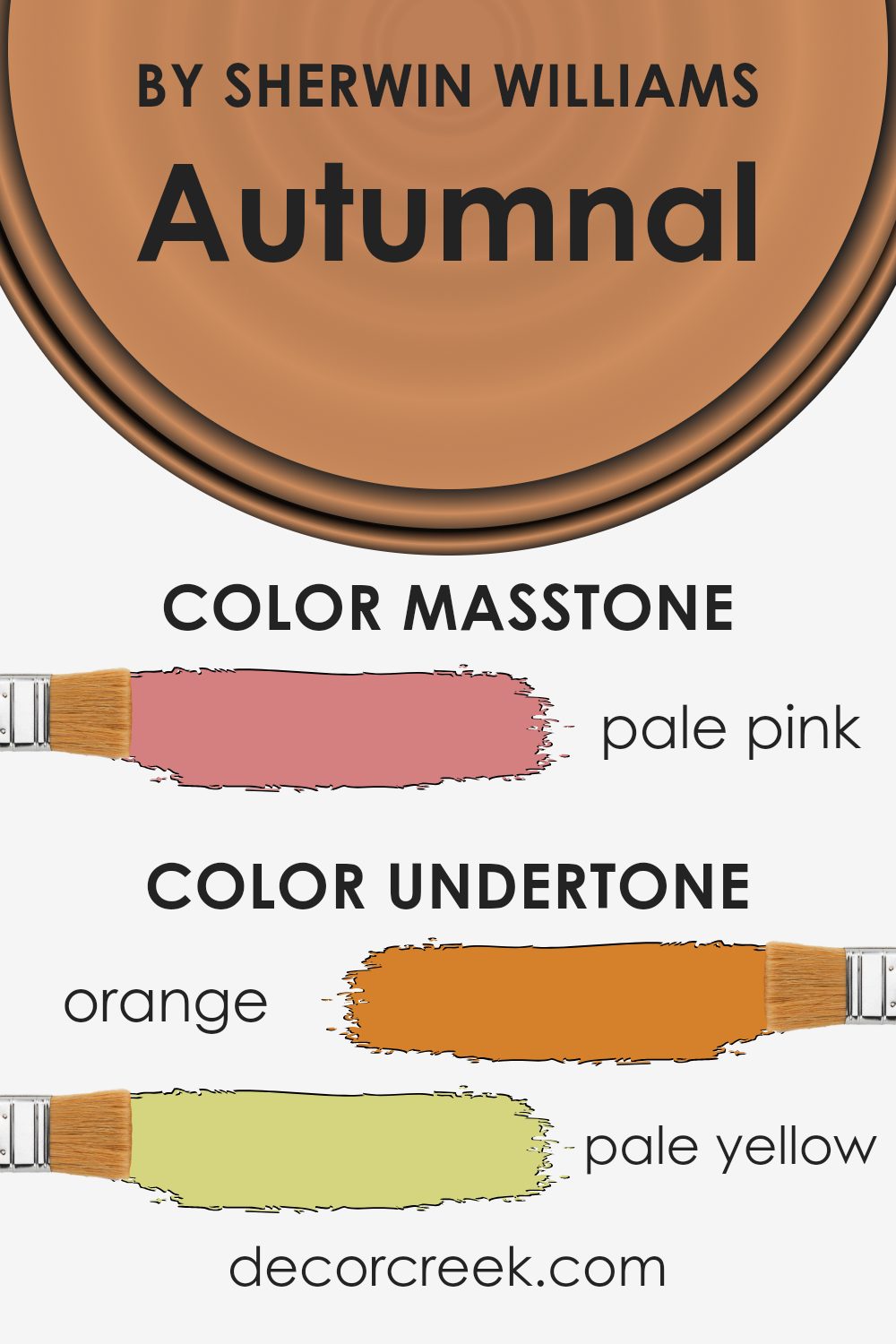
When we talk about paint colors like the one from Sherwin Williams, it’s not just about the main color. The secret magic behind them is the undertones – those subtle colors that might not be immediately noticeable but greatly affect how we perceive the main color. Imagine undertones as background singers; while they might not be the main focus, they add depth and richness to the song, or in this case, the color.
For instance, orange, pale yellow, and grey undertones give a warm and cozy feel, perfect for a snug reading nook. Yellow and olive add a touch of freshness, like early morning in a garden. Pink, red, and mint bring in a playful, vibrant vibe, good for energizing a space. On the other hand, undertones like purple, brown, and lilac create a sense of sophistication and mystery, ideal for creating a statement wall. Light gray, fuchsia, and light blue can make a room feel open and airy, great for a living area or bathroom.
In the context of interior walls, these undertones of the Sherwin Williams paint play a crucial role. They interact with natural and artificial light throughout the day, subtly shifting the room’s ambiance as time passes. A room painted in this color will not just show a static hue; it will transition through various moods and energies, from warm morning light to cool, serene evenings. This dynamism makes the color incredibly versatile, adapting to different styles and personal preferences, thus adding a unique character to any space.
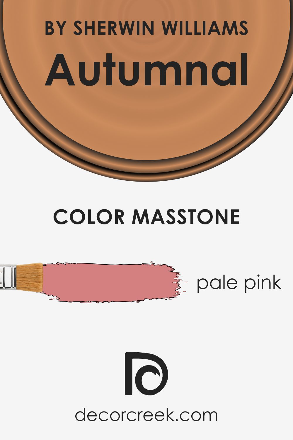
What is the Masstone of the Autumnal SW 6361 by Sherwin Williams?
Autumnal 6361 by Sherwin Williams shows off a masstone that appears as a soft, pale pink. This gentle hue brings a light and airy feel to any room. When you use this color in your home, it adds a touch of warmth without being too overpowering. The beauty of pale pink lies in its versatility. It can easily blend with a wide range of decor styles, from modern to rustic, making it a great choice for those looking to refresh their space with a subtle hint of color.
This pale pink can make small spaces feel bigger and brighter, as light bounces off its soothing surface. In larger rooms, it serves as a perfect backdrop for bold decor pieces or can stand alone for a minimalist approach, giving the room a clean and serene vibe. Its ability to evoke feelings of calm and comfort makes it an excellent choice for bedrooms, living rooms, and even bathrooms. The masstone’s unique shade ensures that it remains timeless, offering a lasting appeal that won’t soon go out of style.
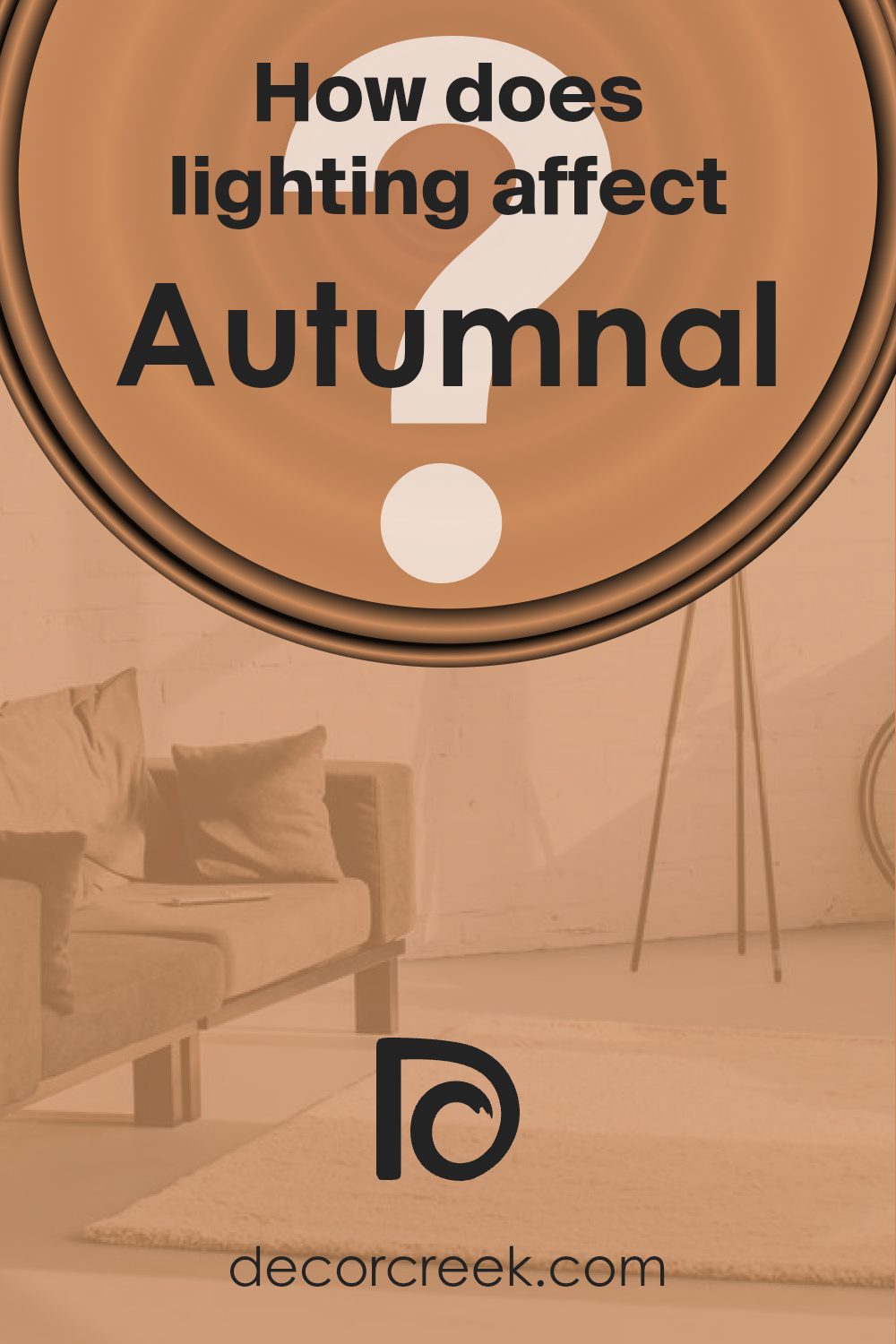
How Does Lighting Affect Autumnal SW 6361 by Sherwin Williams?
Lighting plays a crucial role in how we perceive colors. The type of light and its direction can significantly change the appearance of a color, and understanding this can help in making better decisions for painting and decorating spaces.
- Natural light varies throughout the day. Morning light in east-facing rooms is warm and bright, making colors appear lively and vivid. In rooms facing this direction, Autumnal, a warm and earthy tone, will look particularly vibrant in the morning but will soften as the day goes on.
- South-facing rooms receive the most sunlight throughout the day, which means colors are consistently brighter and more true to their natural hue. For a color like Autumnal, this means it will consistently showcase its rich, warm undertones, creating a cozy and inviting space no matter the time of day.
- North-facing rooms, however, have cooler, more consistent light, which can make colors appear slightly muted. Autumnal in such a room might look more subdued, losing some of its warmth but still offering a comforting hue that can make the space feel snug and welcoming.
- West-facing rooms receive intense light at the end of the day. Colors in these rooms change dramatically, with Autumnal possibly appearing very vibrant and dynamic in the evening as it basks in the sunset light, while being more restrained during the morning when the lighting is dimmer.
- Artificial light, on the other hand, comes in various forms – LED, incandescent, fluorescent, and more – each affecting colors differently. Warm light bulbs can enhance the cozy, welcoming feel of Autumnal, making it richer and more intense. Cooler bulbs might make the color appear somewhat faded, losing a bit of its warmth and depth.
In summary, the way Autumnal – a warm, earthy hue – is perceived can dramatically change depending on the light source. Natural light breathes life into it, with each direction offering a new perspective, while artificial light can either amplify its warmth or temper its vibrancy. By considering the interplay between light and color, one can create spaces with the desired mood and appearance.
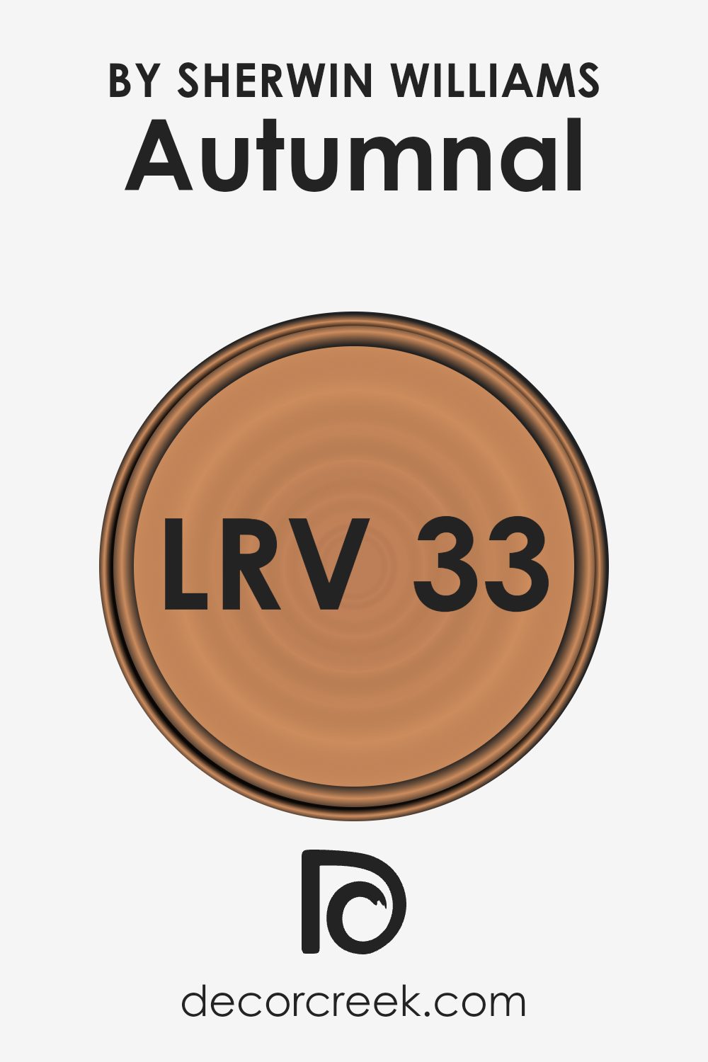
What is the LRV of Autumnal SW 6361 by Sherwin Williams?
LRV stands for Light Reflectance Value, which is a measure indicating how much light a paint color reflects or absorbs. This value is on a scale from 0 to 100, with 0 being pure black (absorbing all light) and 100 being pure white (reflecting all light). LRV helps you understand how light or dark a color will look in a room once applied to the walls. It plays a crucial role in creating the ambiance of a room, influencing how spacious or cozy it feels. For instance, a higher LRV can make a room feel more open and airy, as the walls reflect more light, while a lower LRV can make a space feel more intimate and grounded by absorbing more light.
With an LRV of 32.707, the paint color in question is on the darker side of the spectrum, meaning it absorbs more light than it reflects. This can have a significant impact on the way a room feels and is best used in spaces where you want to create a warm and cozy atmosphere. Since it doesn’t reflect much light, using it in a small, dimly lit room might make the space feel smaller or more closed in. However, in a well-lit or larger room, this color can add depth and character, making it feel more inviting. The specific LRV value indicates it’s versatile enough to work with both natural and artificial light, altering the room’s perception based on the amount of light available.
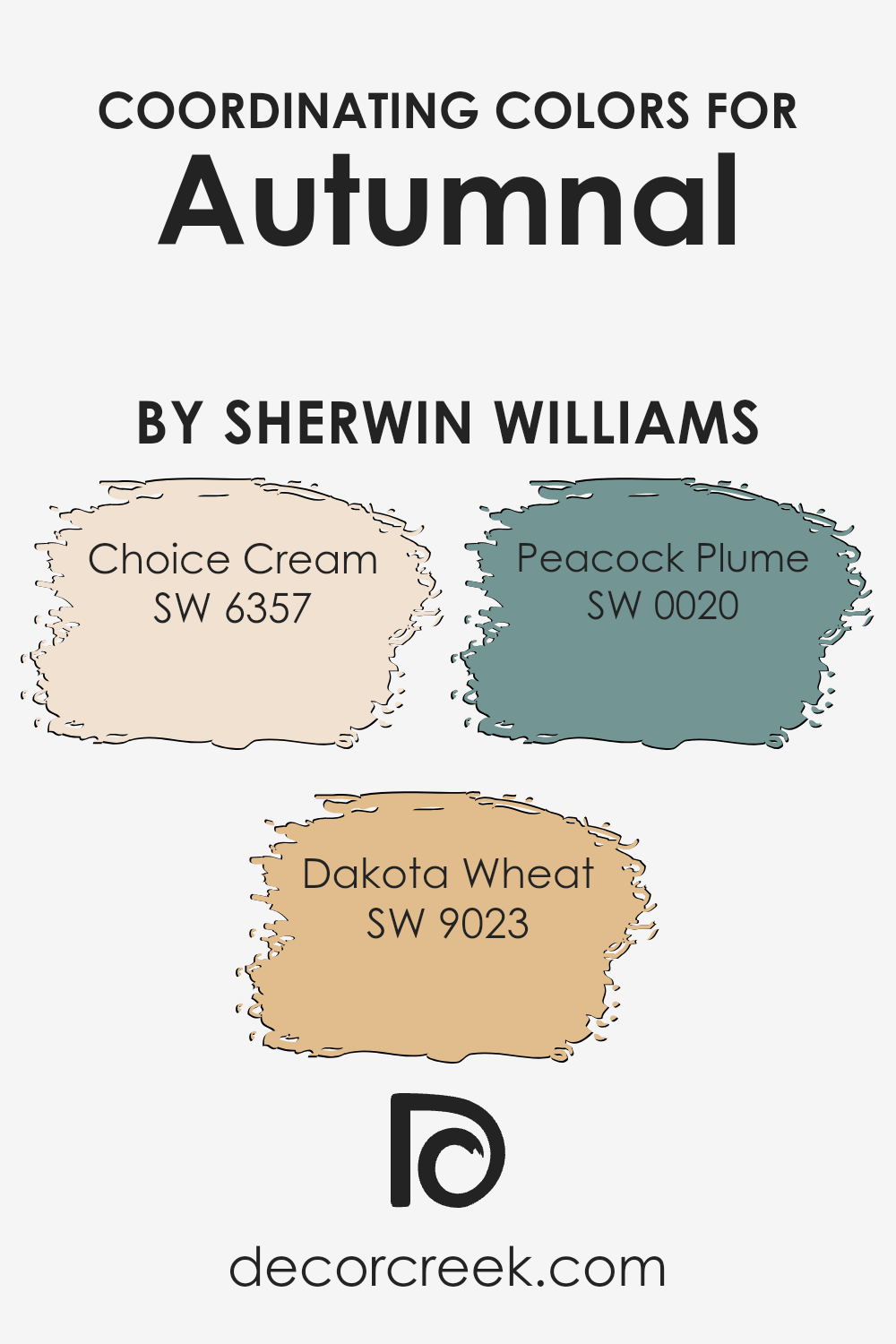
Coordinating Colors of Autumnal SW 6361 by Sherwin Williams
Coordinating colors work together to create a harmonious palette that enhances the visual appeal of a space, often used in interior design to create a cohesive look. When we consider a specific color like Autumnal by Sherwin Williams, it’s vital to pair it with colors that complement its tone and mood. Coordinating colors, in this context, play a role in balancing, accentuating, or softly blending with the main hue to achieve a desired aesthetic effect. For example, when selected thoughtfully, coordinating colors can help in setting a room’s ambiance—be it warm and inviting or cool and serene.
Among the harmonious matches for Autumnal, we find Choice Cream, Dakota Wheat, and Peacock Plume. Choice Cream is a soothing, soft hue that can lighten up a space while remaining subtly warm and inviting, making it perfect for creating a cozy environment. Dakota Wheat offers a deeper, richer complement, adding a sense of warmth and earthiness that works well with Autumnal’s natural vibe. On a bolder note, Peacock Plume stands out with its vibrant, deep teal tone, introducing a dynamic contrast that can breathe life into a room and serve as an eye-catching statement against the more subdued background of Autumnal. Together, these colors can craft a space that balances warmth with dashes of vivid color, creating an environment that feels both welcoming and aesthetically intriguing.
You can see recommended paint colors below:
- SW 6357 Choice Cream
- SW 9023 Dakota Wheat
- SW 0020 Peacock Plume
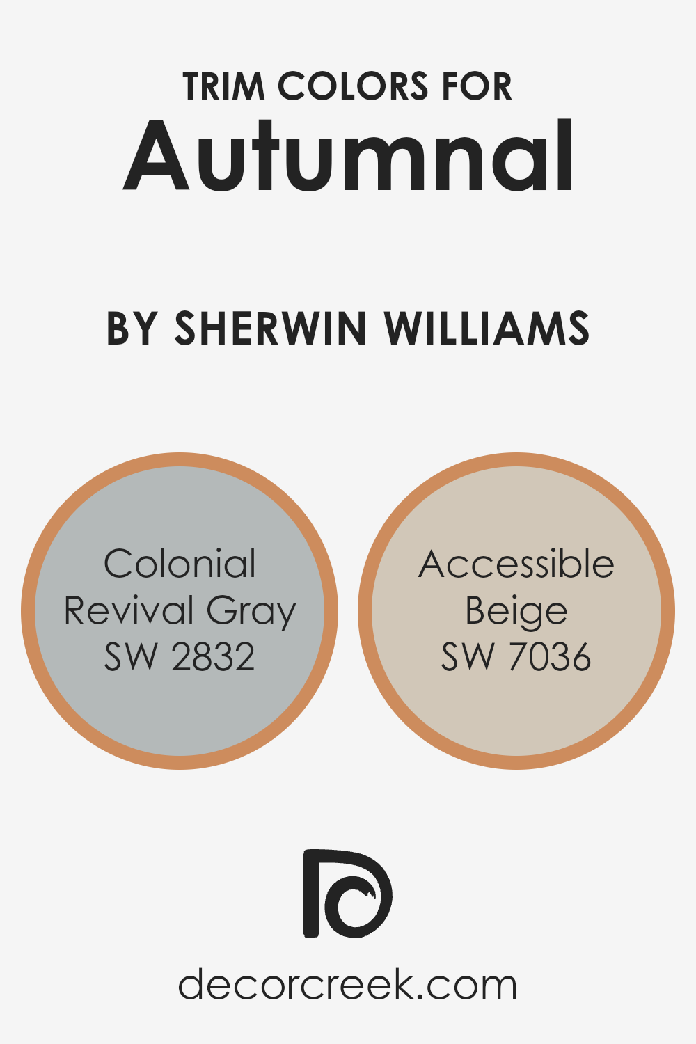
What are the Trim colors of Autumnal SW 6361 by Sherwin Williams?
Trim colors hold a significant role in enhancing the overall beauty and cohesiveness of a paint scheme in your home. For a warm, rich hue like Autumnal by Sherwin Williams, choosing the right trim colors can beautifully frame and accentuate the walls, making the color pop and giving the room a polished look. Trim colors like Colonial Revival Gray and Accessible Beige can complement Autumnal by offering a sophisticated contrast without overwhelming the space. This selection ensures the room feels inviting and well-coordinated, providing a subtle backdrop that allows Autumnal to shine as the focal point.
Colonial Revival Gray is a soft, muted gray with just the right balance of warmth, which makes it an excellent choice for trim, providing a subtle contrast that enhances the depth of the main color. Its understated elegance allows Autumnal to stand out, while still connecting the walls and trim in a harmonious way.
On the other hand, Accessible Beige is a warm beige with a welcoming feel, offering a slightly stronger contrast against the boldness of Autumnal yet still maintaining a soft, seamless look. This color is perfect for creating a cozy and balanced atmosphere, effortlessly marrying the boldness of Autumnal with a sense of tranquility and warmth in the space.
You can see recommended paint colors below:
- SW 2832 Colonial Revival Gray
- SW 7036 Accessible Beige
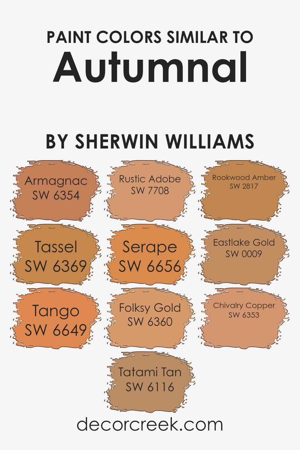
Colors Similar to Autumnal SW 6361 by Sherwin Williams
Similar colors play a crucial role in creating visually appealing and harmonious spaces, where each shade complements the other to enhance the overall aesthetic. Colors close to each other on the color spectrum, like those similar to Autumnal by Sherwin Williams, work together by offering subtle contrasts and a sense of continuity. These related hues can make a room feel cohesive, balanced, and inviting without overwhelming the senses with stark contrasts. The strategy of using analogous colors, such as the warm, earthy tones related to Autumnal, allows for a sophisticated yet approachable design that feels both coordinated and effortlessly stylish.
- Colors like Armagnac add a rich, deep warmth, reminiscent of aged brandy, while Tassel brings a gentle, muted gold that gleams softly in natural light.
- Tassel’s subtle shimmer lends itself well to spaces seeking a touch of understated luxury.
- Tango, a vibrant, energetic orange, injects life and vitality, perfect for creating focal points or adding pops of color.
- Tatami Tan offers a serene, neutral backdrop, reminiscent of natural fibers, ideal for a calm and restful environment.
- Rustic Adobe introduces a sun-baked terracotta, evoking the warmth and charm of southwestern landscapes.
- Serape, with its bright, cheerful hue, mirrors the vivacity of traditional Mexican blankets, while Folksy Gold has a muted, earthy quality that anchors spaces with its solid, reassuring presence.
- Rookwood Amber exudes an antique elegance, its deep, resonant gold adding a touch of heritage and depth.
- Eastlake Gold shines with a soft, pale radiance, offering a subtle hint of sunshine.
Lastly, Chivalry Copper gleams with the sophisticated glow of polished metal, lending any space a refined, inviting warmth. Together, these shades weave a tapestry of autumnal splendor that enhances and enlivens interiors with their coordinated charm.
You can see recommended paint colors below:
- SW 6354 Armagnac
- SW 6369 Tassel
- SW 6649 Tango
- SW 6116 Tatami Tan
- SW 7708 Rustic Adobe
- SW 6656 Serape
- SW 6360 Folksy Gold
- SW 2817 Rookwood Amber
- SW 0009 Eastlake Gold
- SW 6353 Chivalry Copper
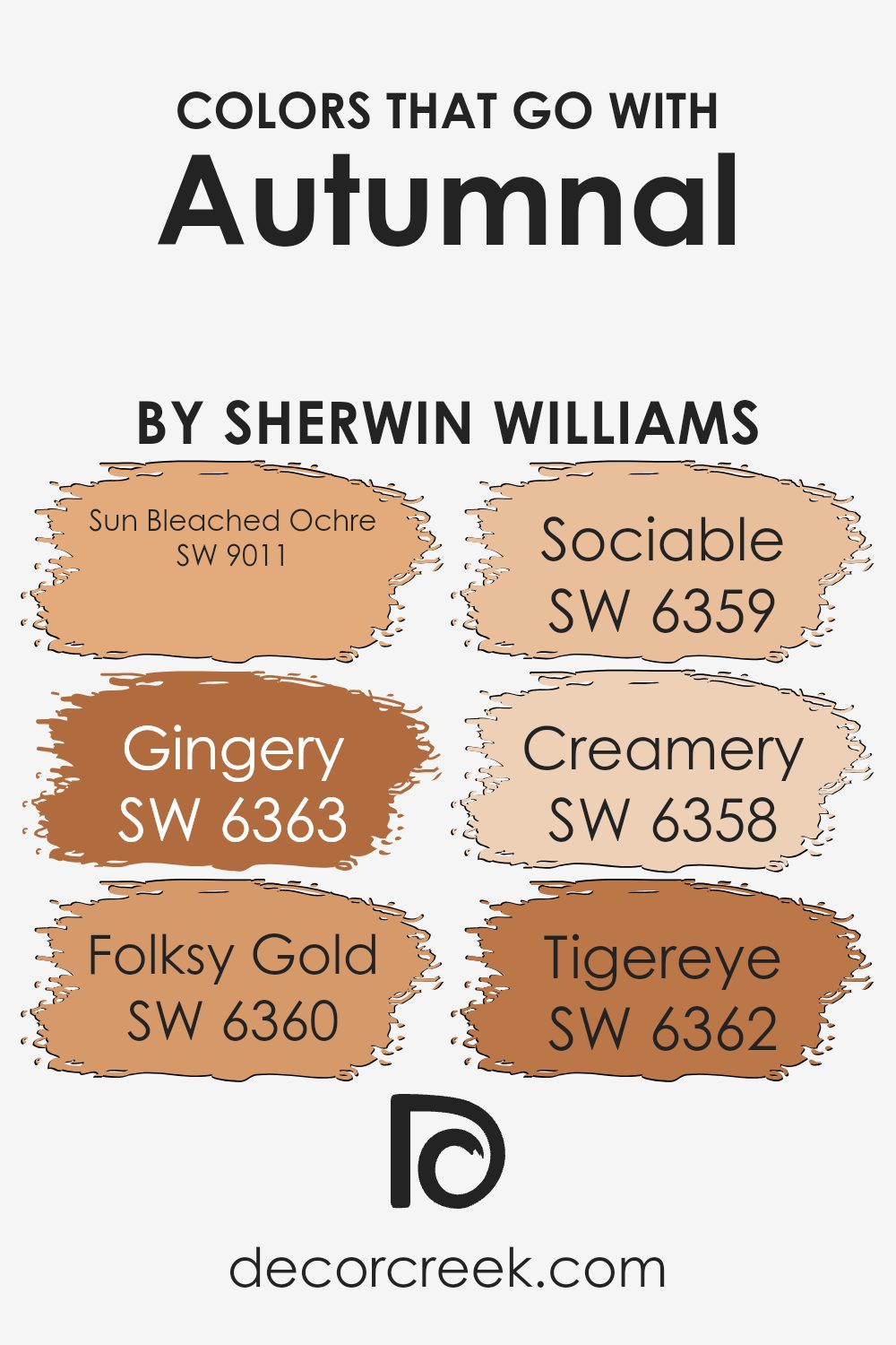
Colors that Go With Autumnal SW 6361 by Sherwin Williams
Selecting colors that complement Autumnal SW 6361 by Sherwin Williams is significant as they help create a harmonious and appealing space. These colors are like the supporting cast that enhances the beauty of the main hue, ensuring that the overall look is cohesive and balanced. When considering colors like Sun Bleached Ochre, Gingery, Folksy Gold, Sociable, Creamery, and Tigereye, it’s all about finding the right mix that aligns with Autumnal’s vibe. These coordinating colors work together to evoke a sense of warmth and comfort, making any room feel welcoming and cozy.
Sun Bleached Ochre is a subtle, muted gold that adds a soft warmth, reminiscent of the gentle touch of the sun’s rays in the afternoon. Gingery, as suggested by its name, brings in a spicy warmth, offering a more pronounced character with its medium-deep orange tone. Folksy Gold has a deep, rich quality that feels both grounded and inviting, perfect for creating a cozy corner. Sociable offers a lighter, peachy touch that’s airy and fresh, great for adding a slight pop without overwhelming. Creamery is a smooth, creamy white that acts as a gentle backdrop, allowing other colors to stand out without competing. Lastly, Tigereye is a deep, warm brown that draws inspiration from nature, adding depth and stability to the palette. Together, these colors create a balanced and inviting space, enhancing the natural charm and character of Autumnal SW 6361.
You can see recommended paint colors below:
- SW 9011 Sun Bleached Ochre
- SW 6363 Gingery
- SW 6360 Folksy Gold
- SW 6359 Sociable
- SW 6358 Creamery
- SW 6362 Tigereye
How to Use Autumnal SW 6361 by Sherwin Williams In Your Home?
Autumnal SW 6361 by Sherwin Williams is a warm, rich paint color that brings the cozy feel of fall into your home. It has a golden-orange hue, similar to the changing leaves, creating a comfortable and inviting atmosphere. This color works well in living rooms or dining areas where you spend a lot of time with family or friends. You can use it as a statement wall to add a pop of color or cover the entire room for a bold look.
It pairs nicely with creamy whites or soft grays for a balanced look. If you like rustic or earthy decor, Autumnal can complement wood finishes and natural textures beautifully. It’s also great for creating a focal point around a fireplace or in a reading nook, adding warmth to the space. With Autumnal, you can easily bring the outdoor beauty of autumn into your home all year round.
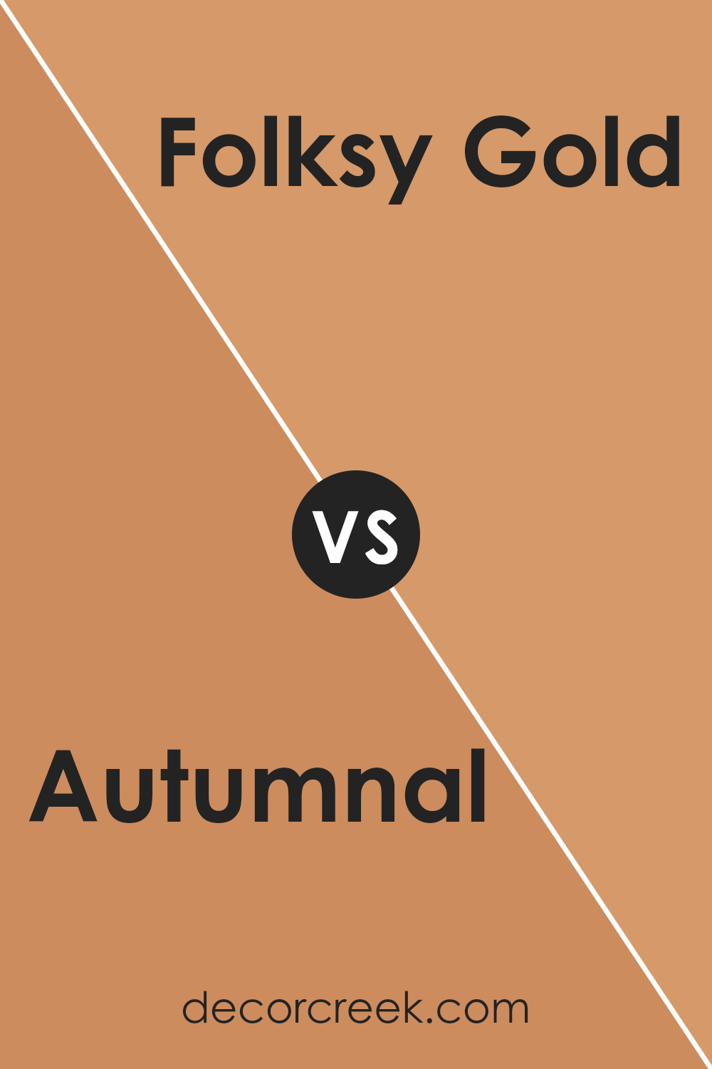
Autumnal SW 6361 by Sherwin Williams vs Folksy Gold SW 6360 by Sherwin Williams
Autumnal and Folksy Gold by Sherwin Williams are two distinct colors each offering a unique vibe to any space. Autumnal is a rich, deep hue that echoes the essence of fall. It’s a color that carries the warmth and coziness of autumn leaves, making it perfect for creating a snug and welcoming atmosphere.
Compared to Autumnal, Folksy Gold has a lighter, cheerier tone. This color brings a bright, sunny feel that’s reminiscent of a sunny autumn day, adding a touch of optimism and warmth to a room without overpowering it. While Autumnal tends to create a more intimate and warmer feel, Folksy Gold offers a breezier and more refreshing ambiance. Both colors work well to enhance the aesthetic of a space, but the choice between them depends on the desired mood – cozy and enveloping or light and uplifting.
You can see recommended paint color below:
- SW 6360 Folksy Gold
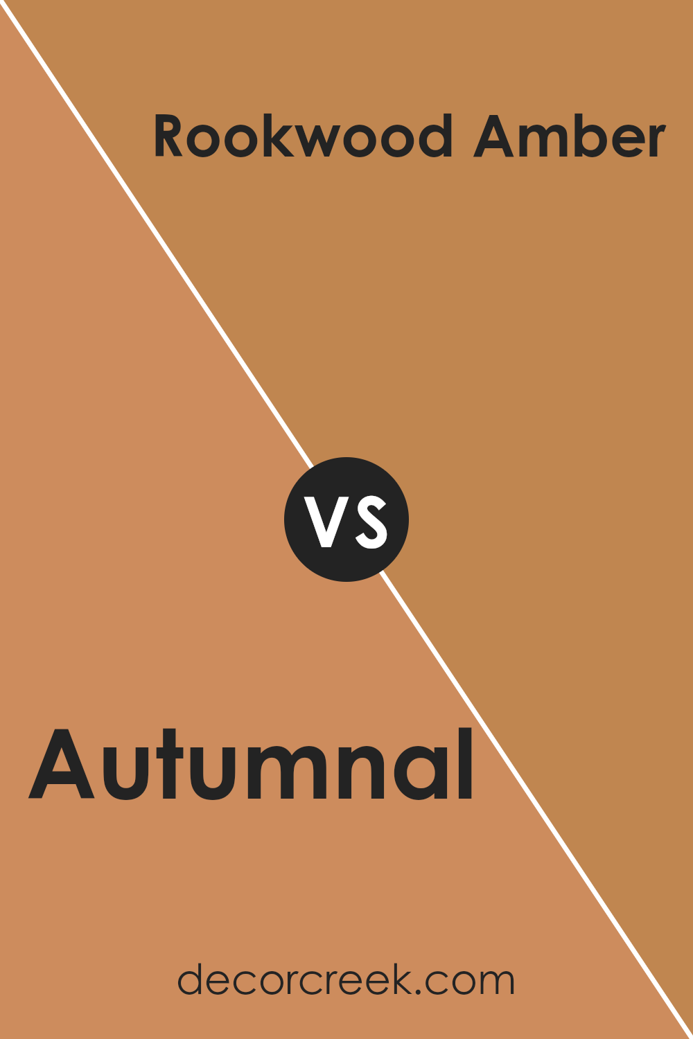
Autumnal SW 6361 by Sherwin Williams vs Rookwood Amber SW 2817 by Sherwin Williams
Autumnal and Rookwood Amber, both from Sherwin Williams, have their unique charm and differences. Autumnal has a vibrant, warm feel to it, like the rich hues of fall leaves under a bright afternoon sun. It’s lively and can really brighten up a space, adding a cozy and welcoming vibe. On the other hand, Rookwood Amber leans towards a deeper, more subdued tone. Think of it as the darker, more mysterious sibling, offering an earthy warmth that’s sophisticated and grounded.
It brings to mind the last rays of sunlight disappearing behind a thick, lush forest. While both colors share a warmth that can make any room feel more inviting, Autumnal stands out with its brighter, cheerier presence, whereas Rookwood Amber offers depth and a sense of calm. Their unique qualities make them suited for different spaces or vibes one might want to achieve in their home.
You can see recommended paint color below:
- SW 2817 Rookwood Amber
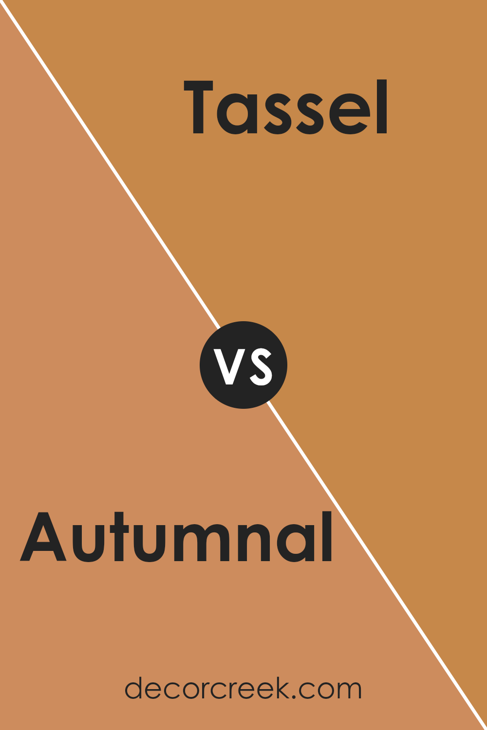
Autumnal SW 6361 by Sherwin Williams vs Tassel SW 6369 by Sherwin Williams
Autumnal is a rich, warm shade that brings to mind the cozy feel of fall leaves. It’s bold and inviting, making any space feel more welcoming. This color leans towards an earthy tone, which is perfect for someone looking to add a touch of nature-inspired warmth to their home.
Tassel, on the other hand, is a lighter, more subdued hue. It has a softness to it that’s very versatile, ideal for creating a calm and serene atmosphere. It’s not as bold as Autumnal but still carries a warm undertone, making it easy to pair with other colors.
When comparing Autumnal and Tassel, it’s clear they both offer warmth but in different intensities. Autumnal stands out with its deeper, vibrant tone, perfect for making a statement. Tassel, while still warm, is more about creating a gentle backdrop, a foundation for spaces that aim for subtlety and lightness.
You can see recommended paint color below:
- SW 6369 Tassel
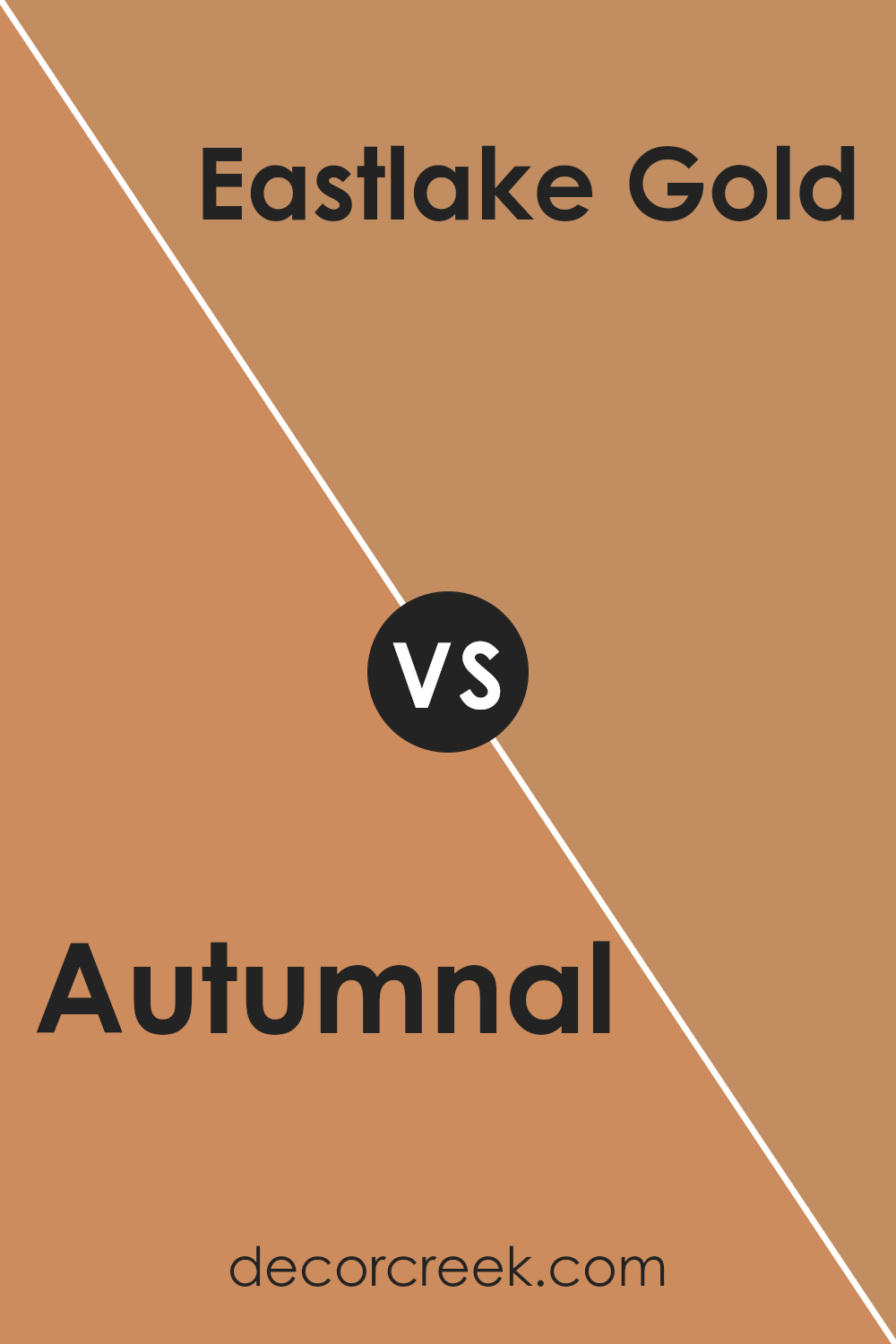
Autumnal SW 6361 by Sherwin Williams vs Eastlake Gold SW 0009 by Sherwin Williams
Autumnal and Eastlake Gold, both by Sherwin Williams, offer unique vibes for any space. Autumnal is a warm, vibrant hue, resembling the cozy feel of fall leaves. It’s rich and welcoming, perfect for creating a statement or adding depth to a room. On the other hand, Eastlake Gold has a more subdued elegance. It’s a softer, more refined gold that brings a hint of sophistication and warmth without overwhelming the senses.
While Autumnal commands attention with its boldness, Eastlake Gold gently complements the surrounding elements, providing a subtle backdrop that enhances without dominating. Both colors have their charm: Autumnal for its hearty, lively feel, and Eastlake Gold for its gentle, refined grace. Choosing between them depends on the mood you want to set—vibrant and energetic or soft and sophisticated.
You can see recommended paint color below:
- SW 0009 Eastlake Gold
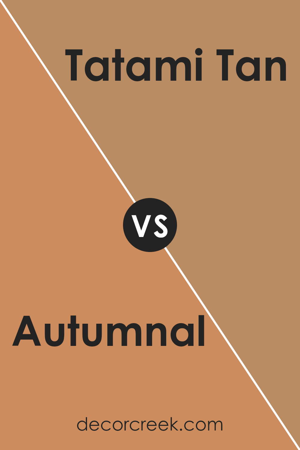
Autumnal SW 6361 by Sherwin Williams vs Tatami Tan SW 6116 by Sherwin Williams
Autumnal and Tatami Tan are both colors from Sherwin Williams, but they have different vibes. Autumnal is a rich, deep orange that gives off a cozy, warm feeling, much like the colors you see in leaves during fall. It’s bold and can make a statement in any room, adding a lot of personality and warmth. On the other hand, Tatami Tan is more subdued; it’s a soft, neutral beige with a hint of warmth. This color is very versatile and can easily fit into any space without overwhelming it.
It’s like the calm, soothing presence in a room that brings everything together in a gentle way. While Autumnal is all about adding a splash of vibrant color, Tatami Tan focuses on creating a peaceful and harmonious atmosphere. Both colors have their unique appeal, depending on what mood or style you’re going for in your space.
You can see recommended paint color below:
- SW 6116 Tatami Tan
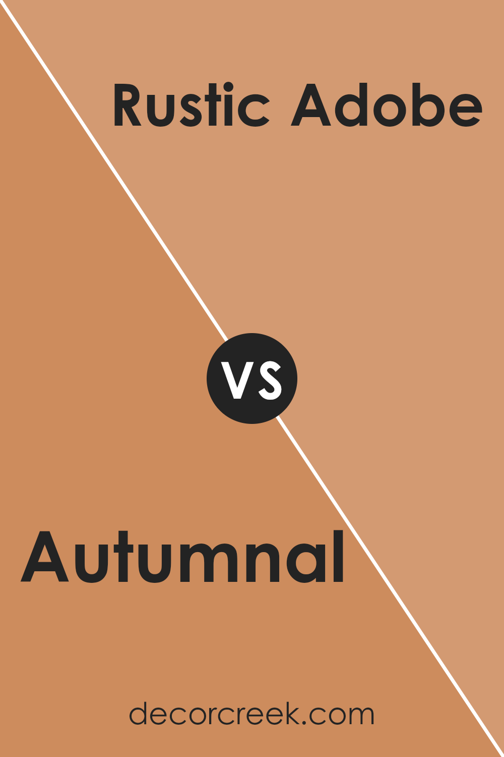
Autumnal SW 6361 by Sherwin Williams vs Rustic Adobe SW 7708 by Sherwin Williams
Autumnal and Rustic Adobe are both colors by Sherwin Williams, showcasing warm, earthy vibes. Autumnal is like a vivid picture of fall, bringing to mind the bright, lively shades of leaves as they change. It’s a bold, energizing hue that can make any space feel cozy yet full of life. On the other hand, Rustic Adobe leans towards a grounded, terracotta feel. It’s reminiscent of sunbaked clay, offering a more subdued, natural warmth.
This color is perfect for creating a serene, inviting atmosphere in any room. While Autumnal pops with vibrancy, Rustic Adobe provides a calm, comforting presence. Together, they could complement each other well in a space, with Autumnal adding a spark of energy and Rustic Adobe soothing the ambiance. Both unique, they cater to different tastes and moods, bringing the beauty of outdoor elements indoors.
You can see recommended paint color below:
- SW 7708 Rustic Adobe
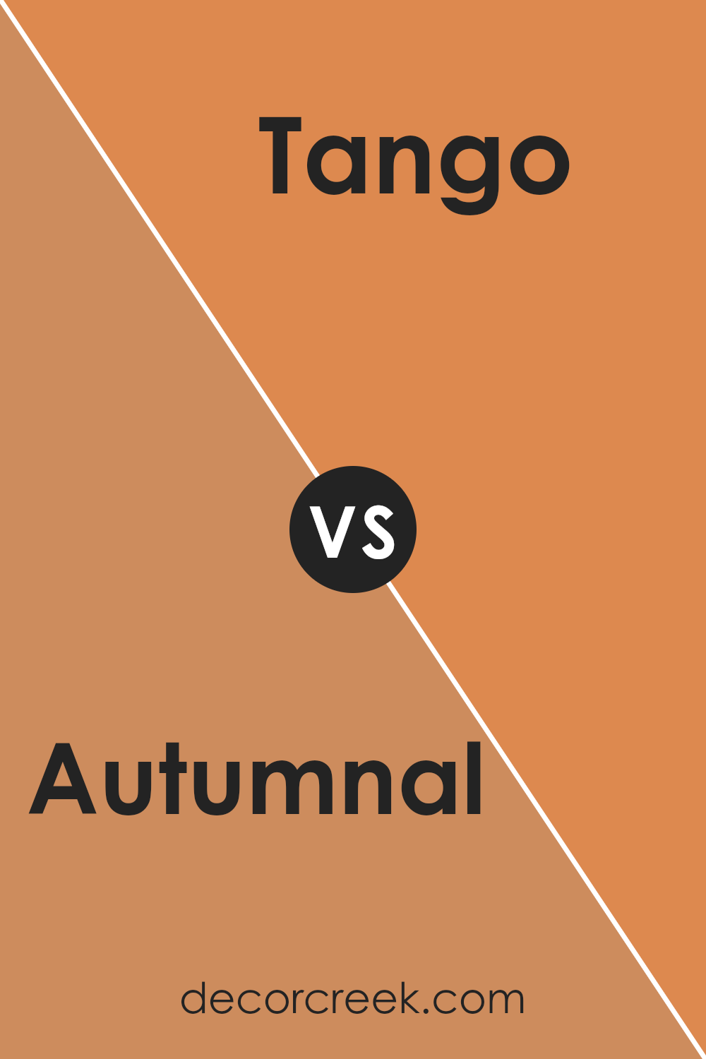
Autumnal SW 6361 by Sherwin Williams vs Tango SW 6649 by Sherwin Williams
Autumnal and Tango, both by Sherwin Williams, are vibrant and expressive colors. Autumnal is a warm, deep red with a cozy feel to it, like the rich hues you see in fallen leaves. It’s a color that screams autumn, perfect for creating a snug and inviting space. On the other hand, Tango is a bold, bright orange. It’s lively and energetic, more reminiscent of summer sunsets or the zest of citrus fruit.
While Autumnal brings a sense of welcome and warmth, Tango adds a punch of vibrant energy and fun to any room. Both colors stand out, but where Autumnal wraps you up in a warm blanket, Tango pulls you into a lively dance. They could complement each other well in a space that seeks both warmth and vibrancy, but each has its own distinct personality.
You can see recommended paint color below:
- SW 6649 Tango
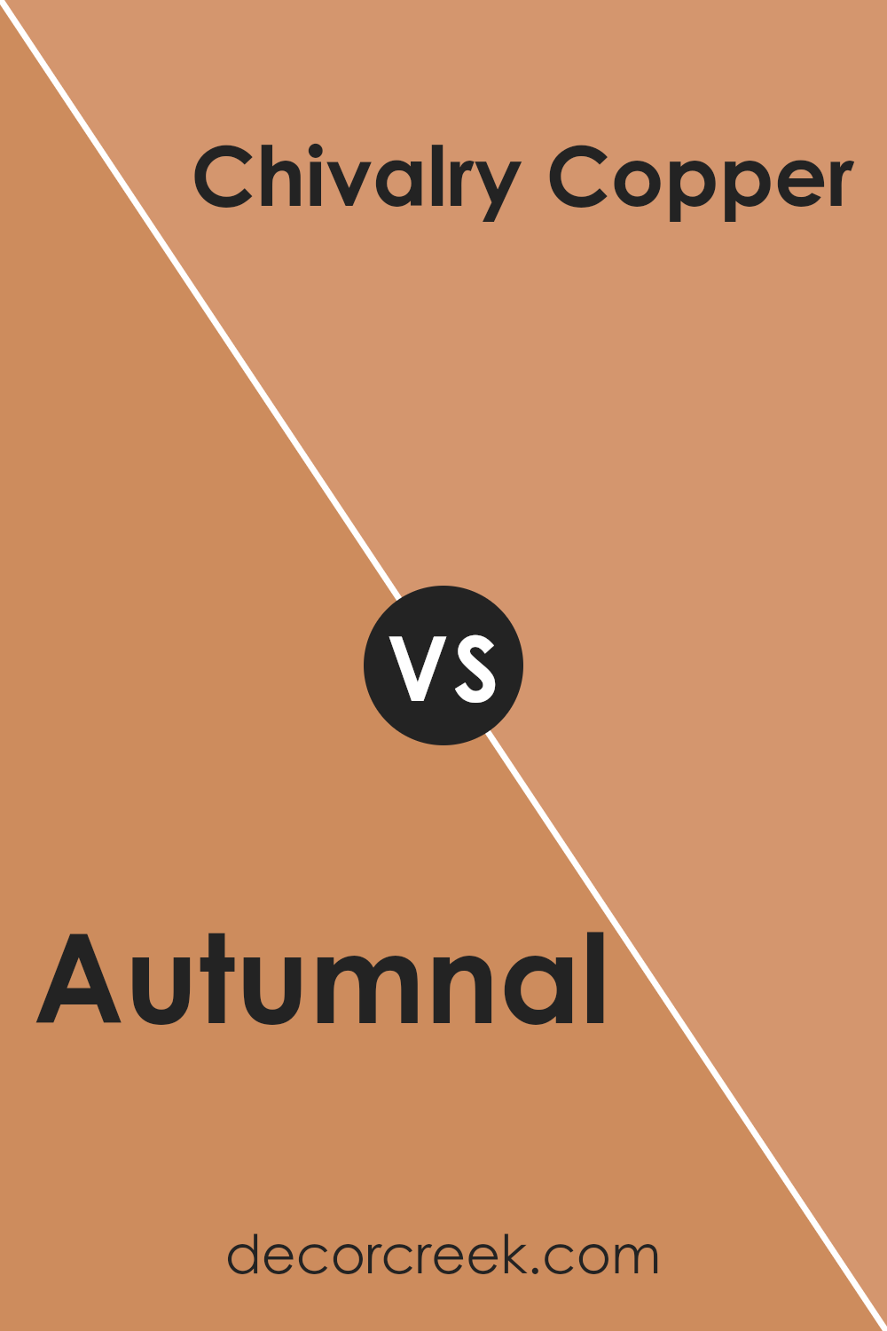
Autumnal SW 6361 by Sherwin Williams vs Chivalry Copper SW 6353 by Sherwin Williams
Autumnal is a cozy and warm shade, a bit like watching sunset colors blend together. It gives off a soothing, yet vibrant atmosphere. This color could light up any room, making it feel welcoming and lively. It’s versatile, fitting well in spaces you want to feel cozy and energized at the same time.
On the other hand, Chivalry Copper has a richer, more intense feel. It’s a bold color, closer to the reddish, deep tones of a traditional copper. It brings to mind the feeling of classic elegance and richness. This color could make a statement in a room, adding depth and a touch of luxury.
Both colors share a warm, inviting base, but they have different vibes. Autumnal leans more towards a cheerful, bright mood, while Chivalry Copper offers depth and sophistication. Depending on what atmosphere you’re aiming for, each color has its charm to transform a space.
You can see recommended paint color below:
- SW 6353 Chivalry Copper
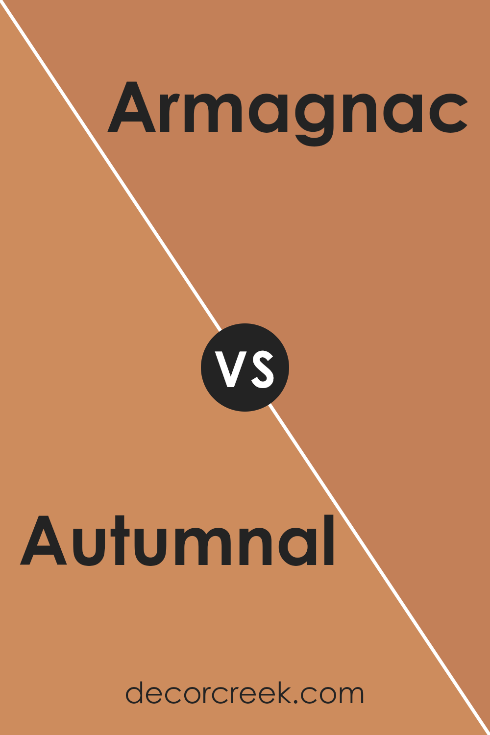
Autumnal SW 6361 by Sherwin Williams vs Armagnac SW 6354 by Sherwin Williams
Autumnal and Armagnac are two warm colors offered by Sherwin Williams, each with its own unique vibe. Autumnal is a vibrant, rich hue that reminds you of the golden leaves of fall. It has a lively and cozy warmth to it, making any space feel welcoming and snug. Think of it as the color of the perfect fall day, full of sunshine and the essence of autumn.
On the other hand, Armagnac leans more towards a deep, reddish-brown. It echoes the look of a fine aged brandy, providing a sense of sophistication and depth. This color can give a room an elegant, slightly dramatic feel without being too overpowering. It’s the kind of color that pairs well with dim lighting and plush furnishings, perfect for creating a refined ambiance.
While both colors share a warmth that can enhance any living space, Autumnal shines with its bright and cheerful golden tones, whereas Armagnac offers a more muted, luxurious feel with its rich, deep red-brown shades. Depending on the mood you want to set for your room, both colors offer fantastic but distinct options.
You can see recommended paint color below:
- SW 6354 Armagnac
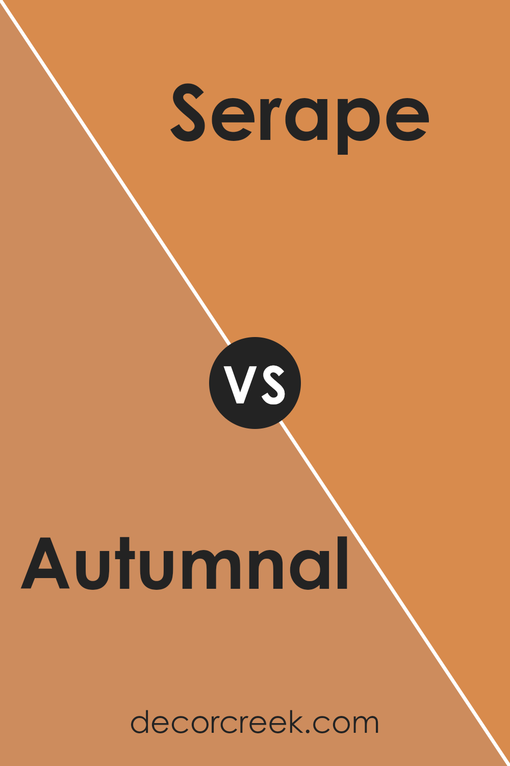
Autumnal SW 6361 by Sherwin Williams vs Serape SW 6656 by Sherwin Williams
Autumnal and Serape, both by Sherwin Williams, are unique colors with their own charm. Autumnal is like the essence of fall captured in paint. It brings to mind the cozy warmth of fallen leaves with its deep, rich reddish-orange hue. This color adds a welcoming and comforting vibe to any space, perfect for creating a homey atmosphere.
On the other hand, Serape is brighter and more vibrant. It’s a lively pink with a hint of orange, reminiscent of tropical sunsets or bright, blooming flowers. This color is great for adding a punch of energy and fun to any room, making it feel fresh and full of life.
While Autumnal leans towards a sophisticated, warm feel ideal for a cozy retreat, Serape is all about vibrancy and zest, best suited for spaces that aim to stimulate and invigorate. Choosing between them depends on the mood you wish to create: a warm, inviting nook with Autumnal or a lively, cheerful spot with Serape.
You can see recommended paint color below:
- SW 6656 Serape
Conclusion
Autumnal SW 6361 by Sherwin Williams is a rich, warm hue that brings a cozy and inviting atmosphere to any space. This color has the ability to transform a room into a comforting haven, reminiscent of the serene and gentle change of seasons. Its versatility allows it to be paired with a wide range of colors and decor, making it an excellent choice for anyone looking to add a touch of warmth to their home.
Choosing Autumnal for your walls means creating a backdrop that complements both modern and traditional designs. Whether it’s used in a living room, bedroom, or dining area, this shade adds depth and character. Its earthly vibe is perfect for those seeking a connection with nature indoors. Overall, it’s a great pick for anyone wanting to refresh their space with a color that is both timeless and sophisticated.
Ever wished paint sampling was as easy as sticking a sticker? Guess what? Now it is! Discover Samplize's unique Peel & Stick samples.
Get paint samples

