An aspect of interior decoration often overlooked by the untrained eye is the importance of color selection. Selecting the right color not only sets the mood but also complements the furnishings, lighting, and overall aesthetic. A popular choice among home decorators and designers is SW 6528 Cosmos.
This article is a deep dive into this popular color, understanding its undertones, coordinating colors, trim colors, how lighting affects it, and how to best utilize it within different rooms and areas of your home.

What Color is SW 6528 Cosmos?
Sherwin-Williams 6528 Cosmos is a captivating blend of blue and green, marrying the tranquility of the ocean with the serenity of a forest. The depth of its color spectrum can range from a deeper teal in dimmer lights to a lighter, more vibrant turquoise under brighter illumination.
The color invokes a calming yet spirited ambiance, making it an excellent choice for creating an inviting, calming space.
While the primary hue is blue-green, there are hints of gray that make SW 6528 Cosmos appear more muted than true turquoise or teal. This color has an intriguing versatility, being vibrant enough to add energy to a room yet subdued enough to serve as a soothing backdrop to a variety of interior design styles.

Ever wished paint sampling was as easy as sticking a sticker? Guess what? Now it is! Discover Samplize's unique Peel & Stick samples.
Get paint samples

Is It a Warm Or Cool Color?
SW 6528 Cosmos is a cool color. Cool colors are generally associated with the sky, ocean, and nature, and they tend to evoke feelings of calm and tranquility. This aligns with Cosmos’ blue-green base, which conjures images of the soothing ocean and refreshing greenery.
Undertones of SW 6528 Cosmos
Undertones subtly influence the overall perception of color. They become more evident under different lighting conditions or when placed next to other colors, and they can significantly impact how well a color coordinates with other hues in a room.
- Gray: This undertone gives the color a muted appearance, making it versatile and less overpowering in a room.
- Green: This lends a sense of freshness and vibrancy to the color, creating an inviting and lively atmosphere.
- Blue: This undertone evokes a feeling of tranquility and serenity, making it an excellent choice for creating calming spaces.

Coordinating Colors of SW 6528 Cosmos
Coordinating colors work harmoniously with a given color, either complementing or contrasting it in a way that brings balance and cohesion to a space. Here are the coordinating colors for SW 6528 Cosmos:
- SW 6525 Rarified Air : This light, airy blue provides a subtle contrast to the deeper Cosmos, helping to create a balanced, layered look.
- SW 7551 Greek Villa : This warm, off-white color can serve as a neutral companion to Cosmos, allowing the latter’s vibrancy to stand out without overwhelming the space.
- SW 0055 Light French Gray : This sophisticated neutral is a perfect match for Cosmos, complementing its cool undertones and creating a calm, serene environment.
Three additional coordinating colors could be:
- SW 6258 Tricorn Black for a bold contrast
- SW 7036 Accessible Beige for a muted, warm balance
- SW 6218 Tradewind for a cooler, serene blend

How Does Lighting Affect SW 6528 Cosmos?
Lighting plays a significant role in how we perceive SW 6528 Cosmos. Under bright, natural light, the color appears more vibrant, with its turquoise aspects more pronounced. It can feel refreshing and energetic, perfect for rooms with large windows that allow plenty of daylight.
In contrast, under artificial or dimmer light, the color tends to show more of its deep teal and gray undertones, becoming more subdued and tranquil.

Light Reflectance Value (LRV) of SW 6528 Cosmos
The Light Reflectance Value (LRV) of color is a measure of how much light it reflects. SW 6528 Cosmos has an LRV of 38, meaning it reflects 38% of the light that hits it. This places it in the mid-range of the LRV scale.
A color with an LRV in this range balances the line between reflection and absorption of light. This means that in a well-lit room, Cosmos won’t overly brighten the room by reflecting most of the light but will add some vibrancy due to its decent reflection rate.
Conversely, in a dimly lit room, it won’t absorb all the light, but it will create a cozy, calming effect due to its moderate absorption rate.
 of SW 6528 Cosmos")
LRV – what does it mean? Read This Before Finding Your Perfect Paint Color
Trim Colors of SW 6528 Cosmos
Trim colors are used on architectural features like molding, door frames, window frames, and skirting. They create boundaries and contrast within a room, bringing out the depth and beauty of the wall color. Three suitable trim colors for SW 6528 Cosmos could be:
- SW 7008 Alabaster : A warm, natural white that provides a gentle contrast to the cool Cosmos.
- SW 7006 Extra White : A pure white that provides a sharper contrast, making the Cosmos color pop.
- SW 7551 Greek Villa : A warm off-white that complements Cosmos, creating a soft, harmonious look.

Colors Similar to SW 6528 Cosmos
Understanding colors similar to SW 6528 Cosmos can offer alternatives that might be a better fit for your specific project.
- Behr Blue Hydrangea
- BM Pressed Violet
- Farrow & Ball Lulworth Blue
- PPG Kaleidoscope
- Valspar Porcelain Vase
Knowing similar colors allows you to stay within the same color family while fine-tuning the specific shade to match your design needs.

Colors That Go With SW 6528 Cosmos
To achieve a good-looking palette in your home, consider using the following colors along with SW Cosmos on the walls:
- SW 6244 Naval : This deep, rich navy can create a dramatic contrast, enhancing the vibrancy of Cosmos.
- SW 7637 Oyster White : A soft, warm white that provides a subtle, harmonious balance to the cool Cosmos.
- SW 6338 Beau Blue : A light pastel blue that complements Cosmos and adds an extra layer of tranquility.
- SW 6463 Breaktime : A soft, muted teal that harmonizes with Cosmos, creating a soothing monochromatic look.
- SW 6258 Tricorn Black : This pure, strong black creates a bold, dramatic contrast.
- SW 6052 Sandbank : A warm, sandy beige that provides a gentle, earthy balance to the cool Cosmos.
These colors work with SW 6528 Cosmos, offering various effects, from bold contrasts to subtle, calming harmonies. It’s essential to choose colors that complement each other to create a visually appealing space.

How to Use SW 6528 Cosmos In Your Home?
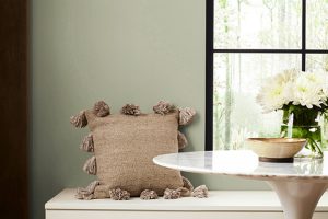
SW 6528 Cosmos is versatile enough to be used in various rooms, fitting into different design styles. Its calming undertones make it an excellent choice for areas you want to infuse with tranquility and relaxation, such as bedrooms or bathrooms. At the same time, its lively, vibrant nature can energize social areas like living rooms or kitchens.
Whether you’re going for a modern, minimalist look, a cozy rustic style, or an eclectic bohemian vibe, Cosmos can fit the bill. It pairs beautifully with natural materials like wood, metal, and stone and can complement a wide range of color schemes.
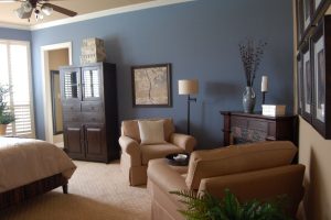
How to Use SW 6528 Cosmos in the Bedroom?
In a bedroom, Cosmos can create a serene and calming environment. When used on all walls, it can envelop the room in tranquility. Pair it with white or off-white furnishings for a fresh, clean look or with darker woods for a more cozy and grounded feel. For a more contemporary style, use it as an accent wall behind the bed, paired with lighter neutrals on the other walls.

How to Use SW 6528 Cosmos in the Bathroom?
In a bathroom, Cosmos can create a refreshing, spa-like feel. It pairs beautifully with white or gray tiles and chrome or brushed nickel fixtures. To prevent the color from overwhelming a small space, consider using it on the lower half of the walls with a lighter color or white tiles on the top half.

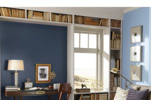
How to Use SW 6528 Cosmos in the Living Room?
In the living room, Cosmos can serve as a vibrant yet soothing backdrop. Pair it with neutral-colored sofas for balance, and add pops of complementary colors like yellows or corals in accessories for a vibrant look. For a more subdued look, use it on one accent wall or in accessories against a backdrop of neutral walls.

How to Use SW 6528 Cosmos for an Exterior?
For an exterior, Cosmos can create a striking and welcoming impression. It pairs well with white or off-white trim and can work beautifully with stone or brick elements. Consider using it on the front door for a splash of color or on trim elements for a unique, playful look.

How to Use SW 6528 Cosmos for the Kitchen?
In a kitchen, Cosmos can bring energy and vibrancy. For a modern look, consider Cosmos cabinets paired with white or gray countertops and backsplash. For a more traditional style, use it on a feature wall or as a colorful backsplash paired with white or wood cabinets.

How to Use SW 6528 Cosmos for the Kitchen Cabinets?
For kitchen cabinets, Cosmos can add a bold yet soothing touch. Pair it with lighter wall colors and countertops to prevent the color from overwhelming the space. Stainless steel or brushed nickel hardware can complement the color beautifully, adding a modern touch.

Comparing SW Cosmos With Other Colors
To better understand the color and see its uniqueness, compare it with other hues, similar and not. This will show you how different LRVs and undertones make colors be distinct.
SW 6528 Cosmos vs. SW 7006 Extra White
Extra White is a pure, bright white that provides a stark contrast against the cool and deep Cosmos. Combined, they create a vibrant, crisp look where Cosmos stands out as the primary color, and Extra White serves as the blank canvas, amplifying Cosmos’ vibrancy. The contrasting balance between these two colors can make a room feel lively yet balanced.

SW 6528 Cosmos vs. SW 6480 Lagoon
Both Cosmos and Lagoon reside in the realm of teal, but there are subtle differences between them. Lagoon leans more towards blue, while Cosmos has a balanced blend of blue and green with a hint of gray.
Lagoon comes off as more traditional and deep compared to the slightly modern and vibrant appeal of Cosmos. They can work together to create a layered, monochromatic look or individually, depending on the atmosphere you want to evoke.

SW 6528 Cosmos vs. SW 7541 Grecian Ivory
Grecian Ivory is a light, neutral beige with green undertones, presenting a warm counterpart to the cool Cosmos. When used together, these colors can create a balanced, harmonious look. Cosmos’ vibrant nature gets a subtle grounding effect from Grecian Ivory’s neutral warmth, making the combination suitable for creating a soothing yet lively environment.

SW 6528 Cosmos vs. SW 6340 Baked Clay
Baked Clay is a rich, warm color that contrasts significantly with the cool, refreshing nature of SW Cosmos. Baked Clay’s warm, earthy tone provides a rustic contrast to Cosmos’ modern, oceanic vibe. This pairing can result in an interesting, eclectic blend of warmth and coolness, bringing a vibrant energy to the room.

SW 6528 Cosmos vs. SW 6224 Mountain Air
SW Mountain Air is a light , muted blue with gray undertones. It is much softer and lighter compared to the deeper and more vibrant Cosmos. The soothing calmness of SW Mountain Air can provide a gentle contrast to the energizing vibe of Cosmos, creating a harmonious, tranquil atmosphere with a pop of liveliness.

SW 6528 Cosmos vs. SW 6258 Tricorn Black
Tricorn Black is a deep, solid black that can create a dramatic contrast with the vibrant Cosmos. When these two colors are paired, the resulting look is bold and attention-grabbing. Cosmos’ lively nature is dramatically emphasized by the dark backdrop of Tricorn Black, making the combination a striking choice for a contemporary, sophisticated interior.

Conclusion
In conclusion, Sherwin-Williams 6528 Cosmos is a vibrant yet calming color, striking the perfect balance between energetic and serene. Its unique blend of blue, green, and gray offers a range of design possibilities, from creating a tranquil retreat in a bedroom to a lively, engaging living area.
Its compatibility with various contrasting and coordinating colors makes it a versatile choice for different spaces, styles, and atmospheres.
Whether used as a primary wall color, an accent, or on cabinets, Cosmos can transform a room into a space that’s both invigorating and soothing. It’s a choice that invites creativity and personalization, ready to adapt to your vision and preferences. When it comes to selecting a color that’s both versatile and stylish, SW 6528 Cosmos is a compelling option worth considering.

Ever wished paint sampling was as easy as sticking a sticker? Guess what? Now it is! Discover Samplize's unique Peel & Stick samples.
Get paint samples
Frequently Asked Questions
⭐What style of interior decor does SW 6528 Cosmos best suit?
Cosmos is a versatile color that can fit into various interior decor styles. It's a popular choice for modern, coastal, and eclectic styles due to its vibrant yet soothing appeal. However, how it's used - whether as an all-over wall color, an accent wall, or on cabinetry - can influence its compatibility with different decor styles.
⭐What are the best rooms to use SW 6528 Cosmos in?
SW 6528 Cosmos can work well in any room due to its balanced nature. Its soothing undertones make it an excellent choice for bedrooms and bathrooms where tranquility is desired. Meanwhile, its vibrant appeal can energize social spaces like living rooms and kitchens.
⭐What colors coordinate well with SW 6528 Cosmos?
A wide range of colors can coordinate well with Cosmos. Light neutrals like SW 7551 Greek Villa, SW 0055 Light French Gray, or SW 6525 Rarified Air can balance its vibrancy. For a bold, dramatic look, colors like SW 6258 Tricorn Black can be used. Other shades of blues and greens, like SW 6218 Tradewind, can create a harmonious, layered look.
⭐How does lighting affect the look of SW 6528 Cosmos?
Lighting can significantly influence how Cosmos is perceived. Under bright, natural light, it appears more vibrant, with its turquoise aspects more pronounced. Under artificial or dimmer light, it leans more towards its deep teal and gray undertones, creating a more subdued and tranquil ambiance.
⭐What are suitable trim colors for SW 6528 Cosmos?
Trim colors in shades of white, such as SW 7008 Alabaster, SW 7006 Extra White, or SW 7551 Greek Villa, work well with Cosmos. These colors create a contrast that helps highlight the vibrancy of Cosmos and brings out its depth and beauty.