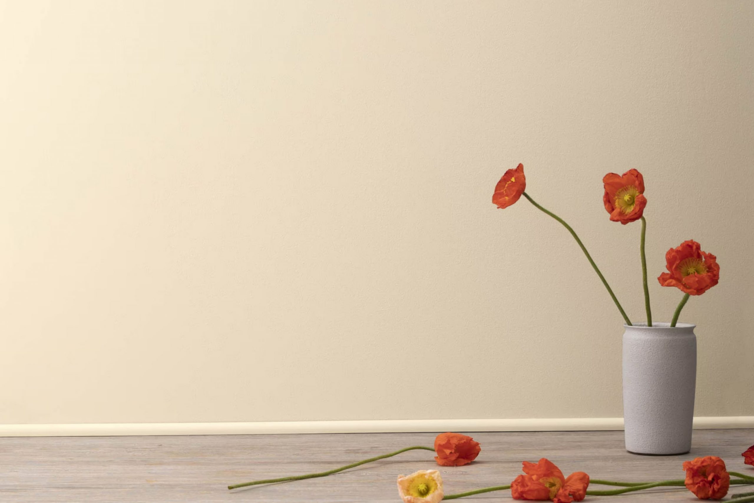
I recently had the chance to bring a fresh look to my living room, and I chose 1066 Barely Beige by Benjamin Moore for the walls. As someone always on the lookout for subtle yet warm shades, this color immediately caught my eye. Its light beige tone provides a soft backdrop that enhances the room’s natural light, making the area feel larger and more open.
Painting with Barely Beige proved to be a smooth experience. The color spread evenly, covering the old paint effectively without the need for multiple coats. It dried quickly, leaving a consistent matte finish that played beautifully with both the morning sunlight and the softer, evening light.
This color also offered me an adaptable base, allowing a wide range of decor styles and colors to fit in seamlessly. From bold, dark furniture to lighter, airy fabrics, everything works well against Barely Beige. It’s amazing how a single change like this can make my home feel refreshed and new without a complete overhaul.
Whether you’re looking to update a single room or revamp your entire house, considering a neutral like Barely Beige could do wonders.
What Color Is Barely Beige 1066 by Benjamin Moore?
Barely Beige by Benjamin Moore is a soft and subtle shade that adds a warm and inviting touch to any room. This color has a hint of warmth, making it adaptable and easy to pair with a variety of decor styles and materials. Barely Beige is ideal for creating a cozy and comfortable ambiance in your room.
In terms of interior styles, Barely Beige works particularly well in casual, traditional, and modern settings. It acts as a neutral backdrop that allows furniture and artwork to stand out. For a casual look, consider using this color with rustic wood finishes, cozy fabrics, and informal furnishings.
In a more traditional setting, it pairs elegantly with classic wood furniture, rich textiles like velvet, and detailed trimmings. For modern decor, complement Barely Beige with sleek furniture, metallic accents, and minimalistic decor to create a clean and fresh look.
When it comes to materials and textures, Barely Beige blends beautifully with natural elements such as wood, stone, and linen. Its warm undertones enhance the organic feel of these materials, making the room feel grounded and welcoming. It also works well with soft textures like cotton, wool, and plush upholstery, adding to the overall comfort of the room.
Is Barely Beige 1066 by Benjamin Moore Warm or Cool color?
Barely Beige 1066 by Benjamin Moore is a soft, light beige color that has a warm undertone. It’s a very adaptable shade that works well in many different areas of a home. Because it is so gentle and neutral, it can easily match with a wide range of other colors and decor styles. This is perfect for living rooms or bedrooms where you want a peaceful and welcoming atmosphere without the walls dominating the room.
In rooms with less natural light, Barely Beige helps to brighten the setting subtly without being too stark, like some whites can be. It’s particularly effective in making small rooms feel bigger and more open. For those looking to refresh their home without making drastic changes, repainting with this color can be a great choice.
It lays a calm, neutral backdrop that lets furniture and other decor items stand out. Whether you have a modern or traditional taste, Barely Beige offers a clean, fresh look that keeps everything looking tidy and harmonious.
Undertones of Barely Beige 1066 by Benjamin Moore
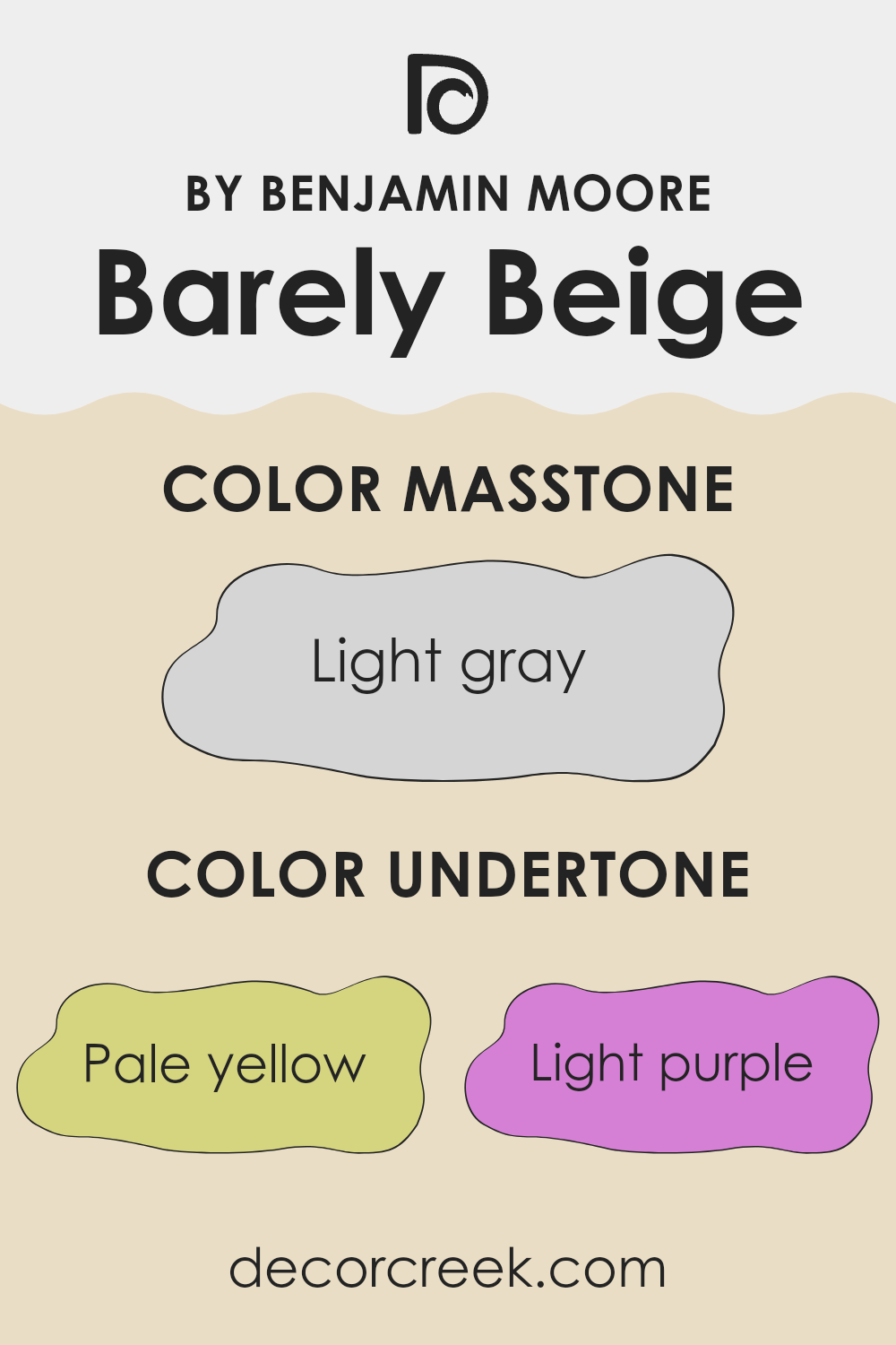
Barely Beige 1066 is a subtle and adaptable paint color by Benjamin Moore that has a range of undertones, which include pale yellow, light purple, light blue, pale pink, mint, lilac, and grey. These undertones play a key role in how this color appears under different lighting conditions and when paired with various décor elements.
Color undertones can significantly influence the visual perception of a room. They can make a color appear warmer or cooler, depending on the surrounding environment and lighting. For example, the pale yellow undertone in Barely Beige can make a room feel slightly warmer and more inviting, an effect that enhances settings that receive less natural light.
The presence of light purple and lilac undertones adds a hint of coolness, which can help in balancing the warmth of the yellow, making the paint excellent for rooms that aim for a balanced, neutral feel. Furthermore, the grey undertone serves to mute the overall intensity, ensuring that the color remains soft and subtle, making it a perfect choice for creating a calm and relaxing environment without overpowering the senses.
Using Barely Beige on interior walls can have different effects depending on the room direction and natural light. In rooms with ample sunlight, the pale yellow and light blue undertones might become more pronounced, providing a bright and airy feel. In artificial light, the grey and mint undertones may dominate, producing a more grounded and cool atmosphere.
This adaptability with its undertones makes it practical for various rooms and styles, adjusting subtly to complement natural influences and decor.
What is the Masstone of the Barely Beige 1066 by Benjamin Moore?
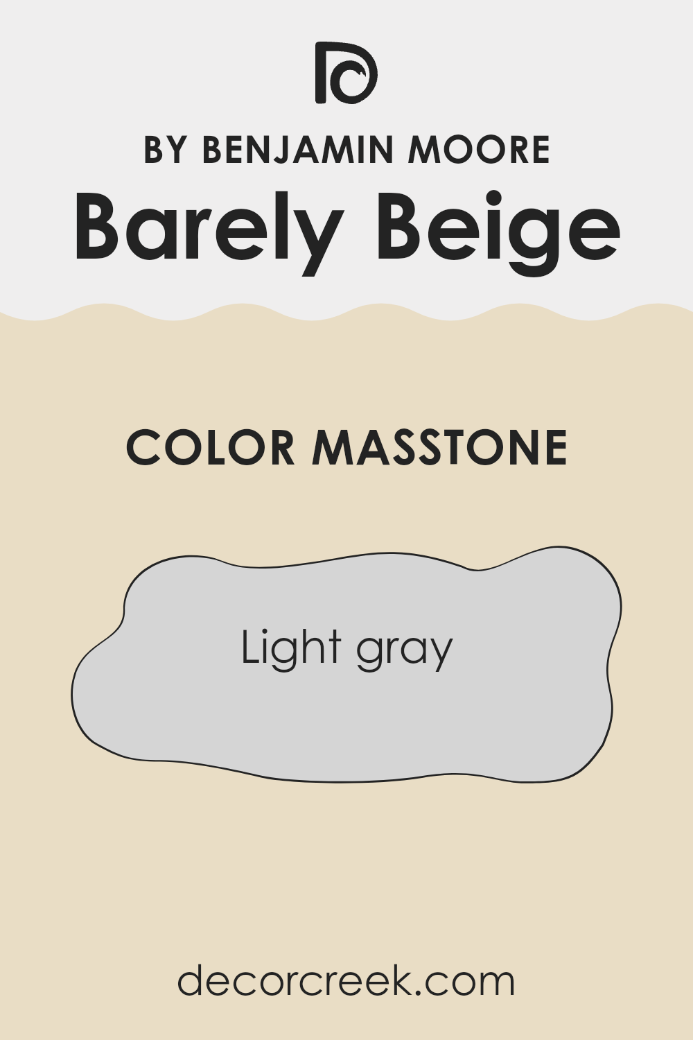
Barely Beige 1066 by Benjamin Moore sports a masstone of light gray, providing a subtle and neutral backdrop perfect for most home environments. This shade’s gentle gray tone means it can blend seamlessly with a variety of decor styles, from modern minimalist to cozy country.
Because it doesn’t overpower, this color helps smaller rooms appear more open and well-lit, while still adding enough warmth to make larger areas feel inviting. When used on walls, this particular light gray creates a calm, clean canvas that showcases other colors used in the room, like furnishings or art.
It’s also very forgiving when it comes to maintenance, as light marks or drawings don’t stand out starkly against its mild hue. This makes it an ideal choice for busy households that want to maintain a tidy look with minimal effort. Overall, Barely Beige 1066 offers adaptability and easiness, making it a reliable option for creating a pleasant home atmosphere.
How Does Lighting Affect Barely Beige 1066 by Benjamin Moore?
Lighting plays a crucial role in how colors appear in our environments. Different light sources can dramatically alter the perception of a color. For example, the color Barely Beige by Benjamin Moore might be affected in various ways depending on whether it is viewed under natural or artificial light.
In artificial light, Barely Beige tends to look warmer and more inviting. Incandescent bulbs, which give off a yellowish tone, can enhance the warmth of Barely Beige, making it appear cozier and softer. Fluorescent lighting, on the other hand, has a cooler tone and can make Barely Beige look slightly more muted and less warm.
Under natural light, the appearance of Barely Beige can change depending on the time of day and weather conditions. During a bright, sunny day, Barely Beige may have a crisp, vibrant quality, whereas on a cloudy day, it might appear more subdued and gentle.
The orientation of the room also affects how Barely Beige looks. In north-facing rooms, which receive less direct sunlight and tend to have cooler light, Barely Beige might look more subdued and slightly cooler in tone. This can make the room feel calm but slightly shadowed.
South-facing rooms get plenty of sunlight throughout the day, which means Barely Beige will appear brighter and truer to its color most of the time. This orientation is ideal for maintaining the color’s warmth and depth all day long.
East-facing rooms receive strong light in the morning. Here, Barely Beige will look very lively and warm in the morning but will lose some intensity as the day progresses. This makes it ideal for breakfast rooms or morning areas.
West-facing rooms get the evening light, which can be quite warm and intense. Barely Beige in these rooms will look particularly warm and welcoming in the afternoon and evening when the sun sets. Understanding how light affects colors can help you make informed choices about paint colors in your home to achieve the desired effect in each area.
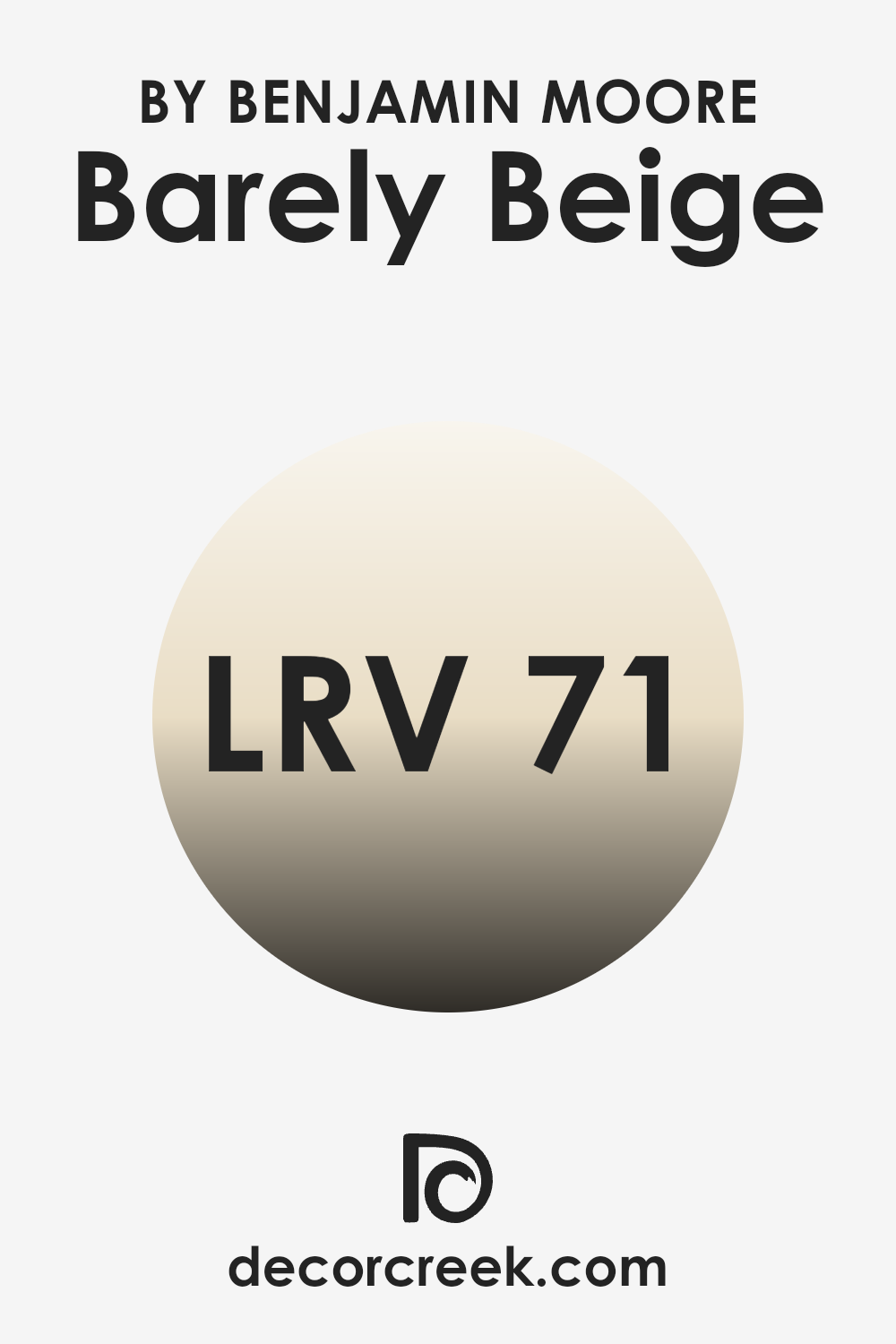
What is the LRV of Barely Beige 1066 by Benjamin Moore?
LRV, or Light Reflectance Value, is a measure used to describe the percentage of light a paint color reflects from or absorbs into a surface. When you pick a color for your home or office, understanding LRV can be quite useful as it affects how light or dark the color appears once it’s applied to the walls.
Higher values mean the color reflects more light, making the area feel brighter and more open. Conversely, lower values mean the color absorbs more light, which can make a room feel cozier but also smaller and darker.
The LRV of Barely Beige is 71.32, indicating that it is a light color that will reflect a substantial amount of light. This characteristic makes it a good choice for areas that you want to appear more airy and spacious.
It can help in brightening dim rooms or giving a lift to an area that doesn’t get much natural sunlight. The gentle tone of Barely Beige ensures that it isn’t too stark, providing a warm feel to the environment without overpowering the senses. This makes it adaptable for use in various settings and decor styles, enhancing the area with a soft, welcoming atmosphere.
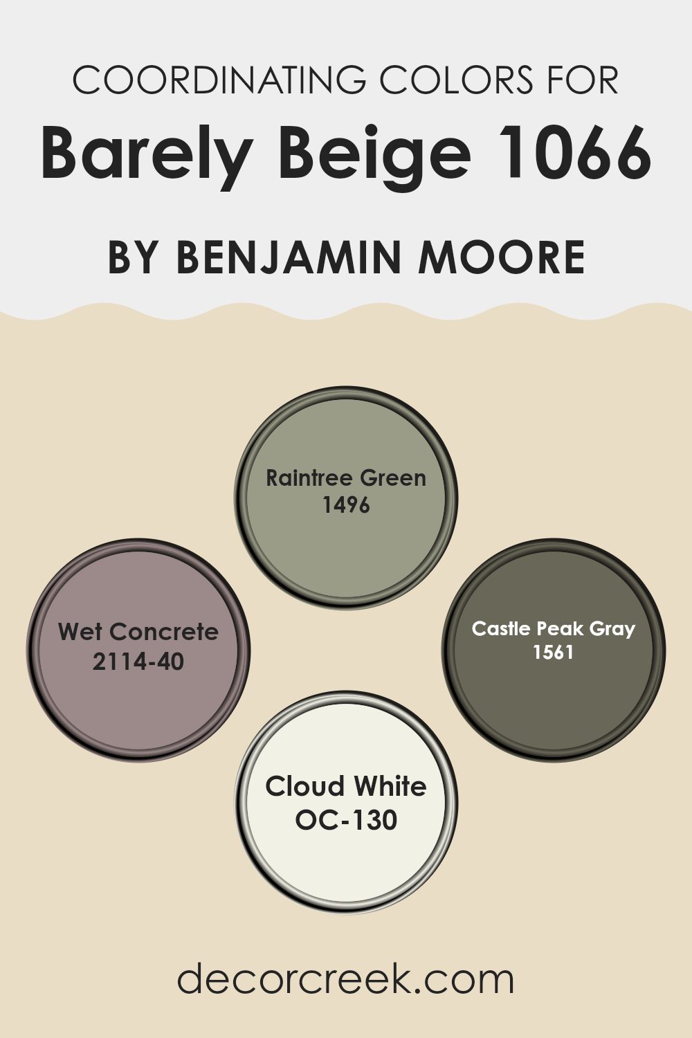
Coordinating Colors of Barely Beige 1066 by Benjamin Moore
Coordinating colors are various shades that harmonize well with a main color to create a balanced and appealing look in an area. These colors either complement or contrast with the main color, providing options to create different moods or themes in a room.
For instance, Barely Beige by Benjamin Moore is a soft, neutral beige that serves as an adaptable backdrop, making it easy to incorporate a range of coordinating colors that can either subtly enhance or softly contrast its warm tones.
1496 – Raintree Green is a muted green with earthy tones, offering a natural and grounding effect that pairs beautifully with the neutrality of the beige. 2114-40 – Wet Concrete is a deep, cool gray that provides a strong contrast, ideal for adding a bit of drama and depth to an otherwise light and airy area. 1561 – Castle Peak Gray offers a lighter gray option that is still robust enough to make a statement, yet it remains understated enough to maintain a calm atmosphere.
OC-130 – Cloud White is a clean and crisp white, perfect for trim and ceilings, providing a fresh lift that complements the warmer tones of the beige. Each of these colors works together with Barely Beige to create a cohesive and inviting palette.
You can see recommended paint colors below:
- 1496 Raintree Green
- 2114-40 Wet Concrete
- 1561 Castle Peak Gray
- OC-130 Cloud White
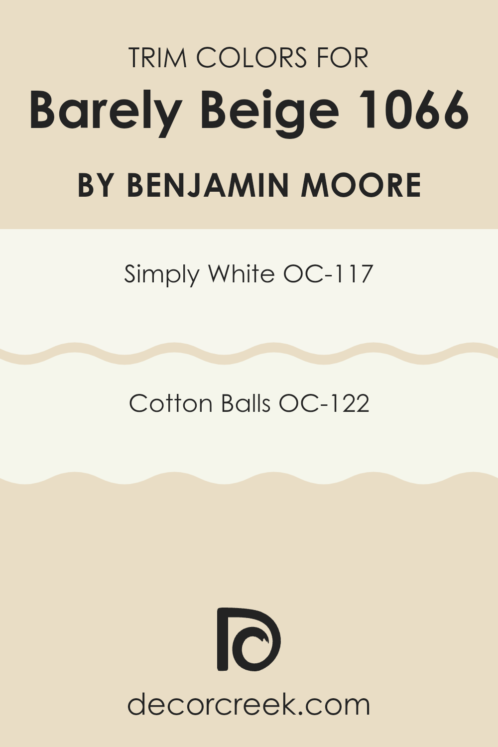
What are the Trim colors of Barely Beige 1066 by Benjamin Moore?
Trim colors are specific shades selected to accentuate or complement the main color on walls, typically used for door frames, skirtings, window frames, and moldings. Choosing the right trim color can enhance the visual appeal of a room by creating a pleasing contrast or seamless transition between the wall color and other architectural elements.
For a color like Barely Beige by Benjamin Moore, which is a soft, neutral tone, the recommended trim colors like OC-117 Simply White and OC-122 Cotton Balls are particularly effective in creating a clean and pulled-together look.
Simply White (OC-117) is a crisp, clean white that has a fresh and bright quality, making it a perfect counterpoint to the warmth of Barely Beige. It helps define the area crisply without overpowering the soft tone of the main color.
Cotton Balls (OC-122) is another excellent choice for trims; it’s a slightly warmer white that offers a subtle, gentle highlight to the warmer undertones in Barely Beige. Using either of these whites can give rooms a more coherent, polished appearance, enhancing the overall aesthetic without complicating the color scheme.
You can see recommended paint colors below:
- OC-117 Simply White
- OC-122 Cotton Balls
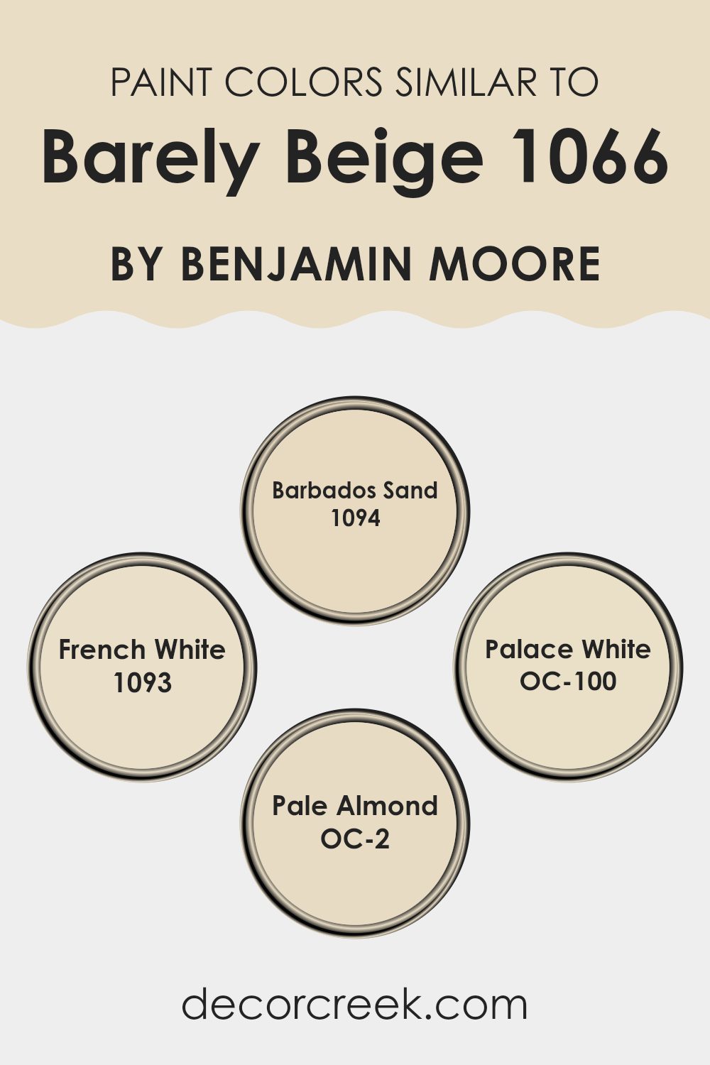
Colors Similar to Barely Beige 1066 by Benjamin Moore
Similar colors play a vital role in creating a harmonious and cohesive look in interior design, especially when aiming for a subtle and refined aesthetic. Choosing shades like 1094 – Barbados Sand, 1093 – French White, OC-100 – Palace White, and OC-2 – Pale Almond, which have a close relation to Barely Beige, ensures a smooth visual flow between different surfaces and elements in a room.
These colors, by sharing similar undertones, effectively enhance each other, contributing to a unified atmosphere without abrupt visual interruptions. Such a palette allows for design flexibility, making it easier to blend various textures and furniture styles, while maintaining an overall elegant cohesion.
Among these hues, 1094 – Barbados Sand brings warmth to areas, offering a comforting earth tone that works well with natural materials like wood and stone. Meanwhile, 1093 – French White provides a subtle hint of ivory that reflects light beautifully, enhancing the brightness of a room without being stark. OC-100 – Palace White is another adaptable choice, with a hint of soft gray, making it an excellent backdrop for both vibrant and muted decors.
Lastly, OC-2 – Pale Almond is a gentle beige that lends a touch of warmth to any setting, pairing beautifully with a wide range of colors and adding a discreet touch of coziness to the environment. Together, these shades create a palette that is easy to live with and style around, perfect for achieving a pleasant and inviting home atmosphere.
You can see recommended paint colors below:
- 1094 Barbados Sand
- 1093 French White
- OC-100 Palace White
- OC-2 Pale Almond
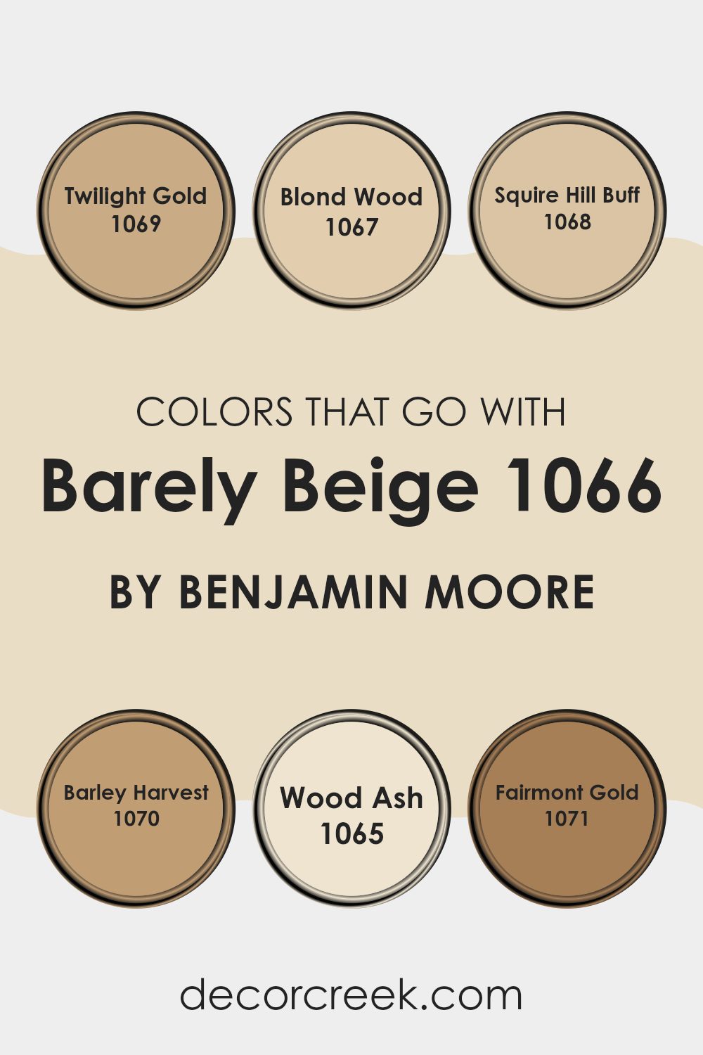
Colors that Go With Barely Beige 1066 by Benjamin Moore
Choosing colors that complement Barely Beige 1066 by Benjamin Moore is crucial for creating a harmonious and visually appealing setting. Barely Beige is a soft, welcoming neutral that serves as a perfect backdrop for both bold and subtle hues, allowing for an adaptable palette. Coordinating colors like Twilight Gold, Blond Wood, and Squire Hill Buff, each add their own charm while maintaining balance in the overall design. Twilight Gold is a warm, inviting color that resembles the subtle glow of a sunset and adds a touch of warmth to any room, making it feel cozy and comfortable.
Blond Wood has a light, natural hue reminiscent of freshly cut wood, offering a neutral but fresh feel that complements darker or brighter tones. Squire Hill Buff is slightly deeper, echoing the shades found in a sandy cliff, and it works beautifully to ground lighter colors like Barely Beige.
Moving to slightly richer tones, Barley Harvest brings to mind ripe, golden fields, adding a rustic touch that’s both appealing and comforting. Wood Ash, the lightest among these suggestions, has a clean, crisp tone, perfect for creating a fresh look when paired with the warmth of Barely Beige.
Lastly, Fairmont Gold offers a muted golden hue that radiates warmth, perfect for adding a welcoming touch without overpowering the senses. Together, these colors form a cohesive, well-rounded palette that enhances the beauty and flexibility of Barely Beige.
You can see recommended paint colors below:
- 1069 Twilight Gold
- 1067 Blond Wood
- 1068 Squire Hill Buff
- 1070 Barley Harvest
- 1065 Wood Ash
- 1071 Fairmont Gold
How to Use Barely Beige 1066 by Benjamin Moore In Your Home?
Barely Beige 1066 by Benjamin Moore is a gentle and subtle paint color that can breathe new life into any room in your home. This shade is a smooth, soft beige that can make areas feel cozy and welcoming. It works particularly well in living rooms or bedrooms where a calm atmosphere is desired, making these rooms perfect for relaxing and unwinding.
You can use Barely Beige on all walls for a uniform look, or it can be applied to one wall to create a stylish accent feature. It pairs beautifully with white trim or can be matched with darker furniture pieces for a nice contrast.
Additionally, this color does wonders in small rooms or environments with limited natural light, as it reflects light well, helping to make interiors appear larger and brighter. Whether you’re updating your home with fresh paint or just adding a new twist to your color scheme, Barely Beige offers an adaptable option that blends seamlessly with various decor styles and other colors.
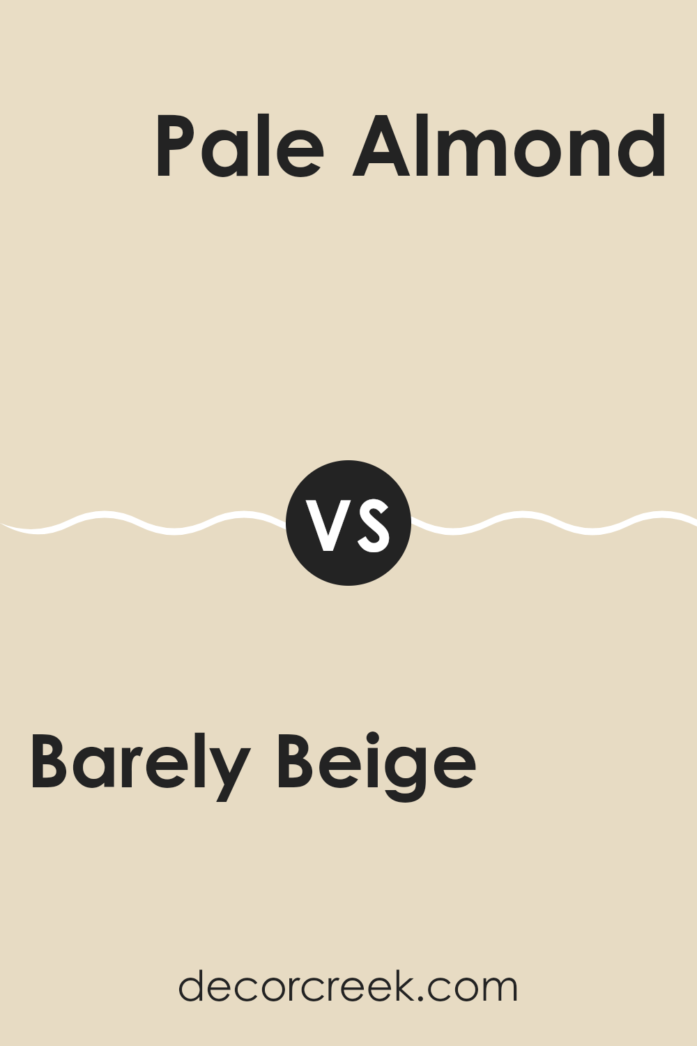
Barely Beige 1066 by Benjamin Moore vs Pale Almond OC-2 by Benjamin Moore
Barely Beige 1066 and Pale Almond OC-2 by Benjamin Moore are both subtle, warm neutrals, perfect for creating cozy and inviting settings. Barely Beige leans more towards a classic beige tone with soft, creamy undertones.
It’s a great choice if you want a hint of warmth without overpowering a room. On the other hand, Pale Almond is slightly lighter and has a hint of almond, which gives it a fresher appearance. This color works well in rooms where you want to maintain a bright and airy feel.
Both colors are flexible and can easily blend with various decors, but Barely Beige might be better for those seeking a traditional beige look, while Pale Almond is ideal for those who prefer something a bit brighter and more neutral. Both paint colors are understated enough to be used extensively throughout a home, from living rooms to bedrooms.
You can see recommended paint color below:
- OC-2 Pale Almond
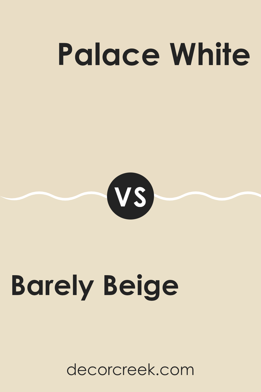
Barely Beige 1066 by Benjamin Moore vs Palace White OC-100 by Benjamin Moore
Barely Beige and Palace White are two subtle paint colors from Benjamin Moore. Barely Beige is a gentle beige tone, giving a warm and inviting feel. Its somewhat richer warmth makes rooms cozy, perfect for areas where you want a touch of softness without overpowering brightness.
On the other hand, Palace White is a lighter, almost creamy color. It’s not stark white; rather, it has a hint of off-white with an understated warmth that’s adaptable and gentle, making it great for settings that you want to feel soft and light.
These colors differ mainly in their warmth and depth. Barely Beige, with its slightly deeper tone, offers a comforting warmth, suitable for living areas and bedrooms. Palace White, being lighter, works well in smaller rooms or areas where you want to enhance natural light, like kitchens and bathrooms. Both colors work well in a variety of decorating styles, adding a clean, fresh backdrop to any setting.
You can see recommended paint color below:
- OC-100 Palace White
Barely Beige 1066 by Benjamin Moore vs French White 1093 by Benjamin Moore
Barely Beige and French White are two calming colors by Benjamin Moore that are both subtle, yet have distinct differences. Barely Beige has a soft, sandy touch, offering a warm, inviting feel to any room. It can make rooms feel cozy and is adaptable enough to match a variety of decor styles and colors.
On the other hand, French White offers a touch more neutrality. It leans slightly towards a creamy off-white without becoming too stark or cold, making it ideal for someone looking to freshen up a setting while keeping it warm and welcoming.
In comparison, Barely Beige brings a tad more warmth due to its beige undertones, whereas French White serves as a cleaner, slightly less warm backdrop. Both colors are great for creating a light, airy feel, but your choice between them might hinge on whether you prefer the slight, warm sandiness of Barely Beige or the softer, creamy appeal of French White.
You can see recommended paint color below:
Barely Beige 1066 by Benjamin Moore vs Barbados Sand 1094 by Benjamin Moore
Barely Beige 1066 and Barbados Sand 1094 by Benjamin Moore are both subtle, warm-toned neutral colors ideal for creating a cozy atmosphere. Barely Beige leans slightly lighter with a soft, muted tone that offers a calm and clean look. It’s adaptable and works well in almost any setting, reflecting light beautifully to make rooms feel more spacious.
On the other hand, Barbados Sand is a bit deeper and has a richer, creamier feel to it. This color adds warmth to a room and pairs well with darker furniture or accents, giving a room a more grounded and welcoming vibe. The added depth makes Barbados Sand a great choice for areas that require a touch of warmth without being overpowering.
Both colors are excellent choices for those looking to maintain a neutral palette while adding warmth and comfort to their living environments. Depending on the lighting and furnishings, each can adjust well, making them practical for various home styles.
You can see recommended paint color below:
After reading about the 1066 Barely Beige paint color by Benjamin Moore, I have learned quite a bit about how this paint can make a room look really lovely. Barely Beige is a warm and soft color, almost like the color of sand on a sunny beach. This means it’s really easy to match it with different decors and furniture, whether your room has a lot of colors or just a few.
It’s a great choice if you want your room to feel cozy and inviting. Because it’s from Benjamin Moore, a brand known for making quality paints, you can expect it to go on smoothly and last a long time, which means you won’t have to repaint often. This makes it a smart pick if you’re someone who doesn’t like doing extra work.
Finally, choosing Barely Beige is a safe bet if you’re unsure about what color to paint your room. It’s simple, looks clean, and isn’t too bright or too dark.
So, whether you’re painting your living room, bedroom, or even a small corner of your home, 1066 Barely Beige by Benjamin Moore could be just the right color to make your setting feel warm and welcoming.
Ever wished paint sampling was as easy as sticking a sticker? Guess what? Now it is! Discover Samplize's unique Peel & Stick samples.
Get paint samples

