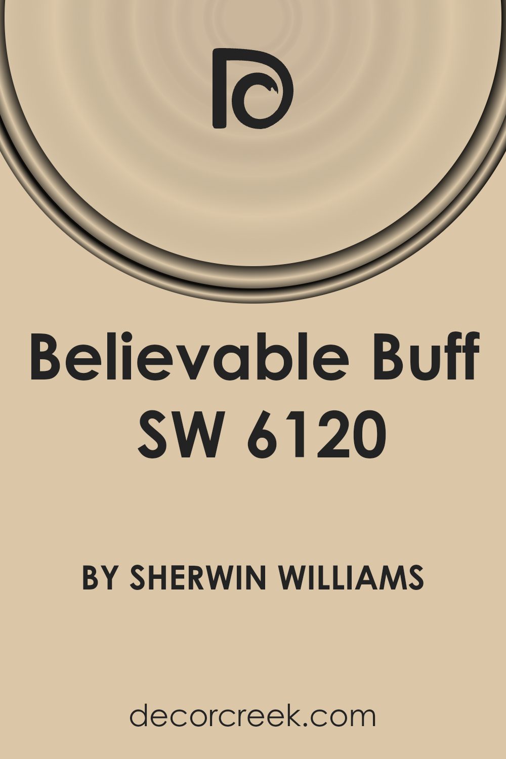
The paint color named Believable Buff, or SW 6120, is a creation by Sherwin Williams, a brand well-known for its wide range of quality paints. This particular shade is a popular choice among homeowners and interior designers owing to its warm and inviting hue. Believable Buff falls within the spectrum of neutral colors, making it incredibly versatile for use in various spaces and styles of decor. Whether you’re looking to paint a cozy living room, a serene bedroom, or even a welcoming kitchen, this color provides a perfect backdrop.
One of the key advantages of using Believable Buff is its ability to complement various furnishings and accent colors. This means you can easily pair it with soft pastels for a gentle, relaxing vibe or with bold, rich colors for a more dynamic look. In addition, its neutral yet warm tone helps in creating an illusion of space and light in smaller or dimly lit rooms, making rooms feel more airy and bright.
If you’re planning to update the look of your home, considering Believable Buff could be a great starting point. Its adaptability and the cozy atmosphere it brings have made it a favorite choice for those aiming to achieve a friendly and inviting home environment without overwhelming the senses. This article will guide you through everything you need to know about Believable Buff, from its best pairings to how it transforms spaces with its warmth and charm.
What Color Is Believable Buff SW 6120 by Sherwin Williams?
The color Believable Buff by Sherwin Williams is a warm and inviting shade that radiates coziness and simplicity. Picture a soft, creamy beige that has just a hint of peachy warmth, creating a welcoming ambiance in any space. This versatile hue serves as an excellent backdrop for various interior styles, particularly shining in environments where comfort and relaxation are key. It slots seamlessly into country, rustic, and even modern minimalist themes, thanks to its understated elegance and warmth.
Believable Buff works wonders with natural materials and textures, enhancing their beauty without overpowering them. In spaces featuring wood, from honey-toned pine to richer walnut, it brings out the material’s natural warmth, making the room feel grounded and serene. Paired with stone, whether it’s a sleek marble countertop or a rugged stone fireplace, it adds to the richness and depth of the texture.
Fabrics in natural fibers like cotton, linen, and wool in neutral colors or soft, earthy tones harmonize beautifully with Believable Buff, creating a cozy, layered look that’s both stylish and inviting. Metals, from brushed gold to wrought iron, add a hint of sophistication and contrast nicely with its warm, creamy base, proving that Believable Buff is a truly versatile color that can pull together a variety of materials and textures to create a space that feels cohesive and warmly welcoming.
Is Believable Buff SW 6120 by Sherwin Williams Warm or Cool color?
Believable Buff by Sherwin Williams is a warm and neutral paint color that brings a cozy and inviting atmosphere into any home. Perfect for those looking to create a comfortable and calming space, this color has a way of making rooms feel more welcoming. Its versatility allows it to work beautifully in a variety of spaces, from living rooms and bedrooms to kitchens and bathrooms.
This shade is like a hug for your walls, providing a soft backdrop that complements both modern and traditional decor. Because of its neutral tone, Believable Buff pairs well with a wide range of other colors, from bright and bold to soft and subtle, allowing for flexibility in design and decoration. It’s particularly effective in spaces that get a lot of natural light, where it can take on a warm, golden glow that adds depth and richness.
In addition to its aesthetic appeal, Believable Buff has practical benefits too. Its neutrality can help smaller spaces appear larger and more open, while also offering a timeless look that won’t quickly go out of style. This makes it a smart choice for homeowners looking for a color that will last through various trend cycles. Whether you’re aiming for a look that’s cozy and serene or warm and inviting, Believable Buff is a color that can help you achieve it.
Undertones of Believable Buff SW 6120 by Sherwin Williams
Believable Buff is a warm and versatile paint color that brings a cozy feel to any room. This color is not just a simple buff; its richness comes from the mix of subtle undertones it harbors. Think of undertones like secret ingredients in a recipe; they can dramatically change how a color looks under different lighting and when paired with various decor elements.
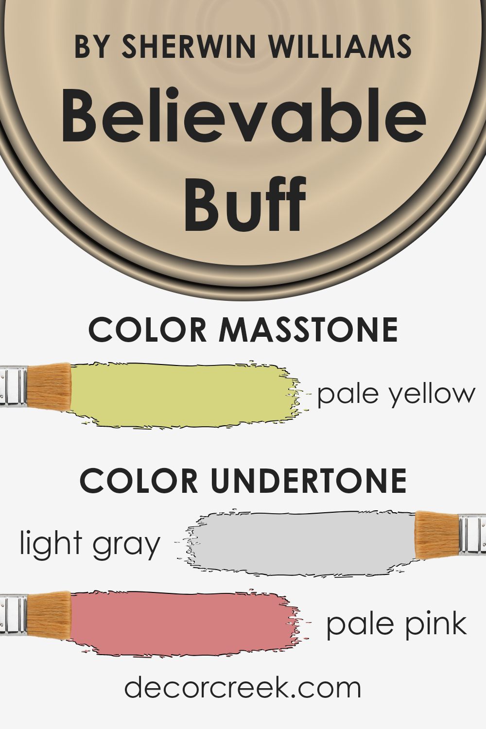
Among its undertones, you’ll find hints of light gray, giving it a soft, muted base. Pale pink and light purple add a touch of sweetness and depth, preventing the color from feeling flat. Mint and light blue introduce fresh, airy vibes, ideal for creating a soothing environment. The gray component keeps Believable Buff grounded, ensuring it complements contemporary interior styles seamlessly.
Lilac and yellow undertones inject a playful dynamism, brightening up spaces without overwhelming them. Orange and light green notes bring warmth and energy, perfect for creating inviting spaces. Lastly, the olive undertone adds an earthy richness, enhancing the color’s natural feel.
In practice, these undertones influence how Believable Buff adapts to different room aspects and lighting conditions. In sunlight, the warmer undertones like orange and yellow may stand out, making the room feel vibrant yet cozy. In artificial light, the cooler tones like light gray and mint might become more pronounced, offering a calm and serene ambiance.
On interior walls, Believable Buff acts as a chameleon, subtly shifting its appearance to match its surroundings. This adaptability makes it an excellent choice for living rooms, bedrooms, and even kitchens, where its various undertones can harmonize with a wide range of furniture, flooring, and accessory colors. Overall, its complex undertones add layers of visual interest and depth, transforming spaces into warm, inviting environments.
What is the Masstone of the Believable Buff SW 6120 by Sherwin Williams?
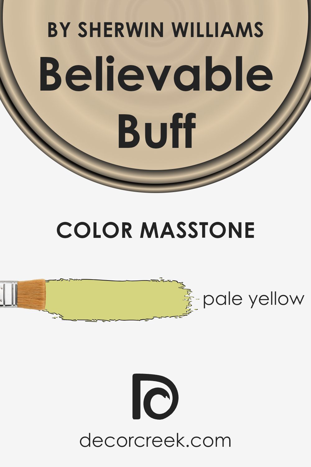
Believable Buff is like a soft hug in the form of color. Its main tone, pale yellow (#D5D580), has a gentle sunny vibe that brings warmth to any room without overwhelming it. This color is fantastic for homes because it works so well in various spaces, from a cozy reading nook to a lively kitchen.
Pale yellow is known for its ability to make spaces feel brighter and more welcoming. During the day, it captures the sunlight, making rooms appear more spacious and airy. As the evening comes, it transitions smoothly, maintaining a warm and peaceful atmosphere, perfect for relaxing after a long day.
This versatility means that it can fit with many decor styles, from traditional to modern. Its understated elegance allows for a wide range of furniture and accent colors to pop against it. Whether you’re looking to create a serene bedroom or invigorate a living space, this color’s light and cheerful nature can help achieve the desired ambiance with ease.
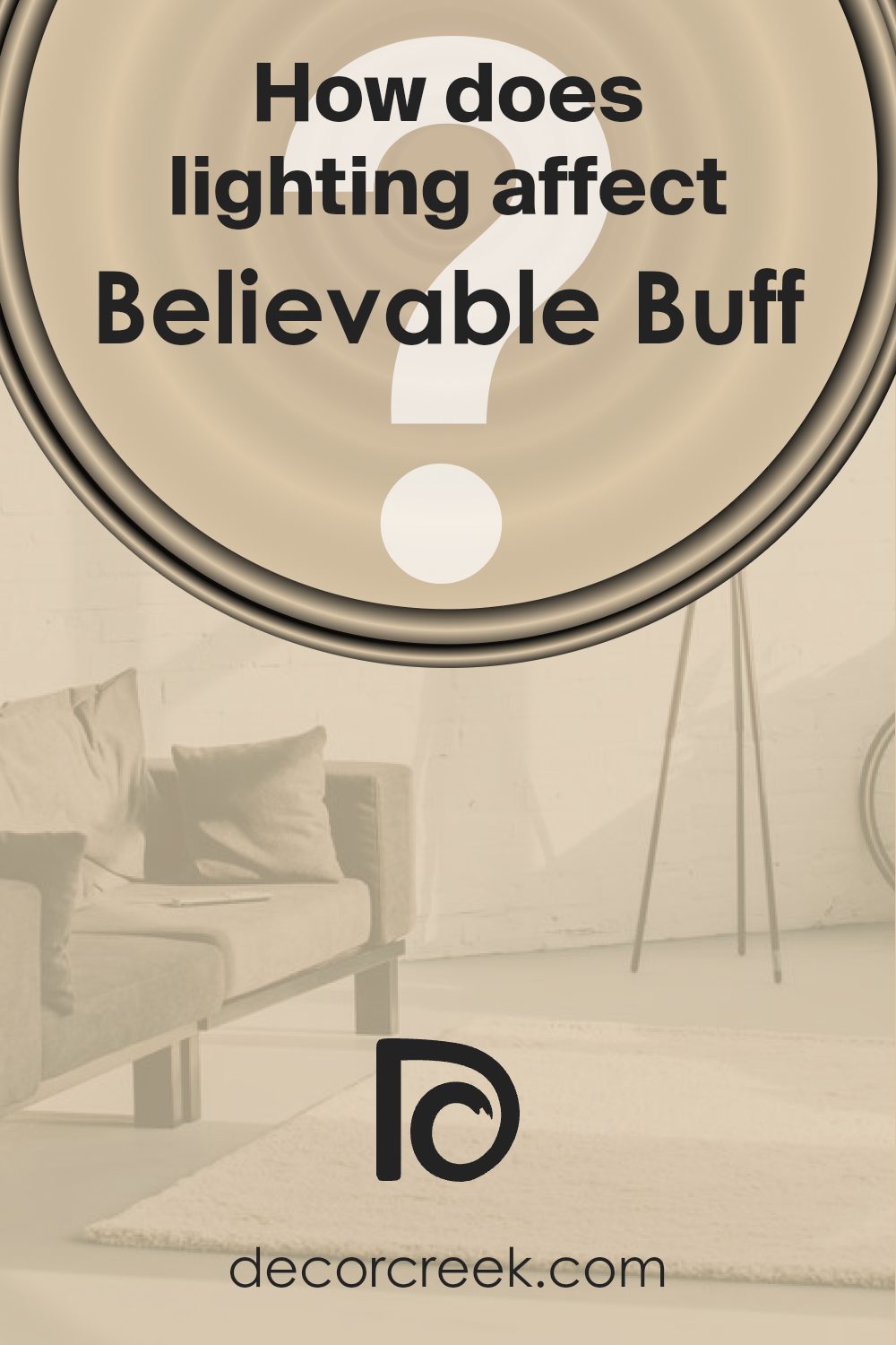
How Does Lighting Affect Believable Buff SW 6120 by Sherwin Williams?
Lighting plays a crucial role in how colors look in any space. It can change the appearance of a color significantly, making it look different under various light sources. This principle applies well to a color like Believable Buff, a warm and versatile paint choice.
- In artificial light, the warmth of Believable Buff can either be enhanced or subdued, depending on the type of bulb used. Warm white bulbs can make the color appear more rich and cozy, perfect for living rooms or bedrooms where a soft and inviting atmosphere is desired. On the other hand, cool white bulbs might make the color look slightly muted, giving it a more neutral appearance that could fit well in a kitchen or bathroom.
- Natural light brings its own unique impact to this color. In rooms with ample daylight, Believable Buff radiates warmth and brightness, showcasing its true potential. The quality and angle of natural light, however, change throughout the day and affect how this color is perceived.
- In north-faced rooms, which often receive cooler, indirect light, Believable Buff may appear more subdued and neutral, losing a bit of its warmth. This can be beneficial in creating a calm and serene space, as the color adds a subtle hint of warmth without overwhelming the room.
- South-faced rooms bathe in warmer, direct light for most of the day, making Believable Buff look its best. Here, the color can be fully appreciated, enhancing the room with its warmth and inviting glow, perfect for spaces where you spend a lot of daylight hours.
- East-faced rooms enjoy bright morning light, making Believable Buff look vibrant and warm early in the day. The color tends to become gentler and more muted as the day progresses, offering a consistent and comforting presence.
- West-faced rooms get the evening sunlight, which can make Believable Buff glow warmly in the afternoons and evenings. It’s a great choice for dining rooms or living areas where you want to create a cozy atmosphere for the latter part of the day.
In summary, lighting conditions greatly influence how we see and feel about colors like Believable Buff. Its ability to adapt to different lighting makes it a versatile color choice for any room orientation.
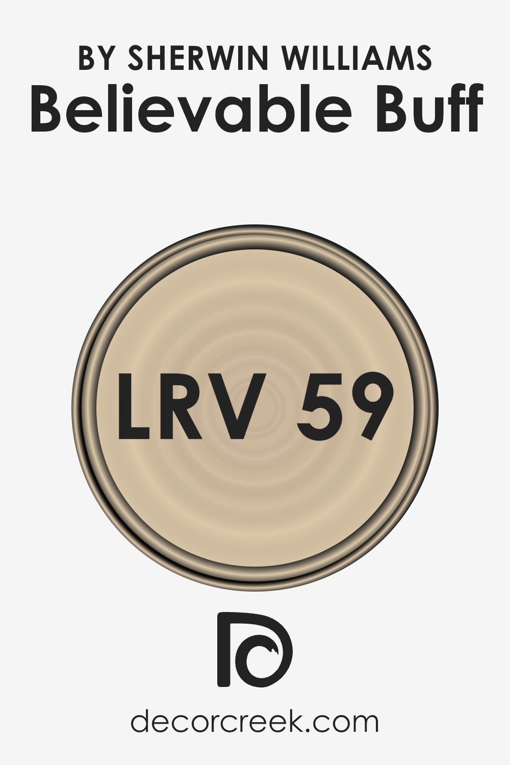
What is the LRV of Believable Buff SW 6120 by Sherwin Williams?
LRV stands for Light Reflectance Value. It’s a measurement used to find out how much light a paint color reflects back into a room, compared to the amount of light it absorbs. The scale goes from 0 to 100, with 0 being completely black, absorbing all light, and 100 being pure white, reflecting back all the light. Colors with a higher LRV make rooms feel brighter and more open because they reflect more light. On the other hand, colors with a lower LRV can make a space feel cozier but smaller, as they absorb more light.
The LRV of Believable Buff (58.512) is a bit above the middle of the LRV scale. This means it’s a color that reflects a moderate amount of light, making it quite versatile. In spaces with plenty of natural light, this color can enhance the brightness, adding a warm and welcoming feel without making the space feel too stark or overly bright. In rooms with less natural light, its reflective qualities can help make the space feel lighter than it would if a darker color were used. However, it won’t brighten the space as much as a color with a higher LRV might.
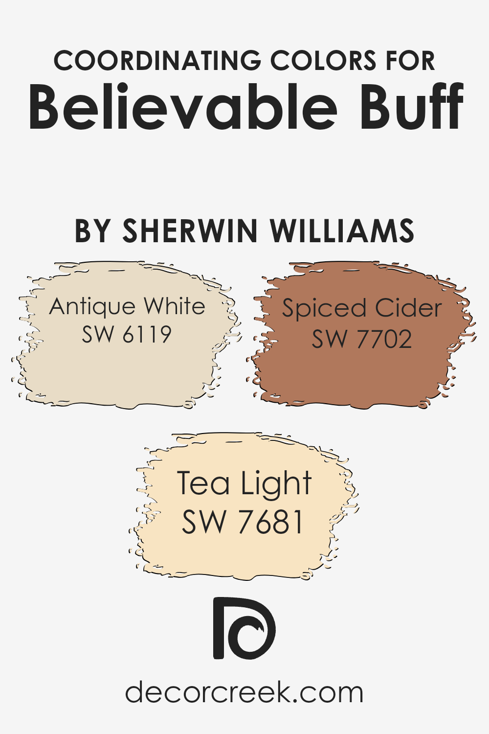
Coordinating Colors of Believable Buff SW 6120 by Sherwin Williams
Coordinating colors complement each other and are used to create harmony in a space, enhancing the overall aesthetic experience. These colors often share a common hue, saturation, or brightness, making them visually pleasing when paired together. For instance, when you consider the warm, welcoming tone of Believable Buff from Sherwin Williams, finding coordinating colors that enhance its cozy vibe without competing for attention is key.
Antique White (SW 6119) is a soft, muted shade that brings a sense of tranquility and timelessness, making it a perfect backdrop that allows other colors, like Believable Buff, to stand out. Then there’s Tea Light (SW 7681), a lighter, subtler color that infuses spaces with a gentle, airy brightness, encouraging a serene and uplifting environment. Finally, Spiced Cider (SW 7702) comes through with a bolder, richer presence, offering warmth and a dash of autumnal spice that pairs beautifully with Believable Buff, ensuring that the space feels both inviting and well-balanced. Together, these coordinating colors work harmoniously to create spaces that are both inviting and visually appealing, making them excellent choices for anyone looking to enhance the natural charm of Believable Buff.
You can see recommended paint colors below:
- SW 6119 Antique White
- SW 7681 Tea Light
- SW 7702 Spiced Cider
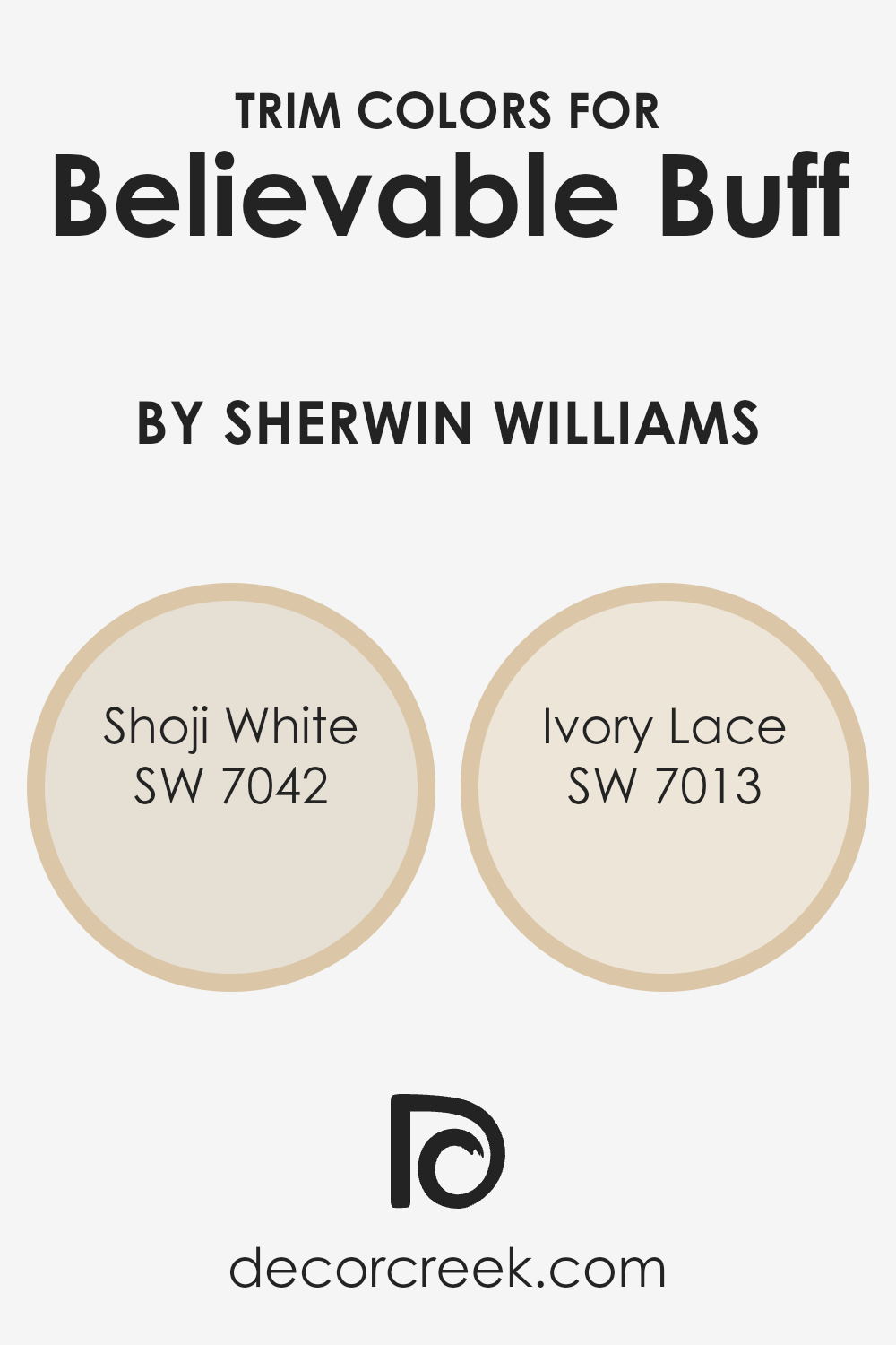
What are the Trim colors of Believable Buff SW 6120 by Sherwin Williams?
Trim colors are essentially the accent colors used on the interior or exterior finishes of a home, such as door frames, window sills, skirtings, and moldings. They play a crucial role in defining the architectural details and character of a space, creating contrast, and enhancing the overall aesthetic appeal. When paired with a warm and inviting hue like Believable Buff by Sherwin Williams, trim colors can either subtly complement the main color or offer a striking contrast, depending on the chosen palette. The right trim color can frame Believable Buff beautifully, highlighting its cozy, inviting nature, and ensuring a harmonious yet dynamic visual flow throughout the space.
Shoji White SW 7042 is a soft, muted off-white with a touch of warmth that makes it an ideal trim color for creating a seamless transition when used alongside Believable Buff. Its subtle warmth ensures that it complements the depth and richness of Believable Buff without overpowering it, providing a gentle contrast that enhances the room’s sense of openness and light.
On the other hand, Ivory Lace SW 7013, with its creamy richness, offers a slightly more pronounced contrast against Believable Buff, enriching the space with a touch of elegance and a traditional feel. The gentle contrast between Ivory Lace and Believable Buff brings out the best in both colors, lending a sophisticated and polished look to the space while maintaining a welcoming atmosphere.
You can see recommended paint colors below:
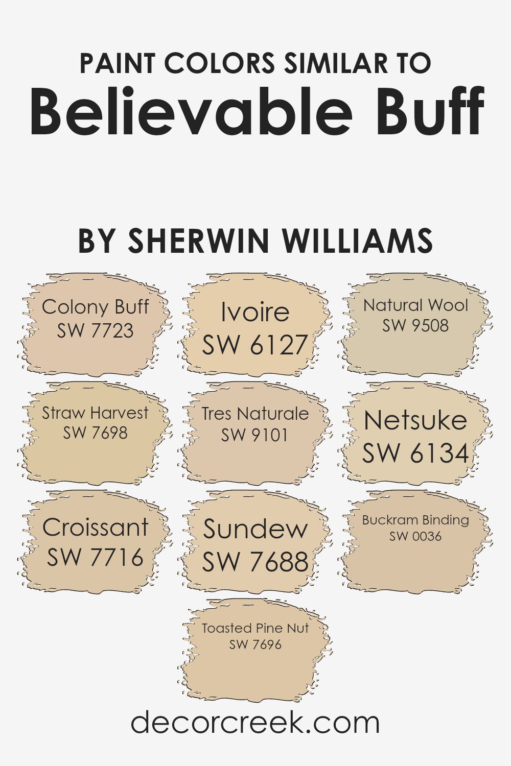
Colors Similar to Believable Buff SW 6120 by Sherwin Williams
Choosing similar colors is a vital part of design because it helps in creating a cohesive and visually appealing space. Colors similar to Believable Buff offer a range of hues that seamlessly blend with each other, providing a serene and warm ambiance. These colors work together by sharing a common undertone, ensuring that no single color overpowers the other, but instead, they complement and enhance the beauty of each space.
Among the colors similar to Believable Buff, Colony Buff introduces a subtle, earthy feel that mimics the warmth of a sunlit path, making it perfect for cozy, inviting spaces.
- Straw Harvest has a slightly more vivid tone, reminiscent of ripe wheat fields, adding a touch of brightness without overwhelming.
- Croissant, with its creamy and comforting presence, brings to mind the softness of freshly baked goods, ideal for creating a relaxing environment.
- Toasted Pine Nut adds depth with its nuttier, richer hue, offering a perfect balance between light and dark shades.
- Ivoire, with its light, airy feel, captures the essence of simplicity and elegance, whereas Tres Naturale leans towards a more organic and muted tone, echoing the hues found in nature.
- Sundew has a gentle, almost imperceptible pinkish undertone, offering a unique twist to neutral spaces.
- Natural Wool provides a soft, delicate backdrop, akin to the texture of wool, ensuring a timeless appeal. Netsuke, with its nuanced earthiness, plays well in spaces that aim for a touch of sophistication.
- Lastly, Buckram Binding, with its slightly more pronounced depth, anchors the space in tradition and warmth.
Together, these colors weave a tapestry of harmony, enhancing the aesthetic appeal and creating environments that are both beautiful and tranquil.
You can see recommended paint colors below:
- SW 7723 Colony Buff
- SW 7698 Straw Harvest
- SW 7716 Croissant
- SW 7696 Toasted Pine Nut
- SW 6127 Ivoire
- SW 9101 Tres Naturale
- SW 7688 Sundew
- SW 9508 Natural Wool
- SW 6134 Netsuke
- SW 0036 Buckram Binding
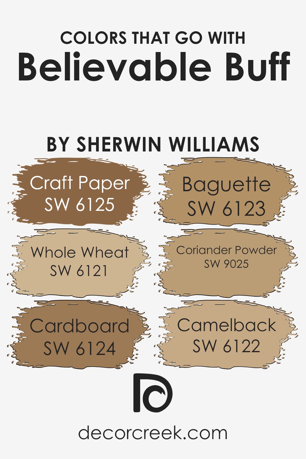
Colors that Go With Believable Buff SW 6120 by Sherwin Williams
Choosing the right colors to pair with Believable Buff SW 6120 by Sherwin Williams can greatly enhance the aesthetic appeal of any space. These complementary colors, including Craft Paper, Whole Wheat, Cardboard, Baguette, Coriander Powder, and Camelback, work wonderfully with Believable Buff because they share similar warmth and richness. This harmonious blend creates a cohesive and inviting atmosphere in rooms, highlighting the beauty of each color while contributing to a unified interior design theme. Understanding the importance and functionality of these combinations can transform ordinary spaces into cozy, welcoming homes.
- Craft Paper SW 6125 offers a deeper, earthy tone that grounds the lighter Believable Buff, providing depth and contrast. It’s akin to the sturdy, reliable feel of its namesake, perfect for creating a sense of stability.
- Whole Wheat SW 6121, on the other hand, is a lighter, nurturing complement that enhances the warmth of Believable Buff, making spaces feel sunny and cheerful.
- Cardboard SW 6124, with its muted, neutral palette, bridges the gap between the lighter and deeper tones, acting as a versatile partner for Believable Buff in various design approaches.
- Baguette SW 6123 brings a hint of golden sweetness, echoing the warmth of freshly baked bread, ideal for cozy, comforting rooms.
- Coriander Powder SW 9025 injects a subtle spice, akin to the soft, earthy tones found in the spice itself, adding a unique, yet harmonious, flare to the mix.
- Lastly, Camelback SW 6122 carries a classic, subdued elegance that enriches the overall scheme, ensuring a sophisticated and timeless look.
Together, these colors create exquisite palettes that elevate the beauty and warmth of spaces adorned with Believable Buff.
You can see recommended paint colors below:
- SW 6125 Craft Paper
- SW 6121 Whole Wheat
- SW 6124 Cardboard
- SW 6123 Baguette
- SW 9025 Coriander Powder
- SW 6122 Camelback
How to Use Believable Buff SW 6120 by Sherwin Williams In Your Home?
Believable Buff by Sherwin Williams is a warm and inviting paint color that adds a cozy touch to any room in a home. It’s a soft, creamy shade that pairs well with a variety of decor styles, from modern to rustic. This versatile color works great in living rooms, creating a welcoming atmosphere for guests and family alike. It’s also an excellent choice for bedrooms, providing a calm and relaxing backdrop for a good night’s sleep.
In the kitchen, Believable Buff can brighten the space, making it feel more spacious and inviting. It complements wood cabinets and natural stone countertops beautifully, enhancing the warmth of the room. For a seamless look, you can carry the color into the dining area, where it will set a friendly and comfortable tone for meals and gatherings.
Additionally, this shade works well in hallways and entryways, offering a soft, welcoming vibe as soon as you step into the house. Since it’s a neutral color, it goes well with various accent colors, allowing for flexibility in decorating with different accessories and textiles. With Believable Buff, anyone can easily refresh their home, making it more inviting and pleasant to live in.
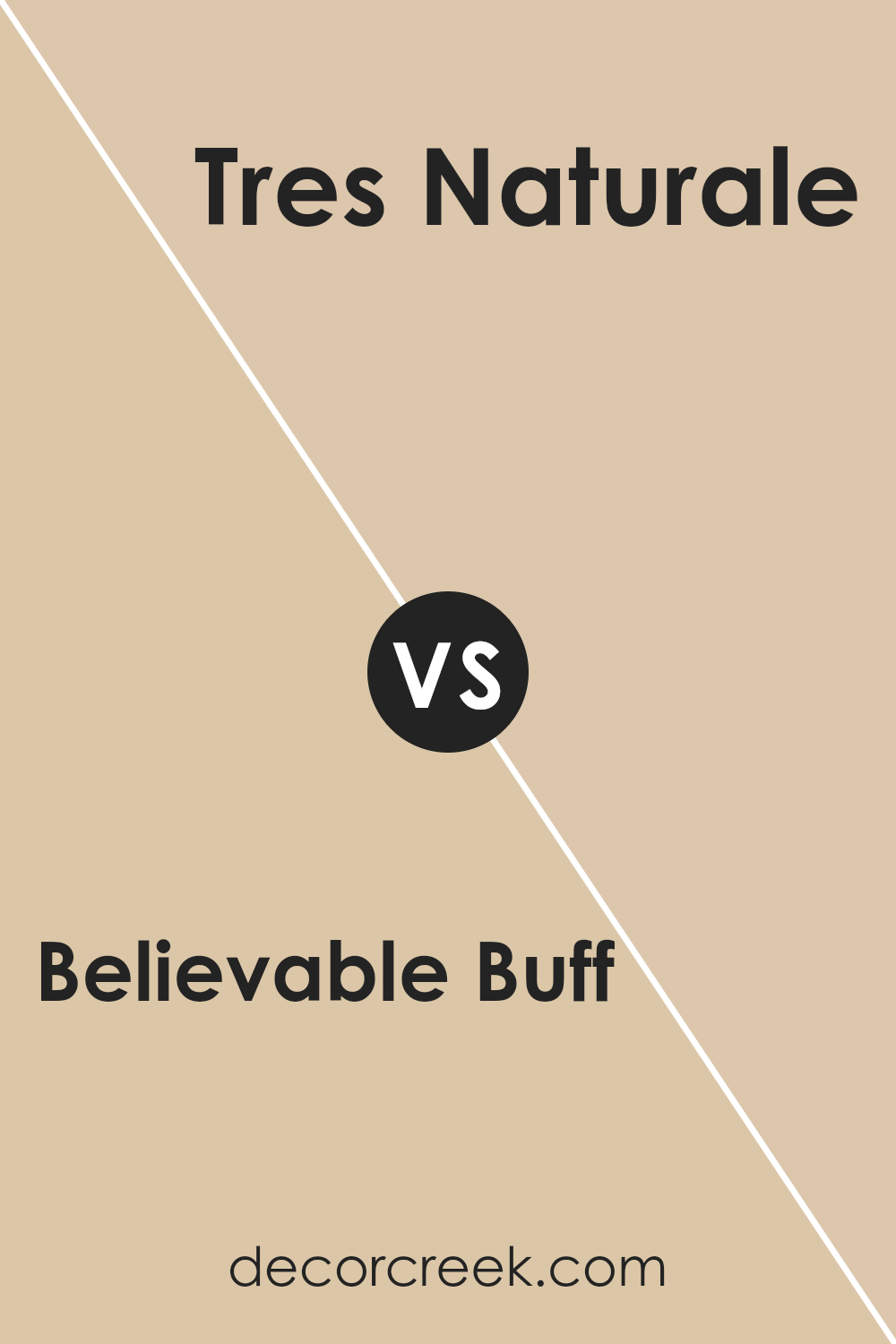
Believable Buff SW 6120 by Sherwin Williams vs Tres Naturale SW 9101 by Sherwin Williams
Believable Buff and Tres Naturale are two beautiful colors from Sherwin Williams, but they have their unique characteristics. Believable Buff is a warm and welcoming shade that can make any space feel cozy and inviting. It has a lovely, soft touch that works well in rooms where you want to relax and feel at home, like living rooms or bedrooms. On the other hand, Tres Naturale leans more towards a neutral, earthy tone. It’s a bit darker than Believable Buff and brings a sense of calm and serenity to a space.
Tres Naturale is great for areas where you want to create a peaceful and grounded atmosphere, such as a study or a spa-like bathroom. Both colors are versatile and can blend beautifully with various decor styles, but Believable Buff adds warmth, while Tres Naturale keeps things cool and natural.
You can see recommended paint color below:
- SW 9101 Tres Naturale
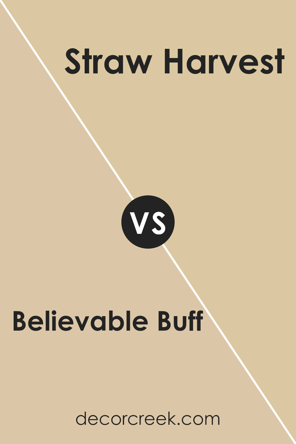
Believable Buff SW 6120 by Sherwin Williams vs Straw Harvest SW 7698 by Sherwin Williams
Believable Buff and Straw Harvest are two colors from Sherwin Williams that have their own unique appeal. Believable Buff is a subtle, soft beige with warm undertones, making it a versatile choice for any room. It’s like a cozy blanket, offering a comforting and relaxed vibe. On the other hand, Straw Harvest has a brighter, more vibrant look.
Think of it as the glow of a morning sun, bringing energy and cheerfulness into a space. While Believable Buff acts as a neutral backdrop, blending seamlessly with other colors, Straw Harvest stands out more, demanding attention and adding a pop of warmth. Both colors can make a room inviting, but the choice between them depends on what mood you want to create. Do you prefer a gentle, understated elegance or a cheerful, sunny ambiance? Depending on your preference, either of these colors can perfectly complement your space.
You can see recommended paint color below:
- SW 7698 Straw Harvest
Believable Buff SW 6120 by Sherwin Williams vs Netsuke SW 6134 by Sherwin Williams
Both Believable Buff and Netsuke by Sherwin Williams are warm, welcoming colors that can make any space feel cozy and inviting. Believable Buff has a soft, creamy quality that feels like a gentle hug for your walls. It’s a light, comforting beige that brings a sense of calm and relaxation to rooms. On the other hand, Netsuke steps a bit darker, leaning toward a richer, earthy tone that still holds onto warmth but with a more pronounced depth.
This color can add a bit more character and strength to a space without overwhelming it, offering a perfect balance between being assertive and nurturing. When comparing these two, Believable Buff is ideal for those seeking a lighter, airier feel, while Netsuke is better suited for creating a cozy, grounded ambiance. Both are incredibly versatile and can work beautifully in living rooms, bedrooms, or any area where comfort is key.
You can see recommended paint color below:
- SW 6134 Netsuke
Believable Buff SW 6120 by Sherwin Williams vs Ivoire SW 6127 by Sherwin Williams
Believable Buff and Ivoire are two inviting shades from Sherwin Williams. Both belong to a warm, welcoming palette but show distinct characteristics. Believable Buff leans more towards a soft, muted beige, providing a cozy and calming atmosphere. It’s like a gentle hug for your walls, offering a neutral backdrop that’s easy to match with different decor styles. On the other hand, Ivoire displays a slightly more vibrant personality.
This color has hints of yellow, giving rooms a cheerful, sunny vibe. It lights up spaces, making them feel more open and airy. While both colors create a warm ambiance, Believable Buff keeps things subtle and down-to-earth, whereas Ivoire adds a touch of brightness, making spaces feel lively. In choosing between them, consider the mood you want to set: for a serene and grounded feel, go with Believable Buff; for a lift of energy and light, Ivoire is your friend.
You can see recommended paint color below:
- SW 6127 Ivoire
Believable Buff SW 6120 by Sherwin Williams vs Natural Wool SW 9508 by Sherwin Williams
Believable Buff and Natural Wool by Sherwin Williams are two warm and inviting colors, but they have distinct personalities. Believable Buff is like a cozy, sunny morning. It’s a soft, warm beige that feels welcoming and comforting in any space. It has a gentle vibrancy that can make a room feel more alive without overwhelming it.
On the other hand, Natural Wool is more subdued and versatile. It’s a neutral, lighter shade that’s closer to off-white with a hint of warmth. This color is like the softest, most comfortable wool sweater you can find. It’s great for creating a calm, serene environment, acting as a quiet backdrop that lets other colors or decor features stand out.
When comparing the two, Believable Buff offers a bit more color and warmth, making spaces feel cozy and lived-in. Natural Wool, however, is excellent for those looking for a clean, minimalist look, providing a light and airy feel. Both can easily fit into various decor styles, making them great choices for anyone looking to refresh their space.
You can see recommended paint color below:
- SW 9508 Natural Wool
Believable Buff SW 6120 by Sherwin Williams vs Colony Buff SW 7723 by Sherwin Williams
Believable Buff and Colony Buff are two shades from Sherwin Williams that, although similar at first glance, have distinct tones that set them apart. Believable Buff has a warm and inviting presence, offering a cozy feel to any space. It strikes a balance between being not too light nor too dark, making it a versatile choice for many rooms.
On the other hand, Colony Buff carries a slightly more pronounced golden hue, radiating a tad more warmth and brightness than Believable Buff. This makes Colony Buff a great option for spaces you want to infuse with a cheerful and welcoming atmosphere, especially in areas that receive a lot of natural light.
While both colors offer a soothing backdrop, suitable for various decor styles, the choice between them depends on the specific ambiance you aim to create. If you’re leaning towards a subtle, neutral palate with just a hint of warmth, Believable Buff might be your go-to. In contrast, if you prefer something that feels a bit sunnier and more vibrant, Colony Buff could be the better option.
You can see recommended paint color below:
- SW 7723 Colony Buff
Believable Buff SW 6120 by Sherwin Williams vs Croissant SW 7716 by Sherwin Williams
Believable Buff and Croissant are two cozy shades from Sherwin Williams that both bring warmth to any space, yet each has its own unique feel. Believable Buff is a light, creamy beige with a touch of warmth, making spaces feel inviting yet not overpowering. It’s like a gentle hug for your walls, offering a soft, neutral backdrop that pairs easily with various decor styles.
On the other hand, Croissant leans a bit darker, mimicking the golden brown of its namesake. This color brings a richer, more earthy tone to the table, adding depth and a sense of comfort to rooms. It’s the perfect choice for someone looking to create a cozy, slightly more enveloping atmosphere.
Though both colors share a warm undertone, Believable Buff keeps things light and airy, while Croissant offers a touch of sophistication and luxury with its deeper, golden hue. Whether you want to brighten up a small space or add cozy warmth, choosing between these two depends on the vibe you’re going for.
You can see recommended paint color below:
- SW 7716 Croissant
Believable Buff SW 6120 by Sherwin Williams vs Buckram Binding SW 0036 by Sherwin Williams
Believable Buff and Buckram Binding are two unique colors from Sherwin Williams, but each has its own special charm. Believable Buff is a warm, inviting color with a cozy vibe. It’s like the gentle glow of morning sunlight, making spaces feel welcoming and homely. Think of it as a soft hug for your walls, adding a calm, soothing touch to any room.
On the other hand, Buckram Binding takes a different path with its rich, deeper tone. It has a more pronounced presence, bringing a sense of sophistication and elegance. This color is like the sturdy pages of an old, cherished book, adding depth and character wherever it’s used. It works great in spaces where you want to add a bit of drama without overwhelming the senses.
When you put Believable Buff next to Buckram Binding, you can really see how they both play off each other’s strengths. Believable Buff offers warmth and lightness, while Buckram Binding adds depth and intensity. Together, they can create a beautifully balanced space, marrying comfort with elegance.
You can see recommended paint color below:
- SW 0036 Buckram Binding
Believable Buff SW 6120 by Sherwin Williams vs Toasted Pine Nut SW 7696 by Sherwin Williams
Believable Buff and Toasted Pine Nut are two colors from Sherwin Williams that both bring warmth and coziness to any space, yet they have distinct tones that set them apart. Believable Buff is a soft, creamy shade. It’s like a gentle hug for your walls, offering a subtle, inviting backdrop that feels both comfortable and understated. This color works perfectly in spaces where you want a touch of warmth without overwhelming the room with color.
On the other side, Toasted Pine Nut has a deeper, richer feel. Imagine the color of toasted almonds or the golden hues of autumn leaves. It’s a bit bolder than Believable Buff and carries an earthy, robust vibe. It’s perfect for creating a cozy, welcoming atmosphere in areas like the living room or dining area, where you gather and spend lots of time.
Both colors complement natural elements beautifully but in different ways. While Believable Buff leans towards a light, airy feel, Toasted Pine Nut brings a deeper, more anchored warmth. Depending on the mood you want to create, either shade can transform a space into a welcoming haven.
You can see recommended paint color below:
- SW 7696 Toasted Pine Nut
Believable Buff SW 6120 by Sherwin Williams vs Sundew SW 7688 by Sherwin Williams
Believable Buff and Sundew are two colors from Sherwin Williams that offer a warm and inviting feel to any space. Believable Buff is a soft, warm beige that brings a cozy and comfortable vibe. It’s like a hug for your walls, making rooms feel welcoming and lived-in. This color works well in spaces where you want to relax and unwind, as its understated elegance provides a neutral backdrop that complements a wide range of decor styles.
On the other hand, Sundew takes a slightly lighter approach. It’s a creamy, soft yellow that brightens up spaces without overwhelming them. Sundew adds a gentle touch of sunshine, making it perfect for areas where you want to inject a bit of life and energy without going too bold. It pairs beautifully with natural light, glowing warmly in sunny rooms.
Both Believable Buff and Sundew share a warm undertone, making them excellent choices for creating inviting spaces. However, Believable Buff leans more towards a classic neutral, offering versatility and a grounding effect, while Sundew brings a subtle hint of color, ideal for adding a soft, cheerful ambiance to a room. Whether combined or used separately, these colors can create beautiful, harmonious spaces in your home.
You can see recommended paint color below:
- SW 7688 Sundew
Conclusion
Believable Buff by Sherwin Williams is a warm and versatile paint color that effortlessly brings a cozy and inviting atmosphere to any room. This particular shade is well-loved for its ability to pair beautifully with a wide range of decor styles, from traditional to modern, making it a go-to choice for homeowners and designers alike. Its natural, soft hue provides a perfect backdrop for both bold and subtle interior design choices, allowing for a blend of colors and textures to come alive.
This color stands out as a practical option for those looking to refresh their space with a touch of warmth and elegance. Whether applied in living areas, bedrooms, or even kitchens, Believable Buff offers a timeless appeal that enhances the overall aesthetic of a home. It’s a color that adapts well to changing trends, ensuring that spaces painted with it remain stylish and welcoming for years to come.
Ever wished paint sampling was as easy as sticking a sticker? Guess what? Now it is! Discover Samplize's unique Peel & Stick samples.
Get paint samples

