In the vast palette of colors offered by Sherwin Williams, SW 6119 Antique White stands out as a timeless and versatile shade that brings warmth and a sense of comfort to any space.
This color is not just a simple off-white; it has a unique charm that makes it perfect for creating a cozy and inviting atmosphere in homes. Whether you’re aiming for a classic feel in your living room or a soothing ambiance in your bedroom, Antique White has the ability to transform your space with its subtle elegance.
The beauty of SW 6119 Antique White lies in its adaptability. It pairs wonderfully with a wide range of décor styles, from rustic to modern, and complements various color schemes, whether you’re into bold colors or muted tones.
This color works magic by brightening up spaces without feeling overwhelming, making it an excellent choice for walls, trim, or cabinetry. Additionally, its warm undertones provide a seamless transition between different rooms, ensuring a harmonious flow throughout your home.
If you’re looking for a color that combines sophistication with warmth, SW 6119 Antique White by Sherwin Williams is worth considering. It’s not just about painting your walls; it’s about creating a backdrop for your life’s most cherished moments.
This hue, with its understated character, offers a perfect canvas to let your personal style shine through, making your home a true reflection of you.
What Color Is Antique White SW 6119 by Sherwin Williams?
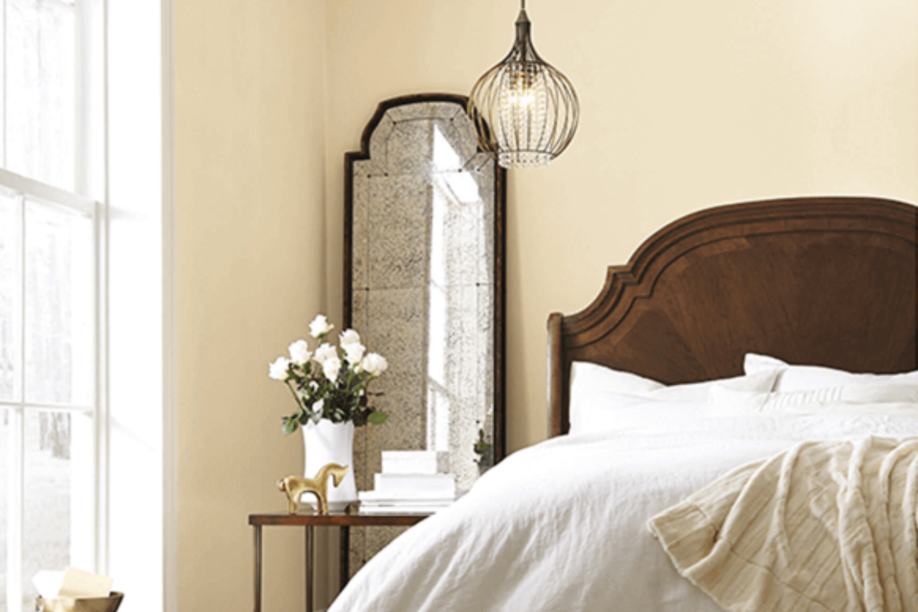
Antique White by Sherwin Williams is a soft, creamy shade that brings a warm and inviting ambiance to any space. This color has a timeless charm that can transform a room, giving it a cozy and comfortable atmosphere. It’s not a stark white but has a hint of warmth that makes it versatile and easy to incorporate into various interior designs.
This creamy hue works exceptionally well in styles such as traditional, country, shabby chic, and even modern minimalist, thanks to its subtle, warm undertones. It’s a great choice for walls, creating a neutral backdrop that allows your decor to shine.
It also performs beautifully on trim and cabinetry, offering a slight contrast to brighter or cooler walls without overwhelming the senses.
When it comes to pairing with materials and textures, Antique White is a champion. It goes hand in hand with natural wood tones, from light, beachy pines to rich, dark walnuts, enhancing the material’s natural beauty without competing for attention. It also complements stone elements, like marble or granite, adding a touch of elegance to kitchens and bathrooms.
For textiles, think linens, cottons, and even soft, plush velvets in both neutral and bold colors to create a layered, welcoming aesthetic. Overall, its versatility makes it a go-to color for creating spaces that feel both sophisticated and inviting.
Ever wished paint sampling was as easy as sticking a sticker? Guess what? Now it is! Discover Samplize's unique Peel & Stick samples.
Get paint samples

Is Antique White SW 6119 by Sherwin Williams Warm or Cool color?
Antique White by Sherwin Williams is a popular paint color that brings a cozy and inviting atmosphere to any home. Its creamy, off-white hue makes it a versatile choice that pairs well with a wide range of other colors and decor styles.
Unlike stark whites, this shade has a warm undertone, which means it can help spaces feel more comfortable and welcoming without feeling too bright or cold. This warmth makes it perfect for living areas, bedrooms, and even kitchens, where it can complement natural wood, textiles, and various finishes beautifully.
Since Antique White isn’t as harsh as pure white, it’s excellent for creating a soft, soothing backdrop that still feels light and airy. Homeowners often use it on walls to make rooms appear larger, but it’s also a great choice for trim and cabinetry for a cohesive look. Its subtlety is its strength; it supports other colors to shine while quietly adding character and sophistication to the space.
Whether you’re aiming for a modern farmhouse look, shabby chic vibe, or a minimalist aesthetic, Antique White can help achieve that desired look without overwhelming the senses.
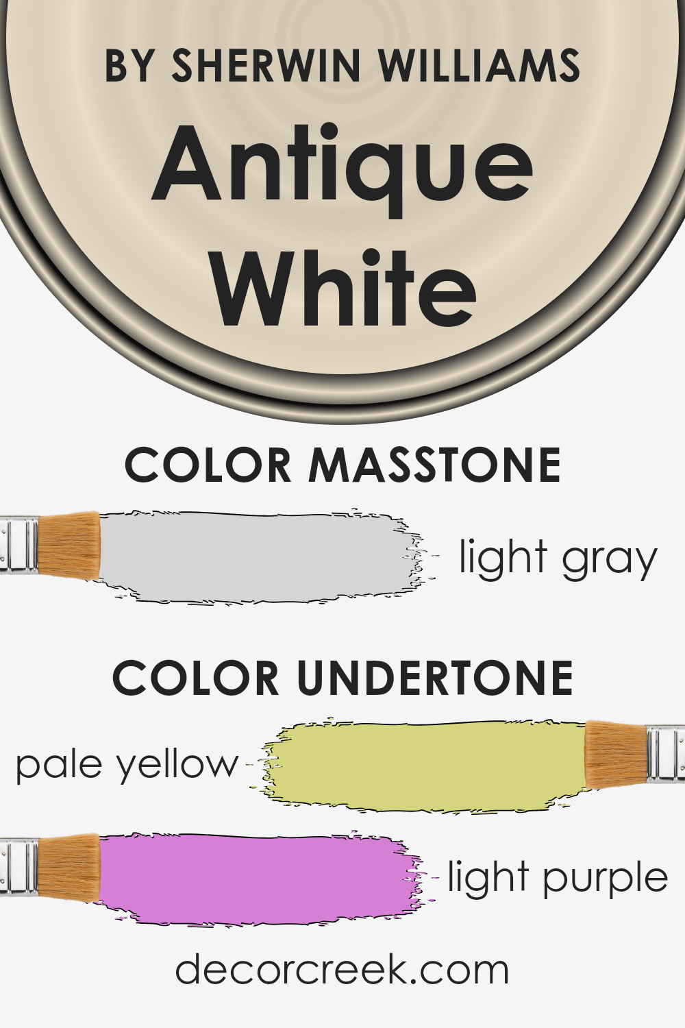
Undertones of Antique White SW 6119 by Sherwin Williams
Antique White by Sherwin Williams is a soft and warm paint color that has subtle hints beneath its surface which influence how it appears in different settings. The undertones of this color include pale yellow and light purple. An undertone is like a hidden hue that doesn’t stand out at first glance but plays a significant role in the color’s overall appearance.
The pale yellow undertone adds a hint of warmth, making the color cozy and inviting. It’s like when the sun lights up a room, bringing a cheery vibe. This warmth makes the Antique White a great choice for living rooms or bedrooms, creating a soft backdrop that feels welcoming.
On the other hand, the light purple undertone introduces a touch of coolness, which can make the color appear more nuanced. Unlike the straightforward warmth of yellow, this subtle coolness adds a layer of sophistication and depth. In certain lighting, especially cooler light, this undertone can become more noticeable, giving the walls a slightly more elegant and complex character.
The interplay of these undertones means that Antique White can change appearance under different lighting conditions. In natural daylight, it might lean towards its warmer, yellow side, making a room feel airy and light. In artificial lighting, the cooler, light purple tones might become more apparent, adding an intriguing twist to the room’s ambiance. Thus, choosing this color for interior walls offers a versatile and dynamic backdrop that adapts to different times of the day and decorating styles, making spaces feel cozy yet sophisticated.
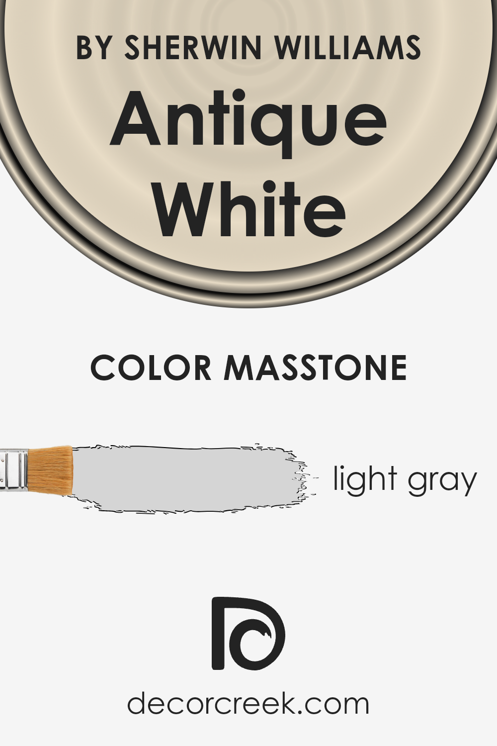
What is the Masstone of the Antique White SW 6119 by Sherwin Williams?
Antique White, with its masstone of light gray (#D5D5D5), offers a subtle and soothing backdrop for any room in the house. This color’s gentle gray base helps it blend seamlessly with various decor styles, from modern to traditional. Its understated elegance means it works beautifully in spaces seeking a calm and collected atmosphere, like bedrooms or living rooms.
The light gray masstone also means that Antique White interacts softly with both natural and artificial light, reflecting it in a way that can make spaces feel more open and airy. This quality makes it especially useful in smaller rooms or areas without a lot of natural light.
Moreover, this shade can serve as a versatile canvas, setting the stage for bolder colors or patterns in furniture and accessories to stand out without overwhelming the space. Its adaptability and timeless appeal ensure that Antique White can create a welcoming and cozy environment in any home.
How Does Lighting Affect Antique White SW 6119 by Sherwin Williams?
Lighting plays a crucial role in how we perceive colors, significantly impacting their appearance in different environments. The way a specific color looks can vary dramatically under various light sources. This is important to consider when choosing paint colors for your home, such as Antique White by Sherwin Williams.
- In artificial light, the environment can greatly influence how Antique White appears. Generally, incandescent bulbs bring out warmer tones, making this color seem creamier or slightly yellowed. In contrast, LED or fluorescent lighting, which can have cooler tones, might make Antique White look a bit sharper and more neutral, potentially pulling out subtle gray hues in the color.
- Natural light also has a significant effect on how colors look, and this varies throughout the day and depends on the room’s orientation. In north-faced rooms, which receive indirect sunlight, Antique White tends to look cooler and more consistent throughout the day. This cooler light can make the color appear more muted, emphasizing its neutral base without allowing the warmth to dominate.
- South-faced rooms bask in abundant sunlight, making colors look brighter and more vivid. Here, Antique White will feel warmer and more radiant, enhancing its creamy qualities and making the space feel inviting and cozy.
- In east-faced rooms, morning light can make Antique White look very warm and welcoming, highlighting its creamy undertones. As the day progresses and the direct sunlight moves away, the color can appear more neutral and consistent.
- West-faced rooms experience the opposite effect, with the color potentially appearing flat or neutral in the morning light. However, as the sun sets, Antique White can turn into a warm, glowing hue due to the intense, warm afternoon light, creating a cozy and comfortable atmosphere.
Understanding how lighting affects colors like Antique White can help you make informed decisions on where to apply them, ensuring your spaces always look their best under any lighting condition.
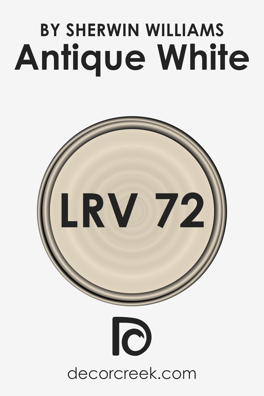
What is the LRV of Antique White SW 6119 by Sherwin Williams?
LRV stands for Light Reflectance Value, which is a measurement used to describe the percentage of visible and usable light that a paint color reflects or absorbs when painted on a wall. It operates on a scale from 0 to 100, where 0 absorbs all light and appears really dark, kind of like a deep, dark cave, and 100 reflects all light, shining bright like a fresh snowfall.
The LRV helps you understand how light or dark a color will look once it’s up on your walls. It’s super handy for figuring out if a color will make your room feel lighter, brighter, and more open, or cozier and more intimate by absorbing more light.
With an LRV of 72.45, Antique White by Sherwin Williams is closer to the lighter end of the scale. This means it’s going to reflect a good amount of light around the room.
In a brightly lit space, this color will look airy and luminous, making the space feel welcoming and spacious. If the room doesn’t get a ton of natural light, Antique White can still help it appear brighter than it actually is.
This light reflectance can also amplify the natural and artificial lighting in the room, meaning you might use less energy lighting up the space. So, choosing a color with a high LRV like this can be a practical and stylish decision, especially if you’re aiming for a fresh, open look.
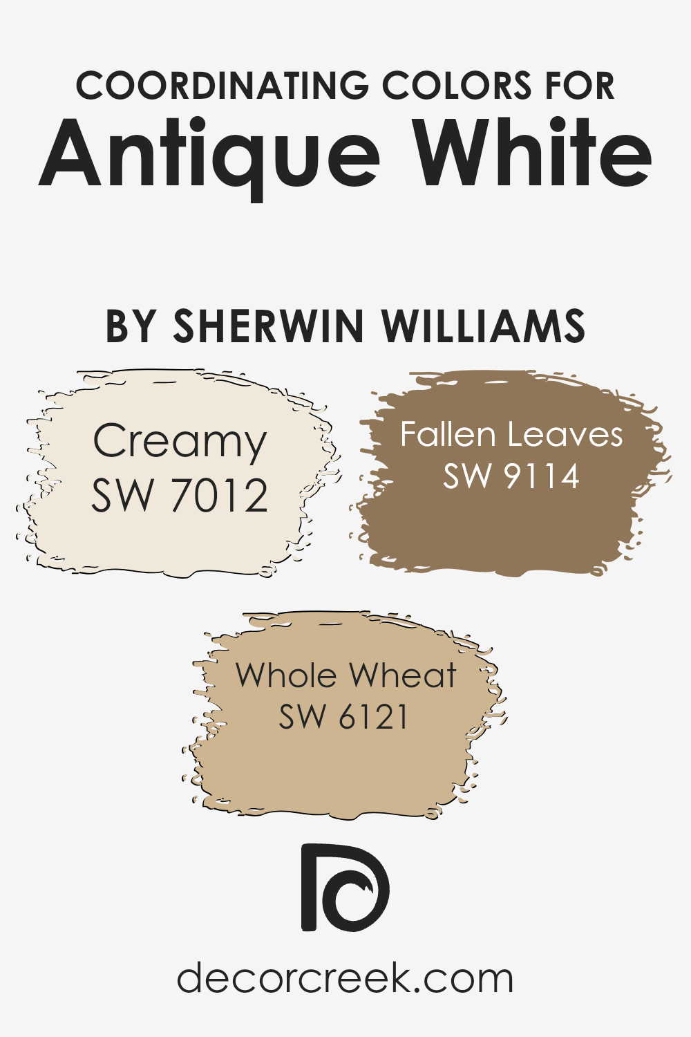
Coordinating Colors of Antique White SW 6119 by Sherwin Williams
Coordinating colors are shades that complement each other when used together in design and decor, enhancing the overall aesthetic appeal. They’re selected based on how well they blend with a primary color, creating a cohesive look. For example, when you’re working with a delicate hue like a subtle off-white, finding the right coordinating colors can add depth and character to your space without overwhelming it.
These colors are especially useful in ensuring that everything in a room feels unified and thoughtfully put together.
Creamy (SW 7012) provides a smooth, soft backdrop that’s not too stark, making it a perfect companion for creating a warm and inviting space. It’s like a gentle hug for your walls, offering a whisper of color while maintaining a light and airy feel. Whole Wheat (SW 6121) adds a bit more strength with its richer, golden tone, reminiscent of autumn’s warmth.
This color can bring a cozy and comforting energy to any room, making spaces feel more intimate and welcoming. Lastly, Fallen Leaves (SW 9114) has a deep, earthy quality that grounds a room. Its richer, darker shade offers a strong contrast to lighter hues, providing a stunning visual impact. Together, these colors work harmoniously to enhance the beauty and charm of the primary color, offering a palette that’s both balanced and beautiful.
You can see recommended paint colors below:
- SW 7012 Creamy
- SW 6121 Whole Wheat
- SW 9114 Fallen Leaves
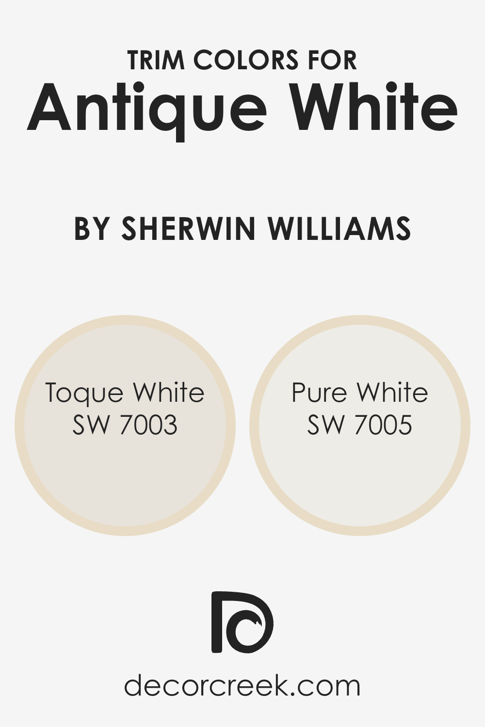
What are the Trim colors of Antique White SW 6119 by Sherwin Williams?
Trim colors are essentially the hues selected for the architectural details of a room or exterior, such as door frames, window trims, baseboards, and crown moldings. The right trim color can enhance the overall appearance of a wall color by adding contrast or cohesion, depending on the desired effect.
For a classic, timeless look, Antique White by Sherwin Williams is a popular choice for walls because of its warm, inviting tone. Pairing it with the right trim colors can significantly impact the space, making it feel more put together and polished.
Two excellent trim color options for Antique White are Toque White and Pure White, both by Sherwin Williams. Toque White, SW 7003, is a soft, warm white with a hint of gray.
It’s a subtle choice that blends smoothly, offering a slight contrast to Antique White without overwhelming it. Pure White, SW 7005, on the other hand, is a bright, clean white.
It provides a sharper contrast that can make the warmer tones of Antique White pop, giving the room a fresh, crisp look. Both choices can beautifully complement Antique White, either by softening the transitions between wall and trim or by defining the space with a more pronounced frame.
You can see recommended paint colors below:
- SW 7003 Toque White
- SW 7005 Pure White
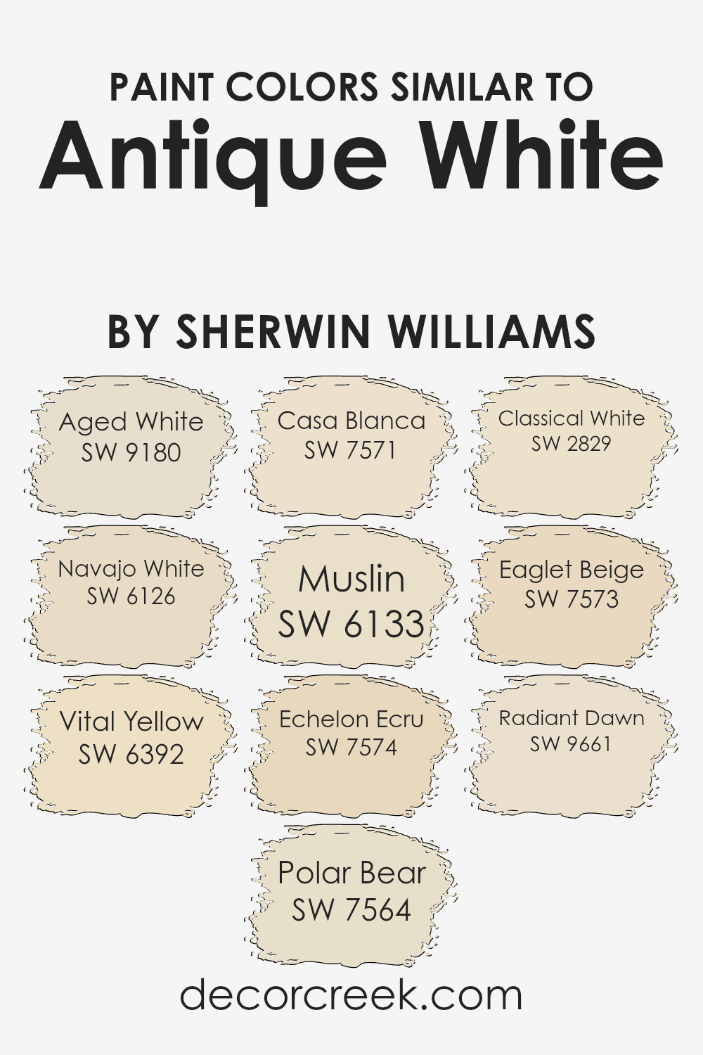
Colors Similar to Antique White SW 6119 by Sherwin Williams
Similar colors play a crucial role in design and décor by providing a seamless flow and harmonious vibe to any space. When we look at colors close to Antique White like Aged White, Navajo White, Vital Yellow, Polar Bear, Casa Blanca, Muslin, Echelon Ecru, Classical White, Eaglet Beige, and Radiant Dawn, we see a spectrum that bridges the warm and inviting with the bright and airy.
This palette allows for subtle contrasts and coherence, making spaces feel cohesive yet dynamically enriched. Using similar colors means elements in a room can stand out without appearing jarring or out of place, creating a sense of unity and comfort.
Aged White offers a gently weathered feel, bringing warmth and simplicity. Navajo White glows with a soft, creamy radiance, while Vital Yellow injects a subtle, cheerful brightness.
Polar Bear is crisp and clean, providing a fresh backdrop. Casa Blanca adds a touch of elegance with its soft, peachy tones. Muslin wraps a room in a cozy, understated warmth. Echelon Ecru has a sophisticated, earthy depth, enriching spaces without overwhelming them. Classical White is pure and timeless, offering clarity and simplicity.
Eaglet Beige is soft and neutral, ideal for creating tranquil and inviting environments. Lastly, Radiant Dawn shines with a gentle luminosity, bringing a hint of the morning sky’s serenity indoors.
Together, these colors complement Antique White’s versatility, enhancing its ability to blend and stand as a foundational hue that supports varied design approaches.
You can see recommended paint colors below:
- SW 9180 Aged White
- SW 6126 Navajo White
- SW 6392 Vital Yellow
- SW 7564 Polar Bear
- SW 7571 Casa Blanca
- SW 6133 Muslin
- SW 7574 Echelon Ecru
- SW 2829 Classical White
- SW 7573 Eaglet Beige
- SW 9661 Radiant Dawn
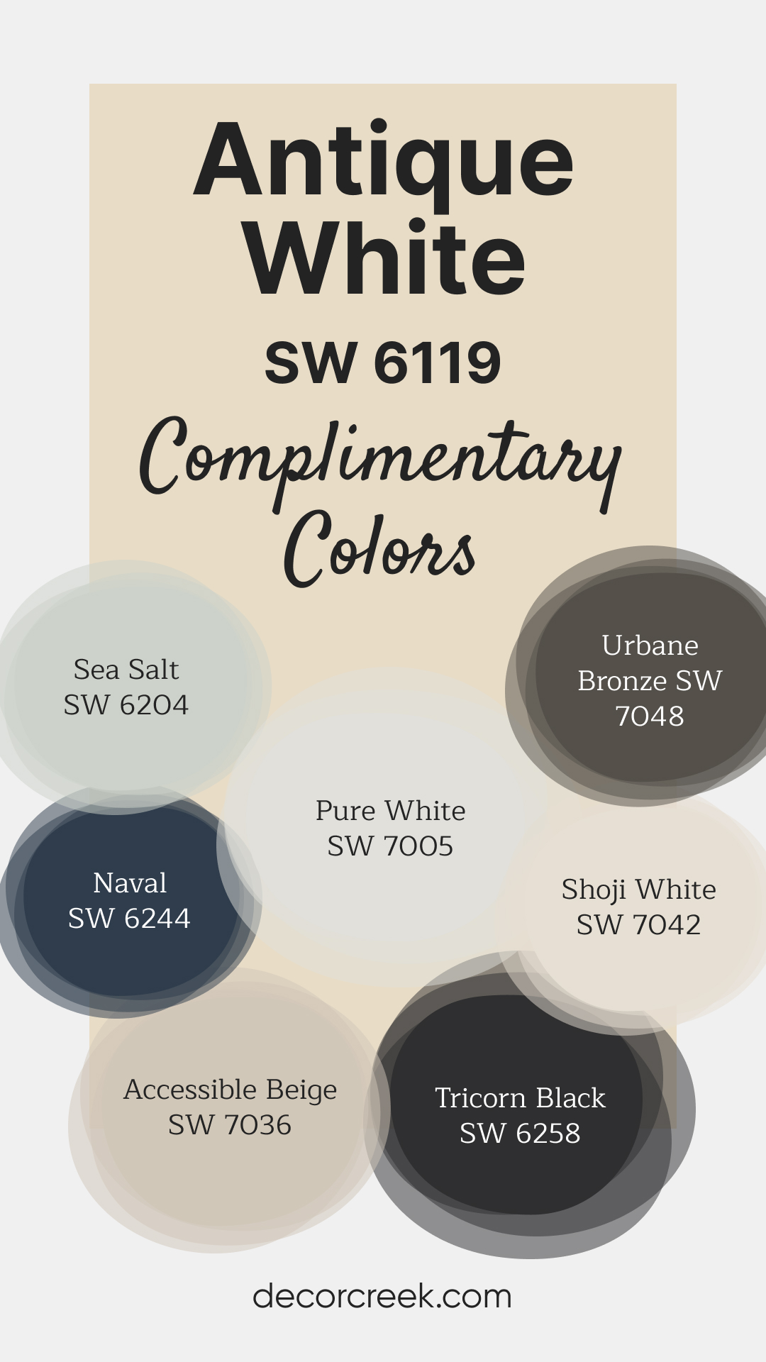
Complimentary Colors for Antique White SW 6119 Paint Color by Sherwin Williams
Sherwin Williams’ paint colors make it easy to create a balanced and inviting look for your home. Antique White and Sea Salt are perfect for adding a soft, light feel, while Naval and Urbane Bronze bring a bold and grounded effect.
These combinations allow you to mix light and dark tones for a rich and dynamic look that feels intentional and well thought out.
For a clean, fresh foundation, Pure White and Shoji White work beautifully with both bold and subtle accents. Accessible Beige provides a welcoming touch that pairs well with darker shades like Tricorn Black, offering contrast without feeling too stark.
Whether you’re painting walls, trim, or accents, these colors make it simple to achieve a polished and cohesive space.
How to Use Antique White SW 6119 by Sherwin Williams In Your Home?
Antique White SW 6119 by Sherwin Williams is a warm and welcoming shade that brings a cozy feel to any room in your home. This paint color shines with its rich, creamy tone that’s not too bright but just right for creating a soft, inviting ambiance. It’s perfect for those who want to add a touch of elegance and comfort to their living space without the starkness of pure white.
You can use Antique White in various areas of your home. It’s excellent for living rooms or bedrooms where you want a relaxed atmosphere, as its warm undertones complement natural light beautifully, giving the room a serene glow.
In the kitchen, it can give cabinets a classic look that feels both timeless and fresh. It also works well in hallrooms and entryways, providing a welcoming vibe right from the start.
This color pairs wonderfully with a wide range of decor styles and colors, making it easy to integrate with your existing home design. Whether you’re going for a rustic, modern, or traditional look, Antique White can help tie your aesthetic together, making your home feel more harmonious and thoughtfully designed.
Antique White SW 6119 by Sherwin Williams vs Aged White SW 9180 by Sherwin Williams
Antique White and Aged White by Sherwin Williams are two beautiful colors often chosen for their warm and inviting tones. Antique White is a lighter, soft cream color with a hint of yellow, giving it a warm and comforting feel. It’s perfect for creating a cozy and welcoming space, making it a popular choice for living rooms and bedrooms.
On the other hand, Aged White has a deeper, more muted tone, leaning slightly towards taupe. This color adds a bit more depth to walls, making it ideal for adding character to a room without overpowering it with boldness.
Although both colors share a warm undertone, Antique White offers a brighter appeal, bringing light into the room, while Aged White provides a sophisticated, subtle elegance.
Choosing between them depends on the desired ambiance; Antique White brightens up a space, while Aged White gives it a refined warmth.
You can see recommended paint color below:
Antique White SW 6119 by Sherwin Williams vs Classical White SW 2829 by Sherwin Williams
Antique White and Classical White by Sherwin Williams are two shades that might seem similar but have distinct vibes. Antique White has a creamy, warm tone, leaning a bit towards beige or off-white. This color brings a cozy and soft ambiance to a room, making it feel welcoming and homely. It’s great for spaces where you want a touch of warmth without overwhelming brightness.
On the other hand, Classical White has a cleaner, more straightforward white appearance. It’s not stark white but has a subtle warmth, making it versatile for various spaces. Classical White can make a room feel fresh and open, providing a neutral backdrop that’s easy to pair with other colors.
Comparing the two, Antique White offers a more vintage or traditional feel due to its warmer undertones, while Classical White leans towards a modern, simplistic aesthetic, offering a bit more flexibility in creating a bright, airy space. Depending on your decor style and the ambiance you’re aiming for, each color has its unique charm.
You can see recommended paint color below:
- SW 2829 Classical White
Antique White SW 6119 by Sherwin Williams vs Casa Blanca SW 7571 by Sherwin Williams
Antique White and Casa Blanca, both by Sherwin Williams, offer a cozy and inviting vibe but in slightly different tones. The main color, Antique White, leans towards a warmer, creamier hue, giving off a soft, welcoming feel. It’s like the color of a well-loved, old book page – not quite white but carrying a sense of warmth and comfort.
On the other hand, Casa Blanca steps a bit closer to the traditional white spectrum but with an underlying warmth that prevents it from feeling too stark or cold. Think of it as the gentle morning light filtering through a sheer curtain – bright, but not blinding.
Comparing the two, Antique White has a deeper, more yellow or beige undertone, making it perfect for spaces where a cozy, peaceful feel is desired.
Casa Blanca, while still warm, offers a cleaner backdrop, suitable for spaces that aim for a bright and airy atmosphere with a touch of warmth.
You can see recommended paint color below:
- SW 7571 Casa Blanca
Antique White SW 6119 by Sherwin Williams vs Vital Yellow SW 6392 by Sherwin Williams
Antique White and Vital Yellow by Sherwin Williams are two distinct colors, each offering its own unique appeal. Antique White is a soft, creamy white with a cozy, warm feel.
It’s subtle and not too stark, perfect for creating a relaxed and inviting atmosphere in any room. In contrast, Vital Yellow is a bright, cheerful yellow. It brings a pop of energy and optimism, lighting up spaces with its sunny vibe. While Antique White acts as a soothing backdrop for various decor styles, allowing other colors to stand out, Vital Yellow demands attention and can instantly lift the mood of a space.
When comparing the two, it’s clear that Antique White offers a tranquil base, ideal for those seeking a peaceful and timeless look. Vital Yellow, on the other hand, is all about vibrancy and fun, ideal for adding a burst of happiness to any area.
Both colors serve different moods and purposes, from the calming embrace of Antique White to the lively spark of Vital Yellow.
You can see recommended paint color below:
- SW 6392 Vital Yellow
Antique White SW 6119 by Sherwin Williams vs Echelon Ecru SW 7574 by Sherwin Williams
Comparing Antique White and Echelon Ecru by Sherwin Williams is like looking at two subtle shades of warmth for your walls. Antique White is a soft, creamy hue with a touch of beige, giving it a warm, inviting feel that’s perfect for creating a cozy, comfortable space. It’s the sort of color that can brighten up a room while still providing a sense of calm and serenity.
On the other hand, Echelon Ecru is a bit deeper, edging closer to a light taupe. This color brings a slightly more sophisticated and richer feel to a room. While it’s still warm, its depth adds character and can make a space feel more grounded and elegant.
Both colors offer a backdrop that’s easy to match with other colors, furniture, and decor. Antique White leans towards a classic, timeless look, while Echelon Ecru adds a touch of modern sophistication. Your choice between them would depend on the kind of atmosphere you’re aiming to create. Do you want your space to feel more open and airy, or are you going for a more defined, stylish look?
You can see recommended paint color below:
- SW 7574 Echelon Ecru
Antique White SW 6119 by Sherwin Williams vs Eaglet Beige SW 7573 by Sherwin Williams
Antique White and Eaglet Beige are two popular colors from Sherwin Williams. Both offer a cozy and warm feel to any room, but they have some differences. Antique White leans more towards a creamy off-white with a touch of warmth, making it a great choice for those looking for a classic, soft backdrop that isn’t stark white. It pairs well with a wide range of colors, adding a subtle, cozy vibe to spaces.
On the other hand, Eaglet Beige is a bit deeper and warmer. It’s a true beige that brings an inviting atmosphere to rooms. This color is perfect for those who want to add a bit more depth to their walls without going too dark or overwhelming. Eaglet Beige works well in spaces where you want to create a comfortable, welcoming environment.
When comparing these two, it’s all about the mood you want to set. Antique White offers a lighter, airier feel, while Eaglet Beige gives a room a more grounded, warm essence. Both are versatile, but your choice depends on the type of warmth and depth you want to achieve in your space.
You can see recommended paint color below:
- SW 7573 Eaglet Beige
Antique White SW 6119 by Sherwin Williams vs Radiant Dawn SW 9661 by Sherwin Williams
Antique White and Radiant Dawn by Sherwin Williams are two distinct shades, each bringing its own unique vibe to a space. Antique White is a warm and cozy color, akin to a creamy vanilla. It’s soft and subtle, making it perfect for creating a relaxed and inviting atmosphere. It’s great for almost any room, adding a touch of warmth without overwhelming the senses.
On the other hand, Radiant Dawn is a light, airy color with a more vibrant feel. It’s like the early morning sky, offering a fresh and energizing look.
This makes it ideal for spaces where you want to add a bit of brightness and liveliness, such as a kitchen or bathroom.
While Antique White has a more muted and timeless appeal, Radiant Dawn stands out as more lively and fresh. Depending on the mood you want to set for your room, Antique White can make it cozy and welcoming, whereas Radiant Dawn can make it feel more vibrant and energetic.
You can see recommended paint color below:
- SW 9661 Radiant Dawn
Antique White SW 6119 by Sherwin Williams vs Muslin SW 6133 by Sherwin Williams
Antique White and Muslin, both from Sherwin Williams, present a warm and inviting palette, yet each carries its unique charm. Antique White leans towards a creamy, soft hue, offering a subtle touch of warmth that feels cozy and comforting. This color is perfect for creating a peaceful and serene space, as it reflects light beautifully, making rooms feel larger and more open.
On the other hand, Muslin has a slightly more pronounced beige tone, giving it a warmer, richer feel than Antique White. It’s excellent for adding a bit of depth and character to spaces without overwhelming the senses.
Muslin can make a room feel welcoming and lived-in, making it ideal for family rooms or bedrooms where a sense of warmth is desired.
Comparing the two, while both share a warm base, Antique White provides a lighter, airier feel, suitable for spaces aiming for a delicate, refined look. Muslin, with its stronger presence, offers a cozy, enveloping atmosphere. Choosing between them depends on the desired mood and aesthetic of the space.
You can see recommended paint color below:
- SW 6133 Muslin
Antique White SW 6119 by Sherwin Williams vs Polar Bear SW 7564 by Sherwin Williams
Antique White and Polar Bear are both colors by Sherwin Williams that add warmth and brightness to spaces, but they do so in their own unique ways. Antique White is a creamy hue, not starkly white but rather softly inviting with a touch of warmth, making it perfect for creating a cozy and welcoming atmosphere. It has a slightly yellow or beige undertone which adds to its antique, lived-in feel. This color works well in rooms that aim for a classic or traditional look.
On the other hand, Polar Bear is a cleaner, brighter white with a crisp and fresh appearance. It lacks the yellow or beige undertone of Antique White, leaning more towards a pure white without being too cold.
This makes Polar Bear an excellent choice for more modern or minimalist designs, where the goal is to create a bright, airy, and open space.
In summary, while both colors are designed to brighten spaces, Antique White offers a warmer, cozier feel with its creamy undertones, making it ideal for classical settings. Polar Bear, however, is your go-to for a sharper, more contemporary look due to its cleaner and brighter nature.
You can see recommended paint color below:
- SW 7564 Polar Bear
Antique White SW 6119 by Sherwin Williams vs Navajo White SW 6126 by Sherwin Williams
Antique White and Navairo White, both from Sherwin Williams, are two popular shades that often get compared. Antique White is a soft, creamy hue with a warm undertone, making it perfect for creating a cozy and inviting atmosphere in any room. Its subtlety brings elegance without overpowering the space, serving as an excellent backdrop for various decor styles.
Navajo White, on the other hand, leans toward a peachy, softer tone compared to Antique White. It’s a bit warmer and has a hint of yellow undertone, offering a slightly brighter feel to a room. This color can make spaces feel more open and airy while still maintaining a warm ambiance.
Although both colors share a similar base, the key difference lies in their undertones and the warmth they bring to a space. Antique White provides a neutral, classic look, while Navajo White adds a touch of warmth, suitable for those wanting a slightly more inviting and cheerful environment.
Choosing between them depends on the mood you wish to create and the specific characteristics of the space you’re decorating.
You can see recommended paint color below:
- SW 6126 Navajo White
Conclusion
Antique White by Sherwin Williams is a timeless and versatile shade that brings warmth and a cozy atmosphere to any room. This particular shade has a unique ability to blend with different decor styles, from classic to modern, making it a go-to choice for homeowners and designers alike.
Its soft, creamy hue provides a subtle backdrop that enhances the space without overwhelming it, ensuring that it can pair well with a wide range of color palettes and accent pieces.
The appeal of Antique White lies in its flexibility and the inviting ambiance it creates. Whether used on walls, trim, or cabinets, this color adds a touch of elegance and sophistication. Its understated beauty is perfect for those looking to achieve a serene and welcoming environment.
Moreover, the durability and high quality of Sherwin Williams paint assure that this color will maintain its charm for years to come, making Antique White a smart and stylish choice for any interior project.

Ever wished paint sampling was as easy as sticking a sticker? Guess what? Now it is! Discover Samplize's unique Peel & Stick samples.
Get paint samples
