Introducing SW 7577 Blackberry from Sherwin Williams, a rich and bold hue that makes a memorable impact wherever it’s used. This color, part of the Sherwin Williams collection, offers a classic blend of deep berry tones that bring warmth and personality to any space. Perfect for creating an accent wall, adding depth to a room, or elevating exterior trim, Blackberry excels in a variety of settings.
From living rooms and dining areas to bedrooms and offices, this versatile shade pairs well with both light neutrals and vibrant colors, allowing for various design styles.
Whether you’re looking to craft a cozy, inviting atmosphere or add a dash of drama to an otherwise subdued decor, SW 7577 Blackberry offers endless possibilities. Its timeless quality ensures that it fits seamlessly into traditional and contemporary spaces alike.
So, if you’re ready to infuse your home with a touch of elegance and personality, consider SW 7577 Blackberry. It’s not just a paint color—it’s a way to make your space uniquely yours.
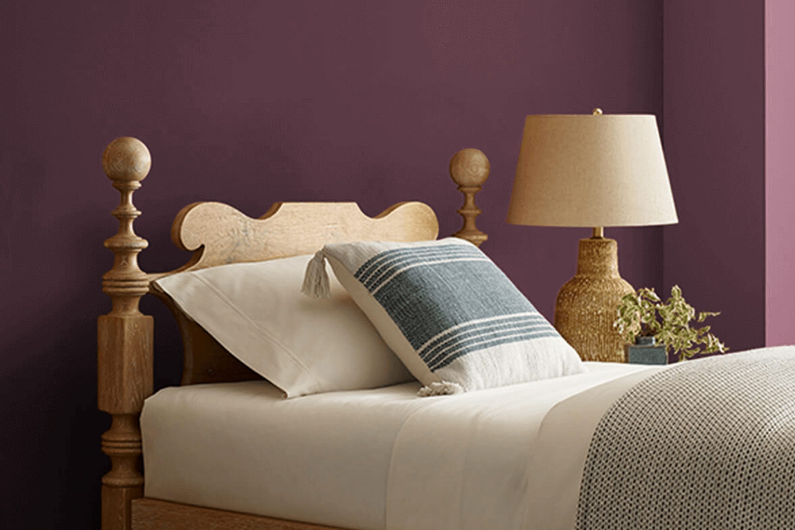
What Color Is Blackberry SW 7577 by Sherwin Williams?
Blackberry SW 7577 by Sherwin Williams is a rich, deep purple hue with warm undertones, reminiscent of the luscious fruit it’s named after. This color brings a cozy and inviting feel to any space, making it perfect for creating an intimate atmosphere. Its deep tone works wonderfully in areas designed for relaxation and conversation, like living rooms or dining areas.
This shade fits seamlessly into various interior styles, particularly working well with classical, modern, and eclectic themes. In a classical setting, it pairs beautifully with luxurious gold accents or creamy whites, adding depth and a touch of drama. In modern interiors, pairing it with sleek, silver finishes or minimalist furniture can create a striking contrast.
Eclectic rooms benefit from its ability to complement varied textures and vibrant patterns, providing a backdrop that highlights unique decor pieces.
The best materials to pair with this color include rich woods such as walnut, which can emphasize the warmth of the purple. Plush textiles like velvet or silk also work well, enhancing the indulgent feel of the color. Natural stone, particularly in lighter shades, can provide a striking contrast, making the room feel grounded yet airy.
In terms of textures, a matte finish on walls can make the color appear even more profound, whereas glossy surfaces create an elegant shimmer.

Is Blackberry SW 7577 by Sherwin Williams Warm or Cool color?
BlackberrySW 7577 by Sherwin Williams is a deep, rich purple with hints of black that adds a bold touch to any space. It’s the kind of color that makes a strong statement, whether used on an accent wall or throughout a room. Since it’s so rich and profound, it works well in larger spaces or rooms with plenty of natural light to prevent the color from becoming too overwhelming.
In homes, this color can create a cozy and inviting atmosphere when paired with the right decor and lighting. It pairs nicely with shades of grey, cream, or even gold accents, which help to balance its intensity. In a bedroom, applying this color can help to establish a cozy, restful environment, while in a living room, it can add a touch of drama and luxury.
For those looking to add personality and depth to their living spaces, this color is a great choice.
Undertones of Blackberry SW 7577 by Sherwin Williams
BlackberrySW 7577 by Sherwin Williams is a rich, vibrant color that changes subtly depending on the lighting and surrounding colors. The undertones of a paint color are like hidden flavors in food—they can subtly influence how the color looks and feels in a space without being immediately obvious.
This particular shade has a complex mix of undertones: brown, navy, purple, dark green, olive, dark turquoise, and grey. These undertones can make the color appear slightly different under various lighting conditions. For example, in bright natural light, the navy and purple undertones might make the color appear more vibrant and lively. In artificial or dim lighting, the brown and dark green undertones could give it a more muted, cozy feel.
On interior walls, these undertones can have a significant impact. In a room with lots of natural light, BlackberrySW 7577 might show its more vibrant side, making the walls a focal point of the room. In spaces with less light, or during the evening, the darker undertones like brown and dark green can make the room feel warmer and more inviting.
Choosing furnishings and decor that complement or contrast these undertones can also affect the overall ambiance. Lighter colors might make the darker undertones stand out, while similar dark tones can create a harmonious look. Thus, understanding and considering the undertones of BlackberrySW 7577 can help in achieving the desired atmosphere in a room.
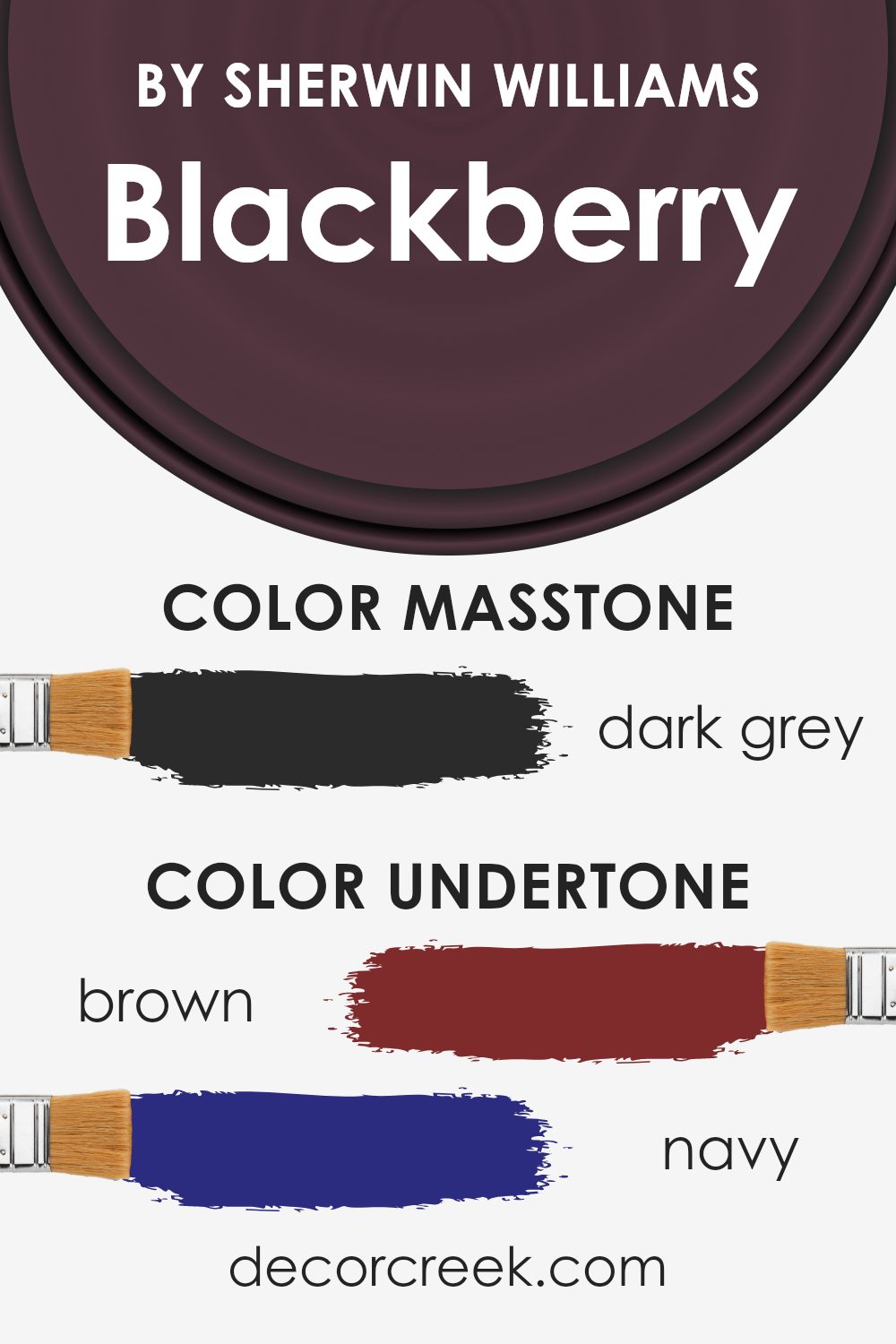
What is the Masstone of the Blackberry SW 7577 by Sherwin Williams?
BlackberrySW 7577 by Sherwin Williams is known for its dark grey masstone. This deep and nearly black shade adds a robust character to any room it graces. When used in homes, it brings a feeling of grounding and boldness, establishing a strong presence.
This makes it an excellent choice for accent walls or furniture pieces, as it draws the eye and makes lighter colors pop when used alongside it. However, due to its darkness, using it on large surfaces can make spaces feel smaller or more closed in.
It’s best in rooms with adequate natural light or where lighter colors and mirrors are also part of the decor to balance the visual weight. In summary, while Blackberry SW 7577’s dark grey tone adds a dramatic flair, it should be used thoughtfully to avoid overwhelming a space.
How Does Lighting Affect Blackberry SW 7577 by Sherwin Williams?
Lighting plays a crucial role in how we perceive colors. The same paint can look different under various light sources. For instance, Blackberry SW 7577 by Sherwin Williams could change its appearance significantly depending on whether it’s under natural or artificial light.
Natural Light:
Natural light, often considered the best light source for true color representation, varies throughout the day and affects how we perceive colors. Rooms facing different directions also experience this impact differently:
- North-Faced Rooms: These rooms get less direct sunlight, so they can make colors appear darker and more shadowed. Blackberry SW 7577 may appear almost black or a very deep purple in these conditions, adding a kind of moody or dramatic depth to the space.
- South-Faced Rooms: Here, there is an abundance of bright, warm light throughout the day. This type of light can make the Blackberry color look lighter and more vibrant. The warm undertones of the sun might bring out subtle red or brown notes in the paint.
- East-Faced Rooms: Morning light in these rooms is bright and cool, so Blackberry SW 7577 could look very lively and vivid in the morning, returning to a true dark purple as the light fades.
- West-Faced Rooms: Evening light in these rooms is warmer and can alter the appearance of the color similarly to south-facing rooms but with more intensity as the sun sets. This color might look softer and more welcoming later in the day.
Artificial Light:
Artificial light includes a range of light types, such as LED, fluorescent, and incandescent bulbs, each affecting colors differently.
-LED Lights: These can range from warm to cool temperatures. Cool LEDs may make Blackberry SW 7577 lean towards a true dark purple, while warm LEDs might highlight its deeper, warmer tones.
- Fluorescent Lights: Often emitting a flat, cool light, fluorescent bulbs might enhance the bluish tones in the paint, giving it a starker appearance.
- Incandescent Lights: These bulbs cast a warmer light and can make the color appear softer and richer, possibly bringing out more of its red or brown undertones.
Understanding how light affects this particular shade can help in deciding the right color for a room’s purpose and desired atmosphere.

What is the LRV of Blackberry SW 7577 by Sherwin Williams?
LRV stands for Light Reflectance Value, which is a measure used to describe the amount of visible and usable light that a color reflects or absorbs when painted on a surface. Essentially, LRV helps in understanding how light or dark a color will look once applied to the walls. It is a scale where higher numbers mean the color reflects more light, making a room feel brighter and more open. Conversely, lower numbers indicate that the color absorbs more light, creating a cozier and more enclosed feeling in a space.
The LRV of Blackberry SW 7577, which is 4.81, suggests that it is a very dark color. When used on walls, this shade will absorb a significant amount of light, meaning it won’t significantly brighten a room under natural or artificial light. Instead, it will offer a rich depth of color, making it ideal for creating a statement or accent wall in spaces that could benefit from a dramatic touch.
Colors with such a low LRV are typically used sparingly or in larger, well-lit spaces to avoid making the area feel too dark or small.

Coordinating Colors of Blackberry SW 7577 by Sherwin Williams
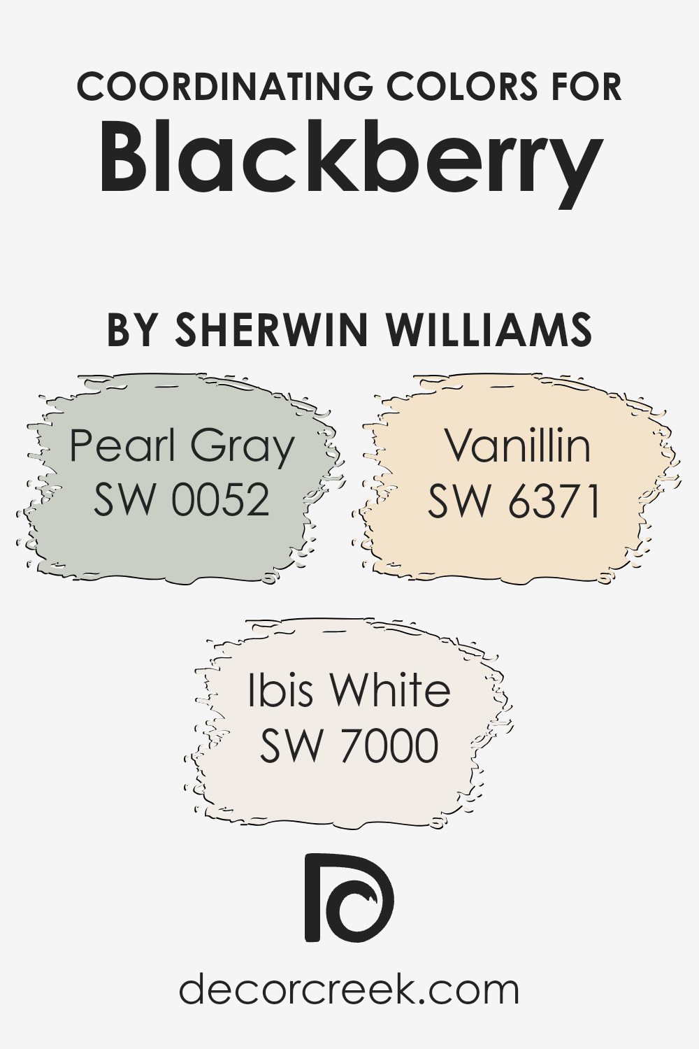
Coordinating colors are hues that complement or enhance each other when used together in various design settings. These colors can create a visually appealing and balanced look, whether for interior spaces, artwork, or fashion. For example, when paired with a rich color like Blackberry from Sherwin Williams, thoughtful selection of coordinating colors is key to achieving a harmonious aesthetic. One might choose softer or neutral tones that can offset a dominant color or bring out its various undertones.
Pearl Gray is a gentle gray that works beautifully to temper the intensity of darker shades, providing a soothing backdrop that allows bolder colors to stand out without overwhelming the senses. Blackberry pairs nicely with Pearl Gray, as the soft gray highlights the depth of the berry hue.
Ibis White, on the other hand, offers a crisp and clean look that brings freshness and brightness, creating a striking contrast that can make vibrant colors pop even more. Lastly, Vanillin, a subtle creamy shade, adds warmth and softness, lending a cozy feel when used alongside richer, more saturated colors. Together, these coordinating colors support and enhance the overall aesthetic, providing balance and visual interest to any design they’re part of.
You can see recommended paint colors below:
- SW 0052 Pearl Gray (CHECK A SAMPLE)
- SW 7000 Ibis White (CHECK A SAMPLE)
- SW 6371 Vanillin (CHECK A SAMPLE)
What are the Trim colors of Blackberry SW 7577 by Sherwin Williams?
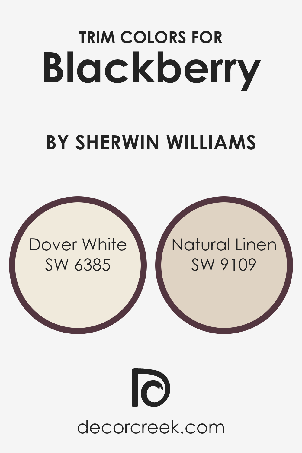
Trim colors are essential in interior design as they help define and accentuate the architectural features of a room. For BlackberrySW 7577 by Sherwin Williams, which is a rich, deep color, using lighter trim colors like SW 6385 – Dover White and SW 9109 – Natural Linen can create a beautiful contrast that highlights moldings, doors, and windows, ensuring these features pop against the darker walls.
These trim colors not only frame the space but also add a touch of brightness, enhancing the overall aesthetic of the room by providing a crisp, clean finish that complements the darker tone of Blackberry.
Dover White SW 6385 has a creamy, warm hue that brings a soft and inviting feel to the space. It is versatile enough to blend beautifully with the boldness of Blackberry, preventing the room from feeling too dark or overwhelming. On the other hand, Natural Linen SW 9109 offers a subtle, beige tone that adds a hint of warmth and natural element to the room, ensuring that the environment remains inviting and pleasant. Both colors are excellent choices for trim, working together to highlight the rich depth of Blackberry while maintaining a harmonious and appealing interior space.
You can see recommended paint colors below:
Colors Similar to Blackberry SW 7577 by Sherwin Williams
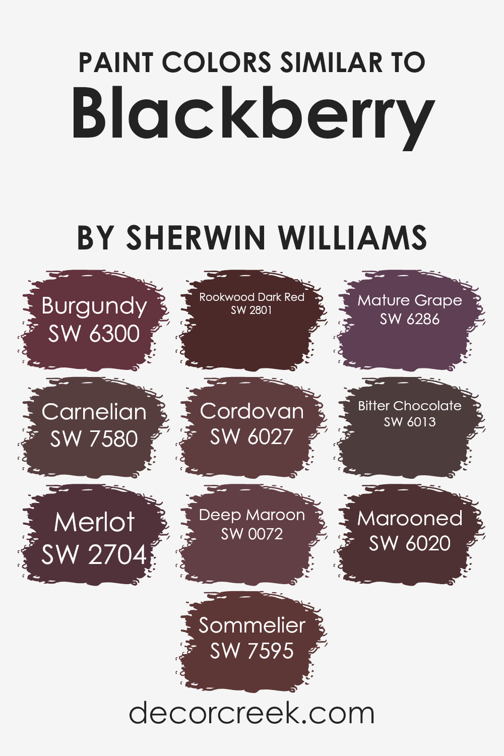
Similar colors play a crucial role in creating a harmonious and aesthetically pleasing color palette. They can be used to establish a sense of balance and cohesion in a space, making it feel more put together. Colors that share a common hue or undertone, like those similar to Sherwin Williams Blackberry, work seamlessly together as they have related color characteristics though they may differ in darkness or saturation.
Using shades like Burgundy, Carnelian, and others in this family can help achieve a rich, cohesive look without stark contrasts, perfect for environments where a subtle yet unified appearance is desired.
Burgundy is a deep, warm red that brings a cozy feel to interiors. Carnelian, slightly brighter, adds a touch of vibrant warmth with its reddish-orange tone. Merlot is a muted, earthy red that offers depth and warmth, great for creating inviting spaces. Sommelier has berry-like undertones that make it ideal for luxurious settings. Rookwood Dark Red features a rustic quality, perfect for traditional decor. Cordovan’s rich, leather-like hue works well in sophisticated environments. Deep Maroon provides a bold, dramatic flair, great for accent walls. Mature Grape, with its deep purple tone, adds a touch of mystery and richness. Bitter Chocolate is a dark, almost black shade that adds dramatic depth. Lastly, Marooned offers a classic dark red that’s both timeless and versatile, suitable for many design styles. Each of these colors, while unique, comfortably complements others within the group, making them perfect candidates for layering and creating textured interior designs.
You can see recommended paint colors below:
- SW 6300 Burgundy (CHECK A SAMPLE)
- SW 7580 Carnelian (CHECK A SAMPLE)
- SW 2704 Merlot (CHECK A SAMPLE)
- SW 7595 Sommelier
- SW 2801 Rookwood Dark Red
- SW 6027 Cordovan (CHECK A SAMPLE)
- SW 0072 Deep Maroon (CHECK A SAMPLE)
- SW 6286 Mature Grape (CHECK A SAMPLE)
- SW 6013 Bitter Chocolate (CHECK A SAMPLE)
- SW 6020 Marooned (CHECK A SAMPLE)
Colors that Go With Blackberry SW 7577 by Sherwin Williams
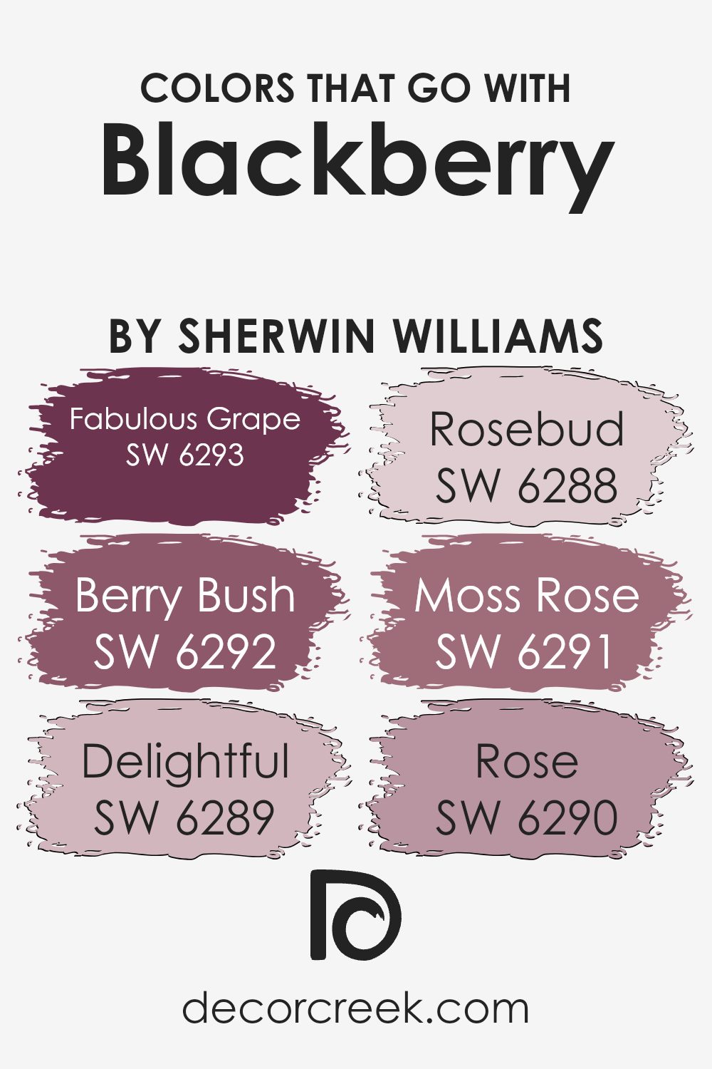
Choosing the right companion colors for BlackberrySW 7577 by Sherwin Williams is crucial because it helps create a harmonious and aesthetically pleasing palette for any room. These colors complement or contrast with Blackberry nicely, allowing for a variety of design themes from warm and cozy to bright and cheerful, which enhances the overall decoration.
Selecting the ideal colors also helps in achieving a desired mood and style, like making a room appear more spacious or providing a dramatic backdrop for furniture and decor.
For instance, SW 6293 – Fabulous Grape is a deep, rich purple that adds a regal touch when paired with Blackberry. It works well in spaces that aim for a lush, inviting feel. SW 6292 – Berry Bush is slightly lighter, offering a vibrant contrast that is both refreshing and eye-catching. Another option is SW 6289 – Delightful, an airy pink that introduces a whisper of softness to balance the depth of Blackberry, ideal for creating a gentle and cozy atmosphere. SW 6288 – Rosebud, a muted rose tone, complements Blackberry by adding a delicate and traditional old-fashioned charm. If looking for something in the flora-inspired tones, SW 6291 – Moss Rose presents a dusty pink that evokes the feel of a quaint garden, while SW 6290 – Rose is a clear, bright pink that stirs a sense of playfulness and dynamism. Together, these colors work cohesively to enhance the visual impact of Blackberry, making it adaptable to various design preferences and room functionalities.
You can see recommended paint colors below:
- SW 6293 Fabulous Grape (CHECK A SAMPLE)
- SW 6292 Berry Bush (CHECK A SAMPLE)
- SW 6289 Delightful (CHECK A SAMPLE)
- SW 6288 Rosebud (CHECK A SAMPLE)
- SW 6291 Moss Rose (CHECK A SAMPLE)
- SW 6290 Rose (CHECK A SAMPLE)
How to Use Blackberry SW 7577 by Sherwin Williams In Your Home?
Blackberry SW 7577 by Sherwin Williams is a rich, deep purple paint color that can add a unique touch to any space. This color works great in areas where you want to add some elegance and depth. For instance, painting one wall in your living room or bedroom with Blackberry can create a stunning accent wall, making the room look more stylish instantly. It’s also a good choice for a full room if you like darker, moody colors that give a cozy feeling.
Besides walls, you can use Blackberry on furniture or cabinets for a pop of color. It looks especially nice on a piece of furniture as a statement piece in a neutral-colored room. If you’re a bit unsure about painting a large area, start small—maybe paint a bookshelf or a side table.
This color pairs well with light grays, creams, and soft whites, which help balance its intensity and keep the space feeling open and inviting. If you’re looking to add a touch of elegance to your home easily, consider using Blackberry.
Blackberry SW 7577 by Sherwin Williams vs Mature Grape SW 6286 by Sherwin Williams
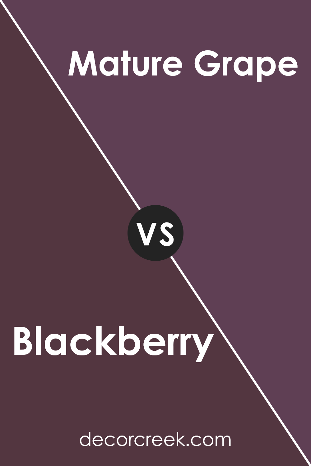
Blackberry SW 7577 by Sherwin Williams is a rich, deep purple with a bold presence that gives any space a sense of depth and drama. This dark hue can make large rooms feel cozier and more intimate. On the other hand, Mature Grape SW 6286 is also a dark purple, but it has a slightly lighter tone. It adds a touch of brightness to spaces while maintaining an elegant, understated feel. While both colors share a purple base, Blackberry leans towards a darker, more intense purple, whereas Mature Grape offers a softer approach with less intensity and more flexibility in lighter spaces.
These differences make Blackberry more suitable for striking accent walls or furniture pieces, while Mature Grape works well as a general wall color in various rooms. Both are excellent choices for adding depth and a modern aesthetic to home decor.
You can see recommended paint color below:
- SW 6286 Mature Grape (CHECK A SAMPLE)
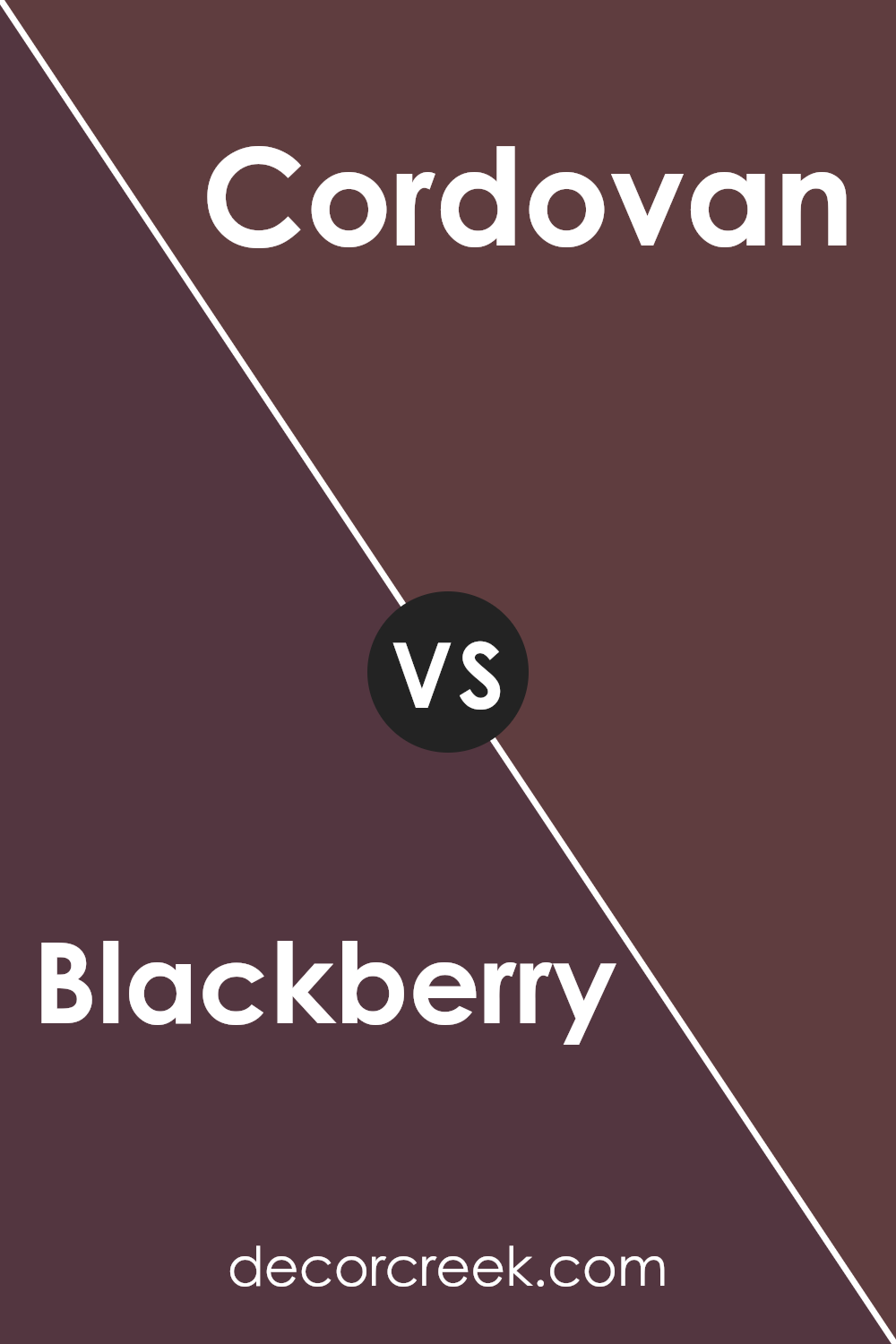
Blackberry SW 7577 by Sherwin Williams vs Cordovan SW 6027 by Sherwin Williams
Blackberry by Sherwin Williams is a deep, rich purple with a hint of red, creating a cozy and inviting atmosphere. It’s bold and can make a strong statement when used on walls or as an accent. In contrast, Cordovan by Sherwin Williams is a robust, reddish-brown shade that leans towards a more classic and timeless look.
This color can also bring warmth and comfort to spaces but with a more earthy and grounded feel than Blackberry.
While both colors can serve similar purposes in adding depth and character to an area, Blackberry tends to stand out more vividly because of its purplish hue, whereas Cordovan offers a subtle touch of traditional elegance. In choosing between them, consider the mood and theme you want to set: Blackberry suits modern and dynamic settings, while Cordovan fits well in traditional or rustic environments.
You can see recommended paint color below:
- SW 6027 Cordovan (CHECK A SAMPLE)
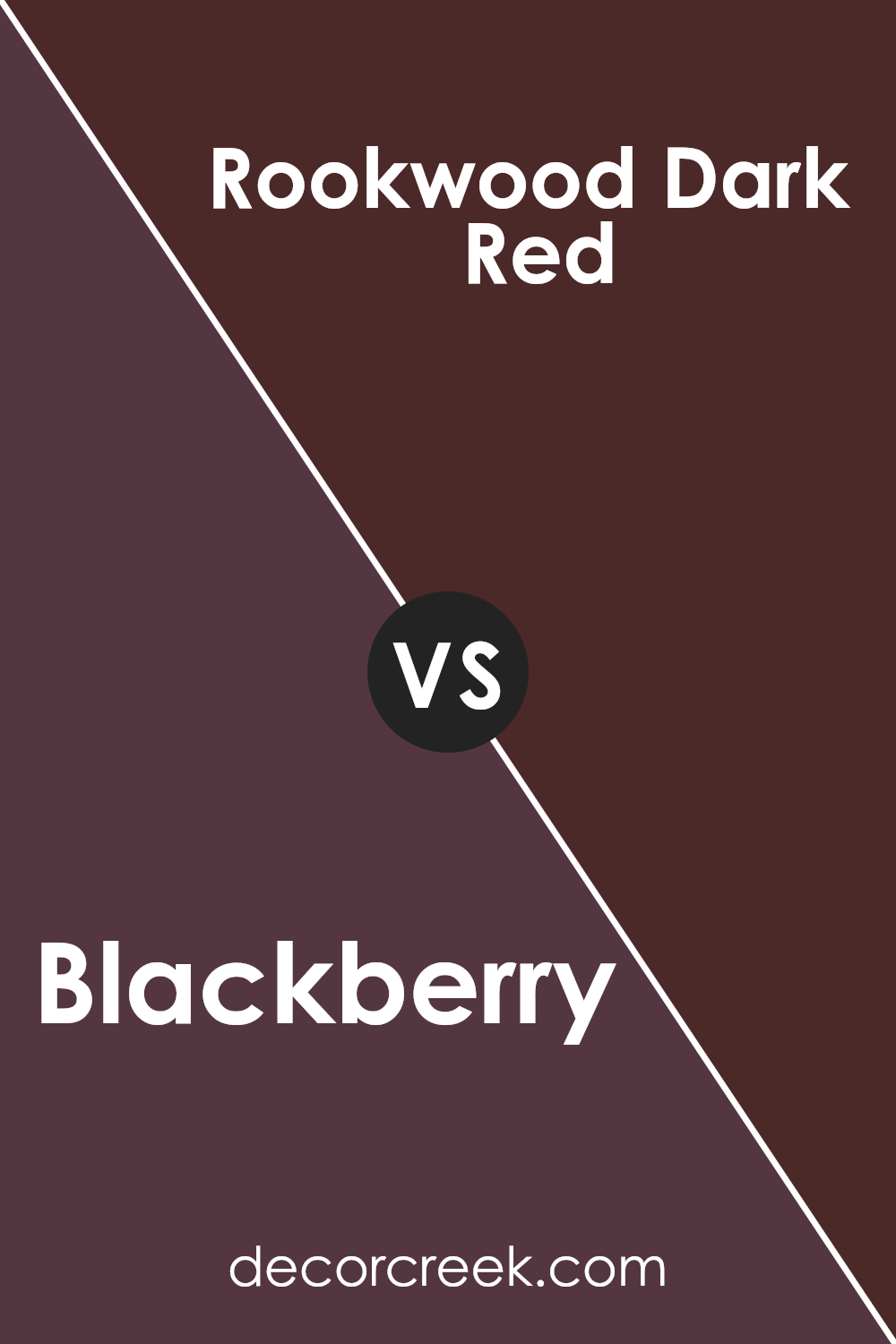
Blackberry SW 7577 by Sherwin Williams vs Rookwood Dark Red SW 2801 by Sherwin Williams
Blackberry by Sherwin Williams is a deep, rich purple with a hint of black, creating a cozy and bold feel. It’s a great choice for spaces where you want to make a strong impact with color like accent walls or furniture pieces to add depth to a room.
On the other hand, Rookwood Dark Red, also by Sherwin Williams, is a solid, warm red shade with a touch of brown which gives it a hearty and welcoming vibe.
This color works well in areas where a traditional or rustic look is desired, particularly in dining rooms or entryways to greet guests with warmth. Both colors are quite dark and can serve to set a moodier or more dramatic tone in a space, but while Blackberry leans towards a cooler, more mysterious look, Rookwood Dark Red offers a sense of warmth and grounding. Both are well-suited for accentuating a room with a touch of timeless elegance.
You can see recommended paint color below:
- SW 2801 Rookwood Dark Red
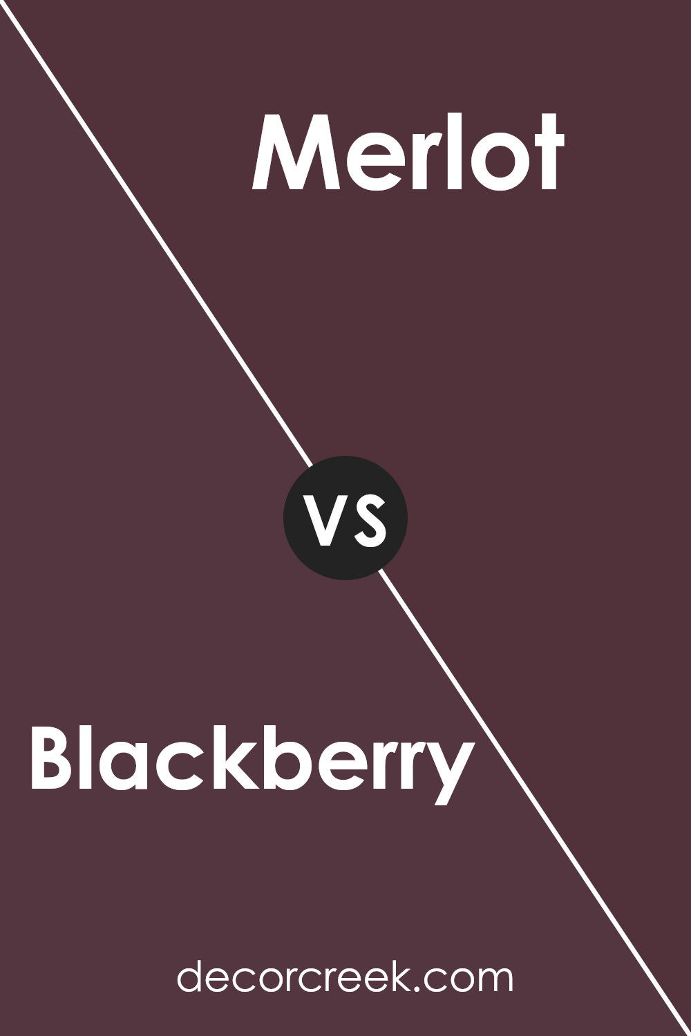
Blackberry SW 7577 by Sherwin Williams vs Merlot SW 2704 by Sherwin Williams
Blackberry and Merlot, both by Sherwin Williams, are rich, deep colors but have distinct tones. Blackberry is a dark purple with a very muted, almost black appearance. It leans towards a cooler palette, making it perfect for settings where you want a touch of modernity without overwhelming brightness. It can add depth to a space and works well as an accent wall or in decor elements like cushions or curtains.
On the other hand, Merlot is warmer and more vibrant, reflecting the red of its namesake wine. It’s bold and can bring warmth and energy to a room. This color is great in social spaces like living rooms or dining areas where its liveliness can stimulate conversations and interactions.
When choosing between these two, consider the mood and atmosphere you want to create in your space. Blackberry suits more subdued, elegant designs, while Merlot is ideal for lively, cozy settings.
You can see recommended paint color below:
- SW 2704 Merlot (CHECK A SAMPLE)
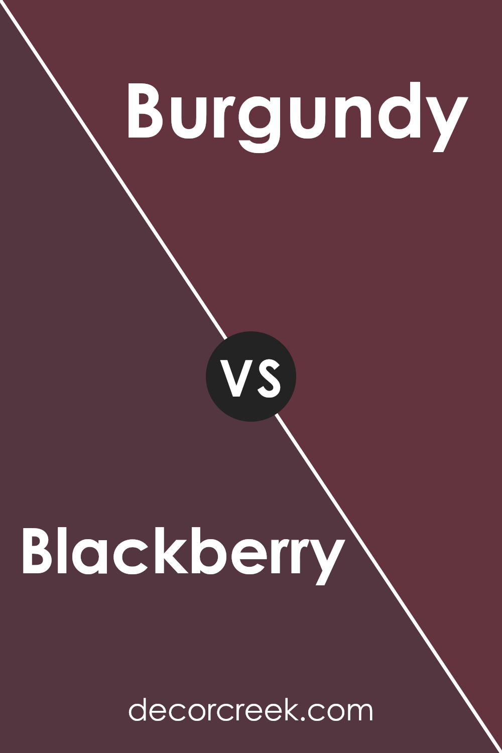
Blackberry SW 7577 by Sherwin Williams vs Burgundy SW 6300 by Sherwin Williams
Both Blackberry and Burgundy by Sherwin Williams are rich, deep colors, but they have distinct tones that set them apart. Blackberry has a dark, almost purple hue that could be seen as a very deep plum. It provides a strong presence in a space, making it ideal for highlighting areas or as an accent wall in a room that needs a touch of drama.
On the other hand, Burgundy carries a red tone, resembling the wine after which it is named. This color adds warmth and a welcoming feel to spaces, making it perfect for cozy areas like living rooms or dining areas.
Though both colors are dark and could be used to create similar effects, their underlying tones of purple and red will evoke different moods and styles. Blackberry leans more towards a cooler, more reserved look, while Burgundy offers warmth and comfort. Choosing between them depends on the atmosphere you want to create in your space.
You can see recommended paint color below:
- SW 6300 Burgundy (CHECK A SAMPLE)
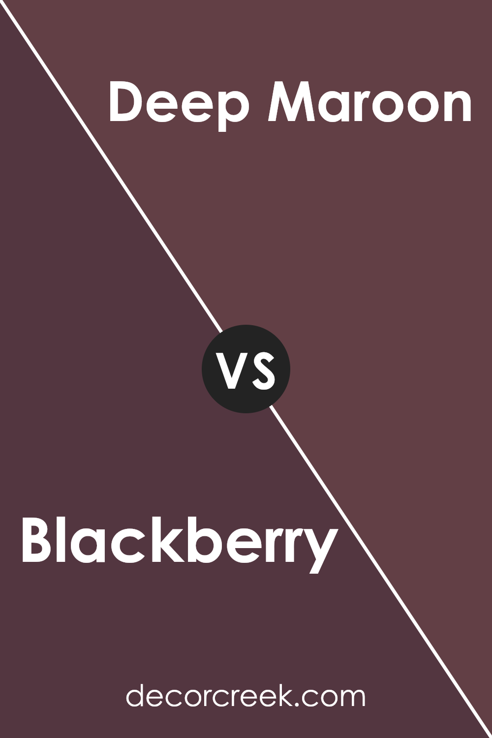
Blackberry SW 7577 by Sherwin Williams vs Deep Maroon SW 0072 by Sherwin Williams
The main color, Blackberry, and the second color, Deep Maroon, both offered by Sherwin Williams, present rich, dark tones that are perfect for creating a cozy and inviting atmosphere. Blackberry has a deep purple hue that leans towards a very dark, almost black shade of purple. It’s a great choice for adding a touch of drama and luxury to a space without being too overwhelming.
On the other hand, Deep Maroon has a strong red undertone, giving it a slightly warmer feel compared to Blackberry. It resembles the dark red seen in Maroon, but with more depth, making it ideal for spaces where you want to add warmth and a sense of welcoming.
Both colors are suitable for accent walls or as base colors in rooms that benefit from darker shades. While both are dark, the key difference lies in their undertones: purple for Blackberry and red for Deep Maroon. This distinction will affect how each color interacts with light and the other colors in your room.
You can see recommended paint color below:
- SW 0072 Deep Maroon (CHECK A SAMPLE)
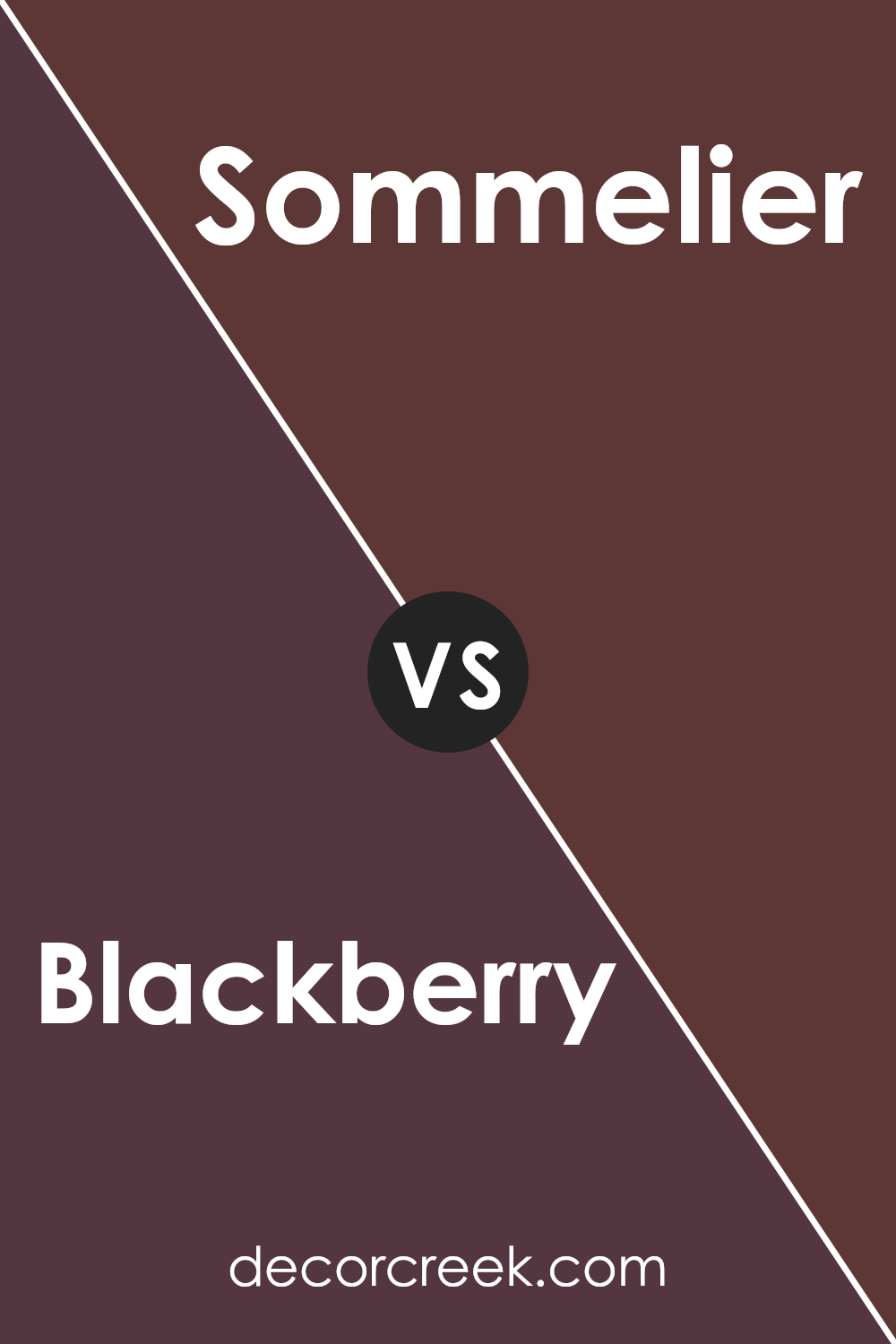
Blackberry SW 7577 by Sherwin Williams vs Sommelier SW 7595 by Sherwin Williams
Blackberry by Sherwin Williams is a deep, rich purple with a hint of black that gives it a bold and cozy feel. It’s perfect for spaces where you want to add a lot of depth and make a striking statement. The color is very dark, so it works well in a room that gets a lot of light or as an accent wall to contrast with lighter colors.
On the other hand, Sommelier by Sherwin Williams leans more towards a warm, brownish-red wine color. It has a cozy and inviting quality but is lighter than Blackberry, making it easier to use in smaller or less brightly lit spaces without overwhelming the area. Sommelier can warm up a room and pairs well with natural materials like wood and leather.
Both colors are unique and bring their own character to a space, but while Blackberry leans more towards a deep, moody vibe, Sommelier offers a warmer, earthier feel.
You can see recommended paint color below:
- SW 7595 Sommelier
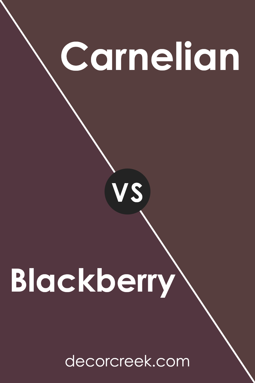
Blackberry SW 7577 by Sherwin Williams vs Carnelian SW 7580 by Sherwin Williams
Blackberry by Sherwin Williams is a deep, rich purple with cozy undertones that feels very warm and inviting. It can add a sense of depth and warmth to a room, making it perfect for spaces where you want a touch of elegance without being too bold.
On the other hand, Carnelian by Sherwin Williams is a bold terracotta red. It has a vibrant, earthy quality that is much more dynamic and energetic compared to Blackberry. This color is great for making a statement in an area, offering a splash of warmth that can liven up any space.
While both colors share a warm base, they represent different vibes and energies. Blackberry leans towards a subtle, deep hue that suggests comfort and depth, suitable for a relaxing and cozy atmosphere. Carnelian, being brighter and bolder, is ideal for spaces where a sense of energy and vibrancy is desired. Choosing between them depends on what mood or atmosphere you want to achieve in your space.
You can see recommended paint color below:
- SW 7580 Carnelian (CHECK A SAMPLE)
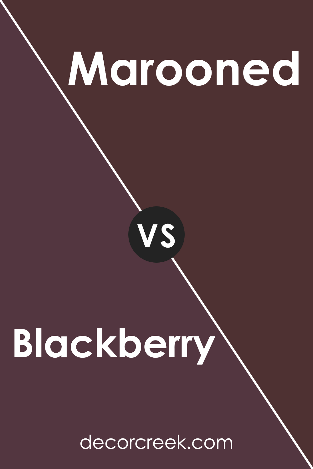
Blackberry SW 7577 by Sherwin Williams vs Marooned SW 6020 by Sherwin Williams
Blackberry SW 7577 is a deep, rich purple with a hint of red, giving it a warm and cozy feel. This color is versatile enough to work well in a bedroom or a living room, providing a strong but inviting atmosphere.
On the other hand, Marooned SW 6020 leans more towards a classic maroon. It’s a darker, more subdued shade of red that feels traditional and grounded. Marooned is perfect for spaces where you want to add depth without overwhelming the room with too much brightness.
Both colors are ideal for creating a cozy feel in a space, but Blackberry adds a touch of mystery with its purple undertones, while Marooned offers a sense of stability and earthiness with its rich red. Choosing between them depends on whether you prefer the cooler undertones of purple or the warm depth of red.
You can see recommended paint color below:
- SW 6020 Marooned (CHECK A SAMPLE)
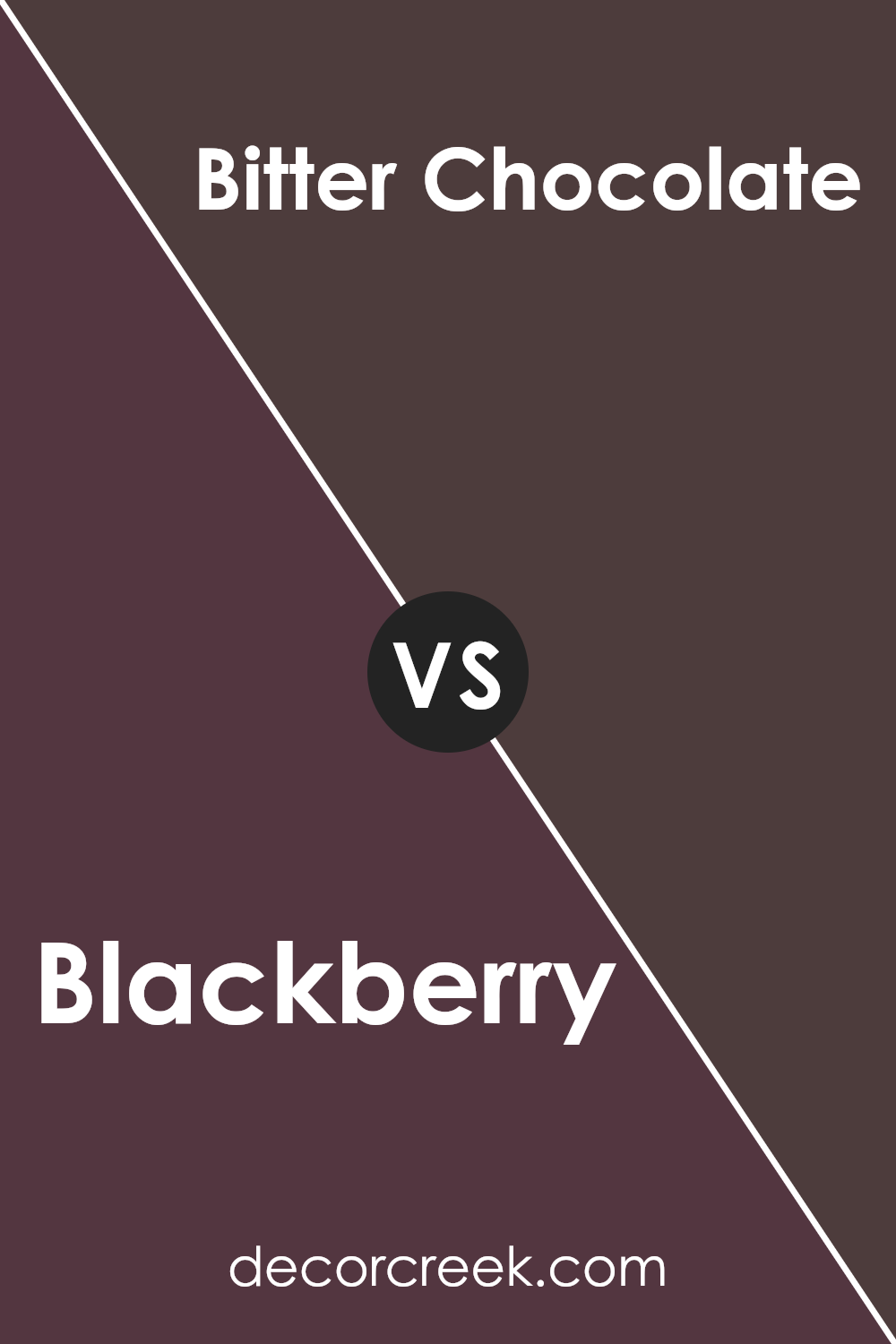
Blackberry SW 7577 by Sherwin Williams vs Bitter Chocolate SW 6013 by Sherwin Williams
Blackberry SW 7577 and Bitter Chocolate SW 6013 are both rich, deep colors from Sherwin Williams. Blackberry has a vibrant, deep purple hue that brings a strong personality and warmth to a space. It’s bold yet somewhat understated, making it a great choice for those who want to add color without overwhelming a room.
On the other hand, Bitter Chocolate is a very dark brown that almost resembles a dark chocolate bar. This color is warmer than Blackberry and lends a cozy and comforting feel to any area. It’s perfect for creating a snug, inviting atmosphere.
Both colors work well as accent walls or for furniture pieces, offering a touch of elegance and a dramatic flair. While Blackberry leans towards a cool tone with its purple base, Bitter Chocolate offers a warmth that is soothing and welcoming. These shades are versatile and can fit into a variety of design styles, whether you want something bold or something more subtle and warm.
You can see recommended paint color below:
- SW 6013 Bitter Chocolate (CHECK A SAMPLE)
Conclusion
Blackberry SW 7577 by Sherwin Williams is a rich, deep hue that brings a cozy and bold feeling to any space it adorns. This paint color has the power to make a striking statement when used on walls or as an accent, ideal for spaces that aim to have a bit of dramatic flair. Its versatility allows it to pair well with lighter shades and earthy textures, offering numerous styling possibilities for home decor.
When incorporated into interior design, Blackberry SW 7577 can provide a backdrop that enables furniture and other decor elements to stand out. It works exceptionally well in living areas, bedrooms, and dining spaces, providing an inviting warmth that can make these rooms feel more comfortable and refined.
Using this color can easily refresh a room’s appearance and create an inviting atmosphere that welcomes both residents and guests.

Ever wished paint sampling was as easy as sticking a sticker? Guess what? Now it is! Discover Samplize's unique Peel & Stick samples.
Get paint samples


