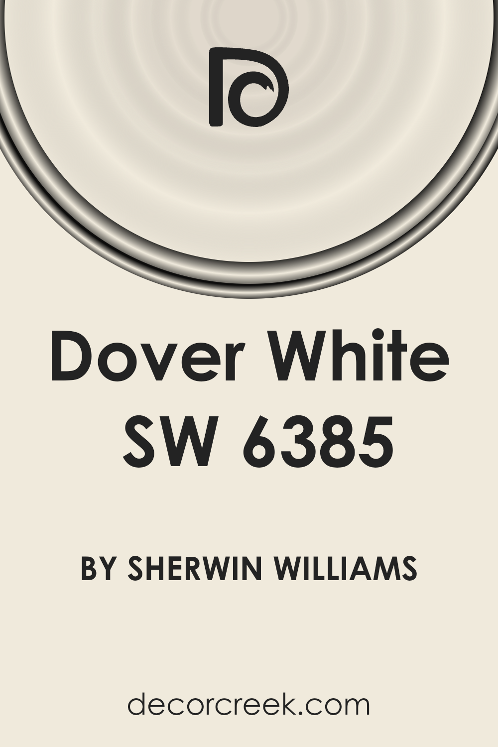
When choosing the perfect paint color for your home or workspace, it’s essential to consider one that offers both versatility and a refreshing touch. One such color is Dover White (SW 6385) by Sherwin Williams.
This warm and inviting shade of white has gained popularity for its ability to create a cozy yet bright atmosphere in any room
Unlike stark whites, Dover White brings a subtle warmth that enhances the space, making it feel welcoming and lived-in.
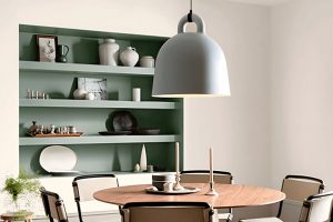
This versatile color works wonders in a variety of settings. Whether you’re looking to paint your kitchen cabinets, living room walls, or even the exterior of your house, Dover White can complement different styles and tastes.
It pairs beautifully with a wide range of colors, from bold and vibrant hues to soft and neutral tones. This makes it an excellent choice for those wanting to add a touch of freshness without overwhelming their space.
In this article, we’ll explore how Dover White stands out from other shades and how its unique qualities can elevate your home’s aesthetic.
Whether you’re a seasoned decorator or picking up a paintbrush for the first time, discovering the charm of Dover White could be just what you need to breathe new life into your surroundings.
What Color Is Dover White SW 6385 by Sherwin Williams?
Dover White by Sherwin Williams is a warm, inviting shade of white that offers a soft and creamy appearance.
This cozy hue brings a sense of calm and brightness to any space, making it perfect for creating an inviting atmosphere in your home.
Its subtle warmth means it can easily blend with a variety of decor styles, from traditional to modern and even rustic.
This particular white works exceptionally well in interior styles that favor a classic, timeless look. Think of settings that use a lot of wood, natural fibers, and textures that add depth and character to the space.
It pairs beautifully with rich wooden furniture, lending a serene backdrop that highlights the natural beauty of the wood. For a more modern approach, Dover White can complement metallic accents and glass decor, adding a soft balance to sleek lines and reflective surfaces.
Materials like linen, cotton, and wool look fantastic against this shade, as it highlights their texture and adds to the cozy feel of a room.
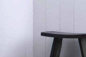
Whether used on walls, trim, or cabinets, this color offers flexibility and warmth, making any room feel more inviting. It’s a wonderful choice for living rooms, kitchens, and bedrooms, where its gentle character can create a peaceful and welcoming environment.
Ever wished paint sampling was as easy as sticking a sticker? Guess what? Now it is! Discover Samplize's unique Peel & Stick samples.
Get paint samples

Is Dover White SW 6385 by Sherwin Williams Warm or Cool color?
Dover White SW 6385 by Sherwin-Williams is a classic, warm white paint color that brings a cozy and welcoming atmosphere into homes. This color stands out because it has a creamy undertone, making it different from stark, cold whites.
When applied to walls, Dover White gives a room a soft, gentle backdrop, perfect for spaces where you want to relax and feel at ease. It’s especially great in living areas or bedrooms, creating a soothing environment that’s easy on the eyes.
In homes with lots of natural light, Dover White reflects the light beautifully, enhancing the room’s brightness and making spaces appear larger.
In rooms with less light, its warm undertones prevent it from feeling sterile or too cool, which can sometimes happen with pure white shades. This versatility means it works well with a wide range of home styles and decor, from modern to rustic.
Moreover, Dover White pairs well with many colors, serving as a neutral canvas for bolder decor or as part of a monochromatic, serene color scheme.
Whether used on walls, trim, or cabinets, it adds a touch of warmth without overwhelming the senses, making it a popular choice for homeowners looking to create a welcoming and comfortable home environment.
Undertones of Dover White SW 6385 by Sherwin Williams
Dover White by Sherwin Williams is a popular paint choice for interior walls. This color isn’t just a simple white; it has subtle undertones that add depth and complexity to its appearance.
Specifically, it carries hints of pale yellow and light purple. These undertones can significantly influence how we perceive the color.
Undertones are like hidden colors that aren’t immediately obvious but affect the overall hue. With Dover White, the pale yellow undertone adds a warm, inviting glow.
This makes rooms feel cozy and welcoming, especially in natural light. On the other hand, the light purple undertone introduces a hint of coolness, which can help balance the warmth and ensure the color doesn’t lean too yellow in certain lighting.
These two undertones work together to make Dover White adaptable to various lighting conditions and design schemes. In bright sunlight, the yellow might become more pronounced, giving rooms a sunny, cheerful look.
In artificial light or during the evening, the purple might step forward, lending a softer, more neutral appearance.
For interior walls, these undertones mean Dover White is never just a flat, sterile white. Instead, it brings a subtle richness and versatility, making spaces feel more alive and dynamic.
Whether you’re aiming for a warm, inviting atmosphere or a brighter, more airy feel, Dover White can adapt, thanks to its nuanced undertones.
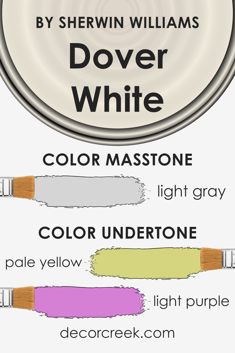
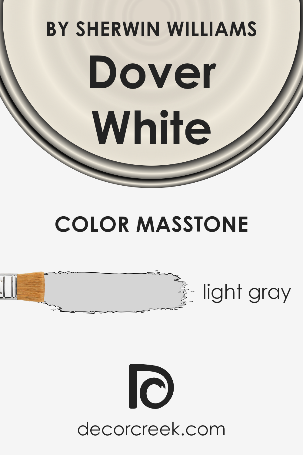
What is the Masstone of the Dover White SW 6385 by Sherwin Williams?
Dover White SW 6385 by Sherwin Williams has a masstone that many might think is just white at first glance. However, its true color is actually a light gray, with the exact hue being #D5D5D5.
This subtle distinction makes it incredibly versatile for use in homes. Light gray can blend seamlessly with almost any decor style, from modern to traditional, adding a touch of sophistication without overpowering a room.
It’s perfect for creating a serene and inviting atmosphere in spaces where you want to relax, like living rooms and bedrooms. The light gray hue of Dover White also helps to reflect natural light, making rooms feel brighter and more spacious.
Additionally, this color pairs well with both bold and neutral palettes, allowing homeowners to add accents according to their personal taste without worrying about clashing colors.
Its ability to adapt to various lighting conditions and complement other colors makes it a smart choice for those looking to refresh their home’s look.
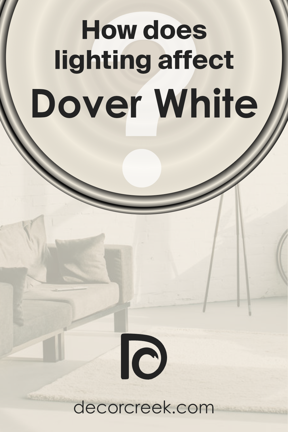
How Does Lighting Affect Dover White SW 6385 by Sherwin Williams?
Lighting plays a crucial role in how we perceive colors, turning the appearance of any hue slightly or dramatically different under various light conditions.
Understanding this can help us choose the right paint for our walls, like Dover White SW 6385 by Sherwin Williams, ensuring the color looks good at all times of the day and in different rooms of a house.
In artificial light, colors can seem warmer or cooler depending on the light bulb used. LED bulbs, for example, come in a range of color temperatures from warm yellow to cool blue.
Dover White can look warmer and more inviting under a warm light, making it ideal for living rooms or bedrooms where soft light compliments the cozy atmosphere.
Under cooler, bluer lights, Dover White may appear brighter and crisper, a good match for bathrooms or kitchens.
Natural light, on the other hand, changes throughout the day and affects how colors look. Morning light tends to be cooler, making Dover White look fresh and bright.
As the day progresses, sunlight becomes warmer, softening the color, and by the evening it can transform into a cozy, creamy hue.
- The orientation of rooms also influences how Dover White appears:
North-faced rooms get less direct sunlight, making colors look cooler and somewhat muted. Dover White in such rooms maintains a bright and clean appearance without feeling cold. - South-faced rooms are flooded with warm light most of the day, which can make Dover White look warmer and enhance its creamy qualities.
- East-faced rooms catch the morning light, making Dover White look very bright and lively in the mornings but cooler in the afternoon and evening.
- West-faced rooms receive the evening light, so Dover White will appear cooler in the morning and gradually warm up, reaching a soft, warm peak by sunset.
Choosing the right color, like Dover White by Sherwin Williams, involves considering how different lighting conditions will affect its appearance in your space, ensuring the color matches your aesthetic and functional needs under all circumstances.
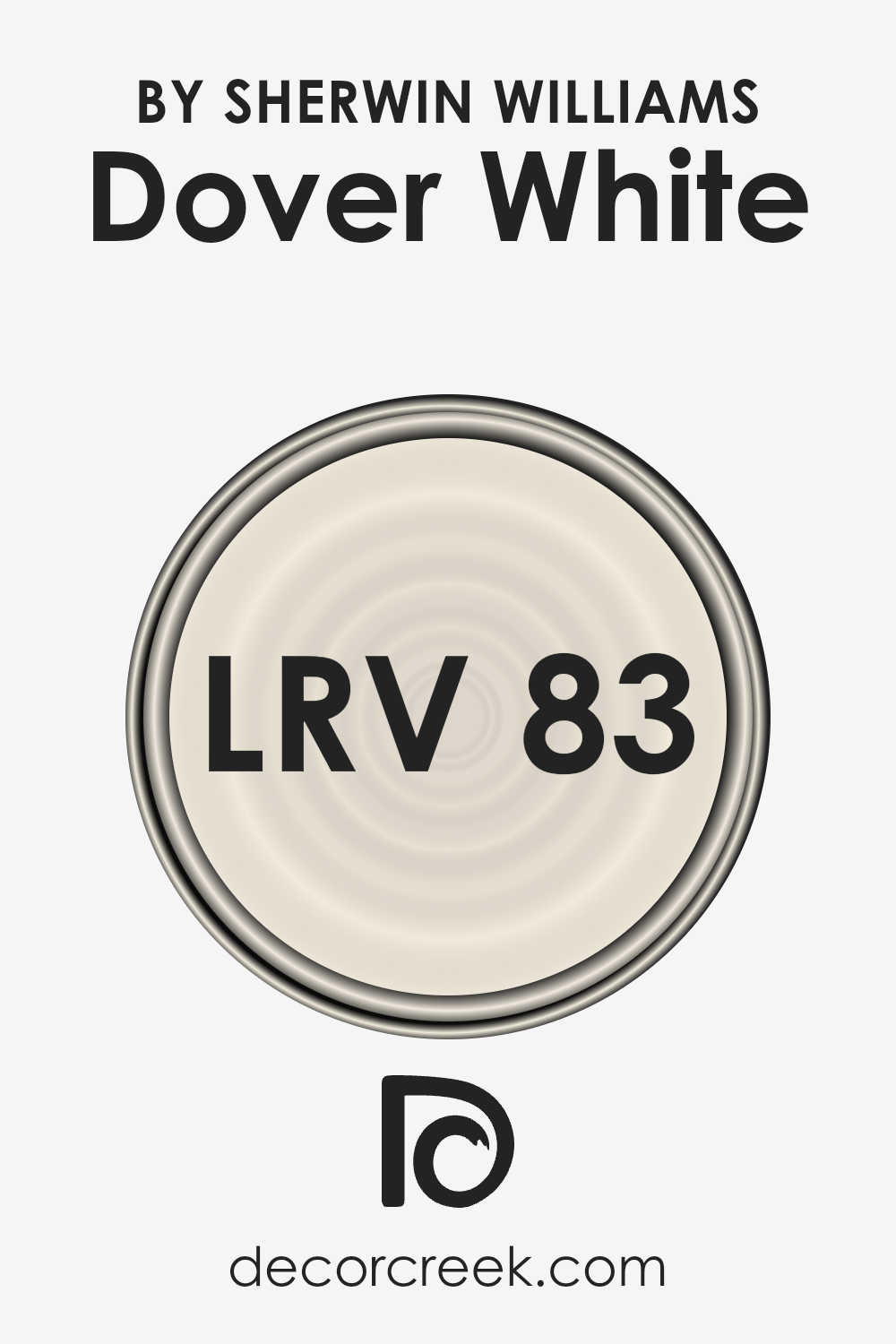
What is the LRV of Dover White SW 6385 by Sherwin Williams?
LRV stands for Light Reflectance Value, and it’s a measure of how much light a color reflects compared to how much it absorbs. Imagine LRV on a scale from 0 to 100, where 0 is pure black, absorbing all the light, and 100 is pure white, reflecting all the light.
This number helps you understand how bright or dark a color will look on your walls. A higher LRV means the color is lighter and will reflect more light, making spaces feel more open and airy.
Conversely, a lower LRV means the color is darker and absorbs more light, which can make a room feel smaller or cozier.
With an LRV of 82.52, Dover White is on the lighter end of the scale, meaning it will reflect a lot of light. This makes it a great choice for making a space feel brighter and larger.
In rooms with a lot of natural light, this color will appear almost radiant, enhancing the feeling of openness. In spaces with less natural light, it can help make the room feel less closed in by maximizing the available light.
The high LRV of Dover White means it has the ability to create a light, welcoming atmosphere in your home, making it an excellent choice for walls where you want to add brightness without the starkness of pure white.
LRV – what does it mean? Read This Before Finding Your Perfect Paint Color
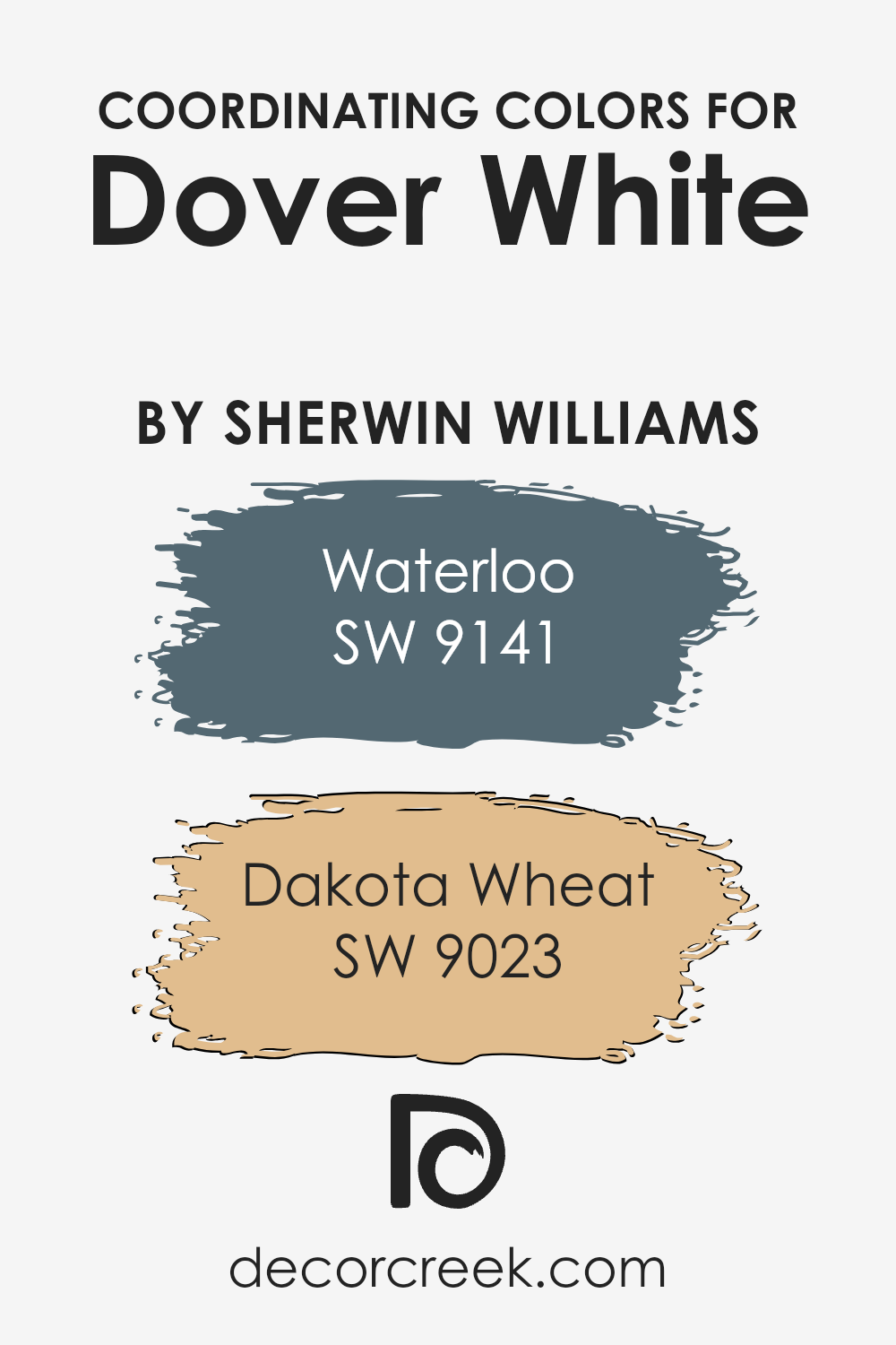
Coordinating Colors of Dover White SW 6385 by Sherwin Williams
Coordinating colors are hues that complement each other on the color wheel, working together to create a harmonious look in any space.
They can enhance the main color, adding depth and complexity to the design. For a color like Dover White by Sherwin Williams, coordinating colors need to both contrast and complement its warm, inviting undertone, making the room feel balanced and thoughtfully put together.
SW 9141 – Waterloo is a coordinating color that offers a deep, serene blue with a touch of gray, giving off a calming effect perfect for creating a restful environment.
This color contrasts beautifully with the warmth of Dover White, adding a sophisticated and modern feel to any room.
On the other hand, SW 9023 – Dakota Wheat brings a soft, golden hue that harmonizes with Dover White’s creamy warmth, promoting a cozy and welcoming atmosphere.
This color lends itself well to spaces that aim for a sunny and uplifting vibe, ensuring the room feels put-together and vibrant. Together, these coordinating colors offer a versatile palette that can make any space feel inviting and harmonious.
You can see recommended paint colors below:
- SW 9141 Waterloo
- SW 9023 Dakota Wheat
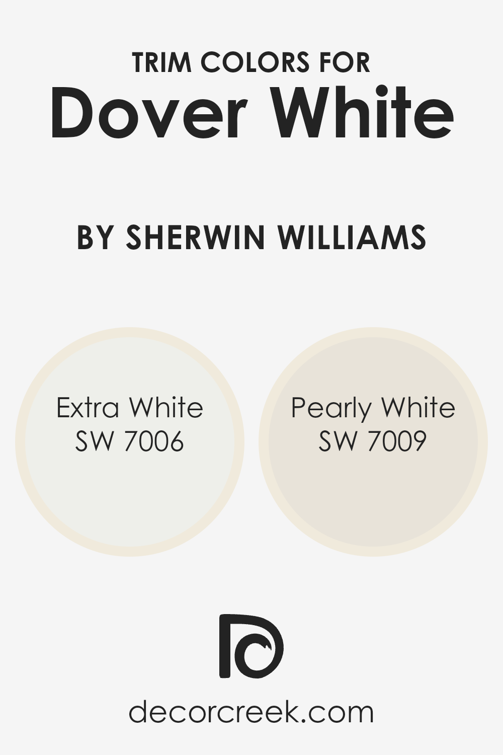
What are the Trim colors of Dover White SW 6385 by Sherwin Williams?
Trim colors are essentially the accent colors used on the architectural elements like door frames, window frames, skirting boards, and moldings in a room.
When it comes to choosing a trim color for Dover White by Sherwin Williams, a classic and popular shade of warm, welcoming white, selecting the right trim color is key to either subtly complement the wall color or create a striking contrast that highlights these features, adding depth and dimension to the space.
The chosen trim colors can significantly influence the room’s overall look, mood, and feel, making this decision more impactful than it might initially seem.
For a harmonious look with Dover White, Extra White (SW 7006) serves as a crisp and clean trim option. Extra White is a bright and pure white that brings a fresh and vibrant contrast to Dover White, making it ideal for a modern and minimalist aesthetic.
On the other hand, Pearly White (SW 7009) offers a softer approach with its slightly warmer tone, adding a subtle and sophisticated elegance to the space.
This color gently complements Dover White by enriching its warm undertones without creating an overwhelming contrast, perfect for creating a cozy and inviting atmosphere.
You can see recommended paint colors below:
- SW 7006 Extra White
- SW 7009 Pearly White
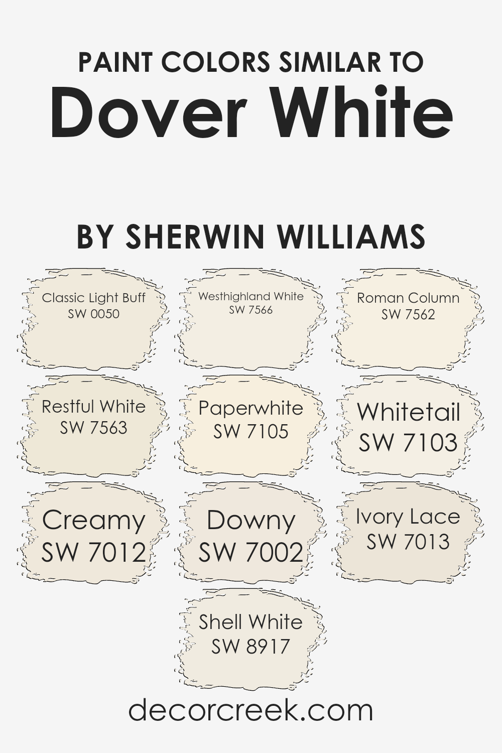
Colors Similar to Dover White SW 6385 by Sherwin Williams
Similar colors play a crucial role in design and aesthetics because they create a sense of harmony and balance. For example, when dealing with shades akin to Dover White by Sherwin Williams, it’s fascinating to see how each color generates a unique vibe while maintaining a cohesive look.
Colors like Classic Light Buff offer a tranquil earthiness, acting as the perfect backdrop that subtly warms up space without overwhelming it.
Then there’s Restful White, which lives up to its name by providing a serene, calming effect, making it ideal for creating a peaceful retreat.
Creamy, as another example, radiates a soft, inviting glow, reminiscent of the gentle light at dawn, enhancing the coziness of any room.
Shell White whispers elegance with its understated beauty, adding a fine layer of sophistication. Westhighland White takes a slightly bolder approach, offering brightness that rejuvenates spaces with a fresh, clean look.
Paperwhite injects a crisp, energizing quality, akin to the freshness of new linen, while Downy softens the ambiance with its delicate, almost ethereal touch.
Roman Column stands out with its architectural inspiration, lending a grounded, yet refined, air. Whitetail blends seamlessly into the mix, versatile in its ability to lighten spaces without coldness.
Lastly, Ivory Lace graces interiors with its soft, almost nostalgic charm, rounding out the spectrum of similar colors that, while each presenting a unique character, work together to create cohesive and versatile palettes.
These shades prove that similar colors are not just a matter of matching but about crafting spaces that feel thoughtfully composed and endlessly inviting.
You can see recommended paint colors below:
- SW 0050 Classic Light Buff
- SW 7563 Restful White
- SW 7012 Creamy
- SW 8917 Shell White
- SW 7566 Westhighland White
- SW 7105 Paperwhite
- SW 7002 Downy
- SW 7562 Roman Column
- SW 7103 Whitetail
- SW 7013 Ivory Lace
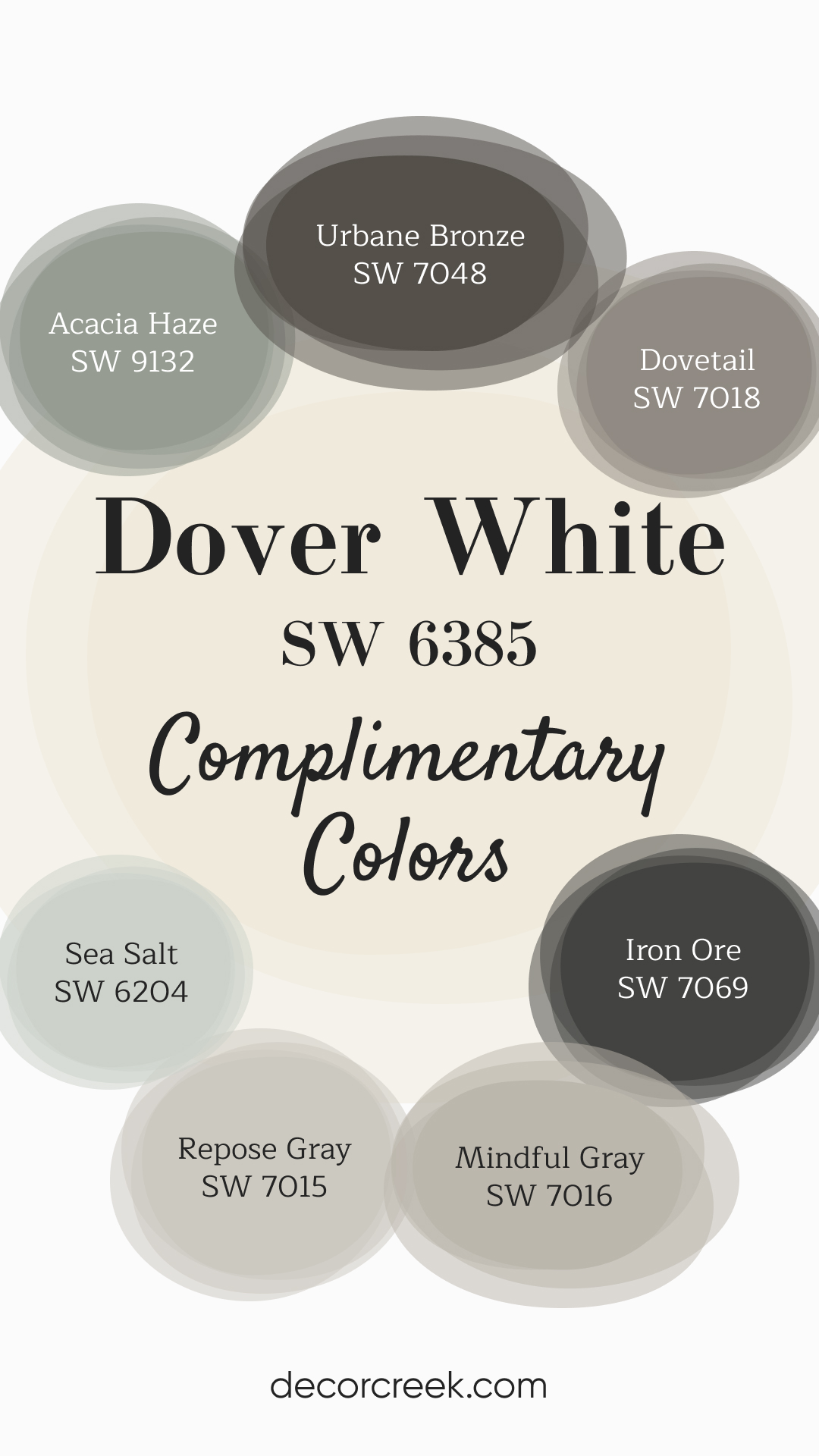
Complimentary Colors for Dover White SW 6385 Paint Color by Sherwin Williams
Dover White by Sherwin Williams is a classic warm white that works beautifully in any room. It creates a fresh, bright backdrop that pairs well with richer shades like Urbane Bronze or Iron Ore for a bit of contrast.
If you’re looking for a more subtle mix, Dovetail and Repose Gray provide a perfect middle ground, offering a soft and elegant touch to the space. For a more relaxed and inviting feel, incorporate calming tones like Mindful Gray, Acacia Haze, and Sea Salt.
These colors bring a gentle, nature-inspired vibe, making them ideal for bedrooms, living rooms, or spaces where you want a peaceful atmosphere. This combination of colors is perfect for creating a timeless and balanced interior.
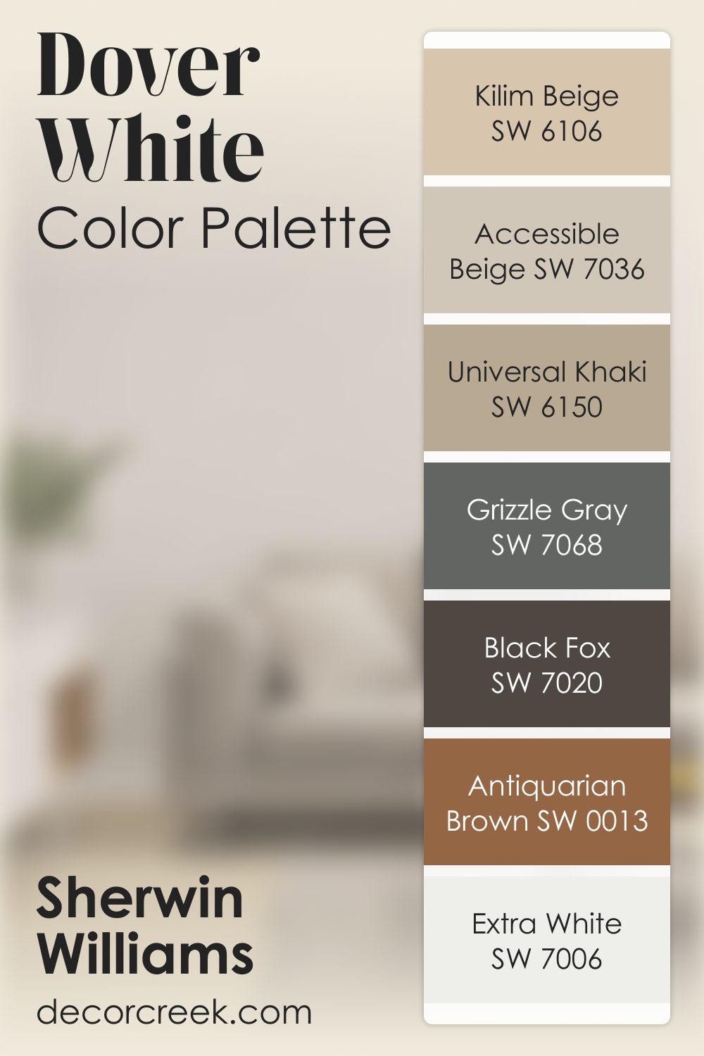
Dover White SW 6385 by Sherwin Williams Color Palette
Dover White has a warm glow that always feels comforting to me. It brings a soft, inviting light into the room, almost like morning sun on a quiet day. I enjoy pairing it with Accessible Beige or Kilim Beige when I want a palette that feels cozy and grounded. Universal Khaki and Grizzle Gray add earthy depth that makes the palette feel rich without becoming too heavy.
For stronger contrast, Black Fox is my favorite anchor—it gives Dover White a bold counterpart while keeping the room feeling calm.
Antiquarian Brown brings a warm vintage mood, and Extra White adds a crisp note that highlights the softness of Dover White even more.
This palette works so well because it layers warmth in a thoughtful, gentle way. Each shade brings something comforting, making the whole look feel bright, natural, and wonderfully lived-in.
How to Use Dover White SW 6385 by Sherwin Williams In Your Home?
Dover White SW 6385 is a paint color from Sherwin Williams that’s like a cozy blanket for your walls. It’s not just plain white; it has a warm, creamy tone that can make any room feel more inviting.
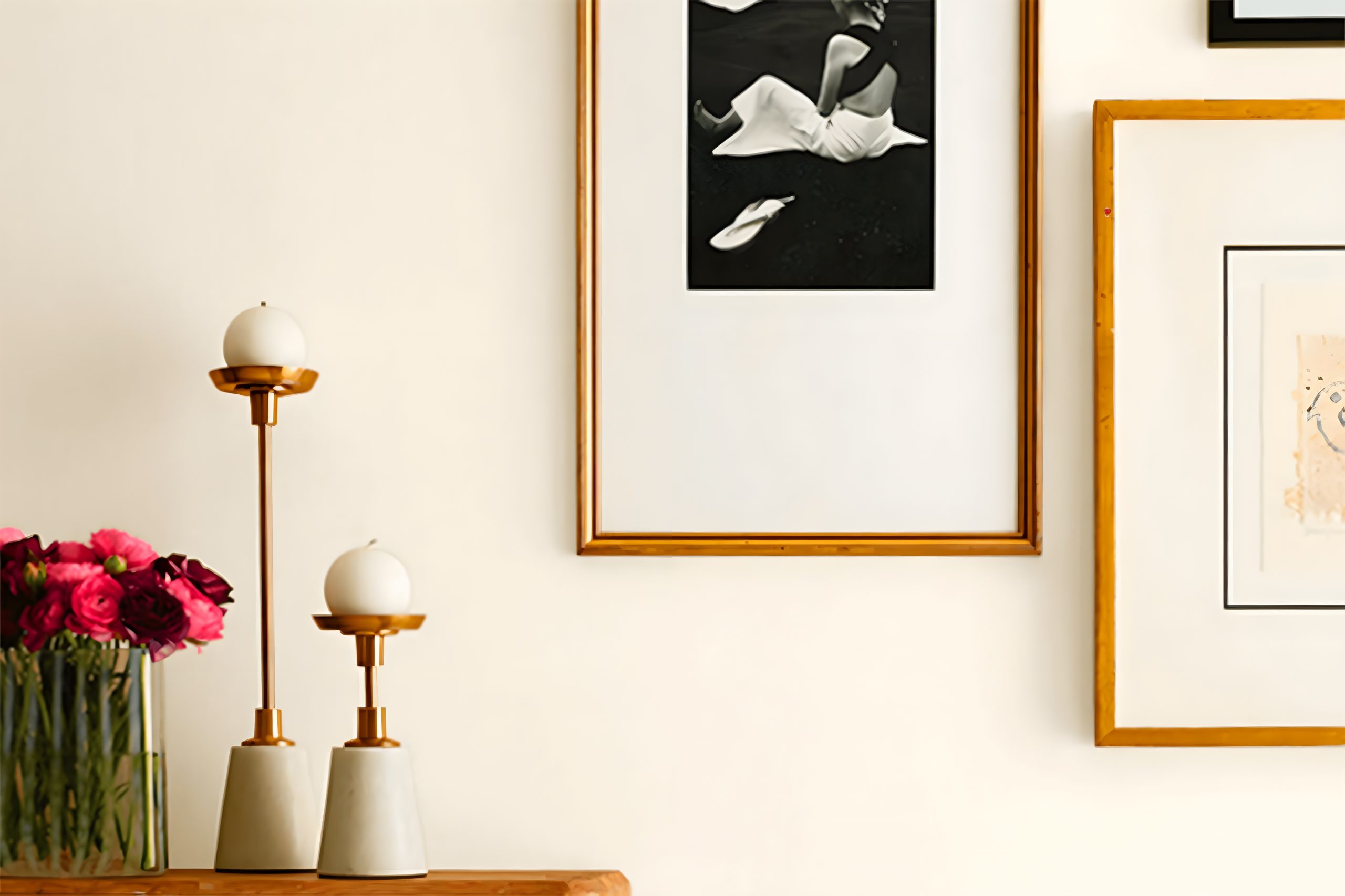
Think of it as the perfect backdrop for your life, whether you’re hanging up artwork, showcasing some cool furniture, or just looking for something that makes your space feel brighter.
Using Dover White in your home is pretty straightforward. It’s great for living rooms or bedrooms, where you want a peaceful, calming vibe.
Because it’s so neutral, you can match it with almost any color or decor style. Imagine your kitchen cabinets painted in Dover White, giving off a fresh and clean look, or your bedroom walls creating a soft, serene escape.
It’s also an excellent choice for making small rooms appear larger and more open, as the light color can help bounce natural light around.
Plus, if you ever decide to change up your decor, Dover White works with nearly everything, so you won’t have to repaint unless you want to switch up the vibe completely.
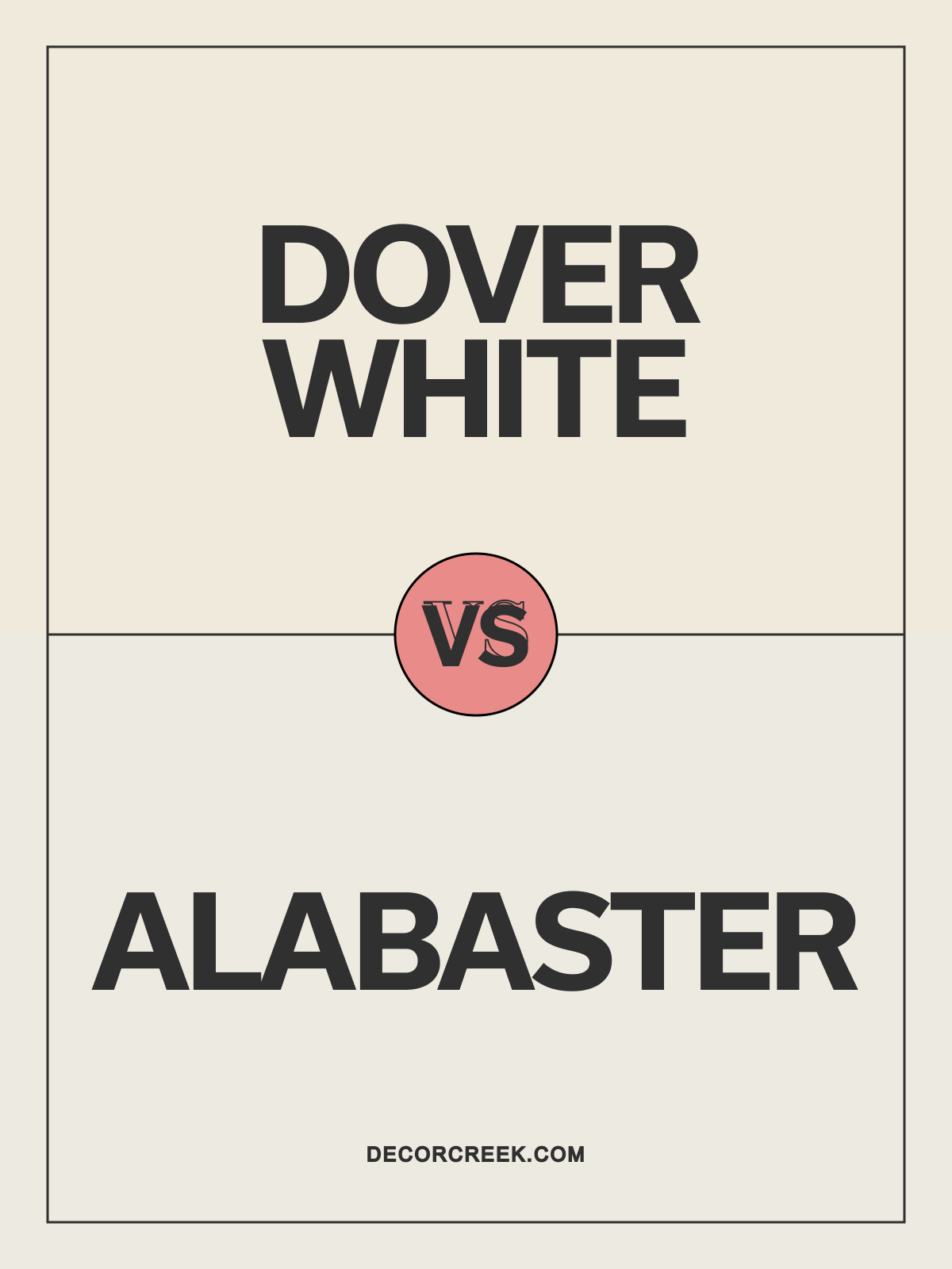
Dover White SW 6385 vs Alabaster SW 7008 by Sherwin Williams
Dover White SW 6385 and Alabaster SW 7008 are two popular warm whites by Sherwin Williams. Dover White has a soft, creamy undertone that adds a cozy, inviting feel, perfect for traditional spaces. Alabaster is also warm but slightly lighter, with a subtle elegance that works well in both modern and classic settings.
Dover White is ideal for spaces where a warmer, richer white is desired, such as living rooms or dining areas. Alabaster’s softer warmth makes it perfect for bedrooms or kitchens, adding brightness without feeling stark. Both colors pair beautifully with natural wood and neutral accents for a harmonious, polished look.
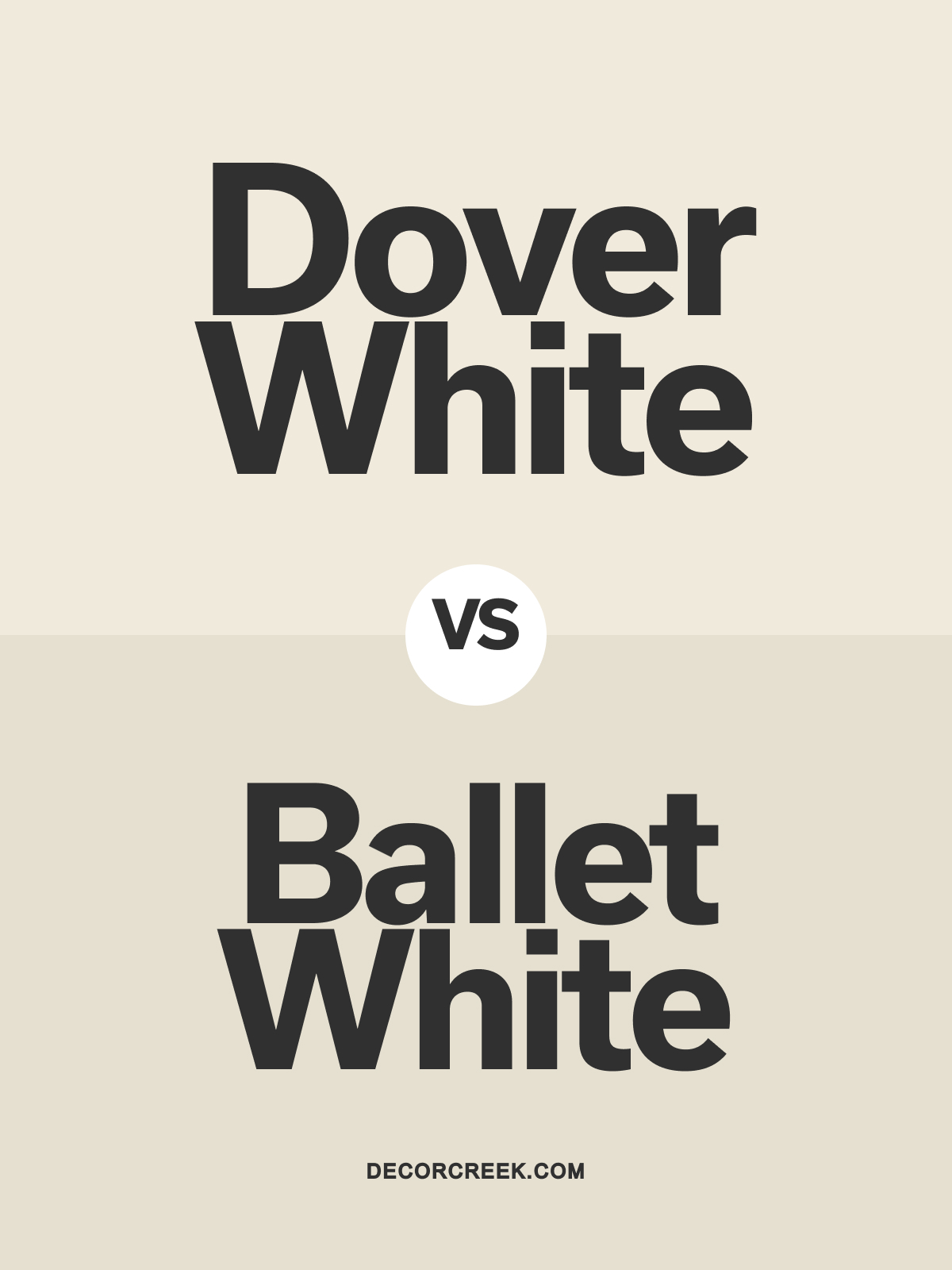
Dover White SW 6385 vs Ballet White OC-9 by Benjamin Moore
Dover White SW 6385 and Ballet White OC-9 by Benjamin Moore are both warm, inviting whites with distinct undertones. Dover White has a creamy undertone that brings warmth and coziness to spaces. Ballet White leans slightly more beige, offering a soft, muted warmth that feels refined and elegant.
Dover White is perfect for living rooms or kitchens, where a welcoming, cozy white is desired. Ballet White suits bedrooms or home offices, adding a subtle sophistication.
Both colors work beautifully with light woods and soft neutrals, creating a warm, balanced look.
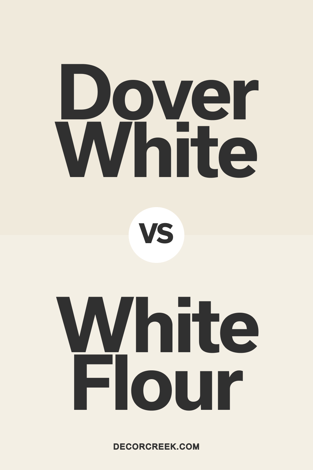
White Flour SW 7102 vs Dover White SW 6385 by Sherwin Williams
White Flour SW 7102 and Dover White SW 6385 by Sherwin Williams are both soft, warm whites with different undertones. White Flour is a slightly brighter, off-white that adds a light, airy feel. Dover White is a warmer, creamier white that brings a cozy, welcoming vibe to spaces.
White Flour is ideal for modern spaces needing a fresh, clean backdrop, while Dover White is perfect for more traditional or farmhouse-style interiors where warmth and depth are desired.
Both shades look stunning with natural wood and neutral decor, adding elegance and charm to any room.
Dover White SW 6385 vs Natural Choice SW 7011 by Sherwin Williams
Dover White SW 6385 and Natural Choice SW 7011 by Sherwin Williams are two warm whites with unique characteristics. Dover White has a creamy undertone that brings a cozy, inviting warmth to any room. Natural Choice is softer, with a touch of beige, creating a light, earthy feel that’s perfect for modern settings.
Dover White works well in kitchens or living rooms, where a rich, warm white is preferred.
Natural Choice is ideal for bedrooms or open spaces needing a subtle, warm backdrop. Both colors pair beautifully with white trim and natural wood, creating a cohesive and inviting atmosphere.
Dover White SW 6385 vs Drift of Mist SW 9166 by Sherwin Williams
Dover White SW 6385 and Drift of Mist SW 9166 by Sherwin Williams are soft, warm tones with distinct vibes. Dover White is a creamy off-white with a warm, inviting undertone that adds depth to rooms. Drift of Mist is a light, warm gray with subtle green hints, offering a more balanced, earthy feel.
Choose Dover White for traditional or cozy spaces, where a warm, creamy white can add charm.
Drift of Mist suits modern or minimalist spaces, adding a soft, natural look. Both colors look stunning with white trim and light wood accents, enhancing the room’s serene, sophisticated appeal.
Dover White SW 6385 vs Eider White SW 7014 by Sherwin Williams
Dover White SW 6385 and Eider White SW 7014 by Sherwin Williams are two versatile whites with unique undertones. Dover White has a creamy, warm undertone, making it perfect for adding a cozy feel to spaces. Eider White, by contrast, is a cooler off-white with subtle gray tones, bringing a fresh, airy look.
Dover White works well in traditional spaces or rooms needing warmth, like living areas or kitchens.
Eider White is ideal for modern or minimalist spaces, adding a clean, crisp look. Both shades pair beautifully with light woods and soft neutrals, creating a balanced, polished finish.
Dover White SW 6385 vs West Highland White SW 7566 by Sherwin Williams
Dover White SW 6385 and West Highland White SW 7566 by Sherwin Williams are two warm, inviting whites with slight differences. Dover White has a creamy warmth that brings a cozy, classic feel. West Highland White is a soft, slightly lighter warm white, offering a clean, bright look with warmth.
Dover White is perfect for living rooms or dining areas, where a rich, warm white is desired.
West Highland White suits bedrooms or bathrooms for a light, airy feel. Both colors pair well with natural woods and soft grays, adding a warm, harmonious touch to any room.
Dover White SW 6385 vs Ivory Lace SW 7013 by Sherwin Williams
Dover White SW 6385 and Ivory Lace SW 7013 by Sherwin Williams are soft, warm whites that bring a cozy vibe to spaces. Dover White has a creamier undertone, adding warmth and richness. Ivory Lace is a bit lighter with a subtle warmth, providing a fresh, inviting look that feels airy.
Dover White works well in larger spaces or traditional rooms where a warm, inviting white is desired.
Ivory Lace is ideal for bedrooms or hallways, adding brightness with a hint of warmth. Both colors pair nicely with white trim and light wood accents, creating a balanced, welcoming space.
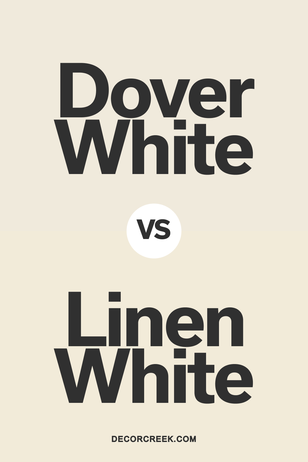
Dover White SW 6385 vs Linen White OC-146 by Benjamin Moore
Dover White SW 6385 and Linen White OC-146 by Benjamin Moore are warm whites with cozy undertones. Dover White has a creamy, soft warmth that’s ideal for creating a welcoming atmosphere. Linen White leans slightly warmer and richer, adding a touch of classic elegance and charm.
Dover White is perfect for contemporary spaces where a neutral warm white is needed. Linen White works beautifully in traditional settings, such as dining rooms or entryways, adding warmth and depth. Both shades complement natural wood and white trim, creating a cohesive and polished look.
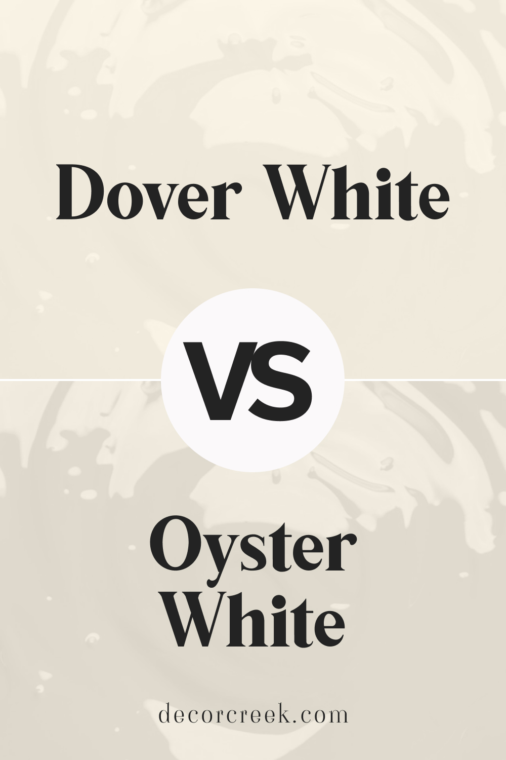
Dover White SW 6385 vs Oyster White SW 7637 by Sherwin Williams
Dover White SW 6385 and Oyster White SW 7637 by Sherwin Williams are two warm, soft whites with distinct undertones. Dover White has a creamy, warm undertone, making it cozy and inviting. Oyster White is a softer, beige-leaning white that feels slightly cooler, adding a subtle, natural feel to spaces.
Dover White suits traditional rooms or cozy spaces, where a warm white adds charm. Oyster White is ideal for open areas or modern spaces, where a light, understated white can bring balance.
Both shades pair beautifully with white trim and neutral decor, creating a harmonious, serene ambiance.
White Tail SW 7103 vs Dover White SW 6385 by Sherwin Williams
White Tail SW 7103 and Dover White SW 6385 by Sherwin Williams are two warm whites with distinct tones. White Tail has a soft warmth, slightly lighter than Dover White, offering a clean yet cozy look. Dover White is a richer, creamier white that brings depth and warmth to any room.
White Tail works well in contemporary settings or rooms needing a lighter touch, like bedrooms or bathrooms.
Dover White is ideal for larger spaces or traditional interiors, adding richness and warmth. Both colors pair nicely with light woods and soft grays, creating an inviting, balanced atmosphere.
Dover White SW 6385 by Sherwin Williams vs Restful White SW 7563 by Sherwin Williams
Dover White and Restful White are both shades from Sherwin Williams. Dover White is known for its creamy, warm, and inviting tone. It’s not a pure white; instead, it has a soft, welcoming vibe, making spaces feel cozy and lived-in.
It’s great for creating a comforting atmosphere in places like living rooms and kitchens.
On the other hand, Restful White leans towards a cleaner, crisper, and more modern appearance. It has a subtle cool undertone, making it a perfect pick for those seeking a fresh and serene look.
This color suits spaces that aim for a minimalist or contemporary style, such as bathrooms or modern bedrooms.
In essence, Dover White carries a warmth ideal for those who want an inviting and cozy space, while Restful White offers a fresh and clean backdrop, excellent for modern and tranquil settings.
Each brings its unique vibe, catering to different aesthetic preferences and room functionalities.
You can see recommended paint color below:
- SW 7563 Restful White
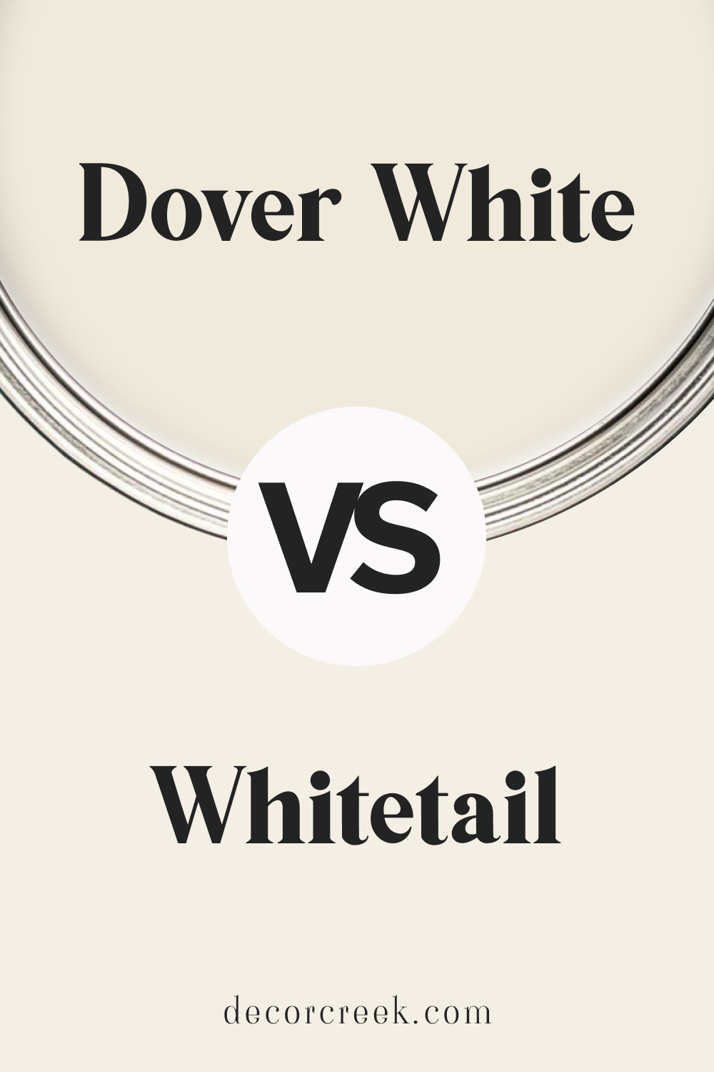
Dover White SW 6385 by Sherwin Williams vs Whitetail SW 7103 by Sherwin Williams
Dover White and Whitetail are two colors by Sherwin Williams that both offer a take on white but with distinct differences. Dover White has a warm, creamy tone that gives it a welcoming feel.
It’s perfect for spaces where you want to add a touch of coziness without going fully into a yellow or beige spectrum. On the other hand, Whitetail leans towards a purer white, with just a hint of warmth to keep it from feeling too sterile.
This makes it great for areas that need to feel bright and airy. When comparing the two, think of Dover White as adding a soft glow to a room, making it feel homely and inviting.
Whitetail, however, is the choice when you want to maximize light reflection without going for a cold, stark white.
Both colors work well in a variety of spaces, but your preference might depend on the mood you’re aiming to create – cozy and warm with Dover White or bright and open with Whitetail.
You can see recommended paint color below:
- SW 7103 Whitetail
Dover White SW 6385 by Sherwin Williams vs Roman Column SW 7562 by Sherwin Williams
Dover White and Roman Column, both by Sherwin Williams, showcase their unique characters through subtle differences. Dover White stands out as a warm, creamy white with a soft, inviting appearance.
It’s versatile, making it a go-to for spaces needing a touch of coziness without overwhelming brightness. On the other hand, Roman Column brings a slightly different vibe.
Though also warm, it carries a hint more beige or off-white, contributing to a richer, more grounded feel in spaces. This color might be preferred in settings where a pure white feels too stark, yet the desire for a light, airy ambiance remains.
Both hues offer a backdrop for various decor styles, though Dover White leans towards a cleaner, more luminous foundation, while Roman Column provides a slightly more sophisticated, nuanced base.
Choosing between them depends on the desired warmth and the specific atmosphere one aims to create in their space.
You can see recommended paint color below:
- SW 7562 Roman Column
Dover White SW 6385 by Sherwin Williams vs Shell White SW 8917 by Sherwin Williams
Dover White and Shell White are two paint colors by Sherwin Williams that may look similar at first glance but have their own unique qualities.
Starting with Dover White, it’s a warm, creamy white that brings a cozy and inviting feel to any room.
This color has a touch of yellow, making it perfect for spaces where you want a soft and welcoming atmosphere. It’s especially great in living areas and kitchens where you want to add warmth.
On the other hand, Shell White is a cleaner, crisper white with a slightly cooler vibe. It lacks the creamy depth of Dover White, making it a better choice for those who prefer a more neutral background.
Shell White works wonderfully in spaces that get a lot of natural light, as it reflects the light beautifully without adding warmth.
To sum it up, if you’re after a warm, cozy feel, Dover White is the way to go. But if you prefer a more neutral, crisp white, Shell White would be your best bet.
Both colors are versatile and can create a beautiful base for any room, depending on the ambiance you’re aiming for.
You can see recommended paint color below:
- SW 8917 Shell White
Dover White SW 6385 by Sherwin Williams vs Creamy SW 7012 by Sherwin Williams
Dover White and Creamy are both shades from Sherwin Williams. Starting with Dover White, this color leans more towards a soft, gentle white with a subtle warmth that doesn’t feel stark or cold.
Imagine a cozy, sunlit room in the morning, that’s the vibe Dover White brings. It’s pretty versatile and can lighten up spaces without overwhelming them.
On the flip side, Creamy is like Dover White’s close relative but with a bit more depth. Creamy, as the name suggests, adds a dash more yellow or creaminess, creating a warmer, more inviting atmosphere.
It’s the kind of color that wraps you in a warm hug, especially in well-lit areas where its richness can really shine through.
While both colors aim to warm up spaces, Dover White keeps things light and airy, and Creamy dials up the warmth a notch, making spaces feel more enveloped and cozy.
They could work wonderfully together in rooms where you want a harmonious transition without drastic color changes, maintaining a soothing and welcoming ambiance throughout.
You can see recommended paint color below:
- SW 7012 Creamy
Dover White SW 6385 by Sherwin Williams vs Paperwhite SW 7105 by Sherwin Williams
Dover White and Paperwhite are two shades from Sherwin Williams that have their uniqueness while sharing a subtle vibe. Dover White leans towards a warm tone, giving off a cozy and inviting feel.
It has a creamy aspect that makes spaces feel more welcoming and lived-in, perfect for someone looking to create a homey atmosphere. On the other hand, Paperwhite is cooler and closer to a true white.
It’s crisper and can make a room feel more spacious and bright, ideal for those aiming for a fresh, clean look in their spaces.
While both colors are excellent choices for walls to reflect natural light beautifully, your preference will depend on the mood you want to set in your room.
If you’re inclined towards a warmer, softer ambiance, Dover White is the go-to. For a brighter, more energizing space, Paperwhite stands out as the clear choice.
Each brings its charm to interiors, catering to different aesthetic and emotional desires.
You can see recommended paint color below:
- SW 7105 Paperwhite
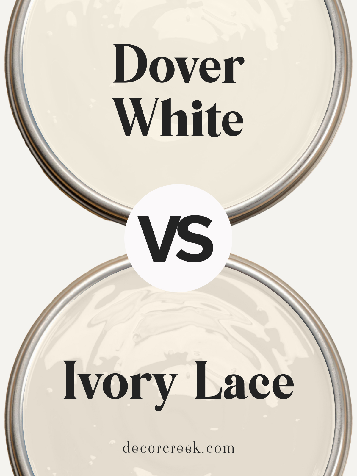
Dover White SW 6385 by Sherwin Williams vs Ivory Lace SW 7013 by Sherwin Williams
Dover White and Ivory Lace by Sherwin Williams are two appealing but distinct shades. Dover White sits closer to a true, creamy white. It’s a warm color that brings a cozy, inviting feel to any room, making it feel open and airy.
Think of it as a soft blanket of snow, bright but with a touch of warmth.
On the other hand, Ivory Lace steps slightly into the beige territory, offering a tad more depth than Dover White. It has an elegant and sophisticated vibe, akin to the delicate nature of actual lace.
While still warm, Ivory Lace introduces a hint of earthiness, making spaces feel grounded yet still light and welcoming.
Both colors work wonderfully in spaces aiming for a serene and calming atmosphere. Dover White shines in areas with lots of natural light, enhancing the space’s brightness.
Ivory Lace, while also versatile, is perfect for adding a bit of sophistication without overpowering a room. Choosing between them depends on the desired balance between pure brightness and warm sophistication.
You can see recommended paint color below:
- SW 7013 Ivory Lace
Dover White SW 6385 by Sherwin Williams vs Classic Light Buff SW 0050 by Sherwin Williams
Dover White and Classic Light Buff are both cozy colors by Sherwin Williams, but they have their unique vibes. Dover White is like a soft blanket of snow on a sunny day, bright and warm with a hint of creaminess.
It’s the kind of color that makes a room feel inviting and snug. On the other hand, Classic Light Buff is more like a sandy beach on a calm morning. It’s a neutral, but with a slightly golden undertone that brings a gentle warmth to spaces.
While Dover White lights up a room with its brightness, making it seem more open and airy, Classic Light Buff offers a soothing warmth, creating a cozy and comfortable atmosphere.
Whether you want a space that feels fresh and lively or one that’s more relaxed and welcoming, choosing between these two would depend on the mood you’re aiming for in your room.
They both work great in lots of lighting conditions, but Dover White reflects light a bit more, which can make a small space feel bigger.
You can see recommended paint color below:
- SW 0050 Classic Light Buff
Dover White SW 6385 by Sherwin Williams vs Westhighland White SW 7566 by Sherwin Williams
Dover White and Westhighland White are both colors by Sherwin Williams, each offering its unique appeal for spaces looking for a white with character.
Dover White has a warm, creamy tone, making it perfect for creating cozy and welcoming spaces. It’s not a stark white, which means it pairs well with a wide range of colors, adding a soft, inviting vibe to any room.
On the other hand, Westhighland White also leans towards the warmer side but is a bit brighter than Dover White. It’s a versatile shade that manages to feel fresh and airy, making it great for spaces you want to feel open and light-filled.
This color can also serve as a subtle backdrop for bold accents or work beautifully in monochromatic schemes for a serene atmosphere.
Both colors are excellent choices for those looking to add warmth to their space without going too off-white.
Dover White brings a creamier, more soothing presence, while Westhighland White offers a cleaner, crisper look while still maintaining a warm undertone.
You can see recommended paint color below:
Dover White SW 6385 by Sherwin Williams vs Downy SW 7002 by Sherwin Williams
Dover White and Downy by Sherwin Williams are two popular paint colors, but they serve different vibes in a space. Dover White is a warm, creamy white with a soft touch.
It’s perfect for creating a cozy and inviting atmosphere. It has a hint of yellow undertone, making it a go-to choice for spaces you want to feel sunny and cheerful, without being too bright.
On the other hand, Downy is a light gray with a slight blue undertone, giving it a cooler, more serene feel. It’s like the calm before the storm, peaceful and tranquil, making it ideal for bedrooms or bathrooms where relaxation is key.
This color can make a small room feel more spacious while adding an elegant touch.
While both colors are light and can brighten up a space, Dover White leans towards warmth, making a room feel homely. Downy, however, brings a fresh, airy feel to a space, offering a modern and sophisticated ambiance.
Depending on the mood you want to set, each color has its unique charm to transform your home.
You can see recommended paint color below:
- SW 7002 Downy
Conclusion
In conclusion, Dover White SW 6385 by Sherwin Williams stands out as a versatile and warm white paint color that can illuminate any space. Its ability to blend well with a variety of decor styles and colors makes it a go-to choice for those looking to refresh their interiors.
Whether applied in a modern minimalist setting or a more traditional space, this shade brings a cozy, welcoming feel, demonstrating its adaptability in enhancing the overall atmosphere of a room.
Moreover, Dover White’s soft and inviting hue is perfect for creating a sense of brightness and spaciousness, making smaller rooms appear larger and more open.
The warmth of this color provides a perfect backdrop for art and furnishings, allowing individual pieces to stand out.
People seeking a reliable and beautiful paint option will find Dover White an excellent choice for transforming their living spaces into peaceful and stylish sanctuaries.

Ever wished paint sampling was as easy as sticking a sticker? Guess what? Now it is! Discover Samplize's unique Peel & Stick samples.
Get paint samples