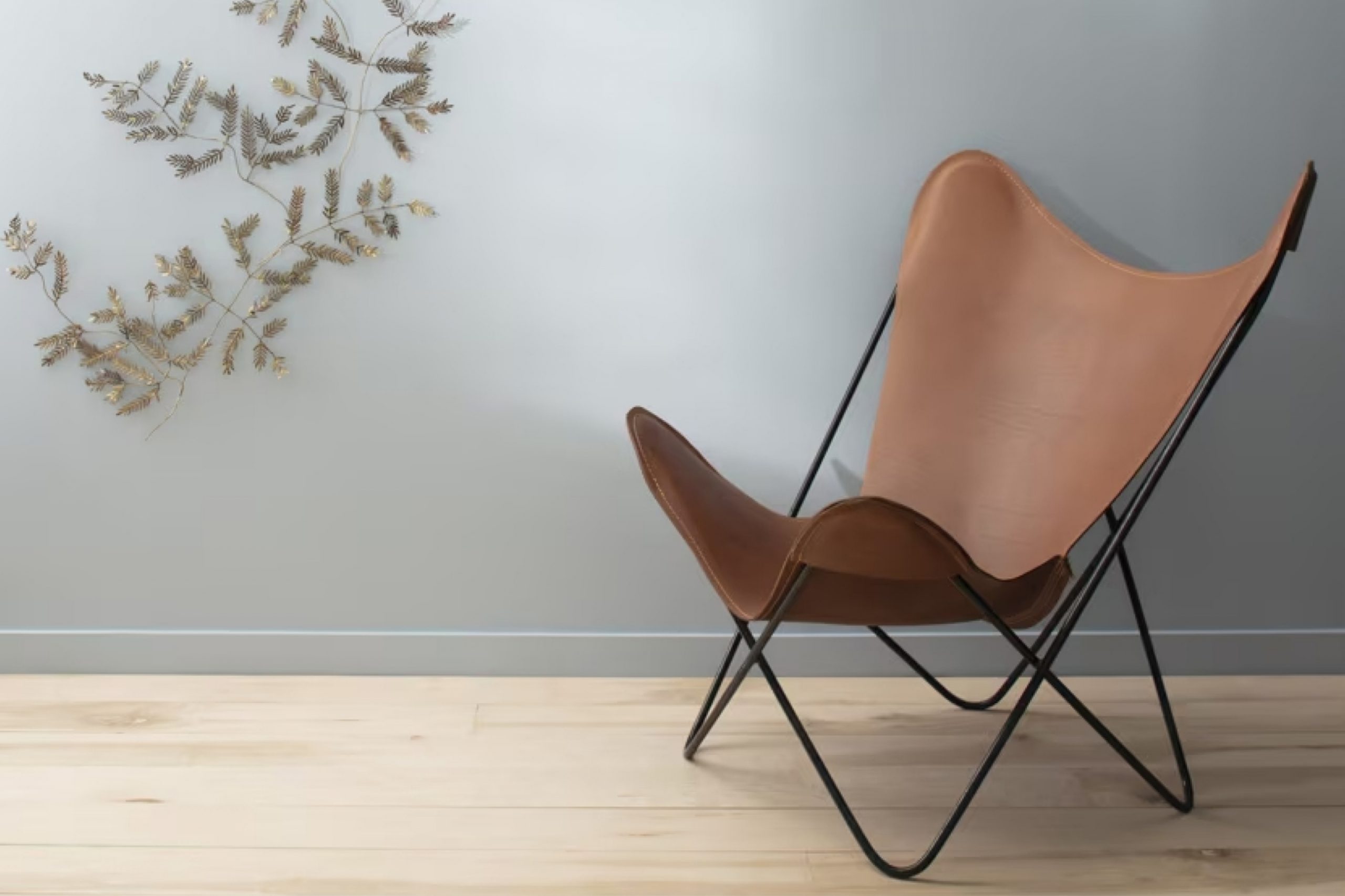
It’s not just a shade; it’s an experience that adds depth and serenity to any space. The bluish-grey hue perfectly balances boldness with subtlety, making it versatile for various settings.
On a personal note, when I applied 1620 Blue Heather to my living room walls, it instantly changed the ambiance. It somehow made everything feel more cohesive and inviting. The color has this unique ability to be both modern and timeless.
It breathes a soft, cool tone into a room, creating a sense of calm, which helps when life’s pace becomes hectic.
In my experience, whether it’s used as a backdrop for artwork or combined with vibrant accents, this shade serves as an excellent choice. It manages to elevate a room without overwhelming it, and highlights your personal style with ease.
If you’re considering a new look for your space, 1620 Blue Heather might provide just the touch you are looking for. It certainly did for me, transforming my living environment into a soothing haven.
What Color Is Blue Heather 1620 by Benjamin Moore?
Blue Heather by Benjamin Moore is a gentle, soothing shade of light blue-gray. This color brings a calm and peaceful feeling to a room, making it perfect for creating a relaxing space. It’s a versatile color that can fit well in various interior styles, from coastal to modern and even traditional settings.
In a coastal-themed room, Blue Heather can mimic the soft hues of the sea and sky, complementing natural elements like driftwood and seashells. For modern interiors, this color works beautifully with sleek metallic accents and white trim, creating a clean and airy look.
Pair Blue Heather with materials like natural wood, soft linens, and smooth ceramics for a harmonious effect. Light-colored woods, such as oak or pine, highlight the blue tones, while linens in white or neutral shades add a touch of comfort.
Texture plays a key role in enhancing this color’s appeal. Plush rugs, woven blankets, and velvet pillows can add depth and interest to a room painted in Blue Heather. It also pairs nicely with other muted colors like soft pinks, pale greens, or even a gentle lavender for a more layered and cohesive look.
Overall, Blue Heather is a flexible choice that can adapt to different tastes and room styles.

Is Blue Heather 1620 by Benjamin Moore Warm or Cool color?
Blue Heather by Benjamin Moore, labeled as 1620, is a soft, muted shade of blue with a hint of gray. This color can bring a calming and relaxed feel to spaces in the home. Its subtle tone makes it versatile enough to work in various rooms, whether it’s a bedroom, living room, or even a bathroom.
In bedrooms, Blue Heather can create a peaceful environment, helping to promote rest and relaxation. Its gentle nature is perfect for areas where people want to unwind after a long day.
In living rooms, it can serve as a calming backdrop, allowing furniture and decor to stand out without feeling overwhelming.
Additionally, because of its understated hue, Blue Heather pairs well with a wide range of colors, from whites and creams to darker shades like navy or charcoal. This makes it an excellent choice for those looking to maintain a neutral yet stylish palette throughout their living spaces.
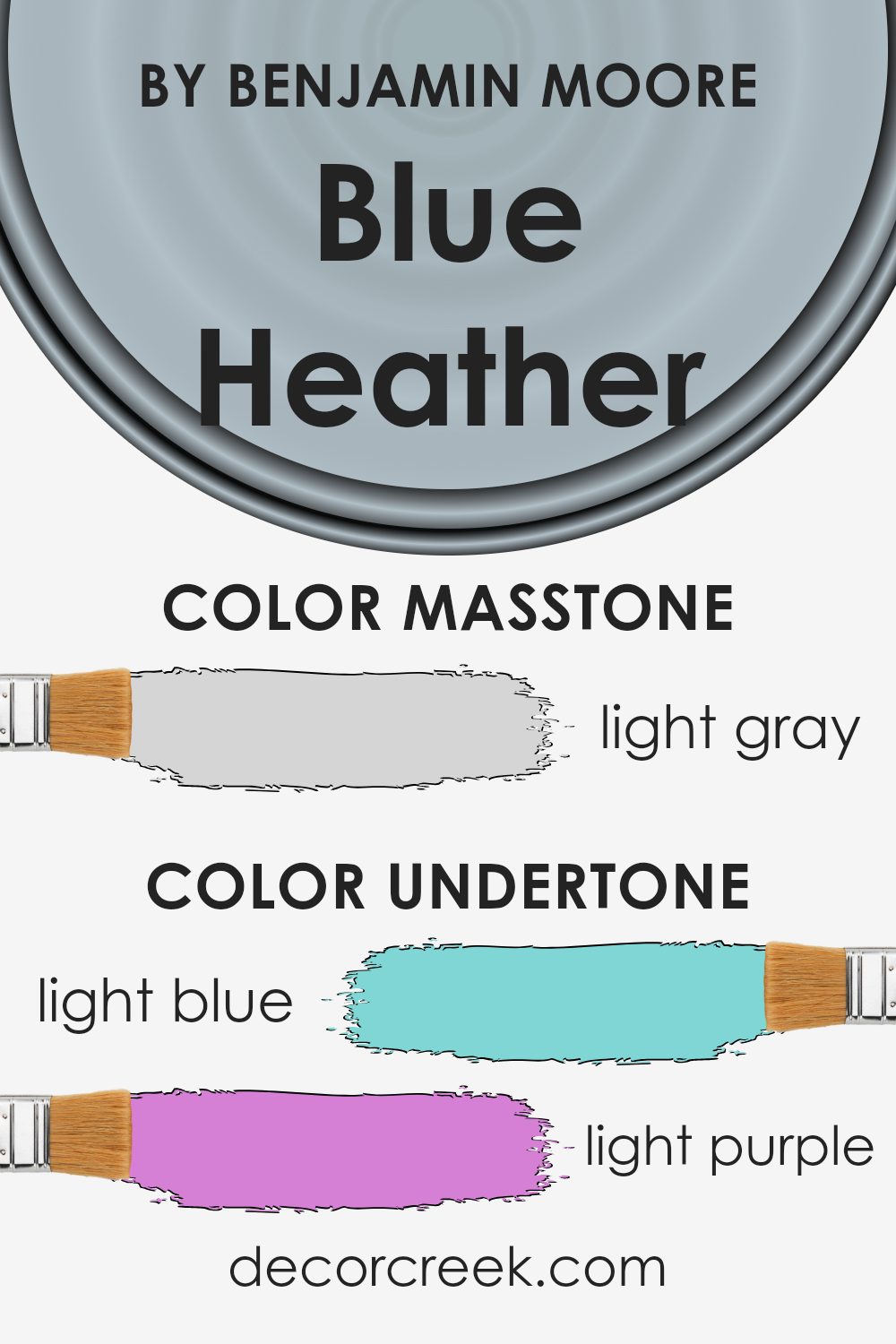
Undertones of Blue Heather 1620 by Benjamin Moore
Blue Heather by Benjamin Moore has a mix of undertones that make it an interesting color choice. The color features undertones of light blue, light purple, lilac, pale yellow, mint, pale pink, and grey. These undertones influence how the color appears in different settings and lighting conditions.
When we look at a color, the undertones can change how we perceive it. For example, in natural sunlight, Blue Heather might show more of its blue and lilac hues, giving off a cool, calm impression.
In artificial lighting, the pale yellow or mint undertones might become more evident, making the color feel warmer and more welcoming.
On interior walls, Blue Heather can provide a soft, calming effect, thanks to its blue and purple tones. These colors are known for creating a peaceful and relaxing environment. The grey undertone can add a touch of neutrality, ensuring that the color doesn’t feel too bright or overwhelming.
Meanwhile, the subtle hints of pink and yellow help in adding warmth, preventing the space from feeling cold or stark. Overall, Blue Heather’s range of undertones makes it a versatile choice that can adapt to various styles and moods within a room.
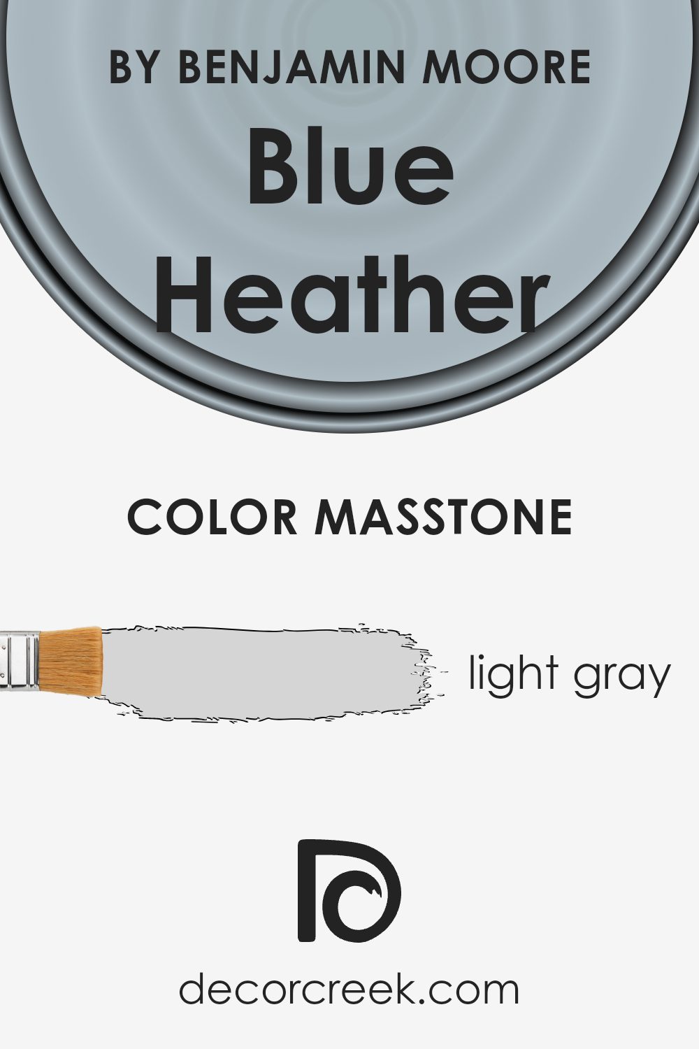
What is the Masstone of the Blue Heather 1620 by Benjamin Moore?
Blue Heather 1620 by Benjamin Moore is a light gray shade that can make a home feel fresh and open. Its neutral tone works well in many spaces because it blends easily with other colors. When used on walls, this shade can make rooms look brighter and more spacious, as it reflects natural light. The light gray creates a calm and welcoming atmosphere, making it an ideal choice for living rooms, bedrooms, or even kitchens.
The color’s versatility allows it to pair beautifully with a variety of accent colors. It can be combined with bold colors for a stylish contrast or with softer shades to keep the space looking light and airy.
Blue Heather’s gentle hue can also help highlight architectural features or décor items without overwhelming them.
This color is a dependable choice for those who want a modern and timeless look in their home without making a statement that is too bold.
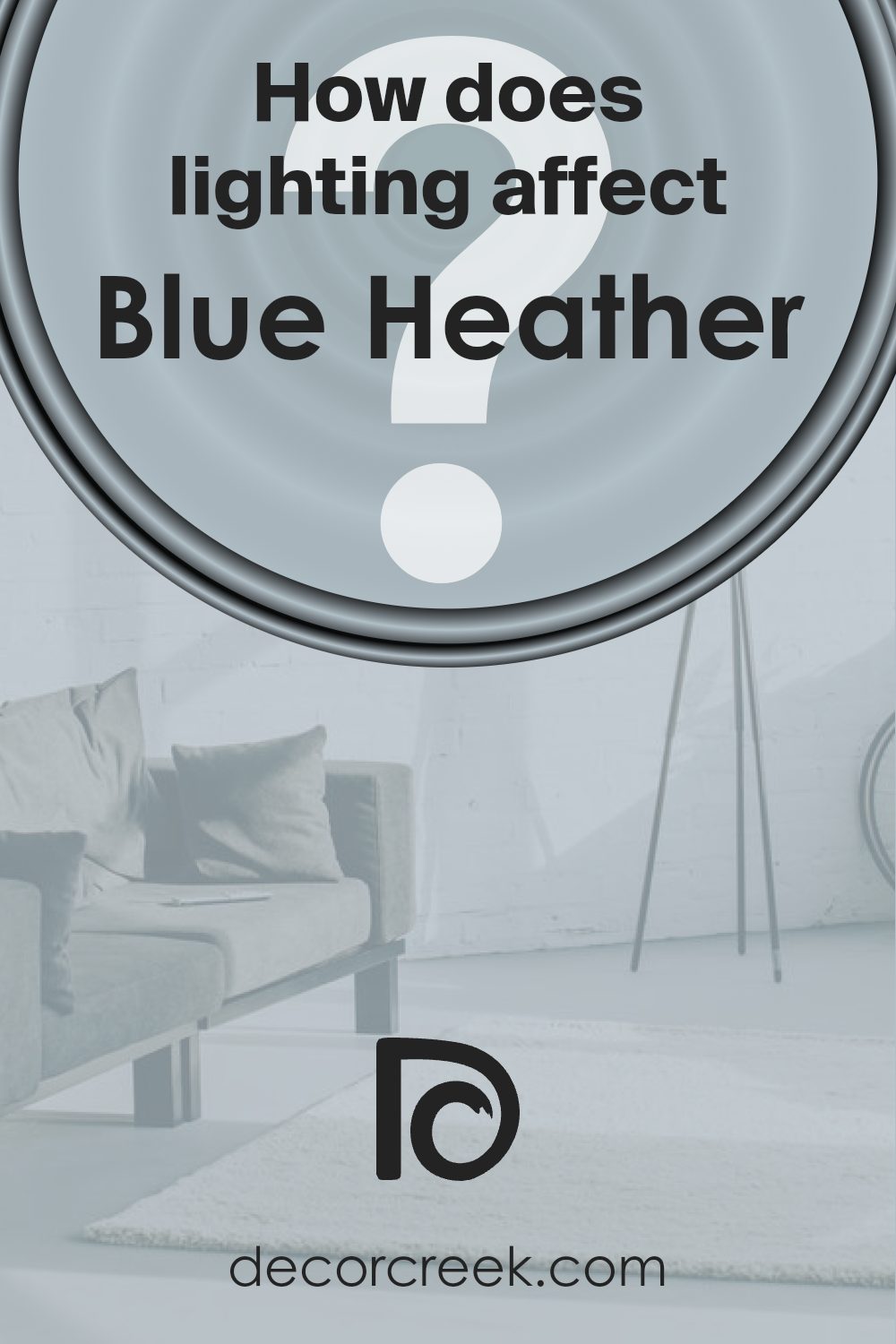
How Does Lighting Affect Blue Heather 1620 by Benjamin Moore?
Lighting plays a significant role in how we perceive colors. Natural and artificial lights can change the appearance of a color in a given space. For example, Blue Heather by Benjamin Moore, a soft and muted shade of blue, can look quite different depending on the light source and room direction.
In natural light, the look of Blue Heather can change throughout the day and in different room orientations. In a north-facing room, which typically gets cooler and less direct sunlight, Blue Heather might appear a bit more subdued and cooler, bringing out its gray undertones.
This can make the room feel calm and understated, though sometimes slightly shadowy if the light is minimal.
In contrast, south-facing rooms receive more direct sunlight, often throughout the day. Here, Blue Heather will appear warmer and more vibrant. The abundant natural light can enhance its soft blue hue, making the space feel airy and open without losing the calming effect of the color.
East-facing rooms benefit from bright morning light. Blue Heather in morning light can look fresh and bright, reflecting a clear sky-like tone. However, as the sun moves away, the color might fade slightly, taking on cooler qualities similar to those in a north-facing room.
West-facing rooms experience the opposite, with softer morning light and brighter, warmer light in the afternoon and evening. Blue Heather in this setting can shift from a gentle tone to a warmer hue as the day progresses, offering a cozy and inviting atmosphere in the evenings.
Under artificial light, Blue Heather can be influenced by the type of bulbs used. Warm lighting can make the color appear more inviting and accentuate its blue-gray qualities, while cooler lighting will highlight its blue aspect, making it feel sharper and more contemporary. Therefore, understanding lighting is important to achieve the desired feel and look of a room.
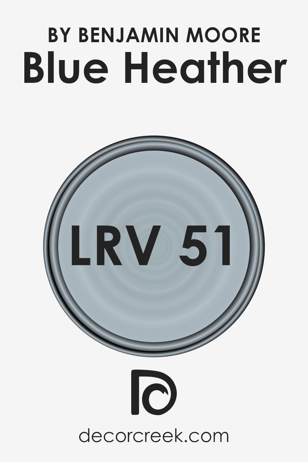
What is the LRV of Blue Heather 1620 by Benjamin Moore?
Light Reflectance Value, or LRV, is a measure of how much light a color reflects compared to how much it absorbs. The value is given as a percentage from 0 to 100, where 0 is completely black (absorbing all light) and 100 is pure white (reflecting all light).
Essentially, LRV helps you understand how bright or dark a color will look when applied to a surface like a wall. A higher LRV means the color will reflect more light, making a room feel brighter and more open.
In contrast, a lower LRV means the color will absorb more light, which can make a room feel cozier or more intimate.
The color Blue Heather by Benjamin Moore has an LRV of 50.92, placing it almost in the middle of the LRV scale. This means it reflects a moderate amount of light, and won’t make a room feel too light or too dark. This balance makes Blue Heather a versatile choice for many spaces.
It won’t overwhelm a small room with brightness, yet it won’t make a large area feel dim or enclosed. Its medium light reflection keeps the space grounded and comfortable, ideal for those who want a bit of color without being too bold or overpowering.
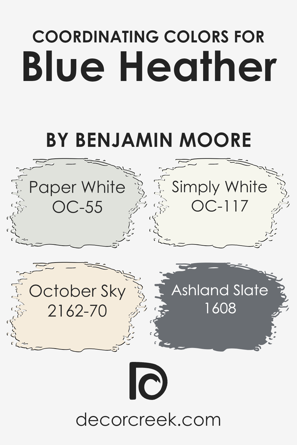
Coordinating Colors of Blue Heather 1620 by Benjamin Moore
Coordinating colors are hues that complement each other well and create a cohesive look when used together in a space. When designing around the gentle tone of Blue Heather by Benjamin Moore, these colors can enhance its appeal. Coordinating colors work by maintaining balance and harmony, ensuring that the overall palette is pleasing to the eye.
They offer a way to highlight specific attributes of a central color without overwhelming it. This creates a unified design in any environment, whether it’s a cozy living room or a modern kitchen.
For Blue Heather, consider pairing it with Paper White, a subtle off-white that provides a clean, soft backdrop. October Sky is another complementary choice, a blue-gray that adds an airy, calming touch. Simply White is known for its pure and crisp quality, perfect for brightening the space.
Lastly, Ashland Slate, a deeper gray with hints of blue, gives depth and contrast, drawing out the richness of Blue Heather. Together, these hues provide a versatile palette, ideal for creating spaces that feel fresh and inviting.
You can see recommended paint colors below:
- OC-55 Paper White
- 2162-70 October Sky
- OC-117 Simply White
- 1608 Ashland Slate
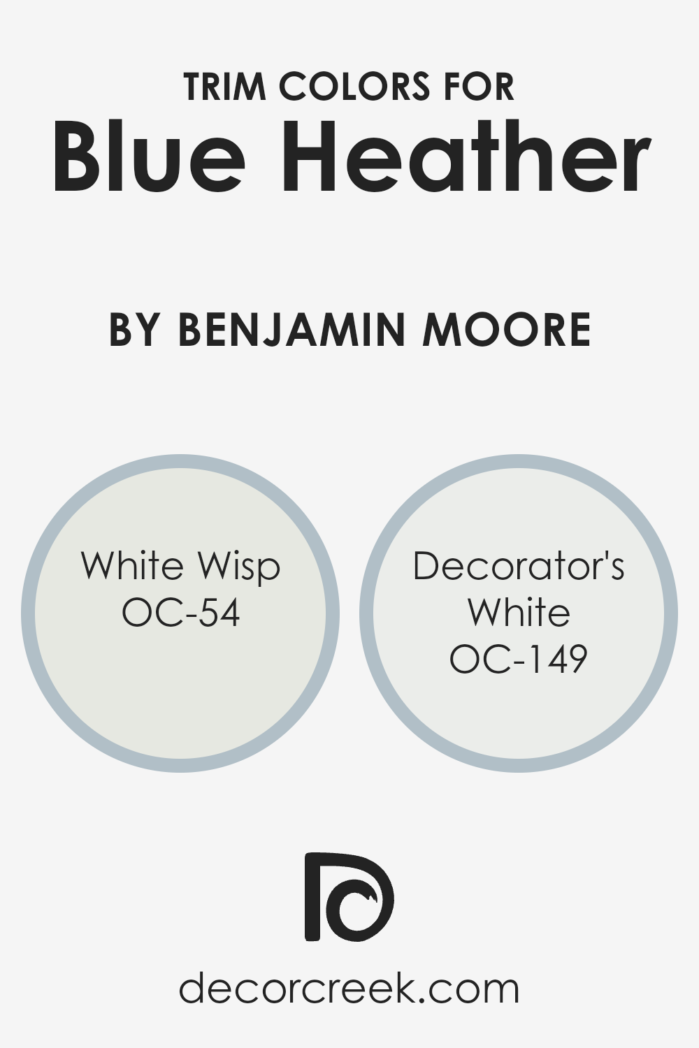
What are the Trim colors of Blue Heather 1620 by Benjamin Moore?
Trim colors play a vital role in enhancing the overall look of a room by providing a distinct outline that helps define and separate different spaces. When paired with a wall color like Blue Heather, trim colors like OC-54 White Wisp and OC-149 Decorator’s White can highlight architectural details such as windows, doors, and moldings, providing a clean and crisp contrast that is pleasing to the eye.
Using these trim colors not only frames the primary color in an appealing manner but also adds an extra level of depth and balance to the room.
White Wisp is a soft off-white shade with a hint of gray, which gives it a subtle, calming quality. It adds a touch of warmth without overpowering, making it an excellent choice for trim when paired with the cool undertones of Blue Heather.
Decorator’s White, on the other hand, is a bright, cool white that offers a refreshing and clean look.
It contrasts effectively with Blue Heather, enlivening the space while keeping a classic and timeless appeal. Both colors serve to enrich the main wall color, providing the room with a polished and cohesive finish.
You can see recommended paint colors below:
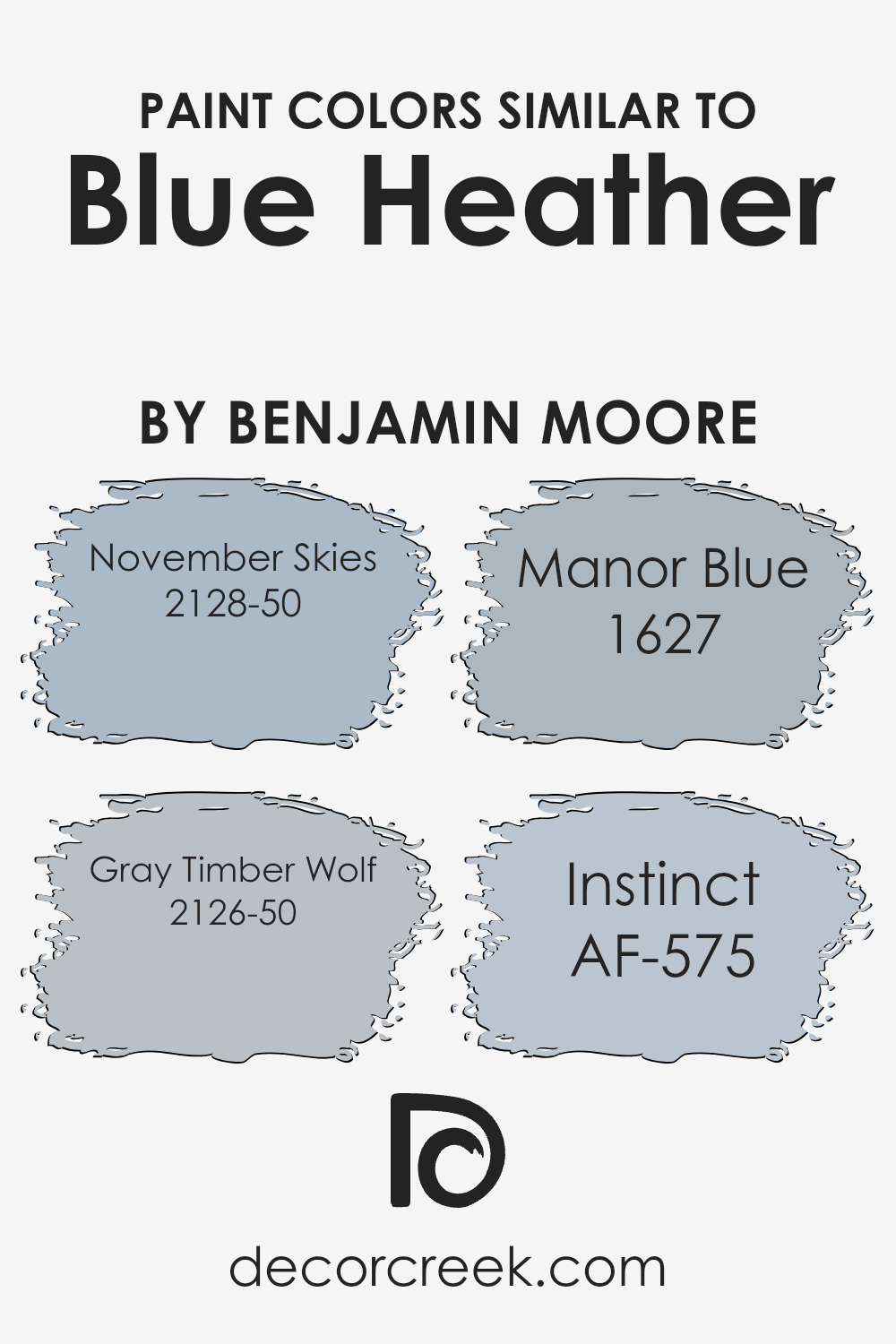
Colors Similar to Blue Heather 1620 by Benjamin Moore
Similar colors play an essential role in design and decoration because they create a harmonious and cohesive look. They complement each other seamlessly, allowing for a balanced and unified appearance in any space.
The colors similar to Blue Heather, such as November Skies, Gray Timber Wolf, Manor Blue, and Instinct, each have unique characteristics that contribute to this balance. These colors work together to enhance the feeling of calmness and order, making them perfect for creating comfortable and inviting environments.
November Skies is a soft blue that brings a sense of coolness and calm, like a gentle breeze on a clear day. Gray Timber Wolf is a muted gray that adds a neutral and soothing touch, perfect for grounding a space. Manor Blue is a deeper blue shade that offers a hint of richness and depth without overpowering other colors.
Instinct is a subtle and warm gray that blends seamlessly with its surrounding hues, adding a hint of warmth.
These colors, while distinct on their own, share an underlying connection through their undertones, allowing them to work beautifully together to achieve a cohesive and pleasing aesthetic.
You can see recommended paint colors below:
- 2128-50 November Skies
- 2126-50 Gray Timber Wolf
- 1627 Manor Blue
- AF-575 Instinct
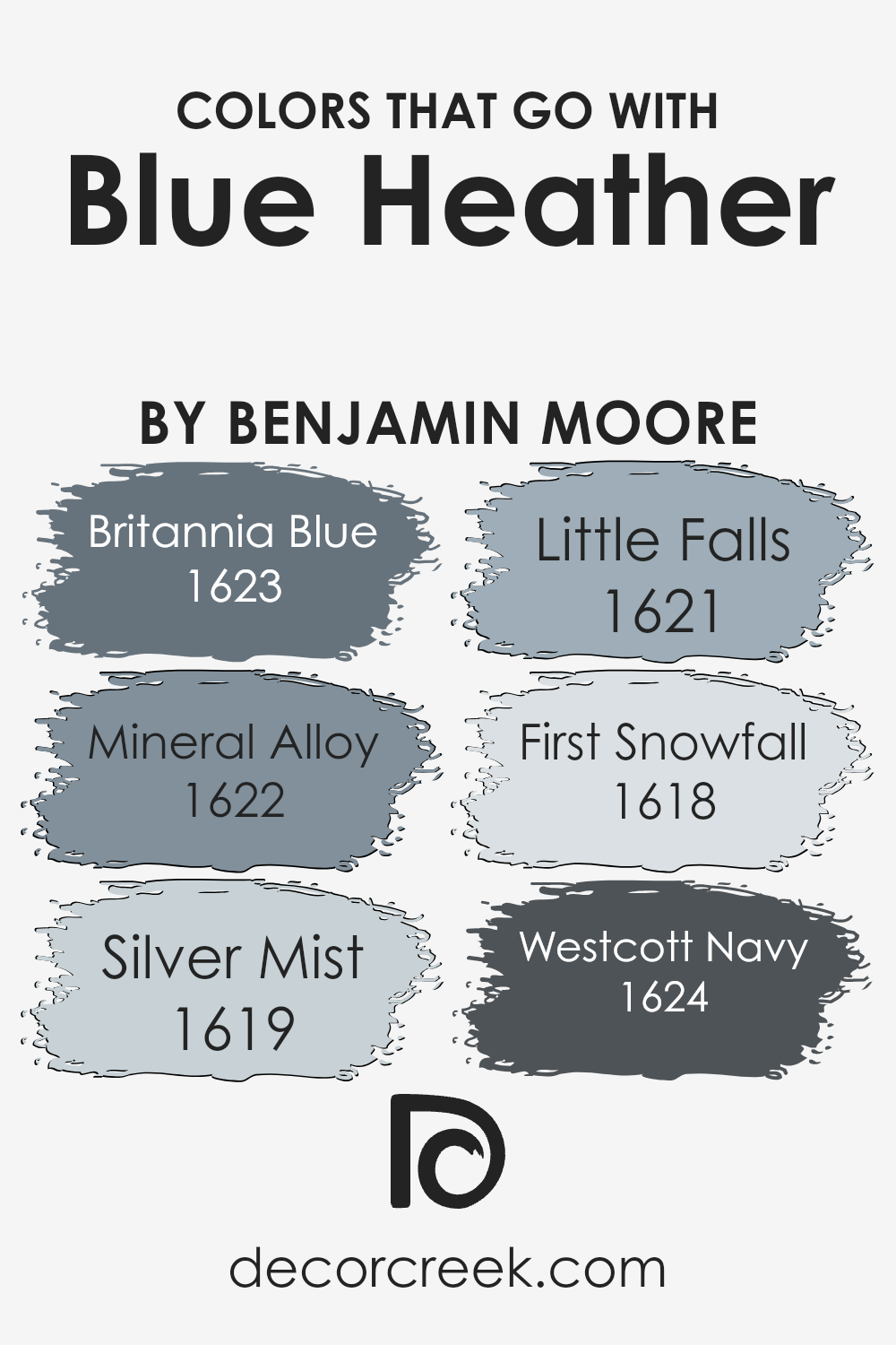
Colors that Go With Blue Heather 1620 by Benjamin Moore
Colors that go with Blue Heather 1620 by Benjamin Moore are essential because they enhance the overall look and feel of a space. Choosing the right colors can create harmony and balance, making a room feel more inviting.
For example, Britannia Blue 1623 is a rich, deep blue that adds depth and contrast when paired with the soft, muted tone of Blue Heather. Mineral Alloy 1622 is a cooler shade with a hint of gray that complements Blue Heather’s gentle color, providing a modern touch.
Silver Mist 1619, a pale, shimmery hue, can bring lightness and airiness to the space, pairing beautifully with Blue Heather’s softness.
Little Falls 1621 is a slight blue-green that introduces a subtle yet refreshing contrast. This touch of nature goes well with the subtlety of Blue Heather. First Snowfall 1618 is a crisp, clean shade that brightens and highlights any area, complementing the gentle undertone of Blue Heather.
Finally, Westcott Navy 1624 is a bold navy shade that provides an excellent grounding effect, offering a solid foundation while letting the softness of Blue Heather stand out.
Together, these colors can create a cohesive and timeless look that makes any space feel like home.
You can see recommended paint colors below:
- 1623 Britannia Blue
- 1622 Mineral Alloy
- 1619 Silver Mist
- 1621 Little Falls
- 1618 First Snowfall
- 1624 Westcott Navy
How to Use Blue Heather 1620 by Benjamin Moore In Your Home?
Blue Heather 1620 by Benjamin Moore is a soft, muted shade of blue that can create a calm and inviting atmosphere in any room. This color works well in various spaces, adding a subtle touch of color without being overwhelming.
In a living room, Blue Heather can be used on the walls to provide a soothing backdrop for neutral furnishings and natural materials, like wood or wicker. In a bedroom, it can be paired with white or cream accents for a peaceful, airy vibe.
For a bathroom, consider using Blue Heather on the walls for a spa-like feel, complemented by white towels and silver fixtures. It can also enhance a child’s room, providing a playful yet gentle space when combined with bright, colorful accessories. Whether it’s used on all walls or as an accent, Blue Heather brings a sense of calm and freshness to a home.
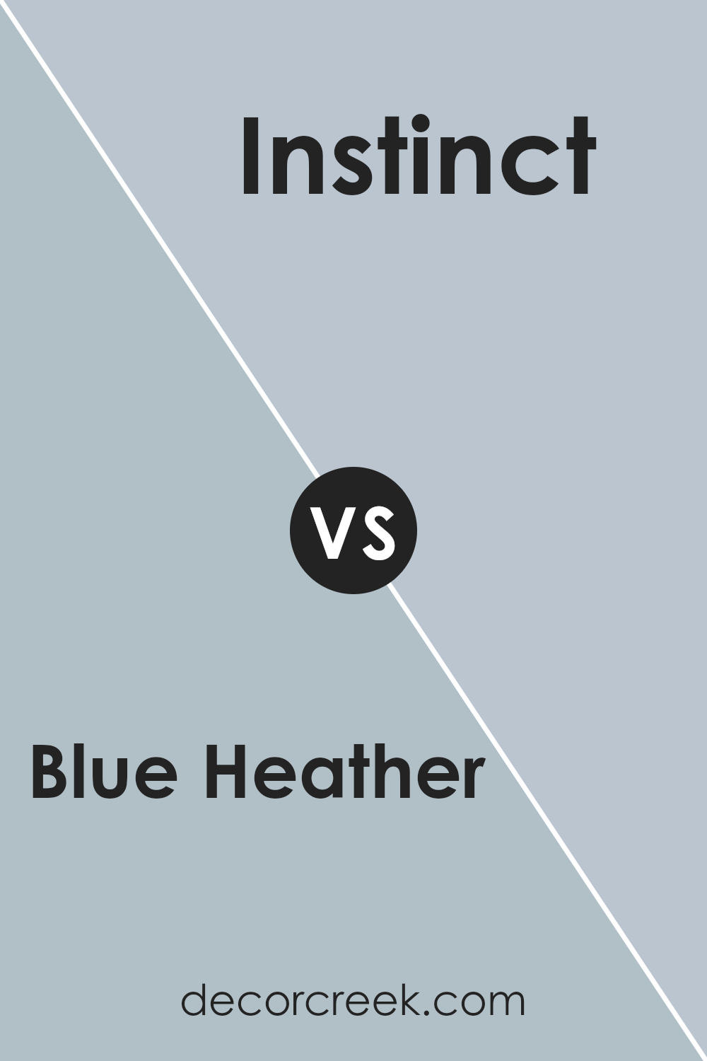
Blue Heather 1620 by Benjamin Moore vs Instinct AF-575 by Benjamin Moore
Blue Heather 1620 by Benjamin Moore is a soft, muted blue with a hint of gray. It has a calming and soothing effect, making it a great choice for bedrooms or spaces where you want a relaxed atmosphere. The color is light and airy, bringing a sense of openness to a room.
On the other hand, Instinct AF-575 by Benjamin Moore is a deeper, more saturated shade of blue. It has an earthy tone to it, with a mix of blue and green undertones that provide a sense of richness and depth. This color is more dramatic and can create a cozy, intimate feeling in a room.
While Blue Heather lends a gentle and light vibe to a space, Instinct offers a bolder, more striking look. Choosing between these two colors depends on whether you prefer a soft, breezy space or a more dramatic and warm environment.
You can see recommended paint color below:
- AF-575 Instinct
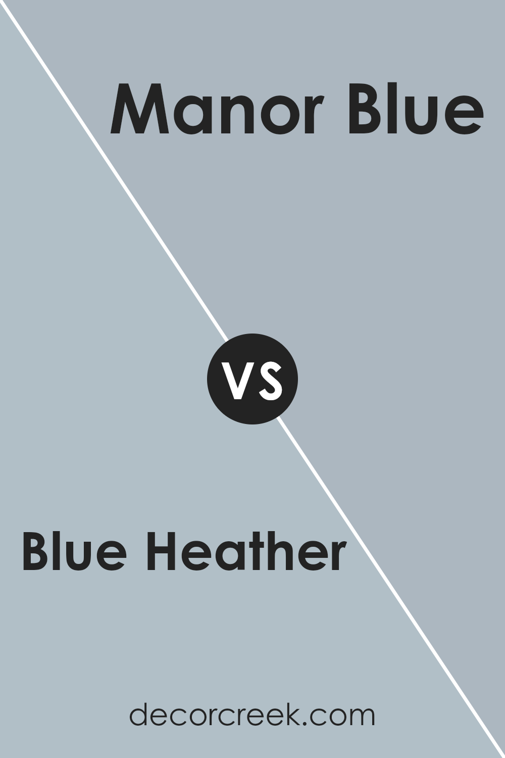
Blue Heather 1620 by Benjamin Moore vs Manor Blue 1627 by Benjamin Moore
Blue Heather and Manor Blue, both by Benjamin Moore, are rich and soothing shades but offer different vibes. Blue Heather is a soft, muted blue with hints of gray, creating an airy and calming atmosphere. It’s an excellent choice for spaces that aim for a gentle, subtle look.
Manor Blue, on the other hand, is a deeper, more intense blue with a touch of warmth. This color adds a cozy, inviting feel to a room, making it perfect for areas where you want a more dramatic touch.
While Blue Heather works well in spaces meant for relaxation like bedrooms or bathrooms, Manor Blue suits living rooms or dining areas where you might want to make a stronger statement. Both colors pair well with neutral shades, but their different depths provide variety in mood and energy within a home.
You can see recommended paint color below:
- 1627 Manor Blue
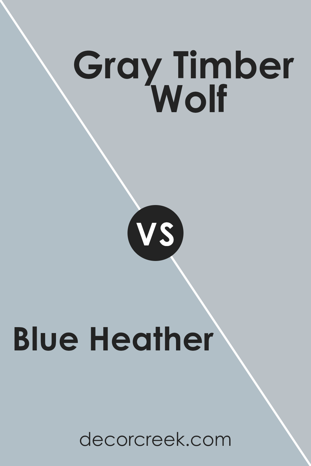
Blue Heather 1620 by Benjamin Moore vs Gray Timber Wolf 2126-50 by Benjamin Moore
Blue Heather and Gray Timber Wolf are two popular colors from Benjamin Moore. Blue Heather is a soft and muted blue with a hint of gray, making it a versatile choice for creating a calm and inviting space. It has a soothing quality that can make a room feel peaceful, especially in areas like bedrooms or living spaces.
Gray Timber Wolf, on the other hand, is a more neutral, medium gray. It’s a balanced shade that doesn’t lean too heavily towards any undertone, making it an excellent backdrop for highlighting other decor elements.
This makes Gray Timber Wolf a great choice for modern or minimalist settings where a neutral canvas is desired.
Both colors are understated and work well in various settings. Blue Heather brings a touch of color without being overwhelming, while Gray Timber Wolf offers a reliably neutral base. Depending on the mood you want to create, either could be a fitting option in your home.
You can see recommended paint color below:
- 2126-50 Gray Timber Wolf
Blue Heather 1620 by Benjamin Moore vs November Skies 2128-50 by Benjamin Moore
Blue Heather 1620 by Benjamin Moore is a gentle blue with a hint of gray, making it feel calming and balanced. It’s soft and versatile, fitting well in various settings, from bedrooms to living rooms. This color can create a peaceful atmosphere without being overpowering.
On the other hand, November Skies 2128-50 also by Benjamin Moore, is a deeper, richer blue. It is more vibrant compared to Blue Heather, giving spaces a stronger presence. This color works well if you’re looking to make a room feel cozy and inviting, as its intensity can add warmth.
Both colors have a blue base, but Blue Heather is more subdued while November Skies is bolder. If you want something more neutral, Blue Heather is a better choice. For those who prefer a more dramatic or cozy look, November Skies is ideal. Both colors can beautifully complement different styles and tastes.
You can see recommended paint color below:
- 2128-50 November Skies
Conclusion
When I look at 1620 Blue Heather by Benjamin Moore, I think of a soft and gentle color that can make any room feel cozy and nice. It reminds me of a calm cloudless sky or the color of the sea on a peaceful day. This shade isn’t too bold; it’s just right for making a room feel welcoming without being too loud.
In my own room, I think Blue Heather would be perfect for making my space feel comfortable and warm. It’s like wrapping the room in a soft blanket that makes you want to relax. This color goes really well with other colors too, like white or light gray, which makes it fun to decorate with.
You can add pillows, rugs, or curtains in these colors, and they all look great together.
I feel that 1620 Blue Heather is a wonderful choice for people who want their room to feel inviting and calm. Whether painting a bedroom, living room, or even a study area, this color can help create a soothing atmosphere.
It’s not too dark and not too bright, which means it could even make a small room feel bigger and airy. Overall, Blue Heather is a lovely color that makes any room feel special and comfortable.
Ever wished paint sampling was as easy as sticking a sticker? Guess what? Now it is! Discover Samplize's unique Peel & Stick samples.
Get paint samples

