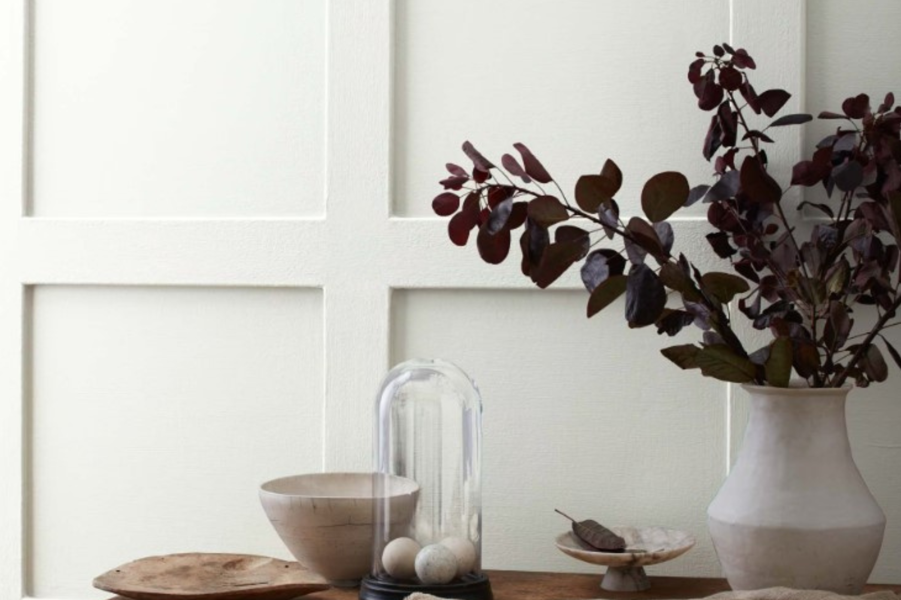
Choosing the right paint color for your space can be quite the task, especially with the plethora of options out there. If you’re on the lookout for a color that brings a sense of calmness and clarity to any room, then OC-54 White Wisp by Benjamin Moore might just be what you need. This delicate hue is not just another white. It has a unique charm that sets it apart, making spaces feel airy and light.
White Wisp is part of Benjamin Moore’s Off-White Collection, notable for its soft, subtle quality that works wonders in creating serene environments. This particular shade is favored for its versatility.
Whether you’re updating a living room, bedroom, or even a bathroom, White Wisp has the ability to instantly brighten up the area while keeping a soft, inviting vibe.
What makes OC-54 White Wisp stand out is its ability to blend seamlessly with various decor styles and color palettes. Whether your home is filled with bold colors or more understated tones, White Wisp can complement your existing design seamlessly. Additionally, it’s a fantastic choice for those looking to give their space a fresh, clean look without going for a stark, pure white.
So, if you’re considering giving your home a makeover or simply want to freshen up a room, OC-54 White Wisp by Benjamin Moore is a color worth considering. Its ability to add light and space to any room makes it a go-to choice for homeowners and interior designers alike.
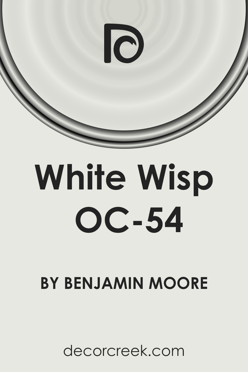
What Color Is White Wisp OC-54 by Benjamin Moore?
White Wisp OC-54 by Benjamin Moore is a gentle and versatile color that adds a subtle hint of softness to any room. This shade could be described as a soft, airy white with a touch of gray, making it a great choice for creating a light and refreshing atmosphere. It’s not just a simple white; its nuanced undertones give it a unique character that can enhance the peacefulness and brightness of a space.
This color works beautifully in a variety of interior styles. It’s perfect for minimalist designs where simplicity and clarity are key, and it equally complements modern interiors that focus on clean lines and uncluttered spaces.
Scandinavian styles, which favor muted tones and natural light, also pair wonderfully with White Wisp. Its understated elegance can serve as a backdrop for rustic elements, adding a sense of warmth without overwhelming the senses.
When it comes to materials and textures, White Wisp OC-54 is extremely accommodating. It pairs well with natural wood, bringing out its warmth and texture, and it also complements metallic finishes like brass or copper, adding a touch of sophistication. In rooms with plenty of natural light, this color reflects beautifully, creating an airy and open feel.
Fabrics in soft textures such as linen or cotton look fantastic against this backdrop, contributing to a cozy and inviting atmosphere. All in all, White Wisp OC-54 is a versatile choice that can breathe life into any space, making it feel fresh and tranquil.
Ever wished paint sampling was as easy as sticking a sticker? Guess what? Now it is! Discover Samplize's unique Peel & Stick samples.
Get paint samples

Is White Wisp OC-54 by Benjamin Moore Warm or Cool color?
White Wisp OC-54 by Benjamin Moore is a soft, airy shade of white that has a hint of gray. This subtle nuance makes it incredibly versatile for use in homes, allowing it to blend seamlessly with a wide range of decor styles and color palettes. Unlike stark whites, White Wisp has a calming effect on spaces, making rooms feel more open, light, and comfortable.
This color is perfect for walls in living areas, bedrooms, and even kitchens and bathrooms because it provides a clean, fresh backdrop that can make other colors in furniture and decorations really stand out.
The beauty of White Wisp lies in its ability to adapt to different lighting conditions. In rooms with plenty of natural light, it can appear almost ethereal, enhancing the feeling of space.
In spaces with less light, it adds a warm and cozy vibe, without the heaviness that comes with darker colors. Homeowners value White Wisp for its balance of warmth and neutrality, as it easily complements wood tones, metals, and natural materials. It’s an excellent choice for creating a soothing and inviting home environment.
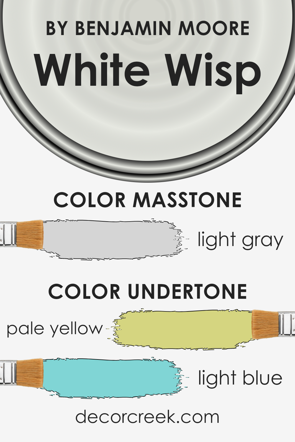
Undertones of White Wisp OC-54 by Benjamin Moore
White Wisp is a unique paint color because it’s not just white. It has subtle hints of pale yellow and light blue hidden in it. Think of undertones like secret ingredients in a recipe. They can change the flavor of the dish without you even noticing. In the world of paint, these hidden colors can make a huge difference in how we perceive the main color.
Now, why does this matter for a color like White Wisp used on interior walls? These undertones can actually play with the light in the room to create different moods and effects. For example, on a sunny day, the pale yellow undertone might make a room feel warmer and more welcoming. It’s like the room is catching a bit of the sunlight and holding onto it.
On the other hand, the light blue undertone can make a space feel calm and refreshed, like a gentle breeze blowing through the room. This can be especially noticeable in a room with cooler light, like on a cloudy day.
So, when you paint a room with White Wisp, you’re not just getting a simple white room. You’re getting a room that can feel slightly different at various times of the day or in different lighting. It’s a subtle way to add depth and interest without straying far from a neutral color palette.
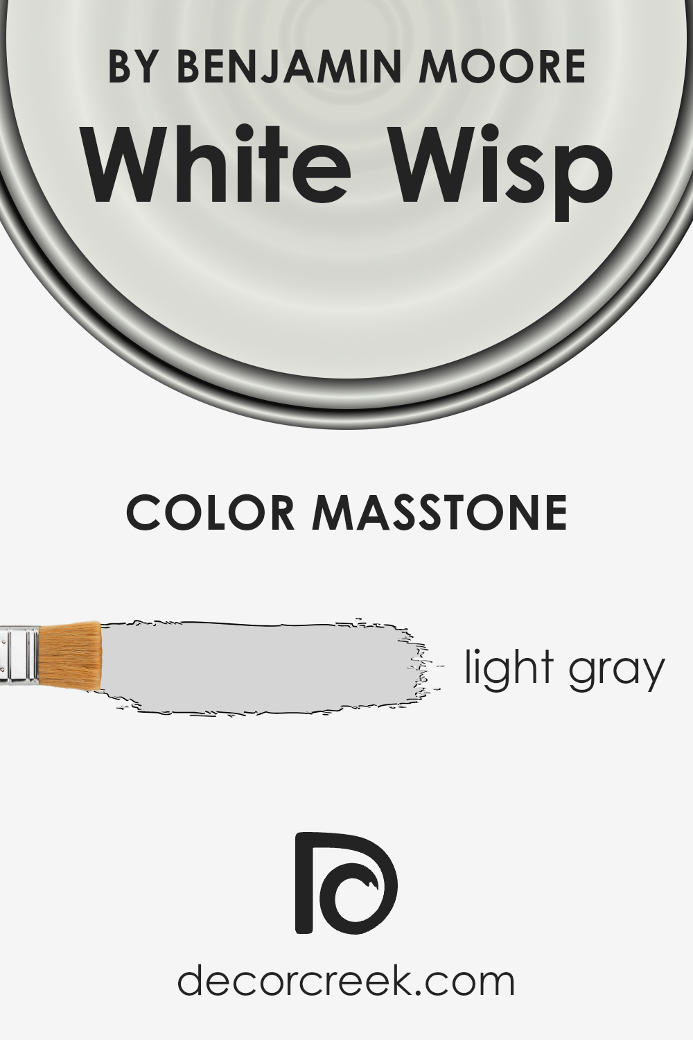
What is the Masstone of the White Wisp OC-54 by Benjamin Moore?
White Wisp OC-54 by Benjamin Moore, with its masstone of light gray (#D5D5D5), offers a subtle and soothing backdrop for any home. This particular shade of gray strikes the perfect balance between warm and cool tones, making it an incredibly versatile choice for decorating. It acts as a gentle neutral, providing a base that complements a wide range of colors and styles.
Whether your home features modern, minimalist decor or more traditional elements, White Wisp can enhance the look without overpowering it. In spaces that receive a lot of natural light, this color can appear almost luminous, adding a bright and airy feel. Conversely, in rooms with less light, it introduces a cozy and serene atmosphere, proving its adaptability to different lighting conditions.
Using White Wisp on walls can also make rooms appear larger, as its light gray hue helps to reflect light and doesn’t visually shrink spaces in the way darker colors can.
How Does Lighting Affect White Wisp OC-54 by Benjamin Moore?
Lighting plays a crucial role in how we perceive colors, transforming their appearance dramatically depending on whether they are bathed in natural sunlight or illuminated by artificial lights. This change is vital to consider when choosing paint colors for your home.
Take, for example, the color White Wisp by Benjamin Moore. This subtle shade can look remarkably different under various lighting conditions. In natural light, White Wisp comes across as a clean, almost ethereal white, with a gentle cool undertone that can make spaces feel serene and spacious. Under artificial light, such as LED or incandescent bulbs, its true character shifts slightly.
Warm lighting can make it appear softer and more inviting, while cooler lighting accents its crispness, making it feel more modern and vibrant.
- The orientation of a room also impacts how White Wisp looks. In north-facing rooms, which often get less direct sunlight and thus have cooler light, White Wisp might look a bit more shadowy and cool, enhancing its subtle undertones. This can create a calm, tranquil space that feels airy and open, even if it’s not flooded with light.
- South-facing rooms, in contrast, receive more intense, warmer light throughout the day. Here, White Wisp can shine in all its glory, looking brighter and more luminous. The warmer light highlights its clean base, making the room feel sunny and welcoming, even if the décor is minimal.
- In east-facing rooms, morning light can reveal a very soft and warm aspect of White Wisp, making spaces feel refreshing and lively in the morning hours, then turning cooler as the day progresses. This dynamic shift can add an interesting dimension to rooms, keeping them feeling fresh.
- West-facing rooms get the evening sun, which can cast a golden glow, warming up the color slightly. During sunsets, this light can accentuate the cooler undertones of White Wisp, balancing the room with a soothing, yet slightly vibrant atmosphere as the day ends.
In all, the interaction between White Wisp and light is a subtle dance, where its serene and airy qualities adapt beautifully to each room’s unique lighting conditions, proving its versatility as a color choice for diverse spaces and lighting environments.

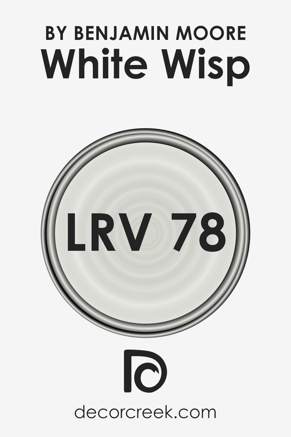
What is the LRV of White Wisp OC-54 by Benjamin Moore?
LRV, which stands for Light Reflectance Value, is a measurement that tells us how much light a paint color reflects compared to how much it absorbs. Think of it as a scale from 0 to 100, where 0 absorbs all the light (like a pitch-black room) and 100 reflects all the light (imagine standing in the bright snow under the sun).
LRV is super useful when picking out paint colors because it gives you a hint about how bright or dark a color will look on your walls. A higher LRV means the color is lighter and will make a room feel more open and airy because it reflects more light around the space.
With an LRV of 78.4, the color White Wisp by Benjamin Moore is on the lighter end of the scale, meaning it’s pretty good at bouncing light around a room. This can make a big difference in how the color appears once it’s on your walls, especially in how it might change throughout the day as natural light shifts.
In a well-lit room, White Wisp will look bright and lively, enhancing the sense of space. In rooms with less natural light, it still works to make the space feel lighter than it would if you were to use a color with a lower LRV. This makes it a versatile choice for a variety of spaces, helping small rooms feel bigger and making airy rooms feel even more open and inviting.
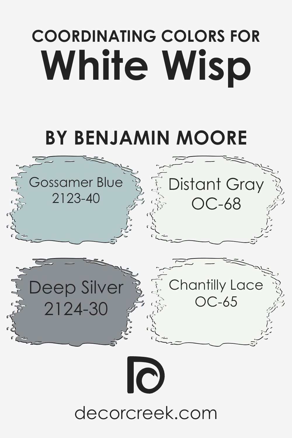
Coordinating Colors of White Wisp OC-54 by Benjamin Moore
Coordinating colors are essentially hues that complement each other when used together, creating a harmonious and visually appealing scheme. They can be different shades, tones, or tints of colors that, when paired, enhance the overall look of a space.
The idea behind using coordinating colors, like those that pair well with Benjamin Moore’s White Wisp OC-54, is to achieve balance and a sense of unity in decor. White Wisp itself is a subtle, airy white that provides a clean, serene backdrop, allowing coordinating colors to truly stand out.
Among the coordinating colors for White Wisp OC-54, Gossamer Blue 2123-40 is a lovely, soft blue with a hint of gray that evokes a sense of calm and tranquility, perfect for creating a soothing atmosphere.
Deep Silver 2124-30, on the other hand, is a rich, medium gray that adds a touch of sophistication and depth, making it ideal for a contemporary space. Distant Gray OC-68 is another light shade but with a cooler undertone, offering a crisp contrast to warmer hues, thereby brightening and refreshing the room.
Lastly, Chantilly Lace OC-65 stands out as a pure, clean white with just the right amount of warmth, making it an excellent choice for trim or ceilings, as it enhances the main color’s vibrancy while maintaining a seamless look. Together, these coordinating colors work to create a cohesive and inviting space that highlights the beauty and versatility of White Wisp OC-54.
You can see recommended paint colors below:
- 2123-40 Gossamer Blue
- 2124-30 Deep Silver
- OC-68 Distant Gray
- OC-65 Chantilly Lace
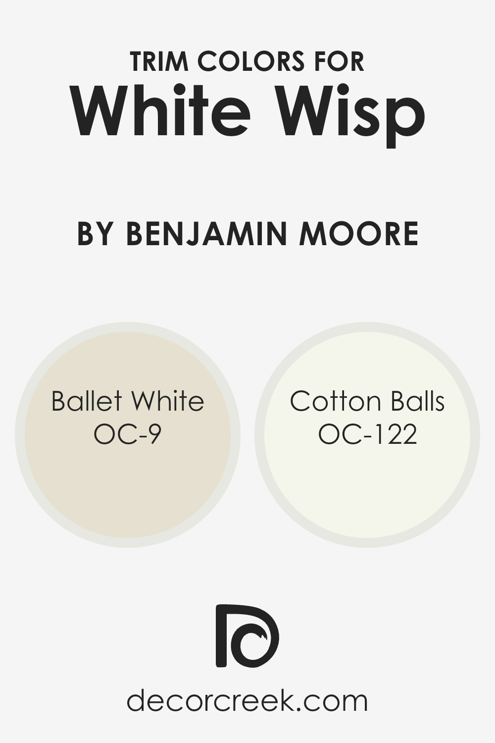
What are the Trim colors of White Wisp OC-54 by Benjamin Moore?
Trim colors refer to the hues used on the architectural details of a room such as door frames, moldings, and baseboards. These colors play a crucial role in accentuating the overall aesthetic of a space, adding depth and contrast that can enhance the primary wall color, making it look more polished and complete. For a subtle and sophisticated background like
White Wisp OC-54 by Benjamin Moore, selecting the right trim colors is key to achieving an elegant and cohesive look. OC-9 Ballet White and OC-122 Cotton Balls are excellent choices for trim, working harmoniously with White Wisp OC-54 to create a serene and inviting atmosphere.
OC-9 Ballet White offers a soft, creamy nuance that brings warmth and a gentle brightness to spaces, making it an ideal complement to the airy and light nature of White Wisp OC-54. It’s subtle enough to blend yet distinct enough to define the space beautifully. On the other hand, OC-122 Cotton Balls presents a clean, crisp white that injects a fresh and vibrant energy into the room.
This color provides a sharper contrast against White Wisp OC-54, making it perfect for those looking to highlight architectural features with a bit more definition. Together, both Ballet White and Cotton Balls offer flexibility in creating an environment that feels both harmonious and dynamically layered.
You can see recommended paint colors below:
- OC-9 Ballet White
- OC-122 Cotton Balls
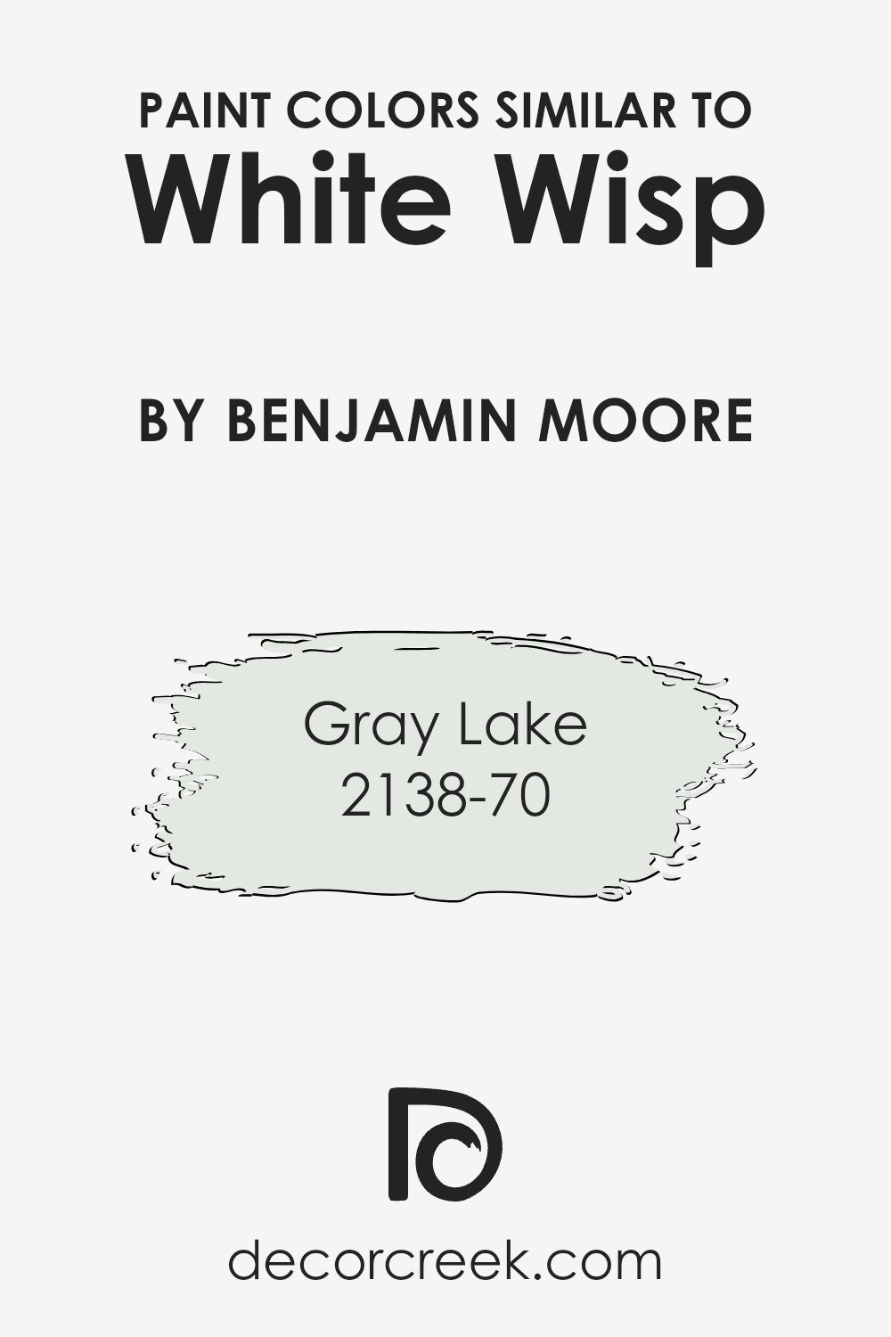
Colors Similar to White Wisp OC-54 by Benjamin Moore
Similar colors are important in interior design and painting because they help create a cohesive and harmonious look. When colors are closely related on the color spectrum, they blend seamlessly into each other, providing a subtle transition rather than a stark contrast. This can be particularly soothing to the eyes, making a room feel more unified and peaceful.
Using similar colors, like variations of a base shade, allows for depth and complexity in a design scheme without the risk of clashing. It’s an effective way to add interest and layers to a space, while maintaining a singular mood or atmosphere.
These nuances in color variations can elevate a design from simple to sophisticated with minimal effort.
Taking a closer look at similar colors to White Wisp by Benjamin Moore, such as Gray Lake, showcases how subtle differences can have a significant impact. Gray Lake has a serene quality, embodying the tranquility of a misty morning by the water. Its gentle blend of gray and blue undertones makes it versatile for spaces seeking a calm and collected ambiance.
Similarly, the color 2138-70, though it shares a similar foundation with White Wisp, introduces its own unique character. It leans towards a lighter, almost ethereal touch of gray that can brighten a room while still maintaining a soft, understated elegance. Both colors highlight how variations on a theme can bring diversity within a consistent color palette, allowing a design to tell a more intricate story.
You can see recommended paint color below:
- 2138-70 Gray Lake
How to Use White Wisp OC-54 by Benjamin Moore In Your Home?
White Wisp OC-54 by Benjamin Moore is a gentle and airy paint color that can bring a touch of freshness into any home. Its subtle undertones make it a versatile choice for different spaces, whether you’re updating a cozy living room or a peaceful bedroom.
his color works wonders in areas with a lot of natural light, where it can truly show its unique blend, but it’s also effective in brightening spaces that need a little extra light.
For those looking to refresh their home, White Wisp offers a clean backdrop that’s easy to match with various decor styles, from modern minimalism to traditional. It’s an ideal color for walls, giving rooms an open and serene feel.
Additionally, it can be used on trim or cabinets for a crisp, unified look that’s both inviting and stylish.
Whether you’re painting a whole room or just adding accents, White Wisp brings a touch of sophistication and is easy to incorporate into your home renovation projects.
White Wisp OC-54 by Benjamin Moore vs Gray Lake 2138-70 by Benjamin Moore
White Wisp and Gray Lake, both by Benjamin Moore, are two distinct shades that offer unique vibes for any space. White Wisp is a soft, airy white with just a hint of gray, giving it a clean and subtle warmth that makes rooms feel more open and bright. Its versatility allows it to work beautifully in various settings, acting as a perfect backdrop for bold colors or a calm palette for minimalist designs.
On the other hand, Gray Lake is a light gray with a hint of blue, offering a tranquil and refreshing feel that can cool down spaces while still inviting light in. This color leans more towards a serene, soft look, making it ideal for creating peaceful and relaxing environments.
While it projects a cooler tone compared to the warmth of White Wisp, Gray Lake maintains a lightness that can enhance spaces without overwhelming them with darkness.
Together, these two colors can complement each other well, with White Wisp providing a warm, bright base and Gray Lake adding cool, soothing accents. Whether used in tandem or alone, they bring their unique characteristics to spaces, enriching them with depth and atmosphere.
You can see recommended paint color below:
- 2138-70 Gray Lake
Conclusion
White Wisp by Benjamin Moore is a unique and versatile paint color that brings a light and airy feel to any space. Its subtle undertones provide a warm and inviting atmosphere, making it a perfect choice for those looking to create a serene and welcoming environment.
Unlike stark whites, it offers just enough depth to add character to walls without overwhelming the room’s aesthetic, making it ideal for both modern and traditional settings.
The flexibility of White Wisp means it can complement a wide range of decor styles and pair beautifully with different colors and materials. Whether used as a dominant color for walls or as an accent for trim and ceilings, it consistently delivers a clean and cohesive look.
For homeowners and designers seeking a neutral backdrop that provides a gentle lift to interiors, White Wisp emerges as a top contender, balancing brightness with warmth in a way few other colors can achieve.
Ever wished paint sampling was as easy as sticking a sticker? Guess what? Now it is! Discover Samplize's unique Peel & Stick samples.
Get paint samples
