Black
Black Blue
Blue Brown
Brown Gray
Gray Green
Green Neutral
 Orange
 White
White Yellow
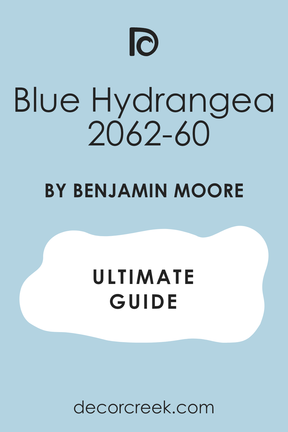
When I came across 2062-60 Blue Hydrangea by Benjamin Moore, it was like stumbling upon a hidden gem in the world of paint colors. This shade of blue has a wonderful softness that reminds me of early spring mornings when the garden begins to wake up. Describing it simply as blue doesn’t do it justice—it’s as if you’ve bottled the calming essence of a sunlit hydrangea bush in full bloom.
I noticed how this particular hue has a soothing quality, making it a perfect option for anyone looking to bring a sense of calm into their room. Whether I am thinking about giving my bedroom a makeover or just adding a splash of color to brighten a cozy corner of the living room, Blue Hydrangea stands out with its gentle charm.
Ideal for those who appreciate subtle elegance, this color works beautifully in well-lit areas, enhancing the natural light and making the room feel more inviting.
As I consider incorporating it into my own home, I am drawn to its adaptability and how it pairs gracefully with a variety of decor styles and palettes.
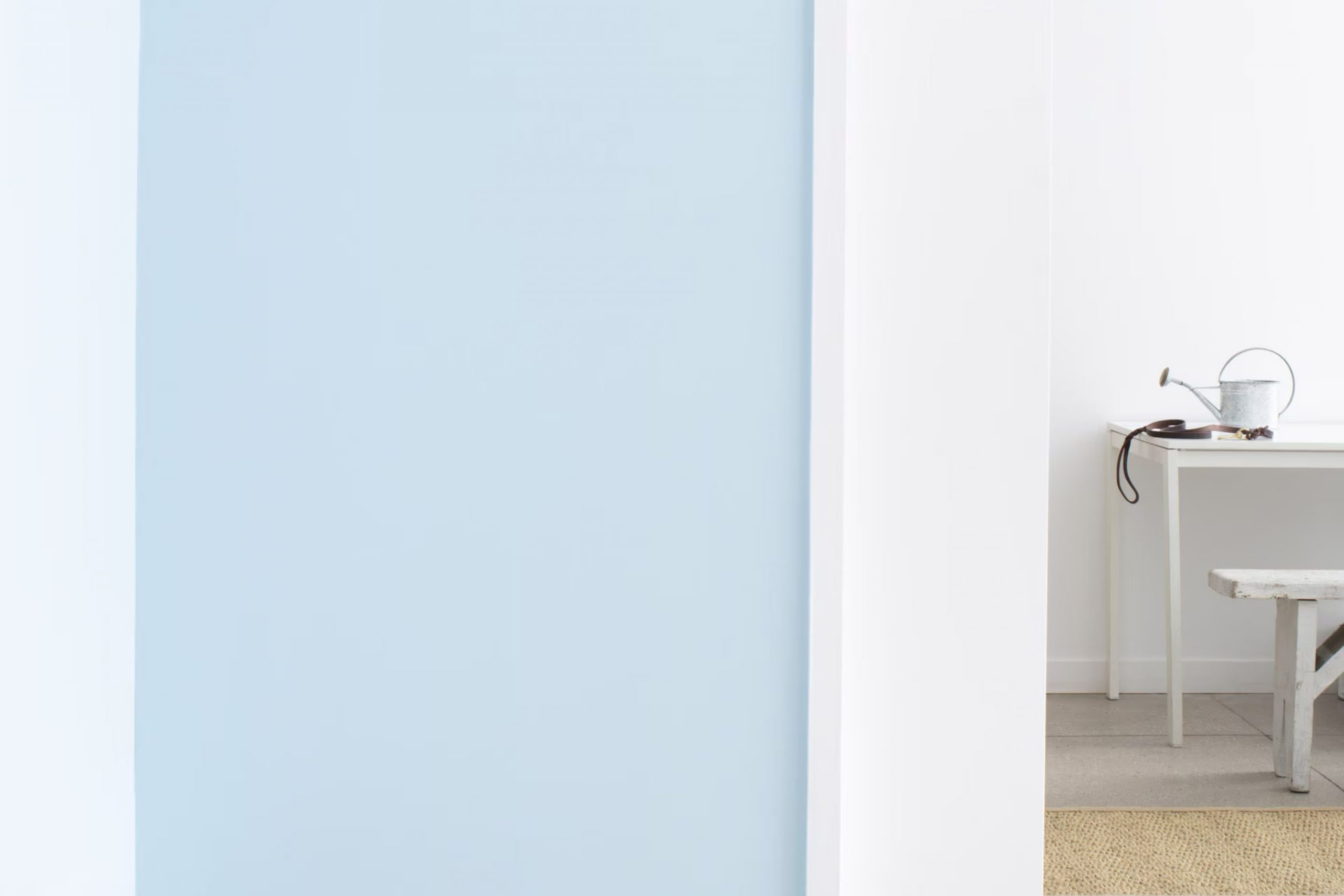
What Color Is Blue Hydrangea 2062-60 by Benjamin Moore?
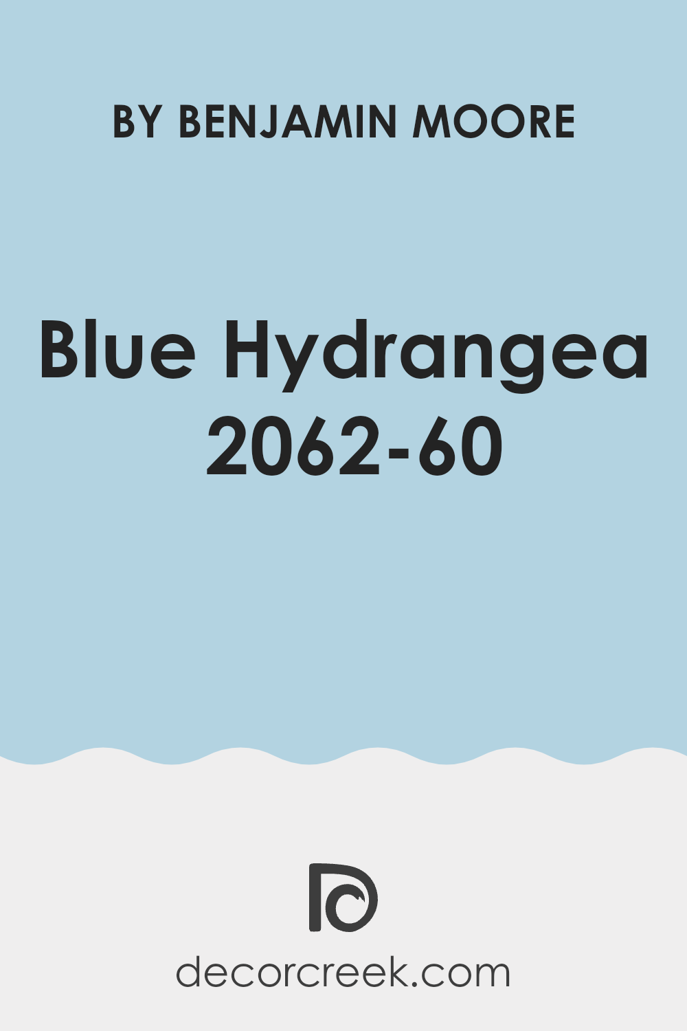
The color Blue Hydrangea by Benjamin Moore is a vibrant yet soft shade of blue that beautifully captures the freshness and appeal of a spring morning. This specific hue has a light and airy feel, making it an excellent choice for adding a touch of brightness to any room without being too bold.
Blue Hydrangea is particularly effective in interior styles that aim for a clean and refreshing look such as coastal, modern, or Scandinavian designs. Its calm and pleasant vibe is conducive to rooms meant for relaxation and peace, like bedrooms and bathrooms, but it can also bring a refreshing feel to living areas and kitchens.
In terms of pairing with materials and textures, Blue Hydrangea works wonderfully with natural woods, bringing out their warmth and adding to the overall cozy feel of the room. It also complements well with white and gray tones, which can help create a balanced and light aesthetic. For textures, consider soft, plush fabrics to enhance the comforting feel or smooth, sleek finishes for a more contemporary look.
This hue also pairs nicely with metallic accents like silver or brushed nickel, giving a room a modern touch while maintaining its comforting atmosphere.
decorcreek.com
Is Blue Hydrangea 2062-60 by Benjamin Moore Warm or Cool color?
Blue Hydrangea 2062-60 by Benjamin Moore is a vibrant color that can add a fresh and cheerful touch to any room in the home. It strikes a perfect balance between being lively and soothing, ideal for creating a welcoming atmosphere. When used in living areas, this shade can make the room feel more open and airy, while in smaller rooms like bathrooms, it gives a playful splash of color without being too bold.
This shade works well with both modern and traditional decor, making it an adaptable choice for many homes. It pairs nicely with whites and grays, which help to ground its brightness and make the room feel harmonious.
Additionally, Blue Hydrangea can be a great color for accent walls or furniture, providing a lovely contrast against more neutral shades found in most homes. In essence, this color brings a delightful pop that can make rooms more enjoyable and stylish.
Undertones of Blue Hydrangea 2062-60 by Benjamin Moore
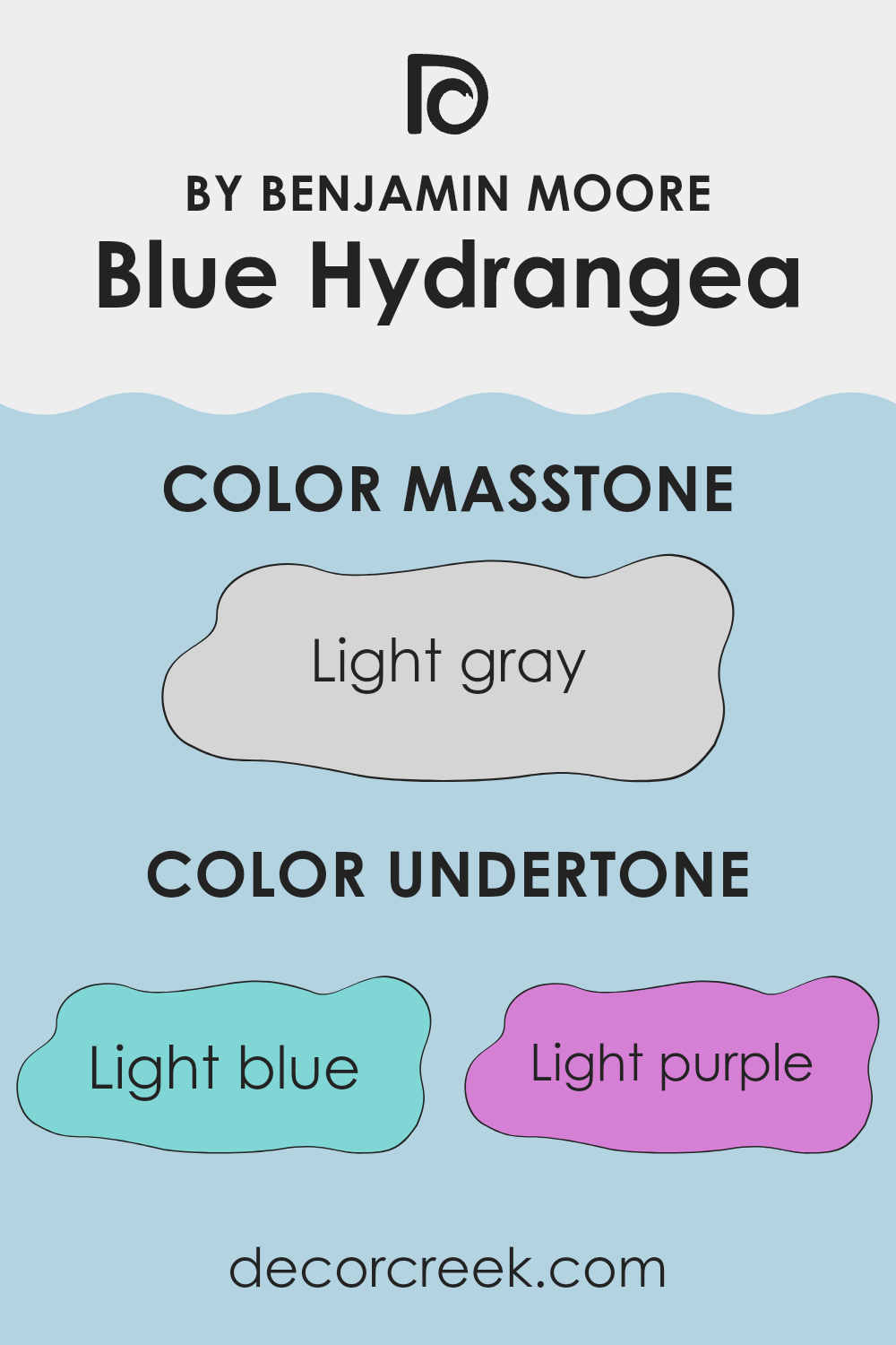
Blue Hydrangea by Benjamin Moore is a vibrant color that can look different depending on the lighting and surrounding colors due to its various undertones. Undertones are subtle colors that are mixed into the paint, influencing how the main hue appears under different conditions. The undertones for this color range from light blue and lilac to mint and pale pink.
In interior decorating, understanding these undertones is crucial because they shape the overall feeling and look of the room. For example, a light blue undertone can make a room feel airy and bright, whereas a pale pink undertone might give the room a warmer, softer look.
When Blue Hydrangea is used on interior walls, these undertones can interact differently depending on the amount of natural light the room receives or the colors of the furniture and decor. In a well-lit room with lots of natural sunlight, the light blue and lilac undertones might become more prominent, making the walls appear more lively and dynamic. In artificial light or dimmer conditions, the grey or pale yellow undertones could become more noticeable, giving the room a subdued and cozy atmosphere.
Overall, the undertones in the paint color you choose can significantly affect the mood and aesthetic of your room. With a color like Blue Hydrangea, the variety of undertones offers adaptability, allowing the color to adjust slightly to different environments and design choices.
decorcreek.com
What is the Masstone of the Blue Hydrangea 2062-60 by Benjamin Moore?
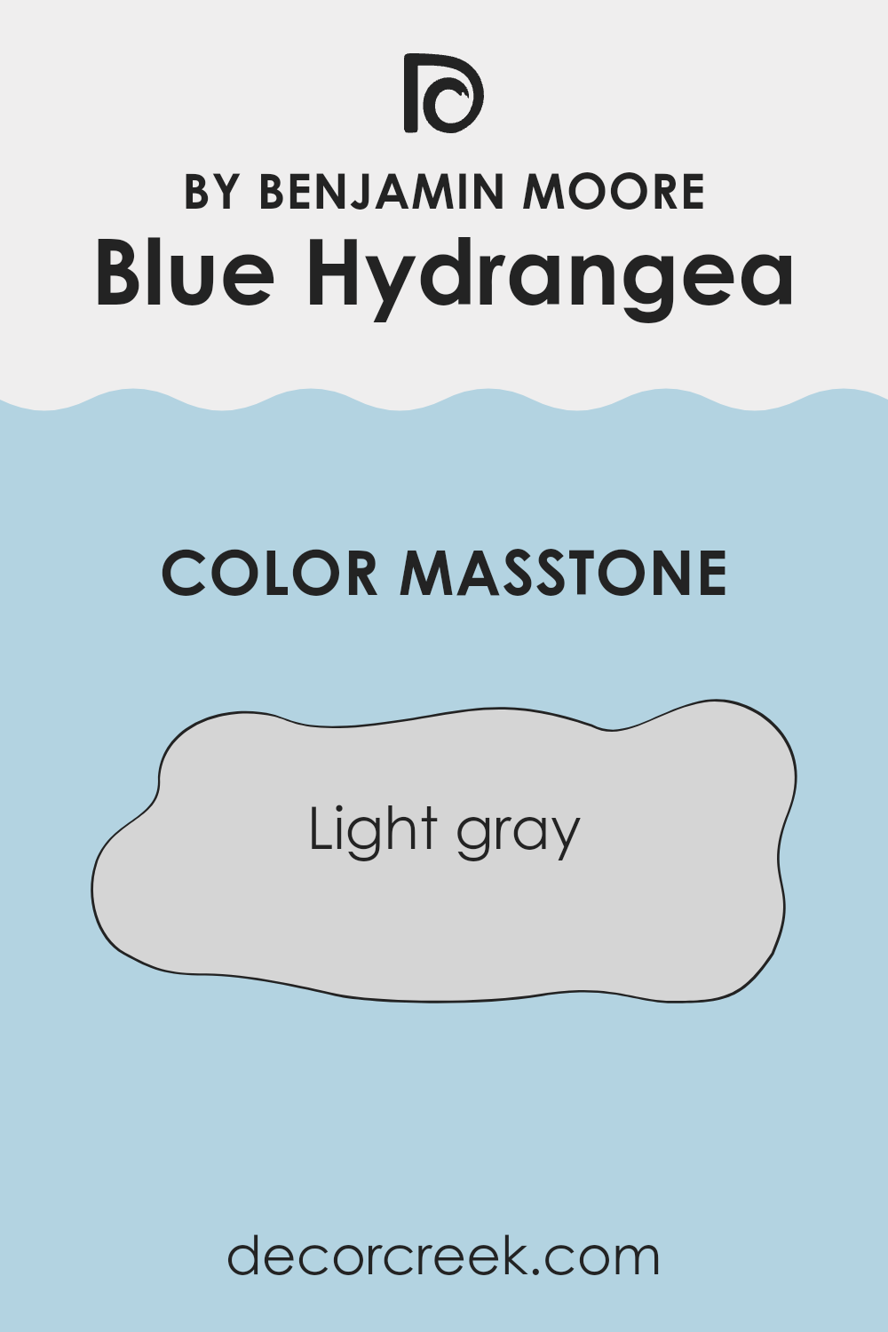
Blue Hydrangea2062-60 by Benjamin Moore has a masstone of light gray (#D5D5D5), which provides a calm and subtle backdrop in any room of a home. This light gray shade can make small rooms feel larger and more open because it reflects natural light well.
These qualities make it an excellent choice for living rooms, bedrooms, and even bathrooms where you want a neutral base that allows furniture and decor to stand out. Additionally, the light gray color doesn’t overpower the room, giving homeowners the freedom to experiment with colorful accents and textures without the worry of clashing.
Because of its neutral tone, it also pairs nicely with a wide range of other colors, from bright yellows to deep blues, providing flexibility in home decorating. Whether used as a main color or an accent wall, Light Gray from Benjamin Moore is practical and can easily adjust to different styles and tastes.
decorcreek.com
How Does Lighting Affect Blue Hydrangea 2062-60 by Benjamin Moore?
Lighting plays a crucial role in how we perceive colors. The same color can appear different depending on the type and amount of light it’s exposed to. This is due to the fact that colors are seen based on how they absorb and reflect light.
Take the paint color Blue Hydrangea by Benjamin Moore as an example. This shade of blue can look very different under various lighting conditions. Under artificial light, such as LED or incandescent bulbs, Blue Hydrangea might appear brighter and more vibrant. In natural light, which is generally cooler, this shade may look slightly more muted and subdued. This is because natural light, especially during the middle of the day, has a bluish tone that can enhance cooler colors like blue.
The direction of the room also affects how this color appears throughout the day. In north-facing rooms, light tends to be cooler and more consistent throughout the day. Here, Blue Hydrangea might appear more consistent but slightly darker, as the cooler light emphasizes the blue tones. South-facing rooms enjoy ample sunlight, which brings out the brightness and vitality of the blue, making it appear more vivid and lively.
In east-facing rooms, morning light can make Blue Hydrangea look soft and fresh. As the sun rises, the warm sunrise colors can add a slight crispness to the blue, making it feel welcoming. Conversely, in west-facing rooms, the evening light, which tends to be warmer, can make the color look richer and more intense towards the end of the day.
Understanding these nuances can help when deciding how and where to use certain colors in your home to achieve the look you want.
decorcreek.com
What is the LRV of Blue Hydrangea 2062-60 by Benjamin Moore?
LRV, or Light Reflectance Value, is a measure used to determine how much light a color reflects and how much it absorbs. It is expressed as a percentage, and a higher LRV means the color will appear lighter, reflecting more light back into the room.
This value plays an important role in choosing paint colors for your walls, as it helps predict how the color will look in various lighting conditions. For example, a color with a high LRV is typically better for darker rooms because it reflects more light and makes the room feel brighter.
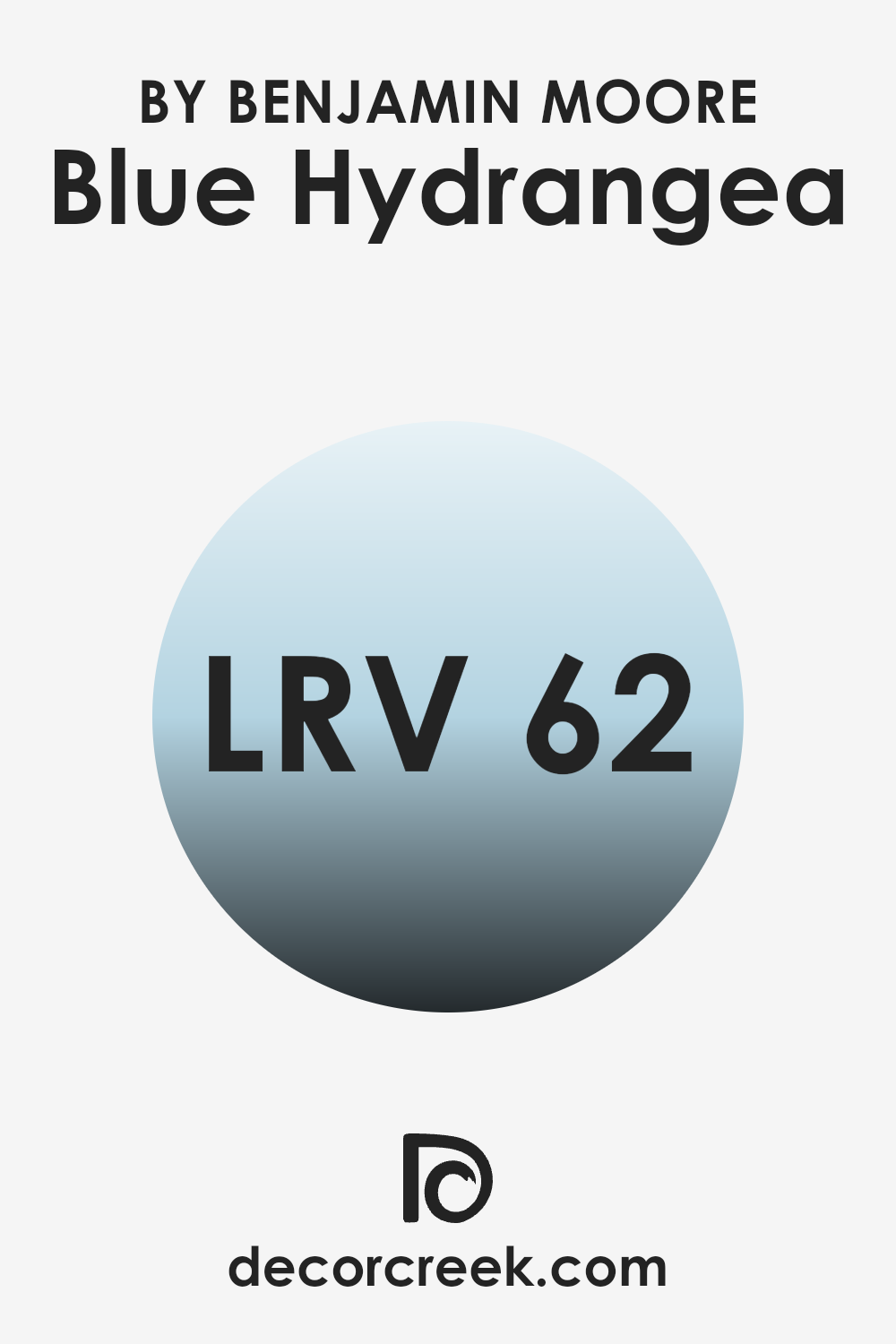
Considering the LRV of Benjamin Moore’s Blue Hydrangea (61.76), this shade has a moderate level of light reflection. This means it won’t appear too bright in well-lit rooms, nor will it look overly dark in rooms with less natural light. It strikes a nice balance, making it an adaptable choice for different settings. The moderate LRV also helps maintain the true color of the paint, ensuring that the beautiful blue shade you choose doesn’t shift dramatically under different lighting conditions. This makes it a practical option for enhancing the aesthetics of a room without worrying too much about the lighting environment.
decorcreek.com
Coordinating Colors of Blue Hydrangea 2062-60 by Benjamin Moore
Coordinating colors are designed to complement or enhance each other within a room, creating a balanced and pleasing color scheme. For example, Blue Hydrangea by Benjamin Moore is a vibrant and cheerful shade that can be beautifully paired with several other colors to accentuate its attributes. These coordinating colors can either contrast with or subtly support the main hue, depending on the atmosphere you wish to create in your room.
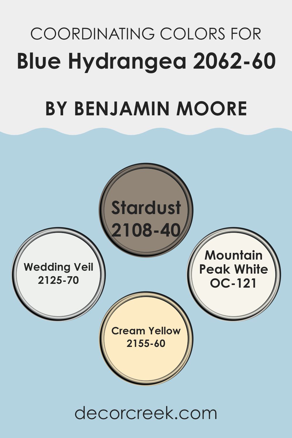
The color Stardust is a soft, warm gray that works well with Blue Hydrangea, offering a gentle contrast that is neither too stark nor too closely matched, making it perfect for creating a cozy yet light room. Wedding Veil is a crisp and clean white, excellent for making Blue Hydrangea pop and giving a refreshing clarity to a room, enhancing its openness.
Mountain Peak White is another great choice, with its slightly off-white tone that adds warmth to the room while maintaining an airy and open feel. Lastly, Cream Yellow is a subtle, muted yellow. This color pairs delightfully with Blue Hydrangea for a cheerful and sunny ambiance, providing a gentle uplift to the coolness of the blue without being too bold.
You can see recommended paint colors below:
- 2108-40 Stardust
- 2125-70 Wedding Veil
- OC-121 Mountain Peak White
- 2155-60 Cream Yellow
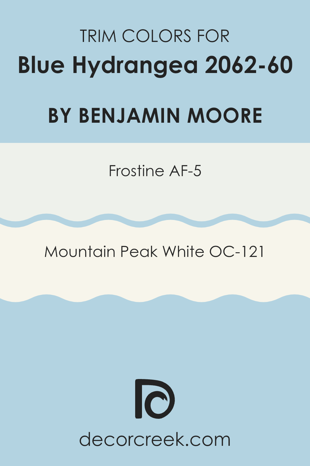
What are the Trim colors of Blue Hydrangea 2062-60 by Benjamin Moore?
Trim colors play a crucial role in enhancing the aesthetic appeal of a paint color by adding definition and contrast to the walls, ceilings, doors, and windows. In the case of Blue Hydrangea 2062-60 by Benjamin Moore, selecting the right trim color can dramatically influence the overall look and feel of the room.
Trim colors like AF-5 – Frostine and OC-121 – Mountain Peak White are excellent choices for complementing the vibrant blue tones of Blue Hydrangea. These colors not only highlight the features of the room but also provide a clean, crisp finish that enhances the beauty of the wall color without dominating it.
Frostine AF-5 is a soft, airy white that offers a subtle contrast, softening the intensity of darker hues while giving a fresh and open feel to the room. Mountain Peak White OC-121, meanwhile, is a brighter white with a slightly warm undertone that pairs beautifully with Blue Hydrangea, creating a sharp and polished look. Both trim colors are adaptable and can seamlessly integrate with various decor styles, ensuring that the main color stands out while maintaining a harmonious balance throughout the room.
You can see recommended paint colors below:
- AF-5 Frostine
- OC-121 Mountain Peak White
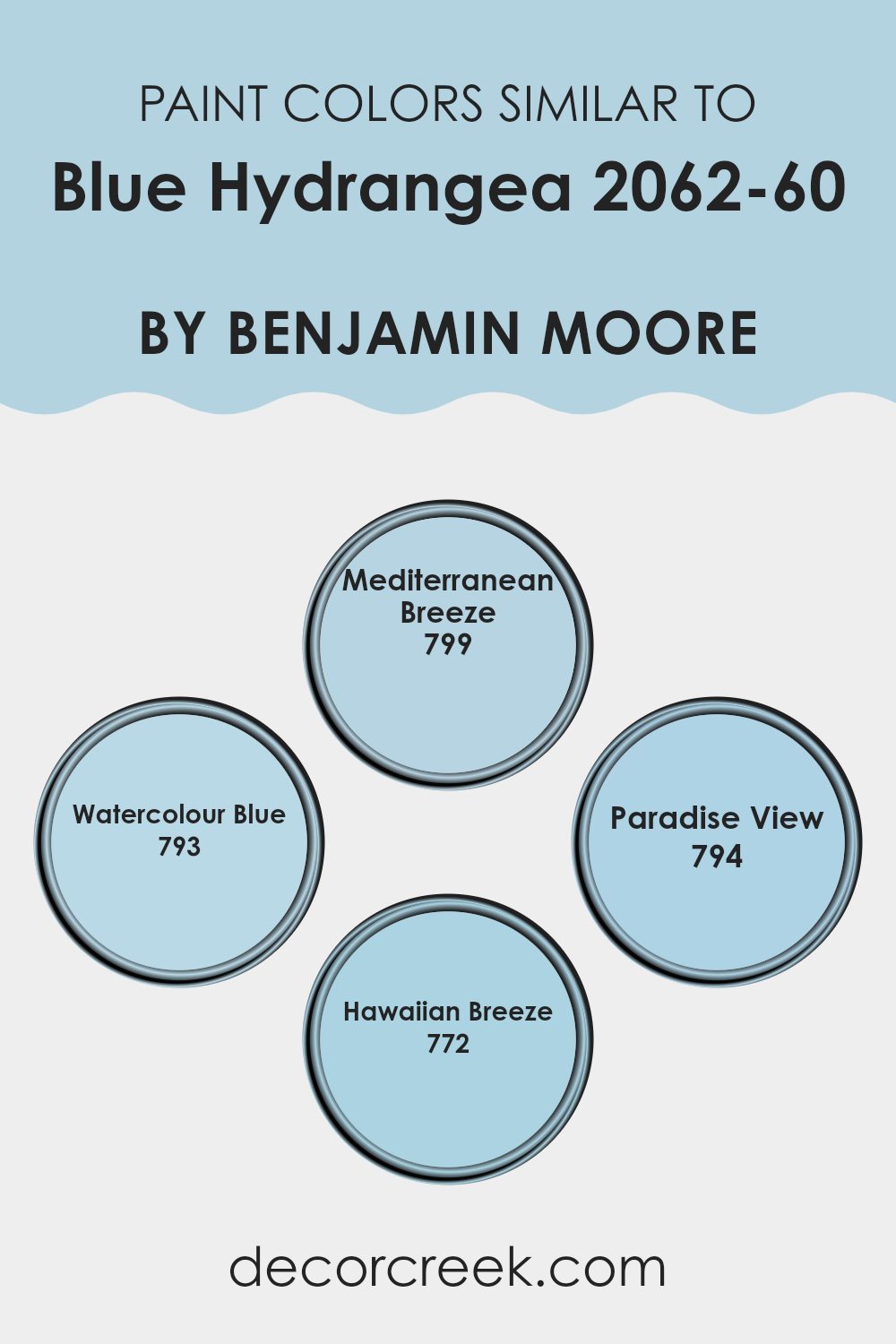
Colors Similar to Blue Hydrangea 2062-60 by Benjamin Moore
Creating a harmonious color palette with shades similar to Blue Hydrangea by Benjamin Moore, such as Mediterranean Breeze, Watercolour Blue, Paradise View, and Hawaiian Breeze, can significantly enhance the aesthetic cohesion in a room.
This strategy is essential because using shades that closely resemble each other allows for a gentle transition from one area to another, providing a soothing visual flow that can make interiors feel more cohesive and balanced. These colors are especially useful in achieving a seamless look as they share a common base but add subtle nuances that can make each room distinctive yet connected.
Mediterranean Breeze offers a light and airy touch reminiscent of the seaside, bringing a gentle, refreshing vibe to interiors. Watercolour Blue continues the theme of delicacy with a slightly more saturated tone that hints at dreamy summer skies.
Transitioning smoothly, Paradise View portrays a deeper yet calm blue, mirroring the peaceful depths of tropical waters. Hawaiian Breeze rounds off this palette by incorporating a slightly more vibrant blue that suggests a lively, inviting atmosphere of a tropical escape. Each of these colors contributes its own unique but closely related element to a design scheme, promoting a sense of unity without monotony.
You can see recommended paint colors below:
- 799 Mediterranean Breeze
- 793 Watercolour Blue
- 794 Paradise View
- 772 Hawaiian Breeze
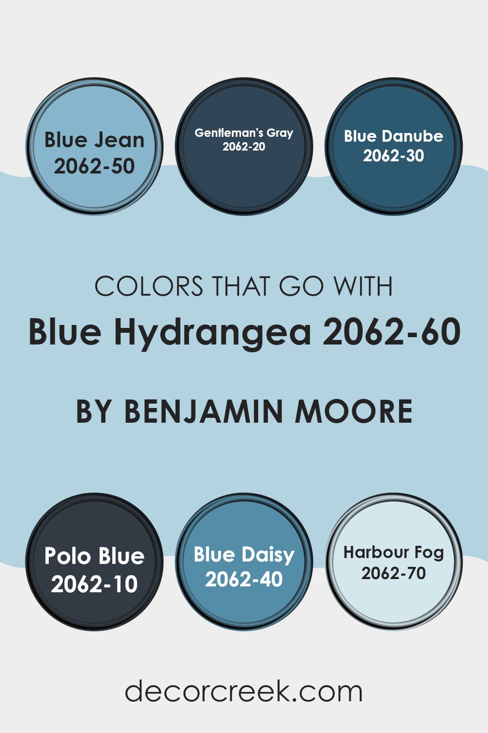
Colors that Go With Blue Hydrangea 2062-60 by Benjamin Moore
Choosing the right colors to pair with Blue Hydrangea 2062-60 by Benjamin Moore is crucial for creating a harmonious and visually appealing room. The selected complementary colors, ranging from deep blues to a soft grey, can help to create a cohesive look that enhances the unique qualities of each shade while also presenting a balanced decor. Combining colors effectively ensures that each room maintains a flow that is both inviting and stylish, regardless of its purpose or layout.
Blue Jean 2062-50 provides a slightly lighter, vibrant blue that perfectly complements the mid-tone of Blue Hydrangea, adding a refreshing pop of color without being too bold. For a more dramatic effect, Gentleman’s Gray 2062-20 presents a deep, rich blue with grey undertones, offering depth and contrast that is ideal for accent walls or furniture pieces.
On the other hand, Blue Danube 2062-30 has a lively, vivid tone that injects energy into any room. Polo Blue 2062-10 is the deepest of these selections, exuding an almost nautical vibe, perfect for creating a strong visual impact in larger or well-lit rooms.
Meanwhile, Blue Daisy 2062-40, with its hint of playful brightness, works wonders in energizing a study or a craft room. Lastly, Harbour Fog 2062-70 is a soft, gentle grey that provides a light, airy feel, ideal for rooms seeking a touch of minimalism and simplicity. Together, these colors support and enhance the beauty of Blue Hydrangea, allowing for a wide range of decorating styles and personal tastes.
You can see recommended paint colors below:
- 2062-50 Blue Jean
- 2062-20 Gentleman’s Gray
- 2062-30 Blue Danube
- 2062-10 Polo Blue
- 2062-40 Blue Daisy
- 2062-70 Harbour Fog
How to Use Blue Hydrangea 2062-60 by Benjamin Moore In Your Home?
Blue Hydrangea 2062-60 by Benjamin Moore is a vibrant, cheerful shade that brings a splash of color to any room. This shade of blue has a lively tone that can brighten up rooms, making it perfect for areas like the living room or kitchen. It pairs well with white trims, giving a fresh and clean look, and works great with wooden furniture and floors due to its cool tone.
Using this color in a bedroom can add a touch of happiness while keeping the atmosphere light and airy. It’s also an excellent choice for bathrooms, where it can create a refreshing vibe. You can paint an entire room with it or use it for a feature wall to create a focal point.
For those who like to mix and match colors, Blue Hydrangea goes well with light yellows, grays, and even some greens, allowing for a variety of decorating styles. Whether you want a room to feel more lively or just add a bit of color, this paint can do the trick.
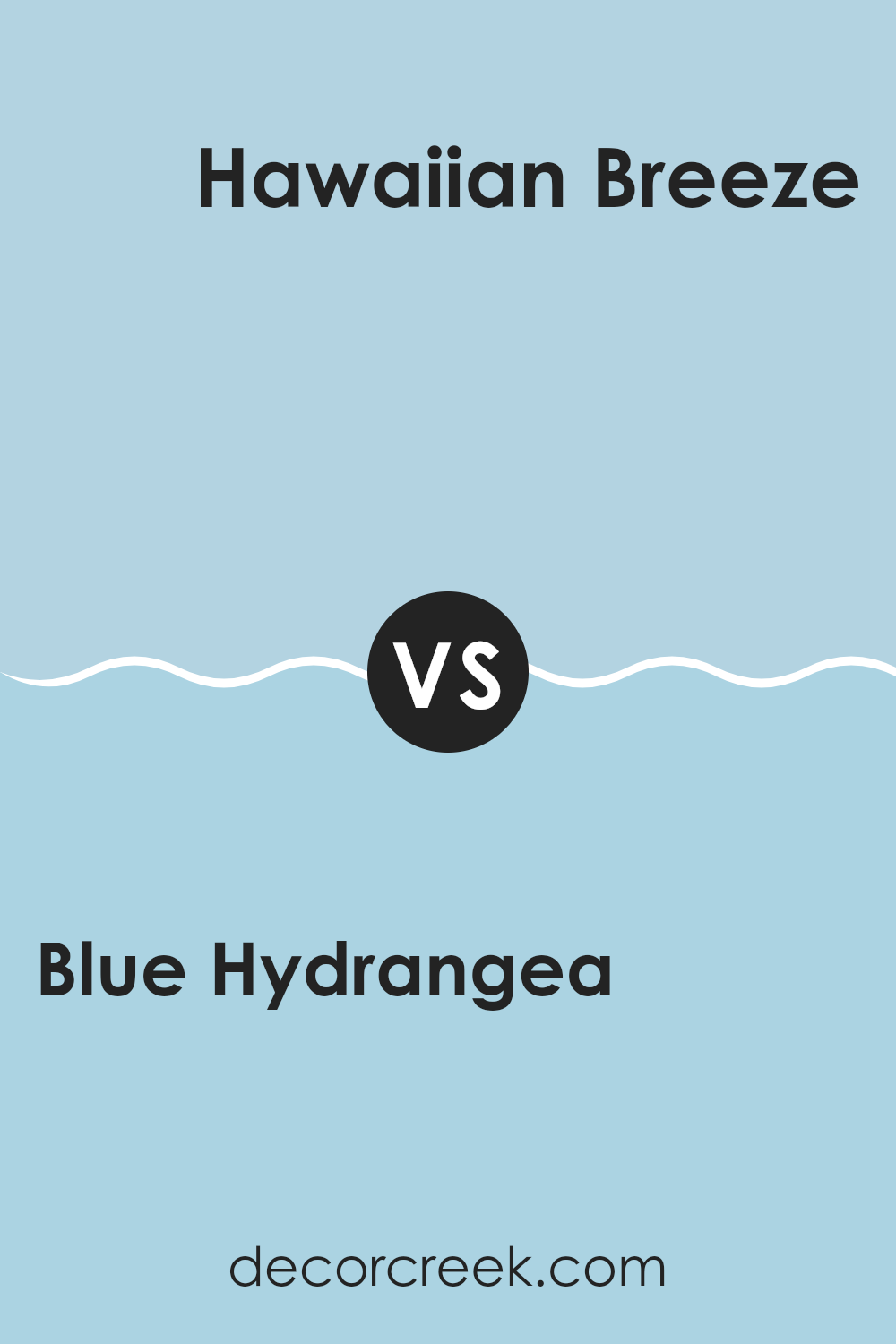
Blue Hydrangea 2062-60 by Benjamin Moore vs Hawaiian Breeze 772 by Benjamin Moore
Blue Hydrangea is a soft, light blue color that gives a gentle and calm feeling to any room. It has a fresh, airy quality, much like the early morning sky, making it perfect for creating a relaxed environment.
Hawaiian Breeze, on the other hand, is a bolder, more vibrant turquoise. It’s a lively color that brings to mind tropical waters and sunny skies, adding a cheerful and energetic touch to rooms. When comparing the two, Blue Hydrangea is more understated and subtle, ideal for a soothing backdrop or a quiet nook.
Hawaiian Breeze stands out more and is great for areas where you might want to add a playful and bright element. Each color offers a unique atmosphere and can beautifully enhance different rooms depending on the mood you want to set.
You can see recommended paint color below:
- 772 Hawaiian Breeze
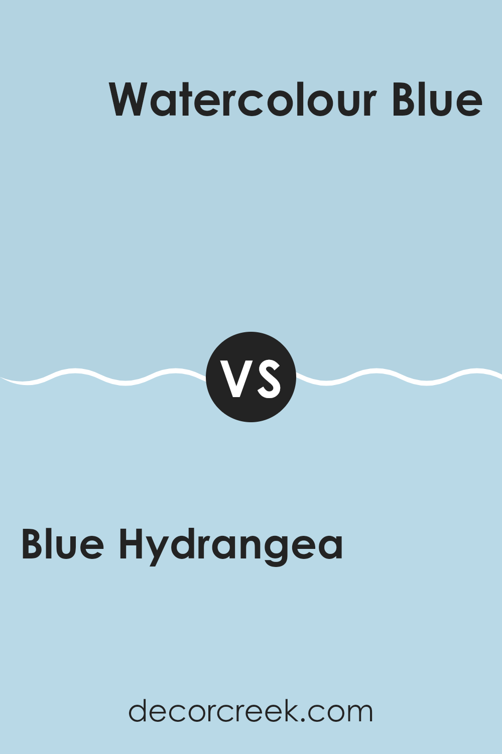
Blue Hydrangea 2062-60 by Benjamin Moore vs Watercolour Blue 793 by Benjamin Moore
Blue Hydrangea is a soft and light blue that brings a fresh and airy feel to any room. It has a touch of lavender that makes it subtly warm and inviting. This color is great for creating a calm, soothing environment in bedrooms or bathrooms.
On the other hand, Watercolour Blue is a bit deeper and richer. It still maintains a sense of calm, but with a slightly more impactful presence due to its depth. This shade can work well in areas where a more noticeable, yet still not too bold, color is desirable, like living rooms or dining areas.
Both shades are quite calming, but Blue Hydrangea leans towards a gentle, delicate vibe while Watercolour Blue offers a bit more strength while remaining soft. The choice between them would depend on how light or bold you want the room’s ambiance to be. They could even complement each other well in a single room, used in different areas or as accent versus main wall colors.
You can see recommended paint color below:
- 793 Watercolour Blue
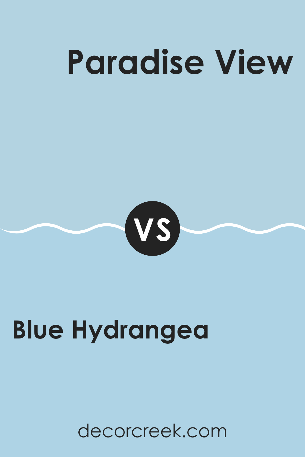
Blue Hydrangea 2062-60 by Benjamin Moore vs Paradise View 794 by Benjamin Moore
Blue Hydrangea and Paradise View are both paint colors by Benjamin Moore that offer a refreshing touch to any room. Blue Hydrangea is a soft, subtle blue that feels light and airy. It’s a color that can easily create a calm and inviting atmosphere in a room.
On the other hand, Paradise View steps a bit away from the conventional blue shades, adding a touch of green that gives it a slightly more vibrant and lively character. This makes it ideal for rooms where you want a bit more energy but still wish to maintain a sense of calm.
Both colors work well in various settings such as bedrooms, bathrooms, or living areas, depending on the mood you wish to set. While both are attractive, your choice might depend on whether you prefer a more classic blue with a gentle appeal or a unique shade that brings a touch of freshness and energy.
You can see recommended paint color below:
- 794 Paradise View
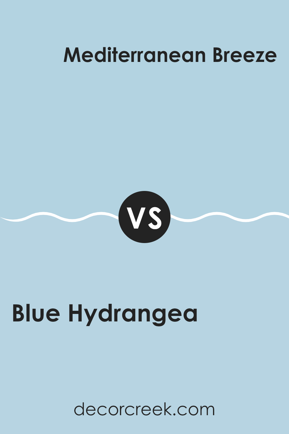
Blue Hydrangea 2062-60 by Benjamin Moore vs Mediterranean Breeze 799 by Benjamin Moore
Blue Hydrangea and Mediterranean Breeze are two distinct paint colors by Benjamin Moore. Blue Hydrangea is a soft, light blue with a slightly muted tone. It has a calming feel that makes it perfect for creating a relaxing room. This color is subtle, making it easy to match with a variety of decor styles and accents.
Mediterranean Breeze, on the other hand, is a deeper, more vibrant blue. It has a fresh and lively feel to it, suggesting the clear blue skies or the dynamic waves of the sea. This color is bolder and can add a splash of energy to any room.
Both colors are blue but offer different vibes. Blue Hydrangea is gentler and can make a small room feel bigger and more open. Mediterranean Breeze has a stronger presence, ideal for a focal point in a room or when you want to add some cheerfulness. They each have their own unique charm and can work well in various settings depending on what mood you want to set.
You can see recommended paint color below:
- 799 Mediterranean Breeze
After trying out Benjamin Moore’s 2062-60 Blue Hydrangea paint in my room, I can honestly say that it brings so much brightness and a peaceful feeling to my walls. The blue color reminds me of a clear sky on a sunny day or beautiful blue flowers. When painting, the paint went on the wall smoothly and covered the old color well, which made decorating a lot easier.
This particular blue shade works wonderfully in rooms where you want to feel calm and happy, like a bedroom or a living room. It’s soft enough to make you feel relaxed but also has just the right amount of cheerfulness. Whether it’s morning light or evening, this color always looks great.
If anyone is looking to refresh their room with a new color, I would definitely recommend Blue Hydrangea. It has refreshed the feel of my room, making it a cozy, welcoming spot in my home. The color is cheerful and calming at the same time, and I think it would be a great choice for anyone wanting to add a nice touch of blue to their home.
decorcreek.com
Ever wished paint sampling was as easy as sticking a sticker? Guess what? Now it is! Discover Samplize's unique Peel & Stick samples.
Get paint samples