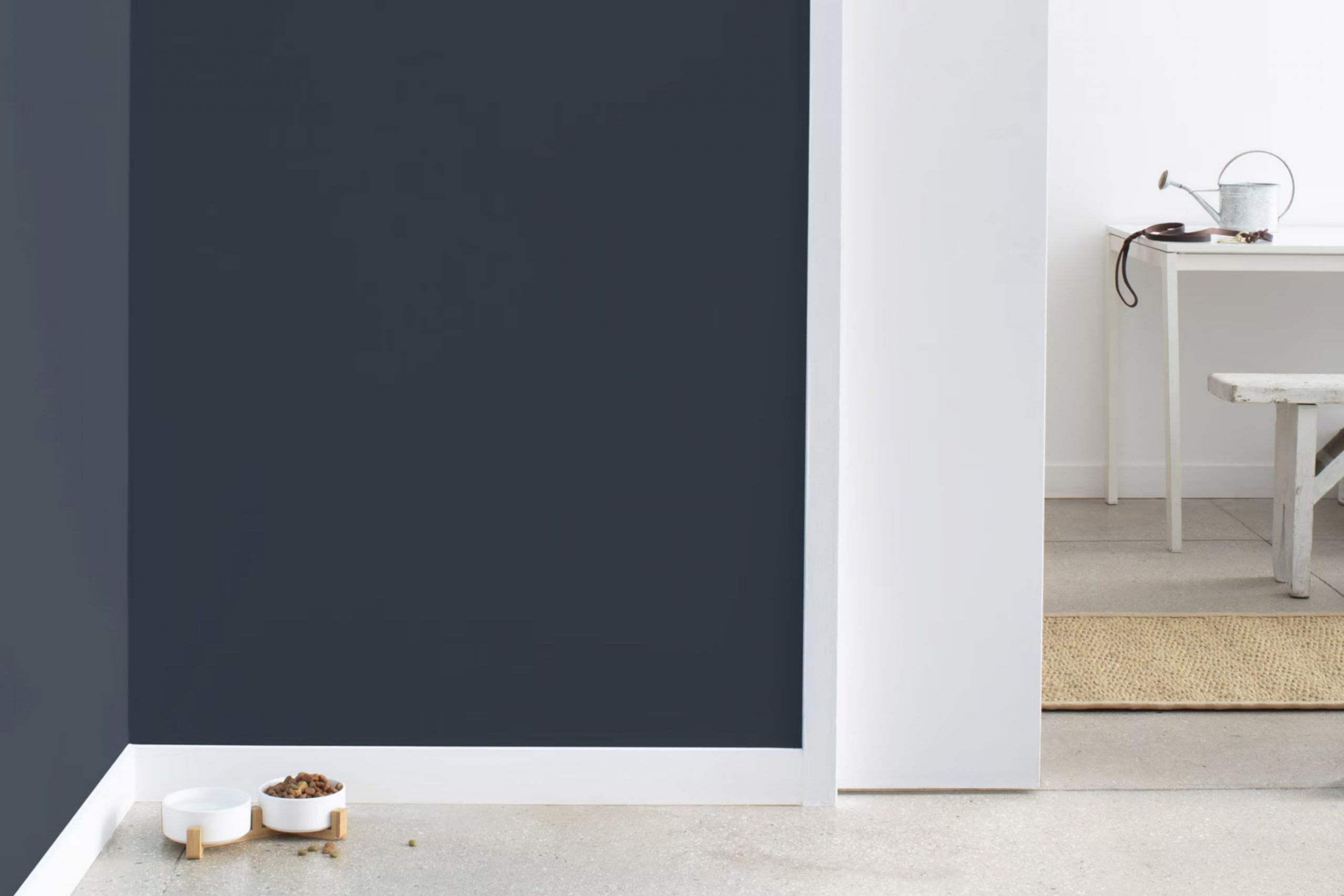
If you’re searching for a fresh splash of color for your walls, you might want to consider Benjamin Moore’s 2062-10 Polo Blue. When I first decided to repaint my living room, I stumbled upon this shade and figured it could be the change I was looking for. Polo Blue isn’t just any ordinary shade of blue; it has a richness and depth that immediately enhances the room, giving it a more refined yet inviting atmosphere.
I had previously leaned towards lighter colors, believing they would make my rooms feel bigger. However, by choosing this bold blue, I learned it actually made the room feel more cohesive and cozy.
With Polo Blue, I even noticed that my decor pieces, especially those with metallic and wooden finishes, really stood out, creating an appealing contrast. Even better, the color works wonderfully at any time of the day. Under natural morning light, it has a vibrant energy, and by evening, it exudes calm and comfort, perfect for winding down.
So, if you’re planning a room refresh and want a color that combines beauty with adaptability, Polo Blue by Benjamin Moore might just be the perfect choice. It definitely renewed my room in a way I hadn’t imagined possible.
What Color Is Polo Blue 2062-10 by Benjamin Moore?
Polo Blue 2062-10 by Benjamin Moore is a rich navy color with deep undertones that suggest a sense of strength and reliability. This shade, embodying a classic nautical vibe, brings a bold yet cozy feel to any room.
Perfect for modern or traditional interiors, this blue works particularly well in coastal-inspired designs due to its maritime charm. It also complements minimalist styles where bold color can make a striking statement against a more subdued background. Industrial interiors also benefit from Polo Blue as it pairs well with raw materials like metal and exposed brick.
In terms of materials, Polo Blue pairs beautifully with natural wood tones, from light oaks to dark walnuts, enhancing the warmth of the wood. It also matches well with metallic finishes like brushed nickel and copper, adding a touch of rustic charm. For fabrics, consider soft textures like wool, linen, or creamy leather to create a cozy and inviting room.
Polo Blue is adaptable in its application, ideal for accent walls, kitchen cabinets, or even a striking ceiling color. Its depth adds a sense of luxury to any room without being overpowering, making it a practical choice for a broad range of decorating projects.
Is Polo Blue 2062-10 by Benjamin Moore Warm or Cool color?
Polo Blue 2062-10 by Benjamin Moore is a deep, rich blue paint color that brings a bold touch to any room in a house. It’s perfect for those looking to make a statement without being too loud. This color can make large rooms feel more intimate and cozy, which is great for living areas or bedrooms.
On the other hand, in smaller rooms like bathrooms or studies, Polo Blue can create a sense of depth and drama. Since it’s a darker shade, it works well as an accent wall or for cabinetry, paired with lighter colors like whites or grays to balance the darkness and keep the room from feeling too heavy.
The striking nature of Polo Blue also means it pairs well with wood finishes, metal accents, and can even be a stunning backdrop for artwork or decorative pieces. Overall, Polo Blue can bring a fresh yet grounded feeling to a home, making it both stylish and comfortable.
Undertones of Polo Blue 2062-10 by Benjamin Moore
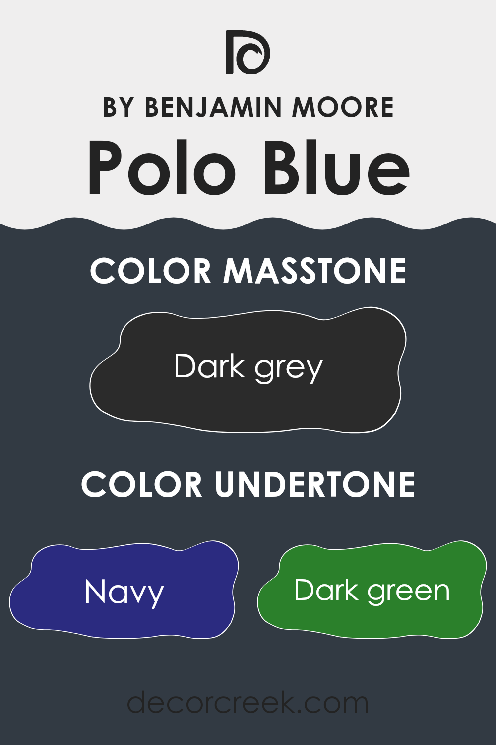
The color Polo Blue 2062-10 by Benjamin Moore has a complex set of undertones which include navy, dark green, brown, dark turquoise, purple, olive, and grey. Understanding how undertones work is key to using this color effectively in your home.
Essentially, undertones are subtle colors that lie beneath the surface of the main hue and can greatly influence how the color appears under different lighting conditions. They can make a color look cooler or warmer depending on their hue and how strong they are compared to the main color.
For Polo Blue 2062-10, these various undertones can impact the way this paint color looks on your walls. Depending on the time of day and the type of light in the room, this color could appear more navy or slightly green. In dim light, it might even look closer to grey or brown. This shifting quality makes Polo Blue an interesting choice for interior walls, offering a dynamic look that changes subtly throughout the day and in different lighting conditions.
When choosing this color for a room, consider the main sources of light. Natural light brings out more of the blue and green undertones, while artificial light might accentuate the brown or purple. This color can work well in rooms where you want a touch of complexity and variation, adding depth and interest to your walls without overpowering your decor.
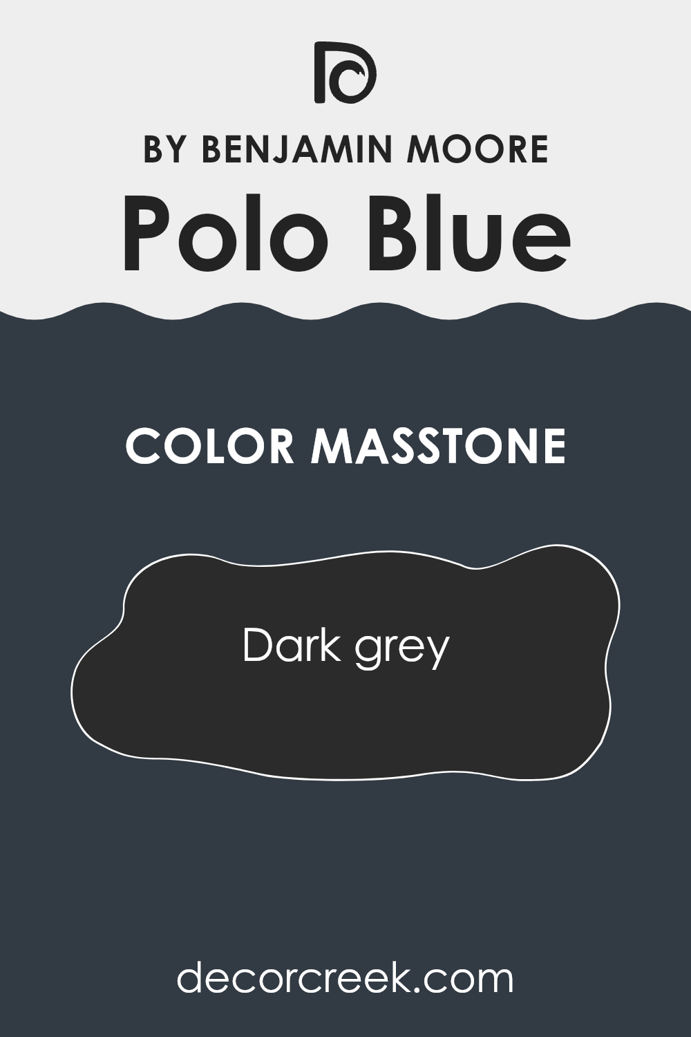
What is the Masstone of the Polo Blue 2062-10 by Benjamin Moore?
Polo Blue 2062-10 by Benjamin Moore presents a robust dark grey masstone, offering a solid and grounding presence in any interior room. This particular shade of deep grey, resembling the color of charcoal, provides a neutral backdrop that can complement a variety of décor styles and color schemes.
When used in homes, it helps to create a subtle, understated look that doesn’t overpower the senses. This color is especially useful in rooms that need a touch of formality or a professional look, such as home offices or libraries.
In living rooms and bedrooms, it can help to tone down brighter colors or act as a base for lighter, contrasting furnishings and accents. Its flexibility makes it a popular choice for both contemporary and traditional homes. Moreover, because of its dark nature, it is effective at hiding marks and smudges, making it practical for high-traffic areas or homes with kids and pets.
How Does Lighting Affect Polo Blue 2062-10 by Benjamin Moore?
Lighting plays a crucial role in how colors appear in a room. Different light sources can dramatically alter the perception of a color. For instance, Polo Blue by Benjamin Moore, a deep, rich blue, will look different under various lighting conditions. In artificial light, such as that from LED or incandescent bulbs, Polo Blue might appear slightly different than under daylight.
LED lights, which often have a cooler tone, could make Polo Blue seem more vibrant and sharper. On the other hand, incandescent lighting, which casts a warmer glow, can soften the intensity of Polo Blue, giving it a more muted appearance. This rich blue might lose some of its depth under warm yellow light, appearing slightly greener or grayer.
Under natural sunlight, Polo Blue reveals its true color but changes subtly throughout the day with the shifting light. In north-facing rooms, which receive less direct sunlight and often get cooler, bluish light, Polo Blue can look more profound and vivid, accentuating its cooler undertones. This makes it a great choice for creating a bold and dramatic effect in such rooms.
In south-facing rooms, exposed to plentiful, warmer daylight, Polo Blue may lighten up a bit and reveal subtle green undertones. The abundant light can highlight the complexity of the color, making the room feel lively and dynamic.
Rooms with east-facing windows benefit from the morning sunlight, which is generally bright and warm. Here, Polo Blue will appear more cheerful and bright in the morning, gradually transitioning into a deeper, more shadowed version as the day progresses. West-facing rooms experience the reverse effect.
The color will start off more subdued during the morning when the light is cooler and gain intensity and warmth as the sun sets. Polo Blue here could look both calming and bold as the natural light changes. Understanding how lighting affects colors like Polo Blue can help in effectively using the color to achieve the desired atmosphere in different rooms at different times of the day.
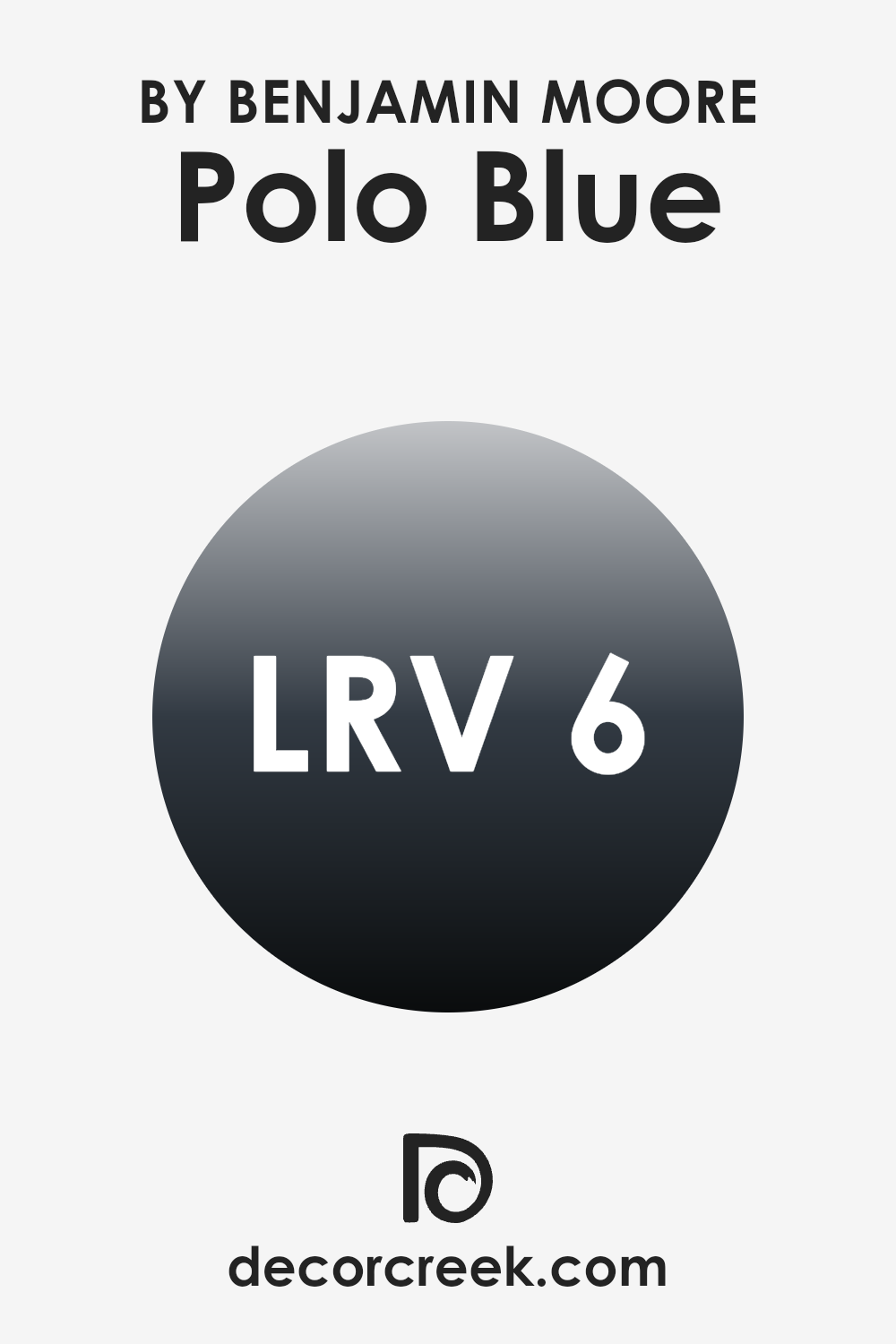
What is the LRV of Polo Blue 2062-10 by Benjamin Moore?
Light Reflectance Value (LRV) is a measure of the percentage of light a paint color reflects back into a room. It ranges from 1 to 99, with higher values indicating that the color reflects more light and appears lighter, and lower values indicating that the color absorbs more light and appears darker.
LRV is an important factor to consider when choosing paint colors, as it can significantly impact the atmosphere and visual perception of a room. For example, a room painted with a color that has a high LRV will generally look brighter and feel more open, whereas a room painted with a low LRV color might appear cozier but smaller.
The LRV of Polo Blue, which is 5.67, means that it is a very dark hue that absorbs much of the light that hits it, reflecting back very little. When used on walls, this low LRV can create a rich depth of color, making the room feel enclosed and intimate.
In rooms with limited natural light, using a color with such a low LRV can make the area appear even darker, possibly necessitating additional lighting to compensate. When considering where to apply this deep blue shade, be mindful of the room’s lighting and purpose to ensure it complements the room effectively.
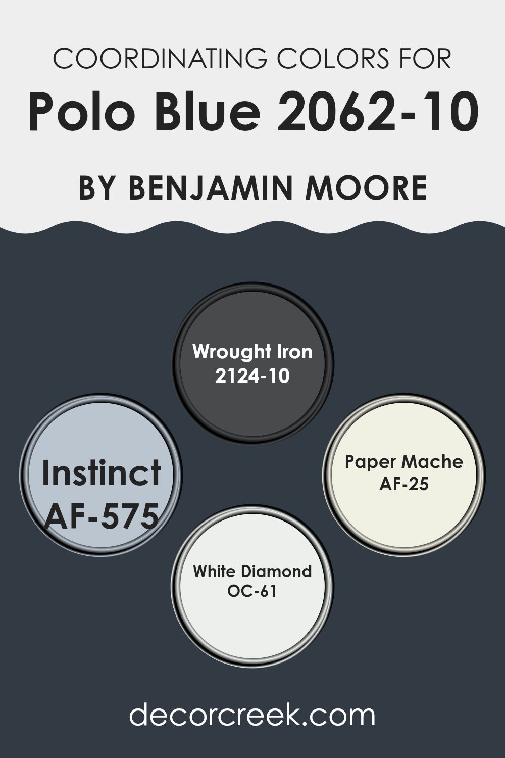
Coordinating Colors of Polo Blue 2062-10 by Benjamin Moore
Coordinating colors are those that complement each other when used together, enhancing the overall aesthetic appeal of a room. By selecting colors that harmonize well, you create a cohesive and appealing look. A good example of this can be seen with the coordinating colors for Polo Blue by Benjamin Moore. These colors include Wrought Iron, Instinct, Paper Mache, and White Diamond, each offering a unique contribution to the palette to support and enhance the deep tones of Polo Blue.
Wrought Iron is a deep gray that almost borders on black, providing a strong and grounding effect, perfect for accentuating the richness of Polo Blue. Instinct is a nuanced gray with subtle blue undertones, which pairs nicely to add depth and complexity without overpowering the primary color.
Paper Mache is a soft, off-white color that offers a light, neutral background against which the more intense shades can stand out. Finally, White Diamond is a crisp and clean white that brings out the vibrant tones of Polo Blue, ensuring that the room feels open and airy. Together, these colors work harmoniously to create a balanced and visually appealing environment.
You can see recommended paint colors below:
- 2124-10 Wrought Iron
- AF-575 Instinct
- AF-25 Paper Mache
- OC-61 White Diamond
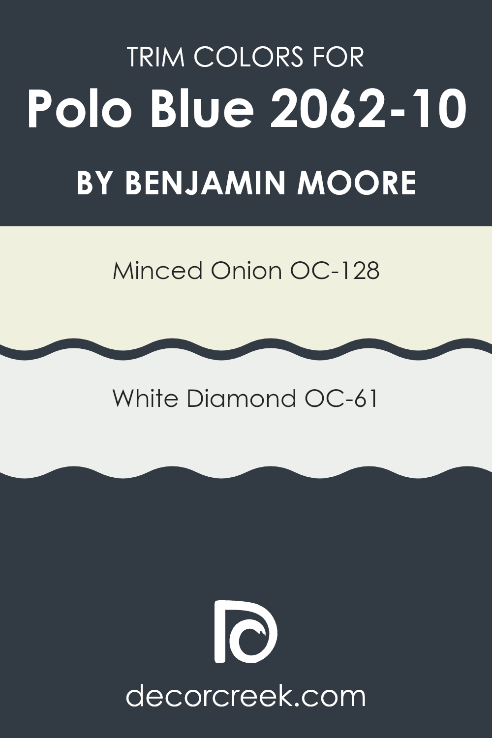
What are the Trim colors of Polo Blue 2062-10 by Benjamin Moore?
Trim colors are used to enhance the overall look of a wall or room, acting as a frame to highlight architectural features or contrast the main wall color. Choosing the right trim color can make a significant difference in how a color like Polo Blue by Benjamin Moore is perceived and can help to define the room.
For Polo Blue, a deep and vibrant hue, selecting a proper trim color is especially important as it helps bring out the richness of the blue while ensuring the room doesn’t feel overpowering. Minced Onion OC-128 and White Diamond OC-61 are two great options for trim colors with Polo Blue.
Minced Onion is a subtle, almost ethereal grey that gently complements the deep tones of Polo Blue, providing a soft boundary that can make the wall color appear more grounded without taking away from its intensity. White Diamond, on the other hand, is a crisp, clean white that offers a sharper contrast, which can make the blue stand out even more and give the room a fresh, lively look. Both colors help balance the depth of Polo Blue, ensuring the walls look striking yet harmonious.
You can see recommended paint colors below:
- OC-128 Minced Onion
- OC-61 White Diamond
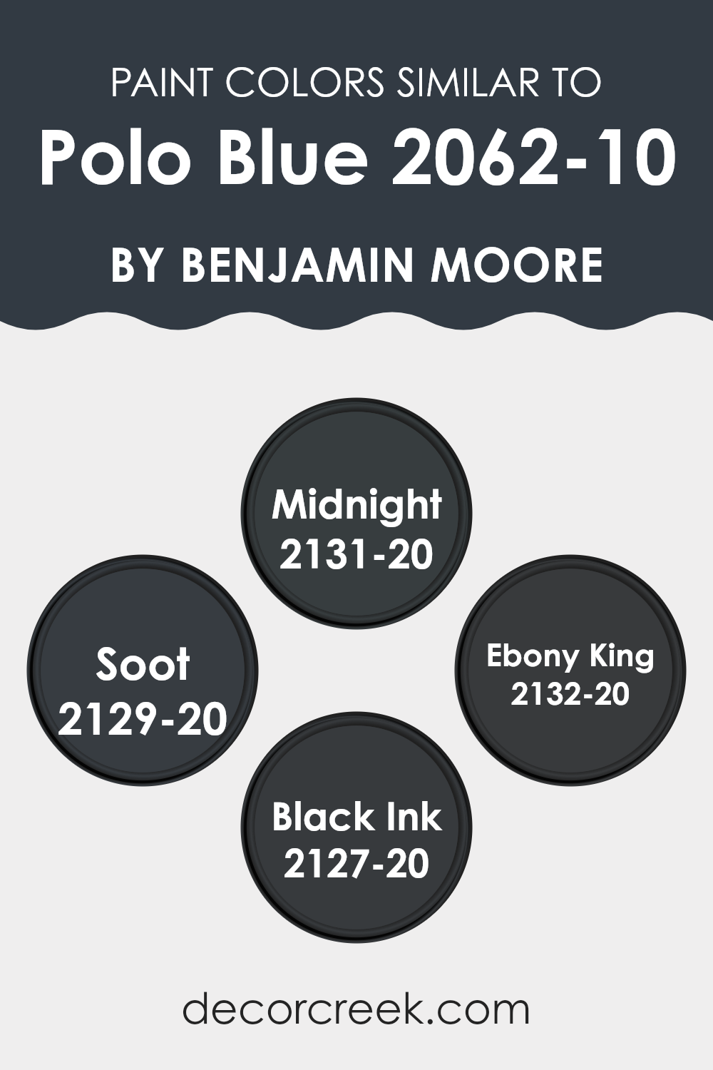
Colors Similar to Polo Blue 2062-10 by Benjamin Moore
Similar colors are important because they help create a harmonious and consistent look in a room. When you use colors that closely resemble each other, it creates a subtle and refined aesthetic, making the room feel coherent and thoughtfully designed.
For instance, colors similar to Polo Blue by Benjamin Moore such as Midnight, Soot, Ebony King, and Black Ink work well together because they all share a depth that helps establish a strong, cohesive design scheme. These colors contribute to a seamless transition between different surfaces and elements in a room, enhancing the overall decor without creating harsh contrasts.
Midnight is a deep blue that almost looks black under certain lighting, perfect for accent walls or furniture, giving a rich backdrop to brighter decorations. Soot, another shade, offers a slightly lighter blue-black hue, which works well for providing a subtle variation while maintaining the overall dark theme of a room.
Ebony King has a strong visual impact, with its deep, charcoal richness that can anchor a room’s aesthetic. Finally, Black Ink, the darkest of these shades, is ideal for creating depth and definition in corners or for textural elements like trim or doors, rounding out the design with its profound tone.
You can see recommended paint colors below:
- 2131-20 Midnight
- 2129-20 Soot
- 2132-20 Ebony King
- 2127-20 Black Ink
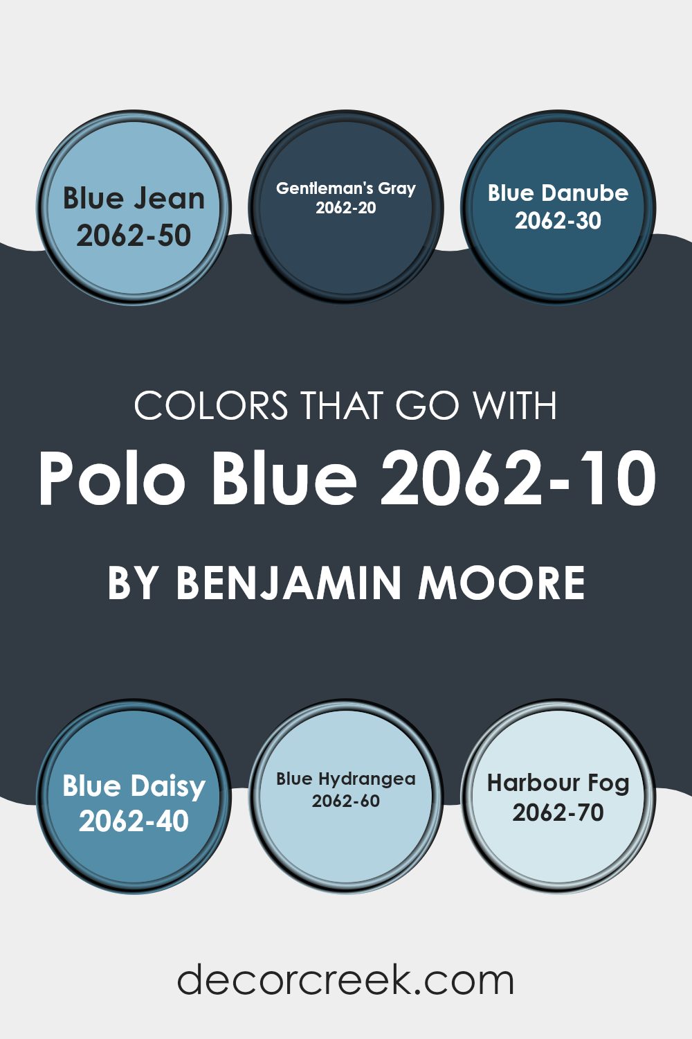
Colors that Go With Polo Blue 2062-10 by Benjamin Moore
When selecting colors that pair with Polo Blue 2062-10 by Benjamin Moore, it’s important to consider how these shades contribute to the overall mood of a room. Colors such as Blue Jean, Gentleman’s Gray, Blue Danube, Blue Daisy, Blue Hydrangea, and Harbour Fog work beautifully with Polo Blue to create a cohesive and engaging color palette. These tones not only complement Polo Blue but also enhance the environment, making the room feel well-balanced and visually appealing.
Blue Jean is a soft, comfortable hue reminiscent of favorite denim. It pairs nicely with Polo Blue for a casual yet stylish appearance. Gentleman’s Gray, in contrast, is a richer, deeper tone that adds a hint of elegance and depth, perfect for refined interiors.
Blue Danube is vivid and lively, injecting a burst of brightness that contrasts wonderfully with Polo Blue’s deeper base. Blue Daisy offers similar vibrancy but with a slightly lighter touch, ideal for energizing a room without overpowering it.
Among the lighter shades, Blue Hydrangea brings a gentle, refreshing presence, ideal for cultivating a soothing atmosphere. Lastly, Harbour Fog provides a muted, soft backdrop that allows Polo Blue to shine while maintaining harmony throughout the room. Together, these colors create an adaptable and appealing palette that suits a range of design styles and preferences.
You can see recommended paint colors below:
- 2062-50 Blue Jean
- 2062-20 Gentleman’s Gray
- 2062-30 Blue Danube
- 2062-40 Blue Daisy
- 2062-60 Blue Hydrangea
- 2062-70 Harbour Fog
How to Use Polo Blue 2062-10 by Benjamin Moore In Your Home?
Polo Blue 2062-10 by Benjamin Moore is a deep, vibrant shade of blue. This color has a rich tone that can add a striking touch to any room in your home. It’s particularly effective in creating a bold statement wall in living areas or bedrooms.
To incorporate Polo Blue into your home, consider painting one wall with this shade to serve as a backdrop for art or to highlight a specific area of a room. In smaller rooms, like a powder room or an entryway, using this color on all walls can create a dramatic effect, making the area feel cozy yet stylish.
For those who love a nautical or coastal theme, Polo Blue is a perfect choice. It pairs beautifully with whites and grays for a clean, modern look, or it can be matched with warmer tones like mustard or burnt orange for a more dynamic feel. Accessories in metallic tones such as gold or brass can really stand out against a Polo Blue background, adding a touch of luxury without being overly ornate.
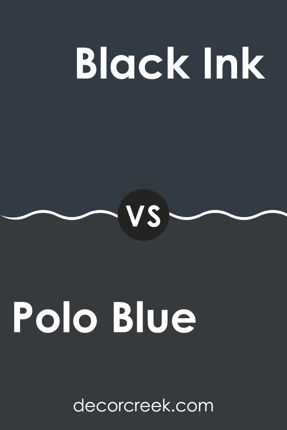
Polo Blue 2062-10 by Benjamin Moore vs Black Ink 2127-20 by Benjamin Moore
Polo Blue by Benjamin Moore is a rich, deep blue color that has a vibrant yet calming quality. It’s a strong shade that can make a bold statement when used on walls or as an accent in a room. Its lively character makes it suitable for rooms that benefit from a dynamic yet cozy atmosphere.
On the other hand, Black Ink by Benjamin Moore is a very deep black that has a clear, refined look. Unlike Polo Blue’s more colorful presence, Black Ink offers a neutral foundation, making it an adaptable choice that can blend with various colors. It works particularly well for creating contrast and depth, ideal for highlighting artwork or furniture in a room.
While both Polo Blue and Black Ink are powerful in their own right, Polo Blue adds a touch of color and warmth, whereas Black Ink provides minimalist simplicity and grounding. This makes them suitable for different design goals depending on the mood and purpose of the room.
You can see recommended paint color below:
- 2127-20 Black Ink
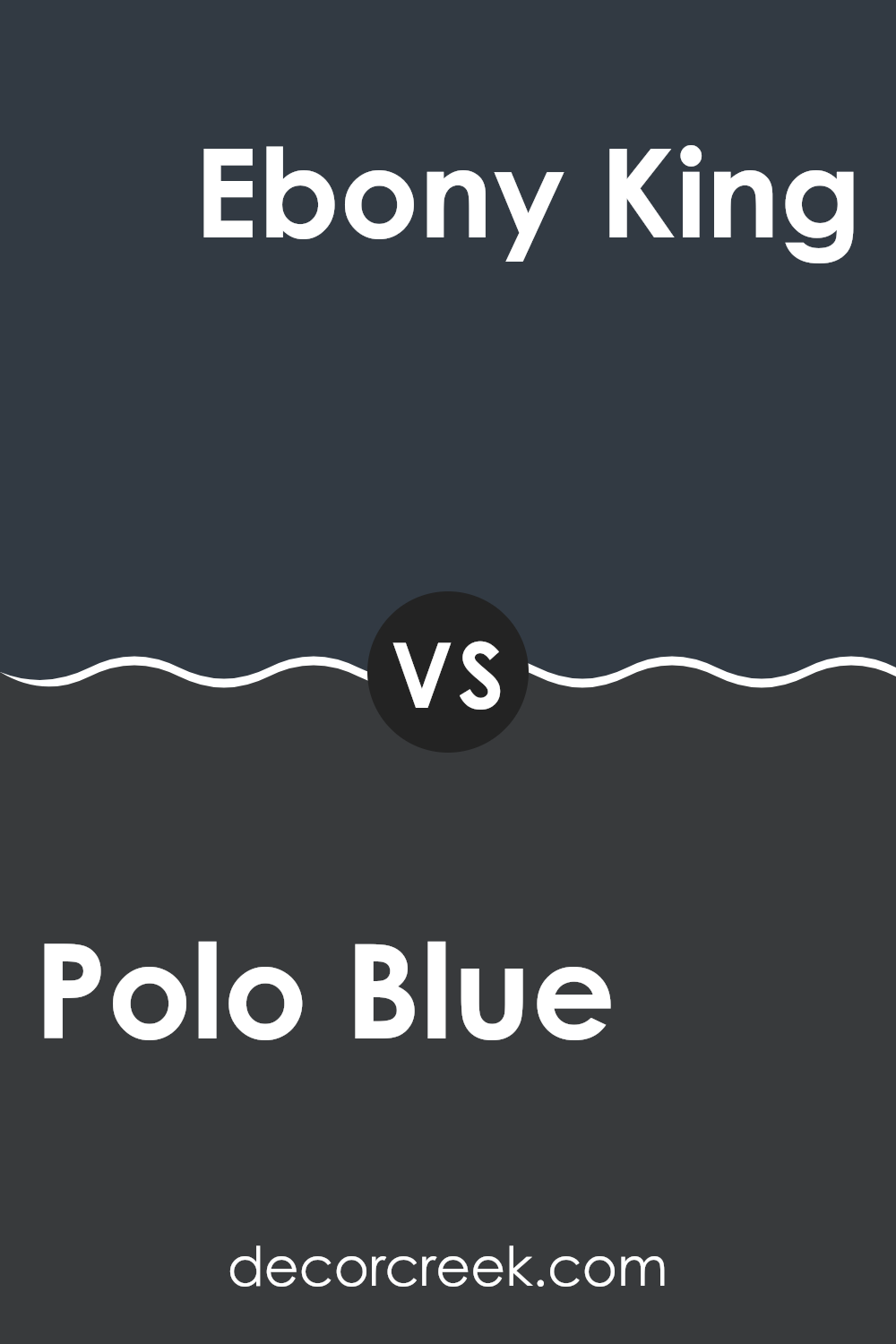
Polo Blue 2062-10 by Benjamin Moore vs Ebony King 2132-20 by Benjamin Moore
The color Polo Blue has a deep navy blue tone that recalls the classic look of a polo shirt. It’s a strong and bold blue but with a hint of brightness that brings a touch of freshness to any room. It works well in areas where you want to make a statement without overpowering the room.
On the other hand, Ebony King is a much darker shade that leans toward a black hue with subtle undertones of deep green. This color is perfect for adding drama and intensity to a room. It’s ideal for accent walls or furniture pieces where you want to draw attention or create a focal point.
Both colors offer distinct moods and can set very different tones in a room. While Polo Blue provides a lively yet classic blue, Ebony King delivers a more striking and impactful presence. Depending on the atmosphere you want to achieve, either could be an excellent choice for your decorating goals.
You can see recommended paint color below:
- 2132-20 Ebony King
Polo Blue 2062-10 by Benjamin Moore vs Midnight 2131-20 by Benjamin Moore
Polo Blue and Midnight by Benjamin Moore are both deep, dark hues, but they have distinct vibes. Polo Blue leans toward a deep navy with a hint of brightness that gives it a more vibrant appearance.
It’s a color that feels strong and steady, perfect for creating a bold statement in rooms like a study or dining area. On the other hand, Midnight is darker and closer to a true black with subtle hints of blue.
This shade is ideal for creating a cozy, intimate atmosphere in rooms or on accent walls, where the goal is to make the room feel close and snug. While both colors can be used in various home decor settings, Polo Blue offers a slight nautical feel because of its bluer undertone, whereas Midnight provides a more shadowy and intriguing aesthetic.
You can see recommended paint color below:
- 2131-20 Midnight
Polo Blue 2062-10 by Benjamin Moore vs Soot 2129-20 by Benjamin Moore
The main color, Polo Blue by Benjamin Moore, is a rich, deep navy that has a strong presence. It evokes a sense of calm and reliability, making it a classic choice for rooms where you want to add depth without overpowering the room. It pairs beautifully with crisp whites or warm neutrals for a balanced look.
The second color, Soot by Benjamin Moore, is a very dark, charcoal gray. Almost black, Soot manages to offer a touch of warmth that keeps it from feeling too harsh. It’s an excellent choice for creating dramatic, cozy rooms or for use on accent features like doors or cabinets.
While both colors are dark, Polo Blue leans more toward a true blue, providing a maritime, nautical vibe that is enduring. In contrast, Soot edges closer to black, offering a modern and bold statement that is adaptable in various design settings. Pairing them together could create an appealing visual contrast, where Soot grounds the room and Polo Blue adds a layer of color depth.
You can see recommended paint color below:
- 2129-20 Soot
After learning all about 2062-10 Polo Blue by Benjamin Moore, I have a good feeling about this paint color! Polo Blue is a really beautiful, dark blue shade. It looks a lot like the deep blue ocean or the sky at night. This color can make parts of your home look truly captivating and unique because it’s so bold and strong.
This kind of blue can also make your room feel cozy, like a warm, comforting hug. It works well in different areas of the house, whether it’s a small nook or a large room. Some might think it’s too dark, but when paired with good lighting or lighter tones, it truly shines! It could be wonderful for areas like a reading corner or even a big living room, depending on your style.
Polo Blue also lasts beautifully and keeps its charm over time, so you won’t have to worry about frequent repainting. Many people have shared positive experiences with this color, saying it made their home feel more personal and inviting.
So, if you’re thinking about refreshing your home, 2062-10 Polo Blue by Benjamin Moore could be an exciting and stylish choice!
Ever wished paint sampling was as easy as sticking a sticker? Guess what? Now it is! Discover Samplize's unique Peel & Stick samples.
Get paint samples

