As someone who appreciates the nuances of color, I found Brewster Gray to be a perfect backdrop for various design styles.
Its subtle undertones add depth without overwhelming the space, making it suitable for any room in the house. Whether you’re updating a modern apartment or a traditional home, this hue can enhance the atmosphere effortlessly.
I’ve noticed how Brewster Gray seamlessly adapts to different lighting conditions, taking on a slightly different character as the day progresses. In the morning, it offers a soft, cool ambiance, while in the evening, it can shift to a warmer, more intimate feel. This adaptability is one of the reasons why I’m drawn to it, as it never feels static or dull.
If you’re considering a fresh coat of paint, HC-162 Brewster Gray might just provide the perfect backdrop for your space, bringing a sense of calm and subtle elegance that complements a wide range of furnishings and accents.
What Color Is Brewster Gray HC-162 by Benjamin Moore?
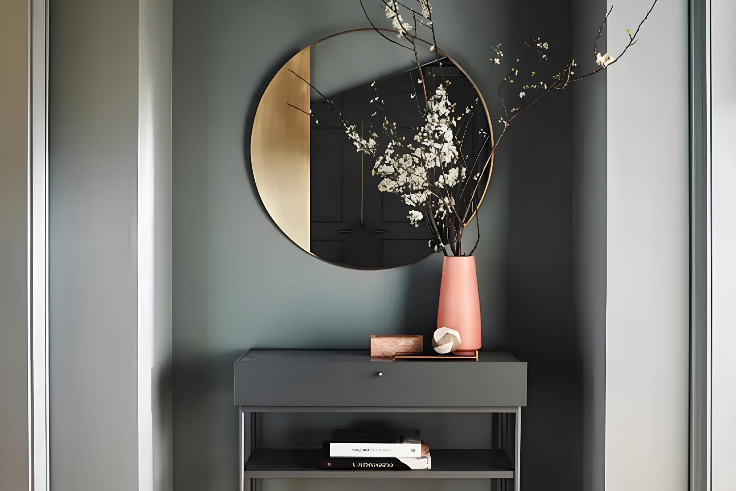
Brewster Gray is a soft, muted gray with subtle blue undertones. Its gentle hue can create a calming atmosphere in any room. This versatile color works well in a variety of interior styles. In a modern setting, Brewster Gray can complement sleek lines and minimalist decor.
It can also blend seamlessly into traditional designs, enhancing classic furniture and ornate details. Additionally, it fits well in coastal or farmhouse styles, where its subtle blue hint can evoke a sense of the sea or sky.
When it comes to materials, Brewster Gray pairs beautifully with natural wood tones. Whether it’s a rich mahogany or a light oak, the contrast can be warm and inviting. Metal accents, such as brushed nickel or aged brass, also harmonize well, adding a touch of elegance. For textiles, consider soft fabrics like linen or cotton in neutral tones.
Creams, whites, and taupes can balance Brewster Gray’s coolness without overpowering it. For some added interest, consider textures such as woven baskets or a sisal rug to ground the space.
Whether in a living room, bedroom, or kitchen, Brewster Gray provides a timeless backdrop that can adapt to changing decor styles and preferences.

Is Brewster Gray HC-162 by Benjamin Moore Warm or Cool color?
Brewster Gray HC-162 by Benjamin Moore is a versatile and appealing paint color that works well in various home settings. This shade of gray has a subtle blue undertone, which gives it a cool and calming effect. It’s a great choice for creating a soothing atmosphere in any room.
The neutral nature of Brewster Gray makes it easy to pair with a wide range of colors and styles. It complements both modern and traditional decor, allowing homeowners to add their personal touch with furniture and accessories.
In living rooms, Brewster Gray can provide a clean and fresh look, making the space feel open and inviting. In bedrooms, its calming quality helps create a restful environment. Kitchens benefit from its sophisticated hue, which works well with stainless steel appliances and natural wood tones. Whether used as a primary wall color or an accent shade, Brewster Gray seamlessly adapts to the space it inhabits, enhancing the overall aesthetic.
Undertones of Brewster Gray HC-162 by Benjamin Moore
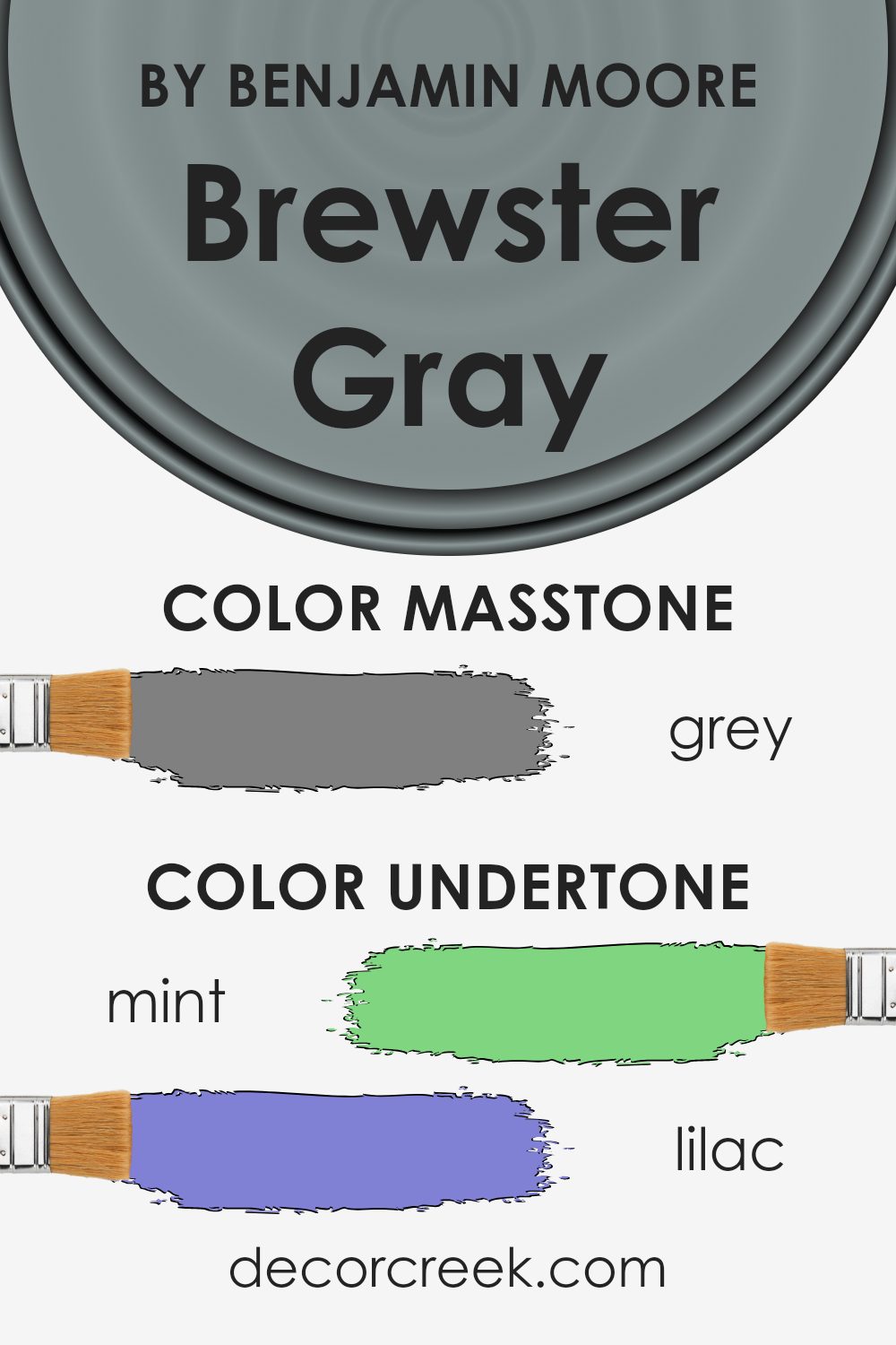
Brewster Gray (HC-162) by Benjamin Moore is more than just a basic gray; it has a range of undertones that make it interesting and versatile. Undertones are the subtle hints of color that can influence how we perceive the main color. In Brewster Gray, a variety of undertones, such as mint, lilac, pale pink, and light blue, can be detected, along with others like olive, navy, and red.
These undertones can affect how Brewster Gray appears on your walls. For instance, natural and artificial light can interact with the mint and light blue undertones, giving the paint a cooler look during the day.
In contrast, in the evening or under warmer lighting, the lilac, pale pink, and orange undertones can make Brewster Gray seem warmer and more inviting.
The balance between dark and light undertones, like dark turquoise and light gray, helps Brewster Gray fit comfortably in different environments. It can look fresh and modern or cozy and traditional, based on surrounding colors and furnishings.
For interior spaces, these undertones allow Brewster Gray to be both a background color and a main attraction, blending well with multiple styles while providing a hint of color complexity.
What is the Masstone of the Brewster Gray HC-162 by Benjamin Moore?
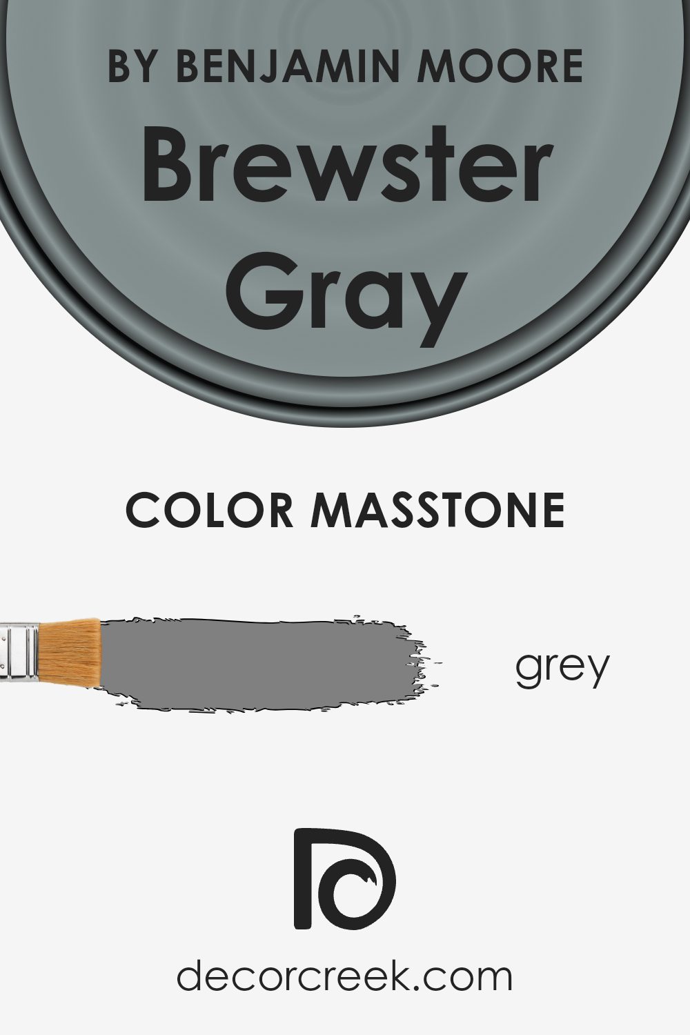
Brewster Gray HC-162 by Benjamin Moore is a versatile gray with a masstone of #808080. This balanced shade of gray can add a calm and modern feel to any home setting. Its neutral nature allows it to pair easily with various colors and furnishings, making it a popular choice for many different styles.
It works well in living rooms, bedrooms, and kitchens, providing a clean backdrop that highlights other colors and decor. The gray tone can also help make a space feel more open and airy, as it reflects light subtly across surfaces.
When used on walls, Brewster Gray can bring a comfortable and warm atmosphere, offering a pleasant space to relax. It complements both dark and light furnishings, providing flexibility to change the look of a room without needing to repaint. Its classic and understated feel can make it a staple color in interior design.
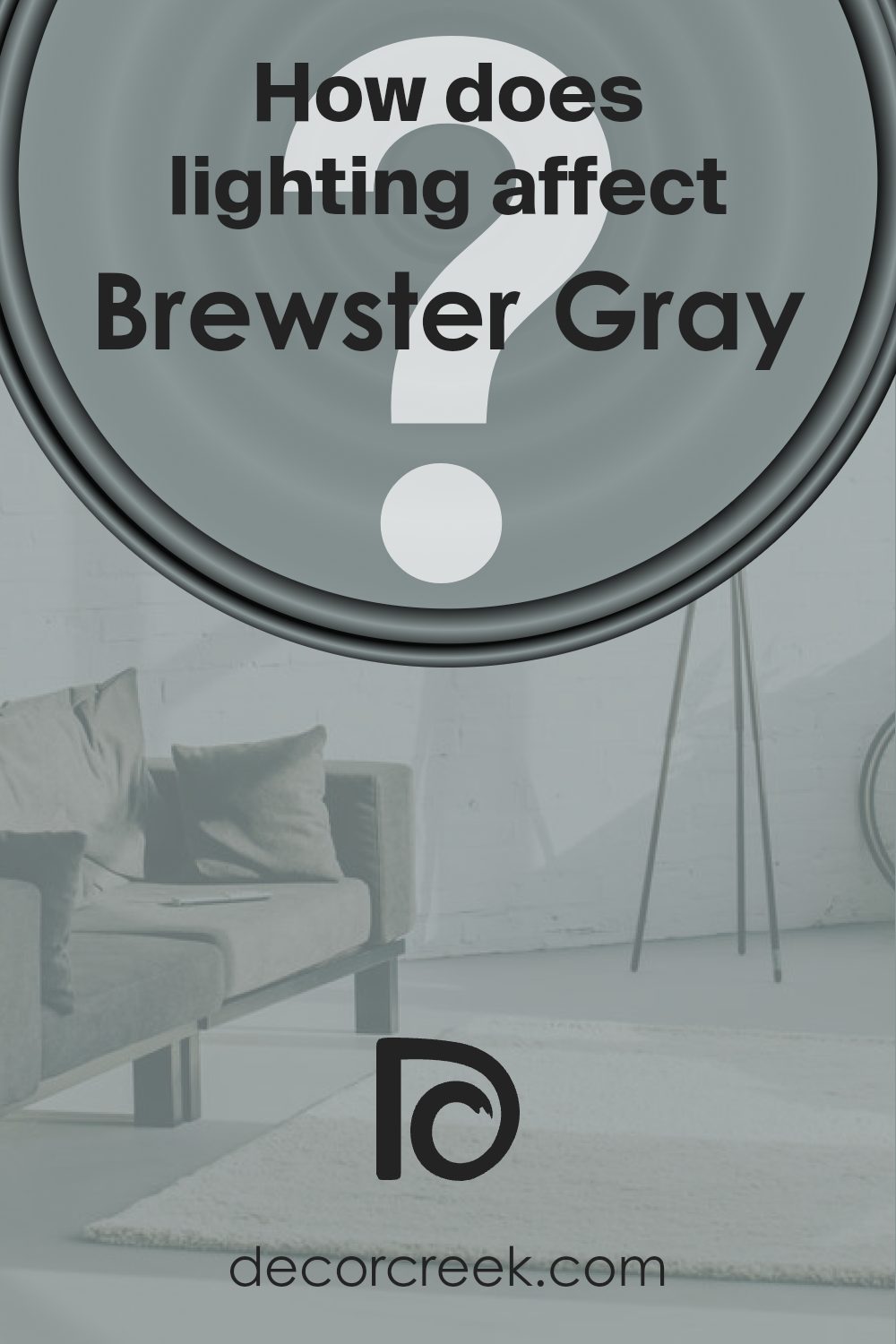
How Does Lighting Affect Brewster Gray HC-162 by Benjamin Moore?
Lighting plays a major role in how we perceive colors in a space. The same color can look very different under various lighting conditions. Brewster Gray, a neutral gray by Benjamin Moore, is a color that changes significantly with different light sources.
Under artificial light, such as incandescent bulbs, Brewster Gray can appear warmer, with a hint of beige, due to the yellow light put off by these bulbs. Fluorescent lighting, on the other hand, tends to bring out cooler tones, making the gray feel more crisp and sometimes slightly blue.
LED lights can vary widely, but generally, they can provide a balanced view depending on their temperature rating.
In natural light, Brewster Gray reveals its true tone more clearly but is subject to change based on the room’s orientation. In north-facing rooms, which typically receive cooler and less direct sunlight, this gray can appear more muted and a bit cooler. This is because the light from the north is more consistent but doesn’t bring strong warm tones, enhancing the gray’s subtle blue undertones.
In south-facing rooms, with their abundant warm natural light, Brewster Gray can appear lighter and warmer. The rich light helps the color look inviting and warm, bringing out any warmer undertones in the paint.
East-facing rooms receive bright, direct light in the morning, which can make Brewster Gray look brighter and more vibrant early in the day. As the day progresses, the light becomes softer and more indirect, causing the color to look slightly cooler and more subdued.
West-facing rooms get more intense light in the late afternoon and evening. Throughout the morning and midday, Brewster Gray might seem slightly flat or cool, but as late afternoon approaches, it can take on a warmer and richer tone due to the warm sunset light filling the room.
In conclusion, Brewster Gray’s appearance shifts greatly depending on lighting and room orientation, showcasing different facets of its subtle gray tone.
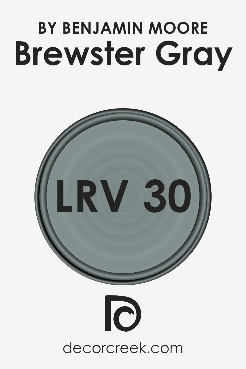
What is the LRV of Brewster Gray HC-162 by Benjamin Moore?
Light Reflectance Value (LRV) measures the amount of visible and usable light that a paint color reflects. It is rated on a scale of 0 to 100, with 0 signifying absolute black (no light reflection) and 100 representing pure white (maximum light reflection). The higher the LRV, the more light the color reflects, making rooms appear brighter and more spacious.
Conversely, colors with lower LRV absorb more light, tend to make spaces feel cozier, and are often selected for a warm, snug feel in a room.
Brewster Gray by Benjamin Moore has an LRV of 29.97. This means it is on the lower side of the reflection scale, suggesting that Brewster Gray absorbs a fair amount of light rather than reflecting it. As a result, this color can make a room appear cozy and intimate, without overwhelming it with brightness. In spaces that have a lot of natural light, Brewster Gray may offer a balanced, muted backdrop, while in darker rooms, it may deepen the warmth, providing a comforting atmosphere.
This makes it a versatile choice for both living areas and bedrooms where a soothing, enveloping feel is desired.
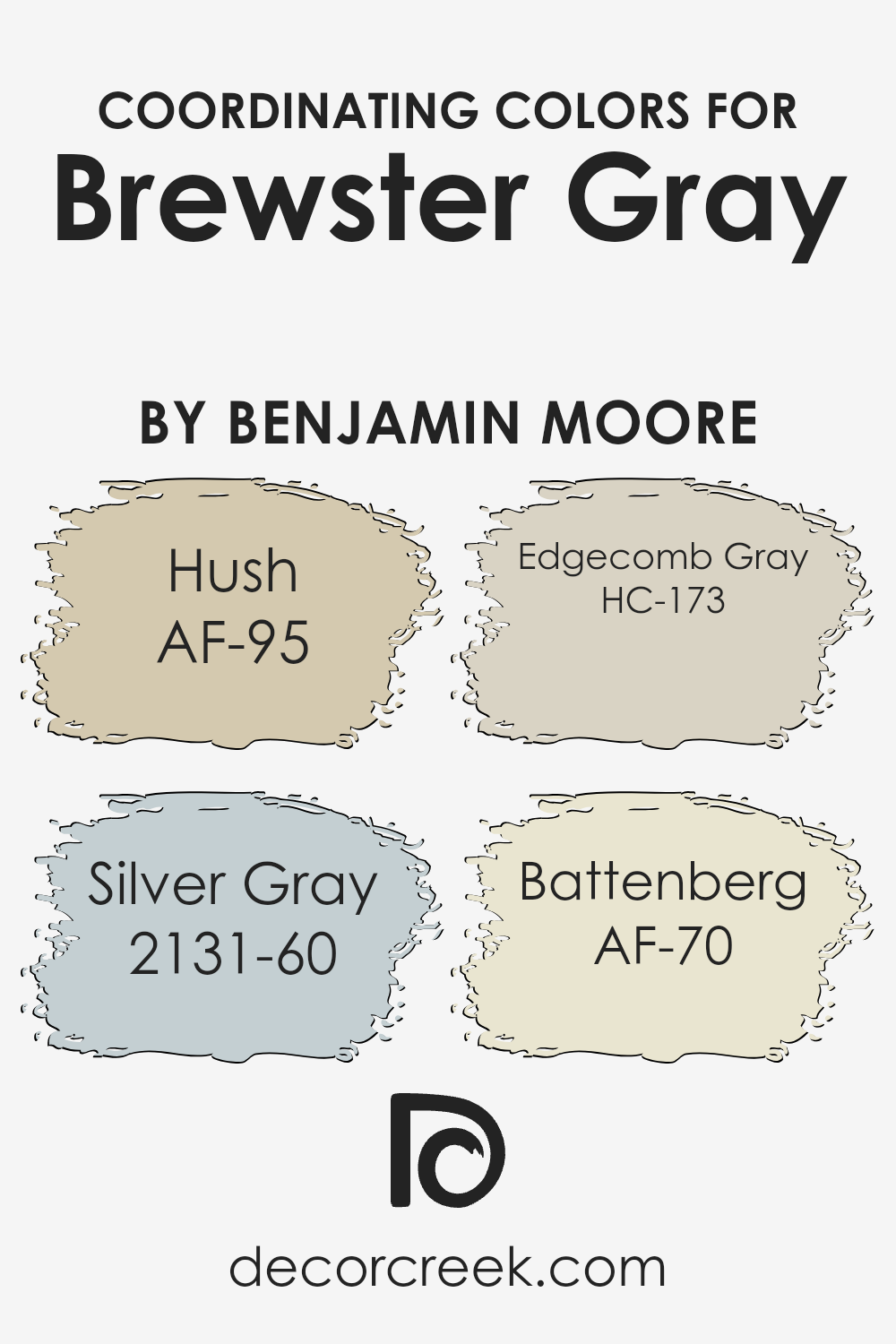
Coordinating Colors of Brewster Gray HC-162 by Benjamin Moore
Coordinating colors are hues that work well together, creating a harmonious and pleasing visual experience. They highlight the primary color’s qualities, bringing out its best features while adding depth to the room’s overall atmosphere. Brewster Gray, a Benjamin Moore color, is known for its soft, muted tone, and the coordinating colors help maintain a balanced and inviting space.
When choosing colors to pair with Brewster Gray, consider shades that complement its cool tones.
Hush (AF-95) is a warm, sandy beige that can add a touch of warmth to Brewster Gray, making a space feel more welcoming. Silver Gray (2131-60) is a soft, silvery shade that matches well with Brewster Gray, enhancing its calming effect and bringing out subtle blue undertones. Edgecomb Gray (HC-173) is a light greige that offers a gentle contrast, adding brightness and a modern feel to the space.
Meanwhile, Battenberg (AF-70) is a rich off-white that works beautifully as a neutral backdrop, allowing Brewster Gray to stand out without overpowering the room. Together, these colors create a palette that is both balanced and nuanced, offering a cohesive look for any interior space.
You can see recommended paint colors below:
- AF-95 Hush
- 2131-60 Silver Gray
- HC-173 Edgecomb Gray
- AF-70 Battenberg
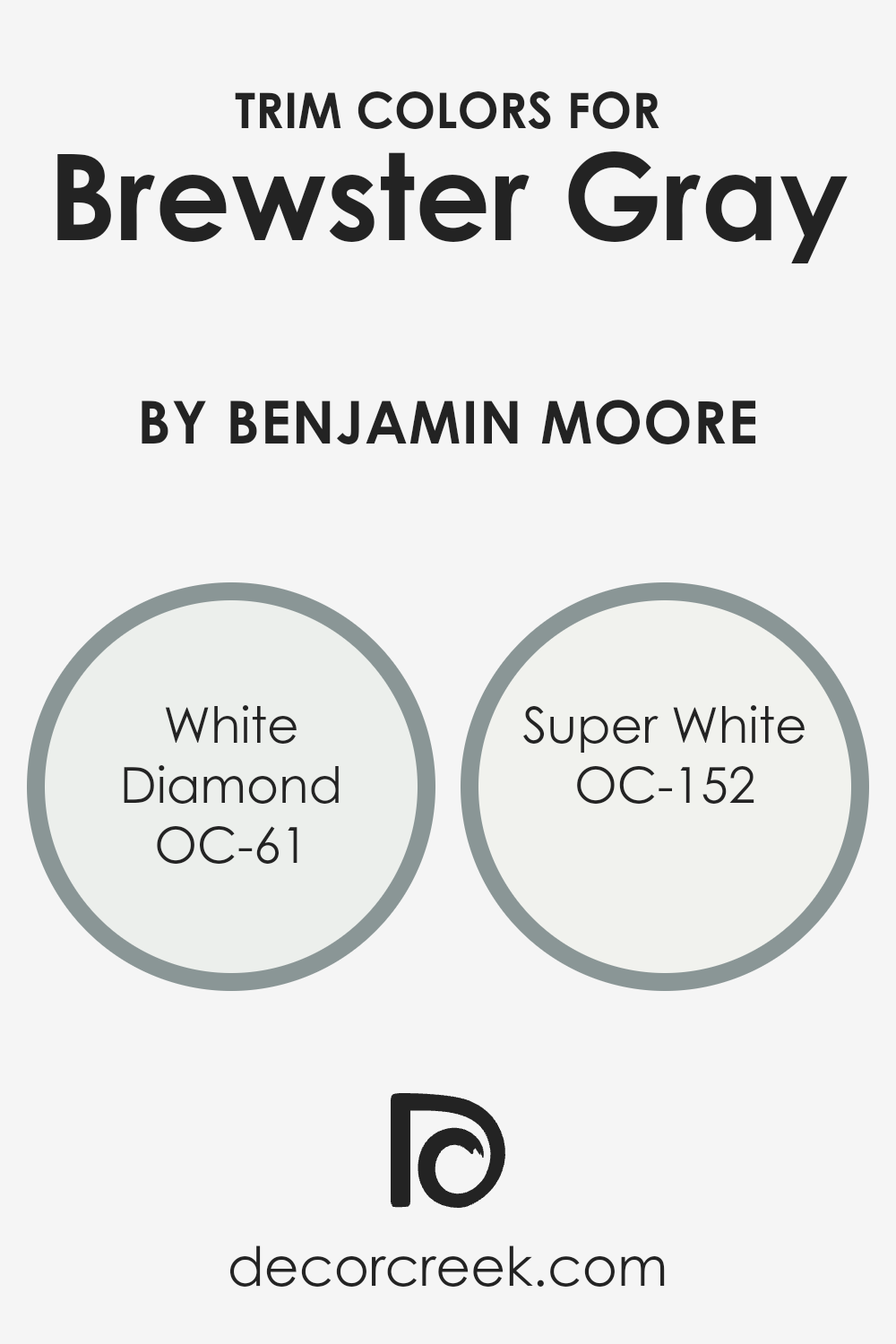
What are the Trim colors of Brewster Gray HC-162 by Benjamin Moore?
Trim colors are the colors used for the details and edges in a room, like around doors, windows, and baseboards. They are essential because they highlight these architectural features and create contrast with the wall color. For Brewster Gray, a popular medium gray from Benjamin Moore, choosing the right trim color can make the room look more polished and balanced.
White Diamond, with its clean and crisp appearance, works perfectly for a subtle and bright contrast, enhancing the gray walls without being too stark. Choosing the right trim color can enhance the overall look and feel of the room, making the individual elements stand out while maintaining a coherent and stylish appearance.
Super White, known for its brilliant and clean white tone, adds a fresh and modern touch to any space, making it an ideal choice as a trim color alongside Brewster Gray. Super White provides a classic and timeless look, adding crisp edges to the gray walls, making them appear sleek and uninterrupted.
Meanwhile, the softer touch of White Diamond allows for a more harmonious blend, offering a lighter contrast that subtly highlights the transitions between surfaces.
Both colors provide unique advantages depending on the desired look, but they each serve to brighten up the space and refine the Brewster Gray walls by bringing depth and clarity to the room’s architectural features.
You can see recommended paint colors below:
- OC-61 White Diamond
- OC-152 Super White
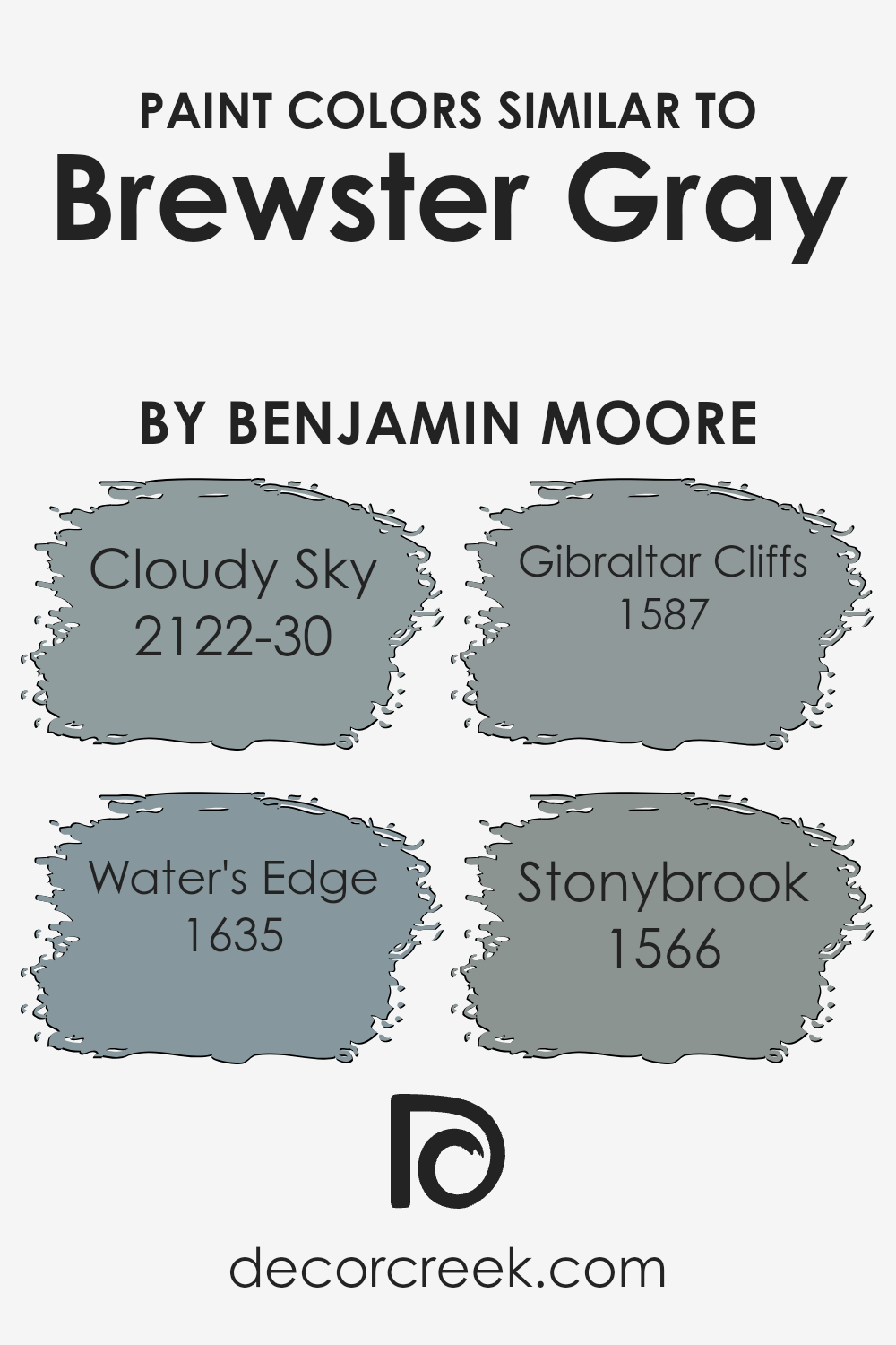
Colors Similar to Brewster Gray HC-162 by Benjamin Moore
Similar colors play a significant role in design and decorating because they create a cohesive and harmonious look. By using colors that are close to each other on the color wheel or palette, you can achieve a soothing and unified effect in a space. Brewster Gray HC-162 by Benjamin Moore is a classic color that lends itself well to various coordinating shades.
When you pair Brewster Gray with similar hues like Cloudy Sky, Water’s Edge, Gibraltar Cliffs, and Stonybrook, you create an inviting atmosphere that’s pleasing to the eye. These similar colors complement each other naturally, allowing each shade to shine without overpowering the others.
Cloudy Sky, for example, brings a soft, muted blue-gray tone that feels airy and refreshing. Water’s Edge introduces a touch of cool blue mixed with gray, offering a sense of calmness and depth. Gibraltar Cliffs adds a richer gray with subtle hints of blue, evoking a stony elegance. Meanwhile, Stonybrook brings in a gentle, earthy gray-green that provides a touch of warm balance.
Together, these colors allow for a versatile palette that can work across different rooms and styles, creating spaces that are both inviting and visually balanced.
You can see recommended paint colors below:
- 2122-30 Cloudy Sky
- 1635 Water’s Edge
- 1587 Gibraltar Cliffs
- 1566 Stonybrook
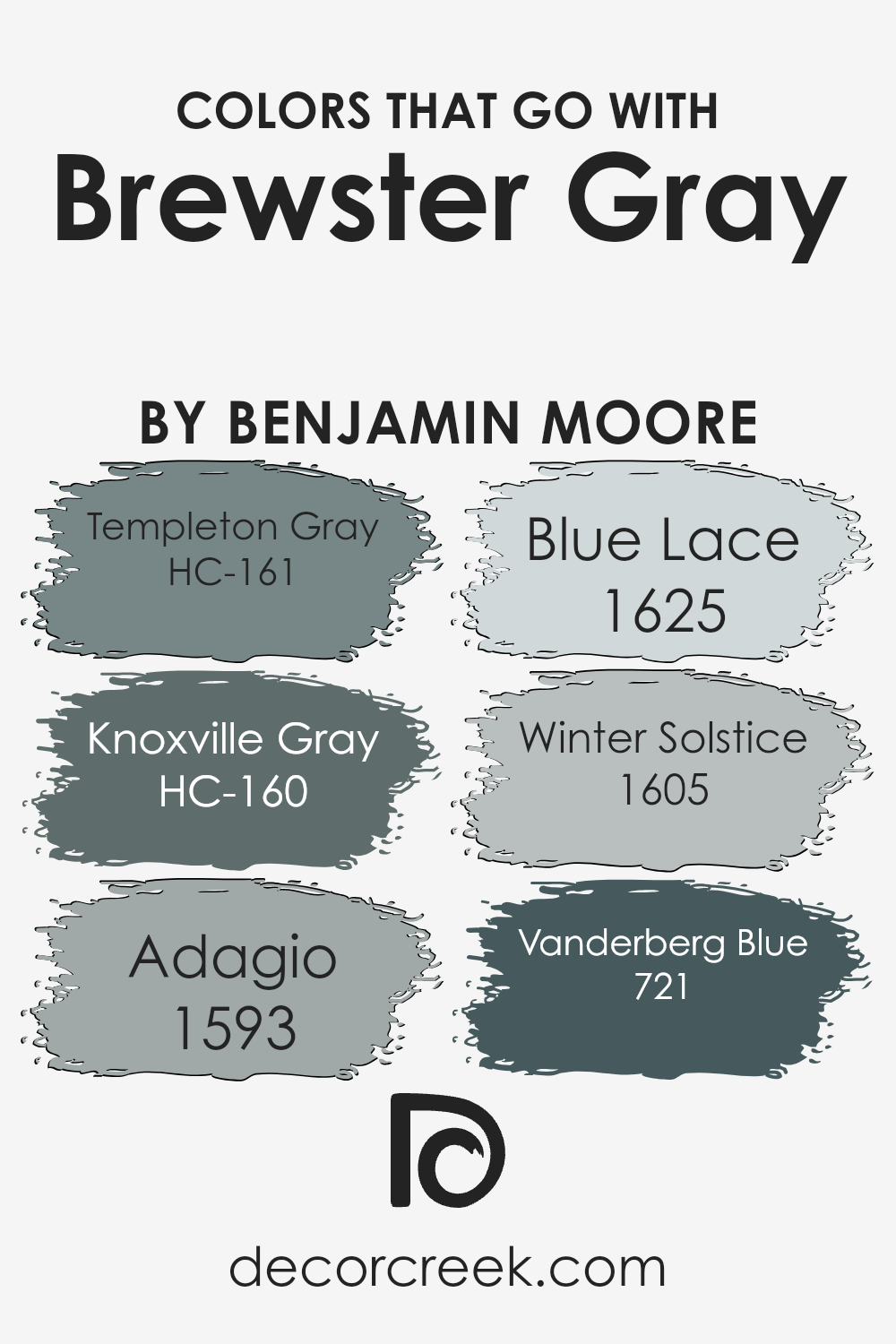
Colors that Go With Brewster Gray HC-162 by Benjamin Moore
Brewster Gray HC-162 by Benjamin Moore is a classic and versatile color that pairs beautifully with a range of complementary shades. Choosing the right colors to go with Brewster Gray can make your space feel more harmonious and connected. HC-161 Templeton Gray is a subdued shade with a slightly green undertone, offering a grounded yet expansive feel when paired with Brewster Gray.
In contrast, HC-160 Knoxville Gray has a deeper, more dramatic blue tone that adds richness and depth to a room. These grays provide a perfect backdrop that allows Brewster Gray to shine without overpowering the space.
For a lighter touch, consider pairing Brewster Gray with 1593 Adagio, a soft blue that mirrors the calmness of a clear sky. To add a hint of whimsy, 1625 Blue Lace introduces a gentle, airy feel with its lighter shades, creating a fresh, uplifting environment.
Meanwhile, 1605 Winter Solstice has a silvery tone that echoes the stillness of a cool winter day, bringing a subtle, calm feel to your space. For a bolder choice, 721 Vanderberg Blue is a rich, navy color that can anchor the room while perfectly complementing the medium tones of Brewster Gray.
These combinations work together to create a balanced and inviting atmosphere.
You can see recommended paint colors below:
- HC-161 Templeton Gray
- HC-160 Knoxville Gray
- 1593 Adagio
- 1625 Blue Lace
- 1605 Winter Solstice
- 721 Vanderberg Blue
How to Use Brewster Gray HC-162 by Benjamin Moore In Your Home?
Brewster Gray HC-162 by Benjamin Moore is a versatile paint color that can add a touch of elegance to any room in your home. This shade of gray is both calming and neutral, making it a great choice for various interior spaces. You might consider using Brewster Gray in your living room to create a cozy and inviting atmosphere. It pairs well with both modern and traditional furniture styles.
In the bedroom, Brewster Gray can help create a restful environment. Pair it with white bedding and wooden accents for a clean and classic look. For the kitchen, this gray can provide a subtle backdrop, allowing colorful utensils or vibrant decor pieces to stand out.
You can also use Brewster Gray in a home office to promote focus and clarity. Its neutral tone works well with a range of colors, so feel free to add pops of color through accessories like curtains, rugs, or artwork.
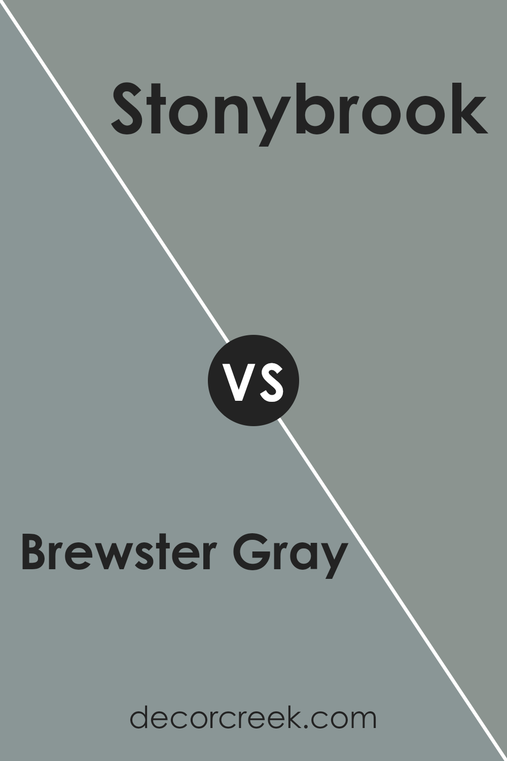
Brewster Gray HC-162 by Benjamin Moore vs Stonybrook 1566 by Benjamin Moore
Brewster Gray and Stonybrook are both versatile gray shades from Benjamin Moore, but they have distinct differences. Brewster Gray is a medium-toned gray that offers a balanced blend of warm and cool undertones. It’s a solid choice for creating a neutral backdrop that works well in various settings. It provides a cozy and inviting atmosphere, making it ideal for living rooms or bedrooms.
On the other hand, Stonybrook is slightly lighter with subtle green undertones. This gives it a softer and more airy feel compared to Brewster Gray. Stonybrook can brighten up a space while still maintaining a calm and relaxed environment. It’s perfect for areas where you want a hint of color without being overwhelmed.
Choosing between these colors depends on the mood you want to set. For a richer, more enveloping space, Brewster Gray might be the way to go, whereas Stonybrook offers a lighter, more refreshing touch.
You can see recommended paint color below:
- 1566 Stonybrook
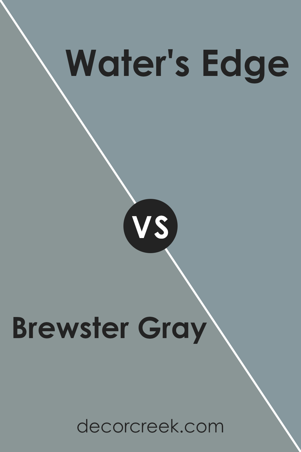
Brewster Gray HC-162 by Benjamin Moore vs Water’s Edge 1635 by Benjamin Moore
Brewster Gray and Water’s Edge are both popular choices from Benjamin Moore, known for their versatility in interior design. Brewster Gray is a timeless gray that leans slightly towards a blue undertone, making it a classic and reliable neutral. It pairs well with a variety of other colors and materials, whether it’s wood tones or bright accents, making it ideal for living rooms or dining areas.
Water’s Edge, on the other hand, is a softer, more soothing blue with subtle gray hints. It brings a coastal feel and works well in bedrooms or bathrooms, creating a calming atmosphere. While Brewster Gray tends to be more grounded and solid, Water’s Edge offers a touch of airy lightness.
Both colors can complement each other in a space but have distinct moods—Brewster Gray is more structured, while Water’s Edge is relaxed and refreshing.
You can see recommended paint color below:
- 1635 Water’s Edge
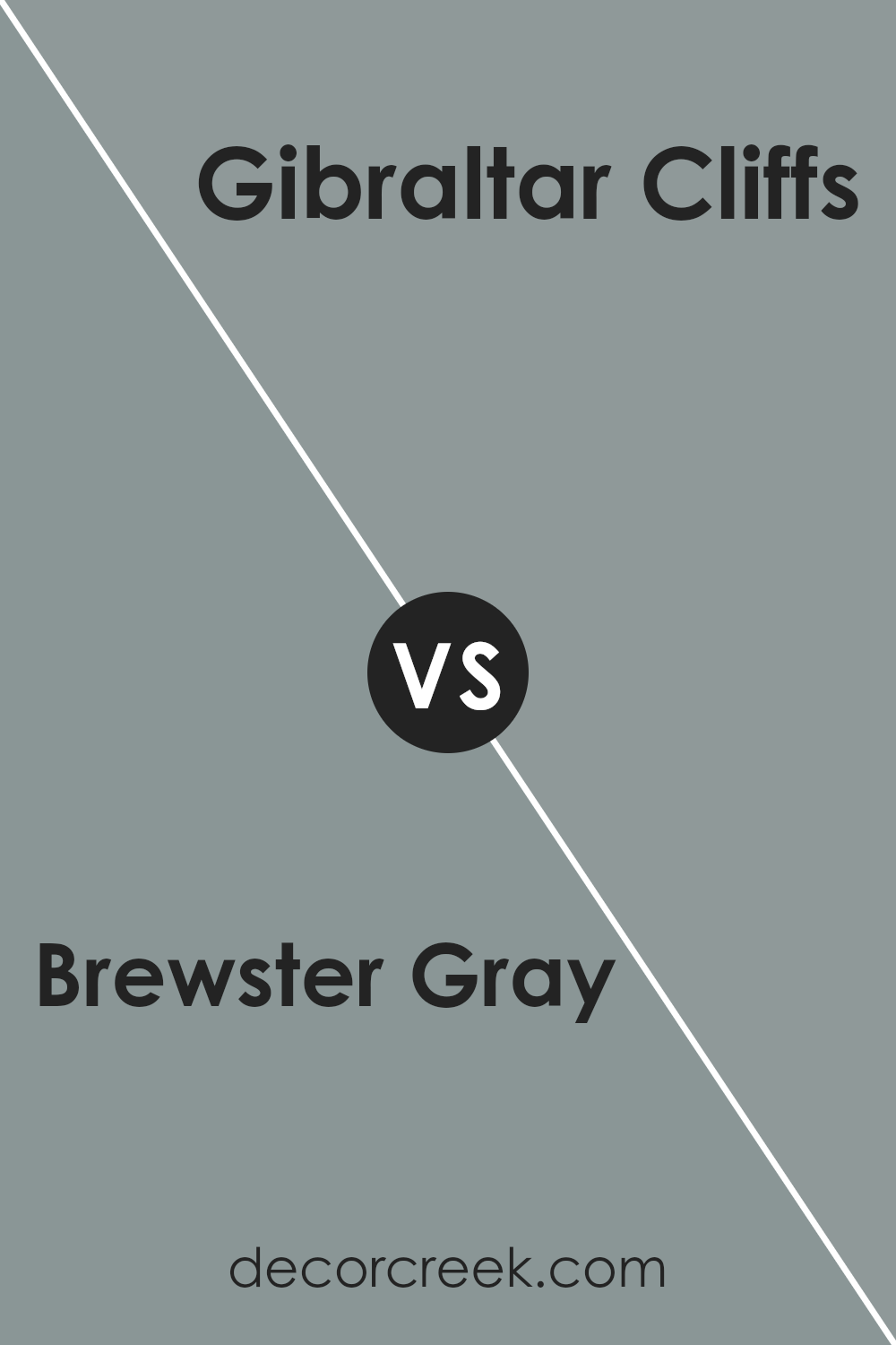
Brewster Gray HC-162 by Benjamin Moore vs Gibraltar Cliffs 1587 by Benjamin Moore
Brewster Gray HC-162 and Gibraltar Cliffs 1587 are two popular gray shades from Benjamin Moore. Brewster Gray has a classic and balanced gray tone with subtle blue undertones. It’s versatile and pairs well with many other colors, making it suitable for a variety of spaces. Its soft appearance can create a calming atmosphere in any room.
On the other hand, Gibraltar Cliffs 1587 is a deeper and richer gray. It has stronger blue undertones compared to Brewster Gray and can add a more dramatic feel to a space. It’s ideal for adding contrast and depth, often used in accent walls or as a backdrop to highlight other elements in a room.
In summary, if you prefer a lighter and more neutral gray, Brewster Gray is the way to go. For a bolder, more intense gray with a hint of blue, Gibraltar Cliffs might be more appealing.
You can see recommended paint color below:
- 1587 Gibraltar Cliffs
Brewster Gray HC-162 by Benjamin Moore vs Cloudy Sky 2122-30 by Benjamin Moore
Brewster Gray (HC-162) and Cloudy Sky (2122-30) are both popular shades from Benjamin Moore, but they offer different vibes. Brewster Gray is a medium-toned gray with a cool blue undertone. It’s a versatile color that can work well in different settings, from living rooms to bedrooms. It tends to give spaces a calm and relaxed feel, making it a good choice for areas where you want to unwind.
Cloudy Sky, on the other hand, is a bit darker and has a stronger blue presence. While it’s also a gray, the blue is more pronounced, making it feel a bit more dramatic and bold. This color is great if you want to make a statement or add depth to a room. It pairs well with lighter accents and can create a cozy, intimate atmosphere.
Both colors offer a touch of elegance, but your choice will depend on whether you prefer a balanced gray or a more pronounced blue-gray.
You can see recommended paint color below:
- 2122-30 Cloudy Sky
Conclusion
Brewster Gray is a special shade of gray that people really seem to like. It’s the kind of color that can fit in lots of different places, making rooms look nice and calm. It’s like a friendly color that doesn’t shout but rather speaks softly, adding just the right touch to any room.
I learned that Brewster Gray can make a room feel cozy and comfortable whether you put it on the walls of a bedroom, a living room, or even a kitchen. It pairs well with other colors and different kinds of furniture, helping everything look just right together.
It’s one of those colors that seems simple but can make a big difference in how a room feels.
This color isn’t too bright or too dark, and that balance is what makes it so popular. People say it helps create a nice feeling in their homes, making Brewster Gray a go-to choice for many who want a fresh look without making things too flashy.
All in all, it seems like Brewster Gray is a great pick for anyone wanting their rooms to be nice and welcoming.
Ever wished paint sampling was as easy as sticking a sticker? Guess what? Now it is! Discover Samplize's unique Peel & Stick samples.
Get paint samples

