Introducing the OC-152 Super White by Benjamin Moore, a paint color that’s been catching the eyes of homeowners and professional decorators alike. If you’re searching for a shade of white that stands out for its clarity and brightness, this might be the perfect pick for your next project.
Unlike some whites that can feel cold or sterile, Super White brings a sense of warmth and openness to spaces, making it a versatile choice for any room in your house. Whether you’re looking to freshen up a cozy corner or give your entire home a light and airy feel, OC-152 has the potential to transform your space with its pure and inviting vibe.
This color is not just about looks; it’s also about how it makes your space feel more welcoming and bigger.
Super White is favored for its ability to reflect light, making it a go-to for those wanting to enhance the natural light in their rooms. From sleek modern kitchens to serene and peaceful bedrooms, OC-152 Super White by Benjamin Moore proves to be a timeless selection that pairs well with a wide array of decor styles and other colors.
If a fresh, clean, and luminous ambiance is what you’re aiming for, taking a closer look at Super White might just be the start of your next exciting home makeover project.

What Color Is Super White OC-152 by Benjamin Moore?
The color Super White OC-152 by Benjamin Moore stands out as an exceptionally pure and clean shade of white. This color brings a sense of brightness and expansiveness to any room, highlighting other elements in the interior without overwhelming them. Its versatility is one of its strongest points, allowing it to blend seamlessly into a variety of interior styles.
Super White works particularly well in minimalistic designs, where its simplicity can be the foundation of the decor, giving a sense of calm and order. It also fits perfectly within modern and contemporary spaces, providing a crisp backdrop that makes colors and textures pop.
In terms of pairing with materials and textures, Super White is quite accommodating. It pairs beautifully with natural wood, from light oak to darker walnut, enhancing the warmth and texture of the wood grain.
Metal finishes, whether brushed nickel, polished chrome, or matte black, stand out crisply against this white, making it a fantastic choice for modern kitchens and bathrooms.
It also works well with soft textiles in both bold and pastel shades, allowing for flexibility in decorating with fabrics. Glass and mirrored surfaces reflect light against Super White walls, amplifying the brightness of a space, making it feel larger and more open. Its ability to adapt and enhance makes Super White a go-to color for creating bright, airy, and inviting spaces.
Ever wished paint sampling was as easy as sticking a sticker? Guess what? Now it is! Discover Samplize's unique Peel & Stick samples.
Get paint samples
Is Super White OC-152 by Benjamin Moore Warm or Cool color?
Super White OC-152 by Benjamin Moore is a bright, crisp color that has the power to transform any room in your home. This shade of white is incredibly versatile, making it an excellent choice for creating a clean and fresh look. Its purity acts like a blank canvas, allowing other elements in the room, like furniture and art, to really stand out.
This color is particularly effective in smaller spaces or rooms with limited natural light, as it reflects light well, making spaces appear more open and airy. In larger areas, Super White can give a seamless look, enhancing the sense of unity and flow throughout the house.
It’s not just about aesthetics, though. Choosing Super White can also have a calming effect, creating a peaceful and tranquil environment. This is ideal for living areas and bedrooms where comfort is key.
Additionally, this color is timeless, ensuring your home looks stylish and bright for years to come without feeling the need to frequently update your walls to keep up with trends.
Undertones of Super White OC-152 by Benjamin Moore
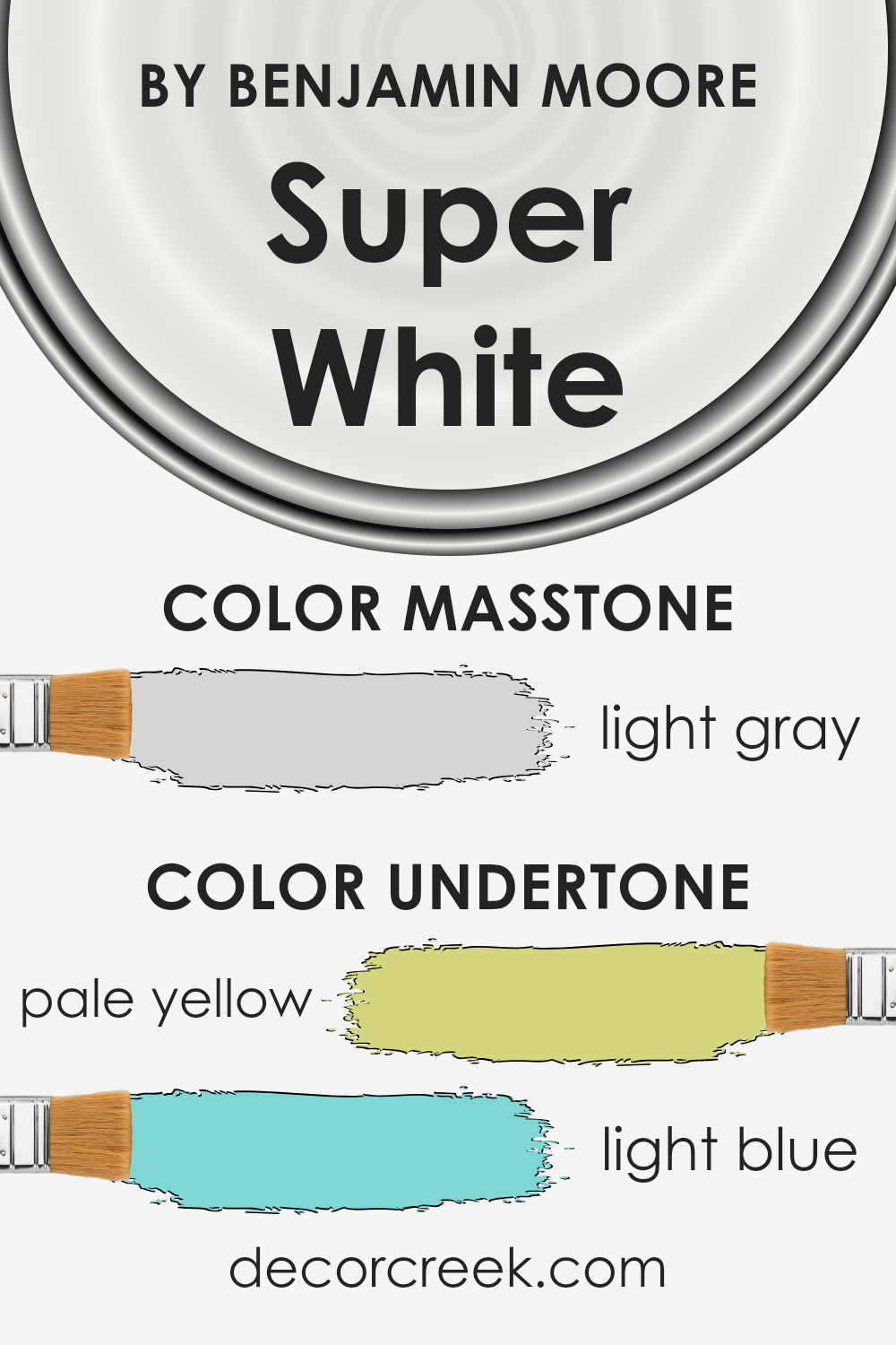
Super White by Benjamin Moore is a popular paint choice for those wanting a crisp, bright white for their interior spaces. However, what’s interesting about this color is its subtle undertones, specifically pale yellow and light blue. Undertones in paint colors are like hidden colors that are not immediately visible but can influence how the main color looks under different lighting conditions or when paired with other colors.
The pale yellow undertone in Super White adds a hint of warmth to the color. This means that in spaces with plenty of natural sunlight, the walls can appear slightly warmer, inviting, and softer, avoiding the starkness sometimes associated with pure white. On the other hand, the light blue undertone introduces a hint of coolness, which can make the color feel fresh and airy in less lit areas or when the natural lighting is less warm, such as in northern-facing rooms.
When used on interior walls, Super White’s blend of undertones means the color can subtly shift in appearance throughout the day. In the morning or under bright lighting, the walls might lean towards a warmer, softer white, thanks to the pale yellow.
In contrast, in the afternoon or in spaces with cooler light, the light blue might become slightly more pronounced, giving the room a crisp and refreshing vibe.
Understanding these undertones is crucial because it helps in choosing the right color for your space, ensuring that the paint complements the room’s natural lighting and your décor. It’s this interplay of subtle colors within Super White that enhances its versatility and appeal, making it a favored choice for creating bright, welcoming, and well-balanced interior spaces.
What is the Masstone of the Super White OC-152 by Benjamin Moore?
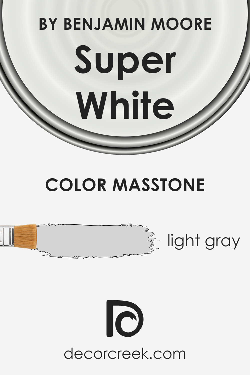
Super White OC-152 by Benjamin Moore looks like it has a masstone of light gray (#D5D5D5). This subtle hue influences its appearance and use in homes in a unique way. When you think of white, you might expect a stark, bright shade. However, with a hint of gray, Super White gets a soft, soothing quality. This makes it incredibly versatile for decorating.
It’s perfect for spaces where you want to add brightness without the harshness that some pure whites can bring. In rooms with a lot of natural light, it takes on a luminous quality, reflecting light in a way that makes spaces seem larger and airier.
In areas with less light, the gray undertone helps the color remain warm and inviting, avoiding the clinical feel that sometimes comes with true whites.
Because of these qualities, Super White works well across various styles and settings. It’s a great choice for walls, trims, and ceilings, providing a clean and cohesive look that compleases the space without overwhelming it.
How Does Lighting Affect Super White OC-152 by Benjamin Moore?
Lighting plays a crucial role in how we perceive colors in our environments. The color Super White by Benjamin Moore is a great example to explore how different types of light can affect the appearance of color in a space. Lighting conditions can enhance, diminish, or alter the color’s purity and vibrancy, making understanding these effects essential when choosing paint for your interiors.
- In artificial light, colors can appear differently depending on the type of bulbs used. LED or fluorescent lighting can make Super White look brighter and more pristine because these lights often mimic the clarity of natural daylight. However, in warmer, dimmer light, such as that from incandescent bulbs, Super White may take on a slightly softer, creamy tone. This is due to the yellowish hue that incandescent bulbs emit, which can blend with the paint color, reducing its crispness.
- Natural light brings its own set of variations to how Super White is perceived. The direction a room faces significantly influences this effect. In north-faced rooms, which receive less direct sunlight, Super White tends to display a cooler, more consistent shade throughout the day but might seem a bit starker and less warm. South-faced rooms bathe in abundant sunlight, making Super White appear brighter and more radiant, enhancing its crisp, clean qualities.
- In east-faced rooms, Super White will be touched by the warm tones of the morning sun, giving the space a soft, inviting glow in the early hours. However, as the day progresses, the color may lose some of its warmth and look more neutral or cooler. West-faced rooms experience the reverse; the color will appear cooler in the morning and then be enveloped in the warm, golden hues of the setting sun in the afternoon and evening, creating a cozy atmosphere.
Understanding these effects can help ensure that when you use a color like Super White, you can achieve the desired impact in your space, regardless of the lighting conditions.

What is the LRV of Super White OC-152 by Benjamin Moore?
LRV stands for Light Reflectance Value, which is a measurement that tells us how much light a color reflects or absorbs once it’s applied to a wall. This value is measured on a scale from 0 to 100, with 0 being completely black (absorbing all light) and 100 being pure white (reflecting all light). Understanding LRV is crucial because it can significantly affect the visual perception of a room.
A higher LRV means that a color will reflect more light, making a room feel brighter and larger. Conversely, a lower LRV color will absorb more light, which can make a space appear cozier but smaller or darker.
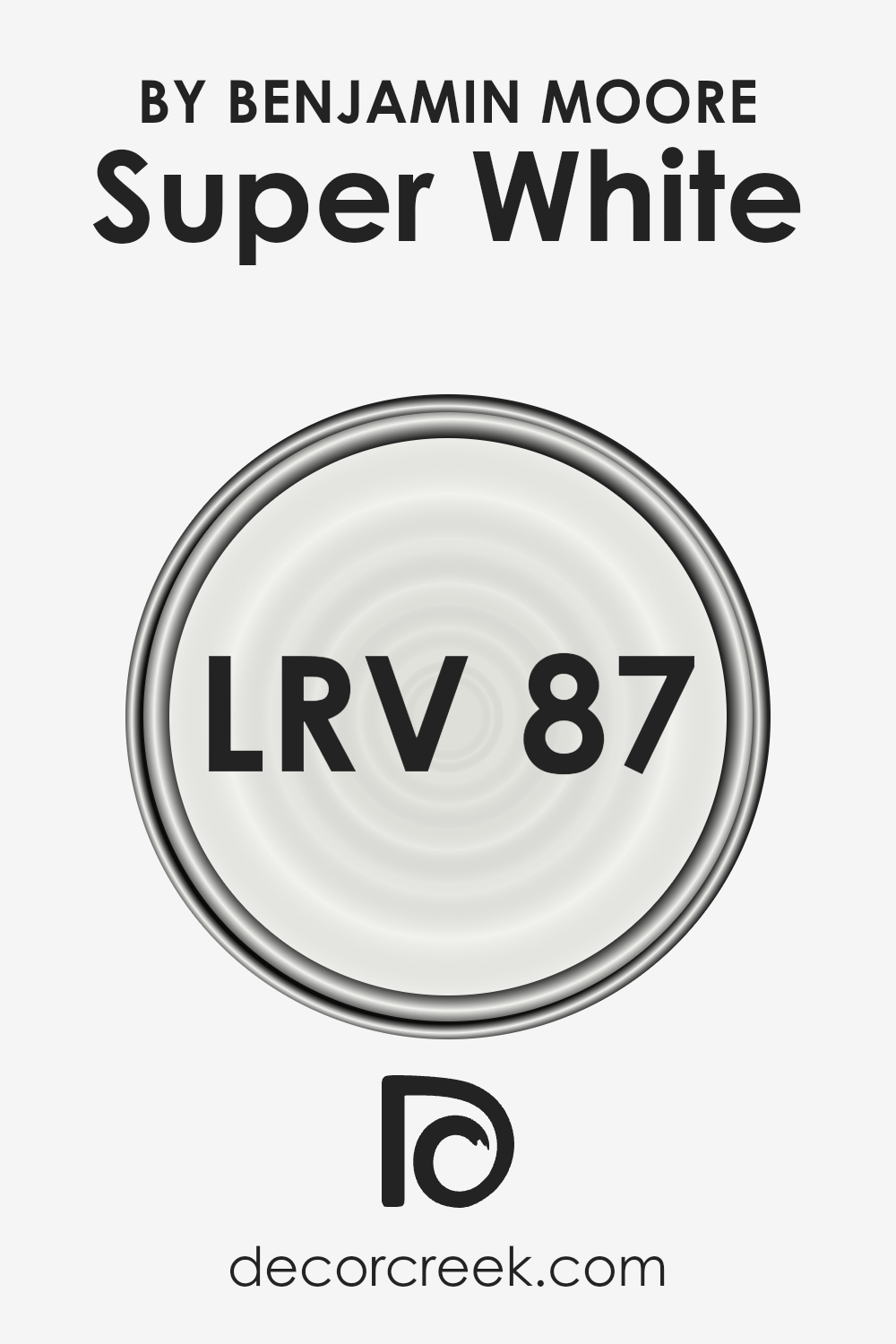
With an LRV of 87.36, Super White OC-152 by Benjamin Moore falls into the category of colors that reflect a lot of light. This means that when you use it on your walls, it’s likely to make your room feel airy, open, and bright.
This particular shade of white can help maximize the natural light in a room, making it feel more inviting and spacious. Even in spaces that receive less natural light, its high LRV can help in making the room appear illuminated. It’s an excellent choice for anyone looking to freshen up their space with a clean, vibrant look, without overpowering the room with too much brightness.
Coordinating Colors of Super White OC-152 by Benjamin Moore
Coordinating colors are hues that complement each other when used together in design and décor. They enhance the overall aesthetic of a space, creating balance and harmony. These colors, carefully selected, can bring out the best in each other and in the room they’re used in.
When we talk about coordinating colors, especially for a paint like Benjamin Moore’s Super White, we’re discussing shades that can either contrast beautifully or blend subtly with this crisp, clean white to achieve a desired atmosphere.
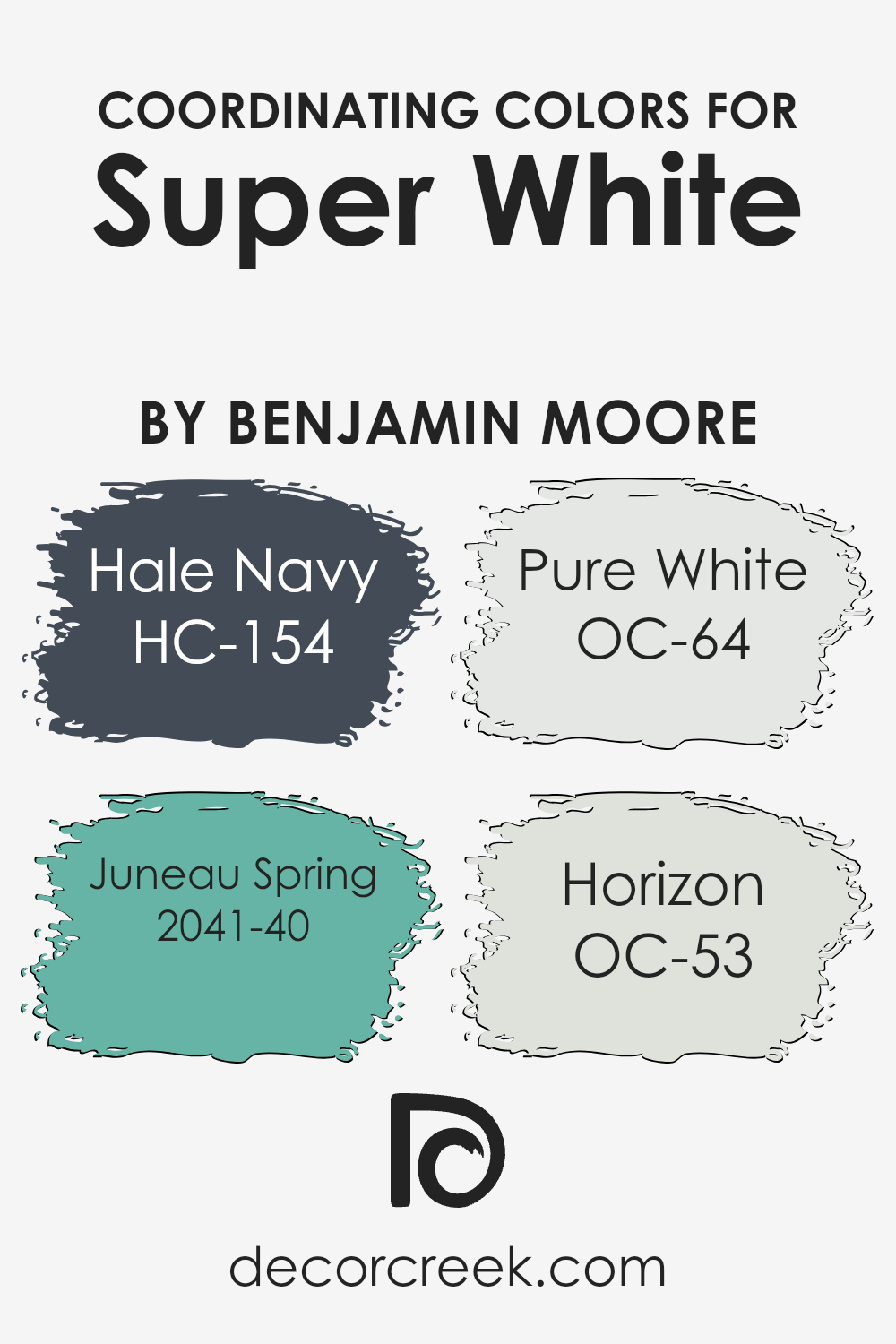
Hale Navy HC-154 is a profound, rich navy that offers an elegant contrast to Super White, bringing a sense of sophistication and depth to any space. Its strong presence can anchor a room, making it ideal for accent walls or statement furniture.
Juneau Spring 2041-40, on the other hand, is a lively, fresh green that injects vibrancy and life into a room. It creates a soft, nature-inspired palette when paired with Super White, perfect for spaces intended to feel refreshing and energetic. Pure White OC-64 is another coordinating color that offers a subtle variation to Super White. It helps in creating a nuanced, layered white-on-white effect, adding texture and depth without stark contrast.
Lastly, Horizon OC-53 is a soft, airy gray with blue undertones that provides a serene and tranquil vibe. It works beautifully with Super White to create a calm, cohesive look, ideal for a peaceful retreat in a home. Together, these coordinating colors offer a range of possibilities to enhance the beauty and feeling of any space.
You can see recommended paint colors below:
- HC-154 Hale Navy (CHECK A SAMPLE)
- 2041-40 Juneau Spring (CHECK A SAMPLE)
- OC-64 Pure White (CHECK A SAMPLE)
- OC-53 Horizon
What are the Trim colors of Super White OC-152 by Benjamin Moore?
Trim colors are essentially the hues chosen for the architectural elements and accents of a home or a room, such as door frames, window sills, skirting, and crown molding. The right trim colors can beautifully frame a wall color, creating a cohesive look that highlights the architectural features of a space.
For a bright and crisp color like Super White by Benjamin Moore, selecting complementary trim colors is crucial to enhance its clean and refreshing appeal without overwhelming it. Trim colors serve as a subtle boundary that can make wall colors pop and give a finished look to a room.
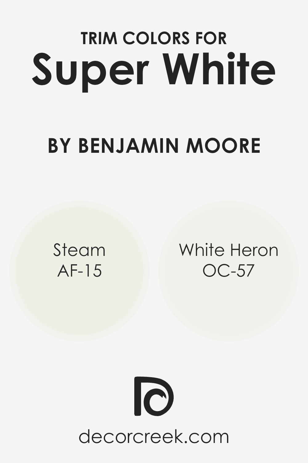
AF-15, known as Steam, is a soft, almost ethereal white with a slight warmth to it, offering a gentle transition from the pristine nature of Super White. It’s subtle enough to not draw attention away from the main color but adds a layer of sophistication and depth. OC-57, or White Heron, on the other hand, is a crisp, clean white with a hint of coolness, providing a sharp, but not stark, contrast to Super White.
This pairing brings a fresh and airy feel to the space, enhancing the brightness without creating a sterile environment, and maintaining a harmonious balance that’s pleasing to the eye.
You can see recommended paint colors below:
- AF-15 Steam (CHECK A SAMPLE)
- OC-57 White Heron (CHECK A SAMPLE)
How to Use Super White OC-152 by Benjamin Moore In Your Home?
Super White OC-152 by Benjamin Moore is a fantastic paint color that can brighten up any space in your home. It’s like the perfect white that’s not too cool or too warm. Imagine it as a fresh start for your walls, making your rooms look clean, spacious, and inviting. You can use this color in so many ways!
In your living room or bedroom, it can create a calm and peaceful vibe, giving you the perfect backdrop to add your personal touch with art, furniture, and decor. It’s like a blank canvas waiting for your ideas. In the kitchen, Super White can make the space look clean and modern, no matter the style of your cabinets or countertops. If you have a small room or hallway, painting it Super White can help reflect light, making the area feel bigger and brighter.
It’s super versatile, so whether you’re looking to refresh your home office or give your bathroom a spa-like feel, Super White OC-152 can definitely help you achieve the look you want. It’s a simple change that can make a big difference in how your home feels.
Conclusion
In conclusion, Super White by Benjamin Moore stands out as a top choice for anyone looking to brighten up their space with a clean, vivid shade of white. Its ability to reflect light makes it perfect for making rooms appear larger and more inviting, catering to a variety of decorating styles and preferences.
This color’s versatility and timeless nature ensure that it can seamlessly integrate into any room, whether it’s to create a striking contrast with bold hues or to achieve a minimalist aesthetic.
Moreover, the durability and quality that come with Benjamin Moore paints mean that choosing Super White is not just about aesthetics but also about investing in a long-lasting finish.
It’s clear that this paint color is well-suited for those seeking to refresh their interiors with a crisp, modern look while enjoying the peace of mind that comes from using a product from a trusted brand. Whether it’s used for an entire room or as an accent, Super White has proven to be a reliable and stylish choice.

Ever wished paint sampling was as easy as sticking a sticker? Guess what? Now it is! Discover Samplize's unique Peel & Stick samples.
Get paint samples


