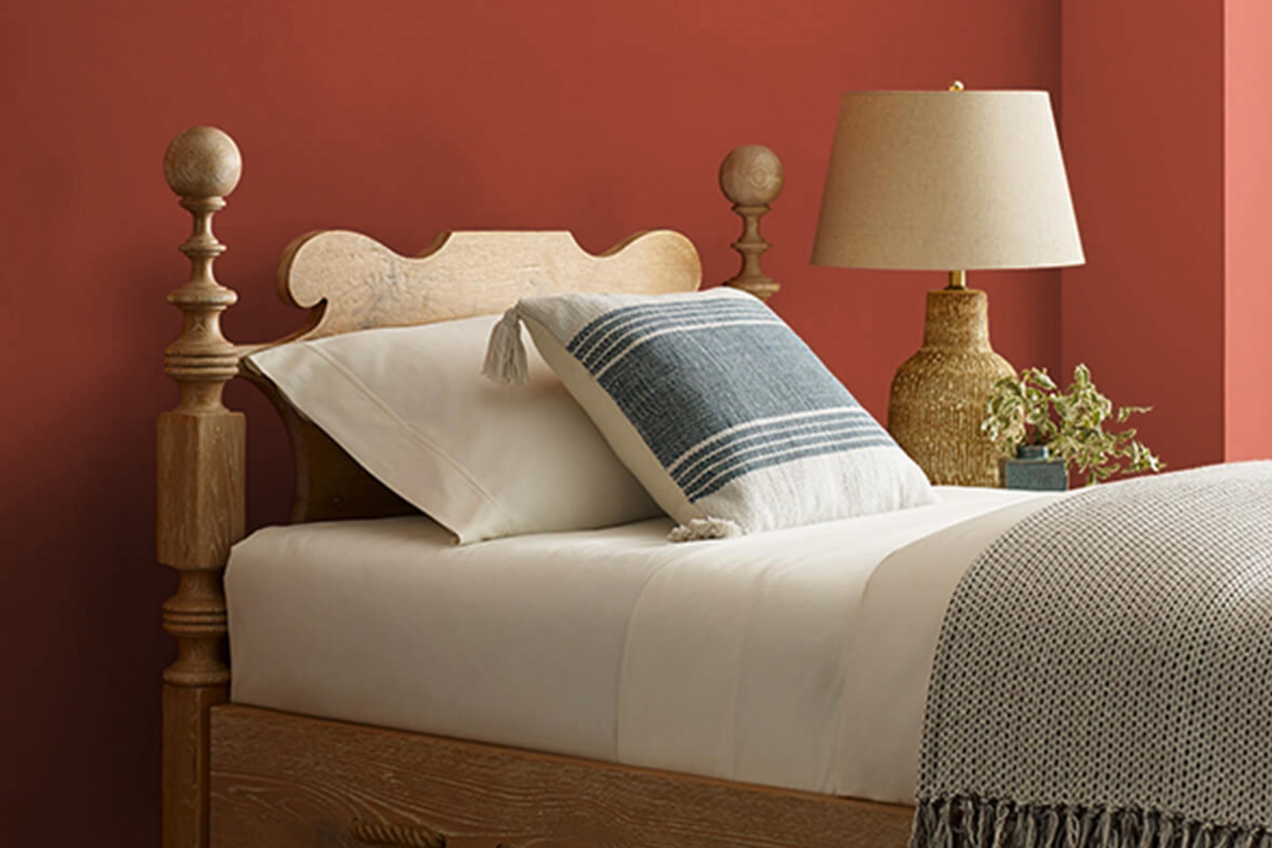
When I think about colors that bring a warm, inviting feeling to a space, SW 7599 Brick Paver by Sherwin Williams stands out. Imagine a cozy autumn afternoon, with leaves rustling underfoot as you walk down a tree-lined path. That’s the mood this color evokes. It has a rich, earthy tone that reminds me of traditional brickwork, yet it can feel modern, too.
I find Brick Paver to be incredibly versatile. It pairs beautifully with neutral shades, like creams and soft grays, creating a balanced, soothing atmosphere. At the same time, it can stand boldly on its own, adding depth and character to a room.
Whether you’re painting an accent wall, revamping an entire room, or adding a touch of color to furniture, this shade offers a timeless charm.
The thing I appreciate most about Brick Paver is how it adapts to different lighting. In natural daylight, it appears vibrant and full of life.
Under warm indoor lighting, it takes on a cozy, enveloping hue. For any space in need of warmth and personality, SW 7599 Brick Paver is a color worth considering.
What Color Is Brick Paver SW 7599 by Sherwin Williams?
Brick Paver SW 7599 by Sherwin Williams is a warm, earthy red with hints of brown and orange, reminiscent of classic brick colors. This color has a rich, grounded feel and can bring warmth and coziness to a room. It works wonderfully in rustic or traditional interior styles, where its natural tones complement wooden beams, leather furniture, and stone elements.
For a more modern twist, Brick Paver can also be used in industrial settings, pairing nicely with exposed steel, concrete floors, and reclaimed wood. This color can add a touch of warmth and balance out cool, industrial elements.
Brick Paver pairs well with a variety of materials and textures. It complements earthy materials like terracotta or ceramic tiles, and natural fabrics like linen or wool.
In a room with lots of natural light, it can be a beautiful accent wall color, grounding the space and providing a warm backdrop for art or bookshelves.
It also pairs beautifully with deep greens or muted navy blues for a more dramatic look, or with soft creams and whites for a more subtle, cozy vibe. Whether used in a living room, dining area, or even in a cozy kitchen, Brick Paver brings a touch of warmth and a sense of comfort to any space.
Is Brick Paver SW 7599 by Sherwin Williams Warm or Cool color?
Brick Paver SW 7599 by Sherwin Williams is a warm, rich shade of red that brings a sense of coziness and comfort to any space. This color works well in homes because it creates an inviting atmosphere, making rooms feel welcoming and full of life. It’s an excellent choice for accent walls, adding a bold touch without overwhelming the entire room.
In living rooms, Brick Paver can make the space feel cozy and ideal for relaxation. In dining areas, it can add warmth and encourage conversation.
This color pairs beautifully with neutral tones like beige, taupe, or cream, highlighting its warmth while keeping the overall look balanced. Additionally, it works well with natural materials like wood and stone, enhancing an earthy, grounded feel in the home.
Whether used as a statement piece or a subtle accent, Brick Paver SW 7599 adds character and warmth to home interiors.
Undertones of Brick Paver SW 7599 by Sherwin Williams
Brick Paver SW 7599 by Sherwin-Williams is a rich, warm color that has a lot going on beneath the surface. When you think about a color like this, you have to consider its undertones. Undertones are the subtle hints of other colors mixed in with the main color, and they can change how we perceive it.
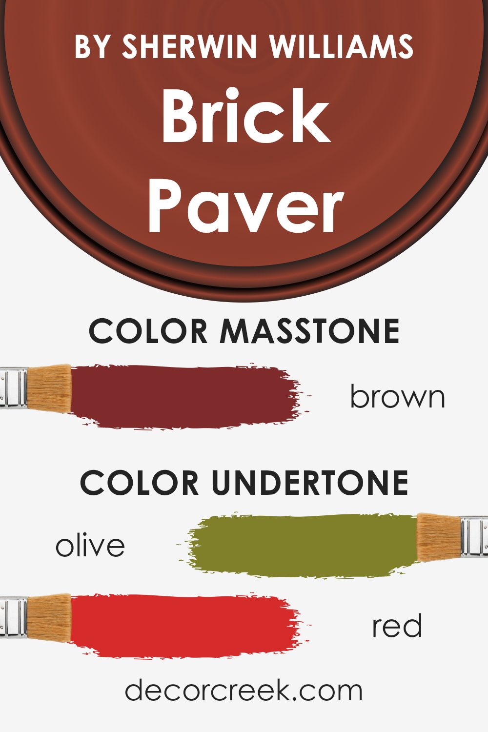
For Brick Paver, you have a mix of undertones like olive, red, purple, orange, grey, pink, dark grey, pale pink, dark green, navy, and dark turquoise. These undertones create a complex background that influences whether the main color looks warmer or cooler, darker or lighter.
For example, red and orange undertones make it warmer, while grey and dark grey bring in a touch of coolness and neutrality.
When Brick Paver is used on interior walls, these undertones can affect the mood of a room. The red and orange hints make the space feel cozy and inviting, perfect for living rooms or kitchens where warmth is welcome.
The grey and dark tones give it a more grounded feel, which can add depth to the room without being overwhelming. Meanwhile, hints of purple and pink offer subtle vibrancy, adding character without being too bold. These shifts give the paint richness and versatility, making it a great choice for various settings.
What is the Masstone of the Brick Paver SW 7599 by Sherwin Williams?
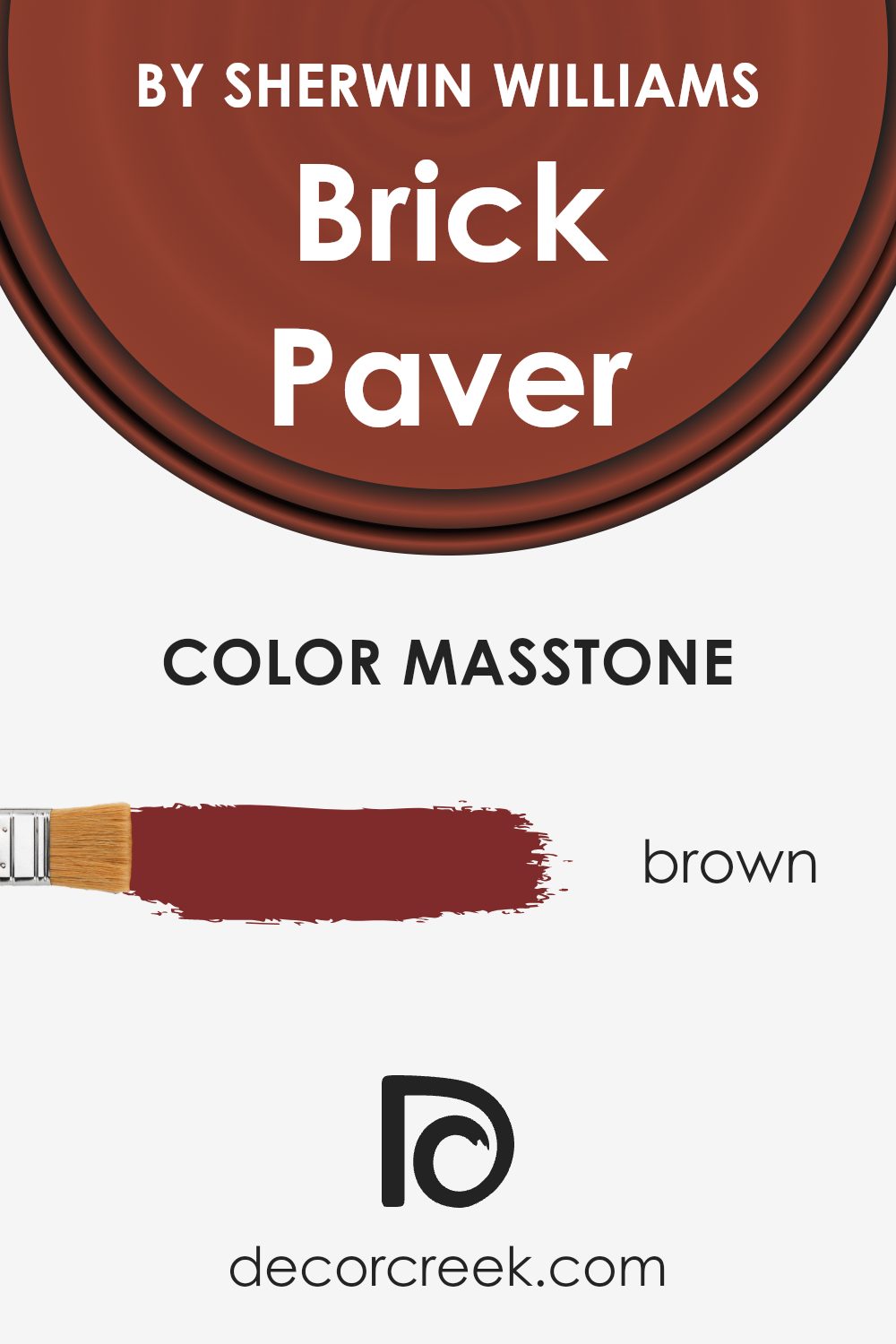
Brick Paver (SW 7599) by Sherwin-Williams is a rich brown color that can add warmth and depth to any room. The masstone of this color is a strong brown, which helps create a cozy and inviting atmosphere. In homes, this color works well in spaces where you want to feel relaxed and grounded, such as living rooms or dining areas.
It pairs well with neutral accents like beige, cream, and soft greys, which can help balance its deep tone.
Using Brick Paver on walls can make a room feel more intimate and connected, especially in larger spaces where you want to create a sense of warmth. It can also be used as an accent color, providing a strong contrast when used with lighter shades.
Adding textures, like wooden furniture or soft fabrics, complements its natural feel and brings out the richness of this brown hue, making it versatile for various interior styles.
How Does Lighting Affect Brick Paver SW 7599 by Sherwin Williams?
Lighting plays a crucial role in how we perceive colors. The same color can look different under various lighting conditions due to the way light interacts with it. For instance, a color like Brick Paver (SW 7599) by Sherwin Williams, which is a warm, earthy red, can change its appearance based on the type and direction of light it receives.
In natural light, colors appear more true to their typical shade. However, natural light itself changes throughout the day and varies depending on the room’s orientation.
In a north-facing room, which tends to have cooler and harsher light, Brick Paver may take on a more muted and subdued appearance. The cooler light might draw out slightly more neutral tones of the color, making it appear less warm.
In a south-facing room, where the light is warmer and more intense, Brick Paver can show as vibrant and rich. The warm sunlight enhances the red and brown undertones, giving the color depth and making it seem more lively and inviting throughout most of the day.
An east-facing room gets direct sunlight in the morning and indirect light in the afternoon. Brick Paver will appear bright and strong in the morning sun, potentially having a more orange tint. By the afternoon, without direct sunlight, the color might appear softer and less intense.
In a west-facing room, the opposite happens: the color stays softer in the morning and becomes more vivid and saturated in the afternoon and evening as the setting sun provides warmer tones.
The warm afternoon light can enhance the earthy, cozy qualities of Brick Paver, making the room feel welcoming and comfortable later in the day.
Under artificial light, the type of bulb used can greatly affect Brick Paver’s appearance. Incandescent or warm LED bulbs can bring out the warm, red-brown richness of the color. Fluorescent lighting, which is typically cooler, might make the color appear less warm and a bit more neutral or flat.
Understanding these lighting effects can help you better predict how a color like Brick Paver will look in your space throughout the day.

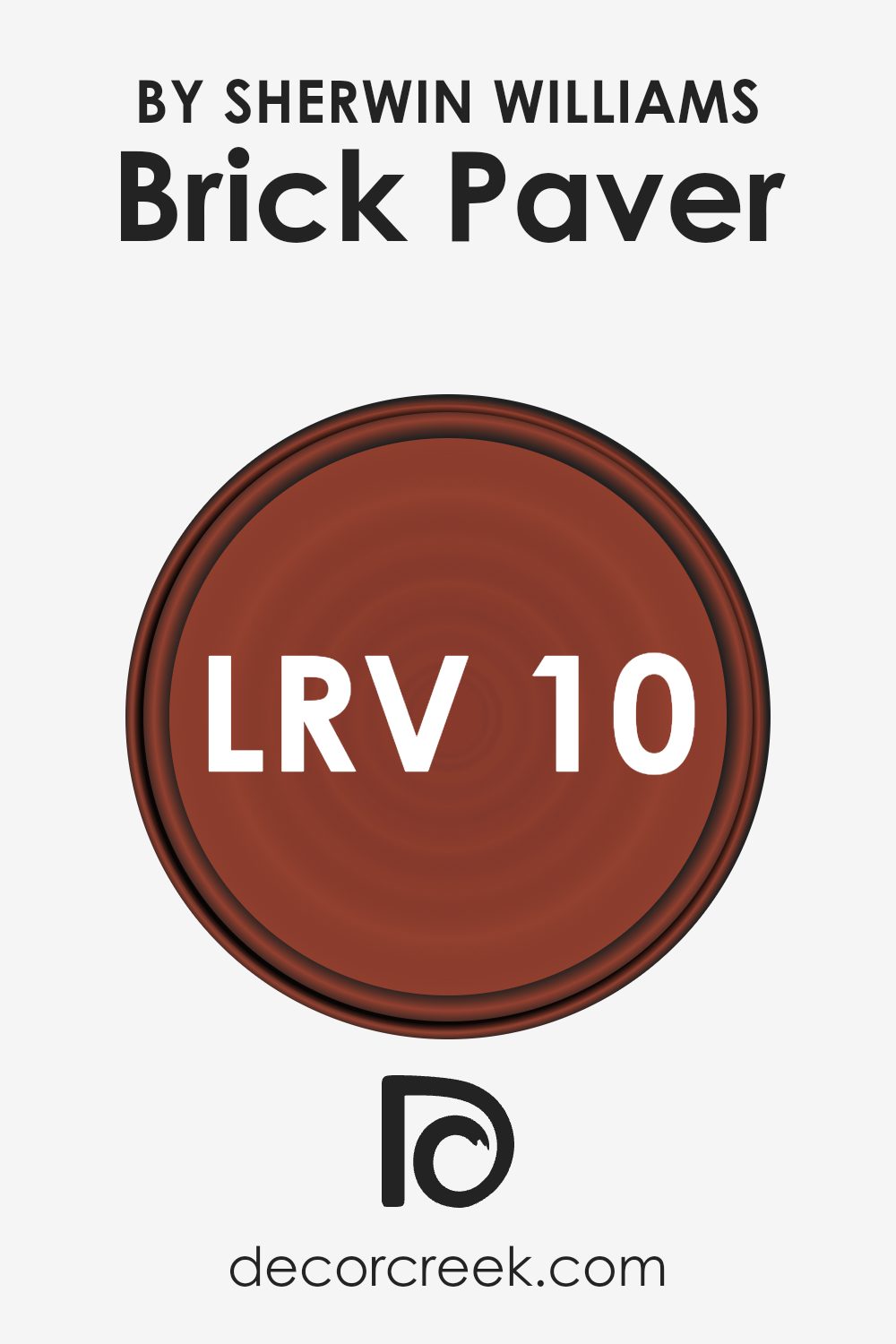
What is the LRV of Brick Paver SW 7599 by Sherwin Williams?
LRV stands for Light Reflectance Value, which is a measure of how much light a color reflects. It ranges from 0 to 100, where 0 means the color absorbs all light and is completely black, and 100 means the color reflects all light and is pure white.
An LRV of 10.099, like that of the Brick Paver color by Sherwin Williams, indicates that this shade is quite dark and absorbs a lot of light, reflecting only about 10% of it.
This means that the color will appear richer and deeper, especially in areas with less natural light. When you paint your walls with a color that has a low LRV, the space may feel more intimate and cozy due to the diminished light reflection.
For a shade like Brick Paver with an LRV of 10.099, the room it’s used in will take on a warm and inviting atmosphere.
Because this color absorbs more light, it can make a large room feel more contained and comfortable. In well-lit spaces, the color can give a dramatic flair, standing out as a bold choice.
However, in dimly lit areas, it might make the space feel smaller, but also more snug and private.
The low LRV can enhance the earthy, rich tones present in Brick Paver, giving your walls a strong and defined presence, perfect for accent walls or creating a focal point in a room.
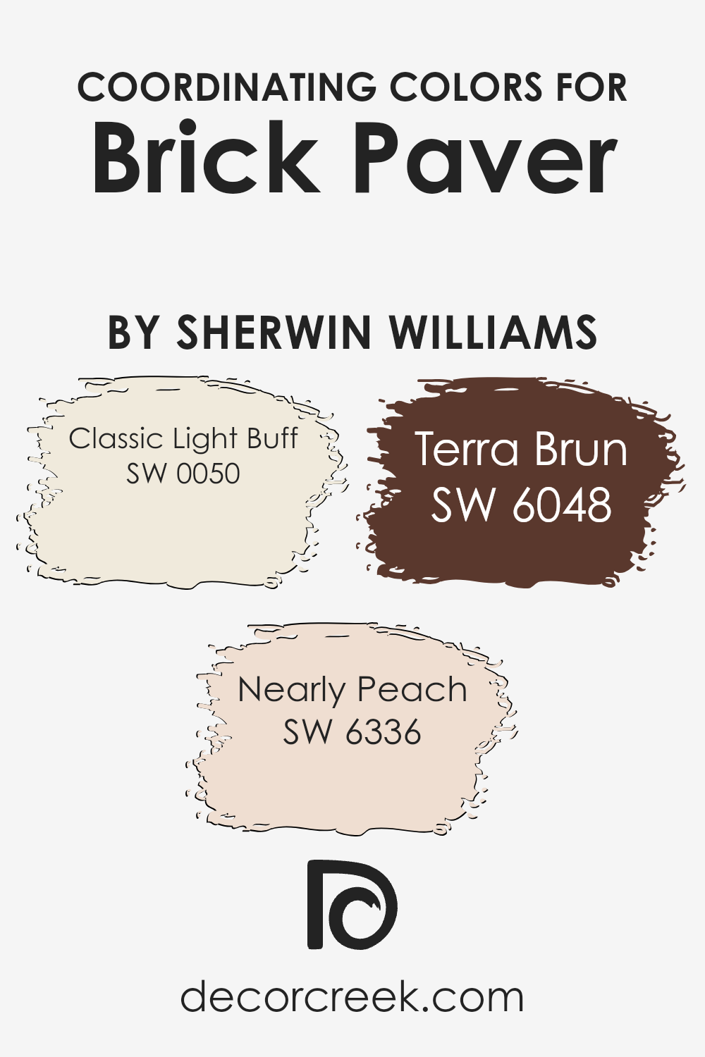
Coordinating Colors of Brick Paver SW 7599 by Sherwin Williams
Coordinating colors are hues that work together to create a harmonious look in a space. These colors complement each other and are often used in design to achieve a balanced aesthetic. When paired with the warm, earthy tones of Sherwin Williams’ Brick Paver, coordinating colors help to enhance the overall feel and atmosphere of a room.
Choosing the right complementary shades can highlight and bring out the best in the primary color, making the entire space look cohesive and inviting.
One such coordinating color is Classic Light Buff (SW 0050), which offers a soft, neutral backdrop that adds depth without overwhelming.
It is a timeless shade that brings a sense of warmth and coziness.
Nearly Peach (SW 6336), with its gentle, delicate undertones, adds a touch of subtle cheerfulness, creating an inviting and uplifting environment. Meanwhile, Terra Brun (SW 6048) provides a rich, earthy contrast that complements the warmth of Brick Paver, adding depth and grounding the space.
Together, these colors create a well-rounded palette that feels warm and welcoming, presenting an inviting atmosphere that feels like home.
You can see recommended paint colors below:
- SW 0050 Classic Light Buff
- SW 6336 Nearly Peach
- SW 6048 Terra Brun
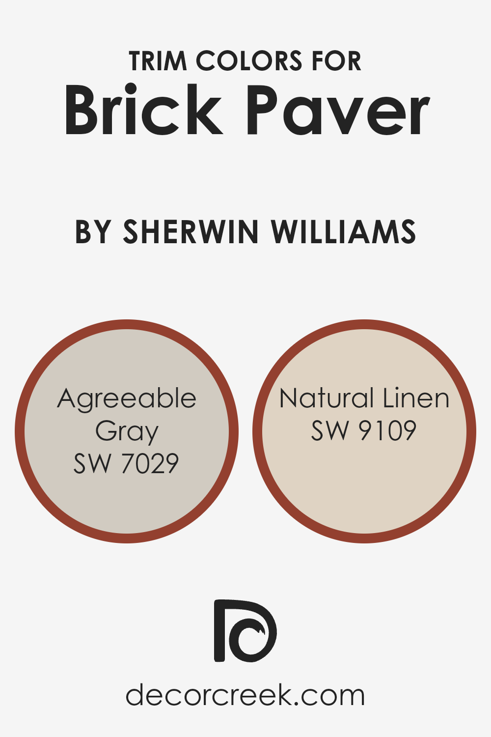
What are the Trim colors of Brick Paver SW 7599 by Sherwin Williams?
Trim colors are the complementary paint colors used to highlight or frame the main color on walls, often found on baseboards, moldings, window frames, and doors. They play a crucial role in enhancing the primary color and adding depth to the overall appearance of a room or exterior.
When it comes to using Brick Paver by Sherwin Williams, choosing the right trim colors can create a balanced and harmonious look. Brick Paver is a warm, earthy red that evokes a sense of warmth and coziness.
Pairing it with the right trim colors can help accentuate its natural beauty and provide a pleasing contrast or complement that can bring a space together.
Agreeable Gray and Natural Linen are excellent choices as trim colors for Brick Paver. Agreeable Gray is a soft, neutral gray with a hint of warmth, which can gently contrast with Brick Paver without overpowering it.
It’s versatile and understated, making it an ideal backdrop that can highlight the richness of red hues.
Natural Linen, on the other hand, is a warm beige with subtle yellow undertones. This color provides a soft, inviting feel that can complement the warm tones of Brick Paver, creating a sense of cohesion and comfort.
Together, these trim colors work to define spaces and enhance the overall aesthetic appeal when paired with Brick Paver, making a room feel more inviting and well-designed.
You can see recommended paint colors below:
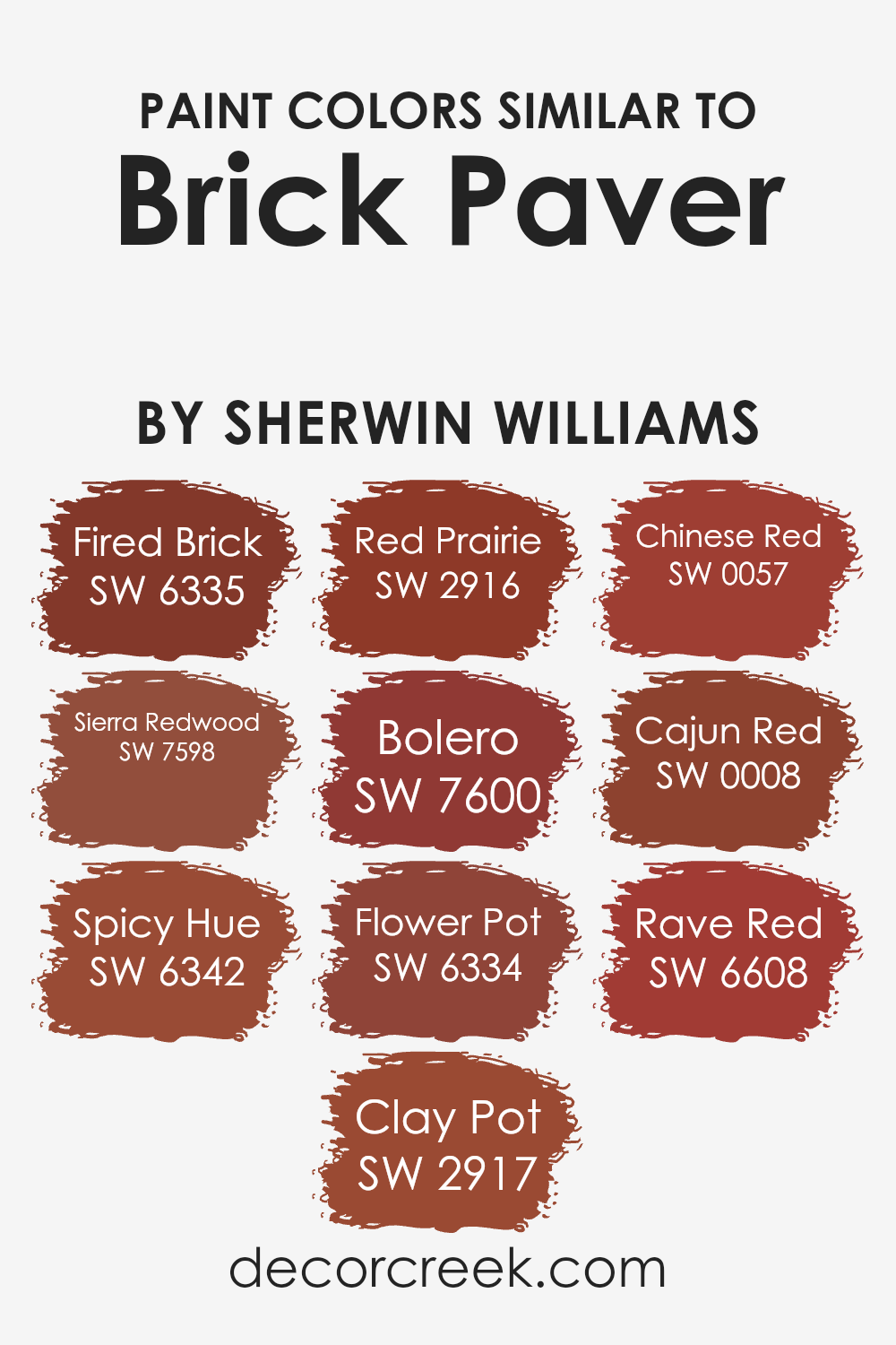
Colors Similar to Brick Paver SW 7599 by Sherwin Williams
Similar colors are crucial in design and decoration because they create harmony and cohesion in a space. Using colors that are close to each other on the color wheel, like those similar to Brick Paver by Sherwin Williams, can make a room feel more put together.
These colors typically share a common hue with slight variations in intensity and brightness, which allows them to blend nicely while adding subtle contrast. This technique can be particularly effective in creating warm, inviting, and balanced environments.
Shades like Fired Brick offer a deep, earthy red that adds richness, while Sierra Redwood brings a warm touch with its slightly softer tone. Spicy Hue introduces a touch of orange, energizing the palette without overwhelming it.
Colors like Clay Pot deliver an earthy, muted warmth, perfect for a cozy atmosphere. Red Prairie is another soft option, offering a gentle yet warm red that feels welcoming.
Bolero stands out with its bold, vibrant red, ideal for making a statement. Flower Pot has a terracotta feel, adding rustic charm to any setting.
Chinese Red introduces a classic, intense red that draws attention in a subtle way while Cajun Red’s spirited tone highlights modernity.
Lastly, Rave Red is vivid, bringing dynamism without overpowering the surroundings. Each of these colors works together to create a unified and appealing design palette.
You can see recommended paint colors below:
- SW 6335 Fired Brick
- SW 7598 Sierra Redwood
- SW 6342 Spicy Hue
- SW 2917 Clay Pot
- SW 2916 Red Prairie
- SW 7600 Bolero
- SW 6334 Flower Pot
- SW 0057 Chinese Red
- SW 0008 Cajun Red
- SW 6608 Rave Red
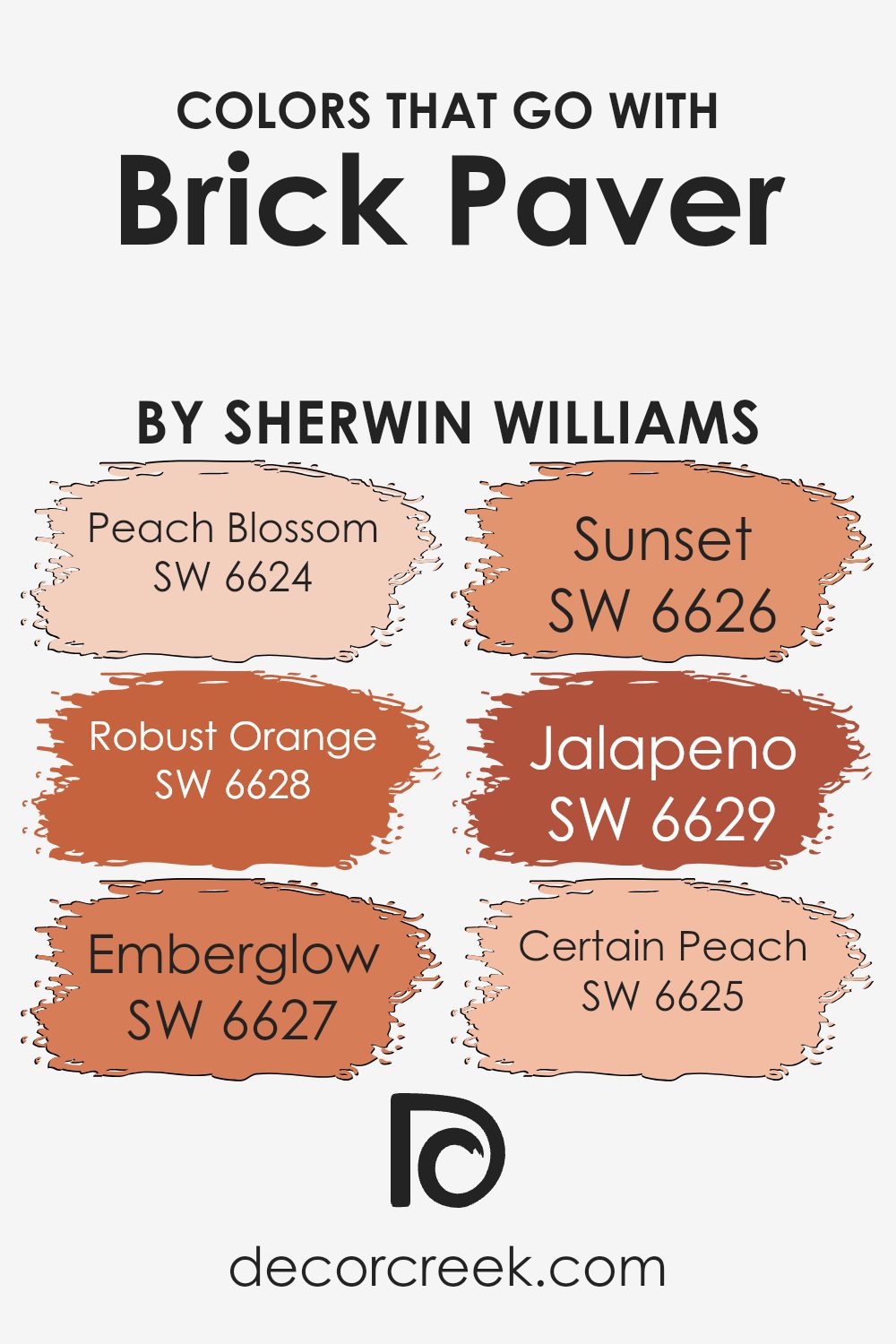
Colors that Go With Brick Paver SW 7599 by Sherwin Williams
Choosing colors that go with Brick Paver SW 7599 by Sherwin Williams can create a harmonious and welcoming environment. When paired correctly, these colors enhance the rich, earthy tones of Brick Paver, creating a cohesive look that is visually appealing. SW 6624, Peach Blossom, is a soft and warm color that adds a gentle touch to the boldness of Brick Paver.
SW 6628, Robust Orange, is vibrant and energizing, working well to highlight and contrast with the deep red-brown of Brick Paver. Emberglow, SW 6627, brings a warm glow that complements and enriches Brick Paver’s natural tones, adding vibrancy and warmth.
Sunset, SW 6626, has a golden warmth reminiscent of a sun-kissed sky, which pairs beautifully with Brick Paver for a cozy and inviting feel. SW 6629, Jalapeno, is a spicy green that adds a refreshing pop of color, balancing the warmer tones of Brick Paver without overpowering it.
Meanwhile, Certain Peach, SW 6625, is a delicate, soothing hue that gently contrasts and softens the intensity of the brick red.
Each of these colors contributes to creating a balanced and cohesive palette that works well with Brick Paver, enhancing spaces with warmth, depth, and lively energy.
You can see recommended paint colors below:
- SW 6624 Peach Blossom
- SW 6628 Robust Orange
- SW 6627 Emberglow
- SW 6626 Sunset
- SW 6629 Jalapeno
- SW 6625 Certain Peach
How to Use Brick Paver SW 7599 by Sherwin Williams In Your Home?
Brick Paver SW 7599 by Sherwin Williams is a warm, earthy red that can bring a cozy and inviting feel to your home. This color is perfect for adding a touch of warmth to any room. If you’re looking to create an accent wall, Brick Paver offers a rich tone that can make your space feel more intimate. Pair it with neutrals or earth tones to keep things balanced and inviting.
In the living room, this color can create a focal point that draws people in. Combine it with cream or beige for a harmonious look. It’s also a great choice for dining rooms, as it can make the area feel more welcoming for gatherings with family and friends.
In the kitchen, using Brick Paver on cabinets or as a backsplash accent can add depth and interest. This color works well in rustic or traditional styles, lending a timeless appearance to your home.
Brick Paver SW 7599 by Sherwin Williams vs Red Prairie SW 2916 by Sherwin Williams
Brick Paver SW 7599 is a warm, earthy reddish-brown color by Sherwin Williams. It’s reminiscent of classic brick buildings and has a welcoming yet grounded feel. It works well in spaces where you want to create a cozy, rustic vibe, adding depth and richness to the surroundings.
On the other hand, Red Prairie SW 2916 is a more vibrant and brighter red. It has an energetic and lively quality, bringing a touch of boldness to a room. This color is ideal for making a statement and can add warmth and cheer to any space.
While Brick Paver presents a more subdued and muted tone, making it versatile for different styles, Red Prairie stands out with its vivid presence. Both colors bring warmth and character to a room, but they differ significantly in intensity and impact. Choose Brick Paver for subtle elegance, and Red Prairie for a bold pop of color.
You can see recommended paint color below:
- SW 2916 Red Prairie
Brick Paver SW 7599 by Sherwin Williams vs Clay Pot SW 2917 by Sherwin Williams
Brick Paver SW 7599 and Clay Pot SW 2917 are two warm colors from Sherwin Williams. Brick Paver is a rich, earthy red with a brown undertone, reminiscent of classic brickwork. It’s bold and creates a cozy, inviting feeling in a room. It’s perfect for making a statement in spaces like living rooms or dining areas.
On the other hand, Clay Pot is a warm terracotta hue with hints of orange and pink. It has a softer, more muted tone compared to Brick Paver.
Clay Pot feels comforting and adds warmth to any space without being too overpowering.
While both colors bring warmth, Brick Paver stands out more, while Clay Pot provides a softer touch, making it suitable for bedrooms or more relaxed settings. Together, they can complement each other beautifully, with Brick Paver adding depth and Clay Pot offering a soothing balance.
You can see recommended paint color below:
- SW 2917 Clay Pot
Brick Paver SW 7599 by Sherwin Williams vs Cajun Red SW 0008 by Sherwin Williams
Brick Paver SW 7599 and Cajun Red SW 0008 by Sherwin Williams are two distinct shades of red that offer different vibes to any space. Brick Paver has a warm, earthy tone that reminds one of clay bricks. It gives off a cozy and grounded feeling, suitable for spaces where you want warmth and comfort.
On the other hand, Cajun Red is richer and more vibrant, reminiscent of deep red spices. This color offers a more bold and energetic atmosphere, perfect for creating a lively environment.
While both are reds, Brick Paver’s muted quality makes it a versatile choice for many settings, whereas Cajun Red stands out and can be a striking feature in any room.
Both can be used to add a touch of warmth, but the choice between them depends on whether you prefer a subtle or a more daring statement.
You can see recommended paint color below:
- SW 0008 Cajun Red
Brick Paver SW 7599 by Sherwin Williams vs Rave Red SW 6608 by Sherwin Williams
Brick Paver (SW 7599) and Rave Red (SW 6608) by Sherwin Williams are both warm colors, but they offer different vibes. Brick Paver is a muted, earthy red that carries a sense of warmth and groundedness. It works well for creating a cozy and inviting atmosphere, suitable for spaces like living rooms or dining areas where you want a welcoming feel.
On the other hand, Rave Red is a vibrant and bold color. It’s a bright and energetic shade, perfect for making a statement. Rave Red can be used as an accent wall or in accessories to add a pop of excitement and drama to a space.
While Brick Paver leans towards a more neutral and natural look, Rave Red is all about standing out and making an impact. Both colors are rich in their own way, but Brick Paver is subtle and earthy, whereas Rave Red is lively and daring.
You can see recommended paint color below:
- SW 6608 Rave Red
Brick Paver SW 7599 by Sherwin Williams vs Spicy Hue SW 6342 by Sherwin Williams
Brick Paver SW 7599 and Spicy Hue SW 6342 by Sherwin Williams are two distinct but warm colors. Brick Paver is a deep, earthy red with brown undertones, reminiscent of traditional brick paths or rustic outdoor spaces. It brings a strong, cozy feeling to a room, making spaces feel grounded and welcoming.
On the other hand, Spicy Hue is a lively, energetic shade of orange with red undertones, similar to the color of sunlit spice markets. It adds vibrancy and warmth to a room, creating an inviting and cheerful atmosphere.
While both colors are warm and rich, Brick Paver leans towards a more subdued and classic look, ideal for timeless elegance.
Spicy Hue, however, is bold and lively, perfect for adding a pop of energetic color. Both colors can be used effectively in different settings to create unique and cozy spaces, enhancing the feel with their warmth.
You can see recommended paint color below:
Brick Paver SW 7599 by Sherwin Williams vs Sierra Redwood SW 7598 by Sherwin Williams
Brick Paver SW 7599 and Sierra Redwood SW 7598 are both warm, earthy colors by Sherwin-Williams, but they have distinct tones. Brick Paver SW 7599 is a rich, warm red with a hint of brown, reminiscent of traditional red bricks. It exudes a robust and rustic feel, perfect for creating a cozy, inviting space. This color works well in living rooms or dining areas where warmth and comfort are desired.
On the other hand, Sierra Redwood SW 7598 is slightly more subdued compared to Brick Paver SW 7599.
It has a softer, more muted red tone, with a subtle brown undertone that gives it a natural and earthy quality. Sierra Redwood is a great choice for those who want a softer, less intense color compared to Brick Paver.
It is well-suited for bedrooms or other relaxing spaces where a calming yet warm atmosphere is appreciated.
Both colors can add character and warmth to interior and exterior design schemes.
You can see recommended paint color below:
- SW 7598 Sierra Redwood
Brick Paver SW 7599 by Sherwin Williams vs Flower Pot SW 6334 by Sherwin Williams
Brick Paver SW 7599 by Sherwin Williams is a rich, earthy red that carries the warmth of natural clay. It gives a grounded, substantial feel to any space. This color often brings to mind rustic architecture and warm, cozy environments.
On the other hand, Flower Pot SW 6334 by Sherwin Williams is a slightly brighter red with orange undertones. It has an energetic and lively appearance, perfect for injecting a bit of vibrancy into a room. This color often feels more playful and spirited compared to the deeper tone of Brick Paver.
When comparing these two, Brick Paver leans towards a darker, more muted palette, making it suitable for creating a warm and inviting atmosphere.
In contrast, Flower Pot’s brighter and orange-tinged hue is great for those who want a bit more zest and boldness. Both colors capture a warm, inviting vibe, but Flower Pot offers a bit more cheerfulness.
You can see recommended paint color below:
- SW 6334 Flower Pot
Brick Paver SW 7599 by Sherwin Williams vs Chinese Red SW 0057 by Sherwin Williams
Brick Paver SW 7599 and Chinese Red SW 0057, both by Sherwin Williams, are rich, warm colors, yet they have distinct personalities. Brick Paver is a deep red with brown undertones, reminiscent of natural clay bricks. It provides a grounded, earthy feel, making it perfect for cozy spaces or adding a touch of nature to a room. It’s a strong color but feels welcoming and solid, like the warm hues of a sunset.
On the other hand, Chinese Red is a brighter and more vibrant color. It has less brown and more pure red, giving it an energetic and lively appearance.
This color can create a bold statement and works well in spaces where a pop of color is desired. It’s more of a classic, eye-catching red—perfect for rooms that aim to feel dynamic and inspiring.
Together, these colors can balance each other with Brick Paver offering warmth and stability, while Chinese Red brings energy and excitement.
You can see recommended paint color below:
- SW 0057 Chinese Red
Brick Paver SW 7599 by Sherwin Williams vs Bolero SW 7600 by Sherwin Williams
Brick Paver SW 7599 and Bolero SW 7600 are both rich red hues from Sherwin Williams, but they have distinct differences. Brick Paver is a warm, earthy red with a hint of brown. It reminds one of natural, aged bricks and gives off a cozy, rustic vibe. This color is great for spaces where you want a warm and inviting feel.
On the other hand, Bolero is a more vibrant and intense red. It is bold and energetic, similar to the color of a lively red pepper or a bright red fabric. Bolero can make a strong statement and energize a space with its striking presence.
While Brick Paver leans toward a more muted and comforting tone, Bolero stands out with its brighter and more assertive nature.
Depending on the desired mood, Brick Paver suits a softer approach, whereas Bolero is perfect for adding excitement.
You can see recommended paint color below:
- SW 7600 Bolero
Brick Paver SW 7599 by Sherwin Williams vs Fired Brick SW 6335 by Sherwin Williams
Brick Paver and Fired Brick are two warm colors offered by Sherwin Williams. Brick Paver stands out with its earthy, reddish-brown tone, reminiscent of natural clay bricks. It exudes a comforting, grounded feel that is perfect for spaces looking for a cozy and inviting atmosphere.
On the other hand, Fired Brick is slightly deeper with a more intense, rich red tone. It resembles the color of well-fired clay bricks, bringing a sense of warmth and vibrancy.
While both colors are in the red-brown family, Brick Paver leans more towards brown, making it slightly more subdued in nature.
Fired Brick, being redder, is bolder and adds a fiery touch to any space. Both colors can be used to create warm and inviting environments but offer different levels of intensity and mood due to their varied shades.
You can see recommended paint color below:
- SW 6335 Fired Brick
Conclusion
Brick Paver is a warm, earthy red that reminds me of a cozy brick fireplace or old-fashioned brick roads. It’s a color that feels friendly and welcoming, like a big hug from a favorite sweater.
When you use Brick Paver in a room, it makes everything feel homey and comfortable. It’s perfect for making a space feel warm and inviting. It can be used in living rooms, dining rooms, or even on the exterior of a house to give it a warm look.
Brick Paver is bold but not too bright, so it doesn’t hurt your eyes or feel too strong. It’s like the color of autumn leaves or the setting sun, bringing a natural and comforting feeling inside your home.
I think Brick Paver is a great choice for anyone who wants to make their home feel more inviting and warm.
It’s a color that really brings out the best in a room, making it feel like a place where you want to spend time with family and friends. It’s amazing how just one color can make such a big difference!
Ever wished paint sampling was as easy as sticking a sticker? Guess what? Now it is! Discover Samplize's unique Peel & Stick samples.
Get paint samples

