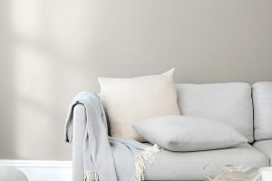
In the vast world of interior design, finding the perfect color for your space can be a real challenge.
Luckily, there’s a shade that has won the hearts of many homeowners and designers alike for its versatility and beauty: Agreeable Gray SW 7029 by Sherwin Williams.
This hue stands out as a top choice for those looking to strike the ideal balance between warm and cool tones, making it an excellent option for almost any room.
Agreeable Gray is not just another gray. Its unique blend offers a soft, neutral canvas that complements a wide array of décor styles, furniture colors, and additional accents.
Whether you’re updating a cozy bedroom, a welcoming living room, or even a bathroom, this color creates a soothing backdrop that enhances the aesthetic appeal of your space without overpowering it.
What’s truly remarkable about Agreeable Gray is its adaptability. In natural light, it reveals a warm, inviting undertone that makes spaces feel more open and airy.
Contrastingly, in rooms with less light, it maintains its depth, providing a sense of comfort and sophistication.
For anyone aiming to refresh their home with a color that provides a blend of modern elegance and timeless charm, Agreeable Gray SW 7029 by Sherwin Williams might just be the perfect starting point.
What Color Is Agreeable Gray SW 7029 by Sherwin Williams?
Agreeable Gray by Sherwin Williams is a versatile and warm paint color that strikes a beautiful balance between gray and beige.
This soft, welcoming shade acts as a neutral backdrop, making it easy to pair with a variety of decor styles, colors, and materials.
Its muted warmth brings a cozy yet sophisticated vibe to any room, making spaces feel more open and inviting.
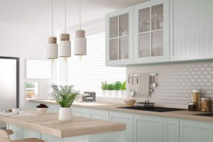
Due to its neutral yet inviting tone, Agreeable Gray works exceptionally well in a range of interior styles, from modern and minimalist to traditional and farmhouse.
It’s a perfect color choice for living rooms, bedrooms, and kitchens, as it offers a subtle warmth that enhances natural light and complements most furniture and decor items.
When it comes to materials and textures, Agreeable Gray pairs wonderfully with natural wood, bringing out its rich tones and adding a touch of earthiness to the space.
It also harmonizes beautifully with metallic accents like gold or silver, creating a chic and elegant look. Soft, plush fabrics in rich colors or patterns stand out against this neutral backdrop, adding depth and interest to the room.
Whether it’s a sleek leather sofa or a cozy, textured throw blanket, Agreeable Gray provides a flexible and appealing base that allows materials and decor to shine.
Ever wished paint sampling was as easy as sticking a sticker? Guess what? Now it is! Discover Samplize's unique Peel & Stick samples.
Get paint samples

Is Agreeable Gray SW 7029 by Sherwin Williams Warm or Cool color?
Agreeable Gray by Sherwin Williams is a popular paint color known for its versatility and warmth. This neutral shade is a perfect blend of gray with a touch of beige, making it the ideal “greige” that adapts well to various decorating styles and spaces.
It’s light enough to make rooms feel airy and spacious yet has enough depth to add character and warmth, avoiding the clinical feel some grays can have.
This color is particularly effective in homes because it serves as a beautiful backdrop that can complement a wide range of furnishings and decor.
Whether your home is filled with modern pieces or more traditional items, Agreeable Gray has the unique ability to tie different elements together harmoniously.
It reflects light beautifully, which can help make small spaces appear larger and more inviting. Its neutral hue also means it can adapt to various lighting conditions, maintaining its soothing presence from dawn till dusk.
For homeowners looking for a color that provides flexibility and a touch of elegance, Agreeable Gray is a top choice.
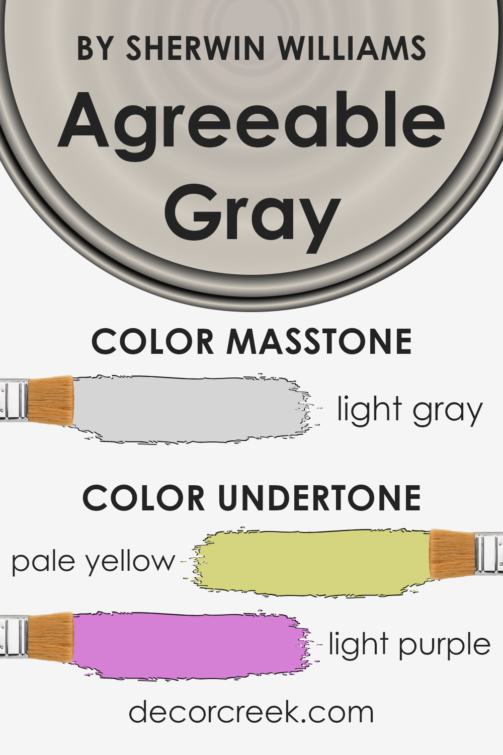
Undertones of Agreeable Gray SW 7029 by Sherwin Williams
Agreeable Gray by Sherwin Williams is a popular neutral paint color known for its versatility and warmth. One of the key reasons for its adaptability is the undertones it possesses.
Specifically, this color has subtle hints of pale yellow and light purple. Understanding these undertones is crucial because they significantly influence how we perceive the color in various lighting conditions and settings.
Undertones are like secret ingredients that add depth and complexity to a primary color. For example, the pale yellow undertone in Agreeable Gray adds a touch of warmth, making spaces feel more welcoming and cozy.
On the other hand, the light purple undertone introduces a soft, almost ethereal quality, which can give a space a more refined and serene look.
Together, these undertones work to ensure that the color remains neutral and flexible, yet far from plain or dull.
When applied to interior walls, these undertones play with natural and artificial light, subtly shifting the color’s appearance throughout the day.
In bright sunlight, the yellow undertones might become more pronounced, making a room feel sunnier and cheerier.
During the evening, or in spaces with less natural light, the purple undertones can emerge, lending a calm and soothing ambiance to the room.
This chameleon-like ability allows Agreeable Gray to harmonize with a wide range of decor styles, colors, and materials, making it a go-to choice for designers and homeowners alike.
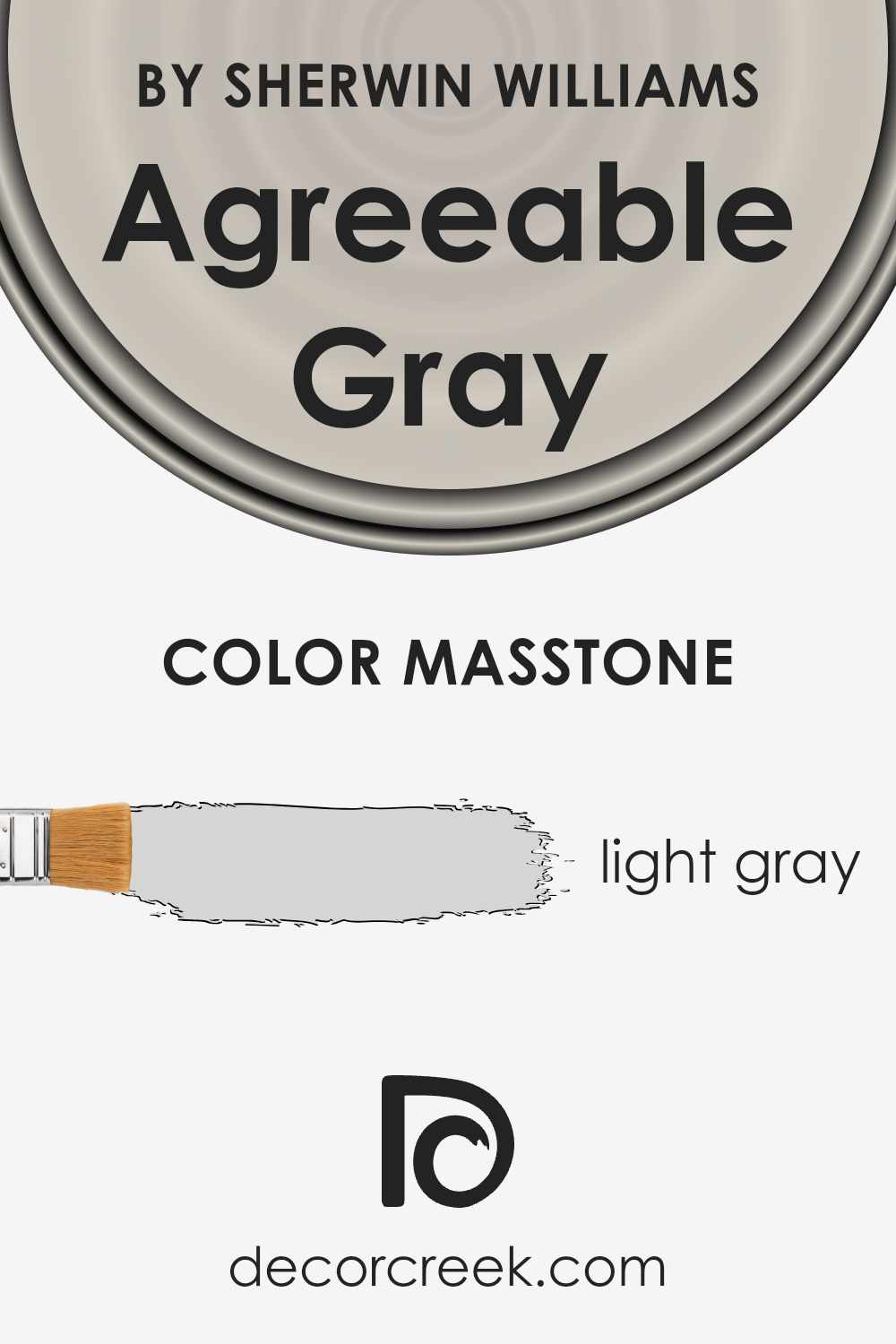
What is the Masstone of the Agreeable Gray SW 7029 by Sherwin Williams?
Agreeable Gray, a popular choice among homeowners, carries a gentle, light gray hue that can significantly shape the feel of a space.
The color’s masstone, or the color you see when the paint is applied thickly and appears at its most saturated, is a light gray that brings a soft, calming presence into any room.
Its neutral tone makes it incredibly versatile, allowing it to work well in various spaces and with different decor styles, from modern to traditional.
This light gray shade has the unique ability to make small spaces appear larger and brighter, creating an inviting atmosphere. In rooms with plenty of natural light, it adds an airy feel, enhancing the sense of openness.
For darker spaces, it helps to reflect whatever light is available, mitigating the lack of natural light and making the room feel more expansive.
The beauty of this color lies in its adaptability. It seamlessly complements a wide range of colors, from bold hues to softer tones, allowing for creative freedom in decorating.
Whether it’s the backdrop for colorful artwork or paired with cozy, neutral furnishings, this light gray provides a serene and balanced foundation that enhances the overall aesthetic of a home.
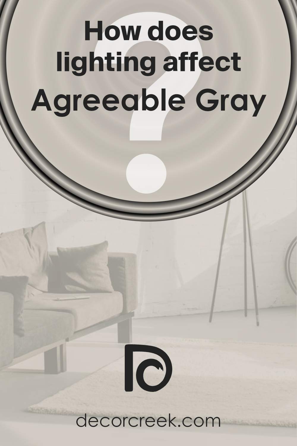
How Does Lighting Affect Agreeable Gray SW 7029 by Sherwin Williams?
Lighting plays a crucial role in how colors look in any space. When it comes to a color like Agreeable Gray, the type of light – artificial or natural – can significantly impact its appearance.
This popular shade is a warm mix of gray and beige, often referred to as “greige.”
Under artificial light, the color tends to shift depending on the type of bulb used. LED or fluorescent lighting can bring out the cooler aspects of Agreeable Gray, making it appear more gray than beige.
Incandescent lighting, on the other hand, warms it up, highlighting the beige undertones and making the space feel cozy.
Natural light brings its dynamics into play. The direction of the light – whether north, south, east, or west – affects how Agreeable Gray looks at different times of the day.
In north-faced rooms, which receive less direct sunlight, this color can appear cooler and more genuinely gray. This creates a calm, tranquil vibe but could feel a bit chilly in rooms without much natural warmth.
South-faced rooms bathe in abundant sunlight, warming the color to reveal its beige undertones.
This makes the room feel brighter and more inviting, showcasing the paint’s ability to adapt and bring warmth even to spaces flooded with natural light.
East-faced rooms enjoy the morning light, which tends to be warmer and brighter.
Here, Agreeable Gray will look softer and warmer in the morning, potentially shifting towards its cooler gray side as the day progresses and the light diminishes.
West-faced rooms capture the evening light, which can cast a golden glow as the sun sets. This warm light accentuates the beige in the color, making spaces feel cozy and welcoming in the afternoon and evening.
In conclusion, Agreeable Gray is a versatile color that changes subtly under different lighting conditions. Its ability to morph from cooler to warmer tones with the changing light makes it a favorite for various spaces and orientations, offering a flexible backdrop to any interior décor.
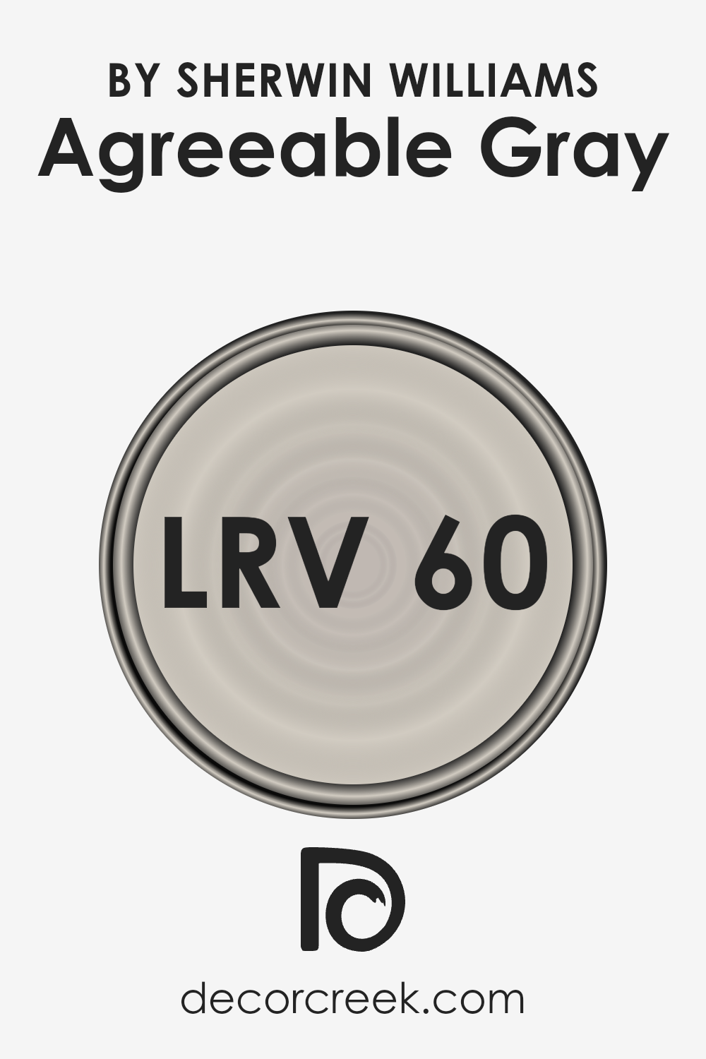
What is the LRV of Agreeable Gray SW 7029 by Sherwin Williams?
LRV stands for Light Reflectance Value, and it is a measure used to indicate the amount of visible and usable light that a color reflects from or absorbs into a surface.
It’s a scale from 0 to 100, with 0 being complete absorption (black, which reflects no light) and 100 being complete reflection (white, which reflects all light).
The LRV of a paint color affects how light or dark it appears on your walls and can greatly influence the mood and atmosphere of a room.
In essence, a higher LRV means the color reflects more light, making spaces appear brighter and more open, whereas a lower LRV results in a color that absorbs more light, creating a cozier, more intimate feel.
With an LRV of 60.386, Agreeable Gray is positioned on the lighter side of the spectrum but isn’t extremely bright.
This means it has a good balance of reflecting light without being too stark or overwhelming, making it a versatile choice for various spaces and lighting conditions.
In rooms with ample natural light, this color will appear softer and can help enhance the brightness of the space. In contrast, in rooms with less natural light, it will still help to lighten the room without appearing too cold or dull.
The particular LRV of Agreeable Gray makes it a flexible color that can adapt well to different settings and decor styles, providing a warm, inviting backdrop to any room.
LRV – what does it mean? Read This Before Finding Your Perfect Paint Color
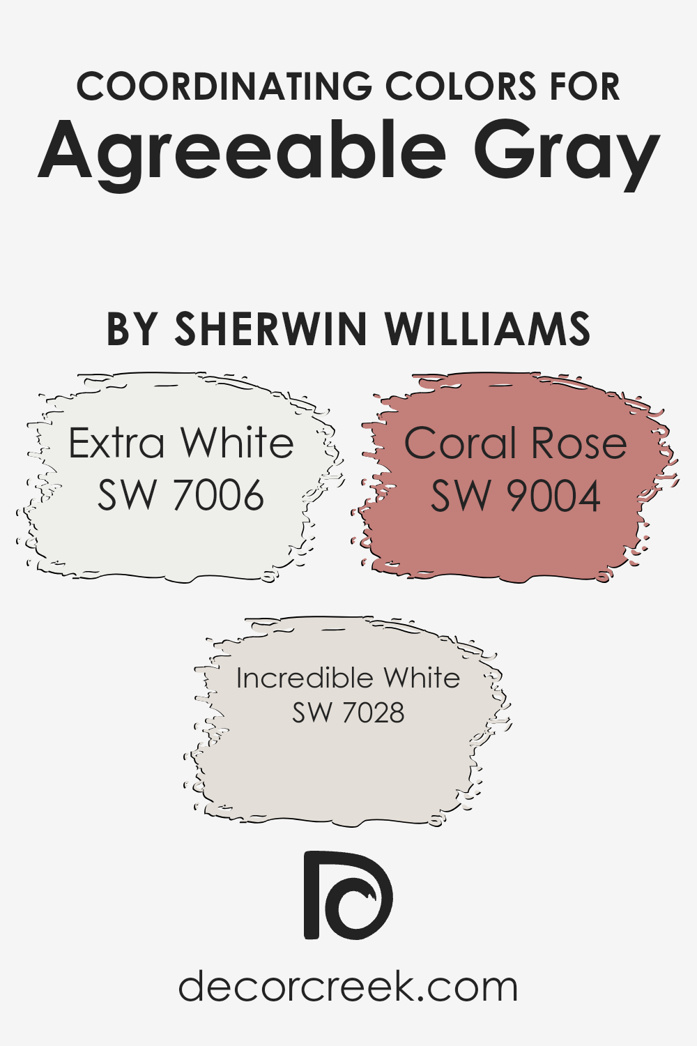
Coordinating Colors of Agreeable Gray SW 7029 by Sherwin Williams
Coordinating colors are hues that complement each other and work well together in a space, creating a harmonious and balanced look.
When it comes to Agreeable Gray by Sherwin Williams, a popular neutral shade, selecting the right coordinating colors is key to bringing out its warm undertones and versatility.
Coordinating colors can enhance the main hue by providing contrast, depth, or soft transitions between walls and decor, making it crucial for homeowners to choose colors that will complement their primary paint choice effectively.
For Agreeable Gray, SW 7006 – Extra White is an excellent coordinating color. Extra White is a clean, bright white that can make a room feel more spacious and airy.
It’s perfect for trim, doors, and ceilings, providing a crisp contrast to Agreeable Gray that highlights its warmth without overwhelming it.
Another great coordinating color is SW 7028 – Incredible White, which offers a softer alternative to Extra White.
Incredible White has a slightly warm tone that seamlessly blends with Agreeable Gray, ideal for creating a gentle flow between rooms.
Lastly, SW 9004 – Coral Rose introduces a vibrant but sophisticated splash of color. This lively shade adds a pop of interest and personality when used alongside Agreeable Gray.
Coral Rose can elevate a space by adding a touch of warmth and freshness, perfect for accents such as throw pillows, artwork, or a statement wall in a neutral room.
You can see recommended paint colors below:
- SW 7006 Extra White
- SW 7028 Incredible White
- SW 9004 Coral Rose
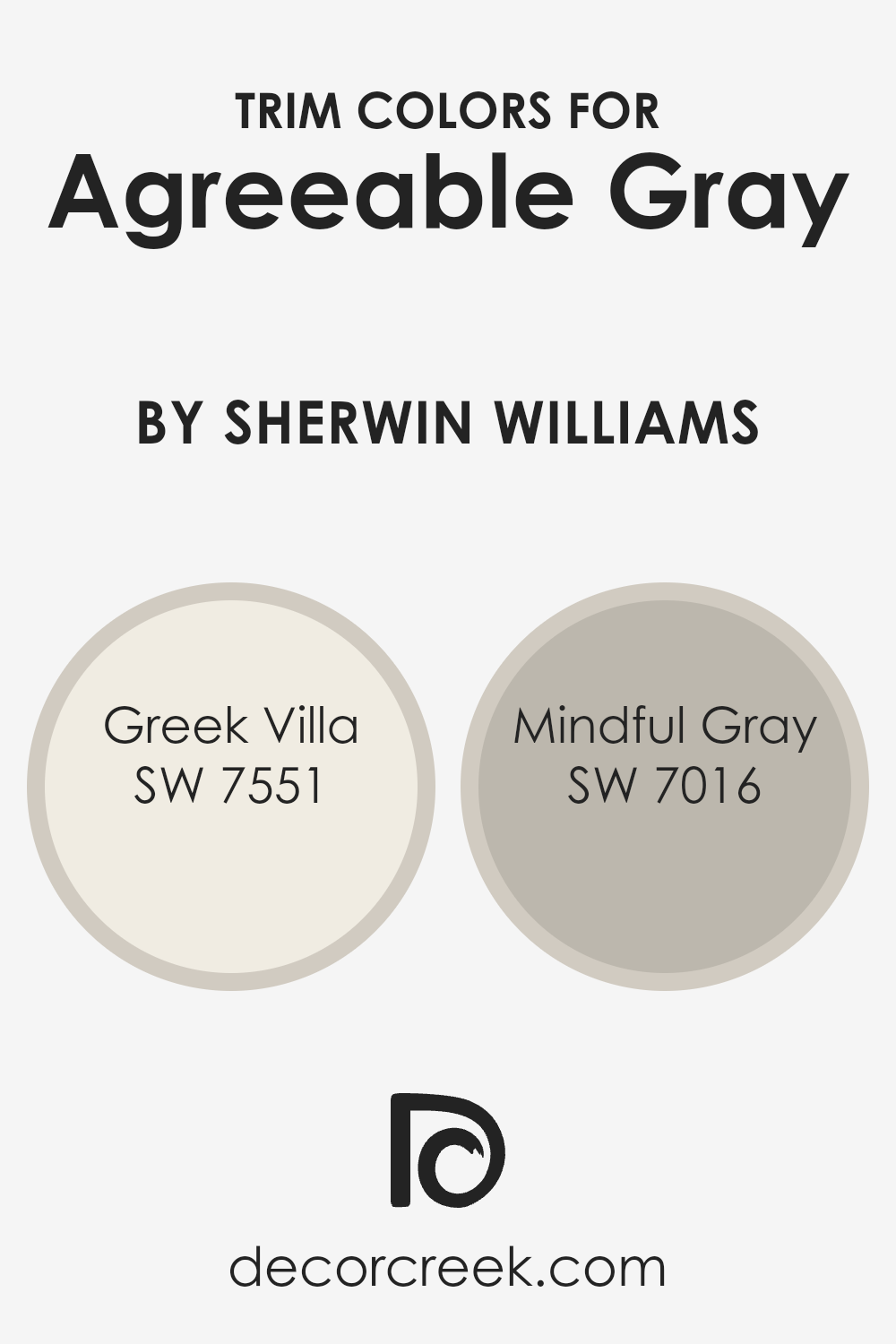
What are the Trim colors of Agreeable Gray SW 7029 by Sherwin Williams?
Trim colors are essentially the hues selected for the architectural elements and details of a room, such as baseboards, moldings, door and window frames.
These colors play a crucial role in defining and complementing the overall aesthetic of a space, acting as a frame to enhance wall colors.
In the case of Agreeable Gray by Sherwin Williams, choosing the right trim color can significantly impact the ambiance of a room, providing contrast or cohesion to its subtle warmth and neutrality.
For a harmonious look alongside Agreeable Gray, Greek Villa (SW 7551) is a soft, creamy white that offers a crisp but not stark contrast, adding a brightness that can make spaces feel more open and airy.
Meanwhile, Mindful Gray (SW 7016) is a gentle gray that harmonizes beautifully, offering a bit more depth and sophistication to the trim, which can help in creating a more seamless transition between the wall and trim, for those seeking a less contrasting look.
Both of these options can enhance the visual appeal of a room painted in Agreeable Gray, either by brightening it up or by adding a subtle layer of complexity to the color scheme.
You can see recommended paint colors below:
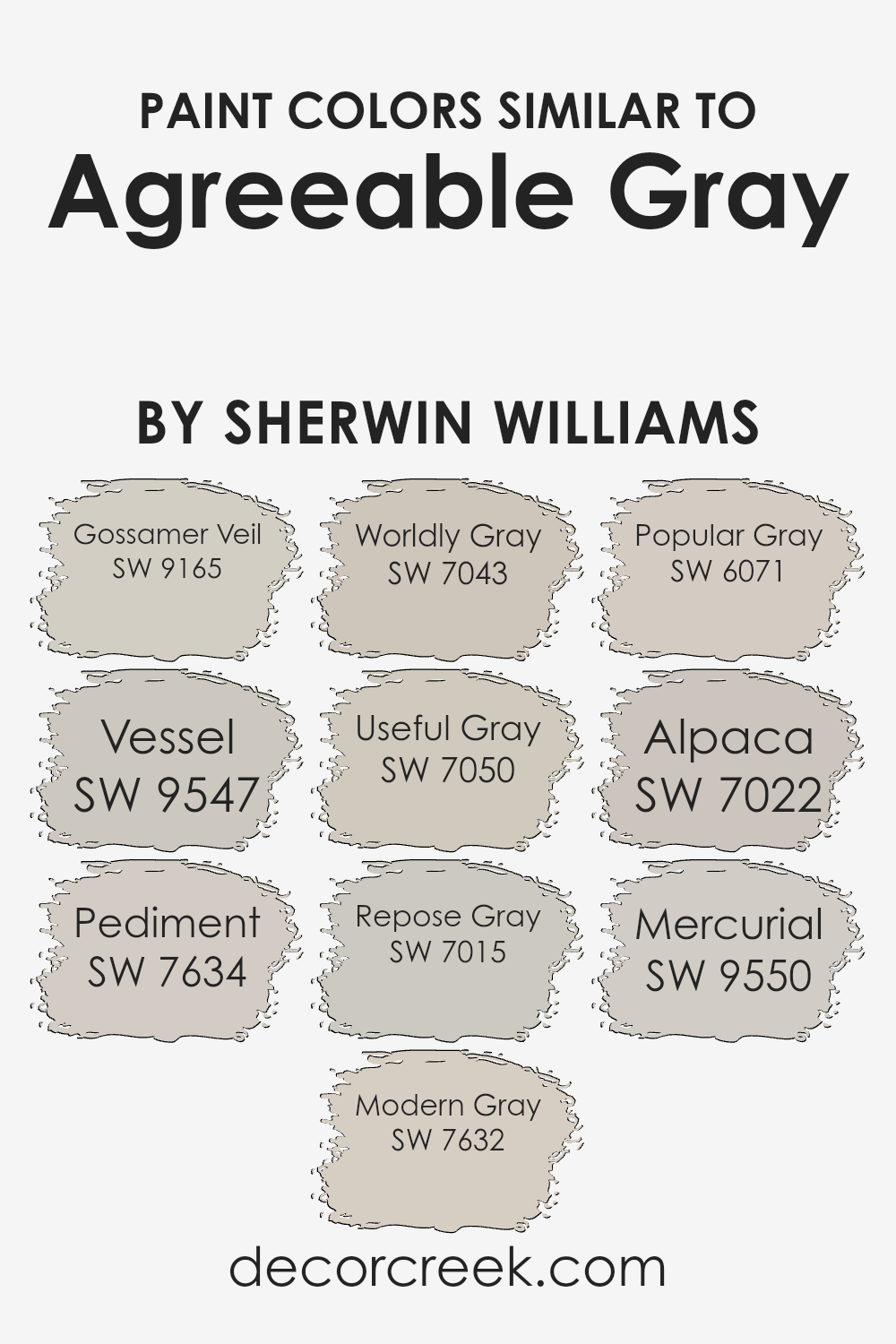
Colors Similar to Agreeable Gray SW 7029 by Sherwin Williams
Choosing a palette of similar colors is essential for creating a harmonious and visually appealing space.
Colors close to each other on the color wheel, such as those akin to Agreeable Gray by Sherwin Williams, provide a subtle variance that adds depth and complexity to interiors without overwhelming the senses.
These shades, ranging from warmer tones to cooler hues, work together by offering slight differences that can enhance textures, shapes, and lighting in a space. Utilizing similar colors can achieve a cohesive look that is both sophisticated and balanced.
Gossamer Veil is a soft, ethereal color that brings a light, airy feel to any room, making it appear more spacious. Vessel, on the other hand, hints at a slightly cooler tone, reminiscent of a serene, overcast sky, perfect for a calming retreat.
Pediment offers a touch of earthiness, grounding the space with its understated warmth. Modern Gray is sleek and contemporary, lending an effortlessly chic vibe to modern interiors.
Worldly Gray travels the middle ground, balancing warm and cool tones for a versatile backdrop. Useful Gray skews a bit cooler, making it ideal for spaces that aim for a crisp, clean look.
Repose Gray stands out for its ability to adapt, reflecting varying undertones in different lighting conditions. Popular Gray offers a whisper of warmth, making spaces feel inviting and homey.
Alpaca presents a unique blend of gray and beige, providing a cozy yet sophisticated neutral.
Lastly, Mercurial has an enigmatic charm, with its ability to shift subtly between warm and cool undertones, making it a captivating choice for those looking to add a touch of mystery.
Each color, while similar to Agreeable Gray, has its unique characteristics, allowing for endless possibilities in design and decor.
You can see recommended paint colors below:
- SW 9165 Gossamer Veil
- SW 9547 Vessel
- SW 7634 Pediment
- SW 7632 Modern Gray
- SW 7043 Worldly Gray
- SW 7050 Useful Gray
- SW 7015 Repose Gray
- SW 6071 Popular Gray
- SW 7022 Alpaca
- SW 9550 Mercurial
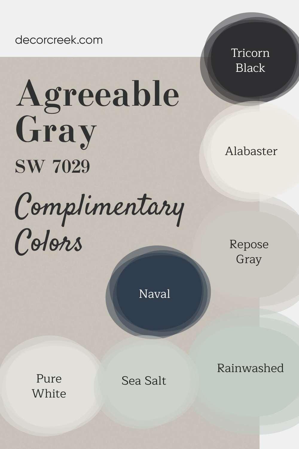
Complimentary Colors for Agreeable Gray SW 7029 Paint Color by Sherwin Williams
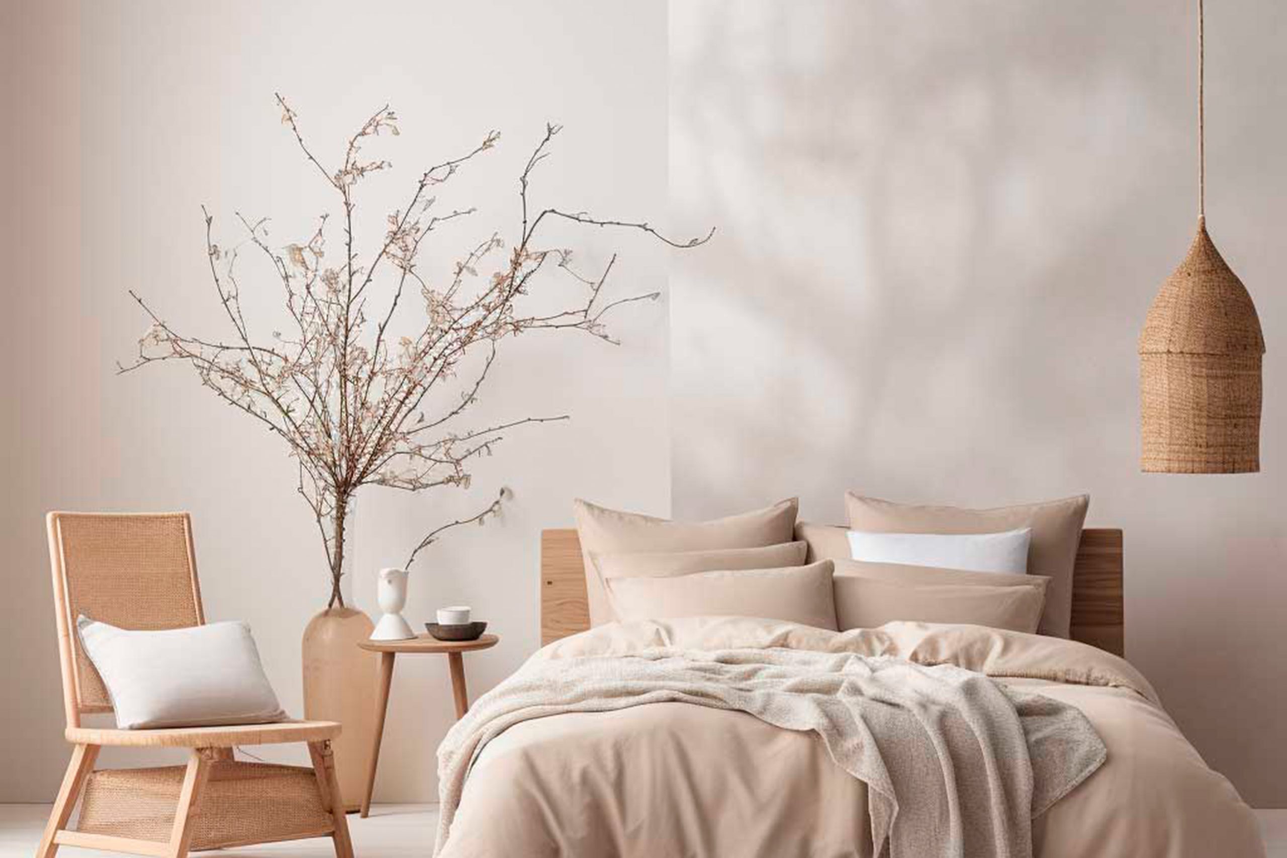
Choosing the right paint colors for your home can transform a space, making it feel fresh, inviting, and uniquely yours. This collection from Sherwin Williams features some of the most popular and versatile shades. Agreeable Gray and Repose Gray offer subtle warmth, while Alabaster and Pure White bring a clean, bright look to any room.
For a calming touch, soft greens like Sea Salt and Rainwashed add a hint of nature indoors. For a bolder, more dramatic effect, Naval and Tricorn Black provide a stunning contrast that elevates modern design. Whether you’re updating a single room or your entire home, these shades give you the flexibility to create a cohesive, sophisticated look that reflects your personal style.
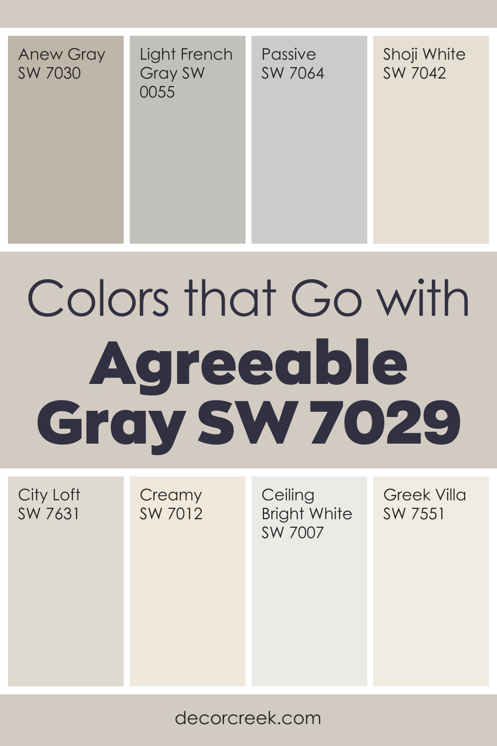
Colors That Go With Agreeable Gray SW 7029 for a Calm and Balanced Home
Agreeable Gray SW 7029 is one of those colors that instantly makes a room feel steady and welcoming. It has a soft warmth that works well with many styles, and that’s why I often use it as a gentle base tone.
When paired with Anew Gray, Passive, Light French Gray, and City Loft, the room gains a smooth flow without feeling flat.
Lighter shades like Shoji White, Creamy, and Greek Villa brighten Agreeable Gray and make the whole palette feel soft and fresh.
I love using this color in living rooms, bedrooms, and hallways because it brings comfort without calling attention to itself. It supports wood tones, natural fabrics, and simple décor beautifully.
With the right color partners, Agreeable Gray becomes the kind of shade that makes a home feel peaceful and easy to be in. These pairings help create a look that is flexible, warm, and comfortable for everyday life.
How to Use Agreeable Gray SW 7029 by Sherwin Williams In Your Home?
Agreeable Gray SW 7029 by Sherwin Williams is a popular paint color choice for homeowners looking to add a touch of modern elegance to their space.
Known for its warm and versatile gray tones, it seamlessly fits into any room, whether it’s the living room, bedroom, kitchen, or bathroom.
What makes this color unique is its ability to blend well with different decor styles and color schemes, making it a go-to option for anyone looking to update their home’s look without the hassle of repainting if they decide to change their furniture or decorations later on.
For those wanting to refresh their home, Agreeable Gray provides a neutral backdrop that can make your space feel more open and welcoming.
It pairs beautifully with white trim for a crisp look or can be combined with darker colors for a more dramatic effect.
Applying it in areas with natural light can also enhance its warm undertones, creating a cozy atmosphere that invites people to relax and feel at home.
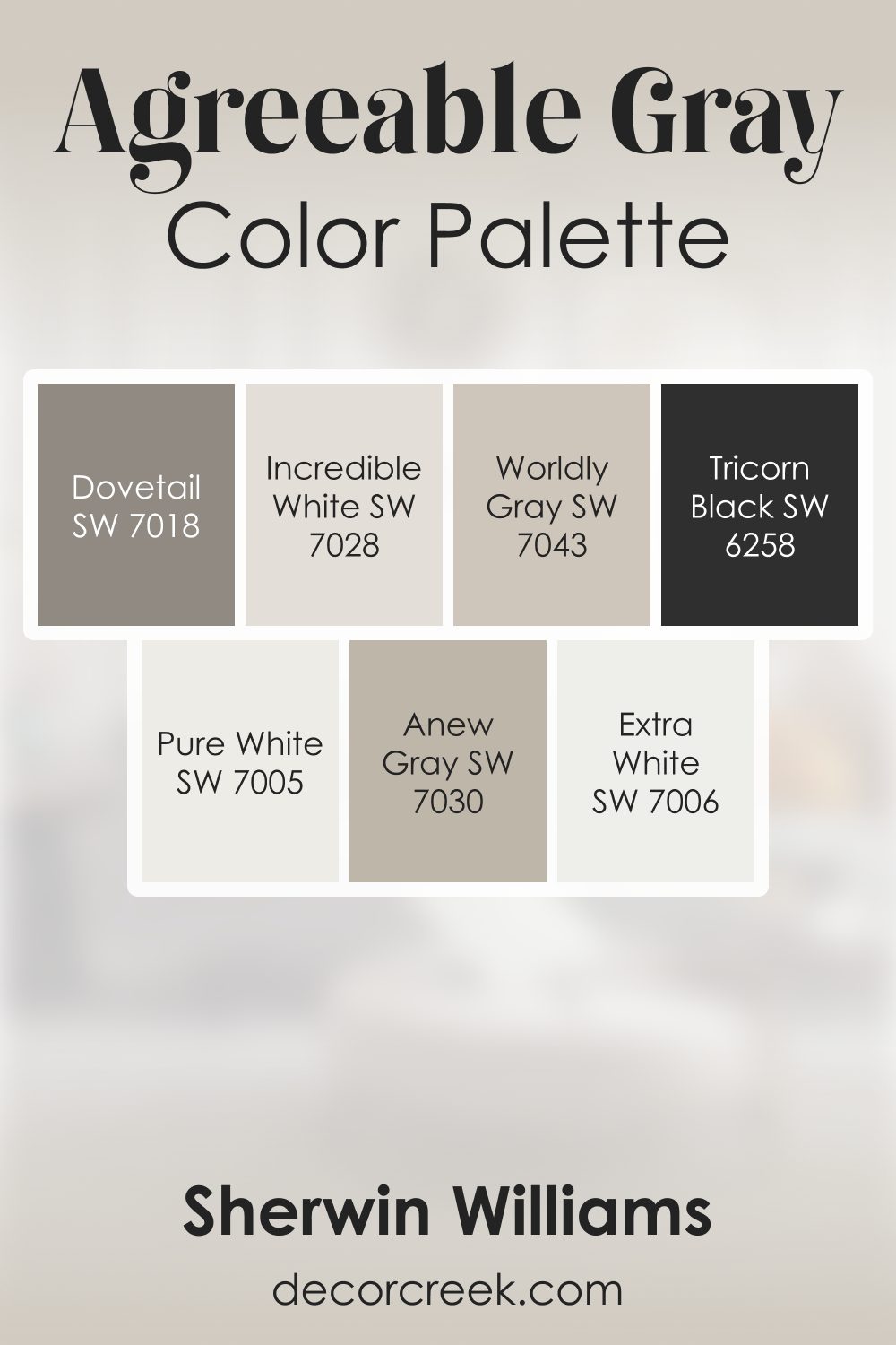
Agreeable Gray SW 7029 by Sherwin Williams Color Palette
I always enjoy working with Agreeable Gray because it carries this peaceful softness that instantly makes a room feel friendly. It sits right between warm and cool, which helps it connect beautifully with so many supporting shades. Extra White keeps the palette open and bright, while Pure White adds a soft, airy touch. Worldly Gray and Anew Gray bring warm comfort, creating a cozy layered look that feels natural and easy.
When I want contrast, Tricorn Black adds strength and clarity. Dovetail gives the palette a strong mid-tone moment, making the whole combination feel complete. Incredible White is perfect for adding a gentle lift, helping the palette feel light and smooth.
This group of colors works beautifully together because everything feels balanced. Agreeable Gray keeps the foundation steady, while the supporting colors add interest, warmth, and depth in a calm, friendly way.
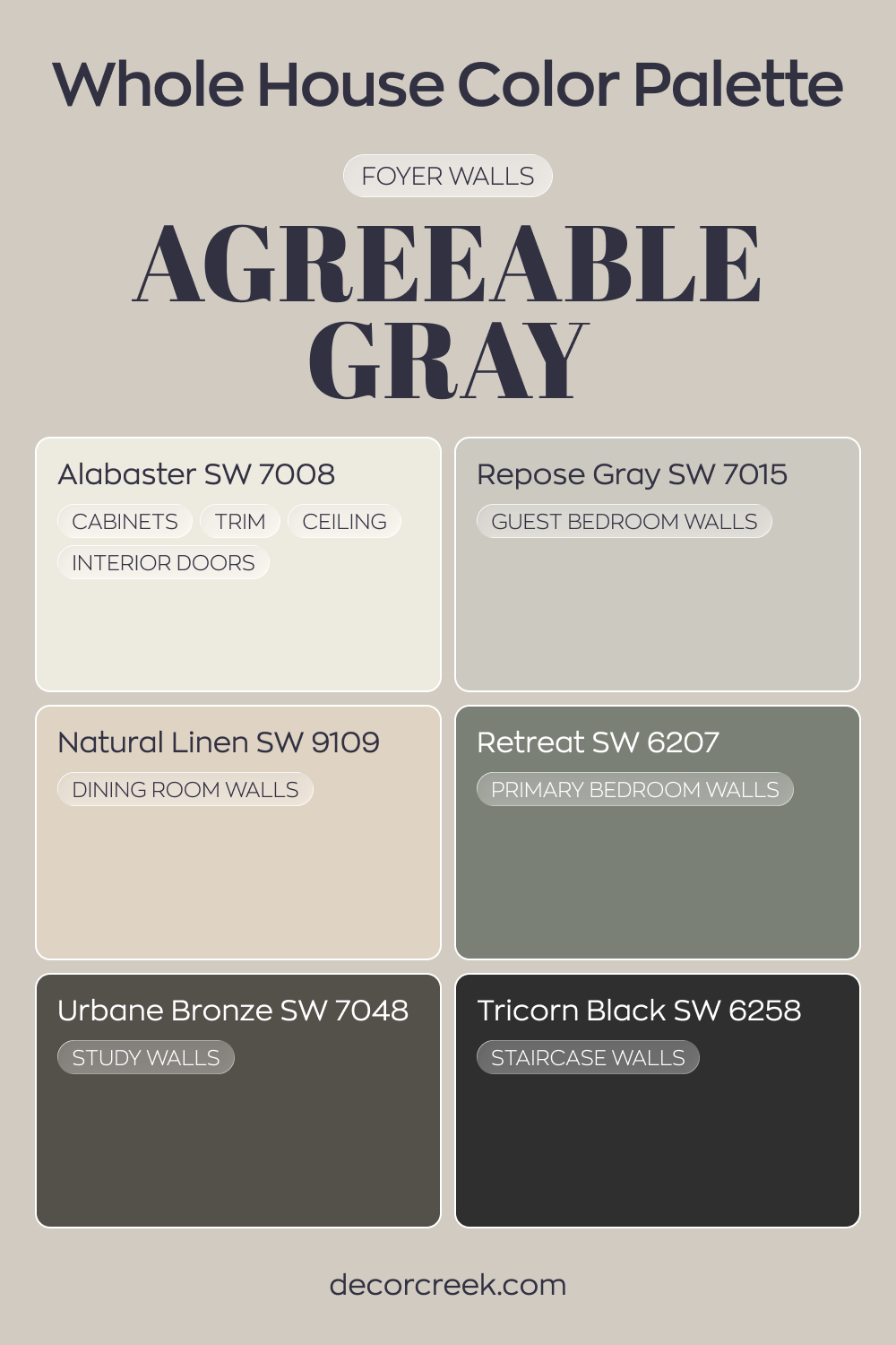
Whole House Paint Color Palette Crafted Around Agreeable Gray SW 7029
Agreeable Gray SW 7029 sets a balanced tone in the foyer, offering a welcoming neutral base. Alabaster on cabinets, trim, ceilings, and interior doors keeps the look fresh and defined. The pairing creates a clean transition into the rest of the home.
Repose Gray in the guest bedroom adds a slightly cooler variation, while Natural Linen in the dining room introduces warmth. Retreat in the primary bedroom deepens the palette with a rich green note.
These tones move smoothly from soft neutrals to earthy depth.
Urbane Bronze in the study and Tricorn Black along the staircase add striking contrast. The darker accents give structure and strength to the lighter gray foundation.
Agreeable Gray SW 7029 by Sherwin Williams vs Useful Gray SW 7050 by Sherwin Williams
Agreeable Gray and Useful Gray, both from Sherwin Williams, are popular choices for those looking to add a modern yet warm touch to their spaces.
Agreeable Gray leans more towards a soft, warm gray with a hint of beige, making it a perfect neutral that pairs well with almost any decor. It creates a cozy and inviting atmosphere without being too dark or overpowering.
On the other hand, Useful Gray steps a bit cooler than Agreeable Gray, sporting a slight green undertone that gives it a more distinct, refined look.
This color is versatile as well, fitting in various settings, but it brings a slightly more modern and fresh vibe compared to the warmer, more traditional feel of Agreeable Gray.
Both colors are incredibly adaptable and can work in various lighting conditions, making them suitable for many rooms and styles.
Choosing between them depends on the mood you’re looking to create: warm and cozy with Agreeable Gray or cool and sophisticated with Useful Gray.
You can see recommended paint color below:
Agreeable Gray SW 7029 by Sherwin Williams vs Repose Gray SW 7015 by Sherwin Williams
Agreeable Gray and Repose Gray, both from Sherwin Williams, are popular neutral paint colors, but they have their own unique characteristics.
Agreeable Gray is on the warmer side, blending beige into the gray to create a cozy and inviting atmosphere.
It’s a bit of a chameleon, adapting well to different lighting conditions and playing nicely with a wide range of decor styles.
On the other hand, Repose Gray leans towards a cooler, more classic gray. It still remains neutral but offers a slightly more modern and crisp look compared to Agreeable Gray.
Repose Gray can also complement various settings, though it may highlight cooler tones in daylight. Both colors are versatile and widely used for their ability to provide a sophisticated and timeless backdrop to interiors.
Choosing between them really comes down to the mood you want to set and how the natural light in your space influences their appearance.
You can see recommended paint color below:
Agreeable Gray SW 7029 by Sherwin Williams vs Vessel SW 9547 by Sherwin Williams
Agreeable Gray and Vessel are two distinct colors from Sherwin Williams, each offering a unique vibe to any space. Agreeable Gray is a warm neutral with a lovely blend of gray and beige.
Think of it as the perfect backdrop for various decor styles, adding a cozy yet sophisticated touch. It’s like a soft hug for your walls, versatile enough to work in any room.
On the other hand, Vessel is a deeper, richer color that leans towards a dark teal or navy. It’s bold and makes a statement, providing a striking contrast when used alongside lighter hues or as a focus wall.
Vessel can add a touch of elegance and depth to spaces, perfect for creating an accent or adding character.
While Agreeable Gray is your go-to for a light, airy, and open feel, Vessel steps in when you want to add drama or a focal point in your decor.
Both colors offer something unique, yet choosing between them depends on the atmosphere you’re aiming to create.
You can see recommended paint color below:
Agreeable Gray SW 7029 by Sherwin Williams vs Alpaca SW 7022 by Sherwin Williams
Agreeable Gray and Alpaca, both by Sherwin Williams, are popular choices for those looking to bring a warm and inviting neutral tone to their spaces.
Agreeable Gray stands out for its ability to blend seamlessly with most decor, thanks to its balanced mix of gray and beige, often referred to as “greige.”
This color is incredibly versatile, making it a go-to choice for any room, reflecting a modern yet timeless appeal. On the other hand, Alpaca carries a slightly softer vibe, leaning more towards the beige side with a hint of gray.
This gives Alpaca a warmer presence, ideal for creating a cozy atmosphere in spaces like living rooms or bedrooms.
While both colors share a neutral base, Agreeable Gray offers a hint more of gray, providing a cooler tone compared to Alpaca’s warmer, beige-influenced hue.
Choosing between them depends on the desired mood and temperature of the room, with Agreeable Gray offering cool sophistication and Alpaca, a snug, welcoming feel.
You can see recommended paint color below:
Agreeable Gray SW 7029 by Sherwin Williams vs Popular Gray SW 6071 by Sherwin Williams
Agreeable Gray and Popular Gray are both colors by Sherwin Williams, but they have their unique characteristics. Agreeable Gray is a warm gray with beige undertones, which gives it a cozy and inviting feel.
It’s versatile, meaning it can work well in many spaces, adding a touch of elegance without overpowering the room. On the other hand, Popular Gray has a slightly cooler tone compared to Agreeable Gray.
It still falls in the warm gray category but leans more towards a neutral palette. This color can brighten up spaces while maintaining a soft, subtle ambiance.
Both colors are great choices for those looking to achieve a modern and understated look in their home.
However, your choice between the two might depend on the specific mood you’re aiming to create—warm and cozy with Agreeable Gray or more neutral and subtle with Popular Gray.
You can see recommended paint color below:
Agreeable Gray SW 7029 by Sherwin Williams vs Gossamer Veil SW 9165 by Sherwin Williams
Agreeable Gray and Gossamer Veil are two popular paint choices from Sherwin Williams, each with its unique charm. Agreeable Gray is a warm, welcoming gray with a slight hint of beige, making it a perfect neutral backdrop for any room.
It’s like a cozy blanket, offering comfort and versatility. On the other hand, Gossamer Veil takes a slightly different approach. This color is lighter, presenting a soft, warm gray with subtle beige undertones.
It acts like a whisper of color, providing a delicate, airy feel to spaces that seek a touch of elegance without overwhelming the senses.
When comparing them, Agreeable Gray brings a bit more warmth and depth, making spaces feel grounded and homey. Gossamer Veil, with its lighter touch, offers a clean, minimalist vibe, ideal for creating a serene and tranquil environment.
Both colors work well in various lighting situations, gracefully flexing with natural light to showcase their beauty.
Whether choosing the cozy embrace of Agreeable Gray or the understated elegance of Gossamer Veil, you’re guaranteed a sophisticated and inviting atmosphere.
You can see recommended paint color below:
Agreeable Gray SW 7029 by Sherwin Williams vs Pediment SW 7634 by Sherwin Williams
Agreeable Gray and Pediment are two popular colors by Sherwin Williams, each offering a unique backdrop for interior spaces. Agreeable Gray is a soft, warm gray with beige undertones that make it incredibly versatile and welcoming.
This color fits well in almost any space, brightening rooms with natural light or providing a cozy warmth in dimmer areas. On the other hand, Pediment leans toward a cooler, lighter gray with slight taupe nuances, giving it a subtle serene feel.
It’s perfect for those seeking a modern, minimalistic look that still retains a touch of warmth.
Both colors provide an excellent base for a variety of decor styles, but the choice between them might come down to whether you prefer a warmer, more inviting feel with Agreeable Gray, or the understated, calm atmosphere that Pediment can create.
You can see recommended paint color below:
- SW 7634 Pediment
Agreeable Gray SW 7029 by Sherwin Williams vs Worldly Gray SW 7043 by Sherwin Williams
Agreeable Gray and Worldly Gray by Sherwin Williams are two popular colors, but they have some differences.
Agreeable Gray is a warm gray with a touch of beige, making it a perfect neutral that fits in almost any space. It’s light and airy, giving rooms a fresh, cozy feel without feeling too cold.
On the other hand, Worldly Gray sits a bit cooler on the color spectrum. Though still a gray, it leans slightly more towards the true gray side than Agreeable Gray, lacking some of the warmer beige undertones.
This makes Worldly Gray a great choice for spaces where a more straightforward gray is desired, providing a sleek and modern look.
Both colors are versatile and can blend well with various decor styles, but your choice between them might come down to the specific mood you want to set and the natural light in your space, with Agreeable Gray offering warmth and Worldly Gray offering a crisper feel.
You can see recommended paint color below:
Agreeable Gray SW 7029 by Sherwin Williams vs Modern Gray SW 7632 by Sherwin Williams
Agreeable Gray and Modern Gray are both popular colors from Sherwin Williams, each with its own unique charm. Agreeable Gray is known for its warmth and versatility.
It’s a soft, light gray that has a cozy, welcoming vibe due to its slight beige undertones. This makes it an excellent choice for nearly any room in your home, creating a balanced and inviting atmosphere.
On the other hand, Modern Gray is a bit cooler and more understated. It’s a mid-tone gray with subtle warm undertones, making it a bit more neutral compared to Agreeable Gray.
This color is perfect for those looking for a contemporary, chic look. It has a sophisticated quality, making spaces feel more open and airy.
When you compare the two, Agreeable Gray leans towards a warmer, cozier feel, ideal for creating a homey environment. Modern Gray, however, offers a cleaner, more minimalist appeal.
Depending on the mood you want to set for your space, either color could be a fitting choice.
Whether you’re aiming for warmth and comfort with Agreeable Gray or a sleek and modern vibe with Modern Gray, both colors offer a beautiful palette for your home.
You can see recommended paint color below:
Agreeable Gray SW 7029 by Sherwin Williams vs Mercurial SW 9550 by Sherwin Williams
Agreeable Gray and Mercurial, both from Sherwin Williams, have their unique places in the color spectrum, catering to varied tastes and design needs.
Agreeable Gray stands out as a warm, versatile gray with beige undertones, making it a cozy neutral that goes well with almost any decor or color scheme.
It’s the kind of color that brings a soft, welcoming vibe to a room, whether it’s drenched in natural light or more on the dim side, adapting beautifully to different spaces.
On the other hand, Mercurial presents itself as a deeper, more intense color with a complex personality. It’s not just gray; it has a richness that can add drama or sophistication to a space, depending on how it’s used.
This color can anchor a room, providing a striking backdrop that makes lighter colors pop or offers a sumptuous depth when paired with darker hues.
When choosing between the two, consider the mood you want to create. Agreeable Gray is perfect for those seeking a calm, neutral backdrop that’s easy to live with.
Mercurial suits those looking to make more of a statement or add a layer of richness to their interiors.
Both colors offer something special, but their impact is markedly different, reflecting their individual charm and potential to transform spaces in their own unique ways.
You can see recommended paint color below:
- SW 9550 Mercurial
Conclusion
Agreeable Gray by Sherwin Williams is a versatile paint color that has gained popularity for its ability to create a warm and inviting atmosphere in any room.
Its neutral yet warm undertone makes it an excellent choice for those looking to add a cozy, yet sophisticated touch to their space.
Ideal for a variety of decorating styles, its flexibility allows it to be paired with a wide range of colors, making it a go-to option for homeowners and designers alike.
This paint’s adaptability is further enhanced by its compatibility with both natural and artificial light, ensuring that it maintains its charming appeal under varying lighting conditions.
As a result, Agreeable Gray stands out as a practical and stylish choice for anyone looking to update their home with a fresh, yet timeless look.
Its ability to blend seamlessly with other hues and its appeal in different lighting situations underscore its reputation as a fan favorite in the realm of interior design.

Ever wished paint sampling was as easy as sticking a sticker? Guess what? Now it is! Discover Samplize's unique Peel & Stick samples.
Get paint samples