When you’re looking to give your space a cozy, warm vibe, I find myself recommending SW 6681 Butter Up by Sherwin Williams quite often. This delightful shade offers a soft, sunny glow that can brighten any room without feeling overpowering.
It’s like a splash of warmth that brings a light and uplifting atmosphere to your home, making it feel more inviting.
If you associate yellow with optimism and cheerfulness, Butter Up enlivens that mood in a more muted, gentle way. It works great in a kitchen or living area where you spend a lot of time with loved ones, as it seems to make those moments a little brighter.
Personally, I think it pairs beautifully with whites and grays, providing a balance that’s both fresh and warm.
The paint holds up well in different lights, appearing consistently pleasant whether it’s early morning or late afternoon. This adaptability makes it a dependable choice for most homes.
If you’re thinking about revitalizing your space with a new tone, SW 6681 Butter Up might just be the splash of color you need.
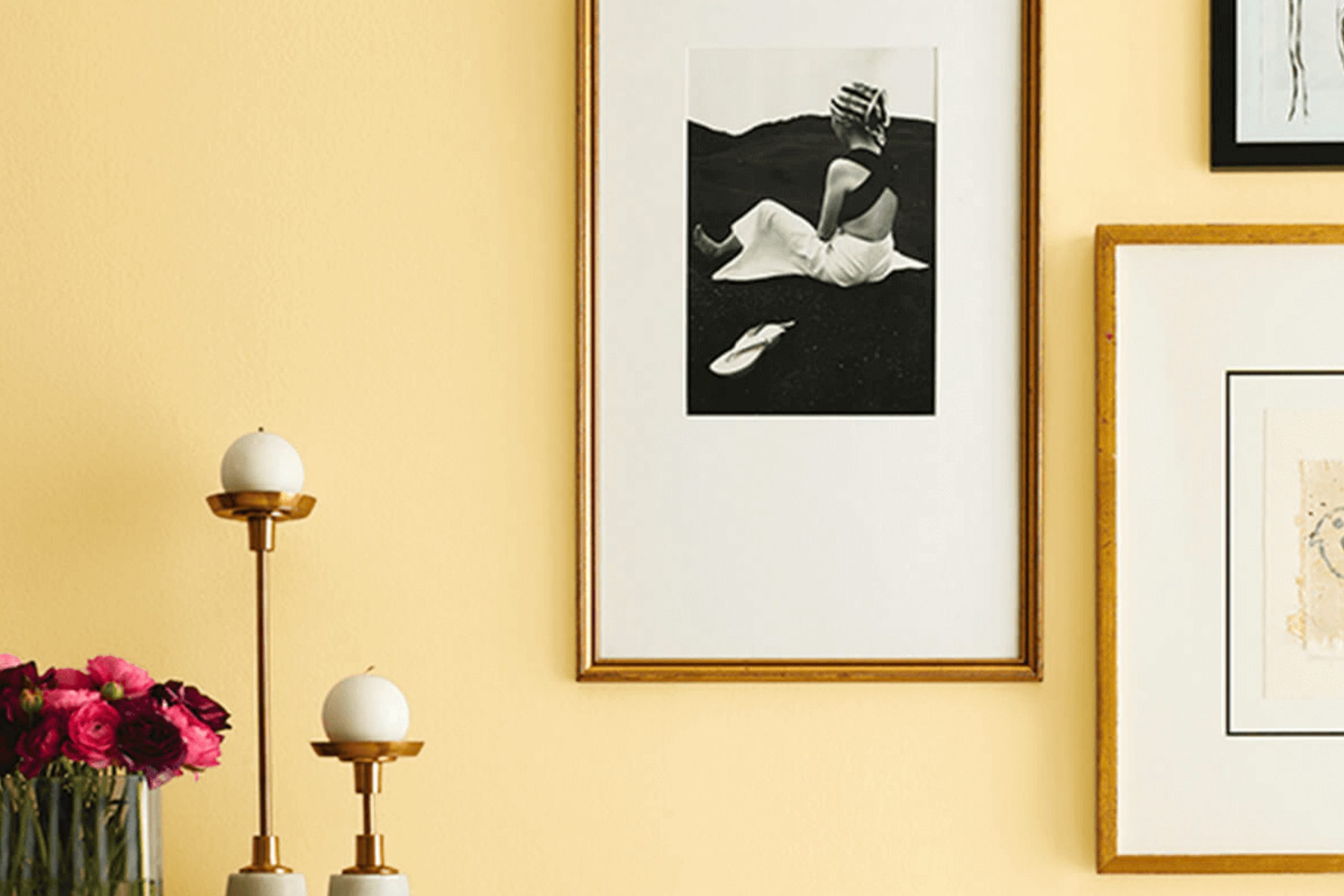
What Color Is Butter Up SW 6681 by Sherwin Williams?
Butter Up by Sherwin Williams is a warm and inviting shade of yellow that exudes a cozy, cheerful vibe in any space. This color is stunningly vibrant without being overpowering, making it perfect for creating a sunny and welcoming atmosphere in your home.
This cheerful yellow works exceptionally well in various interior styles, particularly in country, cottage, and traditional decors. It also adds a fresh and playful touch to contemporary spaces when used as an accent color.
In a kitchen or dining area, Butter Up can stimulate appetites and encourage lively conversation. In a living room or reading nook, it provides a bright yet cozy backdrop that enhances natural light.
Butter Up pairs beautifully with a wide range of materials and textures, enhancing the warm feel of the room. It looks gorgeous with natural wood, whether it’s on hardwood floors or rustic wooden furniture, bringing out the rich textures of the grain.
Additionally, this color complements soft, fluffy textures like cotton throw pillows and woolen blankets, increasing the comfort factor of your space. Adding elements of white or cream can balance out its brightness, while dark greens or navy blues can offer a delightful contrast, making the space feel grounded and cohesive.
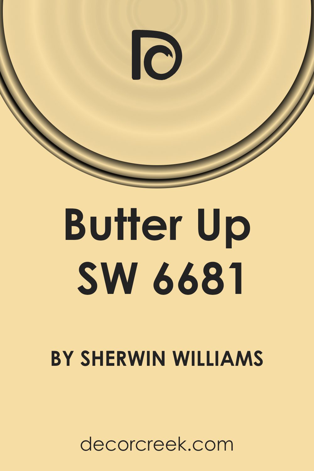
Is Butter Up SW 6681 by Sherwin Williams Warm or Cool color?
Butter Up by Sherwin Williams is a warm, inviting shade of yellow that brings a cozy, cheerful vibe to any room. It’s like having a hint of sunshine indoors, which can really brighten up spaces that don’t get a lot of natural light.
This color works great in kitchens and living rooms where you want to create a welcoming atmosphere for family and guests. Since it’s a soft yellow, it pairs well with a lot of other colors, from crisp whites to soft greys and even bolder shades like blue or green.
Using Butter Up on the walls can make a room feel more open and airy, which is especially useful in smaller spaces that might feel tight or cramped. It’s also known for making people feel happy and relaxed, so it’s a great choice if you want to give your home a warm, friendly feel.
Undertones of Butter Up SW 6681 by Sherwin Williams
Butter Up is a lively yellow paint color that can create a warm and welcoming atmosphere in any room. The color has a range of subtle undertones that can influence how it appears depending on the lighting and surrounding colors. These undertones include light gray, pale pink, light purple, mint, yellow, light blue, grey, orange, lilac, light green, and olive.
Undertones are the hidden hues that can modify the main color, affecting how we perceive it. They can make a color appear cooler or warmer and can either blend smoothly with the environment or create striking contrasts.
In the case of Butter Up, these diverse undertones add depth and complexity, making the color versatile and adaptable to different interior styles and settings.
When used on interior walls, Butter Up reflects light differently throughout the day, revealing different shades due to its undertones. For example, in a room with ample sunlight, its yellow and light green undertones will make the space feel bright and airy.
In artificial lighting, the pale pink or light purple undertones might become more noticeable, giving the room a cozy, soft vibe.
This makes Butter Up an excellent choice for living spaces, kitchens, or any area where a cheerful and inviting atmosphere is desired. By understanding these undertones, homeowners can better decide on decor and accents to complement the walls and create the desired mood in their rooms.
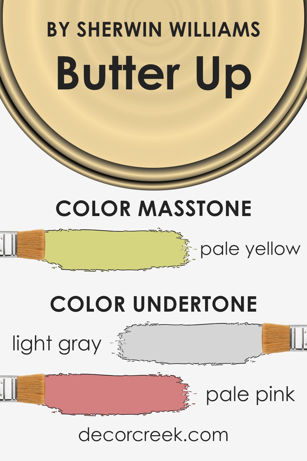
What is the Masstone of the Butter Up SW 6681 by Sherwin Williams?
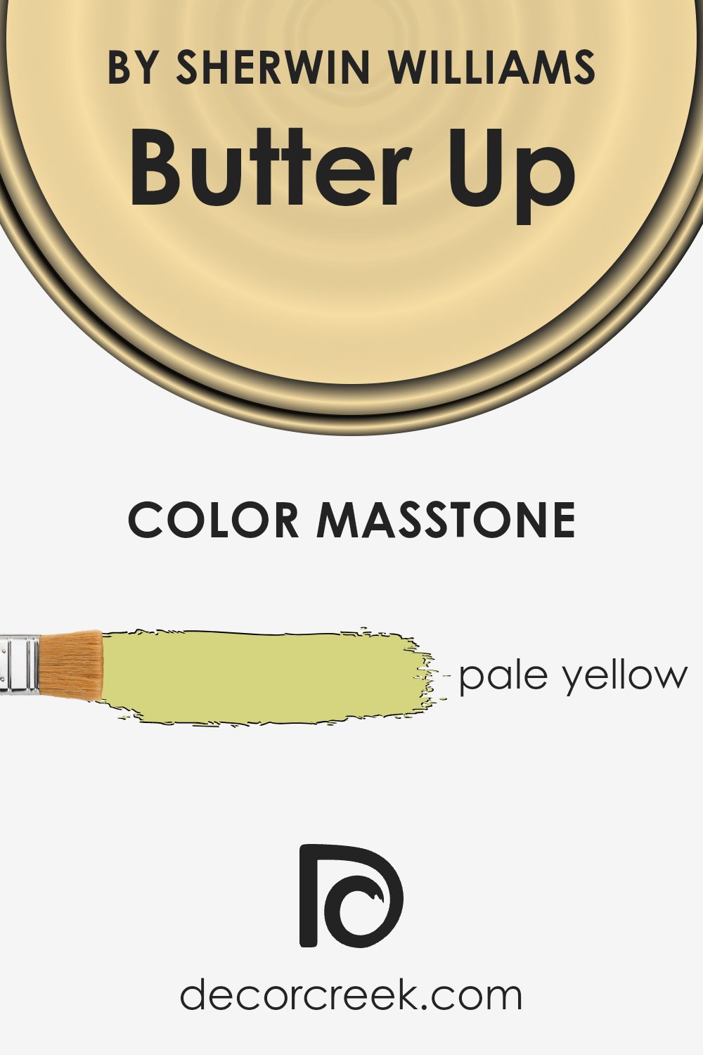
Butter UpSW 6681 by Sherwin Williams has a masstone of pale yellow, resembling the pleasant shade of light butter. This color brings a soft, warm glow to any room, making it feel cozy and welcoming.
Its gentle tone is perfect for spaces where you want to create a relaxed, cheerful atmosphere without overwhelming the senses. The subtlety of pale yellow allows it to blend well with other colors, making it versatile for both modern and traditional homes.
It pairs beautifully with whites, grays, and blues for a fresh, airy look, or with rich browns and greens for a more grounded, nature-inspired vibe. This color is ideal for living areas, kitchens, and bedrooms where a touch of lightness can make the space seem larger and more inviting. Additionally, the mildness of pale yellow helps in spaces with limited natural light, offering a sense of brightness and warmth that enhances the overall ambiance of the home.
How Does Lighting Affect Butter Up SW 6681 by Sherwin Williams?
Lighting plays a crucial role in how we perceive colors. The same paint shade can appear different depending on the type of light it’s exposed to. For instance, Butter Up, a warm and inviting yellow, can show subtle variations under different lighting conditions.
In artificial light, such as that from LED or incandescent bulbs, Butter Up tends to appear more consistently vibrant. Artificial light typically enhances the brightness of warm colors, making this yellow seem lively and more pronounced.
This makes it a great choice for spaces that rely mostly on artificial lighting, as it maintains its cheerful hue.
In natural light, the appearance of Butter Up can change depending on the time of day and the weather. On a sunny day, natural light can intensify its warm tones, making the color appear brighter and more vivid. On cloudy days, however, it might look softer and more muted, but still retains a warm glow.
The orientation of a room also affects how Butter Up looks. In north-facing rooms, which receive less direct sunlight and more cool light, this yellow can appear slightly more subdued and less intense. It might occasionally need additional artificial lighting to bring out its warmth.
South-facing rooms get plenty of direct sunlight, which makes Butter Up look very vibrant and dynamic throughout the day. The paint takes on a lively, energetic quality that can make the room feel cozy and welcoming.
East-facing rooms see the most change with this color, as they get bright morning light that makes Butter Up look very bright and warm early in the day, then gradually more muted as the day progresses.
West-facing rooms have the opposite effect; they might start off more subdued in the morning but become warmly lit in the late afternoon and evening, making Butter Up appear richer and more intense.
These variations show how different lighting conditions can influence the way we perceive the same color, like Butter Up, in various indoor environments.
What is the LRV of Butter Up SW 6681 by Sherwin Williams?
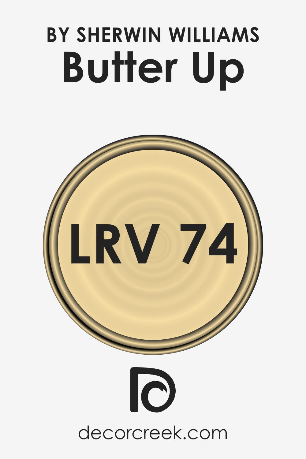
LRV stands for Light Reflectance Value, a measure that indicates the amount of light a paint color reflects or absorbs when applied to a wall. LRV values range from 0, which is completely black, absorbing all light, to 100, which is pure white, reflecting all light.
This value is particularly useful when choosing paint colors as it helps predict how light or dark a color will appear in a space. Higher LRV numbers indicate lighter colors that can make a room feel more open and airy, whereas lower numbers suggest darker shades that tend to make a room feel smaller and cozier.
The LRV for the color Butter Up, which is 73.8, means it is quite light and will reflect a lot of light back into the room. This makes it an excellent choice for spaces that you want to appear brighter and more spacious. Since it reflects a considerable amount of light, using this paint in a room with limited natural light can help brighten the space.
Additionally, the light nature of this color means it will influence the mood of the room, making it feel more inviting and fresh. Therefore, Butter Up is versatile, suitable for various settings, particularly in areas like living rooms or kitchens where a cheerful ambiance is often desired.
Coordinating Colors of Butter Up SW 6681 by Sherwin Williams
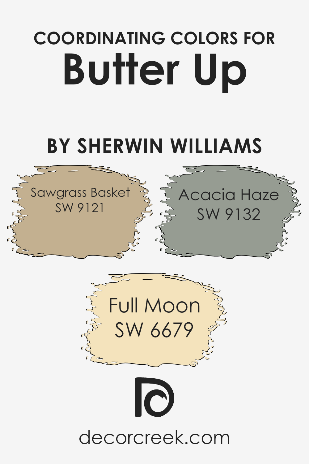
Coordinating colors are complementary shades that blend well with a primary paint color to create a harmonious and visually appealing palette in a space. When chosen well, these colors enhance the main hue, bringing out its best qualities without overpowering it.
For instance, if you’re working with a soft yellow like Butter Up from Sherwin Williams, selecting coordinating colors can subtly accent or contrast the main color to design a balanced and inviting space.
Sawgrass Basket SW 9121 is a rich, deep neutral that offers a grounding effect, providing a strong contrast to the softness of a buttery yellow, making the room feel warm and cozy without dimming its inherent brightness.
On another note, Full Moon SW 6679 brings out a crisp, light, almost ethereal quality that can make a space feel open and airy, complementing the light-hearted nature of a yellow backdrop.
Acacia Haze SW 9132, with its cool, muted green tone, works magic by giving a natural, refreshing touch that pairs beautifully with the earthy quality of yellow, adding a calm and collected feel to the overall look. Together, these colors support and enhance the primary color, creating a cohesive look that ties a room together beautifully.
You can see recommended paint colors below:
- SW 9121 Sawgrass Basket (CHECK A SAMPLE)
- SW 6679 Full Moon (CHECK A SAMPLE)
- SW 9132 Acacia Haze (CHECK A SAMPLE)
What are the Trim colors of Butter Up SW 6681 by Sherwin Williams?
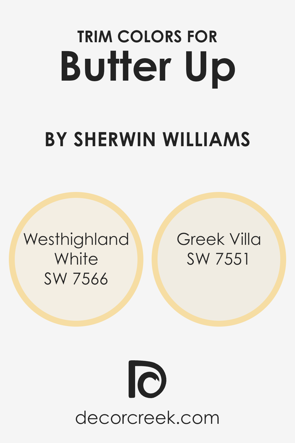
Trim colors are specific shades used on the edges, frames, and borders of walls, doors, windows, and other architectural features to accentuate and define the space. By selecting appropriate trim colors like SW 7566 – Westhighland White and SW 7551 – Greek Villa, you can effectively highlight the creamy yellow tones of Butter Up by Sherwin Williams.
Choosing the right trim color not only complements the main wall color but also enhances the overall aesthetic by adding depth and contrast, making design features stand out. It’s a simple yet impactful way to refine the visual flow and coherence of a room.
SW 7566 – Westhighland White is a bright and clean shade with a subtle warmth that works wonderfully to frame a more saturated or vivid hue like Butter Up. By using it as a trim color, it can provide a crisp boundary that makes the yellow pop while maintaining a seamless, harmonious look.
On the other hand, SW 7551 – Greek Villa offers a slightly muted, off-white tone with a touch of greige, lending a softer edge compared to the starkness of pure white. This trim color can enrich the room’s ambiance with a gentle transition from the cheerful yellow of the walls to the comforting neutrality found in Greek Villa.
You can see recommended paint colors below:
Colors Similar to Butter Up SW 6681 by Sherwin Williams
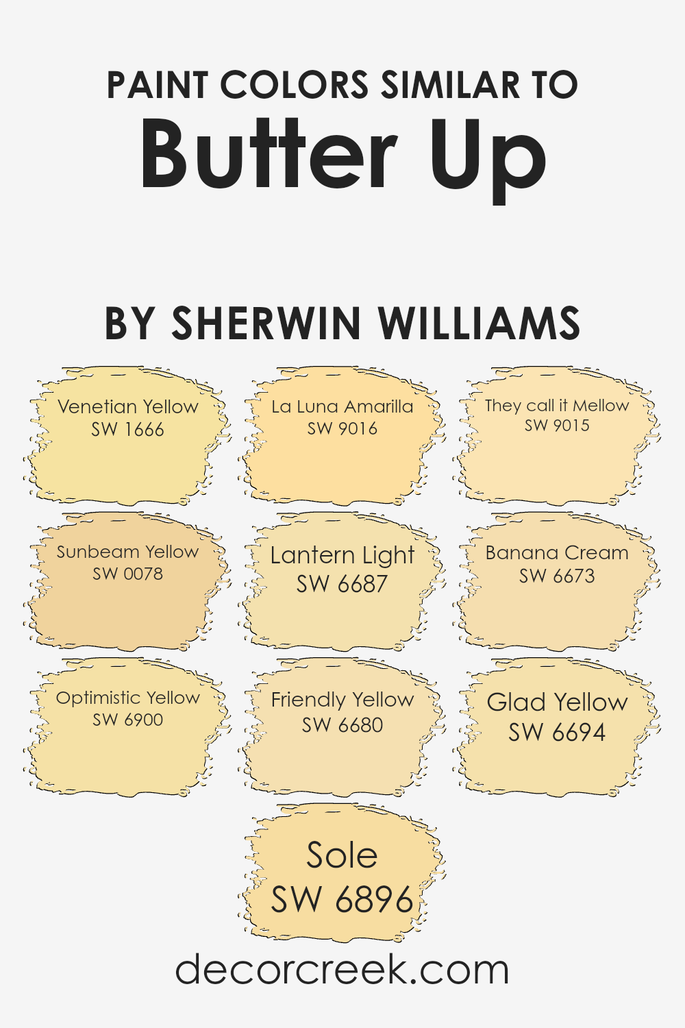
Using similar colors in a design or painting project ensures a harmonious and cohesive appearance, enhancing the overall aesthetic. Colors that are close to each other on the color wheel, such as variations of yellow, offer a subtle contrast while maintaining a unified look.
This technique allows for a smooth transition between shades and creates a soothing effect, which is ideal for spaces meant to foster a relaxing and cheerful atmosphere.
For example, Venetian Yellow is a warm, sun-kissed hue that brings a cozy and inviting tone to any space. It pairs beautifully with Sunbeam Yellow, which has a slightly brighter, more radiant appearance that can brighten up a room.
Optimistic Yellow lives up to its name with a vibrant, energetic feel that sparkles with positivity. In contrast, Sole is a deeper, golden shade that adds a touch of richness and depth. La Luna Amarilla offers a soft, creamy texture that feels both fresh and lush.
Lantern Light is a bit more muted, providing a gentle glow that is comforting and understated. Friendly Yellow has a classic, cheerful look that’s easy on the eyes and uplifting to the spirit. They Call It Mellow is another smooth and creamy color that’s gentle and easygoing, great for creating a relaxed environment. Banana Cream is a delightful, light pastel yellow that adds a hint of sweetness to the palette.
Lastly, Glad Yellow is a bright, welcoming color that instills a sense of happiness and energy, perfect for stimulating spaces. Each of these colors, while unique, share a commonality that makes them work well together, giving designers the flexibility to create a space that is cohesive yet diverse in its use of shades.
You can see recommended paint colors below:
- SW 1666 Venetian Yellow (CHECK A SAMPLE)
- SW 0078 Sunbeam Yellow (CHECK A SAMPLE)
- SW 6900 Optimistic Yellow (CHECK A SAMPLE)
- SW 6896 Sole (CHECK A SAMPLE)
- SW 9016 La Luna Amarilla (CHECK A SAMPLE)
- SW 6687 Lantern Light (CHECK A SAMPLE)
- SW 6680 Friendly Yellow (CHECK A SAMPLE)
- SW 9015 They call it Mellow (CHECK A SAMPLE)
- SW 6673 Banana Cream (CHECK A SAMPLE)
- SW 6694 Glad Yellow (CHECK A SAMPLE)
Colors that Go With Butter Up SW 6681 by Sherwin Williams
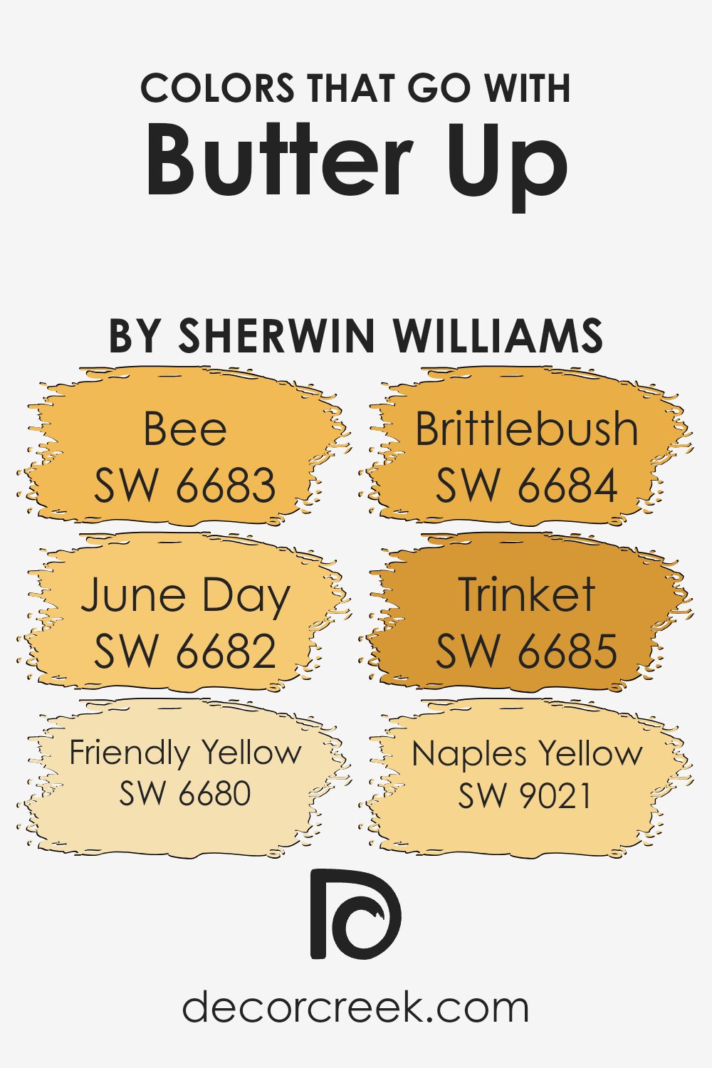
Choosing the right colors to complement Butter Up SW 6681 by Sherwin Williams can significantly enhance the visual appeal of a space. Complementary colors like SW 6683 – Bee, SW 6682 – June Day, SW 6680 – Friendly Yellow, SW 6684 – Brittlebush, SW 6685 – Trinket, and SW 9021 – Naples Yellow bring out the best in Butter Up, creating a harmonious and appealing environment.
Each of these colors has unique characteristics that work well alongside Butter Up to create a warm and inviting atmosphere in any room.
SW 6683 – Bee is a vibrant yellow that brings a sunny brightness to spaces, perfect for areas needing a cheerful touch. SW 6682 – June Day provides a lighter, almost pastel yellow, giving rooms a soft, airy feel. On the other hand, SW 6680 – Friendly Yellow offers a rich, golden hue that complements darker furniture and decor. SW 6684 – Brittlebush has an earthy tone, great for adding a subtle warmth, while SW 6685 – Trinket, with its deeper golden-yellow, can add a touch of luxury. Lastly, SW 9021 – Naples Yellow sports a muted, creamy yellow, excellent for spaces aiming for a gentle splash of color without overwhelming the senses. Mixing and matching these colors can create a pleasing palette that enhances the cheerful essence of Butter Up.
You can see recommended paint colors below:
- SW 6683 Bee (CHECK A SAMPLE)
- SW 6682 June Day (CHECK A SAMPLE)
- SW 6680 Friendly Yellow (CHECK A SAMPLE)
- SW 6684 Brittlebush (CHECK A SAMPLE)
- SW 6685 Trinket (CHECK A SAMPLE)
- SW 9021 Naples Yellow (CHECK A SAMPLE)
How to Use Butter Up SW 6681 by Sherwin Williams In Your Home?
Butter Up by Sherwin Williams is a warm, inviting yellow paint color that can really brighten up any space in a home. This cheerful hue creates a cozy, welcoming atmosphere, making it perfect for living rooms and kitchens where families gather.
The softness of this yellow is not too bold, so it blends nicely with other colors. For example, pairing it with whites or grays in the kitchen can give a clean and fresh look. In the living room, combining it with blues or greens can add a calm, harmonious feel.
Additionally, this color works well in small spaces like bathrooms or hallways, as it helps to make them appear larger and more open. Overall, using Butter Up in your home can add a touch of warmth and light, making your spaces feel more inviting and pleasant.
Butter Up SW 6681 by Sherwin Williams vs Sole SW 6896 by Sherwin Williams
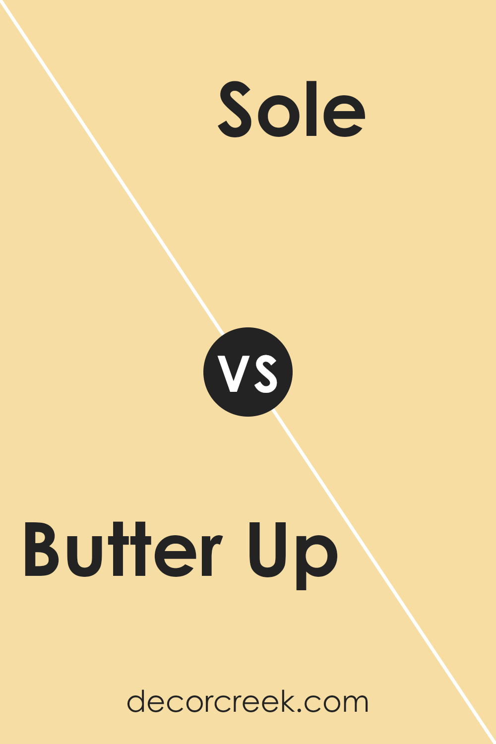
“Butter Up” by Sherwin Williams is a warm, creamy yellow shade that brings brightness and light to a space. It has a soft, inviting quality that makes it perfect for creating cozy, cheerful environments. This color works well in living rooms, kitchens, and nurseries, adding a touch of sunshine to any area.
On the other hand, “Sole” by Sherwin Williams is a vibrant, bold yellow. It has an energetic feel that can liven up a room and draw attention. Because of its stronger hue, Sole is ideal for accent walls or decor pieces that you want to stand out.
Together, these two colors offer distinct vibes – Butter Up with its gentle, soothing presence and Sole with its striking, lively spirit. They can be used in combination to balance out vibrant spots with calm areas, or individually to set a specific mood in different rooms.
You can see recommended paint color below:
- SW 6896 Sole (CHECK A SAMPLE)
Butter Up SW 6681 by Sherwin Williams vs Glad Yellow SW 6694 by Sherwin Williams
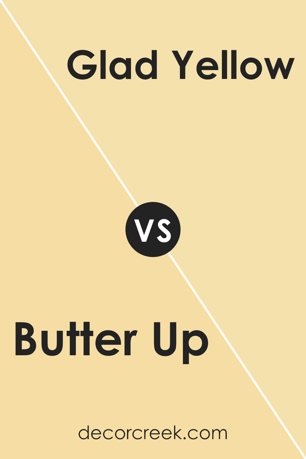
Butter Up and Glad Yellow are two bright colors from Sherwin Williams that each bring their own unique feel to a space. Butter Up is a soft, muted yellow that offers a subtle warmth, making it perfect for creating a cozy and inviting atmosphere in any room.
Its gentle hue works well in spaces that aim for a calm and understated look, without being too bold or overwhelming.
On the other hand, Glad Yellow is a bolder, more vibrant shade of yellow. It’s a color that stands out and brings a cheerful and energetic vibe to a space. This makes it ideal for areas where you want to add a pop of brightness and joy, such as kitchens or children’s play areas.
Both colors are great for adding warmth and light to a room, but Butter Up is better for those who prefer a softer touch, while Glad Yellow suits those looking for a more striking impact.
You can see recommended paint color below:
- SW 6694 Glad Yellow (CHECK A SAMPLE)
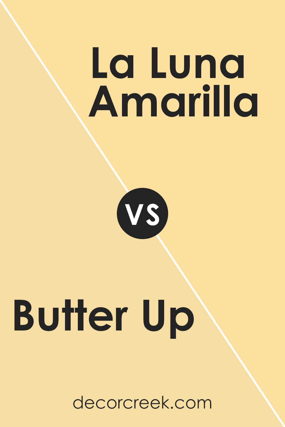
Butter Up SW 6681 by Sherwin Williams vs La Luna Amarilla SW 9016 by Sherwin Williams
“Butter Up” from Sherwin Williams is a warm, creamy yellow that brings a bright and cheerful vibe to any space. It’s soft enough not to overwhelm, making it a great choice for creating a cozy, welcoming atmosphere in rooms that get a lot of light or need a bit of cheer.
On the other hand, “La Luna Amarilla” is a deeper, more golden yellow. This color has a rich, sunlit quality about it, resembling the warm glow of a sunset. It’s a bold choice that makes a statement, ideal for spaces where you want to add a splash of personality and warmth.
Comparing the two, “Butter Up” is lighter and more subdued, excellent for a gentle touch of color in a room. “La Luna Amarilla,” with its golden tones, offers a stronger presence and can be a focal point in a design. Both colors bring warmth but in distinct shades and intensities.
You can see recommended paint color below:
- SW 9016 La Luna Amarilla (CHECK A SAMPLE)
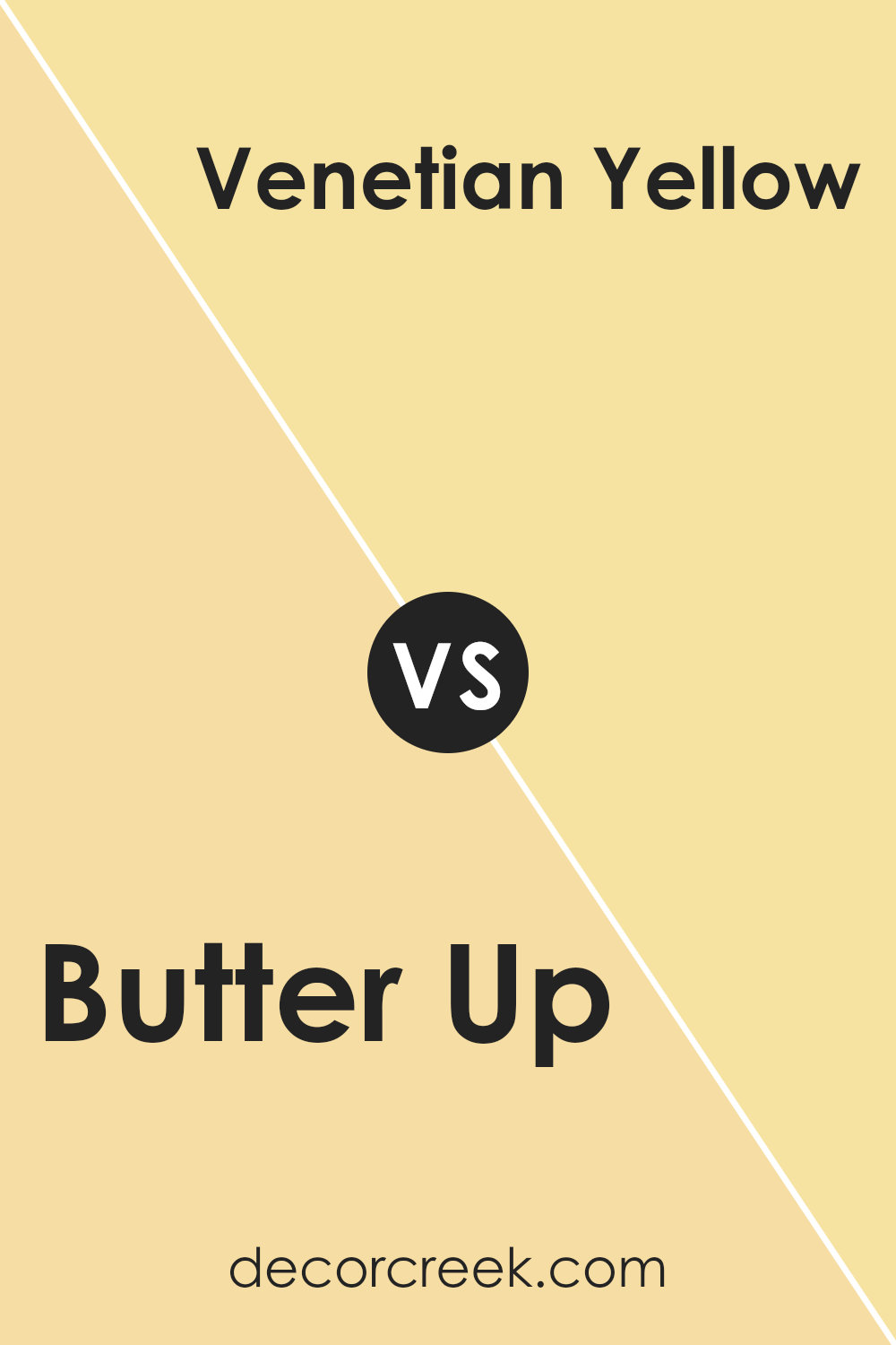
Butter Up SW 6681 by Sherwin Williams vs Venetian Yellow SW 1666 by Sherwin Williams
Butter Up by Sherwin Williams is a warm, soft yellow with a subtle, creamy base, making it perfect for creating a cozy and inviting atmosphere in any room. This color tends to reflect light gently, enlarging spaces while offering a sunlit, airy feel.
On the other hand, Venetian Yellow is a more vivid, bright yellow. This shade is bolder and more striking, ideal for spaces where you want to make a cheerful statement or energize the environment.
Unlike Butter Up, Venetian Yellow draws more attention and can dominate a space if not balanced properly with neutral or calming shades.
In summary, while both colors bring warmth and brightness, Butter Up is softer and more understated, suitable for a relaxed, subtle ambiance. Venetian Yellow is punchier and great for adding vibrancy and a focal point in a space.
You can see recommended paint color below:
- SW 1666 Venetian Yellow (CHECK A SAMPLE)
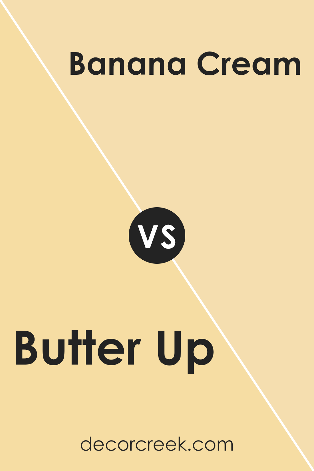
Butter Up SW 6681 by Sherwin Williams vs Banana Cream SW 6673 by Sherwin Williams
Butter Up and Banana Cream, both by Sherwin Williams, are two warm, inviting shades of yellow. Butter Up is a soft, subtle yellow with a creamy feel that gives a soothing touch to any room. It’s less intense than some yellows, making it easier to incorporate into various decorating styles.
On the other hand, Banana Cream is a brighter, more vibrant yellow. This color is bolder and can instantly cheer up a space, making it feel more lively and energetic. Both colors work well in spaces where you want to add light and warmth, but the choice between them depends on how subtle or bold you want to go.
Butter Up is better if you prefer a more muted yellow, while Banana Cream is ideal for adding a pop of brightness.
You can see recommended paint color below:
- SW 6673 Banana Cream (CHECK A SAMPLE)
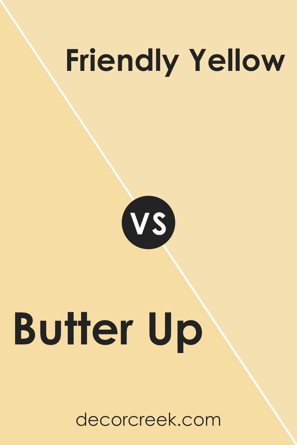
Butter Up SW 6681 by Sherwin Williams vs Friendly Yellow SW 6680 by Sherwin Williams
“Butter Up” and “Friendly Yellow” are both cheerful colors by Sherwin Williams, but they have subtle differences. “Butter Up” is a soft, muted yellow that brings a warm, cozy feel to a room. It’s like the gentle color of butter and can give a relaxing vibe to any space.
On the other hand, “Friendly Yellow” is a brighter, more vibrant shade. It’s closer to the sunny side of yellow, making it perfect for spaces where you want a lively and energetic atmosphere.
While “Butter Up” might work better in a bedroom or living room for a calming effect, “Friendly Yellow” is great for kitchens, playrooms, or any area where you want to inject positivity and a bit of fun.
Depending on the mood you want to set, each color has its own charm and ideal use.
You can see recommended paint color below:
- SW 6680 Friendly Yellow (CHECK A SAMPLE)
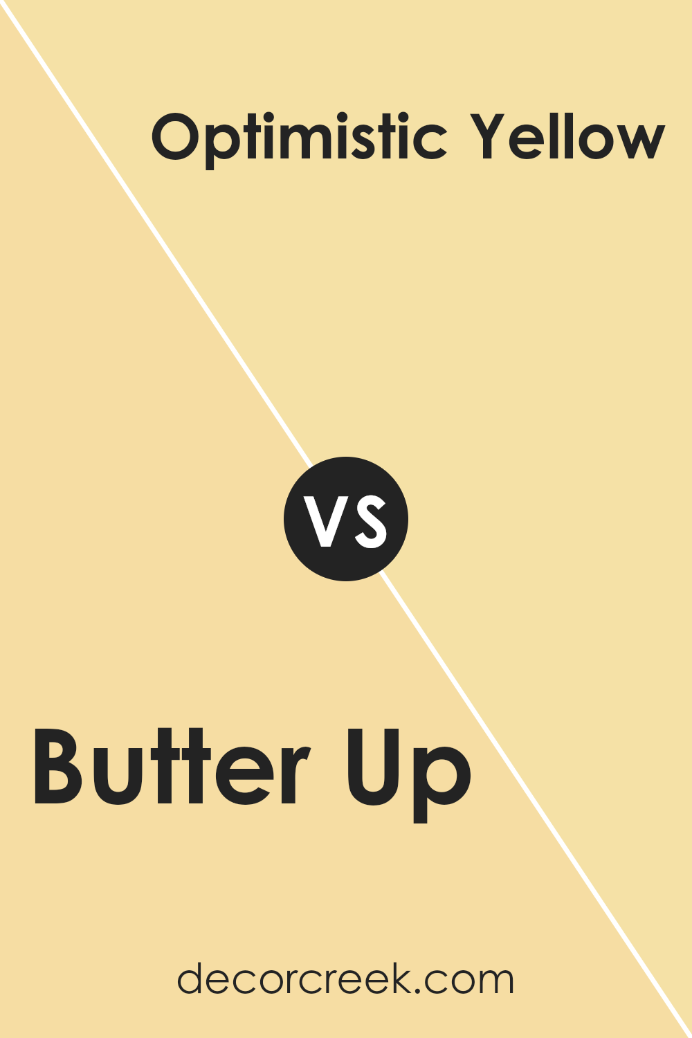
Butter Up SW 6681 by Sherwin Williams vs Sunbeam Yellow SW 0078 by Sherwin Williams
The color “Butter Up” by Sherwin Williams is a soft, warm yellow that gives rooms a cozy, welcoming feel. It carries a buttery tone that pairs well with a variety of colors, making it versatile for different spaces and design aesthetics.
On the other hand, “Sunbeam Yellow” is a brighter, more vibrant yellow. This color is more intense and energetic, ideal for spaces where you want to add a lively splash of brightness. It stands out more vividly against other colors, making it a good choice for accent walls or areas that benefit from a cheerful boost.
In terms of mood and effect, Butter Up offers a calmer, more subdued ambiance, great for relaxed environments. Sunbeam Yellow, with its radiant energy, is better suited for areas that aim to stimulate activity and happiness.
Both colors are great choices for bringing warmth into a space but serve slightly different purposes depending on the atmosphere you’re aiming to create.
You can see recommended paint color below:
- SW 0078 Sunbeam Yellow (CHECK A SAMPLE)
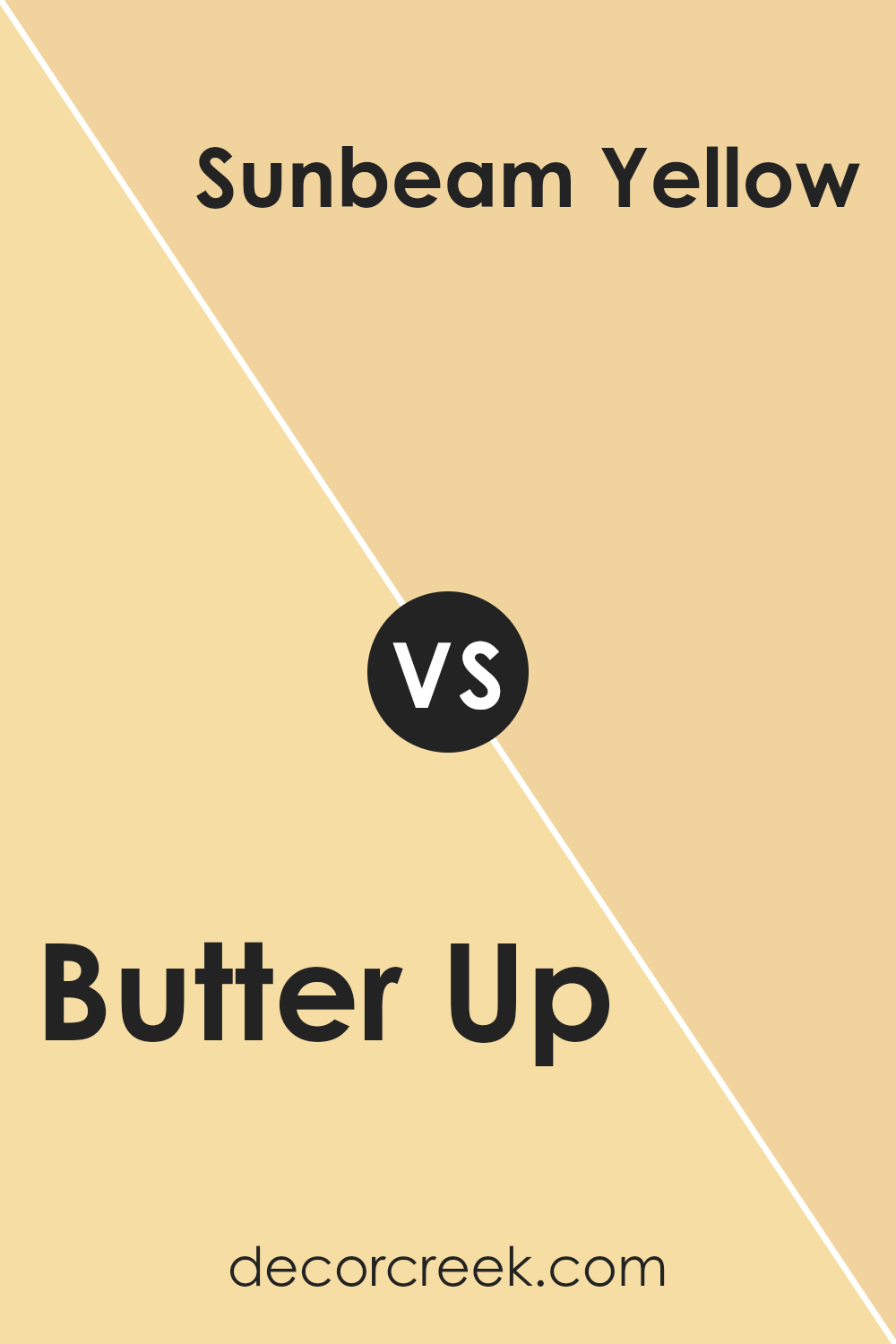
Butter Up SW 6681 by Sherwin Williams vs Lantern Light SW 6687 by Sherwin Williams
Butter Up and Lantern Light by Sherwin Williams are both warm and inviting colors, though they have distinct tones. Butter Up is a soft, muted yellow that brings a gentle and welcoming feel to a room. It’s a subtle color, perfect for creating a cozy, relaxed atmosphere. This hue works well in living rooms and kitchens where you want a hint of warmth without overwhelming brightness.
Lantern Light, on the other hand, is a brighter and more vibrant yellow. It has a sunny quality to it, making spaces feel cheerful and lively. This color is great for areas where you want to add energy and a sense of joy, such as dining areas or a child’s playroom.
Both colors are warm yellows from the same color family but serve different purposes based on their intensity and the mood you want to set in your space. Butter Up is more subdued for a calm feel, while Lantern Light is punchier for an energetic environment.
You can see recommended paint color below:
- SW 6687 Lantern Light (CHECK A SAMPLE)
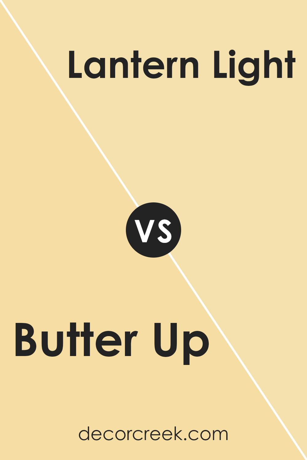
Butter Up SW 6681 by Sherwin Williams vs They call it Mellow SW 9015 by Sherwin Williams
“Butter Up” and “They call it Mellow” are both warm, inviting colors by Sherwin Williams, but they have distinct tones that set them apart. “Butter Up” is a lively, bright yellow that brings a cheerful vibe to a room. It’s the kind of color that makes spaces feel sunny and energetic, perfect for kitchens or family rooms where you want a happy, uplifting atmosphere.
On the other hand, “They call it Mellow” has a more subdued, soft yellow tone, resembling a pale mustard. This color is more muted compared to “Butter Up,” giving it a gentle, calming feel. It’s ideal for creating a cozy, peaceful setting in places like bedrooms or reading nooks where you want to relax.
Both colors add warmth to any space but in different ways: “Butter Up” with its vibrant energy and “They call it Mellow” with its quiet warmth.
You can see recommended paint color below:
- SW 9015 They call it Mellow (CHECK A SAMPLE)
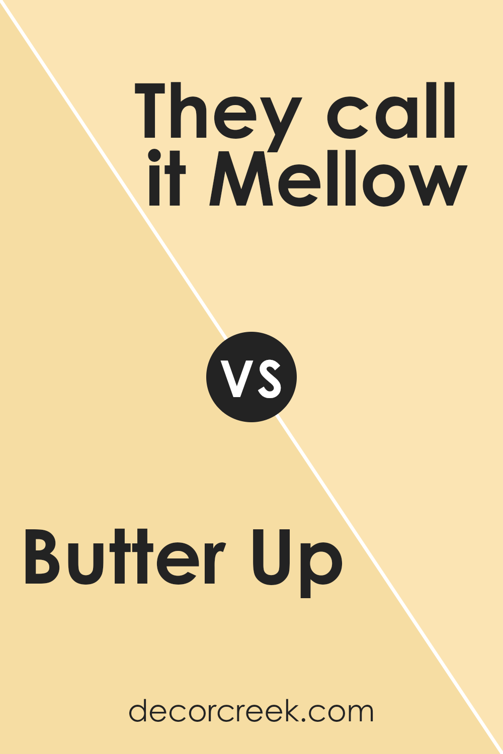
Butter Up SW 6681 by Sherwin Williams vs Optimistic Yellow SW 6900 by Sherwin Williams
Butter Up and Optimistic Yellow, both from Sherwin Williams, present lively yet distinct yellow hues. Butter Up offers a soft, creamy yellow that resembles the gentle color of butter. It’s perfect for creating a light, welcoming atmosphere without overwhelming a space. It works well in kitchens, living rooms, and nurseries, adding a subtle warmth.
In contrast, Optimistic Yellow sports a vibrant, vivid yellow. This shade is bolder and more striking, making it a great choice for spaces where you want to inject energy and cheerfulness. It could be a fantastic option for accent walls, playrooms, or any area needing a pop of brightness.
Both colors bring their unique vibes to interiors, with Butter Up leaning towards a calm, muted palette, and Optimistic Yellow standing out with its lively intensity. Whether you prefer a gentle whisper of color or a shout of joy, these yellows cater to different tastes and styles.
You can see recommended paint color below:
- SW 6900 Optimistic Yellow (CHECK A SAMPLE)
Conclusion
Concluding my review of SW 6681 Butter Up by Sherwin Williams, I’ve found this paint color to be an excellent choice for anyone looking to warm up their space with a soft, cheerful yellow. Butter Up provides a cozy, inviting atmosphere without being too overpowering or bright, making it suitable for almost any room in the house. Throughout my testing, it showed great coverage and durability, which adds good value, especially for busy areas.
I experimented with Butter Up in various lighting conditions and was impressed with how it maintained its warm tone, bringing a sunny vibe to my environment even on dull days. Its compatibility with a wide range of décor styles, from rustic to modern, also makes it versatile for various projects.
After seeing it in action, I’m convinced that Butter Up is an ideal choice for anyone looking to add a touch of warmth to their home. It’s a color that is both functional and aesthetically pleasing, making any space more welcoming.
I highly recommend giving Butter Up a try if you’re considering a fresh look for your interiors. It really lives up to expectations, offering a balanced, attractive finish that’s sure to enhance your decorating scheme.

Ever wished paint sampling was as easy as sticking a sticker? Guess what? Now it is! Discover Samplize's unique Peel & Stick samples.
Get paint samples


