In the kaleidoscopic world of colors, few evoke as much serenity, purity, and versatility as white. A particular hue capturing the hearts of homeowners and interior designers alike is Sherwin Williams’ SW 7566 Westhighland White.
This article aims to delve into the depths of this color, unraveling its characteristics, undertones, and perfect pairings and exploring its varied applications in home décor and design.

What Color Is SW 7566 Westhighland White?
SW 7566 Westhighland White is a soft, soothing shade of white with an understated elegance that speaks volumes. Despite its seemingly simple appearance, it presents a rich canvas of potential, able to adapt and enhance the various design elements in a room. It exudes an aura of calm and tranquility, effortlessly melding into a room’s ambiance and setting a serene tone for the space.
At the heart of SW 7566 Westhighland White lies a hint of sophistication, brought to life by a very slight beige undertone.
This underlying touch infuses the color with a warmth that keeps it from appearing too stark or clinical, resulting in a hue that is inviting and cozy while still retaining the pristine charm associated with white.

Is It a Warm or Cool Color?
While SW 7566 Westhighland White might initially appear neutral, it leans more towards the warm spectrum. This is due to its subtle beige undertone, which imparts a degree of coziness and warmth to the color. However, its warmth is understated, allowing it to harmonize beautifully with both warm and cool shades.
Undertones of SW 7566 Westhighland White
As mentioned, SW 7566 Westhighland White has a very slight beige undertone. Understanding undertones is crucial as they play a significant role in how we perceive color. An undertone, essentially, is the color lurking beneath the surface, subtly influencing the overall hue.
When the undertone complements the overall color scheme of a room, it results in a harmonious blend, enhancing the aesthetic appeal of the space. The beige undertone in SW 7566 Westhighland White adds a delicate warmth to the color, preventing it from appearing too stark or sterile.

Coordinating Colors of SW 7566 Westhighland White
Coordinating colors are those that, when paired with a base color, create a pleasing and harmonious palette. They work by enhancing the base color’s appeal, either by contrasting with it or complementing it. Here are some coordinating colors for SW 7566 Westhighland White:
- SW 7036 Accessible Beige : A muted beige with a warm undertone, it pairs well with Westhighland White by offering a contrasting yet harmonious hue.
- SW 7072 Online : A cool gray color, it offers a striking contrast to Westhighland White, accentuating its warmth.
- SW 6282 Mauve Finery : This gentle blush color introduces a touch of femininity to the palette, pairing beautifully with Westhighland White.
- SW 2822 Downing Sand : A neutral sandy color, it adds depth to the palette, complementing Westhighland White’s slight beige undertone.
Adding to these, consider the following:
- SW 7005 Pure White : As a clean, neutral white, it reinforces the brightness of Westhighland White.
- SW 7035 Aesthetic White : A beige-tinged white, it further emphasizes the warm undertone of Westhighland White.
- SW 7008 Alabaster : A warmer off-white hue, it enhances the cozy ambiance created by this color.

How Does Lighting Affect SW 7566 Westhighland White?
Lighting, both natural and artificial, greatly affects how we perceive colors, and SW 7566 Westhighland White is no exception. During daylight hours, when natural light floods a room, Westhighland White may appear brighter and slightly cooler. The color’s soft beige undertone becomes more apparent under warm, yellow-toned artificial lights, making it appear cozier and warmer.
Dimmer settings can also transform the color dramatically, from a bright, inviting white to a more intimate, subdued hue. Conversely, in spaces with little to no natural light, Westhighland White might lean towards a cooler tone. Understanding these changes in color perception based on lighting conditions is key to optimizing Westhighland White’s use in your home.

LRV of SW 7566 Westhighland White
The Light Reflectance Value (LRV) of color is a measure of how much light it reflects on a scale of 0 (absolute black, absorbing all light) to 100 (pure white, reflecting all light). SW 7566 Westhighland White has an LRV of 86, making it a very light-reflective color. This means it can effectively brighten up spaces, making rooms appear larger and more spacious.
An LRV of 86 also ensures that Westhighland White is versatile, working well in various lighting conditions and with diverse color palettes. It reflects a significant amount of light, preventing it from feeling oppressive or heavy in smaller or darker spaces.
Its high LRV also makes it an excellent choice for spaces that need to feel airy and open, such as living rooms and kitchens.

LRV – what does it mean? Read This Before Finding Your Perfect Paint Color
Trim Colors of SW 7566 Westhighland White
Trim colors play a pivotal role in accentuating architectural details and adding depth to a space. They are usually applied to skirting boards, door frames, window frames, and molding. For SW 7566 Westhighland White, consider these shades of white from Sherwin Williams for the trim:
- SW 7006 Extra White : This is a pure, bright white that will create a sharp contrast with Westhighland White, making the latter pop.
- SW 7008 Alabaster : A warmer white that will harmonize with Westhighland White’s subtle beige undertone.
- SW 7005 Pure White : A neutral white that provides a soft contrast, letting Westhighland White shine without stealing the spotlight.

Colors Similar to SW 7566 Westhighland White
Knowing similar colors can be useful for identifying alternative options, coordinating color schemes, and creating a harmonious palette. Here are some colors similar to SW 7566 Westhighland White:
- SW 7103 Whitetail : A soft, warm white that leans slightly more toward creaminess, perfect for a cozy yet bright space.
- SW 7102 White Flour : A muted, off-white hue with a subtle warm undertone, lending a soft and soothing ambiance.
- SW 7551 Greek Villa : A bit richer and slightly more beige, it offers a warmer and cozier look.
- SW 8917 Shell White : An off-white with a subtle gray undertone, providing a cooler, more neutral alternative.
Recognizing similar colors is important because they can be used interchangeably in a color scheme, providing alternatives if the primary color isn’t exactly as desired. They can also be used to create subtle variations in a monochromatic color scheme.

Colors That Go With SW 7566 Westhighland White
Pairing colors that work well together is crucial for creating a cohesive and aesthetically pleasing color scheme. Here are some colors that look great with SW 7566 Westhighland White:
- SW 7665 Wall Street : A deep blue-gray, it provides a bold contrast, making Westhighland White appear brighter.
- SW 6015 Vaguely Mauve : A soft, grayish mauve, it introduces a touch of femininity and softness to the palette.
- SW 6018 Enigma : A dark, mysterious purple, it creates a striking and sophisticated contrast.
- SW 7567 Natural Tan : A warm, muted beige, it complements the beige undertone in Westhighland White.
- SW 9037 Baby Bok Choy : A light, fresh green, it introduces a natural and calming element to the palette.
- SW 7019 Gauntlet Gray : A medium-tone gray with a touch of warmth, it adds depth and sophistication.
Harmonious color combinations make a room feel balanced and create an atmosphere that’s pleasing to the eye. These colors either contrast or complement Westhighland White, providing visual interest and enhancing the overall design.

How to Use SW 7566 Westhighland White In Your Home?
SW 7566 Westhighland White is versatile, making it ideal for numerous rooms and interior design styles. Its subtle warmth can foster a welcoming ambiance in a modern living room or introduce a sense of serenity in a traditional bedroom. Its high LRV makes it perfect for small spaces that need brightening or large rooms that require a unifying color. This adaptable hue can also complement various materials, from the rustic charm of weathered wood to the sleek appeal of modern metal accents.
How to Use SW 7566 Westhighland White in the Bedroom?
In the bedroom, SW 7566 Westhighland White can create a calming atmosphere, ideal for relaxation and sleep. Pair it with soft, warm tones for a cozy feel or with cool blues and greens for a more refreshing vibe. Its high LRV ensures that the room feels bright and airy during the day, while its subtle warmth keeps it from feeling too stark or cold.
Consider using Westhighland White on the walls, with deeper, richer colors for the furniture and soft furnishings. This creates a serene backdrop, allowing the other elements in the room to take center stage. Alternatively, for a monochromatic palette, pair it with other warm whites and neutral tones, playing with textures to add depth and interest.

How to Use SW 7566 Westhighland White in the Bathroom?
Westhighland White can work wonders in a bathroom, creating a clean, serene space that feels like a personal spa. Its subtle warmth makes the space feel welcoming rather than clinical. Pair it with earthy, warm neutrals for a natural, organic feel or with cool blues and greens for a refreshing, watery theme.
Use Westhighland White for the walls and ceiling to maximize light reflection, especially if the bathroom is small or lacks natural light. For a touch of sophistication, consider a contrasting dark tile on the floor or a colorful mosaic backsplash.

How to Use SW 7566 Westhighland White in the Living Room?
In a living room, Westhighland White offers a perfect backdrop for various design elements. It can make the space feel larger and brighter, especially when paired with plenty of natural light. Consider contrasting it with darker furniture or accents to add depth and visual interest to the room.
For a modern aesthetic, pair Westhighland White with sleek blacks and grays, allowing for a pop of color through accessories. For a more classic or traditional style, coordinate it with warmer neutrals, muted blues, or soft greens. The key is to balance the brightness of Westhighland White with elements that provide contrast or warmth.

How to Use SW 7566 Westhighland White for an Exterior?
For home exteriors, Westhighland White is a classic choice that offers a timeless appeal. It reflects sunlight beautifully, helping to keep the home cool during hot months. Pair it with contrasting trim colors to highlight architectural features and add character to your home’s facade.
Consider using Westhighland White for the siding, with a darker color like Gauntlet Gray or Wall Street for the roof, for a striking contrast. The subtle warmth of Westhighland White also coordinates well with natural wood or stone accents, adding to the curb appeal of the home.

How to Use SW 7566 Westhighland White for the Kitchen?
In the kitchen, Westhighland White can create a bright, clean, and inviting space. Use it on the walls to reflect light and make the room feel more spacious. Pair it with warm wooden tones for a rustic or farmhouse style or with sleek black and metallic accents for a modern look.
For a more traditional kitchen, consider pairing Westhighland White with a classic subway tile backsplash and marble countertops. For a contemporary twist, try it with a colorful tile backsplash or vibrant kitchen accessories.

How to Use SW 7566 Westhighland White for the Kitchen Cabinets?
Westhighland White is a great choice for kitchen cabinets. It can help brighten the space and make it feel clean and fresh. The cabinets can be paired with contrasting hardware in brass or black for a chic, modern look.
For a monochromatic scheme, consider Westhighland White cabinets with a slightly darker or warmer white for the walls. This creates a subtle contrast, adding depth and interest to the kitchen. For a more dramatic look, try pairing Westhighland White cabinets with darker countertops or a vibrant backsplash.

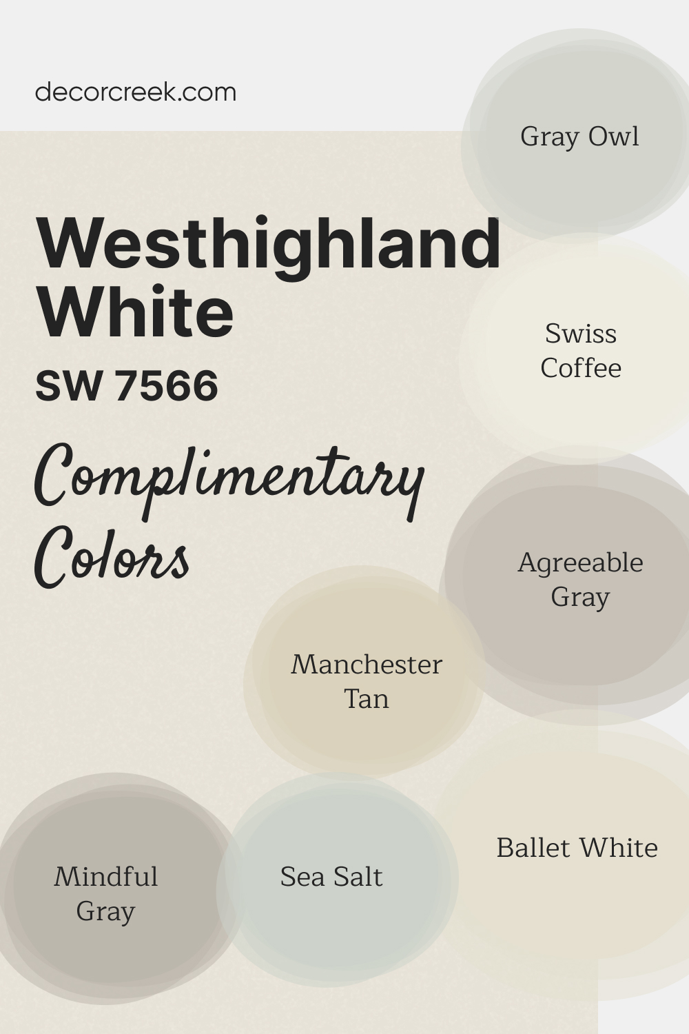
Complimentary Colors for Westhighland White SW 7566 Paint Color by Sherwin-Williams
Westhighland White SW 7566 by Sherwin-Williams is a warm, inviting white that adds a cozy feel to any room. Its soft undertones make it perfect for creating a bright yet welcoming atmosphere.
Whether used on walls, trim, or cabinetry, this shade blends seamlessly with a variety of complementary colors. For a warm, neutral palette, Ballet White OC-9 and Swiss Coffee OC-45 provide subtle warmth.
Manchester Tan HC-81 and Mindful Gray SW 7016 add depth and contrast, while Sea Salt SW 6204 and Gray Owl OC-52 bring gentle color to the mix.
Agreeable Gray SW 7029 offers a versatile option that ties the palette together for a harmonious look.
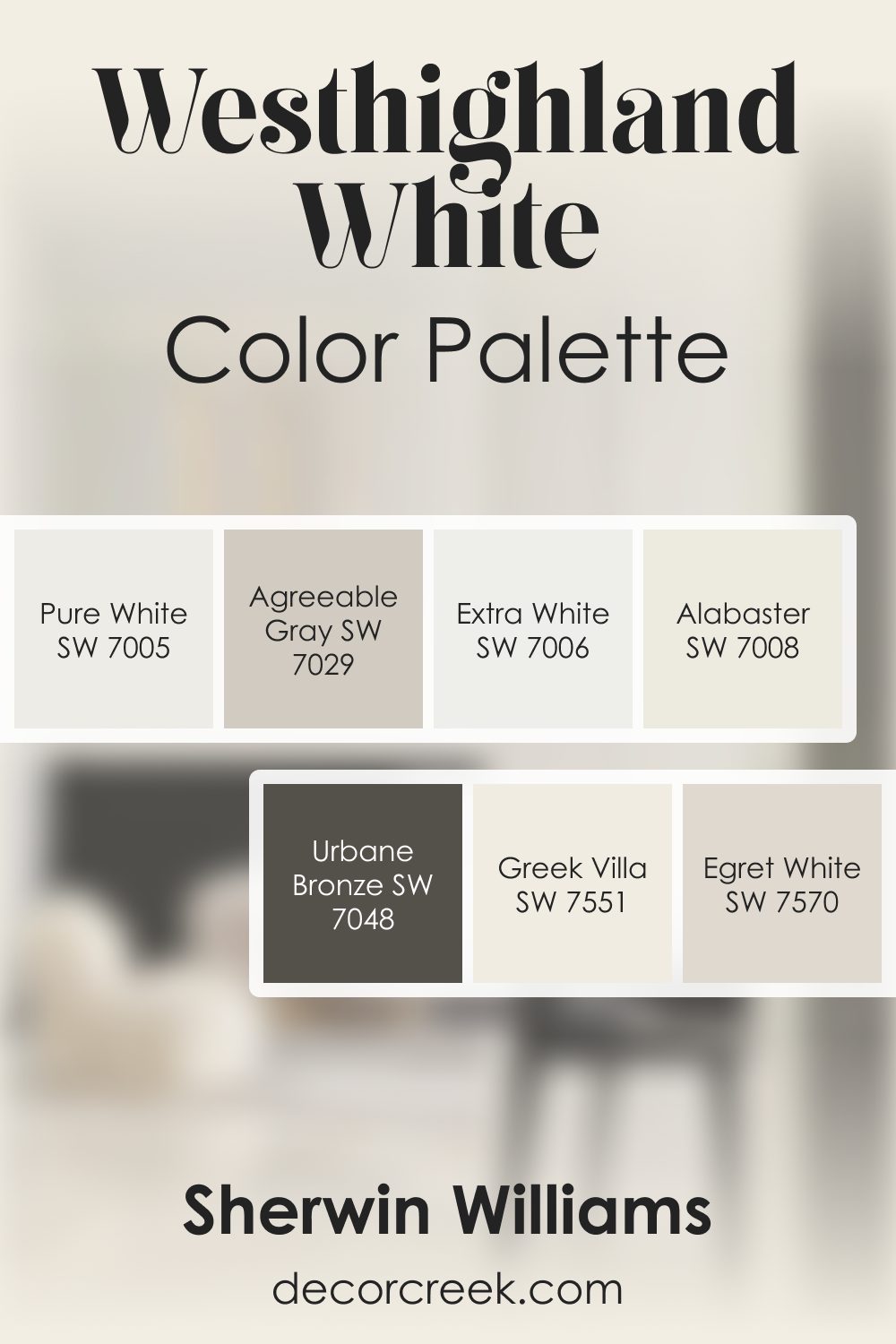
Westhighland White SW 7566 by Sherwin Williams Color Palette
Westhighland White shines with a creamy softness that pairs beautifully with both light and dark accents.
Alabaster, Pure White, and Greek Villa keep the palette bright and uplifting, giving your home a gentle glow. Egret White and Agreeable Gray bring a light warmth that feels inviting and calm.
Urbane Bronze adds a rich contrast—bold yet grounded—while Extra White offers a crisp finishing touch.This palette suits homes that want warmth without heaviness, brightness without sharpness.
Each color blends smoothly with the next, making your rooms feel thoughtful and welcoming.
It’s a lovely collection for creating interiors that feel both fresh and comforting.
Comparing SW 7566 Westhighland White With Other Colors
Comparing colors is essential to understanding their differences and similarities, their effects on mood and space, and how they work together in a color scheme. Here, we compare SW 7566 Westhighland White with six other colors.
SW 7566 Westhighland White vs. SW 7548 Portico
SW Portico is a soft, warm neutral with a taupe undertone. Compared to Westhighland White, it’s darker and warmer, making it a great complementary color for creating a warm, cozy space. Where Westhighland White provides brightness and openness, SW Portico offers depth and warmth.

SW 7566 Westhighland White vs. SW 7547 Sandbar
SW Sandbar is a muted beige with a touch of gray. It’s considerably darker and warmer than Westhighland White. While Westhighland White works wonderfully as a bright, neutral backdrop, SW Sandbar can add subtle warmth and complexity to the palette.

SW 7566 Westhighland White vs. SW 7647 Crushed Ice
SW Crushed Ice is a very light gray with a slight blue undertone. It appears cooler and grayer than Westhighland White. While Westhighland White offers subtle warmth, SW Crushed Ice introduces a touch of cool serenity.

SW 7566 Westhighland White vs. SW 7014 Eider White
SW Eider White is a light gray with a purple undertone. It’s noticeably cooler and grayer compared to Westhighland White. Westhighland White provides a more neutral and versatile backdrop, while SW Eider White infuses the space with a cooler, more contemporary vibe.

SW 7566 Westhighland White vs. SW 7008 Alabaster
SW Alabaster is a warm, creamy white. It has a noticeably warmer and creamier hue compared to Westhighland White. While both colors share a warm undertone, SW Alabaster offers a more traditional, cozy feel compared to the bright, neutral appeal of Westhighland White.

SW 7566 Westhighland White vs. SW 7570 Egret White
SW Egret White is a soft white with a subtle gray undertone. Compared to Westhighland White, it leans more towards gray and is slightly cooler. Both colors work beautifully as neutral backdrops, but where Westhighland White imparts a sense of crisp freshness, Egret White provides a touch of modern sophistication.
Conclusion
SW 7566 Westhighland White is a versatile, bright, warm white that is ideal for many different applications in home decor. From enhancing the brightness of space to creating a serene atmosphere, it’s a go-to choice for many homeowners and designers. Its high LRV, subtle undertones, and compatibility with a range of colors make it an exceptional choice for both interiors and exteriors.
When compared to other whites and light neutrals, Westhighland White stands out for its balance of warmth and neutrality. It’s a shade that complements a variety of design styles and can effortlessly tie together diverse color palettes. Its understanding allows you to make informed decisions on the overall look and feel of your space.
Whether you’re considering a complete home makeover or a simple room refresh, SW 7566 Westhighland White offers a timeless, sophisticated foundation on which you can build your vision. Always remember to consider lighting, complementary colors, and your personal style when choosing your perfect shade. The right color can transform your space into a place you love, and SW 7566 Westhighland White might just be the color to do that.

Ever wished paint sampling was as easy as sticking a sticker? Guess what? Now it is! Discover Samplize's unique Peel & Stick samples.
Get paint samples

Frequently Asked Questions
⭐What undertones does SW 7566 Westhighland White have?
SW 7566 Westhighland White has a very slight beige undertone, which adds a subtle warmth to the color, making it perfect for a wide range of home decor applications.
⭐What coordinating colors can be used with SW 7566 Westhighland White?
Some of the coordinating colors that pair beautifully with Westhighland White include SW Accessible Beige, SW Online, SW Mauve Finery, SW Downing Sand, and a few other similar shades. These colors can create a harmonious color scheme that brings out the best of Westhighland White.
⭐How does lighting affect SW 7566 Westhighland White?
Like any color, lighting can have a significant impact on how SW 7566 Westhighland White is perceived. Under warm, incandescent light, its beige undertones may appear more prominent, creating a slightly creamier appearance. In cool, natural daylight, it may appear brighter and more neutral.
⭐What is the Light Reflectance Value (LRV) of SW 7566 Westhighland White?
The Light Reflectance Value (LRV) of SW 7566 Westhighland White is 86. This high LRV means that it reflects a substantial amount of light, making it a great choice for brightening up spaces and making them feel more open and spacious.
⭐Which rooms work best with SW 7566 Westhighland White?
Due to its versatility, SW 7566 Westhighland White works well in virtually any room, from kitchens and bathrooms to bedrooms and living rooms. It's also an excellent choice for exteriors, reflecting sunlight and providing a classic curb appeal.


I am trying to select a kitchen cabinet paint color to go with Taj Mahal quartzite. The cabinet molding connects to the kitchen, living room and dining rooms molding.
I have watched so many of your videos and you suggested Dover white but I feel it looks to yellow. I am leaning towards SW west highland white. will this be too start for kitchen cabinets. Floors are warm brown.
Also, Kitchen and connected front hall has a chair rail. I am thinking accessible beige on lower half with Alabaster on top and West highland white as trim.
comment or suggestion much appreciated.
Thanks