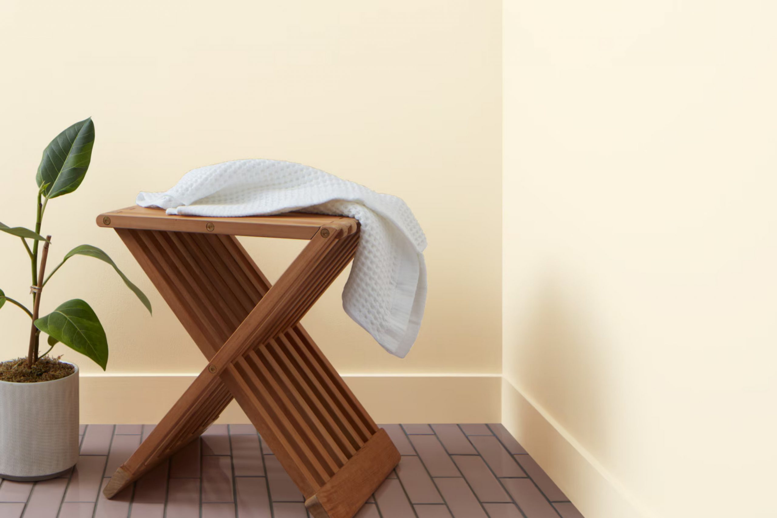
As I started my search for the perfect paint to refresh my living room, I stumbled upon OC-105 Calming Cream by Benjamin Moore. This color stood out for its soft, subtle warmth, and I knew it would bring a fresh feel to the room without being too strong.
It’s a color that seems to offer just the right blend of coziness and brightness, making it ideal for a room where you want to relax and unwind. The cream hue has a soothing effect, making it a perfect backdrop for both lively family gatherings and quiet evenings alone.
It works well with a variety of decor styles, from rustic to modern, adapting seamlessly to the existing vibes of a home. By choosing Calming Cream, I was hoping not just to repaint the walls, but to enhance the entire feel of the room.
Whether paired with bold colors or soft neutrals, this shade has the potential to tie everything together beautifully. In my quest for a paint that would not only change the color of my walls but also create a serene and welcoming environment, OC-105 Calming Cream appeared to be an excellent choice.
What Color Is Calming Cream OC-105 by Benjamin Moore?
Calming Cream OC-105 by Benjamin Moore is a warm, welcoming off-white shade with a soft touch of beige. Its subtle creaminess provides a cozy, comforting aura, making any room feel more inviting. The color’s neutral tone ensures it fits well with a variety of interior styles, particularly those that aim for a relaxed and homey atmosphere such as rustic, country, or traditional designs.
This color pairs wonderfully with natural materials like wood, bringing out their rich tones, or with stone, where it adds a gentle contrast. Fabrics like cotton, linen, and wool look particularly lovely with Calming Cream, as the texture of these materials complements the softness of the color.
Whether used on walls, trim, or as an accent, Calming Cream creates a harmonious backdrop that allows furniture and decor items to stand out.
It’s especially effective in living rooms, bedrooms, and kitchens where a light, airy feel is desirable. In rooms with plenty of natural light, Calming Cream brightens the area by gently reflecting light, helping it feel more open and spacious.
In dimmer rooms, its warm undertones help the area feel more inviting and cozy — perfect for creating a snug retreat.
Is Calming Cream OC-105 by Benjamin Moore Warm or Cool color?
Calming Cream OC-105 by Benjamin Moore is a soft, warm white paint that brings a gentle cozy feel to any room. Ideal for creating a relaxed environment, it pairs well with various decor styles from traditional to modern.
Its subtle cream undertones add warmth, making the room feel inviting and homey without looking too stark or cold. This color works beautifully in areas with less natural light, as it helps reflect light and brighten the surroundings. Calming Cream works well with both bright colors for a cheerful feel and neutral tones for a softer, more relaxed look.
It’s particularly effective in living areas, bedrooms, and kitchens where a soft backdrop is desired. This shade is also a great choice for trim, providing a slight contrast to walls painted in deeper colors without harsh transitions. Overall, Calming Cream OC-105 is a practical choice for bringing a fresh, airy feel to any home.
Undertones of Calming Cream OC-105 by Benjamin Moore
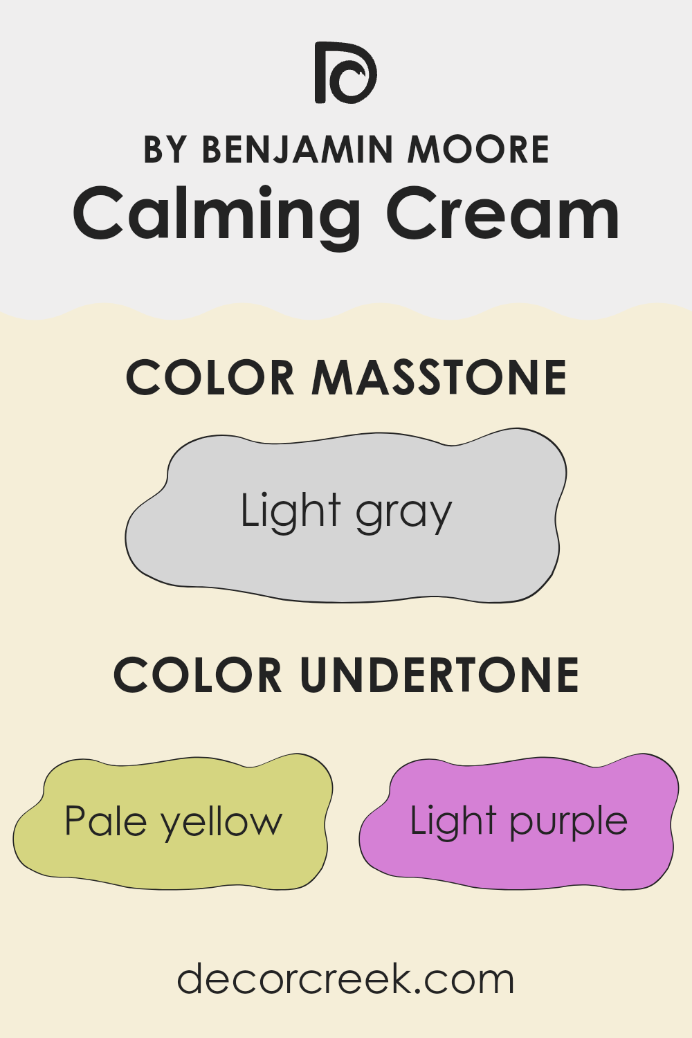
Calming Cream is a soft and warm neutral paint color that adds a cozy touch to any room. Undertones are subtle colors that blend into the main shade, influencing how the color appears under different lighting conditions. In the case of Calming Cream, its undertones include pale yellow, light purple, light blue, pale pink, mint, lilac, and grey.
These undertones affect how we perceive the color. For instance, pale yellow can make the color feel warmer and more inviting, which is great for living rooms and kitchens. Light purple and lilac add a hint of coolness that helps balance sunny rooms, making them feel more comfortable.
Light blue and mint bring a fresh, airy feel — perfect for bathrooms or small areas that you want to feel bigger. Pale pink adds a soft, gentle touch, making it great for a calming bedroom. Grey helps balance the color, giving it a more neutral feel that works well in many parts of the home.
When applied to interior walls, the combination of these undertones in Calming Cream provides a complex and layered look that adapts well to different types of lighting and furniture styles. It can make a room feel warm and cozy with its yellow and pink tones, while the cooler notes of purple, blue, and mint help keep things feeling fresh.
Grey keeps it neutral enough to pair easily with other colors in home decor. This adaptability makes Calming Cream a popular choice for those looking to paint their walls with a color that offers both comfort and flexibility.
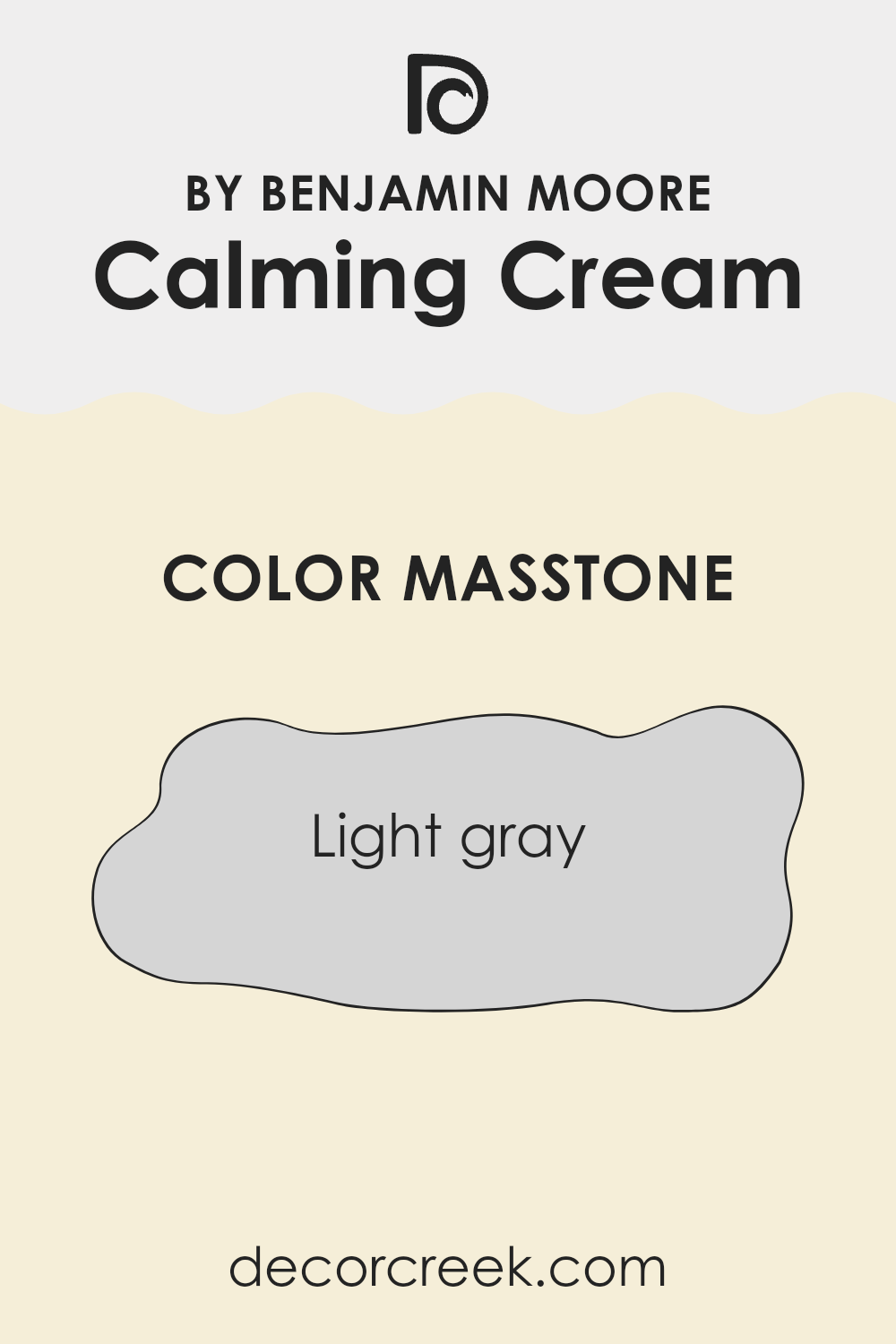
What is the Masstone of the Calming Cream OC-105 by Benjamin Moore?
Calming Cream OC-105 by Benjamin Moore is a light gray shade that brings a soft and clean feel to any room. This particular color helps to create a relaxed atmosphere without being too bold or overpowering. Since it’s a neutral color, it fits nicely in many parts of the home — whether it’s the living room, bedroom, or even the kitchen.
Light gray can help small rooms look bigger and feel more open, which is great for homes with limited room to work with. Additionally, this color pairs easily with other colors. Whether you’re looking to add bright accents like pillows and artworks or keep everything understated with similar tones, light gray forms a great base.
It’s also practical because it doesn’t show dirt or scuffs easily, which is perfect for high-traffic areas in the house. Overall, using a light gray like Calming Cream OC-105 can help to make a home feel more airy and pleasant.
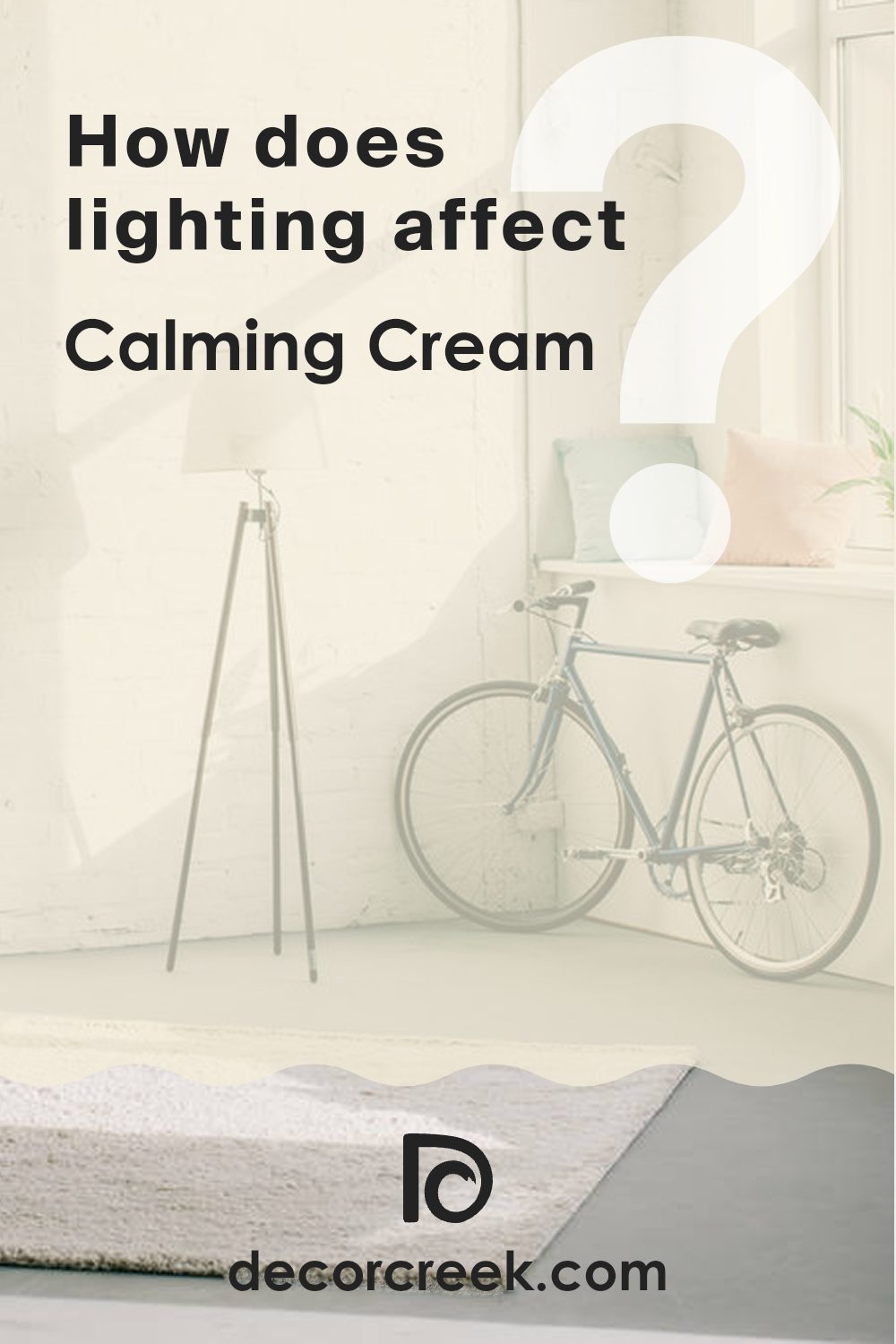
How Does Lighting Affect Calming Cream OC-105 by Benjamin Moore?
Lighting plays a crucial role in how we perceive colors in our surroundings. The color of paint on the walls can look different depending on the type of light shining on it, whether it’s natural sunlight or artificial lighting from bulbs.
Take, for example, the color Calming Cream OC-105 by Benjamin Moore. In natural light, this shade appears soft and almost buttery, giving a warm and inviting glow to any room. Under artificial light, such as LED or fluorescent bulbs, this color might look slightly different. LED lights, which often have a bluish tint, can make Calming Cream look more muted, while warm-toned bulbs can enhance its creamy aspect, making the room feel cozy.
The direction of room’s windows also affects how this color appears at different times of the day. In north-faced rooms, which receive less direct sunlight, Calming Cream tends to look more subdued, maintaining a consistent soft look throughout the day. This makes it a good choice for creating a calm and steady atmosphere in places like a home office or study room.
South-faced rooms, on the other hand, get a lot of bright, direct sunlight, which can make this cream color look more vibrant and bright, particularly in the middle of the day. It’s a great option for living areas, adding a lively yet warm feel during the day.
In east-faced rooms, morning light can make Calming Cream look very gentle and refreshing, an ideal setting for bedrooms to wake up to comfortably. Conversely, in west-facing rooms, the evening light brings a golden glow to the paint, making areas like dining rooms feel warm and welcoming as the day winds down.
Overall, Calming Cream OC-105 works well in many settings, but its look can shift a lot depending on the lighting. That’s why it’s important to think about the direction the room faces and how much light it gets before picking this color for your home.
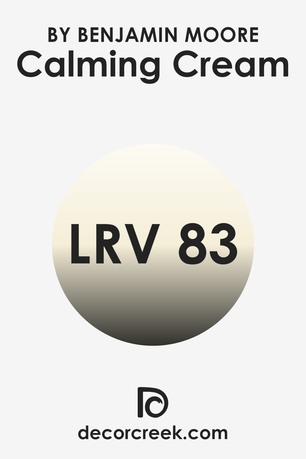
What is the LRV of Calming Cream OC-105 by Benjamin Moore?
LRV stands for Light Reflectance Value, which measures the percentage of light a paint color reflects compared to how much it absorbs. Simply put, if a color has a higher LRV, it reflects more light into the room. That makes the color look lighter and helps the room feel more open and bright.
On the other hand, colors with lower LRV absorb more light and often look deeper, but they can also make a room feel smaller or more cozy. The LRV value of Calming Cream, which is 83.13, indicates that it is a very light color that will reflect a lot of light.
This quality makes it a great choice for darker rooms or areas where you want to create a more open, airy feel. Walls painted with this color will appear luminous and will retain their light tone under most lighting conditions, aiding in creating a bright and welcoming environment without the need to use very intense light sources.
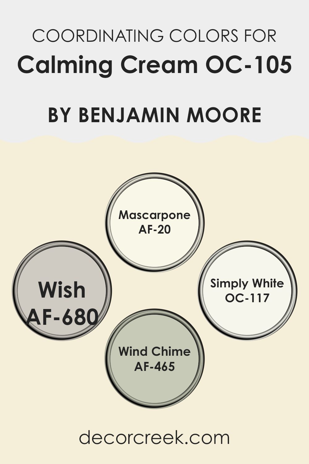
Coordinating Colors of Calming Cream OC-105 by Benjamin Moore
Coordinating colors are complementary shades that work well together to create a balanced and pleasant look in any room. When colors are chosen to go with a base shade like Calming Cream, they bring balance and a smooth flow—whether from one room to another or within the same area. This kind of coordination is key in interior design, as the right color mix can shape the mood and even change how large or cozy a room feels.
AF-20 Mascarpone is a rich, creamy white that brings a bright and airy feel wherever it is applied, making it perfect for trim and ceilings to provide a subtle contrast. AF-680 Wish is a soft, neutral gray that provides a gentle background, ideal for creating a soothing environment without overpowering the main hue.
OC-117 Simply White is another clean, crisp white with a slightly warmer undertone that pairs well with softer hues for a seamless look. Meanwhile, AF-465 Wind Chime is a muted, gray-blue with a hint of lavender, offering a whisper of color that adds interest and depth to the overall design palette. Each of these shades complements Calming Cream effectively, ensuring that every element in the room feels connected and purposefully styled.
You can see recommended paint colors below:
- AF-20 Mascarpone
- AF-680 Wish
- OC-117 Simply White
- AF-465 Wind Chime
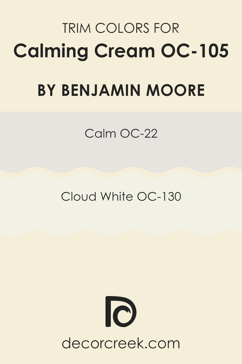
What are the Trim colors of Calming Cream OC-105 by Benjamin Moore?
Trim colors, like OC-22 Calm and OC-130 Cloud White by Benjamin Moore, play a crucial role in interior painting as they help to define and accentuate the architectural details of a room, such as door frames, crown moldings, and baseboards. Choosing the right trim color can enhance the overall aesthetic and ensure a cohesive look.
For a wall color like Calming Cream, choosing the right trim shades helps highlight the room’s details and edges in a clean, subtle way. It lets the main color shine while keeping the overall look balanced and easy on the eyes.
Using OC-22 Calm as a trim provides a subtle contrast, having a light and airy feel that gently complements the soothing nature of Calming Cream. It’s a soft white with a hint of gray, offering a fresh but unobtrusive boundary that suits many different decor styles. On the other hand, OC-130 Cloud White offers a brighter and crisper edge, giving a clean finish that can make the room appear more open and lively. This classic shade of white creates a crisp, fresh look that pairs beautifully with the warmer tones of Calming Cream, making the room feel more open and welcoming.
You can see recommended paint colors below:
Colors Similar to Calming Cream OC-105 by Benjamin Moore
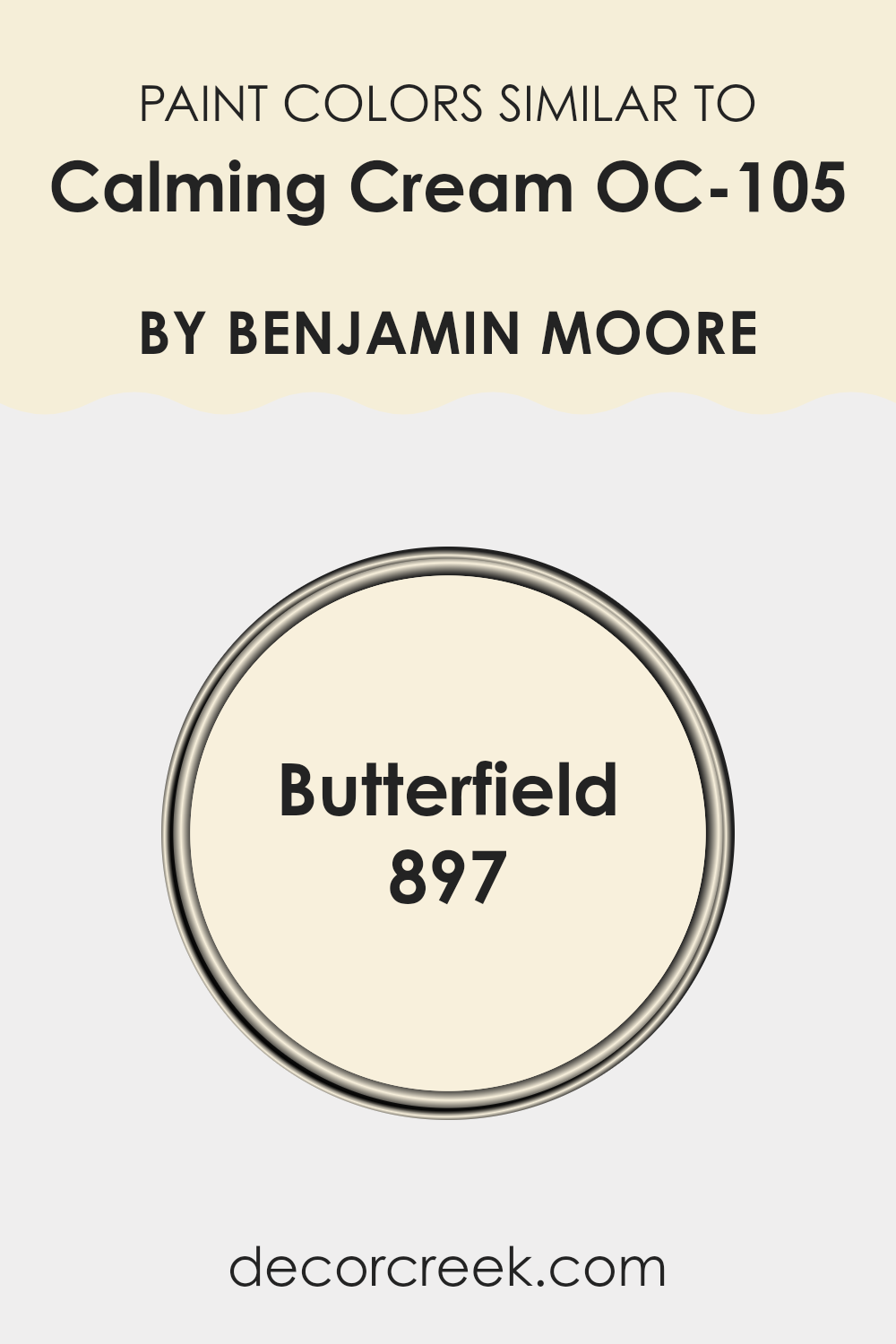
Choosing a cohesive color palette can really improve how balanced and visually pleasing a room feels. When using paints like Calming Cream OC-105 by Benjamin Moore, finding similar colors such as Butterfield 897 can help create a subtle and cohesive look.
Similar colors work together because they share common undertones, making the transition from one area to another flow smoothly without abrupt changes that can disrupt the feeling of the room. This approach is especially helpful in open-plan layouts or rooms that connect to each other, as it keeps a consistent theme throughout your home.
Calming Cream OC-105 is a gentle off-white shade that imparts a warm and welcoming feel to a room. This color pairs beautifully with many decor styles and reflects natural light, helping the room feel brighter and more open. Butterfield 897, on the other hand, is a slightly richer cream with a buttery tone that adds a cozy, comforting atmosphere.
It’s an excellent choice for living areas and bedrooms where a soft, inviting ambiance is desired. Both of these colors offer a subtle backdrop, making it easy to add other decorative elements without the colors clashing or feeling too busy. Their similar color values ensure that each room flows into the next with elegance and ease.
You can see recommended paint color below:
- 897 Butterfield
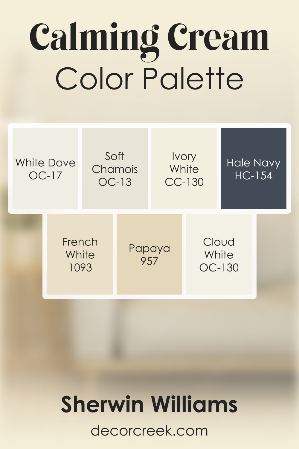
Calming Cream OC-105 by Benjamin Moore Color Palette
Calming Cream brings a gentle warmth that feels friendly and inviting, and this palette is thoughtfully built to highlight that soothing character. White Dove and Cloud White brighten Calming Cream with a soft, clean glow that helps the color feel open and welcoming.
Soft Chamois and Ivory White add warm, mellow undertones that blend effortlessly with its creamy base, creating a smooth and comforting flow throughout the palette.
French White deepens the warmth slightly, adding a nostalgic note that feels natural and refined.
Papaya brings a cheerful accent that adds a pleasant lift without overpowering the palette’s calm nature.
Hale Navy introduces depth and structure, giving the palette a strong, steady anchor that balances the warm neutrals beautifully. Together, these shades create a palette that feels balanced, uplifting, and easy to live with. The combination works wonderfully for interiors that aim for warmth with a gentle, friendly personality—places where soft light, warm tones, and subtle contrast feel right at home.
How to Use Calming Cream OC-105 by Benjamin Moore In Your Home?
Calming Cream OC-105 by Benjamin Moore is a soft and warm shade of paint that brings a cozy feel to any room. This color is perfect for those looking to create a relaxed and welcoming environment in their home. It works great in living rooms or bedrooms because it has a gentle tone that pairs well with natural light and complements various decor styles, from modern to rustic.
Using Calming Cream in a small area like a bathroom or hallway can make it feel brighter and more open. If you’re not ready to commit to painting an entire room, consider using it for an accent wall or on trim and molding for a subtle touch of warmth.
It pairs nicely with a wide range of colors, so you can easily match it with existing furniture pieces or use it as a base to add colorful accents like cushions, rugs, and art. Whether you want a peaceful corner to relax after a busy day or a cheerful area to start your morning, Calming Cream sets a lovely tone.
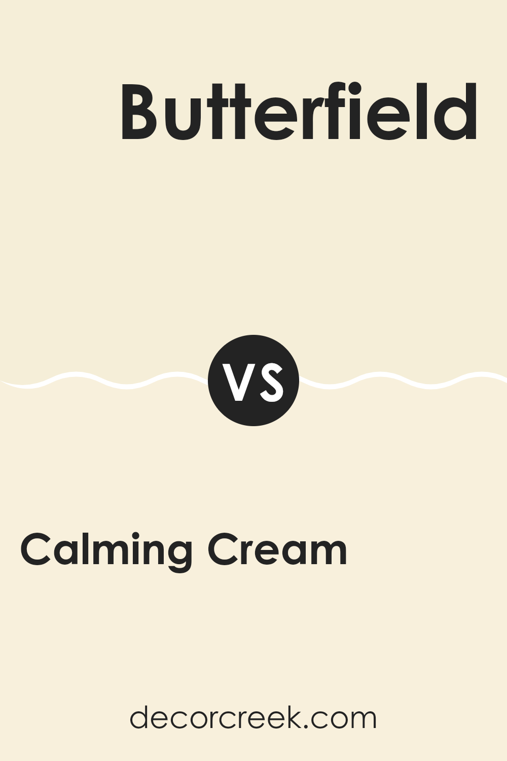
Calming Cream OC-105 by Benjamin Moore vs Butterfield 897 by Benjamin Moore
The main color, Calming Cream, and the second color, Butterfield, are both soft, warm, and cozy hues perfect for creating a welcoming atmosphere in any room. Calming Cream has a subtle and soothing tone that is nearly off-white with a hint of yellow, giving it a gentle warmth. It blends well with various decor styles and exudes a clean, fresh vibe.
Butterfield, on the other hand, is a bit deeper and richer than Calming Cream. It has a stronger presence of yellow, making it a cozier and more vibrant option. This color is great for adding a cheerful splash, especially in kitchens or dining areas where you want things to feel friendly and inviting.
Overall, while both colors share a base of warmth, Butterfield stands out more due to its deeper, buttery tone, while Calming Cream offers a more muted and minimalist approach. Both are great choices, depending on the kind of mood you want to create in the room.
You can see recommended paint color below:
- 897 Butterfield
After checking out OC-105 Calming Cream by Benjamin Moore, I can say I’m quite impressed! This cream paint color has a warm and cozy feel that makes any room look bright and welcoming. It’s not too dark or too light, which is perfect because it works in any room, whether it’s big or small.
I found that it looks especially good in the living room and the bedroom because it creates a peaceful and friendly atmosphere. It’s like the color hugs you when you walk into the room! Also, it matches well with different furniture styles and colors, whether you have dark wood tables or light-colored sofas.
If you’re thinking about giving your room a new look, Calming Cream is a great choice. It covers the walls smoothly, hiding all the little marks and bumps. And guess what? It even helps in hiding the fact that walls get dirty, making your room look clean and neat all the time.
Overall, I really recommend OC-105 Calming Cream if you want to make your room look pretty and feel cozy. It’s a simple way to make a big difference in how your home looks and feels. Plus, it’s easy to use and delivers great results every time. So, if you’re deciding on a new color, you might want to check this one out. You’ll probably love it as much as I do!
Ever wished paint sampling was as easy as sticking a sticker? Guess what? Now it is! Discover Samplize's unique Peel & Stick samples.
Get paint samples

