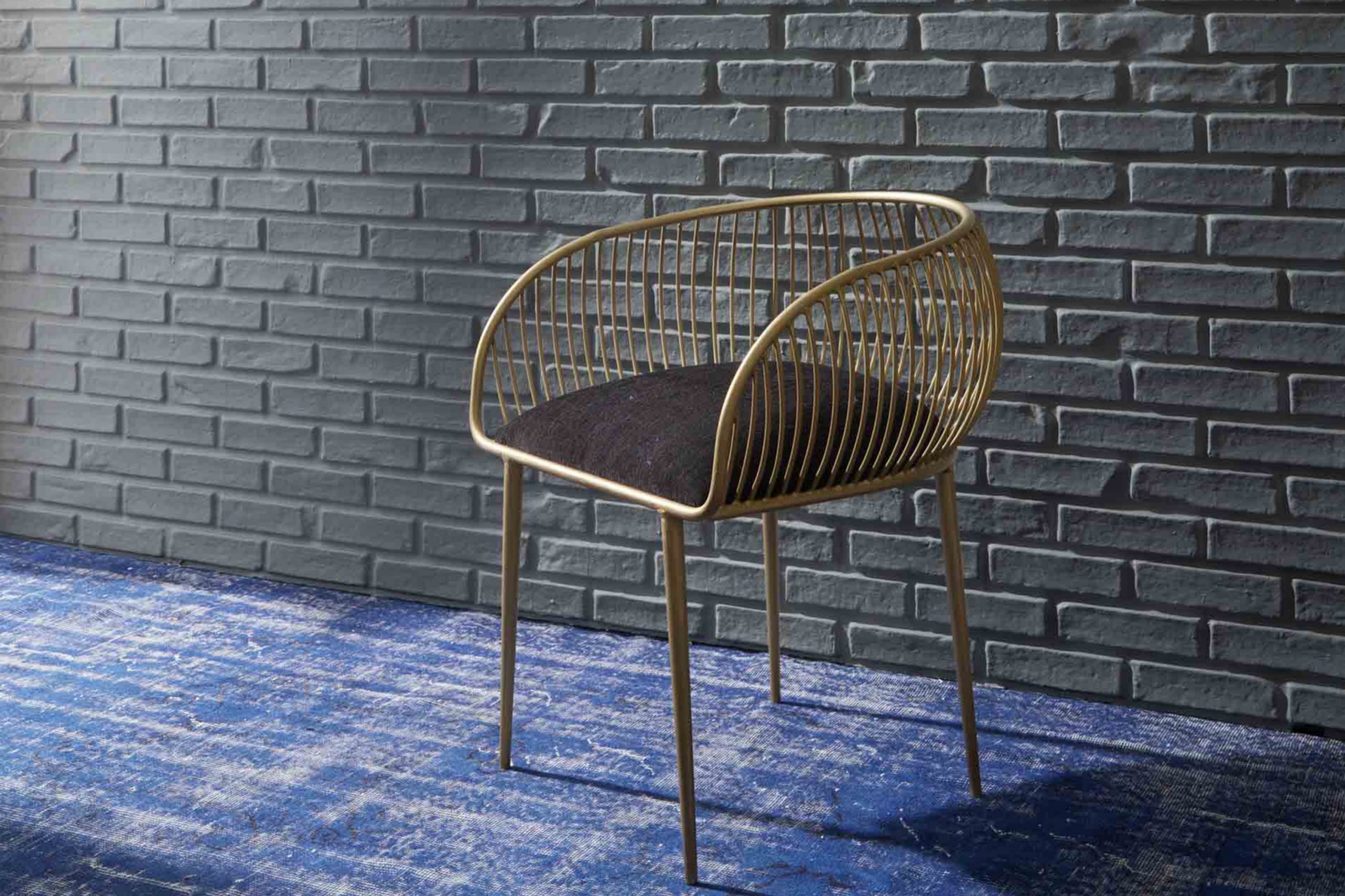
If you’re considering a new color for a room in your home or just a fan of elegant and refined hues, let me introduce you to HC-178 Charcoal Slate by Benjamin Moore. This shade is a unique blend of deep blue and subtle gray, making it flexible enough to work beautifully in various settings, whether it’s the exterior of a home or an accent wall in a living room.
If you want a color that balances well between being noticeable yet understated, Charcoal Slate can be a perfect choice. Its dark tone provides a dramatic flair, setting a mood that’s both cozy and modern. I have found that it pairs wonderfully with white trims, providing a crisp, clean look that’s always in style.
Using Charcoal Slate in your home not only adds a touch of refinement but also offers a backdrop that makes artwork and furniture stand out. Whether you lean towards contemporary or traditional decor, this color provides a stunning canvas that enhances everything around it.
So, if you’re looking to refresh a room in your home, consider HC-178 Charcoal Slate for a look that’s both enduring and contemporary.
What Color Is Charcoal Slate HC-178 by Benjamin Moore?
Charcoal Slate (HC-178) by Benjamin Moore is a deep, striking gray shade with a hint of blue undertones that offer a strong yet inviting aesthetic to any room it adorns. This rich color resembles the stone it’s named after, providing a solid and grounding foundation that works wonderfully in various interior designs.
The adaptability of Charcoal Slate lends itself well to modern and contemporary styles, as well as traditional and industrial rooms. It possesses enough depth to make a statement in a room, yet it is neutral enough to complement a wide range of palettes and decor themes.
When considering materials, Charcoal Slate pairs beautifully with natural wood, helping its textures and colors pop against its dark backdrop. It also harmonizes well with metallic finishes like brass and copper, which add a touch of warmth to the cool undertones of this color. Incorporating fabrics like linen or wool in lighter colors can create a pleasing contrast that enhances the cozy feel of a room.
For those looking to create a balanced and stylish environment, Charcoal Slate is an excellent choice for walls, accent pieces, or even cabinetry. Whether it’s a bedroom, living room, or a study, this color provides depth and character to the room.
decorcreek.com
Is Charcoal Slate HC-178 by Benjamin Moore Warm or Cool color?
Charcoal Slate HC-178 by Benjamin Moore is a dark gray with subtle blue undertones, making it a flexible choice for many homes. This shade can add depth and interest to any room without overpowering it.
Being a neutral color, Charcoal Slate works well in various rooms, whether in a living room as a statement wall or in a bedroom for a cozy, calming atmosphere. Its ability to blend with other colors and materials makes it a practical choice for those looking to refresh their home’s look.
When paired with lighter colors, such as whites or creams, it adds a striking contrast, but it can also create a harmonious look when matched with other dark shades. This color is particularly useful in areas with lots of natural light, as the light brings out its subtle blue tones, adding a unique touch to the overall ambiance.
Undertones of Charcoal Slate HC-178 by Benjamin Moore
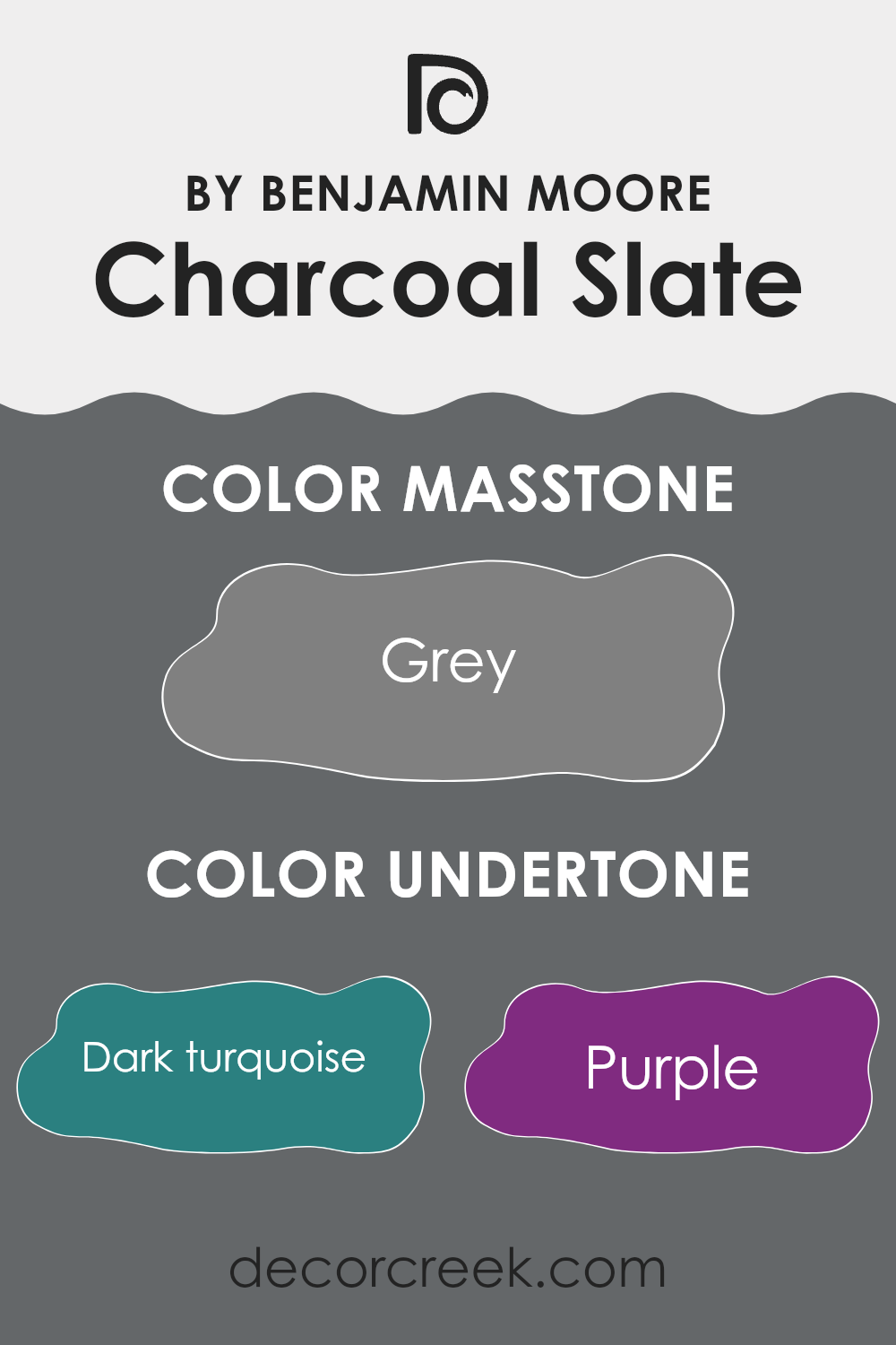
Charcoal Slate is an adaptable color with a complex mix of undertones, which can significantly influence how it appears on interior walls. The presence of dark turquoise, purple, and navy undertones adds depth, making the color appear richer and more dynamic in different lighting conditions. When light hits the walls painted in this color, these cooler undertones can make the room feel more defined and structured.
On the other hand, undertones like olive, brown, and dark green bring warmth to the color, ensuring that the ambiance remains welcoming and cozy. These warmer undertones counterbalance the cooler ones, creating a balanced look that works well in various decorating styles.
The subtle hues of lilac and mint undertones can subtly influence the mood of a room by injecting a hint of freshness and vitality. This is particularly noticeable in well-lit rooms where natural light emphasizes these lighter undertones, and the walls seem to have a soft glow.
Moreover, undertones such as light gray and pale pink add a gentle softness to the color, making it ideal for rooms intended to have a calm and gentle feel. However, because Charcoal Slate has a mix of both dark and light undertones, it remains a strong choice for many rooms, adapting to changes in decoration and furniture over time.
Color perception is influenced largely by these underlying tones; hence, the variety in undertones can make the color appear slightly different from one room to another depending on light sources and surrounding colors, offering unique experiences in each setting.
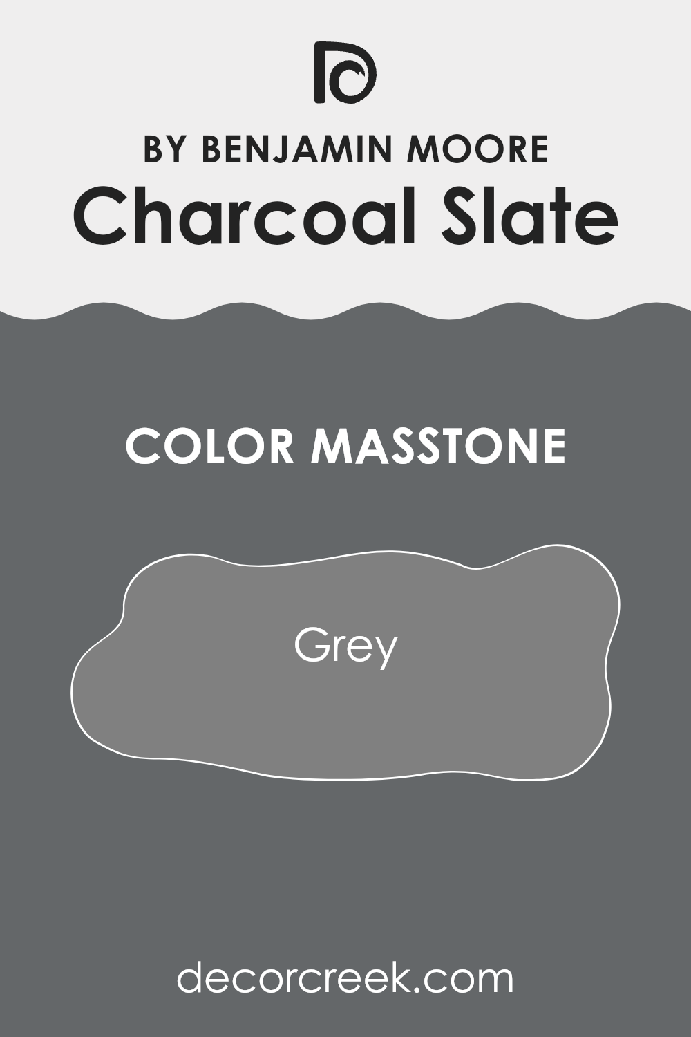
What is the Masstone of the Charcoal Slate HC-178 by Benjamin Moore?
Charcoal Slate HC-178 by Benjamin Moore is a balanced grey color that adds a strong, grounded presence to any room. Its masstone is a solid grey, which provides a neutral backdrop that works well in a variety of rooms and lighting conditions.
This color is particularly effective in areas like living rooms or bedrooms, where it can help create a cozy, welcoming atmosphere without overpowering the room with too much darkness. The neutrality of the grey also makes it flexible for pairing with brighter colors or various textures, allowing for adaptability in decorating styles.
In homes, this color can help cover imperfections on walls and brings a clean, polished look. It’s an excellent choice for those wanting to maintain a low-key, yet stylish interior. Its ability to blend seamlessly with other colors and elements makes it adaptable and convenient for creating a personalized feel in a home.
How Does Lighting Affect Charcoal Slate HC-178 by Benjamin Moore?
Lighting plays a critical role in how we perceive colors in our surroundings. Different types of light can significantly affect the appearance of a paint color on your walls. For instance, a color like Charcoal Slate, a deep, moody gray with blue undertones by Benjamin Moore, can look very different depending on the light it’s exposed to.
In artificial light, such as from LED or fluorescent bulbs, Charcoal Slate may appear slightly darker and more intensely saturated. The cool undertone in Charcoal Slate means it can look more pronounced under cool-toned artificial lights, which can enhance its depth and richness. In the warm glow of incandescent bulbs, however, this color might soften slightly, revealing a more muted, gray aspect which makes it feel warmer.
Natural light brings out the truest version of Charcoal Slate. In a room with plenty of sunlight, such as in south-facing rooms, the color will appear lighter and more evenly gray throughout the day as the sun provides a bright, clear light. This can make the room feel open despite the depth of the color.
In north-facing rooms, which receive less direct sunlight and thus have a cooler, more shadowed light, Charcoal Slate can look more profound and strikingly darker. The lack of intense sunlight allows its blue undertones to stand out, making the room feel more intimate.
East-facing rooms benefit from the warm, yellow light of the morning sun, making Charcoal Slate appear slightly warmer and lighter in the mornings while returning to its deeper, true gray-blue as the light fades.
In west-facing rooms, the color will experience a shift throughout the day. It starts off true to its cool gray nature in the morning and grows increasingly vibrant and richer toward sunset, reflecting the reds and oranges of the evening light.
Thus, Charcoal Slate’s adaptability under different lighting conditions can offer various atmospheres depending on the room’s orientation and lighting choices, which should be considered when deciding where to apply this particular shade.
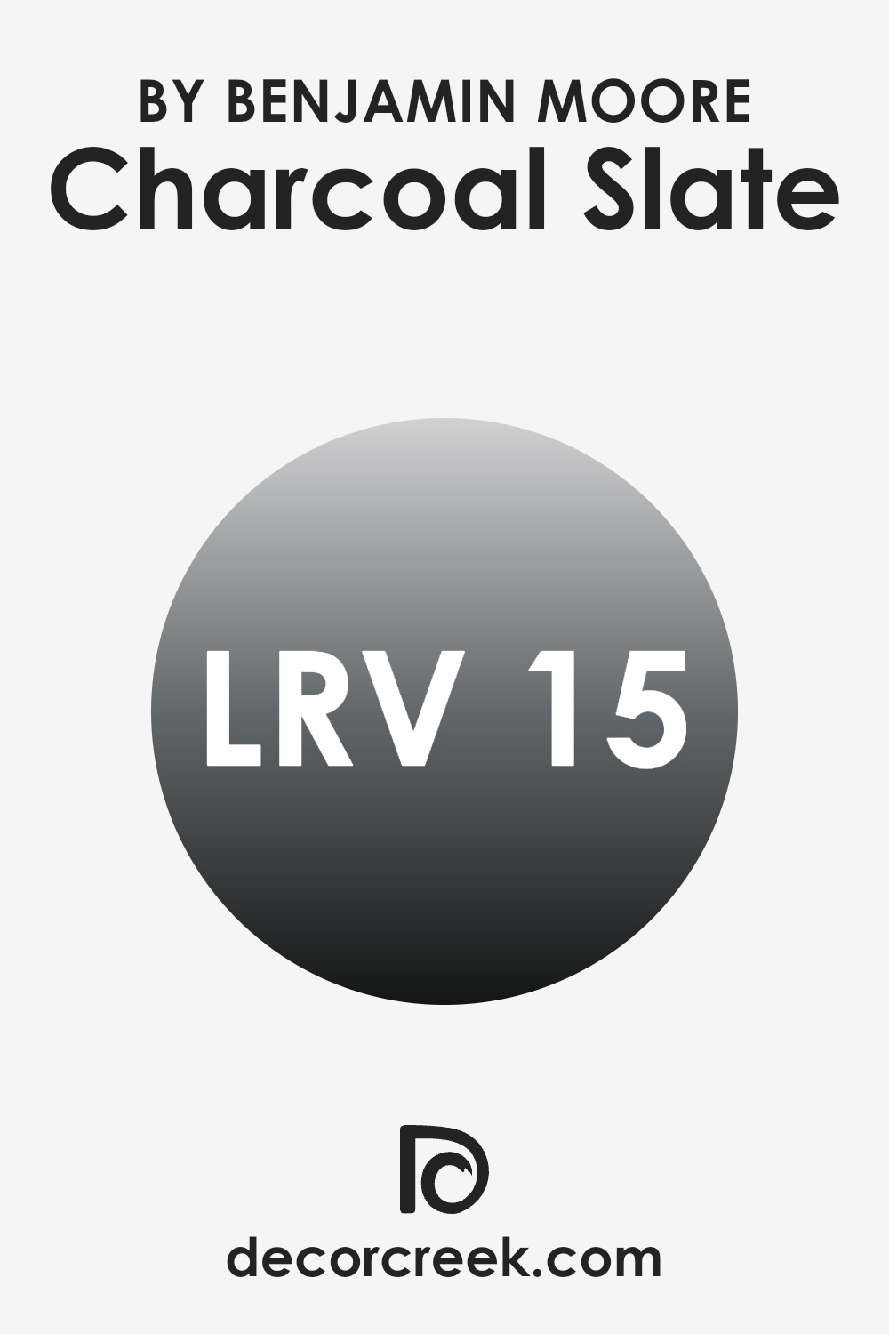
What is the LRV of Charcoal Slate HC-178 by Benjamin Moore?
LRV stands for Light Reflectance Value, which is a measure used to describe the amount of visible and usable light that a paint color reflects when it is dry. In simpler terms, LRV is a scale that shows how light or dark a color will look once it’s on your wall.
The scale runs from a low of 1, which is very dark, almost black, to a high of 99, nearly white. Keeping this in mind can help you choose the right shade for your room, depending on how much natural light your room gets. Paint colors with low LRV absorb more light, making them ideal for a room that you want to feel cozier.
The LRV of the paint color Charcoal Slate is 14.51, indicating that it is a darker shade. This means that it doesn’t reflect much light, absorbing more light than it reflects. Therefore, when used on walls, Charcoal Slate will make the room it is used in appear smaller and more enclosed.
If used in a small room, it can make the room feel even smaller, but in a large, brightly-lit room, it can bring a more intimate and grounded feeling. It’s a great choice if you want to add depth and a sense of closeness to larger, open rooms. When considering this color, good lighting is essential to ensure that the room doesn’t feel too dark.
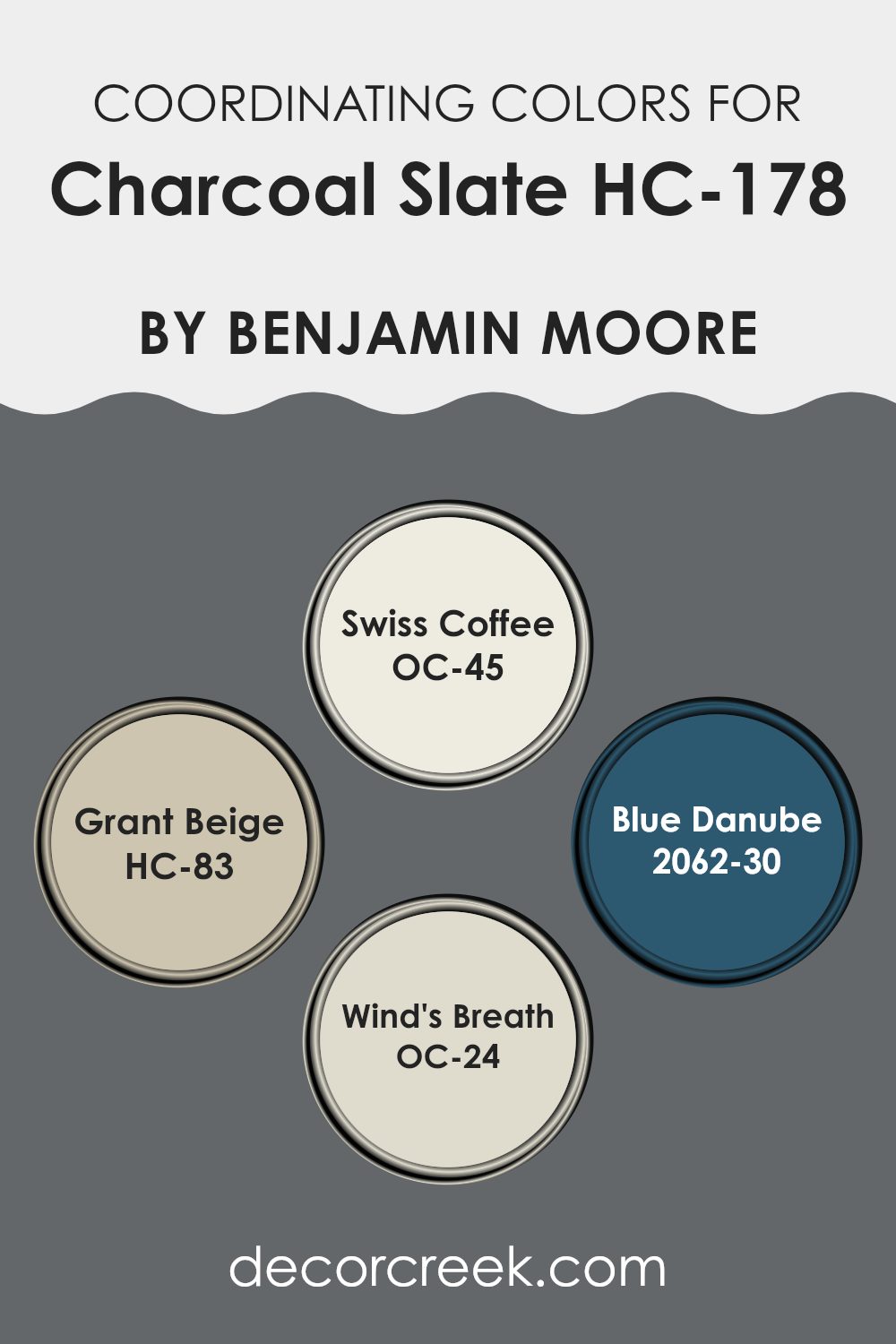
Coordinating Colors of Charcoal Slate HC-178 by Benjamin Moore
Coordinating colors are shades that complement each other when used together in a room, enhancing the overall aesthetic appeal without overpowering the primary color. In the case of Benjamin Moore’s Charcoal Slate, a rich, deep gray, the palette of coordinating colors includes Swiss Coffee, Grant Beige, Blue Danube, and Wind’s Breath. These colors bring balance, create depth, and offer a harmonious flow throughout the decor, making it easier to design a cohesive-looking room.
Swiss Coffee is a soft, creamy white that brightens rooms and provides a crisp contrast to the darker tones of Charcoal Slate. It works wonderfully for trim or cabinetry to create a fresh feel in any room. Grant Beige is a subtle, warm beige that adds a cozy, inviting tone, perfect for living areas or bedrooms where you want a touch of warmth.
Blue Danube is a vibrant, deep blue that adds a splash of bold color, ideal for accent walls or decorative accessories to inject some energy into the room. Wind’s Breath is a gentle off-white with a whisper of beige that offers a delicate balance, softening the intensity of darker shades and perfect for maintaining a light, airy atmosphere. Through thoughtful application, these coordinating colors can shape a beautifully designed room that reflects a coherent color story.
You can see recommended paint colors below:
- OC-45 Swiss Coffee
- HC-83 Grant Beige
- 2062-30 Blue Danube
- OC-24 Wind’s Breath
What are the Trim colors of Charcoal Slate HC-178 by Benjamin Moore?
Trim colors are used to highlight architectural details and frame the main colors of a room or exterior. They play an essential role in complementing and enhancing the base color used on the larger surfaces, such as walls or the side of a house. For instance, when using a deep hue like Benjamin Moore’s Charcoal Slate, trim colors like OC-22 – Calm and OC-69 – White Opulence are ideal choices.
These lighter shades naturally create a visually appealing contrast that makes the darker shade stand out more prominently, ensuring that the architectural elements don’t fade into the background but rather pop against the richer, darker tone of Charcoal Slate.
OC-22 – Calm by Benjamin Moore is a gentle grey that leans towards a neutral tone, making it a flexible choice for trim, providing a soft but distinct boundary without overpowering the main color. On the other hand, OC-69 – White Opulence is a crisp, clean white that offers a fresh and clear demarcation.
This color is perfect for creating a striking contrast, particularly effective in drawing attention to the elegant features of a home or room when paired with a darker shade like Charcoal Slate. Each offers a way to subtly highlight and define rooms, contributing to the overall aesthetic in different but equally effective ways.
You can see recommended paint colors below:
- OC-22 Calm
- OC-69 White Opulence

How to Use Charcoal Slate HC-178 by Benjamin Moore In Your Home?
Charcoal Slate HC-178 by Benjamin Moore is a unique gray color with deep blue undertones. This adaptable shade can make any room look more stylish and modern. It’s perfect for creating a strong statement wall in your living room or bedroom. Because of its calming darkness, it pairs well with lighter colors like soft whites or light grays, which will help to keep the room feeling airy and open.
You could also use this color in smaller rooms, like a bathroom or on kitchen cabinets, for a chic and polished look. It works well with natural elements like wood or metal, adding a touch of elegance without being too intense. If you’re interested in giving your furniture a new life, consider painting an old dresser or a bookshelf in Charcoal Slate to instantly update its appearance.
Overall, this color is excellent for anyone looking to add depth and a hint of drama to their home without going too bold. It’s easy to match with various décor styles, whether you’re aiming for a modern look or something more traditional.
Having reviewed HC-178 Charcoal Slate by Benjamin Moore, I’ve learned quite a lot about this particular paint color. It was interesting to see how the deep gray color could change the feel of a room. The shade is not too dark nor too light, striking a perfect balance which makes any room look more beautiful.
I was particularly amazed by how well it paired with different decorations and furniture. Whether the room had bright colors or lighter shades, Charcoal Slate always managed to complement the overall aesthetic really well. It seems like a great choice for someone wanting to make their home look a bit more modern without it being too bold.
Another great thing about this color is that it suited so many different rooms. Whether it was a bedroom, a living area, or even a bathroom, this color made each room appear cozy and welcoming. It was impressive to see its flexibility and how it enhanced every type of room layout and style.
To summarize, I would recommend HC-178 Charcoal Slate by Benjamin Moore to anyone looking to redo their home. Its ability to go so well with various styles and rooms makes it a wonderful choice for both new home decorators and those experienced in interior design. If a fresh, modern look is the goal, this color is definitely worth considering.
decorcreek.com
Ever wished paint sampling was as easy as sticking a sticker? Guess what? Now it is! Discover Samplize's unique Peel & Stick samples.
Get paint samples

