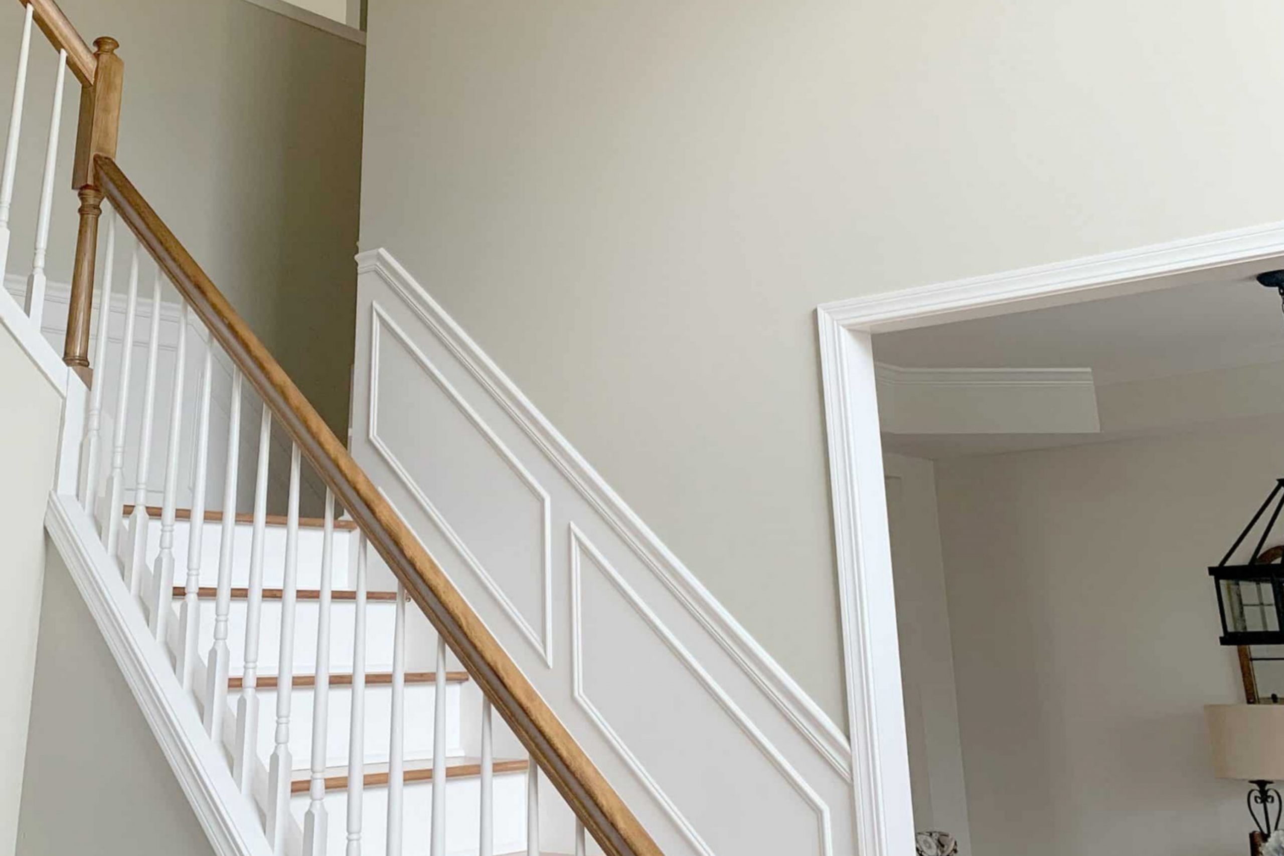
It’s one of those colors that seems to wrap a space in comfort, giving off an evergreen vibe. Grant Beige isn’t just another neutral shade; it has a depth that can subtly change depending on the lighting.
During the day, under natural light, it feels airy and open, bringing a gentle glow into the room. Yet, in the evening, it takes on a richer, cozier tone, perfect for creating a relaxed atmosphere.
What I love most about Grant Beige is its adaptability. It pairs beautifully with a wide range of colors, whether you opt for bold accents or prefer a more subdued, monochromatic look. This hue works well in both modern and traditional settings, making it an ideal choice for any decorating style.
Whether you’re repainting a living room, updating your bedroom, or giving your kitchen a fresh look, Grant Beige offers a seamless transition that can enhance any space its applied to.
For me, choosing this color was about creating a harmonious balance, making my home feel warm and inviting all year round. It’s a shade that has truly transformed the way my spaces look and feel.
What Color Is Grant Beige HC-83 by Benjamin Moore?
Grant Beige (HC-83) by Benjamin Moore is a warm, neutral beige that can add a cozy and inviting feel to any room. This shade has a subtle blend of gray and brown undertones, which helps it blend seamlessly with a variety of color schemes. Its adaptable nature makes it a great choice for many interior styles, from traditional to modern.
In traditional interiors, Grant Beige works beautifully as a backdrop for classic furnishings, rich wood tones, and ornate details. Its warmth complements dark woods, giving spaces a timeless and comforting atmosphere.
In modern or minimalist settings, this color provides a soft contrast against sleek lines and contemporary fixtures, adding depth without overpowering.
The versatility of Grant Beige extends to the materials and textures it pairs with. It harmonizes well with natural materials like wood, stone, and leather, enhancing their organic characteristics.
Textiles such as linen, wool, and cotton in creams, browns, and muted shades create a cohesive look, adding layers of texture and interest.
Whether in living rooms, bedrooms, or kitchens, Grant Beige offers a soothing backdrop that allows other elements of the room to shine.
Its adaptability and warmth make it a reliable choice for creating spaces that feel comfortable and well-balanced.
Is Grant Beige HC-83 by Benjamin Moore Warm or Cool color?
Grant Beige (HC-83) by Benjamin Moore is a popular paint color known for its warm, neutral tones. It’s a versatile beige that provides a cozy and comforting feel to any space, making it suitable for various rooms in the home.
This color has a slight gray undertone, which helps it blend well with other colors and materials, whether you’re pairing it with wood finishes, white trim, or bold accents. Its understated warmth can make a living room feel inviting or a bedroom more restful.
In areas like the kitchen or bathroom, Grant Beige can add a touch of elegance without being overpowering. It reflects natural light softly, which can make spaces appear bigger and more open. This color is also known for complementing both traditional and modern decor styles, offering flexibility in design.
Whether used on walls or as an accent, Grant Beige is an excellent choice for creating balanced and harmonious interiors.
Undertones of Grant Beige HC-83 by Benjamin Moore
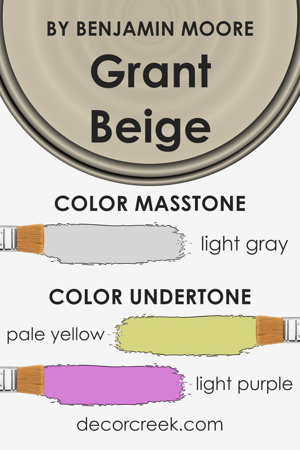
Grant Beige by Benjamin Moore, identified as HC-83, appears as a warm and welcoming neutral color, but its hidden undertones give it depth and complexity. The undertones of Grant Beige include pale yellow, light purple, pale pink, light blue, mint, lilac, and grey. These undertones subtly influence how we perceive the color, both individually and collectively.
In general, undertones affect the perception of color by adding subtle hints that may not be immediately obvious. Depending on lighting and surroundings, these undertones can become more pronounced, making the color appear warmer or cooler.
For example, in a room with natural light, the pale yellow and mint undertones might be more noticeable, making the color seem warmer and more inviting. Conversely, in a room with artificial lighting, the grey and lilac undertones might stand out, giving the space a cooler, more calming feel.
When applied to interior walls, the undertones of Grant Beige can influence the mood of a room. Rooms with ample sunlight may highlight the yellow and mint undertones, creating an environment that feels cozy and energetic.
In contrast, rooms with softer, artificial light might emphasize the lilac and grey tones, lending a more subdued and relaxed atmosphere.
These shifts in perception can help Grant Beige complement a variety of interior styles and decor themes.
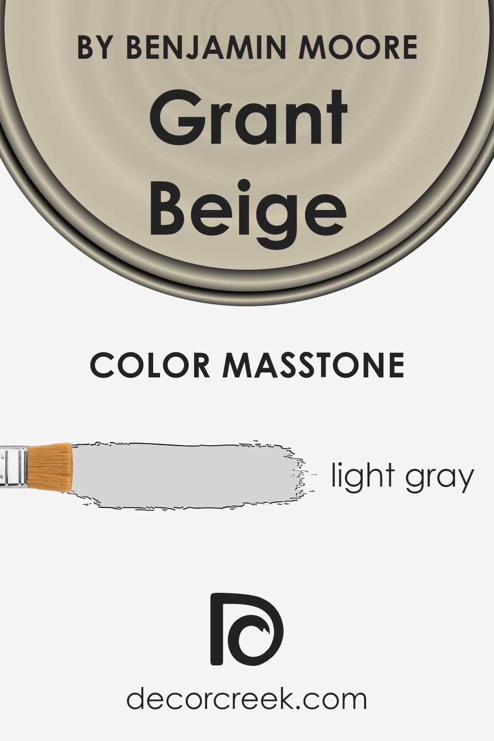
What is the Masstone of the Grant Beige HC-83 by Benjamin Moore?
Grant Beige (HC-83) by Benjamin Moore is a popular color known for its light, neutral qualities. Its masstone, which is light gray (#D5D5D5), plays a significant role in how the color appears in different settings. The light gray undertone of the masstone helps Grant Beige maintain a subtle and versatile feel, making it suitable for a variety of home interiors.
This color can act as a perfect backdrop for living rooms, bedrooms, and hallways, allowing other colors and decor to stand out without overwhelming the space. The calm nature of the light gray masstone makes Grant Beige adaptable to different lighting conditions, ensuring that it retains a consistent appearance throughout the day.
Whether in natural daylight or under artificial lighting, the neutral tones prevent the color from feeling too warm or too cool, providing a balanced and inviting atmosphere in any room.
How Does Lighting Affect Grant Beige HC-83 by Benjamin Moore?
Lighting plays a significant role in how we perceive colors in our surroundings. It can change the way a color looks, depending on whether the light is natural or artificial, and based on the direction from which it hits the room. When we consider a specific color like Grant Beige (HC-83) by Benjamin Moore, it’s important to understand how these factors can alter its appearance.
Under artificial light, such as incandescent bulbs, Grant Beige can appear warmer and more yellow. This is because incandescent lighting tends to have a soft, yellowish glow that brings out warmer tones in a color.
On the other hand, under fluorescent lights, which often have a cooler, bluish tint, Grant Beige might appear slightly more muted or even a bit grayish.
In natural light, the direction a room faces can have a dramatic effect on how Grant Beige looks. In north-facing rooms, natural light is typically cooler, so Grant Beige may take on a cooler tone, showing more gray than beige. It may feel more subdued and less vibrant.
South-facing rooms receive warm, consistent sunlight throughout the day, which enhances the warm undertones of Grant Beige. In these rooms, the color can look more inviting and bright, as the sunlight adds a touch of warmth to the walls.
East-facing rooms get direct sunlight in the morning, which can make Grant Beige appear more dynamic and lively first thing in the day. However, as the sun moves, the room receives less intense light, softening the color.
West-facing rooms get the best light in the afternoon and early evening. During this time, Grant Beige can appear rich and warm, picking up the golden hues of the setting sun. Earlier in the day, though, it may seem a bit more flat as the room receives less direct sunlight.
Overall, Grant Beige is a versatile color that adapts to its environment, but lighting and room orientation are crucial factors to consider for the desired effect.
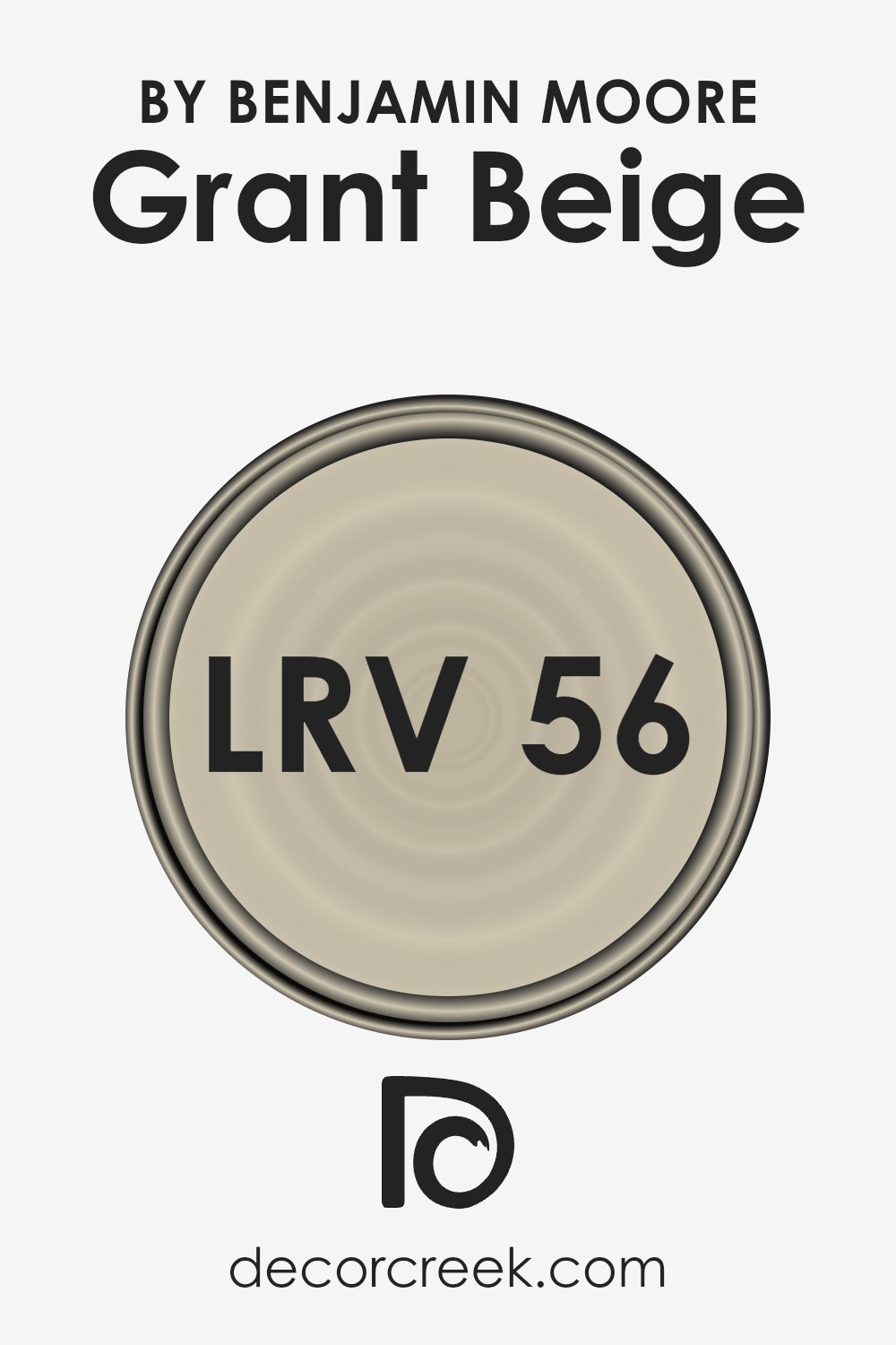
What is the LRV of Grant Beige HC-83 by Benjamin Moore?
LRV stands for Light Reflectance Value, which measures how much light a paint color reflects or absorbs. On the LRV scale, 0 represents absolute black, which absorbs all light, while 100 represents pure white, which reflects all light.
Colors with higher LRV values reflect more light, making spaces feel brighter and more open. Conversely, colors with lower LRV values absorb more light, making spaces feel cozier and sometimes smaller.
Understanding the LRV of a paint color can help in choosing the right shade to achieve the desired atmosphere and lighting effect in a room.
For Grant Beige, with an LRV of 55.81, the color reflects a moderate amount of light, balancing brightness and warmth. This means it won’t be too dark or too light on your walls. It provides a neutral backdrop with a comfortable, inviting feel.
With this LRV, it can adapt well to different lighting conditions, making it a versatile choice for various rooms. It maintains a balance between reflecting enough light to keep a space airy, and absorbing enough to add warmth and depth to the room.
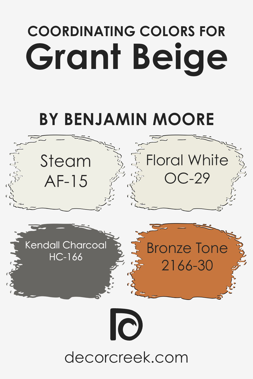
Coordinating Colors of Grant Beige HC-83 by Benjamin Moore
Coordinating colors are hues that work well together to create a harmonious look in a space. When you coordinate colors, you choose shades that complement each other, enhancing the overall aesthetic. Grant Beige by Benjamin Moore is a warm neutral that pairs beautifully with other colors, making it easy to create a balanced look.
Coordinating with Grant Beige, Steam (AF-15) offers a soft and clean white that adds brightness without overpowering. It’s ideal for trim, ceilings, or any area where you want a crisp, refreshing touch.
Kendall Charcoal (HC-166) introduces a strong, deep gray that provides a bold contrast to the subtle warmth of Grant Beige. This color is perfect for an accent wall or furniture piece, giving a modern twist to the room. Floral White (OC-29) is another lovely companion, with its creamy tone adding a touch of elegance and warmth, making spaces feel cozy and inviting.
Lastly, Bronze Tone (2166-30) adds richness with its warm, earthy brown, creating depth and highlighting natural elements within the decor. Together, these colors provide versatility and charm, allowing you to design a space that feels cohesive and inviting.
You can see recommended paint colors below:
- AF-15 Steam
- HC-166 Kendall Charcoal
- OC-29 Floral White
- 2166-30 Bronze Tone
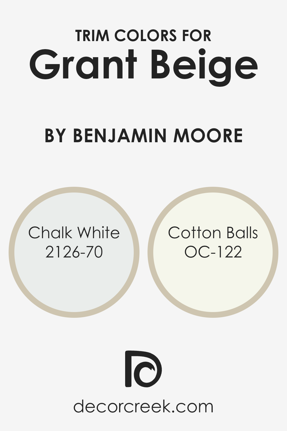
What are the Trim colors of Grant Beige HC-83 by Benjamin Moore?
Trim colors are the shades used to paint the moldings, window frames, and other architectural details that border walls. They play an important role in room design by enhancing the main wall color and helping define spaces.
For Grant Beige HC-83 by Benjamin Moore, using the right trim colors can bring out its warm, earthy tone, adding depth and balance to a room. By pairing this neutral beige with complementary trim colors, you can create a cozy and inviting atmosphere.
The contrast between the wall and trim also helps highlight architectural features, giving the space a more defined look.
Chalk White 2126-70 and Cotton Balls OC-122 are excellent choices for trim when using Grant Beige as the main wall color. Chalk White is a soft, cool white with a hint of gray that provides a subtle and clean look, perfect for creating a crisp, modern edge around the walls without being too stark.
On the other hand, Cotton Balls is a warm, creamy white that offers a touch of softness and warmth, complementing the cozy feel of Grant Beige while adding a hint of brightness.
Both colors work to highlight the elegance of the room without overwhelming the main wall color, creating a harmonious and inviting environment.
You can see recommended paint colors below:
- 2126-70 Chalk White
- OC-122 Cotton Balls
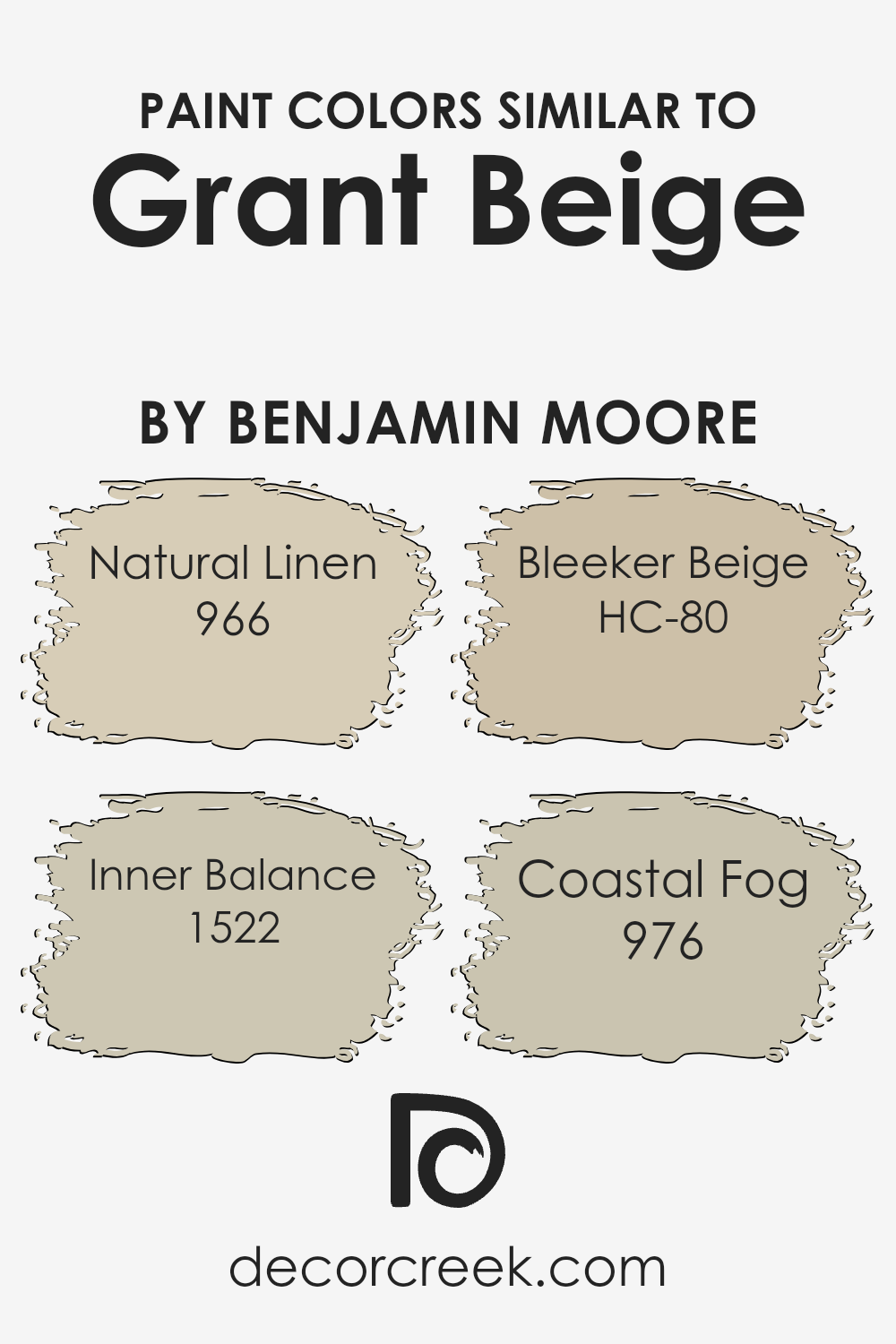
Colors Similar to Grant Beige HC-83 by Benjamin Moore
Similar colors play an essential role in design because they create harmony and balance in a space. They help tie different elements together, ensuring a cohesive look that is calming and pleasing to the eye.
Using colors that are similar to Grant Beige by Benjamin Moore, such as Natural Linen 966, Inner Balance 1522, Bleeker Beige HC-80, and Coastal Fog 976, allows for a subtle variation without overwhelming the senses.
These shades work together to maintain a consistent color scheme that enhances the warmth and neutrality of a room, making it feel inviting and comfortable.
Natural Linen 966 is a soft, warm neutral that pairs beautifully with Grant Beige, adding a touch of lightness and freshness. Inner Balance 1522 offers a gentle, muted tone with a hint of warmth, perfect for creating a cozy atmosphere.
Bleeker Beige HC-80 is a slightly deeper hue, providing a bit more depth while still staying neutral and versatile. Coastal Fog 976 brings a soft, misty quality, offering a gentle contrast that doesn’t stray far from the main palette.
Together, these colors complement each other and allow for a seamless transition between spaces, making them ideal for open floor plans or adjacent rooms.
You can see recommended paint colors below:
- 966 Natural Linen
- 1522 Inner Balance
- HC-80 Bleeker Beige
- 976 Coastal Fog
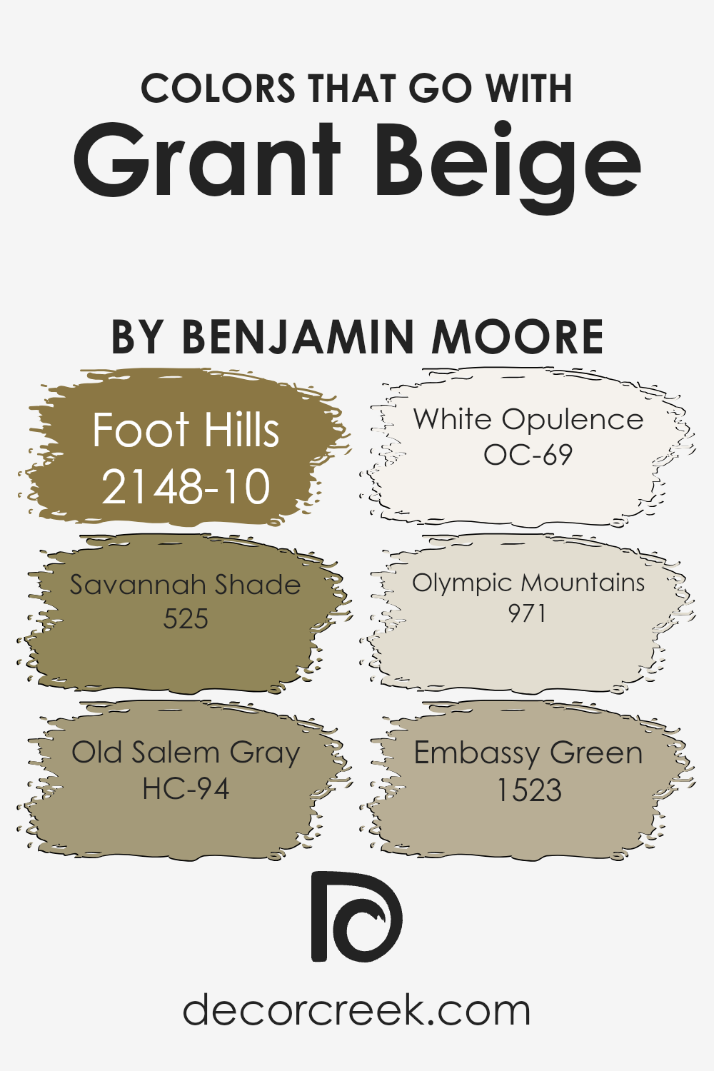
Colors that Go With Grant Beige HC-83 by Benjamin Moore
Grant Beige HC-83 by Benjamin Moore is a classic, warm neutral that provides a perfect backdrop for a variety of colors. When paired with 2148-10 – Foot Hills, a deep, earthy green, it adds a touch of nature and depth, creating a calming environment.
The rich green balances the warmth of Grant Beige, making spaces feel welcoming. Savannah Shade 525, a muted olive-toned hue, complements Grant Beige with its subtle complexity, adding a soft yet sophisticated touch that enhances the warmth without overpowering.
Old Salem Gray HC-94, with its calm, muted tones, harmonizes beautifully with Grant Beige, providing a gentle contrast that brings out the best of both colors. For a classic and clean look, White Opulence OC-69 offers a creamy, soft white that brightens the setting, perfect for a fresh and airy feel.
Complementing with 971 – Olympic Mountains, a misty, light gray, introduces a hint of coolness that balances the warmth of the beige.
Finally, Embassy Green 1523, a deep, rich shade of green, adds dynamic energy against Grant Beige’s neutral tone, delivering a striking contrast without being too bold. Together, these colors create a balanced palette that feels both relaxing and dynamic.
You can see recommended paint colors below:
- 2148-10 Foot Hills
- 525 Savannah Shade
- HC-94 Old Salem Gray
- OC-69 White Opulence
- 971 Olympic Mountains
- 1523 Embassy Green
How to Use Grant Beige HC-83 by Benjamin Moore In Your Home?
Grant Beige HC-83 by Benjamin Moore is a versatile paint color that can be used in many parts of your home. It’s a warm, neutral beige that adds a cozy and inviting feel to any room. Because of its subtle tone, it can easily complement a wide range of furniture and decor styles, from traditional to contemporary.
Consider using Grant Beige in your living room or bedroom to create a calm and welcoming atmosphere. It also works well in hallways and entryways, as it provides a neutral backdrop that allows other colors and elements to stand out.
In the kitchen, this shade can make a perfect balance between walls and countertops, especially with wooden or white cabinetry.
Another benefit of Grant Beige is its adaptability to various lighting conditions, maintaining its warmth in both natural and artificial light. This makes it a great choice for spaces that might not get a lot of sunlight.
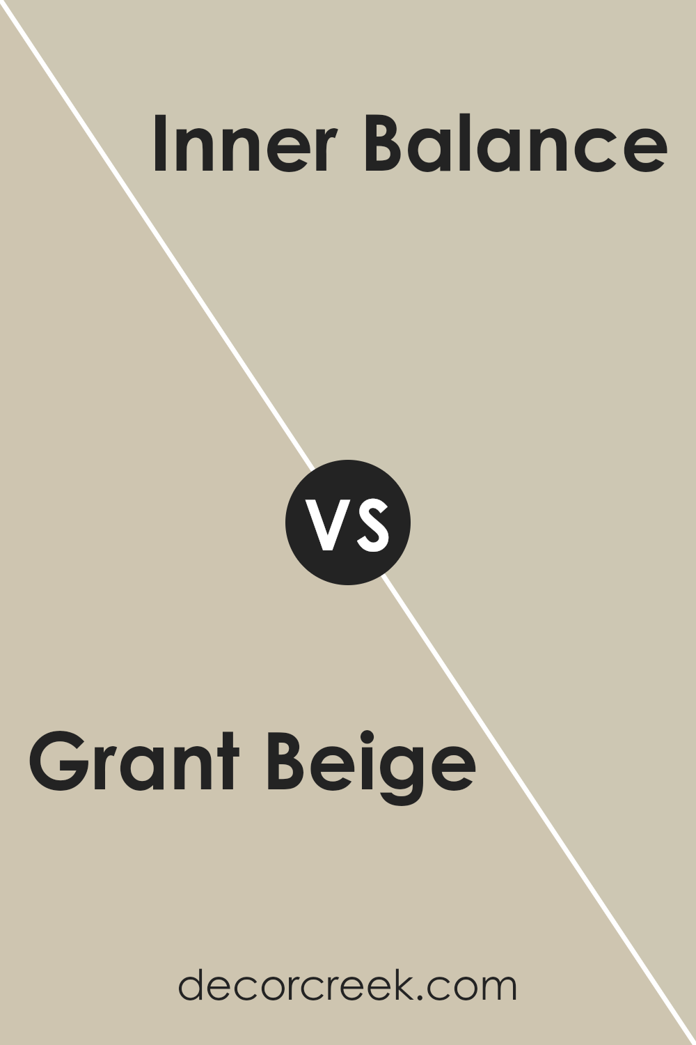
Grant Beige HC-83 by Benjamin Moore vs Inner Balance 1522 by Benjamin Moore
Grant Beige HC-83 by Benjamin Moore is a warm, neutral color with a hint of earthiness. It offers a natural and inviting feel, making it a versatile choice for many spaces. It pairs well with both darker and lighter colors, providing a balanced backdrop in a room without overwhelming the space.
Inner Balance 1522, on the other hand, is a lighter, cooler tone. It has a soft, muted quality that feels calm and refreshing. This color is especially good for creating a light and airy atmosphere, making a room feel open and spacious.
When comparing the two, Grant Beige brings warmth and coziness, suitable for creating a welcoming environment. Inner Balance, however, leans towards a cooler sensation, ideal for spaces where you want a relaxed, refreshing feel. Both colors can work beautifully in different settings but offer distinct vibes. Use Grant Beige for a cozy feel and Inner Balance for a breezy atmosphere.
You can see recommended paint color below:
- 1522 Inner Balance
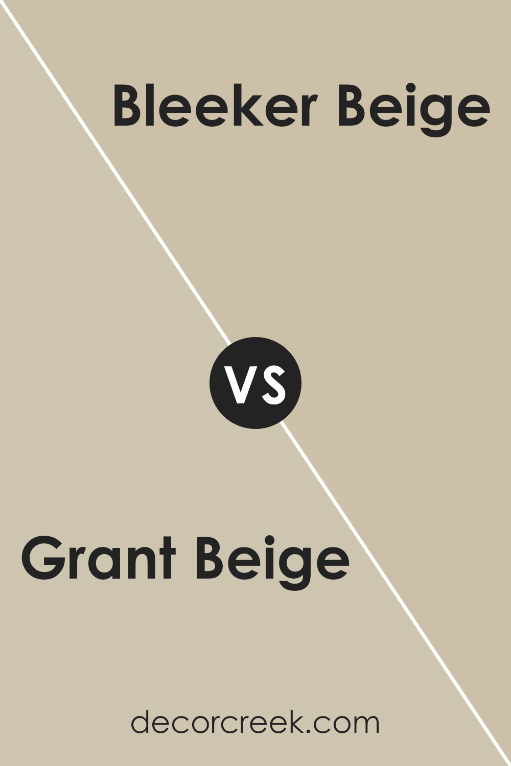
Grant Beige HC-83 by Benjamin Moore vs Bleeker Beige HC-80 by Benjamin Moore
Grant Beige HC-83 and Bleeker Beige HC-80 by Benjamin Moore are two shades of beige, but they have subtle differences. Grant Beige is a warm, medium-toned beige that can add a cozy feel to a room. It has a touch more of yellow undertones, which can make spaces feel welcoming and sunny.
On the other hand, Bleeker Beige is a slightly cooler beige. It has more gray undertones, giving it a more neutral and balanced vibe. This can make it versatile and suitable for various settings and styles.
When deciding between the two, consider the lighting and the mood you want to create. Grant Beige might work better in rooms that need warmth and brightness, while Bleeker Beige is great for spaces where you want a calm, understated look.
Both are excellent choices, offering different atmospheres based on their undertones and warmth.
You can see recommended paint color below:
- HC-80 Bleeker Beige
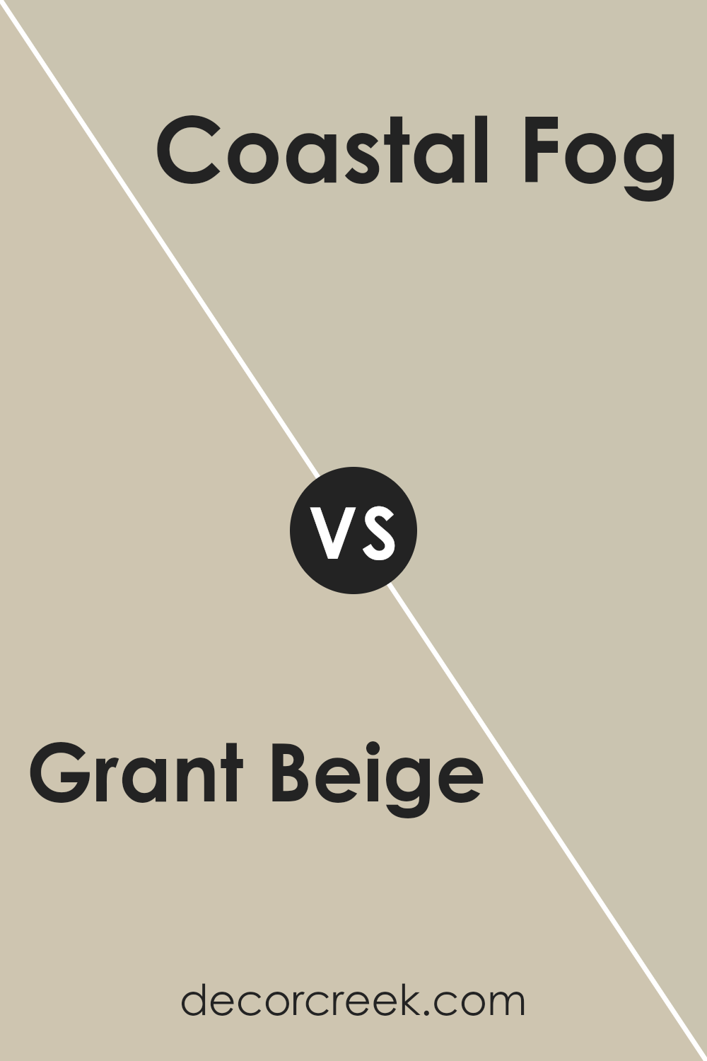
Grant Beige HC-83 by Benjamin Moore vs Coastal Fog 976 by Benjamin Moore
Grant Beige HC-83 by Benjamin Moore is a warm, earthy color that adds a cozy feel to any space. It has a mix of cream and tan tones, which makes it versatile enough to pair with both light and dark accents. This color is often chosen for its comforting vibe, making it an excellent choice for living rooms or bedrooms.
On the other hand, Coastal Fog 976 by Benjamin Moore is a softer, more muted color. It leans towards gray with a hint of warmth, creating a calming effect. Coastal Fog is subtle and refined, making it a great backdrop in spaces where you want a peaceful ambiance without being too plain.
When comparing the two, Grant Beige is warmer and more inviting, while Coastal Fog is understated and calming. They cater to different moods, with Grant Beige adding warmth and Coastal Fog offering a gentle, soothing presence.
Both are great in their own way, depending on the atmosphere you wish to create.
You can see recommended paint color below:
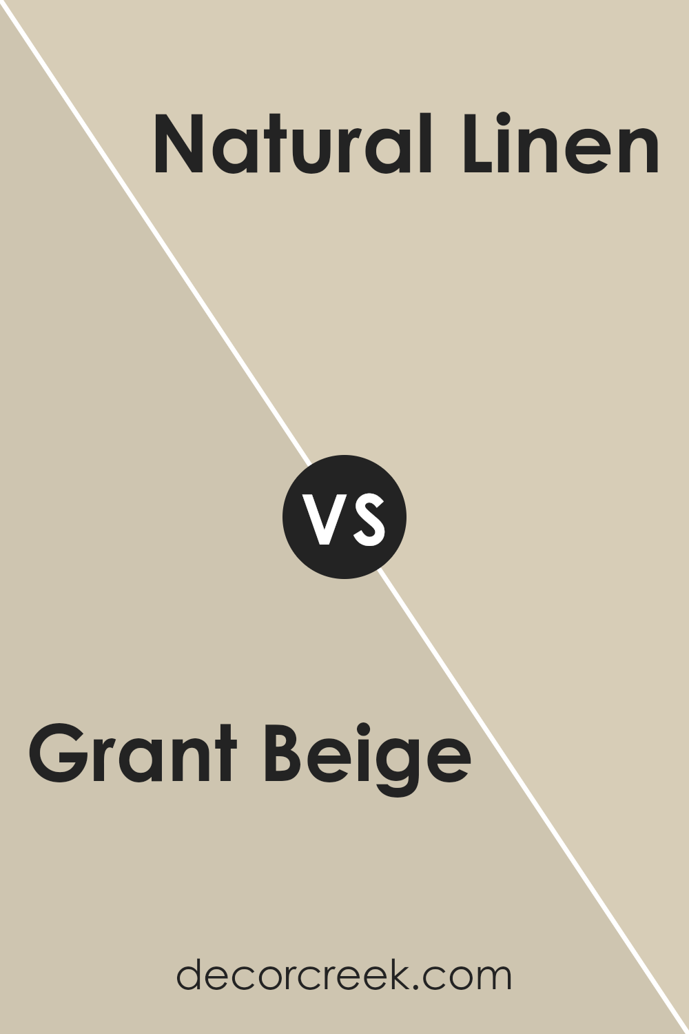
Grant Beige HC-83 by Benjamin Moore vs Natural Linen 966 by Benjamin Moore
Grant Beige HC-83 by Benjamin Moore is a warm beige color with earthy undertones, giving it a rich and cozy feel. It’s a versatile color that works well in various settings, providing a welcoming and comfortable atmosphere.
On the other hand, Natural Linen 966 by Benjamin Moore is a lighter, softer shade of beige. It has more of a subtle, creamy look, making spaces feel bright and open.
While Grant Beige leans more towards a deeper, grounded tone, Natural Linen offers a lighter, airy feel. Both colors are neutral and can pair well with other colors, but Grant Beige is better suited for adding a touch of warmth and depth to a room, whereas Natural Linen adds brightness and softness.
Choosing between the two depends on whether you prefer a cozier and more intimate vibe or a light and fresh ambiance.
You can see recommended paint color below:
- 966 Natural Linen
Conclusion
As I wrap up my thoughts on Grant Beige HC-83 by Benjamin Moore, I want to share why this color is a great choice. Imagine a warm hug or your favorite cozy blanket – that’s what this shade feels like to a room. It’s a warm and gentle color that makes any place feel like home.
Think of the walls of your room. They can talk through color. With Grant Beige, it’s as if they’re whispering comforting stories and calming your mind. This shade can sit with you and make even gloomy days feel brighter.
Grant Beige isn’t too loud or too quiet. It’s right in the middle, which helps it fit anywhere. Whether it’s the living room where your family gathers or your bedroom where you dream away, this color will always be a welcoming background.
Also, it plays nice with other colors, like blues or greens, creating a peaceful and happy room. If your room were a stage, Grant Beige would be the gentle friend supporting all the other colors to shine brightly.
So next time you think of painting, remember Grant Beige. It’s the perfect mood-setter, offering warmth and comfort, like a favorite old sweater you never want to take off.

Ever wished paint sampling was as easy as sticking a sticker? Guess what? Now it is! Discover Samplize's unique Peel & Stick samples.
Get paint samples

