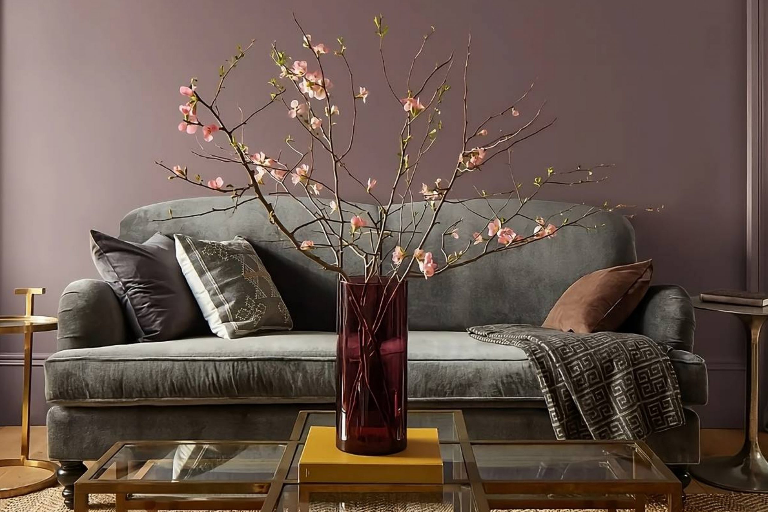
This unique hue strikes a perfect balance, offering a sophisticated blend of rich cinnamon and cool slate. It feels both cozy and elegant, making it a versatile choice for nearly any room in the house.
I imagined how Cinnamon Slate could transform a living space, adding a sense of warmth and comfort without overwhelming the senses. Its subtle depth is perfect for creating an intimate atmosphere.
Whether used on an accent wall in a living room, or to add character to a bedroom, this color brings a sense of calm and refinement.
As a backdrop, Cinnamon Slate works harmoniously with both darker and lighter shades, making it easy to pair with various furniture and décor styles. It enhances wood tones and complements metallic accents beautifully, adding a touch of understated elegance.
If you’re considering a change that adds warmth and sophistication to your home, 2113-40 Cinnamon Slate might just be the answer.
It’s a color that invites you to create a space that feels both personal and welcoming, blending seamlessly into your everyday life.
What Color Is Cinnamon Slate 2113-40 by Benjamin Moore?
Cinnamon Slate by Benjamin Moore is a warm, earthy color with a mix of brown and gray tones. This shade brings a cozy, inviting feeling to any room. Its subtle complexity makes it a versatile choice for various interior styles.
This color works well in rustic and farmhouse settings, adding warmth and depth to spaces with wooden beams, stone fireplaces, or exposed brick walls. It also fits nicely in modern or industrial interiors, where its neutral base can soften metal and concrete elements.
For a more traditional style, Cinnamon Slate can enhance rich wood furniture and classic details.
Pairing Cinnamon Slate with certain materials and textures can accentuate its charm. It complements natural materials like wood, leather, and wool beautifully, creating a cozy, harmonious atmosphere.
Light-colored wood, such as oak or maple, can highlight Cinnamon Slate, while dark woods, like walnut or mahogany, add a luxurious touch.
Textures like linen, cotton, or jute work well, providing contrast and a welcoming feel. To add interest, consider using metallic accents in brass or copper, which enhance the warmth of the color. Overall, Cinnamon Slate is a versatile and inviting color choice that can enrich various spaces.
Is Cinnamon Slate 2113-40 by Benjamin Moore Warm or Cool color?
Cinnamon Slate 2113-40 by Benjamin Moore is a warm, earthy paint color that brings a cozy and inviting feel to any space. This rich, muted shade combines elements of brown and grey, creating a neutral yet distinct tone that can blend well with various decorating styles. In homes, Cinnamon Slate adds depth to living rooms, bedrooms, and kitchens, making them feel more intimate and grounded.
The color works well in spaces with both natural and artificial light, as it subtly changes shade depending on the time of day. When paired with lighter neutrals or whites, it creates a balanced contrast that highlights architectural features or room details.
It complements wooden furniture and accessories, enhancing the warmth of the room.
Cinnamon Slate is versatile, working alongside more vibrant colors for those who enjoy a lively atmosphere. It’s also a good choice for accents, like feature walls or small decorative elements, for a touch of warmth without overwhelming a space.
Undertones of Cinnamon Slate 2113-40 by Benjamin Moore
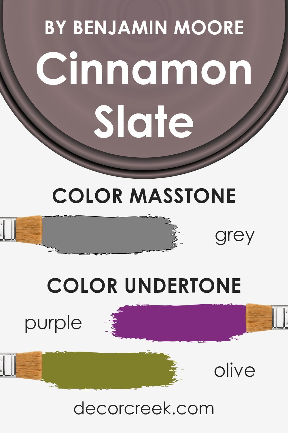
Cinnamon Slate by Benjamin Moore has a unique blend of undertones that influence how we perceive its color. This particular shade can change based on lighting and surroundings, thanks to the rich mix of secondary hues. Among these undertones are hints of purple, olive, pale pink, and turquoise. These subtle shades can bring a soft warmth or a soothing coolness depending on the space and lighting.
For example, when the purple and lilac undertones come through, the color may have a slightly regal and sophisticated feel. Alternatively, the olive and dark green tones add earthiness, giving a more natural and grounded vibe.
The presence of darker tones such as navy and dark grey can make Cinnamon Slate appear more muted and somber.
In an interior setting, Cinnamon Slate’s undertones work to create a cozy and inviting atmosphere, making it ideal for living rooms or bedrooms. The interplay between the warm tones like pink, orange, and pale yellow can add vibrancy and warmth, making the room feel cheerful and welcoming.
Conversely, cool undertones like dark turquoise or light blue provide a calming effect, adding balance to the space. The overall feel of this color can vary, giving homeowners flexibility to match it with various decor styles.
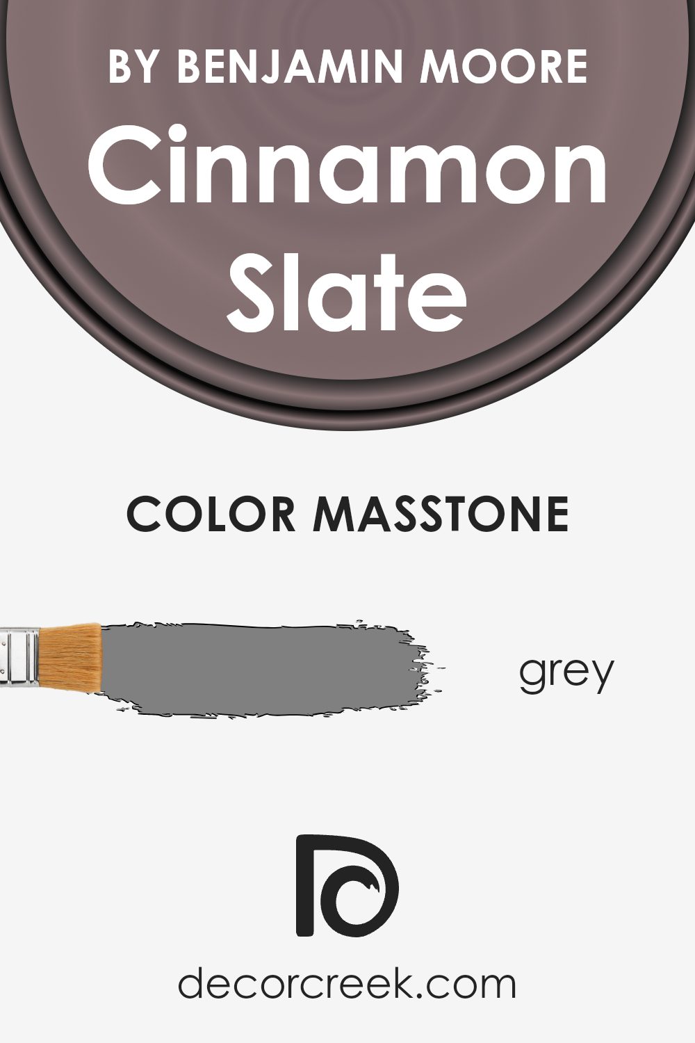
What is the Masstone of the Cinnamon Slate 2113-40 by Benjamin Moore?
Cinnamon Slate (2113-40) by Benjamin Moore is a warm, earthy shade that combines elements of gray and brown. The masstone, or the overall appearance of the color, leans towards a medium gray (#808080), giving it a versatile and grounded vibe.
In homes, this makes Cinnamon Slate a practical choice, as it can complement both modern and traditional interiors.
The gray undertone helps the color to act as a neutral backdrop, allowing other decor elements to stand out without clashing. This makes it suitable for living rooms, bedrooms, or kitchens where a soothing yet sophisticated atmosphere is desired.
The warmth from the brown hints in the color adds a cozy feel, ensuring that spaces feel inviting rather than stark. It pairs well with wooden furniture and metallic accents, enhancing the overall aesthetic.
Natural light accents its warm aspects, while artificial light may highlight its cooler tones, offering a balanced and pleasant appearance.
How Does Lighting Affect Cinnamon Slate 2113-40 by Benjamin Moore?
Lighting plays a crucial role in how we perceive colors. Different types of light can change the appearance of a paint color, making it appear warmer or cooler, brighter or duller. For example, natural daylight tends to offer the most balanced lighting, while artificial lighting can have a variety of color temperatures, affecting how colors are perceived.
Cinnamon Slate by Benjamin Moore is a warm, earthy tone with some red and brown undertones. In natural light, especially an abundance of it, this color will display its richness and depth. It will look true to its warm, cozy characteristics, enveloping a space in a comfortable glow.
In a north-facing room, where the light is cooler and more diffuse, Cinnamon Slate might appear a bit muted and cooler, reducing its warm qualities slightly. In such spaces, the color’s red and brown undertones will still show but become more subdued. Using warm artificial lighting in these rooms can enhance its warm tones.
In a south-facing room, where natural light is often warmer and more intense, Cinnamon Slate will thrive. The warmth of the light will bring out the color’s rich, earthy qualities, making it appear more vibrant and alive throughout the day.
In east-facing rooms, morning light is abundant but cooler, so the color might initially look less warm during early hours. However, as the day progresses and the light warms, even artificial lighting in evenings can maintain its cozy charm.
In west-facing rooms, the opposite occurs. Colors can look duller in the morning due to the lack of direct sunlight, but in the afternoon and evening, the room fills with warm light, enhancing the Cinnamon Slate’s rich tones.
Therefore, when choosing this color, consider the room’s orientation and lighting conditions to ensure it looks as intended at different times and under different lighting situations.
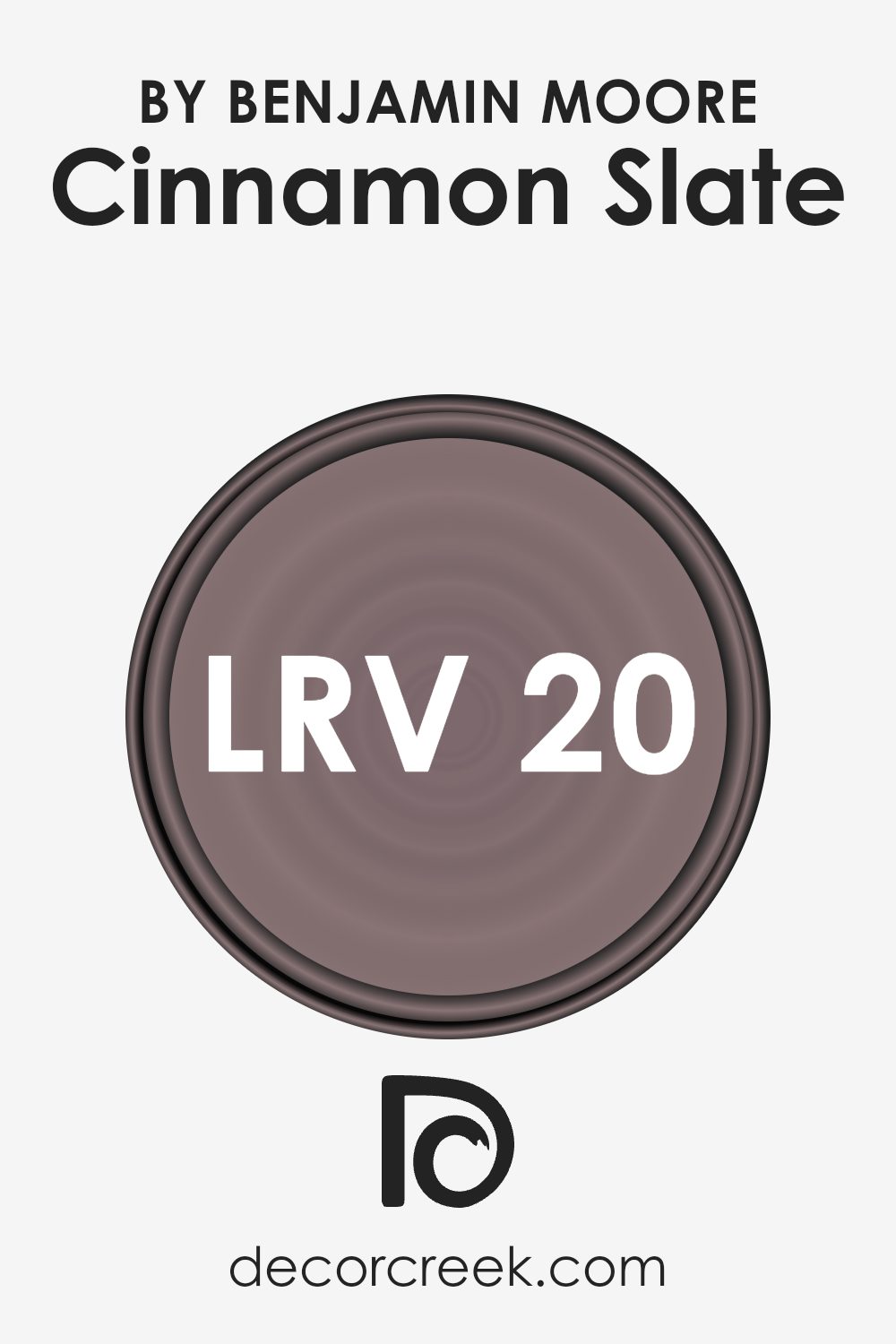
What is the LRV of Cinnamon Slate 2113-40 by Benjamin Moore?
LRV stands for Light Reflectance Value. It’s a scale that measures how much light a color reflects or absorbs and ranges from 0 to 100. A color with a low LRV, close to 0, absorbs more light and appears darker. Conversely, a high LRV, closer to 100, means the color reflects more light and appears lighter.
Understanding LRV helps in choosing the right paint color for a room based on how much natural or artificial light it gets. For example, in a room with a lot of natural light, a color with a lower LRV might work well because it won’t become overwhelming when the sun is shining.
On the other hand, in dimly lit spaces, a color with a higher LRV can help bounce light around, making the room feel brighter.
Cinnamon Slate has an LRV of 19.71, which is relatively low on the scale. This means it is a darker color that will absorb more light than it reflects. The deep, warm tones of this shade can create a cozy, intimate atmosphere in a room. Because it reflects less light, Cinnamon Slate can make larger rooms feel more balanced and not too open
. In smaller spaces, it might enhance the feeling of snugness but could also make the room appear smaller if there’s not enough light. If you’re thinking about using this color, consider how much natural or artificial light is available to ensure it doesn’t make the space feel too dark.
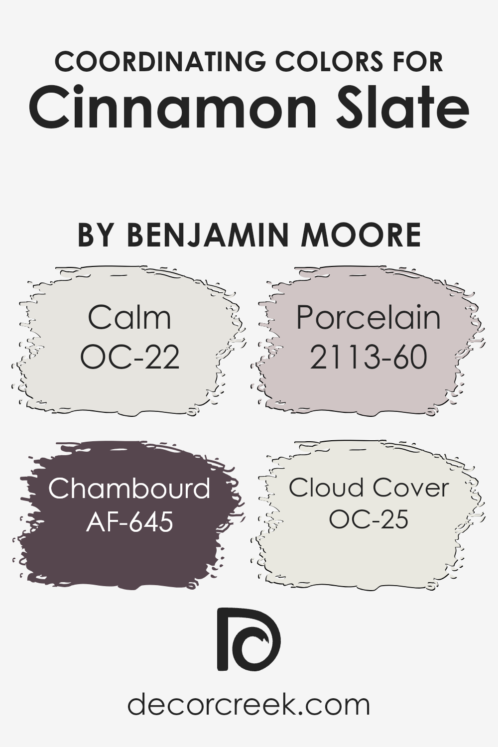
Coordinating Colors of Cinnamon Slate 2113-40 by Benjamin Moore
Coordinating colors are colors that complement each other well and create a harmonious look when used together in design and decor. They can help bring balance and unity to a space, making it more visually appealing. When choosing colors to go with Cinnamon Slate by Benjamin Moore, there are several shades that work beautifully together to create a cohesive palette
. Calm (OC-22) is a soft, muted gray that brings a relaxed and gentle feel to a room. Its subtle nature makes it a great backdrop that can highlight the warmer, earthier tones of Cinnamon Slate.
Chambourd (AF-645) introduces a splash of dramatic purple, adding depth and richness to the overall color scheme. This bold choice can be perfect for adding a focal point or an element of surprise. Porcelain (2113-60), on the other hand, is a delicate, light hue with hints of pink that can soften the look of the room and add a touch of elegance.
Cloud Cover (OC-25) is a versatile off-white color that feels light and airy, making it ideal for balancing the stronger shades and maintaining an open and fresh atmosphere. Together, these colors create a beautifully coordinated and inviting space.
You can see recommended paint colors below:
- OC-22 Calm
- AF-645 Chambourd
- 2113-60 Porcelain
- OC-25 Cloud Cover
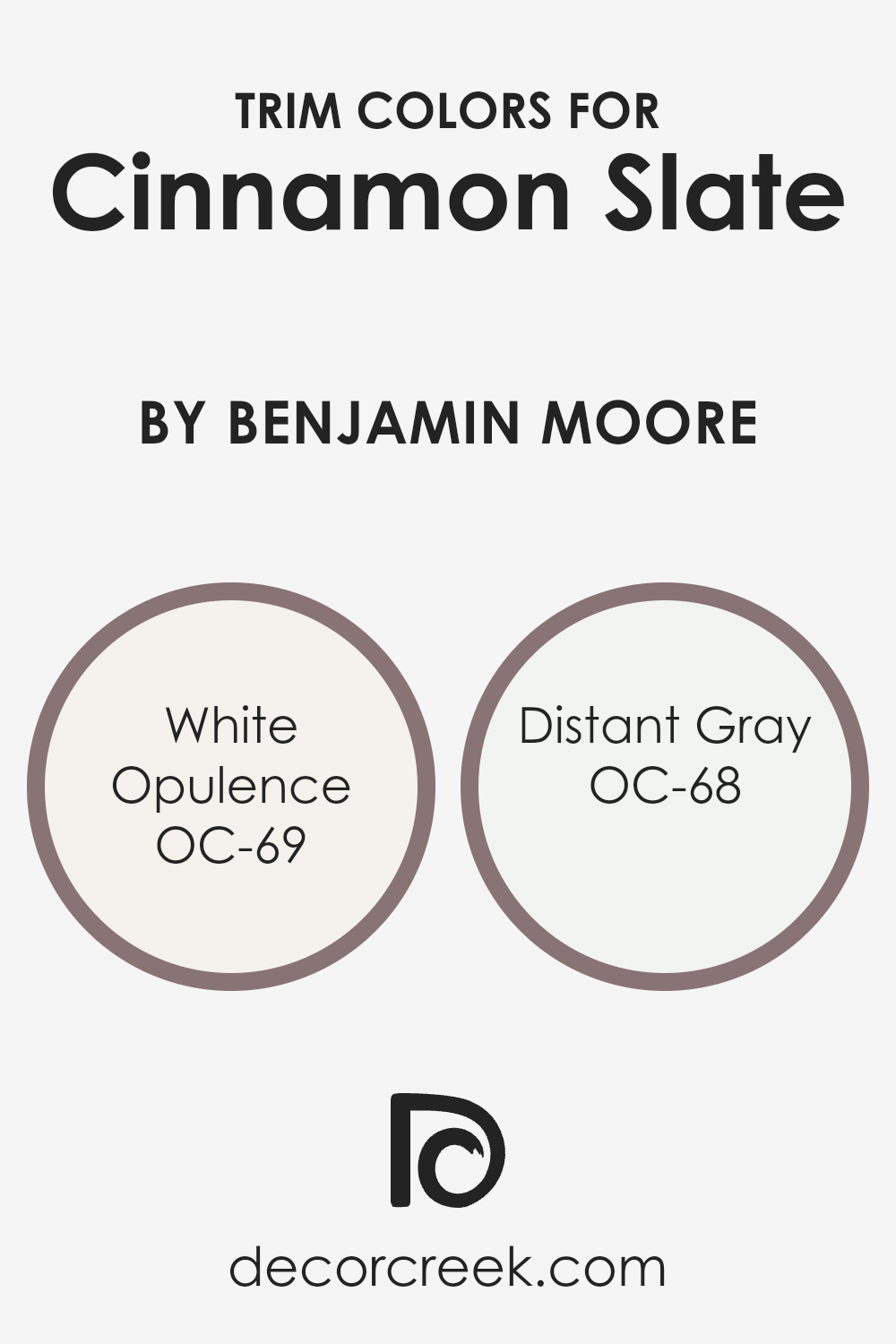
What are the Trim colors of Cinnamon Slate 2113-40 by Benjamin Moore?
Trim colors play an essential role in enhancing the appearance and finish of a room. They help create contrast or harmony with the main wall color, making the overall design more cohesive and visually appealing. In the case of Cinnamon Slate by Benjamin Moore, a warm and earthy tone, trim colors like White Opulence and Distant Gray can be very important.
These colors can either soften or emphasize the rich depth of the Cinnamon Slate color, depending on the effect you’re aiming for. White Opulence offers a gentle, slightly warm white that can provide a soft contrast without feeling too stark.
Meanwhile, Distant Gray brings a subtle, cool undertone that can highlight the rich warmth of Cinnamon Slate, making both colors stand out beautifully.
White Opulence is a warm white that feels inviting and soothing, creating a soft and harmonious look as a trim color. It’s subtle, yet it offers enough contrast to define the edges and style of the room without overpowering the main color.
On the other hand, Distant Gray is more of a cool, crisp white, providing a clean and modern contrast. This can be ideal if you want a sharper definition around windows, doors, and baseboards, adding a fresher touch to the space.
Together, these trim colors can balance and enhance the earthy tones of Cinnamon Slate, ensuring a polished and complete look.
You can see recommended paint colors below:
- OC-69 White Opulence
- OC-68 Distant Gray
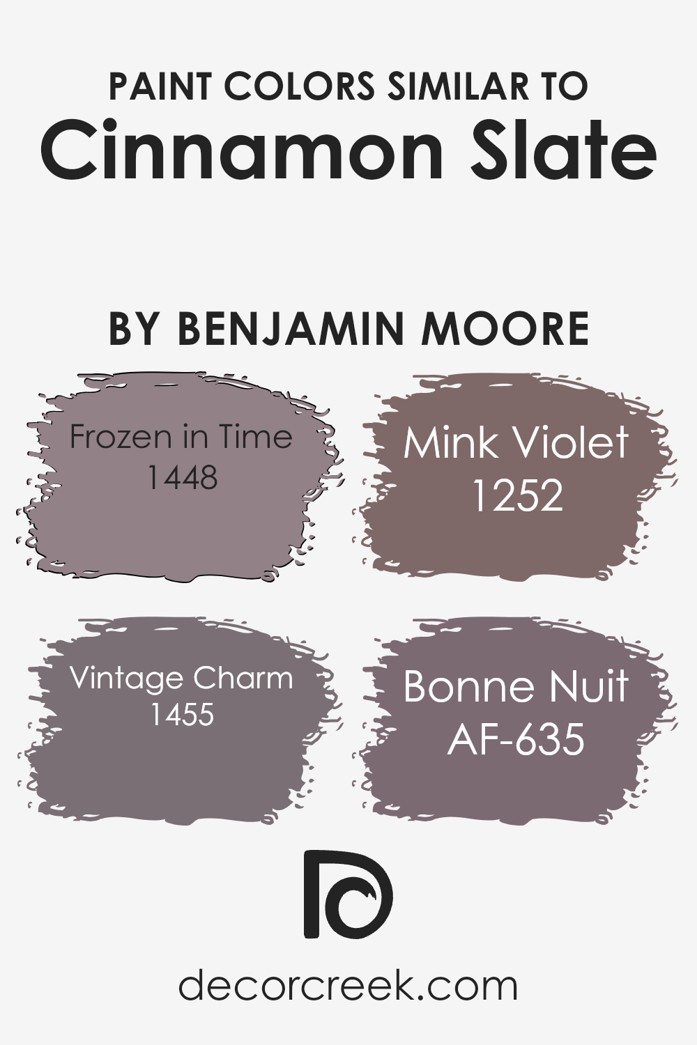
Colors Similar to Cinnamon Slate 2113-40 by Benjamin Moore
Colors similar to Cinnamon Slate by Benjamin Moore play a significant role in creating harmonious and cohesive spaces. These colors, when used together, create a sense of unity and flow in a room, allowing different elements to blend seamlessly.
Choosing similar shades can enhance the overall effect of a space, making it feel balanced and inviting. They work by complementing one another, ensuring that no single color overpowers the others, but instead, they work together to create an aesthetically pleasing environment.
Frozen in Time (1448) is a soft and restful hue with a touch of muted lilac, adding a gentle, calming vibe to any space. Vintage Charm (1455) offers a bit deeper tone with its warm, mauve undertones, which adds a cozy and welcoming feel. Mink Violet (1252) leans more into a dusty plum shade, giving it a rich but muted appearance that adds depth without being overwhelming.
Bonne Nuit (AF-635) is a dark, moody blue with gray undertones, providing a dramatic contrast while still staying in the same color family. Together, these colors create a palette that is both diverse and harmonious, ideal for those looking to create spaces that feel both connected and comforting.
You can see recommended paint colors below:
- 1448 Frozen in Time
- 1455 Vintage Charm
- 1252 Mink Violet
- AF-635 Bonne Nuit
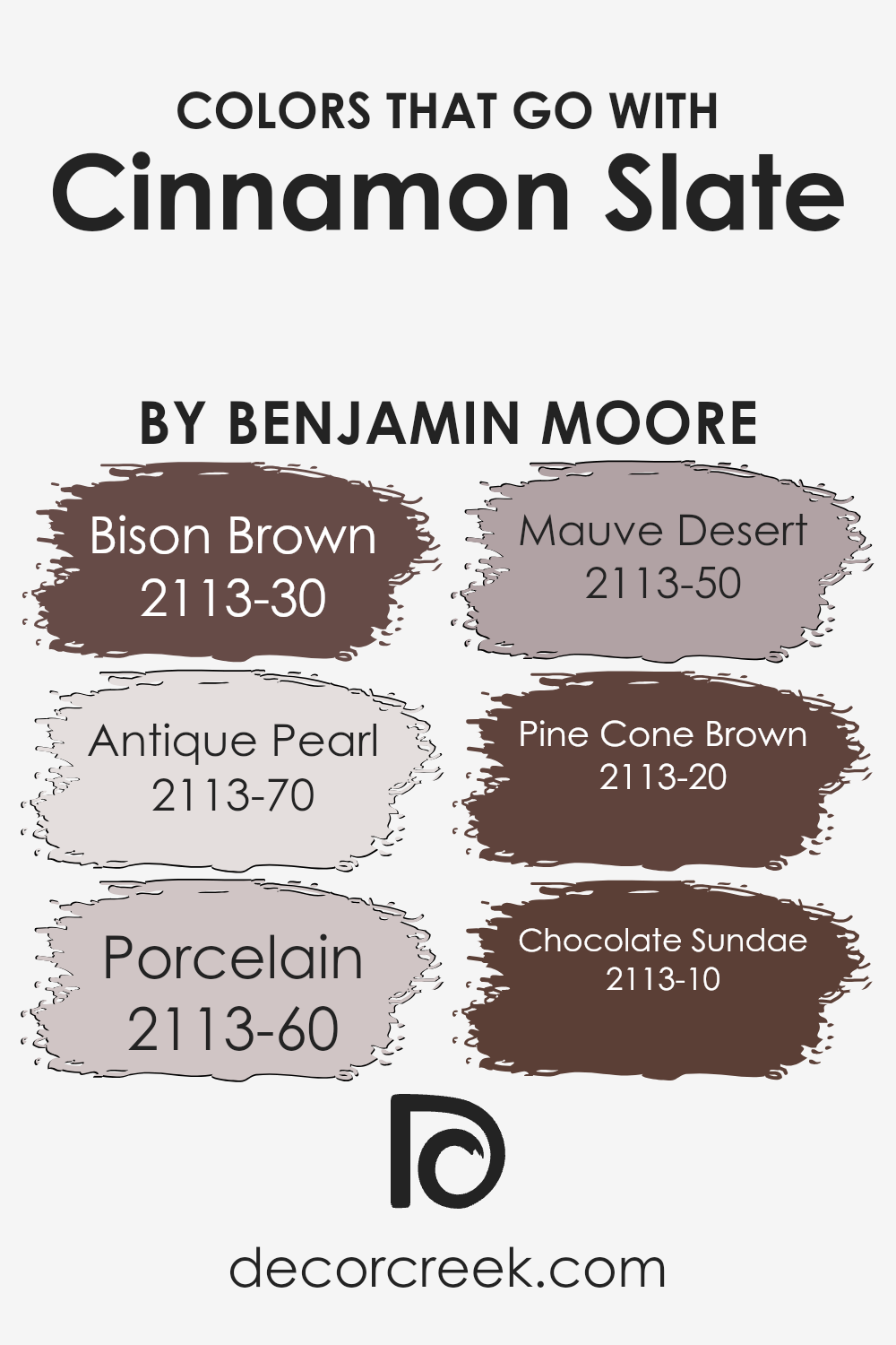
Colors that Go With Cinnamon Slate 2113-40 by Benjamin Moore
Choosing colors that work well with Cinnamon Slate 2113-40 by Benjamin Moore is important because they can enhance the room’s overall feel and create a harmonious environment. These colors complement each other to bring out the best in Cinnamon Slate.
For instance, Bison Brown 2113-30 is a rich, dark brown that adds depth and warmth, creating a strong contrast with the cinnamon hue. It brings a cozy and grounded feeling to a space.
Antique Pearl 2113-70 is a soft, off-white with a hint of warmth that can brighten up any area and make it feel more open while keeping a warm undertone.
Porcelain 2113-60 is a light, muted color that adds a gentle touch of sophistication, making it easy on the eyes and inviting. Mauve Desert 2113-50 introduces a bit of muted pinkish hue, which adds a subtle hint of color without being overpowering, creating a sense of balance.
Pine Cone Brown 2113-20 is a medium brown that feels earthy and calming, working beautifully for a natural look.
Chocolate Sundae 2113-10 is a deep, rich chocolate brown that infuses the space with a sense of luxury and comfort. Together, these colors create a cohesive look, making spaces feel balanced and inviting.
You can see recommended paint colors below:
- 2113-30 Bison Brown
- 2113-70 Antique Pearl
- 2113-60 Porcelain
- 2113-50 Mauve Desert
- 2113-20 Pine Cone Brown
- 2113-10 Chocolate Sundae
How to Use Cinnamon Slate 2113-40 by Benjamin Moore In Your Home?
Cinnamon Slate by Benjamin Moore is a rich, warm color that brings a cozy feel to any space. It’s a deep brown with reddish undertones, making it an excellent choice for creating an inviting atmosphere. This color works well in living rooms or dining areas where you want to encourage conversation and relaxation.
Pair it with neutral tones like beige or cream to balance its warmth, or add touches of gold and copper for a more elegant look.
In the kitchen, Cinnamon Slate can add a modern touch to cabinets or an accent wall, complementing stainless steel or dark wood surfaces. In bedrooms, it provides a snug and comfortable backdrop, especially when combined with soft fabrics and lush textures.
For smaller spaces like a reading nook or study, it offers a sense of depth and coziness. Overall, Cinnamon Slate adds character and warmth, making spaces feel welcoming and comfortable.
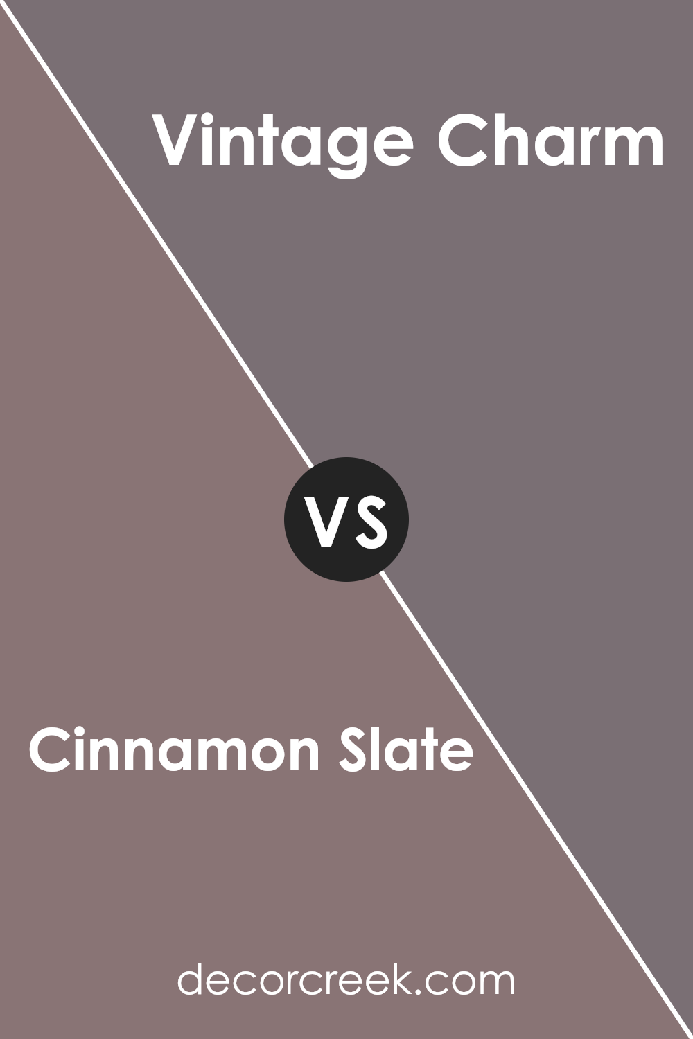
Cinnamon Slate 2113-40 by Benjamin Moore vs Vintage Charm 1455 by Benjamin Moore
Cinnamon Slate 2113-40 and Vintage Charm 1455 by Benjamin Moore are two distinct colors that can bring different moods to a space. Cinnamon Slate is a rich, earthy hue that combines brown and gray tones. It’s warm and grounding, making it suitable for creating a cozy and inviting atmosphere in any room. It pairs well with natural materials and can add depth to a space without being overpowering.
On the other hand, Vintage Charm is a softer, more muted shade with a slightly nostalgic feel. It blends hints of beige and gray, giving it a timeless and classic look. This color can bring a gentle, calming touch to interiors and works well in spaces where a more laid-back and understated vibe is desired.
While both colors can complement each other, Cinnamon Slate tends to be bolder, while Vintage Charm offers a more subtle and soothing presence. Choosing between them depends on the mood you want to create in your home.
You can see recommended paint color below:
- 1455 Vintage Charm
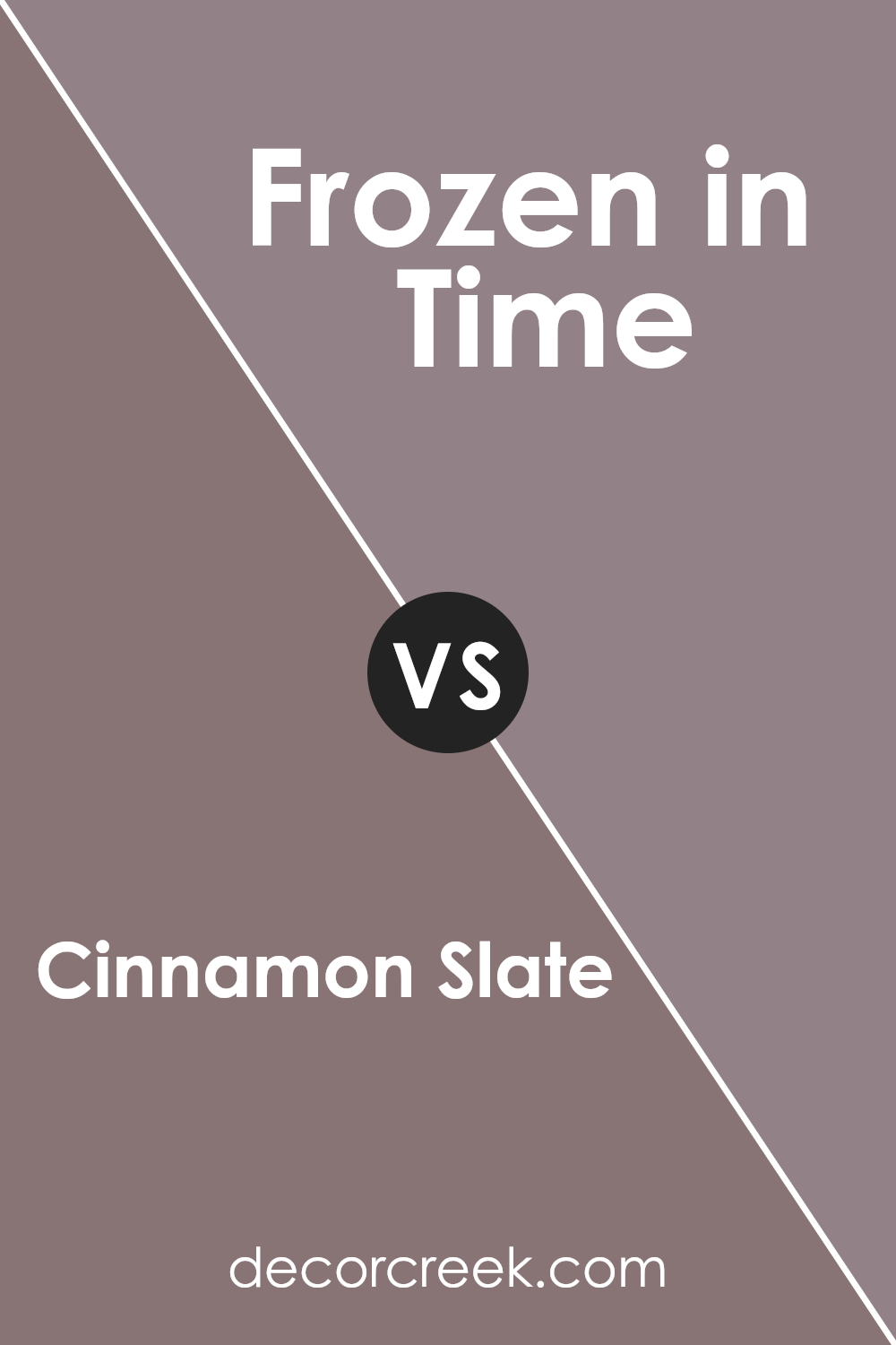
Cinnamon Slate 2113-40 by Benjamin Moore vs Frozen in Time 1448 by Benjamin Moore
Cinnamon Slate and Frozen in Time by Benjamin Moore offer two distinct color experiences. Cinnamon Slate is a warm, earthy tone with a hint of spice, offering a cozy and inviting feel. It’s perfect for adding depth and richness to a space, making it ideal for living rooms or dining areas where a comfortable atmosphere is desired.
On the other hand, Frozen in Time presents a softer, cooler vibe. This light shade of gray with a touch of warmth feels more airy and open, making it suitable for bedrooms or bathrooms where a calm and restful environment is preferred.
While Cinnamon Slate grounds a room with its robustness, Frozen in Time brings a gentle, relaxed quality. Both colors can work within modern or traditional settings, depending on the overall design and decor. Whether you want to create a snug haven or a peaceful retreat, these two colors provide versatile choices for any home.
You can see recommended paint color below:
- 1448 Frozen in Time
Cinnamon Slate 2113-40 by Benjamin Moore vs Bonne Nuit AF-635 by Benjamin Moore
Cinnamon Slate and Bonne Nuit are two distinct colors from Benjamin Moore that offer different atmospheres for a space. Cinnamon Slate is a warm, earthy tone with hints of red and brown, reminiscent of cozy autumn days. It brings a sense of warmth and comfort to a room, making it a great choice for living spaces or areas where you want to encourage relaxation and conversation.
On the other hand, Bonne Nuit is a deep, muted blue that evokes a calm, restful feeling. This color works well in bedrooms or spaces where you want to create a peaceful and restful ambiance. While Cinnamon Slate feels inviting and grounded, Bonne Nuit leans towards a more soothing and cool vibe.
Both colors can be used to highlight specific areas depending on the desired mood. Cinnamon Slate’s warmth can make a room feel more intimate, while Bonne Nuit’s calmness can provide a gentle backdrop that promotes restfulness.
You can see recommended paint color below:
- AF-635 Bonne Nuit
Cinnamon Slate 2113-40 by Benjamin Moore vs Mink Violet 1252 by Benjamin Moore
Cinnamon Slate 2113-40 is a warm, earthy color by Benjamin Moore. It has a rich, spicy feel, resembling a mix of brown and red with a hint of orange. This makes it a versatile choice for cozy, inviting spaces, as it provides a sense of warmth and comfort. It’s an excellent option for living rooms or kitchens where you want a comforting atmosphere.
On the other hand, Mink Violet 1252 is a cooler color. It’s a deep, muted purple that combines elements of brown and grey. This gives it a more understated and sophisticated appearance, suitable for creating a calm and relaxed environment.
It’s ideal for bedrooms or studies where you need a peaceful setting.
When comparing the two, Cinnamon Slate brings warmth and energy, while Mink Violet offers a soothing, calming presence. Both colors can serve as beautiful accents or main shades, depending on the mood and feel you want to create in your space.
You can see recommended paint color below:
- 1252 Mink Violet
I believe this color works nicely in many rooms. You could use it in a living room to make it feel cozy and inviting or in a bedroom to create a feeling of comfort.
It probably looks great with other neutral colors, like whites and creams, but also with brighter colors, if you want a bit more energy.
When you paint a room with Cinnamon Slate, it might feel like bringing a piece of nature inside. To me, it seems like a color that could make rooms feel both warm and stylish at the same time. Plus, since it’s not too bright or too dark, it’s easy on the eyes.
Overall, 2113-40 Cinnamon Slate by Benjamin Moore feels like a paint color that would make any room feel welcoming and comfortable. I think it could be a great choice if you want something simple, yet beautiful, for your home.
Ever wished paint sampling was as easy as sticking a sticker? Guess what? Now it is! Discover Samplize's unique Peel & Stick samples.
Get paint samples

