If you’re looking for a color that brings a fresh and clean look to your space, OC-68 Distant Gray by Benjamin Moore might be the perfect choice. This color is part of the Off-White Color collection, which is known for its subtle and sophisticated hues.
Distant Gray stands out as a neutral that can effortlessly uplift any area of your home, making it feel brighter and more spacious.OC-68 Distant Gray is not just any ordinary gray. It has a unique blend that creates a soft, airy feel, making it an excellent choice for those who want to refresh their walls without overwhelming the room with color. Whether you’re redoing your living room, bedroom, or even your bathroom, this color adds a touch of elegance without trying too hard.
One of the best things about Distant Gray is its versatility. It pairs beautifully with a wide range of decor styles and colors. Whether you have a modern, minimalist home or a cozy, traditional space, Distant Gray can seamlessly fit in and complement your existing decor.
Additionally, it works well in spaces with lots of natural light, as well as those that rely more on artificial lighting, maintaining its charming appeal under different conditions.Choosing OC-68 Distant Gray by Benjamin Moore for your next project means selecting a color that’s both timeless and on-trend. It offers a perfect backdrop for your creative decorations and personal style to shine through.
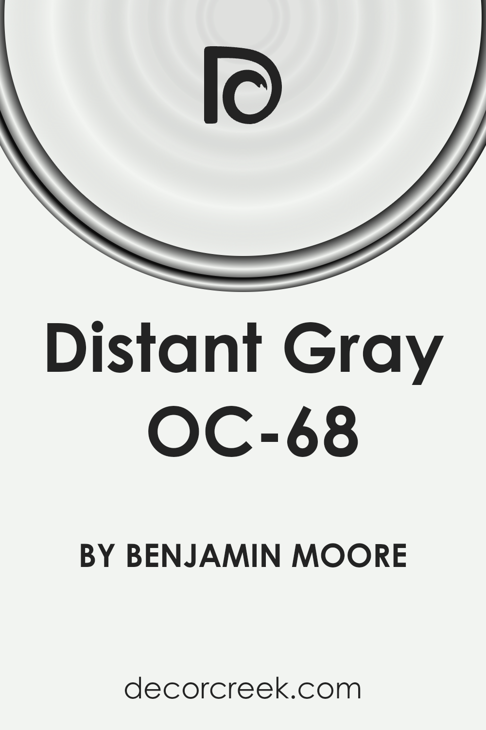
What Color Is Distant Gray OC-68 by Benjamin Moore?
Distant Gray OC-68 by Benjamin Moore is a soft, light shade of gray that offers a clean and timeless look to any space. This color is incredibly versatile, acting as either a neutral backdrop or a serene standalone hue, depending on the lighting and surrounding colors. Its subtle warmth means it can adapt to various settings, bringing a sense of calm and sophistication.
Distant Gray works exceptionally well in modern and minimalist interior styles, where its simplicity can shine, but it’s also a perfect choice for more traditional or coastal-inspired spaces due to its understated elegance.
When it comes to pairing with materials and textures, Distant Gray is highly accommodating. It complements natural wood tones beautifully, from lighter maples to richer walnuts, adding depth and warmth to the room.
Metallic finishes like brushed nickel or polished chrome also pair well, bringing a touch of modernity and shine. For textures, think about incorporating soft, plush fabrics or smooth, sleek surfaces to contrast the wall color subtly. Linen, cotton, and velvet in soft whites or contrasting darks can create a layered, inviting space. Finally, adding elements of glass or mirrored accents can help to reflect light, making Distant Gray-themed rooms feel brighter and more spacious.
Is Distant Gray OC-68 by Benjamin Moore Warm or Cool color?
Distant Gray OC-68 by Benjamin Moore is a light shade that brings a fresh and airy feel to any space in the home. Its subtle tone bridges the gap between white and gray, creating a serene environment that’s both modern and timeless. This color is particularly effective in spaces that get a mix of natural and artificial light, reflecting gently to brighten the room. Its versatility means it works well in small rooms, making them appear more spacious, as well as in larger areas where it adds an understated elegance.
When applied to walls, Distant Gray offers a neutral backdrop that complements a wide range of accent colors, furniture styles, and decor themes. This flexibility allows homeowners to switch up their interior accessories without having to repaint.
In bedrooms, it enforces a peaceful ambiance, conducive to relaxation and rest, while in living spaces, it acts as a subtle canvas that highlights artwork and statement pieces.
Overall, Distant Gray OC-68 by Benjamin Moore is ideal for creating a light, clean look that’s both welcoming and stylish.
Undertones of Distant Gray OC-68 by Benjamin Moore
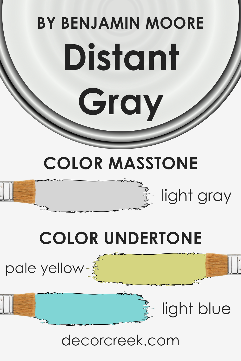
Distant Gray is a fascinating paint color known for its cool and crisp appearance, but what truly sets it apart are its subtle undertones. When we talk about undertones, we mean the hidden colors that are not always obvious at first glance but can influence how we perceive the main color. In the case of Distant Gray, it’s the pale yellow and light blue undertones that play a significant role.
These undertones can affect our perception of Distant Gray in various ways. For instance, the pale yellow brings in a hint of warmth, which can make a space feel more inviting and cozy, even though the main color is a cool gray.
On the other hand, the light blue undertone adds a touch of serenity and calmness, enhancing the coolness of the gray in a way that can make a room feel more spacious and airy.
When applied to interior walls, Distant Gray transforms the space based on its undertones and the lighting in the room. In rooms with plenty of natural light, the pale yellow undertone might become more pronounced, creating a soft, warm glow. In spaces with less natural light or with artificial lighting, the light blue undertone might stand out more, giving the room a tranquil and peaceful vibe.
Understanding these undertones is crucial for anyone looking to use this color in their home, as they significantly influence the atmosphere and mood of the space.
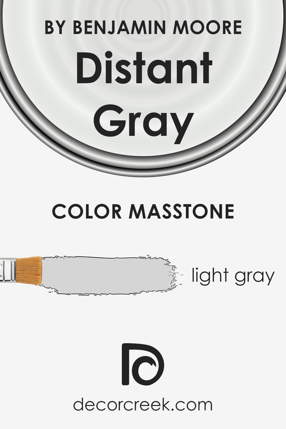
What is the Masstone of the Distant Gray OC-68 by Benjamin Moore?
Distant Gray OC-68 by Benjamin Moore is a light gray color with a masstone that you might describe using the code #D5D5D5. This shade is especially good for homes because of its soft, subtle qualities. Light gray tones like this one can make small spaces appear bigger and brighter, as they reflect more light compared to darker colors. It’s a versatile color that fits just about any room, whether you’re looking for a calm atmosphere in bedrooms or a clean, professional look in home offices.
Because of its neutrality, Distant Gray pairs well with a wide range of decor, from modern minimalist to cozy farmhouse styles, allowing personal items and furniture to stand out.
It serves as a serene backdrop that can easily be matched with bolder colors or used in a more monochromatic design scheme to create a peaceful and unified space. This adaptability makes it a favorite choice for homeowners looking to add a fresh and contemporary feel to their living environments without overwhelming the senses.
How Does Lighting Affect Distant Gray OC-68 by Benjamin Moore?
Lighting plays a crucial role in how we perceive colors in our environment. It can make a color appear vivid and deep or washed out and dull. This effect is due to the different types of light sources and their impact on colors. For instance, artificial light can vary in hue from warm yellows and oranges to cool blues and whites, while natural sunlight changes throughout the day and depending on the weather.
Let’s consider a specific color, Distant Gray by Benjamin Moore, and explore how it changes under different lighting conditions and in rooms with various orientations. Distant Gray is a subtle, nearly white shade with a hint of gray. It’s a versatile color that can look different depending on the room’s exposure to light.
- In artificial light, Distant Gray tends to appear warmer or cooler based on the bulb used. Under warm, yellow light, it can take on a softer, creamier appearance, making a room feel cozy. With cool, bluish light, the gray tones become more pronounced, giving a more modern and crisp feel.
- Natural light brings its own dynamic changes to Distant Gray. In a north-facing room, where light tends to be cooler and more constant, this color may lean more towards its gray aspect, creating a serene and calming atmosphere. North light is generally softer, so the color won’t shift dramatically throughout the day.
- South-facing rooms get abundant, warmer light, which can make Distant Gray look brighter and more like a pure white during the day. This orientation tends to enhance the brightness of the color, making spaces feel more open and energetic.
- East-facing rooms receive morning light, which is warm and bright but turns cooler as the day progresses. Here, Distant Gray can look particularly lively and fresh in the morning, gradually turning into its cooler, serene gray as the afternoon approaches.
- In west-facing rooms, the situation reverses. The color may display its cooler, gray qualities during the first part of the day but become warmer and more inviting with the setting sun’s golden hues.
In summary, Distant Gray’s subtle balance between white and gray makes it highly responsive to different lighting conditions, providing a range of atmospheres from warm and cozy to cool and tranquil based on the room’s orientation and light source.
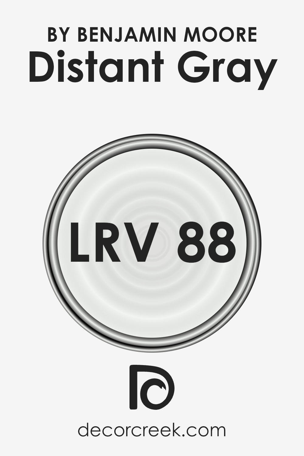
What is the LRV of Distant Gray OC-68 by Benjamin Moore?
LRV stands for Light Reflectance Value, a measure that tells us how much light a color reflects or absorbs. Think of it as a scale from 0 to 100, where 0 means it’s super dark and absorbs almost all light, like a black hole, and 100 is super bright, reflecting all light back, like a mirror in the sunshine.
This scale helps you understand how light or dark a color will look on your walls. When you pick a paint color, knowing its LRV can help you figure out if it will make your room feel cozy and snug by absorbing light or bright and airy by reflecting it.
Now, for the color with an LRV of 88.14, it’s quite high on the scale, meaning it reflects a lot of light. For a color like this, it’s going to look pretty bright on your walls, making the space feel more open and larger. In rooms that get a lot of sunlight, this high LRV means the color will catch that light, making the walls almost glow and enhancing the feeling of lightness.
On the other hand, in spaces with less natural light, this color can still help brighten the space significantly, making it a good choice for making a dark room feel more welcoming and cheerful.
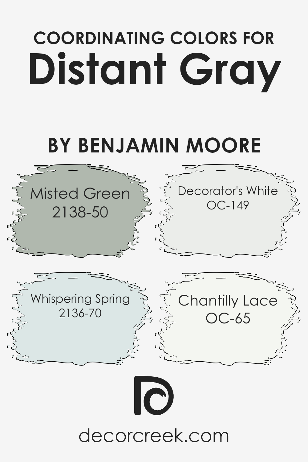
Coordinating Colors of Distant Gray OC-68 by Benjamin Moore
Coordinating colors are essentially hues that work well together to enhance the overall aesthetic of a space, complementing the main color without overpowering it. When you choose a color like Benjamin Moore’s Distant Gray OC-68 for your walls or a significant piece in your room, finding the right coordinating colors is like picking the perfect accessories for your outfit; they enhance the overall look and feel without taking center stage.
By selecting shades that harmonize with Distant Gray, such as Misted Green, Whispering Spring, Decorator’s White, and Chantilly Lace, you create a cohesive and inviting space.
Misted Green has a soft, gentle vibe that brings a touch of nature indoors, creating a calming and serene atmosphere that pairs beautifully with the neutrality of Distant Gray.
Then there’s Whisper Spring, a light, airy blue with a whisper of freshness that seems to breathe life into any space, making rooms feel open and bright. Decorator’s White is a crisp, clean shade that adds a sense of freshness and space, offering a subtle contrast that highlights the finer features of a room without overwhelming it. Lastly, Chantilly Lace presents itself as a pure, bright white, offering a classic look that can make other colors, including Distant Gray, pop and seem more vibrant. Altogether, these coordinating colors work in harmony to create a space that feels balanced, cohesive, and beautifully designed.
You can see recommended paint colors below:
- 2138-50 Misted Green
- 2136-70 Whispering Spring
- OC-149 Decorator’s White
- OC-65 Chantilly Lace
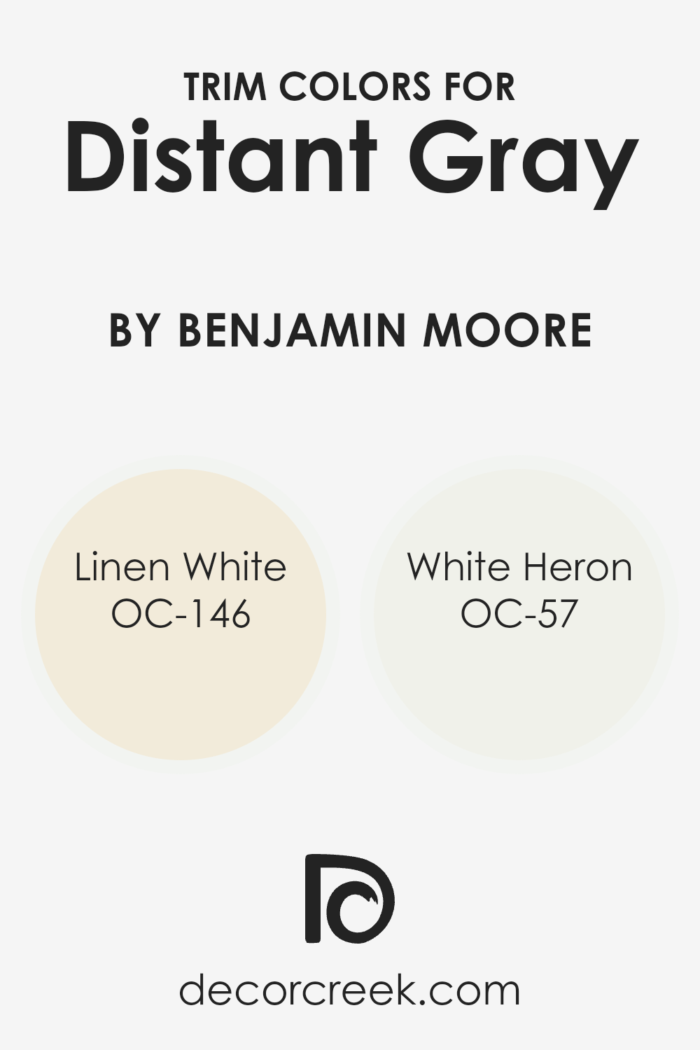
What are the Trim colors of Distant Gray OC-68 by Benjamin Moore?
Trim colors are specific shades chosen to complement or contrast the primary color of a wall, enhancing the overall aesthetic of a room. For a color like Distant Gray by Benjamin Moore, selecting the right trim color is crucial because it accentuates the subtle undertones of the main color, drawing attention to architectural details and creating a cohesive look. A well-chosen trim can frame the walls beautifully, making the space feel more polished and thoughtfully designed.
The key to achieving this effect lies in picking trim colors that not only work well with Distant Gray but also add to the room’s ambiance without overwhelming it.
Linen White OC-146 offers a warm, creamy tone that softly bridges the gap between stark white and deeper hues, making it an ideal choice for a trim that introduces a hint of warmth to the coolness of Distant Gray, providing a gentle contrast that’s pleasing to the eye. White Heron OC-57, on the other hand, is a clean, crisp white with a slightly luminous finish, bringing a fresh and airy feel to the trim.
This color complements Distant Gray by adding a bright, reflective quality to the room, offering a contrast that is subtle yet impactful. Together, these trim colors enhance the beauty of Distant Gray, ensuring the space feels balanced and inviting.
You can see recommended paint colors below:
- OC-146 Linen White
- OC-57 White Heron
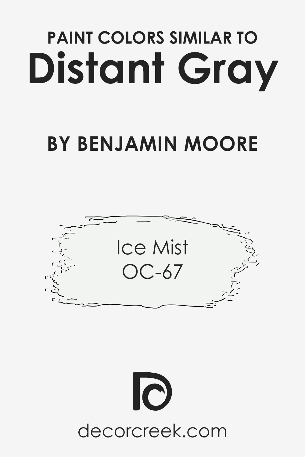
Colors Similar to Distant Gray OC-68 by Benjamin Moore
Similar colors play a significant role in interior design and decoration, primarily because they create harmony and balance within a space. When colors closely relate to each other, like Distant Gray OC-68 and its similar shade Ice Mist OC-67 by Benjamin Moore, they can effortlessly blend together to produce a serene and cohesive look.
These colors work hand in hand, providing a subtle distinction that enriches the overall aesthetic without causing a stark contrast. Using similar colors allows for a fluid and natural transition between spaces and surfaces, making the environment more inviting and comfortable to be in. It’s akin to telling a color story that is gentle and seamless, where each hue supports and enhances the others around it.
Distant Gray OC-68 is a soft, almost ethereal tone that offers a clean and airy feel to any room. Its lightness brings a sense of openness and tranquility, making it an excellent choice for creating a peaceful and minimalist ambiance.
On the other hand, Ice Mist OC-67, while closely related to Distant Gray, is a shade that leans towards a cooler, frost-like appearance.
It provides a refreshing and crisp touch to the space, embodying the purity of early morning frost. Both of these colors, with their subtle nuances, work together to achieve a refined and understated elegance, setting a perfect backdrop for various design elements to shine.
You can see recommended paint color below:
- OC-67 Ice Mist
How to Use Distant Gray OC-68 by Benjamin Moore In Your Home?
Distant Gray OC-68 by Benjamin Moore is a soft, elegant gray color that brings a sense of calm and simplicity to any space. If you’re thinking about giving your home a fresh look, this shade is a versatile choice that can enhance various areas. In the living room, Distant Gray creates a serene backdrop for both modern and traditional decor, making your space feel larger and more inviting.
It’s also perfect for bedrooms, where its soothing tones can help you relax and unwind. In kitchens and bathrooms, this color pairs beautifully with white cabinets and marble countertops, offering a clean and timeless look.
Distant Gray isn’t just about looks; its subtle warmth adds coziness, making it ideal for family rooms. You can also use it in hallways and entryways to create a welcoming vibe right from the doorstep.
With Distant Gray, you can achieve a polished interior that remains cozy and comfortable, truly making your house feel like a home.
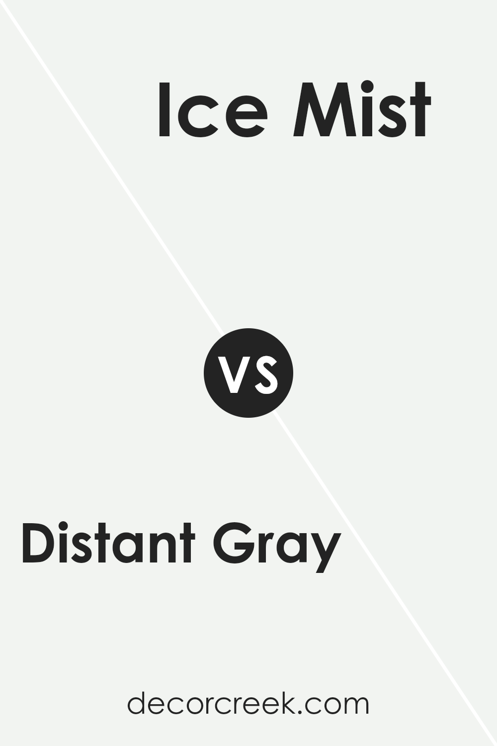
Distant Gray OC-68 by Benjamin Moore vs Ice Mist OC-67 by Benjamin Moore
Distant Gray and Ice Mist, both by Benjamin Moore, are subtle shades that offer a calm and serene vibe. Distant Gray is a soft, light gray that lends a clean, almost ethereal feel to spaces. It’s like a whisper of gray on a white canvas, providing just enough color to add interest without overpowering. On the other hand, Ice Mist has a cooler tone, almost leaning towards a very light blue or a frosty white. This color brings a refreshing and airy feel, illuminating rooms with its crisp brightness.
When comparing the two, Distant Gray serves up a neutral backdrop, versatile and gentle, making it perfect for those looking for a hint of color in their minimalist or modern decor.
Ice Mist, in contrast, is the go-to for creating a bright, invigorating space that feels open and endless. It mirrors the lightness of a clear sky, making small rooms appear larger and dark spaces brighter.
Both colors offer a unique charm, whether you’re aiming for a subtle hint of gray or a fresh, almost wintery white. Their clean simplicity allows them to adapt to various styles, making them suitable for any room looking for a touch of tranquility.
You can see recommended paint color below:
- OC-67 Ice Mist
Conclusion
Distant Gray OC-68 by Benjamin Moore is a subtle and versatile color that brings a peaceful and serene atmosphere to any space. Its light and almost ethereal quality make it an excellent choice for creating a bright, airy feel in rooms of any style or size. Ideal for those looking to establish a fresh and clean look, Distant Gray works beautifully in both contemporary and traditional settings, effortlessly complementing a wide range of decor.
As a backdrop, Distant Gray offers a quiet foundation that allows other colors to shine, making it a favorite among designers and homeowners alike. Whether used in a minimalist design scheme or as a contrast to bolder hues, its understated elegance ensures a timeless appeal.
This color manages to capture a delicate balance, providing just enough warmth to avoid feeling stark, while still offering the crisp, clear ambiance that many seek in a neutral palette.
Ever wished paint sampling was as easy as sticking a sticker? Guess what? Now it is! Discover Samplize's unique Peel & Stick samples.
Get paint samples

