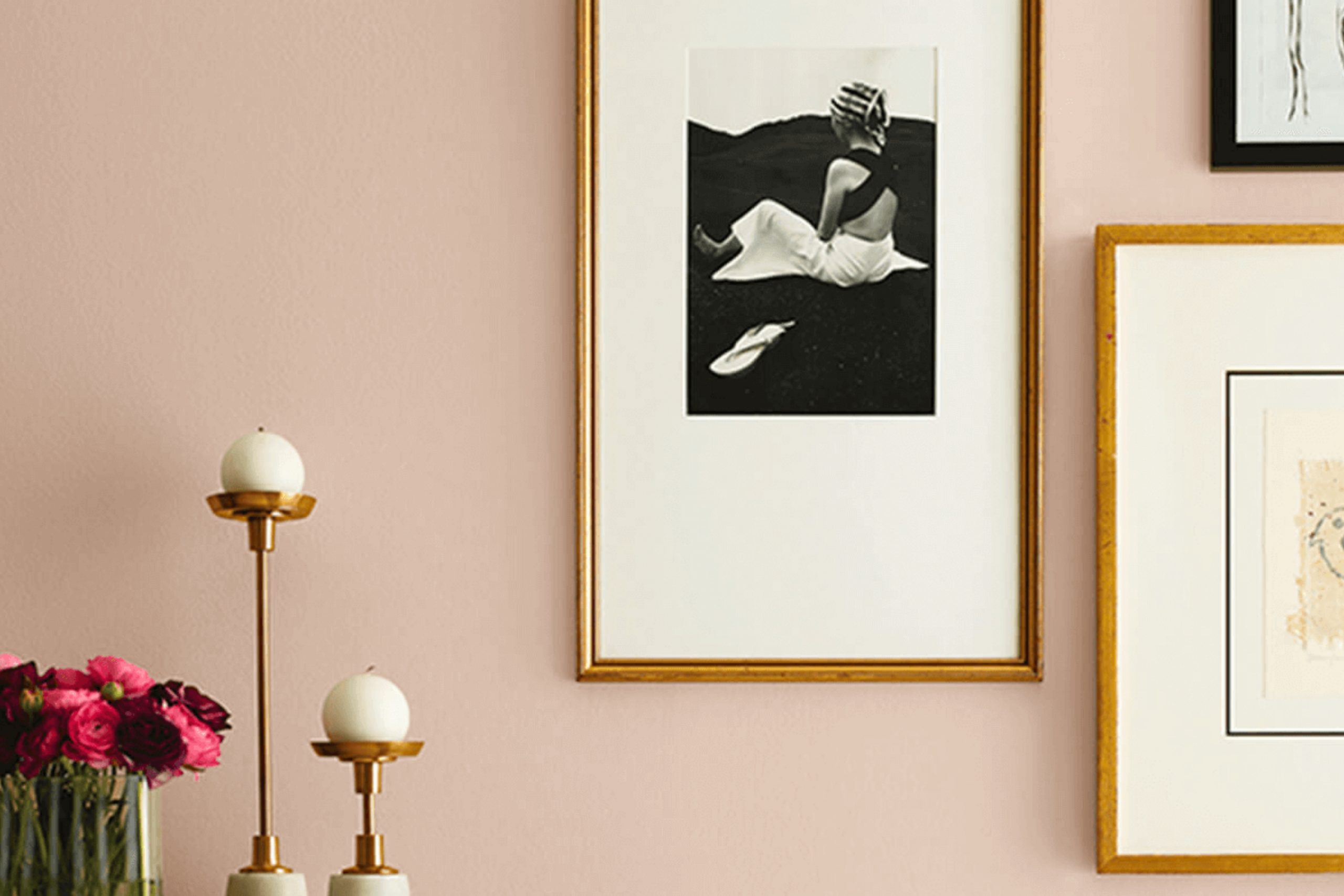
If you’re considering a fresh coat of paint for your living space, let me tell you about SW 0056 Classic Sand by Sherwin Williams. This color is a warm, inviting shade that truly lives up to its name, bringing to mind those peaceful, sandy beaches or a cozy, sunlit corner of your home. As someone who appreciates subtle yet rich hues, I find Classic Sand particularly appealing because it offers a perfect blend of warmth without overwhelming a room.
In your journey to refreshing your home’s palette, you might find this color to be an excellent choice for creating a calm, soothing ambiance. It pairs beautifully with a wide range of decor styles and colors, making it incredibly versatile. Whether you’re looking to paint a bedroom, a living area, or even the exterior of your house, Classic Sand can provide a gentle backdrop that enhances other elements in your space.
More than just a background color, Classic Sand can stand solid on its own, making any room feel more open and airy yet warmly inviting.
If your home has lots of natural light, you’ll see this color changing subtly throughout the day, adding to its charm and appeal.
What Color Is Classic Sand SW 0056 by Sherwin Williams?
Classic Sand by Sherwin Williams is a warm, inviting beige that brings a cozy and soft atmosphere to any room. This color is a versatile neutral, perfect for creating a grounded and welcoming environment. It has a balancing effect, making it a great base for experimenting with accents and accessories.
Classic Sand works exceptionally well in traditional and rustic interior styles. Its earthy tones complement wood finishes beautifully, enhancing the natural grain of oak or pine furniture. In a classical setting, it pairs wonderfully with rich textures like velvet or silk, lending a subtle elegance to the space without overwhelming it with color.
For a more contemporary twist, Classic Sand can be used in minimalist or Scandinavian designs. Here, it matches well with lighter woods, clean lines, and understated decor. The color is effective in softening modern interiors while maintaining a fresh, airy feel.
In terms of materials, Classic Sand coordinates well with natural fibers like linen, wool, and cotton. These materials contribute to a tactile experience that reinforces the warmth of the color. When used on walls, it provides a perfect backdrop for showcasing art or decorative items, allowing other colors to pop without creating visual clutter.
Overall, Classic Sand is a charming and adaptable color that suits various design aesthetics, making spaces feel more homely and put-together.

Is Classic Sand SW 0056 by Sherwin Williams Warm or Cool color?
The Classic Sand color by Sherwin Williams is a warm, inviting beige that brings a cozy and comfortable feel to any room. This shade is versatile, making it easy to pair with different styles and colors.
Whether it’s used on all walls in a room or just one as an accent, Classic Sand creates a welcoming atmosphere. This color works well in spaces where you want to relax, like living rooms and bedrooms, adding a gentle warmth that makes the space feel more homelike.
Being neutral, Classic Sand is great for showcasing artwork and furniture as it doesn’t overpower other colors. It also helps in brightening up dark spaces without being too stark, providing a soft contrast. In terms of maintenance, lighter colors like this hide minor imperfections well and are timeless, meaning they don’t go out of style quickly. Classic Sand is a practical choice for those looking to refresh their home without committing to bold colors.
Undertones of Classic Sand SW 0056 by Sherwin Williams
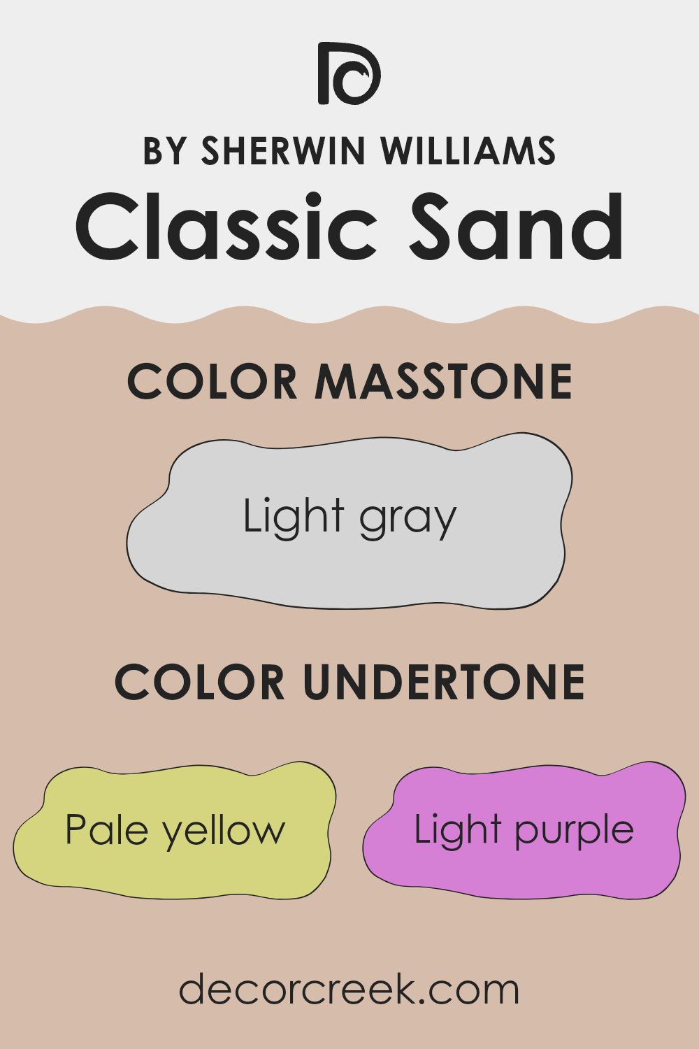
Classic Sand SW 0056 by Sherwin Williams is a versatile color often used in interior design due to its neutral base with complex undertones. This particular shade carries hints of pale yellow, light purple, pale pink, mint, light blue, gray, and lilac. These undertones play a significant role in how the color appears under different lighting conditions and when paired with various decor elements.
Undertones are subtle colors that lurk beneath the surface of the main color and can shift its overall hue. They can make a color feel warmer or cooler and can significantly affect the mood of a room. For instance, a yellow undertone might make a space feel more welcoming, while a blue undertone could give a chillier feel.
For Classic Sand, the variety of undertones makes it exceptionally adaptable. In rooms with plenty of natural light, the pale yellow and light blue undertones might become more pronounced, creating a calm and airy feel. Alternatively, in spaces with less light, the gray and lilac undertones could dominate, lending the walls a more subdued and cozy feel.
Thus, this particular paint color can be quite dynamic. It can adapt to various styles and settings, making it a good choice for anyone looking to refresh their interior while keeping options open for future decor changes. Whether you’re aiming for a fresh, vibrant look or a more grounded, subtle vibe, Classic Sand can accommodate these shifts nicely.
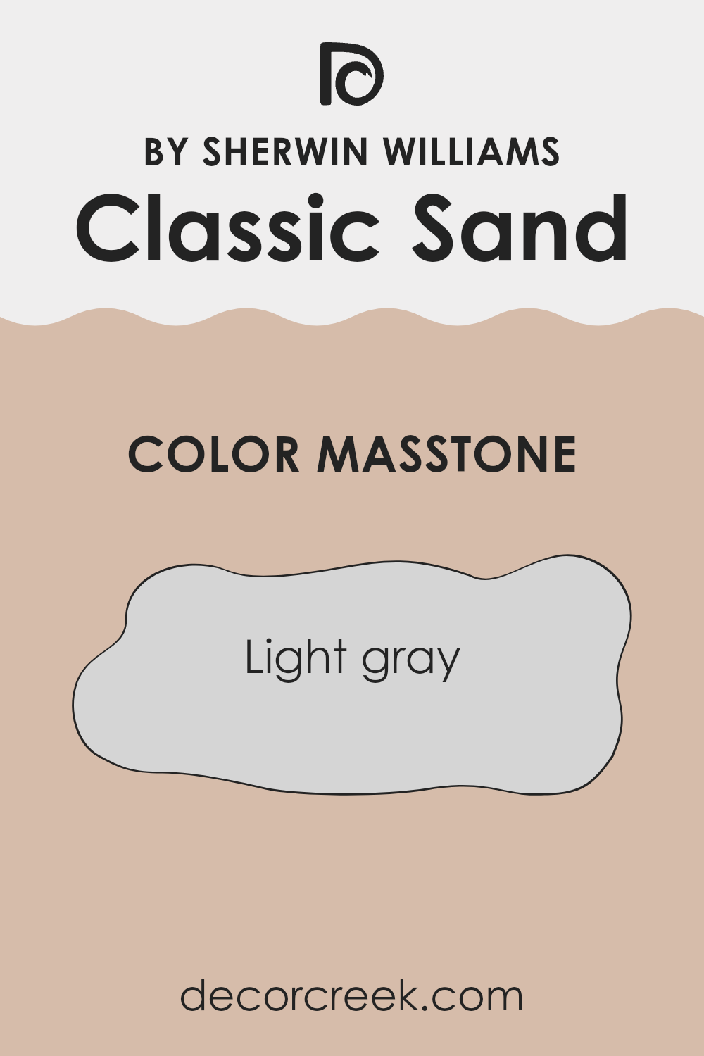
What is the Masstone of the Classic Sand SW 0056 by Sherwin Williams?
Classic Sand SW 0056 by Sherwin Williams has a masstone, or the main color you see when looking at the paint without any tinting or effects, of Light Gray (#D5D5D5). This light gray color is incredibly versatile, making it an excellent choice for home interiors.
Its neutrality allows it to pair well with almost any other color, from bold and bright tones to softer pastels. This means you can use it in a variety of settings, whether you want a contrast with dark furniture or a complement to more vibrant decor elements.
Light gray works especially well in spaces where you want a fresh and modern look without going too stark or cold as some darker grays might. It also helps to reflect natural light, making smaller rooms appear larger and more open. Due to its subtle nature, it stays in the background, allowing other elements of your room to stand out. This flexibility makes it a go-to choice for many because it supports various design styles without dominating the space.
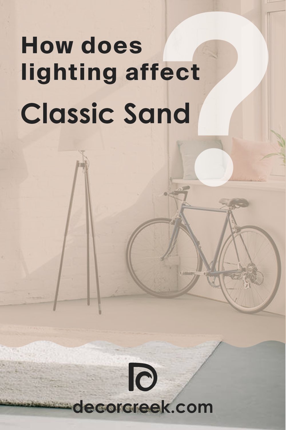
How Does Lighting Affect Classic Sand SW 0056 by Sherwin Williams?
Lighting plays a crucial role in how we perceive colors. The type of light and its intensity can significantly impact the appearance of a color in a room. Different lights, such as natural daylight or artificial lighting from bulbs, influence how a color looks.
Take the color “Classic Sand,” a warm, neutral shade. In natural light, this color appears lighter and more vibrant because sunlight has a broad spectrum that enhances various pigments. In a room with lots of windows and natural light, Classic Sand will look lively and welcoming.
Under artificial lighting, the appearance of Classic Sand can vary depending on the kind of bulbs used. For instance, incandescent bulbs, which give off a warmer, yellowish light, might make this color seem more golden and cozy. On the other hand, fluorescent bulbs, which emit a cooler, bluish tone, could make it look duller and less warm.
The orientation of a room also affects how “Classic Sand” might be perceived:
- North-facing rooms: These rooms get less direct sunlight, which can cause colors to appear slightly darker and cooler. In such rooms, Classic Sand might look a bit muted and less vibrant, taking on a cooler tone.
- South-facing rooms: These spaces receive ample sunlight most of the day, which means Classic Sand will show its brighter, warmer side, making the room feel more inviting and warm throughout the day.
- East-facing rooms: These rooms enjoy strong sunlight in the mornings when the sun rises. The morning light will make Classic Sand look very warm and bright early in the day, but it might turn cooler and shadowier as the day progresses.
- West-facing rooms: Sunlight in these rooms is most intense during the late afternoon and evening. Classic Sand will have a normal appearance in the morning but will glow warmer and more cozily in the evening light.
In summary, lighting conditions strongly influence how we see colors, and understanding this can help when deciding how and where to use a specific color in home decor. The color “Classic Sand” adapts differently in various lighting scenarios, making it versatile and useful in many settings.
What is the LRV of Classic Sand SW 0056 by Sherwin Williams?
Light Reflectance Value (LRV) is a measure that tells you how much light a paint color reflects or absorbs. A higher LRV means the color reflects more light, making it appear lighter and brighter on your walls. A lower LRV means the paint absorbs more light, and thus the color will appear darker.
This is important when choosing paint colors for a room as it can influence the atmosphere and feel. Brighter rooms tend to feel larger and more open, while darker colors can make a room feel smaller and cozier.
For the color in question, with an LRV of 53.201, it sits in the mid-range of the light reflectance scale. This means it is neither very bright nor very dark, offering a balanced option for rooms. In spaces with moderate light, this color will help maintain a neither too bright nor too somber appearance. In well-lit areas, it can enhance the light without being overpowering, and in darker rooms, it still holds a sense of warmth without absorbing too much light. This makes it versatile for different lighting conditions and room sizes.

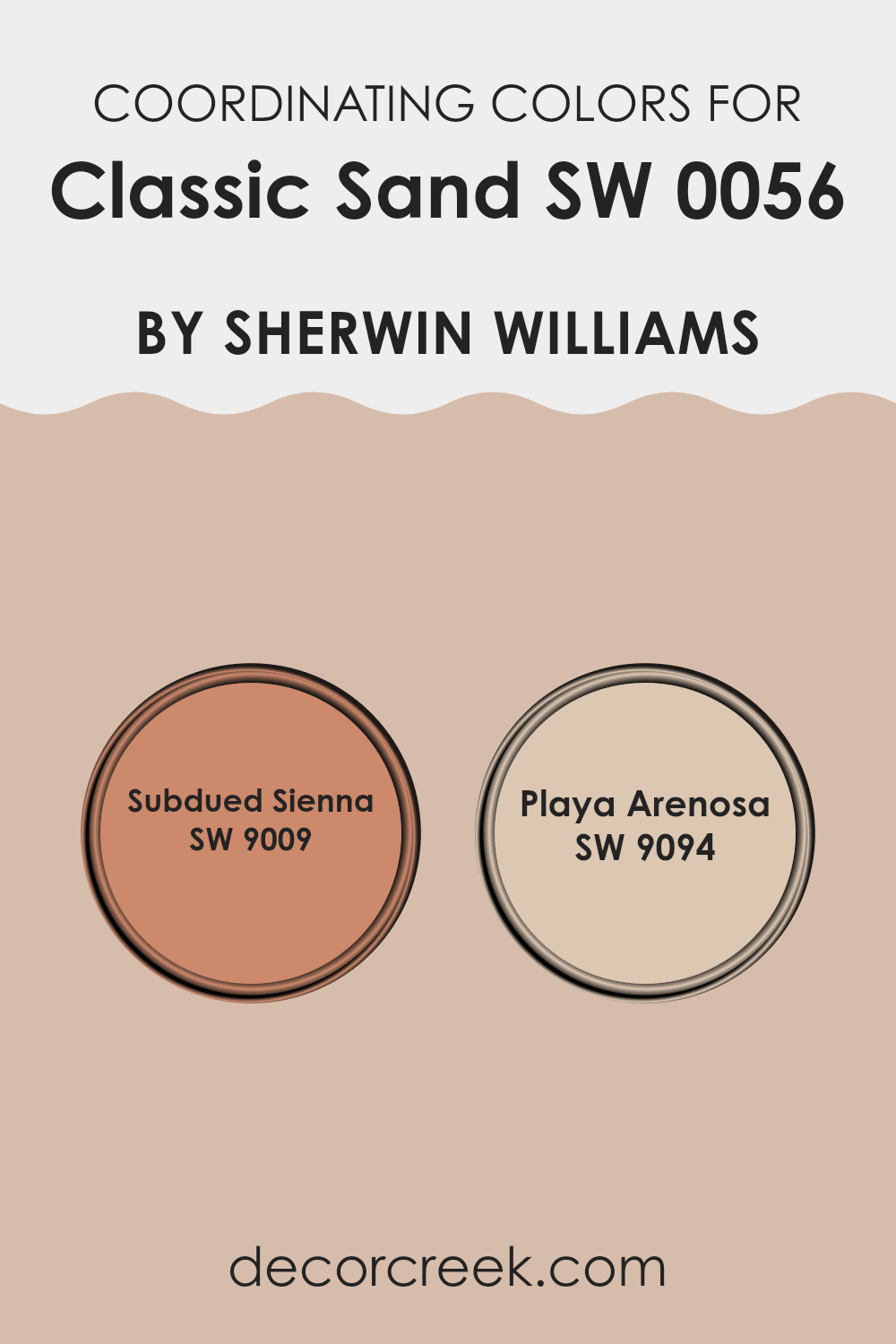
Coordinating Colors of Classic Sand SW 0056 by Sherwin Williams
Coordinating colors are those that pair well together to create harmonious and aesthetically pleasing color schemes in an interior design. When selecting coordinating colors, it’s essential to choose shades that complement each other without clashing, enhancing the overall appearance of a space. Classic Sand by Sherwin Williams, a subtle and welcoming neutral tone, pairs beautifully with colors that either contrast its warmth or align closely with its sandy hue, making the atmosphere in a room feel more cohesive and balanced.
One such coordinating color is SW 9009 – Subdued Sienna, a deep, earthy rust color that adds depth and warmth when used alongside a more neutral shade like Classic Sand. Subdued Sienna works well in spaces that need a pop of color or in rooms that aim to create a cozy and inviting environment.
Another coordinating color is SW 9094 – Playa Arenosa, a soft and light beige that nearly mirrors the calmness of sandy beaches. This color is excellent for maintaining a light and airy feel in a room, complementing the gentle qualities of Classic Sand without overwhelming the space with too much saturation or brightness. Both of these coordinating colors help in achieving a balanced and pleasant color scheme that adds character and charm to any room.
You can see recommended paint colors below:
- SW 9009 Subdued Sienna
- SW 9094 Playa Arenosa
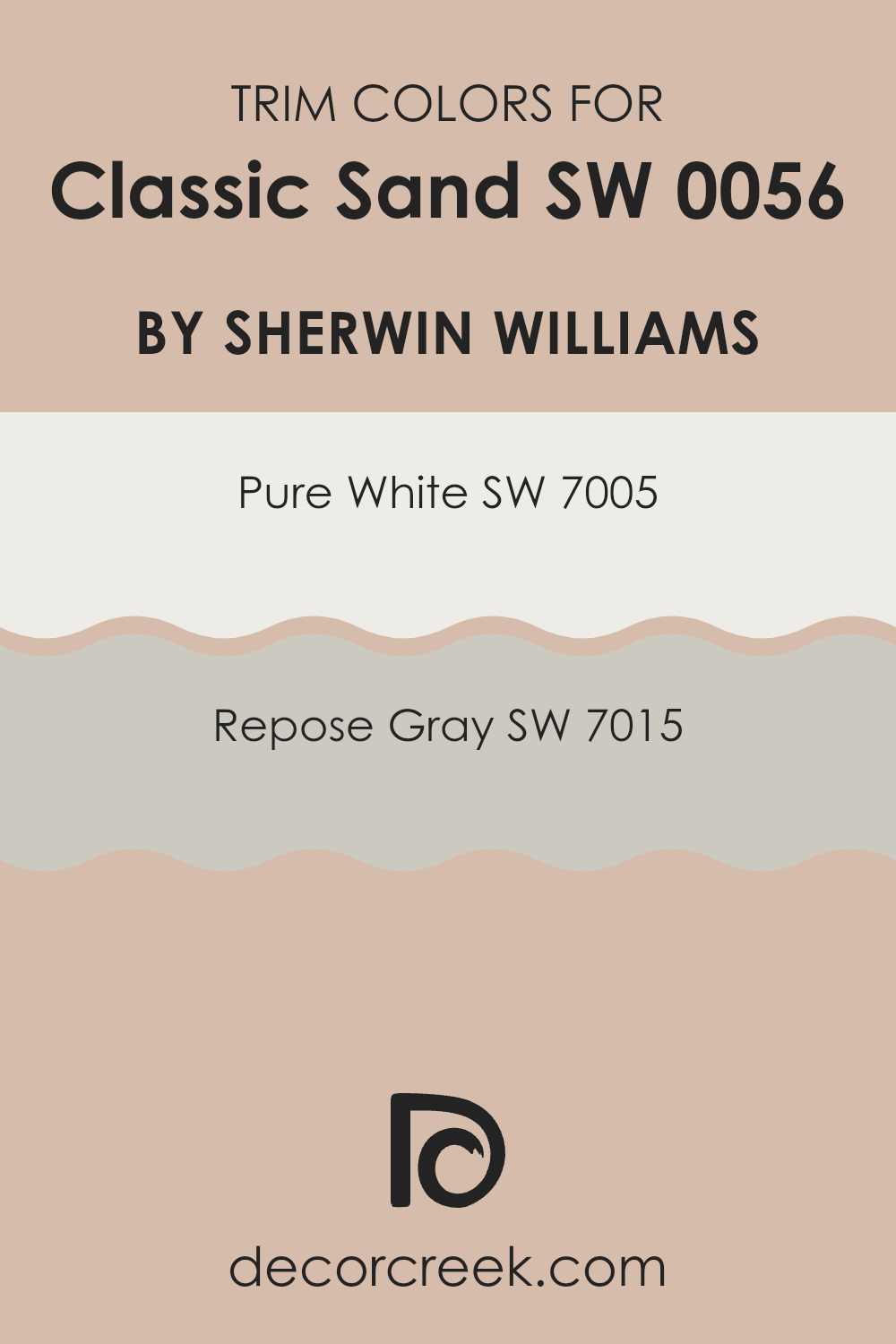
What are the Trim colors of Classic Sand SW 0056 by Sherwin Williams?
Trim colors serve a crucial role in painting and decorating by providing a visual frame or boundary for walls, enhancing the overall appearance of a room. For a warm, neutral tone like Classic Sand by Sherwin Williams, choosing the right trim color can complement and subtly highlight the main color.
SW 7005 – Pure White and SW 7015 – Repose Gray are excellent choices for trim, as they can help define the space without overpowering the primary wall color. These trims can add a clean, distinct finish to the edges, windows, and doors, contributing to a polished look.
SW 7005 – Pure White is a very crisp and fresh shade that brightens up the space wherever it is used, making it a favorite for trims. It creates a sharp contrast especially against deeper or richer wall colors, allowing architectural details to pop. On the other hand, SW 7015 – Repose Gray offers a softer approach with its gentle gray hue. This color is less stark than Pure White, providing a smooth transition between the wall and trim, which can enhance the comforting feel of a room without creating too harsh of a contrast.
You can see recommended paint colors below:
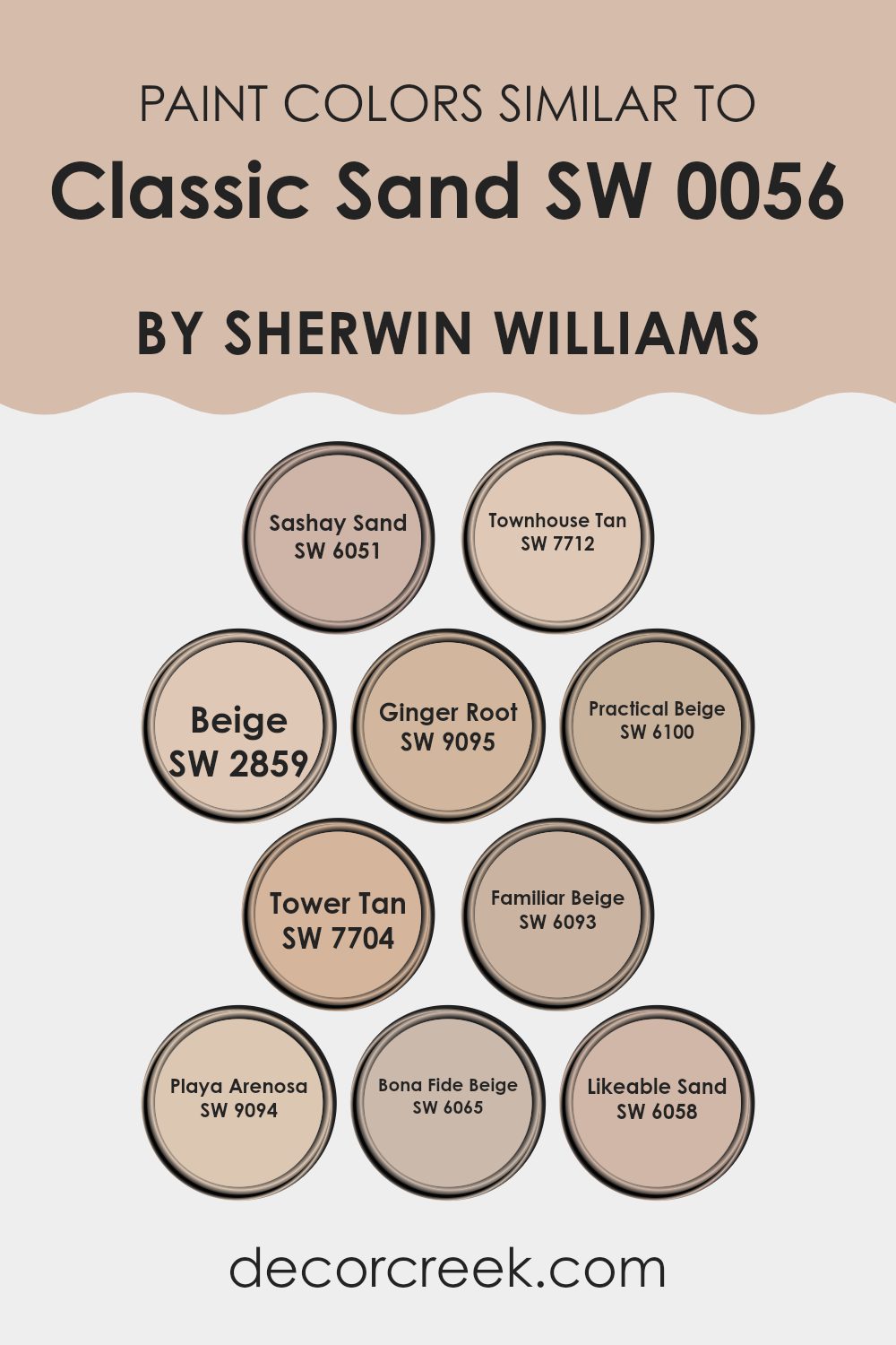
Colors Similar to Classic Sand SW 0056 by Sherwin Williams
Similar colors are crucial in design because they create a harmonious and cohesive look, making spaces appear more unified and pleasant. Using variations of a single shade or closely related colors can subtly enhance the depth and detail of a room without overwhelming the senses with high contrast. When colors like these are used together, they also help in creating a sense of continuity and flow throughout a space, which is especially important in open floor plans or when connecting multiple rooms with a single color palette.
For instance, SW 6051 – Sashay Sand brings a quiet warmth to spaces, providing a soft background that pairs well with both bright and muted accents. Moving a bit darker, SW 7712 – Townhouse Tan has a richer hue that anchors lighter tones while maintaining a cozy ambiance.
On the other hand, SW 2859 – Beige is a true classic, offering a neutral canvas that works across various decor styles and textures. SW 9095 – Ginger Root has a slight zest that livens up a beige palette without clashing with existing elements. SW 6100 – Practical Beige is just what its name suggests: versatile and down-to-earth, perfect for spaces that need a straightforward color solution.
SW 7704 – Tower Tan adds a bit of sophistication, while keeping the overall feel warm and welcoming. SW 6093 – Familiar Beige has an inviting tone, making it ideal for family rooms or common areas. SW 9094 – Playa Arenosa mimics the subtlety of sandy shores, great for creating a relaxed, beachy vibe.
SW 6065 – Bona Fide Beige offers stability and reliability in its shade, suitable for any space needing a solid foundation. Lastly, SW 6058 – Likeable Sand could be the friendliest of the bunch, with its easy-going nature and adaptability to diverse interior themes. These similar shades provide a beautiful spectrum for achieving a sophisticated, yet welcoming atmosphere, tailored perfectly for creating inviting living spaces.
You can see recommended paint colors below:
- SW 6051 Sashay Sand
- SW 7712 Townhouse Tan
- SW 2859 Beige
- SW 9095 Ginger Root
- SW 6100 Practical Beige
- SW 7704 Tower Tan
- SW 6093 Familiar Beige
- SW 9094 Playa Arenosa
- SW 6065 Bona Fide Beige
- SW 6058 Likeable Sand
How to Use Classic Sand SW 0056 by Sherwin Williams In Your Home?
Classic Sand SW 0056 by Sherwin Williams is a timeless and versatile paint color. It has a soft, warm beige tone that brings a cozy and welcoming feel to any room. It’s an excellent choice for those looking to add a gentle touch of warmth to their home without overwhelming it with darker colors.
This neutral shade works well in various spaces, such as living rooms, bedrooms, and kitchens. It pairs beautifully with both bold colors and other neutrals. For example, for a balanced look, you can match Classic Sand with white trim and darker furniture. Alternatively, it can also serve as a calming backdrop for colorful accents like blue pillows or green plants, which add pops of color and life to a space.
Classic Sand is also practical. It hides minor wall imperfections and is easy to maintain. Whether you’re repainting an entire room or just adding an accent wall, this color can help make your home more appealing and comfortable.
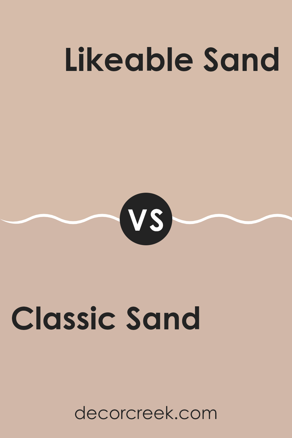
Classic Sand SW 0056 by Sherwin Williams vs Likeable Sand SW 6058 by Sherwin Williams
Classic Sand and Likeable Sand are two neutral paint colors from Sherwin Williams that are quite similar but have their subtle differences. Classic Sand is a bit darker and has a warmer, more beige tone.
This makes it a great choice for creating a cozy feel in a room and is perfect for spaces that need a touch of warmth without overwhelming the senses. On the other hand, Likeable Sand is lighter and has hints of gray, giving it a crisper and cleaner look.
Because of its lighter shade, it can help make a small room appear slightly bigger and brighter. Both colors are versatile and can easily pair with various decor styles and colors, making them practical options for any home. Whether you choose Classic Sand for its warm cozy vibe or Likeable Sand for a brighter, cleaner feel, each brings its unique charm to the space.
You can see recommended paint color below:
- SW 6058 Likeable Sand
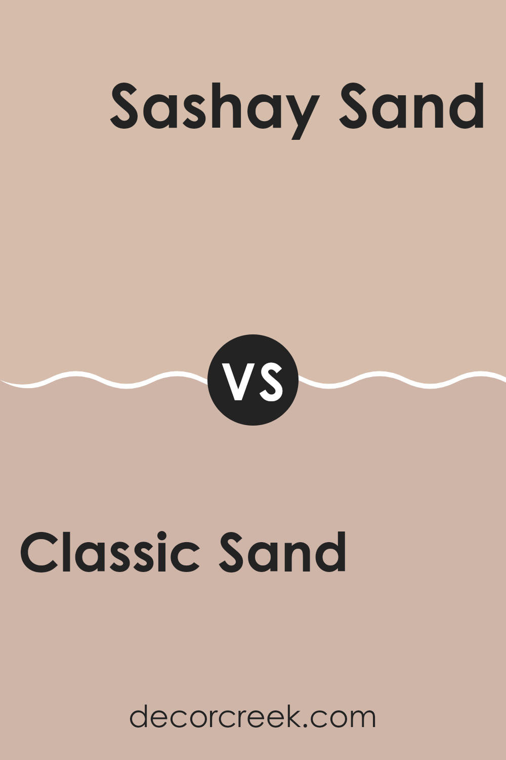
Classic Sand SW 0056 by Sherwin Williams vs Sashay Sand SW 6051 by Sherwin Williams
Classic Sand and Sashay Sand are both neutral colors by Sherwin Williams, but they hold distinct tones that set them apart. Classic Sand is a soft beige that has a warm, inviting quality to it. This color is versatile and works well to create a cozy, comfortable atmosphere in any room. It pairs beautifully with richer colors like deep blues or dark woods, providing a balanced backdrop.
On the other hand, Sashay Sand leans more towards a grayish tint, making it slightly cooler than Classic Sand. This tone is excellent for those who prefer a more muted, understated look. It offers a modern vibe and works well in spaces that aim for a contemporary feel, complementing metals and glass accents.
While both colors provide a neutral palette, Classic Sand adds warmth to spaces, whereas Sashay Sand offers a cooler, more modern approach. Both are flexible choices for various decorating styles, each bringing its own distinct mood to the surroundings.
You can see recommended paint color below:
- SW 6051 Sashay Sand
Classic Sand SW 0056 by Sherwin Williams vs Familiar Beige SW 6093 by Sherwin Williams
Classic Sand and Familiar Beige are two neutral paint colors from Sherwin Williams that resemble each other quite closely but hold subtle differences. Classic Sand has a warm base with hints of yellow, creating a cozy and inviting vibe in any room.
It’s lighter and radiates an airy feel, which can make small spaces appear larger. On the other hand, Familiar Beige leans towards a richer, creamier tone, embodying a more grounded and earthy feel. While still warm, this shade might make a space feel more enclosed yet comfortable.
If you’re aiming to brighten up a room and give it a light, fresh look, Classic Sand would be a great choice. Conversely, if you’re after a more robust color that can add depth to a larger space, Familiar Beige would work well. Both colors offer versatility and can work beautifully in many different types of décor and room settings.
You can see recommended paint color below:
- SW 6093 Familiar Beige

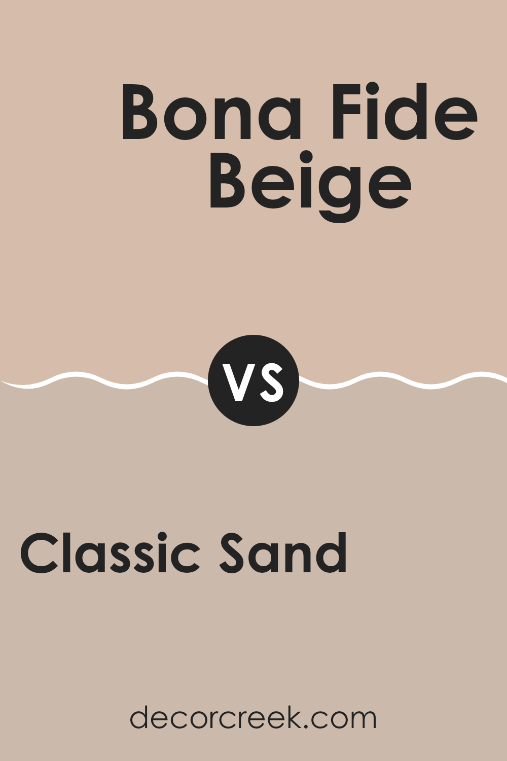
Classic Sand SW 0056 by Sherwin Williams vs Bona Fide Beige SW 6065 by Sherwin Williams
Classic Sand and Bona Fide Beige are two popular shades offered by Sherwin Williams. Classic Sand is a lighter, softer beige that brings a fresh, airy feel to any room. Its subtle warmth makes it versatile, fitting well in spaces that aim for a bright and open atmosphere.
On the other hand, Bona Fide Beige is a bit darker, with a richer, earthy tone. It provides a cozy vibe, making it a great choice for areas where you want to feel more enclosed and comfortable, like living rooms or bedrooms.
Both colors lend a natural, understated elegance to walls and work well as neutrals that can support various decor styles. However, Classic Sand might be better for smaller, well-lit spaces to enhance the sense of space, whereas Bona Fide Beige is ideal for larger rooms or spaces with less natural light, where it won’t feel overwhelming.
You can see recommended paint color below:
- SW 6065 Bona Fide Beige
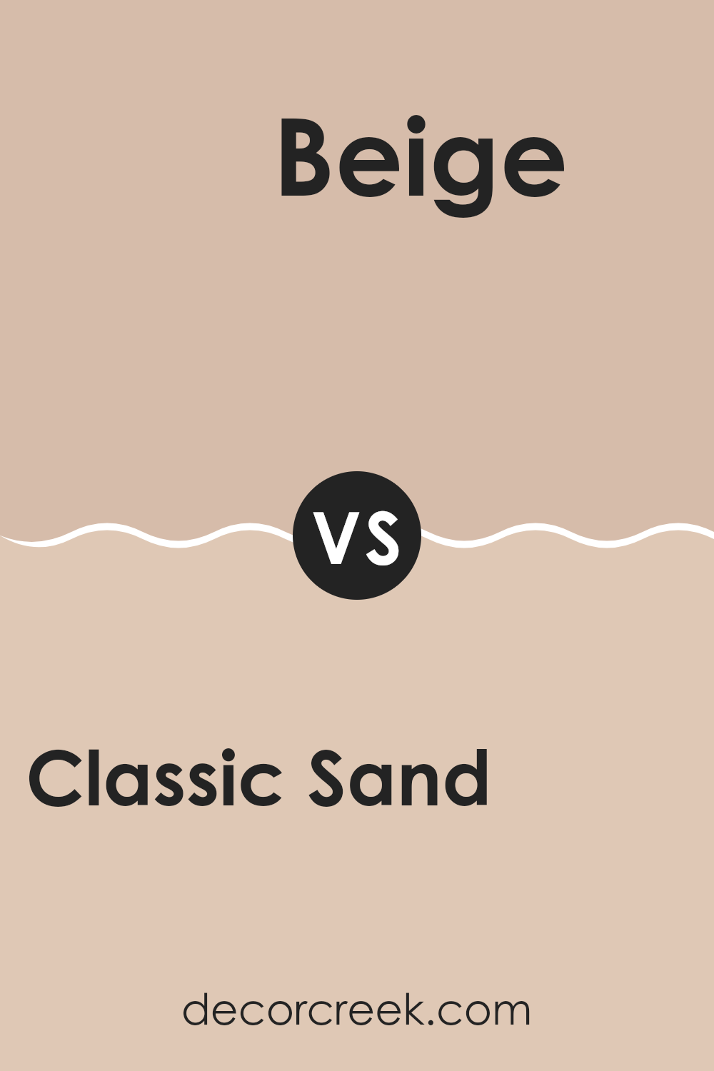
Classic Sand SW 0056 by Sherwin Williams vs Beige SW 2859 by Sherwin Williams
Classic Sand and Beige by Sherwin Williams are two neutral colors that complement many design styles. Classic Sand is a soft, gentle beige with a warm undertone. It’s perfect for creating a cozy and welcoming atmosphere in any room. This color works well in spaces where you want to establish a subtle, yet inviting ambiance.
On the other hand, Beige is slightly richer and deeper than Classic Sand. It has a stronger presence, making it ideal for areas where you desire a bit more warmth and character without overwhelming the space. Beige can add a touch of elegance to living areas and bedrooms without being too bold.
Both colors are versatile, but Classic Sand offers a lighter approach, while Beige provides a hint of more depth. When deciding between the two, think about the mood you want to set and the amount of natural light in your room. Classic Sand might be better for a brighter, airier feel, whereas Beige could be the choice for a more defined and cozy vibe.
You can see recommended paint color below:
- SW 2859 Beige
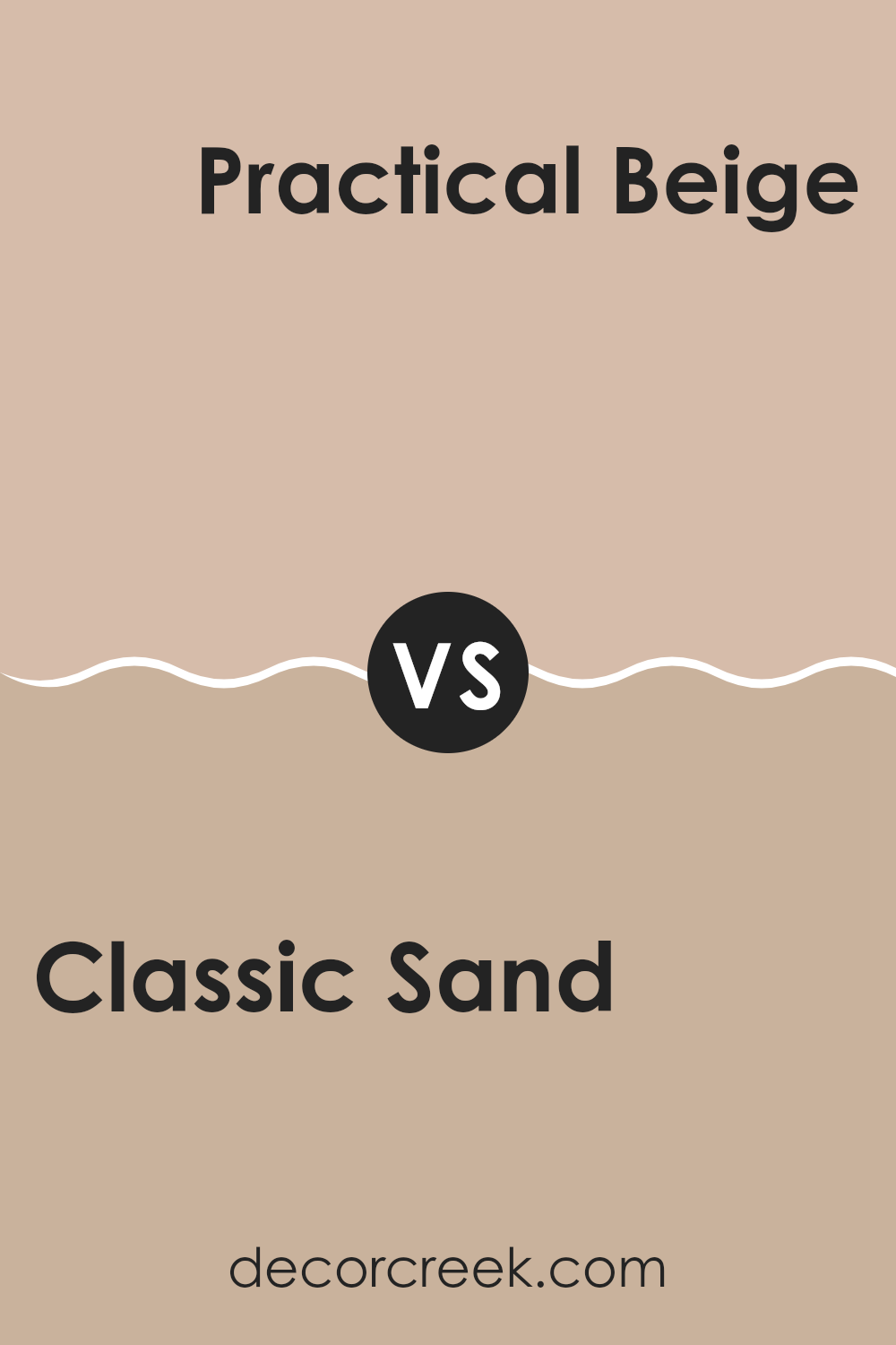
Classic Sand SW 0056 by Sherwin Williams vs Practical Beige SW 6100 by Sherwin Williams
Classic Sand and Practical Beige by Sherwin Williams are two neutral colors that have their unique charm. Classic Sand is lighter with a soft, creamy appeal, making it ideal for smaller spaces or rooms that you want to feel more open and airy.
It has a warm undertone that brings a cozy vibe to any area. On the other hand, Practical Beige is a deeper shade that tilts towards a richer, earthier feel. This color adds a bit more warmth to spaces due to its dusky undertones, making it perfect for creating a cozy and inviting atmosphere.
Both colors pair well with a variety of decor styles but serve different purposes based on the mood you want to set. While Classic Sand is better for achieving a bright and light feel, Practical Beige works better in settings where a more grounded, nurturing atmosphere is desired. Their versatility in working with other colors and materials makes them both great choices for home interiors.
You can see recommended paint color below:
- SW 6100 Practical Beige
Classic Sand SW 0056 by Sherwin Williams vs Townhouse Tan SW 7712 by Sherwin Williams
Classic Sand and Townhouse Tan, both by Sherwin Williams, are two neutral shades that can subtly change the feel of a space. Classic Sand is a light beige color with a warm, welcoming vibe. This color is great for making small rooms feel bigger because it reflects more light.
On the other hand, Townhouse Tan is a darker tan shade. It has a richer, earthier tone that works well in larger spaces or rooms with a lot of natural light.
Both colors can create a cozy and inviting atmosphere, but Classic Sand provides a softer background, while Townhouse Tan offers a bolder statement. They can be used together for a balanced, natural look, or separately to achieve different impacts in a room’s decor.
You can see recommended paint color below:
- SW 7712 Townhouse Tan
Classic Sand SW 0056 by Sherwin Williams vs Tower Tan SW 7704 by Sherwin Williams
Classic Sand and Tower Tan, both from Sherwin Williams, present subtle but distinct tones that can significantly influence the feel of a room. Classic Sand is a softer, lighter beige that resembles the natural color of sandy beaches. This color is very versatile, making it easy to pair with a variety of decor styles and colors. It’s particularly good for creating a calm, welcoming atmosphere in spaces like living rooms or bedrooms.
On the other hand, Tower Tan is a deeper, warmer hue. It is reminiscent of a rich clay soil and brings a stronger presence to walls due to its darker tone. This color works well in areas where you want to add a bit of warmth and depth, such as dining rooms or entryways.
When choosing between these two, consider the size of your room and the amount of natural light it receives. Classic Sand can help make a small room feel bigger and brighter, while Tower Tan is ideal for adding warmth to a larger, well-lit area.
You can see recommended paint color below:
- SW 7704 Tower Tan
Classic Sand SW 0056 by Sherwin Williams vs Playa Arenosa SW 9094 by Sherwin Williams
Classic Sand and Playa Arenosa are two colors by Sherwin Williams that both offer a neutral palette, but they do have distinct differences in tone and warmth. Classic Sand is a light beige that gives off a fresh and clean look, making it ideal for spaces that you want to feel open and airy. It’s a versatile color that can easily match various decor styles, from modern to rustic.
On the other hand, Playa Arenosa leans closer to a taupe, mixing beige with gray undertones. This color is deeper and warmer compared to Classic Sand, providing a cozy feel to any room. It’s perfect for creating a comforting and inviting atmosphere, suitable for living rooms or bedrooms where warmth is desired.
Even though both colors are neutral, Classic Sand is lighter and more straightforward, while Playa Arenosa offers a bit more depth and warmth, making each suitable for different tastes and spaces.
You can see recommended paint color below:
- SW 9094 Playa Arenosa
Classic Sand SW 0056 by Sherwin Williams vs Ginger Root SW 9095 by Sherwin Williams
Classic Sand and Ginger Root are both warm, welcoming colors from Sherwin Williams, but they offer different vibes for your space. Classic Sand is a light, creamy beige that provides a soft, neutral backdrop in any room. It’s versatile and pairs well with many colors, making it easy to use in diverse decor styles from traditional to modern.
Ginger Root, on the other hand, is a deeper, muted ginger shade that adds a bit more warmth and personality. It resembles the earthy tones of autumn and is perfect for creating a cozy atmosphere. This color works well in spaces where you want to add a touch of warmth without overwhelming the area with too bold a color.
Both colors are fantastic for creating a warm, inviting space, but your choice between them depends on how subtle or rich you want the room’s palette to be. Classic Sand is great for a light, airy feel, while Ginger Root offers a more grounded, cozy touch.
You can see recommended paint color below:
- SW 9095 Ginger Root
Conclusion
After spending some time talking about SW 0056 Classic Sand by Sherwin Williams, I’ve really come to appreciate what makes this paint color so special. Classic Sand is a beautiful, soft beige shade that feels like the sandy beaches we all love to play on. It’s gentle and warm, making any room feel welcome and cozy, sort of like getting a warm hug.
This color works really well in lots of different rooms. Whether it’s in a busy kitchen, a quiet bedroom, or even a fun playroom, it adds a touch of warmth without making the space feel too crowded or busy. It’s also great because it goes well with other colors. You can add colors like blues, greens, or even browns, and they’ll all look great together with Classic Sand.
Choosing paint can be really tricky, but Classic Sand is a choice that you probably won’t regret. It’s easygoing and not too flashy, making it a good pick for anyone who wants their room to feel just right—not too bright, not too dark, but just nice and cozy. Whether you’re redoing your room or just adding a bit of new color, Classic Sand is a reliable and pretty option to consider.

Ever wished paint sampling was as easy as sticking a sticker? Guess what? Now it is! Discover Samplize's unique Peel & Stick samples.
Get paint samples

