Choosing the right paint color for a room can feel overwhelming. There are infinite choices, and finding just the right shade can be a challenge. However, some colors, such as Sherwin-Williams’ SW 7015 Repose Gray, have a universal appeal that make them easy choices for various applications.
This article aims to break down the components of this beloved neutral, explain why it works so well in different settings, and suggest color combinations that can enhance its visual appeal.

What Color Is SW 7015 Repose Gray?
SW 7015 Repose Gray is a beloved gray shade from Sherwin-Williams. It is an inviting, versatile color, often described as the perfect “greige”—a hybrid of gray and beige. It’s a light to medium tone that feels soothing, sophisticated, and airy. Its neutrality provides a balanced, calming effect, making it an ideal backdrop for various decor styles, from modern minimalist to rustic farmhouse.
Repose Gray is a soft, understated color that has a chameleon-like quality. Depending on lighting conditions and accompanying colors, it can appear more gray or more beige, and sometimes even slightly blue. This adaptability makes it a go-to choice for many interior designers and homeowners.

Ever wished paint sampling was as easy as sticking a sticker? Guess what? Now it is! Discover Samplize's unique Peel & Stick samples.
Get paint samples

Is It a Warm Or Cool Color?
SW Repose Gray is considered a warm gray. While it falls into the gray category, its warm undertones keep it from feeling too cold or stark. Its versatility in pairing with both cool and warm shades is a testament to its unique balance between warm and cool tones.
Undertones of SW 7015 Repose Gray
Understanding the undertones of color can be crucial in achieving the desired look and feel in a room. The undertones in Repose Gray include:
- Beige: This warm undertone is what gives Repose Gray its versatility and a pleasant aesthetic. It prevents the gray from becoming too icy and imparts a cozy, inviting feel.
- Blue: Under certain light conditions or when paired with specific colors, Repose Gray can show a hint of blue. This undertone adds a touch of coolness to balance the warm beige.
- Brown: The brown undertone further emphasizes the warmth of Repose Gray. It contributes to the color’s adaptability and compatibility with a wide range of decor styles.
These undertones play a significant role in how we perceive color. Depending on the surrounding colors, lighting, and elements in the room, one undertone may be more prominent than the others, shifting the appearance of Repose Gray.

Coordinating Colors of SW 7015 Repose Gray
Coordinating colors are those that work harmoniously with a main color to create a balanced, visually pleasing palette. Here are some colors that coordinate beautifully with Repose Gray:
- SW 7005 Pure White : This is a clean, bright white that provides a stark contrast to Repose Gray, highlighting its depth and warmth.
- SW 6258 Tricorn Black : This is a deep, saturated black that can provide a dramatic counterpoint to Repose Gray, making it pop.
- SW 6171 Chatroom : This is a muted green-gray that complements Repose Gray’s warm undertones.
- SW 6325 Constant Coral : A soft coral that adds a touch of warmth and liveliness to the calmness of Repose Gray.
In addition to these, the following colors also coordinate well with Repose Gray:
- SW 9171 Felted Wool : This is deeper, warmer gray that pairs nicely with Repose Gray, adding depth and interest.
- SW 6255 Morning Fog : A cool gray with a touch of blue that can balance out the warmth of Repose Gray.
- SW 7036 Accessible Beige : This neutral beige shares the same warm undertone as Repose Gray, making it a natural companion.

How Does Lighting Affect SW 7015 Repose Gray?
Lighting can significantly influence how we perceive color. In natural light, Repose Gray tends to show its warm, beige undertones. The color appears lighter and softer, creating an airy, open feeling.
However, in spaces with less natural light or in artificial light, the color can appear slightly darker, revealing more of its gray quality. Its blue undertone can sometimes be more noticeable under cool artificial lighting.

LRV of SW 7015 Repose Gray
The Light Reflectance Value (LRV) of paint color is a measure of how much light it reflects. On a scale of 0 (absolute black) to 100 (pure white), Repose Gray has an LRV of 60. This means it’s a fairly light color, reflecting more light than it absorbs.
An LRV of 60 makes Repose Gray a perfect choice for spaces you want to keep light, airy, and open. It can brighten up a dark room or make a small space seem larger. However, despite its high LRV, Repose Gray is still a rich, noticeable color, unlike whites or near-whites. It provides just enough contrast against white trim or light-colored furniture.

LRV – what does it mean? Read This Before Finding Your Perfect Paint Color
Trim Colors of SW 7015 Repose Gray
Trim colors play a significant role in enhancing the main wall color. For Repose Gray, the following shades of white can work excellently:
- SW 7005 Pure White : A clear, bright white, it offers a crisp contrast against Repose Gray, highlighting its warm undertones.
- SW 7008 Alabaster : This is a warmer, creamy white that echoes the warmth in Repose Gray, creating a cohesive, harmonious feel.
- SW 7004 Snowbound : A cooler white with gray undertones, it can emphasize Repose Gray’s cooler aspects, bringing out its subtle blue undertone.
Trim colors are crucial for creating a visually pleasing transition between the wall color and other architectural elements like doors, windows, and crown molding.

Colors Similar to SW 7015 Repose Gray
It’s often helpful to know colors similar to the one you’re considering, as they might suit your space better or offer slight variations that appeal to you more. Colors similar to Repose Gray include:
- SW 9547 Vessel
- SW 9629 Constellation
- SW 6197 Aloof Gray
- SW 9165 Gossamer Veil
- SW 7050 Useful Gray
Understanding these alternatives allows you to make more informed decisions, and having options can be a lifesaver if your first choice isn’t quite right in your specific lighting or with your furniture.

Colors That Go With SW 7015 Repose Gray
Knowing which colors pair well with your chosen hue is key to creating a harmonious color scheme. Besides the coordinating colors mentioned above, Repose Gray pairs well with a range of other colors:
- SW 6253 Olympus White : A cool, muted blue that complements Repose Gray’s warmth.
- SW 6204 Sea Salt : A soft, muted green with gray undertones that echoes the calming feel of Repose Gray.
- SW 6044 Doeskin : A rich, warm beige that harmonizes with Repose Gray’s warm undertones.
- SW 9055 Billowy Breeze : A light, airy blue that brings out Repose Gray’s subtle cool undertones.
- SW 7548 Portico : A medium beige with warm undertones that complements Repose Gray’s warmth.
- SW 7587 Antique Red : A bold choice that contrasts beautifully with Repose Gray, creating a vibrant, energetic palette.
Choosing colors that harmonize well in the same room is vital to creating a balanced, pleasing aesthetic. By carefully selecting your color palette, you can create a room that feels cohesive, inviting, and uniquely you.

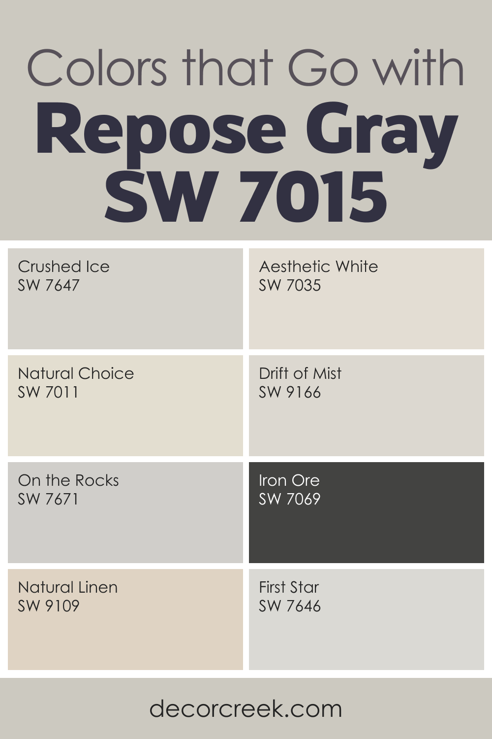
Repose Gray SW 7015 is one of my favorite soft grays because it feels gentle but still clear. It never leans too warm or too cool, which makes it easy to use in many rooms. When paired with light tones like Aesthetic White, Crushed Ice, Natural Choice, First Star, and Drift of Mist, Repose Gray creates a clean and airy palette. These colors help it stay light without losing depth.
For stronger contrast, I love using On the Rocks or even the bold Iron Ore. These darker tones make Repose Gray look smoother and more defined. Soft neutrals such as Natural Linen warm it up just enough to create a cozy feeling.
This shade works beautifully in bedrooms, open living areas, hallways, and even kitchens. It supports wood accents, simple fabrics, and modern décor with ease. With the right color partners, Repose Gray helps a home feel calm, bright, and relaxed, while keeping a clean and stylish look.
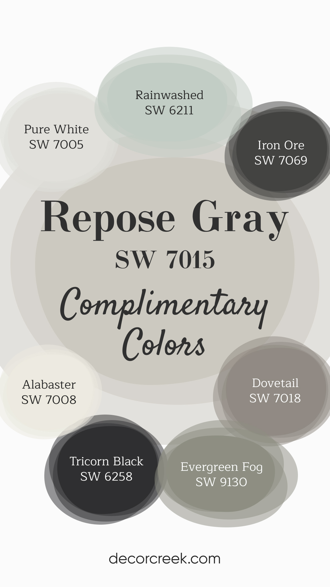
Complimentary Colors for Repose Gray SW 7015 Paint Color by Sherwin-Williams
Repose Gray pairs effortlessly with both light and dark colors. It complements brighter shades like Alabaster and Pure White for a clean, fresh look, while deeper tones like Iron Ore and Tricorn Black add bold contrast. These combinations offer a balanced and polished feel.
For a touch of color, Rainwashed brings in a soft blue-green, and Evergreen Fog adds a hint of natural green. Dovetail is a versatile gray that fits smoothly with the entire palette, creating a cohesive design that’s easy to style.
How to Use SW 7015 Repose Gray In Your Home?
The beauty of SW 7015 Repose Gray lies in its versatility and its ability to blend seamlessly into a wide range of rooms and design styles. This adaptable hue can feel modern and minimalist, traditional and timeless, or rustic and cozy, depending on how it’s used.
SW 7015 Repose Gray In the Bedroom
SW Repose Gray is a serene, calming choice for a bedroom. Its balanced, neutral tone creates a soothing ambiance conducive to rest and relaxation. Pair it with crisp white linens for a clean, minimalist look or richer colors like SW 7548 Portico or SW 7587 Antique Red for a more dramatic, cozy feel. Furniture in dark wood tones complements Repose Gray beautifully, enhancing its warm undertones.
Layering textures and patterns can add depth and interest to a Repose Gray bedroom. Combine it with natural materials like wood, rattan, or wool for a rustic, farmhouse feel. Or, for a more modern aesthetic, pair it with metallic accents and sleek, minimalist furniture.

SW 7015 Repose Gray In the Bathroom
In a bathroom, Repose Gray brings a spa-like tranquility. Its light, neutral tone can make a small bathroom feel larger, and its warmth can counterbalance the cool whites often used in bathroom fixtures. Pair Repose Gray with marble countertops, white cabinetry, and chrome or brushed nickel fixtures for an elegant, timeless look.
For a more contemporary feel, you might consider pairing Repose Gray with darker or more vibrant colors. A shower curtain or towels in SW 6325 Constant Coral, for instance, can add a splash of color and warmth to a Repose Gray bathroom.
Or, for a sophisticated monochromatic look, consider pairing Repose Gray walls with darker gray cabinetry, such as SW 9171 Felted Wool.

SW 7015 Repose Gray In the Living Room
A Repose Gray living room feels welcoming and comfortable, making it an ideal choice for one of the most frequented areas of the home. Its warm undertones shine when combined with natural materials like leather, wood, or linen, enhancing the cozy, inviting feel of the living space.
Repose Gray’s versatility also allows it to work well in more modern or minimalist living room designs.
Paired with furniture in black, white, or cool grays and accented with pops of colors like SW 9055 Billowy Breeze or SW 6204 Sea Salt, Repose Gray can create a sleek, modern space that still feels warm and inviting.

SW 7015 Repose Gray For an Exterior
As an exterior color, Repose Gray is sophisticated and timeless. Its warmth provides a welcoming vibe, while its neutrality means it can work well with a wide range of trim and accent colors. Pairing it with SW 7005 Pure White trim and black shutters or doors can result in a classic, stately look.
The versatile nature of Repose Gray also makes it suitable for different architectural styles. It can lend a modern, streamlined look to a contemporary home, or it can blend beautifully with the natural elements in a rustic or cottage-style exterior. Consider using SW 6255 Morning Fog or SW 7036 Accessible Beige for the front door to complement the Repose Gray exterior.

SW 7015 Repose Gray For the Kitchen
SW Repose Gray is a popular choice for kitchens due to its soothing and inviting vibe. It pairs beautifully with both dark and light cabinetry, providing a neutral backdrop that lets your kitchen décor shine. Whether it’s a rustic kitchen with warm wooden countertops or a sleek, modern one with stainless steel appliances and marble countertops, Repose Gray can tie everything together harmoniously.
Furthermore, Repose Gray in a kitchen works well with a variety of backsplash and countertop choices.
For instance, a white subway tile backsplash, granite countertops, and stainless steel appliances would give a classic, timeless appeal. Alternatively, a bold patterned tile and bright accents can add a contemporary edge to the space.

SW 7015 Repose Gray For Kitchen Cabinets
Repose Gray can work wonders on kitchen cabinets. As a cabinet color, it provides a visually pleasing alternative to the common whites or dark woods. Repose Gray cabinets can pair beautifully with a SW 7005 Pure White backsplash and darker countertops, creating a balanced, layered look.
On the other hand, if you have a kitchen with a lot of natural light, Repose Gray cabinets can also pair beautifully with lighter countertops and a vibrant backsplash in shades like SW 6325 Constant Coral or SW 6204 Sea Salt.
The warm undertones of Repose Gray can help keep the space from feeling too cold or stark, while the pops of color add interest and personality.

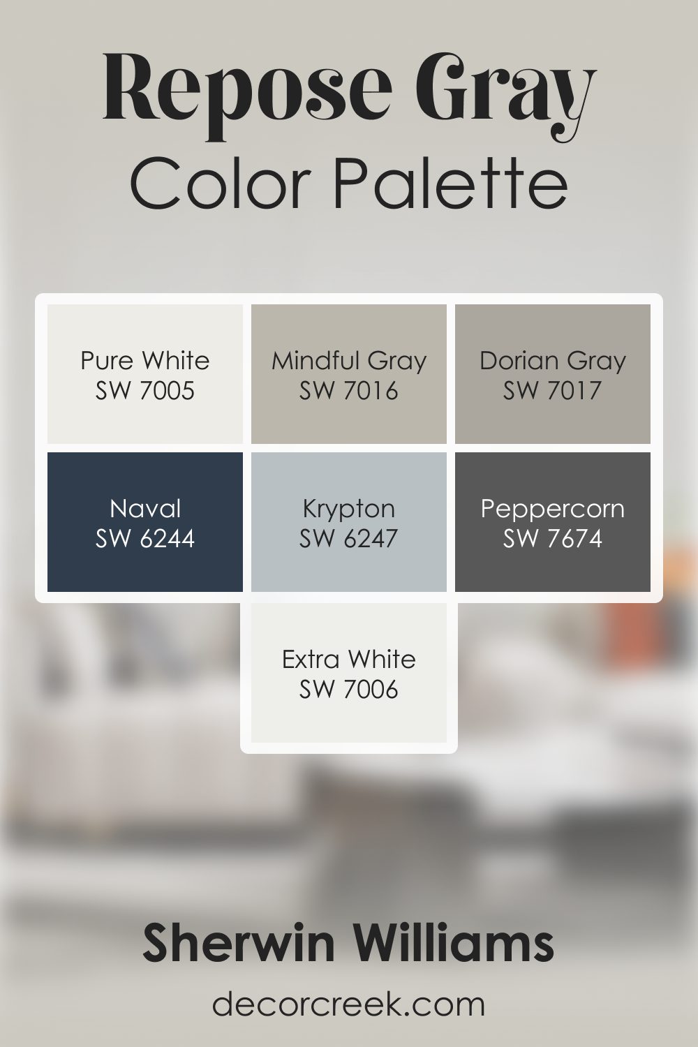
Repose Gray SW 7015 by Sherwin Williams Color Palette
Repose Gray has a soft, modern feeling that I always find comforting. It carries a quiet confidence that makes rooms feel settled and stylish. Pure White and Extra White brighten the palette, helping Repose Gray feel fresh without adding sharpness. Mindful Gray and Dorian Gray sit on either side of it, adding layered structure and a smooth, grounded mood.
For depth, I love bringing in Peppercorn. It gives the palette a strong anchor and makes lighter shades feel crisp and intentional.
Naval adds a classic touch of blue that feels rich and steady. Krypton softens everything with a gentle fresh tone that works beautifully with Repose Gray’s calm attitude.
What I love most is how this palette feels both relaxed and put-together. Each color supports the others, and Repose Gray keeps the whole combination feeling natural, smooth, and wonderfully balanced.
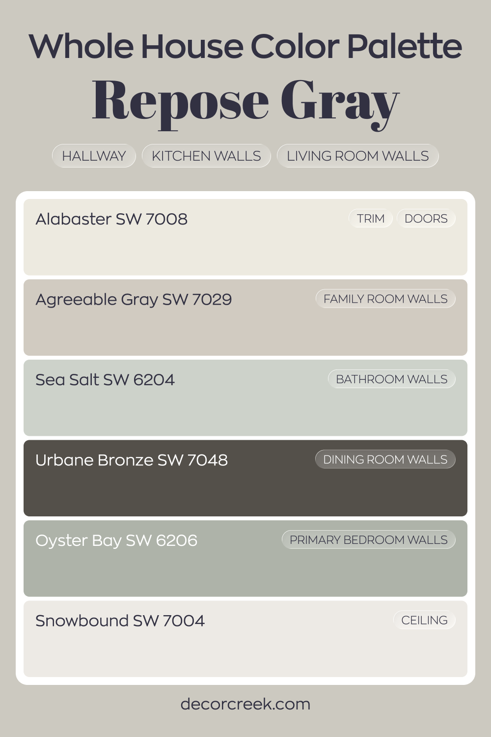
Whole House Paint Color Palette Built Around Repose Gray SW 7015
Repose Gray SW 7015 flows through the hallway, kitchen, and living room with a balanced gray tone. Alabaster on trim and doors keeps the edges crisp and bright. Snowbound on the ceiling enhances the light feeling overhead.
Agreeable Gray in the family room creates a gentle shift while staying within the same neutral family. Sea Salt in the bathroom adds a fresh hint of color, and Oyster Bay in the primary bedroom deepens that green influence.
Urbane Bronze on the dining room walls introduces contrast and richness.
This palette blends layered grays with soft greens and one strong dark anchor. The house feels cohesive, with each room offering a slightly different mood while staying connected.
Comparing SW 7015 Repose Gray With Other Colors
Comparing different colors is crucial to understanding how they interact with each other, the space, and the light conditions in your home. It helps you visualize how your chosen color will look alongside other colors you plan to use in your space, such as furniture, fabrics, and decor items.
By comparing colors, you can discover color combinations that you might not have considered otherwise, helping you create a harmonious, visually pleasing color scheme that suits your style and the mood you want to create in your space. Below, you can read how SW Repose Gray compares with other hues.
SW 7015 Repose Gray vs. SW 7043 Worldly Gray
SW Worldly Gray is another gray with warm undertones, similar to Repose Gray. However, Worldly Gray tends to lean more towards beige, whereas Repose Gray is a truer gray. This makes Repose Gray a more neutral choice that can work well with both warm and cool colors, while Worldly Gray is best used in a palette of warm, earthy tones.

SW 7015 Repose Gray vs. SW 6322 Intimate White
Intimate White is a soft, light pink with warm undertones. It’s a delicate, romantic color that offers a subtle contrast to the neutral, slightly cooler tone of Repose Gray. Where Repose Gray brings a calming, balanced backdrop, Intimate White adds a touch of warmth and softness, creating an atmosphere that’s gentle and inviting.
In a room painted in Intimate White, Repose Gray can serve as an anchoring element, providing a neutral balance to the soft pink. It can be incorporated in the form of furniture, trim, or accessories.
On the other hand, in a Repose Gray room, accents of Intimate White can add a delicate, feminine touch, creating a serene and peaceful ambiance. The combination of these two colors creates a harmonious palette that’s ideal for a calming and comfortable space, such as a bedroom or a nursery.

SW 7015 Repose Gray vs. SW 6743 Mint Condition
Mint Condition is a vibrant, fresh color with cool green undertones. This bright, lively shade provides a stark contrast to the subtle, warm neutrality of Repose Gray. Where Mint Condition brings a burst of energy and freshness, Repose Gray brings a calming, grounding influence that can temper the vibrancy of Mint Condition and keep it from overwhelming the space.
In a room painted with Mint Condition, incorporating Repose Gray in the trim, furniture, or accents can provide a neutral counterpoint and bring balance to the space. Conversely, in a Repose Gray room, elements of Mint Condition can introduce a pop of color and create a refreshing, invigorating atmosphere.
The interplay between the cool, energetic Mint Condition and the warm, calm Repose Gray can result in a harmonious, vibrant color scheme that’s full of life yet still relaxing and welcoming.

SW 7015 Repose Gray vs. SW 6326 Henna Shade
SW Henna Shade is a deep, warm terracotta color that provides a rich, earthy contrast to the light, neutral tone of Repose Gray. Henna Shade brings a sense of warmth and coziness, adding depth and a touch of nature-inspired richness to a space.
SW Repose Gray, with its subdued neutrality, can balance the intensity of SW Henna Shade, creating a welcoming and harmonious color palette.
The warm undertones in both colors ensure that they pair well together, with Repose Gray offering a serene counterpoint to the vibrant energy of Henna Shade.

SW 7015 Repose Gray vs. SW 6515 Leisure Blue
Leisure Blue is a soothing, medium-toned blue with a slight hint of gray. Compared to Repose Gray, it’s more vibrant and has cool undertones, which creates a refreshing contrast. Repose Gray’s warm, neutral character complements the coolness of Leisure Blue, enhancing its calming effect and preventing it from overpowering the space.
Together, these colors can evoke the tranquility of a beach or coastal scene, with Repose Gray serving as the sandy beach and Leisure Blue as the peaceful sea.
In a room painted with Leisure Blue, using Repose Gray for trim, furniture, or accents can help balance the coolness of the blue and add some warmth to the space. Alternatively, in a Repose Gray room, adding elements in Leisure Blue can introduce a pop of color and create a serene, calming atmosphere. The moderate brightness of both colors ensures that they can coexist harmoniously without one overwhelming the other.

SW 7015 Repose Gray vs. SW 7712 Woven Wicker
SW Woven Wicker is a warm, medium-toned brown that exudes a sense of comfort and coziness. In contrast, Repose Gray is lighter and cooler, offering a serene and grounded backdrop that can subtly balance the warmth of Woven Wicker. These two colors share an earthy quality that can create a space that feels organic and welcoming.
In combination, Repose Gray and Woven Wicker can evoke a rustic or farmhouse aesthetic, especially when paired with natural materials like wood or leather. Woven Wicker, with its rich warmth, can add depth and interest to a Repose Gray room, while Repose Gray can soften and lighten a Woven Wicker space.
This balance between the cool neutrality of Repose Gray and the warm earthiness of Woven Wicker results in a harmonious, inviting color scheme.

Conclusion
SW 7015 Repose Gray is a versatile, neutral color that brings a sense of calm and balance to any space. Its warm undertones make it a welcoming and comfortable color, while its muted intensity ensures it can blend seamlessly with a wide range of other colors.
From creating a serene atmosphere in a bedroom to providing a sophisticated backdrop in a living room or kitchen, Repose Gray proves to be a reliable choice for any interior design style.
Whether you pair it with soft, muted hues for a monochromatic look or contrast it with vibrant, bold colors for a dynamic effect, Repose Gray is a timeless color that can truly transform your home.

Ever wished paint sampling was as easy as sticking a sticker? Guess what? Now it is! Discover Samplize's unique Peel & Stick samples.
Get paint samples
Frequently Asked Questions
⭐What type of spaces work best with SW 7015 Repose Gray?
Repose Gray is a highly versatile paint color and can work well in a variety of spaces. Its neutral, warm tone makes it an excellent choice for living rooms, bedrooms, kitchens, bathrooms, and even home offices. Because it's a medium-light color, it can help small spaces appear larger and brighter. At the same time, its understated elegance can add sophistication to larger rooms.
⭐What colors coordinate well with SW 7015 Repose Gray?
As a warm, neutral gray, Repose Gray pairs beautifully with a wide range of colors. Whites like SW 7005 Pure White can offer a crisp, bright contrast, while darker shades like SW 6258 Tricorn Black can provide depth and drama. It can also be paired with softer colors like SW 6171 Chatroom or more vibrant hues like SW 6325 Constant Coral. The key is to consider the overall mood you want for your room when choosing coordinating colors.
⭐Is SW 7015 Repose Gray a warm or cool color?
SW 7015 Repose Gray is considered a warm gray. This means that while it's a gray color, it has warm undertones that give it a slightly beige or taupe hue under certain lighting conditions. This warmth makes Repose Gray a comforting, inviting color that can help to create a cozy atmosphere in your home.
⭐What is the LRV of SW 7015 Repose Gray and why is it important?
The Light Reflectance Value (LRV) of SW 7015 Repose Gray is 60. This means it reflects a good amount of light and is considered a medium-light color. LRV is important to consider when choosing a paint color because it can impact how bright or dark a room feels. A higher LRV, like that of Repose Gray, can help a room feel brighter and more open, while a lower LRV can make a room feel smaller and cozier.
⭐Can I use SW 7015 Repose Gray for my home exterior?
Yes, you can absolutely use SW 7015 Repose Gray for your home exterior. Its warm, neutral tone can give your home a timeless and elegant look. It pairs well with a variety of trim colors and can work with various architectural styles. Because it's a medium-light color, it can also help to highlight the architectural features of your home.


