If you are looking to refresh your space with a rich and warm paint color, consider SW 9078 Cocoa Berry by Sherwin Williams. This particular shade brings a cozy and comforting atmosphere to any room, thanks to its deep, chocolatey tones mixed with a hint of berry. It’s an excellent choice if you want to add a touch of sophistication without going too dark.
When you use Cocoa Berry, you’ll notice how it complements a wide range of decor styles.
From modern to traditional, this versatile color works beautifully to enhance wood finishes, metallic accents, and natural textiles.
Whether you’re painting a bedroom to create a cozy retreat or updating your living room for a more inviting feel, Cocoa Berry offers a unique balance of warmth and style.
So if you feel your interior could use a lift, think about how this lovely shade could breathe new life into your walls.
It’s not just a color; it’s a way to make your living space feel more like home.
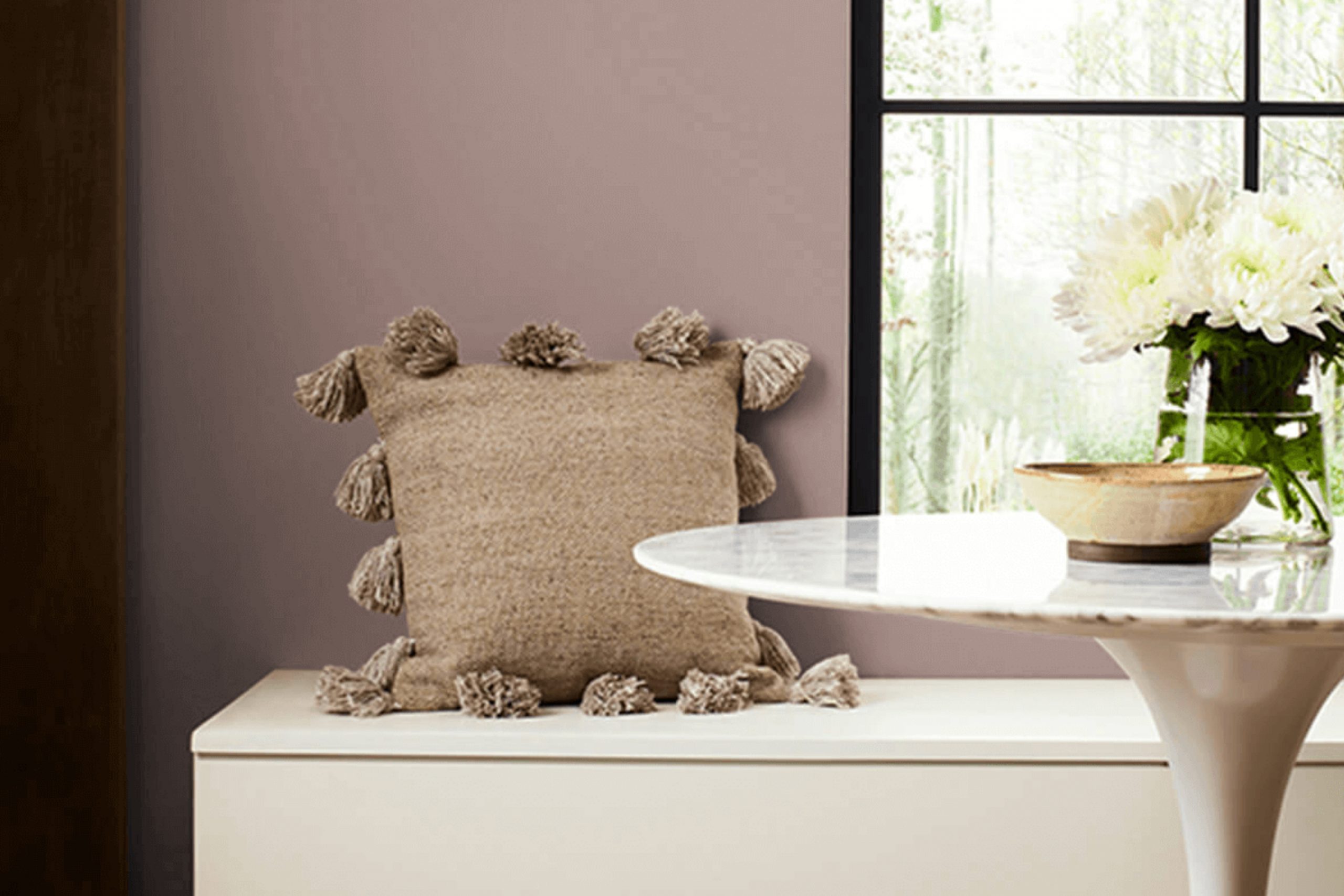
What Color Is Cocoa Berry SW 9078 by Sherwin Williams?
Cocoa Berry by Sherwin Williams is a rich, vibrant color that combines deep berry tones with a hint of earthy brown. This warm hue creates a cozy and inviting atmosphere in any room. It is particularly effective in enhancing the comfort and charm of living spaces.
Cocoa Berry works beautifully in traditional and rustic interior styles. In a traditional setting, it brings warmth and depth, enhancing wooden furniture and classic decor elements.
For rustic interiors, it complements natural materials like stone and wood, adding a touch of luxury without overpowering the inherent simplicity of the rustic style.
This color pairs well with a variety of materials and textures. It looks stunning against creamy whites or soft beige, which help to balance its intensity.
Textures like velvet or silk in upholstery bring out the lushness of Cocoa Berry, while matte finishes on walls or furniture accentuate its depth. Combining it with metals like copper or bronze can introduce a subtle shimmer that enriches its overall appeal.
Ideal for creating a cozy nook or a statement wall, Cocoa Berry adds personality and warmth to spaces both small and large. Whether used as an accent or a dominant shade, it ensures a stylish, welcoming environment.

Is Cocoa Berry SW 9078 by Sherwin Williams Warm or Cool color?
Cocoa Berry SW 9078 by Sherwin Williams is a rich, deep berry color that adds a cozy and inviting feel to any room. It’s a perfect choice for creating a warm, welcoming atmosphere in your home, whether it’s in the living room, dining area, or a bedroom. The color can make large spaces feel more intimate and smaller areas appear more interesting and filled with character.
Cocoa Berry works well with a variety of decor styles, from rustic to modern. It pairs beautifully with neutral colors like soft whites and grays, which help to balance its intensity.
Additionally, it can be complemented with golden hues, greens, or even blues for a more dynamic and lively interior design.
Using Cocoa Berry on a feature wall can serve as a stunning backdrop for artwork or can set the tone for the entire room. It’s also durable and hides imperfections well, making it not only a stylish choice but a practical one for everyday living.
Undertones of Cocoa Berry SW 9078 by Sherwin Williams
Cocoa Berry is a unique color with a rich blend of undertones that change how it appears depending on the surrounding light and colors. Undertones are subtle colors that lie beneath the surface of the main color and can significantly influence the atmosphere a color creates in a space.
For Cocoa Berry, the undertones range widely from soft pinks and mints to bolder shades like oranges and navy. Pale pink and mint undertones give a gentle, soothing effect, making the color feel warmer and more inviting. This is great for living areas or bedrooms where you want a cozy, welcoming ambiance.
On the other hand, undertones like dark green and navy add depth, making the color appear more grounded and stable, ideal for creating a focal point or accent wall.
When applied on interior walls, this range of undertones allows Cocoa Berry to be versatile. In natural light, the lighter undertones like lilac and pale yellow might become more pronounced, giving the room a brighter feel. In artificial light, darker undertones like brown and dark grey might stand out, providing a richer, more enveloping feel.
This makes Cocoa Berry an excellent choice for rooms that serve multiple purposes throughout the day or for spaces that crave a bit of complexity in color without overwhelming the senses.
Understanding these undertones can help in choosing decor and complementary colors that either highlight or balance Cocoa Berry’s depth on your walls, ensuring the room achieves the desired effect.
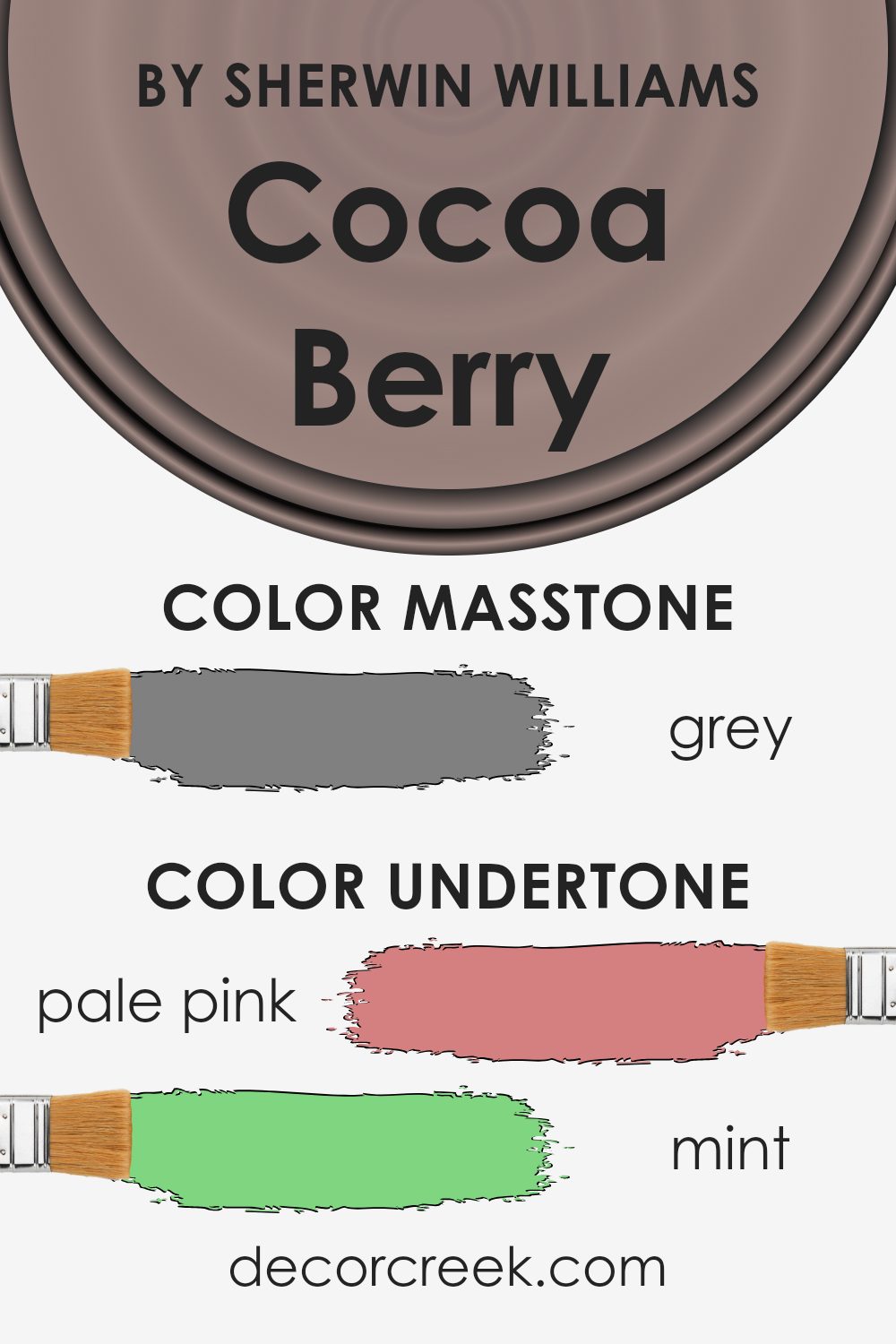
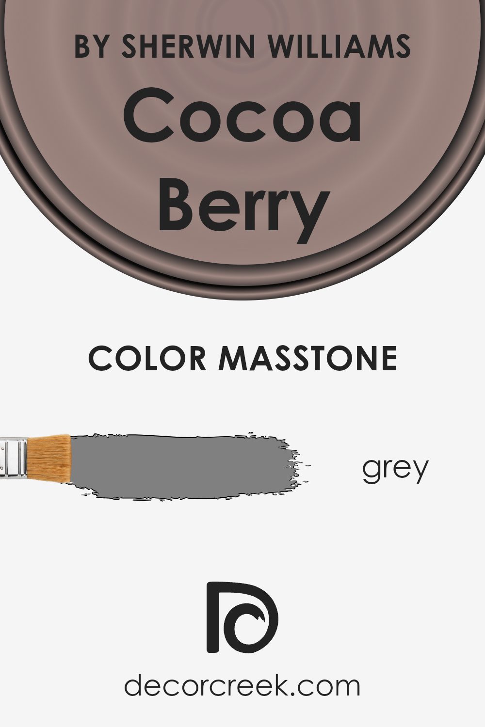
What is the Masstone of the Cocoa Berry SW 9078 by Sherwin Williams?
Cocoa BerrySW 9078 by Sherwin Williams, with its masstone of Grey (#808080), offers a versatile color choice for home interiors. Grey, known for its balanced properties, means this shade can easily complement a variety of decor styles and color schemes. Being a neutral color, grey can act as a calm backdrop in a busy room filled with vivid colors or stand proudly on its own in a more monochromatic design scheme.
This makes Cocoa BerrySW 9078 a great option for those looking to refresh their walls without risking a clash with existing furniture and accessories. Furthermore, its grey tone can help hide marks or smudges, making it a practical choice for high-traffic areas like hallways and family rooms.
Whether it’s paired with bright colors for a dynamic contrast or used with other neutrals for a clean and consistent look, Cocoa BerrySW 9078 provides flexibility in home design.
How Does Lighting Affect Cocoa Berry SW 9078 by Sherwin Williams?
Lighting has a significant impact on the way colors appear in any space. Different light sources can make the same color look different, affecting the mood and aesthetics of a room. The color Cocoa Berry, a deep and warm hue, is a poignant example of this effect.
In artificial light, Cocoa Berry tends to look richer and darker. Common types of artificial lighting, like incandescent bulbs, enhance the red and warm undertones of this color, making it feel cozy and welcoming. This makes it a great choice for living areas and bedrooms where you want a comforting and restful atmosphere.
In natural light, the appearance of Cocoa Berry can change depending on the time of day and the weather.
On a sunny day, the color might appear brighter and more vibrant, while on a cloudy day, it could look more muted. Natural light generally provides the truest representation of color, showcasing Cocoa Berry in its full depth and complexity.
The orientation of the room also plays a crucial role. North-facing rooms receive less direct sunlight, causing colors to appear a bit cooler and more subdued. In such rooms, Cocoa Berry might seem softer and less intense. This can be desirable in spaces designed for relaxation and calm.
South-facing rooms, in contrast, enjoy abundant light most of the day. Here, Cocoa Berry will look more lively and vivid, enhancing the warm undertones of the color. This could add a cheerful and energetic vibe to the room, perfect for spaces used for socializing.
East-facing rooms get plenty of light in the morning, making colors look bright and fresh. Cocoa Berry will look warm and inviting in the morning light but might become cooler as the day progresses and the natural light diminishes.
West-facing rooms experience the opposite; they get stronger light in the afternoons and evenings. Cocoa Berry in such rooms can appear intensely warm and dynamic in the evening, setting a perfect mood for dining or relaxing in the evening.
Thus, when choosing colors like Cocoa Berry for a room, consider the lighting and how it will interact with the color throughout the day. This consideration ensures that the chosen hue will continuously meet the desired atmosphere of the space.

What is the LRV of Cocoa Berry SW 9078 by Sherwin Williams?
LRV stands for Light Reflectance Value, which is a measure of the amount of visible and usable light that is reflected from a surface when light shines on it. It is expressed on a scale where a higher value means the color reflects more light, making it look lighter, and a lower value means it reflects less light, making it look darker.
This scale helps in choosing paint colors that will work well in a specific room based on the amount of natural or artificial light it receives.
The LRV of 26.744 for the color in question means it has a relatively low light reflectance, indicating it’s a deeper, richer shade. In practical terms, using this color on walls in a room will create a cozy and more enclosed feel as it absorbs more light than it reflects.
This can be ideal for large, well-lit spaces, where you might want to create a feeling of warmth and intimacy, but it might make a small, poorly lit room feel even smaller and darker. So, it’s important to consider the size and lighting of the room when deciding to use this shade.

Coordinating Colors of Cocoa Berry SW 9078 by Sherwin Williams
Coordinating colors are those that complement each other well and create a harmonious color scheme in any space. When used wisely, they help in achieving a visually balanced and aesthetically pleasing environment.
For instance, Cocoa Berry, a rich hue from Sherwin Williams, pairs beautifully with colors that can enhance its depth and warmth without overpowering it.
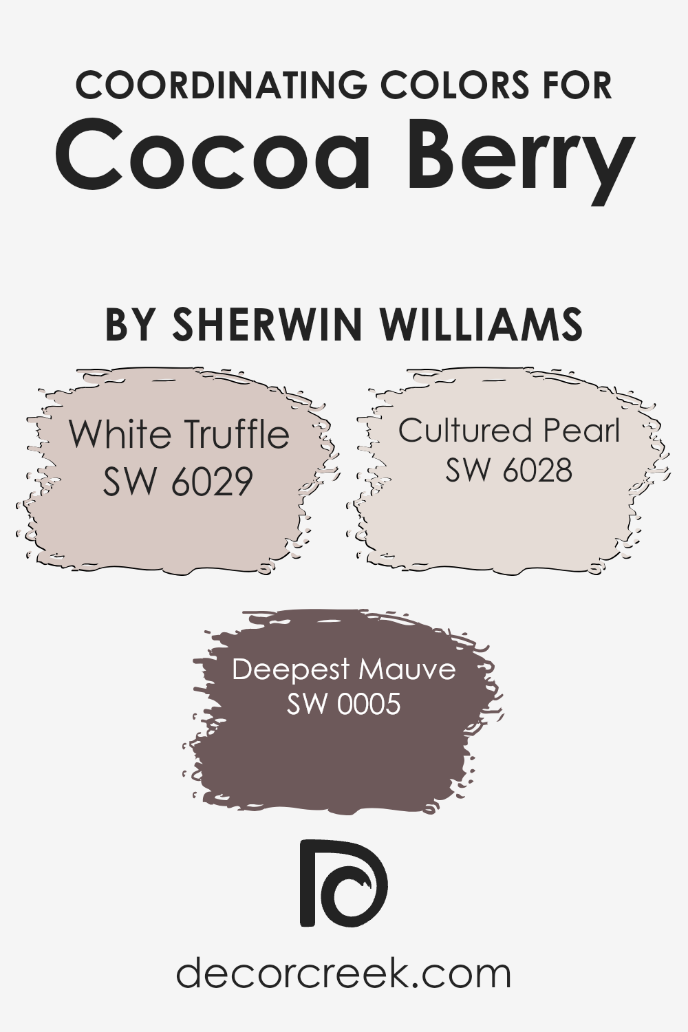
Selecting coordinating colors such as White Truffle, Deepest Mauve, and Cultured Pearl can offer a delightful contrast or subtle enhancement to the primary color, depending on how they are used.
White Truffle is a warm off-white with a subtle hint of beige, making it a perfect backdrop that allows deeper colors like Cocoa Berry to stand out. It’s a great choice for walls or trim, providing a soft, neutral canvas that complements richer colors.
Deepest Mauve, on the other hand, is a bold and deep purple that can add an interesting dimension when paired with warmer, dark shades like Cocoa Berry. It works well as an accent color, lending a touch of drama and interest to a room.
Finally, Cultured Pearl is a gentle gray with a touch of pink, offering a soft contrast that’s ideal for creating a soothing and cohesive look. Using it can help balance out the intensity of more vivid shades, making a room feel more cohesive.
You can see recommended paint colors below:
- SW 6029 White Truffle (CHECK A SAMPLE)
- SW 0005 Deepest Mauve (CHECK A SAMPLE)
- SW 6028 Cultured Pearl (CHECK A SAMPLE)
What are the Trim colors of Cocoa Berry SW 9078 by Sherwin Williams?
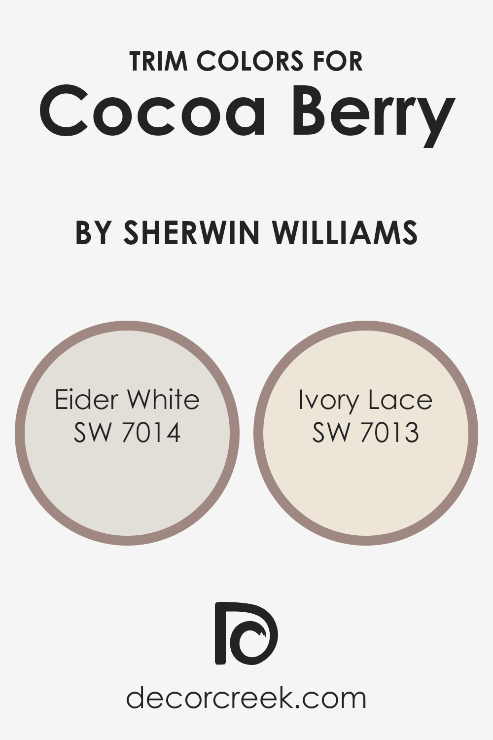
Trim colors are used to highlight and define the boundaries or edges of different surfaces on architectural elements like doors, window casings, and baseboards. When choosing trim colors for a rich color such as Cocoa Berry by Sherwin Williams, using complementary trim colors can really make the main hue stand out and give the room a polished look.
SW 7014 – Eider White and SW 7013 – Ivory Lace are excellent choices for this purpose as they provide a soft contrast that can enhance the overall aesthetic without overpowering the strong tone of Cocoa Berry.
Eider White by Sherwin Williams is a gentle gray with a warm undertone that makes it an ideal trim color when paired with deeper shades like Cocoa Berry. It blends smoothly with darker colors, providing a subtle differentiation that helps in defining spaces softly and effectively.
Ivory Lace, on the other hand, offers a touch of creamy warmth that adds a light, refreshing contrast. This color can help in softening the intensity of Cocoa Berry, giving the walls a well-rounded, inviting feel. While different, both these shades contribute to creating a visually cohesive environment when used as trim colors.
You can see recommended paint colors below:
Colors Similar to Cocoa Berry SW 9078 by Sherwin Williams
Similar colors within a color scheme are essential for creating a harmonious and aesthetically pleasing ambiance. These shades blend seamlessly, offering subtle differences that can enhance the overall design without causing visual discord.
For example, colors like Chocolate Powder and Dusted Truffle provide a smooth transition with their slightly differing tones, adding depth and richness to spaces.
Similarly, colors like Redend Point and Velvety Chestnut carry warm undertones that work well to create a cozy atmosphere, ideal for inviting interiors.
The lighter shades such as Rosaline Pearl and Dry Dock can be used effectively to bring a lighter, more refreshing touch to rooms that feature predominantly dark shades like Cocoa Berry or Armadillo.
On the other hand, Hushed Auburn and Auger Shell present a medium range that bridges the light and dark tones, making them perfect for balancing the look.
Coquina and Auger Shell offer a more subtle variation with their unique blends, making each space distinct yet harmoniously aligned with similar hues. These colors, when used together, ensure a sophisticated flow through different areas of a home or office, enriching the environment while keeping the color palette unified.
You can see recommended paint colors below:
- SW 9160 Armadillo (CHECK A SAMPLE)
- SW 9158 Coquina
- SW 9083 Dusted Truffle (CHECK A SAMPLE)
- SW 9082 Chocolate Powder (CHECK A SAMPLE)
- SW 9081 Redend Point (CHECK A SAMPLE)
- SW 9080 Hushed Auburn
- SW 9079 Velvety Chestnut (CHECK A SAMPLE)
- SW 9077 Rosaline Pearl (CHECK A SAMPLE)
- SW 7502 Dry Dock (CHECK A SAMPLE)
- SW 9159 Auger Shell (CHECK A SAMPLE)

Colors that Go With Cocoa Berry SW 9078 by Sherwin Williams
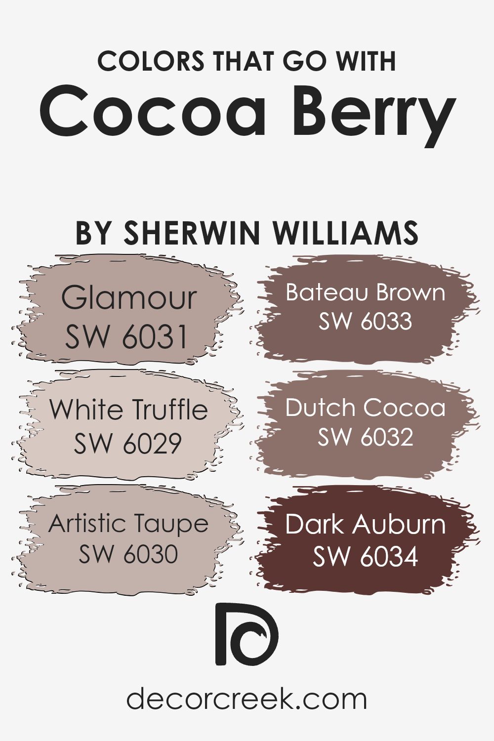
Choosing the right colors to complement Cocoa Berry SW 9078 by Sherwin Williams is key to creating a harmonious and aesthetically pleasing space. This deep, rich berry color can serve as a stunning accent or a bold backdrop, and pairing it with well-chosen hues enhances its beauty and the overall feel of a room.
For instance, Glamour SW 6031 adds a soft peachy touch that gently contrasts with the intensity of Cocoa Berry, providing a warm, inviting vibe. White Truffle SW 6029 is a light, creamy color that offers a subtle brightness, preventing the heavier hues from overpowering the space.
On another note, Artistic Taupe SW 6030 brings in a smooth, muted gray that effortlessly balances the richness of Cocoa Berry, adding depth and sophistication without using dark shades. Bateau Brown SW 6033, a deeper, earthy brown, works perfectly to reinforce a grounded, cozy feel in any environment.
Dutch Cocoa SW 6032 echoes the depth of Cocoa Berry but with a brown undertone that enhances the room’s warmth, making it ideal for creating a snug and inclusive atmosphere.
Lastly, Dark Auburn SW 6034 offers a deep red-brown that blends beautifully with the vibrancy of Cocoa Berry, crafting a sophisticated palette that’s both dynamic and welcoming.
Together, these colors create varied visual interest and a cohesive interior that feels both comfortable and stylish.
You can see recommended paint colors below:
- SW 6031 Glamour (CHECK A SAMPLE)
- SW 6029 White Truffle (CHECK A SAMPLE)
- SW 6030 Artistic Taupe (CHECK A SAMPLE)
- SW 6033 Bateau Brown (CHECK A SAMPLE)
- SW 6032 Dutch Cocoa (CHECK A SAMPLE)
- SW 6034 Dark Auburn
How to Use Cocoa Berry SW 9078 by Sherwin Williams In Your Home?
Cocoa Berry SW 9078 by Sherwin Williams is a warm and cozy paint color that makes any room feel inviting. This color, a deep berry shade, works well in many areas of the home. For example, you could paint a bedroom wall with Cocoa Berry to create a cozy, comforting space that helps you relax and unwind.
It’s also great for a living room accent wall, providing a rich backdrop that complements furniture and decorations.
If you like a bit of drama, Cocoa Berry can be used in a dining room to set a festive, lively mood during meals. It pairs well with soft lighting and can make your dining space look and feel very welcoming. For those who enjoy craft or reading rooms, applying Cocoa Berry will give the space a warm, snug atmosphere that enhances concentration and pleasure in your activities.
Overall, Cocoa Berry is versatile and can give any room a touch of warmth and style.
Cocoa Berry SW 9078 by Sherwin Williams vs Redend Point SW 9081 by Sherwin Williams
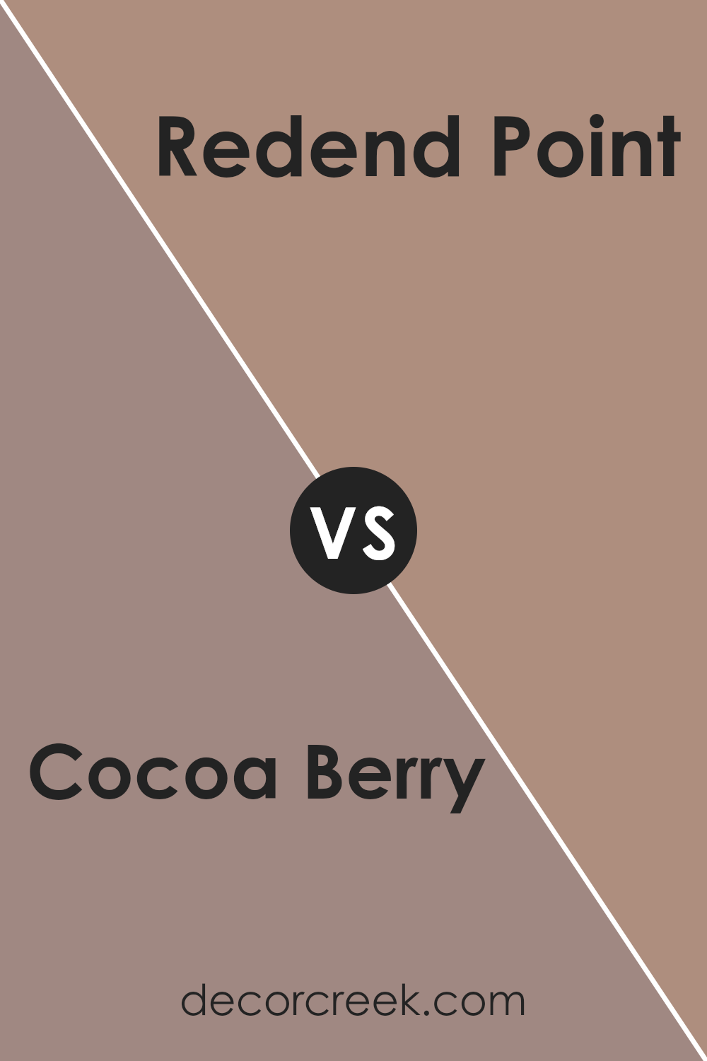
Cocoa Berry and Redend Point are two distinct paint colors offered by Sherwin Williams. Cocoa Berry presents a deeper, more saturated feel reminiscent of a rich, ripe berry. Its tones are warm and inviting, making it a great choice for cozy spaces where a touch of elegance and depth is desired.
On the other hand, Redend Point is softer and more muted. With a subtle hint of pink, it invokes a welcoming, gentle ambiance. This color works well in areas where a calm and relaxed atmosphere is the goal, such as living spaces or bedrooms.
Both colors can add unique warmth and character to a room, but Cocoa Berry leans towards a more dramatic and bold flair, while Redend Point offers a softer, understated elegance. When choosing between the two, consider the mood you want to set and the natural light in your space, as both factors will influence how the colors are perceived.
You can see recommended paint color below:
- SW 9081 Redend Point (CHECK A SAMPLE)
Cocoa Berry SW 9078 by Sherwin Williams vs Chocolate Powder SW 9082 by Sherwin Williams
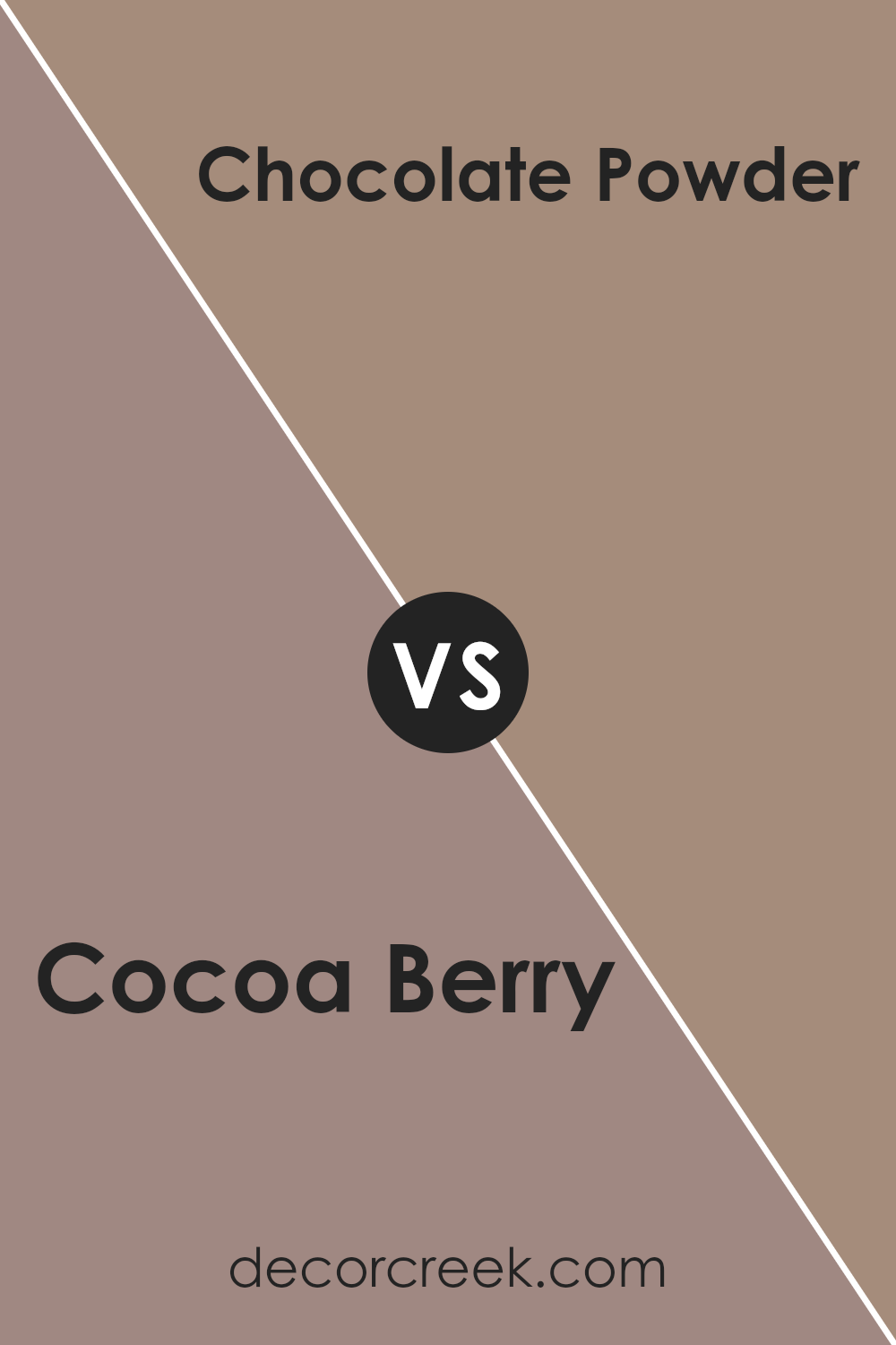
Cocoa Berry and Chocolate Powder are two distinct colors offered by Sherwin Williams, both emanating rich earthiness yet contrasting in their depth and warmth. Cocoa Berry has a vibrant, energetic berry tone that brings a sense of cozy warmth to a room.
It’s a bit lighter and can add a playful yet homey ambiance, making spaces feel welcoming and cheerful. On the other hand, Chocolate Powder is a much deeper shade. This color resembles the dark, comforting hues of cocoa powder used in baking.
It gives off a strong presence due to its depth, making it ideal for creating a statement or accent wall that commands attention. This darker color is perfect for adding density and a touch of elegance to a space, particularly in areas aimed at relaxation or gathering.
While both colors share a natural, earthy base, their impact varies significantly with Cocoa Berry lighting up spaces and Chocolate Powder grounding them.You can see recommended paint color below:
- SW 9082 Chocolate Powder (CHECK A SAMPLE)
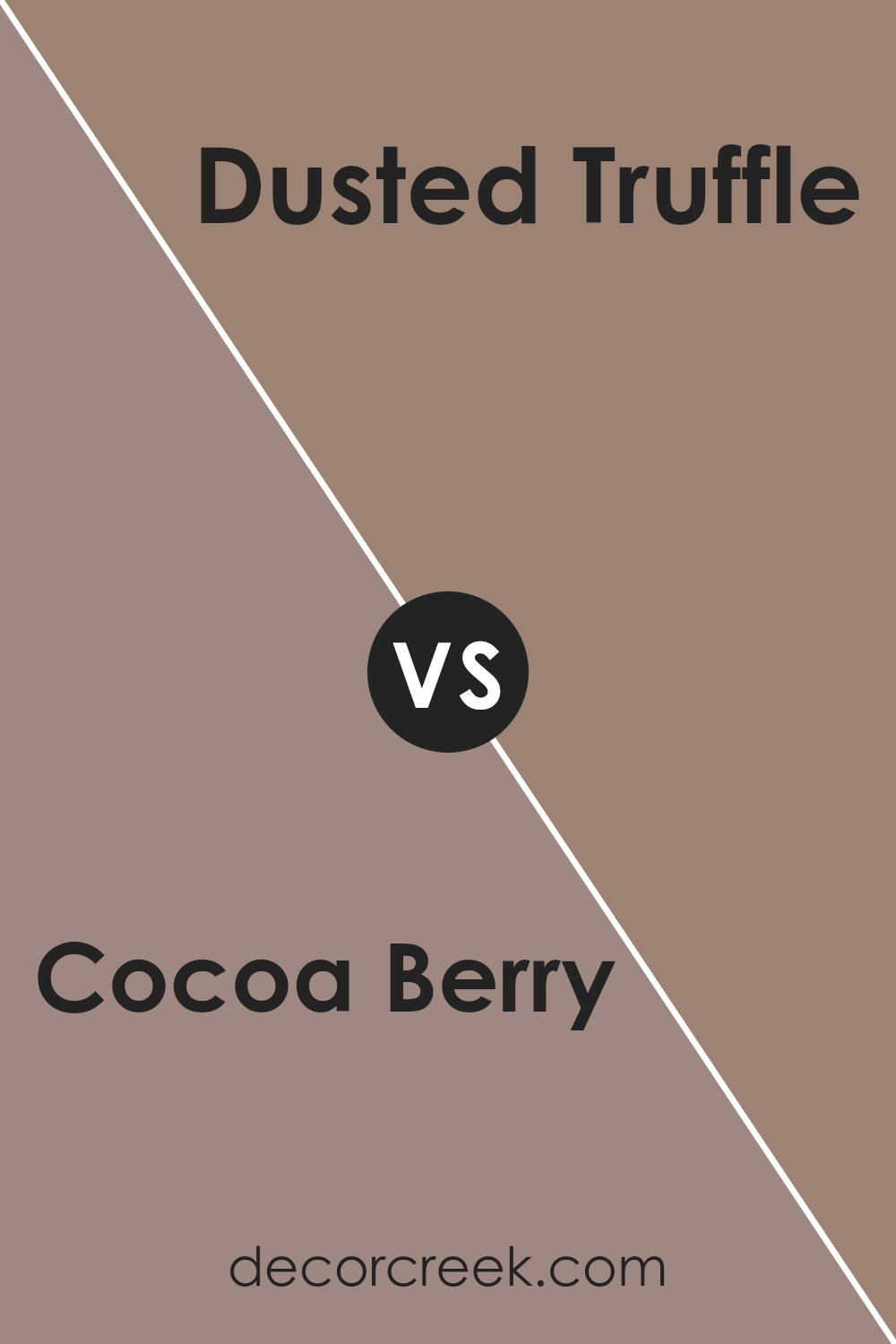
Cocoa Berry SW 9078 by Sherwin Williams vs Dusted Truffle SW 9083 by Sherwin Williams
The main color, Cocoa Berry, is a rich, deep shade that feels warm and inviting. It’s a strong color that can make a bold statement in a space, perfect for creating a cozy, welcoming atmosphere. In contrast, Dusted Truffle is a softer, more muted tone. This color leans more towards a neutral palette, making it incredibly versatile for various spaces without overwhelming the senses.
While Cocoa Berry offers a more impactful and noticeable presence due to its deeper hue, Dusted Truffle provides a subtle elegance that can blend easily with different decor styles and colors.
This makes Dusted Truffle an excellent choice for those looking for a color that offers flexibility and a gentle enhancement to the space without drawing too much attention.
Together, these colors can work well if you want to combine a striking feature wall with more understated surroundings, using Cocoa Berry as a focal point and Dusted Truffle for adjoining walls. Their warm undertones also help to ensure that the combination feels harmonious and balanced.
You can see recommended paint color below:
- SW 9083 Dusted Truffle (CHECK A SAMPLE)
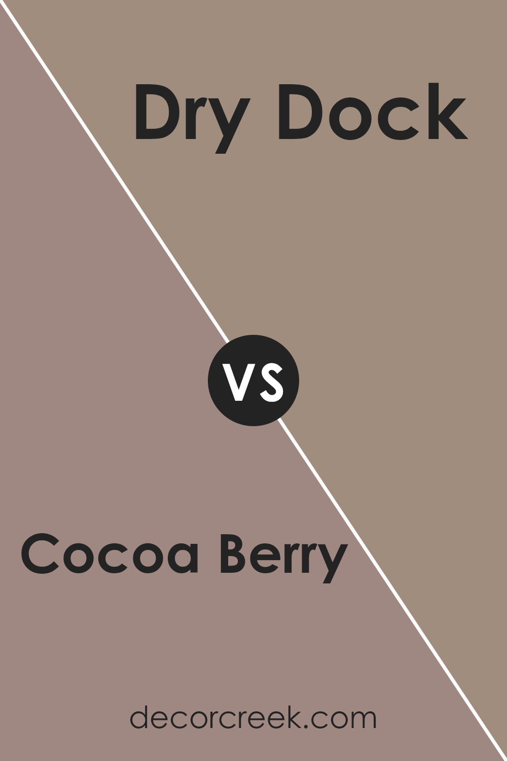
Cocoa Berry SW 9078 by Sherwin Williams vs Dry Dock SW 7502 by Sherwin Williams
Cocoa Berry and Dry Dock, both by Sherwin Williams, offer distinct vibes for any room decor. Cocoa Berry is a deep, rich, berry-toned hue that suits spaces meant to feel cozy and intimate. This warm color can make large rooms feel more inviting or give a bold statement in a small area as an accent wall.
On the other hand, Dry Dock has a soft, neutral gray tone that works well in a variety of settings, providing a calm and unobtrusive backdrop. It’s versatile enough to work in any room, complementing both modern and traditional decor.
It’s particularly effective in spaces where you want to highlight other design elements, such as artwork or furniture, without the wall color stealing the focus.
In essence, while Cocoa Berry draws attention with its deep warmth, Dry Dock offers a more laid-back, clean canvas which blends smoothly into any style or palette.
You can see recommended paint color below:
- SW 7502 Dry Dock (CHECK A SAMPLE)
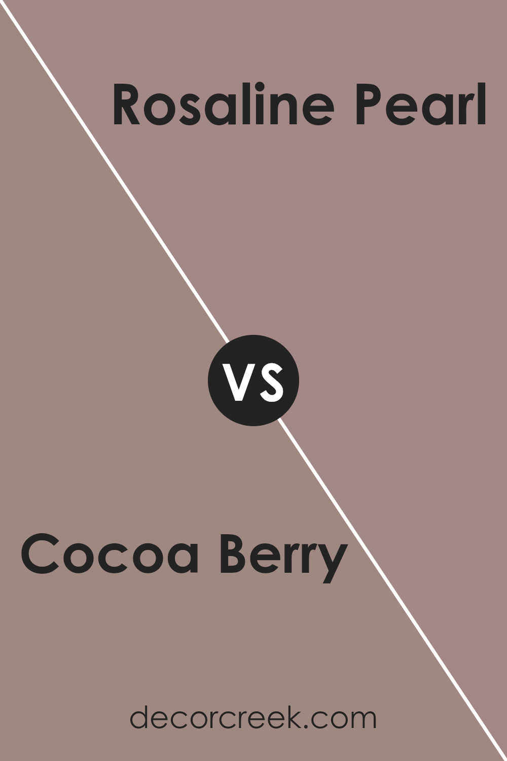
Cocoa Berry SW 9078 by Sherwin Williams vs Rosaline Pearl SW 9077 by Sherwin Williams
Cocoa Berry and Rosaline Pearl are two distinct colors by Sherwin Williams. Cocoa Berry is a deeper, richer tone that resembles the dark hues of cocoa mixed with a hint of berry. This color has a warm vibe, making it great for spaces where you seek comfort and calmness, like living rooms or bedrooms.
On the other hand, Rosaline Pearl has a lighter, more gentle appearance. It is a soft pink that brings a fresh and airy feel to a room, perfect for areas where you want to add a touch of lightness, such as bathrooms or nurseries.
While Cocoa Berry can create a cozy, enveloping atmosphere, Rosaline Pearl offers a subtle brightness that can make a small space appear larger and more inviting. Both colors work well in different settings depending on the mood and effect you’re aiming to achieve.
You can see recommended paint color below:
- SW 9077 Rosaline Pearl (CHECK A SAMPLE)
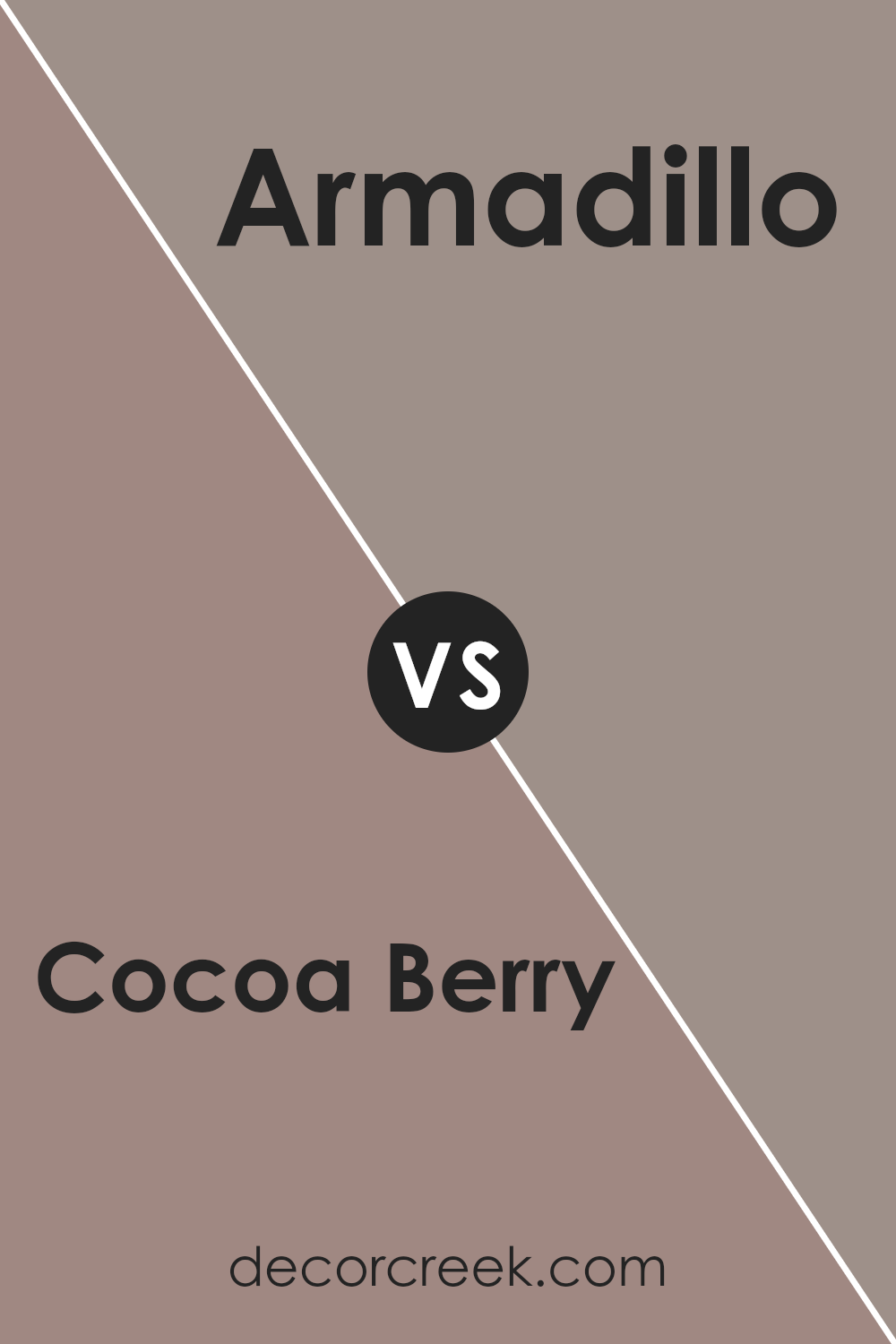
Cocoa Berry SW 9078 by Sherwin Williams vs Armadillo SW 9160 by Sherwin Williams
Cocoa Berry is a rich and warm red color with a deep, inviting tone. It resembles the natural hue seen on ripe berries, making it a cozy and comforting choice for any space. In contrast, Armadillo is a warm gray with a hint of brown. This color is more muted and understated, providing a neutral backdrop that pairs well with a variety of decor styles and colors.
When comparing these two colors, Cocoa Berry offers more warmth and vibrancy, making it ideal for spaces where you want to add a sense of energy or encourage gathering, like living rooms or dining areas.
On the other hand, Armadillo’s subtle and earthy tone is excellent for areas where you prefer a calm and grounded ambiance, such as bedrooms or offices.
Both colors give a room a warm feel, but each does so in its unique way—Cocoa Berry with a punch of rich color and Armadillo with a soothing neutrality.
You can see recommended paint color below:
- SW 9160 Armadillo (CHECK A SAMPLE)
Cocoa Berry SW 9078 by Sherwin Williams vs Auger Shell SW 9159 by Sherwin Williams
Cocoa Berry and Auger Shell are two distinct colors by Sherwin Williams that offer unique atmospheres for any space. Cocoa Berry is a deep, rich maroon with a hint of chocolate undertones. This color brings a cozy and warm feeling to a room, making it ideal for spaces where you want to relax such as living rooms or bedrooms.
In contrast, Auger Shell is a much lighter shade, resembling the soft color of sandy beaches. It’s a subtle, neutral beige that provides a calm and inviting backdrop, making it perfect for creating a bright and airy feel.
This color works well in areas that receive a lot of natural light or smaller spaces that you want to appear more open.
Together, these colors could complement each other in a home, with Cocoa Berry adding depth and warmth to a space while Auger Shell keeps the overall palette light and soothing. Each has its appeal depending on the mood and style you aim to achieve in your decorating projects.
You can see recommended paint color below:
- SW 9159 Auger Shell (CHECK A SAMPLE)
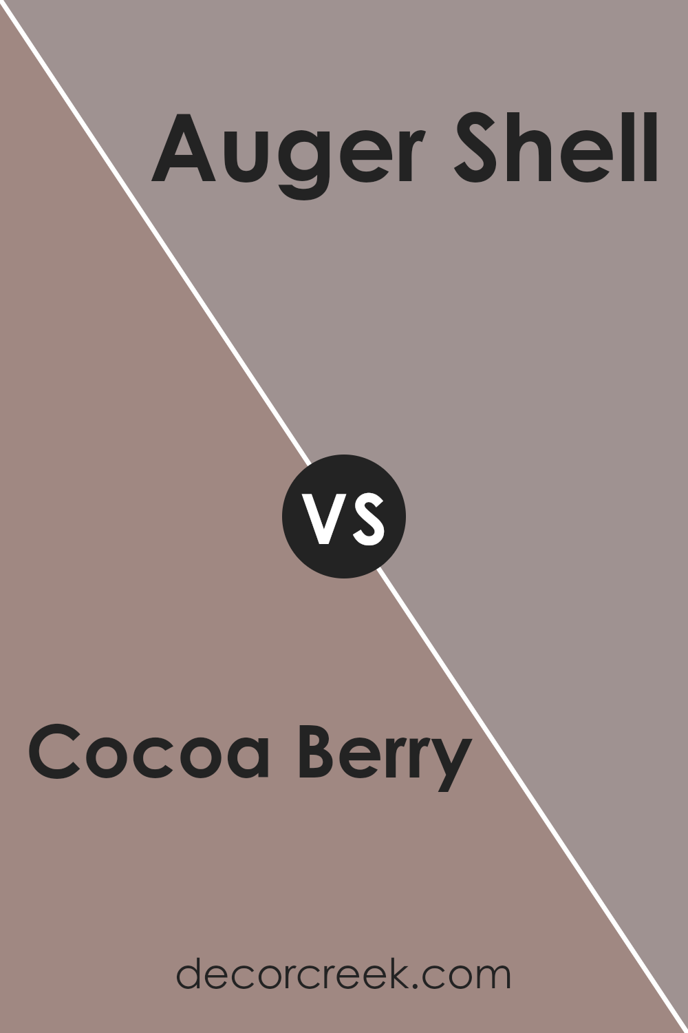
Cocoa Berry SW 9078 by Sherwin Williams vs Coquina SW 9158 by Sherwin Williams
Cocoa Berry and Coquina, both from Sherwin Williams, offer distinctly different tones that can change the mood of a room. Cocoa Berry is a deep, rich reddish-brown, somewhat reminiscent of a dark raspberry. This vibrant color adds warmth and a bit of drama to spaces, making it a great choice for areas where a cozy, inviting feel is desired.
On the other hand, Coquina is a much lighter shade, leaning towards a soft, sandy beige with subtle gray undertones. This color is perfect for creating a bright, airy feel in a room, making spaces appear larger and more open.
It works well in rooms that get a lot of sunlight and can help enhance the natural light.
In conclusion, while Cocoa Berry brings warmth and depth, Coquina provides a lighter, more subtle backdrop. Depending on the atmosphere you want to create, each color has its unique appeal. Cocoa Berry is ideal for adding character and warmth, whereas Coquina is excellent for a fresh, open look.
You can see recommended paint color below:
- SW 9158 Coquina
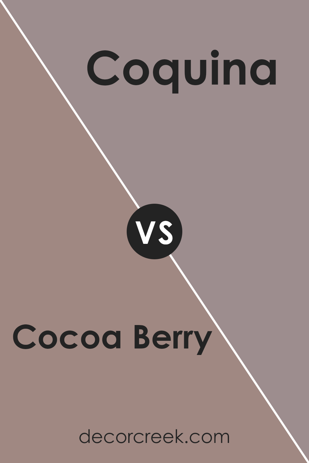
Cocoa Berry SW 9078 by Sherwin Williams vs Hushed Auburn SW 9080 by Sherwin Williams
Cocoa Berry and Hushed Auburn are two warm, cozy colors. Cocoa Berry is a deep, rich shade resembling a vibrant, ripe berry tone with a hint of soothing brown. This makes it ideal for creating a cozy and inviting atmosphere in spaces like living rooms or bedrooms.
In contrast, Hushed Auburn leans more towards the brown side, offering a soft, muted auburn color that resembles the earthy tones of autumn leaves. It has a subtle redness which gives it a gentle warmth. Hushed Auburn is perfect for areas where a calm, low-key vibe is desired, such as studies or dens.
When comparing them, Cocoa Berry stands out with more depth and intensity due to its darker, berry-like tones, whereas Hushed Auburn offers a lighter, more understated charm with its blend of brown and soft red. Each color can help achieve a different aesthetic, depending on the mood you wish to set in your room.
You can see recommended paint color below:
- SW 9080 Hushed Auburn
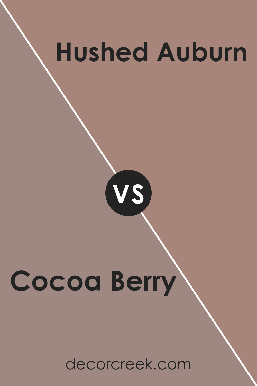
Cocoa Berry SW 9078 by Sherwin Williams vs Velvety Chestnut SW 9079 by Sherwin Williams
Cocoa Berry and Velvety Chestnut by Sherwin Williams are both warm, inviting colors, yet they have distinct differences that can affect the mood of a space. Cocoa Berry is darker, with a deep, rich hue that resembles a blend of chocolate and ripe berries.
This color can make a room feel cozy and wrapped in comfort, perfect for creating a snug, intimate atmosphere. On the other hand, Velvety Chestnut is slightly lighter, leaning towards a softer, more mellow brown with an understated warmth.
It’s a versatile shade that offers a welcoming feel without overwhelming a space, making it ideal for areas where you want a gentle touch of warmth. Both colors work well in spaces that seek to create a sense of warmth and comfort, but the choice between them depends on the desired intensity and mood of the room.
You can see recommended paint color below:
- SW 9079 Velvety Chestnut (CHECK A SAMPLE)
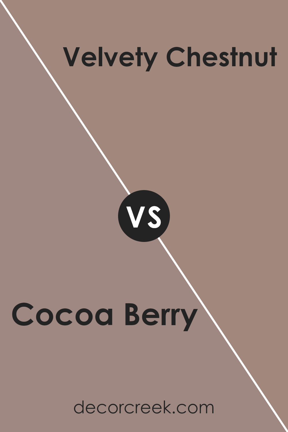
Conclusion
This color is like a mix between dark brown and a hint of purple, just like when you mix chocolate and berries together. This color is great for making any room feel cozy and warm, like a hug from a big, comfortable blanket.
When thinking about using Cocoa Berry in a home, it works really well in bedrooms or living rooms where you want to feel relaxed and comfy. It’s also fun for painting one wall as a special spot that stands out, especially with some nice decorations or pictures that match.
If someone wants to change a room without making everything look too different, Cocoa Berry is a good choice because it’s not too bright but still adds a lot of warmth to the room. People who visit your house will notice how nice it looks and feel welcome.
So, if you or anyone wants to make their home warm and inviting, SW 9078 Cocoa Berry by Sherwin Williams is a great choice. It makes rooms look lovely and makes you feel good when you’re in them!

Ever wished paint sampling was as easy as sticking a sticker? Guess what? Now it is! Discover Samplize's unique Peel & Stick samples.
Get paint samples


