Looking for the perfect paint color can be tricky, but if you’re leaning towards something light, fresh, and versatile, SW 7014 Eider White by Sherwin Williams might just be what you need.
This shade stands out for its subtle elegance and has become a favorite among homeowners and designers alike.
Sitting on the edge between gray and white, Eider White offers a soft, welcoming feel to any space without the starkness that sometimes comes with pure white.
Its unique blend makes it an excellent choice for those wishing to add a touch of warmth to their rooms while maintaining a bright and airy atmosphere.
What sets Eider White apart is its ability to adapt to various lighting conditions, slightly shifting its tone from a warm, cozy hue in natural light to a more pronounced, cool gray under artificial lighting.
This chameleon-like property ensures it fits beautifully in many settings, be it a modern minimalist living room or a cozy, traditional bedroom. Plus, pairing it with different decor elements is a breeze.
Whether you’re aiming for a chic, monochrome look or seeking a neutral backdrop for bold furnishings, Eider White serves as a fantastic canvas.
If you’re on the hunt for a paint color that combines flexibility with understated beauty, SW 7014 Eider White is worth considering. Its ability to transform spaces while creating a serene and inviting atmosphere is truly remarkable.
What Color Is Eider White SW 7014 by Sherwin Williams?
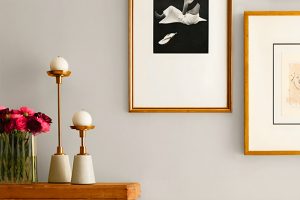
Eider White by Sherwin Williams is a subtle shade that straddles the line between white and light grey, offering a serene and calming backdrop to any room.
With its quiet elegance, it brings a fresh and airy feel, making spaces look more open and luminous. Its versatility allows it to adapt to various interior styles, from modern minimalist to cozy farmhouse and everything in between.
This color works particularly well in spaces aiming for a relaxed and inviting atmosphere. It can serve as a neutral canvas for bold accents or blend smoothly with softer hues for a more understated look.
Eider White pairs beautifully with natural materials and textures, such as light woods, stone, and linen, enhancing its organic feel.
Metal accents in silver, gold, or black can add a touch of sophistication and contrast, while soft fabrics like cotton or wool will complement its softness, creating a layered, cozy vibe.
Ideal for living rooms, bedrooms, or any space where comfort is key, Eider White supports a variety of aesthetic choices, allowing personal tastes to shine through.
Whether you’re decking out a contemporary loft or a quaint country cottage, this color offers a timeless backdrop that is both inviting and stylish.
Ever wished paint sampling was as easy as sticking a sticker? Guess what? Now it is! Discover Samplize's unique Peel & Stick samples.
Get paint samples

Is Eider White SW 7014 by Sherwin Williams Warm or Cool color?
Eider White by Sherwin Williams is a popular paint color that brings a soft and subtle touch to any room. This hue is not just plain white; it has a hint of gray, giving it a warm and inviting quality.
Homeowners appreciate Eider White for its versatility – it matches well with a variety of decors and styles.
Whether you have a modern, minimalist home or a place filled with vintage finds, this color creates a serene backdrop that enhances other elements in the room.
Using Eider White can make small spaces appear bigger and brighter, as the light color reflects natural light beautifully. This is especially great for rooms that don’t get a lot of sunlight.
For those with larger, open-plan homes, it offers a clean, cohesive look that ties different areas together without feeling overwhelming. Plus, it acts as a gentle contrast to bold colors, helping them pop without clashing.
Overall, Eider White is a fantastic choice for anyone looking to refresh their space with a calm, cozy vibe.
Undertones of Eider White SW 7014 by Sherwin Williams
Eider White by Sherwin Williams is a unique shade often chosen for its versatility and soft feel. The undertones of a paint color are like a hidden layer of color that can subtly influence how the main hue appears.
In the case of Eider White, its undertones are pale yellow and light purple. These undertones play a vital part in how we perceive the color, especially under different lighting conditions.
Pale yellow gives Eider White a warm, inviting glow. In sunlight, this undertone can make a room feel cozy and cheerful, turning spaces into welcoming havens. It’s like adding a hint of sunshine, even on cloudy days.
On the other hand, the light purple undertone adds a touch of sophistication and depth. This cooler undertone can make spaces feel more spacious and serene, providing a calming effect that’s perfect for bedrooms or bathrooms.
When applied to interior walls, Eider White transforms in an intriguing way. During the day, natural light may highlight the yellow undertones, making rooms feel airy and bright.
As the day turns to evening and artificial lights take over, the purple undertones might become more noticeable, creating a relaxed and stylish ambiance.
This dual nature makes Eider White an excellent choice for those looking to achieve a balance between warmth and elegance in their home.
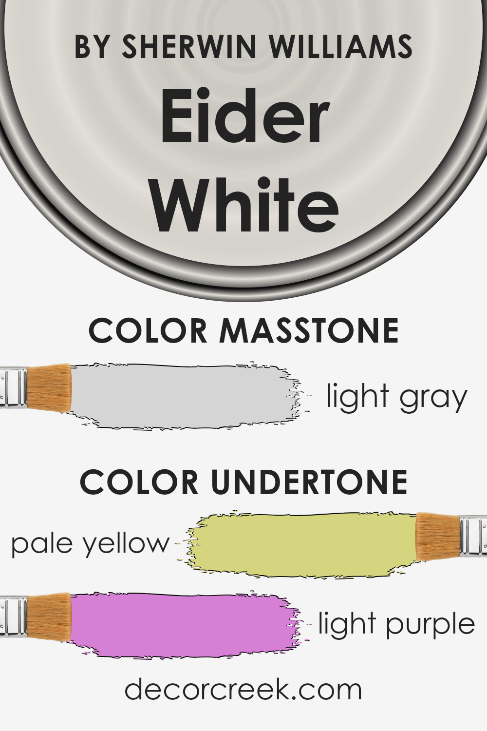
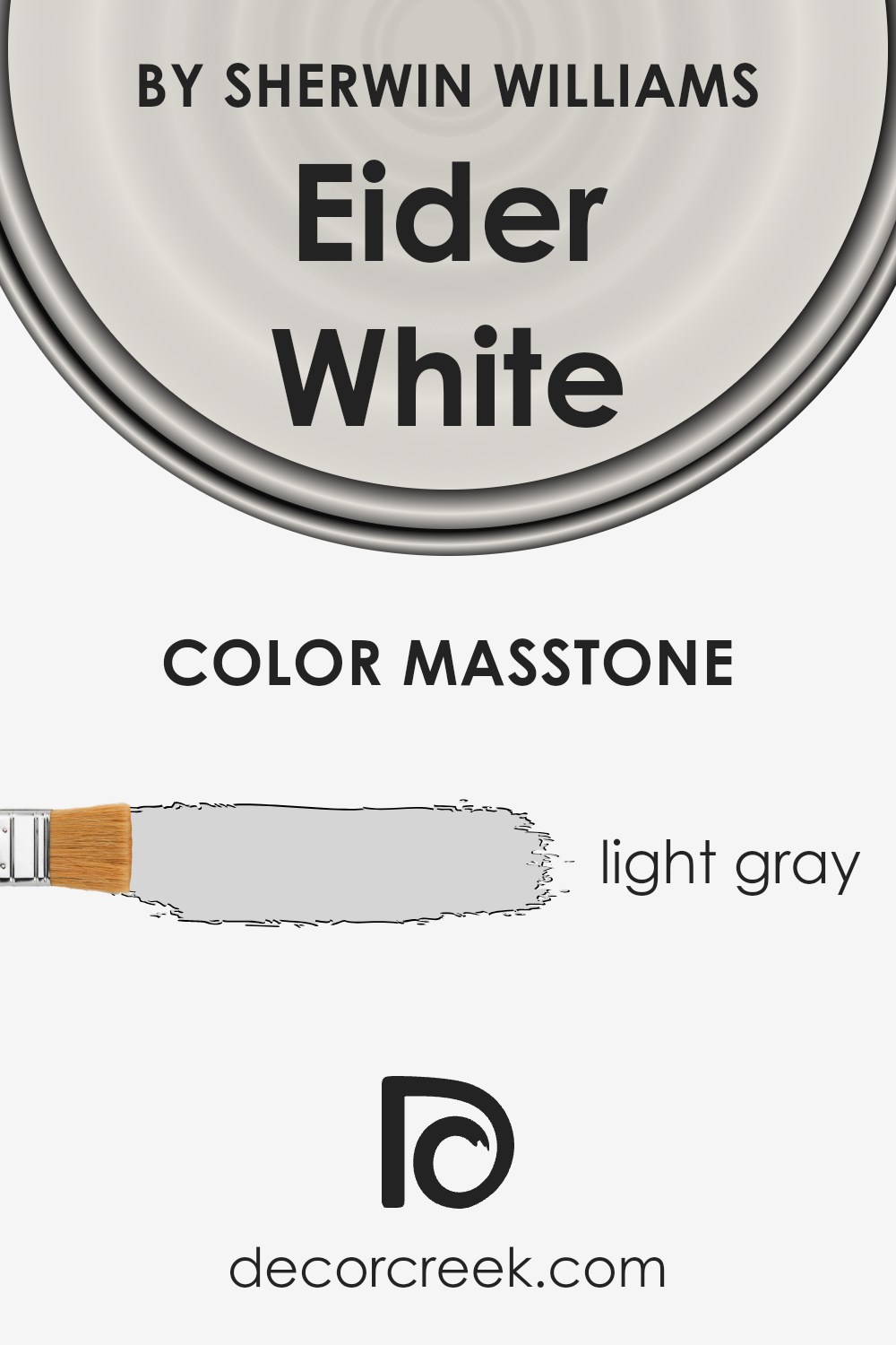
What is the Masstone of the Eider White SW 7014 by Sherwin Williams?
Eider White SW 7014 by Sherwin Williams has a masstone or main color impression of light gray, a soft and subtle shade that’s easy on the eyes.
Its light gray tone, comparable to the hex color #D5D5D5, offers a fresh and airy feel, making rooms appear larger and more inviting. This particular gray blends well with various decor styles and color schemes, adding to its versatility.
It works beautifully in homes because it provides a neutral backdrop that allows decorative elements to stand out.
Whether you’re going for a modern, minimalist look or something more classic and cozy, Eider White fits effortlessly into your vision.
Its light gray nature means it can adapt to different lighting conditions, subtly shifting its appearance from cool to warm tones.
This adaptability makes it ideal for any room, whether it’s a sun-drenched living area or a softly lit bedroom, creating a serene and comfortable space.
Easy to pair with bold colors or soft pastels, Eider White ensures your home feels both sophisticated and welcoming.
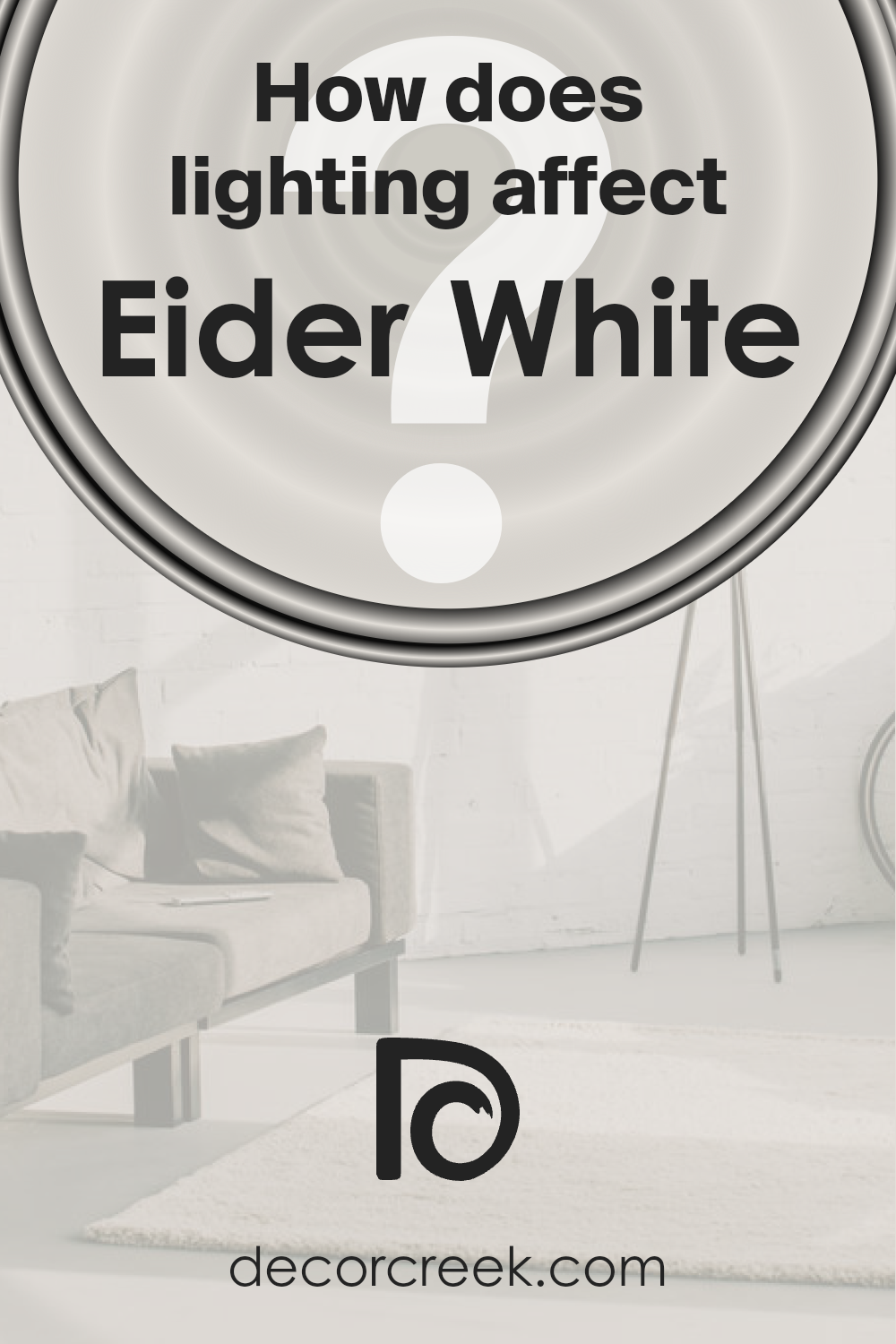
How Does Lighting Affect Eider White SW 7014 by Sherwin Williams?
Lighting plays a crucial role in how we perceive colors in our surroundings. When light hits a color, it can change its appearance dramatically.
This effect is especially noticeable with wall paints, like the gentle hue of Eider White by a well-known paint brand. Understanding how this color transforms under different lighting conditions can help you choose the best setting for it in your home.
In artificial light, the warmth or coolness of the bulbs can influence how Eider White looks. Warm light tends to bring out the subtle, creamy undertones, making the color appear more inviting.
On the other hand, cool light might highlight its crisp, clean aspects, giving it a more modern edge. It’s fascinating to see how the same color can shift from cozy to contemporary with just a change in lighting.
Natural light, however, introduces a dynamic element because it changes throughout the day.
In rooms facing north, which typically receive less direct sunlight, Eider White might lean towards its cooler, gray undertones, creating a serene and calming atmosphere.
In contrast, south-facing rooms bask in abundant light most of the day, highlighting the color’s warmth and making the space feel bright and airy.
East-facing rooms enjoy the morning sunlight, which can make Eider White look exceptionally soft and warm in the mornings, fading to a cooler tone as the day progresses.
Western rooms, however, will see the opposite effect; the color will appear cooler in the morning’s weaker light and warm up in the evening as the sun sets, bathing the room in a golden glow.
Thus, the orientation of your room and the type of light it receives can significantly affect how Eider White—or any color, for that matter—will look in your space.
By considering these factors, you can ensure that you’re getting the desired effect from your color choice throughout the day.
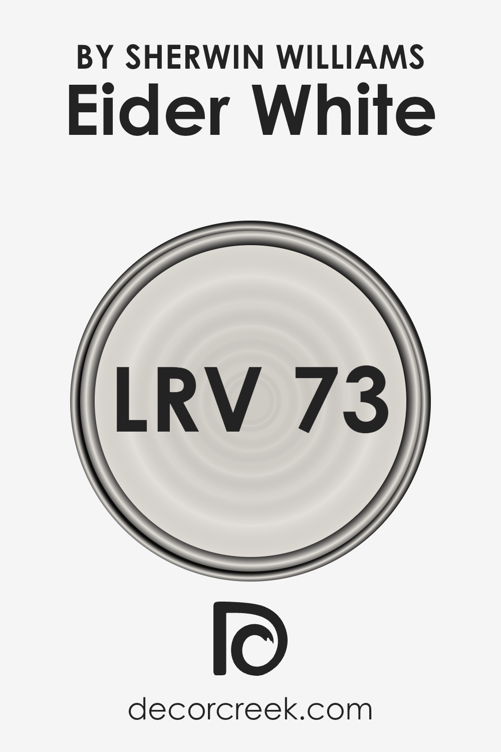
What is the LRV of Eider White SW 7014 by Sherwin Williams?
LRV stands for Light Reflectance Value, which is a measure of the percentage of light a paint color reflects. Imagine LRV on a scale from 0 to 100, where 0 absorbs all light (think of a pitch-black room) and 100 reflects all light (like a brightly lit, white room).
This value is super important when choosing paint because it helps you understand how light or dark a color will look on your walls. The amount of natural light a room gets can significantly impact the appearance of the paint color.
Lighter colors can make a small room feel more spacious and airy, while darker colors can make a large room feel cozier.
Eider White, with an LRV of 73.219, is on the lighter end of the scale. This means it reflects a good amount of light, making it a great choice for making spaces feel larger and more open.
In rooms with a lot of natural light, this color will appear even lighter and can help create a bright and inviting space. However, in a room with less natural light, Eider White will still help to keep the space feeling bright compared to darker colors.
Its light-reflecting properties make it versatile for various settings, ensuring the room feels welcoming and not closed in.
LRV – what does it mean? Read This Before Finding Your Perfect Paint Color
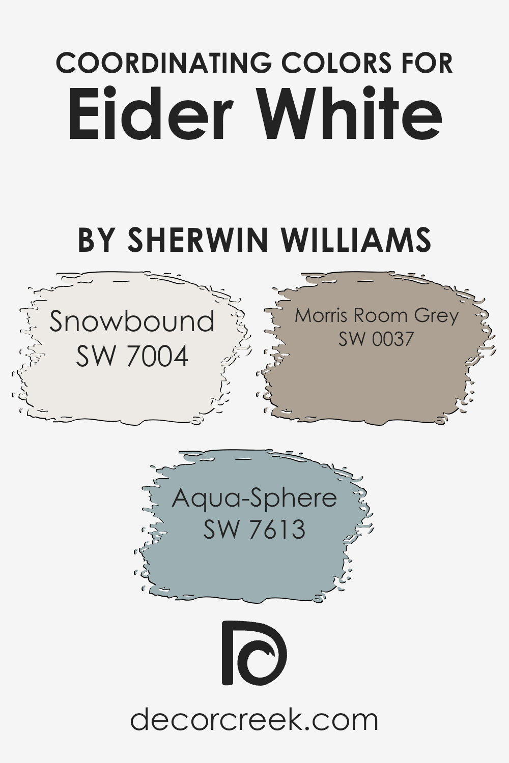
Coordinating Colors of Eider White SW 7014 by Sherwin Williams
Coordinating colors are essentially hues that complement each other and work together to enhance the aesthetic appeal of a space. They can be used to create a harmonious color scheme, giving rooms a polished and cohesive look.
Such colors can either contrast with or complement a primary color to add depth and character to interior designs.
Taking Eider White by Sherwin Williams as a starting point, there are several coordinating colors that can beautifully align with it to craft visually appealing spaces.
Snowbound (SW 7004), for instance, is a warm and soft white that brings a sense of calm and cleanliness to spaces. It pairs wonderfully with Eider White, offering a subtle contrast that highlights the features of a room without overpowering it.
Aqua Sphere (SW 7613) adds a different dimension; it’s a serene blue-green hue that infuses spaces with a touch of tranquility and sophistication, making it an ideal choice for bathrooms or bedrooms seeking a peaceful ambience.
Lastly, Morris Room Grey (SW 0037) offers a versatile, deeper gray shade that complements Eider White by providing depth and warmth.
This color is especially useful in creating an elegant, grounded look in a room, perfect for living areas or studies.
Together, these coordinating colors can help you create a balanced and inviting atmosphere in your home, reflecting your style with harmony and sophistication.
You can see recommended paint colors below:
- SW 7004 Snowbound
- SW 7613 Aqua-Sphere
- SW 0037 Morris Room Grey
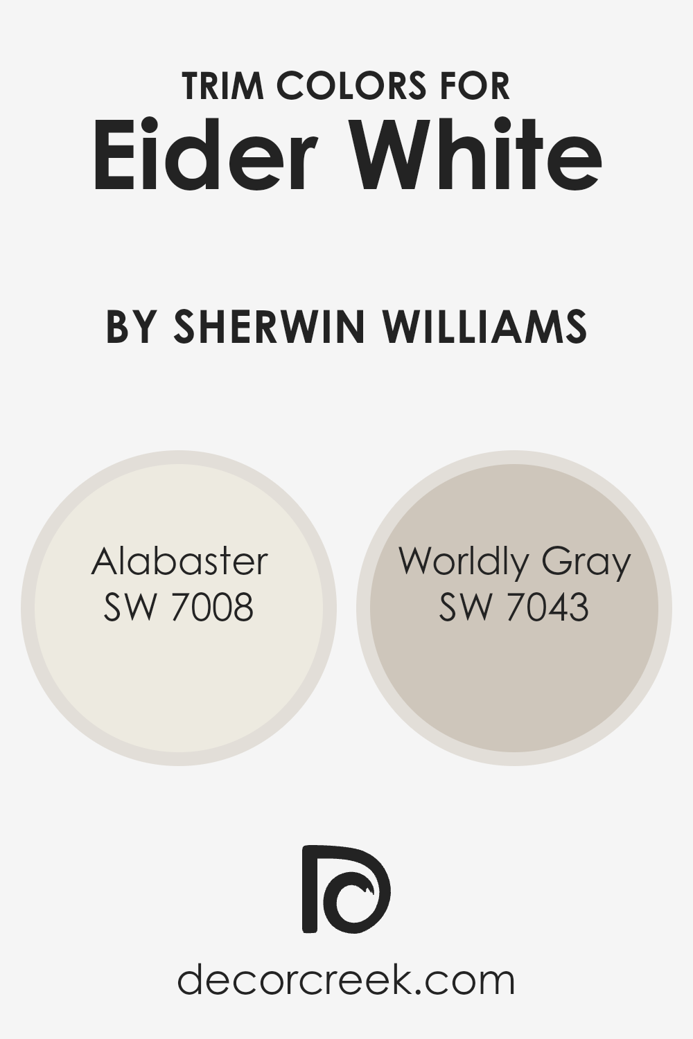
What are the Trim colors of Eider White SW 7014 by Sherwin Williams?
Trim colors are the hues chosen to paint the trims of rooms—like door frames, window frames, and skirting boards—adding contrast and depth to the walls’ primary color.
In the case of a gentle and soft hue like Eider White by Sherwin Williams, selecting the right trim color can significantly enhance its subtle beauty, creating a refined ambiance in any space.
Trim colors act as a frame for your wall colors, drawing the eye, emphasizing architectural features, and creating a cohesive look throughout the room.
Alabaster SW 7008 is a warm, creamy shade that offers a smooth transition from the softness of Eider White, providing a subtle contrast without overwhelming the senses.
It’s like adding a soft glow around your room, making it feel cozy and inviting. On the other hand, Worldly Gray SW 7043 brings a more grounded, earthy contrast to the light and airy feel of Eider White.
This shade adds a touch of sophistication and depth, making the space feel more anchored and balanced.
Both Alabaster and Worldly Gray work harmoniously with Eider White, offering two distinct approaches to framing and enhancing the overall aesthetic of your space.
You can see recommended paint colors below:
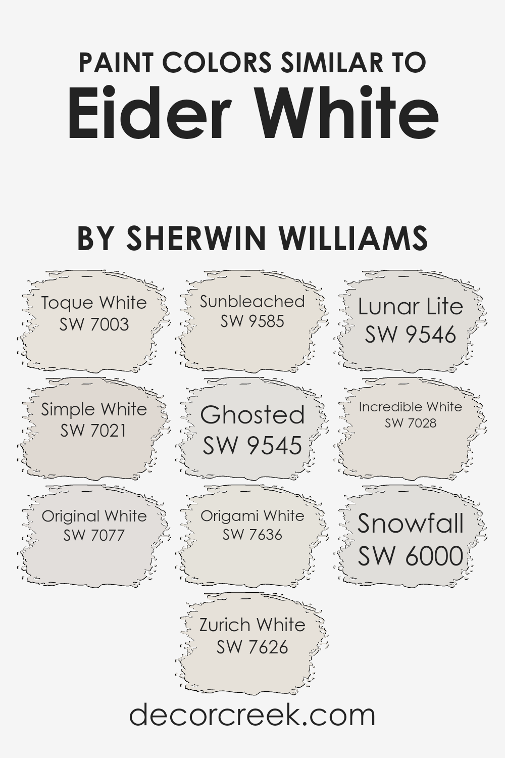
Colors Similar to Eider White SW 7014 by Sherwin Williams
Similar colors play a crucial role in design and decoration because they create harmony and a sense of balance. When we look at colors that are closely aligned with Eider White by Sherwin Williams, we find a palette that is both soothing and cohesive.
Colors like Toque White and Simple White lend themselves to a subtle variation that can differentiate spaces without a stark contrast.
This gentle transition from one shade to another helps to weave spaces together seamlessly, ensuring that no single element overpowers another.
For example, Original White adds a hint of warmth, making it perfect for areas that crave a cozy atmosphere. Meanwhile, Zurich White has an understated elegance that can brighten rooms without overwhelming them with pure whiteness.
Sunbleached and Ghosted offer a touch of softness and airiness, ideal for creating a light and welcoming environment. Origami White stands out for its neutral base, capable of complementing a wide range of decor styles.
Lunar Lite brings a modern twist with its slight cool undertone. Incredible White and Snowfall both serve as excellent backdrops, the former leaning towards a warmer hue, while the latter provides a crisp, clean look.
Each of these colors, with their unique tones and shades, offers endless possibilities to enhance the aesthetic appeal of any space, making them indispensable tools in the world of interior design.
You can see recommended paint colors below:
- SW 7003 Toque White
- SW 7021 Simple White
- SW 7077 Original White
- SW 7626 Zurich White
- SW 9585 Sunbleached
- SW 9545 Ghosted
- SW 7636 Origami White
- SW 9546 Lunar Lite
- SW 7028 Incredible White
- SW 6000 Snowfall
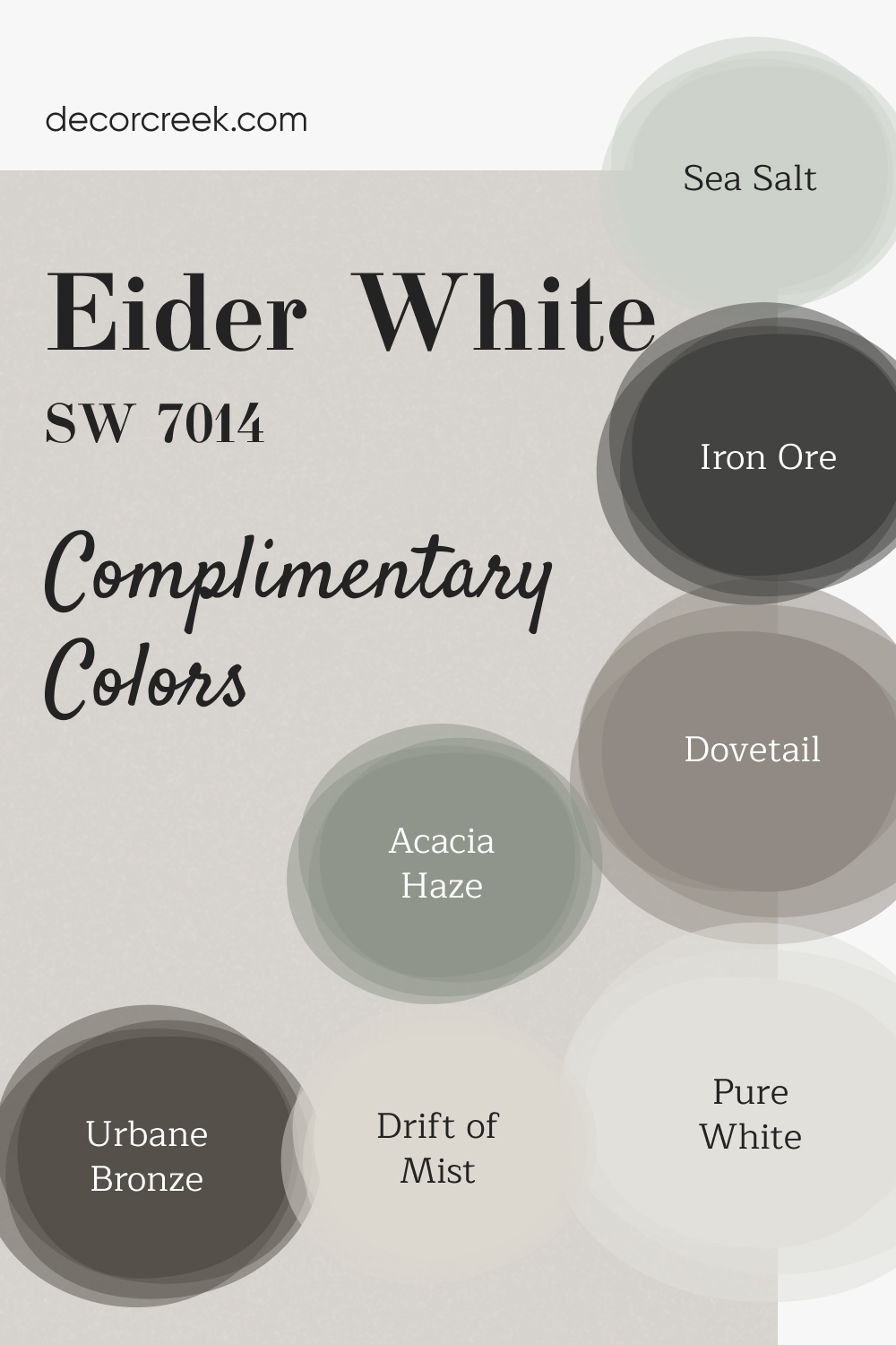
Complimentary Colors for Eider White SW 7014 Paint Color by Sherwin Williams
Eider White by Sherwin Williams is a delicate, airy shade that works beautifully as a base for any room. When paired with the deep richness of Iron Ore or Urbane Bronze, it creates a striking contrast that adds depth without overwhelming the space.
If you’re looking to introduce a hint of color, Sea Salt and Acacia Haze offer a calming touch, making the room feel serene and refreshing. For a brighter, more open look, Pure White and Drift of Mist are ideal for trim, ceilings, or accent pieces, bringing in a sense of lightness.
Dovetail complements the palette with a soft gray that grounds the space, offering balance and versatility. Together, these colors create a peaceful, inviting atmosphere that feels both modern and timeless.
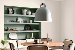
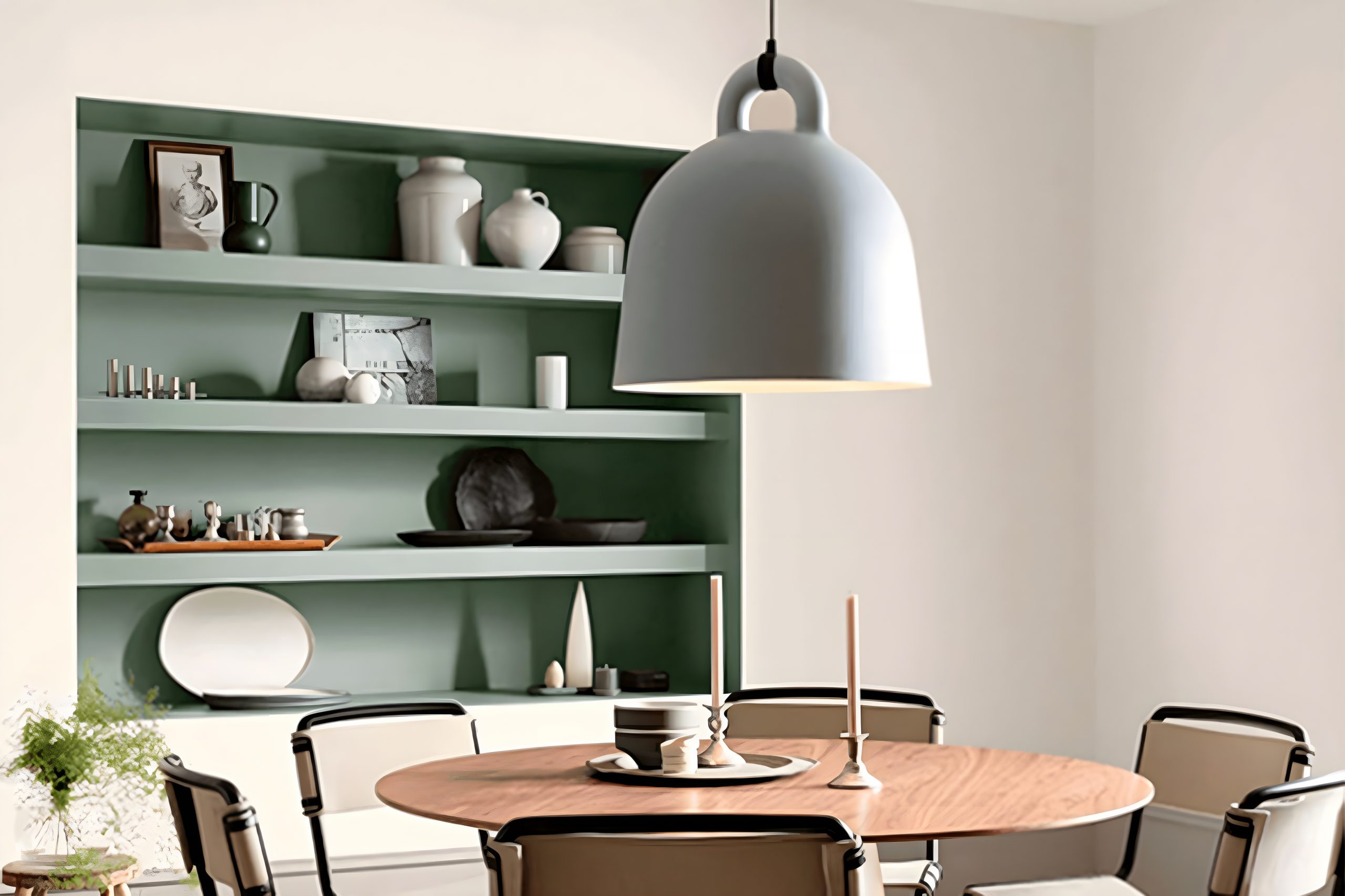
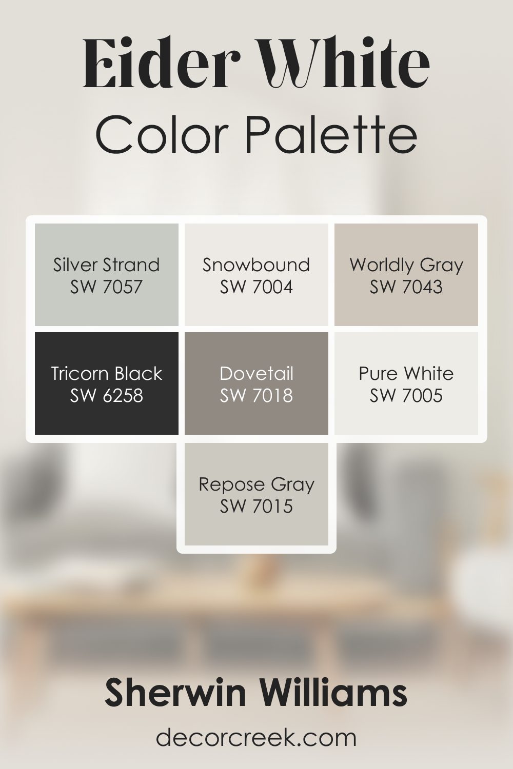
Eider White SW 7014 by Sherwin Williams Color Palette
Eider White always feels soft and airy to me, like a gentle glow across the room. It has a quiet character that pairs beautifully with Repose Gray and Dovetail, creating a smooth blend of warm and cool tones. Pure White and Snowbound add brightness without feeling too sharp, keeping the palette clean and light.
When I want depth, Tricorn Black becomes the perfect accent, giving the palette strong definition. Worldly Gray adds warmth, and Silver Strand brings a refreshing hint of cool color that softens the entire look.
This palette feels peaceful and refined, with Eider White giving every shade a soft, easy place to settle.
How to Use Eider White SW 7014 by Sherwin Williams In Your Home?
Eider White by Sherwin Williams is a beautiful, soft shade of white that leans slightly towards a cool gray. This versatile color is perfect for anyone looking to freshen up their home with a modern and airy vibe.
Whether you’re painting the whole room or just an accent wall, Eider White can easily match with different decor styles and colors, making it a great choice for any room.
If you’re thinking about using it in your living space, it can help make the room feel more spacious and welcoming. In a bedroom, it adds a calming effect, creating a peaceful sanctuary where you can unwind.
It’s also a fantastic pick for kitchens and bathrooms, where it can help the spaces appear cleaner and brighter.
Eider White pairs well with both bold colors and neutral tones, giving you the flexibility to add pops of color through furniture and accessories or keep things minimalistic.
It’s a clever way to update your home without the hassle of a major renovation.
Eider White SW 7014 by Sherwin Williams vs Zurich White SW 7626 by Sherwin Williams
Eider White and Zurich White are two colors by Sherwin Williams that both offer a fresh take on white, but with unique differences. Eider White leans a bit cooler, with a hint of gray that gives it a soft, subtle feel.
It’s perfect for creating a calm and serene atmosphere in any space. On the other hand, Zurich White has a warmer tone, slightly leaning towards beige, making it a great choice for those wanting a cozy and inviting vibe.
Eider White is ideal for modern and minimalist designs because of its clean and crisp appearance, whereas Zurich White fits beautifully in traditional or rustic settings due to its warmth.
Both colors reflect light well, making rooms appear brighter and more spacious. Choosing between them depends on the mood you want to create: Eider White for a cooler, sleek look, and Zurich White for a warmer, welcoming feel.
You can see recommended paint color below:
Eider White SW 7014 by Sherwin Williams vs Incredible White SW 7028 by Sherwin Williams
Eider White and Incredible White, both from Sherwin Williams, offer subtle yet distinct vibes for any room. Eider White has a light, almost soft gray touch that gives off a cozy, welcoming feel.
It’s perfect for those who want a hint of color without straying too far from white. On the other hand, Incredible White leans towards a warmer spectrum, with a beige undertone that makes spaces feel more inviting and snug.
While Eider White can illuminate a room without making it feel stark or clinical, Incredible White brings a touch of warmth, creating an atmosphere that’s both friendly and comfortable.
Both colors are versatile and can easily complement various decors, but your choice would depend on the mood you’re aiming for: Eider White for a fresher, open space, and Incredible White for a warmer, cozier feel.
You can see recommended paint color below:
Eider White SW 7014 by Sherwin Williams vs Snowfall SW 6000 by Sherwin Williams
Eider White and Snowfall, both by Sherwin Williams, are two beautiful shades that have subtle differences. Eider White is a soft, light gray with a hint of warmth, making it an excellent neutral background for any room.
It’s versatile and can easily complement a wide range of decor. On the other hand, Snowfall is a crisp, clean white with a slightly cooler tone.
This color is great for creating a fresh, open feel in a space, making rooms appear larger and more inviting.
While Eider White can add a cozy warmth to interiors, Snowfall offers a more traditional white look that’s perfect for brightening up spaces and pairing with any color scheme.
Choosing between them depends on the atmosphere you want to create; Eider White offers a hint of cozy warmth, while Snowfall brings a brighter, more spacious feel.
You can see recommended paint color below:
- SW 6000 Snowfall
Eider White SW 7014 by Sherwin Williams vs Simple White SW 7021 by Sherwin Williams
Eider White and Simple White are two popular paint colors from Sherwin Williams, but they have their unique differences. Eider White leans towards a light grey with a subtle hint of warmth.
This makes it a versatile choice for rooms that you want to feel cozy yet spacious. It’s particularly good at balancing out spaces with natural light, adding a soft, elegant touch without overwhelming the room with too much warmth.
On the other hand, Simple White is a cleaner, more straightforward white color. It doesn’t have the same grey undertones that Eider White carries.
Instead, Simple White offers a purer backdrop, making it ideal for those looking for a classic white look. It’s excellent for making spaces feel brighter and more open, providing a fresh and airy feel to any room.
While both colors aim to lighten up a space, Eider White offers a hint of warmth and depth with its grey undertones, whereas Simple White keeps things clear and crisp with its straightforward white approach.
Choosing between them depends on whether you prefer a soft, warm ambiance or a bright, clean look.
You can see recommended paint color below:
- SW 7021 Simple White
Eider White SW 7014 by Sherwin Williams vs Original White SW 7077 by Sherwin Williams
Eider White and Original White, both by Sherwin Williams, are subtle yet distinct shades each bringing its own unique vibe.
Eider White leans toward a light, soft gray with a hint of warmth, making it versatile for rooms where you want a cozy yet bright feel. It’s like a gentle morning mist, offering a calm and soothing touch to any space.
On the other hand, Original White is what you might call a true white but with a slight nod to warmth, steering clear of feeling too stark or cold.
It’s the kind of white that offers a clean slate, perfect for highlighting other colors or standing confidently on its own. While Eider White adds a whisper of color, Original White serves as a straightforward backdrop.
Both are excellent choices, yet they cater to different tastes and spaces – Eider White for a hint of softness and depth, Original White for purity and simplicity.
You can see recommended paint color below:
- SW 7077 Original White
Eider White SW 7014 by Sherwin Williams vs Lunar Lite SW 9546 by Sherwin Williams
Eider White and Lunar Lite are both colors by Sherwin Williams that offer soft and subtle tones for any space. Eider White leans towards a light gray with a touch of warmth to prevent it from feeling cold.
This color is versatile and can easily adapt to various decor styles, making it a popular choice for its understated elegance.
On the other hand, Lunar Lite is a much paler shade, bordering on the edge of white with just a hint of color. This gives it an almost ethereal feel, perfect for creating a serene and peaceful atmosphere.
It reflects light beautifully, making spaces appear brighter and more open.
While both colors provide a clean and minimalist aesthetic, Eider White offers a bit more depth and warmth, making it suitable for areas where a cozy ambiance is desired.
Lunar Lite, with its airy vibe, is ideal for those looking to achieve a crisp and fresh look. Choosing between the two depends on the mood you’re aiming to set in your space.
You can see recommended paint color below:
- SW 9546 Lunar Lite
Eider White SW 7014 by Sherwin Williams vs Ghosted SW 9545 by Sherwin Williams
Eider White and Ghosted, both from Sherwin Williams, offer subtle but distinct vibes for any space. Eider White has a soft, warm undertone that brings a cozy feel without overpowering the room.
It’s perfect for those who want a hint of warmth in their neutral palette. On the other hand, Ghosted steps in with a cooler, more understated approach.
This color brings a fresh, airy feel, making it ideal for modern spaces that aim for a clean, minimalist look.
While both colors share a certain lightness and neutrality, their differences in warmth and mood set them apart. Eider White leans towards a welcoming, gentle ambiance, making spaces feel more intimate and homey.
Ghosted, however, offers a crisp backdrop, giving rooms a more open, serene atmosphere.
Choosing between them depends on the desired feel of the room. Eider White works well in areas where comfort and softness are key, while Ghosted is your go-to for a sleek, contemporary edge.
Both are versatile, but their unique undertones can significantly influence the overall look and feel of a space.
You can see recommended paint color below:
- SW 9545 Ghosted
Eider White SW 7014 by Sherwin Williams vs Origami White SW 7636 by Sherwin Williams
Eider White and Origami White, both by Sherwin Williams, are subtle and sophisticated shades ideal for creating a calm and welcoming space.
Eider White has a slightly gray undertone, giving it a cool, soft appearance. This makes it perfect for rooms that get a lot of sunlight, as it helps balance out the warmth.
On the other hand, Origami White leans more towards a warm, beige tone, providing a cozy and inviting feel to any area. It’s particularly suited for spaces that could use a bit of warmth to make them feel more homely.
Although both colors are quite neutral, Eider White serves well in a modern, minimalist decor due to its crispness, while Origami White is excellent for those looking for a touch of warmth without overwhelming the senses.
Choosing between them depends on the room’s lighting and your personal preference for warmth or coolness in your decor.
You can see recommended paint color below:
- SW 7636 Origami White
Eider White SW 7014 by Sherwin Williams vs Sunbleached SW 9585 by Sherwin Williams
Eider White and Sunbleached are two distinct colors, both offered by Sherwin Williams. Eider White is a soft, muted shade of white with a hint of gray.
It’s a versatile color that can give spaces a calm and relaxing vibe. It’s perfect for those looking to add a subtle touch of sophistication to their rooms without overpowering them with color.
On the other hand, Sunbleached is a much lighter tone, almost resembling the natural color of sun-faded wood. It carries a warm and inviting feel, making it ideal for creating a cozy and comfortable atmosphere in any space.
Unlike Eider White’s cool undertones, Sunbleached leans towards a warmer palette, evoking the sensation of sunlight softly filtering into a room.
When comparing the two, the main difference lies in their temperature and brightness. Eider White, with its gray undertones, offers a more neutral and subdued backdrop.
Sunbleached, true to its name, brings warmth and a sense of airiness, reminiscent of a sunny day. Both colors are great choices for those wanting to brighten up their homes while maintaining a sophisticated aesthetic.
You can see recommended paint color below:
- SW 9585 Sunbleached
Eider White SW 7014 by Sherwin Williams vs Toque White SW 7003 by Sherwin Williams
Eider White and Toque White, both by Sherwin Williams, offer unique touches to any space. Eider White stands out with a slight hint of gray, giving it a cool, serene vibe.
This makes it perfect for creating a peaceful and fresh atmosphere in rooms. On the other hand, Toque White leans toward a warmer tone, almost nudging into the off-white category.
It carries a subtle hint of beige, making it ideal for spaces where a cozy, welcoming feel is desired.
Comparing the two, Eider White might be the go-to for a modern, minimalistic look, thanks to its cooler undertone. It pairs well with sleek decor and can make small spaces appear bigger.
Toque White, with its warmer tones, suits traditional settings better, enhancing wood finishes and softer textiles. It adds a touch of warmth to a room without overwhelming it with color.
In essence, while both colors offer a backdrop of elegant simplicity, Eider White brings a crisp, airy feel, whereas Toque White offers warmth and coziness.
Choosing between them depends on the atmosphere you want to achieve in your space.
You can see recommended paint color below:
- SW 7003 Toque White
Conclusion
In summary, the color Eider White by Sherwin Williams stands out for its subtle warmth and versatility, making it an excellent choice for those looking to add a soft, elegant touch to their spaces.
Its ability to adapt to various settings and complement different decor styles has garnered it high marks among homeowners and designers alike.
The unique blend of gray and white in Eider White offers a neutral backdrop that can enhance the aesthetic appeal of any room without overwhelming it with color.
Moreover, this particular shade is praised for its ability to evoke a sense of calmness and sophistication, proving itself to be more than just a simple paint choice.
Whether used in a bedroom, living area, or kitchen, Eider White brings a light, airy feel to the environment, creating a welcoming space.
Its popularity is not just about the color itself but also about the mood it sets, making it a go-to option for those looking to achieve a chic and serene home ambiance.

Ever wished paint sampling was as easy as sticking a sticker? Guess what? Now it is! Discover Samplize's unique Peel & Stick samples.
Get paint samples