I recently had the chance to freshen up my living room and decided to go with a bold new paint color. After scrolling through countless options, HC-184 Cottage Red by Benjamin Moore caught my eye. I wanted something warm and welcoming, and this shade seemed like the perfect fit. It’s a deep, rich red that both soothes and makes a statement.
In my search, I found that despite its boldness, Cottage Red has a surprisingly flexible appeal. It can complement various decor styles, from rustic country to modern chic. I’ve always been partial to colors that add character to a room without feeling too strong, and I was excited to see how Cottage Red would change my room.
I’ll walk you through why I chose this particular color, how it works with different lighting, and give you some tips on matching it with furnishings and accents. If you’re like me, wanting to add a dash of coziness and style to your room, keep reading to see how HC-184 Cottage Red might just be the color you’re looking for.
Whether it’s brightening up a dreary room or providing a backdrop that makes everything else pop, I’m here to share how this hue worked wonders in my home.
What Color Is Cottage Red HC-184 by Benjamin Moore?
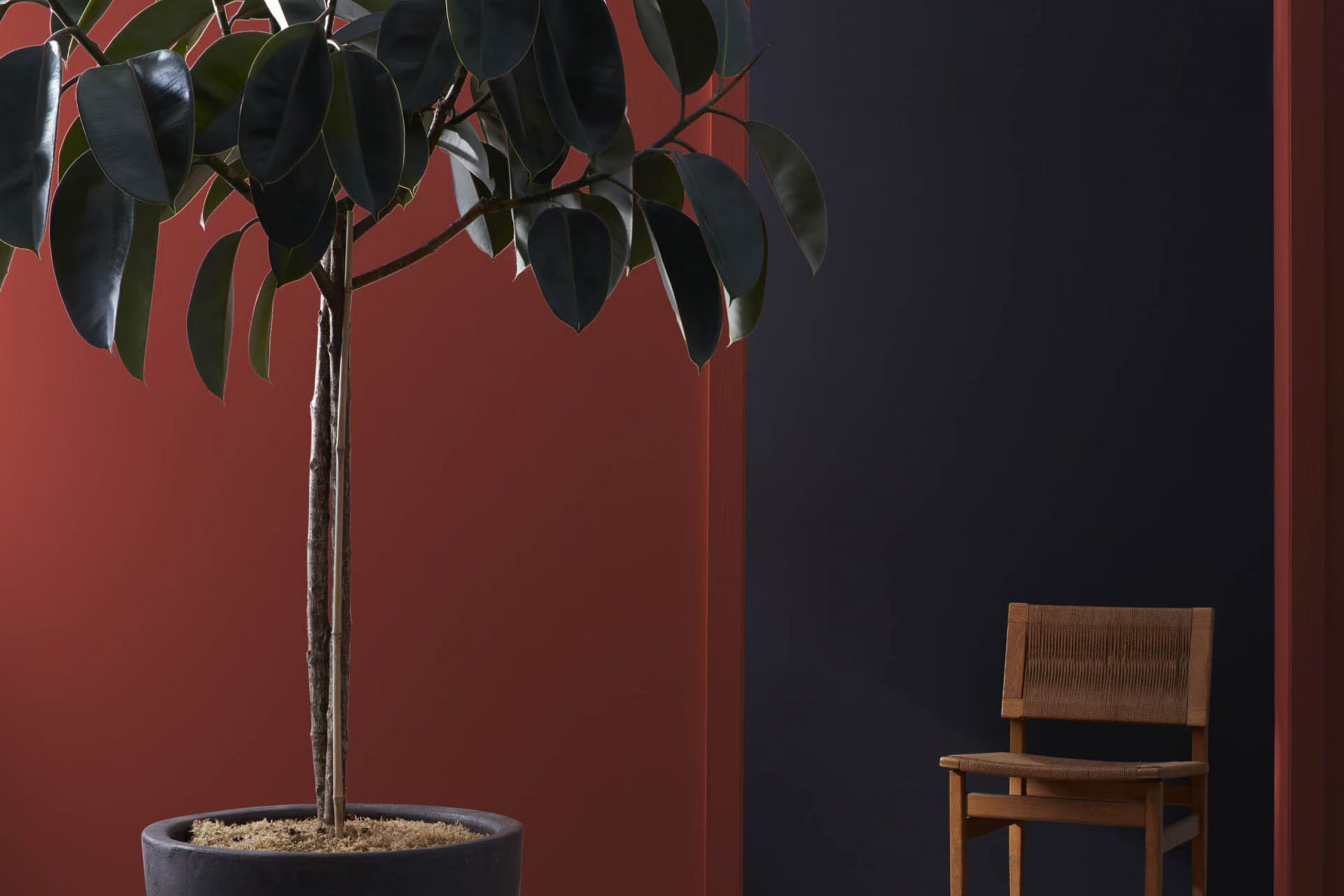
Cottage Red is a warm, deep red hue with rich, earthy undertones that give it a cozy and inviting feel. This color is flexible but particularly well-suited for styles that emphasize comfort and warmth, such as rustic, farmhouse, or traditional interiors. The depth of Cottage Red creates a grounding effect, making it ideal for creating a focal point in a room, whether on an accent wall or for cabinetry.
In terms of materials, Cottage Red pairs beautifully with natural wood, whether it’s a light pine or a dark walnut, enhancing the wood’s natural grain and bringing a sense of warmth to the room. It also goes well with textured fabrics like wool or linen, adding depth and interest to the decor. For a more polished look, incorporating leather furniture or details can complement the richness of the color while providing a touch of luxury.
Metals like brass or copper are excellent choices for hardware or decorative accents with Cottage Red. These metals add a subtle shimmer that contrasts nicely with the deep red, providing a pleasing aesthetic balance.
Overall, using Cottage Red in your home decor can create a warm, welcoming atmosphere that feels both grounded and stylish.
Is Cottage Red HC-184 by Benjamin Moore Warm or Cool color?
Cottage Red HC-184 by Benjamin Moore is a warm, inviting shade of red that brings a cozy and welcoming feel to any home. This color is fitting for those looking to add a touch of traditional charm to their room.
Its deep, rich hue works well in living rooms, dining areas, and even on exterior siding or doors to make a house stand out. Cottage Red is flexible enough to pair with neutral tones like whites and beiges, which helps to keep the room balanced and not feel too strong with color.
It also looks stunning when combined with natural wood elements, which can enhance the rustic appeal. When used in smaller rooms like entryways or bathrooms, it adds a dramatic flair without making the room feel closed in. Overall, Cottage Red is a great choice for adding warmth and character to a home environment.
Undertones of Cottage Red HC-184 by Benjamin Moore
Cottage Red by Benjamin Moore is a rich, warm red that brings a cozy and inviting atmosphere to any room. Understanding its undertones can help determine how this color will look in your room, as lighting and surrounding colors can strongly influence its appearance.
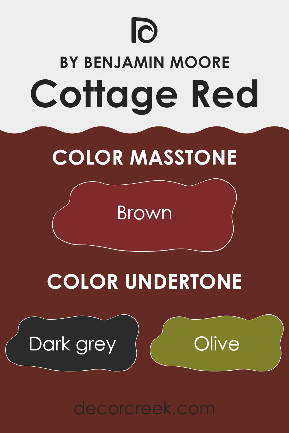
The undertones of Cottage Red are quite varied, including dark grey, olive, purple, dark green, navy, red, grey, dark turquoise, orange, pink, and pale pink. These undertones play a crucial role in how Cottage Red adjusts to different environments. For example, in a room with natural light, the orange and pink undertones might make the color appear softer and more vibrant. Meanwhile, in an area with less light, the dark grey or olive undertones could make it look more muted and grounded.
When applied to interior walls, the richness of Cottage Red, combined with its undertones, can make the room feel warm and welcoming. The red and orange undertones add warmth, making the area feel more intimate. In contrast, the cooler undertones like navy and dark green can help balance the warmth, ensuring the color doesn’t feel too heavy.
Overall, the mixture of undertones in Cottage Red allows it to be flexible yet impactful. Depending on the room’s lighting and the colors of the furnishings and decor, Cottage Red can either stand out as a bold focal point or blend into a softer, cozy background. This makes it an excellent choice for those looking to add both warmth and character to their interiors.
What is the Masstone of the Cottage Red HC-184 by Benjamin Moore?
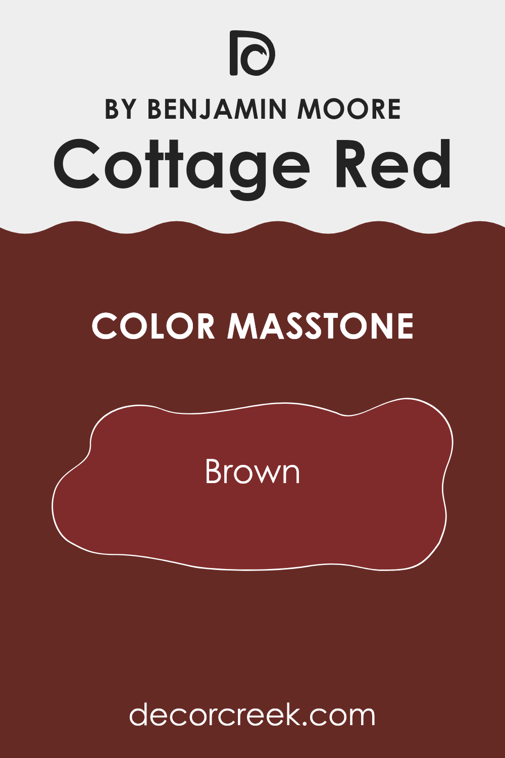
Cottage Red HC-184 by Benjamin Moore has a masstone of Brown (#802B2B), giving it a deep, warm tone that works well in home decor. The richness of this brown-based hue offers a welcoming feel, making it an ideal choice for areas where a cozy atmosphere is desired. This color works well in living rooms and dining areas, bringing a sense of warmth that encourages relaxation and conversation.
In smaller areas, such as a study or reading nook, Cottage Red adds depth and interest without feeling too strong. It pairs beautifully with natural materials like wood or leather, enhancing the overall look of traditional or rustic-style homes.
When used as an accent, this shade contrasts nicely with lighter colors, drawing the eye and adding character to the room. Overall, its earthy undertones provide a solid foundation for many design styles, promoting a comfortable and inviting environment.
How Does Lighting Affect Cottage Red HC-184 by Benjamin Moore?
Lighting plays a crucial role in how we perceive colors. The type of light and its intensity can make a significant difference in how a color appears. Cottage Red by Benjamin Moore is a rich, warm hue that can vary greatly depending on the lighting conditions.
In artificial light, Cottage Red tends to appear more vibrant and intense. Incandescent lighting, which has a yellowish cast, enhances the red tones, making the color appear warmer and cozier. Fluorescent lighting, on the other hand, can cast a slightly bluish tone, making the red appear less warm and slightly muted.
In natural light, the appearance of Cottage Red can change throughout the day. The quality of natural light differs depending on the direction a room faces and the time of day. In north-facing rooms, which receive less direct sunlight, Cottage Red may look more subdued and slightly darker, as the cooler, indirect light doesn’t bring out the warmth of the red as much.
South-facing rooms that get plenty of direct sunlight will showcase Cottage Red in its richest, most vibrant form. The direct light heightens the warm undertones, making the walls look lively and inviting.
In east-facing rooms, the morning light can make Cottage Red look exceptionally bright and fresh. As the light is warmer in the mornings, it complements the warm tones of the red. However, as the day progresses and the natural light diminishes, the color might lose some of its brightness and appear more muted.
West-facing rooms get the evening light, which is warmer. Cottage Red will look particularly intense and glowing in the late afternoon and evening in these rooms, offering a welcoming and cozy atmosphere that enhances relaxation and comfort as the day ends.
Understanding how lighting affects colors like Cottage Red can help in deciding where to apply this color and what kind of lighting to use, ensuring that you get the desired effect in your room.
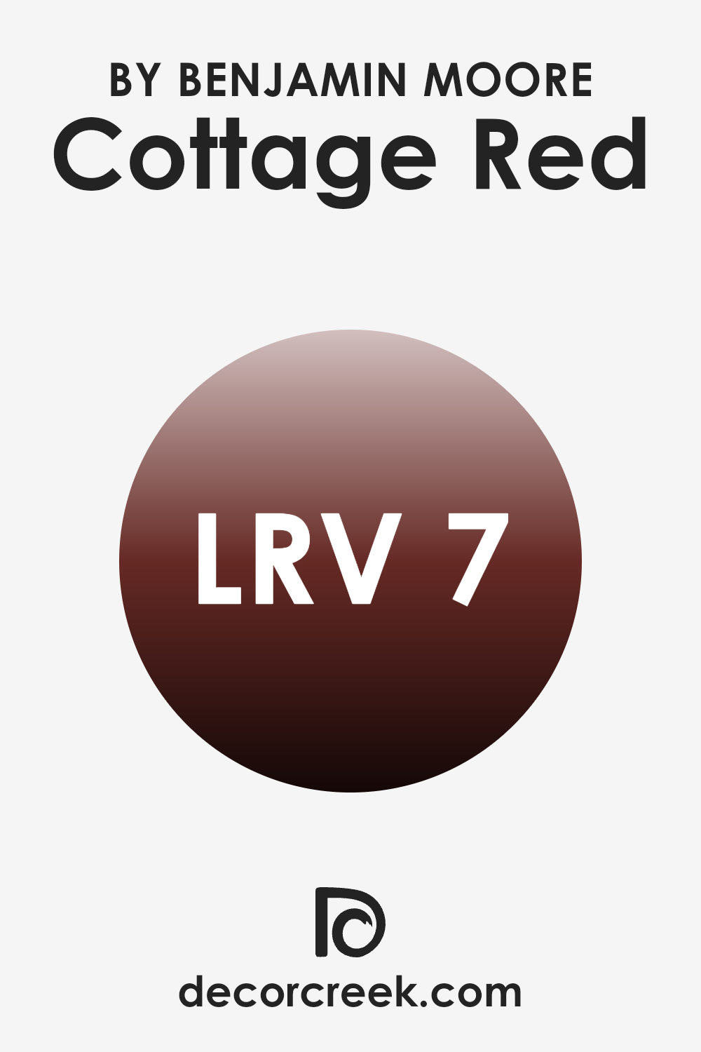
What is the LRV of Cottage Red HC-184 by Benjamin Moore?
LRV, or Light Reflectance Value, is a measure used to determine how much light a color reflects or absorbs. This scale runs from 1 (which absorbs most light and appears very dark) to 99 (which reflects most light and appears very bright).
Essentially, the LRV helps you understand how light or dark a paint color will look once it’s on your walls. A higher LRV means a lighter paint color that will make a room feel more open and airy, while a lower LRV means a darker color that can make an area feel cozier but smaller.
The LRV of Cottage Red (6.69) suggests that it is a darker color that will absorb much of the light, rather than reflecting it. In practical terms, when used on walls, this color could make a room feel more enclosed and intimate. It’s important to consider the amount of natural or artificial light in a room when choosing a color with a low LRV like this, as it can look even darker in poorly lit rooms. For those looking to create a warm, cozy atmosphere in a room, Cottage Red would be an appropriate choice, but it might not be ideal for making a small room appear larger.
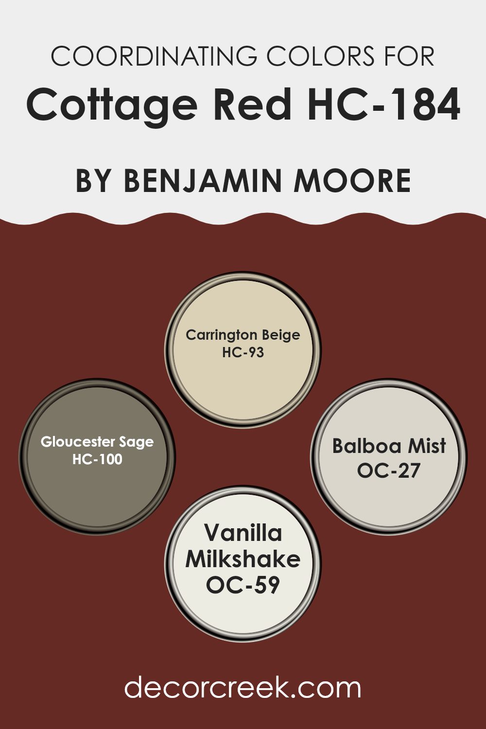
Coordinating Colors of Cottage Red HC-184 by Benjamin Moore
Coordinating colors are shades that complement each other well and create a balanced and harmonious look when used together in a design scheme. They typically share similar undertones or are placed thoughtfully on the color wheel to enhance their visual appeal when paired. For instance, Carrington Beige is a warm, muted beige tone that gives off a neutral and inviting feel, making it a great match for bolder shades. By offering a soft backdrop, it allows more intense colors to stand out without feeling too heavy.
Gloucester Sage, with its subtle, earthy green hue, brings a hint of nature and freshness to the palette, working beautifully to enhance the depth and complexity of richer colors. Balboa Mist offers a crisp and airy light gray that acts as a flexible neutral.
It provides a light contrast that is important for making vibrant colors pop while still maintaining a gentle room atmosphere. Vanilla Milkshake is a creamy off-white that adds a touch of brightness to any room, lending a soft touch that keeps the overall vibe cozy and welcoming. By selecting these coordinating colors, you create a cohesive and appealing color scheme that adds charm and character to any room.
You can see recommended paint colors below:
- HC-93 Carrington Beige
- HC-100 Gloucester Sage
- OC-27 Balboa Mist
- OC-59 Vanilla Milkshake
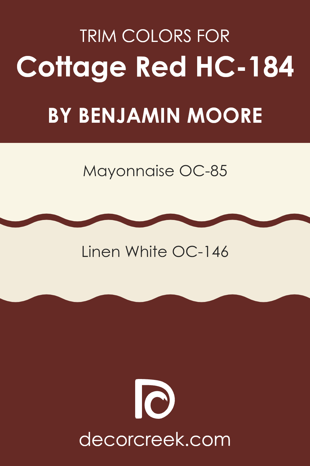
What are the Trim colors of Cottage Red HC-184 by Benjamin Moore?
Trim colors are the hues used for the decorative borders around windows, doors, and baseboards in a room or on the exterior of a building. They play an essential role in enhancing the overall aesthetic of a room by providing a contrast or complement to the main color on the walls.
When paired with a vibrant color like Cottage Red by Benjamin Moore, trim colors can help define architectural features and break up intense wall colors, giving a clean and polished look to the overall design.
For Cottage Red, using OC-85 Mayonnaise and OC-146 Linen White as trim colors is a great choice. Mayonnaise is a warm, creamy off-white that has a gentle presence, softening the boldness of Cottage Red while adding a cozy, inviting feel to the interior. Linen White has a slightly more natural, understated approach, imparting a subtle warmth that harmonizes beautifully with the deeper red, ensuring the room remains welcoming and grounded.
You can see recommended paint colors below:
- OC-85 Mayonnaise
- OC-146 Linen White
How to Use Cottage Red HC-184 by Benjamin Moore In Your Home?
Cottage Red HC-184 by Benjamin Moore is a warm and rich paint color that adds a cozy vibe to any room. It’s a deep red that can make a room feel welcoming and comfortable.
This color is great for a statement wall in a living room or dining room—it adds a burst of warmth and character without feeling too intense. It can also be used on the front door for a welcoming entrance, or on kitchen cabinets to create a homey, rustic look.
Since it’s a strong color, pairing it with lighter, neutral shades like creams or soft whites can keep a room from feeling too closed in. Also, wood furniture and natural textures like linen or wool look fantastic against this deep red, enhancing its cozy feel. For those who love a traditional look, Cottage Red is a perfect choice—it pairs especially well with other earthy tones and natural materials.
After learning about HC-184 Cottage Red by Benjamin Moore, I’m really impressed! It’s a paint color that looks like the cozy red you see on old farmhouses or classic barns. This color makes any house feel warm and welcoming, like a big hug. Whether you’re painting the outside of your home or just a special wall inside, Cottage Red adds a lovely touch of country charm without feeling too strong.
What’s great about this color is that it’s not just for old-style homes; it can look really nice on modern houses too. Plus, it’s the kind of red that goes well with lots of other colors. You can match it with soft whites, warm browns, or even deeper greens for a pleasing look.
Overall, HC-184 Cottage Red by Benjamin Moore is a great choice if you want to make your home look and feel cozy. It’s a friendly color that’s easy to like and easy to live with. So if you’re thinking about adding a splash of color to your place, Cottage Red might just be the perfect pick to make your home stand out and feel extra special!
Ever wished paint sampling was as easy as sticking a sticker? Guess what? Now it is! Discover Samplize's unique Peel & Stick samples.
Get paint samples

