When I decided to give my living room a fresh coat of paint, I came across OC-59 Vanilla Milkshake by Benjamin Moore. This creamy off-white color has a soft, warm tone that creates a cozy and welcoming atmosphere. As someone who spends a lot of time in my living room, whether for hosting friends or unwinding after a long day, choosing the right color was important to me.
The gentle hue of Vanilla Milkshake adds just enough warmth to the room without overpowering it. It’s adaptable, pairing well with a variety of decor styles and colors. I noticed that when the sunlight hits the walls, the color subtly shifts, reflecting a comforting, almost soothing quality that makes the room feel more intimate.
What I appreciate most about OC-59 is how it serves as a perfect backdrop for artwork and furniture. It complements bold colors and helps accent pieces stand out. Whether it’s a vibrant painting or a simple, elegant sofa, everything looks great against this smooth, creamy shade.
So, if you’re thinking about refreshing your room, Vanilla Milkshake might be the color to bring that warm, inviting look you’re aiming for.

What Color Is Vanilla Milkshake OC-59 by Benjamin Moore?
Vanilla Milkshake is a warm, creamy white color that brings a cozy and inviting feel to any room. This hue exudes a soft elegance, making it a perfect neutral backdrop that doesn’t feel stark or cold. It’s adaptable enough to work in a variety of interior styles, from modern to traditional, and particularly shines in farmhouse and shabby chic aesthetics.
In terms of compatibility, Vanilla Milkshake pairs beautifully with natural materials like wood, adding a gentle contrast to rich, dark stains or a smooth complement to lighter, washed woods.
When combined with textiles, it works well with soft linens and chunky knits, enhancing the textures without overpowering them. This color also matches ideally with metallic finishes such as brushed gold or copper, bringing out their warm undertones.
Ideal for living areas, bedrooms, and kitchens, Vanilla Milkshake can help brighten rooms subtly while providing a nurturing atmosphere. Its creamy nature means it reflects light gently around the interior, making it a superb choice for areas that receive less natural light.
Pairing it with pastel colors, such as soft blues and gentle greens, can create a calm yet cheerful palette, suitable for places where you wish to relax and unwind.
Is Vanilla Milkshake OC-59 by Benjamin Moore Warm or Cool color?
Vanilla Milkshake OC-59 by Benjamin Moore is a warm and inviting paint color that works wonderfully in homes. With its creamy white hue, it offers a subtle touch of coziness that makes rooms feel more welcoming and comfortable.
This color is highly adaptable and can be used in various areas, whether you want to freshen up a living room, bedroom, or kitchen. Because of its neutral tone, it pairs nicely with a wide range of colors and decor styles, from modern and minimalist to rustic and traditional.
Using Vanilla Milkshake on walls can help make a small room look larger and brighter as it reflects light well. This is particularly helpful in rooms that don’t receive a lot of natural sunlight.
Additionally, its softness allows for easy transitions when incorporating different textures or design elements, ensuring everything in the room comes together harmoniously. This makes it a solid choice for anyone looking to create a cozy, stylish home environment.
Undertones of Vanilla Milkshake OC-59 by Benjamin Moore
Vanilla Milkshake is an adaptable paint color that can subtly change its appearance depending on the lighting and surrounding colors due to its complex undertones. Undertones are the hint of color that is present in the paint besides the main color, affecting how we perceive the color in various settings.
The undertones in Vanilla Milkshake include pale yellow, light blue, light purple, mint, pale pink, lilac, and grey. These undertones can make the color appear cooler or warmer. For example, in a room with lots of natural light, the pale yellow and pale pink undertones might make the walls seem warmer and more welcoming.
On the other hand, in an area with less natural light, the grey and light blue undertones could give a more muted and calm appearance. When using Vanilla Milkshake on interior walls, it’s important to consider these undertones because they can influence the feeling of a room.
Light blue and mint undertones can give a fresh and airy mood, perfect for a bathroom or kitchen, while the lilac and light purple might enhance a bedroom, providing a gentle and restful backdrop. By choosing furniture and decorations that complement these undertones, you can really bring out the best in Vanilla Milkshake.
Soft textures and materials work well with its creamy and smooth nature, making any room feel cozy and nicely put together. Remember, the surrounding colors and lighting play significant roles in how these undertones reveal themselves.
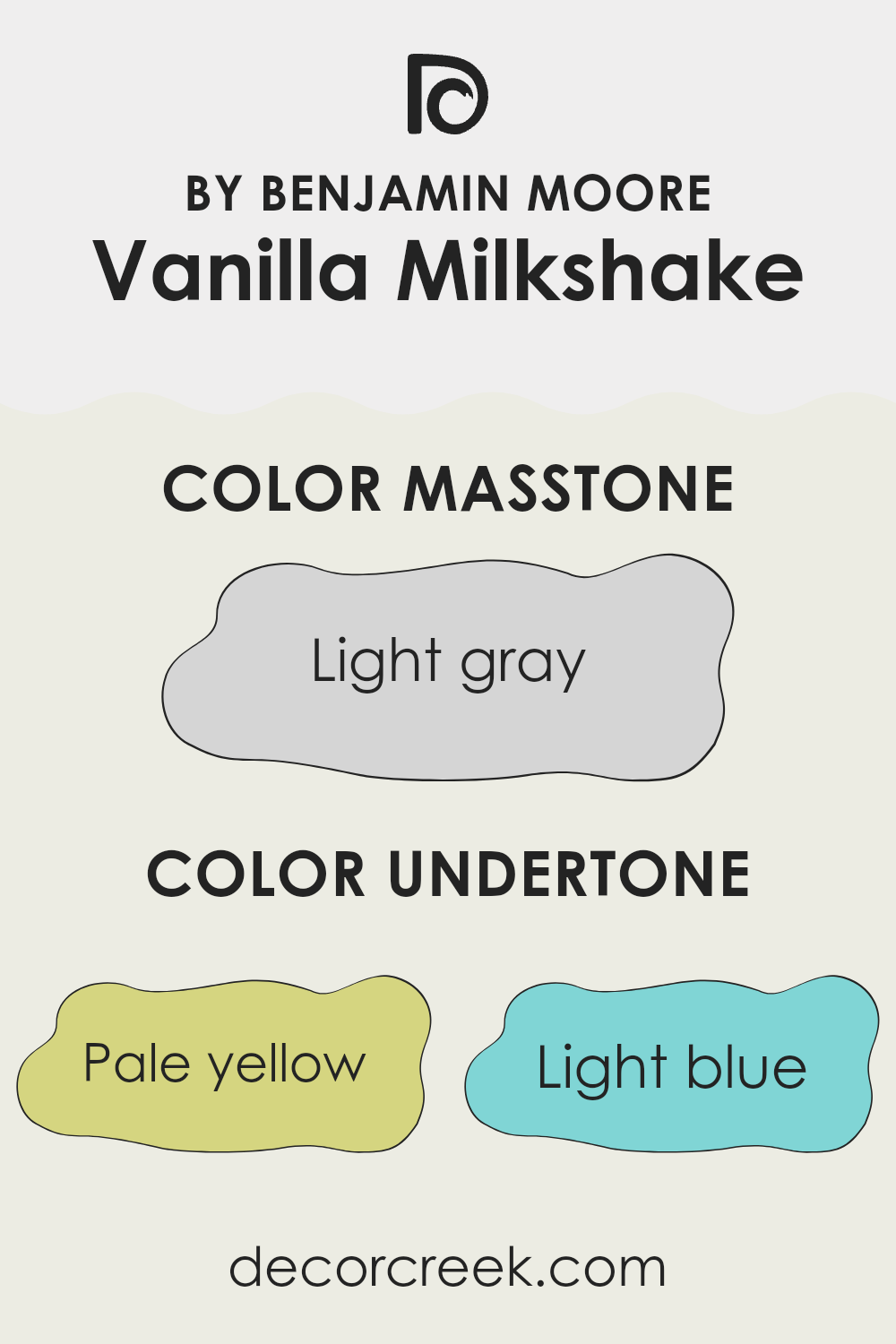
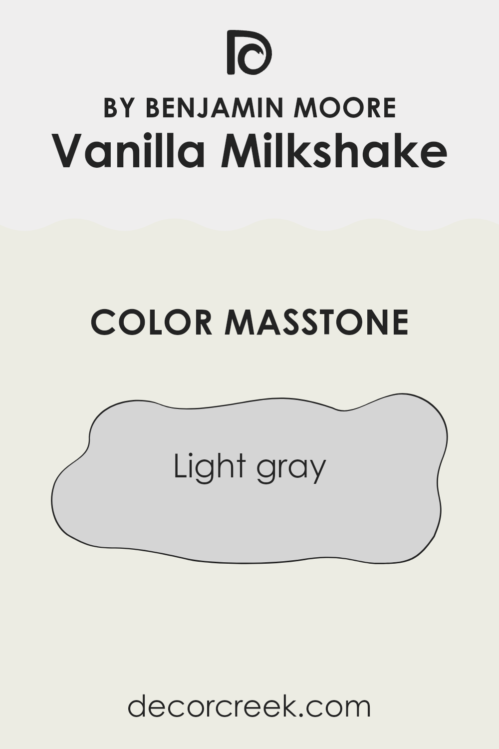
What is the Masstone of the Vanilla Milkshake OC-59 by Benjamin Moore?
Vanilla Milkshake OC-59 by Benjamin Moore has a masstone of light gray, a tone that brings a fresh and airy feel to any room. This color is adaptable, easily pairing with a wide range of decor styles and other colors, making it a practical choice for various areas in a home. Its neutral hue helps in creating a calm atmosphere, which is perfect for places like bedrooms and living rooms where relaxation is key.
The subtle brightness of the light gray can also make smaller areas appear larger and more open, an ideal quality for apartments or rooms with limited square footage. Furthermore, this color is excellent at hiding small imperfections on walls due to its light-reflecting properties, ensuring that the walls look smooth and even.
Overall, Vanilla Milkshake OC-59 offers a simple yet effective way to refresh a home’s interior, providing a clean and light background that supports both functional living and aesthetic appeal.
decorcreek.com
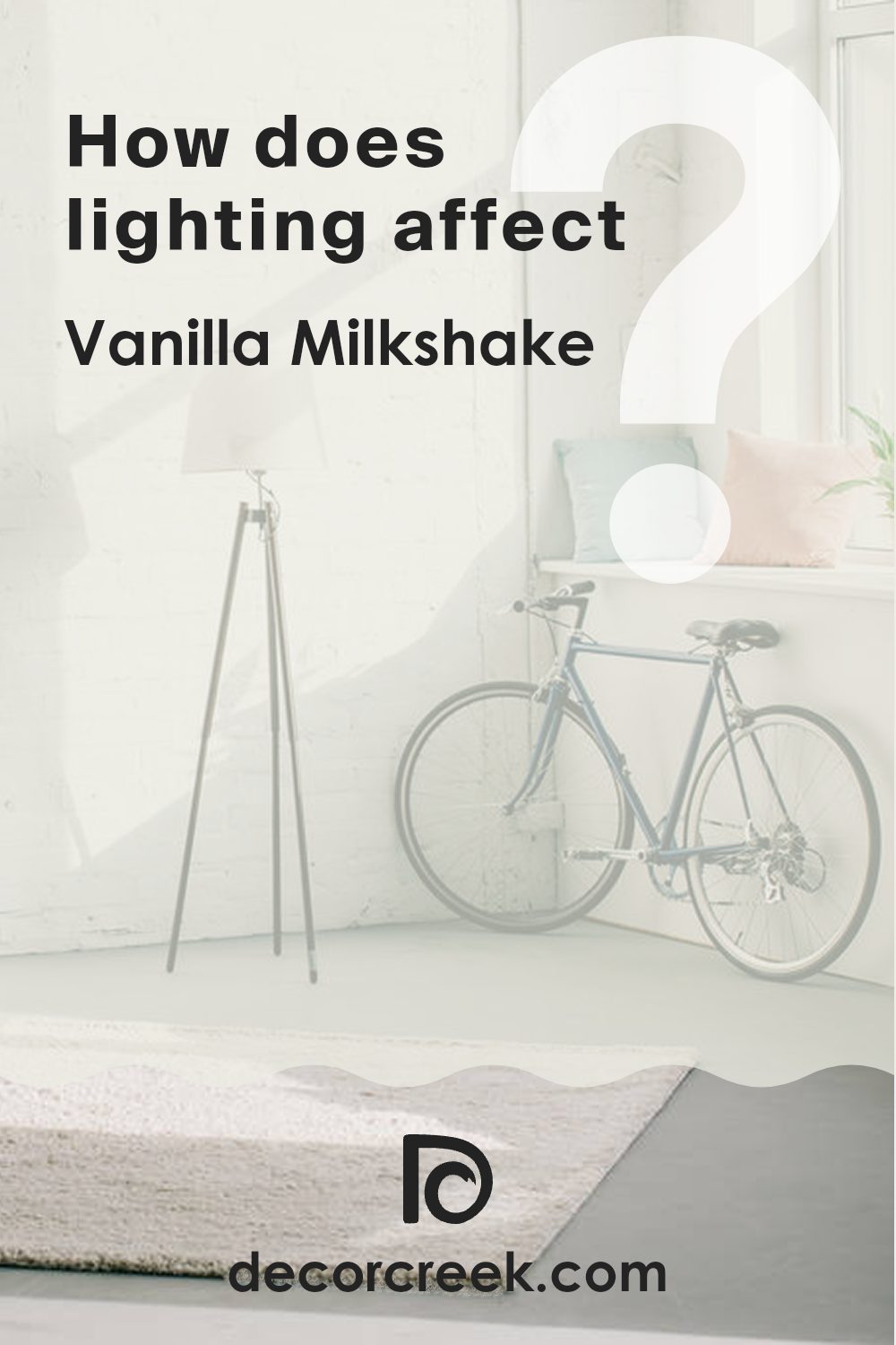
How Does Lighting Affect Vanilla Milkshake OC-59 by Benjamin Moore?
Lighting plays a crucial role in how we perceive colors in our surroundings. Different types of light can make the same color look different. For example, Vanilla Milkshake by Benjamin Moore, a creamy white hue, can appear differently under various lighting conditions.
In natural light, Vanilla Milkshake tends to show its true tone. Natural light, especially sunlight, is full-spectrum, meaning it includes all colors, so it doesn’t change the appearance of shades too much. Under natural light, Vanilla Milkshake looks bright and true to its creamy white character.
However, in artificial light, the tone can change depending on the type of bulb used. Warm light bulbs (like incandescent ones) might make Vanilla Milkshake appear more yellow or warmer, because these lights have a yellowish hue. Cool light bulbs (like some LEDs or fluorescent bulbs) can make it look slightly bluer or cooler, which might make the color appear crisper.
The direction your room faces also affects how Vanilla Milkshake looks. In north-facing areas, which get less direct sunlight and tend to have a cooler light, this shade might look more muted and slightly greyish. The cooler tone of the light can make the room feel less warm.
In south-facing areas, where there is abundant sunlight throughout the day, Vanilla Milkshake will look warmer and more vibrant. The natural warmth and brightness of the sun will enhance the creamy qualities of the color, making the room feel more welcoming.
East-facing areas receive a lot of light in the morning, which is generally warm and bright. Here, Vanilla Milkshake will look soft and bright in the morning but might lose some vibrancy in the afternoon as the natural light dims.
Similarly, in west-facing areas, the color will look more subdued in the morning but gain warmth and intensity in the evening as the sun sets, bringing in redder and warmer light.
So, when considering painting your room with Vanilla Milkshake, think about your lighting conditions at different times of the day to understand how it will influence the mood and look of the area.
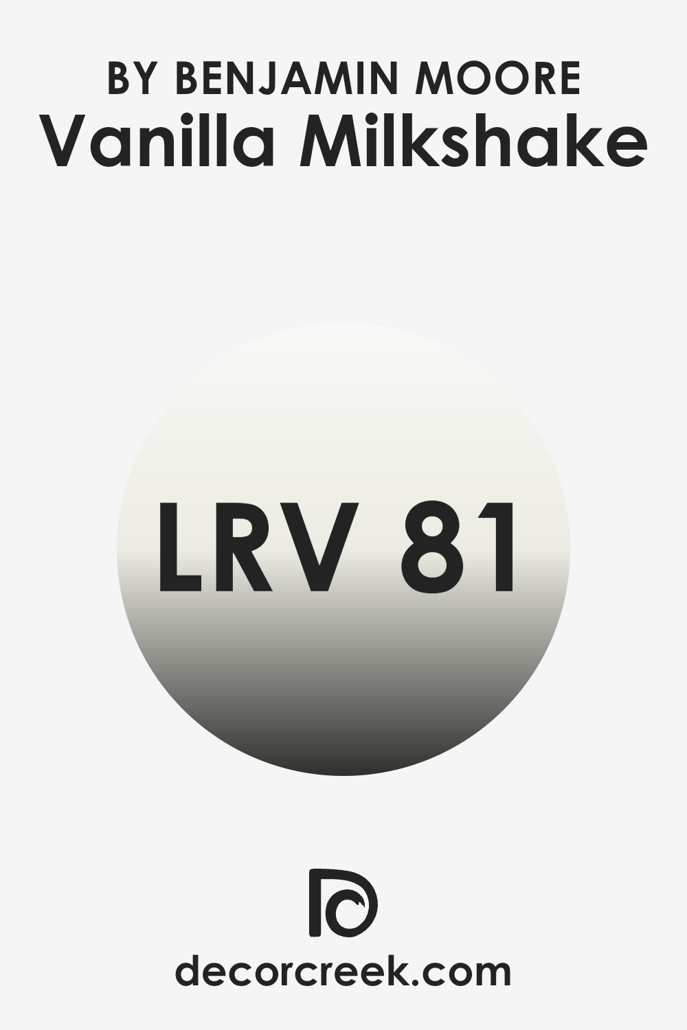
What is the LRV of Vanilla Milkshake OC-59 by Benjamin Moore?
LRV, or Light Reflectance Value, is a measure used to describe the amount of visible light a paint color reflects when it’s on your walls. This scale runs from 1 to 100, where 1 is the darkest, absorbing most light, and 100 is the brightest, reflecting most of it.
LRV is very useful for choosing paint colors because it tells you how light or dark a color will appear under various lighting conditions. A higher LRV can make a room feel more open and airy as it reflects more light around the area, while a lower LRV can make it feel cozier and more enclosed because it absorbs more light.
The LRV of Vanilla Milkshake, which is 80.97, means it is a very light color that will reflect a lot of light. This makes it a great choice for making smaller or darker rooms appear brighter and more open. Since this color reflects a lot of light, it can also help in reducing the need for artificial lighting during the day, which can be a practical and energy-efficient choice.
Furthermore, such a high LRV can help in maintaining a cooler temperature in the room, as lighter colors absorb less heat. This characteristic makes Vanilla Milkshake an excellent option for creating a light and refreshing atmosphere in any area.
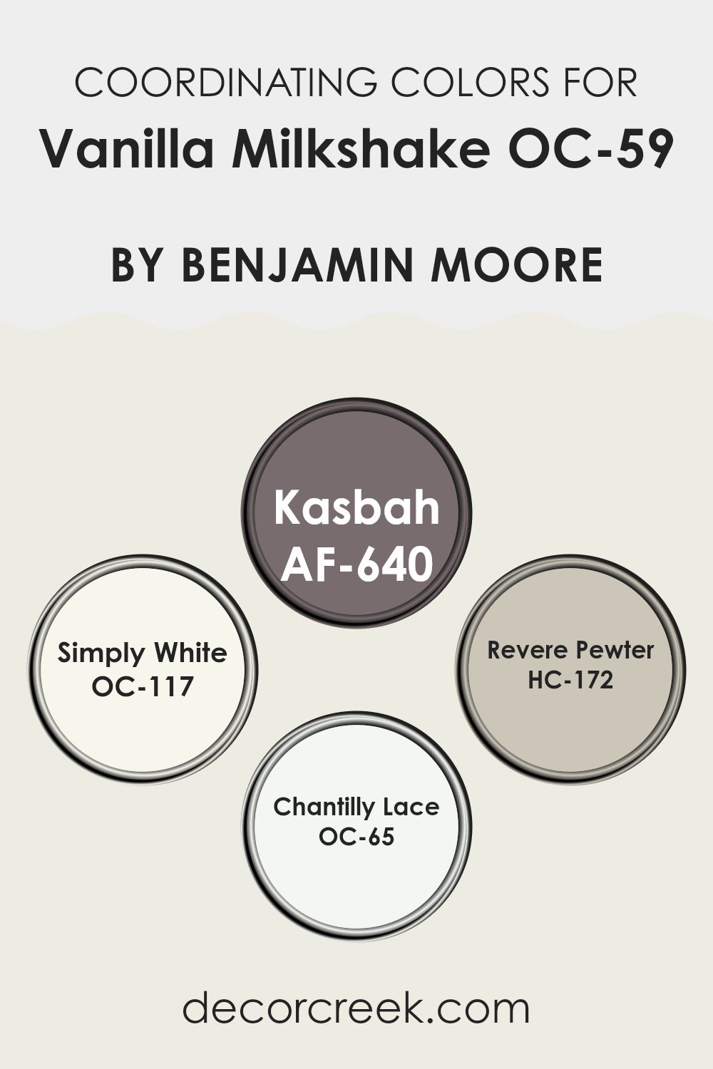
Coordinating Colors of Vanilla Milkshake OC-59 by Benjamin Moore
Coordinating colors work together to create a harmonious look in any room, enhancing the overall aesthetic and bringing balance through color relationships. When using a neutral base like Vanilla Milkshake OC-59 by Benjamin Moore, which is a soft, creamy white, coordinating colors can add depth and diversity to your decor without overpowering the simplicity of the main shade.
These complementary tones range from subtle neutrals to more defined hues, each selected to create a cohesive look while allowing room for personal style expression. Kasbah AF-640 is a deep, earthy taupe that provides a strong contrast against lighter hues, perfect for accent walls or furniture pieces.
Simply White OC-117, another coordinating tone, is a clean and refreshing white that brings out the brightness in Vanilla Milkshake, making rooms seem more open and light-filled. Revere Pewter HC-172 offers a warm, light gray balance, acting as an adaptable midpoint between the lighter and darker shades in the palette.
Finally, Chantilly Lace OC-65 is an ultra-pure white that can be used on trim or ceilings, enhancing the subtle undertones of the other tones, and making the room appear more crisp and well-defined. Together, these shades provide a variety of options that work well with Vanilla Milkshake, allowing for flexibility in design while maintaining an inviting and balanced atmosphere.
You can see recommended paint colors below:
- AF-640 Kasbah
- OC-117 Simply White
- HC-172 Revere Pewter
- OC-65 Chantilly Lace
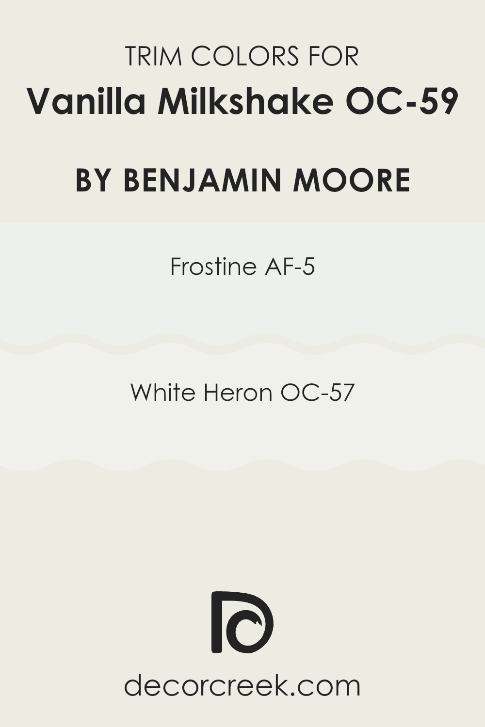
What are the Trim colors of Vanilla Milkshake OC-59 by Benjamin Moore?
Trim colors are specific shades used to accentuate or contrast the primary tones on walls, highlighting architectural details such as door frames, window sills, and baseboards. Choosing the right trim color can enhance the overall look of a room by defining areas and creating a clean, polished finish.
For a tone like Vanilla Milkshake by Benjamin Moore, which is a warm and inviting neutral, trim colors like AF-5 – Frostine and OC-57 – White Heron are excellent choices. These hues complement the creamy quality of Vanilla Milkshake well, providing a gentle differentiation that helps the wall color stand out more effectively.
AF-5 – Frostine is a soft off-white with a hint of cool undertones that brings a fresh and airy feeling to any room. It pairs beautifully with neutral or warm shades, making it a great companion for Vanilla Milkshake as it adds a crisp edge without overpowering the main tone.
On the other hand, OC-57 – White Heron is a clean and bright white that offers a sharper contrast, which can be particularly appealing in more modern or minimalist designs. This color highlights the architectural features of a room, ensuring that every detail stands out against the softer background of Vanilla Milkshake. Together, these trim tones provide adaptable options that can help shape the overall look of your interior to your taste.
You can see recommended paint colors below:
- AF-5 Frostine
- OC-57 White Heron
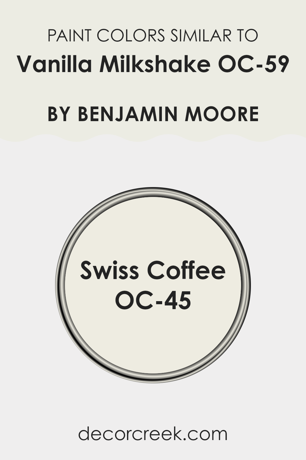
Colors Similar to Vanilla Milkshake OC-59 by Benjamin Moore
Similar colors play a crucial role in interior design by creating a cohesive and harmonious mood in living areas. When tones have close shades or undertones, such as Vanilla Milkshake OC-59 and Swiss Coffee OC-45 by Benjamin Moore, they allow for a smooth visual flow from one area to another. These hues are particularly useful in open layouts or smaller rooms where continuity can make the area appear larger and more unified.
Additionally, using similar tones can be very forgiving for decorators who may hesitate to choose bold colors. The subtle differences between close shades can also add a layer of depth and charm to interiors without becoming too strong visually.
Swiss Coffee OC-45 is a soft off-white with a gentle warmth that makes it perfect for creating a cozy and inviting atmosphere. Its slightly creamy character helps to soften the edges of a room and works beautifully in places that aim to maintain a light and airy feeling. On the other hand, Vanilla Milkshake OC-59 brings a slightly brighter and crisper look, offering a clean backdrop that is adaptable for many decor styles and settings.
This color’s light-reflective quality can help brighten a small room or an area with limited sunlight, making it appear more open and welcoming. Together, these shades create a unified color palette that feels both elegant and practical for daily living.
You can see recommended paint color below:
How to Use Vanilla Milkshake OC-59 by Benjamin Moore In Your Home?
Vanilla Milkshake OC-59 by Benjamin Moore is a gentle off-white paint that gives a soft and clean look to any room in your home. Its subtle hue works well in rooms that get a lot of sunlight, as it reflects light beautifully, making the area look brighter and more inviting.
This tone is adaptable and can be used on walls in your living room, bedroom, or even kitchen. It pairs well with many shades, allowing you to add darker furniture or colorful decor pieces to create a pleasant contrast. If you’re considering a quick refresh in your home, painting your bathroom or even just one accent wall in Vanilla Milkshake can give the area a fresh look.
The color is also a great pick for trim or cabinets if you want a cohesive look throughout your home without relying on stark whites. It’s an easy choice for anyone looking to add a touch of simplicity and cleanliness to their living area.
Vanilla Milkshake OC-59 by Benjamin Moore vs Swiss Coffee OC-45 by Benjamin Moore
Vanilla Milkshake and Swiss Coffee are two subtle paint colors by Benjamin Moore, each offering a unique nuance to an area. Vanilla Milkshake is a soft, creamy white with a warm undertone that makes rooms feel cozy and welcoming. It’s perfect for places where you want a gentle hint of color while keeping a light and open feel.
In contrast, Swiss Coffee is a bit deeper and richer than Vanilla Milkshake. It also leans toward a warm palette but has more depth, bringing a slightly more defined color presence to walls. It works beautifully in areas that need a touch more warmth without becoming too strong or intense.
When used indoors, both shades provide a clean, fresh backdrop, but the choice between them depends on how much warmth and depth you want to include. While both are excellent options for creating a calm and comfortable setting, Vanilla Milkshake is ideal for those who prefer a lighter, almost airy mood, whereas Swiss Coffee suits those looking for a bit more coziness and richness.
You can see recommended paint color below:
After reading all about OC-59 Vanilla Milkshake by Benjamin Moore, I’m convinced that it’s an excellent paint color for giving rooms a fresh look. This shade has a warmth to it that makes any room feel cozy and inviting, like your favorite sweater or a warm hug. It’s easy to see why it’s a popular choice for many homes.
Vanilla Milkshake isn’t just a plain white; it has creamy undertones that keep it from feeling too stark or bright. It’s perfect for those who want a white interior without it feeling too cool. This paint can brighten a dark room or make a small area appear more open.
Whether it’s used in a lively living room, a calm bedroom, or even a bathroom, OC-59 Vanilla Milkshake brings a soft warmth that’s easy to love. It pairs well with many other shades, so you’re free to experiment with different looks. You can add colorful decor or furniture to make each room distinct.
In summary, OC-59 Vanilla Milkshake by Benjamin Moore is a wonderful option for anyone hoping to give their home a warm and welcoming look. It’s more than just a white tone; it’s a background that lets other colors stand out and creates a comfortable area to live in. It’s truly a shade many people would enjoy having in their homes.
Ever wished paint sampling was as easy as sticking a sticker? Guess what? Now it is! Discover Samplize's unique Peel & Stick samples.
Get paint samples

