This color isn’t just another shade of white; it has a subtle richness that adds depth to any space.
Unlike stark whites that can sometimes feel cold and impersonal, Creamy White offers a gentle brightness that makes rooms feel inviting and cozy. It sits beautifully on walls, creating a soothing backdrop that complements a variety of furniture and decor styles.
In my home, I found it perfect for both modern and traditional settings. Its soft undertones bring out the best in natural light, making each room feel more open and airy. What I love most about OC-7 Creamy White is how it harmonizes with other colors.Whether pairing it with bold accent colors or keeping things more neutral, this shade adapts wonderfully.
It’s a reliable choice for any area of the house, from the living room to the bedroom.
In short, OC-7 Creamy White is all about creating a welcoming and stylish atmosphere that truly feels like home.
What Color Is Creamy White OC-7 by Benjamin Moore?
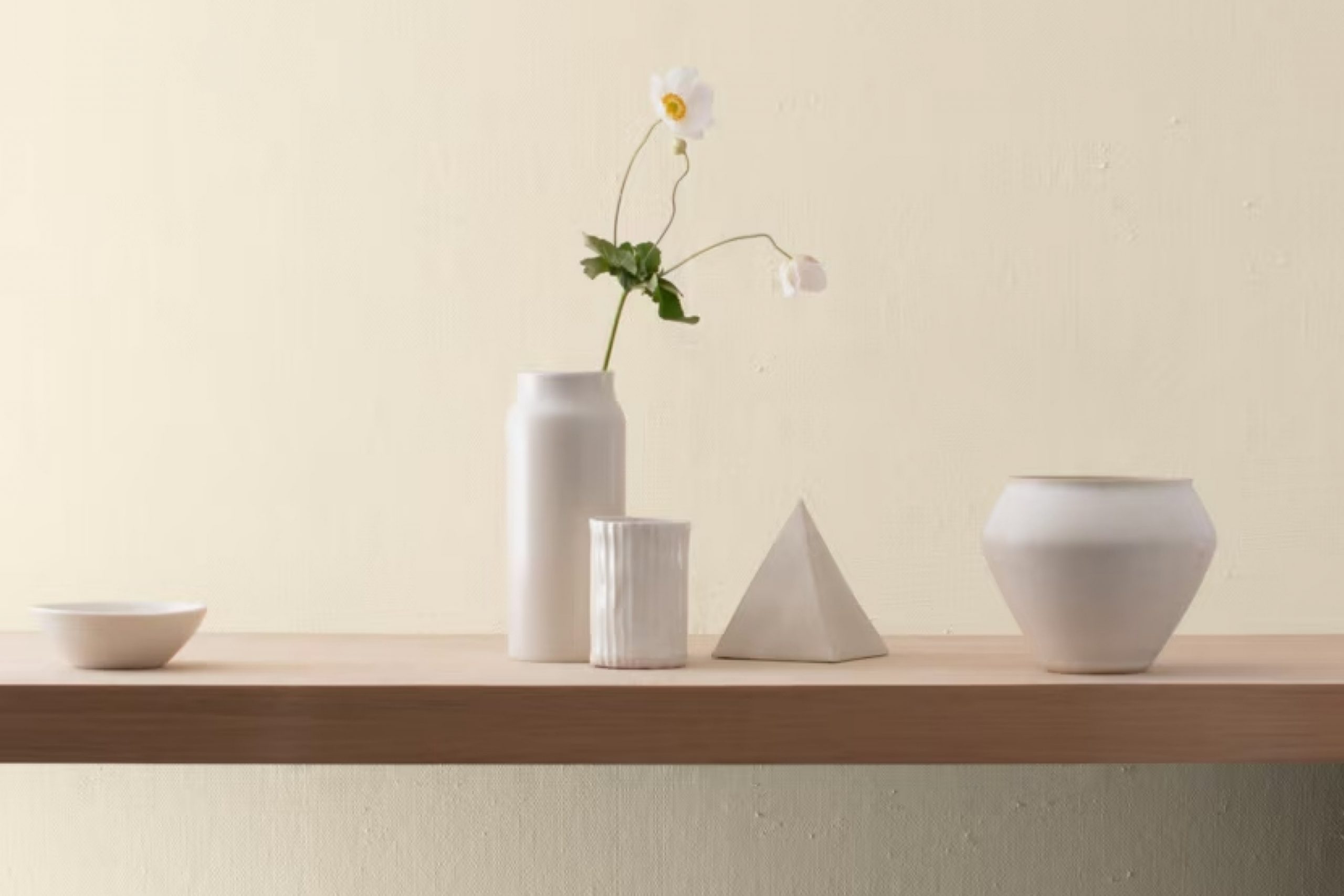
Creamy White OC-7 by Benjamin Moore is a warm, soft white with a hint of creamy beige. It feels gentle and inviting, making it a popular choice for various spaces in the home. This color works beautifully in traditional and modern interiors alike, providing a versatile backdrop for any room.
In a traditional setting, Creamy White can highlight architectural details and blend harmoniously with classic furnishings. It pairs nicely with dark woods and rich fabrics, offering a lovely contrast.
In more contemporary or minimalist spaces, this shade can soften the starkness often associated with modern design, working well with metals, glass, and sleek furniture.
This warm white can also enhance cozy, rustic styles. It complements natural materials like stone, exposed brick, and reclaimed wood, adding warmth and brightness.
For farmhouse or cottage aesthetics, use Creamy White as a main wall color and pair it with soft blues, greens, or dusty pinks for a charming, homey look.
When it comes to textures, Creamy White is highly adaptable. It pairs well with plush textiles like wool and linen, as well as with smooth surfaces like polished marble and ceramic tiles. This makes it an excellent choice for creating inviting and comfortable spaces in any home.
Is Creamy White OC-7 by Benjamin Moore Warm or Cool color?
Creamy White OC-7 by Benjamin Moore is a warm, versatile paint color that fits well in various home settings. It provides a subtle, soft backdrop that can make spaces feel welcoming and cozy. This shade works well in both traditional and modern decor, allowing furniture and other decor elements to stand out.
Because of its warm undertones, it adds a sense of comfort to living rooms, bedrooms, and kitchens. Its neutral quality makes it an excellent choice for walls, as it complements a wide range of accent colors.
In rooms with natural light, Creamy White OC-7 can reflect the sunlight, adding brightness and warmth. In dimmer areas, it maintains its cozy appeal without feeling stark or cold. This color is particularly effective in open-plan spaces, where it can create a uniform look without being overwhelming.
Overall, Creamy White OC-7 offers a perfect balance of warmth and neutrality, making it a popular choice for many homeowners.
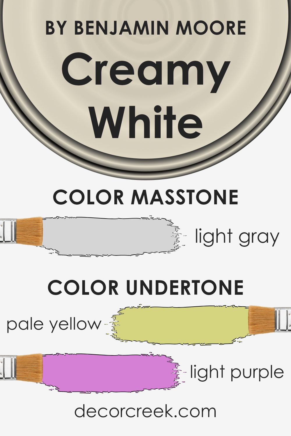
Undertones of Creamy White OC-7 by Benjamin Moore
When you look at Creamy White OC-7 from Benjamin Moore, it seems like a simple shade of white. But the undertones make it special. This color has hints of pale yellow, which makes it feel warm and soft. The touch of light purple introduces a gentle, almost romantic feeling, while the light blue adds a sense of calm and freshness.
There’s also pale pink, which adds a bit of warmth and approachability. Mint gives a hint of coolness, making the color feel more balanced. Lilac and grey add depth and a hint of sophistication without being too obvious.
Undertones are important because they can change how we perceive a color, especially under different lighting conditions. For example, in a room with a lot of natural sunlight, Creamy White OC-7 might appear warmer, with the yellow and pink undertones becoming more noticeable. In a shaded or north-facing room, the cooler blue and mint undertones might come forward, making the space feel calm and refreshing.
On interior walls, Creamy White OC-7 creates a versatile backdrop that can work well with various decor styles. Its subtle undertones allow it to complement both warm and cool color schemes, making it a flexible choice for any room.
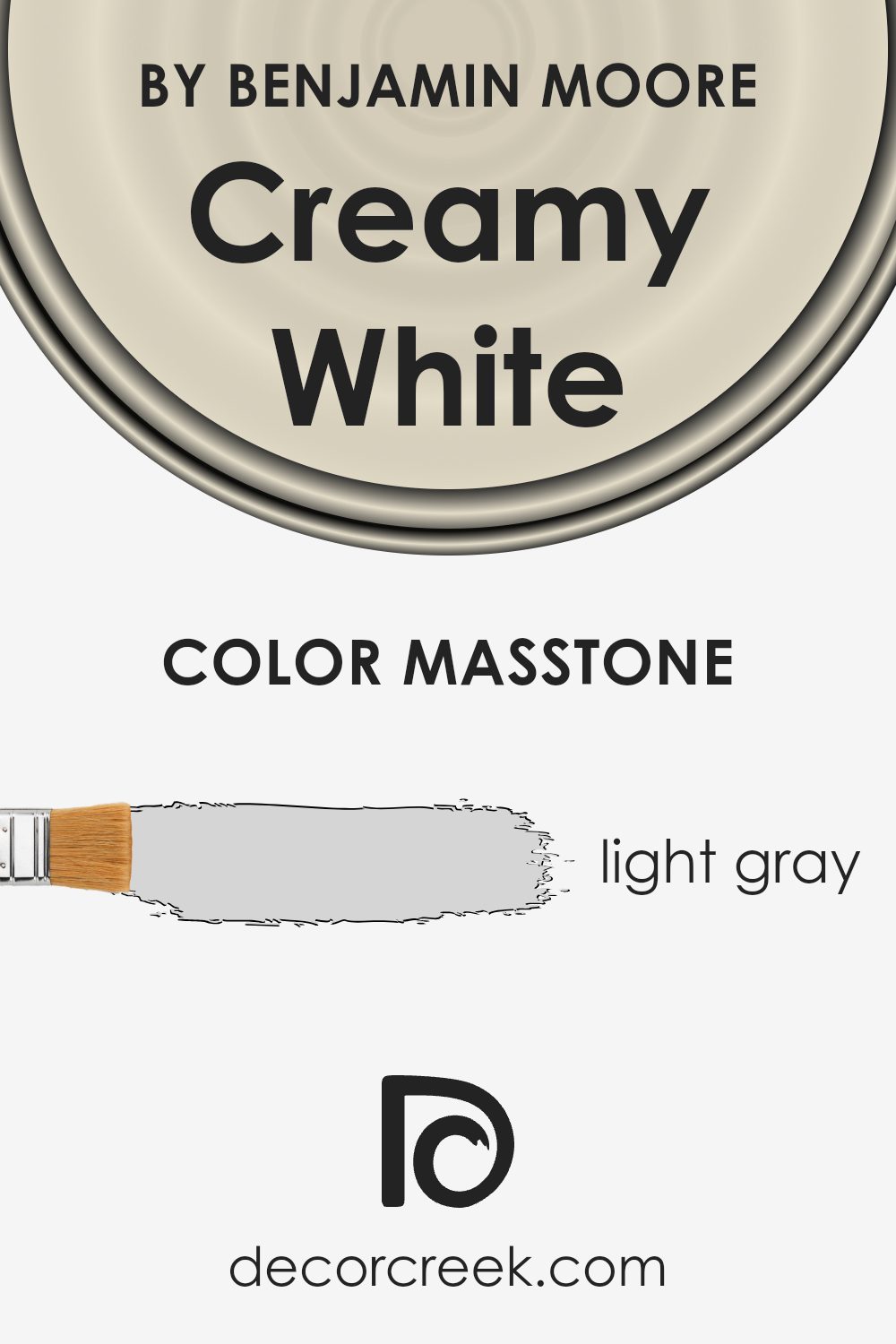
What is the Masstone of the Creamy White OC-7 by Benjamin Moore?
Creamy White OC-7 by Benjamin Moore, with its light gray undertone (#D5D5D5), brings a subtle and refined touch to home interiors. This soft gray masstone brightens spaces without overpowering them, making rooms feel open and airy.
The neutral tone is versatile, blending well with both modern and traditional design elements. Its understated appearance pairs nicely with a variety of colors, allowing furniture and décor to stand out while maintaining harmony.
In rooms where natural light is abundant, this color can create a warm and inviting atmosphere, as it reflects light softly around the room. In dimly lit areas, it maintains a cozy feel, making it suitable for any room in the house. Its adaptability makes it an excellent choice for those who want to maintain a cohesive look throughout their home, as it can easily move between different styles and spaces without looking out of place.
How Does Lighting Affect Creamy White OC-7 by Benjamin Moore?
Lighting plays a significant role in how we perceive colors. Different types of light can change the way a color looks, which is important to consider when choosing paint for your home.
The color “Creamy White” by Benjamin Moore, also known as OC-7, is a soft, off-white shade. Its appearance can shift depending on the lighting it is exposed to. In natural light, especially if it is abundant, Creamy White tends to look bright and airy.
However, in artificial lighting, such as incandescent bulbs, the color might appear warmer and slightly yellower.
In north-facing rooms, which typically receive cooler, indirect light, Creamy White can take on a slightly grayer or cooler undertone. This might make the room feel a bit more subdued but still pleasant.
In south-facing rooms, which get the most sunlight, Creamy White will appear warm and creamy as it reflects the abundant natural light. This can make the room feel inviting and comforting throughout the day, as it captures the full warmth of the sun.
East-facing rooms get direct morning sunlight that is warm and shadowy afternoon light that is cooler. In the morning, Creamy White might look warm and glowy, and later switch to more neutral or cooler tones as the day progresses.
West-facing rooms receive warm afternoon and evening light, which will enhance the creaminess of Creamy White, making it appear rich and enveloping as the sun moves toward the horizon.
When selecting a color like Creamy White, consider how light in your room changes throughout the day and seasons. Similarly, use samples on multiple walls, and observe how the color changes with natural and artificial light to make an informed decision. Understanding these changes helps you choose the best color for your space.

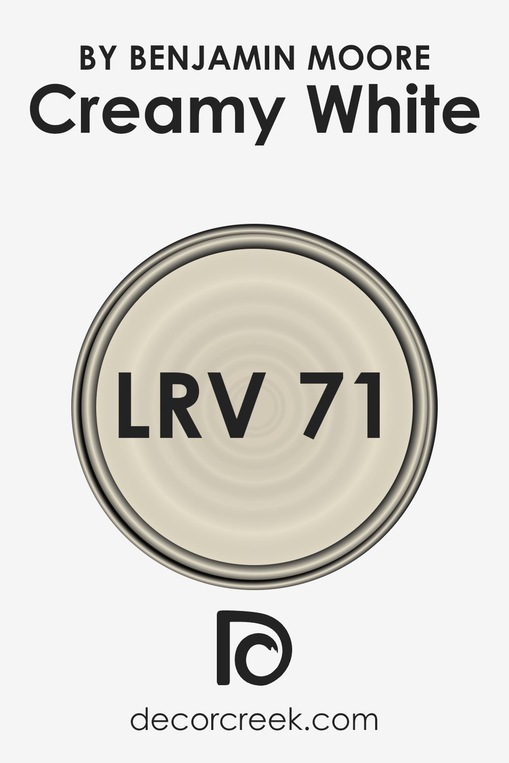
What is the LRV of Creamy White OC-7 by Benjamin Moore?
LRV stands for Light Reflectance Value, which is a measure used to describe the amount of visible and usable light that reflects from a painted surface when it is illuminated by a light source. The LRV scale ranges from 0, which represents absolute black and absorbs all light, to 100, indicating pure white, which reflects all light.
The higher the LRV, the more light is reflected off the surface. This concept is critical when choosing paint colors, as it helps in predicting how light or dark a color will appear and how it affects the lightness of a room.
If a room receives a lot of natural light, a color with a high LRV can appear much brighter, whereas in a dimmer room, it can help make the space feel more open and airy.
For a color like Creamy White OC-7, which has an LRV of 70.95, this means it will reflect a substantial amount of light, making the space feel bright and welcoming.
Because it’s on the higher end of the LRV scale, this creamy white will not only lighten up a room but can also help it appear more spacious, enhancing the sense of openness.
This makes Creamy White an excellent choice for areas where you want to maximize the sense of light without it becoming overwhelming. It is ideal for rooms where maintaining a soft, warm ambience is desired, such as living rooms or kitchens, and pairs well with other colors because of its versatile, light-reflecting properties.
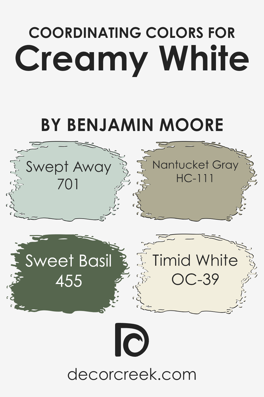
Coordinating Colors of Creamy White OC-7 by Benjamin Moore
Coordinating colors are hues that go well together, enhancing the overall look of a space. They complement the main color—in this case, Creamy White from Benjamin Moore—and create a harmonious atmosphere. To achieve a balanced palette, it’s essential to choose colors that either match or provide a pleasant contrast.
These selections ensure that each color stands out while also supporting the main tone rather than overwhelming it.
For Creamy White, the coordinating colors provide a beautiful range of options. Swept Away is a light, airy blue that adds a soft, refreshing touch, perfect for creating a calm and open feel. Sweet Basil, a rich green, brings in elements of nature and adds a warm, earthy vibe that balances the softness of Creamy White. Nantucket Gray offers a subdued, muted green tone, ideal for a subtle yet stylish look.
Timid White is a gentle, warm off-white that effortlessly integrates with Creamy White, adding depth without overpowering the primary shade. These colors work together to create an inviting and cohesive environment.
You can see recommended paint colors below:
- 701 Swept Away
- 455 Sweet Basil
- HC-111 Nantucket Gray
- OC-39 Timid White
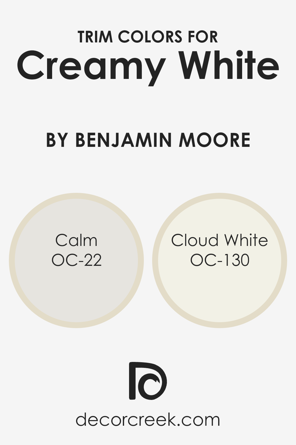
What are the Trim colors of Creamy White OC-7 by Benjamin Moore?
Trim colors are used to highlight the edges and borders of walls, bringing attention to the architectural details of a space. For Creamy White OC-7 by Benjamin Moore, choosing the right trim color is crucial because it can either enhance or diminish the warm and inviting nature of the primary wall color.
Trim colors such as OC-22 Calm and OC-130 Cloud White can work well by providing a subtle contrast, ensuring the Creamy White stands out while maintaining a cohesive look. Calm is a soft, muted gray with subtle warm undertones that seamlessly complements Creamy White, adding gentle contrast without overwhelming the primary color.
Meanwhile, Cloud White is a creamy off-white that pairs perfectly, introducing a hint of brightness and lightness to balance the warmth of Creamy White.
Using these trim colors can significantly influence the overall feel of a room painted with Creamy White OC-7.
A choice like Calm can create a harmonious balance with Creamy White by lending a sophisticated yet understated contrast, keeping the room feeling soothing and inviting.
On the other hand, selecting Cloud White as a trim color can add a crisp and fresh finish, making smaller spaces feel more open and airy. Both options maintain the warm and cozy vibe of Creamy White, ensuring that the main color remains the focal point while the trim provides the finishing touch that enhances the room’s overall appeal.
You can see recommended paint colors below:
Colors Similar to Creamy White OC-7 by Benjamin Moore
When designing a space, choosing similar colors can create a sense of harmony and balance. For instance, colors like Feather Down OC-6 work well with Creamy White OC-7 by Benjamin Moore. These colors have a gentle warmth that can make any space feel inviting and cozy.
They work together to provide a seamless transition across walls and furniture, making rooms appear larger and more unified.
The subtle variations in tone between these similar shades add depth without overwhelming the senses, which is perfect for anyone looking to create a calm and welcoming atmosphere.
Feather Down OC-6 offers a soft, muted beige with a touch of warmth, which complements the clean and fresh feel of Creamy White OC-7.
It helps bring a gentle, natural feel to a room, working as an excellent backdrop that allows other colors and textures to stand out.
Meanwhile, Creamy White OC-7 brings brightness and clarity, reflecting light beautifully throughout the space. Together, these colors highlight each other’s qualities, making them an excellent choice for those who want a space that feels both warm and bright without strong contrasts.
Choosing colors with similar undertones connects each element of your design, creating a peaceful and pleasing aesthetic.
You can see recommended paint color below:
- OC-6 Feather Down

How to Use Creamy White OC-7 by Benjamin Moore In Your Home?
Creamy White OC-7 by Benjamin Moore is a versatile paint color that can brighten and refresh any home. Its warm, soft tone creates a welcoming and cozy feel, making it ideal for living spaces like the living room or bedroom. This shade works well with various design styles, from modern to traditional, adding a timeless quality to any room.
You can use Creamy White OC-7 on walls to open up a small space, making it feel larger and more inviting. It also pairs beautifully with bolder colors, so you might consider using it as a backdrop for vibrant accents like pillows, rugs, or artwork.
This paint color is equally effective in kitchens and bathrooms, where its light hue can reflect natural light and provide a clean, airy atmosphere.
In summary, Creamy White OC-7 is a flexible option for anyone looking to refresh their home with a warm, inviting color that’s easy to work with and always in style.
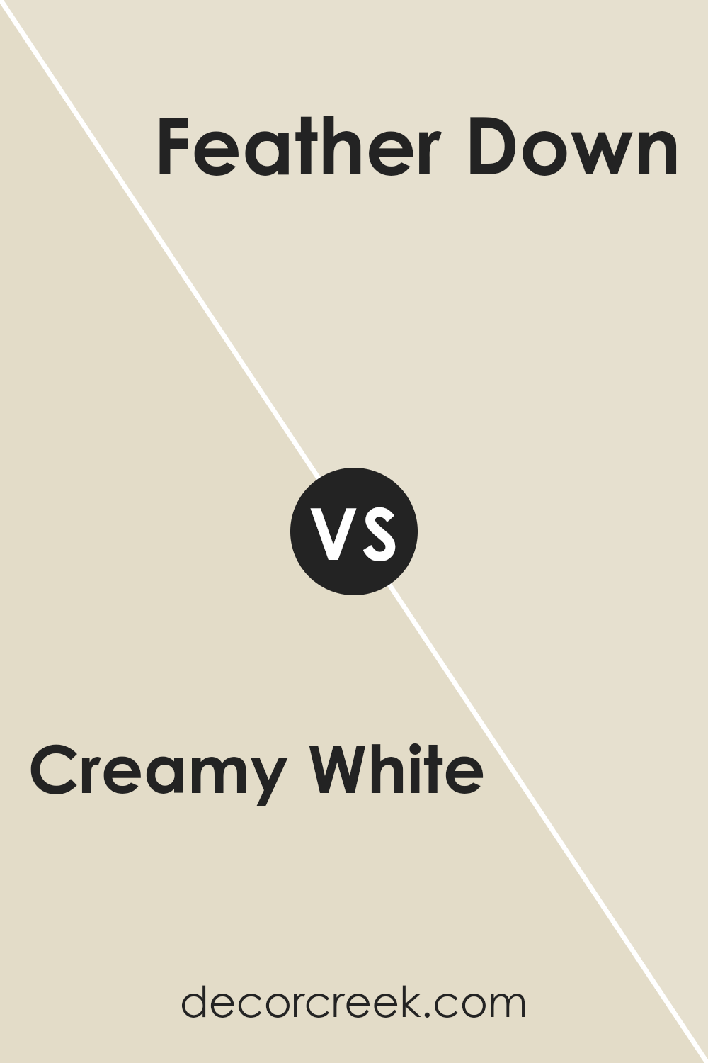
Creamy White OC-7 by Benjamin Moore vs Feather Down OC-6 by Benjamin Moore
Creamy White OC-7 and Feather Down OC-6 are two popular paint colors from Benjamin Moore. Both are off-white shades, but they have distinct differences. Creamy White OC-7 is a soft, warm white with yellow undertones, giving it a cozy and inviting feel. It works well in spaces where you want a gentle and warm background that doesn’t overpower other colors.
Feather Down OC-6, on the other hand, is slightly darker with a touch of beige and gray undertones. This subtle hint of gray gives it a more neutral appearance, making it a versatile choice for various settings. While Creamy White offers a warm ambiance, Feather Down provides a more grounded and subdued look.
Overall, if you want a warm and creamy background, go for Creamy White. If you prefer a more neutral and calming tone, Feather Down could be the better option.
You can see recommended paint color below:
- OC-6 Feather Down
Conclusion
Creamy White is gentle and warm, kind of like a hug from a cozy blanket on a chilly day. When you paint your walls with this color, everything starts to feel calm and friendly.
What makes Creamy White really cool is how it works well with so many other colors and styles. Whether your furniture is old-fashioned or super modern, this shade fits right in. It acts like the good friend who gets along with everyone at a party.
If you have a small room that you wish felt a bit bigger, Creamy White can help with that too. It bounces the light around, so everything seems brighter and more open.
In my opinion, OC-7 Creamy White is special because it feels welcoming and pleasant.
It can make any room feel nice and comfortable. Whether you are painting a bedroom, a kitchen, or even a hallway, this color is a perfect choice to create a happy and inviting place.

Ever wished paint sampling was as easy as sticking a sticker? Guess what? Now it is! Discover Samplize's unique Peel & Stick samples.
Get paint samples

