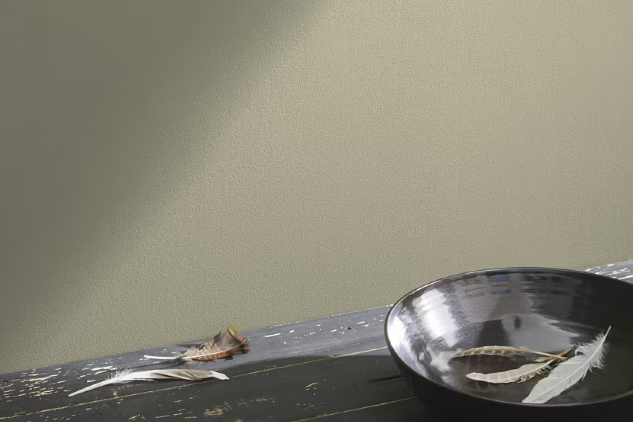
If you’re on the hunt for a paint color that beautifully balances warm and cool tones, let me introduce you to HC-111 Nantucket Gray by Benjamin Moore. Don’t let the name fool you; it’s not your typical gray. This shade is a fresh, medium tone that dances between gray and beige, often referred to as “greige.”
Many people love using Nantucket Gray because it has a unique quality of changing hues based on the lighting in the room.
In bright, natural light, the color feels more beige, offering a warm, inviting vibe. In dimmer, cooler lighting, it leans more toward a soft, subtle gray.
This flexibility makes it an excellent choice for living rooms, bedrooms, or any space in your home where the ambiance shifts throughout the day.
Applying Nantucket Gray can inspire a modern yet timeless feel in your space, fitting well with various decor styles and color palettes. It works wonderfully with whites for a crisp look, complements rich, dark woods, and even pairs well with bold color accents. As a neutral, it provides a soothing backdrop that contrasts nicely with more vibrant accessories or furniture pieces, allowing them to stand out.
Whether you’re redecorating a room or giving your entire house a new coat of paint, Nantucket Gray offers versatility and style that could well be exactly what you need.
What Color Is Nantucket Gray HC-111 by Benjamin Moore?
Nantucket Gray by Benjamin Moore is a versatile color that leans between gray and beige, offering a warm, neutral backdrop for various interior styles. This hue has an earthy undertone, making it an ideal choice for those looking to create a cozy and inviting atmosphere. It’s particularly effective in living rooms and bedrooms where comfort is paramount.
This color pairs beautifully with natural materials such as wood, stone, and linen, enhancing their inherent textures and adding depth to the overall design.
Its neutral palette allows it to work well with both light and dark woods, from oak to walnut, making it a great choice for flooring, furniture, and wooden decorative elements.
Nantucket Gray also complements metal finishes like bronze or copper, which add a touch of warmth and refinement to the space.
In terms of interior styles, Nantucket Gray is particularly suitable for rustic, traditional, and contemporary spaces. Its subtly rich tone provides a perfect foundation for rustic environments that feature organic elements and handcrafted details. In traditional settings, it offers a timeless appeal that ties together classic furniture and patterned textiles.
For contemporary rooms, its neutrality acts as a clean canvas, allowing modern artwork and statement pieces to stand out.
Overall, Nantucket Gray is a functional and appealing choice for those looking to create a warm, natural-looking space that feels both grounded and airy.
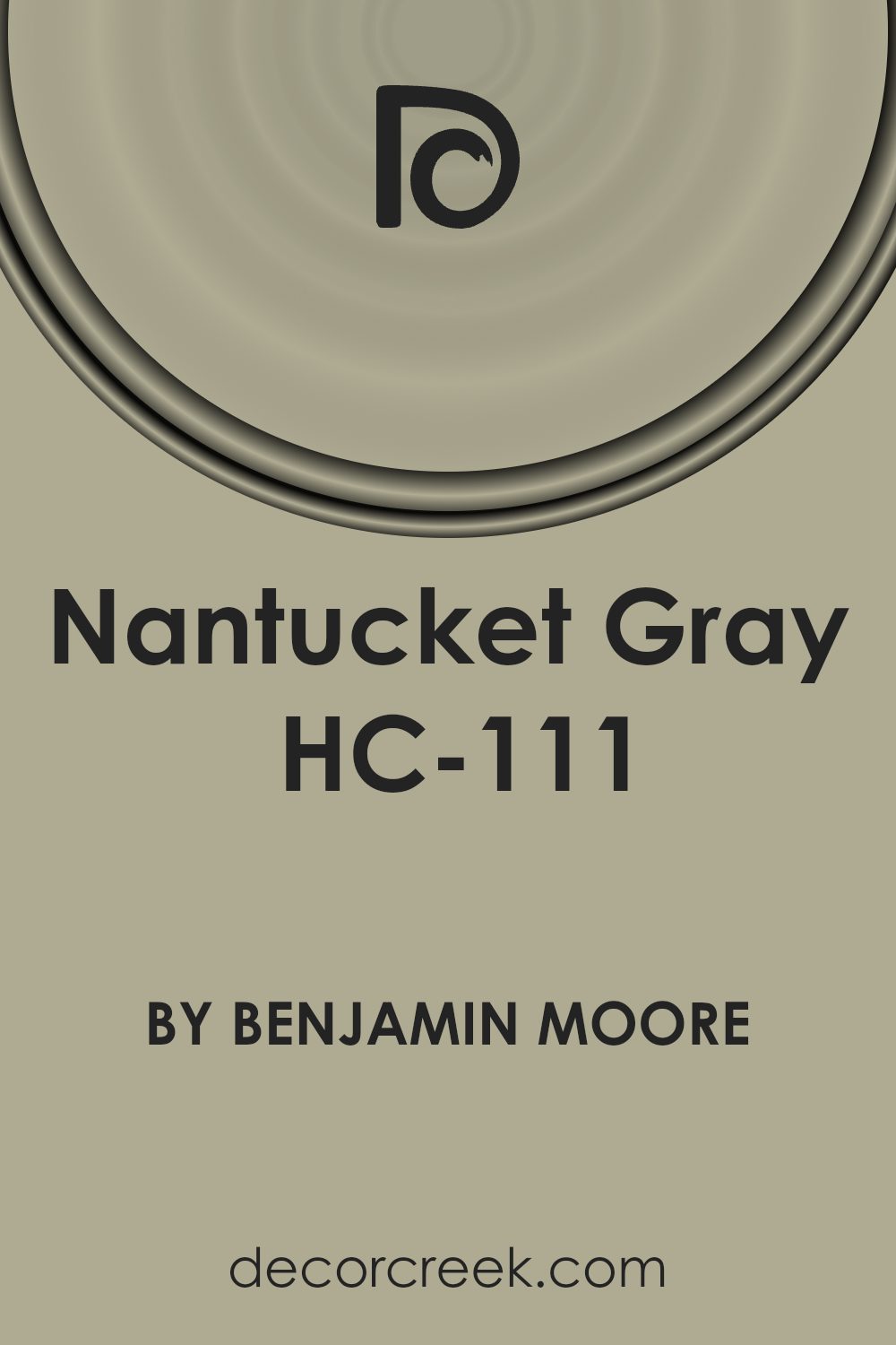
Is Nantucket Gray HC-111 by Benjamin Moore Warm or Cool color?
Nantucket GrayHC-111 is a unique paint color by Benjamin Moore that offers a versatile option for home decorating. Despite its name, Nantucket Gray actually leans towards a green hue, giving it a distinct yet neutral appearance that works well in many settings.
This color is especially great for creating a cozy and inviting atmosphere in rooms like the living room or bedroom. Its subtle green undertone adds a touch of nature and freshness without overpowering the space.
This shade pairs well with both modern and traditional decor, making it a practical choice for many homes. It complements white trim beautifully, which can help to highlight architectural features without creating a stark contrast.
Whether you’re looking to paint a whole room or just an accent wall, Nantucket GrayHC-111 is adaptable and can help to refresh any space with its unique charm.
Its natural tone also works well with wooden furniture and elements, enhancing the warmth of the home.
Undertones of Nantucket Gray HC-111 by Benjamin Moore
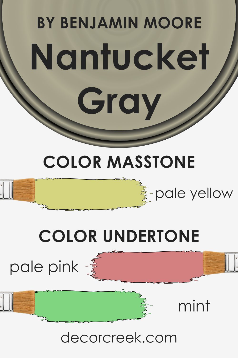
Nantucket Gray is a unique color because it includes a variety of undertones, ranging from pale pink to olive. This means that under different lighting conditions and when paired with various decor elements, the main gray color can appear to shift subtly. Undertones are essentially the hidden hues that are mixed into the primary color, and they play a significant role in how a color is perceived once applied to walls.
For instance, the pale pink and light purple undertones in Nantucket Gray can bring a soft warmth to a room, making the space feel more inviting.
These warmer tones can help counterbalance the coolness of the primary gray, providing a balanced visual experience. On the other hand, undertones like mint and light blue can enhance the freshness of the color, making a room feel more airy and open.
When Nantucket Gray is used on interior walls, these undertones can interact in interesting ways.
In a room with plenty of natural light, the lighter undertones like light gray and lilac might become more pronounced, creating a gentle, soothing backdrop.
In artificial light, darker undertones like olive might stand out, giving the room a more grounded feel.
Understanding these undertones can help in choosing decor and furnishings that either complement or contrast effectively with the wall color, allowing for a more cohesive interior design scheme.
Thus, the complexity of Nantucket Gray’s undertones provides a versatile foundation for various styles and preferences in home decor.
What is the Masstone of the Nantucket Gray HC-111 by Benjamin Moore?
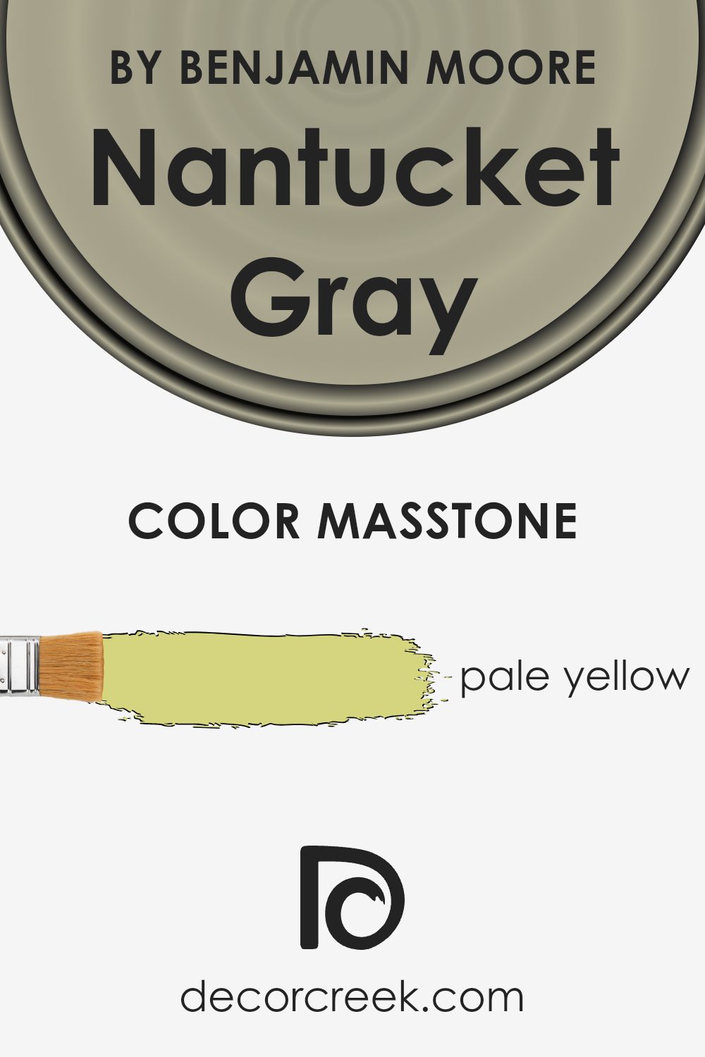
Nantucket Gray HC-111 has a masstone of pale yellow, a subtle and warm shade that can brighten up any space without being too overpowering. This particular hue provides a comforting background in rooms, making them feel cozy and inviting.
When homeowners choose to use this color, it easily harmonizes with a wide range of decor styles and colors, from bold and vibrant accessories to more muted and natural materials.
The pale yellow base effectively reflects both natural and artificial light, making spaces seem larger and more open. This is especially beneficial in smaller rooms or areas with limited natural light. Additionally, it complements wood tones very well, enhancing the beauty of wooden furniture and flooring with its soft, gentle glow.
Overall, Nantucket Gray HC-111 is a versatile color choice that works beautifully in various settings, creating a friendly and welcoming environment in homes while coordinating effortlessly with other colors and materials.
How Does Lighting Affect Nantucket Gray HC-111 by Benjamin Moore?
Lighting plays a crucial role in how colors look in a space, significantly affecting the mood and ambience of a room. Different light sources can change the appearance of a color like Nantucket Gray by Benjamin Moore, based on the quality and direction of light they provide.
In artificial light, Nantucket Gray tends to take on a warmer, more inviting tone because the yellow and soft elements in the artificial lighting highlight the warmer undertones in the paint.
Think of it in terms of a cozy, gentle glow that makes the gray look less harsh and more welcoming, particularly great for evenings or in rooms with limited natural light.
Under natural light, the color can appear differently based on the room’s orientation and the time of day. In north-facing rooms, which receive less direct sunlight and therefore have a cooler, bluish light, Nantucket Gray might look a bit more muted and slightly cooler in tone.
This creates a calm, subtle backdrop, perfect for creating a peaceful and focused space.
In south-facing rooms, this color will likely appear much lighter and slightly warmer throughout the day as these rooms get abundant sunlight. The ample natural light brings out the lively, warm undertones of the gray, making the room feel airy and welcoming.
East-facing rooms get bright morning light, which can make Nantucket Gray look crisp and vibrant in the morning, gradually transitioning to a softer hue as the day progresses. This makes east-facing rooms feel alive and bright in the morning, perfect for start-of-the-day activities.
Finally, in west-facing rooms, Nantucket Gray will have a softer appearance in the morning and become more distinctly warm and rich towards the evening, when the setting sun casts a golden glow. This creates a cozy atmosphere, ideal for relaxing at the end of the day.
Overall, the effect of lighting on colors like Nantucket Gray can be quite dynamic, heavily dependent on the light conditions present, which can alter the perception of space and color throughout the day.
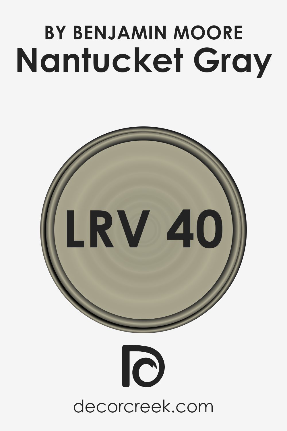
What is the LRV of Nantucket Gray HC-111 by Benjamin Moore?
LRV stands for Light Reflectance Value, which is a measure used to describe the amount of light a color reflects or absorbs. It’s a scale usually used for paint colors and it ranges from a low value, which means the color absorbs more light and appears darker, to a high value, meaning the color reflects more light and appears brighter.
Understanding the LRV of a color helps in making informed decisions about paint choices, especially when considering the lighting of a room. A higher LRV can make a small or dark room feel more open and airy, whereas a lower LRV can give a room a cozier, more intimate feel.
The LRV for Nantucket Gray is 39.83, which places it in the medium range of light reflectance. This means it neither reflects nor absorbs light excessively, providing a balanced hue that maintains its true color under different lighting conditions.
It’s an adaptable choice that works well in spaces that receive moderate amounts of natural light or in rooms with average lighting fixtures.
With its medium LRV, Nantucket Gray offers a versatile backdrop that isn’t too overpowering, making it suitable for various room styles and sizes.
Its balanced nature ensures that the color doesn’t significantly darken a room nor make it overly bright, creating a harmonious ambiance with an inviting feel.
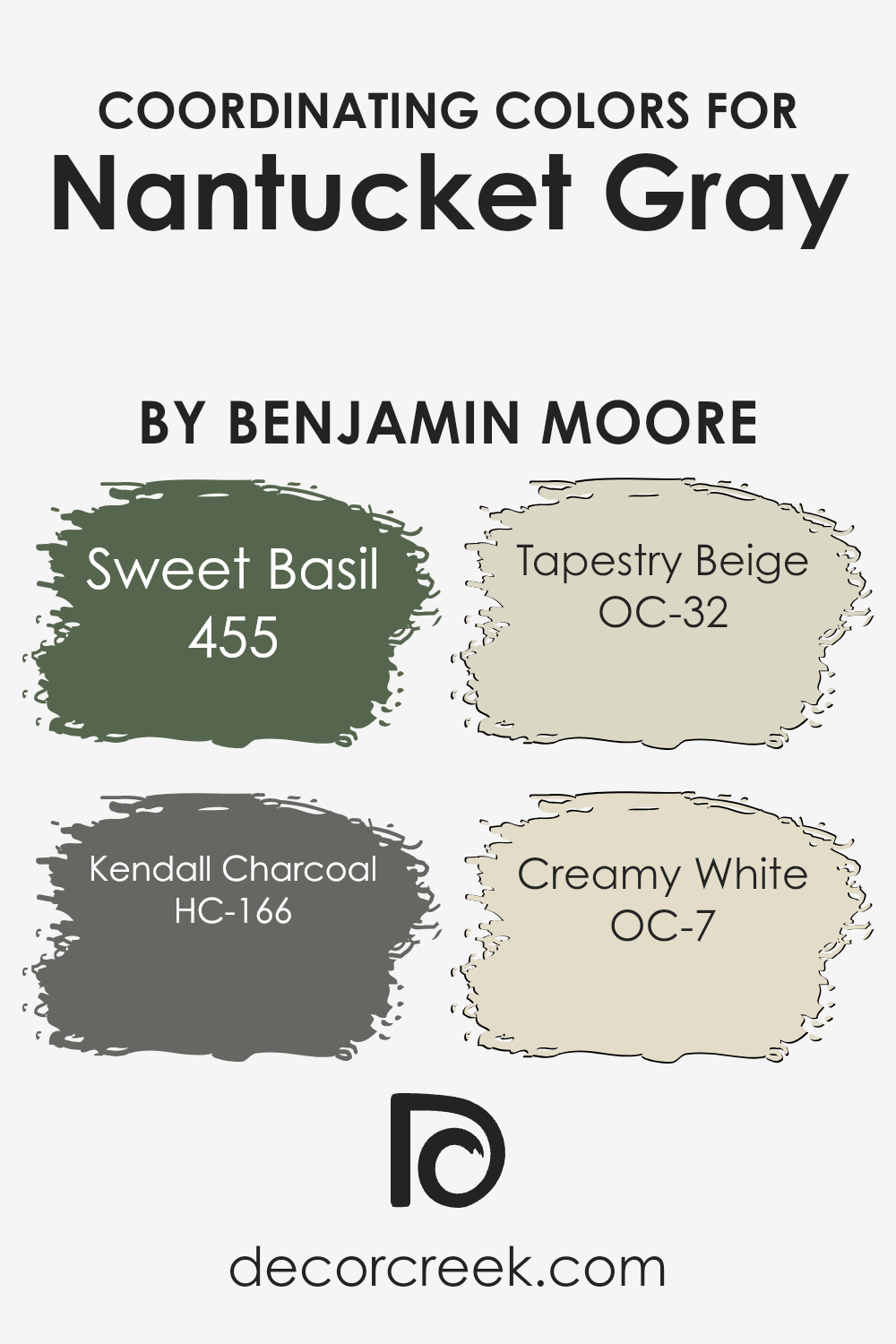
Coordinating Colors of Nantucket Gray HC-111 by Benjamin Moore
Coordinating colors are chosen to complement a main color, helping to create a harmonious color scheme in any space. By selecting shades that either contrast or blend seamlessly with the primary color, designers can achieve a balanced and visually pleasing look.
For instance, with Nantucket Gray as the primary color, a mix of greens, beiges, and whites work well together to set a calm and welcoming ambiance.
455 Sweet Basil is a soft, muted green that brings a subtle touch of nature to the space, making it feel fresh and inviting. HC-166 Kendall Charcoal offers a deep, rich gray that provides a striking contrast to Nantucket Gray, ideal for adding depth and interest to the environment.
OC-32 Tapestry Beige is a warm, light beige that offers a gentle background color, perfect for softening the overall feel of a room or enhancing its lightness.
Lastly, OC-7 Creamy White is a clean and bright white that illuminates and enlarges spaces, making it an excellent choice for trim or ceilings to create a crisp, fresh finish.
These coordinating colors work together to create a cohesive look that enhances the beauty of Nantucket Gray.
You can see recommended paint colors below:
- 455 Sweet Basil (CHECK A SAMPLE)
- HC-166 Kendall Charcoal (CHECK A SAMPLE)
- OC-32 Tapestry Beige
- OC-7 Creamy White (CHECK A SAMPLE)
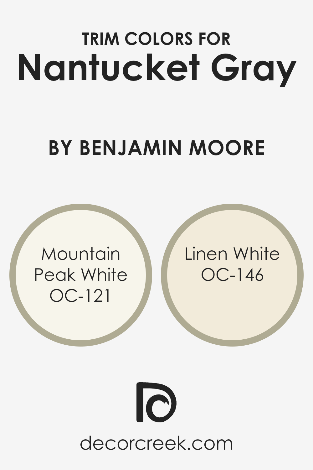
What are the Trim colors of Nantucket Gray HC-111 by Benjamin Moore?
Trim colors are selected accents used to highlight and define architectural details such as window frames, door frames, skirting boards, and moldings. The right trim color can dramatically enhance the overall look of a wall color.
For Nantucket Gray by Benjamin Moore, which is a mid-tone gray, choosing the appropriate trim color is vital to create a clean and harmonious appearance.
Trim colors like Mountain Peak White and Linen White are excellent choices to complement this shade of gray, offering a crisp contrast that accentuates the wall’s own natural tones without competing for attention.
Mountain Peak White is a very light, almost pure white color that brings a bright and airy feel when used as trim with Nantucket Gray.
It’s especially good for spaces that aim to maintain a fresh and open vibe, helping the gray to stand out.
On the other hand, Linen White offers a softer, slightly creamy white that provides a warmer contrast and can add a gentle, inviting quality to the room.
Depending on the lighting and accompanying decor, Linen White can help create a more seamless transition between the similarly soft-hued Nantucket Gray and other elements of the room.
You can see recommended paint colors below:
- OC-121 Mountain Peak White
- OC-146 Linen White
Colors Similar to Nantucket Gray HC-111 by Benjamin Moore
Choosing similar colors is crucial when designing a space because it ensures that the aesthetic is harmonious and pleasing to the eye. When colors are similar, they have a subtle variety but do not clash, creating a gentle and cohesive look. Similar colors often share a common hue but differ slightly in saturation and lightness, making them easy to pair together.
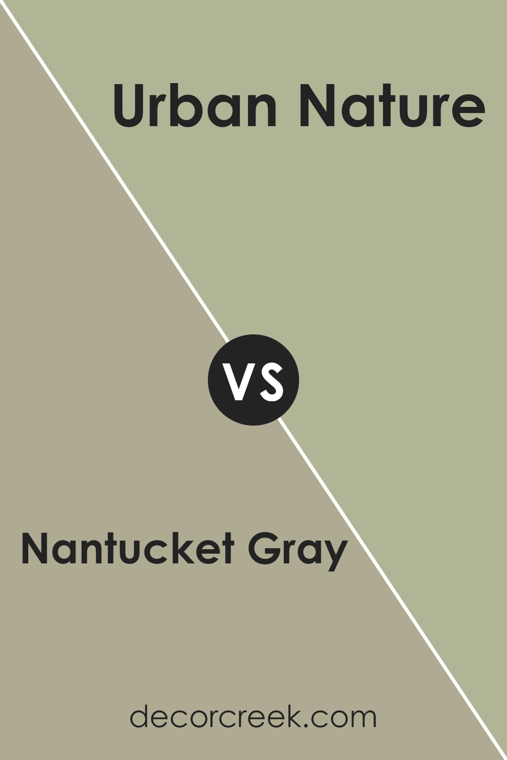
For example, if you are a fan of Nantucket Gray by Benjamin Moore, a color like Urban Nature by Benjamin Moore might be a great complement for your color scheme.
Nantucket Gray is a balanced, soft gray that carries a hint of green, giving it an earthy, muted appeal that is versatile for various spaces. It’s perfect for creating a calm backdrop in a room. On the other hand, Urban Nature is a slightly deeper shade that leans more significantly towards the green spectrum while keeping its gray undertone.
This color is ideal for adding a bit of depth to a room without overwhelming the senses with too dark of a shade. Pairing Nantucket Gray and Urban Nature brings visual interest to the space while maintaining a fluid color transition that is pleasing to the eye.
You can see recommended paint color below:
- AF-440 Urban Nature (CHECK A SAMPLE)

How to Use Nantucket Gray HC-111 by Benjamin Moore In Your Home?
Nantucket Gray HC-111 by Benjamin Moore is a versatile paint color that balances a warm gray with subtle green undertones, making it a unique choice for any home. This cozy shade works well in many areas, providing a calm, welcoming ambiance without becoming too overpowering.
In living rooms or dens, Nantucket Gray creates a cozy environment ideal for relaxing and socializing. It’s particularly effective in spaces that get a lot of natural light, as the light reveals the complexity of the color.
In bedrooms, it promotes a restful atmosphere, pairing beautifully with white trim and wood furniture for a grounded look.
Moreover, it’s an excellent choice for exterior use, such as on shutters and doors, giving your home a distinctive appearance from the outside. In kitchens and dining areas, it pairs well with cabinets and decor, adding warmth but maintaining a fresh feel.
Overall, Nantucket Gray is a smart pick for anyone looking to add a touch of unique warmth to their home without going too bold.
Nantucket Gray HC-111 by Benjamin Moore vs Urban Nature AF-440 by Benjamin Moore
Nantucket Gray and Urban Nature by Benjamin Moore are both unique shades, but they offer different vibes for a space. Nantucket Gray is not a typical gray; it has a warm, beige undertone that makes it more inviting and cozy. It’s great for creating a soft, neutral backdrop in any room, providing a light and airy feel without being too stark.
On the other hand, Urban Nature is a deeper, more organic color. It has elements of green and gray, resembling the hue of natural moss.
This color is perfect for someone looking to bring a touch of nature indoors, offering a grounding, earthy quality that can make a space feel more connected to the outdoors.
Both colors are versatile and can be used in various settings, from modern to traditional, depending on the accompanying decor and accents. While Nantucket Gray tends to open up a space with its lighter tone, Urban Nature adds depth and character with its richer, darker shade.
You can see recommended paint color below:
- AF-440 Urban Nature (CHECK A SAMPLE)
Conclusion
Discussing HC-111 Nantucket Gray by Benjamin Moore here helped me learn just how impressive this paint color can be for homes. Nantucket Gray, even though called gray, is actually more of a green color that reminds you of nature. It can make a house feel warm and welcoming, just like a cozy blanket. Whether used in the living room, kitchen, or even the outside of the house, it adds a touch of calm.
I found out that many people like this color because it works well with lots of other colors.
You can pair it with bright colors like yellow for a happy, sunny look or with dark colors like brown for a more grounded, earthy feel. It’s a great choice if someone wants a change but doesn’t want something too bold or shocking.
After writing about it, I think Nantucket Gray is a great pick for anyone looking to repaint their home. It’s not just any gray; it’s a unique greenish-gray that feels warm and cozy, and it’s easy to look at every day.
I would recommend it to families who enjoy a calm and friendly look in their home.
Benjamin Moore made a color that’s not only easy to like but also fun to use in different parts of the house.
Ever wished paint sampling was as easy as sticking a sticker? Guess what? Now it is! Discover Samplize's unique Peel & Stick samples.
Get paint samples


