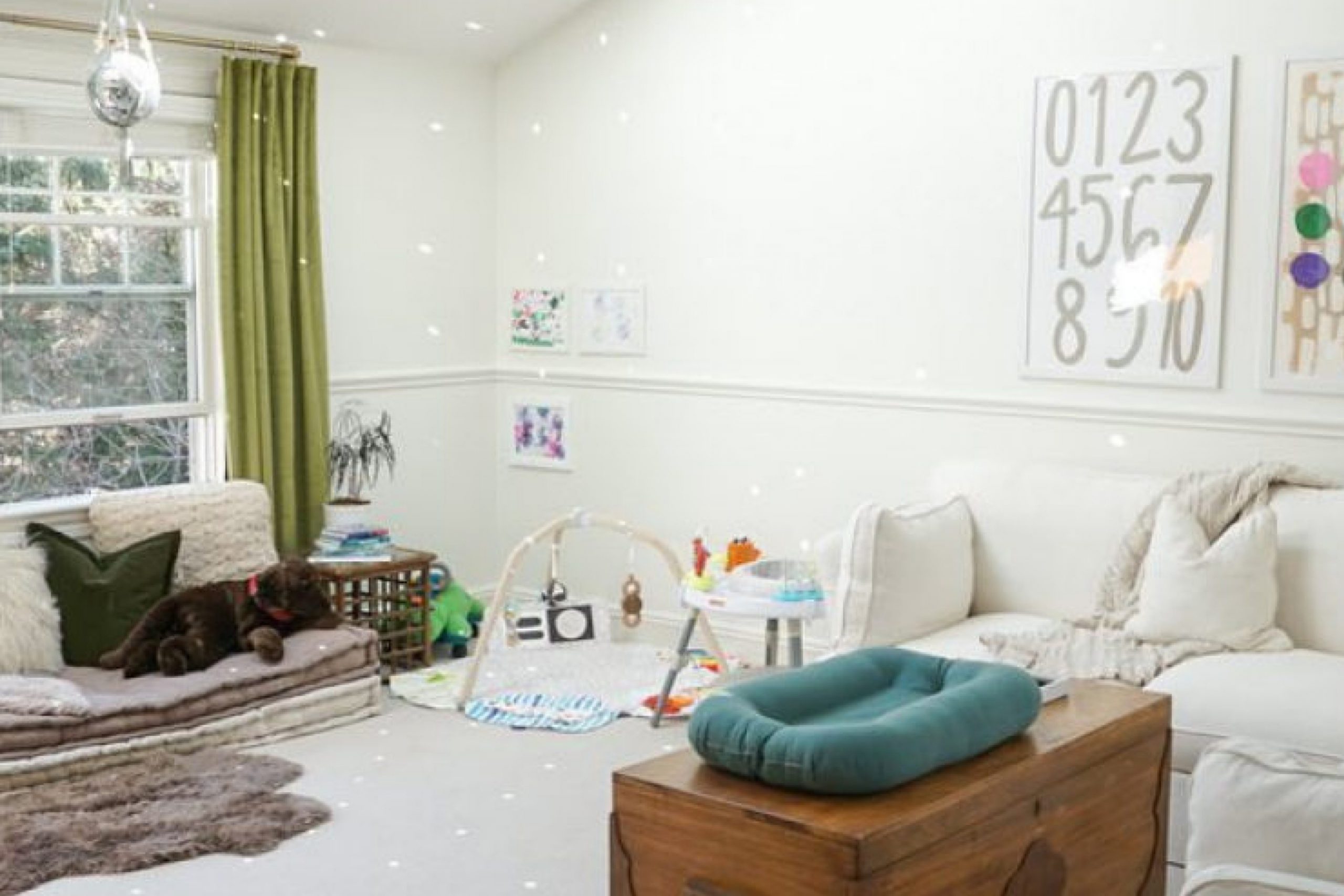
When you’re looking to transform a room into a cozy, inviting space, the color of the walls is a fantastic place to start. One shade that I’ve found effortlessly brings warmth and a soothing vibe to any room is SW 7556 Creme by Sherwin Williams. This particular paint color is a soft, creamy hue that can light up a space while maintaining a subtle elegance.
If you’re like me and enjoy a touch of timeless charm, SW 7556 Creme can serve as a versatile backdrop for various decor styles—from modern minimalist to rustic or vintage.
Whether you’re splashing it on your living room walls, using it to freshen up your kitchen, or livening up your bedroom, this color blends seamlessly with different textures and furnishings, adding a layer of warmth without overwhelming the space with intense color.
Plus, its versatility extends beyond just home interiors. I’ve used SW 7556 Creme in office spaces to create a more welcoming and focused environment.
There’s something about its gentle presence that makes it a go-to option when you need a paint color that ties everything together with grace and ease.
Whether planning a whole house redo or just a single room makeover, I highly recommend considering SW 7556 Creme if you’re aiming for a look that’s both sophisticated and comforting.

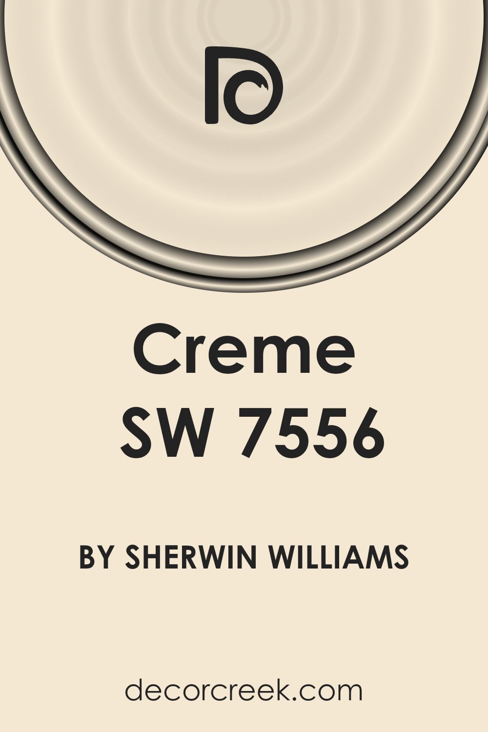
What Color Is Creme SW 7556 by Sherwin Williams?
The color Creme SW 7556 by Sherwin Williams is a warm, inviting neutral hue with a soft yellow undertone. This shade evokes feelings of homeliness and subtle cheer, making it a popular choice for those looking to create a cozy and welcoming atmosphere. Its lightness provides a sense of freshness without being overpowering, making it highly versatile and easy to integrate into various interior designs.
Creme SW 7556 works exceptionally well in cottage, rustic, and traditional interiors. These styles often employ natural materials and warm tones, with which this color pairs beautifully. In a cottage-style setting, it can complement exposed wood beams, natural stone features, and woven textiles to enhance the quaint, charming vibe.
In rustic spaces, pairing it with elements like distressed wood furniture, linen fabrics, and terracotta tiles can accentuate a relaxed, down-to-earth feel.
Additionally, this color is great for spaces that use a lot of natural light. It reflects sunlight beautifully, brightening up a room effortlessly. When used in living rooms, bedrooms, or kitchens, Creme SW 7556 can be matched with soft cotton, smooth leather, and rich wood textures to create a harmonious and pleasing aesthetic.
It’s not only flexible but also effective in making other design elements stand out, providing a subtle backdrop that complements bold colors or patterns in décor items and furnishings.
Is Creme SW 7556 by Sherwin Williams Warm or Cool color?
Creme SW 7556 by Sherwin Williams is a warm, creamy white paint color that brings a cozy and inviting vibe to any room. It’s a popular choice for homeowners because it has a soft and subtle tone that pairs well with a wide range of decors and furniture.
This versatile paint color can be used in almost any area of the home, including living rooms, bedrooms, and kitchens. It works particularly well in spaces where you want to create a gentle and welcoming atmosphere without the starkness of pure white.
Creme SW 7556 is great for making smaller rooms look bigger and brighter as it reflects light well, adding a fresh and airy feel to the space. Additionally, this color is easy to maintain and doesn’t show small imperfections or dirt easily, making it a practical choice for busy households.
Whether you’re aiming for a modern or a more traditional look, Creme SW 7556 blends smoothly with other colors, enhancing the overall aesthetic of your home.
Undertones of Creme SW 7556 by Sherwin Williams
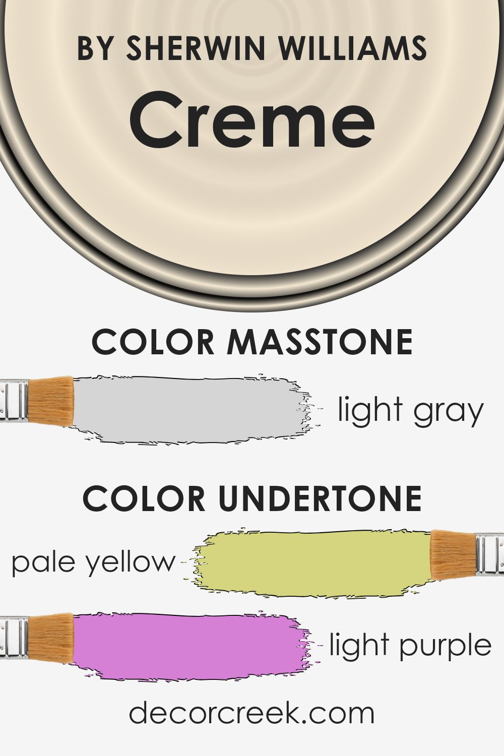
CremeSW 7556 is a complex paint color that contains a variety of subtle undertones which greatly influence how it appears in different settings. The undertones of a color are the faint hues that are mixed into the main shade, affecting its overall appearance and how it reacts to light and surrounding colors.
In the case of CremeSW 7556, these undertones include pale yellow, light purple, light blue, pale pink, mint, lilac, and grey.
Each of these undertones contributes to the perception of CremeSW 7556 in unique ways. For instance, pale yellow adds a warm glow, making the space feel cozy and welcoming. Light purple and lilac bring a hint of coolness, which can balance the warmth of yellow.
Light blue and mint offer a fresh, airy feel, ideal for creating a calming atmosphere. Pale pink introduces a soft, nurturing element, while grey provides a neutral base that stabilizes the color palette.
When applied to interior walls, CremeSW 7556 can look different depending on the room’s lighting and the surrounding decor. The pale yellow and pink undertones might make the room feel warmer in sunlight, whereas the light blue and lilac could become more prominent in artificial or dimmer lighting, providing a subtle coolness.
This variability makes CremeSW 7556 a versatile choice for many spaces, adapting its look to both natural and artificial lighting conditions. Thus, the specific mix and interaction of these undertones determine the color’s effectiveness in bringing a desired atmosphere to a room.
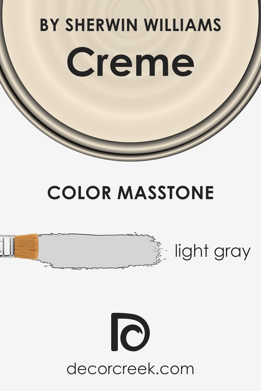
What is the Masstone of the Creme SW 7556 by Sherwin Williams?
CremeSW 7556 by Sherwin Williams has a masstone of light gray, with the color code #D5D5D5. This soft and neutral shade is highly versatile, making it an excellent choice for various spaces in a home. Due to its light gray tone, this color can brighten up rooms that don’t receive much natural sunlight, offering a fresher and more open feel. This makes it ideal for smaller spaces or north-facing rooms.
The light gray hue also acts as a strong foundation for decorating, allowing homeowners to pair it easily with almost any accent color, from bold and bright shades to more muted tones. This adds flexibility in changing decor without needing to repaint.
The neutrality of light gray ensures that it doesn’t dominate a space, making it a good background color that complements different styles, whether modern or traditional.
It can make a room feel more airy and clean, which is appealing to many people looking for a subtle yet effective home improvement option.
How Does Lighting Affect Creme SW 7556 by Sherwin Williams?
Lighting plays a crucial role in how we perceive colors, and it can make a big difference in the look and feel of a room. Color Creme SW 7556 by Sherwin Williams is an excellent example of how different lighting conditions can influence a paint color.
In artificial light, Creme SW 7556 tends to appear warmer and more inviting. Fluorescent lighting can give it a slightly greenish tint, while incandescent bulbs enhance its creamy, warm qualities. This makes it ideal for living spaces and bedrooms where softer, cozier vibes are desired.
In natural light, the true character of Creme SW 7556 can change depending on the direction the room faces and the quality of light during the day. In north-faced rooms, which receive less direct sunlight and tend to have cooler, softer light, this color might look more muted—leaning slightly towards pale or chalky.
It retains its warmth but won’t be as vibrant due to the limited natural light.
South-faced rooms receive more intense, direct sunlight throughout the day. Here, Creme SW 7556 will appear brighter and more vivid, reflecting its creamy quality effectively. The abundant natural light brings out the richness of the color, making the room feel welcoming.
East-facing rooms enjoy the morning sunlight, which is softer and warmer. In these rooms, the color will have a gentle, warm glow in the morning, which transitions to a softer tone as the day progresses and the natural light reduces.
West-faced rooms are filled with the evening light, which can be warmer and more golden. In these settings, Creme SW 7556 will glow warmly towards the end of the day, creating a cozy and inviting atmosphere.
Overall, the effect of lighting on Creme SW 7556 by Sherwin Williams illustrates how a paint color can adapt to its surroundings, offering different experiences depending on the natural and artificial light it is exposed to.

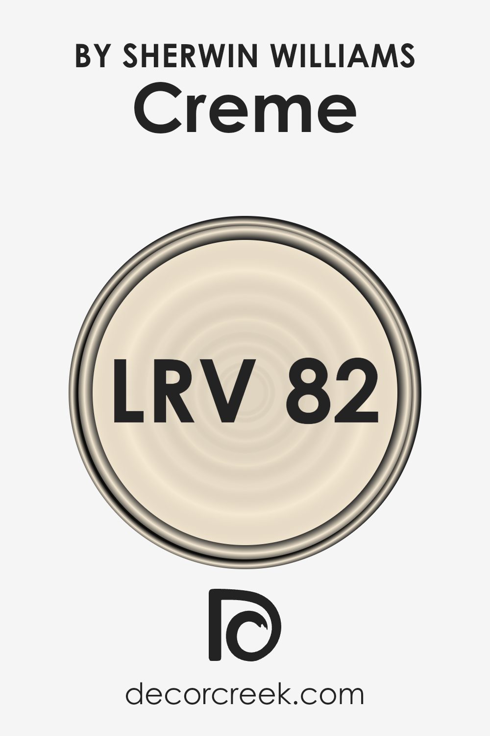
What is the LRV of Creme SW 7556 by Sherwin Williams?
LRV stands for Light Reflectance Value, and it measures the amount of light a paint color reflects back into a room. It’s given as a percentage, where a higher number indicates that a paint color can reflect more light. This is helpful to know because it impacts how light or dark a color looks on the walls once applied.
Lighter colors with higher LRVs make rooms feel more open and airy since they reflect more light around the space. Conversely, colors with lower LRVs absorb more light, which can make a space appear cozier but smaller.
Regarding the color with an LRV of 81.597, it is quite a light color, reflecting a lot of light. This characteristic makes it a good choice for smaller rooms or spaces with limited natural light, as it can help make the area feel bigger and brighter. The high LRV also means that it’s a versatile color, working well in various settings and complementing many decor styles by providing a bright and fresh look.
However, it’s important to consider that such a light color might require multiple coats to achieve a uniform appearance, especially if painting over a darker shade.
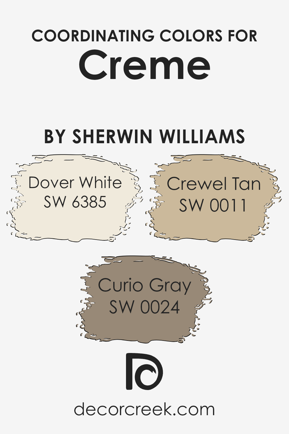
Coordinating Colors of Creme SW 7556 by Sherwin Williams
Coordinating colors are hues that complement each other when used together in a space, enhancing the overall aesthetics without overwhelming the senses. These colors generally share a similar saturation and lightness or are on opposite sides of the color wheel, creating a pleasing contrast.
For example, when decorating with a base color like Crème by Sherwin Williams, which is a warm, soft neutral, choosing the right coordinating colors can make a room feel more balanced and inviting.
Dover White (SW 6385) is a gentle off-white that brings a sense of brightness and openness to a space, making it ideal for creating an airy and light atmosphere. It pairs well with richer tones, providing a subtle contrast that’s not too stark. Curio Gray (SW 0024) is a deeper, muted gray that offers a calm and grounding effect, perfect for spaces that aim for a quiet, understated look.
It works really well in a color scheme that includes softer, lighter hues to provide depth and interest. Lastly, Crewel Tan (SW 0011) is a warm, earthy tan that adds warmth and coziness to any room.
This shade harmonizes beautifully with both lighter colors like Dover White and mid-tone colors like Curio Gray, yielding a cohesive yet diverse palette. By carefully selecting such coordinating colors, you can create a harmonious and inviting environment in any interior space.
You can see recommended paint colors below:
- SW 6385 Dover White
- SW 0024 Curio Gray
- SW 0011 Crewel Tan
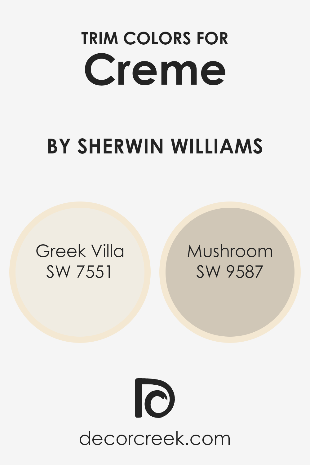
What are the Trim colors of Creme SW 7556 by Sherwin Williams?
Trim colors play a vital role in emphasizing the aesthetic appeal of your home’s interior or exterior, acting as a frame to enhance the central paint color on walls or other surfaces. For instance, when using Creme by Sherwin Williams, ideal trim colors would be SW 7551 – Greek Villa and SW 9587 – Mushroom, each providing a distinct contrast that highlights the depth and beauty of the main hue.
These trim colors not only define the space visually but also contribute to a polished and well-coordinated look in your decorating scheme.
Greek Villa SW 7551 offers a soft, warm white tone with a hint of cream, making it an excellent choice for a trim that subtly separates yet harmonizes with richer or softer wall colors. Its gentle brightness complements a variety of palettes, adding a chic yet understated boundary to any room.
Mushroom SW 9587, on the other hand, adds a deeper, earthy quality as a trim color, perfect for bringing warmth and a natural ambiance to spaces using neutral or muted tones. This color particularly stands out for its ability to add a welcoming richness when paired with lighter, creamy walls.
You can see recommended paint colors below:
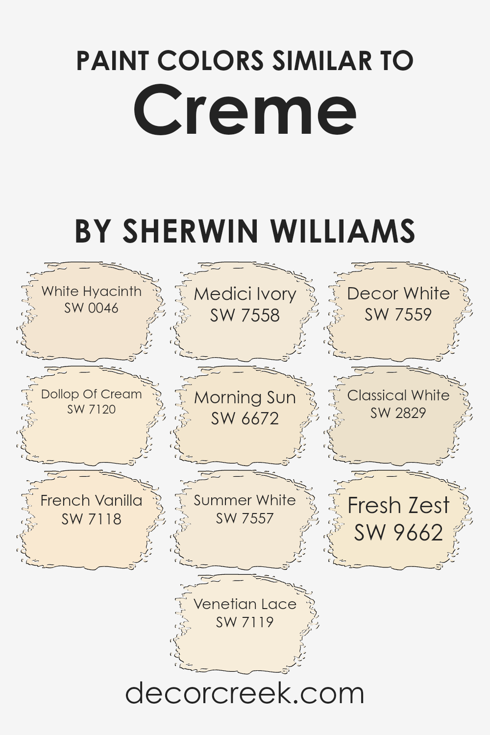
Colors Similar to Creme SW 7556 by Sherwin Williams
Choosing similar colors in interior design can create a harmonious and cohesive look that is soothing to the eye. Colors like those in the vicinity of Creme by Sherwin Williams provide a soft palette that can make spaces feel warmer and more inviting. Such colors blend well with each other, avoiding stark contrasts that might otherwise jar the atmosphere. This kind of color continuity is particularly helpful in areas where you want a seamless visual flow between spaces, such as open floor plans.
SW 0046 – White Hyacinth offers a gentle hint of white with a subtle floral undertone, making it perfect for creating a light, airy feel. SW 7120 – Dollop Of Cream, as the name suggests, adds a soft, creamy touch that pairs well with any décor.
SW 7118 – French Vanilla brings a slightly warmer note, reminiscent of a cozy, well-lit café.
SW 7119 – Venetian Lace has an elegant yet understated tone, ideal for spaces that aim for a refined look without being too stark. SW 7558 – Medici Ivory draws inspiration from classical motifs, giving a nod to traditional elegance.
SW 6672 – Morning Sun bursts with a gentle yellow, offering a cheerful radiance reminiscent of a sunny day.
SW 7557 – Summer White is crisp yet not cold, perfect for enhancing natural light in a room. SW 7559 – Decor White is great for those seeking a straightforward, clean backdrop. SW 2829 – Classical White carries a timeless quality, making it suitable for both modern and traditional spaces.
Lastly, SW 9662 – Fresh Zest adds a subtle vibrancy with its hint of zest, perfect for adding just a slight punch of energy to a room.
You can see recommended paint colors below:
- SW 0046 White Hyacinth
- SW 7120 Dollop Of Cream
- SW 7118 French Vanilla
- SW 7119 Venetian Lace
- SW 7558 Medici Ivory
- SW 6672 Morning Sun
- SW 7557 Summer White
- SW 7559 Decor White
- SW 2829 Classical White
- SW 9662 Fresh Zest
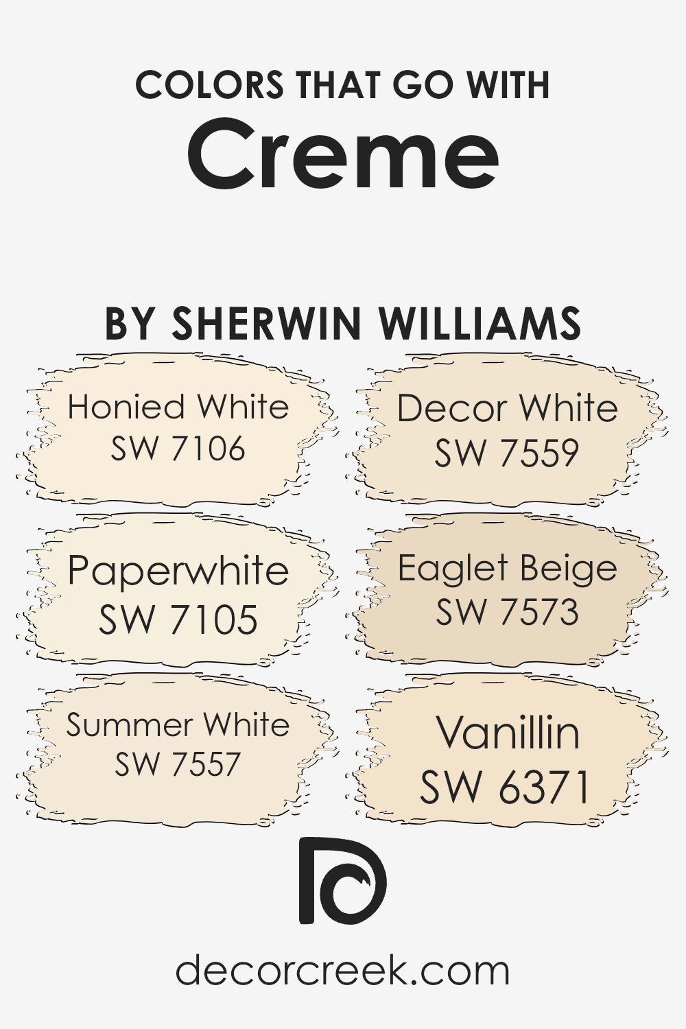
Colors that Go With Creme SW 7556 by Sherwin Williams
Choosing colors that harmonize well with Creme SW 7556 by Sherwin Williams is crucial because it ensures that the overall ambiance of a room is cohesive and pleasing to the eye. Complementary colors, such as SW 7106 – Honied White or SW 7105 – Paperwhite, amplify the warmth of Creme SW 7556, creating a welcoming and cozy environment.
Similarly, using shades like SW 7557 – Summer White and SW 7559 – Decor White can brighten up a space without overwhelming it with starkness, blending smoothly with the creamy richness of Creme SW 7556.
Moreover, adding warmer tones like SW 7573 – Eaglet Beige introduces a subtle contrast that highlights the earthiness of Creme SW 7556, providing depth and warmth to interiors. On the lighter side, SW 6371 – Vanillin is a gentle off-white that pairs neatly with Creme, making smaller spaces feel larger and more open.
These color combinations are beneficial when decorating because they allow for flexibility in choosing decor and furnishings while maintaining a harmonious look that feels both fresh and inviting.
You can see recommended paint colors below:
- SW 7106 Honied White
- SW 7105 Paperwhite
- SW 7557 Summer White
- SW 7559 Decor White
- SW 7573 Eaglet Beige
- SW 6371 Vanillin
How to Use Creme SW 7556 by Sherwin Williams In Your Home?
Creme SW 7556 by Sherwin Williams is a warm and inviting paint color that can add a cozy touch to any home. If you’re looking to give your living room or bedroom a soft and welcoming feel, Creme is an excellent choice. Its subtle creamy hue pairs well with a wide range of decor styles, from traditional to modern.
In the kitchen, using Creme on cabinets or walls can create a bright and airy atmosphere, making the space appear larger and more open. It’s also a great option for bathrooms, where it can help to create a clean and calm environment.
For those who like DIY projects, Creme can be used to refresh old furniture. It’s light enough to brighten up pieces without overwhelming them, which can really enhance the overall look of a room.
Overall, Creme is a versatile paint color that can help make your home more beautiful and comfortable. Whether you’re painting a whole room or just adding some accents, it’s a solid choice that works well in many different areas of a house.
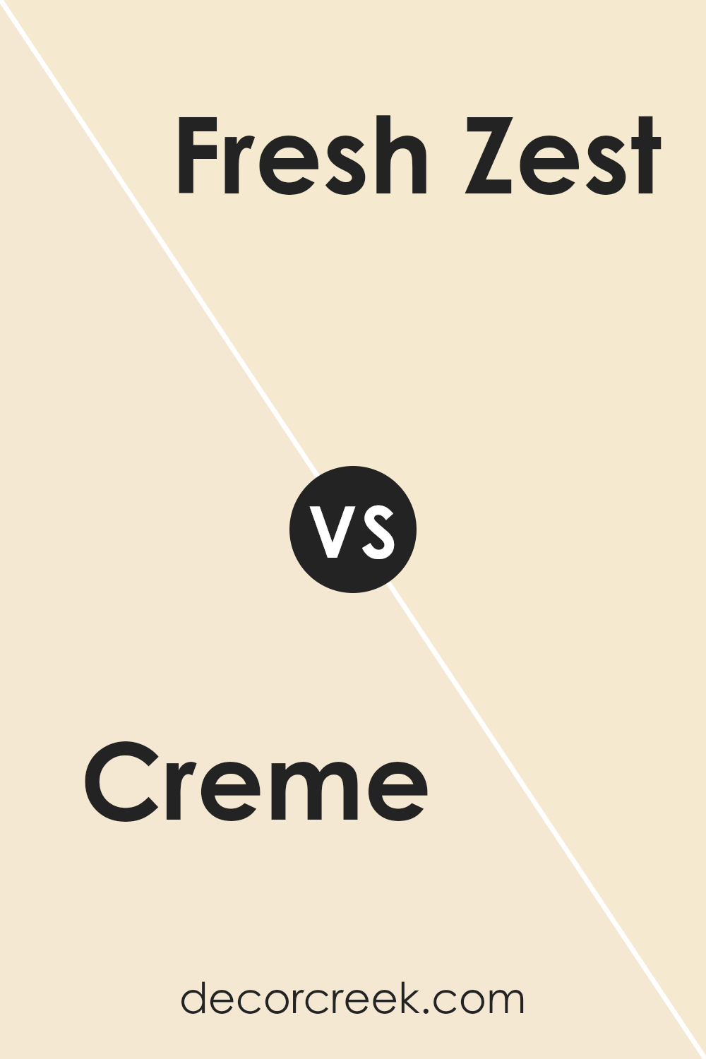
Creme SW 7556 by Sherwin Williams vs Fresh Zest SW 9662 by Sherwin Williams
The main color, Creme, offers a soft, warm beige tone that feels inviting and cozy, making it a great choice for living spaces or bedrooms wanting a neutral backdrop. It pairs well with a wide range of decor styles, from traditional to modern. In contrast, Fresh Zest presents a vibrant, lime green shade that adds a punch of fresh energy to any space.
This color is perfect for adding a lively touch to accent walls or in rooms that benefit from a splash of brightness, like kitchens or playrooms. While Creme provides a gentle warmth, Fresh Zest brings a cheerful vibrancy, demonstrating how different color choices can influence the mood and style of a room.
Together, they can be used to create a balanced and visually appealing environment, with Creme grounding the space and Fresh Zest adding a dynamic element.
You can see recommended paint color below:
- SW 9662 Fresh Zest
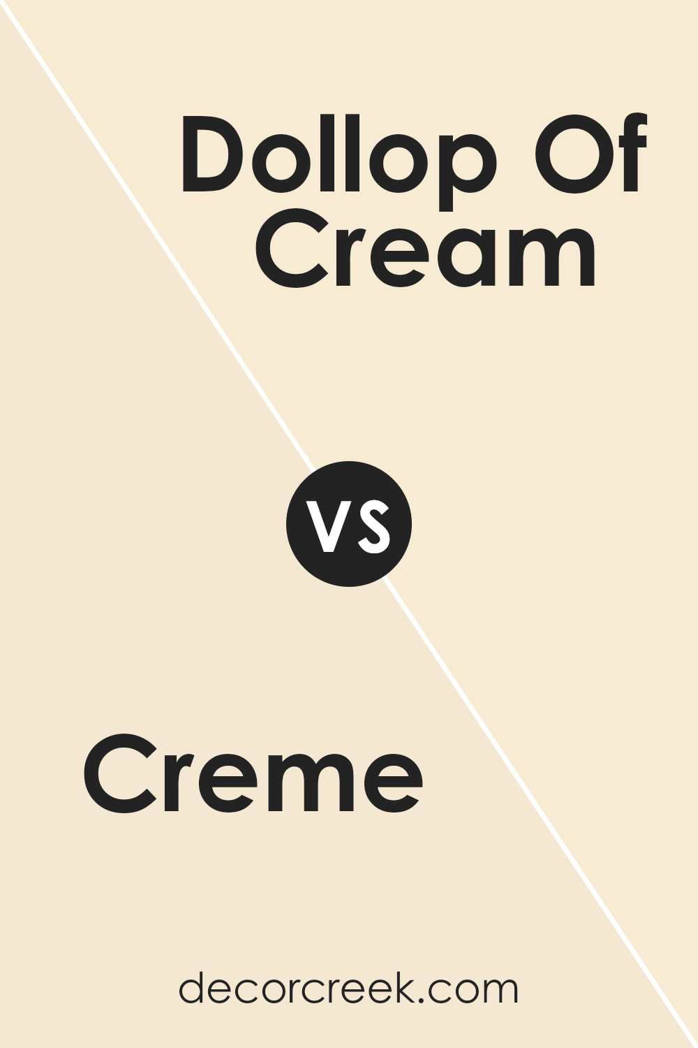
Creme SW 7556 by Sherwin Williams vs Dollop Of Cream SW 7120 by Sherwin Williams
The main color, Creme SW 7556, and Dollop Of Cream SW 7120, both by Sherwin Williams, are quite similar yet distinct in their own way. Creme SW 7556 is a deeper, warmer shade that offers a cozy and inviting atmosphere. It’s a richer tone that works well in spaces where you want a solid, comforting presence without overwhelming the room with too much darkness.
In contrast, Dollop of Cream SW 7120 is lighter and softer. This color is great for creating a bright and airy feel, making spaces seem more open and larger. Its subtle warmth helps to add a gentle, welcoming vibe without being too stark.
Both colors are excellent choices for creating a relaxed and pleasant environment, with Creme providing a more grounded feel, and Dollop of Cream enhancing the lightness and openness of a space.
You can see recommended paint color below:
- SW 7120 Dollop Of Cream
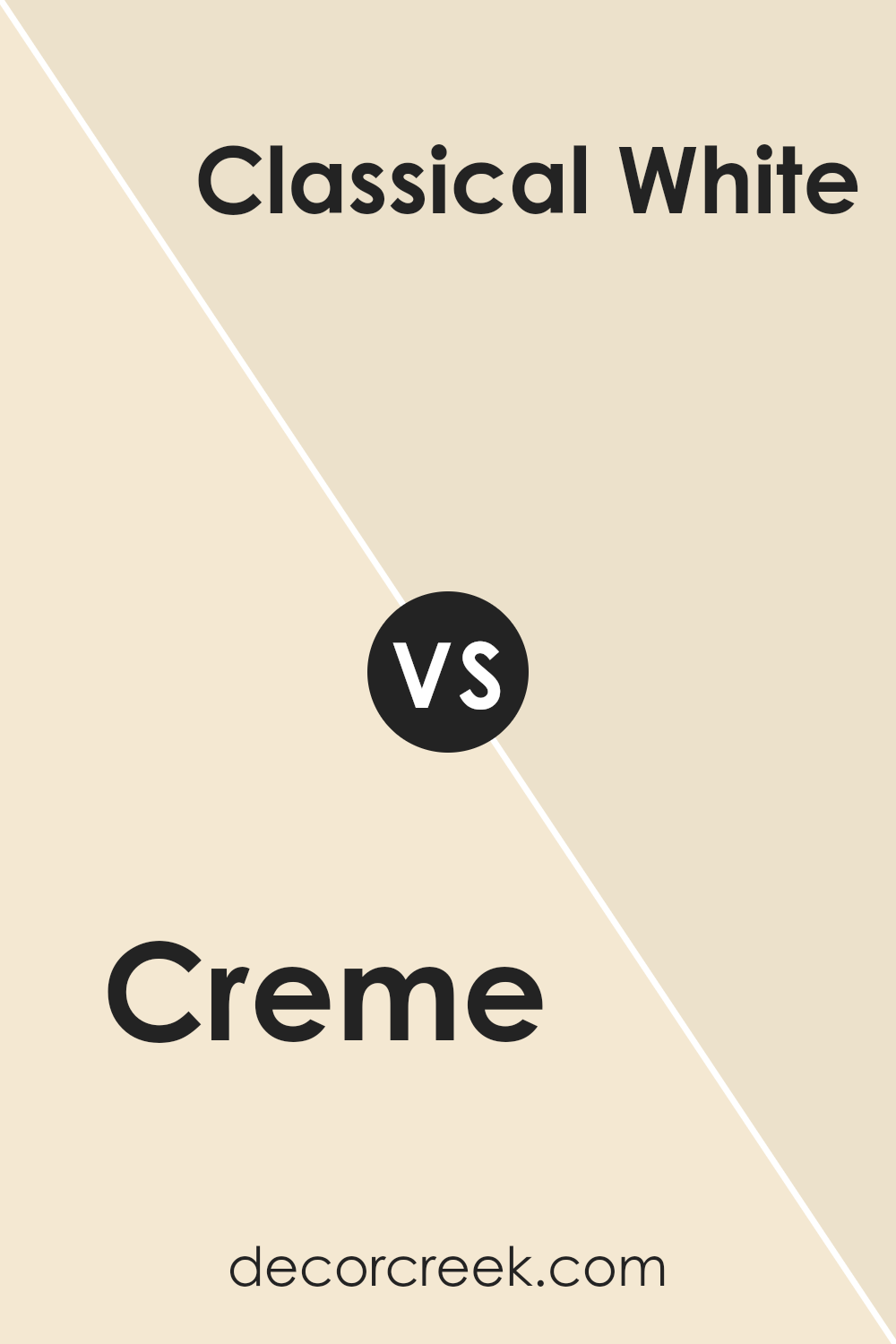
Creme SW 7556 by Sherwin Williams vs Classical White SW 2829 by Sherwin Williams
Creme SW 7556 and Classical White SW 2829 are two elegant paint colors from Sherwin Williams that complement various decor styles. Creme SW 7556 is a warm, muted beige with a cozy feel. It suits spaces where a soft, welcoming ambiance is desired, making it perfect for living rooms and bedrooms.
This color pairs well with darker furniture and vibrant accents, offering a subtle contrast without overpowering the room.
On the other hand, Classical White SW 2829 is a clean and bright white color. It gives rooms a fresh, open look, excellent for smaller or darker spaces as it helps reflect light, making areas appear larger and more airy. Classical White is versatile, serving well as a base for bolder colors or as a standalone choice for a crisp, clean aesthetic.
Both colors are practical, each lending a unique character to spaces; Creme adds warmth while Classical White creates a sense of openness.
You can see recommended paint color below:
- SW 2829 Classical White
Creme SW 7556 by Sherwin Williams vs Decor White SW 7559 by Sherwin Williams
Creme (SW 7556) and Decor White (SW 7559) by Sherwine Williams are both neutral colors, but they have different tones and moods. Creme is a soft, warm beige with a hint of yellow, making it cozy and inviting. It’s great for rooms where you want a relaxed, homey feel. This color works well in living spaces, bedrooms, and kitchens.
On the other hand, Decor White is a clean and bright white. It’s crisper and cooler than Creme, giving a fresh and airy vibe to any space. This color is perfect for areas where you want to create a sense of openness and purity, like bathrooms or small, dark rooms to make them appear larger.
Both colors are versatile and work well in many different settings, but your choice might depend on the atmosphere you want to create – warm and snug with Creme or light and spacious with Decor White.
You can see recommended paint color below:
- SW 7559 Decor White
Creme SW 7556 by Sherwin Williams vs French Vanilla SW 7118 by Sherwin Williams
Creme SW 7556 by Sherwin Williams is a warm and welcoming shade that leans towards a soft beige with a hint of yellow, making it a cozy choice for any space. Its subtle warmth makes rooms feel inviting and comfortable. This color works well in living areas and bedrooms where a gentle, soothing presence is desired.
On the other hand, French Vanilla SW 7118 is also a warm tone but has a slightly more pronounced yellow undertone, giving it a creamy appearance that resembles the rich flavor of its namesake. This color tends to brighten spaces more actively than Creme SW 7556, making it an excellent option for darker rooms or north-facing spaces that receive less sunlight.
Both colors offer a soothing backdrop ideal for a variety of decorating styles, but French Vanilla SW 7118 can make a room feel more energetic and cheerful, while Creme SW 7556 tends to create a more subdued, cozy atmosphere. When choosing between the two, consider the amount of natural light in your space and the mood you wish to create.
You can see recommended paint color below:
- SW 7118 French Vanilla
Creme SW 7556 by Sherwin Williams vs Summer White SW 7557 by Sherwin Williams
Creme and Summer White, both by Sherwin Williams, are gentle and warm colors that pair beautifully together. Creme is a cozy beige with soft, yellow undertones, giving it a slightly richer feel. It’s great for creating a welcoming atmosphere in any room. On the other hand, Summer White is lighter and airier.
It has a subtle creamy tone, but is closer to traditional white, making spaces feel bigger and brighter. When used side by side, Creme provides a comforting warmth that complements the breezy, light touch of Summer White. This combination works well in rooms that need a balance of cheerfulness and calm, such as living areas or bedrooms.
Together, these colors keep environments friendly and open without being too stark or too bold.
You can see recommended paint color below:
- SW 7557 Summer White
Creme SW 7556 by Sherwin Williams vs White Hyacinth SW 0046 by Sherwin Williams
Comparing Creme SW 7556 and White Hyacinth SW 0046 from Sherwin Williams, you’ll see both colors offer a soft and inviting feel but differ in their warmth and brightness. Creme SW 7556 is a warm, neutral beige. It gives a cozy vibe and works well in spaces that aim for a comfortable, welcoming atmosphere, such as living rooms or bedrooms.
On the other hand, White Hyacinth SW 0046 is lighter and appears more as a soft white rather than a true, stark white. It’s great for making smaller spaces appear bigger and brighter, and can freshen up a room without feeling too cold.
While both shades can help create a relaxed environment, Creme leans more into a warm, snug feel, and White Hyacinth brings a light, airy quality.
These colors work well on their own or even together, depending on the mood you want to create in your space.
You can see recommended paint color below:
- SW 0046 White Hyacinth
Creme SW 7556 by Sherwin Williams vs Medici Ivory SW 7558 by Sherwin Williams
The two paints, Creme SW 7556 and Medici Ivory SW 7558, both come from Sherwin Williams and share a warm base, but they have distinct tones that set them apart. Creme SW 7556 is a soft, creamy white with a slightly yellow undertone, giving it a cozy and inviting feel. It’s an excellent choice for spaces where you want a comforting and soft atmosphere, such as living rooms or bedrooms.
On the other hand, Medici Ivory SW 7558 is a bit deeper and richer than Creme. It leans more towards a beige color, containing more gray undertones. This color works well in areas where you want a bit more warmth and depth, making it ideal for entryways or dining areas.
While both colors bring warmth and light to a room, Creme is better for those who prefer a purer, brighter feel, whereas Medici Ivory is suitable for someone looking for a touch of sophistication without being too bold. Overall, both colors can create a welcoming space but offer slightly different vibes based on their undertones and depth.
You can see recommended paint color below:
- SW 7558 Medici Ivory
Creme SW 7556 by Sherwin Williams vs Morning Sun SW 6672 by Sherwin Williams
Creme SW 7556 and Morning Sun SW 6672 are both appealing colors offered by Sherwin Williams, but they serve very different moods and aesthetic purposes in home décor. Creme is a soft, neutral beige that offers a subtle backdrop for a room, making it an excellent choice for anyone who wants walls that are calm and easy to match with other colors.
This understated hue is perfect for those who prefer a minimalist look or want to highlight other elements of their room, such as art or furniture.
On the other hand, Morning Sun is a bright, cheerful yellow. This color is much more vibrant and energetic compared to Creme. It’s great for spaces where you want to add a sense of brightness and enthusiasm, such as kitchens or breakfast nooks. The lively vibe of Morning Sun can create a welcoming atmosphere and is likely to stimulate lively conversations and uplift moods.
In essence, while Creme leans towards quiet and grounding, Morning Sun offers a boost of energy and cheerfulness. Each color serves a distinct purpose, depending on the feeling you want to achieve in your space.
You can see recommended paint color below:
- SW 6672 Morning Sun
Creme SW 7556 by Sherwin Williams vs Venetian Lace SW 7119 by Sherwin Williams
Creme and Venetian Lace are both neutral paint colors from Sherwin Williams, offering subtle but distinct differences. Creme presents a warm, inviting tone, leaning towards a soft beige with a hint of yellow. This color works great in spaces where a cozy, welcoming atmosphere is desired. It pairs well with a wide range of decor, enhancing the area without overpowering it.
On the other hand, Venetian Lace leans slightly cooler compared to Creme, featuring a touch of gray. This gives it a more muted appearance, making it ideal for those who prefer a more understated look. It’s excellent for creating a calm, collected feel in a room, serving as a gentle backdrop that complements various furnishings and finishes.
When deciding between the two, consider the mood and style you want to set in your space. Creme will warm up a room, while Venetian Lace offers a cleaner, crisper vibe. Both are versatile, but the choice depends on the specific aesthetic and atmosphere you’re aiming for in your home.
You can see recommended paint color below:
- SW 7119 Venetian Lace
Conclusion
Wrapping up my thoughts on SW 7556 Creme by Sherwin Williams, I’d say it’s a pretty special paint color. This shade of creme is not just plain white; it has a touch of warmth that makes any room feel more welcoming. Whether it’s a big living room or a small bathroom, this color can make it look nicer.
This paint is also pretty tough; it can handle kids playing and not get dirty easily, which is great for busy homes. Plus, it’s easy to paint with, so even if someone isn’t great at painting, they can still do a good job.
In my opinion, SW 7556 Creme is perfect for anyone looking to freshen up their home with a new color that’s easy on the eyes. It’s soft and warm, making it ideal for places where you relax like bedrooms or family rooms. So, anyone thinking about giving their home a fresh, clean look should definitely check out SW 7556 Creme.
It’s a winner in my book for creating a cozy and pretty look without being too bright or too dull.
Ever wished paint sampling was as easy as sticking a sticker? Guess what? Now it is! Discover Samplize's unique Peel & Stick samples.
Get paint samples

