In my search for the perfect hue, this particular shade stood out to me as a versatile and sophisticated choice. It’s not just another gray; it’s a color with depth, offering a blend of warmth and richness that instantly adds character to any room.
My journey with Cromwell Gray began when I was seeking a neutral backdrop for my living space. I wanted a color that was neither too bold nor too plain.
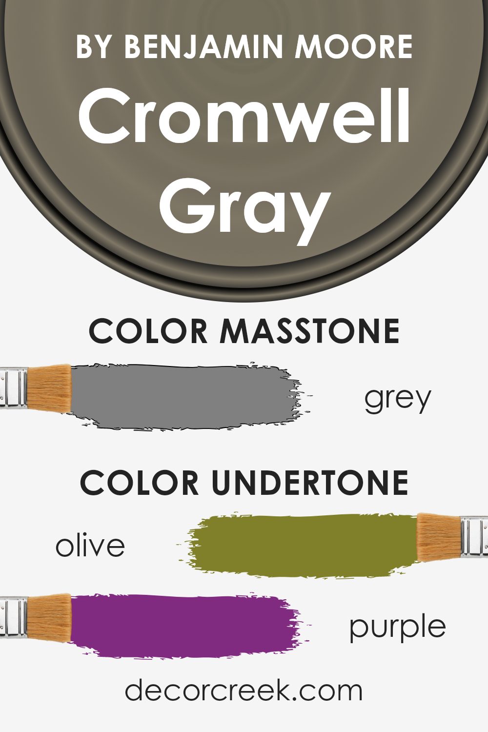
Cromwell Gray struck the perfect balance. Its subtle undertones of green provide just enough contrast to make it interesting, while still maintaining the classic feel that gray is known for.
As I began painting, I noticed how the color seemed to change with the lighting, sometimes appearing more beige, other times more gray.
This dynamic quality made Cromwell Gray incredibly versatile, complementing both modern and traditional decor effortlessly.
Whether it’s paired with crisp white trim or set against natural wood tones, Cromwell Gray continues to impress, proving itself a timeless and elegant choice for my home.
What Color Is Cromwell Gray HC-103 by Benjamin Moore?
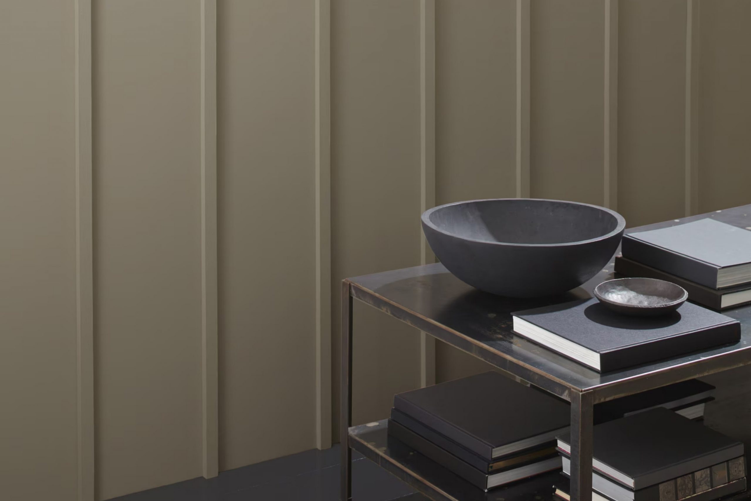
Cromwell Gray (HC-103) by Benjamin Moore is a rich, versatile color that sits comfortably between gray and olive green. It presents a grounded and calm vibe, making it suitable for a variety of interior styles. Its earthy undertones exude warmth, lending it a comforting presence in any room.
Cromwell Gray works particularly well in traditional and transitional interiors. In a traditional setting, it can complement dark wood furniture, creating a cozy and inviting atmosphere. It’s equally at home in a more modern space, acting as a muted backdrop for contemporary art and sleek designs.
When it comes to pairing with materials, Cromwell Gray harmonizes beautifully with natural elements. Consider using it alongside wooden floors or furniture to highlight its warm qualities. It also works well with metal finishes like brass or matte black, enhancing its sophisticated edge.
Textures such as wool, linen, and velvet can add depth and interest when standing against this color, enhancing both tactile and visual appeal.
In terms of lighting, Cromwell Gray adapts well to both artificial and natural light, subtly shifting its undertones to fit the ambiance of the room. An excellent choice for living rooms, studies, or bedrooms, it provides a stable, reassuring backdrop.
Is Cromwell Gray HC-103 by Benjamin Moore Warm or Cool color?
Cromwell Gray HC-103 by Benjamin Moore is a versatile paint color that brings a balanced, neutral tone to various spaces in homes. It’s a mix of gray and green with a hint of warmth, making it suitable for both contemporary and traditional interiors.
This color adapts well to different lighting conditions, appearing more gray or green depending on the time of day and the light source.
In well-lit rooms, Cromwell Gray can create a soft, comforting backdrop, making spaces feel cozy and inviting, without overwhelming the room.
In darker areas or rooms with less natural light, it may seem more muted and subdued, adding depth and sophistication without feeling too bold. This makes it an excellent choice for living rooms, bedrooms, or even kitchens, where a calming yet stylish atmosphere is desired.
Cromwell Gray pairs well with various colors, including whites, creams, and contrasting darker tones, allowing for flexible design options.
Undertones of Cromwell Gray HC-103 by Benjamin Moore
Cromwell Gray by Benjamin Moore is a unique color with subtle undertones that can change the way it appears on walls. Undertones are the subtle hints of color that lie beneath the surface of the primary color. They can affect how a color looks in different lighting conditions and in combination with other colors in a room.
For Cromwell Gray, these undertones include shades like olive, purple, dark turquoise, pale pink, brown, mint, and others. Each of these undertones can influence how Cromwell Gray appears in a room.
For example, the olive and dark green undertones may make the gray seem warmer and more inviting, while the purple and lilac hints might add a slightly cool or even moody feel, depending on the lighting. The subtle touch of brown can anchor the gray, giving it a more grounded and neutral feel. On the other hand, the underlying pale pink and mint might gently soften the gray, making it more cheerful.
When used on interior walls, these undertones can interact with a room’s natural light and furnishings to create different moods. A north-facing room might bring out the cooler purple and lilac undertones, whereas a south-facing one might highlight the warmer olive and brown aspects.
Understanding these undertones can help in choosing complementary colors for decor and furniture in a room.
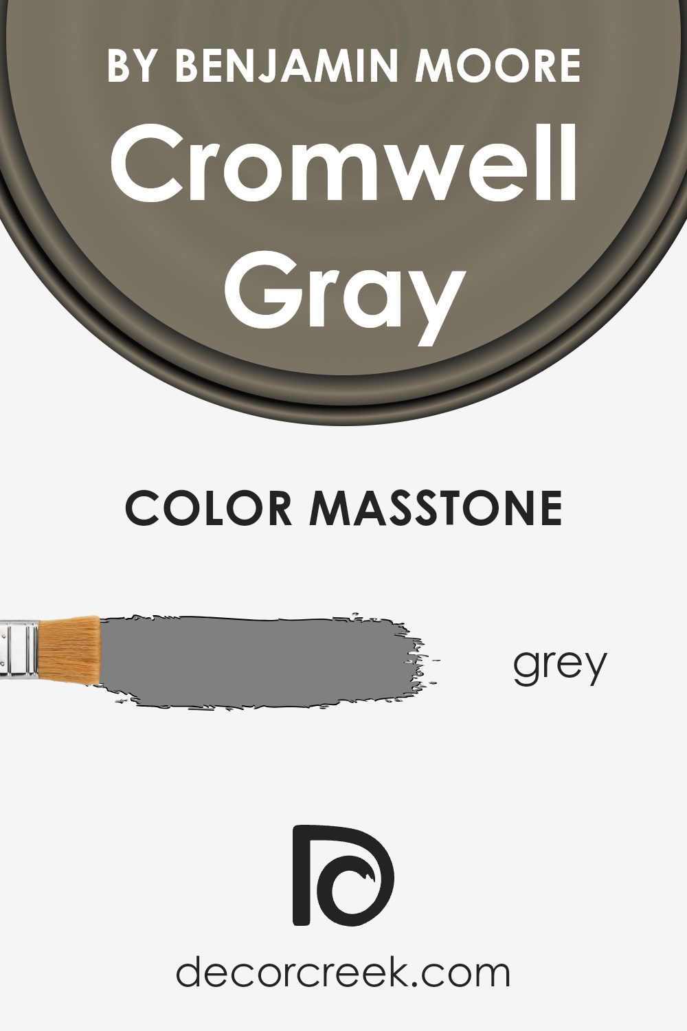
What is the Masstone of the Cromwell Gray HC-103 by Benjamin Moore?
Cromwell Gray HC-103 by Benjamin Moore is a warm, medium-toned gray that can bring a cozy and inviting feel to homes. With its masstone of #808080, this gray offers a balanced hue that pairs well with both modern and traditional settings.
The understated nature of Cromwell Gray makes it a versatile choice for those looking to create a comfortable atmosphere in living rooms, bedrooms, or dining spaces.
Incorporating this color can give a room a grounded look without being too bold. It balances well with whites and off-whites, making it suitable for trims and moldings. Additionally, its warmth complements natural wood furniture and earthy textures. This gray can also work as a neutral backdrop for colorful accents, allowing other elements of a room to pop.
Whether used on all walls or as an accent, Cromwell Gray offers a dependable base that suits various design styles.
How Does Lighting Affect Cromwell Gray HC-103 by Benjamin Moore?
Lighting plays a vital role in how we perceive colors in a space. The same color can look quite different depending on the type of light it’s in. Cromwell Gray, a paint color by Benjamin Moore, is no exception. It’s a warm, medium-dark gray with brown undertones.
In natural light, Cromwell Gray will show its true tones. In a north-facing room, the light is usually cooler and more consistent throughout the day. This can make Cromwell Gray appear a bit more bluish or cooler than it is.
It might come off as a stronger gray with less of the warmth you might see elsewhere. In south-facing rooms, the light is warmer and more intense, especially during midday.
This warmth can enhance the brown undertones in Cromwell Gray, making it look cozier and softer.
East-facing rooms get warm, yellow-toned light in the morning and cooler light in the afternoon. In the morning, Cromwell Gray will look warmer and more inviting, while in the afternoon, its cooler, grayer tones might come through. On the other hand, west-facing rooms have cooler light in the morning and warm, orange-toned light in the evening.
In these rooms, Cromwell Gray might feel crisper in the early hours and warmer towards the evening, which can create a dynamic shift in mood as the day progresses.
Under artificial lighting, Cromwell Gray’s appearance will largely depend on the type of bulb used. Warm bulbs will enhance the brown undertones, making the room feel cozy and inviting. Cool, white bulbs might intensify the gray and can even make it look a bit harsher.
It’s important to test out the color with your preferred lighting setup before committing, as these subtle shifts can greatly impact the overall feel of your room.

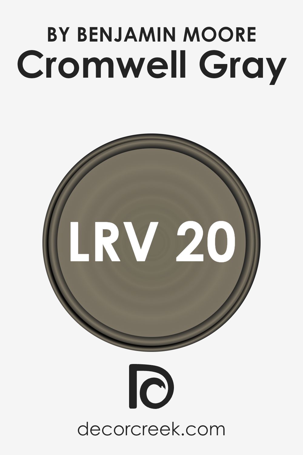
What is the LRV of Cromwell Gray HC-103 by Benjamin Moore?
Light Reflectance Value, or LRV, is a measure that tells you how much light a color reflects. It’s a scale that ranges from 0, which means the color absorbs all light (pure black), to 100, which means the color reflects all light (pure white).
So, when you look at the LRV of a color like Cromwell Gray, which is 19.62, it means that this color reflects some light but also absorbs a lot. Colors with low LRV values, like Cromwell Gray, tend to feel darker and less bright in a room, especially in spaces with limited natural light or artificial lighting.
For Cromwell Gray, having an LRV of 19.62 indicates that it will look quite deep and muted on walls. Because it doesn’t reflect a lot of light, Cromwell Gray will create a cozy and intimate atmosphere. It’s a versatile shade but can appear quite different depending on the lighting in your room. In brightly lit rooms, it might look a bit lighter, while in rooms with less light, it can appear much darker.
Keep in mind that the furniture, decor, and even the time of day can affect how Cromwell Gray appears, due to its ability to absorb more light than lighter colors.
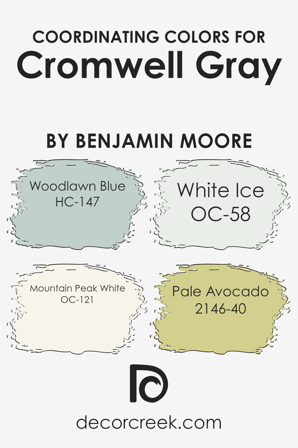
Coordinating Colors of Cromwell Gray HC-103 by Benjamin Moore
Coordinating colors are hues that complement each other well and create a balanced look when used together in a space. When pairing colors with Cromwell Gray from Benjamin Moore, you can create a harmonious design by selecting shades that share similar undertones or provide a pleasant contrast.
Picking the right coordinating colors can enhance a room’s visual appeal, making it inviting and cohesive. By carefully choosing colors that work well together, you can create an atmosphere that feels complete without overwhelming the senses.
Consider pairing Cromwell Gray with Woodlawn Blue (HC-147), a soft, muted blue that adds a touch of calm and coolness. Mountain Peak White (OC-121) is a warm, creamy white that brings brightness and warmth, acting as a perfect backdrop or trim color.
White Ice (OC-58) is a crisp, clean white with a hint of coolness, ensuring a fresh and modern look that pairs well with warmer shades. Pale Avocado (2146-40) adds a subtle, earthy green tone, injecting a bit of natural vibrancy without overpowering the other colors.
These coordinating colors work well together to create spaces that feel balanced and comfortable, offering a versatile palette for any room.
You can see recommended paint colors below:
- HC-147 Woodlawn Blue
- OC-121 Mountain Peak White
- OC-58 White Ice
- 2146-40 Pale Avocado
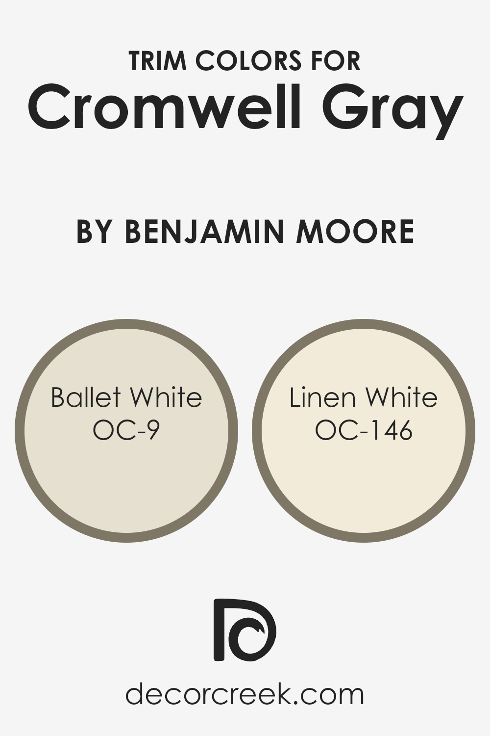
What are the Trim colors of Cromwell Gray HC-103 by Benjamin Moore?
Trim colors are the shades used on the framing details of a room, such as moldings, baseboards, and door frames. They help define and accentuate the architectural features of a space. When paired with Cromwell Gray HC-103 by Benjamin Moore, trim colors like Ballet White and Linen White can create a pleasing contrast that enhances the overall appearance of a room.
Cromwell Gray is a warm and rich gray that can make a space feel cozy and inviting, and the choice of trim colors can either subtly highlight or boldly define the edges and details of the room. By using well-chosen trim colors, you can enhance the aesthetic balance, creating a polished and harmonious look.
Ballet White OC-9 is a soft and creamy white with a hint of beige that offers warmth and subtle elegance. It adds a gentle brightness that can complement Cromwell Gray without overpowering it, creating a cohesive and comfortable atmosphere.
Linen White OC-146, on the other hand, is a warmer and slightly richer shade of white that can add a cozy and welcoming touch to a room. It provides a softer contrast against Cromwell Gray, maintaining a bright but not stark appearance.
Both of these trim colors work well in enhancing the depth and character of Cromwell Gray, adding a finishing touch that completes the look of any room.
You can see recommended paint colors below:
- OC-9 Ballet White
- OC-146 Linen White
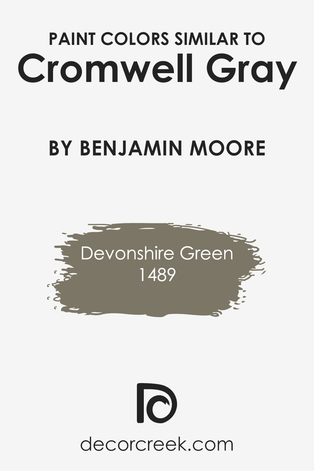
Colors Similar to Cromwell Gray HC-103 by Benjamin Moore
Similar colors are important in design because they help create a harmonious and balanced look. When you use colors that are similar to each other, it ties different elements together, making a space feel more cohesive and calm.
Cromwell Gray by Benjamin Moore, a muted and grounding color, benefits from this concept when paired with similar shades.
Devonshire Green, which has an earthy tone, complements Cromwell Gray beautifully. It adds a hint of richness and depth, resembling the natural elements found in stones and foliage.
Together, these colors create a soothing and unified environment, as they belong to the same palette of nature-inspired shades.
Understanding how similar colors work is essential for creating inviting spaces. 1489 – Devonshire Green brings a sense of lushness and warmth, slightly lighter in tone yet robust enough to stand out without clashing.
It harmonizes perfectly with Cromwell Gray, painting a picture of a tranquil forest under a soft, overcast sky. By using similar colors, you can maintain visual interest without overwhelming the senses. This approach is key in both interior design and art, where balance and unity are desired.
It helps tie everything together, producing an environment where each element naturally fits with the rest.
You can see recommended paint color below:
- 1489 Devonshire Green
How to Use Cromwell Gray HC-103 by Benjamin Moore In Your Home?
Cromwell Gray HC-103 by Benjamin Moore is a versatile paint color that can bring a warm, inviting feel to any home. It’s a soft, neutral shade that can work well in various rooms, from living areas to bedrooms. This color has a balanced mix of gray and beige, making it an excellent backdrop for different styles of furniture and décor.
In a living room, using Cromwell Gray on the walls can create a cozy and welcoming atmosphere. Pair it with light-colored curtains and soft furnishings to brighten up the space.
In a bedroom, this shade helps create a restful environment that makes the space feel comfortable and calm. It also works well with white or wood-colored furniture for a balanced look.
Cromwell Gray is also a good choice for a home office or study. Its neutral tone helps maintain focus without being distracting. Overall, it’s a versatile color that works in many settings.
Cromwell Gray HC-103 by Benjamin Moore vs Devonshire Green 1489 by Benjamin Moore
Cromwell Gray HC-103 and Devonshire Green 1489 by Benjamin Moore offer two distinct color experiences. Cromwell Gray is a warm and neutral shade. It provides a soft, earthy feel ideal for creating a cozy atmosphere in a room. This color works well for people looking to add warmth to their spaces without the heaviness of darker shades.
In contrast, Devonshire Green is a light, muted green that brings a refreshing touch to any setting. It’s more vibrant than a simple neutral and adds a hint of nature to a room. This green has an airy quality that suits spaces where a light, breezy vibe is desired.
Both colors are versatile, but their effects differ. Cromwell Gray is comforting, while Devonshire Green is revitalizing. When choosing between them, consider the mood you want to establish: cozy and warm or fresh and uplifting.
You can see recommended paint color below:
- 1489 Devonshire Green

Conclusion
It’s a wonderful shade of gray that works well in so many places. When I first looked at it, I noticed how it seemed to have both warmth and coolness.
This makes it great for matching with other colors. It feels cozy and inviting without being too bold.
In rooms like the living room or bedroom, this gray can make the space feel calm and comfortable. It’s like wearing your favorite sweater on a chilly day. HC-103 Cromwell Gray can also work in places where you want a bit of style without being too fancy. It’s like the color knows how to fit in without making a fuss.
Imagine painting the walls of your favorite room with this gray, and then seeing how it brings everything together. It’s not flashy, but it’s not boring either.
It feels just right. I like how it can work with any light, whether the sun is shining or it’s a dim evening, making the room look nice at any time of day.
In the end, HC-103 Cromwell Gray by Benjamin Moore is a smart choice. Whether for a place where you play, work, or rest, this paint color feels like a friendly hug.

Ever wished paint sampling was as easy as sticking a sticker? Guess what? Now it is! Discover Samplize's unique Peel & Stick samples.
Get paint samples

